wheel of time: calendar design
DESCRIPTION
calendar designTRANSCRIPT

Design Media Publishing Limited
De
sign M
ed
ia Pub
lishing Lim
ited
The book centres on the subject of calendar design, choosing more than 160 distinguished
works all over the world. With detailed and comprehensive classification, this creative
and practical book will present the most innovative design works to the readers. Its
innovativeness lies in the font selection, layout design, the application of different materials,
various patterns’ selection, etc.
In the process of editing, a number of strict requirements have been made, so here, each
work has innovative design, clever idea, professional photography, comprehensive project
information and so on. The book has been categorised into five sections, including weekly
calendar design, monthly calendar design, desk calendar design, single-page calendar
design and wall calendar design.

Design Media Publishing Limited

contents
preface 4
weekly calendar
monthly calendar
desk calendar
single-page calendar
wall calendar
index
8
26
110
184
234
300

Calendar is a strong social tradition, a modern totem. It serves a
sacred but naive purpose to win the battle over the daily chaos.
Of course, it is a big fat illusion. Humanity will never overcome the
randomness; we can not take control of the time. Nevertheless,
calendars are among the earliest manifestations of culture. Their
shape changed as the ages passed, but the essence is still the
same–to organise time, to navigate us through time.
Calendars are changing with the development of technology. Right
now at my sight I have several modern calendars fighting for my
attention: my phone, my laptop, even in my old school notebook
I have two calendars. Obviously, calendars will become more
and more technological objects, like watches, but like for watches
there will always be a place for beautiful and not necessarily
functional things. iCal, no matter how well it is drawn, will never win
the nomination “Most Lovable” over the hand-painted wooden
calendar which was made 200 years ago.
As for me, calendars are a very personal issue. I create them, so no
longer I can think that a calendar is just a simple utilitarian object (I
know too much).
How do I create a calendar? Postcard with a calendar grid on it–this preface
is not what I want to present to a client. I have nothing to say against
the classic concepts, but it’s getting pretty hard now to surprise
anybody with just a beautiful picture. My partners and I always try
to make an outstanding job. It’s one of the core principles of our
studio–do not make a trivial concept. As far as any of our design
objects is concerned, the calendar should have a remarkable
mnemonic touch. This means that it must have something that
makes it memorable. Sex. (I just wanted to use this word here.)
Actually to come up with something original is not so difficult. If you
are tuned in a right way, the only problem will be to overcome your
own lasiness. The biggest difficulties always arise at the moment
of technical implementation. Production details will be driving
you crazy. At this very moment there is no project of mine with the
production of which I would be satisfied for 100%. I know how to
improve any of my projects. We are fortunate enough that the
calendar is not a chair; we don’t have to try to meet the anatomical
needs. It is not a calculator either, so we don’t need to teach people
how to use it. Since we always aim at the segment of “just interesting
things”, we can afford the luxury of disregarding the original
classical form and function and give more attention to the process
of involving the consumer.
A few boring details about the stages of our work on the calendar:
1. We try to start in spring. Creating the initial idea takes several
weeks. All this time we do search for a unique essence, which mostly
describes our client. The picture with the numbers–it's not something
I want to give to the client. As I said earlier, we always try to create
something incredible. Unfortunately, not all our ideas find the client’s
positive response. We don’t give up. We just find another client. So, in
the end every idea finds its perfect client.
2. Once the concept is formed and approved by the client we are
immersed into the long process of selection of possible technical
solutions. This phase sometimes stretches for several months. Working
out the details, consulting the production experts, preparation to the
production takes a tremendous portion of our time.
3. And finally, the production. Very important stage, where the
smallest error in a moment can ruin the work of several months of
your life.
The book you hold in your hands is a competition of brilliant minds
in one specific industry. It’s a search for the original solution in the
field where these solutions were founded for ages. It is always a
challenge, and only the most courageous and confident are ready
to take it!
— Sergiy Chebotaryov

Combinatorio
Wheel Of Time -- Calendar Design // Weekly Calendar
TITLE: CombinatorioDESIGN AGENCY: LLdesignPRODUCTION DATE: 2008CREATIVE DIRECTOR: Lorella PierdiccaDESIGNER: Lorella PierdiccaCLIENT: CMTNATIONALITY: Italy
Weekly agenda that moves around idea of time.
�/�

10/11Wheel Of Time -- Calendar Design // Weekly Calendar
TITLE: Flip Book CalendarDESIGN AGENCY: Tomato Košir s. p.PRODUCTION DATE: 2006CREATIVE DIRECTOR: Tomato Košir s. p.DESIGNER: Tomato Košir s. p.CLIENT: Youth Service KranjPhOTOGRAPhY: Peter KoštrunNATIONALITY: Slovenia
A student calendar that starts in the fall and ends in the summer. The deciduous tree is a metaphor for student work–it starts as tabula rasa, in the process it gains leafs and at the end of the year it harvests the fruits of its work.
Flip Book Calendar

12/13Wheel Of Time -- Calendar Design // Weekly Calendar
TITLE: World Moving IdeasDESIGN AGENCY: AdmComPRODUCTION DATE: 2009CREATIVE DIRECTOR: Manuel Dall’OlioDESIGNER: Mirit WissotzkyCLIENT: Pershing Yacht PhOTOGRAPhY: Luca CapuanoNATIONALITY: Italy
“There is neither a starting point, nor an ending point. Ideas have always existed, and they always will. Each invention gives life to a future one. Great ideas are living among us, we just have to pause, look, touch and transform them into the next invention.” Great ideas last forever. This is the insight that has inspired the 2009 Pershing calendar "World Moving Ideas" and its celebration of the power of ideas. The calendar presents 12 universally known objects and shows how many of the things that surround us today exist on account of important inventions in the past. Every object includes a month of the year 2009, plus a description of the original idea that led to its invention. For example, the iPod owes its existence to Thomas Edison who invented the phonograph in 1878, whereas magnets are a direct consequence of the refrigerator, invented in 1748 by William Cullen. Dedicated to Pershing customers and produced in a limited edition, the calendar has been sent to Pershing prospects and opinion leaders.
World Moving Ideas
14/15Wheel Of Time -- Calendar Design // Weekly Calendar
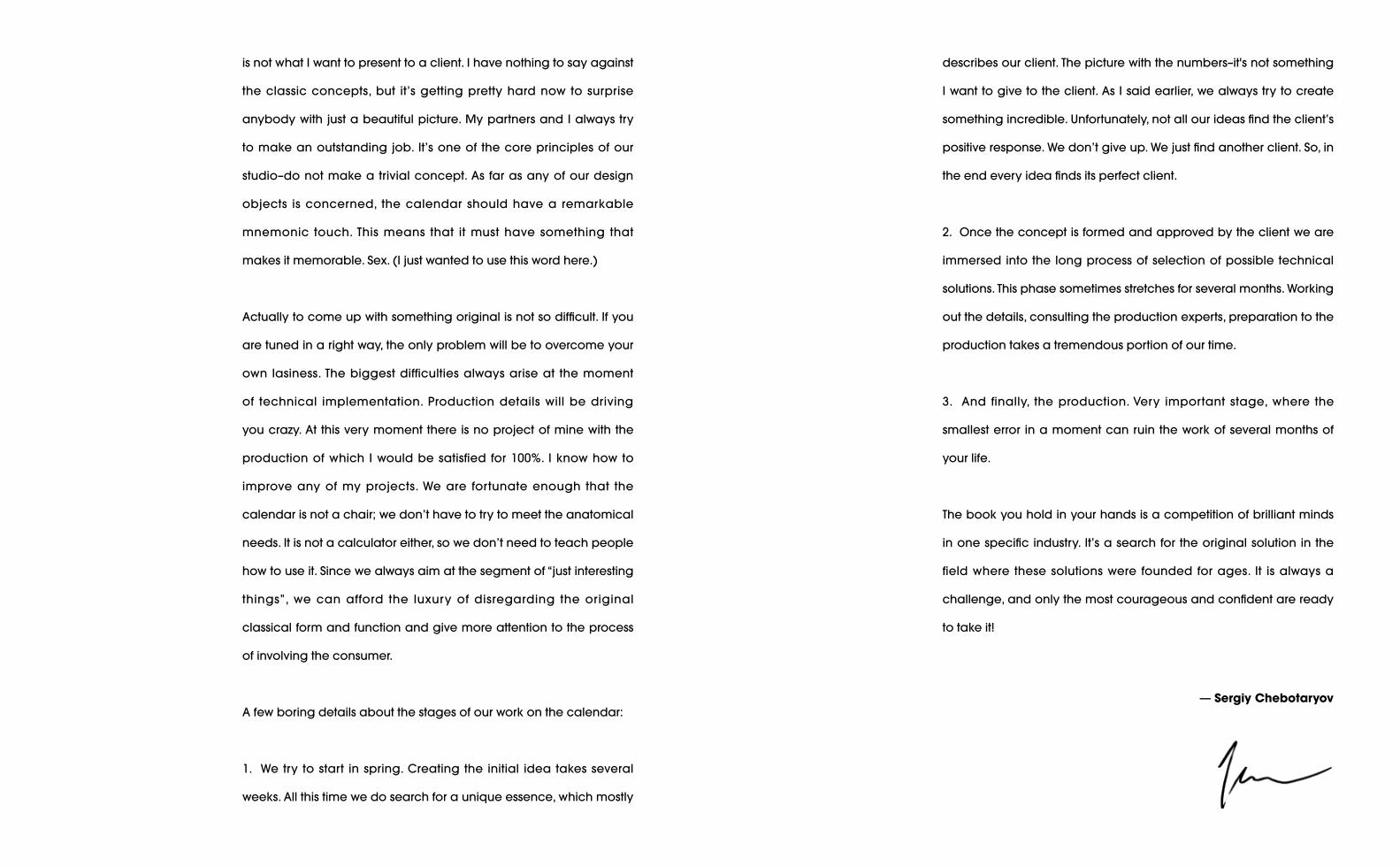
TITLE: Status CalendarDESIGN AGENCY: Burak KaynakPRODUCTION DATE: 2009CREATIVE DIRECTOR: Burak KaynakDESIGNER: Burak KaynakPhOTOGRAPhY: Cem HasNATIONALITY: Turkey
The web's big question “What are you doing right now?” is incredibly useful for tracking your daily activity. This is a calendar where you can write your daily "status". It simply asks the question, "What are you doing today?" And you are invited to answer it!
Status Calendar

16/17
TITLE: Ando Agenda 2010DESIGN AGENCY: Total IdentityPRODUCTION DATE: 2009CREATIVE DIRECTOR: Edwin Van PraetDESIGNER: Edwin Van Praet / Yu ZhaoCLIENT: Ando BVPhOTOGRAPhY: Paul Monster / Tommy KoolwijkNATIONALITY: the Netherlands
Themes for the Ando Agenda 2010 are infinity, rhythm and the creation of time. The circular shapes symbolise the cycle of seasons and of our lives. The calendar allows you space to create your own week, and you can be as flexible with your dates as with the images of a kaleidoscope. The weekly kaleidoscope pictures in this agenda inspire curiosity and creative thinking, as they invite you to see beauty in everyday objects. As you open the perforated Japanese folds in the agenda, the original item used to make the kaleidoscope pattern is revealed. These items are related to specific events of the year, for example the image of a football in the week of the 2010 FIFA World Cup week. The celebration of the circle is completed on the cover, with a total of 360 kaleidoscope patterns. Red Dot Award: Communication Design, Category Editorial. Graphis New York: Golden Award, Design Annual 2011. European Design Awards: GoldenAward, Category Calendar. One Show Design: Merit Award, Category Collateral Design. Kalenderwedstrijd: Award for Best Agenda.
Ando Agenda 2010
Wheel Of Time -- Calendar Design // Weekly Calendar

1�/1�
TITLE: Recyclingdesign CalendarDESIGN AGENCY: NowakteufelknyrimPRODUCTION DATE: 2010CREATIVE DIRECTOR: Petra Knyrim / Stefan NowakDESIGNER: Rike Stephani / Mona MatejicCLIENT: NowakteufelknyrimNATIONALITY: Germany
Not only those who saw “The Age of Stupid” know, that it is time to change the behavior towards the world people live in. People should start to save energy, ride bikes and act more sustainable in all parts of the lives. Therefore, the designers also spare the environment with the new stationery: instead of wasting new resources, they recycle the already used. Misprints, proofs, incoming envelopes, letters, ice packaging –material which is normally thrown away–is branded with a new seal: “recyclingdesign by Nowakteufelknyr im”. The calendar "recyclingdesign by Nowakteufelknyrim 2011"is part of the label.
Calendar
Recyclingdesign
Wheel Of Time -- Calendar Design // Weekly Calendar

20/21Wheel Of Time -- Calendar Design // Weekly Calendar
TITLE: Bills CalendarDESIGN AGENCY: Redstar InkPRODUCTION DATE: 2010CREATIVE DIRECTOR: Marcie Hicks DESIGNER: Marcie HicksPhOTOGRAPhY: Walker HicksNATIONALITY: USA
As part of an organisational series, the bills calendar was designed to simplify financial responsibilities. Each month as a bill arrives, it goes into the “pay” pocket. Once it is paid, it moves over to the “paid pocket” and gets checked off the list.
Bills Calendar

22/23Wheel Of Time -- Calendar Design // Weekly Calendar
TITLE: DIY CalendarDESIGN AGENCY: Redstar InkPRODUCTION DATE: 2009CREATIVE DIRECTOR: Marcie Hicks DESIGNER: Marcie HicksPhOTOGRAPhY: Walker HicksNATIONALITY: USA
The DIY calendar was created with the list maker in mind. Perfect for those who like to make a list and check things off. And because this weekly calendar has no dates, it can be started any time of the year.
Diy Calendar

24/25Wheel Of Time -- Calendar Design // Weekly Calendar
TITLE: Paper CoDESIGN AGENCY: 2CreativesPRODUCTION DATE: 2009CREATIVE DIRECTOR: Rishi SodhaDESIGNER: Rishi SodhaCLIENT: Paper Co.PhOTOGRAPhY: Rishi SodhaNATIONALITY: England
The brief set by Paper Co was to create a new format of desktop calendar which promoted sustainability and diverse use of paper, whilst being able tobe sent out by post in a normal envelope.
Paper Co

Wheel Of Time -- Calendar Design // Monthly Calendar
TITLE: Feel Visual CalendarDESIGN AGENCY: Design EtiquettePRODUCTION DATE: 2007ART DIRECTOR: Mariana PachecoDESIGNER: Mariana PachecoNATIONALITY: Costa Rica
A year seen through the eyes of a colour-blinded individual. The top stripe shows regular colours, while the bottom stripe shows colours seen by someone with a type of colour blindness. A person with one of these visual deficiencies will see the same colours on both stripes.
Feel Visual Calendar
26/27

TITLE: Calendar For Croatian Motorways LtdDESIGN AGENCY: Krizan Design StudioPRODUCTION DATE: 2005CREATIVE DIRECTOR: Ivan KrizanDESIGNER: Petra KrizanCLIENT: Croatian Motorways LtdNATIONALITY: Croatia
This was the Krizan Design Studio’s proposal for the 2005 Calendar for Croatian Motorways Ltd., a firm that basically builds and does maintenance work on state highways and local roads in Croatia. The idea behind it was to make a "road map" of main Croatian highways and then show it in segments on 12 pages of the calendar, one for each month. A small cardboard vehicle would have been used for marking the days, and it would seem as it drives along the road. The proposal unfortunately was never implemented.
Croatian Motorways Ltd
Calendar For
Wheel Of Time -- Calendar Design // Monthly Calendar 2�/2�
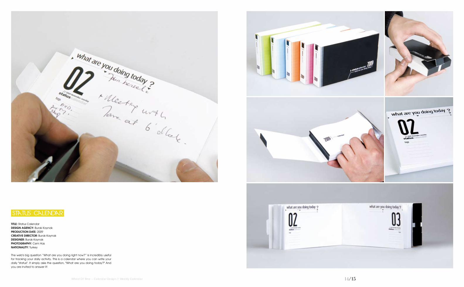
TITLE: MinimumDESIGN AGENCY: Magnus RiisePRODUCTION DATE: 2007DESIGNER: Magnus RiiseCLIENT: Magnus RiiseNATIONALITY: Norway
Calendar for 2008.
Minimum
Wheel Of Time -- Calendar Design // Monthly Calendar 30/31

TITLE: Carla–Some days are differentDESIGN AGENCY: Magnus RiisePRODUCTION DATE: 2008DESIGNER: Magnus RiiseCLIENT: Magnus RiiseNATIONALITY: Norway
Calendar for 2009.
Wheel Of Time -- Calendar Design // Monthly Calendar 32/33
Some days are different
Carla-

34/35
TITLE: U Never KnowDESIGN AGENCY: Magnus RiisePRODUCTION DATE: 2009DESIGNER: Magnus RiiseCLIENT: Magnus RiiseNATIONALITY: Norway
Calendar for 2010.
U Never Know
Wheel Of Time -- Calendar Design // Monthly Calendar 34/35

36/37
TITLE: WALL CalendarPRODUCTION DATE: 2009CREATIVE DIRECTOR: Jason LittleART DIRECTOR: Joao Peres / Jason Little / Sam Pemberton / Ivana MartinovicDESIGNER: Joao Peres / Jason Little / Sam Pemberton / Ivana MartinovicCLIENT: Spicers PaperPhOTOGRAPhY: Karl Schwerdtfeger / Michael Hall / James Cant / Adrian LanderNATIONALITY: France
Each year Spicers Paper sends out a calendar as a piece of design that not only promotes different papers throughout the year, but equally expresses its commitment to the design industry in Australia. Whether in the name of beauty, nostalgia or practicality, the items displayed on the four walls say something about each. Seen through the eyes of four designers and four photographers, wall pays homage to these wall displays. The calendar is made up of a series of posters: each season has a typographic poster along with 3 photographic monthly posters. The entire piece was a set of posters, left loose, unbound, and folded down and packed between two embossed, hand numbered pieces of boxboard, held together with a rubber band.
WALL Calendar
Wheel Of Time -- Calendar Design // Monthly Calendar

TITLE: Calendar “Crow 2008”PRODUCTION DATE: 2008CREATIVE DIRECTOR: Sudhir KuduchkarDESIGNER: Sudhir KuduchkarPhOTOGRAPhY: VectorNATIONALITY: India
The two main ingredients of this calendar are the form (of crow) and treatment (of typography). To begin with the form, it's the wholeness and simplicity of "single" colour "black" and the attached adages with the bird crow that inspired the designer to explore and exploit it as the form for this calendar. Moving on to the treatment, typography is the most "in" thing in graphic designing. It offers immense creative liberty and space to the designer and hence, the designer got tempted to use typography as the treatment for this calendar.
"Crow 2008"
Calendar
Wheel Of Time -- Calendar Design // Monthly Calendar 3�/3�

TITLE: Calendar “Crow 2009”PRODUCTION DATE: 2009CREATIVE DIRECTOR: Sudhir KuduchkarDESIGNER: Sudhir KuduchkarPhOTOGRAPhY: Lena PautinaNATIONALITY: India
Use of just two colours, black and white is deliberate in the calendar. It is done so to maintain the originality of the form (the crow) that has been used. Though colour black symbolise darkness and sadness, the bird crow signifies intelligence and is meant to be a good omen in Hindu culture. Such contrast in maxims encouraged the designer to portray crow as the main form. Coming to the treatment, typography is the best option when one aims to use negative as well as positive space, effectively. Hence, the outcome of intermingling crow with typography is the artistic creation in front of you.
"Crow 2009"
Calendar
Wheel Of Time -- Calendar Design // Monthly Calendar 40/41

42/43
TITLE: Calendar “Crow 2011”PRODUCTION DATE: 2010 - 2011CREATIVE DIRECTOR: Sudhir KuduchkarDESIGNER: Sudhir Kuduchkar PhOTOGRAPhY: FlickrNATIONALITY: India
The calendar has two main elements: Crow as the main form and typography as the maintreatment. Talking about the form first, it was no random choice to work on the concept of crow. Rather, since childhood the designer has been fascinated by this bird. There have been several facts about this creature that tickled his "interest" cells. Their symbolisation carries various contrasts which inspired him to play and explore the concept of having crows as the calendar theme. To complement the form, the designer wanted to adopt a treatment that would again say its own story and would be independent of explanations. Hence, came typography–a form of graphic designing where font type blends with the design and speaks for itself as a part of that design. The restricted use of colours is a deliberate occurrence to maintain the originality and simplicity of the concept.
"Crow 2011"
Calendar
Wheel Of Time -- Calendar Design // Monthly Calendar

44/45Wheel Of Time -- Calendar Design // Monthly Calendar
TITLE: Jezero / The LakeCREATIVE DIRECTOR: Ziga Koritnik / Petra CvelbarDESIGNER: Petra CvelbarCLIENT: Ziga KoritnikPhOTOGRAPhY: Ziga KoritnikNATIONALITY: Slovenia
In this calendar the designer is presenting pictures from the book "Jezero/ The Lake" that was published in August 2009. It contains black and white photo impressions from one of his most beloved places in the world. Unfortunately he didn't find finances to publish it this year, maybe next...
JEZERO / THE LAKE

46/47
TITLE: PokryshkinoDESIGN AGENCY: ZhishiPRODUCTION DATE: 2008DESIGNER: Elena Kostirina / Yulia LukyanchenkoCLIENT: The Network Service Stations PokryshkinoNATIONALITY: Russia
Calendar for the network service stations Pokryshkino. Each service has its own icon. The main theme of the design icons is humour. Funny pictures illustrate the services.
Pokryshkino
Wheel Of Time -- Calendar Design // Monthly Calendar

4�/4�
TITLE: 2007 CalendarDESIGN AGENCY: AnomalyPRODUCTION DATE: 2007DESIGNER: Steve RuraCLIENT: AnomalyPhOTOGRAPhY: Andrew KibbleNATIONALITY: USA
This 2007 Calendar is made of 12 blank notebooks. A numerical monthly calendar is printed on the spine of each book, and the full year is printed on the back. The calendar set was given as a holiday gift to clients and employees.
2007 Calendar
Wheel Of Time -- Calendar Design // Monthly Calendar

TITLE: 2010 Calendar Design, As A Gift For My BrotherDESIGN AGENCY: Steve SwinglerPRODUCTION DATE: 2010CREATIVE DIRECTOR: Steve SwinglerDESIGNER: Steve SwinglerCLIENT: Kevin SwinglerPhOTOGRAPhY: Steve SwinglerNATIONALITY: England
Images from sketchbooks, junk shops, general mucking around and old family jokes.
As A Gift For My Brother
2010 Calendar Design,
Wheel Of Time -- Calendar Design // Monthly Calendar 50/51

52/53
TITLE: "Cheese" Wall Calendar 2010DESIGN AGENCY: StrichpunktPRODUCTION DATE: 2009CREATIVE DIRECTOR: Kirsten Dietz / Jochen RädekerDESIGNER: Julia Ochsenhirt / Agnetha WohlertCLIENT: Eberl Print GmbhPhOTOGRAPhY: Susanne MölleNATIONALITY: Germany
A new wall calender for the Eberl Media Group. To link 150 years of tradition-and an ultra-modern company. Strichpunkt co-operated with management to develop a new corporate structure, name and image. The corporate design plays with exactly-positioned yet versatile typography. The example depicts the 2010 calendar which celebrates another company tradition: that of cheese production, staged by the entire printing comp etence of Eberl on 24 pages–it’s a good thing the word chEEsE has three Es–one for Eberl Media, one for Eberl Print and one for Eberl Online!
"Cheese" Wall Calendar 2010
Wheel Of Time -- Calendar Design // Monthly Calendar
54/55
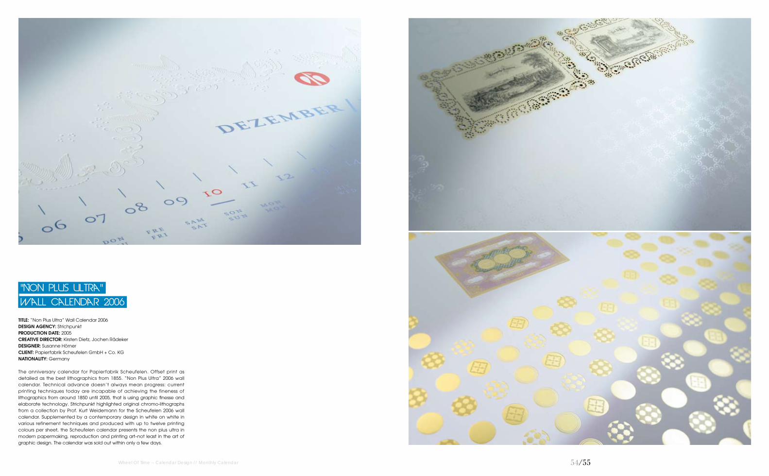
TITLE: “Non Plus Ultra” Wall Calendar 2006DESIGN AGENCY: StrichpunktPRODUCTION DATE: 2005CREATIVE DIRECTOR: Kirsten Dietz, Jochen RädekerDESIGNER: Susanne HörnerCLIENT: Papierfabrik Scheufelen GmbH + Co. KGNATIONALITY: Germany
The anniversary calendar for Papierfabrik Scheufelen. Offset print as detailed as the best lithographics from 1855. “Non Plus Ultra” 2006 wall calendar. Technical advance doesn’t always mean progress: current printing techniques today are incapable of achieving the fineness of lithographics from around 1850 until 2005, that is using graphic finesse and elaborate technology. Strichpunkt highlighted original chromo-lithographs from a collection by Prof. Kurt Weidemann for the Scheufelen 2006 wall calendar. Supplemented by a contemporary design in white on white in various refinement techniques and produced with up to twelve printing colours per sheet, the Scheufelen calendar presents the non plus ultra in modern papermaking, reproduction and printing art–not least in the art of graphic design. The calendar was sold out within only a few days.
Wall Calendar 2006
"Non plus ultra"
Wheel Of Time -- Calendar Design // Monthly Calendar

56/57
TITLE: "the Five Elementswall" Calendar 2009DESIGN AGENCY: StrichpunktPRODUCTION DATE: 2008CREATIVE DIRECTOR: Kirsten Dietz / Jochen RädekerDESIGNER: Julia Ochsenhirt / Agnetha WohlertCLIENT: Papierfabrik Scheufelen GmbH + Co. KGNATIONALITY: Germany
2009 wall calendar for Papierfabrik Scheufelen. A calendar, each of whose sheets is as individual as each person: impossible? Possible! Strichpunkt developed a calendar for 2009 which was printed in 2,009 signed copies and include 24,108 unique items: unique sheets were composed from 12 motifsd each on the elements of fire, water, air and earth as well as love. More than 1,500 variants were run through the computer before the design principle was finalised. 50,000 individual sheets were then produced in 48 special colours and 12 refinement techniques in an offset printing process with the best ones chosen and bound as calendars. A unique experiment with a unique result. Partners: Eberl Print in Immenstadt and Verlag Hermann Schmidt in Mainz.
Calendar 2009
"the Five Elementswall"
Wheel Of Time -- Calendar Design // Monthly Calendar

TITLE: Grazie 2011DESIGN AGENCY: LLdesignPRODUCTION DATE: 2010CREATIVE DIRECTOR: Lorella PierdiccaDESIGNER: Lorella PierdiccaCLIENT: Grazie srlNATIONALITY: Italy
Illustration For Calendar.
Grazie 2011
Wheel Of Time -- Calendar Design // Monthly Calendar 5�/5�
60/61Wheel Of Time -- Calendar Design // Monthly Calendar
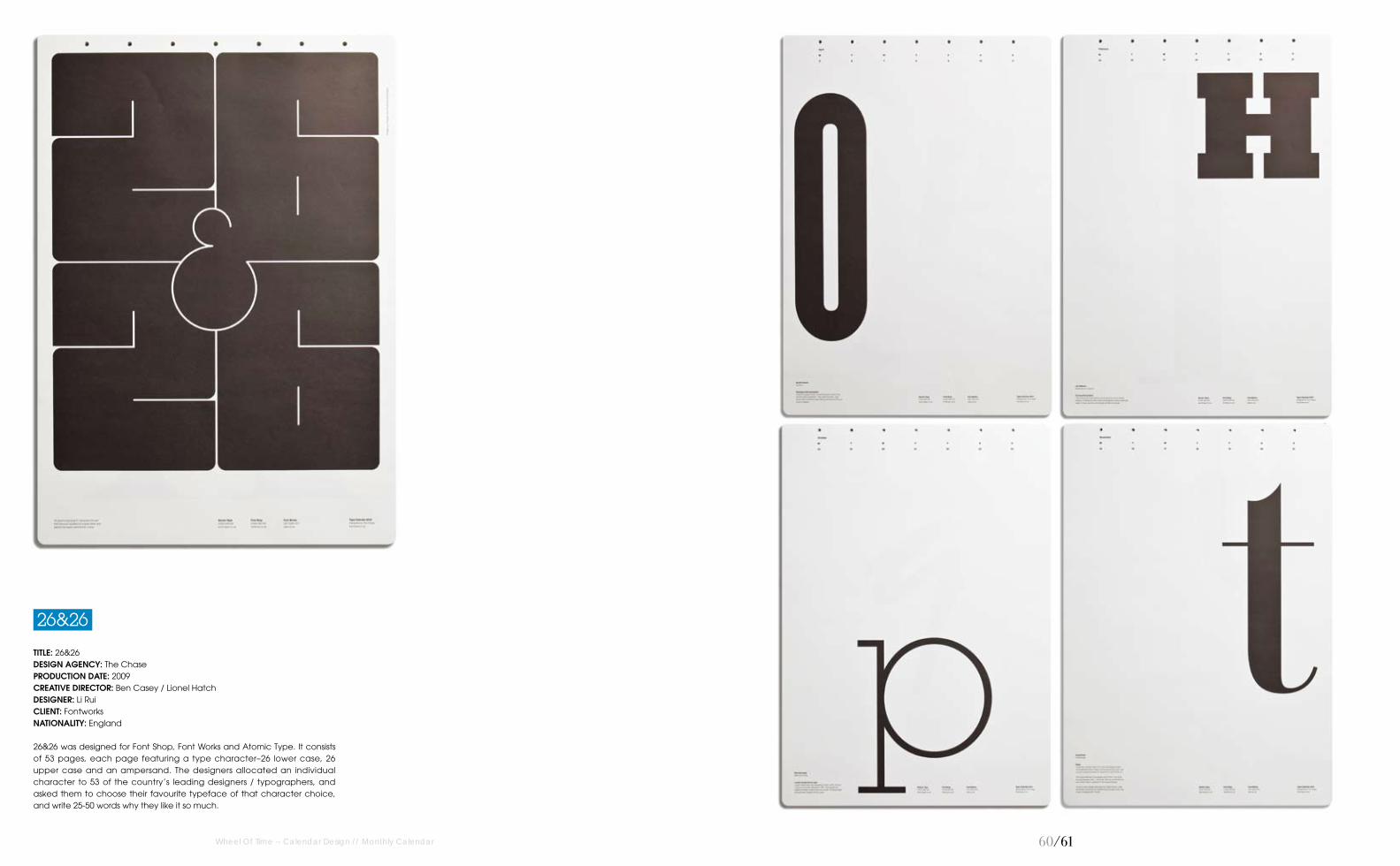
TITLE: 26&26DESIGN AGENCY: The ChasePRODUCTION DATE: 2009CREATIVE DIRECTOR: Ben Casey / Lionel HatchDESIGNER: Li RuiCLIENT: FontworksNATIONALITY: England
26&26 was designed for Font Shop, Font Works and Atomic Type. It consists of 53 pages, each page featuring a type character–26 lower case, 26 upper case and an ampersand. The designers allocated an individual character to 53 of the country’s leading designers / typographers, and asked them to choose their favourite typeface of that character choice, and write 25-50 words why they like it so much.
26&26

62/63
TITLE: Never Forget A FaceDESIGN AGENCY: The ChasePRODUCTION DATE: 2008CREATIVE DIRECTOR: Ben CaseyDESIGNER: Li RuiCLIENT: BBC Wildlife FundPhOTOGRAPhY: Gettyimages NATIONALITY: England
2009 has been declared by the United Nations as the Year of the Gorilla. However, in this year, there are as few as 720 mountain gorillas surviving in the wild. To raise awareness and support for this cause, the Chase designed a fundraising calendar for BBC Wildlife. This calendar confronts people with the haunting statement to never forget the face of our distant cousins and is supported with the graphic idea of a human-look portrait, fading with the passing months, to a final ghosty picture–almost forgotten with a glance. The calendar is loosely bound together with an ever-lasting silicon band that perfectly correlates with each date, of each month throughout the year.
Never Forget A Face
Wheel Of Time -- Calendar Design // Monthly Calendar

64/65
TITLE: Celia Flock 2011 Art CalendarDESIGNER: Celia FlockNATIONALITY: USA
This calendar is 11 inches x 14 inches wall size, and 5 inches x 7 inches desk size. The images relate to the southern part of the U.S. and are very colourful and whimsical in nature. Each page of the calendar is a single sheet and is designed to be framed separately, changed out each month of the year. All of the designs are original images created by Celia Flock.
Wheel Of Time -- Calendar Design // Monthly Calendar
CELIA FLOCK 2011 ART CALENDAR

66/67Wheel Of Time -- Calendar Design // Monthly Calendar
TITLE: Magnetic Perpetual CalendarPRODUCTION DATE: 2010CREATIVE DIRECTOR: Benedetta MaranesiDESIGNER: Benedetta MaranesiCLIENT: Alpiflora – Floricultural CompanyPhOTOGRAPhY: Benedetta MaranesiNATIONALITY: Italy
The kit consist of 52 different magnets, 12 months, 31 days and 9 illustrations. (“Alpiflora Company Logo”, “Smile”, “Bad Day”, “Home Sweet Home”, “Drink Day”, “Deadline”, “Love Occasion” and “Out for Lunch”). This calendar has been developed for the company Alpiflora as gadget business. Original, eternal and environmentally friendly, it is perfect for a company like that, which deals with plants and flowers and cares about the environment.
Calendar
Magnetic Perpetual
6�/6�Wheel Of Time -- Calendar Design // Monthly Calendar
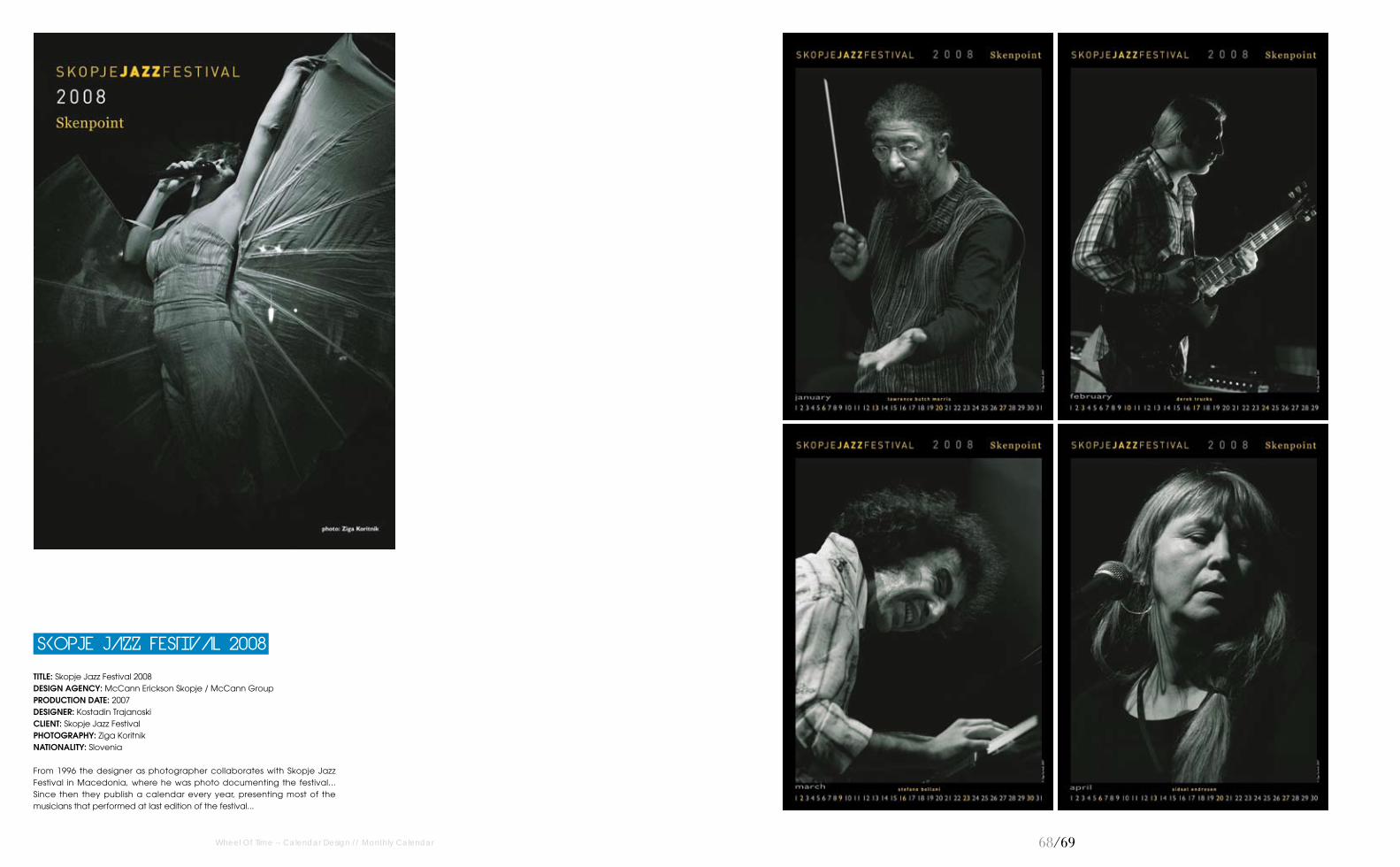
TITLE: Skopje Jazz Festival 2008DESIGN AGENCY: McCann Erickson Skopje / McCann GroupPRODUCTION DATE: 2007DESIGNER: Kostadin TrajanoskiCLIENT: Skopje Jazz FestivalPhOTOGRAPhY: Ziga KoritnikNATIONALITY: Slovenia
From 1996 the designer as photographer collaborates with Skopje Jazz Festival in Macedonia, where he was photo documenting the festival... Since then they publish a calendar every year, presenting most of the musicians that performed at last edition of the festival...
SKOPJE JAZZ FESTIVAL 2008

70/71
TITLE: Surprising The FutureDESIGN AGENCY: AdmComPRODUCTION DATE: 2008CREATIVE DIRECTOR: Manuel Dall’OlioDESIGNER: Manuel Dall’OlioCLIENT: Pershing YachtNATIONALITY: Italy
This limited edition calendar creatively demonstrates the brand’s central commitment to innovation, which is also expressed by the company’s new pay off, "Moving Idea". It showcases twelve quotations by noted figures, drawn from both scientific and political spheres, which shortsightedly dismissed inventions and ideas which ultimately led to fundamental advances in the history of humanity. The calendar’s images contrast with the pessimism of the forecasts, celebrating the beauty of ideas, the courage of the innovators, and faith in the power of the human mind.
Surprising The Future
Wheel Of Time -- Calendar Design // Monthly Calendar
72/73
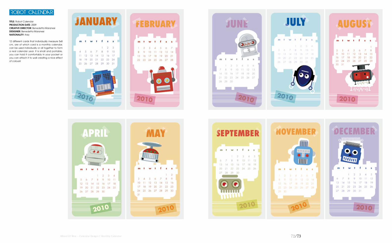
TITLE: Robot CalendarPRODUCTION DATE: 2009CREATIVE DIRECTOR: Benedetta MaranesiDESIGNER: Benedetta MaranesiNATIONALITY: Italy
12 different cards that individually measure 5x8 cm, are of which card is a monthly calendar, can be used individually or all together to form a real calendar year. It is small and portable, you can hold it comfortably in your pocket or you can attach it to wall creating a nice effect of colours!
Robot Calendar
Wheel Of Time -- Calendar Design // Monthly Calendar

74/75
TITLE: Post-It Notes Calendar PRODUCTION DATE: 2007DESIGNER: Andrei Slobtsov NATIONALITY: Russia
Post-it notes are present in nearly every household around the world. The concept of the Post-It Notes Calendar is simple–create a calendar grid and mark the days corresponding to the month. This versatile, DIY calendar can be placed on walls, ceilings, mirrors, refrigerators or any other adhesive friendly surface. The easiest part will be filling up each day with things you don't really want to do.
Post-it Notes Calendar
Wheel Of Time -- Calendar Design // Monthly Calendar
76/77
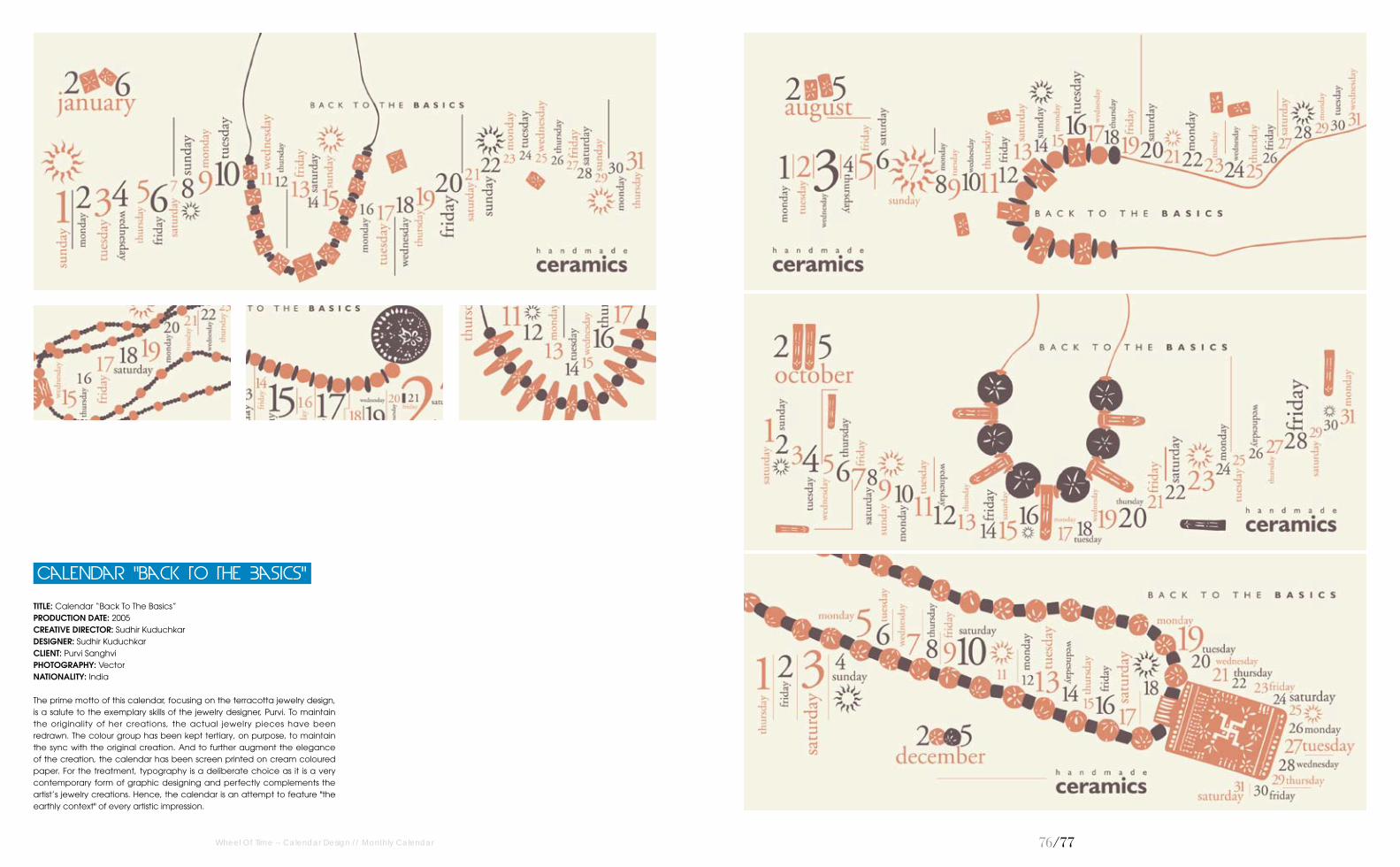
TITLE: Calendar “Back To The Basics”PRODUCTION DATE: 2005CREATIVE DIRECTOR: Sudhir KuduchkarDESIGNER: Sudhir KuduchkarCLIENT: Purvi SanghviPhOTOGRAPhY: VectorNATIONALITY: India
The prime motto of this calendar, focusing on the terracotta jewelry design, is a salute to the exemplary skills of the jewelry designer, Purvi. To maintain the originality of her creations, the actual jewelry pieces have been redrawn. The colour group has been kept tertiary, on purpose, to maintain the sync with the original creation. And to further augment the elegance of the creation, the calendar has been screen printed on cream coloured paper. For the treatment, typography is a deliberate choice as it is a very contemporary form of graphic designing and perfectly complements the artist’s jewelry creations. Hence, the calendar is an attempt to feature "the earthly context" of every artistic impression.
Calendar "back To The Basics"
Wheel Of Time -- Calendar Design // Monthly Calendar
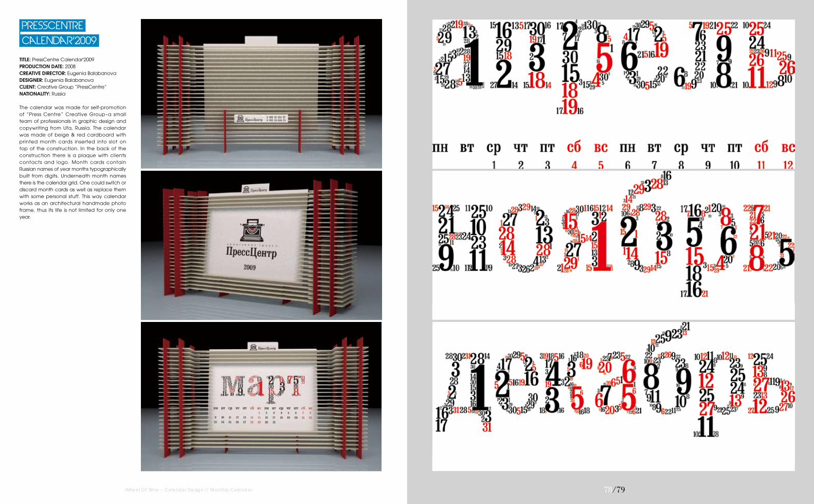
TITLE: PressCentre Calendar'2009 PRODUCTION DATE: 2008CREATIVE DIRECTOR: Eugenia BalabanovaDESIGNER: Eugenia BalabanovaCLIENT: Creative Group “PressCentre”NATIONALITY: Russia
The calendar was made for self-promotion of “Press Centre” Creative Group–a small team of professionals in graphic design and copywriting from Ufa, Russia. The calendar was made of beige & red cardboard with printed month cards inserted into slot on top of the construction. In the back of the construction there is a plaque with clients contacts and logo. Month cards contain Russian names of year months typographicallybuilt from digits. Underneath month names there is the calendar grid. One could switch or discard month cards as well as replace them with some personal stuff. This way calendar works as an architectural handmade photo frame, thus its life is not limited for only one year.
Calendar'2009
PressCentre
Wheel Of Time -- Calendar Design // Monthly Calendar 7�/7�

�0/�1
TITLE: "Mosaic of Life" Calendar PRODUCTION DATE: 2005CREATIVE DIRECTOR: Sudhir KuduchkarDESIGNER: Sudhir KuduchkarCLIENT: Torrent Pharmaceuticals LimitedPhOTOGRAPhY: VectorNATIONALITY: India
This calendar titled "Mosaic of Life", highlights the concept of Tessellation–a collection of plain forms without overlapping and spacing in between. Elaborating, every colour symbolises a particular emotion/ feeling. In the calendar, the differently coloured squares and circles represent the various emotions of a human, which when taken together make the "mosaic of life". To complement the liveliness of life, the numbers are treated with typography. The unique high point of the creation is the use of layers of papers. Various types of papers are used for different months. Each page has a distinctive identity. On the face (refer Jpeg) January and February Month seem to be on the same page. However, the fact is they are two separate pages with different effects and colour treatments. And the same is the case for each pair of months. Feel it to believe it!
"Mosaic of Life" Calendar
Wheel Of Time -- Calendar Design // Monthly Calendar

�2/�3
TITLE: Blue-Nox 2011 CalendarPRODUCTION DATE: 2010CREATIVE DIRECTOR: Corrado GrilliDESIGNER: Corrado GrilliCLIENT: Blue-Nox Academy (WWW.BLUE-NOX.COM)NATIONALITY: Italy
12 months with the best black musicians' portraits. Designed by Corrado "Mecna" Grilli for Blue Nox, featuring splatter portraits of Aloe Blacc, Blu, Black Milk, Cee Lo, Dwele, Jay-Z, Foreign Exchange and others. And when a month ends, cut the part below and have a poster!
Blue-nox 2011 Calendar
Wheel Of Time -- Calendar Design // Monthly Calendar

�4/�5
TITLE: 2009 Organize CalendarDESIGN AGENCY: Zazdesign PRODUCTION DATE: 2008CREATIVE DIRECTOR: Daria ZazireiDESIGNER: Zinaida ZazireiCLIENT: Jack of all TradesNATIONALITY: Greece
The 2009 l imited edit ion Calendar was designed for a snowboard & apparel shop "Jack of all Trades". It contains 12 envelopes for each month which can be used to collect receipts, invoices, doodles, photos or anythingelse, in order to stay organised during the whole year.
Calendar
2009 Organize
Wheel Of Time -- Calendar Design // Monthly Calendar

�6/�7
TITLE: Colorful Dry-erase And Magnetic Perpetual Calendar (Made From Recycled Magazines) DESIGN AGENCY: Colorstory Designs PRODUCTION DATE: 2011DESIGNER: Amy Gibson PhOTOGRAPhY: Colorstory Designs NATIONALITY: USA
Start 2011 off right with a fun and colourful perpetual magnetic calendar! You and your family can organise your daily routines with these creative magnets. All of the 27 colourful letters and 31 numbers are found from Recycled Magazines–so every calendar is unique and made just for you. Each magnet has a neodymium rare earth magnet (small but strong) attached to the back. Each calendar set comes with all of the letters to complete the 12 months of the year and has a black ribbon for hanging! The board is a white dry-erase board and the stripes are black. These magnets are great for children of all ages..., but please be cautious with the magnets and children 4 and under.
Magnetic Perpetual Calendar
Colorful Dry-erase And
Wheel Of Time -- Calendar Design // Monthly Calendar

��/��
TITLE: Animal Crackers 2011DESIGN AGENCY: Hammypie PRODUCTION DATE: 2009CREATIVE DIRECTOR: Harmony CheungDESIGNER: Harmony CheungPhOTOGRAPhY: Harmony CheungNATIONALITY: Canada
Who doesn't love zoo creatures that look good enough to hug? Animal Crackers calendar is a farm frenzied eco-friendly 2011 wall calendar inspired by the natural environment in beautiful Vancouver, BC.
2011
Animal Crackers
Wheel Of Time -- Calendar Design // Monthly Calendar
�0/�1
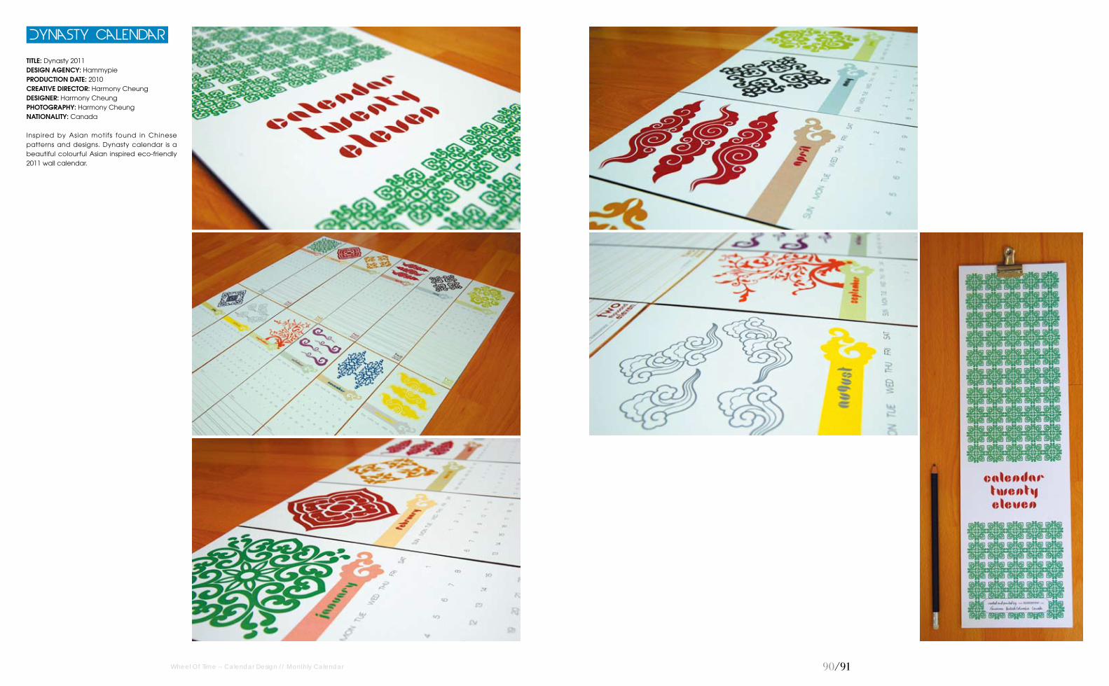
TITLE: Dynasty 2011DESIGN AGENCY: HammypiePRODUCTION DATE: 2010CREATIVE DIRECTOR: Harmony CheungDESIGNER: Harmony CheungPhOTOGRAPhY: Harmony CheungNATIONALITY: Canada
Inspired by Asian motifs found in Chinese patterns and designs. Dynasty calendar is a beautiful colourful Asian inspired eco-friendly 2011 wall calendar.
Dynasty Calendar
Wheel Of Time -- Calendar Design // Monthly Calendar

�2/�3
TITLE: Fortune Cookie 2011DESIGN AGENCY: HammypiePRODUCTION DATE: 2010CREATIVE DIRECTOR: Harmony CheungDESIGNER: Harmony CheungPhOTOGRAPhY: Harmony CheungNATIONALITY: Canada
Inspired by random luck and inspirational phrases. As luck would have it, the designers have baked up a lovely eco-friendly, Fortune Cookie 2011 wall calendar.
Fortune Cookie 2011
Wheel Of Time -- Calendar Design // Monthly Calendar

�4/�5
TITLE: Provocative 2011DESIGN AGENCY: HammypiePRODUCTION DATE: 2009CREATIVE DIRECTOR: Harmony CheungDESIGNER: Harmony CheungPhOTOGRAPhY: Harmony CheungNATIONALITY: Canada
Tasteful female silhouettes for men and women. Provocative calendar is an alluring eco-friendly 2011 wall calendar.
Provocative 2011
Wheel Of Time -- Calendar Design // Monthly Calendar

�6/�7
TITLE: Script 2011DESIGN AGENCY: HammypiePRODUCTION DATE: 2009CREATIVE DIRECTOR: Harmony CheungDESIGNER: Harmony CheungPhOTOGRAPhY: Harmony CheungNATIONALITY: Canada
Some things are just better left black and white. Beautiful scrolls and floral motifs on every page. Script calendar is a sumptuous botanical eco-friendly 2011 wall calendar.
Script 2011
Wheel Of Time -- Calendar Design // Monthly Calendar

��/��
TITLE: Vancouver 2011DESIGN AGENCY: HammypiePRODUCTION DATE: 2010CREATIVE DIRECTOR: Harmony CheungDESIGNER: Harmony CheungPhOTOGRAPhY: Harmony CheungNATIONALITY: Canada
Inspired by the beautiful picturesque city. Vancouver calendar is inspired byall of the lovely things in Vancouver, BC, Canada. It shows the love for the outdoors and hockey, and includes must-see places.
Vancouver 2011
Wheel Of Time -- Calendar Design // Monthly Calendar

100/101
TITLE: Letters CalendarPRODUCTION DATE: 2009DESIGNER: Jenny MeilihovePhOTOGRAPhY: Jenny MeilihoveNATIONALITY: Israel
Initials representative that month, December is D, February is F.
Letters Calendar
Wheel Of Time -- Calendar Design // Monthly Calendar
102/103
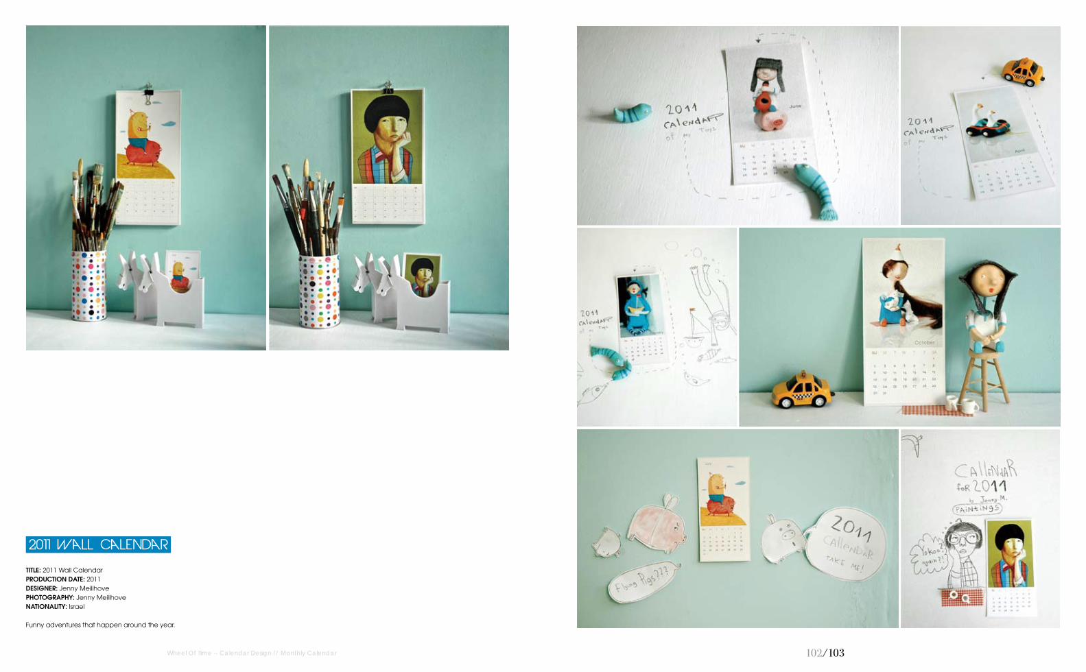
TITLE: 2011 Wall CalendarPRODUCTION DATE: 2011DESIGNER: Jenny MeilihovePhOTOGRAPhY: Jenny MeilihoveNATIONALITY: Israel
Funny adventures that happen around the year.
2011 Wall Calendar
Wheel Of Time -- Calendar Design // Monthly Calendar

104/105
TITLE: Mini 2011 CalendarDESIGN AGENCY: Sweet BonnyPRODUCTION DATE: 2010CREATIVE DIRECTOR: Melanie LatthithamDESIGNER: Melanie LatthithamPhOTOGRAPhY: Melanie LatthithamNATIONALITY: Thailand
Sweet mini calendar, 4×5.25", laser printed on smooth white #80 card stock. Each set comes with matching 1" magnet. The characters straddle the line between fantasy and reality, and escape from the care-free playground of the designers’ mind. Growing up outside of Bangkok, the designer was surrounded by a yet-to-be developed kid's wonderland of jungle and nature. Being exposed early on to a variety of exotic flora and fauna, and the many different creatures that inhabit this environment developed his sense of whimsy and joy. These simple pleasures inspire his art–nothing heady or deep, just "Designs for a Joyous Life!"
Mini 2011 Calendar
Wheel Of Time -- Calendar Design // Monthly Calendar

106/107
TITLE: Hail FebruaryDESIGN AGENCY: Steve Kelly Design LimitedPRODUCTION DATE: 2010CREATIVE DIRECTOR: Steve KellyDESIGNER: Steve KellyNATIONALITY: England
A small desktop calendar sent out to all existing and prospective clients. Each monthly design incorporated a unique blend of colour and typography. The designer decided to miss out January (a slow and glum month for most of people) and celebrate February. January 2012 was added at the end of the year.
Hail February
Wheel Of Time -- Calendar Design // Monthly Calendar

10�/10�
TITLE: Ink CalendarDESIGN AGENCY: Oscar Diaz StudiPRODUCTION DATE: 2007CREATIVE DIRECTOR: Oscar DiazDESIGNER: Oscar DiazPhOTOGRAPhY: Oscar Diaz StudioNATIONALITY: Spain
The ink is absorbed slowly, and the numbers in the calendar are "printed" daily. One a day, they are filled with ink until the end of the month. A self-updated calendar, which enhances the perception of time passing and not only signaling it.
Ink Calendar
2009
Napkins Calendar
TITLE: Napkins Calendar 2009 DESIGN AGENCY: SilaPRODUCTION DATE: 2008CREATIVE DIRECTOR: Stas AkiDESIGNER: Stas AkiPhOTOGRAPhY: Stas AkiNATIONALITY: Russia
Life is consumption. People throw away days like used napkins. Day by day. The idea of connection calendar and a pack of napkins came suddenly to the designer. He thought that calendar should be a functional object which people use every day in the ordinary life. The pack of napkins on the designer’s table seemed to be the right thing to make a calendar from 365 days–365 napkins. The proper number for usual pack that people can buy in the market. Only one napkin per a day. It's a kind of discipline, self-limitation, eco-mind in action. Use less, create more.
Wheel Of Time -- Calendar Design // Monthly Calendar

110/111Wheel Of Time -- Calendar Design // Desk Calendar
TITLE: Urban Calendar 4.25”x24”DESIGN AGENCY: FeyerwerksPRODUCTION DATE: 2007 to presentCREATIVE DIRECTOR: boB (Robert Feyereisen) DESIGNER: boBCLIENT: SPEC PhOTOGRAPhY: Brandon Stengel Credit To Farmkid StudiosNATIONALITY: USA
The mini Urban Calendar came after the Urban Calendar so it could fit on people's desks that had overhead cabinets.
Urban Calendar 4.25"x24"
112/113
Mini Urban Calendar 2"x12"
Wheel Of Time -- Calendar Design // Desk Calendar
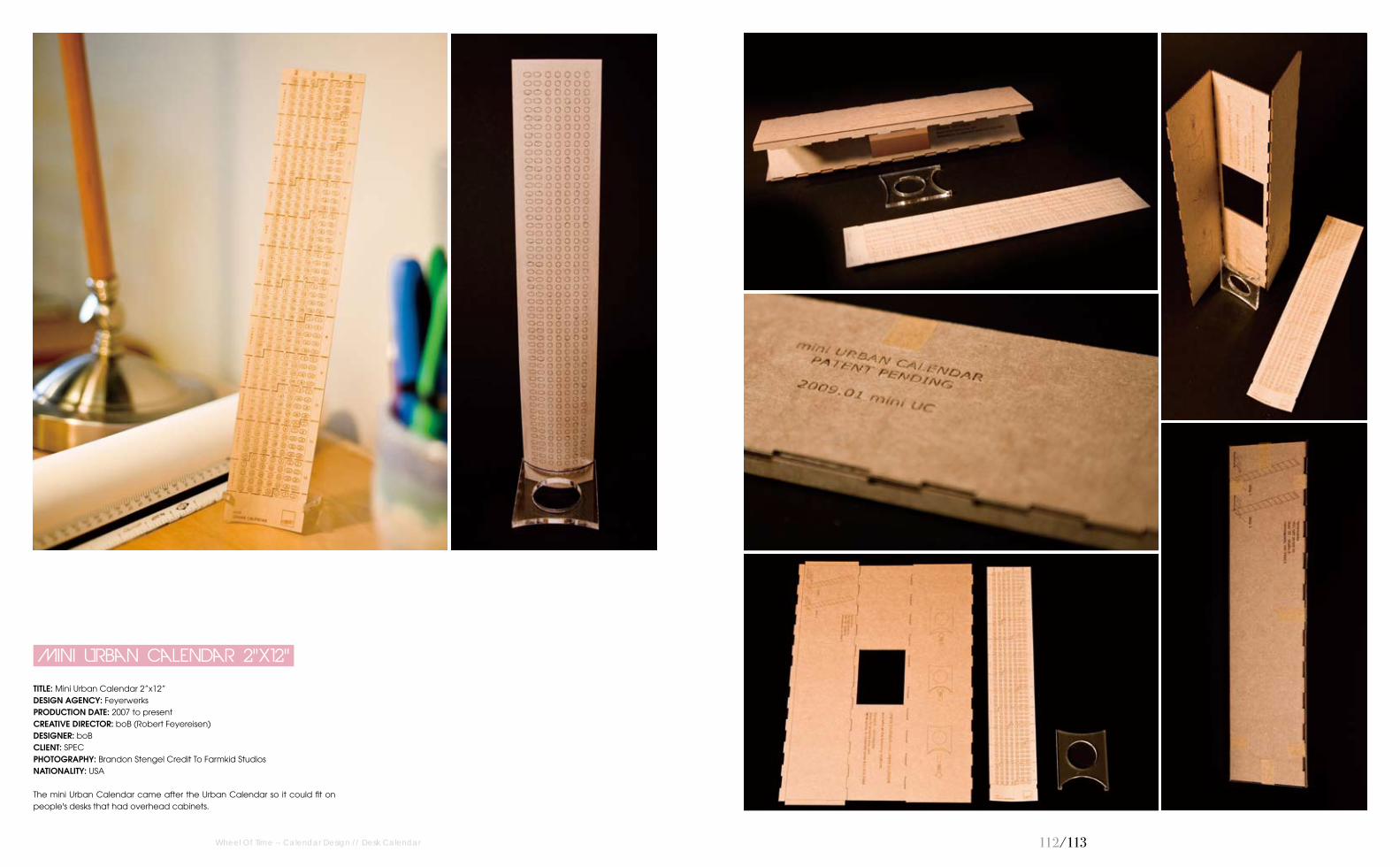
TITLE: Mini Urban Calendar 2”x12”DESIGN AGENCY: FeyerwerksPRODUCTION DATE: 2007 to presentCREATIVE DIRECTOR: boB (Robert Feyereisen) DESIGNER: boBCLIENT: SPEC PhOTOGRAPhY: Brandon Stengel Credit To Farmkid StudiosNATIONALITY: USA
The mini Urban Calendar came after the Urban Calendar so it could fit on people's desks that had overhead cabinets.

114/115Wheel Of Time -- Calendar Design // Desk Calendar
TITLE: Security Product Table CalendarDESIGN AGENCY: AG CreativePRODUCTION DATE: 2007CREATIVE DIRECTOR: Alex Wong, Chee ChuanCLIENT: Security HubPhOTOGRAPhY: AG CreativeNATIONALITY: Malaysia
The concept of the calendar was using the modernist idea to develop it. Using different colours and graphic lines to blend with the design of every month. The content of the calender includes date, Chinese date and public holiday. The goal for the layout is to make it simple and nice.
TABLE CALENDAR
SECURITY PRODUCT

116/117
TITLE: Chocovic 09 CalendarDESIGN AGENCY: BífidPRODUCTION DATE: 2008CREATIVE DIRECTOR: Toni FontDESIGNER: Albert SantanachCLIENT: ChocovicPhOTOGRAPhY: ChocovicNATIONALITY: Spain
The design wants to highlight the evocative images that show the possibilities in the process of creating delicious desserts with the new cocoa products as a result of the research of a chocolate company. Colours combine with the tonalities of the photos while they continue a chromatic range depending on the seasons.
CHOCOVIC 09 CALENDAR
Wheel Of Time -- Calendar Design // Desk Calendar
11�/11�
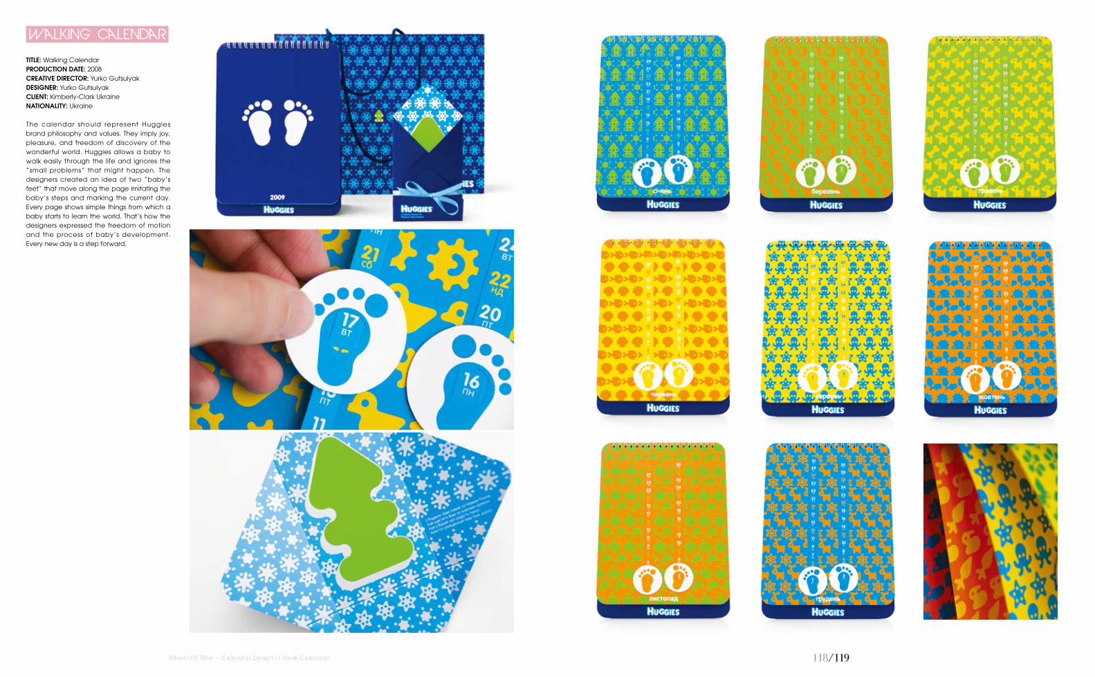
TITLE: Walking CalendarPRODUCTION DATE: 2008CREATIVE DIRECTOR: Yurko GutsulyakDESIGNER: Yurko GutsulyakCLIENT: Kimberly-Clark UkraineNATIONALITY: Ukraine
The calendar should represent Huggies brand philosophy and values. They imply joy, pleasure, and freedom of discovery of the wonderful world. Huggies allows a baby to walk easily through the life and ignores the “small problems” that might happen. The designers created an idea of two “baby’s feet” that move along the page imitating the baby’s steps and marking the current day. Every page shows simple things from which a baby starts to learn the world. That’s how the designers expressed the freedom of motion and the process of baby’s development. Every new day is a step forward.
Walking Calendar
Wheel Of Time -- Calendar Design // Desk Calendar

120/121Wheel Of Time -- Calendar Design // Desk Calendar
TITLE: 2010 Calendar CAR Rendiment Centre AltDESIGN AGENCY: Orange bcn PRODUCTION DATE: 2010ART DIRECTOR: Aïda font / Jordi FerrandizCLIENT: Centre Alt Rendiment CAR Sant CugatNATIONALITY: Spain
The designers named the calendar with the text "year round" the zeros of 2010 relating to sports taking place in the centre, cycling, volleyball, archery... The days of the months of focus within the inner circles of white, red and holidays as well as the outer. They are looking for photographs unusual altering saturated colour, so that the whole is very striking. For external use 300–gram paper with rubberised finish, very comfortable to hold and silkscreen printing silver to contrast.
CAR RENDIMENT CENTRE ALT
2010 CALENDAR
122/123Wheel Of Time -- Calendar Design // Desk Calendar
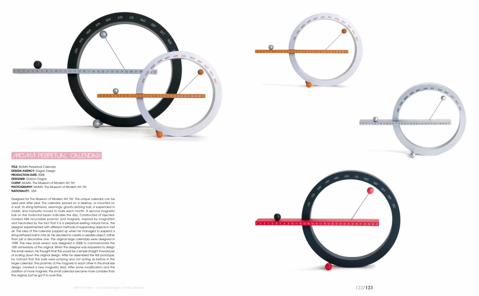
TITLE: MoMA Perpetual CalendarDESIGN AGENCY: Dagan DesignPRODUCTION DATE: 2008DESIGNER: Gideon DaganCLIENT: MoMA, The Museum of Modern Art, NY.PhOTOGRAPhY: MoMA, The Museum of Modern Art, NY.NATIONALITY: USA
Designed for The Museum of Modern Art, NY. This unique calendar can be used year after year. The calendar, placed on a desktop, or mounted on a wall, its string-tethered, seemingly gravity-defying ball, is suspended in midair, and manually moved to mark each month. A second magnetic ball on the horizontal beam indicates the day. Constructed of injected-molded ABS recyclable polymer and magnets. Inspired by magnetism and fascinated by the fact that it is a perpetual existing natural force, the designer experimented with different methods of suspending objects in mid air. The idea of the calendar popped up when he managed to suspend a string-tethered ball in mid air. He decided to create a useable object, rather than just a decorative one. The original large calendars were designed in 1998. The new small version was designed in 2008 to commemorate the 10th anniversary of the original. When the designer was requested to design the small version, he thought that this would be a simple straight forward job of scaling down the original design. After he assembled the first prototype, he noticed that the balls were jumping and not acting as before in the larger calendar. The proximity of the magnets to each other in this small size design, created a new magnetic field. After some modification and the addition of more magnets, this small calendar became more complex than the original, but he got it to work fine.
MoMA Perpetual Calendar

124/125
TITLE: Moon TrackerDESIGN AGENCY: MICAPRODUCTION DATE: 2009CREATIVE DIRECTOR: Lili MayaDESIGNER: Hari SkourtisPhOTOGRAPhY: Hari SkourtisNATIONALITY: USA
Celestial bodies were the first tools humans used to track time. This accordion-style book tracks the changes of the moon day by day through laser cut silhouettes. Each month is perforated for easy tearing. The backside features a mural of the moon as it rotates and revolves along its path.
Moon Tracker
Wheel Of Time -- Calendar Design // Desk Calendar

126/127
TITLE: CUP CalendarDESIGN AGENCY: Creative Power UnitPRODUCTION DATE: 2010CREATIVE DIRECTOR: Tatsushi NagaeART DIRECTOR: Masakazu AiharaDESIGNER: Kana KawashimaCLIENT: Creative Power UnitPhOTOGRAPhY: Kana KawashimaNATIONALITY: Japan
This is a calendar which is designed to look like a mug on the desk. Something different comes out from the mug every month.
CUP Calendar
Wheel Of Time -- Calendar Design // Desk Calendar
12�/12�
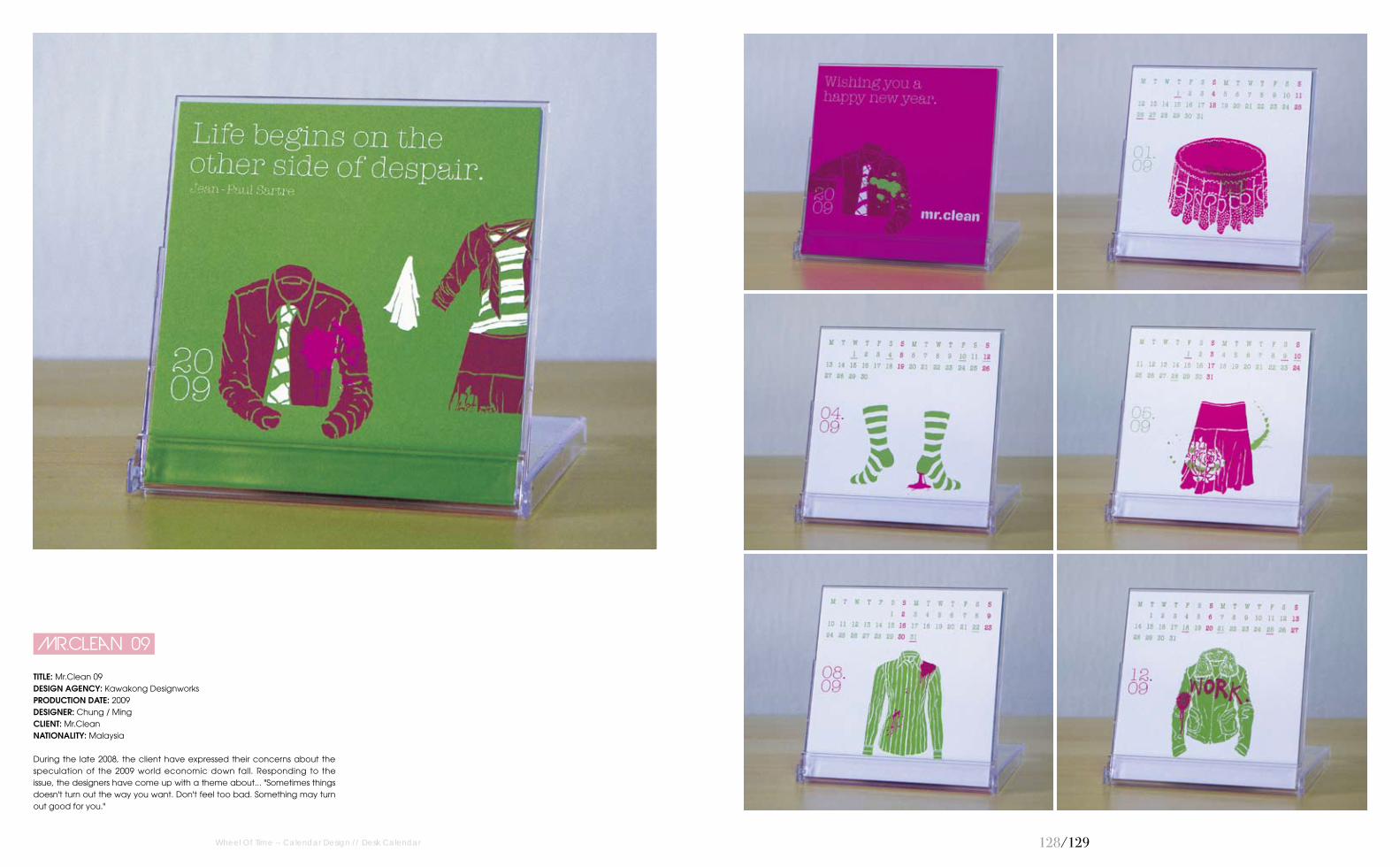
TITLE: Mr.Clean 09DESIGN AGENCY: Kawakong DesignworksPRODUCTION DATE: 2009DESIGNER: Chung / MingCLIENT: Mr.CleanNATIONALITY: Malaysia
During the late 2008, the client have expressed their concerns about the speculation of the 2009 world economic down fall. Responding to the issue, the designers have come up with a theme about... "Sometimes things doesn't turn out the way you want. Don't feel too bad. Something may turn out good for you."
Mr.Clean 09
Wheel Of Time -- Calendar Design // Desk Calendar

130/131
TITLE: Mr.Clean 06DESIGN AGENCY: Kawakong DesignworksPRODUCTION DATE: 2006DESIGNER: Chung / MingCLIENT: Mr.CleanNATIONALITY: Malaysia
The idea was to illustrate a series of illustrations about clothing and household items that can be cleaned at Mr.Clean. But the main message here was, these washing items have meaningful moments in your life and Mr.Clean understands the importance of handling these clothing with care.
Mr.Clean 06
Wheel Of Time -- Calendar Design // Desk Calendar

132/133
TITLE: Serenity skin therapyDESIGN AGENCY: Kawakong DesignworksPRODUCTION DATE: 2007DESIGNER: Chung/ MingCLIENT: Serenity Skin TherapyNATIONALITY: Malaysia
The theme was about "simple things". Serenity's target audience were mostly women above 30 years of age. These series of drawing were about women and their favourite moments, which depict simple things in life and the quality of time that women can have.
Serenity skin therapy
Wheel Of Time -- Calendar Design // Desk Calendar
134/135
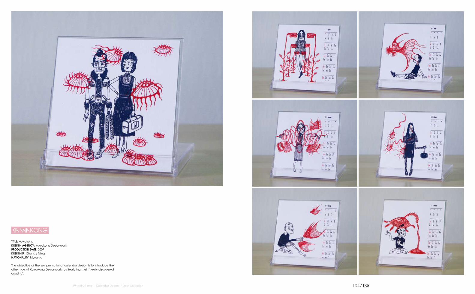
TITLE: KawakongDESIGN AGENCY: Kawakong DesignworksPRODUCTION DATE: 2007DESIGNER: Chung / MingNATIONALITY: Malaysia
The objective of the self promotional calendar design is to introduce the other side of Kawakong Designworks by featuring their "newly-discovered drawing".
Kawakong
Wheel Of Time -- Calendar Design // Desk Calendar

136/137
TITLE: Belyea 2009 Impeller CalendarDESIGN AGENCY: Hansen BelyeaPRODUCTION DATE: 2008CREATIVE DIRECTOR: Ron Lars HansenrDESIGNER: Ron Lars HansenCLIENT: Hansen BelyeaNATIONALITY: USA
The Impeller Calendar, a self-promo for Hansen Belyea, delivers two messages to clients. The first is a global theme as each “paddle” of the impeller features a national holiday for a faraway country. The second is technical expertise. The engineering of the desktop calendar required a series of prototypes and laser die-cutting to get the pieces to lock together perfectly. The Impellerpackage consists of four parts. The mailing carrier is custom die-cut to wrap around the contents. A metallic copper label seals the packet. Inside, the interlocking calendar partsinclude six paddles and two central star hubs. Also inside is a cover card with the Impeller logo on the top side and assembly instructionswith diagrams on the back.
Impeller Calendar
Belyea 2009
Wheel Of Time -- Calendar Design // Desk Calendar

13�/13�
TITLE: Rainbow CalendarDESIGN AGENCY: Niels Kjeldsen DesignPRODUCTION DATE: 2007CREATIVE DIRECTOR: Niels KjeldsenDESIGNER: Niels KjeldsenCLIENT: Dupont - CorianPhOTOGRAPhY: Niels KjeldsenNATIONALITY: Denmark
The design is a Calendar made for the table. The user is in daily contact with the unique Corian material and can by using the calendar experience Corian's luxurious surface, weight and high quality. And all the new Corian colours are represented be the month-pieces. The Calendar is composed of 12 Month-pieces in different colours, 2 Date-cubes in white and a solid base in black. The date is adjusted by turning the cubes around, and the month is changed by placing the relevant month in front of the Date-cubes. Because there is no name of the days in the calendar, it can be used forever...
Rainbow Calendar
Wheel Of Time -- Calendar Design // Desk Calendar

140/141
TITLE: Luminate My DayDESIGN AGENCY: Serviceplan CampaignPRODUCTION DATE: 2008CREATIVE DIRECTOR: Ilka VogtmannDESIGNER: Miro MoricCLIENT: StabiloNATIONALITY: Germany
Stabilo-Calendar "Luminate my day" is a calendar providing a day full of luminous ideas: because the luminator doesn’t only highlight the actual date, but is also highlighting the best ideas of the day. The luminator can be moved within the calendar to highlight the actual date. A spiral binding assures that users can easily switch from one month to the next. The leading staff of Stabilo Germany was delighted to receive the ultimate "Illumination" as a New Year's gift.
Luminate My Day
Wheel Of Time -- Calendar Design // Desk Calendar

142/143
TITLE: Vincle 07 CalendarrDESIGN AGENCY: BífidPRODUCTION DATE: 2006CREATIVE DIRECTOR: Toni FontDESIGNER: Albert SantanachPhOTOGRAPhY: VincleNATIONALITY: Spain
Calendar for a company specialised on social mediation. In each month a window shows us what the eyes of others see to awake empathy in people. Colours and images are in accordance with the season and typography has been tuned and distorted to combine with photos.
Vincle 07 Calendar
Wheel Of Time -- Calendar Design // Desk Calendar

144/145
TITLE: 2011 Birdie Desk CalendarDESIGN AGENCY: JoomPRODUCTION DATE: 2010CREATIVE DIRECTOR: Joom KlangsinDESIGNER: Joom KlangsinPhOTOGRAPhY: Joom KlangsinNATIONALITY: Thailand
A different design in each month of the 2011 Birdie Desk Calendar. 14 individual prints (including front and back cover) of Joom’s original digital illustrations.
2011 Birdie Desk Calendar
Wheel Of Time -- Calendar Design // Desk Calendar

146/147Wheel Of Time -- Calendar Design // Desk Calendar
TITLE: 2011 CD Calendar DESIGN AGENCY: Le Papier StudioPRODUCTION DATE: 2010CREATIVE DIRECTOR: Vana ChuppDESIGNER: Vana ChuppPhOTOGRAPhY: Vana ChuppNATIONALITY: USA
The 2011 Romantic Silhouette Calendar will capture your heart with its elegant and whimsy illustrations. Designed to be used as a desk calendar, this lovely product comes in a CD case. Give it away as the perfect gift or display it on your workspace for a touch of colour and romance.
2011 CD Calendar

14�/14�
TITLE: 2011 Anna And Blue Paperie CalendarDESIGN AGENCY: Anna & Blue PaperiePRODUCTION DATE: 2011DESIGNER: Stefanie RichterPhOTOGRAPhY: Stefanie RichterNATIONALITY: USA
The 2011 Printable Desk Calendar features 12 beautifully designed months. This desktop calendar is full of bright and modern patterns that are sure to keep you cheerful all year long! Lovely to keep on your desk or to use as a gift. January 2011 through December 2011 simply print, cut and place in a CD size calendar case or use a regular size CD case and place on your desk. Adds such a pretty touch to your working space!
Calendar
2011 Anna And Blue Paperie
Wheel Of Time -- Calendar Design // Desk Calendar

150/151Wheel Of Time -- Calendar Design // Desk Calendar
TITLE: Calendar 2008PRODUCTION DATE: 2008CREATIVE DIRECTOR: Sudhir KuduchkarDESIGNER: Sudhir KuduchkarPhOTOGRAPhY: WWW.SXC.HUNATIONALITY: India
The idea behind the projected calendar page was to make a calendar that fits on the "already crowded" work desk and yet serves the purpose. The calendar titled, "Gauging Horizons" is independent of placement. It is designed such that it can be placed either vertically or horizontally. The blue coloured horizontal windows mark the slot for copper washer that will actually hold the pages of the calendar together. The calendar is the outcome of a beautiful confluence of colours and numbers. The use of silhouette for the background and typography for the numbers has no restricted specification. The artist prefers to keep it open for subjective perceptions, the same way as gauging the horizon!
Calendar 2008

152/153
TITLE: 2010 “Zazodiacs” Calendar DESIGN AGENCY: Zazdesign PRODUCTION DATE: 2009CREATIVE DIRECTOR: Daria ZazireiDESIGNER: Zinaida ZazireiNATIONALITY: Greece
The “zazodiacs” calendar uses its own metal packaging box as a presentation stand with help of two little magnets. Each month is an illustrated card based on the zodiac circle. The designers wanted to revive past beliefs that slowly die, and bring them back to life again. People could use a different visual of their star sign.
Calendar
2010 "zazodiacs"
Wheel Of Time -- Calendar Design // Desk Calendar

154/155
TITLE: 2011 “Year Of The Rabbit” CalendarDESIGN AGENCY: ZazdesignPRODUCTION DATE: 2010CREATIVE DIRECTOR: Daria ZazireiDESIGNER: Zinaida ZazireiNATIONALITY: Greece
The Chinese sign of 2011 is the rabbit. This calendar’s purpose is to bring positive emotions to its owner because after all a smile on your face is a reflection of your happy soul. Every month has its corresponding number, disguised as a funny looking rabbit (in some cases 2).
Calendar
2011 "year Of The Rabbit"
Wheel Of Time -- Calendar Design // Desk Calendar

156/157Wheel Of Time -- Calendar Design // Desk Calendar
TITLE: OnecalendarDESIGN AGENCY: Redstar InkPRODUCTION DATE: 2010CREATIVE DIRECTOR: Marcie HicksDESIGNER: Marcie HicksPhOTOGRAPhY: Walker HicksNATIONALITY: USA
A very simple concept. One calendar. Never expires.
Onecalendar

15�/15�Wheel Of Time -- Calendar Design // Desk Calendar
TITLE: Wall CalendarDESIGN AGENCY: Redstar InkPRODUCTION DATE: 2010CREATIVE DIRECTOR: Marcie HicksDESIGNER: Marcie HicksPhOTOGRAPhY: Walker HicksNATIONALITY: USA
Like the DIY calendar, the wal l calendar is a monthly calendar accompanied by a list. The simple and clean layout coincides with the uncluttered space of the organised individual.
Wall Calendar

160/161
TITLE: Bright And Cheerful Desk Calendar DESIGN AGENCY: Colorstory Designs PRODUCTION DATE: 2011DESIGNER: Amy Gibson PhOTOGRAPhY: Colorstory Designs NATIONALITY: USA
The newest desk calendar design is a bright and cheerful way to view the new year! Each of the 12 months has an original, bright and cheerful design, printed clearly on heavy white cardstock. When the clear case is closed, the calendar is easy to transport, but when flipped open, the entire month is easy to view (like an easel). All 12 of the individual months fit neatly in the clear case when open or closed–so you won't loose any of the months not being used. As each new year comes, Colourstory Designs will have new design inserts that can be refills for the clear case.
Desk Calendar
Bright And Cheerful
Wheel Of Time -- Calendar Design // Desk Calendar

162/163
TITLE: Antalis 2010DESIGN AGENCY: StudiowillPRODUCTION DATE: 2009DESIGNER: StudiowillCLIENT: Antalis (HK) Ltd.NATIONALITY: Hongkong, China
In order to design a practical on-desk calendar to promote Antalis' fancy paper and "Greening your business" concept. The designers innovated a new format of calendar, which can be used as a monthly mini schedule, but also an on-desk calendar. Al l monthly schedules were pr inted by di f ferent ef fects to show the react ion between ink and paper, and the information and diagrams show the positive concept and research of "2 sides of paper". It educates the paper-buying public on the true facts so they can make informed choices and promote responsible paper use.
Antalis 2010
Wheel Of Time -- Calendar Design // Desk Calendar

164/165Wheel Of Time -- Calendar Design // Desk Calendar
TITLE: See Nothing CalendarDESIGN AGENCY: Jekyll & HydePRODUCTION DATE: 2009CREATIVE DIRECTOR: Marco Molteni / Margherita MonguzziDESIGNER: Elena Bonanomi / Vincenzo LanzielloCLIENT: Jekyll & HydeNATIONALITY: Italy
365 dots (+1), one for each day in the year and 7 more, one for each day in the week, form the essential elements to always know where you are. Felt-made in 200 copies only, this work progresses the research into the see nothing project, this time connected with the time and how to measure it. Each calendar is completed by two epoxy made pins. All the pins are unique as unique are the days in our singular lives.
See Nothing Calendar

166/167
TITLE: 2011 Desk Calendar DESIGN AGENCY: Colorstory Designs PRODUCTION DATE: 2011DESIGNER: Amy Gibson PhOTOGRAPhY: Colorstory Designs NATIONALITY: USA
Each of the 12 months is designed and printed clearly on white cardstock and has a whimsical, colour ful design in the background representing each month. When the clear case is closed, the calendar is easy to transport, but when flipped open the entire month is easy to view. All 12 of the individual months fit neatly in the clear case when open or closed–so you won't loose any of the months not being used. This mini desk calendars are the perfect size for any desk, office space or countertop–and can make a unique gift for anyone on your list! As each new year comes, Colourstory Designs will havenew design inserts that can be refills for the clear case.
2011 Desk Calendar
Wheel Of Time -- Calendar Design // Desk Calendar

16�/16�
TITLE: Hooray Hands 2011 Desk Calendar DESIGN AGENCY: CuriousDoodles PRODUCTION DATE: 2010CREATIVE DIRECTOR: Laura TrimmellDESIGNER: Laura TrimmellCLIENT: CuriousDoodlesPhOTOGRAPhY: Laura TrimmellNATIONALITY: USA
This calendar is a celebration of us ing your hands creatively. Each hand printed illustrations show a person making/doing with their hands, something the artist finds very rewarding. The environmental impact is reduced by printing on recycled chipboard with water based inks on both sides of the paper.
2011 Desk Calendar
Hooray Hands
Wheel Of Time -- Calendar Design // Desk Calendar

170/171
TITLE: 2008 Desk CalendarDESIGN AGENCY: JoomPRODUCTION DATE: 2008CREATIVE DIRECTOR: Joom KlangsinDESIGNER: Joom KlangsinPhOTOGRAPhY: Joom KlangsinNATIONALITY: Thailand
Each year has 14 individual prints (including front and back cover) of Joom’s original digital illustrations.
2008 Desk Calendar
Wheel Of Time -- Calendar Design // Desk Calendar

172/173
Mini Whimsical Everyday 2011
Wheel Of Time -- Calendar Design // Desk Calendar
TITLE: Mini Whimsical Everyday 2011DESIGN AGENCY: HammypiePRODUCTION DATE: 2010CREATIVE DIRECTOR: Harmony CheungDESIGNER: Harmony CheungPhOTOGRAPhY: Harmony CheungNATIONALITY: Canada
Happy, warm feelings from random, everyday objects. Whimsical Pretty Everyday calendar is a pretty patterned eco-friendly 2011 wall calendar inspired by the things we love.

174/175
Mini Mr. Egg & Friends 2011
Wheel Of Time -- Calendar Design // Desk Calendar
TITLE: Mini Mr. Egg & Friends 2011DESIGN AGENCY: HammypiePRODUCTION DATE: 2010CREATIVE DIRECTOR: Harmony CheungDESIGNER: Harmony CheungPhOTOGRAPhY: Harmony CheungNATIONALITY: Canada
Inspired by childhood favourite critters. Mini Mr. Egg & Friends calendar is a cutely designed eco-friendly 2011 desk calendar.

176/177
Mini Obi Sash 2011
Wheel Of Time -- Calendar Design // Desk Calendar
TITLE: Mini Obi Sash 2011DESIGN AGENCY: HammypiePRODUCTION DATE: 2010CREATIVE DIRECTOR: Harmony CheungDESIGNER: Harmony CheungPhOTOGRAPhY: Harmony CheungNATIONALITY: Canada
Inspired by the beautiful intricacies of Japanese patterns. Mini Obi Sash calendar is a pretty patterned eco-friendly 2011 desk calendar.

17�/17�
Mini Penmanship 2011
Wheel Of Time -- Calendar Design // Desk Calendar
TITLE: Mini Penmanship 2011DESIGN AGENCY: HammypiePRODUCTION DATE: 2010CREATIVE DIRECTOR: Harmony CheungDESIGNER: Harmony CheungPhOTOGRAPhY: Harmony CheungNATIONALITY: Canada
Inspired by the simplicity of ancient inked handwriting. Mini Penmanship calendar is a simple & modern eco-friendly 2011 desk calendar.

1�0/1�1
TITLE: Ride a BikeDESIGN AGENCY: Fresh Pulled PaintPRODUCTION DATE: 2010CREATIVE DIRECTOR: Addison EatonDESIGNER: Addison EatonPhOTOGRAPhY: Addison EatonNATIONALITY: USA
A CD desk calendar that celebrates all varieties of bicycles! With 6 colours and 12 designs, a person has to be super lazy not be inspired to ride his bike. Printed on recycled chip board with water based inks.
Ride A Bike
Wheel Of Time -- Calendar Design // Desk Calendar

1�2/1�3
TITLE: DiscountsDESIGN AGENCY: DDBPRODUCTION DATE: 2008CREATIVE DIRECTOR: Mahesh AnawekarART DIRECTOR: Pravin AmudanCLIENT: Towell Auto CentrePhOTOGRAPhY: Hemanth B. G.NATIONALITY: Oman
To urge people to do something about saving the environment through everyday efforts. It had to be relevant and informative without preachy overtones of public service campaigns. A spoof on discount ads, a common feature in the Middle-East market, where the asterisks and fine print assume the importance of headline. In the calendar too a percentage was used, but was an eco-friendly tip expressed as a percentage of savings, with the fine print explaining the actual remedy. The treatment is an arrangement of everyday objects that surround a consumer’s life.
Discounts
Wheel Of Time -- Calendar Design // Desk Calendar

1�4/1�5
TITLE: Ink Me Stencil CalendarDESIGN AGENCY: Studio DorogayaPRODUCTION DATE: 2009DESIGNER: ChebotaryovCLIENT: InksystemNATIONALITY: Ukraine
Ink Systems is young aggressive company; they deal with lots of ink for printing systems. So, the designers were looking for unusual aggressive ink calendar. The solution is stencil set with all necessary ingredients. They call it “Ink Me”. Calendar pack contains: cyan, magenta and yellow spray inks, 3 stencil layers, stickers with numbers, several types of 50x70 paper (including old wallpaper) and big craft paper sheet to work on it. You get custom 50x70 poster calendar at the end of a process. And of course you can use these stencils not only on paper from the pack. Gold Prize Award at Moscow International Advertising Festival in 2009; Category: Graphic Design. Bronze Prize Award at Kiev International Advertising Festival in 2009; Category: Graphic Design.
Stencil Calendar
Ink Me
Wheel Of Time -- Calendar Design // Single-Page Calendar

1�6/1�7Wheel Of Time -- Calendar Design // Single-Page Calendar
TITLE: Periodic Table Of Time DESIGN AGENCY: LaboratoriumPRODUCTION DATE: 2009CREATIVE DIRECTOR: Ivana Vucic / Orsat FrankovicDESIGNER: Ivana VucicCLIENT: Laboratorium / BlablabPhOTOGRAPhY: Ivana VucicNATIONALITY: Croatia
Periodic Table of Time (PTT) is a Laboratorium self-promotional calendar inspired with Mendeleev’s iconic Periodic Table of the Elements. PTT calendar is origin designed as Xmas gift for the clients and friends. The designers used scientific, ‘laboratory’ look to emphasize experimental nature of the studio. This 3-sheets calendar (4 months per sheet) easily shows three levels of time elements (the date, the day and the month) or conversion from date to day and back. Centered symbol represents a Day, a number printed upper left to symbol-a Date and a upper right number in bracket - a Month. Besides that, PTT calendar provides a way to determine which days have significance as holidays (outline font marks Sundays and Croatians holidays, while asterisk superscript is used for marking some of worldwide holidays that is printed below). Row numbers ahead of table, indicates Month in a current row. This amusing but informative multiple time system helps you to organize your life and your future. PTT can be used as desktop calendar, wall calendar or even wallpaper calendar.
Periodic Table Of Time

1��/1��
TITLE: UK Calendar Graph DESIGN AGENCY: Design By AlphaPRODUCTION DATE: 2008CREATIVE DIRECTOR: Anastasia GeraliDESIGNER: Anastasia GeraliPhOTOGRAPhY: Nikos LoukaNATIONALITY: Cyprus
A circular graph calendar with all the UK holidays of 2009 and 2010. The relationship between holiday, month, day and type is made using connecting lines with thicker lines indicating the more widely celebrated holidays. Printed with water-based inks on 250 gram recycled paper.
UK Calendar Graph
Wheel Of Time -- Calendar Design // Single-Page Calendar

1�0/1�1
TITLE: The Foreign Policy 2009 World CalendarDESIGN AGENCY: Foreign Policy Design Group Self-promotionPRODUCTION DATE: 2008CREATIVE DIRECTOR: Yah-Leng Yu & Arthur ChinART DIRECTOR: Yah-Leng Yu & Arthur ChinDESIGNER: Tianyu Isaiah Zheng (TY)PhOTOGRAPhY: Michael Tan (Mika Images) NATIONALITY: Singapore
The idea for this self-promotion project is to communicate the group’s existence and arrival in Singapore from New York City, leveraging on the name "Foreign Policy" and blending concepts of current affairs, political affairs, maps, the world and the leaders.
2009 World Calendar
The Foreign Policy
Wheel Of Time -- Calendar Design // Single-Page Calendar

1�2/1�3
TITLE: 360 Mall Ramadan ImsakiyaDESIGN AGENCY: Paragon Marketing CommunicationsPRODUCTION DATE: 2010CREATIVE DIRECTOR: Louai AlasfahaniDESIGNER: Nizar Fawzi AlshorbagiCLIENT: 360 MallPhOTOGRAPhY: Nizar Fawzi AlshorbagiNATIONALITY: Bulgaria
During the holy month of Ramadan, Muslims follow a calendar for prayer. This calendar helps them keep track as to when a particular prayer has to be offered. 360 Mall, a high-end shopping mall in Kuwait provided its visitors with a free calendar for the same purpose. The designs used on this calendar were adapted from the various special branding done inside and outside the mall as well as many other collaterals. The calendar was printed on high quality light weight paper and was sized adequately to fit into any pocket.
Ramadan Imsakiya
360 Mall
Wheel Of Time -- Calendar Design // Single-Page Calendar
1�4/1�5Wheel Of Time -- Calendar Design // Single-Page Calendar
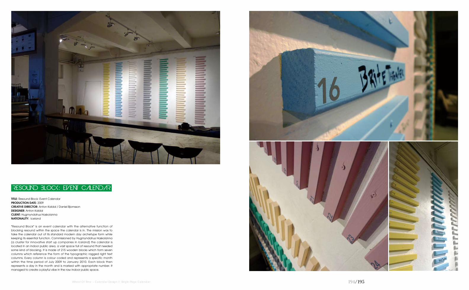
TITLE: Resound Block: Event Calendar PRODUCTION DATE: 2009CREATIVE DIRECTOR: Anton Kaldal / Daniel BjornssonDESIGNER: Anton KaldalCLIENT: Hugmyndahus HaskolannaNATIONALITY: Iceland
"Resound Block" is an event calendar with the alternative function of blocking resound within the space the calendar is in. The mission was to take the calendar out of its standard modern day archetype form while keeping its essential function. Commissioned by Hugmyndahus Haskolanna (a cluster for innovative start up companies in Iceland) the calendar is located in an indoor public area, a vast space full of resound that needed some kind of blocking. It is made of 215 wooden blocks which form seven columns which reference the form of the typographic ragged right text columns. Every column is colour coded and represents a specific month within the time period of July 2009 to January 2010. Each block then represents a day in the month and is marked with appropriate number. It managed to create a playful vibe in the raw indoor public space.
RESOUND BLOCK: EVENT CALENDAR

1�6/1�7
TITLE: Everlasting Adhesive CalendarDESIGN AGENCY: LaboratoriumPRODUCTION DATE: 2005-2010CREATIVE DIRECTOR: Ivana Vucic / Orsat Frankovic DESIGNER: Ivana Vucic CLIENT: Laboratorium / BlablabPhOTOGRAPhY: Ivana Vucic NATIONALITY: Croatia
Everlasting Calendar is multi-functional adhesive tape which functions at the same time as organiser / planner / post-it / tape / sticker... It's limited only by its own length. You can create each month in any time by day & date combination of two separate rolls (different widths) and stick them together at any place you need (different surfaces, wall, table, toilet walls...). Calendar was produced as a promotional gift / Christmas card for Laboratorium clients and friends.
Calendar
Everlasting Adhesive
Wheel Of Time -- Calendar Design // Single-Page Calendar
1��/1��
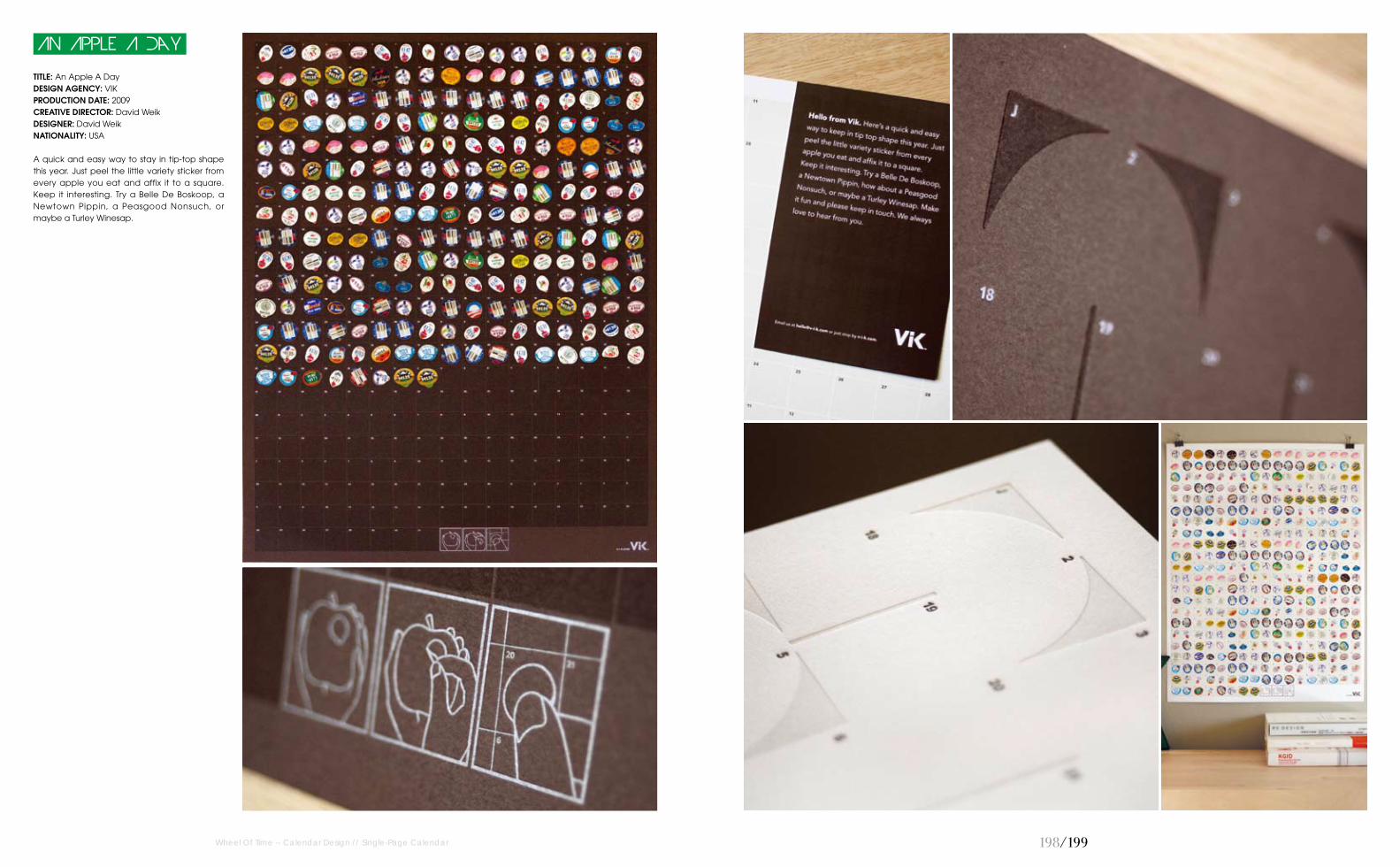
TITLE: An Apple A Day DESIGN AGENCY: VIK PRODUCTION DATE: 2009CREATIVE DIRECTOR: David WeikDESIGNER: David WeikNATIONALITY: USA
A quick and easy way to stay in tip-top shape this year. Just peel the little variety sticker from every apple you eat and affix it to a square. Keep it interesting. Try a Belle De Boskoop, a Newtown Pippin, a Peasgood Nonsuch, or maybe a Turley Winesap.
An Apple A Day
Wheel Of Time -- Calendar Design // Single-Page Calendar

200/201Wheel Of Time -- Calendar Design // Single-Page Calendar
TITLE: 2011 Calendar PRODUCTION DATE: 2011DESIGNER: Nina RadenkovicNATIONALITY: Serbia
This is a personal artwork that the designer originally intended it for herself, and as such hasn't been issued. The designer has decided it to stay non-profit. This is the wall calendar in the form of A2 format poster. It has been designed as a typographic solution to form a circle of dates. Days of the week are not labeled, but weekends are indicated with typographical characters in colour, which together form a circular range of colours. The calendar was inspired by minimalism, leaving space for personal adjustment so that users can draw and mark the dates, which is allowed by large areas of empty space, ideal for business people who need an organiser. It fits in with modern interiors, and it's purposed to be held in the workspace. Typographic solution was inspired by Helvetica, which is exactly the typeface that is used in this project. The designer has been led by her needs, and they are consistent with the needs of dynamic and business people.
2011 Calendar

202/203Wheel Of Time -- Calendar Design // Single-Page Calendar
TITLE: Portraits PRODUCTION DATE: 2010DESIGNER: Jenny MeilihovePhOTOGRAPhY: Jenny MeilihoveNATIONALITY: Israel
Portrait for each month.
Portraits
204/205Wheel Of Time -- Calendar Design // Single-Page Calendar
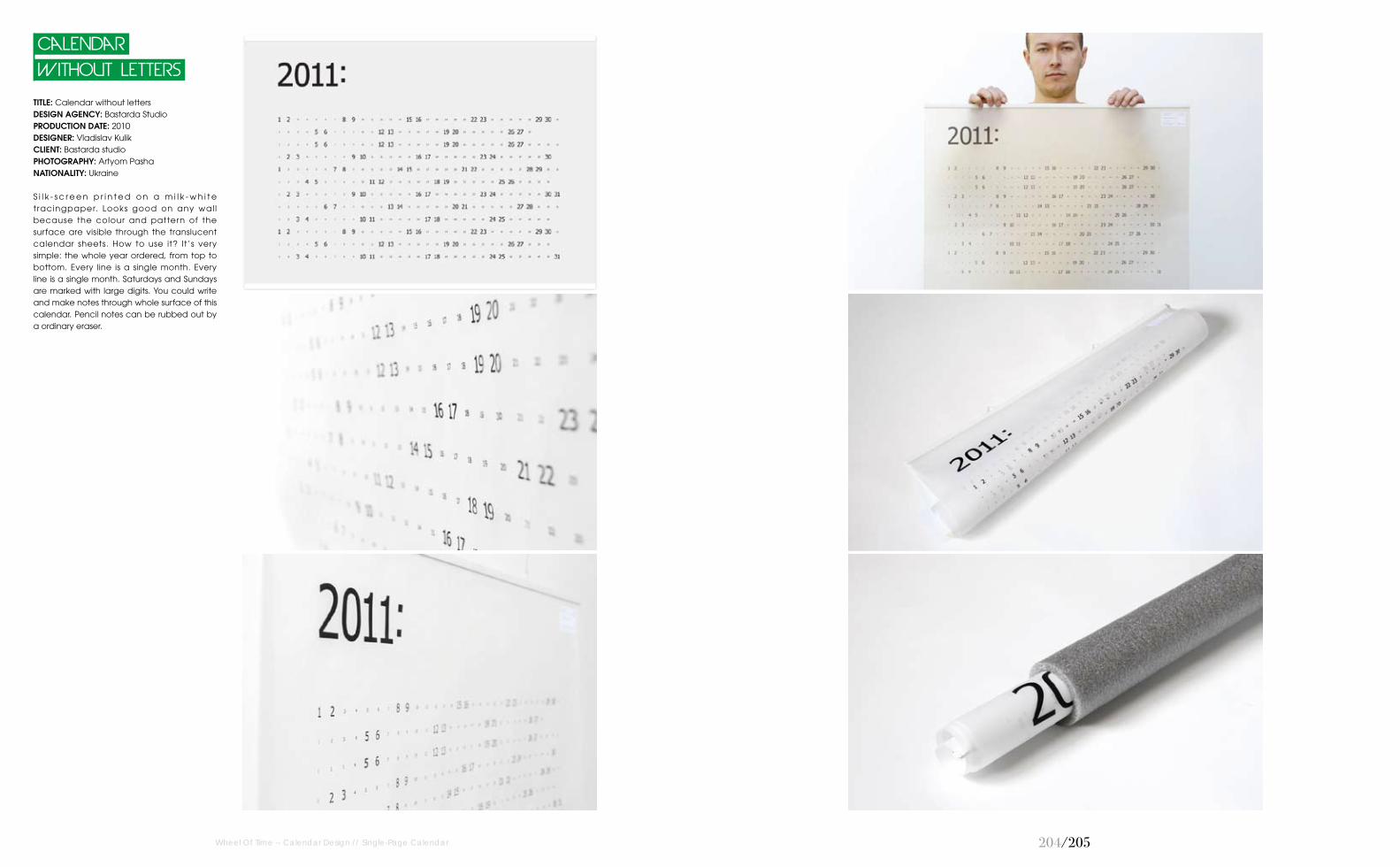
TITLE: Calendar without lettersDESIGN AGENCY: Bastarda StudioPRODUCTION DATE: 2010DESIGNER: Vladislav KulikCLIENT: Bastarda studioPhOTOGRAPhY: Artyom PashaNATIONALITY: Ukraine
S i l k - s c r e e n p r i n t e d o n a m i l k - w h i t e tracingpaper. Looks good on any wal l because the colour and pattern of the surface are visible through the translucent calendar sheets. How to use it? It’s very simple: the whole year ordered, from top to bottom. Every line is a single month. Every line is a single month. Saturdays and Sundays are marked with large digits. You could write and make notes through whole surface of this calendar. Pencil notes can be rubbed out by a ordinary eraser.
Without Letters
Calendar

206/207
TITLE: The Printers Calendar DESIGN AGENCY: The ChasePRODUCTION DATE: 2004CREATIVE DIRECTOR: Ben CaseyDESIGNER: Oliver MaltbyCLIENT: Spellman WalkerNATIONALITY: England
The year in colour for printers, Spellman Walker, with each day represented by a tear-off Pantone colourswatch.
The Printers Calendar
Wheel Of Time -- Calendar Design // Single-Page Calendar

20�/20�
TITLE: Career Life-Break WallplannerDESIGN AGENCY: The ChasePRODUCTION DATE: 2007CREATIVE DIRECTOR: Ben CaseyDESIGNER: Stuart PriceCLIENT: VivistoNATIONALITY: England
Does working for your living ever feel a bit like a prison sentence? For adventure holiday company, Vivisto, this year planner helps you count off the days.
Wallplanner
Career Life-Break
Wheel Of Time -- Calendar Design // Single-Page Calendar

210/211
TITLE: Calendar Nepomuk 2008 DESIGN AGENCY: NepomukPRODUCTION DATE: 2007DESIGNER: Doris Freigofas / Daniel Dolz / Sven NeitzeCLIENT: NepomukNATIONALITY: the Netherlands
Calendar original print, offset.
Calendar Nepomuk 2008
Wheel Of Time -- Calendar Design // Single-Page Calendar

212/213
TITLE: SWMC 2010DESIGN AGENCY: Aleksander Shevchuk & 2many ProjectPRODUCTION DATE: 2010CREATIVE DIRECTOR: Aleksander ShevchukDESIGNER: Aleksander ShevchukCLIENT: SWMC (Sochi Winter Music Conference)PhOTOGRAPhY: Aleksander ShevchukNATIONALITY: Russia
SWMC is a most popular festival in Russia dedicated to modern & club music. Sochi Winter Music Conference is held every year. Three days and four nights. Day for seminars and night for dance party. Night party is conducted in best clubs in Sochi, Russia. This year the designer was invited to do full branding of SWMC 2010. Speaking about re-branding for the conference was very cardinal in 2010. He has heavily modified the logo, as well as completely substrate, which is a bit abstract, a bit reminiscent of falling snow, especially if you look up on snow. Logo of the conference the designers did so that it was like the sound tumbler. Radial circles resemble the volume levels from minimum to maximum level. Therefore all well harmonize with the name of the festival.
SWMC 2010
Wheel Of Time -- Calendar Design // Single-Page Calendar

214/215
TITLE: Little Girl Wall CalendarPRODUCTION DATE: 2009DESIGNER: Jenny MeilihovePhOTOGRAPhY: Jenny MeilihoveNATIONALITY: Israel
Illustrarions Present A Little Girl's Wonderful World. For A Wall Calendar.
Little Girl Wall Calendar
Wheel Of Time -- Calendar Design // Single-Page Calendar
TITLE: Letters Calendar PRODUCTION DATE: 2009DESIGNER: Jenny MeilihovePhOTOGRAPhY: Jenny MeilihoveNATIONALITY: Israel
Mini calendar, using initials representative of one month, December is D, February is F.
Letters Calendar

216/217
TITLE: 2010 Rainbow Circle CalendarPRODUCTION DATE: 2009CREATIVE DIRECTOR: Melissa Van HooseDESIGNER: Melissa Van HooseNATIONALITY: USA
Created to make the days easily separated while still having an interesting look that could work for a variety of customers.
Calendar
2010 Rainbow Circle
Wheel Of Time -- Calendar Design // Single-Page Calendar
TITLE: 2011 Wall CalendarPRODUCTION DATE: 2009DESIGNER: Jenny MeilihovePhOTOGRAPhY: Jenny MeilihoveNATIONALITY: Israel
An imaginayive fantasy world for a calendar.
2011 Wall Calendar

21�/21�
TITLE: 2011 Blue Green Circle CalendarPRODUCTION DATE: 2010CREATIVE DIRECTOR: Melissa Van HooseDESIGNER: Melissa Van HooseNATIONALITY: USA
Created to show a more visually interesting style for each month and the hol idays while still allowing users to write in their own information.
Circle Calendar
2011 Blue Green
Wheel Of Time -- Calendar Design // Single-Page Calendar
TITLE: 2010 Colorful Hoizontal Circle CalendarPRODUCTION DATE: 2009CREATIVE DIRECTOR: Melissa Van HooseDESIGNER: Melissa Van HooseNATIONALITY: USA
This calendar was created to fill the void of interesting wall calendars available for purchase online. It was meant to appeal to a wide variety of people since the colours can match to any home decor.
Hoizontal Circle Calendar
2010 Colorful

220/221
TITLE: 2011 Ribbons CalendarPRODUCTION DATE: 2010CREATIVE DIRECTOR: Melissa Van HooseDESIGNER: Melissa Van Hoose NATIONALITY: USA
Created to bring a bright, cheery mood to any room while still allowing plenty of usable space that is so important when making a functional calendar.
Calendar
2011 Ribbons
Wheel Of Time -- Calendar Design // Single-Page Calendar
TITLE: 2011 Color Bar CalendarPRODUCTION DATE: 2010CREATIVE DIRECTOR: Melissa Van HooseDESIGNER: Melissa Van HooseNATIONALITY: USA
Created for people who want less white in their life and more color while still leaving room to write in holidays and events.
Bar Calendar
2011 Color

222/223
TITLE: Year Of The Tiger Kitty 2010PRODUCTION DATE: 2009DESIGNER: Amy HevronNATIONALITY: USA
The designer wanted to create a silk screened calendar poster that could be enjoyed throughout the year. This one celebrates the Chinese zodiac Tiger for 2010. It's a whimsical representation of the tiger kitty throughout various seasons of the year.
Year Of The Tiger Kitty 2010
Wheel Of Time -- Calendar Design // Single-Page Calendar
TITLE: Year Of The Bunny Rabbit 2011PRODUCTION DATE: 2010DESIGNER: Amy HevronNATIONALITY: USA
The designer wanted to continue with the Chinese zodiac theme and create a Rabbit calendar. This is a silk screened limited edition poster. The bunny rabbit characters are featured throughout the year, eventually multiplying into a large family of bunnies by the end of the year.
Year Of The Bunny Rabbit 2011

224/225
TITLE: 2011 Calendar Pillow CoverDESIGN AGENCY: Le Papier StudioPRODUCTION DATE: 2010CREATIVE DIRECTOR: Vana ChuppDESIGNER: Vana ChuppPhOTOGRAPhY: Vana ChuppNATIONALITY: USA
The 2011 Romantic Silhouettes Calendar will capture your heart with its elegant and whimsy illustrations. Designed to hang on your wall, this lovely product comes with a satin ribbon. Give it away as the perfect gift or display it on your workspace for a touch of colour and romance.
2011 Wall Calendar
Wheel Of Time -- Calendar Design // Single-Page Calendar
TITLE: 2011 Calendar Pillow CoverDESIGN AGENCY: Le Papier StudioPRODUCTION DATE: 2010CREATIVE DIRECTOR: Vana ChuppDESIGNER: Vana ChuppPhOTOGRAPhY: Vana ChuppNATIONALITY: USA
The 2011 Calendar Pillow Cover will make the most elegant gift. Add a touch of colour and style to any setting.
Pillow Cover
2011 Calendar

226/227Wheel Of Time -- Calendar Design // Single-Page Calendar
TITLE: 2010 PRODUCTION DATE: 2010DESIGNER: Haralds FilipovsNATIONALITY: Latvia
The designer made this calendar just for his needs, for non-commercial needs.
2010
TITLE: WreathDESIGN AGENCY: Kring Design StudioPRODUCTION DATE: 2010DESIGNER: Bryan KringCLIENT: Produced for retail saleNATIONALITY: USA
The art for this calendar began as a sun, grew into a flower, and then blossomed into this organic wreath that is brimming with life. The detailed line work was drawn by hand and the graphic floral pattern was drawn on a computer. The combined art was printed on a hand-fed letterpress.
Wreath

22�/22�
TITLE: Life Calendar: Love Life, Day By DayPRODUCTION DATE: 2011CREATIVE DIRECTOR: Raquel CatalanDESIGNER: Raquel CatalanCLIENT: Brigada CreativaNATIONALITY: Spain
Life Calendar is a series of different calendars which highlights an aspect of life. "Love Life, Day by Day" is the second of the series. The 365 days are represented by a heart divided into 4 parts: Time together, Conversation, Caress-Kisses and Sex. According to the activity you had with your couple every day, you must paint the piece of heart indicated. Thus, the more you paint the calendar red will mean more love in the couple. This calendar is not for any specific year. You can start it when you want!
Love Life, Day By Day
Life Calendar:
Wheel Of Time -- Calendar Design // Single-Page Calendar
TITLE: Life Calendar: How Was Your Day?PRODUCTION DATE: 2010CREATIVE DIRECTOR: Raquel CatalanDESIGNER: Raquel CatalanCLIENT: Brigada CreativaNATIONALITY: Spain
Life Calendar is a series of different calendars which highlights an aspect of life. "How was your day?" is the first of the series. The 365 days are represented by an emoticonthat you have to draw as the day has gone (very good, good, regular, bad, very bad). A different way to know and evaluate your mood throughout the days. A simplified daily. The blue circles mark the beginning of each and every month and the yellow circles are for all of the other. This calendar is not for any specific year. You can start it when you want!
How Was Your Day?
Life Calendar:

230/231
TITLE: Calendar Illusion 2011 PRODUCTION DATE: 2010CREATIVE DIRECTOR: Vladislav Novikov-BarkovskyDESIGNER: Vladislav Novikov-BarkovskyCLIENT: Red Richman Creative StudioNATIONALITY: Russia
The maze-like calendar, giving a sense of illusion, without losing the pleasures of life.
Calendar Illusion 2011
TITLE: 2011 Calendar DESIGN AGENCY: Studio Sven NeitzelPRODUCTION DATE: 2010DESIGNER: Sven NeitzelCLIENT: Sven NeitzelNATIONALITY: the Netherlands
Calendar, 2c screen print.
2011 Calendar
Wheel Of Time -- Calendar Design // Single-Page Calendar

232/233
TITLE: Calendar Nepomuk 2010DESIGN AGENCY: Nepomuk PRODUCTION DATE: 2009DESIGNER: Doris FreigofasNATIONALITY: the Netherlands
Calendar original print, 3c screen print.
Nepomuk 2010
Calendar
TITLE: Calendar Nepomuk 2009DESIGN AGENCY: Nepomuk PRODUCTION DATE: 2009DESIGNER: Doris Freigofas / Daniel Dolz / Sven NeitzelNATIONALITY: the Netherlands
Calendar original print, offset.
Nepomuk 2009
Calendar
Wheel Of Time -- Calendar Design // Single-Page Calendar

234/235Wheel Of Time -- Calendar Design // Wall Calendar
TITLE: Failsafe CalendarDESIGN AGENCY: Dmitiy Maslskov / Marat Dzantuganov PRODUCTION DATE: 2008CREATIVE DIRECTOR: Andrey Gubaydullin ART DIRECTOR: Vladislav DerevyannykhNATIONALITY: Russia
Failsafe calendar is a wall interactive project which looks like a big all-prize lottery ticket. Behind each of 365 scratch panels one can find jokes, recommendations, funny pictures, riddles and quizzes, internet links as well as thoughts about life, friendship and love. What's more, it is meaningful, for it is connected to a certain historical moment of the date. And behind some panels there are surprises and presents received from clients of advertising agency “Voskhod”. To make the scratching easier the calendar includes a free new 5-kopeck coin attached to the magnetic tape.
Failsafe Calendar

236/237
TITLE: Calendar for Typography 21PRODUCTION DATE: 2008DESIGNER: Aleksander ShevchukCLIENT: Typography 21 (Printing House)PhOTOGRAPhY: Aleksander ShevchukNATIONALITY: Russia
Calendar has a six pop up figure and rigid cover with black metallic logo on both sides. It was released as a gift to clients’ typography. The concept of the calendar came after watching the pop up books. It's an ideal idea for modern typography, and shows the full force of features. Calendar's catchword translated from Russian is: Full scale print. It lays down the principle of popup book. The designer also applied fluor Pantone that seem more juicy in the light to giving the calendar a great colour and emphasises the uniqueness of the printing press. Continuous development of the calendar lasted for about a month. Each figure was made individuality. First, select the image, then construct a scheme for each figure by which can was opened the calendar. It took a lot of paper. First, details were cut with scalpel and layout knife, then all parts glue together with glue and adhesive tape. Second, the digital machine was used print the image on heavy paper. And only after it was collected the final layout the offset machine was printed final images and made the typography's blades for cutting.
Calendar for Typography 21
Wheel Of Time -- Calendar Design // Wall Calendar

TITLE: Research Studios Calendar 2010DESIGN AGENCY: Research StudiosPRODUCTION DATE: 2010DESIGNER: Neville Brody / Nick Hard / James Nelson / James Le Beau-Morley / George Sheldrake / Jeff KnowlesNATIONALITY: England
Hitting the offices, desks and doormats of the designers’clients, contacts and friends in early January, the designers wanted to give a sneak preview of the 2010 l imited edition Research Studios’ calendar. The brief this year was to experiment with pattern and type to create an artwork for the 12 months of the year and involved Neville Brody alongside designers from the London, Paris, Barcelona and Berlin studios. The calendar carries forward the designers’ passion for type and experimentation with it into 2010.
Calendar 2010
Research Studios
Wheel Of Time -- Calendar Design // Wall Calendar 23�/23�

240/241
Chrono-Shredder
TITLE: Chrono-Shredder PRODUCTION DATE: 2007-2010DESIGNER: Susanna HertrichPhOTOGRAPhY: Susanna HertrichNATIONALITY: Germany
Chrono-Shredder is a poetic time object that reminds us of the volatilizes of the “now”. This hybrid object combines functions of a calendar and a clockand so shreds every single day in real-time. All that time that is irreversibly lost gets a tangible existence in form of shredded paper. As time passes by, the tattered remains of the past pile up under the device. Thus, Chrono- Shredder stimulates a personal reflection on the use of one's lifetime.
Wheel Of Time -- Calendar Design // Wall Calendar

National Properties Calendar
TITLE: National Properties Calendar DESIGN AGENCY: MYKCPRODUCTION DATE: 2009CREATIVE DIRECTOR: Kimoon KimDESIGNER: Kimoon KimCLIENT: Kimoon KimNATIONALITY: South Korea
Concept or contents of the calendar is National properties (monument/ treasure) in South Korea. National properties are good to be a topic, because they are important and memorable assets in the country and also they have their own month time of origin, period of activity. In the past there were some calendars about National properties. But they were made of just pictures. In those calendars you can see clean images, but it is hard to find a graphic uniqueness and variety. So in this work the designer made vector images that show the features of each National property. He placed them on each month that is related with the properties (eg .time of origin, period of activity). Focusing on the shape of National property, the designer made some geometric forms that support the graphic. Besides basic calendar information, there is information about property of the month.
Wheel Of Time -- Calendar Design // Wall Calendar 242/243

244/245
TITLE: Almost ExtinctDESIGN AGENCY: The ChasePRODUCTION DATE: 2010CREATIVE DIRECTOR: Oliver MaltbyDESIGNER: Chris Challinor / Rebecca Low / Dulcie Cowling / Adam CartwrightCLIENT: BBC Wildlife FundNATIONALITY: England
Almost Extinct is an awareness campaign to help the BBC Wildlife Fund raise funds to help threatened wildlife and places. By crossing off endangered species every day, the calendar highlights the species that are getting closer to extinction.
Almost Extinct
Wheel Of Time -- Calendar Design // Wall Calendar

246/247
TITLE: Cats Let Nothing Darken Their Roar Calendar 2011DESIGN AGENCY: Studio Noa BembibrePRODUCTION DATE: 2010CREATIVE DIRECTOR: Noa Bembibre DESIGNER: Noa BembibreCLIENT: Studio Noa BembibreNATIONALITY: Finland
For six years, the calendar Cats Let Nothing Darken Their Roar has introduced new, odd, and strange phrases every month. Designed by Noa Bembibre, it started in 2006 with 30 modest copies, to over a million in 2007, in a special edition for Finland’s daily newspaper Helsingin Sanomat, to a limited edition of 500 copies ever since. This calendar, already in its sixth edition, hides and highlights months’ names within words. The resulting phrases are obscure, witty, thought provoking. Printed in quality white stock with its signature ribbon binding. Presented in a silver printed envelope, this year the calendar also includes a practical pencil, custom made by Viarco in Portugal.
Their Roar Calendar 2011
Cats Let Nothing Darken
Wheel Of Time -- Calendar Design // Wall Calendar

24�/24�
TITLE: 2010 Die Cut Wall CalendarPRODUCTION DATE: 2009DESIGNER: Chris PagePhOTOGRAPhY: Chris PageNATIONALITY: England
A calendar consisting of thirteen loose sheets, one die cut date sheet and twelve coloured month sheets. Each month sheet displays monthly events and indicates the Monday of each week. The numbers 0, 4, 6, 8 and 9 are difficult to portray as the front of the calendar is die cut. To solve this problem the counter form of these numbers were printed on each month sheet. When both the date and month sheets are placed together the numbers are complete, which in turn gives each month its own graphical interest when viewed separately. Two bulldog clips hold all sheets together.
Wall Calendar
2010 Die Cut
Wheel Of Time -- Calendar Design // Wall Calendar

250/251
TITLE: 2010 Calendar PRODUCTION DATE: 2009CREATIVE DIRECTOR: Cecilie EllefsenDESIGNER: Cecilie EllefsenNATIONALITY: Norway
2010 Calendar with illustrations based on tiny doodles from the designer’s sketchbook.
2010 Calendar
Wheel Of Time -- Calendar Design // Wall Calendar

252/253
TITLE: Words Of A Street Poet Calendar PRODUCTION DATE: 2007CREATIVE DIRECTOR: Rosario Martinez-CañasDESIGNER: Juan Camilo RojasNATIONALITY: Colombia
Words of a Street Poet Calendar was designed based on a set of 12 poems taken from a book titled Memories from a street poet by Burton Rosenburgh. The idea was to take poems individually and interpret them typographically!
Calendar
Words Of A Street Poet
Wheel Of Time -- Calendar Design // Wall Calendar
254/255
TITLE: Tuberculosis 3D-Test DESIGN AGENCY: Advertising Association VoskhodPRODUCTION DATE: 2009CREATIVE DIRECTOR: Andrey GubaydullinART DIRECTOR: Vladislav DerevyannykhDESIGNER: Igor Yacuk / Dmitry Izotov / Tatyana DorofeevasCLIENT: MasterpharmNATIONALITY: Russia
“Diask intest” i s a medical product for diagnosing tuberculosis at the early stages with accuracy to 98%. Calendar is based on the concept of children’s game “Find Wally”. Each of 12 months is a comprehensive illustration with many objects and characters among which there’s a little monster hidden that resembles tubercule bacillus. Attached to each calendar there are Diaskintest branded 3-D glasses. With those glasses on the holder of the calendar one can spot the bad guy immediately because the pictured character becomes three-dimensional. Thus, in such a game-like manner the designers bring the idea that it is much easier to detect tuberculosis with the help of “Diaskintest” than if using out-of-date methods.
Tuberculosis 3D-Test
Wheel Of Time -- Calendar Design // Wall Calendar
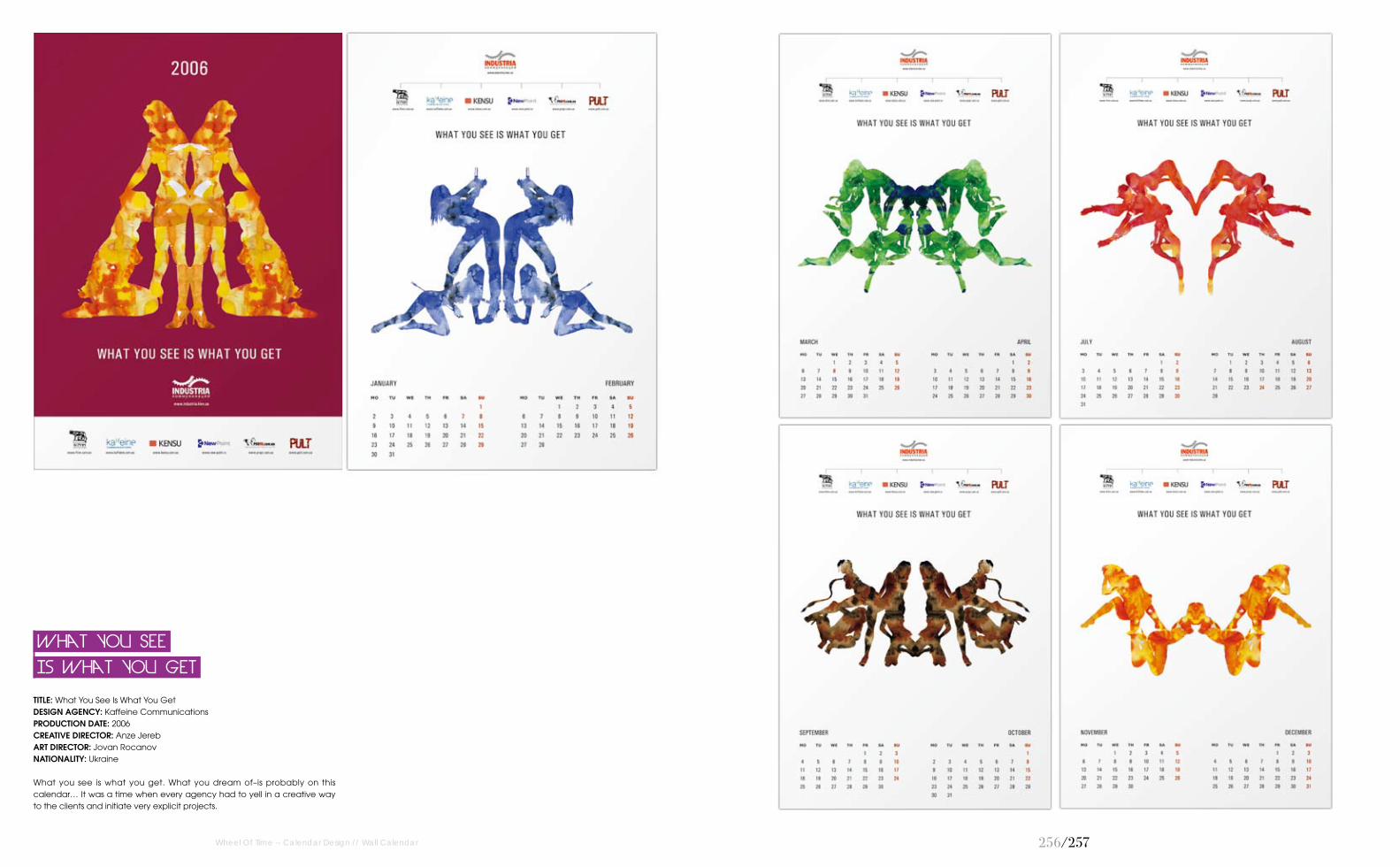
256/257
TITLE: What You See Is What You Get DESIGN AGENCY: Kaffeine CommunicationsPRODUCTION DATE: 2006CREATIVE DIRECTOR: Anze JerebART DIRECTOR: Jovan RocanovNATIONALITY: Ukraine
What you see is what you get. What you dream of–is probably on this calendar… It was a time when every agency had to yell in a creative way to the clients and initiate very explicit projects.
Is What You Get
What You See
Wheel Of Time -- Calendar Design // Wall Calendar

Wide To The Bone Calendar
TITLE: Wide To The Bone Calendar DESIGN AGENCY: Kaffeine CommunicationsPRODUCTION DATE: 2007CREATIVE DIRECTOR: Anze Jereb / Anna MenshikovaART DIRECTOR: Anna TimkovNATIONALITY: Ukraine
Calendar expresses how the designers really like to work, a lot and to their best. That’s why they always have enough minds, hands, spirit and heart to cope with their work. Even if this leads to irreversible consequences to their anatomy–they don’t mind.
Wheel Of Time -- Calendar Design // Wall Calendar 25�/25�

260/261
TITLE: San Carlo Calendar DESIGN AGENCY: Ginette Caron Communication DesignPRODUCTION DATE: 2010ART DIRECTOR: Ginette Caron DESIGNER: Ginette Caron with Masami MoriyamaCLIENT: San CarloPhOTOGRAPhY: Marirosa Toscani BalloNATIONALITY: Italy
A calendar for San Carlo, a potato chips company, in which the whole variety of products is presented throughout the 12 months.
San Carlo Calendar
Wheel Of Time -- Calendar Design // Wall Calendar

262/263
A Shot In The Dark
TITLE: A Shot In The Dark DESIGN AGENCY: The Chase PRODUCTION DATE: 1999CREATIVE DIRECTOR: Ben CaseyDESIGNER: Grant MitchellCLIENT: Highlight PrintersPhOTOGRAPhY: David WalkerNATIONALITY: England
Things that appear normal enough during the day can take on a much eerier quality seen by night. For this self-promotional calendar, A Shot in the Dark, photographer David Walker’s black and white shots were weirdnly enhanced in the printing with 6 inks and 2 varnishes.
Wheel Of Time -- Calendar Design // Wall Calendar
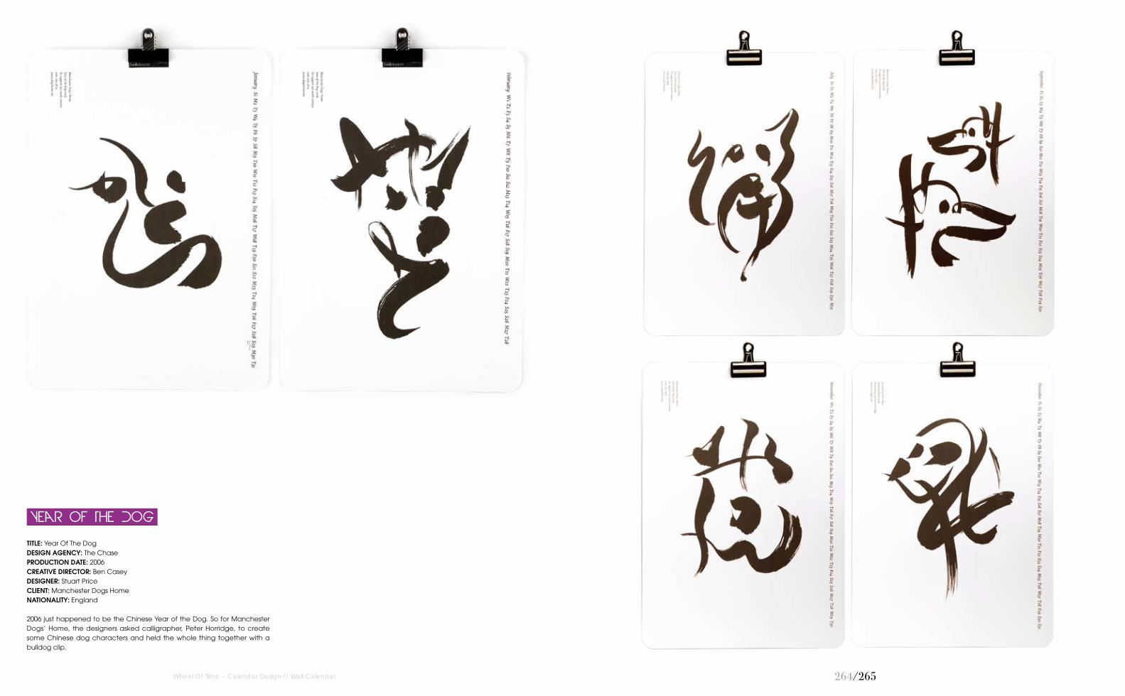
264/265
Year Of The Dog
TITLE: Year Of The Dog DESIGN AGENCY: The Chase PRODUCTION DATE: 2006CREATIVE DIRECTOR: Ben CaseyDESIGNER: Stuart PriceCLIENT: Manchester Dogs HomeNATIONALITY: England
2006 just happened to be the Chinese Year of the Dog. So for Manchester Dogs’ Home, the designers asked calligrapher, Peter Horridge, to create some Chinese dog characters and held the whole thing together with a bulldog clip.
Wheel Of Time -- Calendar Design // Wall Calendar

266/267
Calendario CCOO 2010
TITLE: Calendario CCOO 2010 DESIGN AGENCY: The Mushroom Company PRODUCTION DATE: 2009CREATIVE DIRECTOR: Pedro DelgadoDESIGNER: David De RamónCLIENT: CCOO (Sección Sindical Del Ayuntamiento De Madrid)NATIONALITY: Spain
Comisiones Obreras (CCOO) trade union section of Madrid’s City Council orders a 2 month calendar view DIN A3 format. Need to reflect the different employees of the City Council of Madrid: gardeners, security forces, administration, researchers, teachers, etc. Proposal was accepted immediately: the use of iconography of propaganda posters of the 1930's and 1940’s, with a limited colour palette and orthogonal compositions, but removing the component of such belligerent. The designer proposed groups comprising most of them to carry out 6 illustrations and integrate these groups of workers on funds and buildings of Madrid near their areas of expertise (Communications Palace, National Library, Lavapiés, Planetarium, Parque del Retiro... ) In short, the designer tried that all council workers will see represented in some of the illustrations and his work for his city, trying to keep the union's collective spirit.
Wheel Of Time -- Calendar Design // Wall Calendar

26�/26�
Target Practice
TITLE: Target Practice DESIGN AGENCY: Studio Dorogaya PRODUCTION DATE: 2010DESIGNER: Sergiy ChebotaryovCLIENT: GfK UkraineNATIONALITY: Ukraine
GFK is an international market research organisation. For Ukrainian division of GFK, the designers have created an interactive calendar. Packed in a mat black wooden box. Calendar page illustrations are diagrams, formed as shooting targets. Interactive part of this calendar is 2 sets of dart arrows (3 cyan and 3 magenta coloured, representing male and female auditory). So, you can literally hit the target group. Gold Prize Award at Kiev International Advertising Festival in 2010; Category: Communication Design. Bronze Prize Award at Kiev International Advertising Festival in 2010; Category: Graphic Design.
Wheel Of Time -- Calendar Design // Wall Calendar

TITLE: Fashion Made Me Hardcore Calendar 2010DESIGN AGENCY: Spiros HalarisPRODUCTION DATE: 2010CREATIVE DIRECTOR: Spiros HalarisDESIGNER: Spiros HalarisNATIONALITY: Greece
The project required the making of a calendar for the forthcoming year. The designer incorporated the theme of fashion including fashion illustrations for each month of the year. It is all in black and white and he let the lines and the illustrations do all the talk. It is clean and minimal and each month's illustration has a different feeling.
Calendar 2010
Fashion Made Me Hardcore
Wheel Of Time -- Calendar Design // Wall Calendar 270/271

272/273
TITLE: Calendar 2010 "Viele Diebe leuchten wie die hellste Nacht."DESIGN AGENCY: It's Raining ElephantsPRODUCTION DATE: 2009DESIGNER: Evelyne Laube / Nina WehrleNATIONALITY: Switzerland
2010 Calendar with illustrations for "It's Raining Elephants" (studio).
Leuchten Wie Die Hellste Nacht."
Calendar 2010 "viele Diebe
Wheel Of Time -- Calendar Design // Wall Calendar

274/275
Iscar 1988
TITLE: Iscar 1988DESIGN AGENCY: Reisinger StudioPRODUCTION DATE: 1988CREATIVE DIRECTOR: Dan ReisingerDESIGNER: Dan ReisingerCLIENT: Iscar Cutting Tools ItdNATIONALITY: Israel
Iscar Company manufactures hard-metal cutting tools for industry all over the world. Reisinger designed numerous cut-out calendars for Iscar, each one expressing the concept of "cutting" and, at the same time, appealing to aesthetic and emotive senses. These calendars were awarded gold and silver medals at Stuttgart Calendar Competitions.
Wheel Of Time -- Calendar Design // Wall Calendar

276/277
Perpetual Calendar
TITLE: Perpetual CalendarDESIGN AGENCY: Reisinger StudioPRODUCTION DATE: 1987CREATIVE DIRECTOR: Dan ReisingerDESIGNER: Dan ReisingerCLIENT: Museum of Modern Art, New YorkNATIONALITY: Israel
Interchangeable, coloured, cut-out, PVC sheets (12 colours, 6 forms) are hung onto a black metal background–with possibility to create over 46,000 different images. The day, date and month are hung separately, but the year is not marked. Thus, the calendar can be used year after year.
Wheel Of Time -- Calendar Design // Wall Calendar

27�/27�
5th Floor Poster Calendar
TITLE: 5th Floor Poster Calendar DESIGN AGENCY: 5thFloorPRODUCTION DATE: 2009CREATIVE DIRECTOR: 5thFloorDESIGNER: 5thFloorCLIENT: 5thFloorPhOTOGRAPhY: Niklas SandstormNATIONALITY: Finland
5th Floor 2010 is a limited edition poster collection consisting of twelve individual pieces. Each poster is a personal view of a certain month. The posters form a calendar for the year 2010 but the quality and value are the equivalent of twelve handmade serigraphy(silk-screen) prints. Each one of the 200 copies available is signed and numbered.
Wheel Of Time -- Calendar Design // Wall Calendar

2�0/2�1
TITLE: Inventions In Germany PRODUCTION DATE: 2009DESIGNER: Kristina ScandurraNATIONALITY: Germany / Italy
Our daily life is influenced by many incredible inventions with very high costs of research and development. These significant inventionsinitially met with criticism but were eventually accepted in daily life, made life easier and more convenient. This calendar gives just a small review of more or less famous inventions in Germany that have become indispensable in our daily lives.
Wheel Of Time -- Calendar Design // Wall Calendar
In Germany
Inventions

2�2/2�3
TITLE: 2010 Exhibition Calendar DESIGN AGENCY: The Illustrati PRODUCTION DATE: 2009CREATIVE DIRECTOR: Justin Nash Joel ShakespearDESIGNER: Justin NashPhOTOGRAPhY: Justin NashNATIONALITY: USA
This calendar consists of artwork from some of the best of digital artists from all over the world. The calendar features Olli-Pekka Jauhiainen, Pete Harrison, Adam Spizak, Joel Shakespear, Ben Thomas, Radim Malinic, Johnathon Wong, Mike Campau, Justin Nash, Chuck Anderson, Jeremy Biggers, and Nik Ainley.
Wheel Of Time -- Calendar Design // Wall Calendar
Calendar
2010 Exhibition

2�4/2�5
Sweet Content Calendar
TITLE: Sweet Content CalendarPRODUCTION DATE: 2008CREATIVE DIRECTOR: Alexander KalachevPhOTOGRAPhY: Ruslan OzovNATIONALITY: Russia
Sweet Content is a team where all members are deeply passionate about fresh ideas and trends in graphics, whose target is to promote these ideas through art projects, connecting illustrators worldwide. Second released Sweet Content project–a 2009 unique calendar for the collectors. James White, Peter Jaworowski, Matt W. Moore, Loic Sattler, Sebastian Onufszak, who are the world design celebrities, appeared on this project together with young and rather talented illustrators, such as Niark One, Guilherme Marconi, Mark Verhaagen, Alberto Seveso, Mar Hernandez. Russian designers couldn't stay aside–Edik Katykhin, Merdanchik and Evgeny Kiselev appeared on this bright international project, too.
Wheel Of Time -- Calendar Design // Wall Calendar
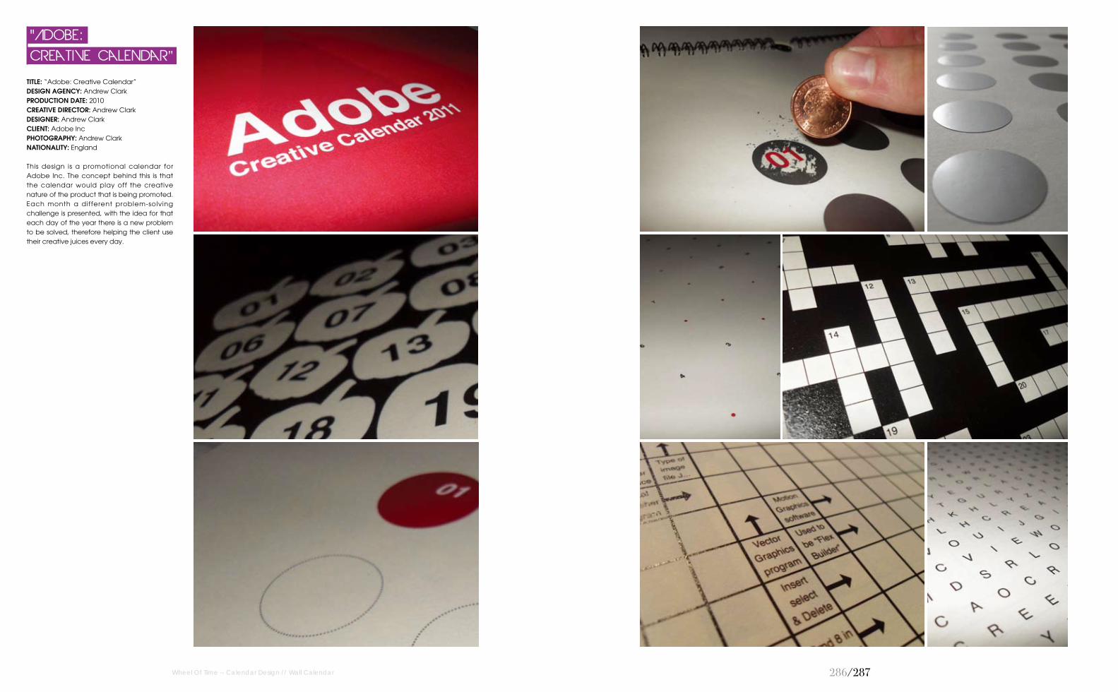
2�6/2�7
TITLE: “Adobe: Creative Calendar”DESIGN AGENCY: Andrew Clark PRODUCTION DATE: 2010CREATIVE DIRECTOR: Andrew ClarkDESIGNER: Andrew ClarkCLIENT: Adobe IncPhOTOGRAPhY: Andrew ClarkNATIONALITY: England
This design is a promotional calendar for Adobe Inc. The concept behind this is that the calendar would play off the creative nature of the product that is being promoted. Each month a different problem-solving challenge is presented, with the idea for that each day of the year there is a new problem to be solved, therefore helping the client use their creative juices every day.
Wheel Of Time -- Calendar Design // Wall Calendar
Creative Calendar"
"Adobe:

2��/2��
Waiting For Sunday
TITLE: Waiting For SundayPRODUCTION DATE: 2011CREATIVE DIRECTOR: Benedetta MaranesiDESIGNER: Benedetta MaranesiNATIONALITY: Italy
A huge wall calendar, which measures 40x100 cm, suitable for large spaces such as offices or classes of students. Each month features a different font and colour. Only Sundays are specified on the calendar and this makes it a real tribute to the holiday!
Wheel Of Time -- Calendar Design // Wall Calendar

2�0/2�1
TITLE: Experience Calendar PRODUCTION DATE: 2008CREATIVE DIRECTOR: Sven Voelker (Mentoring Professor) DESIGNER: Matthias Fritsch / Marko Grewe / Saskia Hohengarten / Felix VorreiterCLIENT: Lions Club Karlsruhe-TurmbergPhOTOGRAPhY: Marco Grewe / Felix VorreiterNATIONALITY: Germany
The Experience Calendar is for kids aged approximately four to ten and their families. The ca lendar featu res funny games , interesting information, gags, and many surprises. Every month has a specific topic and every day contains a little surprise, task or piece related to the monthly topic. By picking out the 7cm circle cards the monthly theme is also transforming its appearance. It's like an all-year advent calendar with 365 "doors" to open: in June kids can discover how larvals become butterflies. In September an empty car-park is filled with imaginative vehicles while the children learn important traffic signs. In December, they can make their own Christmas-tree decoration. The calendar is dateless and can therefore be used again and again.
Wheel Of Time -- Calendar Design // Wall Calendar
Calendar
Experience
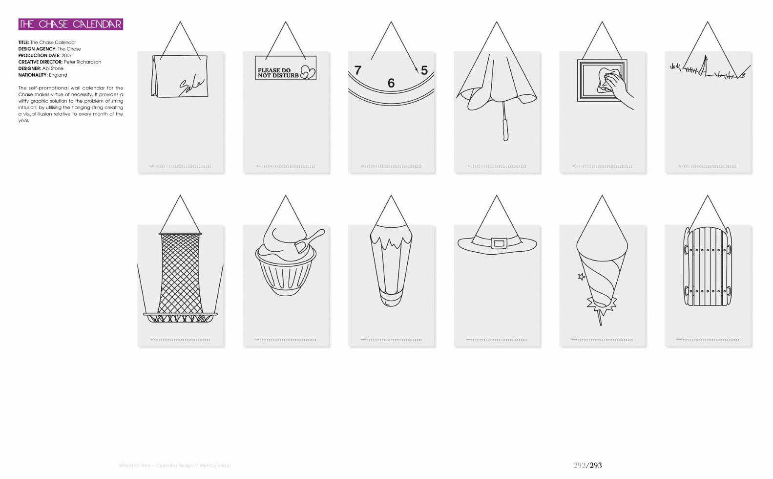
2�2/2�3
TITLE: The Chase CalendarDESIGN AGENCY: The ChasePRODUCTION DATE: 2007CREATIVE DIRECTOR: Peter RichardsonDESIGNER: Abi StoneNATIONALITY: England
The self-promotional wall calendar for the Chase makes virtue of necessity. It provides a witty graphic solution to the problem of string intrusion, by utilising the hanging string creating a visual illusion relative to every month of the year.
The Chase Calendar
Wheel Of Time -- Calendar Design // Wall Calendar

2�4/2�5
TITLE: Toyota Corolla Fukuoka Callendar 2009DESIGN AGENCY: IC4DESIGNPRODUCTION DATE: 2009DESIGNER: Takayuki Hosokawa / ArmoniCLIENT: Toyota Corolla FukuokaNATIONALITY: Japan
For familiarity to this area and those cars, the designers illustrate sightseeing spots in Fukuoka, Japan with Toyota Corolla cars. And for enjoy the user to looking for long time, they designers drew many interesting situations.
Callendar 2009
Toyota Corolla Fukuoka
Wheel Of Time -- Calendar Design // Wall Calendar
TITLE: Hiroshima Shinkin Bank Callendar 2010DESIGN AGENCY: IC4DESIGNPRODUCTION DATE: 2010DESIGNER: IC4DESIGNCLIENT: Hiroshima Shinkin BankNATIONALITY: Japan
For familiarity to this area, the designers illustrate Dream house (imaginary houses that you want to live in). All houses are nearby a sightseeing spot, or itself. And for the user to enjoy looking for long time, the designers drew many interesting situations.
Callendar 2010
Hiroshima Shinkin Bank
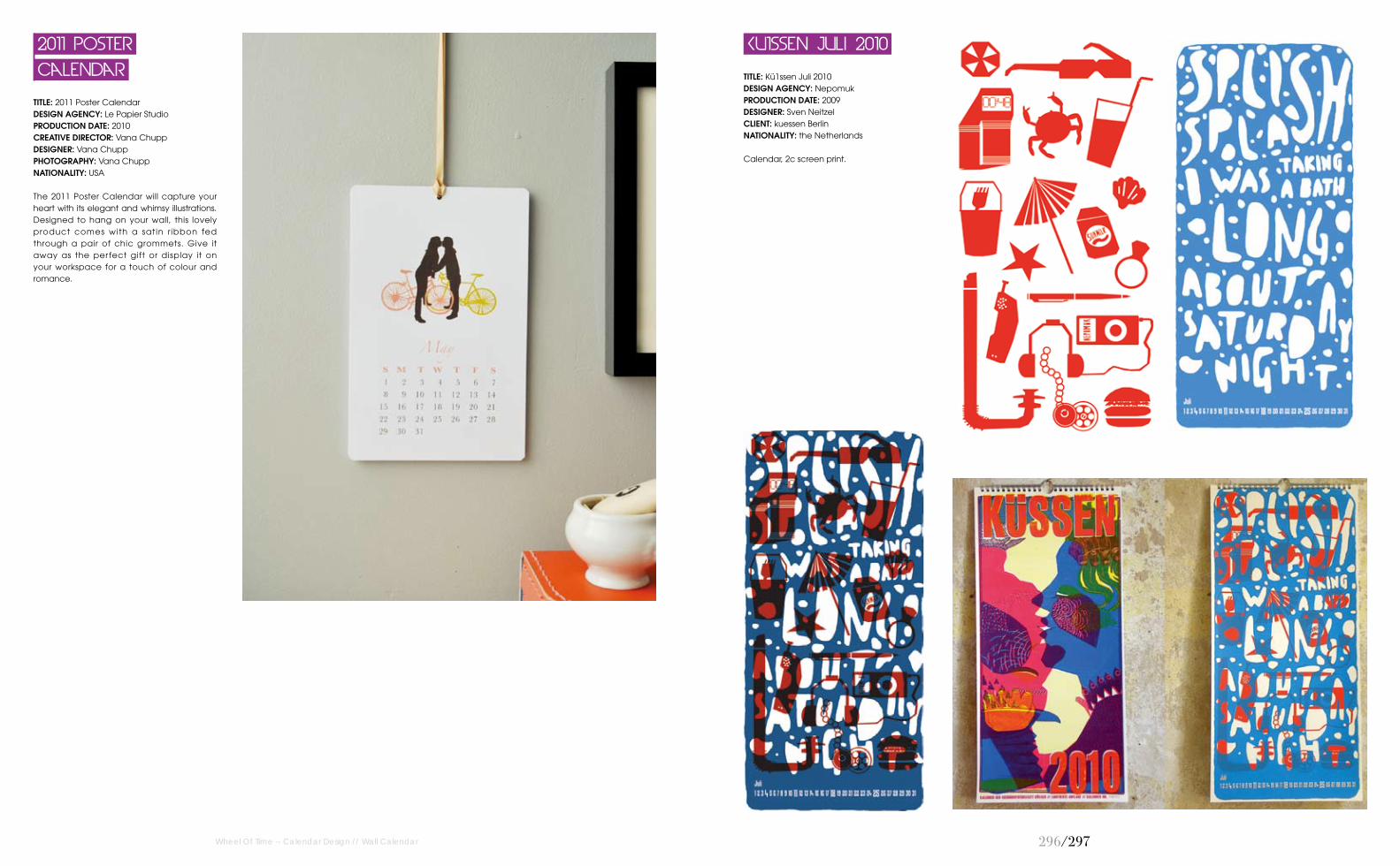
2�6/2�7
TITLE: Kü1ssen Juli 2010DESIGN AGENCY: NepomukPRODUCTION DATE: 2009DESIGNER: Sven NeitzelCLIENT: kuessen BerlinNATIONALITY: the Netherlands
Calendar, 2c screen print.
Ku1ssen Juli 2010
Wheel Of Time -- Calendar Design // Wall Calendar
TITLE: 2011 Poster Calendar DESIGN AGENCY: Le Papier Studio PRODUCTION DATE: 2010CREATIVE DIRECTOR: Vana ChuppDESIGNER: Vana ChuppPhOTOGRAPhY: Vana ChuppNATIONALITY: USA
The 2011 Poster Calendar will capture your heart with its elegant and whimsy illustrations. Designed to hang on your wall, this lovely product comes with a satin r ibbon fed through a pair of chic grommets. Give it away as the perfect gift or display it on your workspace for a touch of colour and romance.
Calendar
2011 Poster
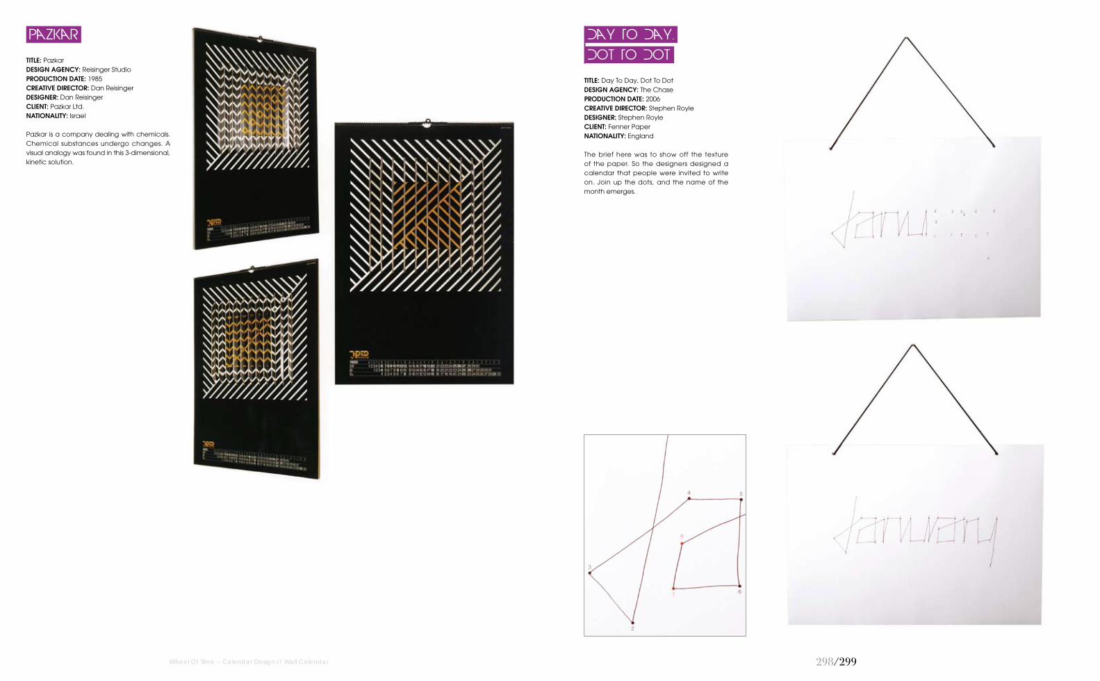
2��/2��
TITLE: Day To Day, Dot To Dot DESIGN AGENCY: The Chase PRODUCTION DATE: 2006CREATIVE DIRECTOR: Stephen RoyleDESIGNER: Stephen RoyleCLIENT: Fenner PaperNATIONALITY: England
The brief here was to show off the texture of the paper. So the designers designed a calendar that people were invited to write on. Join up the dots, and the name of the month emerges.
Dot To Dot
Day To Day,
TITLE: Pazkar DESIGN AGENCY: Reisinger StudioPRODUCTION DATE: 1985CREATIVE DIRECTOR: Dan ReisingerDESIGNER: Dan ReisingerCLIENT: Pazkar Ltd. NATIONALITY: Israel
Pazkar is a company dealing with chemicals. Chemical substances undergo changes. A visual analogy was found in this 3-dimensional,kinetic solution.
Pazkar
Wheel Of Time -- Calendar Design // Wall Calendar

Creative Power UnitAnfini 001, 8-7-15 Akasaka, Minato-ku, Tokyo, 107-0052 JAPAN126
CuriousDoodlesUSA168
DDB Way No. 3341, Dohat Al Adab Street,Al Khuwair South 233, Muscat, Oman 182
Design By Alpha 24/25 Chester Street, Shrewsbury,SY1 1NX, UK188
Design EtiquetteVeritas, Costa Rica26
Eugenia BalabanovaMoscow, Russia78
fel-x and hfg-karlsruhe.deGermany290
Gideon Dagan11664 National Blvd. # 306, Los Angeles, California, 90064, USA122
Ginette Caron CommunicationDesignPiazza Sant’Ambrogio 29, 20123Milano, Italy260
Hansen Belyea225 Terry Avenue North, Suite 102,Seattle, WA 98109, USA136
HammypieCanada88, 90, 92, 94, 96, 98, 172, 174, 176, 178
Haralds FilipovsLatvia226
IC4DESIGNHiroshima, Japan294, 295
It's Raining ElephantsSewanstrasse 122, 10319 Berlin,Germany272
Jason Little 44 rue des petites écuries, 75010Paris, France 36
Jekyll & HydeMilan, Italy164
Jenny MeilihoveTel Aviv, Israel100, 102, 202, 214, 215, 216
JoomSan Francisco, USA144, 170
Juan Camilo Rojas Paris, France252
Kaffeine Communications 03680, Kyiv, 72a, Velyka VasylkivskaStr. office 109, 5th floor, Ukraine256, 258index
2Creatives London, UK 24
5thFloor Helsinki, Finland 278
AdmCom Via Antonio Canova, 1340138, Bologna, Italy12, 70
Advertising Association VoskhodRussia234, 254
Aleksander ShevchukMoscow, Russia 212, 236
Alexander KalachevMoscow, Russia284
Amy HevronUSA222, 223
Andrei Slobtsov Milwaukee, Wisconsin, USA74
Andrew ClarkLondon, UK286
Anna & Blue PaperieUSA148
Anomaly USA 48
Benedetta MaranesiBellagio, Italy66, 72, 288
BífidC/ Pare Gallissà 3, 1r 2ª 08500, Vic, Spain116,142
Anton KaldalReykjavik, Iceland194
Burak KaynakMontreal, QC, Turkey14
Cecilie EllefsenKarl Johans gate 12b, N-0154 Oslo,Norway250
Chris Page39 Tanners Crescent, Hertford, HertsSG138DS UK248
Colorstory Designs2444 Old Middlefield Wy, Ste J, Mountain View, CA 94043, USA86, 160, 166
Corrado GrilliMilan, Italy82
Bastarda Studio12th April Str. 8, app. 22, 61089 Kharkov, Ukraine204
FeyerwerksGeygerstraße 4 12043 Berlin,Germany 110, 112
Foreign Policy Design Group Self-promotion231A South Bridge Road, Singapore58780190
Fresh Pulled PaintVisalia, USA180
Celia FlockUSA64
AG CreativeMalaysia114
Steve SwinglerUK50
Studio Noa BembibreIso Roobertinkatu 10 A 100120 Helsinki, Finland246
Studiowill Hongkong, China162
Sudhir Kuduchkar Ahmedabad, India38, 40, 42, 76, 80, 150
Susanna Hertrich Geygerstraße 4 12043 Berlin,Germany 240
Sweet BonnyBangkok, Thailand104
The Chase1 North Parade, Parsonage Gardens, Manchester, M3 2NH, UK2 East Cliff Gardens, Preston, PR1 3JG, UK22 Newman Street, London, W1T 1PH, UK60, 62, 206, 208, 244, 262, 264, 292, 299
The Mushroom CompanyMadrid, Spain266
Tomato Košir s. p.Ljubljana, Slovenia 10
Total IdentityPedro de Medinalaan 91086 XK Amsterdam, the Netherlands16
Vladislav Novikov-BarkovskyRussia 231
Yurko Gutsulyakapp. 264, 11/44, Urlivska str.,02081 Kyiv, Ukraine118
ZazdesignTychis 3, 15233 Halandri, Othens,Greece 84, 152, 154
Zhishi186 Stachki ave. ap. 42Rostov-na-Donu 344090Russian Federation46
Melissa Van HooseFL, USA217, 218, 219, 220, 221
MICAUSA124
Petra CvelbarSlovenia44
MYKC Geygerstrasse 412043 Berlin, Germany242
NepomukHeikonaut / Sewanstr. 122 10319,Berlin, Germany 210, 230, 232, 233, 297
Niels Kjeldsen DesignViborggade 34, 12100 Copenhagen, Denmark138
Nina RadenkovicUcitelja Mihajlovica 19/111250 Belgrade, Republic of Serbia200
Nowakteufelknyrim Düsseldor, Germany18
Oscar Diaz StudiUnit 9, 5 Fountayne Road, LondonN15 4QL, UK109
Reisinger Studio3 Rama StreetGivatayim 53320, Israel274, 276, 298
Research Studios94 Islington High Street, Islington,London, N1 8EG, UK238
Serviceplan CampaignMunich, Germany140
Spiros HalarisLondon, UK270
SilaSlava Square, 1, Tver, Russia108
Steve Kelly Design LimitedLondon, UK106
VIK132 Rawson Rd, Arlington, MA02474, USA 198
Magnus Riiseh Kristiansand, Norway30, 32, 34
Kristina ScandurraStuttgart, Germany280
Krizan Design StudioZagreb, Croatia 28
LaboratoriumZagreb, Croatia186, 196
Le Papier StudioChicago, USA146, 224, 225, 296
LLdesignVia dell'ospedaletto 18f40132 Bologna, Italy8, 58
Paragon Marketing CommunicationsKuwait 192
Raquel CatalanSpain228, 229
Redstar Ink7637 Family Circle, San Diego, CA92111, USA20, 22, 156, 158
StrichpunktKrefelder Strasse, 32 70376, Stuttgart, Germany52, 54, 56
Studio DorogayaKiev, Ukraine184, 268
The IllustratiUSA282
McCann Erickson Skopje / McCann GroupSlovenia68
Orange bcn Spain120
Kawakong DesignworksSunwayMas Commercial Centre,92A-3B, Jalan PJU1/3B, 47301Petaling Jaya, Selangor, Malaysia128, 130, 132, 134
Kring Design StudioCalifornia, USA227