wagner & debes€¦ · following world war i the company allied itself with the book...
TRANSCRIPT

WWagner & Debes (Germany). The history of the car-tographic publishing house Wagner & Debes is inter-twined with four prominent names in German publish-ing: Eduard Wagner, Karl Baedeker, and his descendants Ernst Debes and Paul Oestergaard. Wagner & Debes began in 1841 as a collaboration between the lithogra-pher Wagner and the bookseller-publisher Baedeker that lasted over one hundred years, ending in 1943. Baedeker is well known for his extensive series of travel guides for which Wagner’s fi rm produced all of the maps. Debes became a partner of Wagner in 1872.
During their collaborative years the cartographic work of the Wagner fi rm (later Wagner & Debes) fell into four main categories: city maps and illustrations for the Bae-deker guides, school atlases for various grade levels, a Handatlas (general reference atlas) compiled by Debes, and numerous individual maps and small atlases pro-duced on special order, such as an atlas of church history and an atlas of locations mentioned in the Old and New Testaments (for details on atlases, see AtlasBase).
From 1877 onward, the two fi rms—one directed by Debes and the other by Fritz Baedeker, Karl’s son—op-erated under a single roof in Leipzig. The clear and con-sistent cartographic style that evolved under Baedeker’s infl uence made reliable geographic details readily acces-sible to serious travelers (fi gs. 1089 and 1090) (Baum-garten and Baumgarten 1998, 40–41).
Eduard Wagner had published school atlases at least as early as 1840. Ernst Debes, who had worked for the fi rm Justus Perthes, continued this tradition and in 1880 launched an integrated series of progressively more de-tailed school atlases. These atlases sold as well as the Justus Perthes school atlases but never achieved the sales volume of school atlases published by Westermann or Velhagen & Klasing. Although the Wagner & Debes at-lases were superior to those of its competitors, quality
mattered little during the economic crisis of the 1930s, and production was terminated in 1931, leaving the fi rm solely dependent on the Baedeker maps.
Since Debes had worked on Stieler’s Handatlas in Gotha, his interest in designing a large, modern gen-eral reference atlas using multicolor lithography is not surprising. His fi rst such work appeared in 1895, with fi fty map sheets. Although it went through four edi-tions and remained on the market with the 1914 edition until 1919, the project was only marginally profi table. A small fi rm like Wagner & Debes could not compete successfully with Velhagen & Klasing, which published Andree’s Handatlases. In addition, Wagner & Debes printed its maps from stone plates, and even though the fi rm used fast stone plate presses, the process remained uneconomical because its plates were engraved directly on stone and thus were not easily replaced. By contrast, maps for Stieler’s Handatlas were originally engraved on copperplates and then transferred to stone by a process that made it easy to replace worn or damaged plates (Espenhorst 2003).
Despite these handicaps, the maps received interna-tional recognition. In St. Petersburg the publisher Adol’f Fëdorovich Marks announced his intent to publish a Russian reference atlas based on the Debes Handatlas. A colleague of Debes, Max Groll, traveled to St. Peters-burg to work with Eduard Yul’evich Petri, and later with Yuliy Mikhaylovich Shokal’skiy, on the production of a modern general reference atlas. The resulting work fi rst appeared in 1905 and was continued through several editions until 1917 (Espenhorst 2003, 659–60).
A second project was undertaken in Prague: the fi rst large general reference atlas in Czech. Jindrich Metelka, who cofounded of the Czech geographical society, was initially in charge. His maps were based on those in the Debes Handatlas, and were developed in close coopera-tion with the publisher in Leipzig. Despite this combi-nation of a local expert and an experienced publisher with a ready model, the project was not completed until 1924.
Another somewhat obscure project was a large Hun-garian reference atlas developed under the direction of Count Pál Teleki in collaboration with Wagner & Debes.
Wagner & Debes 1691
A total of sixty-fi ve maps were initially planned, but by 1914 only thirty-seven had been published. The project was not resumed after World War I.
Following World War I, school atlases were the most profi table segment of the cartographic market. Wagner & Debes produced school atlases for Spanish-speaking countries as well as Latvia. In 1922 the fi rm even pro-duced one for Turkey with map labels and descriptive text in Arabic. There might have been versions in other foreign languages as well: a school atlas in Hebrew dis-covered around the turn of the century was published in London in 1925 using cartography from Wagner & Debes (fi g. 1091). Indeed, the fi rm was so well known internationally that the Soviet government decided to produce a school atlas in Russian at Wagner & Debes and even had it printed in Leipzig.
Following World War I the company allied itself with the book wholesalers Köhler & Volckmar, a fi rm with international connections that enabled Wagner & Debes to obtain foreign contracts. The two fi rms had appar-
ently worked together as early as 1880, when Wagner & Debes produced an atlas for Austria (Kleiner Schul- Atlas [Vienna]). This was followed in 1882 by an atlas for Denmark (Skole-Atlas) and a series of school atlases under the title Atlas universal for countries in Central and South America. There was also a version in Portu-guese, presumably for use in Brazil. The maps in these atlases were among the best available at the time in Cen-tral and South America and in Spain.
Wagner & Debes believed that foreign markets had such a bright future that they established a cartographic branch in Barcelona and arranged for the publishing house FTD (a mission order of the Marists) to distribute school atlases to Catholic schools in Spain and South America. This endeavor ended in the late 1930s, when FTD facilities at Barcelona were destroyed by Republi-can troops during the Spanish Civil War.
With the onset of the economic crisis in the late 1920s the demand for travel guides plummeted so dramatically that Baedeker was forced to ask the German government
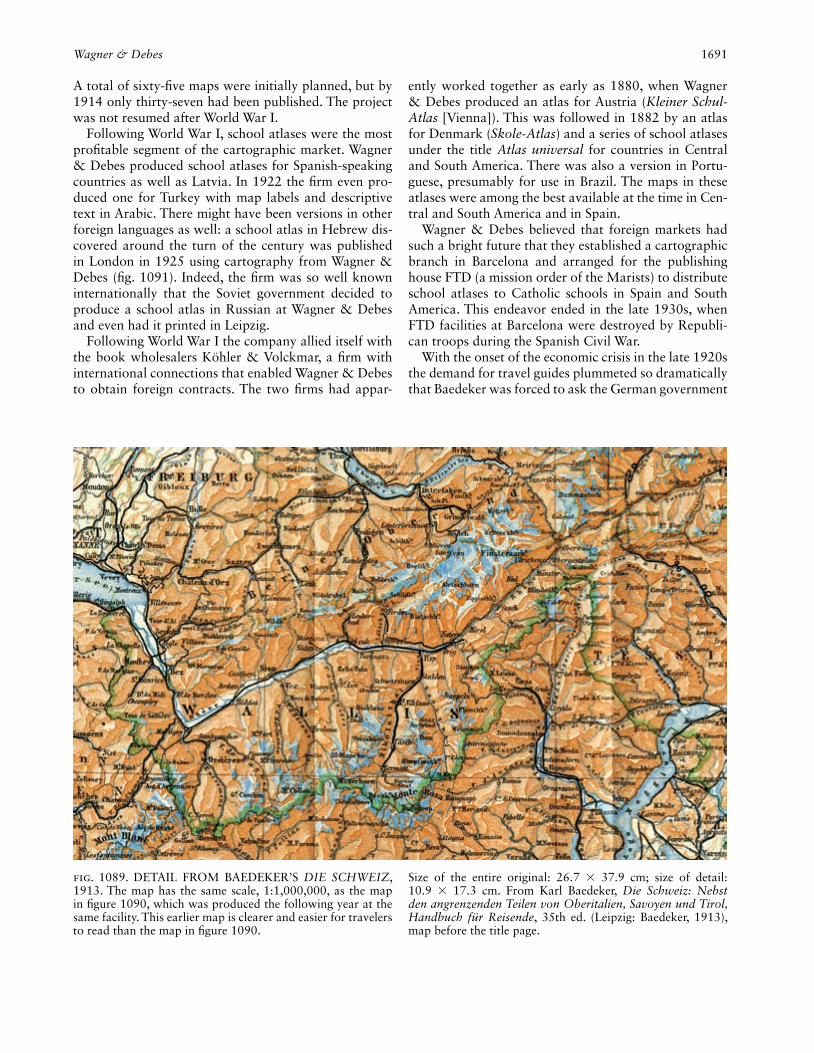
Fig. 1089. DETAIL FROM BAEDEKER’S DIE SCHWEIZ, 1913. The map has the same scale, 1:1,000,000, as the map in fi gure 1090, which was produced the following year at the same facility. This earlier map is clearer and easier for travelers to read than the map in fi gure 1090.
Size of the entire original: 26.7 × 37.9 cm; size of detail: 10.9 × 17.3 cm. From Karl Baedeker, Die Schweiz: Nebst den angrenzenden Teilen von Oberitalien, Savoyen und Tirol, Handbuch für Reisende, 35th ed. (Leipzig: Baedeker, 1913), map before the title page.
1692 Wagner & Debes
for fi nancial assistance—a dependence that eventually led to cooperation with the Nazi dictatorship. The maps produced under the Third Reich could not show any fa-cilities of military signifi cance nor could city maps iden-tify politically sensitive locations such as synagogues. Nevertheless, the maps were kept up to date. In 1938, for example, Baedeker published the fi rst automobile tour guide for Germany.
A similar fate befell the Debes Handatlas. Condi-tions had improved somewhat by 1935, when publisher Paul Oestergaard collaborated with Hans Fischer, a car-tographer trained by Debes, to produce a new version of Debes’s work. For marketing reasons the atlas was called the Columbus Weltatlas: E. Debes Großer Hand-atlas. In December 1943, the offi ces of Baedeker and Wagner & Debes were completely destroyed in an air raid. Because additional copies of the printing plates had accidentally been kept in Freiburg im Breisgau, those at-las plates survived intense Allied bombing during the fi nal months of World War II. Thus, the fi rm Columbus
Verlag was able to produce a new edition of Debes’s ref-erence atlas in 1950. Under the cartographic supervi-sion of Karlheinz Wagner, a fourth-generation Wagner, the atlas was repeatedly expanded and updated and was published until 1970. Following this, cartographer and publisher Kurt Mair absorbed the cartographic portion of Baedeker (but not Columbus Verlag, which was able to continue producing globes). In 1970 the long line of German reference atlases came to an end—a tradition begun ca.1800 in Weimar with the work of Adam Chris-tian Gaspari and Friedrich Justin Bertuch.
Jürgen Espenhorst
See also: Atlas: School Atlas; Marketing of Maps, MassBibliography:AtlasBase Project. Online database of atlases in the German language,
1800–1955. In public-private partnership, hosted by the Staatsbib-liothek zu Berlin. Administered by Robert Michel, Jürgen Espen-horst, and Markus Heinz.
Baumgarten, Peter H., and Monika I. Baumgarten. 1998. Baedeker: Ein Name wird zur Weltmarke. Ostfi ldern: Baedeker.
Espenhorst, Jürgen. 2003. Petermann’s Planet: A Guide to German
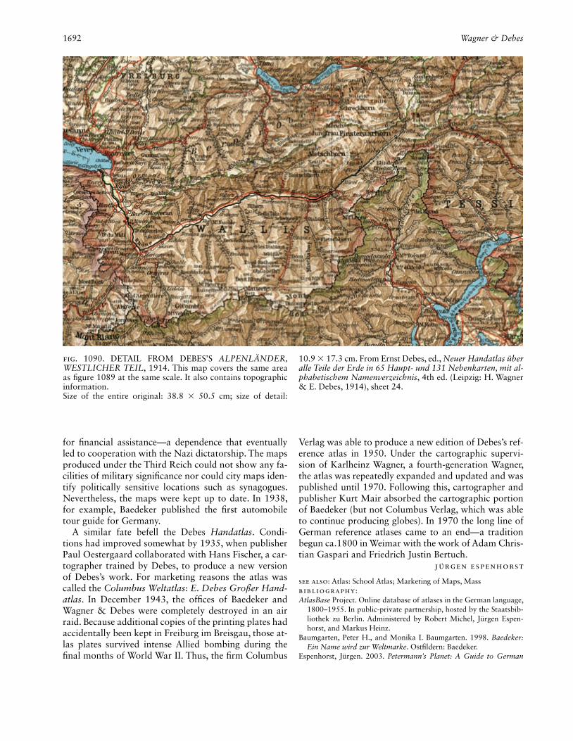
Fig. 1090. DETAIL FROM DEBES’S ALPENLÄNDER, WESTLICHER TEIL, 1914. This map covers the same area as fi gure 1089 at the same scale. It also contains topographic information.Size of the entire original: 38.8 × 50.5 cm; size of detail:
10.9 × 17.3 cm. From Ernst Debes, ed., Neuer Handatlas über alle Teile der Erde in 65 Haupt- und 131 Nebenkarten, mit al-phabetischem Namenverzeichnis, 4th ed. (Leipzig: H. Wagner & E. Debes, 1914), sheet 24.

Wall Map 1693
Handatlases and Their Siblings Throughout the World, 1800–1950, vol. 1, The Great Handatlases. Ed. and trans. George R. Crossman. Schwerte: Pangaea Verlag.
Hinrichsen, Alex W. 1991. Baedeker’s Reisehandbücher, 1832–1990; Bibliographie, 1832–1944; Verzeichnis 1948–1990. 2d ed. Bevern: Ursula Hinrichsen Verlag.
Lehn, Patrick. 2008. Deutschlandbilder, Historische Schulatlanten zwischen 1871 und 1990: Ein Handbuch. Cologne: Böhlau Verlag.
Wagner, Carl, Hans H. Bockwitz, and Kurt Krause. 1935. 100 Jahre H. Wagner & E. Debes, Darmstadt-Leipzig. Leipzig: Wagner & Debes.
Wall Map. Wall maps are large cartographic media meant to function as frontal and graphic means of com-munication and demonstration that can be seen from a greater distance (from about two to ten meters). There-fore, effective design and standardization have to take the long viewing range into account.
From the middle of the nineteenth century, school wall maps decisively shaped the worldview of great numbers of Europeans. During the twentieth century,
Fig. 1091. DETAIL FROM MAP OF EUROPE IN HEBREW SCHOOL ATLAS, 1925. The map, at a scale of 1:8 million, is drawn in an entirely different style, one that was primarily used in school atlases.Size of the entire original: 24.5 × 42.1 cm; size of detail:
15.4 × 16 cm. From Vladimir Jabotinsky and S. Pearlman, .sheets 20/21 ,(London: Hevrat “ha-Sefer,” 1925) (Atlas) אטלסImage courtesy of the American Geographical Society Library, University of Wisconsin–Milwaukee Libraries.

1694 Wall Map
they were predominantly used in geography and history lessons for which single maps and entire map series—often called wall atlases—were produced. Additionally, there existed offi ce wall maps that were used as work and information sources by companies, institutions, and organizations, as well as by police and military staffs.
Werner Stams (1988) distinguishes three phases in the development of the wall map: the early phase (from the beginnings until about 1880), the classical phase (from about 1880 until about 1960 or 1970), and the late phase (after 1970). The classical phase, spanning almost 100 years, proved most infl uential for the further devel-opment of wall maps during the twentieth century.
Around 1880, school wall maps had reached an ar-tistic and technical standard that largely fulfi lled the methodological and didactical prerequisites of lessons given at that time. As a basic artistic tendency, a widely standardized map picture designed for long-range effec-tiveness and on which contours were rendered in color had gained wide acceptance.
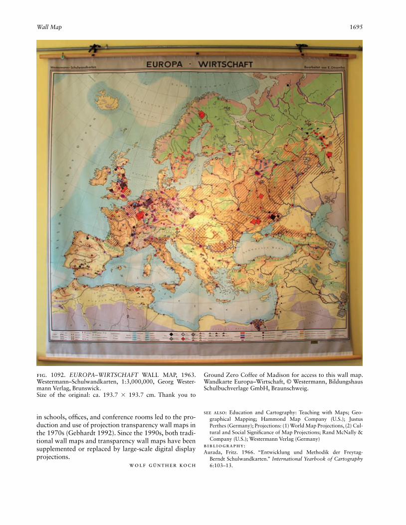
With regards to content, four main types of school wall maps had almost completely emerged by that time: (1) the physical or geographic general map containing the dominant hypsometric color scale, ranging from green (lowlands) to yellow and orange to brown or reddish brown (high mountains), rendered in violet in England, often combined with shadow hachure and/or oblique shading methods; (2) the political-administrative wall map (state map) with surface (or area) color and/or colored boundary bands; (3) historical wall maps, multi-layered with the basic map geared toward effective long-range viewing but graphically very plain; and (4) geo-scientifi c and socioeconomic thematic maps with partly abstract, partly pictographic map symbols (fi g. 1092) (Aurada 1966). In Switzerland, under the infl uence of Eduard Imhof, the design of physical wall maps took a different stylistical course with the use of relief shading, subtle coloring, and aerial perspective.
The range and scientifi c penetration of the great geo-graphical and historical wall map works of publishers Justus Perthes in Gotha, Georg Westermann in Bruns-wick, and Freytag & Berndt in Vienna were globally unparalleled and formative in the 1920s and 1930s. Ac-cording to Franz Köhler (1987), twenty-six publishing houses in Germany and Austria published wall maps in the 1930s. In Great Britain, the companies of W. & A. K. Johnston, and John Bartholomew & Son, both in Edinburgh, and G. Philip & Son in London dominated the area of wall map production from the beginning of the classical phase. In the United States, a series of physi-cal school wall maps and offi ce wall maps, some un-der the name of “Wall-Atlas,” were published from the end of the nineteenth century and increasingly since the beginning of the twentieth century. Rand McNally and
Denoyer-Geppert Science Company, both in Chicago, Hammond Map Company in New York, and also Stan-fords in London can be regarded as the most important publishers active during the entire classical phase. Since the 1930s, the National Geographic Society has also been publishing physical and thematic wall maps.
The scope and organization of classical wall map pro-duction in Germany and Austria changed after World War II. The reasons included the destruction of carto-graphic companies during the war, the resulting recon-struction following the war, and the political division of Germany. A publishing house established during war-time (1944) was Karl Wenschow GmbH in Munich.
The wall maps of the classical era can be formally divided into small-, medium-, and large-sized wall maps, in both landscape and portrait formats. At larger sizes, wall maps have to be printed in sections, four to six parts per map. They are then assembled to form the complete map and mounted on linen or another stable material.
Since the content of a wall map matches the content of a handheld map on a scale that is two to four times as large, map symbols and fonts have to be drawn about two to four times larger. Usually equal area or intermedi-ate map projections (the latter in world maps) were used, which ensured preservation of shape as well; the scales ranged between ca. 1:10,000 and ca. 1:15,000,000.
Lithographic printing, which was introduced in 1850, dominated wall map production at the beginning of the twentieth century. This printing process remained in use until the 1930s, when offset printing gradually replaced the older method.
School wall maps are used almost exclusively in class-rooms, serve the transfer of knowledge as well as the consolidation of learning material and the demonstra-tion of cartographic techniques, and are, furthermore, practical tools for examinations (Hüttermann 1991). Wall maps that are used in noneducational environ-ments, by information centers, exhibitions, offi ces, po-lice stations, and military staffs, for example, have been designed to be more interactive in the 1990s; in doing so, analog technologies have survived until today but have more frequently been supplanted by digital ones. This development has entered the educational sphere as well.
The late phase (since 1970) is characterized by new developments in map content, map design, and map use appearing alongside the highly developed classical types of wall maps that had been time-tested for more than one hundred years. Examples of innovation in-cluded landscape maps, satellite image maps, novel re-lief maps, small-format poster maps (single-sheet maps), and double maps (duo maps) (Hüttermann 1991). Ana-log and digital projection systems were most common. The ever-increasing prevalence of overhead projectors
Wall Map 1695
in schools, offi ces, and conference rooms led to the pro-duction and use of projection transparency wall maps in the 1970s (Gebhardt 1992). Since the 1990s, both tradi-tional wall maps and transparency wall maps have been supplemented or replaced by large-scale digital display projections.
Wolf Günther Koch
See also: Education and Cartography: Teaching with Maps; Geo-graphical Mapping; Hammond Map Company (U.S.); Justus Perthes (Germany); Projections: (1) World Map Projections, (2) Cul-tural and Social Signifi cance of Map Projections; Rand McNally & Company (U.S.); Westermann Verlag (Germany)
Bibliography:Aurada, Fritz. 1966. “Entwicklung und Methodik der Freytag-
Berndt Schulwandkarten.” International Yearbook of Cartography 6:103–13.
Fig. 1092. EUROPA–WIRTSCHAFT WALL MAP, 1963. Westermann–Schulwandkarten, 1:3,000,000, Georg Wester-mann Verlag, Brunswick.Size of the original: ca. 193.7 × 193.7 cm. Thank you to
Ground Zero Coffee of Madison for access to this wall map. Wandkarte Europa–Wirtschaft, © Westermann, Bildungshaus Schulbuchverlage GmbH, Braunschweig.
1696 Warfare and Cartography
Gebhardt, Frieder. 1992. “Gestaltungsgrundsätze von Wandkarten und Transparenten.” In Schulkartographie: Wiener Symposium, 1990, ed. Ferdinand Mayer, 242–51. Vienna: Institut für Geogra-phie der Universität Wien.
Hüttermann, Armin. 1991. “Die Renaissance der Wandkarte.” Geo-graphie und ihre Didaktik 18, no. 3:117–29.
Köhler, Franz. 1987. Gothaer Wege in Geographie und Kartographie. Gotha: VEB Hermann Haack.
Stams, Werner. 1988. “Die Entwicklung der Wandkartenproduktion deutschsprachiger Länder bis zum zweiten Weltkrieg.” In Leipzig als kartographisches Zentrum: Vorträge des wissenschaftlichen Kolloquiums aus Anlaß des 75 jährigen Bestehens der Deutschen Bücherei und ihrer Kartensammlung, ed. Joachim Dammhain and Marianne Stams, 52–73. Leipzig: Deutsche Bücherei.
Warfare and Cartography. The relationship between warfare and cartography was more intimate in the twen-tieth century than in any previous era. In previous cen-turies, armies had fought campaigns with few maps and little geographical knowledge, or even no maps. In the twentieth century, it was virtually inconceivable that a campaign could be waged in the absence of maps. At the same time, military requirements became a major factor behind many of the technical advances in cartography and the expansion of map coverage until, during the Cold War, complete world coverage at medium or small scale had been achieved. While it was the development of aerial survey, and later satellite imagery, that made the expansion of map coverage technically possible, it was without doubt military requirements that drove the process. Other advances in cartography, such as the development of digital technology for map production, were driven by economics rather than military neces-sity, although the military became a major benefi ciary of those developments.
Not all military cartography was innovative in ei-ther its form or its mode of production. A very large proportion of military mapping by all militaries simply involved the direct reproduction of either their own country’s mapping, usually with the addition of infor-mation or features specifi cally required by the military, or the copying of the mapping of their allies or enemies. In many cases the use of third-party mapping required nothing more than the addition of an appropriate mili-tary grid.
Fundamental to understanding the relationship be-tween warfare and cartography is acknowledging the role that secrecy played in this relationship. Many of the technical advances in cartography were driven by military requirements, but the need for secrecy meant that knowledge of those technical advances was re-stricted to a narrow group of people. During the Cold War whole programs were developed about which the outside world knew nothing. A notable example of this
was the Corona program (Cloud 2002). New types of maps were developed to meet specifi c requirements, but the maps themselves remained secret, at least until after the confl ict that created the need for them. The so-called Goings maps, developed by the British for operations in North Africa, are an example of a type of map with wide potential for civilian use but whose use was initially re-stricted to the military (see, e.g., fi gs. 542, 543, 583, and 936). The military was not always so concerned about secrecy. As geographer Gyula Pápay noted, there was a gradual easing of constraints on map publication during the nineteenth century, but this trend was reversed dur-ing the twentieth century, culminating in “the Eastern Bloc regressing in history by about 150 years” following the onset of the Cold War (Pápay 2006, 13).
The impact of warfare on cartography and the impact of cartography on warfare can, and probably should, be treated as separate subjects, and that is the intention here. By addressing fi rst the impact of warfare on car-tography, it is possible to separate the impact of warfare on the design and content of maps from the impact of technologies driven by or derived from the military.
In Europe the intimate relationship between national mapping and warfare was established during the nine-teenth century. Most national mapping agencies (NMAs) were branches of the army, and the standard medium-scale topographic map was frequently known as the General Staff Map. Over the course of the century, as many of these mapping agencies became civilian bodies, separate military mapping organizations frequently de-veloped in parallel. In South America most NMAs were of military origin, and many, such as in Chile, remained so at the end of the century. Countries like Australia, which started the century with only civilian mapping organizations, formed military mapping agencies in the course of the century.
Some of the impacts of warfare on cartography had their origins in the late nineteenth century. Sir John Charles Ardagh (1893), when serving with military intel-ligence in India, called for the adoption of a referencing scheme on maps. The system of “squares” was adopted on British mapping in the early twentieth century for the Third Series Ordnance Survey maps, although surveyor and geographer Charles Frederick Close (1905) made no mention of them, and Arthur R. Hinks (1913, 17) only referred to the desirability of such a system. The changing nature of warfare during World War I made a referencing system not only desirable but essential. All the major combatant nations adopted grid systems for their military maps by the end of the war. However, most countries had adopted a variety of grids for their mili-tary purposes, which meant that forces sometimes had to deal with operating in an area covered by more than one grid or at the junction of grids. For example, each
Warfare and Cartography 1697
German army area in France had its own grid, which caused problems when operations crossed army bound-aries. Overlapping grids or multiple grid boundaries was again a problem in World War II (Clough 1952, 582–83). In an attempt to overcome these diffi culties and to intro-duce a standardized approach, the U.S. Army introduced the Universal Transverse Mercator (UTM) grid in 1947. This quickly became the standard approach on postwar North Atlantic Treaty Organization (NATO) mapping, and its use was extended to civilian mapping well be-yond the members of NATO.
The spread of grids to civilian mapping was patchy and occurred over many years. In World War I map use was largely the preserve of offi cers or senior noncom-missioned offi cers—ordinary soldiers would have had little direct experience in map use. During World War II competence in map use became much more widespread throughout the armed forces, and the skills developed were taken by the service personnel back into their ci-vilian lives, thereby increasing civilian map use as well as increasing the understanding of maps in the general population. After World War II the use of grids on topo-graphic mapping became the norm, refl ecting their ac-ceptance by the wider population.
The listing of sources and authorities for the informa-tion on maps can be traced back to the sixteenth century and the work of cartographers such as Abraham Orte-lius; however, it was the work of August Petermann in the nineteenth century that revived this custom and the work of military cartographers, such as Francis Richard Maunsell, that brought it into the mainstream. In a simi-lar way, the use of reliability diagrams on maps was fi rst introduced for the Hispanic Map of America, published by the American Geographical Society, beginning in 1922 (see fi g. 993). The importance attached to know-ing the reliability and up-to-dateness of information on maps being used in military operations led to reliability diagrams being widely introduced on military maps in World War II. From this use the innovation spread to civilian mapping in the postwar era.
North points, also called compass roses, were a fa-miliar feature of maps from the sixteenth century, but they had largely disappeared from the maps produced by the national mapping agencies of the nineteenth cen-tury, even on maps produced for military use. The Brit-ish Ordnance Survey Third Series, originally designed for military use, reintroduced the use of a north point and also introduced magnetic declination. Continental armies were slower to introduce these features, but by the end of World War I most military maps were show-ing not only north points and magnetic declination but also grid deviation as well. From here the innovation spread to civil mapping. A similar trend can be seen with scale bars, which were only shown on the maps of a few
countries before the twentieth century but became ubiq-uitous over the course of the century.
Most nineteenth century topographic maps lacked the symbolization of features that required the use of a key to aid interpretation (some included a simple road clas-sifi cation). The increased use of symbols on maps, either to depict features previously not shown or in place of names or abbreviations, required the introduction of a key. The military drive to simplify the maps and to make them less cluttered and easier to read was exemplifi ed by the work of the Committee on the Military Map of the United Kingdom, which issued a report in 1892 that had a tremendous infl uence on the design of maps through-out the following century.
The impact on cartography of technologies driven by or derived from the military has been enormous. No-where has this been more important than in the fi elds of data capture and in the move to digital technologies for map production and reproduction or dissemination. Military effects on data capture predate World War I with the early developments in instrumental photo-grammetry by Eduard von Orel at the Militärgeogra-phisches Institut in Vienna and F. Vivian Thompson at the School of Military Engineering in Chatham (Collier 2002, 158). Although both instruments were of limited practical value as they were used only with terrestrial photographs, they demonstrated the possibility of instru-mental photogrammetry as an effective replacement for costly land surveys. Before the outbreak of World War I no country, with the notable exception of Canada and its surveyor general, Édouard Deville, had shown much interest in photogrammetry. The experience gained dur-ing the war, especially in the use of aerial photography, contributed to widespread interest in its use after the war. It is not always possible to identify a direct relation-ship between wartime experience and the application of photogrammetry after the war, but in India that rela-tionship was clear (Lewis and Salmond 1920).
In the interwar period the military control of many NMAs ensured that the military was fully involved in all the latest developments in aerial photography and pho-togrammetry, even if much of the actual development work was carried out within civilian companies, such as Zeiss or Nistri. In Britain the development of air survey methods was very fi rmly under military control via the Air Survey Committee (Collier 2006); in France, Georges Poivilliers developed his family of instruments directly for the Service géographique de l’armée (France, Service géographique de l’armée 1938). The United States and Canada were unusual in developing the use of air survey methods in a largely civilian environment.
The nature of warfare during World War II, with mo-bile actions across vast areas of Eastern Europe, North Africa, and Western Europe; large-scale amphibious

1698 Warfare and Cartography
operations across the Western and South Western Pa-cifi c; and major bombing campaigns in Europe and Asia, meant that photogrammetrically derived or revised maps became an essential tool in military operations. While there were no major innovations in mapping during the war, there were plans to introduce radar-controlled photographic missions over Southeast Asia in the latter stages of the war, rendered unnecessary only by the sud-den end of the war following the nuclear bomb attacks on Japan. The system developed to control photographic missions was subsequently developed into the Decca Navigator, which was widely used as a navigational aid in the pre–Global Positioning System (GPS) era. Radar was also the subject of major technical advances during the war, in particular the British development of radar bomb-aiming equipment (H2S), a forerunner of the im-aging radars of the postwar era.
The need for mapping on an unprecedented scale led to the adoption of many new techniques in drafting and reproduction. These techniques were subsequently to play a major role in postwar cartography. New materi-als were developed to cope with the needs of the military to reproduce maps under adverse conditions or more quickly than with traditional methods. An example of this was the rapid introduction of acetate or vinyl draft-ing fi lms during World War II.
Arguably the most important contributions to car-tography of World War II were the major expansion of the area of the earth covered by accurate mapping and the large increase in the numbers of personnel trained in mapping. While many trained personnel returned from the war to noncartographic careers, many others stayed on to staff the greatly expanded civilian mapping agencies. In the United States, Canada, and Australia, through their work in national and local government agencies as well as in the private sector, and in Great Britain, through the Directorate of Overseas Surveys, these staffers helped increase map coverage of previ-ously unmapped or poorly mapped areas.
As the world moved almost seamlessly from World War II into the Cold War the need for mapping at a global scale, rather than diminishing as it had after World War I, saw an increase. The global scale of this new kind of war meant that the major powers had to invest heavily in mapping territories to which they had little or no access. In part this was achieved by obtaining and copying whatever maps could be obtained of the op-ponent’s territory. The more open mapping programs of the Western Allies meant that the Soviet Bloc had good access to their mapping. The Soviet Bloc regarded all its mapping as secret and did not make it available even to its own citizens. This made access to the material by the Western mapping agencies very diffi cult. Of necessity the West was forced to develop imaging technologies
that would allow maps to be made. Initially, attention was focused on oblique photography from high-fl ying airplanes, and later on photography from airplanes, such as the U-2, which could fl y beyond the altitude of interceptors or antiaircraft missiles. By the late 1950s, however, it was clear that manned airplanes were too vulnerable and potentially politically embarrassing. At-tention then focused on the use of satellite imagery for image intelligence gathering and mapping.
The use of satellite imagery, initially in photographic form, created its own problems. The most well known of these programs was Corona, itself part of a larger pro-gram called Keyhole (Cloud 2002, 267). However, due to the sensitive nature of these mapping programs, very little was published for the public, and consequently they had little direct infl uence on wider mapping programs.
In addition to an interest in new imaging techniques, military mapping agencies also became interested in new methods of compilation and data extraction from imagery. Civilian instrument manufacturers took the lead in the development of analog instruments, which were widely used within military mapping agencies, but the military was quick to appreciate the potential of computer-based methods of data collection. The work of Gilbert L. Hobrough (1959) in Canada showed the potential of image correlation techniques, and analytical aerial triangulation was an early area to benefi t from the use of digital computers. The U.S. Army’s Universal Automatic Map Compilation Equipment (UNAMACE) was the fi rst system to use image correlation extensively for the production of orthophotographs, contours, and digital terrain models (Dowman 1977). The cost of the computing power necessary to run image correlation systems made the approach unattractive to commercial companies, and even NMAs, until the 1990s. The use of photomaps had been proposed just after World War I, but not actively pursued until World War II, when the United States, German, and Italian armies all made use of them for rapid mapping. After the war they were used in Britain and elsewhere, but with limited success. The U.S. Army’s extensive use of photomapping during the Vietnam War and experiments with the generation of al-ternative cartographic products, such as pictoline map-ping (United States, Army Corps of Engineers 1963), helped to establish photomaps as a practical alternative to line maps.
The General Staff Map, the standard map in use by European armies at the start of the century, was usually a medium-scale hachured monochrome map, although Russia and Great Britain had started to introduce color and contours. Some early forms of air navigation maps had been produced in the years leading up to the out-break of war, such as the 1:200,000 Fliegerkarte issued in 1913 by the Prussians for use by the army. Typically
Warfare and Cartography 1699
these early maps were simply topographic maps en-hanced by adding the locations of landing fi elds. The readily apparent inadequacy of these simple maps led to a number of experimental designs, including perspective maps of Flanders produced for the British Royal Flying Corps. On the Western Front the need to keep front-line troops supplied led to the development of transport planning maps, and the need for potable water near the front line led to hydrogeological mapping (Rose 2009). There was also the growing recognition of the need for a wide range of map scales to support planning at stra-tegic and tactical levels as well as for combat.
The experience of artillery warfare in World War I clearly demonstrated the need for map accuracy. During the initial phases of the war, fi eld artillery pieces were deployed in the open against visible targets. This meant that the artillery pieces and their crews were vulnerable to both small-arms and counter-battery fi re. Once po-sitional warfare commenced, the artillery increasingly needed to operate from concealed locations against tar-gets visible only to forward observers on the ground or in airplanes. Ranging shots were used to engage targets, the aim adjusted under the direction of the observers, but the ranging shots would alert the enemy to the im-pending attack. To retain the element of surprise, predic-tive fi re was introduced, requiring accurate positioning of both the artillery pieces and the targets. Shells could then be fi red accurately at an invisible target without the need for ranging shots (Chasseaud 1999). Ultimately, it was the need for accurate locations that drove the ac-curacy standards of NATO mapping and, hence, most civilian mapping in Western Europe. A similar need in-formed the development of mapping in the Soviet Bloc.
During the interwar years there were a number of de-velopments in air maps to support the increasing civil uses of airplanes for mail and passenger services. Strip maps were developed covering the routes to be followed by regular fl ights, but the maps remained essentially topographic maps with some additional information, such as the locations of landing strips and radio bea-cons. During World War II several new map types were developed to support air operations. Some night fl ying maps had been developed before the war, but as both the British and Germans increasingly came to rely on night operations to reduce losses from day fi ghters, bet-ter maps for night fl ying became essential. However, the best maps could not ensure that airplanes would reach their targets in the absence of other aids, such as the German Knickebein radio navigation system, which was used to direct night bombing of Britain in 1940 (Jones 1978, 134–50). The British developed Gee, a pulse beam system that required a standard topographic air map to be overprinted with a grid system of hyperbolic curves related to transmitting stations (Clough 1952, 475).
Gee, with a range of about 400 miles, was subsequently developed into the Loran (long-range navigation) sys-tem, which initially enabled navigation over distances up to 1,200 miles.
Paper maps were suitable for use in multicrewed air-planes, which frequently carried a navigator, but were less suitable for use in the confi ned cockpits of single-seat airplanes. Fighters, which could be vectored onto targets and used airborne radars, had little need of maps, but pilots of ground attack airplanes needed maps to fi nd their targets. The solution was to develop moving map displays, the forerunners of the satellite navigation systems that were being adopted for use in automobiles toward the end of the century (Steele 1998, 213–14). The early versions, such as the Ferranti model, used ana-log technologies based on map images on fi lm or paper strips and an inertial navigation or Doppler system that maintained the aircraft’s position in the middle of the display. A similar system, the Decca Flight Log, had al-ready been fi tted to some civilian airplanes, but its use was limited. Developments in digital map technology led to the replacement of hard copy images by raster displays, and the development of GPS led to the replace-ment of inertial navigation and Doppler systems.
Military mapping agencies were near the forefront of developments in digital techniques for map production. However, these developments were largely driven by a desire to make map production and revision cheaper and less dependent on the drawing skills of cartographic staff rather than driven by a perceived military requirement.
Arguably the greatest positive cartographic legacy of warfare lies in the numbers of people either exposed to maps as users or trained in their making. Not all inno-vations introduced to meet military requirements had spin-offs into civil applications, and most innovations that had clear civil applications would probably have happened without intervention by the military. Even so, the level of funding available to the military, unmatched in the civilian sphere, led to those innovations being in-troduced more quickly than would otherwise have been the case. For some, it was an uncomfortable fact that by the end of the century many, if not most, of the technol-ogies used in cartography had their origins in military applications.
Peter Collier
See also: Conformality; Cruise Missile; Geodesy: Geodesy and Mili-tary Planning; Military Mapping by Major Powers; Military Map-ping of Geographic Areas; Photogrammetric Mapping: Military Photogrammetry as a Precursor of Remote Sensing; Projections: Projections Used for Military Grids; Viewshed Mapping; World War I; World War II
Bibliography:Ardagh, John Charles. 1893. Printed letter to the Royal Geographical
Society from Government House, Calcutta, India. London, Royal Geographical Society Archives.
1700 Warntz, William
Chasseaud, Peter. 1999. Artillery’s Astrologers: A History of British Survey & Mapping on the Western Front, 1914–1918. Lewes: Map-books.
Close, Charles Frederick. 1905. Text Book of Topographical and Geo-graphical Surveying. London: His Majesty’s Stationery Offi ce.
Cloud, John. 2002. “American Cartographic Transformations during the Cold War.” Cartography and Geographic Information Science 29:261–82.
Clough, A. B., comp. 1952. Maps and Survey. London: War Offi ce.Collier, Peter. 2002. “The Impact on Topographic Mapping of Devel-
opments in Land and Air Survey: 1900–1939.” Cartography and Geographic Information Science 29:155–74.
———. 2006. “The Work of the British Government’s Air Survey Committee and Its Impact on Mapping in the Second World War.” Photogrammetric Record 21:100–109.
Dowman, Ian J. 1977. “Developments in On Line Techniques for Photogrammetry and Digital Mapping.” Photogrammetric Record 9:41–54.
France. Service géographique de l’armée. 1938. Le Service géographique de l’armée: Son histoire, son organization, ses travaux. Paris: Im-primerie du Service Géographique de l’Armée.
Hinks, Arthur R. 1913. Maps and Survey. Cambridge: University Press.Hobrough, Gilbert L. 1959. “Automatic Stereo Plotting.” Photogram-
metric Engineering 25:763–69.Jones, R. V. 1978. Most Secret War. London: Hamilton.Lewis, C. G., and H. G. Salmond. 1920. Experiments in Aeroplane
Photo Surveying. Dehra Dun: Printed at the Offi ce of the Trigono-metrical Survey.
Pápay, Gyula. 2006. “Politics and Cartography.” In State Security and Mapping in the GDR: Map Falsifi cation as a Consequence of Ex-cessive Secrecy? ed. Dagmar Unverhau, trans. Eubylon Berlin, 1–13. Berlin: Lit.
Rose, Edward P. F. 2009. “Water Supply Maps for the Western Front (Belgium and Northern France) Developed by British, German and American Military Geologists during World War I: Pioneering Stud-ies in Hydrogeology from Trench Warfare.” Cartographic Journal 46:76–103.
Steele, Philip. 1998. “History of Air Maps and Charts.” Journal of Navigation 51:203–15.
United States. Army Corps of Engineers. 1963. Map Substitute Prod-ucts Presented at SHAPE Geographic Conference. Washington, D.C.: The Corps. Also presented at the Fourth United Nations Re-gional Cartographic Conference for Asia and the Far East, 21 No-vember–5 December, 1964.
Warntz, William. William Warntz was an early pio-neer in the use of computers in cartography and in the study of the mathematical properties of surfaces as ap-plied to geographical analysis. His research concentrated on the use of mathematics to probe, in ways unique for the time, the spatial representation of phenomena, and he can be counted as one of the early founders of the so-called quantitative revolution in geography.
Warntz was born on 10 October 1922 in Berwick, Pennsylvania, near Harrisburg. During World War II, he served in the U.S. Air Force and attended the Aviation Cadet College Training Detachment at Albion College in Michigan. He became a highly decorated navigator. After recuperating from a war injury in Cambridge, En-gland, he returned to the United States and completed
his undergraduate degree in 1949, followed by gradu-ate work and the PhD in 1955, all in economics at the University of Pennsylvania. Between 1956 and 1966 he worked for the American Geographical Society and Princeton University, among other academic institutions (Janelle 1997, 723–24).
Warntz’s most important research began in 1966, when he became professor of theoretical geography and regional planning at Harvard University’s Graduate School of Design, working under Howard T. Fisher, who designed SYMAP, one of the fi rst computer mapping pro-grams. Warntz’s work during this period concentrated on the application of the mathematical and topological properties of surfaces to geographical problems (Steinitz 1970). He was appointed director of the Laboratory for Computer Graphics at Harvard in 1968, and appended “and Spatial Analysis” to its name to refl ect his interest in the application of computers to geographical and car-tographic problems.
His tenure as director of the Harvard Laboratory co-incided with one of the most revolutionary periods in the history of cartography and geography. The development of new mathematical and computational techniques, as well as the computers and graphical displays that ac-companied them, all changed the science of geography and cartography in radical ways (Hessler 2009). Warntz, who was at the forefront of some of these changes, at-tracted a number of young mathematicians, geographers, and regional planners to the lab, where they worked on a diverse range subjects not necessarily typical of geo-graphic research at the time. The lab worked on a large group of theoretical problems such as the Sandwich theorem, the morphologies and mathematics of branch-ing systems, and other topics that could be subjected to computer and graphical analysis. All of these projects refl ected his belief in the ability of computers to vastly increase the power of geographical and spatial analysis as applied to thematic cartography (fi g. 1093).
From 1966 to 1971 Warntz edited the Harvard Papers in Theoretical Geography, an infl uential series of mono-graphs. The articles and papers in the series refl ect the mathematical bent of the laboratory by offering up stud-ies on topological theorems, fi eld and potential theory, and map projections (Chrisman 2006, 59). The stress on applications of new types of mathematics to geographi-cal problems and cartography is plain throughout all of these papers and shows how Warntz envisioned its future, “Theoretical geography is a science of earth loca-tion and spatial relations. It describes, classifi es, and pre-dicts locations in the spatial sense. Cartographics stands to geographical science as graphics does to science gen-erally. Mapping is a general mathematical concept in the theory of sets” (Warntz in Selkowitz 1968, ii).
After leaving the Harvard Laboratory in 1971, Warntz became chair of the Department of Geography at the

Wax Engraving 1701
University of Western Ontario, where he continued his mathematical work on the foundations of computer cartography and founded the Macrogeographic Systems Research Workshop, which concentrated on studying global patterns of change and fl ow in physical and eco-nomic geography. He died on 29 May 1988.
John W. Hessler
See also: Centrography; Electronic Cartography: Intellectual Move-ments in Electronic Cartography; Harvard Laboratory for Com-puter Graphics and Spatial Analysis (U.S.); Mathematics and Car-tography; Planning, Urban and Regional; Statistical Map; Statistics and Cartography; SYMAP (software)
Bibliography:Chrisman, Nicholas R. 2006. Charting the Unknown: How Computer
Mapping at Harvard Became GIS. Redlands: ESRI Press.Hessler, John W. 2009. “How to Map a Sandwich: Surfaces, Topo-
logical Existence Theorems and the Changing Nature of Modern Thematic Cartography, 1966–1972.” Coordinates: Online Journal of the Map and Geography Round Table, American Library Asso-ciation, series A, no. 7.
Janelle, Donald G. 1997. “In Memoriam: William Warntz (1922–1988).” Annals of the Association of American Geographers 87:723–31.
Selkowitz, Stephen E. 1968. “Geography and an Existence Theorem: A Cartographic Computer Solution to the Localization on a Sphere of Sets of Equal-Valued Antipodal Points for Two Continuous Dis-tributions with Practical Applications to the Real Earth.” Preface by William Warntz. Harvard Papers in Theoretical Geography 21.
Steinitz, Carl, ed. 1970. Selected Projects: Harvard Laboratory for Computer Graphics and Spatial Analysis. Cambridge: Harvard Laboratory for Computer Graphics.
Wax Engraving. Invented separately in America (1830s) and England (1840s), wax engraving was soon employed in both countries for printing maps. It became the favored technique of American commercial map and atlas pub-lishing from 1870 to 1930 but remained less popular in Europe.
Wax engraving was also called the wax process, ce-rography, glyphography, electrographic printing, electro-tinting, typographic etching, and relief line engraving. It involved image creation by incising lines in a superfi cial
Fig. 1093. WILLIAM WARNTZ’S THREE-DIMENSIONAL SURFACE MODEL OF U.S. POPULATION, CA. 1960.Image courtesy of the Division of Rare and Manuscript Col-
lections, Cornell University Library, Ithaca (William Warntz Papers, #4392, Box 20, slide 88).

1702 Wax Engraving
wax layer on a supporting metal plate and electroplating the wax image to create a metal shell that was separated and fi lled with metal. The resulting relief (raised) print-ing block could be printed with type in large press runs, an advantage over copper engraving and lithography (fi g. 1094). By 1900 wax engravers were also stamping typeset place-names into the wax, fi lling areas with ma-chine-ruled area patterns, and printing maps in bright colors (Woodward 1977, 27–28). Photography was also adopted but only to put guide images onto wax for the engraver. Despite some mechanization, wax engraving remained a craft requiring much skilled handwork.
Wax engraving was widespread in early twentieth-century America, and the large fi rms using it developed in major cities. Rand McNally, Poole Brothers, and G. F. Cram made Chicago a center for cartographic wax en-graving. Rand McNally, which began wax engraving railroad maps in 1872, developed into a leading road map and atlas publisher (fi g. 1095). Firms that published their own maps became better known than fi rms such as Matthews-Northrup of Buffalo, which wax-engraved maps for other publishers (Woodward 1977, 36–38).
After a promising start in England, wax engraving failed to establish a similar place in mapmaking there. A preference for hand lettering, smaller press runs, and lower wages gave copper engraving and lithogra-phy more staying power in England and Europe. For example, Emery Walker, who had apprenticed at the Dawson brothers’ Typographic Etching Company, made wax-engraved maps for the 11th edition of the Encyclo-paedia Britannica (1910–11) (Woodward 1977, 43–47). Printed in black and crowded with place-names, Walk-er’s wax-engraved maps appear commonplace next to the same edition’s deluxe, multicolor map plates printed lithographically by Justus Perthes of Gotha, Germany.
Even in America, the cheaper and more versatile tech-nology of photolithography (invented in 1860) and off-set lithographic printing (invented in 1904) began to at-tract map business away from wax engraving after 1900. Heavily invested in wax engraving stock and equipment, Rand McNally resisted longest but also abandoned wax engraving by 1950 (Woodward 1977, 40–41). Never-theless, the dense place-names typical of wax-engraved maps persisted on American maps and atlases into the photolithographic era, refl ecting their lingering infl uence on cartographic taste.
Karen Severud Cook
See also: Railroad Map; Rand McNally & Company (U.S.); Repro-duction of Maps: Engraving
Bibliography:Hackleman, Charles W. 1924. Commercial Engraving and Printing:
A Manual of Practical Instruction and Reference Covering Com-mercial Illustrating and Printing by All Processes for Advertising Managers, Printers, Engravers, Lithographers, Paper Men, Pho-tographers, Commercial Artists, Salesmen, Instructors, Students
Fig. 1094. THE STEPS IN WAX ENGRAVING, 1924. The process begins with the preliminary drawing photographed onto the wax surface to serve as an accurate guide image for the engraver; the rest of the steps are nonphotographic.From Hackleman 1924, 377–79.
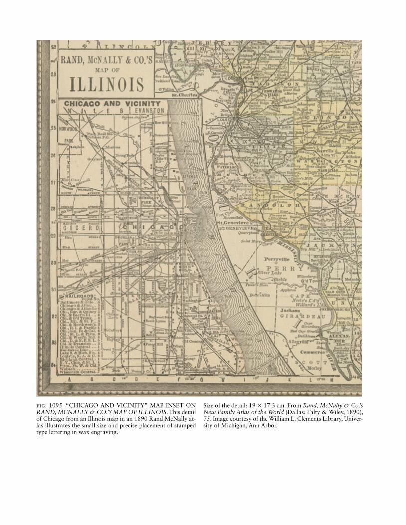
Fig. 1095. “CHICAGO AND VICINITY” MAP INSET ON RAND, MCNALLY & CO.’S MAP OF ILLINOIS. This detail of Chicago from an Illinois map in an 1890 Rand McNally at-las illustrates the small size and precise placement of stamped type lettering in wax engraving.
Size of the detail: 19 × 17.3 cm. From Rand, McNally & Co.’s New Family Atlas of the World (Dallas: Talty & Wiley, 1890), 75. Image courtesy of the William L. Clements Library, Univer-sity of Michigan, Ann Arbor.

1704 Wayfi nding and Travel Maps
and All Others Interested in These and Allied Trades. 2d printing, rev. Indianapolis: Commercial Engraving.
Harris, Elizabeth M. 1968–70. “Experimental Graphic Processes in England, 1800–1859.” Journal of the Printing Historical Society 4:33–86, 5:41–80, 6:53–89.
———. 1975. “Miscellaneous Map Printing Processes in the Nine-teenth Century.” In Five Centuries of Map Printing, ed. David Woodward, 113–36. Chicago: University of Chicago Press.
Woodward, David. 1977. The All-American Map: Wax Engraving and Its Infl uence on Cartography. Chicago: University of Chicago Press.
Wayfi nding and Travel Maps.Campus MapCyclist MapEscape and Evasion MapHiking and Trail MapIndexed Street MapIn-Vehicle Navigation SystemMobility MapOrientation MapPublic Transportation MapRoad AtlasRoad SymbolsWeb-Based WayfindingWheelchair Access Map
Campus Map. Maps describing the confi guration of buildings, roads, and paths on college and university campuses, offi ce parks, large industrial sites, cemeter-ies, national historic sites, and similar grounds were produced throughout the twentieth century in myriad forms, including three-dimensional perspective views. The most common theme was the academic complex, fl ooded yearly by new map users with schedules requir-ing them to be at specifi c locations at designated times. The maps were often produced internally, by adminis-trative units responsible for facilities planning or by aca-demic departments in the mapping sciences, particularly those with professional staff and dedicated cartographic or geographic information system (GIS) laboratories.
As artifacts useful for historical research, campus maps can be found in institutional archives. In the years after 1990 many of these documents were electronically scanned and made accessible via the Internet. By the end of the century in both North America and Europe, Inter-net sites featuring interactive campus maps had become part of colleges’ efforts to recruit students. During a vir-tual visit, prospective students and their parents could zoom in to individual buildings as well as view realistic three-dimensional models and overhead and terrestrial photographs.
Campus maps served diverse functions. Although loca-tion and navigation were the most prominent, other uses
were important. General-purpose campus maps were of-ten supplemented by modifi ed or distinctly different ver-sions delineating parking regulations for permit holders, access accommodations for disabled students or visitors, shuttle bus routes, and specifi c directions for persons at-tending graduations, reunions, sporting events, or con-certs. Special campus maps promoted safety and crime prevention as well as master planning and fund raising. Smaller versions were included in catalogs and other publications, and rolled or folded versions often served as souvenirs.
Since campuses are often located in urban areas crossed by city streets, the maps often contained infor-mation common to urban maps of the vicinity. A campus map and its urban counterpart were often complemen-tary, and sometimes interchangeable. Because campus streets did not always extend beyond the campus or fol-low the patterns of surrounding streets, campus maps commonly included smaller-scale inset maps that related the campus to the surrounding area. Street and walk-way signage that supplemented the maps occasionally included large, permanent orientation maps relating the viewer’s position to buildings in the vicinity or the cam-pus as a whole.
In addition to campus maps, twentieth-century grounds maps were produced for zoological parks, theme parks, fairs, resorts, estates, neighborhoods, shop-ping malls, and businesses (fi g. 1096). Leisure time and tourism increased throughout the century, and as exist-ing tourist attractions were expanded and new venues developed, new maps were produced as advertisements as well as navigation aids.
In their perspectives, twentieth-century campus maps generally were either planimetric (that is, showing the facility from directly overhead) or oblique. Some maps combined these two perspectives in a pseudo-oblique perspective. On these maps, buildings (and occasionally other features) were shown at an oblique angle on a pla-nimetric map of streets and other nonelevated features. In contrast to planimetric maps, which used fl at, two-dimensional footprints to represent a building’s shape and relative size, oblique and pseudo-oblique maps used three-dimensional pictorial symbols—highly general-ized on some maps but decidedly realistic on others—to highlight a building’s relative height or unique profi le.
Two- and three-dimensional perspectives were roughly equal in prominence throughout the century. Two-dimensional versions refl ect the evolution of aca-demic landscapes, most notably the increased size of the typical campus and the proliferation of parking facilities as well as stylistic changes arising from drawing media, printing methods, and typography. By contrast, three-dimensional campus maps refl ect marked changes in de-sign and aesthetics. During the early part of the century,

Wayfi nding and Travel Maps 1705
bird’s-eye views were primarily created by skilled artists and illustrators using traditional instruments, whereas in the latter part of the century, three-dimensional maps and models were typically created with software tools that included computer-aided design (CAD), GIS, 3-D visualization, modeling, and illustration programs, often used in combination.
The accuracy of campus maps varied from geometri-cally precise to broadly illustrative. Maps based on aerial photography, engineering drawings, and late-century CAD, GIS, and 3-D modeling software tended to be more geometrically accurate than maps crafted by artistic illus-trators, who varied greatly in their pursuit of realism.
As with other aspects of twentieth-century cartog-raphy, electronic technology and computer software greatly infl uenced campus maps in both appearance and dissemination. For roughly the fi rst eight or nine decades of the century they were primarily the work of engineering, cartographic, and artistic specialists. But by
the end of the century, when online mapping tools and resources were widely available, the process of campus mapping as well as the maps themselves had become sig-nifi cantly more interactive (fi g. 1097). Their goal was a virtual visit that not only oriented viewers to the physi-cal layout of the campus but also advertised the oppor-tunities therein.
Joseph W. Stoll
See also: Travel, Tourism, and Place MarketingBibliography:Davis, Bruce Ellsworth. 2001. GIS: A Visual Approach. 2d ed. Albany:
OnWord Press, Thompson Learning.Fabrikant, Sara Irina. 2003. “Commentary on ‘A History of
Twentieth-Century American Academic Cartography’ by Robert McMaster and Susanna McMaster.” Cartography and Geographic Information Science 30:81–84.
Freundschuh, Scott. [2009]. “Using 2D and 3D Campus Maps for Navigation and Location.” Unpublished paper.
Lo, C. P. 1973. “Cartographic Presentation of Three-Dimensional Ur-ban Information.” Cartographic Journal 10:77–84.
Fig. 1096. PLAN OF GENERAL ELECTRIC COMPANY’S SCHENECTADY WORKS, 1904. From The Schenectady Electrical Handbook: Being a Guide for Visitors from Abroad Attending the International Electrical Congress, St. Louis, Mo., September, 1904 (Schenectady, 1904), between 10 and 11.
Size of the original: 13.1 × 19.7 cm. Image courtesy of the Schenectady Digital History Archive, Schenectady County Public Library.

1706 Wayfi nding and Travel Maps
Patterson, Tom. 2005. “Looking Closer: A Guide to Making Bird’s-eye Views of National Park Service Cultural and Historical Sites.” Cartographic Perspectives 52:59–75.
Cyclist Map. Bicycle usage increased very rapidly af-ter 1885, mainly due to the development of the Starley safety bicycle and the Dunlop pneumatic bicycle tire. Cyclists now could ride much longer distances, but they had to plan and navigate their routes by themselves, un-like travelers going by mail coach or train. Therefore, maps had to show a variety of landmarks and other topographical details, and scales typically had to be at least 1:200,000 to 1:300,000—larger than most travel maps. Special information required by cyclists included distances, road conditions, and gradients. Because ap-propriate base maps were not available everywhere, cy-clist organizations had to create them. Detailed studies from various countries provide many examples of late nineteenth- and early twentieth-century cyclist maps (Dando 2007; Lierz 1989, 1990a, 1990b; Nicholson 1983, 2004, 2006).
Gradient, which was exceptionally diffi cult to depict
on cyclist maps, invited a wide variety of tentative solu-tions. In addition to general relief representation meth-ods such as contour layering (hypsometric coloring), hachuring, or relief shading, most maps delineated slope along routes with arrows, which initially did not always point uphill, as was common later; many early cyclist maps used arrows pointing downhill or identifi ed dan-gerous hills with warning labels or conventional signs such as a red bar across the road. Before the invention of the freewheel, which allowed coasting, riding downhill was dangerous because of rotating pedals, and effective brake systems were not available before 1900.
Special maps were developed to represent slope. Strip maps that focused on a specifi c route across a road net-work often included an elevation profi le parallel to the highlighted route. Robert Mittelbach’s Deutsche Stras-senprofi lkarte für Radfahrer (85 sheets, 1890–97) re-placed the conventional map by showing roads between locations with a sophisticated arrangement of elevation profi les (fi gs. 1098 and 1099). Using a profi le rather than a plan view, this unusual map included all places,
Fig. 1097. SYRACUSE UNIVERSITY CAMPUS MAPS, 1928 AND 1995.
Image courtesy of Joseph W. Stoll. Permission courtesy of Syra-cuse University Archives.
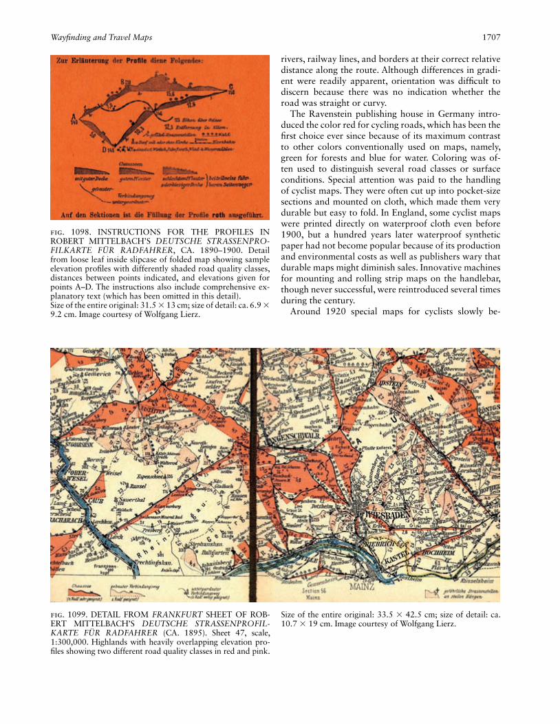
Wayfi nding and Travel Maps 1707
rivers, railway lines, and borders at their correct relative distance along the route. Although differences in gradi-ent were readily apparent, orientation was diffi cult to discern because there was no indication whether the road was straight or curvy.
The Ravenstein publishing house in Germany intro-duced the color red for cycling roads, which has been the fi rst choice ever since because of its maximum contrast to other colors conventionally used on maps, namely, green for forests and blue for water. Coloring was of-ten used to distinguish several road classes or surface conditions. Special attention was paid to the handling of cyclist maps. They were often cut up into pocket-size sections and mounted on cloth, which made them very durable but easy to fold. In England, some cyclist maps were printed directly on waterproof cloth even before 1900, but a hundred years later waterproof synthetic paper had not become popular because of its production and environmental costs as well as publishers wary that durable maps might diminish sales. Innovative machines for mounting and rolling strip maps on the handlebar, though never successful, were reintroduced several times during the century.
Around 1920 special maps for cyclists slowly be-
Fig. 1098. INSTRUCTIONS FOR THE PROFILES IN ROBERT MITTELBACH’S DEUTSCHE STRASSENPRO-FILKARTE FÜR RADFAHRER, CA. 1890–1900. Detail from loose leaf inside slipcase of folded map showing sample elevation profi les with differently shaded road quality classes, distances between points indicated, and elevations given for points A–D. The instructions also include comprehensive ex-planatory text (which has been omitted in this detail).Size of the entire original: 31.5 × 13 cm; size of detail: ca. 6.9 × 9.2 cm. Image courtesy of Wolfgang Lierz.
Fig. 1099. DETAIL FROM FRANKFURT SHEET OF ROB-ERT MITTELBACH’S DEUTSCHE STRASSENPROFIL-KARTE FÜR RADFAHRER (CA. 1895). Sheet 47, scale, 1:300,000. Highlands with heavily overlapping elevation pro-fi les showing two different road quality classes in red and pink.
Size of the entire original: 33.5 × 42.5 cm; size of detail: ca. 10.7 × 19 cm. Image courtesy of Wolfgang Lierz.


Wayfi nding and Travel Maps 1709
gan to disappear as maps serving motorists, emerging around 1900, became more prominent. In the 1980s, af-ter more than half a century, maps designed for cyclists became popular once again in many countries, with a particular focus on roads not yet overcrowded with cars. Special information and symbolization strategies relevant to cyclists were included, and standardization was attempted as well (Lierz 1989, 1993; Oliver 2001). Various maps produced by cyclist organizations, offi cial authorities, and commercial map publishers repeated a few older conceptual failures but also introduced some completely new and successful approaches to map use (fi g. 1100).
In the last decades of the twentieth century, informa-tion overfl ow led to many problems: cyclist maps had al-ways needed to show general topographical and road in-formation as well as special cycling information, namely, distances, road conditions, and gradient. In addition, cyclists now required information about traffi c volume, cycling route systems designed for tourists, and sepa-rate cycle tracks (bike paths) parallel to roads. Although typical scales were increased to 1:50,000 to 1:150,000, most map designs were undermined by attempts to pres-ent all this information on a single all-purpose map at one scale. This strategy yielded too many combinations of road signatures colored with solid, shaded, dashed, or dotted lines in more than six colors or color shades; a glut of conventional signs or nontransparent pictograms were added, and important topographic details were ob-scured. The careful selection of relevant information, ap-propriate symbols and layout, and scales suitable for the intended purpose and audience presented a formidable challenge, and marketing considerations that weakened graphic clarity and conceptual integrity often produced suboptimal compromises.
Wolfgang Lierz
See also: Recreational Map; Route MapBibliography:Dando, Christina E. 2007. “Riding the Wheel: Selling American
Women Mobility and Geographic Knowledge.” ACME: An Interna-tional E-Journal for Critical Geographies 6:174–210.
Lierz, Wolfgang. 1989. “Karten für Radfahrer—seit 100 Jahren auf Irrwegen?” In Tritt für Tritt: Zehn Jahre Allgemeiner Deutscher Fahrrad-Club, 1979–1989, 44–51. Bremen: ADFC-Bundesverband.
———. 1990a. “Radfahrerkarten vor 100 Jahren: Geschichte und Ge-staltung des Urtyps der modernen (Auto-)Straßenkarte.” In 4. Kar-tographiehistorisches Colloquium Karlsruhe 1988, 17.–19. März 1988: Vorträge und Berichte, ed. Wolfgang Scharfe, Heinz Musall, and Joachim Neumann, 169–77. Berlin: Reimer.
———. 1990b. “Von der Velokarte zur Autokarte.” Cartographica Helvetica 1:32–36.
———. 1993. “Landkarten zum Radfahren.” Geographie und Schule 84:48–49.
Nicholson, T. R. 1983. Wheels on the Road: Maps of Britain for the Cyclist and Motorist, 1870–1940. Norwich: Geo Books.
———. 2004. “Cycling and Motoring Maps in Western Europe, 1885–1960.” Cartographic Journal 41:181–215.
———. 2006. “On the Road Down Under: Some Australian Maps and Guides for Cyclists and Motorists, 1895–1961.” IMCoS Jour-nal 104:5–25.
Oliver, Richard. 2001. “Mapping for Cycle Touring in Britain: Past, Present, and a Possible Future.” Cartographic Journal 38:48–60.
Escape and Evasion Map. Military maps on silk were not simply a phenomenon of the twentieth century. One of the earliest extant silk maps was excavated in China in 1973 and dates from the third century b.c. (Yee 1994, 40–46 and pl. 8). Nonetheless, the most prolifi c period for silk maps was the twentieth century, when they were designed entirely for escape and evasion, initially in World War II.
To understand the rationale for escape and evasion maps, it is necessary to appreciate the British military philosophy to the capture of service personnel. Prior to the early years of the century, capture and captivity were regarded as an ignominious fate. However, the experi-ence of successful escape and evasion in World War I and the extent to which prisoners of war (POWs) attempting to escape could consume an inordinate amount of their captors’ time and effort led to a fundamental shift in military attitudes. It became the duty of military person-nel who were shot down or cut off in enemy-held terri-tory to attempt either to evade capture or, if captured, to escape.
That philosophy was manifested in the creation of Military Intelligence Section 9 (MI9) in the War Offi ce on 23 December 1939 (Foot and Langley 1979, 34). Its purpose was to encourage and facilitate escape and eva-sion and to instill a philosophy of escape-mindedness into all three services. MI9 rapidly realized that the es-caper’s most important accessory was a map. The fold-ability and durability of silk led to it being initially se-lected as the best medium for escape and evasion maps (Hutton 1960), and “silk maps” became the generic term for escape and evasion (E&E) maps (fi g. 1101). A map production program was rapidly established.
Most of the maps produced were facsimile copies of existing maps. The earliest ones resulted from the co-vert donation by John (known as Ian) Bartholomew of copies of all his company’s maps of Europe; he waived all copyright to support the war effort. Existing British
(Facing page)Fig. 1100. DETAIL FROM COAST & CASTLES CYCLE ROUTE: THE OFFICIAL ROUTE MAP & GUIDE TO THE 200 MILE CYCLE ROUTE FROM NEWCASTLE TO EDINBURGH (2000). Scale, 1:100,000; published by Sus-trans. The map shows route 1C of the national cycle network.
Three of the eight strips are depicted here, and route profi les are shown at the bottom of each section.Size of the entire original: 47 × 75 cm; size of detail: 47 × 37.5 cm. Image courtesy of Wolfgang Lierz. Permission cour-tesy of Sustrans, Bristol.

1710 Wayfi nding and Travel Maps
Fig. 1101. DETAIL FROM SILK MAP. Sheet A4 (River Front), the port of Danzig, printed on silk at a scale of approximately 1:15,800. Those seeking to escape from German-occupied Po-land were apparently trying to reach Swedish ships berthed
in the port, unloading ore or loading coal (see annotations on the map), where they could claim the protection of a neutral nation.Image courtesy of Barbara A. Bond.
military maps series were also used. Later work in 1943 (Series 43) and 1944 (Series 44) involved the paneling together of existing sheets from the International Map of the World.
There is a general lack of any proper identifi cation on the early products: the Bartholomew maps, for example, were reproduced with an arbitrary numbering system comprising an uppercase letter, sometimes in conjunc-tion with an Arabic number (A, H2, J3), and they were usually undated, although some clues can be detected such as the dating of boundary information. The fac-simile reproduction onto silk or rayon of existing Geo-graphical Section, General Staff (GSGS) series carried only the production details of the maps on which the E&E maps were directly based, specifi cally GSGS 4090 of Norway and GSGS 3982 of Europe, although the scale of the latter was halved, which led to them being described as miniatures or even “handkerchief” maps. (Originally produced at 1:250,000, the E&E versions were reduced to 1:500,000.) Some maps were produced
to support particular operations (for example, Dutch Girl). Many are no longer extant, and their existence can only be pieced together from often-incomplete pro-duction records. They were sometimes printed covertly by commercial fi rms.
Escape packs, including maps, were produced and issued to Royal Air Force crews fl ying over enemy- occupied territory. Ingenious methods were employed to get the maps to prisoners of war: they were encap-sulated in playing cards, pencils, books, gramophone records, and game boards and sent through fi ctitious organizations such as the Licensed Victuallers’ Sports Association to avoid compromising the integrity of the Red Cross (fi g. 1102). Some POW camps established miniature printing works employing a crude but effec-tive collotype method, using melted jelly from tins of meat as a sensitizing agent or hand drawing copies of the single maps that got through. Extant copies of two such maps exist in British map collections.
By the time the United States entered the war in 1941,

Wayfi nding and Travel Maps 1711
Britain was running out of silk. Most of the later E&E maps were produced from viscose rayon, a man-made fi ber technology that the United States contributed to the war effort. The material was specially treated prior to printing so that these maps have a starched feel to them. The use of this material also allowed E&E maps to be produced double-sided with a different map on each side. Many combinations were used, and no com-prehensive record was ever produced.
It has been conservatively estimated that over 1,750,000 copies of over 250 maps were produced as E&E maps in fi ve years. By the end of the war some 35,000 members of the British, Commonwealth, and American armed forces who had been captured or cut off in enemy-held territory had regained Allied lines.
By any standard, this was a remarkable story of carto-graphic intrigue and ingenuity.
Barbara A. BondSee also: Cloth, Maps on; Military Mapping by Major Powers:
(1) United States, (2) Great Britain; Reproduction of Maps: Repro-duction of Maps by Printing; Route Map; Topographic Map
Bibliography:Bond, Barbara A. 1984. “Silk Maps: The Story of MI9’s Excursion
into the World of Cartography, 1939–1945.” Cartographic Journal 21:141–44.
———. 2014. “M19’s Escape and Evasion Mapping Programme, 1939–1945.” PhD diss., Plymouth University, U.K.
Foot, M. R. D., and J. M. Langley. 1979. MI9: The British Secret Ser-vice that Fostered Escape and Evasion, 1939–1945, and Its Ameri-can Counterpart. London: Bodley Head.
Hutton, Clayton. 1960. Offi cial Secret: The Remarkable Story of Es-cape Aids—Their Invention, Production—and the Sequel. London: Max Parrish.
Yee, Cordell D. K. 1994 “Reinterpreting Traditional Chinese Geo-graphical Maps.” In HC 2.2:35–70.
Hiking and Trail Map. During the early twentieth cen-tury, the evolution of practical mechanized transporta-tion transformed hiking from a necessity of everyday life to an activity often pursued for recreation, especially in urbanized societies. This transformation provided the background against which hiking and trail maps evolved.
Hiking and trail maps were affected at least indirectly by the economic depression of the 1930s. The Tennessee Valley Authority (TVA), a U.S. economic recovery pro-gram created to manage the Tennessee River and meet energy needs, produced accurate topographic maps that became favorites of outdoor enthusiasts, includ-ing hikers. The TVA became a major catalyst of prog-ress in mapping technology through its development of photogrammetric mapping techniques. In the decades following World War II, the development of plotting instruments and computer equipment encouraged the continued evolution of photogrammetric applications, and most producers of hiking and trail maps abandoned optical-mechanical analog systems for computer-based mapping (Thompson 1987, 9).
Large-scale topographic maps became the most usable general-purpose maps for hikers because they included information about trails and landforms. Available widely, topographic maps from many countries commonly represented trails with thin dashed or dotted lines and were convenient substitutes for specialized trail maps (fi g. 1103). Topographic maps usually portrayed land-forms with contour lines, though other methods, such as spot elevations, color, shading, hachuring, and form lines, were also used (Olson and Whitmarsh 1944, 155).
Hikers frequently used hiking or walking guidebooks, which were usually designed and produced by persons who had intimate knowledge of and experience with
Fig. 1102. WORLD WAR II ESCAPE MAPS. The methods of smuggling maps into prisoner of war camps included hiding them in game boards and packs of playing cards.Image courtesy of Barbara A. Bond. Permission courtesy of the Trustees of the Royal Air Force Museum, London.

1712 Wayfi nding and Travel Maps
a particular trail or trail region. Guides were designed to be used either as stand-alone authoritative trail re-sources or in combination with topographic maps. In the latter case, the guide often provided detailed in-formation not easily represented on a general-purpose topographic map generalized for a scale smaller than 1:20,000. Examples include Baedeker’s Eastern Alps . . . Handbook (1911) and Alfred Wainwright’s Pennine Way Companion (1968). Elements of the Handbook were aimed at hikers, who were advised to remove sec-tions for compact use. The maps, varying in scale from roughly 1:15,000 to 1:500,000 (fi g. 1104), included de-tailed descriptions of excursions and pedestrian routes
along with illustrated panoramas. In addition, the text contained general information about walking as well as advice about equipment, guides, accommodations, health, and distress signals. For users who wanted to consult larger-scale maps, the Handbook provided a list-ing of other maps, mostly topographic. By contrast, the Pennine Way Companion assisted hikers attempting to follow the northern En gland hiking trail on Ordnance Survey topographic maps with relevant details carefully mapped at 1:25,000. This guidebook focused on the trail itself (fi g. 1105), whereas the Ordnance Survey provided geographic information for places off the route.
Hiking became increasingly specialized during the twentieth century. The person once known as a hiker later became a backpacker, trekker, mountaineer, ori-enteer, wayfi nder, canyoneer, coasteer, geocacher, day-hiker, or through-hiker. This differentiation led to maps designed to communicate appropriately specialized in-formation. While a hiking map could contain informa-tion suitable for multiple hiking-related uses, it became increasingly diffi cult to satisfy everyone with a single general-purpose hiking map of an area.
By the late twentieth century, several trends had be-come evident in the design and production of hiking maps. The Internet became instrumental for map dis-semination, both for free distribution as well as com-mercial sales. Hikers eager to plan an excursion could also browse the Internet for ratings by users of trails and comments about facilities.
Mapmaking materials continued to evolve. It became common to print hiking maps on durable, waterproof materials such as Tyvek. Long distance through-hikers were thus able to carry maps that did not greatly dete-riorate during the course of a hike.
Increasing numbers of people took up hiking for exer-cise or as an escape from urbanization and job pressures. And as hiking trails became more heavily used, good maps were essential for emergency responders (Gleason 1987). Map coordinates began to provide assistance to hikers and emergency personnel using handheld global positioning system receivers.
By the end of the century, production of hiking maps blended traditional cartography with newer geographic information systems. As geospatial tools and data be-came common, producers of hiking maps could readily incorporate a variety of information such as trail loca-tions, aerial photography, satellite imagery, and eleva-tion data, including three-dimensional relief.
Joseph W. Stoll
Fig. 1103. PORTION OF TABLE SHOWING SYMBOLS FOR ROADS AND PATHS, 1944. (Original table also in-cludes fi rst- and second-class road symbols.)Size of the original: ca. 12.2 × 7 cm. Modifi ed from Olson and Whitmarsh 1944, 148.
(Facing page)Fig. 1104. MAP OF THE AREA AROUND INNSBRUCK, AUSTRIA, FROM BAEDEKER HANDBOOK FOR TRAV-ELERS, 1911.
Size of the original: ca. 20.2 × 14.6 cm. From Baedeker 1911, between 256 and 257.


1714 Wayfi nding and Travel Maps
See also: Recreational MapBibliography:Baedeker, Karl. 1911. The Eastern Alps . . . Handbook for Travellers.
12th ed., rev. New York: Charles Scribner’s Sons.Gleason, Vincent. 1987. “Maps for Parklands.” American Cartogra-
pher 14:233–35.McNally, Andrew, III. 1977. “Rand McNally in the World of American
Cartography.” American Cartographer 4:101–10.Olson, Everett Claire, and Agnes Whitmarsh. 1944. Foreign Maps.
New York: Harper & Brothers.Sellars, Richard West. 1997. Preserving Nature in the National Parks:
A History. New Haven: Yale University Press.Thompson, Morris M. 1987. Maps for America: Cartographic Prod-
ucts of the U.S. Geological Survey and Others. 3d ed. Reston: U.S. Geological Survey.
Wainwright, Alfred. 1968. Pennine Way Companion: A Pictorial Guide. Kendal: Westmorland Gazette.
Indexed Street Map. Indexed street maps became com-mon urban documents in North America when street-cars pushed the boundaries of towns and cities outward, beginning the process of urban sprawl that continues today. Urban maps of the early nineteenth century rarely had the defi ning characteristics of this type of city map: an index of streets and a system to locate them on the map usually composed of a grid lettered in the fi rst di-mension and numbered in the second. With the develop-ment of streetcar cities, and the resulting multiplication of streets and neighborhoods, a fi nding aid became a necessity, especially one that could be cheaply produced and folded so that it could be carried in a pocket or purse.
Streets were the central feature of these maps and their size was usually exaggerated to accommodate their name (fi g. 1106). An index printed on the map sheet, its reverse side, or in an accompanying booklet supplied a key to locate any given street on the map. Other geo-graphic details were often omitted or simplifi ed to facili-tate the process of locating a street on the city plan. The process of wayfi nding could be enhanced by including water features, signifi cant buildings, parks, and other landmarks on the maps, even highlighting these in color, but this elaboration added to the cost and could interfere with the legibility of the street map. Larger cities tended to have the more elaborately produced examples.
In the nineteenth century the indexed street map re-placed the street maps that had become a common fea-ture of city directories. The expanding city required an ever larger map, which led to the separate, easily por-table folded map. With the development of the automo-bile city in the twentieth century, it became impossible to label all the streets of a metropolis on one sheet; so metropolitan street atlases were supplemented with in-dividual maps covering only portions of the city, usu-ally only those areas frequented by visitors and tourists. Thomas Brothers Maps, which in 1999 needed a six-volume street atlas to cover the entire San Francisco Bay metropolitan area, included a foldout map of the region to help users locate the appropriate volume. These full-color atlases provide a wealth of detail in addition to streets and carry separate indexes to points of interest such as buildings, schools, hospitals, and parks. The NY Atlas issued by VanDam in 1998 provides less detail in a smaller format but is restricted to the fi ve boroughs of the city proper. These atlases, and later the computerized global positioning system, followed the cartographic format of the traditional indexed street map. So did the series of indexed maps that often appeared in telephone
Fig. 1105. FINAL SEGMENT OF THE PENNINE WAY, BURNHEAD TO KIRK YETHOLM, 1968.Size of the original: 15.2 × 8.8 cm. From Wainwright 1968, 5. Copyright © The Estate of A. Wainwright 1968, 2004. Repro-duced by permission of Frances Lincoln Ltd.
Fig. 1106. DETAIL FROM MAP OF ST. LOUIS, 1953. From City Guide and Map of St. Louis published by Henry Emmett Gross.
Size of the entire original: 36 × 60.8 cm; size of detail: 24.5 × 20.2 cm.
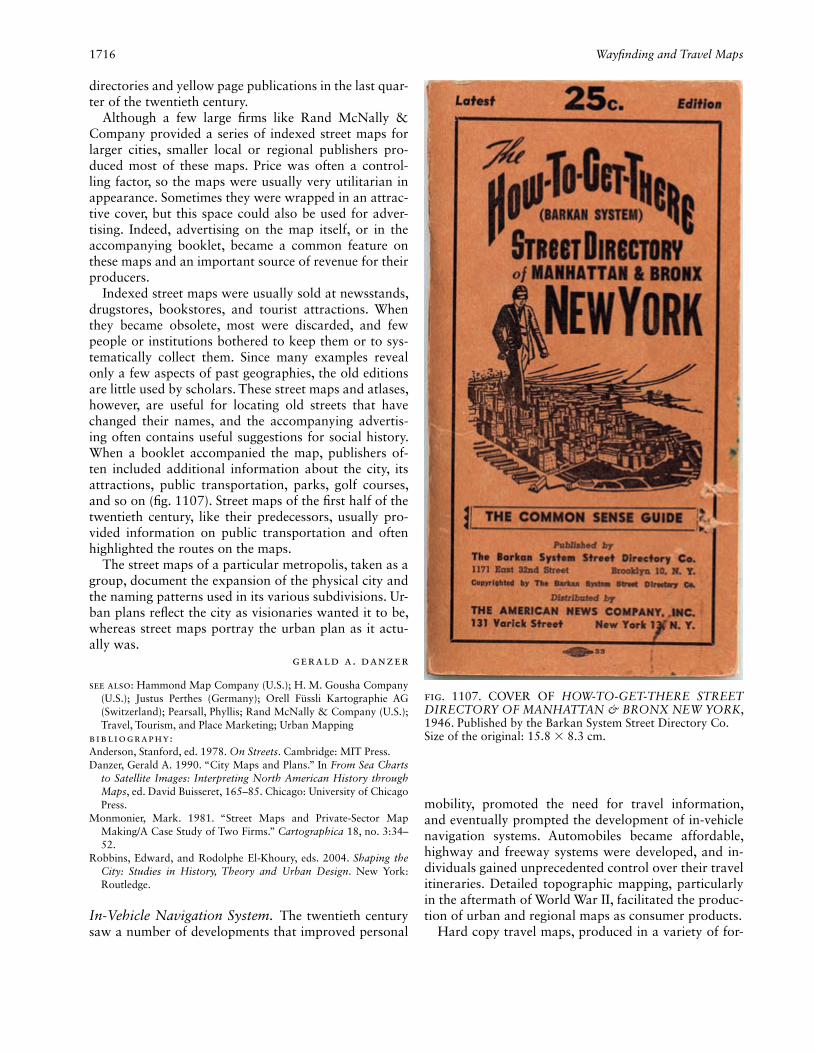
1716 Wayfi nding and Travel Maps
directories and yellow page publications in the last quar-ter of the twentieth century.
Although a few large fi rms like Rand McNally & Company provided a series of indexed street maps for larger cities, smaller local or regional publishers pro-duced most of these maps. Price was often a control-ling factor, so the maps were usually very utilitarian in appearance. Sometimes they were wrapped in an attrac-tive cover, but this space could also be used for adver-tising. Indeed, advertising on the map itself, or in the accompanying booklet, became a common feature on these maps and an important source of revenue for their producers.
Indexed street maps were usually sold at newsstands, drugstores, bookstores, and tourist attractions. When they became obsolete, most were discarded, and few people or institutions bothered to keep them or to sys-tematically collect them. Since many examples reveal only a few aspects of past geographies, the old editions are little used by scholars. These street maps and atlases, however, are useful for locating old streets that have changed their names, and the accompanying advertis-ing often contains useful suggestions for social history. When a booklet accompanied the map, publishers of-ten included additional information about the city, its attractions, public transportation, parks, golf courses, and so on (fi g. 1107). Street maps of the fi rst half of the twentieth century, like their predecessors, usually pro-vided information on public transportation and often highlighted the routes on the maps.
The street maps of a particular metropolis, taken as a group, document the expansion of the physical city and the naming patterns used in its various subdivisions. Ur-ban plans refl ect the city as visionaries wanted it to be, whereas street maps portray the urban plan as it actu-ally was.
Gerald A. Danzer
See also: Hammond Map Company (U.S.); H. M. Gousha Company (U.S.); Justus Perthes (Germany); Orell Füssli Kartographie AG (Switzerland); Pearsall, Phyllis; Rand McNally & Company (U.S.); Travel, Tourism, and Place Marketing; Urban Mapping
Bibliography:Anderson, Stanford, ed. 1978. On Streets. Cambridge: MIT Press.Danzer, Gerald A. 1990. “City Maps and Plans.” In From Sea Charts
to Satellite Images: Interpreting North American History through Maps, ed. David Buisseret, 165–85. Chicago: University of Chicago Press.
Monmonier, Mark. 1981. “Street Maps and Private-Sector Map Making/A Case Study of Two Firms.” Cartographica 18, no. 3:34–52.
Robbins, Edward, and Rodolphe El-Khoury, eds. 2004. Shaping the City: Studies in History, Theory and Urban Design. New York: Routledge.
In-Vehicle Navigation System. The twentieth century saw a number of developments that improved personal
Fig. 1107. COVER OF HOW-TO-GET-THERE STREET DIRECTORY OF MANHATTAN & BRONX NEW YORK, 1946. Published by the Barkan System Street Directory Co.Size of the original: 15.8 × 8.3 cm.
mobility, promoted the need for travel information, and eventually prompted the development of in-vehicle navigation systems. Automobiles became affordable, highway and freeway systems were developed, and in-dividuals gained unprecedented control over their travel itineraries. Detailed topographic mapping, particularly in the aftermath of World War II, facilitated the produc-tion of urban and regional maps as consumer products.
Hard copy travel maps, produced in a variety of for-

Wayfi nding and Travel Maps 1717
mats, from newspaper-size folded sheets to compact street directories, became standard items in most ve-hicles. From the standpoint of in-vehicle use, these pa-per products shared a number of problems. The driver’s information requirement at a given moment could be at any scale, small or large, and could change abruptly. This required constant physical manipulation of the map, or changing maps, both of which constituted a dangerous distraction while driving. Orienting oneself with respect to the map and searching the index were also problematic tasks.
In the 1980s several technologies converged that held the promise not only that orientation and gazetteer tasks could be automated, but also that motorists seeking de-tours around congestion could receive up-to-the-minute traffi c information. First, the digital computer was min-iaturized into the microcomputer, signifi cantly reducing size, cost, and power consumption. Improved graphic display technology; data storage capacity; and interface technologies such as touch-screens, voice synthesis, and recognition lent themselves to in-vehicle application. Second, methods were developed to represent street networks digitally in geographic information systems (GIS). Originally these databases of street networks were intended to facilitate census operations. While intersec-tions were mostly topologically correct, no distinction was made between overpasses and at-grade crossings. Freeways and some major routes did not appear in the census databases because their rights-of-way did not fall within census polygons. These data were helpful but not
entirely suitable for navigation. In the United States, the government offered the data free of cost. A number of fi rms, notably Etak, Geographic Data Technology Inc. (GDT) (later Tele Atlas), and Navigation Technologies Corp. (later NAVTEQ), produced derivatives of U.S. census data or developed their own digital street fi les. In other countries, government products were also supple-mented by commercial offerings. The third important development was in automatic vehicle location (AVL) technology. Global Positioning Systems (GPS) emerged as the most cost-effective and prevalent positioning tech-nology, but were too costly until the early 1990s. The government’s policy of Selective Availability degraded accuracy to ±100 meters; and the loss of GPS signals in urban canyons and heavy foliage cover rendered the technology unreliable. There was also uncertainty whether the U.S. Department of Defense would support free civilian use of GPS in perpetuity. On the other hand, inertial positioning was somewhat successful in fl eet ap-plications (e.g., Borelli and Sklar 1978; Skomal 1981).
Honda Motor Company, Ltd., was among the pio-neers of research in inertial AVL for automobiles, using gas-rate gyroscopes to measure vehicle motion. The Elec-tro Gyrocator was introduced as a dealer option on the Honda Accord in 1981 (fi g. 1108). A cathode ray tube (CRT) displayed the vehicle position. The user inserted street maps, printed on sheets of fi lm, into the display. This required considerable operator attention, negating one of the arguments for a navigation system. In 1984, Etak developed the Navigator, also an inertial tracking
Fig. 1108. HONDA’S ELECTRO GYROCATOR, 1981. One of the fi rst navigation systems for cars. On the right, a user inserts a map transparency.
Image courtesy of Carview Corporation, Tokyo.
1718 Wayfi nding and Travel Maps
system. The map was digitally constructed in real time from an on-board database and therefore could be re-drawn automatically as the vehicle moved.
The principal technical components of in-vehicle navigation were all in place by the early 1990s. Systems cost several thousand dollars, and customers therefore tended to be commercial or public fl eets or luxury car buyers. Etak and Blaupunkt created the TravelPilot, using inertial and GPS tracking, with radio frequency communications links between the vehicle and base. Qualcomm offered the OmniTRACS, which relayed text messages, including route advisories, over a continent-wide satellite-based communications system for the trucking industry. The 1990 Pathfi nder project in Cali-fornia had twenty-fi ve test vehicles receiving real-time feeds on traffi c conditions and dynamically updating their route recommendations. D. L. Clarke et al. (1996) and Thomas A. Dingus et al. (1996) documented these and other projects of the era.
In 1991 the U.S. Congress passed the Intermodal Sur-face Transportation Effi ciency Act (ISTEA), which gave an impetus to research in intelligent vehicle highway systems (IVHS), subsequently termed intelligent trans-portation systems (ITS). There were similar initiatives in Japan and Europe. Funding for IVHS was justifi ed prin-cipally on the grounds that it would enable more effi -cient use of highways and transit systems, saving energy by synchronizing transportation services and directing motorists to the shortest and least congested routes. This and subsequent legislation spurred considerable research and development in navigation systems.
In the mid 1990s the Internet became accessible to home computers. MapQuest and Yahoo, among others, offered free maps and printed directions to any street address in the United States. This exposed GIS to the public and was a pivotal factor in developing the ap-petite for navigation maps in the United States, which had lagged behind Europe and Japan in demand for in-vehicle mapping. The cessation of Selective Availability in 2000 and the availability of the wide area augmenta-tion system (WAAS) for GPS were further stimuli for the navigation industry. The accuracy of civilian GPS improved from ±100 meters to ±5 meters, greatly re-ducing the likelihood of a vehicle being mispositioned on a map and therefore improving the acceptability of in-vehicle mapping in the mass market. This triggered a rapid cycle of technical development, adoption, and price reduction that culminated in the navigation sys-tem becoming a consumer item early in the twenty-fi rst century.
A driver’s need for information can be organized into three basic classes, each presenting distinct data require-ments and technical challenges. Designing an in-vehicle navigation system requires the development of this func-
tionality on miniaturized and ruggedized hardware, with interfaces that demand a minimum of user attention.
1. Orientation is the process of positioning oneself in the context of other objects in one’s vicinity. The pure positioning component is accomplished by AVL systems that output coordinates, updated frequently—every sec-ond with most current GPS. Coordinates are fed to a GIS that displays and annotates nearby objects. This basic capability can handle the majority of a motorist’s queries: “On which street am I, in which city?” “How far down Sunset Boulevard—5000 or 6000?” “Have I crossed Beverly Drive?” “What is the next intersection?” “What is that building on the right?” “Could that be the Hollywood Bowl?”
Implementing this functionality in-vehicle presented some challenges. The map must be displayable at vari-ous scales with a simple user interface. On the relatively small display screens used in vehicles—and more so on personal digital assistants (fi g. 1109) and cell phones—street annotation was diffi cult due to the need for text to follow the street geometry with a font size that was leg-ible under strong ambient light. The map was recentered as updated coordinates were received. As street names or highway numbers panned off the map boundary, new ones had to appear. Some users preferred the traditional north-at-the-top map representation; others were more comfortable with the map constantly reoriented to the vehicle’s heading, perhaps with a bird’s-eye view of the streetscape.
A useful orientation function is to report the name of the street. This was done by map matching, discussed below. GIS proximity and containment operators de-termined whether the vehicle was approaching a given intersection or landmark or was within a city limit. The system may sound an alarm if vehicle speed was too high, taking into account speed limits and road geom-etry. Effi cient data organization and search techniques must be employed to search attributes of thousands of streets in real time.
Given the safety issues inherent in in-vehicle map use, there was value in orientation methods that relied on audio rather than visual cues. J. M. Loomis et al. (1994) designed an approach, originally for visually im-paired pedestrians, in which landmarks were announced over stereo headphones so that the sound appeared to originate at an azimuth corresponding to the object’s location, with the intensity depending on distance. As a pedestrian passed a library, for example, the announce-ment “library” would be heard repeatedly, fi rst from the front, then moving toward the left with a crescendo, fi -nally receding toward the rear. Multiple points could be introduced, immersing the user in the environment.
2. Geocoding is the translation of a location expression into map coordinates: “Where is 400 Council Drive?”
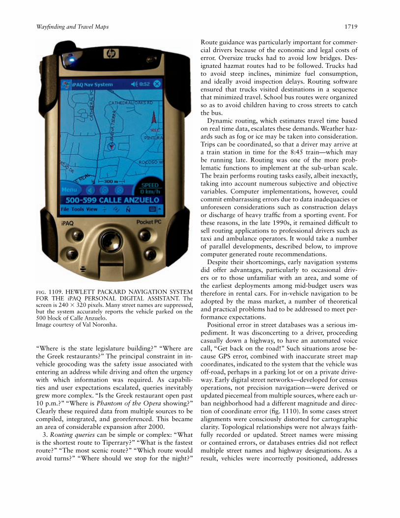
Wayfi nding and Travel Maps 1719
“Where is the state legislature building?” “Where are the Greek restaurants?” The principal constraint in in-vehicle geocoding was the safety issue associated with entering an address while driving and often the urgency with which information was required. As capabili-ties and user expectations escalated, queries inevitably grew more complex. “Is the Greek restaurant open past 10 p.m.?” “Where is Phantom of the Opera showing?” Clearly these required data from multiple sources to be compiled, integrated, and georeferenced. This became an area of considerable expansion after 2000.
3. Routing queries can be simple or complex: “What is the shortest route to Tiperrary?” “What is the fastest route?” “The most scenic route?” “Which route would avoid turns?” “Where should we stop for the night?”
Route guidance was particularly important for commer-cial drivers because of the economic and legal costs of error. Oversize trucks had to avoid low bridges. Des-ignated hazmat routes had to be followed. Trucks had to avoid steep inclines, minimize fuel consumption, and ideally avoid inspection delays. Routing software ensured that trucks visited destinations in a sequence that minimized travel. School bus routes were organized so as to avoid children having to cross streets to catch the bus.
Dynamic routing, which estimates travel time based on real time data, escalates these demands. Weather haz-ards such as fog or ice may be taken into consideration. Trips can be coordinated, so that a driver may arrive at a train station in time for the 8:45 train—which may be running late. Routing was one of the more prob-lematic functions to implement at the sub-urban scale. The brain performs routing tasks easily, albeit inexactly, taking into account numerous subjective and objective variables. Computer implementations, however, could commit embarrassing errors due to data inadequacies or unforeseen considerations such as construction delays or discharge of heavy traffi c from a sporting event. For these reasons, in the late 1990s, it remained diffi cult to sell routing applications to professional drivers such as taxi and ambulance operators. It would take a number of parallel developments, described below, to improve computer generated route recommendations.
Despite their shortcomings, early navigation systems did offer advantages, particularly to occasional driv-ers or to those unfamiliar with an area, and some of the earliest deployments among mid-budget users was therefore in rental cars. For in-vehicle navigation to be adopted by the mass market, a number of theoretical and practical problems had to be addressed to meet per-formance expectations.
Positional error in street databases was a serious im-pediment. It was disconcerting to a driver, proceeding casually down a highway, to have an automated voice call, “Get back on the road!” Such situations arose be-cause GPS error, combined with inaccurate street map coordinates, indicated to the system that the vehicle was off-road, perhaps in a parking lot or on a private drive-way. Early digital street networks—developed for census operations, not precision navigation—were derived or updated piecemeal from multiple sources, where each ur-ban neighborhood had a different magnitude and direc-tion of coordinate error (fi g. 1110). In some cases street alignments were consciously distorted for cartographic clarity. Topological relationships were not always faith-fully recorded or updated. Street names were missing or contained errors, or databases entries did not refl ect multiple street names and highway designations. As a result, vehicles were incorrectly positioned, addresses
Fig. 1109. HEWLETT PACKARD NAVIGATION SYSTEM FOR THE iPAQ PERSONAL DIGITAL ASSISTANT. The screen is 240 × 320 pixels. Many street names are suppressed, but the system accurately reports the vehicle parked on the 500 block of Calle Anzuelo.Image courtesy of Val Noronha.
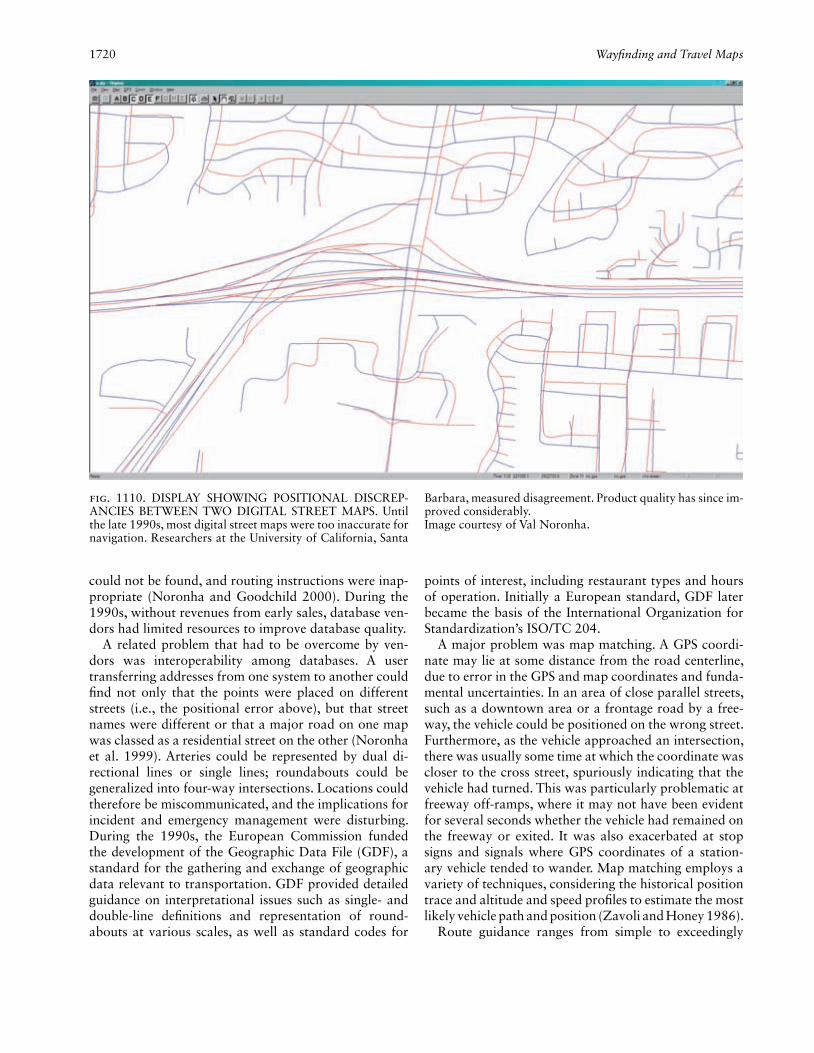
1720 Wayfi nding and Travel Maps
could not be found, and routing instructions were inap-propriate (Noronha and Goodchild 2000). During the 1990s, without revenues from early sales, database ven-dors had limited resources to improve database quality.
A related problem that had to be overcome by ven-dors was interoperability among databases. A user transferring addresses from one system to another could fi nd not only that the points were placed on different streets (i.e., the positional error above), but that street names were different or that a major road on one map was classed as a residential street on the other (Noronha et al. 1999). Arteries could be represented by dual di-rectional lines or single lines; roundabouts could be generalized into four-way intersections. Locations could therefore be miscommunicated, and the implications for incident and emergency management were disturbing. During the 1990s, the European Commission funded the development of the Geographic Data File (GDF), a standard for the gathering and exchange of geographic data relevant to transportation. GDF provided detailed guidance on interpretational issues such as single- and double-line defi nitions and representation of round-abouts at various scales, as well as standard codes for
points of interest, including restaurant types and hours of operation. Initially a European standard, GDF later became the basis of the International Organization for Standardization’s ISO/TC 204.
A major problem was map matching. A GPS coordi-nate may lie at some distance from the road centerline, due to error in the GPS and map coordinates and funda-mental uncertainties. In an area of close parallel streets, such as a downtown area or a frontage road by a free-way, the vehicle could be positioned on the wrong street. Furthermore, as the vehicle approached an intersection, there was usually some time at which the coordinate was closer to the cross street, spuriously indicating that the vehicle had turned. This was particularly problematic at freeway off-ramps, where it may not have been evident for several seconds whether the vehicle had remained on the freeway or exited. It was also exacerbated at stop signs and signals where GPS coordinates of a station-ary vehicle tended to wander. Map matching employs a variety of techniques, considering the historical position trace and altitude and speed profi les to estimate the most likely vehicle path and position (Zavoli and Honey 1986).
Route guidance ranges from simple to exceedingly
Fig. 1110. DISPLAY SHOWING POSITIONAL DISCREP-ANCIES BETWEEN TWO DIGITAL STREET MAPS. Until the late 1990s, most digital street maps were too inaccurate for navigation. Researchers at the University of California, Santa
Barbara, measured disagreement. Product quality has since im-proved considerably.Image courtesy of Val Noronha.

Wayfi nding and Travel Maps 1721
complex. One may advise: “At the intersection ahead, take Highway 101.” Or that could be elaborated: “Move to the right lane. Take Exit 312. Merge with traffi c on your right. Follow the ramp to Highway 101. Merge from the left lane.” The latter, explicit level of instruc-tion, and the data to support it, became commonplace in the early 2000s, from fi rms such as Navteq in the United States and Tele Atlas in the Netherlands, refl ect-ing not just greater complexity in inferring navigation instructions from the topology of the network, but also improved resolution and attribution of databases. While databases of the 1980s and 1990s often treated freeways as single lines, by 2002 the standard was to twin not only dual-carriageway freeways but also major city roads without median barriers. Most intersections large enough to be signalized were routinely represented by separated directional lines. Turn tables distinguished between the minimal delay incurred in a right turn as compared with the larger impedance or penalty associ-ated with a left turn.
To achieve this level of detail and accuracy, digital map vendors had to invest considerable resources in up-date and fi eld verifi cation. Initially some vendors made only cosmetic edits, smoothing angular polylines and fi l-leting sharp intersections. It soon became obvious that a much more concerted effort was required, and that the burgeoning market would justify the expenditure in the long run. The physical layers of the database remained relatively constant and could be observed from second-ary sources such as public maps and satellite imagery. It was the traffi c control layers such as one-way streets, turn prohibitions, and signal timings that required in-tense observation—even local authorities often did not have such data. Speed limit data were also diffi cult to obtain.
Responding to these challenges, vendors developed mobile data vans, equipped with GPS, distance mea-suring instruments (DMIs), forward-, side-, and rear-looking video cameras, tasked to drive every street in a prescribed area. Typically such a van had a two-person crew. The video data were postprocessed to count lanes and to detect signage such as speed limits. Vendors re-constructed three-dimensional geometry of the roadway and surroundings to provide more realistic orientation and route guidance. Clearly this was a signifi cant invest-ment in hardware, labor, and postprocessing. The street database refi nement effort of the late 1990s and early 2000s was remarkable for its magnitude, the breadth of its international coverage, and the rapidity of its deployment.
A critical ingredient in route guidance, particularly for urban trips, is real-time congestion data. Traffi c speed was measured by local authorities for signal synchro-nization and traffi c control, by inductive loop detectors
buried in pavement or by roadside sensors, probe ve-hicles, or airborne observation. Travel time impedances derived from these data were modeled and broadcast commercially by various wireless technologies. In-vehi-cle systems used the data to fi nd detours around traffi c snarls. Accurate real-time guidance ultimately makes the systems useful not only to visitors but also to daily com-muters and professional drivers, generating a mass mar-ket. Measurement and provisioning of travel time data continues to be an area of potential improvement.
Human factors and safety issues had received varying degrees of attention from system designers. Map legibil-ity and user input mechanisms were the focus of early research and development. G. E. Burnett (2000) reported that a navigation display consumed nearly 20 percent of driver attention, resulting in considerably reduced awareness of the road, rear-view mirrors, and the in-strument panel (fi g. 1111). By the early 2000s, audio instructions were widely implemented; some advanced systems interacted with the vehicle’s audio system, dim-ming the music volume while navigation instructions were announced.
A separate point of concern was whether innate hu-man abilities in orientation and navigation would atro-phy as a result of habitual reliance on instruments, or whether prolonged exposure to a wealth of geospatial data would have precisely the opposite effect. Early evi-dence was that navigation systems encouraged careless-ness in route planning because drivers relied on the in-vehicle navigation system to compensate for inadequate pretrip planning (Privilege Insurance 2006).
An issue that continued to intrigue designers was the general problem of location expression and its cross-
Fig. 1111. IN-VEHICLE DASHBOARD DISPLAY. Many built-in navigation displays are positioned in the center con-sole, near the radio. In this vehicle, a 2005 Volvo V70, the navigation panel is on the top of the dashboard, minimizing eye diversion.Image courtesy of Volvo of North America, Rockleigh.
1722 Wayfi nding and Travel Maps
cultural variations. Navigation systems easily processed standard expressions such as street addresses, intersec-tions, and named landmarks. However, in areas without organized civic addressing, locations were described in ad hoc terms such as “by the red barn across from Dr. Foster’s.” Consequently, even when equipped with the latest technology the traditional practice of stopping to ask directions survived.
The strikingly energetic evolution of in-vehicle navi-gation over the past three decades raises the question: What does the future hold? In the early twenty-fi rst century, navigation displays have emerged as the most publicly visible maps. Their evolution in design and their ties to hardware, software, data gathering, automotive engineering, market forces, and economics not only sug-gested future directions of technical development but also emphasized the inseparability of mapping from the underlying geospatial information and the rapidly wid-ening ramifi cations and public profi le of cartography. It seemed likely that in the near future, some navigation instructions would be presented on heads-up displays on windshields, avoiding the need for drivers to move their heads. Maps would morph into augmented reality displays, where visual clutter is reduced by presenting only crucial information elements and attributes.
Beyond the map display, geospatial data were to be integrated into automotive engineering. Data on road geometry would be used as an input in controlling adaptive headlights that turn in anticipation of a curve. Autonomous vehicles and automated highway systems were being conceived. Position data could also be ex-ploited commercially for location-based services; e.g., there were plans to beam advertising messages to ve-hicles waiting at signals in the vicinity of a restaurant or retail outlet.
Most profound is the impending evolution of the intelligent location-aware automobile from a mere re-ceiver of information to a sensor-laden probe. The ve-hicle would sample traffi c congestion, road conditions, and roadway imagery. Ice and fog warnings would be transmitted to nearby peers over ad hoc wireless net-works; other data would be transmitted to traffi c man-agement centers, where they would be synthesized into virtual realities and mined to diagnose problems and hazards, to avert collisions, and to handle emergencies, as well as for informing longer-term planning strategies, such as addressing environmental issues. The location key and map thus became central players in an extensive societal collaboration for common benefi t.
The in-vehicle map, with real-time congestion infor-mation, was perceived in its early days as an expensive toy for a fortunate few. History will eventually record a more honorable legacy—that it triggered an active information age industry that pushed the frontiers of
mapping science, improved the quality of transportation databases, and thrust cartography and spatial informa-tion into an unprecedented position vis-à-vis technology and society.
Val Noronha
See also: Electronic Cartography: Display Hardware; Global Posi-tioning System (GPS); Map: Electronic Map; Road Mapping
Bibliography:Borelli, A., and S. Sklar. 1978. “An Integrated Approach to Automatic
Vehicle Monitoring and Mobile Digital Communication.” In 28th IEEE Vehicular Technology Conference, 9–22. New York: Institute of Electrical and Electronic Engineers.
Burnett, G. E. 2000. “Usable Vehicle Navigation Systems: Are We There Yet?” In Vehicle Electronic Systems 2000: European Confer-ence and Exhibition, 3.1.1–3.3.11. Leatherhead, U.K.: ERA Tech-nology.
Clarke, D. L., et al. 1996. Development of Human Factors Guide-lines for Advanced Traveler Information Systems (ATIS) and Com-mercial Vehicle Operations (CVO): Comparable Systems Analysis. McLean: U.S. Department of Transportation, Federal Highway Administration.
Dingus, Thomas A., et al. 1996. Development of Human Factors Guidelines for Advanced Traveler Information Systems and Com-mercial Vehicle Operations: Literature Review. McLean: U.S. De-partment of Transportation, Federal Highway Administration.
Loomis, J. M., et al. 1994. “Personal Guidance System for the Visually Impaired.” In Proceedings of the First Annual ACM Conference on Assistive Technologies, 85–91. New York: Association for Comput-ing Machinery.
Noronha, Val, and Michael F. Goodchild. 2000. “Map Accuracy and Location Expression in Transportation—Reality and Prospects.” Transportation Research Part C: Emerging Technologies 8:53–69.
Noronha, Val, et al. 1999. “Location Expression Standards for ITS: Testing the LRMS Cross Street Profi le.” Annals of Regional Science 33:197–212.
Privilege Insurance. 2006. “Unsafe Use of Navigation Equipment.” Press release, February. Croydon, U.K. Online publication.
Skomal, Edward N. 1981. Automatic Vehicle Locating Systems. New York: Van Nostrand Reinhold.
Zavoli, Walter B., and Stanley K. Honey. 1986. “Map Matching Aug-mented Dead Reckoning.” In 36th IEEE Vehicular Technology Conference, 359–62. New York: Institute of Electrical and Electron-ics Engineers.
Mobility Map. Maps are selective visual representa-tions of the world. One of their most useful characteris-tics is that they can quickly provide information about an unknown environment through visual inspection. But sight has no function in the realm of the visually impaired or blind. For these groups, maps and spatial diagrams must be accessed through other senses such as touch or hearing. Touch-based maps are generally re-ferred to as “tactile maps.” As a method of cartographic communication, tactile maps have been used in general educational settings (e.g., as wall maps, relief maps, and relief globes) as well as in the more constrained settings associated with mobility aids for the visually impaired (Sherman 1955; Wiedel 1983; Tatham and Dodds 1988; Golledge 1991).
Unlike maps produced for general education and carto-

Wayfi nding and Travel Maps 1723
graphic communication purposes, tactile maps produced for mobility purposes are not as severely constrained. For example, in cartographic communication settings, scale is a critical factor in understanding layout, connec-tivity, arrangement, pattern, and other spatial relational phenomena. This is not such a stringent requirement for tactile mobility maps where the ordinal properties of se-quencing and directional properties of orientation and angularity are dominant. Tactile maps used in a mobility context can be compared to the American Automobile Association’s (AAA) TripTik maps, where each strip can be oriented with destination or heading direction at the top. With these mobility maps, the scaling of segments of a particular journey do not need to strictly refl ect their real-world scaled distances. Although tactile maps for education or cartographic communication can be quite large and immobile (e.g., produced by industrial techniques such as vacuum forming or pressing), tactile mobility maps are generally expected to be more man-ageable and portable. In general, tactile maps contain information that can be discerned via fi ngertip or palm of the hand. Tactile maps produced for mobility often consist only of lines with destinations symbolically rep-resented as geometric fi gures. Discernability is a much more critical factor than the need to accurately represent scaled blocks of information.
A substantial difference exists between the variety and number of symbols that can be used on a visual map and those that can be used on a tactile map. Discern-ability is the primary focus of a tactile mobility map, and the design of symbols and the map structure is less constrained than for tactile maps that represent scaled parts of the real world (e.g., tactile world maps). Critical characteristics of symbols that can be included on tactile maps include size, texture, and shape. In this respect, the critical difference between traditional maps and tactile maps is the addition of the third dimension. In terms of shape or structure of the map itself, researchers found that, for mobility maps, narrow single lines are the easi-est to trace by touch (Bentzen and Peck 1979).
The information contained on tactile mobility maps depends on the purpose for which the map is con-structed, the complexity of the environment, the detail required in the presentation of information, and sym-bolic representation of places such as choice points and important landmarks. Reginald G. Golledge (1991) gen-erated a series of disposable tactile strip maps for routes in an institutional setting for use by visually impaired and blind travelers (fi g. 1112).
These tactile strip maps were based on the identifi ca-tion of signifi cant choice points along set routes, land-marks, reference points (particularly hazards), and the location of street furniture and ambient sounds. Unlike conventional maps, mobility maps do not necessarily in-
clude complete shapes. Colors are irrelevant, and feature size is relatively unimportant. Emphasis is placed on seg-menting a trip and representing it by an uninterrupted line segment between starting and end points of a trip, together with critical landmark, barrier, obstacle, and hazard occurrences within the path of travel. Before the widespread availability of digitized road network data (such as the U.S. Census Bureau’s Topologically Inte-grated Geographic Encoding and Referencing [TIGER] fi les) tactile mobility maps were diffi cult to produce due to the lack of comprehensive transportation infrastruc-ture data. As geospatial data coverage and availability improve throughout the world, tactile mobility maps will become easier to produce.
Tactile mobility maps are not necessarily permanent structures. If they are developed as representations of habitually traveled paths between specifi c and familiar origins and destinations, they can be turned into a tactile form using standard methods such as embossing, etch-ing, vacuum forming, or raised pins. They can also be produced quickly and cheaply using chemically treated capsule paper and an appropriate heat source. Capsule papers are coated with a layer of plastic that consists
Individual’s path
Kiosk, light pole, trash can
Raised planter
Grass, vegetationConcrete open areas
Bikeway
Buildings
Fig. 1112. TACTILE STRIP MAPS.Modifi ed from Golledge 1991, 300 (fi g. 5) (strip maps rotated 180°, legend redrawn). Copyright © 1991 by the American Foundation for the Blind. All rights reserved. Reprinted with permission of the publisher.

1724 Wayfi nding and Travel Maps
of microcapsules fi lled with a minuscule amount of alcohol. A particular trip plan can be electrostatically copied onto the plastic, after which the printed sheet is run through a “cooker” or stereocopy machine that ap-plies heat evenly over the entire surface. In areas where the copying has deposited black toner, infrared waves emitted by the heat source are readily absorbed. Where no toner exists, the waves are refl ected. The capsules beneath the toner are heated and the alcohol expands, causing the capsule to swell, raising the surface above the remaining untreated parts. This produces a tactile approximation of the image formed initially by the toner. While originally suffering from many problems such as disfi guration by folding or crumpling, the production of “bumpy paper” (with a more resilient plasticized surface that does not show folds) has made this type of tactile map production much more durable and acceptable.
The American Printing House for the Blind, the Amer-ican Foundation for the Blind, and the National Centre for Tactile Diagrams (U.K.) have published guidelines about symbolization in tactile maps. However, there are no worldwide accepted standards, and formal training courses are rarely available for people to learn how to create or use tactile maps.
At the Smith-Kettlewell Eye Research Institute, Joshua A. Miele and James R. Marston (2005) have pro-duced software that allows individuals with a computer and an embosser to access TIGER fi les and produce em-bossed tactile maps (including road and street systems) of any neighborhood in which they wish to travel. These embossed maps can be made at various scales, are based on the street layout of an area of interest, and do not simplify the transportation network to represent specifi c routes.
Specifi cally designed systems for wayfi nding based on tactile map use have emerged since the late 1980s. Pioneered as the NOMAD system (Parkes 1988; Parkes and Dear 1989), elaborations of this device designed to be carried as a wayfi nding and mobility aid (e.g., the “Walkabout” system) were later developed.
Marston and his colleagues (2006) have experimented with a haptic pointer interface (HPI) for wayfi nding us-ing a digital map in a wearable computer. The path of an individual is tracked by a Global Positioning Sys-tem (GPS) chip embedded in the computer, and routes between origins and destinations are established using shortest path algorithms. Directional information for travel is transmitted to the traveler via a haptic pointer attached to a fi nger (fi g. 1113).
At any particular choice point, the traveler simply moves his or her hand and determines in which segment of a surrounding 360 degree circle a haptic vibration is excited on the fi nger. Travelers orient their body to max-imize the strength of the vibratory signal and follow this
direction until a new destination point is reached. While this is not regarded as a conventional tactile map, it is an adaptation of tactile experience to mobility needs. The vibrations used to indicate directions can also be cali-brated such that the vibratory intensity increases as the next destination point is approached. Some electronic tactile mobility devices rely on tactile output in Braille format (e.g., Sendero Group’s BrailleNote GPS).
Mobility is required both within buildings and in the external environment. Within the general external envi-ronment it is possible to construct tactile “you-are-here” maps. Early in the new century, architects and design-ers turned their attention to ways of constructing site-based tactile mobility maps and diagrams for within-building use. A particular example is that proposed by Shohreh Rashtian (2006). She suggested that each fl oor of a building could include (at the main entrance and exit points) a tactile map or model of the corridor and room placement in the buildings. Such mobility aids could also have an auditory component so that when particular segments are touched, an auditory prompt would indicate what features are present at that par-ticular location. If a raised line was used to represent a corridor, auditory information might be used to indicate the length of the corridor, the number and distance of intersecting corridors, or details of important reference points along the corridor such as rooms, toilets, and wa-ter fountains.
Matthew T. Rice and his colleagues (2005) developed a mapping system to enhance mobility that uses haptic and auditory cues to provide information about land-
Fig. 1113. HAPTIC POINTER INTERFACE THAT PRO-VIDES VIBROTACTILE DIRECTIONAL INFORMATION TO A TRAVELER.Image courtesy of Reginald G. Golledge and James R. Marston.

Wayfi nding and Travel Maps 1725
marks, accessibility features, buildings, sidewalks, and transportation infrastructure. This Internet-based sys-tem is designed to be used from a fi xed location such as a home, offi ce, or kiosk before a visually impaired individual enters a new environment, thereby greatly re-ducing the amount of time required to learn the spatial layout.
GPS revolutionized personal mobility and also helped take mobility mapping out of the paper domain into the digital domain. Using high-quality differential GPS, for example, the location of a traveler can be pinpointed easily within one meter. More people are using personal digital assistants (PDAs) including pocket personal com-puters, cell phones, and wearable computing devices to substitute for traditional maps used to navigate through an environment. In the digital domain, a variety of GPS-based devices are available to help navigation and way-fi nding. These include BrailleNote GPS from Sendero Group, StreetTalk from Freedom Scientifi c, the Univer-sity of California Santa Barbara Personal Guidance Sys-tem (PGS), and Trekker from HumanWare (see Denham, Leventhal, and McComas 2004). These units use GPS to establish the user’s location on a digital map of the local environment and communicate with the potential traveler using textual information either in the form of synthetic speech or Braille maps and instructions.
There is an important difference between traditional tactile mobility maps and the electronic/digital informa-tion processing and guidance systems that are available in most vehicles and handheld devices. Probably the most signifi cant difference is the lack of potential tac-tile experience. Screens on the handheld or in-vehicle electronic display devices vary from about two square inches to four square inches, and are simply too small to provide signifi cant tactile experience if they were tactilely enabled. None of the commercially produced handheld GPS and mapping devices have any signifi cant tactile capabilities, though some noncommercial devices are being developed by researchers.
Opticon is a device that uses piezoelectrical technol-ogy to produce a dynamic display of raised pins for tac-tile reading. Alternative approaches use electrical cur-rent to raise or lower selected metal pins that represent a tactile display surface, pneumatic pressure to raise or lower a surface to produce a tactile display, surface acoustic wave simulation, shape-memory alloy process-ing, and magnetorheological materials. Many of these approaches have resulted in experimental prototype displays that for numerous technological and economic reasons have not proven commercially viable.
Important factors in determining whether a tactile representation is useful and interpretable include: the number of fi ngers needed to scan the display; how the two hands have to interact to preview any ancillary
material associated with the display; length of time the display is available for interpretation; the size of the dis-play; and the spacing between symbols used in the dis-play. Some specifi cations used in preparation of Braille tactile displays include: a dot base diameter of approxi-mately 1.3 millimeter; vertical dot spacing of approxi-mately 2.5 millimeters; horizontal dot spacing of ap-proximately 2.5 millimeters; horizontal cell spacing of approximately 3.75 millimeters; vertical line spacing of approximately 5.0 millimeters; and dot height of ap-proximately 0.5 millimeter. Other critical variables in-clude how many characters can effectively be read at a single time (as compared, for example, to word length effects in slowing visible reading) and the determination of threshold heights for raised point, line, or area dis-plays (Tatham 1991).
Studies of the effectiveness of types of tactile displays have indicated that users of microcapsule maps recorded the shortest times for discovery of map properties, fol-lowed by multitextual displays, letter-pressed displays, and vacuum-pressed maps. The differences were sub-stantial (Dacen Nagel and Coulson 1990).
Although tactile maps have been used for a long time, their widespread development has occurred primar-ily during the second half of the twentieth century in conjunction with the development of navigational aids for visually impaired individuals. The primary emphasis of tactile mobility maps is discernable symbolization of signifi cant features associated with navigation. Correct scale depiction and realism of geographic features are less important. Tactile mobility maps produced with a variety of different printing, vacuum-forming, and elec-tronic technologies have been incorporated into mobile computing settings by researchers. They were also dis-seminated over the Internet using haptic and auditory interfaces, which allow a visually impaired individual to begin learning the spatial layout of a new environment from a home or offi ce. These developments promise to increase the ability of visually impaired individuals to travel and navigate through new environments.
Reginald G. Golledge and Matthew T. RiceMatthew T. Rice thanks Dr. R. Daniel Jacobson, associate professor
of geography, University of Calgary, who was instrumental in revising this entry on behalf of the late Dr. Reginald G. Golledge.
See also: Cave Map; Interactive Map; Perception and Cognition of Maps: Subject Testing in Cartography; Tactile Map; Visualization and Maps
Bibliography:Bentzen, Billie L., and Alec F. Peck. 1979. “Factors Affecting Trace-
ability of Lines for Tactile Graphics.” Journal of Visual Impairment & Blindness 73:264–69.
Dacen Nagel, Diana L., and Michael R. C. Coulson. 1990. “Tac-tual Mobility Maps/A Comparative Study.” Cartographica 27, no. 2:47–63.
Denham, Jim, Jay Leventhal, and Heather McComas. 2004. “Getting

1726 Wayfi nding and Travel Maps
from Point A to Point B: A Review of Two GPS Systems.” Access-World, 5 no. 6. Online publication.
Golledge, Reginald G. 1991. “Tactual Strip Maps as Navigational Aids.” Journal of Visual Impairment & Blindness 85:296–301.
Marston, James R., et al. 2006. “Evaluation of Spatial Displays for Navigation without Sight.” ACM Transactions on Applied Percep-tion 3:110–24.
Miele, Joshua A., and James R. Marston. 2005. “Tactile Map Auto-mated Production (TMAP): Project Update and Research Summary.” In Technology and Persons with Disabilities Conference, 2005 Con-ference Proceedings. California State University, Northridge. Online publication.
Parkes, Don. 1988. “‘Nomad’: An Audio-Tactile Tool for the Acqui-sition, Use and Management of Spatially Distributed Information by Partially Sighted and Blind Persons.” In Proceedings of the Sec-ond International Symposium on Maps and Graphics for Visually Handicapped People, ed. A. F. Tatham and A. G. Dodds, 24–29. Nottingham, U.K.: University of Nottingham.
Parkes, Don, and R. Dear. 1989. NOMAD: An Audio-Tactile Interac-tive Graphics Processor for the Visually Impaired and Blind. Ref-erence Manual (NOMAD Manual Version 1). Sydney, Australia: Quantum Technology Pty. Ltd.
Rashtian, Shohreh. 2006. “A New Methodology for Creating Spa-tial Representations for the Blind and an Inclusive and Interactive Guidance System for People of All Abilities, Especially People with Severe Visual Impairment and Blindness.” PhD diss., University of California, Los Angeles.
Rice, Matthew T., et al. 2005. “Design Considerations for Haptic and Auditory Map Interfaces.” Cartography and Geographic Informa-tion Science 32:381–91.
Sherman, John Clinton. 1955. “Maps the Blind Can See.” Journal of Geography 54:289–95.
Tatham, A. F. 1991. “The Design of Tactile Maps: Theoretical and Practical Considerations.” In Mapping the Nations: Proceedings, 15th Conference and 9th General Assembly of the International Cartographic Association, Bournemouth, UK, 2 vols., ed. Krysia Rybaczuk and M. J. Blakemore, 1:157–66. London: International Cartographic Association.
Tatham, A. F., and A. G. Dodds, eds. 1988. Proceedings of the Second International Symposium on Maps and Graphics for Visually Hand-icapped People. Nottingham, U.K.: University of Nottingham.
Ungar, Simon, Mark Blades, and Christopher Spencer. 1993. “The Role of Tactile Maps in Mobility Training.” British Journal of Vi-sual Impairment 11:59–61.
Wiedel, Joseph W., ed. 1983. Proceedings of the First International Symposium on Maps and Graphics for the Visually Handicapped. Washington, D.C.: Association of American Geographers.
Orientation Map. An orientation map may be de-scribed as a “you are here” map because it helps ori-ent the map reader in a geographical space such as a park or shopping mall and typically includes a promi-nent symbol indicating the map’s or the map user’s lo-cation. The name “orientation map” refl ects the user’s basic questions of “Where am I?” and “In what direc-tion should I go?” Orientation maps normally answer these questions with stylized or realistic symbols rep-resenting geographic features, transportation facilities, and building footprints as well as three-dimensional pictorial renderings of buildings. Directional frames of reference include north arrows, compass roses, and rect-angular grids. When used as a guide for navigating away
from a given starting point, an orientation map may also be considered a wayfi nding map. And when intended to help the user identify his or her location, maps as varied as topographic maps, navigation charts, and building/grounds plans become orientation maps. In this sense an orientation map is defi ned as much by its purpose as by its symbols and content.
General reference maps were often designed to help users orient themselves. Throughout the twentieth cen-tury they were displayed in public space on signs or ki-osks as well as in printed brochures. Both forms of ori-entation map were found in parks, museums, shopping centers, historical districts, campuses, and similar ven-ues (fi g. 1114). Increases in mobility, wealth, and leisure time fostered a corresponding increase in the number of orientation maps intended for self-guided recreation. Portable orientation maps (in contrast to fi xed displays) are useful at various stages of travel or recreation, most notably as planning tools preceding navigation and also as navigation guides for discerning and following a route. Long after an activity is completed these maps
Fig. 1114. ORIENTATION MAP DISPLAYED IN PUBLIC, SYRACUSE UNIVERSITY.Image courtesy of Joseph W. Stoll.

Wayfi nding and Travel Maps 1727
can be valuable as a souvenir, a memory aid, or a physi-cal record of an event or trip.
Throughout the twentieth century, orientation maps had common ground with cognitive and wayfi nding maps. By the end of the century, the emerging fi eld of environmental graphic design addressed the design and planning of two- and three-dimensional orientation maps within built environments.
As a result of advances in computing and electronic telecommunications, by the late twentieth century orien-tation maps formatted for display on computer screens and handheld devices, including mobile telephones, were widely available. Online mapping services like Al-taVista, Google, MapQuest, and Yahoo!, which allowed users to generate location-based maps with multiscaled views together with navigational directions, made cus-tomized orientation maps nearly ubiquitous. At the same time, portable document format (PDF) distribu-tion, which supported the printing of high-resolution copies at the user’s convenience, increased the number of printed maps, particularly maps used for orientation and wayfi nding.
A handheld orientation map such as a printed trail guide or a street map was likely to be aligned accord-ing to the user’s understanding of both the map and the geographic environment it represented. Typically, a person navigating on foot would use one or more vis-ible landmarks to fi nd his or her location. This align-ment behavior was not only possible with map displays on handheld electronic devices but actively encouraged when the device included a global positioning system (GPS) receiver.
Another form of twentieth-century orientation map can be found in literature and fi lm, in which maps have not only oriented readers or viewers to places or landmarks in the story but also helped them follow the narrative through a real or imaginary environment. In addition, maps have also served as plot devices to ex-plain characters’ actions or illustrate progress at various stages. Between 1942 and 1951, engaging maps on the back covers of 577 Dell paperback books, mostly mys-teries, attracted buyers and helped them follow the story line (Lyles 1983, 83–86; Lovisi 2004, 69) (fi g. 1115). In this and many other instances, orientation maps have also served as a marketing tool.
Joseph W. Stoll
See also: Map: Electronic Map; Recreational Map; Travel, Tourism, and Place Marketing; Urban Mapping; Wall Map
Bibliography:Adeyemi, E. O. 1982. “The Effect of Map Orientation on Human Spa-
tial Orientation Performance.” Cartographic Journal 19:28–33.Campbell, John. 1998. Map Use & Analysis, 3d ed. Boston: WCB
McGraw-Hill.Darken, Rudolph P., and Barry Peterson. 2002. “Spatial Orientation,
Wayfi nding, and Representation.” In Handbook of Virtual Environ-
ments: Design, Implementation, and Applications, ed. Kay M. Stan-ney, 493–518. Mahwah, N.J.: Lawrence Erlbaum Associates.
Levine, Marvin. 1982. “You-Are-Here Maps: Psychological Consider-ations.” Environment and Behavior 14:221–37.
Lovisi, Gary. 2003. “Dell Map Back Mysteries: They Don’t Make ’Em Like That Anymore!” Mystery Scene, no. 80:68–71.
Lyles, William H. 1983. Putting Dell on the Map: A History of the Dell Paperbacks. Westport: Greenwood Press.
Schneider, Laura F., and Holly A. Taylor. 1999. “How Do You Get There from Here? Mental Representations of Route Descriptions.” Applied Cognitive Psychology 13:415–41.
Wyman, Oliver. 2009. Ontario Way-fi nding Research Study. Com-missioned by the Ontario Ministry of Tourism. Toronto: Queen’s Printer for Ontario.
Public Transportation Map. Public transportation maps portray routes and systems that move passengers as well as freight over established pathways according to regular schedules for fi xed fares. The genre includes a wide variety of cartographic materials designed to
Fig. 1115. DELL MAPBACK, ARAB DESERT CAMP AS SEEN IN THE STORY OF “THE SHEIK.”Size of the original: 16.2 × 10.9 cm. From E. M. Hull, The Sheik (New York: Dell Publishing, [1951]), back cover.

1728 Wayfi nding and Travel Maps
support the conception, planning, fi nancing, construc-tion, maintenance, operation, evaluation, promotion, and enjoyment of public transit facilities by describing their infrastructure, function, and use. The major cat-egories of these maps follow the means of locomotion, with distinct subgenres for railroad, airline, bus, truck, and steamship operations. Road and highway maps are normally treated as a separate map type, although many include some information about public transit, noting and often naming railroads, airports, and port facilities. Moreover, maps employed by intercity bus and trucking companies are often identical to highway maps.
Dichotomies useful in describing public transporta-tion maps include distinctions between intercity and intracity coverage, public and private ownership, and passenger and freight conveyance as well as a focus on a single route or larger system, a design emphasizing indi-vidual use or public display, and an audience that is ei-ther internal (and thus restricted to those operating and supporting the facility) or external (principally members of the public who are interested in using the system as customers). In addition, special maps and atlases have appeared over the years to meet the needs of traveling sales representatives or the shipping departments of manufacturing and distribution fi rms. Wholesale and retail merchandising also developed special maps to in-dicate routes established for shipping and zones to de-termine rates for freight. For example, in the fi rst half of the twentieth century, one of the most sophisticated maps used by the average American was the zone map indicating shipping charges for catalog orders placed with Montgomery Ward; Sears, Roebuck and Company; and a host of other mail-order fi rms.
The design of public transportation maps varied greatly according to their purpose, function, and use. Different maps addressed the needs of travelers before, during, and after the trip. In general, public transporta-tion maps focused on the subject route or system, elimi-nating many geographic features and often varying the scale on a particular map as well as distorting other char-acteristics such as direction, shape, and place-name hier-archies. In this process the maps often were transformed into diagrams or charts. Subway maps provide classic examples of this type of distortion. On the other hand, the detailed section maps used for the construction and maintenance of railroad tracks were often models for the detailed, accurate recording of information. Taking into account the full range of these maps will enhance the comprehension and appreciation of any particular example.
A fully developed transportation system serves as a hallmark of a modern state, establishing a national mar-ket and encouraging those social, cultural, economic, and political interactions that sustain material develop-
ment and national loyalties. In addition, the ease with which these national transportation units connect with each other to form international systems provides in-sight into the type, level, and extent of any particular country’s participation in the global economy. Transpor-tation facilities, and the maps on which they depend, are thus key elements in economic development, cultural modernization, and political stability.
Although this article primarily follows the story of public transportation maps in the United States, the maps produced in different countries closely resemble one another when addressing similar needs, and those in more advanced nations often serve as models. The global reach of the imperial holdings of Western nations as well as their advanced technological development and the extent of their participation in international trade helped disseminate European and North Ameri-can transportation cartography around the world in the twentieth century.
The maps produced by railroads in the early years of the twentieth century infl uenced most of the subsequent public transportation cartography irrespective of the mode of transportation involved. Thus a brief survey of the major types of railroad maps will provide a frame-work generally applicable to the other modes of public transit.
The fi rst railroad maps drawn in the United States were produced by survey crews seeking the most practi-cal route for a proposed line. These maps continued to be made as long as new lines were proposed and often took the form of long strip maps. Their authors paid close attention to topography and hydrology and some-times included profi les of suggested routes at the bottom of the map. Alternative courses were often suggested on these preliminary surveys.
After a specifi c route was selected, these original maps were refi ned into construction plans, normally at a much larger scale. The initial maps also functioned as prospectus maps for developers seeking capital for the requisite infrastructure. In these instances, a map’s ef-fectiveness depended on cartographic persuasion, rather than geometric accuracy or internal consistency, which suggests an early emergence of the fundamental division of transportation maps into geometrically accurate maps intended largely for internal use and rhetorical maps for the general public.
Accuracy was the watchword of working maps used by railroad managers and superintendents to monitor, maintain, and evaluate the performance of the route as a whole as well as its various segments. Detailed, large-scale maps used for operations and maintenance were usually produced by the company itself and were subject to continual revision. These revisions often appeared as large-scale blueprints in contrast to the small-scale pre-

Wayfi nding and Travel Maps 1729
sentation maps that folded out of annual reports and prospectus literature. Such publications favored maps of railroad systems rather than portrayals of particular routes, with the maps coded to designate track owned outright as well as the geographic extent of coverage for trackage rights and other operating agreements.
Railroad maps intended for audiences outside the company addressed informational and promotional functions. Maps advertising a particular system ap-peared in handout leafl ets, on wall maps displayed in stations, and as advertisements in magazines, newspa-pers, and directories. Simplifi ed system maps also found their way onto playing cards, matchbook covers, and even onto the letterheads, trademarks, and logotypes of railroad companies.
The most popular system maps, usually very simpli-fi ed, accompanied timetables as foldouts, covers, or centerfolds. Often distorting space and highlighting the particular line with bold typeface and bright colors, time-table maps became the epitome of public transportation cartography and also appeared in vacation brochures, travel guides, and related travel industry publications.
Commercial publishers of these materials at times uti-lized the promotional maps sponsored by the companies and agencies that operated the rail lines, but some map publishers developed their own transportation maps to describe available services, record accurate distances, and show possible connections at any particular loca-tion. The most extensive of these publications, Rand McNally & Co.’s Commercial Atlas of America (with antecedents dating to 1884; title varies) was specifi cally designed to meet the needs of shippers, freight agents, and marketing departments. This atlas soon became the most authoritative reference tool for the transpor-tation geography of the United States. Published con-tinuously throughout the twentieth century, it was up-dated at least once each year. Eventually it was leased from the fi rm rather than sold, and a “commercial atlas service” accompanied the subscription to supply up-to-date information to its patrons. Originally focused on the railroads and postal services, in the 1930s it added airline maps and some global coverage. Thus the 66th edition (1935) dropped “of America” from its title, and the next edition added a pocket on the back cover to hold the fi rm’s Road Atlas of the United States, Canada and Mexico. As a reference tool, this set of atlases, over one hundred in number, has no equal in documenting the public transportation system of the United States in the twentieth century.
At the other end of the spectrum of railroad maps are strip maps designed to enlighten the traveler about the territory to be traversed. The Northern Pacifi c Rail-way, for example, regularly issued “along the way” guidebooks for its mainline between St. Paul, Minne-
sota, and Portland, Oregon. The 1936 version featured a foldout system map and decorated the outer edge of each page with a portion of a strip map detailing the points of interest found along the route. If pasted to-gether, the entire strip map would be about thirty feet long. Other railroads supplied similar route guides to convince passengers that getting there was half of the fun, and that one could acquire an education while gaz-ing at the scenery along the way (fi g. 1116). In 1915 the U. S. Geological Survey prepared a series of hefty books loaded with maps to describe the major railroad routes traversing the American West. Issued under the general title Guidebook of the Western United States, each part was a separate bulletin (numbers 611–14) describing the Northern Pacifi c, Overland, Santa Fe, and Shasta routes. These four volumes remained unmatched as guides to reading the geological history and the contemporary settlement pattern of the region. They are rivaled only by Armin K. Lobeck’s Airways of America (1933), a transcontinental guide for airline passengers, who at the time fl ew at altitudes so low that they could see a host of topographical details.
A variety of promotional maps in vacation brochures, travel handbooks, and periodical advertisements fall into a similar category of materials to connect a pas-senger to the landscape of a particular route or desti-nation. Railroads led the way with these promotional efforts, but other forms of conveyance imitated them. In the case of waterborne passenger service—on rivers, the Great Lakes, and the high seas—the focus of a traveler’s attention, one could argue, could be on landscape obser-vation, as on the Hudson River Day Line, or on the ve-hicle itself, such as the ocean liners that were gradually transformed from conveyances into fl oating resorts. The maps supplied by passenger ships on the Great Lakes in the fi rst half of the century naturally divided into two groups: those that emphasized the rail connections at each port (conveyance maps) and those that eliminated the connecting land transit facilities to concentrate on the experience of the cruise. Ocean liners often supplied passengers and prospects with elaborate brochures that provided detailed plans and views of the ship’s facilities. They were a customized atlas of the vessel rather than a commentary on the passing landscape.
Rail transit within metropolitan areas can be divided into three types. The fi rst, surface lines, includes street-cars (when powered by overhead electric wires reached by trolley poles) (fi g. 1117) and cable cars (when pulled along by an underground cable). The second type, sub-ways or underground systems, used rails set in tube-like structures tunneled underground. Elevated railways, the third type, operated on structures raised above street traffi c. In some cities individual routes that had been chartered separately were consolidated into an inte-

1730 Wayfi nding and Travel Maps
Fig. 1116. DETAIL FROM YOUR SHASTA DAYLIGHT TRIP: PORTLAND · SAN FRANCISCO, SOUTHERN PA-CIFIC COMPANY, 1957.
Size of the entire original: 81 × 16.4 cm; size of detail: 17.2 × 16.4 cm. Permission courtesy of Union Pacifi c Railroad, Omaha.
grated system under one management, and maps then showed the entire network. Transit maps of the entire system often emphasized transfer points, where passen-gers could switch from one route to another for a small transfer charge. Special transfer tickets often included a small outline map of the system so that conductors
could punch holes showing point of origin, direction of travel, time of purchase, and other information to make sure that transfer privilege was not abused. As the cen-tury wore on, most surface lines were replaced by either buses or electrically powered trolley busses, also called trackless trolleys.

Wayfi nding and Travel Maps 1731
Intercity light-rail systems featuring trains powered by electric motors gained popularity in the early decades of the twentieth century. The maps of these so-called in-terurban railways, like the route and system maps of the local transit companies, were very similar to the regu-lar railroad maps. By contrast, subway maps typically mimicked the celebrated London Underground Map (1933; see fi g. 483) and developed their own special character as schematic diagrams not closely related to
the topography of the metropolis. With a relatively large map scale near the city center, where routes converged and stations were more closely spaced, these maps dis-torted the network’s geometry to avoid overlapping sta-tion names. In some cities, maps for commuter rail lines (both light and heavy rail systems) also acquired a more abstract appearance similar to the maps of common- carrier railroads at the beginning of the century. Actually these schematic diagrams of railroad systems date back
Fig. 1117. DETAIL FROM THE SYSTEM OF CHICAGO SURFACE LINES, 1921. The northern half of the map is shown.
Size of the entire original: 51.6 × 26.5 cm; size of detail: 26.6 × 26.5 cm.

1732 Wayfi nding and Travel Maps
to British diagrams in the 1820s, the very fi rst printed railroad maps.
It was the commercial airline carriers, though, that most fully exploited the broad possibilities of carto-graphic abstraction. While aeronautical charts were models of cartographic accuracy, the system maps of the various airlines—a prime example of an external cartography addressed to potential customers—tended to detach the routes from geographic reality and as-sume a pattern of points for destinations and lines for routes. These distortions were especially prominent in the 1970s, when most airlines reorganized their routes around a small number of major hubs.
Chicago & Southern Airlines, which published a route map for passengers in 1940, took care to identify navi-gation aids on the ground, including paved highways that could be used as emergency landing strips and em-phasizing that its planes fl ew a safe “valley level route,” along which the ground’s elevation reached 1,100 feet above sea level only at the highest point, between Chi-cago and New Orleans. By contrast, a Trans World Air-lines system map of 1971 virtually ignored the ground below, and an Air France advertisement in 2006 turned a star-fi lled night sky into an imaginary system encom-passing all of the 728 destinations served by its part-nership team. The advertisement then proclaimed, “The whole world is within your reach.” Public transportation maps, with the notable exception of those designed for operators of vehicles, were generally not used for way-fi nding. Freed from specifi c ties to the actual landscape, they could distort the geographic context or assume an abstract character. In the process they took on political, sociological, and cultural functions often hidden behind their immediate functions. Thus, they offer intriguing possibilities as primary source documents. Maps of local transportation systems, for example, often emphasize a metropolitan reality largely obscured by political maps focused on municipal boundaries and election districts. In addition to highlighting the location and special char-acter of the central business district, they reveal corri-dors of public transportation, which are often visually recessive (if shown at all) on general reference maps. Few maps assume a global dimension with the ease of a system map designed to promote a major airline.
Public transportation maps often serve as tools to manage, plan, and comprehend the way people use par-ticular parts of the planet, large or small. At some levels they stimulate civic pride and national identity, while at others they suggest global connections and international infl uences. They are also pedagogically valuable to the general public, as exemplifi ed by the “along the route” guidebook cartography developed especially for rail-roads and air routes but occasionally offered to highway travelers and urban tourists. Schedule maps encouraged
travelers to consider the dynamics between space and time just as system maps encouraged them to think in terms of linkages and connections. In this way, transpor-tation maps were crucial agents of modernity.
Surprisingly perhaps, the cartographic literature of the last century largely ignored public transportation maps. Although railroad maps attracted some attention, espe-cially in the nineteenth century, studies of the history of transportation cartography in the twentieth century have focused on highway maps for automobile travel. The fi rst volume to redress this situation was Cartogra-phies of Travel and Navigation (Akerman 2006), which contains an excellent chapter on American rail travel and a comprehensive survey of aeronautical charts in the United States (Musich 2006; Ehrenberg 2006). Andrew Modelski’s Railroad Maps of North America (1984) fea-tures a dozen maps from the twentieth century, but none after 1919. The second edition of Walter Ristow’s Avia-tion Cartography (1960) lists references about aviation maps but not the maps themselves, and Nigel Holmes’s Pictorial Maps (1991) points to a handful of examples of design creativity in airline and metropolitan transit system maps.
To fully appreciate the nature of any public trans-portation map one needs to view it in the context of the full complement of cartographic endeavors that cre-ated and sustained the infrastructure of the particular route and the system of which it was a part. Although often neglected on individual maps, a consideration of competing facilities, different modes of travel, and al-ternative routes often enhances understanding. Finally, a map reader’s critical insights, appreciative powers, and overall cartographic literacy will be enhanced as the range of vision extends to include the vast cartographic efforts associated with every aspect of the transporta-tion system. Maps helping people get from here to there alert sensitive readers to different places revealed along the way. They suggest new ways of looking at the home base and encourage a glimpse of other worlds beyond the destination. Such is the nature of travel and the char-acter of its maps.
Gerald A. Danzer
See also: London Underground Map; Railroad MapBibliography:Akerman, James R., ed. 2006. Cartographies of Travel and Naviga-
tion. Chicago: University of Chicago Press.Ehrenberg, Ralph E. 2006. “‘Up in the Air in More Ways than One’:
The Emergence of Aeronautical Charts in the United States.” In Cartographies of Travel and Navigation, ed. James R. Akerman, 207–59. Chicago: University of Chicago Press.
Fleming, Douglas K. 1984. “Cartographic Strategies for Airline Adver-tising.” Geographical Review 74:76–93.
Garland, Ken. 1994. Mr Beck’s Underground Map. Harrow Weald: Capital Transport.
Holmes, Nigel. 1991. Pictorial Maps. New York: Watson-Guptill.Lobeck, Armin K. 1933. Airways of America, Guidebook: The United
Wayfi nding and Travel Maps 1733
Air Lines; A Geological and Geographical Description of the Route from New York to Chicago and San Francisco. New York: Geo-graphical Press, Columbia University.
Modelski, Andrew M. 1984. Railroad Maps of North America: The First Hundred Years. Washington, D.C.: Library of Congress.
Musich, Jerry. 2006. “Mapping a Transcontinental Nation: Nine-teenth- and Early Twentieth-Century American Rail Travel Cartog-raphy.” In Cartographies of Travel and Navigation, ed. James R. Akerman, 97–150. Chicago: University of Chicago Press.
Ovenden, Mark. 2007. Transit Maps of the World. 2d rev. ed. Ed. Mike Ashworth. New York: Penguin.
———. 2009. Paris Underground: The Maps, Stations, and Designs of the Métro. New York: Penguin.
Ristow, Walter W. 1960. Aviation Cartography: A Historico-Biblio-graphic Study of Aeronautical Charts. 2d ed., rev. and enl. Washing-ton, D.C.: Library of Congress.
Road Atlas. Despite the common assumption that the modern road atlas was invented to accommodate the needs of motorists, the genre’s origin must be traced at least to John Ogilby’s Britannia (London, 1675) and the many British atlases modeled after it in the eighteenth century (Delano-Smith 2006, 50–54). Even so, the auto-mobile was decisive in creating an entirely new type of atlas with worldwide popularity.
Road atlases for motorists developed earliest in the original centers of automobile manufacture and use, Western Europe and North America. Medium-scale map series were marketed to bicyclists on both conti-nents before the turn of the century, and these became the models for early automobile road maps and atlases. The most prolifi c early center was Britain, where George Philip & Son prepared the maps for what is likely the earliest national road atlas of the automobile era, Pratt’s Road Atlas of England and Wales (1905) (fi g. 1118). By the mid-1920s several major British commercial pub-lishers, including Barthlomew, Bacon, and a new fi rm, Geographia, had followed this lead. The German tire and rubber manufacturer Continental issued the fi rst edition of its successful Continental-Landstrassen-Atlas für Mit-tel-Europa in 1907, but the format appears to have been unpopular elsewhere on the European continent, where folded map series were preferred to the book format un-til the 1950s (Nicholson 2008). Michelin, for example, did not issue its fi rst road atlas of France until 1942.
North American interest in the format was limited at fi rst and focused on relatively small regions. Bicycle clubs published small road atlases of several states in the 1880s and 1890s, and the earliest North American road atlas of the automobile era, the Scarborough Com-pany’s Complete Road Atlas, Massachusetts and Rhode Island (1905), was similarly limited in geographic scope. During the 1920s, when the number of registered motor vehicles in the United States trebled to more than 26 mil-lion, the creation of a continental system of improved and well-marked highways altered the road atlas’s pros-
pects in North America. At precisely the moment when transcontinental and interregional travel became feasi-ble for large numbers of American and Canadian motor-ists, cartographers were able to reduce the scales of their maps and simplify the content, allowing portrayal of the entire continental route network in a portable volume with no more than thirty to forty double- or single-page maps. In the mid-1920s, after some early experiments by the publishers George F. Cram Company and the Na-tional Survey, Rand McNally inaugurated a road atlas (fi g. 1119) that dominated the format throughout the century, despite periodic competition from more than twenty other publishers (De Orsey 2005, 2006). Though less iconic than the folded (and free) regional, state, and provincial road maps that Rand McNally and other fi rms published for oil companies, North American road atlases proved more enduring and outlasted free oil company maps, which declined in the 1980s.
The component maps of a road atlas are typically prepared at smaller scales than comparable separately issued maps. Publishers and consumers accepted this reduction of scale and detail as a reasonable exchange for the convenience and comprehensiveness of the at-las. This trade-off made sense to many North American motorists in the mid-1920s, and made even more sense in the 1950s, 1960s, and 1970s, when the United States and Canada constructed an integrated network of high-speed superhighways. Convenience might also explain why continental European publishers fi nally embraced the format after World War II, when Europeans created their international system of superhighways, making lon-ger automobile trips more desirable and more feasible.
By century’s end, road atlases were published all over the world in almost endless variety, both by international travel publishers and by emergent domestic sources in many developing countries. These trends surely refl ected both the rapid expansion of international tourism in the air age and the global proliferation of the automobile. By contrast, the resurgence of large-scale road atlases of single American states in the late 1980s and 1990s, no-tably those published by the DeLorme Map Company, might be seen as a reaction to the speed and homogene-ity of superhighway travel in favoring a more fl exible, locally oriented, and exploratory style among some au-tomobile tourists.
The worldwide popularity of the printed road atlas continued unabated into the twenty-fi rst century, despite the challenge to the form posed by digital navigational tools mounted in automobiles or accessible online or with wireless devices. While the digital road atlas offered motorists and other road travelers nearly unlimited in-formation and fl exibility, its printed counterpart enjoyed an obvious simplicity and familiar materiality.
James R. Akerman
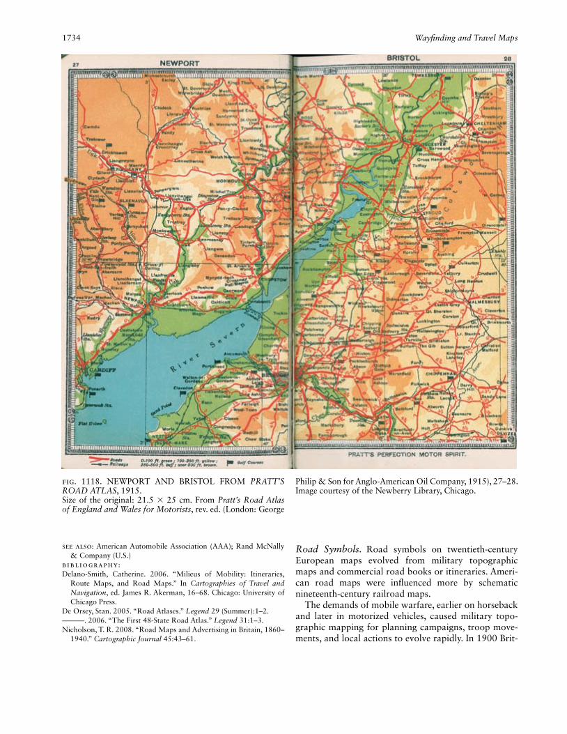
1734 Wayfi nding and Travel Maps
See also: American Automobile Association (AAA); Rand McNally & Company (U.S.)
Bibliography:Delano-Smith, Catherine. 2006. “Milieus of Mobility: Itineraries,
Route Maps, and Road Maps.” In Cartographies of Travel and Navigation, ed. James R. Akerman, 16–68. Chicago: University of Chicago Press.
De Orsey, Stan. 2005. “Road Atlases.” Legend 29 (Summer):1–2.———. 2006. “The First 48-State Road Atlas.” Legend 31:1–3.Nicholson, T. R. 2008. “Road Maps and Advertising in Britain, 1860–
1940.” Cartographic Journal 45:43–61.
Road Symbols. Road symbols on twentieth-century European maps evolved from military topographic maps and commercial road books or itineraries. Ameri-can road maps were infl uenced more by schematic nineteenth-century railroad maps.
The demands of mobile warfare, earlier on horseback and later in motorized vehicles, caused military topo-graphic mapping for planning campaigns, troop move-ments, and local actions to evolve rapidly. In 1900 Brit-
Fig. 1118. NEWPORT AND BRISTOL FROM PRATT’S ROAD ATLAS, 1915.Size of the original: 21.5 × 25 cm. From Pratt’s Road Atlas of England and Wales for Motorists, rev. ed. (London: George
Philip & Son for Anglo-American Oil Company, 1915), 27–28. Image courtesy of the Newberry Library, Chicago.

Wayfi nding and Travel Maps 1735
ish forces fi ghting the second South African ( Anglo-Boer) War replaced inadequate British War Offi ce 1:250,000-scale uncolored topographic maps with multicolored maps by a private Cape Town fi rm. The latter depicted roads, settlements, relief, and rivers with crossings more realistically. Postwar criticism of War Offi ce incompe-tence by a Royal Commission resulted by 1907 in bet-ter military maps of South Africa symbolizing road sur-faces, river crossings, and stopping places with water and grazing, but slow progress meant only the northern Cape Province and the Orange Free State were mapped by 1914. World War II opponents produced guides to enemy maps during the 1940s, emphasizing the capacity of the road networks and potential obstacles or bottle-necks to movement. Illustrating the strategic value of road information are formerly secret topographic maps detailing road widths, road types, and bridges of the for-mer German Democratic Republic (East Germany), dis-covered after Germany’s unifi cation in 1990. Afterward,
the road information was incorporated on civilian maps of former frontier areas of the Federal Republic and of the eastern Länder (states).
Twentieth-century civilian road mapping outpaced military mapping and responded more innovatively to changing road networks, transportation technology, and patterns of travel. Civilian road symbolization evolved to show: (1) roads (width, surface, gradients, number of lanes, complex intersections, distances, classifi cation, numbering, upkeep, and scenic value); (2) obstacles to traffi c fl ow and other movement (obstacles and ways of overcoming them: ferries, fords, bridges, winter closure, railroad crossings, trolley lines, low power cables, toll booths, gates, prohibition of certain kinds of traffi c or ve-hicles, private roads, and traffi c congestion); and (3) ser-vices available along roads (gas and service stations and places to eat, relax, sleep, or park). Larger-scale urban road maps included more detail, such as house numbers, street names, and one-way traffi c systems. Conventions
Fig. 1119. NEBRASKA FROM RAND MCNALLY AUTO ROAD ATLAS, 1926. The cover price of the atlas was seventy-fi ve cents.Size of the original: 29.6 × 44.9 cm. From Rand McNally
Auto Road Atlas of the United States (Chicago: Rand Mc-Nally, 1926), 54–55. Image courtesy of the Newberry Library, Chicago. Map © Rand McNally; R.L. 11-S-001.

1736 Wayfi nding and Travel Maps
developed for depicting ephemeral features clearly and economically on urban street maps. Special features be-gan to appear surprisingly early on civilian road maps. By 1900 many road maps showed relative importance and width of roads.
An early British map for cyclists was published in 1876 with cycle routes in red on a plain black base map, itself apparently dating back to 1796 (Nicholson 1983, 10). The popularity of cycle touring maps boomed af-ter manufacturing pneumatic tires for bicycles began in the late nineteenth century. In America Rand McNally’s fi rst road map, published in 1894 for cyclists, advertised Remington bicycles. Clearly infl uenced by topographic mapping, that early map rendered railroads, urban streets, topography, and water features, all important for cyclists, in detail (Akerman 1993b, 77). T. R. Nichol-son considers that cyclists made more demands on map-makers than motorists (1983, 46). Certainly the maps produced by the Touring Club de France, such as Carte vélocipédique des environs de Paris, showed a wide va-riety of road types and conditions (fi g. 1120). Favored roads were colored yellow, while three categories of disadvantageous roads were solid red. Red dot fi ll indi-cated cobbled roads with paths good for cyclists but bad for motor cars.
Roads derived from topographic surveys were shown as accurately as scale allowed. Lower accuracy charac-terized maps of less developed geographical areas, such as South Africa, where dirt roads made by ox wagons were replaced as the roads became impassable, a pro-cess creating a skein of roads on the ground, only one of which was current. The seventh edition of the Royal Automobile Club of South Africa Route Book (1930)
included a diagrammatic map of routes, differentiating routes described in the book from others of lower infor-mation quality for which distances given were only ap-proximate. The end of the century still found South Af-rican motorists relying on Automobile Association road maps showing tarred roads, while offi cial topographical maps did not distinguish them from dirt roads. Even where a ground survey existed, roads were sometimes generalized. During the Cold War era, following Soviet leadership, the former German Democratic Republic produced accurate topographic mapping not only for military use but also for publication and sale; the lat-ter were of deliberately limited quality and, from 1965, included complex intentional distortions (Cruickshank 2007).
Motor tourism’s wider range of travel created a need to mark routes on the ground and on standardized road maps. The Michelin Tire Company published road maps and guides separately from 1913 for France and 1914 for Great Britain (Everard 1999). Road depiction on Mi-chelin maps was standardized between those countries, although information source materials differed. Wider double-line symbols in black represented wider roads. Road quality was indicated ordinally by color. British roads on Michelin maps were classed as: “Through Routes” (red), “Other good Roads” (red stipple/brown), “Bad Roads” (red bars across the double black lines), “Roads, (Impracticable)” (uncolored double pecked lines), and “Picturesque Roads” (green band along the road). Viewpoints were colored blue. Cyril E. Everard believes Michelin derived their mapping from Ordnance Survey (OS) 1:63,360-scale topographic sheets but used their own road classifi cation (1999, 34–35).
Fig. 1120. DETAIL FROM THE CARTE VÉLOCIPÉDIQUE DES ENVIRONS DE PARIS DRESSÉE PAR LE TOURING CLUB DE FRANCE (PARIS: H. BARRÈRE, 1903). This sixth edition in twelve sheets is at a scale of 1:50,000. Typical of early French cycling maps is the road information overprinted
in color on a black 1:50,000-scale contoured topographic map in the style of the carte d’État-Major (type 1900).Size of the entire original: 67 × 55 cm; size of detail: 8.2 × 24 cm. Private collection.

Wayfi nding and Travel Maps 1737
However, Michelin and OS road symbols for steep hills were design opposites. Michelin arrows pointed up-hill in the French convention, while OS arrows pointed downhill, as they had done since 1914 (Hodson 1999, 142). Yolande Hodson details the principles of OS road classifi cation from a 1924 version of 1912 offi cial in-structions to fi eld revisers and draftsmen. Roads clas-sifi ed by width, quality, and importance were depicted by line symbols indicating width and importance. The crucial distinction between wide and narrow roads was fourteen feet (4.27 m), which allowed two lines of trans-port to pass. Color indicated quality (red meant fi t for fast traffi c, yellow fi t for ordinary traffi c, and uncolored for bad roads). “No road should have any colour on it which is not easily practicable for horse drawn vehicles, or passable for ordinary touring motor cars” (Hodson 1999, 242–43).
In France the pneumatic tire was followed by the in-troduction of asphalt spraying (goudronnage) to reduce dust in the early 1900s. Concern over road accidents and hazards led to safety markings, while road classifi cation led to road numbering to aid navigation (Reverdy 1986, 161–75). The varying upkeep of French roads kept Mi-chelin busy updating maps with road numbers and the state of roads. In spring 1929 there appeared a two-sheet 1:1,000,000-scale Michelin map of France, Etat des routes (No. 99 E.R.), with blue symbols classifying the state of roads overprinted on the normal red, yellow, and thin yellow lines classifying roads by importance. Concurrently, a 1:50,000 map, Sorties de Paris (No. 100), showed the city with brilliant clarity in gray and black with red for distances and trolley lines (fi g. 1121).
The movement of freight by road also spawned spe-cial maps, such as an annually issued French map of weight limits for trucks on roads affected by thawing ice and snow in winter (four categories of increasing weight shown by yellow, green, red, and blue). Unfortunately, red was most visible, green and blue could be confused with the gray-black color showing roads without restric-tions, and yellow was almost invisible. Few examples of such ephemeral maps have survived, and it is not known how useful truck drivers found them.
During the fi rst decade of the twentieth century Amer-ican motorists often used route books, verbal itineraries keyed to strip maps, to follow as yet unnumbered roads from town to town. One example, the 1914 edition of The Offi cial Automobile Blue Book, also included small schematic regional maps showing how the routes inter-related (with roads as solid lines, towns as open dots, and place-names and road distances in lettering, all printed in black) (Akerman 1993b, 81–82). In addition to road books, map publishers like Rand McNally pro-duced regional and state road maps in a schematic style adapted from railroad maps. In 1916 Rand McNally be-
gan publishing Auto Trails maps in association with the Blazed Trails program for designating routes by marking telephone poles with route numbers and colored bands matching the road symbols on their maps. That program was successful until 1926, by which time the numbered federal highway system (initiated in 1921) had made it obsolete (Akerman 1993a, 16; 1993b, 81–83).
As car ownership and touring grew with increas-ing prosperity in Western Europe, traffi c began to be mapped. After World War I new roads and bypasses built to reduce suburban and rural traffi c congestion ap-peared on maps, as did fl yovers and elevated sections of road after World War II. In Britain Autocar magazine teamed up with a popular weekly in 1956 to serialize “Everybody’s” simple black-and-white map for avoiding bottlenecks. Intended to increase the pleasure of sum-mer weekend and holiday driving by avoiding primary and main roads, rural idylls must soon have become as busy. In 1956 the Royal Automobile Club overprinted a detailed street map of London with main roads (yellow), quick-way routes (red), and local short routes (blue). For France’s annual summer holiday migrations, the
Fig. 1121. DETAIL FROM SORTIES DE PARIS: CARTE AU 50,000e (PARIS: PNEU MICHELIN, 1929). Scale 1:50,000. Trolley lines are shown prominently in red on this map be-cause they were a major urban road hazard.Size of the entire original: 75 × 48 cm; size of detail: 14.3 × 12 cm. Private collection.

1738 Wayfi nding and Travel Maps
road-safety organization (Securité routière) began in the 1980s to overprint standard road maps with routes to avoid congestion (itinéraires bis), also usually indicated by highway signs. The autoroute era saw major change in the French road network (Reverdy 1986, 174–75).
In the United States a similar revolution had been ini-tiated in 1921 by federally funded interstate highways (Akerman 1993a, 16). That important new class of roads with limited access and controlled use, excluding slow traffi c, forced European road map makers to cre-ate a new symbol category. Rather than change roads traditionally red, the German Automobile Club colored new Autobahnen blue (fi g. 1122). Postwar, the German road network expanded, and private mapmakers, such as Mair, altered Autobahnen symbols to mauve, nearly swaying the offi cial federal mapping agency to follow their popular example.
In Great Britain, where motorways arrived in the late 1950s, the OS awoke to the need for current route plan-
ning maps. Early national road maps used conventional red road symbols with variations in line type and width for road classes, but different OS symbols for types of road continued to evolve (Hellyer 1991, 148–50). An-nual map editions allowed the OS to experiment, reveal-ing a debate between map producers and their market in times of increasing fi nancial stringency. Such OS maps document both the evolution of the national road net-work and the halting progress toward the digital prod-uct during the late 1980s.
First the bicycle and then motor tourism and commut-ing had a long-lasting and crucial impact on road map design during the twentieth century. Carrying on from the early route books, strip maps, such as the Ameri-can Automobile Association’s TripTik, became popular with less adventurous travelers, but their symbolization emphasized one route and was constrained by the de-sign and placement of markers and names. New trans-portation technology and increasing personal mobility
Fig. 1122. DETAIL FROM STRAßENZUSTANDSKARTE VON DEUTSCHLAND (MUNICH: DER DEUTSCHE AU-TOMOBILCLUB e.V., 1937). Scale 1:1,000,000. This German road map demonstrates the signifi cance of the Autobahnen by the number of identifi ed subcategories, even including autho-rized routes of future Autobahnen.
Size of the entire original: 88 × 116 cm; size of detail: ca. 12.6 × 20.3 cm. Image courtesy of the Earth Sciences and Map Library, University of California, Berkeley

Wayfi nding and Travel Maps 1739
led to innovatively designed road maps for motorists less concerned with the fast or easy route. While road alignments were rarely determined by map authors and publishers, the users of road maps frequently engaged in collecting information about roads, designing appropri-ate symbols or exerting infl uence to expand content or improve depiction. Such information was often propri-etary and hence not published. One study usefully lists features associated with roads and streets (Phillips and Noyes 1977). Military topographic maps or local sur-veys available as base maps also facilitated the midcen-tury explosion in the number and variety of road maps characterizing of the age of the automobile.
Christopher Board
See also: Conventions, Cartographic; Navigation; Styles, Carto-graphic; Topographic Map
Bibliography:Akerman, James R. 1993a. “Blazing a Well-Worn Path: Cartographic
Commercialism, Highway Promotion, and Automobile Tourism in the United States, 1880–1930.” In Introducing Cultural and Social Cartography, comp. and ed. Robert Rundstrom, Monograph 44, Cartographica 30, no. 1:10–20.
———. 1993b. “Selling Maps, Selling Highways: Rand McNally’s ‘Blazed Trails’ Program.” Imago Mundi 45:77–89.
Autocar. 1956. Everybody’s “Avoid-the-Traffi c” Road Maps of Britain. London: Autocar.
Cruickshank, John L. 2007. “‘German-Soviet Friendship’ and the Warsaw Pact Mapping of Britain and Western Europe.” Sheetlines 79:23–42.
Everard, Cyril E. 1999. Michelin Maps of the British Isles 1914–c.1934 at the 1:200,000 Scale. London: Dept. of Geography, Queen Mary and Westfi eld College, University of London.
France. Ministère des Transports. Direction de la Sécurité et de la Cir-culation Routières. 1983. Carte routière de la France, barrières de dégel. Map 1:1,000,000.
Hellyer, Roger. 1991. The “Ten-Mile” Maps of the Ordnance Surveys. London: Charles Close Society for the Study of Ordnance Maps.
Hodson, Yolande. 1999. Popular Maps: The Ordnance Survey Popular Edition One-Inch Map of England and Wales, 1919–1926. Lon-don: Charles Close Society.
Nicholson, T. R. 1983. Wheels on the Road: Maps of Britain for the Cyclist and Motorist, 1870–1940. Norwich: Geo Books.
Phillips, Richard J., and Liza (Elizabeth) Noyes. 1977. “Searching for Names in Two City Street Maps.” Applied Ergonomics 8:73–77.
Reverdy, Georges. 1986. Atlas historique des routes de France. Paris: Presses de l’École Nationale des Ponts et Chaussées.
Web-Based Wayfi nding. Web-based wayfi nding re-fers to services on the World Wide Web that assist us-ers in navigation tasks. They allow entering start and end points and sometimes also intermediate points on a wayfi nding website. They then calculate one or more possible routes for a selected mode of transportation (car, pedestrian, bicycle, public transportation, or com-bined transportation). The route is communicated to the user on a map (overview map of the whole route, detailed maps of the relevant decision points or route segments, or interactive/zoomable maps), with other
graphical symbols (arrows, route sketches, etc.), or in textual form. The simple use of the web to disseminate traditional static wayfi nding maps is not covered here but in Web Cartography (Kraak and Brown 2001). Web-based wayfi nding services are also known as route plan-ners, journey planners, routing services, and, in the case of mobile devices, navigation systems.
Web-based wayfi nding services can be divided into pretrip and on-trip systems. Pretrip systems use the Inter-net connection of a nonmobile device such as a desktop computer and allow the user to plan the route and print out route instructions or maps. On-trip systems use the Internet connection of a mobile device and support the user with wayfi nding information while en route. When the device is equipped with positioning sensors it be-comes a navigation system and relieves users from the task of relating their position to the displayed informa-tion. Route planning with pretrip systems differs from wayfi nding with mobile devices. While the main goal is the same—to get to the destination, in most cases with as little effort as possible—paper maps and maps on nonmobile devices can also help users create a mental map of the route that can assist in future wayfi nding tasks. By contrast, mobile devices can—because of their limited screen sizes and resolutions—only show step-by-step maps, and the creation of a mental map is limited. For future wayfi nding tasks in the same area the device is probably needed again (Peterson 2007).
One of the fi rst online mapping services with rout-ing functionalities was MapQuest, which went online in 1996. Many similar route planning websites followed, nearly all of them developed by private companies and focused for car navigation. There were only a small number of companies that supplied the underlying route network geodata (e.g., Navteq and Tele Atlas). Although some of these services had a lot of setting options and state-of-the-art automated map rendering engines, they can be classifi ed as fi rst generation in Brandon Plewe’s generations of web maps (2007) because they used only basic web protocols, static images as maps, and simple interfaces. A characteristic of fi rst-generation appli-cations was the limiting constraint of low-resolution screens. At about the same time, the public sector started to publish web maps with applications that were citizen oriented, often using data collected by public institu-tions. One of the fi rst was the 1995 web map service of the city of Vienna, Austria, which offered real-time map renderings and pedestrian route calculation based on up-to-date city administration data as well as bicycle route calculation using bicycle network data. The routes were presented in a cartographic and a textual version. Since 1997 it has also allowed the inclusion of public transportation data for pedestrian route calculation
1740 Wayfi nding and Travel Maps
(Gross and Wilmersdorf 1997). These websites mainly used geographic information system (GIS)-to-web ap-plications of the major GIS vendors that resulted in web services with very GIS-like interfaces. These offered many more possibilities than the fi rst-generation maps but were not very intuitive to use. They were used to display diverse public administration data, and routing functions never were their main focus. In about 2005 third-generation web maps appeared and brought about a paradigm shift as the web browser evolved from a simple text-and-image viewer into an interface for so-phisticated web applications. The use of technologies like AJAX and preloaded map tiles improved intuitive handling and user experience and made web map ap-plications interesting for the masses. The most promi-nent of these was Google Maps, with a very simple and intuitive yet powerful user interface that became a de facto standard for good web maps, and users tended to ask why other sites were not like Google Maps—what Michael P. Peterson (2007) calls the “Google Maps Ef-fect.” The wayfi nding feature of Google Maps calculated routes for cars, pedestrians, and in some areas public transportation. User input was improved by allowing not only textual input but also drag and drop or right mouse click access. With Google Maps, web-based way-fi nding became an everyday tool for the average web user: in 2007—two years after its establishment—it had over 80 million unique visitors per month—this was as much as Google Mail and about 20 percent as much as Google’s web search (Riley 2007).
Most of the services mentioned above had many fea-tures, and wayfi nding was not their only focus. Mobile mapping devices were different because their main task was navigation assistance. The fi rst Global Position-ing System (GPS)-based mobile devices for wayfi nding started to appear in 1990. They were designed for car navigation, were built-in, needed additional sensors for positioning, and had no Internet connection. These early systems commonly supported the wayfi nding process not only with a map display but also with voice guidance and simplifi ed graphic route depictions and instructions. In 2000, the intentional degradation of GPS positional accuracy called Selective Availability was discontinued, making it possible to get positioning precise enough for car navigation without the need for additional sensors. This fact and the development of small personal digi-tal assistants (PDAs) made mobile navigation systems with preloaded map data attractive for a broader mar-ket. However, the devices themselves as well as the pro-prietary map data updates were sold at relatively high prices. With the development of Internet-enabled PDAs around 2000, many of the traditional nonmobile web mapping services—even public-sector ones—provided versions for mobile Internet devices (e.g., Vienna city
administration in 2004). These services were optimized for small screen sizes and low bandwidth usage.
Apple’s iPhone, introduced in 2007, was not the fi rst smart phone with an Internet connection, but it was im-mensely popular and can be seen as the trigger of a trend toward mobile applications with high network traffi c. This allowed mobile wayfi nding applications to down-load up-to-date map data whenever and wherever they were needed and to include real-time data such as traf-fi c information in the route calculation. Google Maps Navigation, a modifi ed version of Google Maps with all the features of traditional navigation systems as well as photo-based route visualizations, was made available for free in 2009. Soon thereafter and possibly as a reac-tion, Nokia and MapQuest made their paid navigation services Ovi Maps and MapQuest 4 Mobile freely avail-able. These developments can be seen as a direct attack on the traditional navigation system companies as their business models become outdated.
For both the nonmobile and mobile web-based way-fi nding solutions, two data sources were used for the un-derlying base maps: commercial map data sold mostly by two competitors Navteq and Tele Atlas (which com-bined self-collected and bought-in data of different sources into one large data set) and data collected by public administration bodies. The commercial sources offered data for large areas of the world, whereas public bodies only collected data for their area of responsibility. The quality and level of detail for street and transporta-tion network data are important for routing algorithms (fi g. 1123). Many commercial services offered routes for pedestrians simply using road network data and ignor-ing traffi c rules for cars such as one-way streets or turn restrictions. This was because pedestrian-relevant infor-mation like footpaths, sidewalks, and crosswalks was not present in commercial data sets. Similarly, informa-tion about bicycle tracks and bicycle-relevant traffi c re-strictions also were not in these data sets and therefore the services did not offer routes for cyclists. However, some public administration databases contained this in-formation (such as the web service of ViennaGIS). As some of the public administration web map services and the underlying data are also used for e-government and are therefore reliable, detailed, and always up-to-date, there are still possibilities for routing applications.
A relevant development in the context of base map data is the foundation of OpenStreetMap in 2004, an initiative to build a free open-license geographic base data source. Data are collected by volunteers in a crowd-sourcing approach. As of April 2010 OpenStreetMap “Stats” indicated 230,000 registered users with about 5 percent of them editing the content regularly.
The infl uence of the academic fi eld of cartography to the wayfi nding services mentioned above has been mar-

Wayfi nding and Travel Maps 1741
ginal; the development of services was accomplished mostly by technology-driven programmer-mapmakers in a highly commercial fi eld (fi g. 1124). Maps found in web-based wayfi nding services were based more on the work of design professionals than of cartographers. However, in the beginning of the twenty-fi rst century academic cartographers discovered the fi eld of location-based services and research on this topic became insti-tutionalized, beginning with the fi rst annual Symposium of Location Based Services (LBS) and TeleCartography in 2004 (Gartner, Cartwright, and Peterson 2007; Gart-ner and Rehrl 2009).
Felix Ortag, Manuela Schmidt, and Georg F. Gartner
See also: Route Map; MapQuest.com (U.S.); Web CartographyBibliography:Gartner, Georg F., William Cartwright, and Michael P. Peterson,
eds. 2007. Location Based Services and TeleCartography. Berlin: Springer.
Gartner, Georg F., and Wolfgang Hiller. 2009. “Impact of Restricted Display Size on Spatial Knowledge Acquisition in the Context of Pedestrian Navigation.” In Location Based Services and TeleCar-tography II: From Sensor Fusion to Context Models, ed. Georg F. Gartner and Karl Rehrl, 155–66. Berlin: Springer.
Gartner, Georg F., and Karl Rehrl, eds. 2009. Location Based Services and TeleCartography II: From Sensor Fusion to Context Models. Berlin: Springer.
Gross, Robert, and Erich Wilmersdorf. 1997. “New GIS Gateways for the Citizen: Multi-media and Internet Services.” In Geographic Information ’97: From Research to Application through Coopera-tion, ed. S. Hodgson, M. Rumor, and JanJaap Harts, 1499–1508. Amsterdam: IOS Press.
Kraak, M. J., and Allan Brown, eds. 2001. Web Cartography: Develop-ments and Prospects. London: Taylor & Francis.
Peterson, Michael P. 2007. “Maps and the Internet: What a Mess It Is and How to Fix It!” In Proceedings of the XXIII International Cartographic Conference 2007. Online publication.
Plewe, Brandon. 2007. “Web Cartography in the United States.” Car-tography and Geographic Information Science 34:133–36.
Fig. 1123. WAYFINDING-RELEVANT DIFFERENCES IN DATA QUALITY. Shown are the maximum zoom levels of three services: commercial service Google Maps (top), public service ViennaGIS (middle), and OpenStreetMap (bottom).Images courtesy of Google Maps (top) and ViennaGIS (mid-dle). © OpenStreetMap contributors (bottom).
Fig. 1124. TIMELINE OF WEB-BASED WAYFINDING. The mentioned services are examples and not necessarily the fi rst product of a kind.
1990 GPS-based car navigation
1991
1992
1993 WWW goes public, first PDA
1994
1995 ViennaGIS city map
1996 MapQuest
1997
1998
1999
2000 Mobile Internet (approximately)
2001
2002
2003
2004 OpenStreetMap
2005 Google Maps, Microsoft Virtual Earth (later Bing Maps)
2006
2007 Apple iPhone
2008 Android phone
2009 Google Maps Navigation
2010 Nokia Ovi Maps and MapQuest 4 Mobile become free

1742 Wayfi nding and Travel Maps
Riley, Duncan. 2007. “2007 In Numbers: iGoogle Google’s Home-grown Star Performer This Year.” TechCrunch, 22 December. On-line publication.
Wheelchair Access Map. Many social and health-related issues have been extensively mapped since the nineteenth century—Charles Booth’s poverty maps of London are a classic example—while others were largely hidden from society until relatively recently. This might in part be the result of a medical model of disability, dominant in the early twentieth century, when society tended to institutionalize people with disabilities rather than integrate them within the larger population. This was also refl ected in the lack of appropriate planning and management of physical and social spaces, particu-larly in the industrial city (Gleeson 1999). More recently, these disablist attitudes have been challenged by the so-cial model, which regards society as acting to handicap people through poor physical planning and the imposi-tion of social barriers and constraints.
Accompanying the shift toward the social model was a movement to create universal access through appropri-ate design (Lifchez and Winslow 1979). Unfortunately, map production tended to be ad hoc; for example, while Britain’s Royal Association for Disability and Rehabili-tation (RADAR) issued detailed guidance on the pro-duction of written access guides, its advice on mapping was extremely limited (Vujakovic and Matthews 1994, 363). Maps produced by local access groups to accom-pany written guides tended to be the exception rather than the rule. Another problem identifi ed during the 1980s was the growth in “good news” maps, through which local authorities, countryside agencies, and other providers tended to create an image of accessibility by mapping disability aids such as ramps, lifts, and exclu-sive parking locations (Vujakovic and Matthews 1994, 363, 370). Regrettably, many of these maps ignored the problems associated with uneven surfaces, constraints, and barriers created by poor design. The term “phantom accessibility” was coined to describe this phenomenon, often the result of limited engagement with the users group (Limb, Matthews, and Vujakovic 1995, 187–90).
An innovative aspect of disability mapping was the direct involvement of wheelchair users and others. This “emancipatory cartography” developed out of an in-creasing concern to involve users groups (Vujakovic and Matthews 1994, 373), for example, through the inter-actionist approaches to “design for independent living” championed by Raymond Lifchez and Barbara Winslow (1979). The Coventry Access and Mobility Mapping Project (CAMMP) used cognitive mapping approaches and other direct methods of engagement (environmental explorations) to develop a deeper understanding of the needs of potential map users. The outcomes were then used as the basis for organizing an effective approach to
survey, as well as to build empathic relationships within survey teams that included wheelchair users (fi g. 1125). The results of such mapping are probably more impor-tant as persuasive cartography—making a powerful political statement—than as practical information; the
Fig. 1125. COGNITIVE MAPS OF COVENTRY DRAWN BY A WHEELCHAIR USER AND A GEOGRAPHY UNDER-GRADUATE STUDENT. The participants in the CAMMP were asked to draw a map of the route they would use from Priory Hall at the university to the main city library. These two maps show the difference in perspective between a wheelchair user (a) and a non–wheelchair user (b). Note the annotation by the wheelchair user: “Cobbles (No!).”From Vujakovic and Matthews 1994, 365 (fi g. 1). Reproduced by permission of Taylor & Francis.

Weather Channel, The 1743
maps effectively forced authorities to take note of the needs and concerns of marginalized groups.
Another historical change in the politics of disability that has been mirrored in cartography is the stereotyp-ing of marginalized groups. The symbols used in access mapping have tended to reinforce the concept of the dis-abled as a group set apart from mainstream society, but more recent approaches have attempted to involve users in choosing and designing symbolization and in mov-ing toward a more integrative approach. Even so, inter-national conventions, such as the use of the wheelchair symbol, make it hard to challenge entrenched stereo-types (Vujakovic and Matthews 1994, 369–70).
Advances in computer cartography and geographic information systems (GIS) added a new dimension to ac-cess mapping in the late twentieth century, creating the potential to provide real-time and online information as well as tailor maps to the needs of individual users. The early twenty-fi rst century witnessed the use of new technologies and approaches, such as digital elevation models and shortest-path algorithms, to create more ef-fective wheelchair access maps (Beale et al. 2006).
Peter Vujakovic
See also: Tactile MapBibliography:Beale, Linda, et al. 2006. “Mapping for Wheelchair Users: Route Navi-
gation in Urban Spaces.” Cartographic Journal 43:68–81.Gleeson, Brendan. 1999. Geographies of Disability. London: Rout-
ledge.Lifchez, Raymond, and Barbara Winslow. 1979. Design for Indepen-
dent Living: The Environment and Physically Disabled People. London: Architectural Press.
Limb, Melanie, M. H. Matthews, and Peter Vujakovic. 1995. “Dis-abling Countryside: An Investigation of Wheelchair Users’ Experi-ences of Informal Recreation.” In Policy and Politics in Sport, Physi-cal Education and Leisure, ed. Scott Fleming, Margaret Talbot, and Alan Tomlinson, 177–96. London: Leisure Studies Association.
Vujakovic, Peter, and M. H. Matthews. 1994. “Contorted, Folded, Torn: Environmental Values, Cartographic Representation and the Politics of Disability.” Disability & Society 9:359–74.
Weapons Guidance, Automated. See Cruise Missile
Weather Channel, The (U.S.). Debuting on 2 March 1982, The Weather Channel (TWC) became one of the most widely available channels on U.S. cable and satel-lite television. In 2006 TWC reached the homes of more than ninety million viewers, broadcasting weather anal-ysis, forecasts, documentaries, and local information. Much of its programming consists of live presentations from on-camera personnel with maps appearing behind them. TWC was conceived by television meteorologist John Coleman and funded by Landmark Communica-tions, a privately held fi rm. Viewership was low during the channel’s fi rst two years, averaging about 60,000 households per minute in 1985 (Batten 2002, 154), but it gradually increased as the number of U.S. cable sub-scribers grew and as TWC’s programming became more sophisticated.
Television weathercasters in many U.S. cities had employed cold fronts, warm fronts, isobars, and other graphical products of Bergen School meteorological theory since the late 1940s (Henson 2010, 9). In its fi rst years, TWC used these familiar elements in national maps that took viewers through the upcoming twenty-four hours of weather. This was accomplished through a series of four-second stills that faded in and out sequen-tially to create a sense of slow-motion animation. (The technique was later discarded.) The maps also included areas of precipitation, depicted in various colors: green for rain, dark green for heavier rain, white for snow, and yellow for fog. Base maps for these products varied in color and style in subsequent years and gradually be-came more detailed. Extended outlooks on TWC gener-ally showed three maps for each day, one with areas of precipitation and two depicting high and low tempera-tures. The latter maps used a spectrum of colors (bluer shades for cold, redder shades for warm), banded in in-crements of 10°F (5.6°C) (fi g. 1126). The channel has also made frequent use of radar and satellite loops since its inception.
When TWC began, the Bergen-style front and pre-
Fig. 1126. THE WEATHER CHANNEL TEMPERATURE MAPS, 1983, 1995, AND 2000. This sequence shows the evolution in the presentation of temperature gradients on The Weather Channel.
© The Weather Channel.

1744 Weather Map
cipitation maps were sketched by meteorologists and fi nalized by artists using graphics software (fi g. 1127). The labor-intensive process of drawing each area of pre-cipitation from scratch engendered confl ict between the meteorologists, who carefully placed each element, and the artists, who strove for an aesthetically pleasing map even if that required making alterations to the designs they were given (Raymond Ban, personnel communica-tion). In the mid-1980s TWC replaced its artists with meteorologists skilled in computer graphics. Over time, TWC has also reduced its use of Bergen-style symbols. As of 2006, regional versions of the forecast maps typi-cally showed only temperatures and precipitation, with no fronts indicated.
TWC employed a cumbersome system of several dis-connected software packages to create graphics during its fi rst few years, when computer-generated imagery was not yet a standard part of weathercasts in most U.S. cities (Monmonier 1999, 181). Subsequent upgrades and consolidations facilitated the large demand for graphics by TWC and its online counterpart, Weather.com. By 2002, TWC was generating more than 100,000 maps per day. Only a small fraction were actually used by the channel or its online counterpart (Batten 2002, 213).
Robert Henson
See also: Chroma Key; Meteorology and Cartography; Television and Maps; Weather Map
Bibliography:Batten, Frank, with Jeffrey L. Cruikshank. 2002. The Weather Chan-
nel: The Improbable Rise of a Media Phenomenon. Boston: Har-vard Business School Press.
Henson, Robert. 2010. Weather on the Air: A History of Broadcast Meteorology. Boston: American Meteorological Society.
Monmonier, Mark. 1999. Air Apparent: How Meteorologists Learned to Map, Predict, and Dramatize Weather. Chicago: University of Chicago Press.
Weather Map. By the end of the nineteenth century, government weather services in many countries pub-lished daily weather maps, based solely on surface mea-surements, as did a few daily newspapers. Maps appear-ing in four U.S. newspapers in 1894 were similar to U.S. Weather Bureau maps in their isobars, isotherms, and spot symbols showing wind direction, temperature and sky condition but customized for the city of publication—the maps were drawn up by local Weather Bureau forecast-ers, and the observations available varied from city to city (Monmonier 1999, 162–63). For the fi rst two decades of the twentieth century the Times (London) featured a daily weather map for Europe with isobars (graduated in inches), spot temperatures (in degrees Fahrenheit), wind arrows, sky condition symbols, and text descriptions. The isobars on all surface weather maps of this era were smoothly curved with no discontinuities.
Local forecasters drew their own maps but relied on guidance from a central forecast offi ce in Washington. The limitations of this system were exposed when the weather maps of early 8 September 1900 offered no warning of the hurricane that hit Galveston, Texas, kill-ing more than 8,000 persons. Wireless telegraphy did not yet exist to send reports from ships at sea, and per-sonal politics hindered the sharing of information with Cuba. With the limited information available and the forecasting practices of the time, forecasters believed the storm would move up the East Coast, leaving the Texas coast unscathed (Emanuel 2005, 83–90). A century later maps and satellite images delivered by television and the Internet let the general public as well as professional forecasters track the progress of tropical storms across the Atlantic Ocean and the Gulf of Mexico. A century of progress in observing the atmosphere and predicting its behavior radically changed the number, format, and reliability of weather maps.
In October 1900 National Geographic Magazine published a preliminary U.S. Weather Bureau report on the Galveston hurricane (Garriott 1900). Four full-page maps related the storm’s position to other synoptic data over an eight-day period. The base map, which covered an area from Hudson Bay to the northern fringe of South America, showed only coastlines and no political boundaries. Isobars described the approximate positions of highs and lows. On 5 September, the report noted, the storm’s position was not well defi ned, and the map gave little indication that high pressure to the north would block the storm from following a normal track up the Atlantic coast (fi g. 1128).
In 1905 Willis L. Moore, director of the U.S. Weather Bureau, turned to National Geographic to instruct “in-telligent persons [that] the daily weather chart will be an object of interest as well as pleasure and profi t” (Moore 1905, 255). He provided an overview of the agency’s history, described the process of making weather maps,
Fig. 1127. THE WEATHER CHANNEL FORECAST MAP, 1995. On-camera meteorologist Mike Seidel is shown with a forecast map showing fronts, cyclones, isobars, and precipita-tion areas.© The Weather Channel.

Weather Map 1745
and used sequences of generalized daily weather maps to introduce readers, progressively, to pressure and iso-bars, isotherms, storm tracks, and areas of precipitation. Additional sequences of maps illustrated various types of storms. One map used nine equally large cyclonic spi-rals to track the center of the Galveston hurricane over twelve days. “The spirals . . . . illustrate more clearly than can be done in any other way the eddy-like mo-tion of a cyclone” (Moore 1905, 285). Moore included a variety of maps focused on movement, some showing storm tracks and others representing tornadoes, with all thematic content shown in red, and he spelled out in de-tail the technique for computing resultant vectors used to forecast storm motion.
After World War I a group of meteorologists in Ber-gen, Norway, developed the concept of the midlatitude wave cyclone, which focused attention on the boundary, or front, between air masses of different densities. On surface maps, fronts are portrayed as lines, with unique symbols and colors that distinguish the type of front and its direction of movement. According to Bergen School
theory, an isobar should have a discontinuity, or notice-ably bend, where it intersects a front.
Because wave-cyclone science was not readily ac-cepted, many years elapsed before the public saw weather maps with fronts. In 1930 weather maps of the British Isles in the Times (London) showed the weather of the previous day using isobars in millibars but lacked fronts. By 1936, when ample wireless reports allowed broader coverage, Times maps portrayed the North Atlantic from Labrador to the Mediterranean but still lacked fronts. During the 1930s weather maps in Ger-man and U.S. newspapers were similarly defi cient.
During World War II all combatants restricted the distribution of weather information, and weather maps disappeared from newspapers. Technology developed during the war for observing weather and making fore-casts confi rmed that Bergen-based principles yielded more reliable forecasts. Now indispensable, fronts and air masses became the foundation of the meteorologist’s education, and fronts became a standard feature on postwar newspaper weather maps.
Fig. 1128. TRACK OF WEST INDIAN HURRICANE, 1900. The fi rst of four maps in a sequence showing the path of the hurricane that three days later devastated Galveston and then moved north over the Great Lakes and Montreal.
Size of the original: 11.5 × 13.9 cm. From Garriott 1900, 385.

1746 Weather Map
The decade following World War II witnessed spec-tacular advances in meteorological technology. By the mid-1950s, computers were modeling atmospheric cir-culation, and television was delivering narrated weather maps to millions of homes every evening. Radar had proved adept in detecting weather phenomena, and in 1960 weather satellites began tracking the formation and movement of clouds below. Further developments in computing, modeling, data collection, radar detection and interpretation, satellite imaging, data presentation, and communication stimulated the public’s appetite for current weather information and forecasts.
Market forces helped satisfy this craving. Television stations and networks used weather presentations to compete for viewers, and some stations even added their own radar units. Newspapers competing with print me-dia rivals or local television broadcasters recognized an informative and attractive weather “package” as a dis-tinct advantage. Government agencies and universities produced attractive graphics in print and, later, on the World Wide Web (WWW) to educate and inform the public, as well as to demonstrate their own relevance and thus bolster their appeals for more money. Private fi rms carved out niches by integrating weather data from multiple sources and packaging presentations for the print, television, and web communities. Each of these environments refl ected the momentum of individuals ea-ger to demonstrate their expertise, present their research fi ndings, educate a larger public, and warn of impending threats.
As an exciting new medium reaching into nearly every home, television created employment opportunities by making weathercasting part of the nightly mix of news and sports. On some stations an ex-military meteo-rologist presented the maps, while on others a scantily clad weather girl or a jovial clown fi lled the role. In the process a large public was introduced to fronts and air masses portrayed on maps. Concomitantly, newspapers started including forecast weather maps. For example, the Chicago Tribune ran its fi rst weather map in August 1949. Its maps of the conterminous United States var-ied in size and appearance as their design and content evolved over the years, but always included fronts and an indication of sky conditions or areas of precipitation. Although isobars were never used, the maps highlighted centers of high and low pressure. In 1949 the forecast daily weather map in the Times showed fronts and iso-bars over the British Isles, with isobars labeled in both millibars and inches. By 1960 the Times had two maps, a comparatively detailed map of the British Isles and a North Atlantic map with isobars in 8 mb units and fronts but no indicators of temperatures or sky conditions.
Soon after the fi rst satellite images became available in the 1960s, television weathercasters incorporated them into their presentations, typically as animated
loops showing the motion of clouds. In 1982 the Chi-cago Tribune adopted a GOES (Geostationary Opera-tional Environmental Satellite) image map as its larger weather map while showing the forecast in a smaller, more simplifi ed map.
In 1982 the national newspaper USA Today began publishing a full-color weather page that included a large national map showing forecast temperatures and usually one or more thematic maps. This set a new stan-dard for the presentation of weather maps, and most newspapers soon adopted something similar. By 2006 most newspaper weather maps used color for forecast temperatures on the larger map, high and low tempera-tures for selected cities, and some symbolization for precipitation. The Times (London) was perhaps unique in still including isobars. Fronts remained a common feature on newspaper weather maps but were not uni-versal. Some newspapers provided greater detail on a local or regional map that included cities and perhaps major roads within their circulation area and a bit be-yond. Others included small forecast maps looking fi ve to six days ahead. Because a handful of service bureaus provided much of the content, the weather pages of dif-ferent newspapers often had a similar look.
USA Today was not the only pivotal development in 1982. The same year, The Weather Channel (TWC) be-gan providing American cable viewers around-the-clock weather coverage. Although the service soon became very popular in the United States, efforts to introduce the TWC brand in other countries were unsuccessful. (By the dawn of the twenty-fi rst century, though, dedi-cated twenty-four-hour weather channels were well es-tablished in Britain, Canada, and several other countries with state-supported television.) Commonly, a team of meteorologists prepared a coordinated program of maps showing current and forecast weather, with noteworthy features pointed out by a weathercaster who appeared to be standing in front of the map. Fronts in standard col-ors and symbology were used regularly, whereas isobars shown as white lines on the colored maps were noted only during extreme conditions or when steep pressure gradients created strong winds. Maps of the dew point and the temperature change over the past twenty-four hours were common. During hurricane season and other periods of severe weather, a meteorologist would often use specially composed thematic maps to explain the situation. It became common to display an advertiser’s logo in an upper corner of a map.
A standard feature of TWC was its slogan “Local on the Eights.” Starting at 12:08 a.m., and reappearing every ten minutes thereafter, an animated loop of local radar showed the movement of precipitable moisture over the past three hours. This system was automated, and radar echoes were overlaid on a base map show-ing cities, highways, and political boundaries for ori-
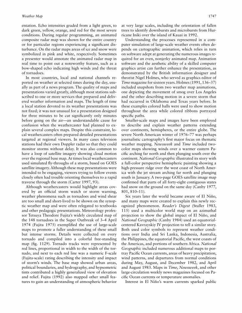
Weather Map 1747
entation. Echo intensities graded from a light green, to dark green, yellow, orange, and red for the most severe conditions. During regular programming, an animated composite radar map was shown for the entire country or for particular regions experiencing a signifi cant dis-turbance. On the radar maps areas of ice and snow were symbolized in pink and white, respectively. Sometimes a presenter would annotate the animated radar map in real time to point out a noteworthy feature, such as a bow-shaped echo indicating high winds and the threat of tornadoes.
In most countries, local and national channels re-ported on weather at selected times during the day, usu-ally as part of a news program. The quality of maps and presentations varied greatly, although most stations sub-scribed to one or more services that prepared and deliv-ered weather information and maps. The length of time a local station devoted to its weather presentations was not fi xed; it was not unusual for a presentation designed for three minutes to be cut signifi cantly only minutes before going on the air—an understandable cause for confusion when the weathercaster had planned to ex-plain several complex maps. Despite this constraint, lo-cal weathercasters often prepared detailed presentations targeted at regional viewers. In many cases television stations had their own Doppler radar so that they could monitor storms without delay. It was also common to have a loop of satellite imagery showing cloud motion over the regional base map. At times local weathercasters used simulated fl y-throughs of a storm, based on GOES satellite imagery. Although these map presentations were intended to be engaging, viewers trying to follow events closely often had trouble orienting themselves to a rapid traverse through the storm (Carter 1997, 93).
Although weathercasters would highlight areas cov-ered by an offi cial storm watch or storm warning, weather phenomena such as tornadoes and wind shear are too small and short-lived to be shown on the synop-tic weather map and were often relegated to textbooks and other pedagogic presentations. Meteorology profes-sor Tetsuya Theodore Fujita’s widely circulated map of the 148 tornadoes in the Super Outbreak of 3–4 April 1974 (Fujita 1975) exemplifi ed the use of large-scale maps to promote a fuller understanding of these small but intense storms. Details were collected on every tornado and compiled into a colorful free-standing map (fi g. 1129). Tornado tracks were represented by red lines, proportional in width to the width of the tor-nado, and next to each red line was a numeric F-scale ( Fujita-scale) rating describing the intensity and impact of storm’s winds. The base map showed urban areas, political boundaries, and hydrography, and hypsometric tints contributed a highly generalized view of elevation and relief. Fujita (1992) also mapped other small fea-tures to gain an understanding of atmospheric behavior
at very large scales, including the orientation of fallen trees to identify downbursts and microbursts from Hur-ricane Iniki over the island of Kauai in 1992.
Understanding the processes represented in a com-puter simulation of large-scale weather events often de-pends on cartographic animation, which relies in turn on software adept at generating the numerous images re-quired for an even, nonjerky animated map. Animation software and the aesthetic ability of a skilled computer graphics artist can further enhance the presentation, as demonstrated by the British information designer and theorist Nigel Holmes, who served as graphics editor of Time magazine for sixteen years. Holmes (1991, 136–37) included snapshots from two weather map animations, one depicting the movement of smog over Los Angeles and the other describing motion in a severe storm that had occurred in Oklahoma and Texas years before. In these examples colored balls were used to show motion throughout the area while colored ribbons portrayed specifi c paths.
Smaller-scale maps and images have been employed to describe and explain weather patterns extending over continents, hemispheres, or the entire globe. The severe North American winter of 1976–77 was perhaps journalistic cartography’s fi rst major focus on thematic weather mapping. Newsweek and Time included two-color maps showing winds over a warmer eastern Pa-cifi c arching far north and then plunging south over the continent. National Geographic illustrated its story with a full-color perspective hemispheric painting showing a high-pressure ridge over the west coast of North Amer-ica with the jet stream arching far north and plunging south in January. A two-page GOES satellite image map confi rmed that parts of all forty-eight contiguous states had snow on the ground on the same day (Canby 1977, 801, 810–11).
Six years later the world became aware of El Niño, and many maps were created to explain this newly rec-ognized phenomenon. Reader’s Digest (Stuller 1983, 115) used a multicolor world map on an azimuthal projection to show the global impact of El Niño, and National Geographic (Canby 1984) used an equatorial-centered Kavrayskiy IV projection to tell a similar story. Both used color symbols to represent weather condi-tions over India and Sri Lanka, Indonesia, Australia, the Philippines, the equatorial Pacifi c, the west coasts of the Americas, and portions of southern Africa. National Geographic included numerous additional maps to por-tray Pacifi c Ocean currents, areas of heavy precipitation, wind patterns, and departures from normal conditions during May, August, and December 1982, and April and August 1983. Maps in Time, Newsweek, and other large-circulation weekly news magazines focused on Pa-cifi c Ocean currents or temperature anomalies.
Interest in El Niño’s warm currents sparked public

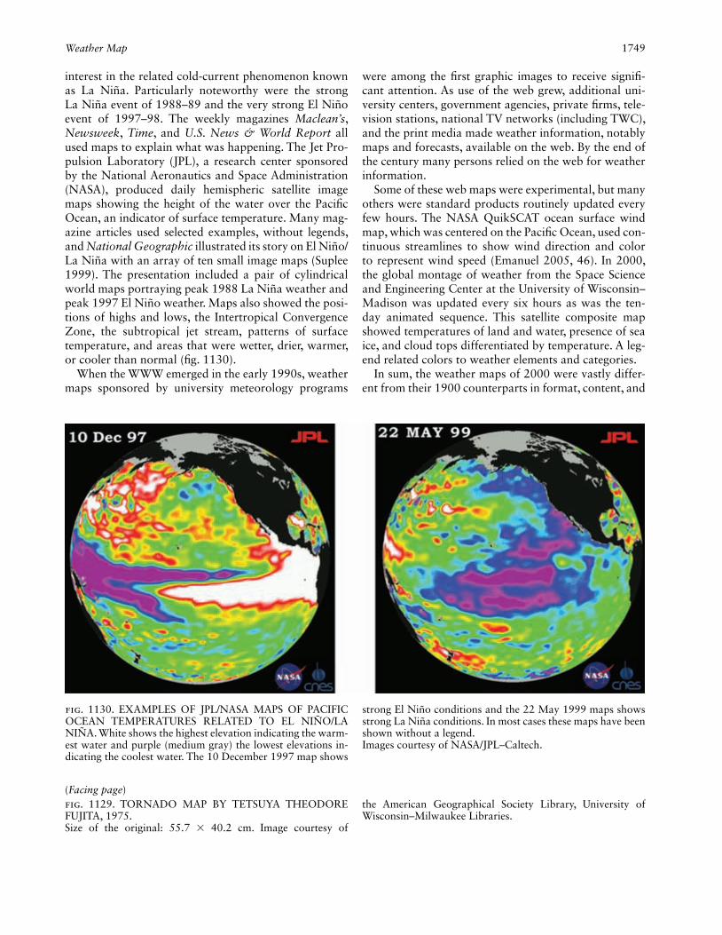
Weather Map 1749
interest in the related cold-current phenomenon known as La Niña. Particularly noteworthy were the strong La Niña event of 1988–89 and the very strong El Niño event of 1997–98. The weekly magazines Maclean’s, Newsweek, Time, and U.S. News & World Report all used maps to explain what was happening. The Jet Pro-pulsion Laboratory (JPL), a research center sponsored by the National Aeronautics and Space Administration (NASA), produced daily hemispheric satellite image maps showing the height of the water over the Pacifi c Ocean, an indicator of surface temperature. Many mag-azine articles used selected examples, without legends, and National Geographic illustrated its story on El Niño/La Niña with an array of ten small image maps (Suplee 1999). The presentation included a pair of cylindrical world maps portraying peak 1988 La Niña weather and peak 1997 El Niño weather. Maps also showed the posi-tions of highs and lows, the Intertropical Convergence Zone, the subtropical jet stream, patterns of surface temperature, and areas that were wetter, drier, warmer, or cooler than normal (fi g. 1130).
When the WWW emerged in the early 1990s, weather maps sponsored by university meteorology programs
were among the fi rst graphic images to receive signifi -cant attention. As use of the web grew, additional uni-versity centers, government agencies, private fi rms, tele-vision stations, national TV networks (including TWC), and the print media made weather information, notably maps and forecasts, available on the web. By the end of the century many persons relied on the web for weather information.
Some of these web maps were experimental, but many others were standard products routinely updated every few hours. The NASA QuikSCAT ocean surface wind map, which was centered on the Pacifi c Ocean, used con-tinuous streamlines to show wind direction and color to represent wind speed (Emanuel 2005, 46). In 2000, the global montage of weather from the Space Science and Engineering Center at the University of Wisconsin–Madison was updated every six hours as was the ten-day animated sequence. This satellite composite map showed temperatures of land and water, presence of sea ice, and cloud tops differentiated by temperature. A leg-end related colors to weather elements and categories.
In sum, the weather maps of 2000 were vastly differ-ent from their 1900 counterparts in format, content, and
(Facing page)Fig. 1129. TORNADO MAP BY TETSUYA THEODORE FUJITA, 1975.Size of the original: 55.7 × 40.2 cm. Image courtesy of
the American Geographical Society Library, University of Wisconsin–Milwaukee Libraries.
Fig. 1130. EXAMPLES OF JPL/NASA MAPS OF PACIFIC OCEAN TEMPERATURES RELATED TO EL NIÑO/LA NIÑA. White shows the highest elevation indicating the warm-est water and purple (medium gray) the lowest elevations in-dicating the coolest water. The 10 December 1997 map shows
strong El Niño conditions and the 22 May 1999 maps shows strong La Niña conditions. In most cases these maps have been shown without a legend.Images courtesy of NASA/JPL–Caltech.
1750 Web Cartography
abundance. This richer trove of weather cartography re-fl ected more insightful meteorological theory as well as marked improvements in the collection, transmission, processing, plotting, and dissemination of weather data. Although the public was surely better informed, partic-ularly about approaching severe weather, the weather map’s newfound ability to look ahead in time came with few guarantees, particular when the forecast horizon was forty-eight or more hours away. Perhaps the great-est legacy of twentieth-century advances in weather car-tography was a fuller appreciation of this uncertainty, powerfully reinforced whenever computer models of-fered radically divergent scenarios.
James R. Carter
See also: Chroma Key; Climate Map; Journalistic Cartography; Me-teorology and Cartography
Bibliography:Bader, M. J., et al., eds. 1995. Images in Weather Forecasting: A Practi-
cal Guide for Interpreting Satellite and Radar Imagery. Cambridge: Cambridge University Press.
Canby, Thomas Y. 1977. “The Year the Weather Went Wild.” National Geographic 152:798–829.
———. 1984. “El Niño’s Ill Wind.” National Geographic 165:144–83.
Carter, James R. 1997. “Weather Map Presentations in Mass Media in the United States.” In International Conference on Mass Media Maps: Approaches, Results, Social Impact: Proceedings, ed. Wolf-gang Scharfe, 89–100. Berlin: Selbstverlag Fachbereich Geowissen-schaften, Freie Universität Berlin.
Emanuel, Kerry A. 2005. Divine Wind: The History and Science of Hurricanes. Oxford: Oxford University Press.
Fujita, Tetsuya Theodore. 1975. “New Evidence from April 3–4, 1974 Tornadoes.” Ninth Conference on Severe Local Storms [Preprints], 248–55. Boston: American Meteorological Society.
———. 1992. “Damage Survey of Hurricane Iniki in Kauai.” Storm Data 34, no. 9:15–27.
Garriott, E. B. 1900. “The West Indian Hurricane of September 1–12, 1900.” National Geographic Magazine 11:384–92.
Holmes, Nigel. 1991. Pictorial Maps. New York: Watson-Guptill Pub-lications.
Monmonier, Mark. 1999. Air Apparent: How Meteorologists Learned to Map, Predict, and Dramatize Weather. Chicago: University of Chicago Press.
Moore, Willis L. 1905. “Forecasting the Weather and Storms.” Na-tional Geographic 16:255–305.
Stuller, Jay. 1983. “El Niño: Harbinger of Deadly Weather.” Reader’s Digest, December, 115–19.
Suplee, Curt. 1999. “El Niño/La Niña.” National Geographic 195, no. 3:72–95.
Web-Based Wayfi nding. See Wayfi nding and Travel Maps: Web-Based Wayfi nding
Web Cartography. Web cartography, also referred to as online cartography or Internet cartography, deals with all aspects of maps and the Internet, including their creation, distribution, use, and infl uence. By the early
twenty-fi rst century most maps were made by computer and delivered through the Internet, and online methods had become the dominant form of mapping, eclipsing paper media and other forms of distribution. Research and development in this area was concerned with mak-ing maps more prevalent, user-focused, accurate, useful, timely, and effective as tools for understanding and com-munication.
The development of web cartography refl ects the notion that any particular medium has a potential for communication. As defi ned by communication theorist Marshall McLuhan (Theall 1971), a medium is a carrier of information that is used to transmit knowledge and ideas between people. Some media, McLuhan argued, are more pervasive and compelling than others. The advent of the World Wide Web demonstrated that the computer is not merely a tool but a medium of commu-nication. Indeed, the web’s ability to link text, graphics, audio, and video elements interactively created a highly engaging medium that can readily adapt to the particu-lar needs of the user. In this respect, it represents a supe-rior medium for maps.
The emergence of an interactive and online form of cartography depended on a system for transferring data between computers and a user interface that made the system easily accessible to a large population. Now known as the Internet, the data transfer system was originally created as an uninterruptible communica-tion system that could survive a nuclear attack. Initi-ated in 1969 by the Advanced Research Projects Agency (ARPA), a quasi-military organization, the system re-mained under the control of the U.S. military throughout the 1970s. ARPANET used a Network Control Protocol (NCP) that was fi rst implemented between Stanford University, the University of California at Santa Bar-bara, and the University of Utah. Sometime during the 1970s, researchers realized that ARPANET was really a government-subsidized person-to-person communi-cations service (Kikta, Fisher, and Courtney 2002, 8). ARPANET switched from NCP to the more fl exible and inclusive TCP/IP (Transmission Control Protocol/Inter-net Protocol) on 1 January 1983, a date many consider the beginning of the Internet.
Increasing burdens on the network throughout the 1980s forced the U.S. government to commission the National Science Foundation (NSF), a federal agency, to oversee the network. Established in 1986, NSFNET had a speed of 56 kbps (kilobits per second) and supported 5,000 Internet hosts. NSFNET was primarily designed to give researchers wider access to supercomputers at fi ve major universities. During the 1980s a large number of research and educational institutions were connected via a high-speed Internet backbone.
During this time, online computer services companies

Web Cartography 1751
like CompuServe began to offer services such as e-mail and chat rooms. Demand for these services spurred de-velopment of the telecommunications infrastructure necessary for the widespread use of the Internet in the 1990s. Data communications speeds of 300 baud (pulses or tones per second) were common at the beginning of the 1980s, when home users with Internet service typi-cally relied on a conventional telephone line and a mo-dem (modulator/demodulator) for converting between the audio signal of the telephone network and the digi-tal signal of a terminal or personal computer. Speeds of 1,200 baud became available by the mid-1980s, and 2,400 baud by the late 1980s. Connections offering 9,600 baud were in use by 1989, followed quickly by the introduction of 14,400 baud (1991), 28,800 baud (1994), and ultimately 56 kbps modems by 1996—the fastest speed possible with telephone lines. But this speed was rarely achieved because most users only had 48 kbps to 50 kbps service, even on a “clean line.” Ac-cess to the Internet through DSL (digital subscriber line) and broadband cable modems became common by the end of the 1990s with speeds of approximately 1 million bits per second. Even so, at the beginning of the twenty-fi rst century a large number of Internet users still relied on a telephone connection.
From its inception in 1969 through the mid-1990s, the Internet was used almost exclusively by academic research scientists and the U.S. military. Besides being restricted to specifi c users, the system was diffi cult to use. The simple process of sending and receiving fi les required memorizing arcane text commands. The World Wide Web changed this and brought the Internet to the masses. First conceived in 1989 at the Organisation eu-ropéenne pour la recherche nucléaire (CERN), located near Geneva, Switzerland, the web was intended to as-sist researchers in high-energy physics research by link-ing related documents so that research articles could be accessed more quickly. Tim Berners-Lee (1989), who played a crucial role in designing the system, wanted to create a seamless network in which information from any source could be accessed in a simple and consistent way. Before the web, accessing the needed information required many different computer programs largely be-cause of the incompatibility between different types of computers. The World Wide Web introduced the prin-ciple of “universal readership,” which required that net-worked information be accessible from any computer with a single program. A text-only prototype of the new protocol was fi nished in 1991. The system was quickly embraced because it also incorporated the previous pro-tocols for fi le exchange, including FTP (fi le transfer pro-tocol), newsgroups, and e-mail.
The swift implementation of the web can be measured by the rapid and widespread adoption of the initial web
browser, Mosaic, developed by the National Center for Supercomputing Applications (NCSA) in Urbana, Il-linois. Designed to work with a variety of computers and operating systems, Mosaic was in wide use within months of its initial release in 1993. Implementing the hypermedia fi le-access structure (Nielsen 1990), the pro-gram incorporated both hypertext and hyperimages, to create links to other documents, either text or graphic. It was written by students Marc Andreessen and Eric Bina as a “consistent and easy-to-use hypermedia-based in-terface into a wide variety of information sources.” The concept, Andreessen later recalled, “was just there, wait-ing for somebody to actually do it” (quoted in Maney 2003). Within weeks Mosaic was the browser of choice for the majority of Internet users. More Mosaic users meant a bigger web audience. The bigger audiences spurred the creation of new content, which in turn fur-ther increased the audience on the web and the demand for Mosaic. Funding for the development of Mosaic came from the High Performance Computing and Com-munication Act of 1991, crafted and sponsored by Sena-tor Al Gore.
Mosaic was the single most important factor in the growth of the World Wide Web. By integrating graphics, sound, and video, it went far beyond the text-only web that Berners-Lee had envisioned. At a meeting in 1994, Berners-Lee publicly admonished Andreessen for an in-novation that fl ooded the system with new users and allowed people to post nude photos of women (Maney 2003). Berners-Lee had clearly not envisioned the mass-market appeal of the World Wide Web. Although Mo-saic was superseded by Netscape toward the end of 1994, and by Microsoft Internet Explorer in 1996, the program was vitally important to the development of the World Wide Web.
Expansion of the Internet also drew on the abundance of personal computers and workstations, a wave of in-novation that started in the 1980s. The IBM PC was in-troduced in 1981, and the Apple Macintosh appeared in 1984. When Mosaic was introduced in 1993, there were over 1.3 million computers (Kikta, Fisher, and Courtney 2002, 10), including 225 million personal computers. Aside from the modem needed to connect with the tele-phone system or cable network, no additional hardware was required to use the Internet.
The web was quickly harnessed for delivering all sorts of information, from news to e-mail and from commerce to promoting jihad, and there were few limits to the in-formation available. Web traffi c quickly dominated the Internet. By 1999, the web generated 68 percent of all Internet traffi c. E-mail and FTP each had about 11 per-cent, with a variety of other protocols accounting for the remaining traffi c.
Computer Industry Almanac Inc., in a series of press

1752 Web Cartography
releases and market reports, estimated that the number of Internet users grew from less than 250,000 in 1993 to over 400 million by the end of 2000. Growth was par-ticularly dramatic in the last two years of the decade as there were only an estimated 200 million Internet users at the end of 1998. Table 59 shows Internet use by coun-try by the end of 2001. The dominance of the United States would dwindle by the end of 2004 as its share of the world users fell to less than 20 percent even though the number of Internet users in the country actually in-creased. Increases in both the rate of usage and in the total number of users were remarkable considering the complexity of the requisite computing and communica-tions infrastructure.
Within a few years after Mosaic’s appearance, web distribution of maps, either static or interactive, had drastically altered the way that people accessed and used maps, and the Internet was having an equally profound impact on maps and map delivery. In the mid-1990s, the distribution of maps through the Internet grew within a few years from almost zero to an estimated 200 mil-lion a day (Peterson 1999). Never in the history of car-tography was there such a dramatic and abrupt shift in the way maps were delivered to map users. Even though
Internet cartography was still in the process of develop-ment at the end of the century, millions of map users were turning to the Internet to access all types of geospa-tial information.
Initially, the Internet was a novelty for cartography. The challenge was devising an effi cient way to add static, interactive, and animated maps to web pages. This hurdle was soon overcome, and around 1997 the web emerged as a major form of map delivery for cer-tain types of interactive client/server maps, notably the interactive street map and route planning maps provided by MapQuest. Especially infl uential in the development of web cartography during the 1990s were the North American Cartographic Information Society’s landmark 1996 conference and several groundbreaking websites, three of which are described below.
Soon after the introduction of Mosaic, the Xerox Palo Alto Research Center (PARC) released an online inter-active mapping program using Mosaic and a Common Gateway Interface (CGI), essentially a bridge between Mosaic and a program running on the PARC’s server. Written by Steve Putz (1994), the Xerox PARC Map-Server (fi g. 1131) became operational in June 1993. Based on digital maps of the world and the United States,
Table 59. Top fi fteen nations in Internet use at year-end 2001. Most of the 355.4 million users are located in the top fi fteen countries. Data for some countries are not available. Source: Computer Indus-try Almanac Inc., Market research report, Internet users by country (2001).
Rank NationInternet users(millions)
Share of users(percent)
1 United States 149 41.92
2 China 33.7 9.48
3 United Kingdom 33 9.29
4 Germany 26 7.32
5 Japan 22 6.19
6 South Korea 16.7 4.70
7 Canada 14.2 4.00
8 Italy 11 3.10
9 France 11 3.10
10 Russia 7.5 2.11
11 Spain 7 1.97
12 Netherlands 6.8 1.91
13 Taiwan 6.4 1.80
14 Brazil 6.1 1.72
15 Australia 5 1.41
Fig. 1131. SCREENSHOT OF THE XEROX PARC INTER-ACTIVE MAPPING WEBSITE. Operational between 1993 and 2003, it represented an early client/server webmapping site.Image courtesy of Michael P. Peterson.

Web Cartography 1753
it allowed the user to zoom between multiple levels of detail. The map was generated on the server, stored in a GIF (graphics interchange format) fi le, and returned to the user on a special web page. Multiple points could be plotted on the map. The site remained operational for a decade.
The TIGER (Topologically Integrated Geographic En-coding and Reference) Map Service was created in 1995 by employees of the U.S. Census Bureau who wanted to test the utility of a web mapping application. The website not only allowed zooming and panning but also provided a layering system with which the user could overlay up to twenty-two map features (fi g. 1132). The system proved so useful that it was not retired until 2010. Custody of the original software was apparently mishandled; as stated on several websites, “The soft-ware is hardware specifi c and some components of the uncompiled source code used to generate the mapping engine have been lost.”
The third major development was the introduction of MapQuest in February 1996. Launched by GeoSys-tems Global Corporation, an outgrowth of R. R. Don-
nelley Mapping Services, MapQuest proved to be the most successful mapping application of the fi rst decade of Internet mapping and at the end of the century was the world’s largest producer of maps—responding to as many as twenty million map requests daily.
The diverse advantages of the web for cartography were readily apparent. The distribution of maps became much easier, faster, and far less expensive than with pa-per. Color maps became more prevalent, and maps were more frequently updated. Most importantly, users could interact with maps and make them more to their liking. For map users as well as organizations eager for a wider use of their data, the interactive nature of mapping on the web was seen as a primary benefi t.
In addition to interaction, map creation and distribu-tion became far more decentralized. Previously, govern-ments and a handful of companies controlled all map-ping activities. The Internet not only broadened the number of map providers, but developments in “Wiki” technology—wiki, a Hawaiian term meaning quick, was fi rst used to describe collaborative open-editing soft-ware in 1994 (Augar, Raitman, and Zhou 2006)—made it possible for anyone to add features to online maps, perhaps the ultimate in decentralized mapping.
Wiki technology also promised, with suitable controls, more current and accurate maps. Finding and correcting errors in maps has always been a problem, and the in-frequent updates of paper maps meant that many errors were fi guratively written in stone. With computer updat-ing that could be carried out much more frequently as well as collaborative online methods, users who knew the territory best were able to propose or make corrections.
Despite obvious advantages, online methods of map distribution were recognized as potentially problematic, largely because anyone with access to a web server could become a map provider. With many websites providing access to free maps, the strict editorial control over map creation that existed under a more centralized form of cartography was no longer possible (McGranaghan 1999). Of course, freer access also fostered counter-mapping by disadvantaged minorities as well as alter-native cartographies by map authors eager to challenge conventional wisdom or offi cial cartography.
Another problem was that online maps, intended for display on a laptop or desktop monitor, typically lacked the graphic quality of printed maps. A profound dif-ference in spatial resolution accounted for much of the disparity between electronic and printed maps. High-quality printing could produce over 2,000 dots per inch, in contrast to a typical computer display, with only 100 dots to the inch or less. Fine details cannot be repre-sented at this resolution, although zooming and panning sometimes provided an acceptable substitute.
Portability was another major advantage of the pa-
Fig. 1132. THE TIGER MAP SERVER BROWSER. This be-came operational in 1995 and displayed 1990 census infor-mation.Image courtesy of Michael P. Peterson.

1754 Westermann Verlag
per map over its Internet counterpart. Although smaller portable web-enabled devices were under development at the end of the twentieth century, none matched the portability or the size of paper maps. Electronic wire-less reading devices offered commercially in the fi rst de-cade of the twenty-fi rst century displayed black text on a white background, which was generally adequate for a novel or even a newspaper but wholly unsuitable for atlases and colored maps.
Server maintenance and cost recovery were equally troublesome. All online maps required a server, which depended on both electronic and human resources. By contrast, once a paper map was produced, its display required no continual effort. More importantly, by the early twenty-fi rst century no reliable system had been devised to remunerate Internet cartographers for their online creations, which were easily copied. By contrast, paper maps were often large and diffi cult to photocopy, and because the physical product was easier to control, authors and publishers were better able to demand pay-ment. Consequently, compensation for online maps was markedly more circuitous. The typical provider sold ad-vertising at the top or side of the web page, or even on the map itself. Owners who wanted their establishments to be found or featured prominently had to pay for the privilege.
In the 1990s web cartography emerged as a distinct focus for academic researchers who explored diverse is-sues associated with the distribution of maps over the web. In 2003 fi ve areas of study were identifi ed: Inter-net map use, Internet map delivery, Internet multimedia mapping, Internet mobile mapping, and theory to sup-port Internet cartography (Peterson 2003). Research on the fi rst topic, Internet map use, examined trends in the number of maps distributed over the web. Data indi-cate that usage grew rapidly, particularly at commercial websites. Indeed, from the mid-1990s through the early years of the twenty-fi rst century, the use of maps distrib-uted over the Internet increased exponentially, and users appear to have adapted remarkably well to these maps (Peterson 2008).
Technological innovations have often changed car-tography, but few of these changes have been as mon-umental as the expedited delivery of interactive maps that began about 1993. With far-reaching consequences not fully clear at the end of the twentieth century, web cartography will most certainly prove as infl uential as map printing, which revolutionized cartography over fi ve centuries ago by taking map reproduction out of the hands of the copyist.
Michael P. Peterson
See also: Cadastral Map; Interactive Map; Journalistic Cartography; MapQuest.com (U.S.); Public Access to Cartographic Information; Wayfi nding and Travel Maps: Web-Based Wayfi nding
Bibliography:Augar, Naomi, Ruth Raitman, and Wanlei Zhou. 2006. “Wikis: Col-
laborative Virtual Learning Environments.” In The International Handbook of Virtual Learning Environments, 2 vols., ed. Joël Weiss et al., 2:1251–69. New York: Springer.
Berners-Lee, Tim. 1989. “Information Management: A Proposal.” Re-printed in Multimedia: From Wagner to Virtual Reality, ed. Ran-dall Packer and Ken Jordan, 189–205. New York: W. W. Norton, 2001.
Cartwright, William, Michael P. Peterson, and Georg F. Gartner. 2006. “New Media: From Discrete, to Distributed, to Mobile, to Ubiqui-tous.” In Geographic Hypermedia: Concepts and Systems, ed. Em-manuel Stefanakis et al., 23–36. Berlin: Springer.
Kikta, Roman, Al Fisher, and Michael P. Courtney. 2002. Wireless In-ternet Crash Course. New York: McGraw-Hill.
Maney, Kevin. 2003. “10 Years Ago, Who Knew What His Code Would Do?” USA Today, 10 March, 1B.
McGranaghan, Matthew. 1999. “The Web, Cartography and Trust.” Cartographic Perspectives 32:3–5.
Nielsen, Jakob. 1990. Hypertext and Hypermedia. Boston: Academic Press.
Peterson, Michael P. 1995. Interactive and Animated Cartography. Englewood Cliffs: Prentice Hall.
———. 1999. “Trends in Internet Map Use: A Second Look.” In Touch the Past, Visualize the Future: Proceedings, 19th International Car-tographic Conference and 11th General Assembly of ICA, 2 vols., ed. C. Peter Keller, 571–80. Ottawa: Organizing Committee for Ot-tawa ICA.
Peterson, Michael P., ed. 2003. Maps and the Internet. Amsterdam: Elsevier.
———. 2008. International Perspectives on Maps and the Internet. Berlin: Springer.
Putz, Steve. 1994. “Interactive Information Services Using World-Wide Web Hypertext.” Computer Networks and ISDN Systems 27:273–80.
Theall, Donald F. 1971. The Medium Is the Rear View Mirror: Under-standing McLuhan. Montreal: McGill-Queen’s University Press.
Westermann Verlag (Germany). The Westermann pub-lishing group (Westermann; Westermann Verlag; Georg Westermann Verlag, Druckerei und Kartographische Anstalt) has long been one of Europe’s leading produc-ers of cartographic products, especially school atlases. At the end of the twentieth century the group included school textbook publishers, children’s and educational game producers, and printing and service companies and was located at Brunswick, Lower Saxony, Germany. Its principal business was producing and distributing school textbooks for the German-speaking market cov-ering numerous subjects, including geography, as well as learning materials and educational games in conven-tional and digital formats for both home and school use. The Westermann family ran the fi rm until 1986, when it became part of Medien-Union, in Ludwigshafen am Rhein.
In 1838 Georg Westermann founded Westermann as a publishing house in Brunswick. In 1845 a print shop was added, and in 1846 a cartographic publishing house

William-Olsson, William 1755
was established out of which the fi rm Kartographische Anstalt Georg Westermann emerged in 1887. The com-pany’s international reputation for high-quality carto-graphic products refl ects the skill and commitment of various past directors, notably Paul Diercke, Richard Dehmel, and Ferdinand Mayer.
The beginnings of Westermann cartography date back to 1845, when Westermann commissioned the cartographer Theodor von Liechtenstern to compile an atlas for secondary schools. After Liechtenstern’s death, cartographer Henry Lange produced the atlas. The Liechtenstern-Lange atlas was Westermann’s fi rst commercially successful cartographic product and es-tablished the company as a leading producer of school atlases. In 1875, the teacher, geographer, and car-tographer Carl Diercke was commissioned to create maps for a school atlas and in 1908 school wall maps as well.
Westermann achieved its cartographic breakthrough in 1883 with the legendary Diercke Schulatlas über alle Teile der Erde: Zum geographischen Unterricht in höheren Lehranstalten, the “school atlas of the whole world, for use in geography lessons in institutions of higher education.” In 1948, when the 83d edition was issued, the atlas was renamed named Diercke Weltatlas. Commonly known as the Diercke, the atlas underwent several fundamental revisions. In 1895 (31st edition, 301 maps) under Carl Diercke and Eduard Gaebler, thematic maps were introduced. In 1957 (89th edition, 450 maps) under Dehmel, physical maps dominated, while in 1974 (185th edition, 500 cartographic images) under Mayer, thematic maps prevailed. In 1988 a new Diercke was published with a novel design and layout (with more than 400 cartographic images). To celebrate the atlas’s 125th anniversary the fi rst completely revised edition was published in 2008 (250 pages of maps).
Over its many decades the Diercke set the standard in school atlas cartography. A skilled and knowledge-able cartographic staff as well as the editorial depart-ment’s long-standing mutually supportive relationship with teachers, school authorities, and university geog-raphers ensured the cartographic quality and commer-cial success of both the atlas and the Westermann fi rm more broadly. In addition to the Diercke, Westermann produced numerous cartographic products, including school, regional, and world atlases; sets of transparent maps for classroom use; historical atlases; wall maps (see fi g. 1092); and various small single-sheet maps. By the century’s end, digital formats and software (e.g, Diercke GIS, Diercke Globus) served as supplements to the Diercke world atlas series.
Hartmut Asche and Christian Herrmann
See also: Atlas: (1) Thematic Atlas, (2) World Atlas; Marketing of Maps, Mass
Bibliography:Bouché, Günther. 1988. . . . und beehre ich mich Ihnen anzuzeigen . . . :
Festschrift zum 150jährigen Bestehen des Unternehmens Wester-mann, 1838–1988. Brunswick: Westermann Verlag.
Falk, Dietmar. 2008. 125 Jahre Diercke-Weltatlas: Sind Sie ein Diercke-Kenner? Brunswick: Westermann Verlag.
Hohenberg, Volker. 1963. Westermann, Profi l eines Verlages: 1838–1963, ein Jubiläumsbericht. Brunswick: Westermann Verlag.
Schmidt, Uwe. 1981. 125 Jahre Westermanns Monatshefte. Bruns-wick: Westermann Verlag.
Schmitz, Georg. 1913. Fünfundsiebzig Jahre Georg Westermann Braunschweig. Brunswick: Westermann Verlag.
Westermann Verlag, ed. 1930. Geständnisse: Ein Almanach des Ver-lages Georg Westermann. Brunswick: Westermann Verlag.
William-Olsson, William. William William-Olsson was born in Stockholm on 17 November 1902 (Alexan-dersson, Arpi, and Claeson 1990). He studied at Uppsala University, and after working several years as a teacher, he was hired as a research assistant by Hans W:son Ahl-mann, professor of geography Stockholm University and the recipient of a grant to study the social relations and geography of Stockholm. William-Olsson received his PhD at Stockholm University in 1937. His disserta-tion, Huvuddragen av Stockholms geografi ska utveck-ling, 1850–1930, examined the geographic development of the city over the previous eight decades; it received in-ternational recognition after he summarized it in a 1940 article in the Geographical Review. In a later work, Stockholms framtida utveckling (1941, also including his dissertation) he developed innovative techniques for using marketing data to forecast urban growth. Numer-ous textbooks on city planning promulgated his meth-ods outside Sweden.
In 1946 William-Olsson became professor in geogra-phy at the Stockholm School of Economics (Handelshög-skolan i Stockholm). He was an extraordinary teacher who taught his students to document their fi ndings in maps. His pedagogic method was to collect large data sets and represent economic development with com-prehensive, detailed maps. He summarized his fi ndings in an economic-geographic map of Sweden at a scale of 1:1,000,000; the heavily annotated map classifi es built-up areas with more than 200 inhabitants accord-ing to their economic function (fi g. 1133).
The success of his Swedish map encouraged William-Olsson to apply his ideas to Europe from the Atlantic to the Urals. The resulting economic-geographic map, which was fi rst presented in Washington, D.C., in 1952 at the International Geographical Union (IGU) congress, attained wide use as a wall map in classrooms through-out the world. At the IGU congress in Rio de Janeiro in 1956 he was elected chair of a commission formed to develop guidelines for mapping the world’s popula-

1756 Wolfegg Castle
tion at a scale of 1:1,000,000 (William-Olsson 1963). Although the resulting guidelines were used in many countries, William-Olsson’s own cartographic interests remained focused on Europe. He taught his students to see the continent from diverse points of view, but always with weakly marked national borders. His work is often associated with large mapping projects and the develop-ment of cartographic methods for what he considered the geographer’s mandate—“to describe the world” (Al-exandersson, Arpi, and Claeson 1990, 177). His interest in people is refl ected in his academic work, whereas his work on urban geography is based more on function than on shape or geometry.
William-Olsson is also known for an equal-area whole-world map projection with four lobes (Bugayev-skiy and Snyder 1995, 278; William-Olsson 1968). This polar projection is a combination of the Lambert equal-area azimuthal projection and the Werner projection based on a Bonne projection (fi g. 1134). To focus on dif-ferent parts of the world, the projection can be centered on cities such as London for Europe, Chicago for North America, or Beijing for East Asia.
William-Olsson’s awards include the Royal Geo-graphical Society’s Victoria Medal, conferred in 1961. He died in Stockholm on 21 February 1990.
Bengt Rystedt
See also: Demographic Map; Perception and Cognition of Maps: (1) Experimental Studies in Psychology, (2) Psychophysics; Projec-tions: Regional Map Projections
Bibliography:Alexandersson, Gunnar, Gunnar Arpi, and Claes-Fredrik Claeson.
1990. “William William-Olsson, 17/11 1902–21/2 1990.” Svensk Geografi sk Årsbok 66:176–77.
Bugayevskiy, Lev M., and John Parr Snyder. 1995. Map Projections: A Reference Manual. London: Taylor & Francis.
Mead, W. R. 1990. “Professor William William-Olsson, 1903 [sic]–1990.” Geographical Journal 156:242.
William-Olsson, William. 1963. “The Commission on a World Popula-tion Map: History, Activities and Recommendations.” Geografi ska Annaler 45:243–50.
———. 1968. “A New Equal Area Projection of the World.” Acta Geo-graphica [Helsinki] 20:389–93.
———. 1984. Stockholms framtida utveckling. Stockholm: Kommit-tén för Stockholmsforskning.
Wolfegg Castle. Located in Baden-Württemberg in southern Germany, Wolfegg Castle is important to the history of cartography because of its connections to sev-eral rare maps, most notably Martin Waldseemüller’s 1507 world map and the controversial Vinland Map. The family history of the castle’s owners starts in the late twelfth century with Eberhard von Tanne-Waldburg. Maximilian Franz Eusebius, grandson of Prince Hein-
Fig. 1133. DETAIL FROM WILLIAM WILLIAM- OLSSON’S EKONOMISK-GEOGRAFISK KARTA ÖVER SVE-RIGE (STOCKHOLM: NORDISK ROTOGRAVYR, 1946), 1:1,000,000, SOUTHERN SHEET. All built-up areas with more than 200 inhabitants are classifi ed in accordance with their main characteristics. Solid black spheres indicate diversi-fi ed center; blue, diversifi ed industrial area; red, mine or metal industry; orange, wood industry; green, textile industry; pur-
ple, other single industry; black gridded spheres, administra-tive/offi ce functions; and blue gridded spheres, various com-munications. The small grey quadrangles indicate one square kilometer arable land.Size of the entire original: 79 × 69.7 cm; size of detail: 11.1 ×24.5 cm. Image courtesy of the Arthur H. Robinson Map Li-brary, University of Wisconsin–Madison.

Wolfegg Castle 1757
rich I of Waldburg-Wolfegg, began the present line of Wolfegg Castle’s owners.
A cream-colored Baroque structure within a walled enclosure, Wolfegg Castle is notable for its beauty and a state of preservation due both to caring owners and to having escaped the ravages of war, except when Swedish troops set fi re to the top fl oors during the Thirty Years’ War (1618–48). The castle’s comparatively serene history ensured the survival of signifi cant collections of original prints, oil paintings, and other Kunstkammer artifacts acquired by generations of the Waldburg-Wolfegg fam-ily. Also long known in Europe for its incunabula and manuscript texts and maps, the castle has regularly at-tracted scholars.
American interest in Wolfegg grew with the 1901 discovery, in the castle library, of the only extant copy of Waldseemüller’s 1507 world map, the fi rst to name the New World “America.” The map was bound into a volume, once owned by the Nuremberg mathematician Johannes Schöner, that contained the only known speci-men of Waldseemüller’s Carta marina (1516), the globe gores to Schöner’s 1517 celestial globe, and a print of the 1515 Stabius-Heinfogel star map drawn by Albrecht
Dürer. The binding itself included pieces of Schöner’s 1515 globe gores (Waldseemüller 1903). The U.S. Li-brary of Congress acquired the 1507 map from Prince Johannes Waldburg-Wolfegg in 2001, a century after the German-Austrian map scholar Father Joseph (Josef) Fi-scher, S.J., had identifi ed the map and realized its signifi -cance (Seaver 2004, 305–13).
In the Wolfegg collections, Fischer also identifi ed the only extant copy of the 1611 world map by Jodocus Hondius and a 1468 manuscript map by Nicolaus Ger-manus—the latter the prototype for the printed Nico-laus Germanus maps showing Greenland in the 1482 and 1486 Ulm editions of Ptolemy’s Geography. Fischer argued that the Waldseemüller maps, the Nicolaus Ger-manus works, and several other maps he had exam-ined together constituted evidence of a proud fi fteenth- and sixteenth-century German cartographic tradition uniquely well informed about the far north, in large part due to the Danish cartographer Claudius Clavus (Fi-scher 1902; Seaver 2004).
At the time of his Wolfegg discoveries, Fischer taught geography and the history of cartography at the Jesuit school Stella Matutina in Feldkirch, Austria, where the Wolfegg family’s sons were educated. He was also re-searching his master’s thesis for the Innsbrück geogra-pher Franz Ritter von Wieser, focusing on cartographic evidence for the Norse voyages to North America early in the eleventh century. All his life Fischer evinced a strong interest in the medieval Norse, certain that they had communicated geographical knowledge used by later medieval cartographers (Fischer 1902; Seaver 2004). The Vinland Map bears many imprints of his id-iosyncratic ideas about the Norse as well as of his vast cartographic knowledge (Seaver 2004). Fischer was given refuge from the Nazis at Wolfegg Castle during World War II, among treasured maps, and died there in 1944.
Kirsten A. Seaver
See also: Collecting, Map: Map Collecting in Europe; Libraries and Map Collections, National; Vinland Map
Bibliography:Fischer, Joseph. 1902. Die Entdeckungen der Normannen in Amerika:
Unter besonderer Berücksichtigung der kartographischen Darstel-lungen. Freiburg: Herder.
Seaver, Kirsten A. 2004. Maps, Myths, and Men: The Story of the Vín-land Map. Stanford: Stanford University Press.
“Waldburg.” 1973–75. In Biographisches Wörterbuch zur deutschen Geschichte, by Hellmuth Rössler and Günther Franz, 2d new ed., 3 vols., ed. Karl Bosl, Günther Franz, and Hanns Hubert Hofmann, 3:3018–19. Munich: Francke.
Waldseemüller, Martin. 1903. The Oldest Map with the Name Amer-ica of the Year 1507 and the Carta Marina of the year 1516 by M. Waldseemüller (Ilacomilus) = Die älteste Karte mit dem Namen Amerika aus dem Jahre 1507 und die Carta marina aus dem Jahre 1516 des M. Waldseemüller (Ilacomilus). Ed. Joseph Fischer and Franz Ritter von Wieser. Innsbruck: Wagner.
Fig. 1134. WILLIAM WILLIAM-OLSSON’S POLAR PRO-JECTION FOR WORLD MAPS PUBLISHED IN 1968. The central part is based on the Lambert equal-area azimuthal pro-jection and extended to the parallel circle 20°N. To that four Bonne lobes adapted from the Werner projection are added. The lobes are extended east-west to fi t the central projection and north-south to give the projection an equal-area capacity. In the fi gure, the central meridian is placed for an optimal view of Europe with the central point at London.

1758 Women in Cartography
Women in Cartography. Although women had been involved in the map trades for several centuries, few achieved recognition or visibility prior to the twentieth century. That was because they worked with husbands, brothers, fathers, or sons, often taking over a map pub-lishing fi rm after being widowed. A few worked as en-gravers or printers, but the numbers were small. It was during the twentieth century that the growing role of women in cartography was refl ected not only in the in-creasing activities of women cartographers but also in the research on women cartographers and the emer-gence of cartography addressing women’s issues.
A challenge to inquiry about women cartographers of the twentieth century is the lack of existing research. More research has been done on the activities of women in the fi eld prior to the twentieth century. Lists of pre-twentieth-century women cartographers have been com-piled, and biographical essays have been written about individual women (Hudson and Ritzlin 2000). Few such lists or studies exist for the twentieth century, although a short list of women who worked for the Admiralty Hydrographic Offi ce during World War II has been com-piled (Maddrell 2008, 139).
For all periods the diffi culty has been identifying the women who have been described as “hidden” cartog-raphers (Tyner 1997). On early printed maps cartogra-phers and engravers often identifi ed themselves in the margins but tended to give only fi rst initial and surname or even just initials. That practice complicates tracing both male and female map producers in any period. During the twentieth century the problem was com-pounded because government and commercial fi rms em-ployed a variety of workers to create a single map, but individuals were not usually credited. Exceptions were special thematic or other maps for periodicals, books, or atlases, such as Richard Edes Harrison’s maps show-ing the world from unusual points of view published in Fortune magazine and A. W. Küchler’s map “Potential Natural Vegetation” (and a selection of maps by other authors) in The National Atlas of the United States of America (1970). In addition, some U.S. state agencies, such as geological and biological surveys, made a prac-tice of crediting those involved in producing maps.
Another obstacle to research on the history of map publishing is that relevant business records have often been discarded (especially when fi rms have changed hands or gone out of business), or accidentally destroyed by natural disasters (such as fi re or fl ood) or by war-time bombing. The records of the few twentieth-century map publishers preserved in libraries and archives are thus all the more valuable for researchers. Examples in-clude the archives of Rand McNally and H. M. Gousha in the Newberry Library in Chicago, Bartholomew & Son in the National Library of Scotland in Edinburgh,
and Justus Perthes in the Forschungsbibliothek Gotha in Germany. Such business records may provide names of cartographers, engravers, colorists, and binders. There are other archives with collections of correspondence, oral histories, and other papers regarding both men and women in twentieth-century cartography, such as the Royal Geographical Society’s records of British geo-graphical activities during World War II (Balchin 1987).
There is as yet no defi nitive history of women in car-tography, although a number of articles touched upon the subject. Avril Maddrell wrote an article about the “map girls” in England (2008), as well as a book about British women geographers in World War II and indi-vidual biographical entries for the Oxford Dictionary of National Biography. The contribution of women to American mapping during World War II was addressed by Judith A. Tyner (1999), who characterized Millie the Mapper as a counterpart to Rosie the Riveter in industry. Will C. van den Hoonaard (2000) sought to examine experiences of women in different countries on their journey to a career in cartography. Special issues of Cartographica (2000) and Meridian (1999) focused on women in cartography, albeit emphasizing the period before the twentieth century. Although Tyner (1997) provided an overview, most research focused on indi-vidual countries and lacked international perspective.
Social context exerted more signifi cant infl uence than technology on the growing role of women in cartogra-phy. Converging catalysts for the increasing numbers and visibility of women in cartography during the twen-tieth century were the two world wars, the emergence of cartography as an academic discipline, and the rise of feminism.
Both world wars removed men from the workforce, and the gaps were fi lled by women. The limited litera-ture about women in cartography during World War I suggests that the increase in numbers was temporary. However, Hilda Rodwell Ormsby prepared large-scale terrain maps of the Western Front for the British Na-val Intelligence Division of the Admiralty during both world wars (Church 1981). A noteworthy woman ac-tive between the world wars was Phyllis Pearsall, who created the A–Z maps of London. Pearsall’s parents had published maps beginning during World War I. She started her own company, the Geographers’ A–Z Map Company, in 1936. Recognizing a need for an up-to-date, easy-to-use city map of London, she walked 3,000 miles mapping the city streets. Her company continued into the twenty-fi rst century (Hartley 2001).
World War II’s impact on cartography was especially dramatic in the United States and Great Britain. Even before the start of the war, the inadequacy of existing maps was recognized because they were out of date, coverage was insuffi cient, and there was no central map

Women in Cartography 1759
collection. After the bombing of Pearl Harbor (7 De-cember 1941) brought the U.S. into the war, the need to correct those inadequacies became urgent, and major training programs were instituted.
The plan was for the U.S. Army Corps of Engineers to receive money and distribute it to subcontractors, in-cluding the U.S. Geological Survey, the U.S. Forest Ser-vice, the Soil Conservation Service, and the Tennessee Valley Authority, each of which would produce maps of designated areas. An estimated staff of 1,000 to 2,000 would be required for the work. It was hoped that engi-neering schools would establish courses on topographic map drafting, surveying instruments and fi eld proce-dures, planetable topography, and photogrammetry for both junior and senior engineering students and liberal arts students. By 15 April 1942 ninety-nine courses had been approved by fi fty-seven institutions in thirty states. There were two surprises. The fi rst was the number of female students who enrolled in the courses. In some programs, the training courses in cartography and topo-graphic drafting had a larger number of women than of men. The second surprise was that, although all of the fourteen members of the Committee on Education for Defense Mapping were professors of civil engineering or surveying, geography departments were major par-ticipants. Many of those involved in mapping at govern-ment agencies, both male and female, were geographers (Tyner 1999, 23–24).
In England, also in need of up-to-date maps and in-formation, “map girls” worked for the Ordnance Sur-vey and the Admiralty Hydrographic Offi ce preparing maps, charts, and handbooks. The women’s branches of the military in both the United States and Great Britain employed women in cartography. Women academic ge-ographers, such as Edith Putnam Parker of the Univer-sity of Chicago, education director of the Army Map Service, and E. G. R. Taylor of the University of London, trained military offi cers in map reading and interpreta-tion (Tyner 1999; Maddrell 2008).
World War II opened academic departments previ-ously unwelcoming to women students. Civil engineer-ing and geology departments, hit hard when male stu-dents left for military service, invited women to study. One such woman was Marie Tharp, who obtained a master’s degree in geology from the University of Michi-gan in 1944. Later, working at Columbia University with Bruce C. Heezen, she was the fi rst to recognize and map the Mid-Atlantic Ridge and rift valley (Lawrence 1999).
While not cartographers, map librarians were im-portant to cartography throughout the century. During World War II map librarians, many of them women, col-lected and organized source maps for the major mapping effort. Clara Egli Le Gear, assistant chief of the Geogra-
phy and Map Division at the Library of Congress, was well known in the fi eld. She compiled several volumes of the monumental guide to geographical atlases in the Library of Congress and was one of the earliest mem-bers of the American Congress on Surveying and Map-ping (ACSM, founded in 1941). Viohla Klipell headed the New York Library Branch of the Army Map Service during World War II, and Dorothy Cornwell Lewis was map librarian for the U.S. Department of State. At the Bibliothèque nationale de France, Myriem Foncin served as head of the Département des Cartes et Plans from 1939 until 1964. In Great Britain, Helen Wallis became the fi rst female superintendent of the Map Room of the British Museum Library in 1967 and, after the library separated from the British Museum in 1973, served as the fi rst map librarian of the British Library until 1986. After midcentury the number of women map librarians around the world increased and remained high into the twenty-fi rst century.
By the end of World War II thousands of women had worked in cartography at all levels, ranging from map drafting to geographic research, as map librarians, and training soldiers in cartography and map reading. The majority of women employed in cartography then in both the United States and Great Britain were subpro-fessionals doing drafting, but a few rose to professional ranks.
It is usually assumed that the lack of available man-power drew large numbers of women to enroll in train-ing courses for drafting positions. Another major rea-son was that salaries were good, and few positions for women paid as well.
Although most women returned to traditional roles after the war, often because their jobs were given to men, some remained and carved out impressive careers. Among those in the United States was Evelyn Lord Pruitt, who began her career with the U.S. Coast and Geodetic Survey and later went to the Offi ce of Naval Research, where she coined the term “remote sensing.” At the time of her retirement she was the highest-ranking woman scientist in the U.S. Navy (Walker 2006). Another was Carol Beaver, who began her career with the Army Map Service and later moved to the National Oceanic and At-mospheric Administration, where she ultimately became director of the Offi ce of Aeronautical Charting and Cartography. She was an active participant in the In-ternational Cartographic Association (ICA) and became cochair of the Commission on Gender and Cartography. Barbara A. Bond ended her long career in the fi eld of mapping and charting in 2000 as deputy chief executive of the U.K. Hydrographic Offi ce.
The growing role of women in cartography and the emergence of cartography as an academic discipline were closely intertwined. Prior to World War II, although ge-
1760 Women in Cartography
ographers used and made maps, the fi elds of topographic surveying and mapping and hydrographic surveying and charting were considered primarily engineering disci-plines. Geographers did not write theses, dissertations, articles, or books on cartographic subjects, with the occasional exception of the history of cartography and map projections. Cartographic design and the impact of maps on readers were not considered. After the war, ge-ographers who had worked as cartographers returned and changed the fi eld. Arthur H. Robinson, who had been director of the mapping division of the Offi ce of Strategic Services during the war, returned to Ohio State University and completed a PhD in 1947 on map design. His dissertation, the fi rst such in a geography depart-ment, ushered in “geographical cartography.”
There was a time lag between the fi rst cartography dissertations by men and those by women. The men who had worked with women during the war became men-tors for female students in the 1960s. Several cartogra-phy masters’ theses were written by women in the 1960s, and the fi rst PhD dissertation was written by Mei-Ling Hsu, whose subject was “An Analysis of Isarithmic Ac-curacy in Relation to Certain Variables in the Mapping Process” (University of Wisconsin–Madison, 1966). The number of cartography dissertations by both men and women increased during the 1970s and 1980s.
While women had gained a foothold in cartography after World War II, the women’s movement that began in the 1960s gave additional impetus. Increased awareness of gender inequalities led to interest in rectifying problems and implementation of affi rmative action and equal em-ployment opportunity. It became more diffi cult to refuse entry to graduate programs and jobs to qualifi ed women. There were some inequities remaining, however. Women spoke of employers who bluntly said “I have to interview you because you are qualifi ed, but I don’t like women in my company” (personal communication, 1999). Women entrants to graduate programs faced tougher interviews before being admitted than did men.
Professional organizations became aware of under-representation and undertook studies on representation in the 1980s and 1990s. The ICA formed a commission on women and prepared a report on gender inequality in the organization. There was concern that women did not participate equally with men in international confer-ences, and the study searched for reasons. The Associa-tion of American Geographers instituted a Committee on the Status of Women.
In 1941, the ACSM had been formed with 163 male members; in 1942 the organization had over 400 mem-bers, only 4 of whom were women; but by 1946, 24 women were members. While those numbers were not large, they indicate that some women intended to make mapping their career. Subsequently, each annual mem-
bership list showed an increase in the number, if not always the percentage, of women; by the end of the cen-tury, 34 percent of the members of the North American Cartographic Association (NACIS) were women.
Not only were women members of professional orga-nizations, they also became offi cers. Judy M. Olson was the fi rst woman president of the American Cartographic Association of the ACSM; NACIS had several female presidents.
The majority of women cartographers worked in business or government, and their jobs ran the gamut from low-level positions to CEO. Barbara Bartz Petche-nik was one of the earliest to attain high visibility in commercial map publishing, but others founded their own companies for cartographic consulting or specialty mapmaking. By the end of the twentieth century, com-panies such as Rand McNally and Environmental Sys-tems Research Institute (ESRI) had high-ranking women supervising divisions of the company. Local, state, and federal government agencies employed women in carto-graphic design, research, and production.
By the end of the twentieth century, there were eighty-eight women in academic geography departments who listed cartography or geographic information science as a specialty. Again, the numbers are not large, but consid-ering that fi fty years earlier there were only a few women listed and that most departments would have only one cartographer of either gender, it was progress. Many of those women had attained prominence in the fi eld.
As noted above, the majority of biographical research has been on women cartographers predating the twen-tieth century. That research was carried out during the twentieth century by feminist geographers, geography and map librarians, and cartographic historians. Al-though feminist geographers, such as Avril Maddrell and Janice J. Monk, focused primarily on women in geography, their work mentioned women cartographers as well.
Cartographic research by women cannot be charac-terized by gender. The types of research carried out by women have included psychophysical studies of specifi c symbols, historical studies of map types, use of color on maps, map reading abilities, generalization and visual-ization; in short, the gamut of cartographic research.
The twentieth century also saw increasing involve-ment in mapping women’s interests and lives, usually in the context of feminist geography. A notable example is Women in the World: An International Atlas (Seager and Olson 1986). The last half of the twentieth century was a watershed for women in cartography. They came out of the shadows and assumed major roles in the fi eld. By the end of the century, cartography was no longer considered an unusual fi eld for a woman.
Judith A. Tyner

Woodward, David 1761
See also: Kretschmer, Ingrid; Pearsall, Phyllis; Petchenik, Barbara B(artz); Tharp, Marie
Bibliography:Balchin, W. G. V. 1987. “United Kingdom Geographers in the Second
World War: A Report by Professor W. G. V. Balchin.” Geographical Journal 153:159–80.
Church, R. J. Harrison. 1981. “Hilda Ormsby, 1877–1973.” Geogra-phers: Biobibliographical Studies 5:95–97.
Hartley, Sarah. 2001. Mrs. P’s Journey: The Remarkable Story of the Woman Who Created the A–Z Map. London: Pocket Books.
Hudson, Alice C. 1996. “The New York Public Library’s Map Divi-sion Goes to War, 1941–45.” Bulletin, Special Libraries Association, Geography and Map Division, no. 182:2–25.
Hudson, Alice C., and Mary McMichael Ritzlin. 2000. “Checklist of Pre-Twentieth-Century Women in Cartography.” Cartographica 37, no. 3:9–24.
Lawrence, David M. 1999. “Mountains under the Sea: Marie Tharp’s Maps of the Ocean Floor Shed Light on the Theory of Continental Drift.” Mercator’s World 4, no. 6:3–43.
Maddrell, Avril. 2008. “The ‘Map Girls’: British Women Geographers’ War Work, Shifting Gender Boundaries and Refl ections on the His-tory of Geography.” Transactions of the Institute of British Geogra-phers, n.s. 33:127–48.
Quinn, A. O. 1944. “Women in Surveying and Mapping.” Bulletin of the American Congress on Surveying and Mapping 4, no. 2:37–40.
Seager, Joni, and Ann Olson. 1986. Women in the World: An Interna-tional Atlas. Ed. Michael Kidron. New York: Simon and Schuster.
Siekierska, Eva, Donna Williams, and Linda O’Neil. 1991. The Par-ticipation of Women in the International Cartographic Associa-tion (ICA): Report and Recommendations of the ICA Task Force on Women in Cartography. Ottawa: International Cartographic Association.
Tyner, Judith A. 1997. “The Hidden Cartographers: Women in Map-making.” Mercator’s World 2, no. 6:46–51.
———. 1999. “Millie the Mapper and Beyond: The Role of Women in Cartography since World War II.” Meridian 15:23–28.
U.S. Department of Labor, Women’s Bureau. 1948. The Outlook for Women in Geology, Geography and Meteorology. Washington, D.C.: U.S. Government Printing Offi ce.
van den Hoonaard, Will C. 2000. “Getting There without Aiming at It: Women’s Experiences in Becoming Cartographers.” Cartographica 37, no. 3:47–60.
Walker, H. Jesse. 2006. “In Memoriam: Evelyn Lord Pruitt, 1918–2000.” Annals of the Association of American Geographers 96:432–39.
Zelinsky, Wilbur, Janice J. Monk, and Susan Hanson. 1982. “Women and Geography: A Review and Prospectus.” Progress in Human Ge-ography 6:317–66.
Woodward, David. The British-born geographer Da-vid Woodward (1942–2004) was a leading fi gure in the consolidation of the history of cartography as an aca-demic fi eld of study. In particular he was a prominent proponent of internal map history—i.e., the history of the profession and practices of mapmaking, with an emphasis on map form rather than map content. His studies of the materiality and aesthetics of early maps, and of their integration within the technologies of map printing, prompted a fertile and productive encounter of map history with art history. His programmatic work,
most obviously his coediting of The History of Car-tography with J. B. Harley, gave institutional substance to the burgeoning fi eld. His own conceptual contribu-tions to the development of sociocultural map history were no less signifi cant than Harley’s more fl amboyant theorizing although they have received much less public recognition. Matthew H. Edney (2005a) provides a de-tailed biography (also Cosgrove 2009) and comprehen-sive biblio graphy.
An artist, calligrapher, and printer, Woodward was fascinated by map design and production. He fi rst stud-ied map design and history with D. H. Maling at the University of Wales at Swansea, which awarded him a BA in 1964. Deeply impressed by Arthur H. Robinson’s Elements of Cartography (1953), Woodward moved to the United States to study with Robinson at the Uni-versity of Wisconsin–Madison, which awarded him an MA in 1967 and a PhD in 1970. Robinson encouraged internal studies of map history and Woodward found this approach profi table for the study of the relationship of printing technologies and map design (Edney 2005b). For the masters, Woodward studied methods of letter-ing on Renaissance woodcut maps and for the doctor-ate, the modern U.S. process of cerography (published as The All-American Map [1977]). His interest in the materiality and design of maps was sustained by his two professional appointments: as map librarian and then fi rst director of the Hermon Dunlap Smith Center for the History of Cartography at the Newberry Library in Chicago (1969–80), and then as Robinson’s successor teaching map design and production at the University of Wisconsin (1980–2002), where a promotion in 1995 conferred the title of Arthur H. Robinson Professor of Geography.
When still a graduate student, Woodward realized that the history of cartography lacked any coherent organizing principles as a fi eld of study other than the vaguely expressed intent to supply information about early maps for use by other historians. It was inevitable that in developing a solution he would seek to regularize and promote map history’s internal paradigm. Because map form was the necessary medium for the expression of map content, he argued, the history of cartography properly comprises “the study of maps and mapmak-ing in their human context through time” (Woodward 1974, 102). He created a matrix of stages in the pro-duction of maps and of themes in their study through which content could be thought to fl ow and to show how traditional map history addressed only a portion of the full sweep of map history (fi g. 1135). Although commentators immediately noticed that the framework relegated the various cultural groups and social institu-tions that commissioned and used maps to just the fi nal row (Woodward 2001, 37n15), these institutions, like

1762 Woodward, David
map content, permeated the entire matrix. In seeking to resolve this problem, Woodward soon began to argue for cartography as an ineluctably human endeavor. He began to look outward from an internal to a more exter-nal understanding of map history and in doing so began to espouse a sociocultural paradigm.
Woodward’s conceptual shift is evident in his scholar-ship and programmatic work at the Newberry Library during the 1970s. He initiated a program to analyze the watermarks and chemical composition of sixteenth-cen-tury Italian printed maps in the Newberry’s collections in order both to develop better techniques for dating paper and map impressions and to understand the basic practices followed by Italian mapsellers. Furthermore, at a 1977 symposium he argued that understanding of the map trade materially contributed to the understand-ing of the Italian Renaissance more generally; this cru-cial presentation clearly demonstrates how internal ap-proaches to map history easily blend into sociocultural approaches (Woodward 1980). Woodward subsequently pursued both technically narrow and culturally broad scholarship to produce a substantial corpus including his Catalogue of Watermarks in Italian Printed Maps, ca 1540–1600 (1996) and Maps as Prints in the Italian Renaissance (1996).
Woodward similarly used the Nebenzahl Lectures (table 60) to promote both internalist and sociocultural approaches to map history. He used the 1972 series to produce a comprehensive account of the technologies of map reproduction; the 1974 and 1977 series to inves-tigate the contexts and techniques responsible for the mapping of events during the American Revolutionary War and for the mapping of the Great Lakes region;and the 1980 series to explore the aesthetic character of maps. This last series was especially important for the wider transition from internal to sociocultural history: by commissioning essays on cartographic topics from art historians, Woodward demonstrated that the study of maps could easily be opened up to scholars across the humanities. At the same time, the volumes that resulted from the lectures and the other publications edited by Woodward consolidated the role of the University of Chicago Press as the principal publisher of academic monographs on map history.
Woodward found that Harley was equally dissatisfi ed with the state of the fi eld. In 1977 they agreed to coedit a four-volume general history of cartographic activities to provide the foundation for a new discipline. Initially conceptualized as a work of internal map history, The History of Cartography steadily evolved a substantial sociocultural complement. Woodward took on the task of organizing the preparation of this huge work at the University of Wisconsin–Madison. Directing the His-tory of Cartography Project dominated the rest of his career, especially after Harley died in 1991. He eventu-ally retired from teaching in 2002 with the intention of focusing on the preparation of the History’s later vol-umes, beginning with volume three, Cartography in the European Renaissance (2007), which he edited himself before his untimely death in August 2004. Preparation
Observer
Surveyor
Observation
SurveyingData Gathering
Physical &Mental Faculties
Surveying Instruments
Questionnaires,etc.
Designer
Editor
Draftsman
Engraver
Printer
Publisher
Seller
Librarian
User
Design
Compilation
Drafting
Engraving
Printing
Publishing
Marketing
AcquisitionStorageRetrieval
Interpretation
Design Tools
Compilation Tools
Drafting Tools
Engraving Tools
Presses, etc.
PublishingFacilities
MarketingFacilities
Library Facilities
Physical &Mental Facilities
Image
Data
Specifications
Worksheet
Manuscript
Plate
Printed Map
Published Map
Marketed Map
Map
Image
MILIEU
MILIEU
PERSONNEL TECHNIQUES TOOLS
PERSONNEL TECHNIQUES TOOLS
PRODUCTION PRODUCT
INFORMATION
GATHERING
INFORMATION
PROCESSING
DOCUMENT
DISTRIBUTION
DOCUMENT
USE
PRODUCTION PRODUCT
INFORMATION
GATHERING
INFORMATION
PROCESSING
DOCUMENT
DISTRIBUTION
DOCUMENT
USE
Fig. 1135. DAVID WOODWARD’S ORGANIZATIONAL MATRIX FOR THE HISTORY OF CARTOGRAPHY, 1974. Demonstration that map content “may be viewed as fl owing through all or part of the matrix” (top); “milieu” was defi ned as “the mappable environment, or that part of reality which lends itself to cartographic treatment” (p. 107). The portions of map history covered by then current studies (bottom), which “lean either to the biographical or the bibliographical” (p. 109).After Woodward 1974, 108 (fi g. 5) and 109 (fi g. 6).

Table 60. The Kenneth J. Nebenzahl, Jr., Lectures in the History of Cartography at the Newberry Library, Chicago
Year Title (organizer*) Published by the University of Chicago Press
1 1966 The Study and Collecting of Early Maps: A Historical Survey (LWT)
R. A. Skelton, Maps: A Historical Survey of Their Study and Collecting (1972)
2 1970 The British Cartography of Eigh-teenth Century North America (LWT)
William Patterson Cumming, British Maps of Colonial Amer-ica (1974)
3 1972 Five Centuries of Map Printing (DW)
David Woodward, ed., Five Centuries of Map Printing (1975)
4 1974 Mapping the American Revolu-tionary War (DW)
J. B. Harley, Barbara Bartz Petchenik, and Lawrence W. Towner, Mapping the American Revolutionary War (1978)
5 1977 Mapping the Great Lakes Region: Motive and Method (DW)
6 1980 Art and Cartography (DW) David Woodward, ed., Art and Cartography: Six Historical Essays (1987)
7 1983 Maps in the Making: The Various Sources of Printed Maps (DB)
8 1985 Monarchs, Ministers and Maps: The Emergence of Cartography as a Tool of Government in Early Modern Europe (DB)
David Buisseret, ed., Monarchs, Ministers, and Maps: The Emergence of Cartography as a Tool of Government in Early Modern Europe (1992)
9 1988 Rural Images: The Estate Plan in the Old and New Worlds (DB)
David Buisseret, ed., Rural Images: Estate Maps in the Old and New World (1996)
10 1991 Profi ling the City: Six Studies in Urban Cartography (DB)
David Buisseret, ed., Envisioning the City: Six Studies in Urban Cartography (1998)
11 1993 Cartographic Encounters: Per-spectives on Native American Mapping and Map Use (DB, GML)
G. Malcolm Lewis, ed., Cartographic Encounters: Perspectives on Native American Mapmaking and Map Use (1998)
12 1996 Maps on the Move: Cartography for Transportation and Travel (JRA)
James R. Akerman, ed., Cartographies of Travel and Naviga-tion (2006)
13 1999 Narratives and Maps: Historical Studies of Cartographic Storytell-ing (JRA)
14 2001 A Taste for Maps: Cartography and Commerce in Early Modern Europe (MSP)
Mary Sponberg Pedley, The Commerce of Cartography: Mak-ing and Marketing Maps in Eighteenth-Century France and England (2005)
15 2004 The Imperial Map: Cartography and the Mastery of Empire (JRA)
James R. Akerman, ed., The Imperial Map: Cartography and the Mastery of Empire (2009)
16 2007 Ancient Perspectives: Maps and their Place in Mesopotamia, Egypt, Greece, and Rome (JRA, RJAT)
Richard J. A. Talbert, ed., Ancient Perspectives: Maps and Their Place in Mesopotamia, Egypt, Greece, and Rome (2012)
17 2010 Mapping the Transition from Colony to Nation (JRA)
* DB—David Buisseret, director, Hermon Dunlap Smith Center for the History of Cartography (1980–95); DW—David Woodward, director, Hermon Dunlap Smith Center for the History of Cartography (1970–80); GML—G. Malcolm Lewis, University of Sheffi eld, UK; JRA—James R. Akerman, director, Hermon Dunlap Smith Center for the History of Cartography (1995–); LWT—Lawrence W. “Bill” Towner, Newberry Library president (1962–86); MSP—Mary Sponberg Pedley, William L. Clements Library, University of Michigan; RJAT—Richard J. A. Talbert, University of North Carolina

1764 World Aeronautical Chart
of the series continued under the volume editors Wood-ward had begun to recruit in the 1990s.
Editorial work on the History furthered Woodward’s engagement with sociocultural concerns. In particular, after initial attempts by other scholars, Woodward had to write the chapter on medieval mappaemundi for vol-ume one (1987). This work led him to engage deeply with the culture of medieval science and Christianity, which in turn continued to enrich his work on Renais-sance mapping and was soon appreciated as a major contribution to a sociocultural history of cartography. Work on non-Western cartographic traditions in Asia, the subject of the fi rst two books of volume two (1992, 1994), kept Woodward at the forefront of the new socio-cultural map history. The defi nition of map that Harley and Woodward had advanced in volume one had gone beyond what some map historians could accept (e.g., Andrews 2001, 212–13n1). Later, in book three of vol-ume two, on indigenous mapping, Woodward expanded the concept still further to encompass verbal and per-formative mapping; the resultant concept of map bears little resemblance to that enshrined in the traditional and internal paradigms (Woodward and Lewis 1998).
It is undeniable that The History of Cartography has had a profound effect on the fi eld. In giving serious schol-arly attention to previously understudied or ignored tra-ditions of mapping, the series signifi cantly broadened and enriched the history of cartography. Even so, the series would have had much less of an impact had Woodward prescribed a specifi c theoretical approach. While Har-ley by the 1980s was fi ltering map history through the lens of state power and social authority, Woodward was much more pragmatic and encouraged the use of what-ever concepts seemed most relevant in explicating the particular maps at hand. This catholic ethos is evident in his last conceptual statements, in which he summarized various possible theoretical approaches but endorsed none (Woodward 2001, 31–48). He broadly defi ned the history of cartography as the study of the form, con-tent, and context of maps and he posited a parallel with the three domains of semiotic analysis (syntactics, se-mantics, and pragmatics). But in private discussion, he subsequently rejected this connection because semiotics gave him little help in conceptualizing map form. That is, Woodward remained committed to the study of the materiality of maps as the necessary foundation of all sociocultural studies, regardless of particular conceptual approach.
Matthew H. Edney
See also: Harley, J(ohn) B(rian); Histories of Cartography; History of Cartography Project; Robinson, Arthur H(oward); Wax Engraving
Bibliography:Andrews, J. H. 2001. “Introduction: Meaning, Knowledge, and Power
in the Map Philosophy of J. B. Harley.” In The New Nature of Maps:
Essays in the History of Cartography, by J. B. Harley, ed. Paul Lax-ton, 1–32. Baltimore: Johns Hopkins University Press.
Cosgrove, Denis E. 2009. “Woodward, David Alfred (1942–2004).” In Oxford Dictionary of National Biography. Oxford: Oxford Univer-sity Press. Online edition.
Edney, Matthew H. 2005a. “David Alfred Woodward (1942–2004).” Imago Mundi 57:75–83.
———. 2005b. “Putting ‘Cartography’ into the History of Cartogra-phy: Arthur H. Robinson, David Woodward, and the Creation of a Discipline.” Cartographic Perspectives 51:14–29. Reprinted, with corrections, in Critical Geographies: A Collection of Readings, ed. Harald Bauder and Salvatore Engel–Di Mauro (Praxis [e]Press, 2008), 711–28. Online publication.
Woodward, David. 1974. “The Study of the History of Cartography: A Suggested Framework.” American Cartographer 1:101–15.
———. 1980. “The Study of the Italian Map Trade in the Sixteenth Century: Needs and Opportunities.” In Land- und Seekarten im Mittelalter und in der frühen Neuzeit, ed. C. Koeman, 137–46. Mu-nich: Kraus International.
———. 2001. “Origin and History of The History of Cartogra-phy” and “‘Theory’ and The History of Cartography.” Both in Plantejaments i objectius d’una història universal de la cartografi a = Approaches and Challenges in a Worldwide History of Cartogra-phy, by David Woodward, Catherine Delano-Smith, and Cordell D. K. Yee, 23–29 and 31–48. Barcelona: Institut Cartogràfi c de Catalunya.
Woodward, David, and G. Malcolm Lewis. 1998. “Introduction.” In HC 2.3:1–10.
World Aeronautical Chart. The 1:1,000,000 World Aeronautical Chart (WAC) was the standard aeronauti-cal chart for pilotage, dead reckoning, and airway ra-dio navigation from its inception in 1942 through the end of the century. Intended for experienced pilots fl y-ing moderate-speed aircraft over long distances at high altitudes, it was designed using primarily the Lambert conformal conic projection, with the polar regions based on the polar stereographic projection. Cultural and topographic information was limited to landmarks and ground checkpoints easily visible from the air, such as urban outlines, principal roads, railroads, drainage patterns, and terrain. Contours, gradient tints, shaded relief, and spot heights indicated relief. Special aeronau-tical symbols displayed the location of airports, radio aids to navigation, airspace information, and obstruc-tions to navigation (fi g. 1136). A world index map and symbol descriptions were included on the verso until the late 1960s (Bahn 1957; Burton 1953, 37–46, 52–53, 120–21).
Production of WACs began during World War II in response to the U.S. Army Air Forces’ requirement for a standard navigation chart for training pilots and naviga-tors and for the Air Transport Command, which fl ew air-craft, troops, and supplies worldwide. To meet this need, the Air Forces’ Map-Chart Division contracted with the U.S. Coast and Geodetic Survey (USC&GS) for a new

World Aeronautical Chart 1765
series of aeronautical charts of the Western Hemisphere based on the USC&GS’s existing 1:1,000,000 Regional Chart of the United States. As coverage expanded to in-clude all land areas worldwide, production responsibility was divided among the USC&GS, which focused on the United States, Mexico, and Caribbean; the Army Map Service; and the Air Forces’ Aeronautical Chart Plant in St. Louis, Missouri (later the Aeronautical Chart and Information Center—ACIC). The WAC series originally consisted of 1,844 sheets, each measuring 56 × 74 cen-timeters, a size selected for handling convenience within the restricted space of airplane cockpits and the limited capability of contemporary fi eld printing presses.
The WAC’s status as the primary international chart for visual air navigation was strengthened when it was
made available for civilian use following World War II and adopted as the basic chart of the International Civil Aviation Organization (ICAO). In 1949 the ICAO rein-forced the primacy of the WAC with its multilanguage publication on standards and specifi cations, along with a booklet of approved symbols and diagrams. By the mid-1950s, about 275 ICAO WACs were available to commercial carriers, covering most of the high-density airways. Major producers included Canada, Great Brit-ain, France, and the United States (Park 1956, 31–32).
The WAC was closely associated with the development of several related chart formats. It served as a framework and index for a coordinated series of navigation and planning charts developed by the military and adopted by the ICAO, including the 1:500,000 Pilotage Chart
Fig. 1136. DETAIL OF WORLD AERONAUTICAL CHART, CHESAPEAKE BAY, 1:1,000,000, 3d ED. Washington, D.C.: U.S. Coast and Geodetic Survey for the U.S. Army Air Forces Aeronautical Chart Service, March 1945, revised March 1946. A representative sheet of the WAC series displaying air naviga-
tion aids in red, including named airways (Green 4 and Amber 7) and several four-course radio ranges that guided pilots and navigators along these controlled corridors.Size of the entire original: 56 × 74 cm; size of detail: 14.1 × 18.2 cm.
1766 World Revolution and Cartography
and the 1:250,000 Approach Chart. WACs were also used to assemble and produce 1:1,000,000 fl ight charts, a series of strip charts of major air routes between prin-cipal cities in North America, Europe, and the Middle East (ca. 1944–55). Finally, the WAC was redesigned by the ACIC in the late 1950s following the introduction of high-speed jets. This new product, designated the Op-erational Navigation Chart (ONC), was essentially the same as the WAC except for the substitution of gradient hill shading for contours and a fourfold increase in sheet size and areal coverage. These alterations were designed to improve terrain analysis and reduce the number of charts required during a fl ight in fast-moving aircraft. World Aeronautical Charts produced by the USC&GS were similarly revised but retained their designation. In the early 1990s an effort by the U.S. National Oceanic and Atmospheric Administration to replace domestic WAC coverage with ONCs was defeated by aviation or-ganizations (Lankford 1996, 13).
The impact of the WAC as a genre extended beyond its value to aviation cartography. As the fi rst map series to provide complete worldwide coverage of land areas at a uniform format and scale, it became a model for cooperative map production at the international level. The WAC program also contributed directly to the most extensive aerial photographic project undertaken in its time: the U.S. Army Air Forces’ trimetrogon photo-graphic program, which was inaugurated in 1942 specif-ically to obtain topographic data for compiling WACs. Furthermore, the adoption of the WAC as the standard chart for visual air navigation by the U.S. military and ICAO contributed signifi cantly to the international stan-dardization of map projections, symbols, line weights, and colors. Finally, its popularity forced advocates of the International Map of the World to change its map projection and specifi cations to conform more closely to the WAC (Pearson et al. 2006, 163).
Ralph E. Ehrenberg
See also: Aeronautical Chart; International Civil Aviation Organiza-tion; International Map of the World
Bibliography:Bahn, Catherine I. 1957. “World Aeronautical Charts.” Bulletin,
Special Libraries Association, Geography and Map Division, no. 29:15–18.
Burton, Alfred H. 1953. Conquerors of the Airways: A Brief History of the USAF-ACIC and Aeronautical Charts. St. Louis: United States Air Force Aeronautical Chart and Information Center.
Lankford, Terry T. 1996. Understanding Aeronautical Charts. 2d ed. New York: TAB Books.
Park, James R. 1956. “Aeronautical Charts: The Role of the Interna-tional Civil Aviation Organization in Cartography.” Canadian Sur-veyor 13:27–35.
Pearson, Alastair W., et al. 2006. “Cartographic Ideals and Geopoliti-cal Realities: International Maps of the World from the 1890s to the Present.” Canadian Geographer 50:149–76.
World Atlas. See Atlas: World Atlas
World Revolution and Cartography. When Vladi-mir Il’ich Lenin and the Bolshevik Party seized power in Russia in October 1917, the concept of world revo-lution was at the core of both their belief system and their political strategy. On the one hand, as proponents of Marxism, they believed the world to be moving to-ward ever greater spatial integration as capitalism tran-scended the borders of existing nation-states to colonize ever more countries and continents in pursuit of materi-als, labor, and markets. Inaugurating the next stage of historical progress, the proletarian revolution would, in their view, accelerate, extend, and transform these glo-balizing dynamics, further dissolving national-territorial distinctions at the same time as it extinguished divisions of class, ethnicity, religion, and culture, thereby leading to the creation of a unifi ed socialist world state and ulti-mately to worldwide communism (Goodman 1960).
On the other hand, as revolutionary strategists the Bolsheviks believed that the survival of the workers’ state in Russia, an overwhelmingly peasant country, depended on the proletariat of the industrially more advanced European countries overthrowing their own bourgeois governments and coming to the aid of their Soviet comrades. To this end, the Russian revolution-aries strove to incite social upheaval abroad. In March 1919 Lenin founded the Third Communist International (Comintern). In the following years, while Soviet Rus-sia was mired in civil war and threatened by foreign in-tervention, Leon Trotsky was the leading advocate of revolutionary internationalism. The Bolshevik regime’s vision and strategy found expression in its visual propa-ganda, especially in the posters that it issued to mobilize its own largely illiterate population and to rally support abroad (Bonnell 1997).
The iconography of revolutionary globalism in these posters included a range of cartographic motifs. The in-ternationalization of socialist power was commonly rep-resented by depictions of globes, or segments of globes, featuring borderless spaces or borders being dismantled. One 1921 poster, by an unknown artist, depicted two muscular workers destroying wooden frontier posts and signage under the slogan “We are destroying the bor-ders between countries” in both Russian and German, since Germany was the country in which the Bolsheviks invested most of their hopes for imminent revolution (fi g. 1137). Aleksandr Apsit’s poster of 1919, “1 May. The Workers Have Nothing to Lose but Their Chains, But they Have the Whole World to Gain,” took its cap-tion from the fi nal lines of the 1848 Communist Mani-

World Revolution and Cartography 1767
festo by Karl Marx and Friedrich Engels (fi g. 1138). Published two months after the foundation of the Co-mintern, the poster shows a borderless world wrapped in the red communist banner. Patches of the same color indicate those countries that had dispatched delegations to the Comintern’s opening congress. The cover illus-tration of the Comintern’s journal invoked the same lines of the Communist Manifesto, depicting a worker resolutely smashing heavy chains that encircle and con-strain the world (fi g. 1139). In a 1920 poster by Mikhail Cheremnykh and Viktor Deni, the Soviet leader is por-trayed sweeping kings, clergy, and capitalists off the globe (fi g. 1140). In this image, in which the shapes of the landmasses are indistinct, the earth is signifi ed by the visible lines of latitude and longitude. Other artists used the abstracted graticule to signify the prerevolutionary world itself as a prison cage. In a 1921 poster designed by the poet Vladimir Mayakovskiy, the world revolution is personifi ed as a geophysical force that “breaks open the bars” of parallels and meridians (fi g. 1141). This echoes the poet’s earlier use of cartographic metaphor to signify the oppressive, humdrum order of the old world and rebellion against it: “I instantly smeared the map of workaday life/Splashing paint out of its pot” (1913; Mayakovskiy 2000, 1:41). Soviet fi lm director Sergei Eisenstein’s 1925 silent fi lm Stachka deploys a similar image of ink spilled over a map to symbolize the effacing of the old disciplinary order. Of course, the Soviet aspi-ration to achieve world revolution was embodied also in
its state emblem, inaugurated in 1924, which itself then fi gured ubiquitously in all genres of visual culture.
The globalist dimension of early Bolshevik culture was also refl ected in the professional preoccupations of Soviet civilian cartographers, who in 1919 established the Vyssheye geodezicheskoye upravleniye (VGU), or Higher Geodetic Administration. During the 1920s their plans and activities focused on extending triangulation networks and linking arcs across borders. They argued for the centrality of Soviet space in global geodetic and mapping ventures, as only through Russia could the great arcs of Africa, Europe, and the Americas be uni-fi ed. Their internationalist endeavors were in harmony not only with Soviet ideas about social and technologi-cal progress leading to global unifi cation but also with the ambitions and schemes of scientists in many coun-tries to strengthen cooperation and harmonize standards and practices across borders, for example, in the Inter-
Fig. 1137. ANONYMOUS PROPAGANDA POSTER, MOS-COW, 1921. A constant motif of early Soviet propaganda posters was the destruction of national borders and creation of an international and ultimately global socialist state.Size of the original: ca. 53.3 × 71.1 cm. Image courtesy of the Hoover Institution Archives, Stanford (RU/SU 1071).
Fig. 1138. ALEKSANDR APSIT POSTER, MOSCOW, 1 MAY 1919. Published two months after the establishment of the Third Communist International in Moscow in March 1919, this poster proclaims the aspiration of the Bolsheviks to incite communist revolution throughout the world.Size of the original: 95 × 71 cm. Image courtesy of Snark/Art Resource, New York (ART 163208).

1768 World Revolution and Cartography
national Map of the World. The globalizing tendency of early Soviet ideology was itself thus a product of broader modernist conceptions of space and time (Kern 2003).
From the start, the Bolshevik regime’s vision of world revolution coexisted with a countervailing strategy aimed at consolidating territorial power, in particular by securing and strengthening external borders against hostile neighboring states. In Dmitriy Moor’s poster of 1920 the body of the westward-facing Red Army soldier, his back against the Urals “spine,” itself becomes the state border: the survival of the state is identifi ed with the vitality of its citizens-in-arms (fi g. 1142). During the civil war, most Soviet leaders viewed state building as a temporary expediency while they waited for revolu-tion to spread abroad. However, following Lenin’s death in January 1924, Joseph Stalin proclaimed a new doc-trine of “socialism in one country” that emphasized the imperative of internal state development and deferred indefi nitely schemes for world revolution associated
with his main rival, Trotsky (Goodman 1960, 129–63; Deutscher 1959, 238–46).
This ideological and strategic reorientation was re-fl ected in Soviet visual culture in a shift from the exten-sive use of global imagery to an emphasis on maps of state territory (although the state emblem continued to invoke the ultimate objective of world communism). Up to and beyond Stalin’s death in 1953 Soviet maps and cartographic imagery treated state territory as sacred space: its external borders were strongly delineated and the two “camps” of socialism and capitalism were starkly differentiated; the country’s vastness was invoked as a source of national pride, as was the diversity of its physi-cal and human landscapes; but above all, cartography emphasized its internal unity and coherence under cen-tralized authority. Globes still featured in visual imagery,
Fig. 1139. COVER OF KOMMUNISTICHESKIY INTER-NATSIONAL, 1919. This powerful image from the front cover of the Comintern journal depicts the titanic force of the proletariat freeing the world of its chains, a reference to the fi nal lines of the Communist Manifesto (1848).Size of the original: 33 × 24.5 cm.
Fig. 1140. MIKHAIL CHEREMNYKH AND VIKTOR DENI, “COMRADE LENIN CLEANSES THE EARTH OF VERMIN,” MOSCOW, 1920. Early Soviet posters such as this one emphasized the internationalist ambitions of the Russian Revolution.Size of the original: 67 × 44 cm. Image courtesy of the Go-sudarstvennyy tsentral’nyy muzey sovremennoy istorii Rossii (State Central Museum of Contemporary History of Russia), Moscow.
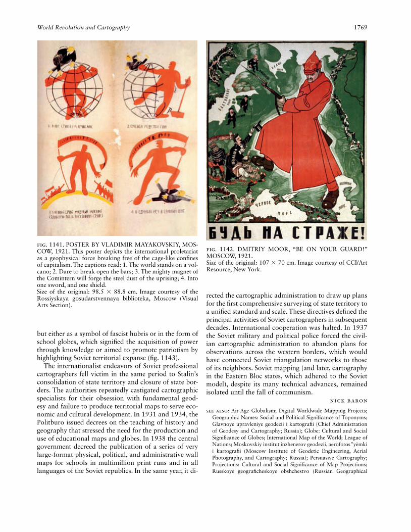
World Revolution and Cartography 1769
but either as a symbol of fascist hubris or in the form of school globes, which signifi ed the acquisition of power through knowledge or aimed to promote patriotism by highlighting Soviet territorial expanse (fi g. 1143).
The internationalist endeavors of Soviet professional cartographers fell victim in the same period to Stalin’s consolidation of state territory and closure of state bor-ders. The authorities repeatedly castigated cartographic specialists for their obsession with fundamental geod-esy and failure to produce territorial maps to serve eco-nomic and cultural development. In 1931 and 1934, the Politburo issued decrees on the teaching of history and geography that stressed the need for the production and use of educational maps and globes. In 1938 the central government decreed the publication of a series of very large-format physical, political, and administrative wall maps for schools in multimillion print runs and in all languages of the Soviet republics. In the same year, it di-
rected the cartographic administration to draw up plans for the fi rst comprehensive surveying of state territory to a unifi ed standard and scale. These directives defi ned the principal activities of Soviet cartographers in subsequent decades. International cooperation was halted. In 1937 the Soviet military and political police forced the civil-ian cartographic administration to abandon plans for observations across the western borders, which would have connected Soviet triangulation networks to those of its neighbors. Soviet mapping (and later, cartography in the Eastern Bloc states, which adhered to the Soviet model), despite its many technical advances, remained isolated until the fall of communism.
Nick Baron
See also: Air-Age Globalism; Digital Worldwide Mapping Projects; Geographic Names: Social and Political Signifi cance of Toponyms; Glavnoye upravleniye geodezii i kartografi i (Chief Administration of Geodesy and Cartography; Russia); Globe: Cultural and Social Signifi cance of Globes; International Map of the World; League of Nations; Moskovskiy institut inzhenerov geodezii, aerofotos”yëmki i kartografi i (Moscow Institute of Geodetic Engineering, Aerial Photography, and Cartography; Russia); Persuasive Cartography; Projections: Cultural and Social Signifi cance of Map Projections; Russkoye geografi cheskoye obshchestvo (Russian Geographical
Fig. 1141. POSTER BY VLADIMIR MAYAKOVSKIY, MOS-COW, 1921. This poster depicts the international proletariat as a geophysical force breaking free of the cage-like confi nes of capitalism. The captions read: 1. The world stands on a vol-cano; 2. Dare to break open the bars; 3. The mighty magnet of the Com in tern will forge the steel dust of the uprising; 4. Into one sword, and one shield.Size of the original: 98.5 × 88.8 cm. Image courtesy of the Rossiyskaya gosudarstvennaya biblioteka, Moscow (Visual Arts Section).
Fig. 1142. DMITRIY MOOR, “BE ON YOUR GUARD!” MOSCOW, 1921.Size of the original: 107 × 70 cm. Image courtesy of CCI/Art Resource, New York.
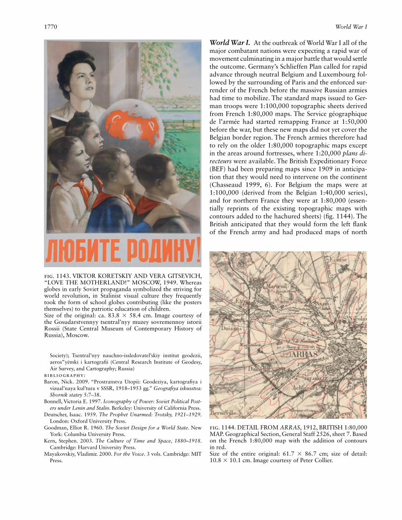
1770 World War I
Society); Tsentral’nyy nauchno-issledovatel’skiy institut geodezii, aeros”yëmki i kartografi i (Central Research Institute of Geodesy, Air Survey, and Cartography; Russia)
Bibliography:Baron, Nick. 2009. “Prostranstva Utopii: Geodeziya, kartografi ya i
vizual’naya kul’tura v SSSR, 1918–1953 gg.” Geografi ya iskusstva: Sbornik statey 5:7–38.
Bonnell, Victoria E. 1997. Iconography of Power: Soviet Political Post-ers under Lenin and Stalin. Berkeley: University of California Press.
Deutscher, Isaac. 1959. The Prophet Unarmed: Trotsky, 1921–1929. London: Oxford University Press.
Goodman, Elliot R. 1960. The Soviet Design for a World State. New York: Columbia University Press.
Kern, Stephen. 2003. The Culture of Time and Space, 1880–1918. Cambridge: Harvard University Press.
Mayakovskiy, Vladimir. 2000. For the Voice. 3 vols. Cambridge: MIT Press.
World War I. At the outbreak of World War I all of the major combatant nations were expecting a rapid war of movement culminating in a major battle that would settle the outcome. Germany’s Schlieffen Plan called for rapid advance through neutral Belgium and Luxembourg fol-lowed by the surrounding of Paris and the enforced sur-render of the French before the massive Russian armies had time to mobilize. The standard maps issued to Ger-man troops were 1:100,000 topographic sheets derived from French 1:80,000 maps. The Service géographique de l’armée had started remapping France at 1:50,000 before the war, but these new maps did not yet cover the Belgian border region. The French armies therefore had to rely on the older 1:80,000 topographic maps except in the areas around fortresses, where 1:20,000 plans di-recteurs were available. The British Expeditionary Force (BEF) had been preparing maps since 1909 in anticipa-tion that they would need to intervene on the continent (Chasseaud 1999, 6). For Belgium the maps were at 1:100,000 (derived from the Belgian 1:40,000 series), and for northern France they were at 1:80,000 (essen-tially reprints of the existing topographic maps with contours added to the hachured sheets) (fi g. 1144). The British anticipated that they would form the left fl ank of the French army and had produced maps of north
Fig. 1143. VIKTOR KORETSKIY AND VERA GITSEVICH, “LOVE THE MOTHERLAND!” MOSCOW, 1949. Whereas globes in early Soviet propaganda symbolized the striving for world revolution, in Stalinist visual culture they frequently took the form of school globes contributing (like the posters themselves) to the patriotic education of children.Size of the original: ca. 83.8 × 58.4 cm. Image courtesy of the Gosudarstvennyy tsentral’nyy muzey sovremennoy istorii Rossii (State Central Museum of Contemporary History of Russia), Moscow.
Fig. 1144. DETAIL FROM ARRAS, 1912, BRITISH 1:80,000 MAP. Geographical Section, General Staff 2526, sheet 7. Based on the French 1:80,000 map with the addition of contours in red.Size of the entire original: 61.7 × 86.7 cm; size of detail: 10.8 × 10.1 cm. Image courtesy of Peter Collier.
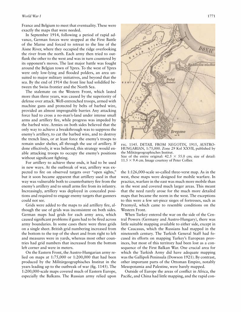
World War I 1771
France and Belgium to meet that eventuality. These were exactly the maps that were needed.
In September 1914, following a period of rapid ad-vance, German forces were stopped at the First Battle of the Marne and forced to retreat to the line of the Aisne River, where they occupied the ridge overlooking the river from the north. Each army then tried to out-fl ank the other to the west and was in turn countered by its opponent’s moves. The last major battle was fought around the Belgian town of Ypres. To the west of Ypres were only low-lying and fl ooded polders, an area un-suited to major military initiatives, and beyond that the sea. By the end of 1914 the front line had solidifi ed be-tween the Swiss frontier and the North Sea.
The stalemate on the Western Front, which lasted more than three years, was caused by the superiority of defense over attack. Well-entrenched troops, armed with machine guns and protected by belts of barbed wire, provided an almost impregnable barrier. Any attacking force had to cross a no-man’s-land under intense small arms and artillery fi re, while progress was impeded by the barbed wire. Armies on both sides believed that the only way to achieve a breakthrough was to suppress the enemy’s artillery, to cut the barbed wire, and to destroy the trench lines, or at least force the enemy’s troops to remain under shelter, all through the use of artillery. If done effectively, it was believed, this strategy would en-able attacking troops to occupy the enemy’s positions without signifi cant fi ghting.
For artillery to achieve these ends, it had to be used in new ways. At the outbreak of war, artillery was ex-pected to fi re on observed targets over “open sights,” but it soon became apparent that artillery used in that way was vulnerable both to counterbattery fi re from the enemy’s artillery and to small arms fi re from its infantry. Increasingly, artillery was deployed in concealed posi-tions and required to engage enemy targets that gunners could not see.
Grids were added to the maps to aid artillery fi re, al-though the use of grids was inconsistent on both sides. German maps had grids for each army area, which caused signifi cant problems if guns had to be fi red across army boundaries. In some cases there were three grids on a single sheet. British grid numbering increased from the bottom to the top of the sheet and from right to left and measures were in yards, whereas most other coun-tries had grid numbers that increased from the bottom left corner and were in meters.
On the Eastern Front, the Austro-Hungarian army re-lied on maps at 1:75,000 or 1:200,000 that had been produced by the Militärgeographisches Institut in the years leading up to the outbreak of war (fi g. 1145). The 1:200,000-scale maps covered much of Eastern Europe, especially the Balkans. The Russian army relied upon
the 1:126,000-scale so-called three-verst map. As in the west, these maps were designed for mobile warfare. In practice, warfare in the east was much more mobile than in the west and covered much larger areas. This meant that the need rarely arose for the much more detailed maps that became the norm in the west. The exceptions to this were a few set-piece sieges of fortresses, such as Przemysl, which came to resemble conditions on the Western Front.
When Turkey entered the war on the side of the Cen-tral Powers (Germany and Austro-Hungary), there was little suitable mapping available to either side, except in the Caucasus, which the Russians had mapped in the nineteenth century. The Turkish General Staff had fo-cused its efforts on mapping Turkey’s European prov-inces, but most of this territory had been lost as a con-sequence of the First Balkan War. One crucial area for which the Turkish Army did have adequate mapping was the Gallipoli Peninsula (Dowson 1921). By contrast, other important parts of the Ottoman Empire, notably Mesopotamia and Palestine, were barely mapped.
Outside of Europe the areas of confl ict in Africa, the Pacifi c, and China had little mapping, and the rapid con-
Fig. 1145. DETAIL FROM NEGOTIN, 1915, AUSTRO-HUNGARIAN, 1:75,000. Zone 29 Kol XXVII, published by the Militärgeographisches Institut.Size of the entire original: 42.5 × 55.0 cm; size of detail: 11.5 × 9.4 cm. Image courtesy of Peter Collier.

1772 World War I
quest of most German colonies meant that no signifi cant effort was made to map them. This is in marked contrast to World War II, which led to a huge extension of good-quality mapping into previously poorly mapped parts of the world.
Once the trench lines had been established on the Western Front, both sides realized that maps of increas-ingly larger scale would be needed for the new kind of warfare that had developed. The British Army quickly increased the scale of the French 1:80,000 maps to 1:40,000, then to 1:20,000, and fi nally for the front line areas to 1:10,000. For particular stretches of the front line even larger scales were used from time to time. Until the end of the war German mapping was largely derived from the existing Belgian or French mapping, usually re-produced at 1:50,000 or 1:25,000 (fi g. 1146). Although all the armies had some survey capability at the out-
break of war, these had to be rapidly expanded to meet the increasing need for up-to-date mapping (Winter-botham 1919; France, Service géographique de l’armée 1936, 79–84; Albrecht 1969; Landmann 1996).
On both sides there was an urgent need to update and revise the maps of areas that were behind enemy lines and to map the increasingly complex trench sys-tems. As this could not be done on the ground, the only practical solution was to use aerial photography. From the outbreak of war, both sides had used airplanes for reconnaissance purposes, but largely as a new kind of cavalry, scouting ahead of the main force and report-ing back either verbally or through written messages. It soon became apparent that this approach was inef-fi cient and error prone insofar as enemy troop numbers were consistently misreported. To improve the quality of information the observers started using cameras to
Fig. 1146. DETAIL FROM EISENHAMMER, 1917, GER-MAN 1:25,000 TRENCH MAP. Sheet 16 showing part of the Eastern Front with blue (German) and red (enemy) annotation.
Size of the entire original: 45.3 × 40.5 cm; size of detail: 14 × 18.6 cm. Image courtesy of Peter Collier.
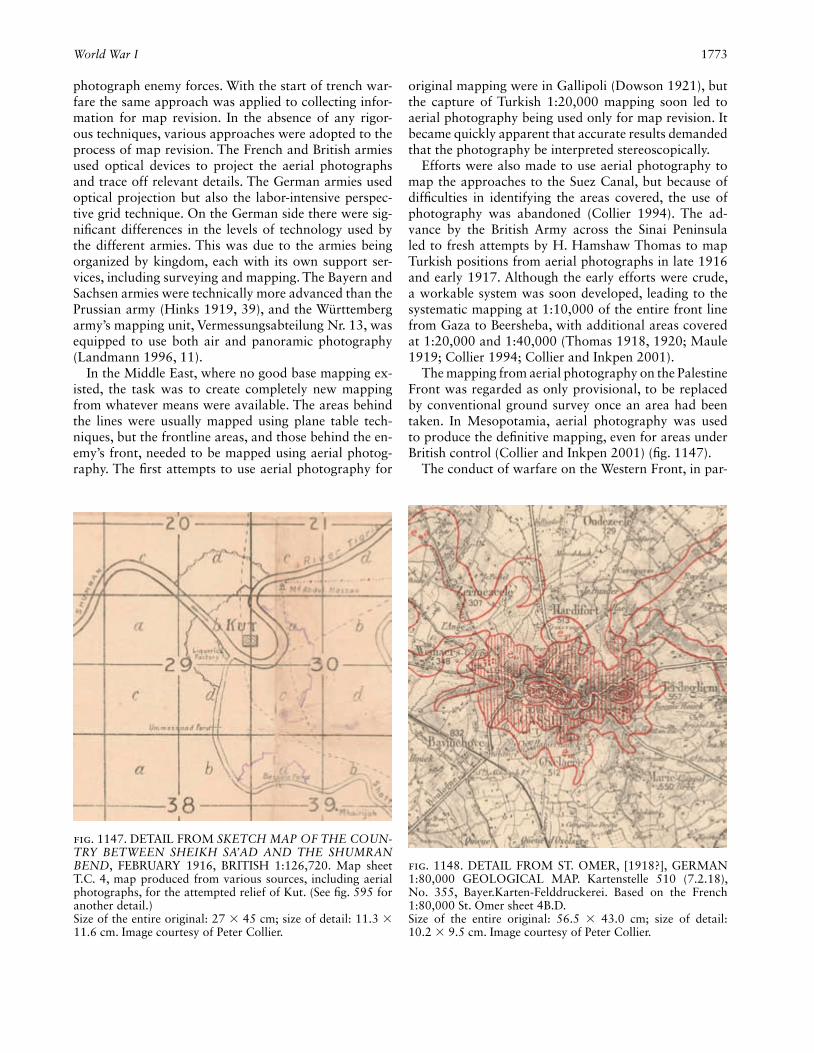
World War I 1773
photograph enemy forces. With the start of trench war-fare the same approach was applied to collecting infor-mation for map revision. In the absence of any rigor-ous techniques, various approaches were adopted to the process of map revision. The French and British armies used optical devices to project the aerial photographs and trace off relevant details. The German armies used optical projection but also the labor-intensive perspec-tive grid technique. On the German side there were sig-nifi cant differences in the levels of technology used by the different armies. This was due to the armies being organized by kingdom, each with its own support ser-vices, including surveying and mapping. The Bayern and Sachsen armies were technically more advanced than the Prussian army (Hinks 1919, 39), and the Württemberg army’s mapping unit, Vermessungsabteilung Nr. 13, was equipped to use both air and panoramic photography (Landmann 1996, 11).
In the Middle East, where no good base mapping ex-isted, the task was to create completely new mapping from whatever means were available. The areas behind the lines were usually mapped using plane table tech-niques, but the frontline areas, and those behind the en-emy’s front, needed to be mapped using aerial photog-raphy. The fi rst attempts to use aerial photography for
original mapping were in Gallipoli (Dowson 1921), but the capture of Turkish 1:20,000 mapping soon led to aerial photography being used only for map revision. It became quickly apparent that accurate results demanded that the photography be interpreted stereoscopically.
Efforts were also made to use aerial photography to map the approaches to the Suez Canal, but because of diffi culties in identifying the areas covered, the use of photography was abandoned (Collier 1994). The ad-vance by the British Army across the Sinai Peninsula led to fresh attempts by H. Hamshaw Thomas to map Turkish positions from aerial photographs in late 1916 and early 1917. Although the early efforts were crude, a workable system was soon developed, leading to the systematic mapping at 1:10,000 of the entire front line from Gaza to Beersheba, with additional areas covered at 1:20,000 and 1:40,000 (Thomas 1918, 1920; Maule 1919; Collier 1994; Collier and Inkpen 2001).
The mapping from aerial photography on the Palestine Front was regarded as only provisional, to be replaced by conventional ground survey once an area had been taken. In Mesopotamia, aerial photography was used to produce the defi nitive mapping, even for areas under British control (Collier and Inkpen 2001) (fi g. 1147).
The conduct of warfare on the Western Front, in par-
Fig. 1147. DETAIL FROM SKETCH MAP OF THE COUN-TRY BETWEEN SHEIKH SA’AD AND THE SHUMRAN BEND, FEBRUARY 1916, BRITISH 1:126,720. Map sheet T.C. 4, map produced from various sources, including aerial photographs, for the attempted relief of Kut. (See fi g. 595 for another detail.)Size of the entire original: 27 × 45 cm; size of detail: 11.3 × 11.6 cm. Image courtesy of Peter Collier.
Fig. 1148. DETAIL FROM ST. OMER, [1918?], GERMAN 1:80,000 GEOLOGICAL MAP. Kartenstelle 510 (7.2.18), No. 355, Bayer.Karten-Felddruckerei. Based on the French 1:80,000 St. Omer sheet 4B.D.Size of the entire original: 56.5 × 43.0 cm; size of detail: 10.2 × 9.5 cm. Image courtesy of Peter Collier.

1774 World War I
ticular, required an unprecedented level of organization and logistical support. To manage the complexity and prevent chaos, new types of mapping were produced. For example, traffi c maps showed approved routes and speed limits for different types of vehicles. Other maps represented deployment and billeting areas for reserve troops and the routes to be taken by individual units go-ing to the front line. As the infrastructure developed be-hind the lines, it became a target for long-range artillery, leading to the need to map the enemy’s rear areas. In fa-vorable conditions, engineers from both sides tunneled under the front lines of the opposing troops and planted mines, which could be exploded prior to an attack. Armies contained specialist units, such as the Württem-berg army’s Vermessungsabteilung Nr. 25 (Landmann 1996, 18–23), which produced the geological mapping needed to plan tunneling operations (fi g. 1148).
From the fi rst days of military operations, the various General Staffs tried to maintain up-to-date information of the enemy forces facing them. Given the largely static nature of warfare on the Western Front, the maps used to illustrate intelligence reports on dispositions were fairly simple. They showed which stretch of the front line was held by which regiment and the location of any known reserves. These maps were updated as new information became available. The maps did not need to be revised every day, even during the course of a major battle. A notable exception was the Palestine Campaign during the Third Battle of Gaza, when Richard Meinertzhagen initiated the production of position maps on a nightly basis (fi g. 1149) for distribution to the General Staff and Corps commander (Meinertzhagen 1960, 224–25). This kind of position mapping was to become routine during World War II.
Fig. 1149. DETAIL FROM OPERATIONS MAP, 1917, BRITISH, 1:100,000. Situation map for 6 p.m. on 31 Octo-ber 1917, it shows the attack on Beersheba by the ANZAC (Australian and New Zealand Army Corps) cavalry; British (red) and Turkish (green) forces. Produced in the fi eld by the Seventh Field Survey Company, General Headquarters Egyp-
tian Expeditionary Force, the British line is solid black, enemy line dashed black.Size of the entire original: 70.1 × 45.9 cm; size of detail: 32 × 46.2 cm. Image courtesy of The National Archives of the U.K. (TNA), Kew.
World War II 1775
By the end of World War I a number of major changes were under way that would transform civilian mapping. The use of grids was soon extended to most topographic mapping. Although the use of aerial photography for mapmaking and revision still relied on imprecise meth-ods, its potential had been understood, and more precise methods developed rapidly over the next decade. Per-haps most importantly, large numbers of men had been trained to use maps, and to value them, leading to in-creased consumption of maps in countries like Britain.
Peter Collier
See also: Paris Peace Conference (1919); Warfare and CartographyBibliography:Albrecht, Oskar. 1969. Das Kriegsvermessungswesen während des
Weltkrieges, 1914–18. Munich: Verlag der Bayerischen Akademie der Wissenschaften in Kommission bei der C. H. Beck’schen Ver-lagsbuchhandlung.
Chasseaud, Peter. 1999. Artillery’s Astrologers: A History of British Survey & Mapping on the Western Front, 1914–1918. Lewes: Map-books.
Collier, Peter. 1994. “Innovative Military Mapping Using Aerial Pho-tography in the First World War: Sinai, Palestine and Mesopotamia, 1914–1919.” Cartographic Journal 31:100–104.
Collier, Peter, and Robert Inkpen. 2001. “Mapping Palestine and Mesopotamia in the First World War.” Cartographic Journal 38:143–54.
Dowson, Ernest MacLeod. 1921. “Further Notes on Aeroplane Pho-tography in the Near East.” Geographical Journal 58:359–70.
France. Service géographique de l’armée. 1936. Rapport sur les travaux exécutés du 1er aout 1914 au 31 décembre 1919. Paris: Imprimerie du Service Géographique de l’Armée.
Hinks, Arthur R. 1919. “German War Maps and Survey.” Geographi-cal Journal 53:30–44.
Landmann, Jochen. 1996. Das Militärische Karten- und Vermessungs-wesen in Südwestdeutschland: Ein Beitrag zur Geschichte im 20. Jahrhundert. Stuttgart: Leiter Militärisches Geowesen.
Maule, W. J. 1919. “Report on the Work of the Seventh Field Sur-vey Company R.E.: Egypt, Sinai, Palestine & Syria.” Unpublished report to the Geographical Section, General Staff. London, Map Research and Library Group.
Meinertzhagen, Richard. 1960. Army Diary, 1899–1926. Edinburgh: Oliver and Boyd.
Thomas, H. Hamshaw. 1918. “Photographic Work of the R.F.C. in Sinai and Palestine during 1917.” The National Archives, Kew (AIR 1/2415/303/28).
———. 1920. “Geographical Reconnaissance by Aeroplane Photog-raphy, with Special Reference to the Work Done on the Palestine Front.” Geographical Journal 55:349–76.
Winterbotham, H. S. L. 1919. “British Survey on the Western Front.” Geographical Journal 53:253–76.
World War II. The cartographic consequences of World War II were signifi cant for more than strictly mili-tary reasons. The global nature of the war resulted in a major extension of basic topographic map coverage into previously unmapped or poorly mapped areas. North Africa, Southeast Asia, and the southwest Pacifi c were
among the most obvious benefi ciaries of this mapping effort, but even Caribbean islands that became bases (like Jamaica) also benefi ted from the provision of new mapping.
The extension of mapping was, in part, a product of the very rapid expansion in the use of air survey tech-niques that took place during the war. Despite few sig-nifi cant advances in air survey technology during those years, the successful application of techniques already developed led to a substantial increase in cartographic coverage (Collier 2002, 2006). The most signifi cant technical development in air survey, the use of radar to fi x the positions of air photographs over previously un-mapped territory, came too late to have any impact dur-ing the war, but was used extensively after the war.
Another type of mapping that benefi ted from the in-vestment in technical developments was the air navi-gation chart. Prior to World War II, the main ways in which aircraft navigated involved either radio beacons or visual markers on the ground, or, in the absence of ground marks and beacons, stellar observations with a sextant. During the war a series of radio navigation aids were developed that made navigation much easier and more accurate. The most important of these tech-niques was called Gee (short for “grid,” and pronounced like the name of the letter G). Using a special chart, it was possible to obtain an accurate determination of an aircraft’s position using the signals from three ground stations. The Gee charts had a lattice of color-coded parabolic curves plotted on them to represent distances from the beacons (see fi g. 545). The civil development of the Gee system, called Decca Navigator, was widely used by both aircraft and ships until superseded by the Global Positioning System (GPS) toward the end of the century.
Air navigation charts also changed because early in the war it became clear that daylight raids by bomb-ers over enemy territory could lead to very heavy losses. This forced both the German and British air forces to adopt night bombing so that enemy fi ghters were less of a hazard. Conventionally colored air navigation charts were not suited for use under the restricted lighting (usually amber) inside the bomber. This necessitated the introduction of new color schemes for charts, usually using purple hypsometric tints to show heights. British target charts used light gray for open land, white for water, purple for communications settlements, and dark gray for woodland, to simulate the appearance of the landscape under moonlight (see fi g. 544).
The increasing range of aircraft also had a role in changing maps, as smaller-scale maps covering much larger areas became necessary. The suitability of differ-ent projections became another consideration, with the reintroduction of the Mercator projection, which had

1776 World War II
been discarded as unsuited for most other kinds of mili-tary mapping.
In attempting to supply the forces with maps of enemy- occupied territory, the fi rst recourse of any mili-tary mapping program was to copy whatever maps had been issued by the appropriate national survey organi-zations. Before the war, the military mapping agencies of the major powers had systematically collected whatever mapping they could of both potential enemy and even potential allied countries. This was used to compile new mapping, usually in the style of the country producing the military maps. Following the outbreak of war, it be-came normal practice to simply copy the maps and re-print them with appropriate additional symbols and a grid. For example, in preparation for Operation Torch, the allied invasion of northwest Africa, the British War Offi ce reprinted French prewar mapping of Morocco, Algeria, and Tunisia (fi g. 1150), with revisions made wherever necessary. Work on this mapping had started in 1941, but it was given a higher priority and increased scope in 1942 (Clough 1952, 270–71). Once the land-
ings had taken place, British and U.S. survey units re-vised the existing maps using any available up-to-date French mapping and aerial photography. From March 1943 the Service géographique in Algiers also took an active part in mapping activities. An early attempt by U.S. topographical units to produce photomaps of parts of Tunisia was not considered successful (Clough 1952, 276). Although users criticized the quality of some of the mapping of northwest Africa, valuable lessons were learned and applied in mapping programs prior to the invasions of the European mainland.
The Axis powers of Germany, Japan, and Italy ad-opted a short-term approach to mapping and made little effort to carry out any new mapping once the war had started. German maps issued for the Eastern Front were frequently composites of photographically reduced lo-cal maps, with individual sheets containing sections in very different styles. The Germans also photographically enlarged maps whenever a larger scale was thought nec-essary, to bring the maps to one of the standard German scales, 1:300,000, 1:100,000, 1:75,000, or 1:25,000
Fig. 1150. DETAIL FROM LA CALLE, 1942. Reproduction of French 1:50,000 map of Algeria (GSGS 4232, 2d. ed., sheet 19) issued to British and American forces.
Size of the entire original: 53.2 × 70.5 cm; size of detail: 15.1 × 22.1 cm. Image courtesy of Peter Collier.

World War II 1777
(Landmann 1996). The one area in which German mili-tary mapping was conceptually ahead of the allies was in the production of Militärgeographische Einzelanga-ben. These maps were produced for various areas in which the German army was interested, with at least 244 different sheets issued by the end of 1943 (Smith and Black 1946, 399). The earliest seem to have been made in preparation for the invasions of Western Europe in 1940. These fi rst sheets, at 1:100,000, had a topo-graphic base overprinted with a road classifi cation and industrial and other installations of military interest. In the margins were brief summaries of environmental and cultural information, and printed on the reverse were larger scale “through way” maps of major settlements (fi g. 1151).
The Western allies were far more active in producing new mapping. In Europe this was possibly due to the long lead time before major operations such as Over-lord, the allied invasion of Normandy. The need for up-to-date mapping was recognized, in particular the need for 1:25,000 mapping of areas not already covered at that scale (Clough 1952, 343–67). By mid-1942 British and Canadian analysts were already mapping north-ern France from air photos, and they were soon joined
by topographic units from the U.S. Army. Initially the work was carried out using radial line plotting, but the U.S. and Canadian forces introduced the use of multi-plex plotters. This work resulted in the production of the so-called Benson series at 1:25,000 (fi g. 1152) and Baby Bensons at 1:12,500. (The Benson series took their name from the Royal Air Force base at Benson, from which most of the photo sorties were fl own [Gordon 2005, 79].) Both series were issued with defense over-prints, showing all known German defensive installa-tions. In this form they carried the highest secrecy classi-fi cation, BIGOT. U.S. topographical units also produced photomapping of the invasion area in anticipation of being unable to complete conventional line mapping prior to the invasion. Each photomap sheet covered an area 10 kilometers square, with nearly 1,600 sheets pro-duced (Clough 1952, 380–81). Even so, complete cover-age with conventional line mapping was available by the time of the invasion and there is little evidence that the photomaps were used operationally.
In Southeast Asia and the Pacifi c there was a shortage of mapping suitable for the conduct of mid-twentieth-century warfare. The British assumed responsibility for mapping in Southeast Asia and the Netherlands East
Fig. 1151. DETAIL OF DÜREN, 1940. This 1:25,000 extract of Düren was printed on the reverse of one of the 1:100,000 German Militärgeographische Einzelangaben (Großblatt 2532, 1940) to show detail more clearly; it was accompanied by a considerable amount of text.
Size of the entire original: 74.5 × 107.0 cm; size of detail: 11.7 × 20.6 cm. Image courtesy of Peter Collier.
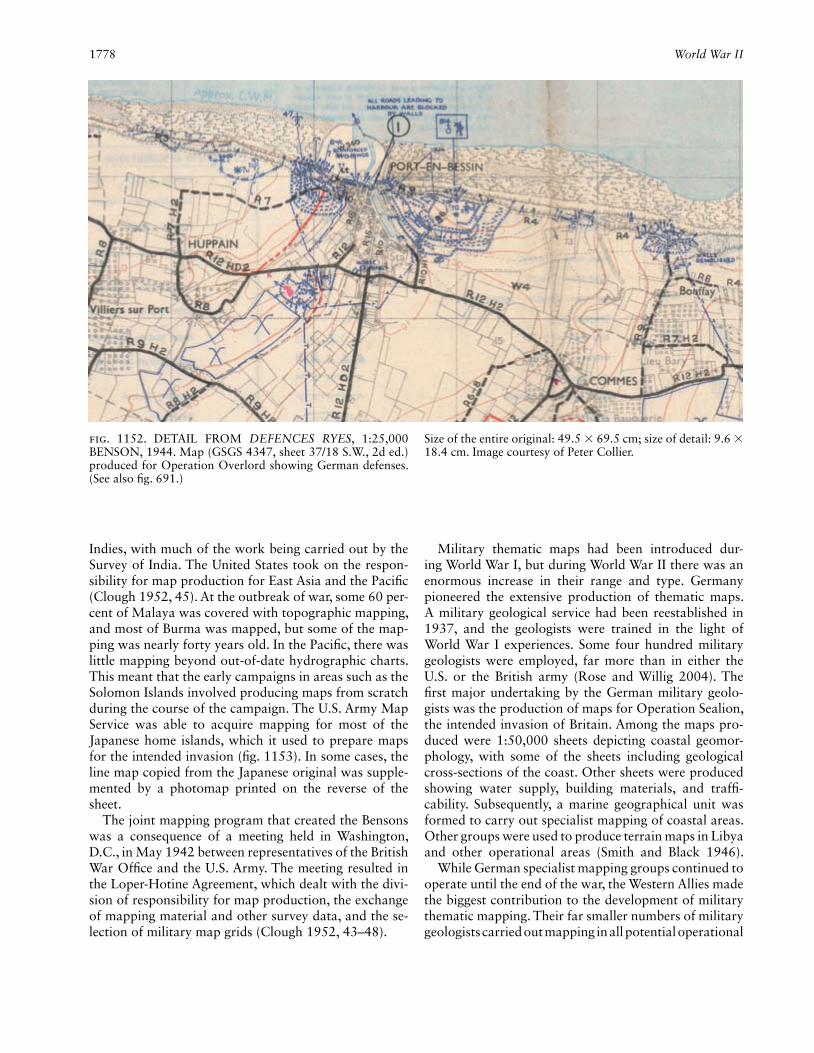
1778 World War II
Indies, with much of the work being carried out by the Survey of India. The United States took on the respon-sibility for map production for East Asia and the Pacifi c (Clough 1952, 45). At the outbreak of war, some 60 per-cent of Malaya was covered with topographic mapping, and most of Burma was mapped, but some of the map-ping was nearly forty years old. In the Pacifi c, there was little mapping beyond out-of-date hydrographic charts. This meant that the early campaigns in areas such as the Solomon Islands involved producing maps from scratch during the course of the campaign. The U.S. Army Map Service was able to acquire mapping for most of the Japanese home islands, which it used to prepare maps for the intended invasion (fi g. 1153). In some cases, the line map copied from the Japanese original was supple-mented by a photomap printed on the reverse of the sheet.
The joint mapping program that created the Bensons was a consequence of a meeting held in Washington, D.C., in May 1942 between representatives of the British War Offi ce and the U.S. Army. The meeting resulted in the Loper-Hotine Agreement, which dealt with the divi-sion of responsibility for map production, the exchange of mapping material and other survey data, and the se-lection of military map grids (Clough 1952, 43–48).
Military thematic maps had been introduced dur-ing World War I, but during World War II there was an enormous increase in their range and type. Germany pioneered the extensive production of thematic maps. A military geological service had been reestablished in 1937, and the geologists were trained in the light of World War I experiences. Some four hundred military geologists were employed, far more than in either the U.S. or the British army (Rose and Willig 2004). The fi rst major undertaking by the German military geolo-gists was the production of maps for Operation Sealion, the intended invasion of Britain. Among the maps pro-duced were 1:50,000 sheets depicting coastal geomor-phology, with some of the sheets including geological cross- sections of the coast. Other sheets were produced showing water supply, building materials, and traffi -cability. Subsequently, a marine geographical unit was formed to carry out specialist mapping of coastal areas. Other groups were used to produce terrain maps in Libya and other operational areas (Smith and Black 1946).
While German specialist mapping groups continued to operate until the end of the war, the Western Allies made the biggest contribution to the development of military thematic mapping. Their far smaller numbers of military geologists carried out mapping in all potential operational
Fig. 1152. DETAIL FROM DEFENCES RYES, 1:25,000 BENSON, 1944. Map (GSGS 4347, sheet 37/18 S.W., 2d ed.) produced for Operation Overlord showing German defenses. (See also fi g. 691.)
Size of the entire original: 49.5 × 69.5 cm; size of detail: 9.6 × 18.4 cm. Image courtesy of Peter Collier.

Wright, John K(irtland) 1779
areas. Britain’s Inter-Service Topographical Department (ISTD) created maps at a variety of scales to show ge-ology, soils, airfi eld suitability, and water supply (Rose and Clatworthy 2007). Other organizations produced so-called Goings (terrain traffi cability) maps and beach gradient maps (Clough 1952, 594–600). The British also reprinted all of the French 1:80,000 geological maps.
The importance of being able to reproduce maps in theater, rather than relying on distant production cen-ters, had been demonstrated during World War I. This was further developed in World War II, when both Brit-ish and U.S. forces used survey vessels with on-board chart printing facilities capable of producing short runs from fl atbed presses. Zeiss developed a portable fi eld version of the multiplex plotter, which was designed for use close to the front line, but most armies used fairly basic data transfer techniques to produce revision over-prints of existing maps. The need for rapid revision of maps of a rapidly changing battlefi eld was recognized in the use of the block plot in the North African theater. A block plot was a gridded plot on which were located
the principal points of all photography taken of a given area. Radial line techniques were used to determine the positions of the principal points. The position of any new reconnaissance photography could then be located by graphic resection and the locations of any new enemy positions plotted. The success of the technique led to its adoption in Italy and Southeast Asia as well as for the run-up to Operation Overlord (Clough 1952, 64–65, 232 ff., 311, 381).
Despite all the technical advances made during the war and the vast areas properly mapped for the fi rst time, probably the greatest cartographic legacy of World War II was the large number of trained personnel who would subsequently play a role in the postwar boom in mapping.
Peter Collier
See also: Paris Peace Conference (1919); Warfare and CartographyBibliography:Clough, A. B., comp. 1952. Maps and Survey. London: War Offi ce.Collier, Peter. 2002. “The Impact on Topographic Mapping of Devel-
opments in Land and Air Survey: 1900–1939.” Cartography and Geographic Information Science 29:155–74.
———. 2006. “The Work of the British Government’s Air Survey Committee and Its Impact on Mapping in the Second World War.” Photogrammetric Record 21:100–109.
Gordon, Alan. 2005. “Mapping and Charting for the Greatest Collab-orative Project Ever.” American Surveyor 2, no. 4:74–80.
Landmann, Jochen. 1996. Das militärische Karten- und Vermessungs-wesen in Südwestdeutschland: Ein Beitrag zur Geschichte im 20. Jahrhundert. Stuttgart: Leiter Militärisches Geowesen.
Rose, Edward P. F., and Jonathan C. Clatworthy. 2007. “Specialist Maps of the Geological Section, Inter-Service Topographical De-partment: Aids to British Military Planning during World War II.” Cartographic Journal 44:13–43.
Rose, Edward P. F., and Dierk Willig. 2004. “Specialist Maps Prepared by German Military Geologists for Operation Sealion: The Invasion of England Scheduled for September 1940.” Cartographic Journal 41:13–35.
Smith, Thomas R., and Lloyd D. Black. 1946. “German Geography: War Work and Present Status.” Geographical Review 36:398–408.
Wright, John K(irtland). John K. Wright, librarian, director, and research associate at the American Geo-graphical Society for thirty-six years, was born in Cam-bridge, Massachusetts on 30 November 1891 and died in Lyme, New Hampshire, on 24 March 1969. He re-ceived three degrees from Harvard.
In his dissertation, published as Geographical Lore of the Time of the Crusades (1925), Wright rejected his predecessors’ view of maps from the twelfth and thir-teenth centuries as “monstrosities,” and argued that they should not be judged against modern standards of sci-entifi c objectivity but rather against those of the Middle Ages. The coldly geometrical lines and symmetry of the maps echoed a mistrust of nature. The features of the earth’s surface, thought of as symbols of spiritual truths
Fig. 1153. DETAIL FROM KAWASAKI, 1:50,000, 1945. U.S. map of Kawasaki (AMS L774, sheet 6053 IV) produced for the intended invasion. Note the list of sources.Size of the entire original: 48.5 × 53.5 cm; size of detail: 15.1 × 11.9 cm. Image courtesy of Peter Collier.

1780 Wuhan cehui keji daxue
or episodes in sacred history, revealed the substitution of an idea for an object, an object for an idea, and the symbolizing faculty of the medieval mind. Maps were diagrammatic schemas converted into works of art that could do no more than approximate relative positions.
In The Leardo Map (1928), Wright examined what he saw as a typical conception of the world of Columbus. Compiled from portolan charts, Giovanni Leardo’s map was “progressive” in accurately showing the coastal features of the Mediterranean. Elsewhere on his map, Leardo proved “conservative” by failing to redraw the outline of the continents in light of the rediscovery of Ptolemy’s Geography.
In the 1930s, Wright’s interest turned to the carto-graphic representation of statistical data. Faced in 1932 with making distribution maps from census data avail-able for mapping units not of the same size, Wright chose dots and arranged them internally to conform to the probable character of the distribution. In 1933 he derived densities for townships from which uninhabited areas determined from U.S. Geological Survey maps were excluded from the calculations, and in 1936 he divided the inhabited areas within each township into tracts of different densities based on “controlled guesswork” and presented equations and tables to aid consistency in ap-portioning estimated densities of population within the limits of control spaces (Wright 1936, esp. 104).
His 1942 essay “Map Makers Are Human” is remem-bered as a guarded rebuke of U.S. government agencies for their misunderstanding of the nature of mapmak-ing. Wright focused on demands that forced mapmak-ers to increased levels of subjectivity and error and to unconscious deception when they amplifi ed insuffi cient data and simplifi ed superabundant evidence. Particu-larly troublesome were government contracts requiring compilation from highly generalized maps to even more highly generalized ones, as when the Millionth Map of Hispanic America at 1:1,000,000 was simplifi ed to the Map of the Americas at 1:5,000,000.
The Millionth Map was pieced together from many man-made sources and carrying errors and subjective elements into the Millionth Map. The American Geo-graphical Society was honest about all this, presenting a relative reliability diagram that showed the character of the surveys and other sources on which all 107 sheets were based. Even so, Wright warned the government that the map was meant to be an aid for fi eldwork and was never intended to be used as a source for detailed information that could be incorporated into other maps. Maps generalized from it should never be used as a ba-sis for conclusions and decisions of importance: clearly what government agencies intended to do.
Martyn J. Bowden
See also: Academic Paradigms in Cartography: Canada and the United States; American Geographical Society; Dasymetric Map
Bibliography:Bowden, Martyn J. 1970. “John Kirtland Wright, 1891–1969.” Annals
of the Association of American Geographers 60:394–403.Wright, John Kirtland. 1925. The Geographical Lore of the Time of
the Crusades: A Study in the History of Medieval Science and Tradi-tion in Western Europe. New York: American Geographical Society. Reprinted New York: Dover Publications, 1965.
———. 1928. The Leardo Map of the World, 1452 or 1453, in the Collections of the American Geographical Society. New York: American Geographical Society.
———. 1936. “A Method of Mapping Densities of Population with Cape Cod as an Example.” Geographical Review 26:103–10.
———. 1942. “Map Makers Are Human: Comments on the Subjec-tive in Maps.” Geographical Review 32:527–44.
Wuhan cehui keji daxue 武汉测绘科技大学 (Wu-han Technical University of Surveying and Mapping; China). In 1955, the Zhongguo guowuyuan 中国国务院 (State Council of China) decided to combine the top technical institutes and colleges in China that were en-gaged in the science and technology of surveying and mapping. A new technical college, Wuhan celiang zhitu xueyuan 武汉测量制图学院 (Wuhan College of Geod-esy, Photogrammetry, and Cartography; WCGPC), was established in 1956. WCGPC attracted a group of out-standing experts (both academic and administrative staff), that included Xia Jianbai 夏坚白 and Ye Xue-an 叶雪安 from Tongji daxue 同济大学 (Tongji University), Chen Yongling 陈永龄 from the Huanan gongxue yuan 华南工学院 (South China Institute of Technology), Wang Zhizhuo 王之卓 from Qingdao gongxue yuan 青岛工学院 (Qingdao Institute of Technology), Li Qing-hai 李庆海 from the Nanjing gongxue yuan 南京工学院 (Nanjing Institute of Technology), and Chen Jian 陈健 from Tianjin daxue 天津大学 (Tianjin University). All of these distinguished academics were educated in Western countries and represented the top expertise among Chi-na’s surveying and mapping academics of the mid-1950s in terms of intellectual quality, teaching, and research ability.
From its very beginning WCGPC aimed to be recog-nized as a leader in world surveying and mapping and to develop its own specialty. The fi rst president, Xia Jian-bai, academician of the Zhongguo kexueyuan 中国科学院 (Chinese Academy of Sciences; CAS), declared two missions at the inaugural ceremony of the college: “One is to train a large number of engineers in surveying and mapping to meet the needs for national socioeconomic development and the other is to carry out scientifi c re-search in surveying and mapping to advance China’s sci-ence and technology in the discipline to an international level” (Xu 2006, 316).
Initially the WCGPC was administrated by the min-istry of higher education. However, in order to tighten the relationship between higher education institutions

Wuhan cehui keji daxue 1781
and industry, in 1958 the central government decided to let the Guojia cehui ju 国家测绘局 (State Bureau of Surveying and Mapping; SBSM) take over the respon-sibility for the administration of the college. In Decem-ber of that same year, the institution was renamed the Wuhan cehui xueyuan 武汉测绘学院 (Wuhan College of Surveying and Mapping; WCSM). In October 1985, it was renamed the Wuhan cehui keji daxue 武汉测绘科技大学 (Wuhan Technical University of Surveying and Mapping [WTUSM]), and in August 2000, WTUSM was merged with Wuhan shuili dianli daxue 武汉水利电力大学 (Wuhan Technical University of Hydraulics and Electrics) and Hubei yike daxue 湖北医科大学 (Hubei Medical University) into Wuhan daxue 武汉大学 (Wu-han University), which is directly administrated by the Zhonghua renmin gongheguo jiaoyu bu 中国人民共和国教育部 (Ministry of Education of China; MOE). Since 2000, surveying and mapping have been the leading dis-ciplines within Wuhan University.
Since 1955 surveying and mapping at Wuhan Univer-sity have achieved the goals outlined by its fi rst presi-dent Xia Jianbai and his successors (table 61). By 2000, it possessed a large number of outstanding experts, in-cluding nine academicians of the CAS and Zhongguo gongcheng yuan 中国工程院 (Chinese Academy of Engi-neering). MOE approved one top-class innovative tech-nology platform—the “985 Project”—“Geospatial In-formation Science Platform” with funding of about U.S. $30 million. Early in the twenty-fi rst century surveying and mapping at Wuhan University had three key sub-disciplines at the national level—geodesy and survey-ing engineering, photogrammetry and remote sensing, and cartography and geographic information systems (GIS)—as well as the Cehui yaogan xinxi gongcheng guojia zhongdian shiyanshi 测绘遥感信息工程国家重点实验室 (State Key Laboratory of Information Engi-
neering in Surveying, Mapping, and Remote Sensing; LIESMARS), and the Guojia weixing dingwei xitong gongcheng yanjiu zhongxin 国家卫星定位系统工程技术研究中心 (National Research Center for Satellite Posi-tioning System Engineering Technology). It had ten de-gree programs (for undergraduate studies), eight masters of science programs, eight doctoral programs, and one postdoctoral research program. Compared with other similar disciplines in China, surveying and mapping at Wuhan University was the most complete in terms of subjects offered, largest in size, and the most mature in terms of educational levels. The overall capability and social impact of the surveying and mapping discipline at Wuhan University put it in the leading position in China and made it renowned internationally. This compre-hensive educational system—undergraduate education (1,200 students admitted per year), graduate education (450 for the masters level and 200 for the doctoral level per year), and postdoctoral research (about 10 persons per year)—produced surveying and mapping profession-als at all levels to met the demand for such professionals in helping China to develop science and technology.
During the past fi fty years, Wuhan University has experienced the transformations of analog to digital technology, and from a geometric science to an infor-mation science. The surveying and mapping discipline has evolved into a spatial information science—geoin-formatics.
After 2000, great attention was paid to the integra-tion of spatial information and grid computing, which led to the concept of a “spatial information grid” (Li, Zhu, and Gong 2003). The main research fi elds in-clude satellite geodesy and modern geodynamics, digi-tal photogrammetry, remotely sensed image processing, satellite positioning systems, GIS theory and algorithm development, map generalization and multiscale repre-
Table 61: WTUSM presidents
Date Name Title and institutional affi liation
6/1955–11/1956 Tang Shouyu 唐守愚 Director of Preparatory Committee of WCGPC
11/1956 –10/1958 Xia Jianbai 夏坚白 President of WCGPC
11/1958–11/1970 Xia Jianbai 夏坚白 President of WCSM
8/1973–10/1980 Fang Junfu 方俊玞 President of the newly built WCSM
11/1980–8/1984 Ji Zengjue 纪增觉 President of WCSM
9/1984–1/1988 Zhou Zhongmo 周忠谟 President of WCSM
2/1988–2/1997 Ning Jinsheng 宁津生 President of WTUSM
3/1997–7/2000 Li Deren 李德仁 President of WTUSM
8/2000–6/2003 Liu Jingnan 刘经南 Vice president of Wuhan University
7/2003– Liu Jingnan 刘经南 President of Wuhan University
7/2000– Li Deren 李德仁 Chair of Academic Committee of Wuhan University

1782 Wuhan cehui keji daxue
sentation, and the integration of satellite positioning, GIS, and remote sensing with communication technol-ogy. Fruitful research results have been achieved in all areas. The number of papers published in international journals and presented at international conferences has increased rapidly. Some research results have been made operational, such as VirtuoZo (a digital photogram-metric workstation), GeoStar (a GIS software package), LD2000 (a mobile mapping system), WuCAPs (software for GPS-triangulation), and PANDA (a high-accuracy GPS software package). Wuhan University has also made contributions to the generation of national Chi-nese spatial databases at 1:1,000,000, 1:250,000, and 1:50,000 scales, at the provincial scales of 1:10,000 and 1:5000, and at local scales of 1:500 to 1:2000.
Between 1990 and 2010, the university won many na-tional, ministerial, and provincial awards and one state award by the State Council of China. Other awards include one Tan Kah Kee science award 陈嘉庚科学奖 (the top award for individuals in science and technology in China), three Ho Leung Ho Lee prizes 何梁何利奖, and one Hubei sheng keji jinbu jiang 湖北省科技进步奖 (Outstanding contribution to science and technology award of Hubei Province). At the same time, over ten high-technology companies have been started to trans-fer the research results into commercial products, which has accelerated the technical transfer and progress of surveying and mapping and related industries.
Many Wuhan University scientists have been active in relevant international societies, including the Interna-tional Association of Geodesy (IAG), the International Union of Geodesy and Geophysics (IUGG), the Inter-national Society for Photogrammetry and Remote Sens-ing (ISPRS), the International Cartographic Association (ICA), the International Federation of Surveyors (FIG), the Committee on Earth Observation Satellite (CEOS), and the Group on Earth Observations (GEO). Wang
Zhizhuo became an honorary member of ISPRS in 1988, Li Deren 李德仁 served as the president of Commission III (1988–92) and Commission VI (1992–96) of ISPRS, and Hu Yuju 胡毓钜 served as a vice president of ICA (1984–91). Many younger scientists have actively par-ticipated in working group activities of these societies. Offi cials of these societies and famous scientists in rel-evant subdisciplines have often been invited to give lec-tures or short courses at Wuhan University. A number of international cooperation projects have been initiated, such as the “Dragon Program” with the European Space Agency (ESA).
Looking to the future, Wuhan University can be ex-pected to participate in the developmental forefront of earth observation technology development to carry out fundamental theoretical research from the atmospheric transmission of electromagnetic radiation and imaging mechanisms to spatiotemporal data acquisition and ap-plications. Attention will be paid to high spatiotemporal resolution and to hyperspectral and radar remote sens-ing data in order to tackle key issues in geospatial sci-ence, resources survey and environmental monitoring, and national economic and social information gathering, and to lay a theoretical and technological foundation for establishing an earth observation system in China.
Li Deren 李德仁
See also: Education and Cartography: Educating MapmakersBibliography:Li Deren 李德仁, Zhu Xinyan 朱欣焰, and Gong Jianya 龚健雅. 2003.
“Cong shuzi ditu dao kongjian xinxi wangge—kongjian xinxi duoji wangge lilun sikao” 从数字地图到空间信息网格—空间信息多级网格理论思考 (From digital map to spatial information multigrid—a thought of spatial information multigrid theory). Wuhan daxue xuebao (xinxi kexue ban) 武汉大学学报(信息科学版) (Geomatics and information science of Wuhan University) 28, no. 6:642–50.
Xu Xingpei 徐兴沛, ed. 2006. Cehui xueke 50 nian 测绘学科五十年 (Surveying and mapping discipline in the last fi fty years). Beijing: Zhongguo ditu chubanshe, Cehui chubanshe.

ZZhongguo kexueyuan 中国科学院 (Chinese Acad-emy of Sciences) (CAS). The Chinese Academy of Sci-ences (CAS) is a leading academic institution and com-prehensive research and development center in natural science, technological science, and high-tech innovation in China. It was founded in Beijing in November 1949 on the basis of the former Academia Sinica (Zhong-yang yanjiu yuan 中央研究院) and Peiping Academy of Sciences (Peiping yanjiu yuan 北平研究院). By 2000, it consisted of 6 academic divisions, 4 special commit-tees, 12 branch offi ces, 105 institutes with legal entity, more than 100 nation key laboratories and national engineering research centers, and about 1,000 fi eld sta-tions throughout the country. Its staff surpassed 50,000 employees.
Before the founding of CAS, senior experts in cartog-raphy, surveying, and mapping, including Wang Zhi-zhuo 王之卓, Chen Yongling 陈永龄, Fang Jun 方俊, and Zeng Shiying 曾世英, were invited to Nanjing for the establishment of an institute of geography within the Central Research Institute. Zhongguo dili yanjiu suo 中国地理研究所 (Chinese Institute of Geography), the fi rst scientifi c institution engaged in geodetic survey and cartographic research in China, was founded in Beibei, Chongqing, in 1940. This institute moved to Nanjing in 1947 and served as the basis of CAS’s Dili yanjiu suo 地理研究所 (Institute of Geography; IOG), which be-came offi cial in 1953. In 1958, CAS moved the main section of its institute to Beijing and continued to use the name of the Institute of Geography (IOG). Another section was moved to Wuhan and established as the Zhongguo kexueyuan celiang yu diqiuwuli yanjiusuo 中国科学院测量与地球物理研究所 (Institute of Geodesy and Geophysics; IGG), and the remaining section stayed in Nanjing and became the Nanjing dili yanjiusuo 南京地理研究所 (Nanjing Institute of Geography; NIOG).
The IOG in 2000 had more than 400 staff members including 7 academicians of CAS, 2 academicians of the Chinese Academy of Engineering (Zhongguo gongcheng yuan中国工程院) and 205 professors, associate profes-sors, and senior engineers. The institute has a strong postdoctoral research and training program in geogra-phy and ecology. It provides the base for doctoral stu-dents in all major subdisciplines of geography and in the related areas of ecology, geoinformation science, cartog-raphy, environmental science, and agricultural econom-ics and management. Students pursuing master’s degrees are trained in physical and human geography, ecology, cartography and GIS, meteorology, environmental sci-ences, and agricultural economics and management. Hosted in the IOG are the Zhongguo dili xuehui 中国地理学会 (Geographic Society of China; GSC) and the Zhongguo qingzanggaoyuan xuehui 中国青藏高原学会 (China Society on the Tibetan Plateau; CSTP). All have carried out various activities, academic exchanges, and the promotion of science at home and abroad. The IOG, with the support of these organizations, publishes more than ten academic journals, including Dili xuebao 地理学报 (Acta Geographic Sinica), Journal of Geographical Sciences, Dili yanjiu 地理研究 (Geographic Research), Diqiu xinxi kexue 地球信息科学 (Geo-information Science), and Journal of Resources and Ecology. The Zhongguo guojia dili 中国国家地理 = Chinese National Geography (in Chinese and English) has the strong sup-port of the IOG and is widely distributed not only in mainland China but also in Hong Kong, Macao, Tai-wan, Southeast Asia, and Japan.
The IOG has close connection with cartography. It houses a national key laboratory, Ziyuan yu huanjing xinxi xitong guojia zhongdian shiyanshi 资源与环境信息系统国家重点实验室 (State Key Laboratory of Re-sources and Environment Information System; LREIS), a department of cartography, a data service center for resources and environmental sciences, and an industrial center for GIS development. LREIS was established in 1985, and was one of the earliest state key labs in GIS in China. It has played an important role in research, train-ing, and application of GIS and geoinformation science in China.

1784 Zhongguo kexueyuan
The IOG was responsible for planning the compre-hensive improvement of the Yellow River watershed, starting in 1953. To meet the needs of this project, about 130,000 maps were collected and a map library established. Moreover, 128 topographic map sheets of the Yellow-Huaihe-Haihe River Plain region at a scale of 1:200,000 were complied with 0.25-meter contour intervals to show the micro-landforms in this area in detail. These maps provided highly accurate data for soil inventory, geomorphological mapping, comprehensive control of salinized land, and dike hydraulic projects.
NIOG was renamed Nanjing dili yu hupo yanjiusuo 南京地理与湖泊研究所 (Nanjing Institute of Geography and Limnology) in 1987. In 2000, it had 219 staff mem-bers, including 1 academician of the CAS, 22 professors, and 69 associate professors and senior engineers. It pro-duces postdoctoral research in geography and four doc-toral programs in physical geography, human geography, cartography and geographic information systems, and en-vironmental science. It has developed a long-term collab-orative relationship with the Huanghe shuili weiyuanhui 黄河水利委员会 (Yellow River Conservancy Commission of China; YRCC) by designing and compiling new styles of thematic maps, applying soil and water conservation techniques in the Loess Plateau region, researching chan-nel evolution of the lower Yellow River, and developing a protection plan for the Yellow River Delta.
The Wuhan IGG had a staff of 149 with 1 academician of CAS, as well as 13 professors and 25 associate profes-sors and senior engineers. It mainly engages in research on geodesy; geophysics and the environment, such as earth crustal movement; geodetic aspects of space tech-nology; and wetland evolution and restoration.
Throughout its history, CAS has been actively in-volved in the support of joint cartographic projects. In 1958, in collaboration with the Guojia cehui ju 国家测绘局 (State Bureau of Surveying and Mapping; SBSM), CAS established the Guojia da dituji bianzuan weiyuan-hui 国家大地图集编纂委员会 (Compilation Committee of the National Atlas). Zhu Kezhen 竺可桢, vice presi-dent of CAS, became the chairman. The main task of the committee was to design and compile multidisciplinary atlases, including general, physical, historical, popula-tion, agricultural, and economic atlases. Five volumes of the atlases were successively published between 1965 and 1992.
Many local branches of the CAS have also compiled regional and thematic atlases. For example, the Chang-jiang hedao hangyun dituji长江河道航运地图集 (Atlas of water course and navigation of the Yangtze River) and Di er ci songhuajiang huanjing zhiliang yanjiu tuji 第二松花江环境质量研究图集 (Atlas of the second envi-ronmental evaluation of Songhua River) (1984) by the Changchun dili yanjiusuo 长春地理研究所 (Changchun
Institute of Geography), the Changjiang sanxia shengtai yu huanjing dituji 长江三峡生态与环境地图集 (Atlas of ecology and environment in the Three Gorges area of the Changjiang River) (1989), and Changjiang jingjidai ke-chixu fazhan dituji 长江经济带可持续发展地图集 (Com-prehensive atlas of the economical zones of the Yangtze River) by the Chengdu Institute of Geography, which reported the investigations and research results of the construction of the Three Gorges Project; the Shenzhen shi dituji 深圳市地图集 (Atlas of Shenzhen) and Zhuhai shi dituji 珠海市地图集 (Atlas of Zhuhai) by the Guang-zhou dili yanjiusuo 广州地理研究所 (Guangzhou Insti-tute of Geography), which illustrated the development of the Zhujiang River Delta; electronic atlases by the IOG to welcome the return of Hong Kong and Macau; and an Zhongguo huabei pingyuan guhedao dituji 中国华北平原古河道地图集 (Atlas of palaeochannels on the North China Plain) by Hebei dili yanjiusuo 河北地理研究所 (Hebei Institute of Geography). Through col-laboration with related institutes, CAS successively com-piled and published more than 400 sheets of national thematic maps at a scale of 1:1,000,000 including land use, land type, land resources, soil, vegetation, grass re-sources, and geomorphology.
Since 1963, CAS has taken the lead in developing re-mote sensing technology and its application in China. CAS launched and organized fourteen aerial remote sensing application experiments and thematic mapping projects. These works made signifi cant contributions to construction projects for resource extraction and en-ergy and urban environment evaluation. In 1975, CAS fi rst introduced Landsat satellite images and published 1:500,000, 1:2,500,000, 1:4,000,000, and 1:6,000,000 satellite image maps and atlases. Furthermore, a variety of geoanalysis atlases were compiled. This not only fa-cilitated the popularization of satellite remote sensing but it also supported the compilation and updating of 1:1,000,000 thematic maps.
In 1969, the secretary-general of CAS, Yu Wen 郁文, organized fi ve institutes to develop automated mapping capabilities and to tackle key bottlenecks independently. In cooperation with Nanjing daxue 南京大学 (Nanjing University), CAS trained professional staff and explored practicable solutions to scanning and tracking graphic plotters as well as photoelectric annotation machines. Three sets of archetypal machines were designed and produced.
Xiandai dituxue 现代地图学 (Modern cartography), written by Liao Ke 廖克, and Xiandai dituji sheji yu bian hui xitong 现代地图集设计与研究 (A research into contemporary atlas design) by Chen Yu 陈昱, compre-hensively summarize the historical experiences of car-tography in China.
He Jianbang 何建邦

Zhongguo kexueyuan 1785
See also: Chen ShupengBibliography:Parnell, Clifton W. 1980. “Geography.” In Science in Contemporary
China, ed. Leo A. Orleans, 167–87. Stanford: Stanford University Press.
Yao, Shuping. 1989. “Chinese Intellectuals and Science: A History of the Chinese Academy of Sciences (CAS).” Science in Context 3:447–73.
Zhongguo kexueyuan 中国科学院 (Chinese Academy of Sciences).
2000. Zhongguo kexueyuan nianjian 1999 中国科学院年鉴1999 (Yearbook of Chinese Academy of Sciences 1999). Beijing: Kexue chubanshe.
———. 2001. Zhongguo kexueyuan nianjian 2001 中国科学院年鉴2001 (Yearbook of Chinese Academy of Sciences 2001). Beijing: Kexue chubanshe.
———. 2010. Zhongguo kexueyuan nianjian 2010 中国科学院年鉴2010 (Yearbook of Chinese Academy of Sciences 2010). Beijing: Kexue chubanshe.