visualizing software models - ulisboa · i visualizing software models miguel filipe paisana gil...
TRANSCRIPT
i
Visualizing Software Models
Miguel Filipe Paisana Gil
Thesis to obtain the Master of Science Degree in
Information Systems and Computer Engineering
Supervisors: Prof. Miguel Leitão Bignolas Mira da Silva
Eng. Carlos Manuel Martins Mendes
Examination Committee
Chairperson: Prof. Mário Rui Fonseca dos Santos Gomes
Supervisor: Prof. Miguel Leitão Bignolas Mira da Silva
Member of the Committee: Prof. Daniel Jorge Viegas Gonçalves
June 2015

ii

iii
Abstract
Software development is a complex and difficult task that requires the investment of significant
resources and carries major risks. Model driven development approaches can help these tasks, but they
generate thousands of objects and relationships which are difficult to analyse without losing the context,
and mostly by proprietary tools. We propose a visualizer for the data model of these
applications/information systems that makes use of visualization techniques with the proper filters to
allow a user to navigate between objects and abstraction levels without losing the context and/or focus.
We used the Design Science Research Methodology to conduct our research. This proposal was
demonstrated in a real life company that uses a tool with model-driven-development concepts to develop
Information Systems and it helped to identify the objects with higher importance in the evaluated
applications. We evaluated it with feedback gathered from interviews and results from the application of
the visualizer in real applications. The artifacts usability was also measured through user tests and it
has shown that it has a nice usability.
Keywords: MDD, visualization, models, rapid development tools, visualization techniques, abstraction

iv

v
Resumo
O desenvolvimento de software é uma tarefa difícil e complexa que requer um investimento significante
de recursos e que contém muitos riscos. O desenvolvimento de software orientado a modelos pode
ajudar nestas tarefas, mas são gerados milhares de objectos e relações que são difíceis de analisar
sem perder o contexto e, maioritariamente, através de ferramentas proprietárias. Propomos, então, um
visualizador para o modelo de dados das definições destas aplicações/sistemas de informação que faz
uso de técnicas de visualização com os filtros adequados de forma a permitir ao utilizador navegar
entre objectos e niveis de abstracção sem perder o contexto e/ou o foco. Utilizámos a metodologia
Design Science Research para conduzir a nossa investigação. Esta proposta foi demonstrada numa
empresa real que utiliza uma ferramenta que tira partido dos conceitos de desenvolvimento de software
orientado a modelos para desenvolver sistemas de informação, e ajudou a identificar os objectos mais
importantes nas aplicações avaliadas. Avaliámos a nossa proposta com feedback recolhido através de
entrevistas e de resultados obtidos através do uso do vizualizador em aplicações reais. Também
medimos a usabilidade do artefacto desenvolvido através de testes com utilizadores, o que mostrou
que possui uma boa usabilidade.
Palavras-Chave: Desenvolvimento orientado a modelos, vizualização, ferramentas de
desenvolvimento rápido, técnicas de visualização, abstracção

vi

vii
Acknowledgments
First and foremost I would like to express my gratitude to my supervisor, Professor Miguel Mira da Silva,
for all his valuable guidance, expertise and advice. His support, useful critiques and important
connections were crucial for the success of this thesis and I am very grateful for the opportunity I had to
develop this work.
Secondly, I would like to thank my family for believing in me and giving me unconditional support along
these years, especially to my mother and father for giving me the opportunity to proceed with my college
studies.
I would also like to thank all my friends and colleagues that were with me during the course for their
support and for the great times that we had together along these years. This extends to all the colleagues
and friends at the INOV Digital Services Innovation research group, who were always helpful and open
to any kind of discussion and advice.
To Quidgest and all the people involved in the FirstSightModel project, a big thank you, for all the
availability shown and for giving their support when needed. Special thanks to INOV and our team, my
co-supervisor Carlos Mendes, Nuno Silva and Marcelo Silva, for all the insight given during these last
months and for being there with advices when I most needed.
Finally, to my girlfriend Diana, who was there almost every step of the way and without whom I wouldn’t
have gotten here, thank you for being there in the good and in the bad moments, for your support and
persistence to never let me give up.

viii

ix
Table of Contents
Abstract ................................................................................................................................................. iii
Resumo................................................................................................................................................... v
Acknowledgments ............................................................................................................................... vii
Table of Contents ................................................................................................................................. ix
List of Figures ....................................................................................................................................... xi
List of Tables ....................................................................................................................................... xiii
List of Acronyms ................................................................................................................................. xv
1. Introduction .................................................................................................................................... 1
1.1. Research Methodology .......................................................................................................... 1
1.2. Structure of the document ..................................................................................................... 3
2. Research Problem ......................................................................................................................... 5
3. Related Work .................................................................................................................................. 7
3.1. Model-Driven Engineering ..................................................................................................... 7
3.1.1. Model-Driven Development ...................................................................................... 8
3.2. Rapid Development Tools .................................................................................................... 12
3.2.1. Genexus ................................................................................................................. 12
3.2.2. Genio ...................................................................................................................... 13
3.2.3. Outsystems Platform .............................................................................................. 15
3.2.4. Overview of the tools .............................................................................................. 16
3.3. Software Visualization ......................................................................................................... 16
3.3.1. Software Visualization Tools .................................................................................. 16
3.4. Visualization techniques ...................................................................................................... 19
4. Objectives ..................................................................................................................................... 21
5. Research Proposal ...................................................................................................................... 23
5.1. Objects Decomposition ........................................................................................................ 27
5.2. Relationships ....................................................................................................................... 27
5.3. Time ..................................................................................................................................... 27
5.4. Grouping .............................................................................................................................. 28
6. Demonstration.............................................................................................................................. 29
6.1. Quidgest and FirstSightModel ............................................................................................. 29

x
6.2. Model Visualization Tool ...................................................................................................... 29
7. Evaluation ..................................................................................................................................... 37
7.1. Usability Tests ...................................................................................................................... 37
7.1.1. Methodology ........................................................................................................... 37
7.1.2. Users....................................................................................................................... 39
7.1.3. Usability tests results .............................................................................................. 39
7.1.4. Survey results ......................................................................................................... 41
7.2. Evaluation Overview ............................................................................................................ 42
8. Conclusion ................................................................................................................................... 45
8.1. Lessons learned .................................................................................................................. 45
8.2. Research Communication ................................................................................................... 46
8.3. Limitations............................................................................................................................ 46
8.4. Future Work ......................................................................................................................... 46
Bibliography ......................................................................................................................................... 49
Appendix A – Prototype Evolution..................................................................................................... 53
Appendix B – User Questionnaire ..................................................................................................... 57
Appendix C – Usability tests results ................................................................................................. 59

xi
List of Figures
Fig. 1. - The DSRM process (adapted from [3]) ...................................................................................... 3
Fig. 2. - Overview of the MDE related concepts ...................................................................................... 7
Fig. 3. - Example of model transformations (from http://www.sparxsystems.com) ................................ 11
Fig. 4. - Examples of Genexus Views (1 - Business Process 2 - Form, 3 - Relationships between tables,
4 - Table) ................................................................................................................................................ 13
Fig. 5. - Relationships between objects in Genio .................................................................................. 14
Fig. 6. - Examples of Outsystems views (1 - Business Processes, 2 - Tables and their relationships) 15
Fig. 7 – The Polaris user interface (from [29]) ....................................................................................... 17
Fig. 8 – Tioga-2 user interface (from [28]) ............................................................................................. 18
Fig. 9 – A shrimp view of a java program (from [30]) ............................................................................. 19
Fig. 10 – Architecture of the proposal .................................................................................................... 23
Fig. 11 - Examples of hierarchical visualizations (1 - General tree visualization, 2 - Treemap, 3 -
Sunburst, 4 - Radial Tree) ..................................................................................................................... 25
Fig. 12 - Examples of network visualizations (1 - Matrix, 2 - Node-Link diagram, 3 - Dependency Graph)
............................................................................................................................................................... 25
Fig. 13 - Examples of multidimensional visualizations (1 - bubble chart, 2 - bar chart) ........................ 26
Fig. 14 – Visualizer’s home page .......................................................................................................... 30
Fig. 15 - Relationships in bubble chart .................................................................................................. 30
Fig. 16 - Bubble chart filters................................................................................................................... 31
Fig. 17 – Visualizer’s relationships page ............................................................................................... 31
Fig. 18 - Visualizer's time view .............................................................................................................. 32
Fig. 19 - Visualizer's time view for a specific entity (CLIEA) ................................................................. 33
Fig. 20 - Timeline filtered ....................................................................................................................... 33
Fig. 21 - Visualizer's cluster view .......................................................................................................... 34
Fig. 22 - Model Visualizer in Genio........................................................................................................ 35
Fig. 23 – Average measured metrics ..................................................................................................... 40
Fig. 24 - Survey's average results per question .................................................................................... 41

xii

xiii
List of Tables
Table 1 - Thesis outline ............................................................................................................................ 3
Table 2 – Tasks and their objectives ...................................................................................................... 38
Table 3 - Usability tests results .............................................................................................................. 39
Table 4 - System Usability Scale score ................................................................................................. 41

xiv

xv
List of Acronyms
MDD Model-driven development
MDA Model-driven architecture
MDE Model-driven engineering
DSRM Design Science Research Methodology
PIM Platform independent model
PSM Platform specific model
FSM FirstSightModel

xvi

1
1. Introduction
Software development is a complex and difficult task that requires the investment of significant
resources and carries major risks. According to its proponents, model-driven software development
approaches are improving the way we build software [1]. The software developed through these
approaches generates a large amount of modules and database entries, with hundreds of tables which
have around 100.000 different attributes.
The field of visualization is getting mature and the visualization of data models can make possible to
researchers, analysts and engineers to get an insight of this data model in an effective and efficient way
[2].
One way to make the analysis of such complex model instances is to go through the visualization of
these data models in different abstraction levels with the capacity of navigating through them.
Out proposal consists in a set of state-of-the-art visual representations, like graphics, combined in a tool
for visualization that will allow the user to navigate through data models raising or lowering the level of
abstraction according to their needs. This proposal was tested through its addition to an existing Rapid
Development tool, Genio, and it helped to identify the objects with higher importance in the evaluated
applications and gave the users a more simple way to analyse the dependencies in the application’s
definitions.
We tested with several users, and evaluated the chosen visualization techniques through observation
and interviews/surveys and performed a critic analysis between them. In the evaluation, we focused on
the data model analysis and reasoning in order to guarantee that the visualizations used are, in fact,
helpful to visualize the relationships between objects in the data models of these applications generated
automatically through the definition of the models and from the MDD approach. We also focused in the
usability of our artefact.
The structure of this document is influenced by the research methodology followed to conduct this
research, Design Science Research Methodology (DSRM). So, to follow the steps defined in the DSRM,
we structured this document based on its steps. Next, we present the research methodology and a
detailed structure of this document in presented in section 1.2.
1.1. Research Methodology
The methodology applied in the development of this thesis is Design Science Research (DSR). DSR is
a system of principles, practices and procedures required to carry out a study [3].
DSR methodology has the objective of surpassing research paradigms, such as the traditional
descriptive research and interpretative research [3]. To achieve this goal DSRM has its roots in

2
engineering and seeks to create and evaluate “IT artifacts intended to solve identified organizational
problems” [3].
To overcome these organizational problems, DSRM proposes the creation and evaluation of artifacts
that may include constructs (vocabulary and symbols), models (abstractions and representations),
methods (algorithms and practices) and instantiations (implemented and prototype systems).
The DSRM process includes six steps [3]: problem identification and motivation, definition of the
objectives for a solution, design and development, demonstration, evaluation, and communication. Next,
we’ll explain each of those steps:
Problem identification and motivation: Consist on defining the specific research problem and
justifying the value of a solution. The problem should be atomized conceptually so that the
solution can capture its complexity. The problem definition will be used to develop an artifact to
effectively provide a solution to the proposed problem.
Definition of the objectives for a solution: In this step we infer the objectives of a solution
from the problem definition and knowledge of what is possible and feasible considering the
related work analysis and discussion. Objectives can be quantitative, e.g., terms in which a
desirable solution would be better that current ones, or qualitative, e.g., a description of how a
new artifact is expected to support solutions to problems not previously addressed. Given that
design is an incremental process, not all problems become objectives since a solution may only
intend to partially solve them.
Design and development: In this step we create the artifact. It can be any designed object in
which a research contribution is embedded in the design. This activity includes determining the
artifact’s desired functionality and its architecture and then creating the actual artifact.
Resources required for moving from objectives to design and development include knowledge
of theory that can be brought to bear in a solution
Demonstration: In this iteration we demonstrate the use of the artifact to solve one or more
instances of the problem. This demonstration can be done through simulation, experimentation
or case studies. It should be explicit how to use the artifact to solve the problem.
Evaluation: In this step we’ll assess (through observation and measurements) how well the
artifact supports a solution to the problem. This activity involves comparing the objectives of a
solution to actual observed results from use of the artifact in the demonstration. It requires
knowledge of relevant metrics and analysis techniques.
Communication: In this last step we’ll communicate the problem and its importance, the
artifact, its utility and novelty, the rigor of its design, and its effectiveness to researchers and
other relevant audiences such as practicing professionals, when appropriate.

3
As shown in Fig. 1, we adapted the DSRM process to our research and we’ll explain each step of it in
the next sections.
1.2. Structure of the document
As we already noted, the structure of this document is influenced by the methodology followed to
conduct this research, DSRM. So, to represent the steps defined in it, this document is structured as
displayed in Table 1:
Chapter Description
2.Research Problem Description of the research problem identified and its motivation
3.Related Work Review of the topics related to the problem, including a critical analysis of
existing solutions
4.Objectives Identified objectives of a solution
5.Research Proposal Extensive description of the research proposal
6.Demonstration Establishment of the use of our proposal in order to solve an instance of the
problem
7.Evaluation Evaluation of how our proposal solves the problem by achieving the
objectives defined
8.Conclusion Final conclusions, lessons learned, communication, limitations and future
work
Table 1 - Thesis outline
Fig. 1. - The DSRM process (adapted from [3])

4
5
2. Research Problem
This chapter describes the ”Identify problem & motivate” step of the DSRM process, where we become
aware and recognize a problem from a state of the art review, giving us the issues that must be
addressed.
The growing adoption of Model-Driven Development (MDD) [4] [5] methods, where models are the
primary artifact of the development process, is shifting the focus of existing software engineering
methods from code to models. In this context, the correctness of such models plays an important role
in the quality of the final software system. Unfortunately, there are currently few tools that support the
verification of software models [6].
MDD of applications brings many advantages concerning the development of highly complex
information systems, which can be seen in development time, software quality, team’s knowledge
management, maintenance and evolution of the system, among others.
However, the state-of-the-art of models with the capacity of automatically generating systems are a
mixture of technological concepts that are better understood by programmers.
Effective performance of many software engineering tasks requires knowledge of how the system works.
Gaining the desired knowledge by studying or statically analysing the source code can be difficult [7].
The produced models from rapid development tools that use the MDD concept make a difficult task for
people with no programming skills to be able to understand them.
Software artifacts in industrial applications can consist of thousands of code files, making
difficult to manage and analyse the system’s complexity. Moreover, in complex systems, the
number of models’ instances that describe, say, a full ERP, have around 100.000 different attributes.
It is important that analysts and developers can extract the most relevant objects of a system from
complex models and navigate through the model.
There are also more challenges related to the use of MDD [8]:
Understanding and managing the interrelations among the multiple representations of software
development artifacts representing different views or levels of abstraction of the same concept;
Comparing and merging different versions of models, e.g., visualizing the differences in a usable
way.
Given the complexity of these applications, the reuse of models to integrate with other ones can be a
challenging task because of the many direct and implicit relations between them.

6

7
3. Related Work
In this chapter we present a literary review of the topics related to the problem. We start by introducing
the most important concepts referred in this document, followed by the analysis of the tools that make
used of these concepts, with more focus on the way they visually represent their objects.
Subsequently, we’ll introduce a taxonomy of visualization techniques from which we have chosen the
right ones for our proposal.
3.1. Model-Driven Engineering
Model driven engineering (MDE) combines process and analysis with architecture [7].
In MDE, models are the prime artifacts, and developing high-quality systems depends on developing
high-quality models and performing transformations that preserve quality or even improve it [8].
In Figure 2, we present our view of the MDE scope.
Fig. 2. - Overview of the MDE related concepts
As seen in Figure 2, MDE can be viewed as a superset of Model Driven Development (MDD), which
can be a superset of Model Driven Architecture (MDA).
MDD can be mistaken for MDE because the principles are the same, but MDE goes beyond of the pure
development activities and encompasses other model-based tasks of a complete software engineering
process (e.g. the model-based evolution of the system).
We’ll explain the concepts behind MDD and MDA, focusing more in the first one.

8
3.1.1. Model-Driven Development
Model-driven development is simply the notion that we can construct a model of a system that we can
then transform into the real thing [9].
It is a software-engineering approach consisting in the application of models and model technologies to
raise the level of abstraction at which developers create and evolve software, with the goal of both
simplifying and formalizing (standardizing, so that automation is possible) the various activities and tasks
that comprise the software development life cycle [10] .
Models consist of sets of elements that describe some physical, abstract, or hypothetical reality [11].
Good models serve as means of communication; they’re cheaper to build than the real thing and they
can be transformed into an implementation.
Central to MDD (and Model Driven Architectures) is the notion of creating different models at different
levels of abstraction and then linking them together to form an implementation. Some of these models
will exist independent of software platforms, while others will be specific to particular platforms.
MDD imposes structure and common vocabularies so that artifacts are useful for their main purpose in
their particular stage in the life cycle (such as describing an architecture), for the underlying need to link
with related artifacts (earlier or later in the life cycle), and to serve as a communication medium between
participants in the project [10].
It enables reuse at the domain level, increases quality as models are successively improved, reduces
costs by using an automated process, and increases software solutions’ longevity [9].
The underlying motivation for MDD is to improve productivity—that is, to increase the return a company
derives from its software development effort. This benefit can be seen in two ways [12]:
It improves developers’ short-term productivity by increasing a primary software artifact’s value
in terms of how much functionality it delivers.
It improves developers’ long-term productivity by reducing the rate at which a primary software
artifact becomes obsolete.
The primary goal of MDD is to raise the level of abstraction at which developers operate and, in doing
so, reduce both the amount of developer effort and the complexity of the software artifacts that the
developers use [10].
Thus with MDD there is a separation of the model from the code, the user works on a platform
independent model, selects the specific target platform, and the tool generates the code. Productivity is
raised because the auto-generation takes care of all the plumbing code [13]. There is also a single
language to use in building the model, the auto-generation will take care of SQL database calls, Java or
.NET platform specific code, XML, and JavaScript for Web clients. This makes it easier to rapidly build
applications and avoid the code testing cycle, as code is 100% generated. Naturally, testing still needs
to be performed to test the design against the project requirements.

9
The major advantage of this is that we express models using concepts that are much less bound to
the underlying implementation technology and are much closer to the problem domain relative to most
popular programming languages. This makes easier to specify the models, understand them, and
maintain them; in some cases, it might even be possible for domain experts rather than computing
technology specialists to produce systems. It also makes models less sensitive to the chosen computing
technology and to evolutionary changes to that technology [14].
This has enabled the creation of far more complex applications without increasing the project
management work load, or conversely, building like-for-like applications faster, cheaper, and with
higher quality, compared with lower-level techniques [13].
Model-driven approaches increase developer productivity, decrease the cost (in time and money) of
software construction, improve software reusability, and make software more maintainable. Likewise,
model-driven techniques promise to aid in the early detection of defects such as design flaws, omissions,
and misunderstandings between clients and developers [1].
Model-Driven Architecture
The Model Driven Architecture is a framework for software development, defined by the OMG. Key to
MDA is the importance of models in the software development process [15]. Within MDA the software
development process is driven by the activity of modelling the software system.
OMG has created a MDA model to create a base for MDD, so it can be seen as a subset of MDD, as it
is the OMG particular vision of MDD [16].
The MDA development life cycle is not very different from the traditional life cycle. The artifacts of the
MDA are formal models, i.e., models that can be understood by computers. The following three models
are at the core of the MDA [17]:
Platform Independent Model (PIM), a model with a high level of abstraction, which is
independent of any implementation technology.
Platform Specific Model (PSM), a model tailored to specify your system in terms of the
implementation constructs that are available in one specific implementation technology. A PIM
is transformed into one or more PSMs.
Code, a description (specification) of the system in source code. Each PSM is transformed into
code.
In MDA, PIMs are initially expressed in a platform-independent modelling language, such as UML. The
platform-independent model is subsequently translated to a PSM by mapping the PIM to some
implementation language or platform (e.g., Java) using formal rules [18].
10
The higher abstraction level is supposed to make MDA easier to use and easier to understand. It also
provides to certain degree of platform independence. Some of the other key benefits [19] from using
MDA are:
Portability, increasing application re-use and reducing the cost and complexity of application
development and management, now and into the future.
Cross-platform Interoperability, using rigorous methods to guarantee that standards based
on multiple implementation technologies all implement identical business functions.
Platform Independence, greatly reducing the time, cost and complexity associated with re-
targeting applications for different platforms-including those yet to be introduced.
Productivity, by allowing developers, designers and system administrators to use languages
and concepts they are comfortable with, while allowing seamless communication and
integration across the teams.
This brings to a reduced cost throughout the application life-cycle, reduced development time for new
applications, improved application quality, increased return on technology investments and rapid
inclusion of emerging technology benefits into their existing systems.
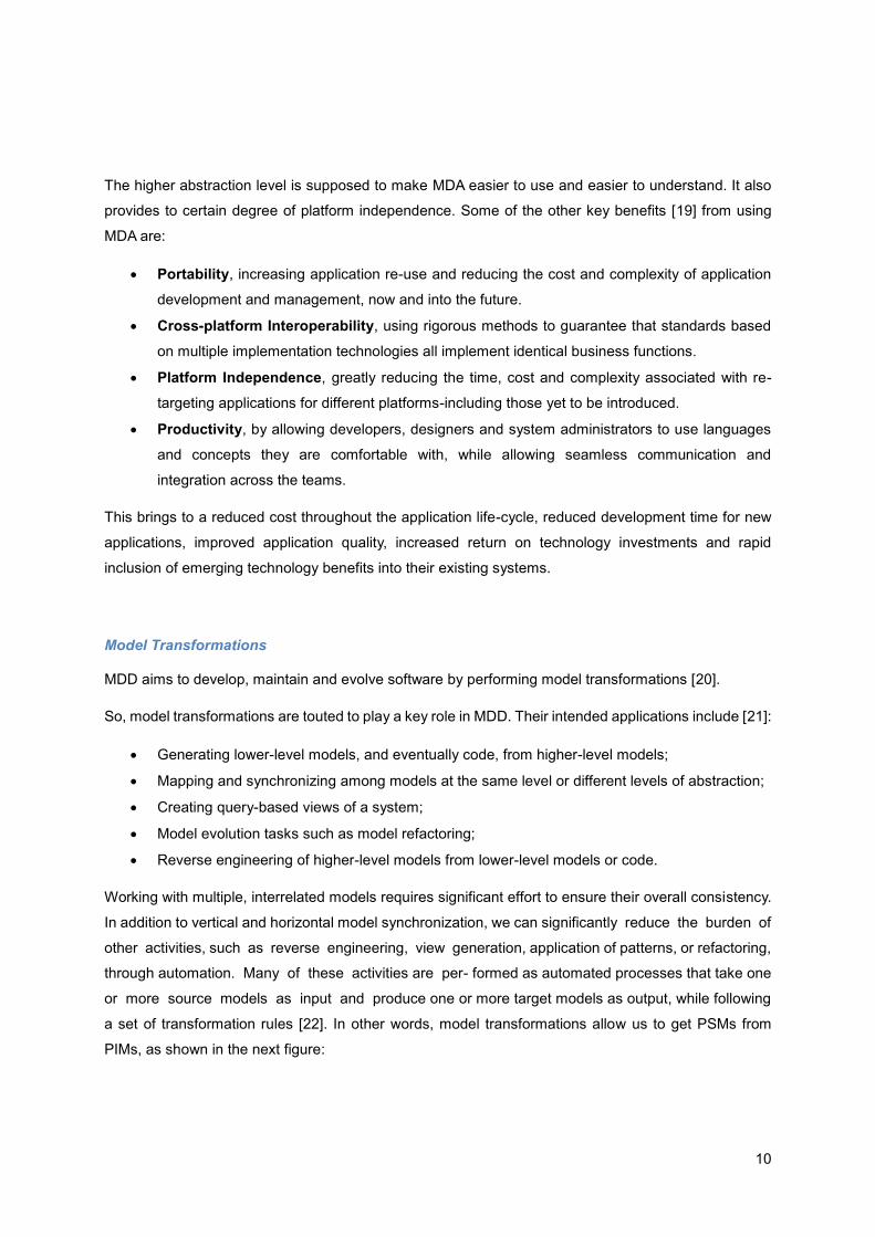
Model Transformations
MDD aims to develop, maintain and evolve software by performing model transformations [20].
So, model transformations are touted to play a key role in MDD. Their intended applications include [21]:
Generating lower-level models, and eventually code, from higher-level models;
Mapping and synchronizing among models at the same level or different levels of abstraction;
Creating query-based views of a system;
Model evolution tasks such as model refactoring;
Reverse engineering of higher-level models from lower-level models or code.
Working with multiple, interrelated models requires significant effort to ensure their overall consistency.
In addition to vertical and horizontal model synchronization, we can significantly reduce the burden of
other activities, such as reverse engineering, view generation, application of patterns, or refactoring,
through automation. Many of these activities are per- formed as automated processes that take one
or more source models as input and produce one or more target models as output, while following
a set of transformation rules [22]. In other words, model transformations allow us to get PSMs from
PIMs, as shown in the next figure:
11
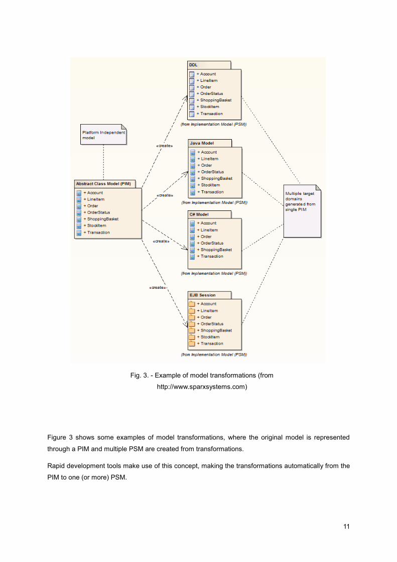
Figure 3 shows some examples of model transformations, where the original model is represented
through a PIM and multiple PSM are created from transformations.
Rapid development tools make use of this concept, making the transformations automatically from the
PIM to one (or more) PSM.
Fig. 3. - Example of model transformations (from
http://www.sparxsystems.com)

12
3.2. Rapid Development Tools
There are many tools that let us to make use of the concepts that we already mentioned, like MDD and
MDA. These tools allow us to build software through the automatic generation of the code from models.
We’ll call these tools rapid development tools since they allow the rapid development of applications.
We have chosen Artech’s Genexus, Quidgest’s Genio and the Outsystems Platform to analyze because
of the similarities and differences that unite these tools.
In the next sections we present the tools and we’ll make a critical analysis of the types of visualization
that they allow.
3.2.1. Genexus
Genexus1 is an intelligent tool developed by Artech aimed at assisting analysts and users throughout
the lifecycle of applications.
The design and prototype are done and tested on a Windows environment. Once the prototype is fully
approved by users, the database and the application programs for the production environment are
generated and/or maintained in a fully automatic way.
Genexus supports business processes through a WorkFlow supplementary tool (GXFlow), as well as
Reporting (GXquery), Business Intelligence (GXplorer) and portal Building (GXportal). It also allows
developing mobile applications.
It has an option to deploy to the cloud which facilitates cloud prototyping and it allows us to use the MDD
concept as it is a program to make other programs. With Genexus it’s possible to describe the high-level
requirements and the tool generates the data model and the native applications, giving full technology
independence.
As a concept, MDD implicitly puts the user at the heart of everything that happens in the definition and
description of a Business system.
To develop the “Model” requires domain expertise that is naturally known and possessed by the user or
business owner. Genexus takes this information and generates the software and data structures that
are required to bring the Business Model to life [23].
With Genexus, the developer starts from collecting Users Data Views as the base model to derive a
deterministic Entity-Relational data-model to drive the business information architecture.
1 www.genexususa.com/

13
Genexus also have some views that allow the user to see the objects of an application, as shown in
figure 4:
Fig. 4. - Examples of Genexus Views (1 - Business Process 2 - Form, 3 - Relationships between
tables, 4 - Table)
The problem we see with these visualizations are the lack of navigation and interactivity between them.
For example, for a user be able to see the relationships between the tables in an application (3) he has
to create a diagram and then drag and drop the tables from the list of tables to the diagram. It is difficult
to navigate through these views without losing the context or the focus. And there is no view that allow
the user to have a general overview of the application with all the objects.
3.2.2. Genio
Genio2 is an integrated development platform, created by Quidgest, to manage dynamic metamodels of
functional specifications and automatic code generation.
It is a platform for rapid development of comprehensive information systems, combining model-based
development with automatic code generation in different programming languages such as MVC,
PhoneGap, Web services, HTML 5 or C#.
2 www.quidgest.pt/q_genioPT.asp

14
Genio allows the programmer to design graphical user interfaces interactively while the compiler invisibly
generates the corresponding source code. Also, Genio generates and manipulates code to automate
code refactoring that would require multiple (error prone) manual steps, thereby improving developer
productivity [24]. Genio is responsible for the entire development process, without any further needs for
changes after generation. Any complementary code that has to be manually written is isolated, protected
and taken into account in each regeneration.
Its current architecture offerings are Back office (Windows, C++, MFC) and Web (C#, AJAX, web
services), Silverlight, PLSQL and WCF WebServices. It also has some prototypes for Mobile, MS-Office
task panes, Share point and Enterprise Java Beans.
Genio enables MDD for it operates as an IDE, creating a central interface to access the definitions,
specialized tools and calls to the generator to create the final code of the solutions.
The generation is performed according to the model definitions (tables and fields of the database,
validation rules, forms, menus systems, application resources, access levels and customer
management). For the generation to be made, generators and templates are also needed. The
templates are documents with instructions on what type of content should go to each portion of the code.
The generator has two inputs, the definitions and the templates, and one output, the source code.
Thus, there is a separation of the model from the code, because the user works on a platform
independent model, selects the specific target platform, and the tool generates the code. Just like MDD.
Genio doesn’t possess a visual way (per say) to analyse the data and navigate through it. The most
similar to representations of the models created by Genio is a view that can show the relationships
between some objects of an application, as shown in figure 5:
This visualization, by itself, does not give the user much information about the application and it should
the combined with other views in order to be more useful.
Fig. 5. - Relationships between objects in Genio

15
3.2.3. Outsystems Platform
The OutSystems Platform3 is a high-productivity solution for the agile development and
management of custom enterprise web and mobile applications. It allows development at the
business logic level, with the platform generating the conventional code needed for deployment
on the available technology. It focuses on accommodating rapidly changing business needs;
scalability without arbitrary limits and with consistent ease-of-use, regardless of scale and complexity;
It is an agile platform, which allows developers to create web applications using a Scrum-based
methodology, if desired. It can create both .NET and Java applications, using its database
modelling tools, in conjunction with a visual modelling language operating at a business logic
level higher than either Java or .NET [25].
The OutSystems Platform includes Business Process Technology which enables the design, execution
and management of processes which are fully integrated with the applications built with the OutSystems
Platform.
In the Outsystems platform, the models are data centric. Once the database model is defined, it is
possible to quickly create the UI models and the business logic. On top of these it’s possible to add
business processes to execute long running transactions, timers, events, and human workflows. All
models are integrated and type checked in real-time.
Like Genexus, the Outsystems Platform also has some views that can help the user understand the
application, as shown in figure 6:
Fig. 6. - Examples of Outsystems views (1 - Business Processes, 2 - Tables and their relationships)
Once more, this visualizations are difficult to navigate and interact and they don’t give a general overview
of an application.
3 www.outsystems.com/platform/

16
3.2.4. Overview of the tools
As already noted, these tools have in common the use of the MDD concept. They allow the developer
to define PIMs, mostly UML-like, and the tool generator makes the necessary transformations to create
the PSM according to the chosen target platform. These tools raise the level of abstraction of the
development of applications by separating the models from the code, which is generated automatically,
like the database definitions of the application, i.e. the data model of the application.
Some of these tools already have a way to visualize the objects of the data model, mostly by ER
diagrams and UML, but it makes use of the proprietary tools and their representation sometimes can be
difficult to analyse. They also can have a way to visualize the business processes through BPMN, but it
isn’t possible to navigate through the different views of the models without changing the context or the
focus.
3.3. Software Visualization
Software visualization [26] refers to the visualization of information of and related to software systems
and their development process by means of static, interactive or animated visual representations of their
structure, execution, behavior and evolution.
In other words, software visualization uses visual representations to make software more
visible. Visualizations concerns the graphical (or semi-graphical) representation of information
in order to assist human comprehension of and reasoning about that information [27].
A number of taxonomies have been proposed [27]. Two of the most interesting are those by Price,
Baecker and Small (1998) and Maletic, Marcus and Collard (2002). The now classic taxonomy by Price,
Baecker and Small (1998) identified six major categories of attributes: scope (the range of programs
the system can take as input), content (the subset of information about the software that is visualized
by the system), form (the characteristics of the output of the visualization), method (how the visualization
is specified), interaction (how the user interacts with and controls the visualization), and effectiveness
(how well the system communicates information to the user).
3.3.1. Software Visualization Tools
Most visualization tools that we found are more concerned in showing the data that is in an application,
instead of showing the relationships between the models that describe the definitions of the application:
the data model. Other examples are tools with the focus on the application code.
We found some visualization tools that allow the user to see the relationships between the tables in a
relational database and that allow to identify some dependencies, but these visualizations don’t seem

17
to allow navigation between them nor they show implicit relationships between elements. It’s like they’re
made to a user that already knows what he wants to see, instead of discovering through navigation.
Some of these tools are Tioga and Tioga-2 [28], Polaris [29] and Shrimp views [30].
Polaris is a system for query, analysis and visualization of multidimensional databases and its user
interface is despicted in Fig. 7:
Fig. 7 – The Polaris user interface (from [29])
This tool has its focus on showing the data inside database tables and not in the model of an application,
so it is not the kind of visualization that we want.
On other hand, Tioga and Tioga-2 are DBMS-centric visualization tools and they can show relationships
inside a database, but they are designed to be used by programmers as they has a low abstraction
level:

18
Fig. 8 – Tioga-2 user interface (from [28])
As shown in Fig. 8, Tioga-2 (a more powerful Tioga) lets the user see relationships in a database, but it
is more easily used by programmers, since the authors describe a programmer model and state that it
is based on the idea that an expert programmer constructs POSTGRES user-defined functions (boxes)
and that a second programmer uses an editor to “wire up" visualizations [28].
The third software visualization tool that we analyzed was Shrimp Views, and it consists in [31]
visualizations that combine the node-link diagrams with the fisheye filtering technique. The problem with
this tool is that it is focused in the code, i.e., software structures:

19
Fig. 9 – A shrimp view of a java program (from [30])
As shown in Fig.9 and mentioned above, this tools has its focus on the code developed and it requires
programming skills (or, at least, programming knowledge) to understand.
3.4. Visualization techniques
There were some attempts at constituting taxonomies to differentiate the kind of visualization. We have
chosen the taxonomy constructed by Shneiderman [32].
In this taxonomy are defined seven data types:
1D - Linear data arranged in a sequential manner, e.g., alphabetical list of names, source code;
2D - Planar or map data, e.g., photographs, maps, newspapers layouts;
3D - Data with volume and with relationships with each other, e.g., molecules, buildings;
Temporal - Data with start time, finish time with or without time overlaps, e.g., medical records,
video editing;
Multi-dimensional - Data that has multiples attributes that translate into points in an n-
dimensional space, e.g., records in relational and statistical databases;
Tree/Hierarchical - Items that are linked though hierarchy in a tree structure, e.g., computer
directories, business organizations;
Network - Items linked through a graph structure, e.g., World Wide Web.
From these types, we’ll chose the most adequate to the kind of data that we want to visualize.

20

21
4. Objectives
This chapter corresponds to the Objectives Definition step of Design Science Research Methodology
(DSRM).
We identified some criteria for good visualizations [33] and matched them with the type of information
that we wanted to visualize. What we want to visualize are different levels of abstraction of the
components of an application developed with a rapid development tool, i.e., its objects. These objects
can be menus, tables and forms and the solution must use graphical representations, i.e., visualization
techniques applied in this context to show the relationships between those objects by various levels of
abstraction. We have chosen those object types because, after the analysis we made to rapid
development tools, we concluded that those were the most important objects created with this kind of
tool. Tables and forms are present in all the tools we analysed and the menus usually are composed by
the other objects present in the application.
We also want to be able to see the most relevant objects of the application with few or without any
interaction. The most relevant objects will be the ones with more dependencies, i.e., the ones that have
relationships with more objects.
The proposed solution must show graphically, in 2D, the model of an application in a stratified and
navigable way in order to find patterns, simplify the knowledge of the application and to show clusters
of entities and its relationships to find the application core.
It is also important that we can visualize the evolution of the application over time in order to check
and monitor the changes of the model and to identify the objects with more changes.
So, the criteria that we have identified for our solution are:
Ease of use – the visualizer must be user friendly in order to make the users to want to use it;
Portability – we want a visualizer that can be used with different rapid development tools;
Quantity of information that can be easily viewed – we want to be able to show a great
amount of data, so we will need to create filters according to the quantity of data to show in each
moment;
Simplicity – The information must be seen in s simple way in order to be easily understood.
Also, tasks performed with the proposed solution must be done in the least amount of time and
with the least effort possible;
Navigation and interaction – The visualizer must provide a way to navigate through different
levels of abstraction;
Context keeping – In some situation it can be useful for the users to keep the context between
visualizations;
Filters – The visualizer must allow the user to filter the data according to their needs.

22
These criteria were defined through informal interviews with analysts and developers from Quidgest,
which work with a rapid development tool, Genio. We also received some sight from specialists in the
area.

23
5. Research Proposal
This chapter maps to the design and development step of Design Science Research Methodology
(DSRM) and its output is an artefact, is this case an instantiation, that aims to solve the identified problem
and the objectives defined earlier in this document.
As we identified in the problem section, software artifacts in industrial applications can consist of
thousands of code files, making difficult to manage and analyse the system’s complexity.
The first problem addressed is the management and analysis of the systems complexity. It is intended
to extract from complex models the most relevant objects of the system without any additional
information or interaction.
The second problem is concerned with the visualization of the models and the navigation between
models inside and out of the same abstraction layer. Bi-dimensional interfaces that allow to visualize
and manipulate data can also be used to improve the perception of the models.
In order to try to solve these problems, we propose the development of a model’s visualizer that
will allow to:
Facilitate the complex model’s visualization through 2D visualization techniques;
Extract from complex models the most relevant objects of the system without any additional
information or interaction;
Visualize the models and the navigation between models inside and out of the same abstraction
layer;
We have chosen 2D visualization techniques because, after a state-of-the-art analysis of the 3D models’
visualization techniques, we realized that its application in this context wouldn’t make much sense, since
in the majority of the cases the models’ legibility is drastically reduced in comparison to 2D visualization
techniques. One of the major factors is that, in 3D, when projected in a screen (2D surface), hides a
great amount of the model, needing rotation and translation interactions that can be too complexes for
a common user.
We proposed the following architecture for the visualizer:
Fig. 10 – Architecture of the proposal

24
The visualizer decomposes the application in its more important objects. These objects will be present
in the Objects Decomposition component in a way that the user can identify the most important ones
without any or little additional interaction. For example, if a table has many connections with other
objects, then, if there is an error with that table, all the related ones will be spreading that error.
Its Time component will allow users to see the changes to the objects through time, giving them an
insight of how the application evolved since it began being developed. The user will know which objects
were created, updated and deleted from the application and when these operations occurred.
The Relationships component will help visualizing the dependencies of objects in the data model of an
application, giving the possibility of navigating through it discovering other connections.
The Grouping component will help to identify groups of models that relate in some context, i.e., how
they are grouped relatively to some other components.
This architecture makes use of different visualization algorithms, each one with the characteristics
needed regarding the kind of information that we want to see.
This stratified architecture also allows users to navigate freely through the abstraction levels and through
focus.
We based our work on existing visualization techniques to represent the elements that we identified
previously. These visualization techniques were chosen from the ones depicted in the taxonomy
constructed by Shneiderman [31] and adapted to fit the information we want to visualize in order to meet
the criteria previously defined.
Through this section we’ll present visualization techniques to be tested. We divided these techniques
into hierarchical, networks and multidimensional because they seem to be the types of visualization that
better fit our purpose – visualize relationships and hierarchies among the many elements that compose
an application with multiple attributes. These visualization techniques were chosen from the ones
depicted in the taxonomy constructed by Shneiderman [31], that we explained in section 3.4.
The hierarchical visualization techniques [31] show items that are linked through hierarchy in a tree
structure, as shown in figure 8. These visualizations can allow the user to identify the number of levels
in a tree or how many children an element may have, for example.

25
Fig. 11 - Examples of hierarchical visualizations (1 - General tree visualization, 2 - Treemap, 3 -
Sunburst, 4 - Radial Tree)
The network visualization techniques [31] show items linked through a graph structure, as it can be seen
in figure 9:
Fig. 12 - Examples of network visualizations (1 - Matrix, 2 - Node-Link diagram, 3 - Dependency
Graph)
These visualization techniques can help the user to identify the relationships between elements and
how they work together. Moreover, they can possibly show applicational modules to be reused.

26
Fig. 13 - Examples of multidimensional visualizations (1 - bubble chart, 2 - bar chart)
Multidimensional visualizations, as the ones shown in figure 10, can be useful to see data with multiple
attributes in a multidimensional space. For example, we could use a bubble chart to represent all the
elements of an application’s data model with the bubbles sizes arranged according to the element’s
importance, using different colours to represents different types; or the bar chart to represent the time
component, where we can see the number of changes made to the objects through time.
We also considered ER diagrams to represent the relationships between objects, but usually these
diagrams go at a lower abstraction level than we intended, sometimes showing all the objects attributes.
Also, usually they are not interactive.
After choosing which visualization techniques to use, we had to choose the technology to implement
them. We used the D3.js [34], a JavaScript library, made by Mike Bostock, which allows us to transform
data documents. Besides JavaScript, it takes advantage of tools like HTML, SVG and CSS.
In this field, D3.js is one of the most used free libraries at the moment, in part, due to its unlimited ability
to create custom visualizations and the great support given by its documentation, examples, and
development community.
In the next subsection we’ll explain which visualization techniques were chosen specifically for each
component of the visualizer, with the reasons that led us to choose these techniques. We have chosen
those visualization techniques having in mind the information that we want to visualize and the possibility
of connecting them for the user to be able to navigate between them.

27
5.1. Objects Decomposition
As already mentioned, the visualizer decomposes the application in its more important objects. This
view has the objective of giving the user an immediate sight of the relative significance of each object in
the model of the application. We tried different visualization techniques, being the bubble chart the one
chosen. We chose this visualization technique because it’s possible to use its different dimensions in
order to represent different object’s attributes. The significance of each object is represented by its
number of relationships to other objects and this is shown in the bubble chart by the size of each bubble,
being the object type represented by the colour of the bubbles.
Other reason that led us to this visualization technique was the fact that it can show all the objects at
the same time, fitting them all in the screen, which helps the users getting a general overview of all the
application’s objects.
We also made some changes to the usual bubble chart, making interactive, in the way that by clicking
in a bubble, all the non-related ones fade out. This can help the users to understand the dependencies
between objects and it’s a starting point to connect the other visualizer’s components.
5.2. Relationships
We have studied several graphics based in Force Direct automatic layout and Dot algorithms. The
number of relationships between objects is exponential and each algorithm behaves in a different way
regarding this complexity.
We have chosen a node-link diagram based in a force direct layout to represent this component of the
visualizer because it can show the relationships between objects and it has a more acceptable response
time.
Filters were applied in order to minimize the quantity of nodes shown in each moment. These filter
include the type o relationship and the type of object.
5.3. Time
Each object is subjected to many modifications by many users through time. These changes are saved
in the model and visualized in this view.
In order to make it easier for the users to understand, we discarded more complex visualization
techniques that tackle the time dimension. We have chosen to represent a histogram through a bar
chart, which takes advantage of different colors to represent different types of operations (updates,
deletes, creates). It also takes advantage of a filter that allows to select the kind of timeline that the user
want to see (day, month, and year).

28
This component keeps the context from the bubble chart, allowing the user to identify which objects
suffered operations in each date and when a given object suffered the operations.
5.4. Grouping
The objects that make up a complex system lead to the creation of clusters connected between
themselves, typically when they address a part of the system (as a storage management inside an
inventory management, for example). To visualize these blocks we used a matrix view where each
connection between two objects raises their proximity and value.
This way, we can visualize modules of objects that have strong connections between themselves and
that can, potentially, represent a subsystem.
We have chosen to represent the way tables relate between themselves inside the menu objects, since
a menu represent a group of tables and forms that are invoked during some interaction with the
application made by the users.
We also included filters, to give the users a choice in the way they want to group the tables – by name,
by frequency or by cluster (menu).

29
6. Demonstration
In this chapter we demonstrate how the proposal that was described in the previous section can be used
to solve one or several instances of the problem depicted in Section 3. Subsequently, this section
conforms to the demonstration step of DSRM, step 4.
6.1. Quidgest and FirstSightModel
Our demonstration was made in Quidgest4, which is a consultancy and software engineering company,
with headquarters in Lisbon, Portugal, implementing a disruptive strategy for the IT sector, based on the
creation and improvement of automatic code generation processes. Genio, Quidgest´s platform for
automatic code generation, enables deployment in a wide range of platforms (as mentioned in previous
sections) and seamlessly integrates with a range of existing technologies.
This demonstration is also included in a research project called FirstSightModel5 that is being developed
between Quidgest and INOV6. This project foresees the development of a Framework with three
components: the visualization, the automatic extraction of models, and generation models of low-level
from the high level. Our demonstration is included in the visualization component of the Framework that
is being developed.
6.2. Model Visualization Tool
As we mentioned in the previous chapter, these visualizations were built on D3.js. So that a
demonstration was possible, we developed, with help from Quidgest, a query that is able to return a
.json file that will be consumed by the visualizations. This file can have the objects in the data model of
an application, their relationships and/or their grouping. The data on the .json file is raw and the data
processing is done in the JavaScript.
We tested our developed tool with several real applications from Quidgest in order to realize if our
proposed tool performed well with different applications. This was extremely important because there
are some applications bigger than other and our tool must perform well disregarding the size of the
application.
In this subsection, we present the tool developed in order to tackle the problem identified. We will present
screenshots of the tool for a specific application (a real one, used by Quidgest), along with the
explanation of each one. In Appendix A we have screenshots that show the evolution of the prototype.
4 www.quidgest.pt/ 5 www.quidgest.pt/q_ProjetosQRENPT.asp?LT=PTG 6 www.inov.pt/

30
The home page of the visualizer, shown in Fig.14, has a representation of the most important objects in
the definitions of the application with their types represented by different colours and their size related
with the number of relationships. Orange identifies Tables, red identifies Forms and blue Menus.
Fig. 14 – Visualizer’s home page
This maps to the objects decomposition’s component previously proposed for the visualizer.
The user can interact with the visualizer in order to gather more information about the definitions of the
application. By clicking in an object, all the non-related objects fade out. This is represented in Fig. 15;
Fig. 15 - Relationships in bubble chart
31
For a better understanding by the users, all the highlighted relationships are kept in a table on the right
of the chart.
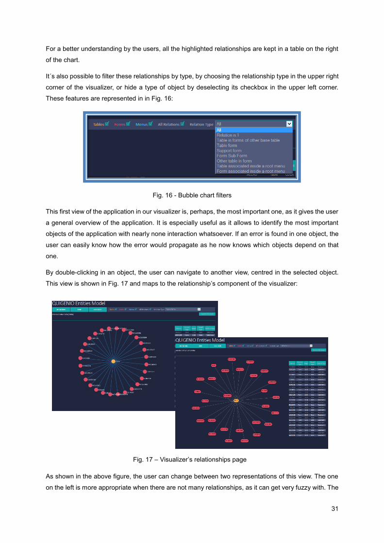
It´s also possible to filter these relationships by type, by choosing the relationship type in the upper right
corner of the visualizer, or hide a type of object by deselecting its checkbox in the upper left corner.
These features are represented in in Fig. 16:
Fig. 16 - Bubble chart filters
This first view of the application in our visualizer is, perhaps, the most important one, as it gives the user
a general overview of the application. It is especially useful as it allows to identify the most important
objects of the application with nearly none interaction whatsoever. If an error is found in one object, the
user can easily know how the error would propagate as he now knows which objects depend on that
one.
By double-clicking in an object, the user can navigate to another view, centred in the selected object.
This view is shown in Fig. 17 and maps to the relationship’s component of the visualizer:
As shown in the above figure, the user can change between two representations of this view. The one
on the left is more appropriate when there are not many relationships, as it can get very fuzzy with. The
Fig. 17 – Visualizer’s relationships page

32
one on the right is an alternative that the tool gives the users when the other one gets more difficult to
analyze. To change between them, the user only has to click on the button positioned below the
relationship type drop down menu.
In this view, the user can navigate to other objects, being able to see their relationships to others, having
the option of seeing the relationships between the objects of the same type as the one selected.
From the home page, it´s also possible to navigate to a time view where the user can see the history of
creation, update and delete of the objects. This is presented in Fig. 18, and it maps to the time
component of the visualizer:
Fig. 18 - Visualizer's time view
By default, the time chart presents all the changes made to the definitions of the application, but the
user can change it by clicking on an object from the bubble chart. By clicking on an object, the time chart
changes to present just the information relative to that specific object. This is shown in Fig. 19:

33
Fig. 19 - Visualizer's time view for a specific entity (CLIEA)
Another feature of this view is the possibility of clicking in a bar from the time chart – this highlights the
objects, in the bubble chart, that were created, updated or deleted in that date.
It´s also possible to apply a filter to the time interval shown in the bar chart by selecting the area in the
mini chart below the actual chart, as shown in Fig.20:
Fig. 20 - Timeline filtered
The above figure shows the timeline of the application filtered to only show operation that occurs in
2014.

34
We could had just shown the bar chart to give the user a notion of how the application was altered over
time, but it made sense to keep the context from the visualizer’s home page (bubble chart) because it’s
important to see the objects that “suffered” the operations. If the application (or a functionality of the
application) stop working in a given moment, the user can check what objects were altered since the
last time it worked perfectly – one of those must have been altered incorrectly.
Finally, it’s possible to navigate to a clustering view of the tables of the application, as shown in Fig. 21:
Fig. 21 - Visualizer's cluster view
This view maps to the grouping component of the visualizer and shows the tables grouped in a matrix
diagram where each colour represents a menu where the tables are used. In this page, the user can
select the number of tables that he wishes to see. It´s also possible to rearrange the matrix axes by
frequency (number of occurrences) and by name of the objects.
The above image shows the tables grouped by menu, and it’s easy to see the “big spots” corresponding
to different menus, allowing to identify what tables are most used in which menu.
This tool is already integrated in Quidgest’s Genio, as shown in Fig. 22:

35
Fig. 22 - Model Visualizer in Genio
When the users have an application’s definitions open, they can already use the visualizer to navigate
through its data model by clicking on the model visualizer ribbon, as shown in the previous figure. The
visualizer will then open with the data according to the definitions that the user has previously loaded.
The data to be consumed by the tool is loaded at the start of the application with the purpose of speeding
the user interaction with the tool in later moments.

36

37
7. Evaluation
In this chapter we describe how we intend to proceed with the evaluation of our proposal. This
description corresponds to step 5 of DSRM, Evaluation. With this assessment we intend to establish
that the proposal we offer supports the solution of the problem statement.
7.1. Usability Tests
In order to evaluate the feasibility of our proposal [35] and demonstration we performed tests of a
quantitative nature, namely usability tests, with 10 users. These tests were made at the users’
workplace, as it is the environment where they would be using the tool in normal circumstances. All the
users performed the tests with the same data, i.e., using the visualizer with the same real application
with real data, as we aimed to simulate tasks that they would perform with the proposed tool. The fact
that all the users performed the tests with the same application allowed us to measure some usability
metrics like: time taken to complete a task, number of errors and number of mouse clicks.
The methodology used to perform the tests, as well as the main results are presented in the next
subsections.
7.1.1. Methodology
Since the users can interact with the developed tool in many ways, it was essential that we explained it
first. We began by making a demonstration (the same for every user) with a duration of about 5 minutes.
After this demonstration, each user was encouraged to try the visualizer and navigate freely through the
application definitions, without knowing the tasks that he would be asked to perform.
The tasks order was randomly selected, since there is no dependency between them, but all users
performed the tasks in the same order to ensure that everyone had the same experience during the
tests and that the test’s results were not influenced by potential experience gained during its execution.
All tasks began in the visualizer’s home page and every filter applied in previous tasks was removed.
During the execution of the tasks we measured 3 usability metrics: time taken to complete a task,
number of errors and number of mouse clicks in each task. We used a program to save the pc screen
during the tests in order to facilitate the analysis the metrics.
The tasks were created with the goal of evaluating the usability of each visualization technique used in
the visualizer, i.e., testing each page or view. But the tasks also had the purpose of evaluating more
specific aspects of the tool. The tasks, along with these aspects are presented in the next table:

38
Task 1 Identify the table with more relationships in the application. How many relationships does it
have?
Objectives:
Evaluate if the users can identify the most important objects in the application with few or
without any interaction;
See if the users understand that the mouse over function in the home page allows to see how
man relationships each object has.
Task 2 Identify the table forms of the table with more relationships in the application. Of these forms,
identify the one with more relationships and then find its support forms.
Objectives:
Evaluate if the users can properly use the filters in the home page or in the relationships page
(the filters are the same in both pages);
See how the users navigate and interact with the tool in a more complex task.
Task 3 Identify the cluster (menu) that relates the tables with more relationships in the application.
Objectives:
Evaluate if the users understand the purpose of the cluster’s page;
See if the users can properly use the filters in this page and if he understands what is
represented.
Task 4 Find the creation date of the table with more relationships in the application. How many
times was it updated since its creation? When it was last modified?
Objectives:
Evaluate if the users understand the purpose of the bar chart that represents the time
component;
Evaluate how the context keeping helps the users in this page;
See if the users understand that by clicking in an object on the bubble chart, the bar charts
adjust to show only the operations performed to that particular object.
Task 5 Verify which objects went under any operations (inserts, removes or updates) in 15/02/2013.
Objectives:
See if the users understand that by clicking in a bar from the bar chart the bubble charts
adjusts itself to show which objects suffered operations in that specific date:
See if the users can select a date by properly using the timeline filter;
Table 2 – Tasks and their objectives

39
After the tests, we asked the users to answer a quick survey, in order to register how they felt about the
visualizer. In appendix B we present the survey used.
This survey had 10 standard questions based on the work of John Broke – The System Usability Scale
[36]. In the end of the survey there was an open answer question to the users make any
suggestion/improvement that they would like to see implemented in the visualizer.
7.1.2. Users
We tested with a group of 10 users giving preference on the ones that would use the visualizer in the
future – Quigest’s Genio developers. Since to date, there wasn’t much availability from Genio
developers, we also tested with some other users that had some experience working with rapid
development tools. The major part were involved in the FSM project.
Our testing group was composed by 9 men and 1 woman with ages varying from 20 to 40 years of age.
During the tests, we noticed that some users didn’t take fully advantage of the demonstration made
before the test and, although we asked them to think before doing any action and to tell us what they
were thinking, some rushed in.
7.1.3. Usability tests results
After the tests conclusion, we summarized the metrics measured. The following table resumes the
observed data and, for each task, we calculated the average, standard deviation, maximum and
minimum values observed for each metric (clicks, errors and time taken):
Mouse clicks Errors Time (seconds)
Task �̅� σ Max Min �̅� σ Max Min �̅� σ Max Min
Task 1 0 0 0 0 0,1 0,3 1 0 1,3 0,64 3 1
Task 2 10,1 1,87 13 7 1,9 0,94 3 0 72,9 16,91 96 40
Task 3 5,2 1,17 7 4 0,9 0,83 2 0 36,7 6,97 50 25
Task 4 3,1 1,51 6 2 0,5 0,67 2 0 31,3 5,25 40 23
Task 5 6,6 1,91 10 3 0,4 0,49 1 0 30,7 8,26 45 17
Table 3 - Usability tests results
By analysis of Table 3, we verified that the users had more trouble performing the second task, since
that one had higher values in all aspects measured. Task 2 was the more complex task that we asked
our users to perform, since they had to go through more steps in order to finish it. Only one user was
able to finish this task without any error. The most common error in this task was related with the use of
the bubble chart filter for the first time, as the majority of the users tried to select the relationship type

40
filter before selecting the object of which relationships he wanted to see. This was a useful feedback,
since we already changed the interface to allow the selection of the filter at any time.
Some users also felt some difficulties when performing task 3. Some didn’t realize that this task was
meant to be done through the visualizer’s cluster view. The feedback given in this task was important,
since we understood that “Clusters” wasn’t a good name to identify this view.
On the other hand, task 1 was the most successful of all the tasks, as it was the simpler one. One of the
major objectives of our proposal is to give the user the possibility to see the most relevant objects of
the application with few or without any interaction. This results of task 1 show that all users were, almost
instantly, able to find the most relevant table in the application. This can be widespread to all other
objects in the application, since the principles are the same. The only error that occurred when testing
this task was when a user rushed in to give an answer without properly looking to the chart presented
in the tool. In the application used in the tests, the two more relevant tables have a similar number of
relationships and, because of the user’s rush, at first he didn’t took the time to mouse over the two tables
to see which one had, effectively, more relationships.
The tasks respecting the visualizer’s time component (tasks 4 and 5) were performed with more
confidence by the users, since they easily understood what they had to do. The aspect that the users
made us notice was the fact that some of them had some difficulty using the time line filter: some made
a lot of mouse clicks just to try to select the area of the chart that they wanted to see (most didn’t
understood that all they had to do was to select a portion of the chart and then drag the mouse to cover
what they wanted). This is reflected in the average time and clicks of task 5 since the most time spent
in this task was trying to select the portion of the chart that they wanted.
The following figure gives a more visual way of analysing the average metrics measured:
Fig. 23 – Average measured metrics
As it can be seen in Fig. 23, after task 1, the time spent to perform the tasks and the number of errors
decrease in average, along the test. So, we believe that when the users star using the tool more often
they will be using it more efficiently. Appendix C has the metrics measures for each task.
0
10
20
30
40
50
60
70
80
Task 1 Task 2 Task 3 Task 4 Task 5
Mouse Clicks Errors Time (s)
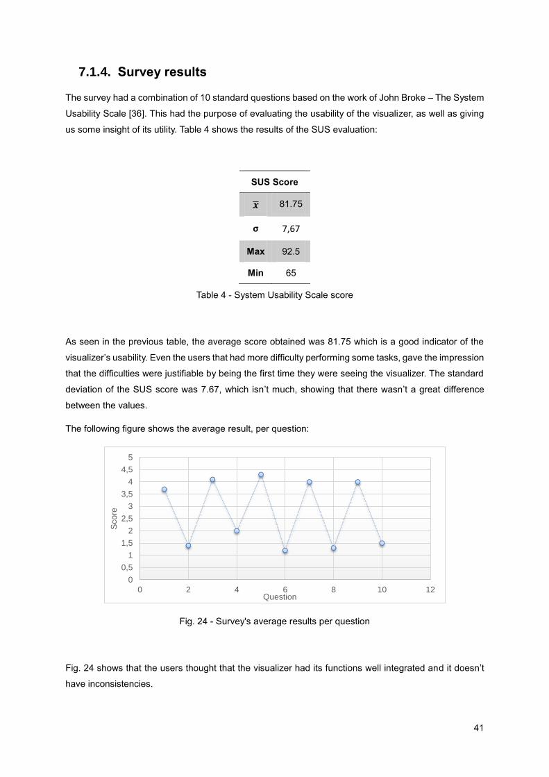
41
7.1.4. Survey results
The survey had a combination of 10 standard questions based on the work of John Broke – The System
Usability Scale [36]. This had the purpose of evaluating the usability of the visualizer, as well as giving
us some insight of its utility. Table 4 shows the results of the SUS evaluation:
SUS Score
�̅� 81.75
σ 7,67
Max 92.5
Min 65
Table 4 - System Usability Scale score
As seen in the previous table, the average score obtained was 81.75 which is a good indicator of the
visualizer’s usability. Even the users that had more difficulty performing some tasks, gave the impression
that the difficulties were justifiable by being the first time they were seeing the visualizer. The standard
deviation of the SUS score was 7.67, which isn’t much, showing that there wasn’t a great difference
between the values.
The following figure shows the average result, per question:
Fig. 24 - Survey's average results per question
Fig. 24 shows that the users thought that the visualizer had its functions well integrated and it doesn’t
have inconsistencies.
0
0,5
1
1,5
2
2,5
3
3,5
4
4,5
5
0 2 4 6 8 10 12
Sco
re
Question

42
After these 10 questions, the survey had an optional open response question. Most users gave some
suggestions, like:
Changing the name of the clusters tab to a more perceptible name;
Allowing the selection of filters before selecting an object;
Making the table that supports the relationships’ visualization interactive, being an alternative to
the chart;
Changing the nomenclature of the label in the time line chart to be more perceptive.
When all was finished, we had a talk with some users – mainly the users that will use this tool for real –
and asked them a few questions about the utility of the developed visualizer. More specifically, we asked
them if they thought that the tool was useful and what would be the function that they would use the
most and why. The responses included:
“The time function can be very useful, mainly when, for some reason, an application’s
functionality stops working and nobody knows why, since the last time the functionality was used
it was working well. With this time view we can see when and what changes were made to the
objects that compose that functionality”;
“The cluster´s view can be helpful when trying to see which tables work together in some context
and allow to identify modules that can be reused”;
“It can help identifying the dependencies between objects, helping to see how an error would
propagate”;
“The bubble chart was very interesting, it can give the users a quick sight over the application’s
objects and their importance”.
These tests were very important to the evaluation of our proposal and demonstration since we got
information and feedback that wouldn’t be easy to have without them.
7.2. Evaluation Overview
Through the tests, questionnaires and interviews made during our artifact evaluation we took some
conclusions regarding the 5 system dimensions referred in [37]. These dimensions are: goal,
environment, structure, activity and evolution. Each of these dimensions is characterized by some
criteria. For each one, we present our conclusions:
Goal
o Our solution is efficient, since the developed artifact produces the desired effect: we
met all the criteria defined in the objectives section of this document;
o Our solution is valid, since it correctly achieves its goals;
43
Environment
o Our solution’s environment is consistent with people, since it’s useful (or can be
useful), understandable and easy to use;
o Our solution’s environment is consistent with an organization, since we tested in
Quidgest and it was approved by all that were involved in any way in its development
process, including top managers;
Structure
o Our solution’s structure is simple, since the information is seen in a simple way in order
to be easily understood. Also, the tasks performed with the proposed solution, in the
tests, were done in seconds, even the ones that users found more difficult;
Activity:
o Our solution is complete, since it has the functionalities desired by the users;
Evolution
o Our solution is robust, since new functionalities can easily be integrated with the
current ones. It’s also easy to add more types of objects and new filters according to
the future necessities of the users and/or the organization
These dimensions have more criteria than we presented above, but some of the criteria wasn’t
applicable to our research.

44

45
8. Conclusion
This research follows the Design Science Research Methodology, since it can be applied in the context
of Information Systems through the creation of IT artifacts that solve real-world organization problems.
Our research is expected to contribute to the implementation of several visualization technique
prototypes that can be applied to the data model of an application that is developed through a tool that
uses MDD concepts.
Those prototypes are navigable, interactive and compose a visualizer that allows the user to navigate
through the application’s data model, between different levels of abstraction and without losing the
context and/or focus. We tested our artefact with 10 users and the results have shown that our prototype
had a nice usability and can actually help
We expect that this visualizer will improve the way the dependencies between objects in a data model
are seen and evaluated in order to identify the components that implement a given part of the application
and that can be reused in other applications that share that same behaviour. We also expect the use of
our artifact can help developers and analysts in analysing how the system really works and how they
can improve it or detect errors.
8.1. Lessons learned
Our research raised several aspects worth mentioning. Some resulted from the Related Work and from
the design phase of our research while others derive from the experience and feedback obtained during
the demonstration and evaluation phases.
First and foremost, one of most important the lessons learned is connected to the awareness of a
research methodology in this field of study. The use of the DSRM methodology provided us the tools on
how to conduct a well-organized and successful research study.
Having proposed, coordinated and conducted a series of tests to different visualization techniques when
applied to the generated objects in the model definitions of an application we have learned and gotten
a new vision on the utility of the visualization techniques tested. And we were able to choose the ones
that better fit with our purpose.
We learned that the visualization of data models can make possible to researchers, analysts and
engineers to get an insight of this data model in an effective and efficient way. This was verified through
our study of the work related to the problem, as well as through the tests and interviews we made.

46
8.2. Research Communication
In order to communicate the problem and its importance, the artifact, its utility and novelty, the rigor of
its design, and its effectiveness to researchers and other relevant audiences such as practicing
professionals, we wrote this thesis and we are preparing a presentation in the scope of the FSM project.
Some minor presentation were already made during this research and the next one will be the final one
where we’ll present all our final results.
We are also finishing a research paper to submit to a conference. This paper will also help to disclose
the work done during the FSM project, as well as the research we´ve done.
8.3. Limitations
As it normally occurs in a research study, there are some limitations to our work.
One of the criteria that we’ve defined in chapter 4 was portability. We wanted to create a tool which could
be used with different rapid development tools. In order to use it with a different rapid development tool,
it is necessary to develop a query to extract from the definitions database a .json file (with the exact
structure we defined) to be consumed by the visualizer and create the charts. The construction of the
query is not trivial, and it can possibly be different for every rapid development tool, since each tool can
have a different way of constructing the data model.
Another limitation that we found is related to the usability tests. We were only able to test with 10 users
due to lack of availability from other areas at Quidgest. We wanted to test with at least 20 users, but at
the time that was not possible. Despite that, we intend to perform a second round of user tests at
Quidgest until the end of the FSM project, and after we made the necessary corrections to the developed
visualizer, as a result of the tests already performed.
8.4. Future Work
As future work, we think it would be interesting to demonstrate our proposal in other companies using
other rapid development tools, but since this work was made in the scope of a research project with a
real company we don’t know if it is going to be possible.
It would also be interesting to add a new component to the developed visualization tool, a processes
component, which would allow to have a new abstraction at a higher level and to see which objects were
used in each business processes. This would help the company to align its applications with its business
processes.

47
Finally, and as we explained with our work limitations, we didn’t had the chance to perform the usability
tests with more users. We’ll perform more user tests until the end of the FSM project, with different
users.

48

49
Bibliography
[1] Liddle, Stephen W. "Model-Driven Software Development." Handbook of Conceptual Modeling.
Springer Berlin Heidelberg, 2011. 17-54.
[2] Van Wijk, Jarke J. "The value of visualization." Visualization, 2005. VIS 05. IEEE. IEEE, 2005.
[3] K. Peffers, T. Tuunanen, M. A. Rothenberger, and S. Chatterjee, “A Design Science Research
Methodology for Information Systems Research,” J. Manag. Inf. Syst., vol. 24, no. 3, pp. 45–77, Dec.
2007.
[4] Cabot, Jordi, Robert Clarisó, and Daniel Riera. "UMLtoCSP: a tool for the formal verification of
UML/OCL models using constraint programming." Proceedings of the twenty-second IEEE/ACM
international conference on Automated software engineering. ACM, 2007.
[5] Walker, Robert J., et al. "Visualizing dynamic software system information through high-level models."
ACM SIGPLAN Notices. Vol. 33. No. 10. ACM, 1998.
[6] Teppola, Susanna, Päivi Parviainen, and Juha Takalo. "Challenges in deployment of model driven
development." Software Engineering Advances, 2009. ICSEA'09. Fourth International Conference
on. IEEE, 2009.
[7] Kent, Stuart. "Model driven engineering." Integrated formal methods. Springer Berlin Heidelberg,
2002
[8] Mohagheghi, Parastoo, and Jan Aagedal. "Evaluating quality in model-driven engineering." Modeling
in Software Engineering, 2007. MISE'07: ICSE Workshop 2007. International Workshop on. IEEE,
2007
[9] Mellor, Stephen J., Tony Clark, and Takao Futagami. "Model-driven development: guest editors'
introduction." IEEE software 20.5 (2003): 14-18.
[10] Hailpern, Brent, and Peri Tarr. "Model-driven development: The good, the bad, and the ugly." IBM
systems journal 45.3 (2006): 451-461.
[11] Mellor, Stephen J., ed. MDA distilled: principles of model-driven architecture. Addison-Wesley
Professional, 2004.
[12] Atkinson, Colin, and Thomas Kuhne. "Model-driven development: a metamodeling foundation."
Software, IEEE 20.5 (2003): 36-41.
[13] Azoff, Michael. “The benefits of model driven development.” Butler Direct Limited (2008).
[14] Selic, Bran. "The pragmatics of model-driven development." IEEE software 20.5 (2003): 19-25.

50
[15] Kleppe, Anneke G., Jos B. Warmer, and Wim Bast. MDA explained: the model driven architecture:
practice and promise. Addison-Wesley Professional, 2003
[16] Gally, Matthias. "What is MDD/MDA and where will it lead the software development in the future?”
(2007)
[17] Kleppe, Anneke G., Jos B. Warmer, and Wim Bast. MDA explained: the model driven architecture:
practice and promise. Addison-Wesley Professional, 2003
[18] Soley, Richard. "Model driven architecture." OMG white paper 308 (2000): 308
[19] Sacevski, Igor, and Jadranka Veseli. "Introduction to Model Driven Architecture (MDA)." Seminar
Paper, University of Salzburg. 2007
[20] Mens, Tom, and Pieter Van Gorp. "A taxonomy of model transformation." Electronic Notes in
Theoretical Computer Science 152 (2006): 125-142
[21] Czarnecki, Krzysztof, and Simon Helsen. "Feature-based survey of model transformation
approaches." IBM Systems Journal 45.3 (2006): 621-645
[22] Sendall, Shane, and Wojtek Kozaczynski. Model transformation the heart and soul of model-driven
software development. No. LGL-REPORT-2003-007. 2003
[23] Breogán Gonda and Nicolás Jodal. “Knowledge-based Development: Philosophy and theoretical
foundation of Genexus”. Artech (2007)
[24] Quidgest. “Genio E-book”
[25] David Norfolk. “OutSystems Platform and Force.com different PaaS for different players”. An
InComparison Paper by Bloor Research (2013)
[26] Johannes Bohnet, Jürgen Döllner: Analyzing Feature Implementation by Visual Exploration of
Architecturally-Embedded Call-Graphs. 4th International Workshop on Dynamic Analysis, ACM, ACM
Press, pp. 41–48, 2006
[27] Petre, Marian, and Ed de Quincey. "A gentle overview of software visualisation." PPIG News Letter
(2006): 1-10.
[28] Aiken, Alexander, et al. "Tioga-2: A direct manipulation database visualization environment." 2013
IEEE 29th International Conference on Data Engineering (ICDE). IEEE Computer Society, 1996.
[29] Stolte, Chris, Diane Tang, and Pat Hanrahan. "Polaris: A system for query, analysis, and
visualization of multidimensional relational databases." Visualization and Computer Graphics, IEEE
Transactions on 8.1 (2002): 52-65.
[30] Storey, Margaret-Anne, et al. "SHriMP views: an interactive environment for information
visualization and navigation." CHI'02 Extended Abstracts on Human Factors in Computing Systems.
ACM, 2002.

51
[31] Knight, Claire. "System and software visualisation." Handbook of software engineering and
knowledge engineering (2001): 1-17.
[32] Shneiderman, Ben. "The eyes have it: A task by data type taxonomy for information visualizations."
Visual Languages, 1996. Proceedings, IEEE Symposium on. IEEE, 1996.
[33] Upson, Craig, et al. "The application visualization system: A computational environment for scientific
visualization." Computer Graphics and Applications, IEEE 9.4 (1989): 30-42.
[34] Bostock, M.: D3.js - data-driven documents. http://d3js.org
[35] Dumas, Joseph S., and Janice Redish. A practical guide to usability testing. Intellect Books, 1999.
[36] Brooke, John. "SUS-A quick and dirty usability scale." Usability evaluation in industry 189 (1996):
194.
[37] Prat, Nicolas, Isabelle Comyn-Wattiau, and Jacky Akoka. "ARTIFACT EVALUATION IN
INFORMATION SYSTEMS DESIGN-SCIENCE RESEARCH–A HOLISTIC VIEW." 18th Pacific Asia
Conference on Information Systems, Chengdu, China. 2014.

52

53
Appendix A – Prototype Evolution
In this appendix we present screenshots taken during the prototyping phase which represent the
evolution of our prototype. Since the current version of the tool is described in the demonstration chapter,
we didn’t include it here.
Objects decomposition

54
Relationships
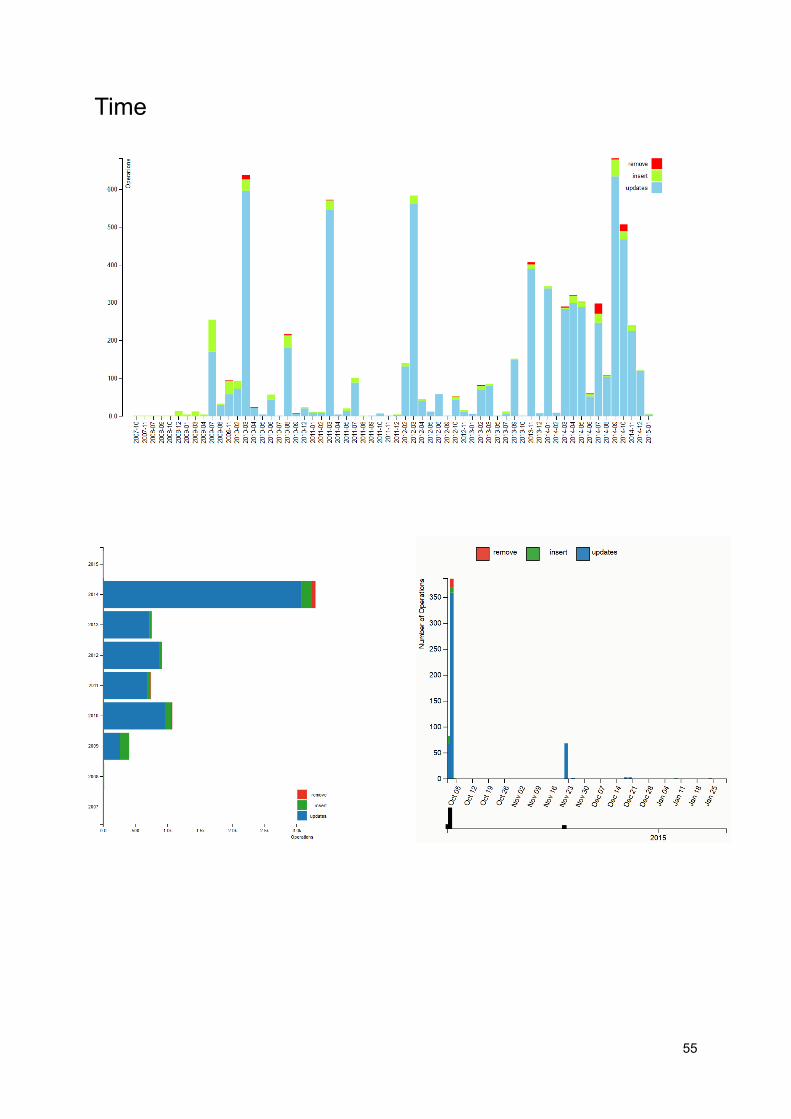
55
Time

56
Grouping

57
Appendix B – User Questionnaire
Questionário
Este questionário tem o objectivo de construir um perfil dos utilizadores e avaliar a usabilidade do visualizador de modelos desenvolvido no âmbito do projecto FirstSightModel. Seguem-se algumas questões relativas à experiencia passada pelo utilizador, de forma a conseguirmos construir uma análise quantitativa e qualitativa do mesmo. O questionário é anónimo a o seu preenchimento não levará mais que uns minutos. Agredecemos a sua cooperação.
1. Qual o seu género? □ Masculino □ Feminino
2. Qual a sua idade? □ Menos de 18 anos □ 18 - 24 □ 25 - 30 □ 31 - 40 □ 41 - 50 □ 51 - 60 □ Mais de 60 anos

58
3. Assinale com um X a opção que acha que se adequa à experiencia que passou ao utilizar a ferramenta (1 – Não concordo, 5 – Concordo completamente)
1 2 3 4 5
3.1 - Usaria este visualizador frequentemente □ □ □ □ □
3.2. - Achei o visualizador desnecessáriamente complexo
□ □ □ □ □
3.3. - Achei o visualizador fácil de usar □ □ □ □ □
3.4. - Acho que iria precisar de apoio para utilizar o visualizador
□ □ □ □ □
3.5. - Acho que as funções do visualizador estão bem integradas
□ □ □ □ □
3.6. - Acho que existem muitas inconsistencias no visualizador
□ □ □ □ □
3.7. - Acho que a maioria dos utilizadores aprenderiam rápidamente a utilizar o visualizador
□ □ □ □ □
3.8. - Achei o visualizador demasiado pesado □ □ □ □ □
3.9. - Senti-me confiante a utilizar o visualizador
□ □ □ □ □
3.10. - Teria de aprender muitas coisas antes de conseguir utilizar o visualizador
□ □ □ □ □
4. (Opcional) Tem alguma sugestão de modificação/melhoria do visualizador? ____________________________________________________________________________________________________________________________________________________________________________________________________________________________________________________________________________
Obrigado pelas respostas!
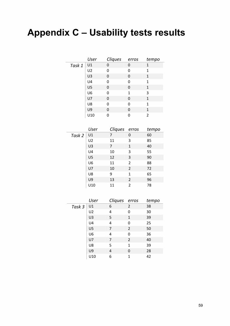
59
Appendix C – Usability tests results
User Cliques erros tempo
Task 1 U1 0 0 1
U2 0 0 1
U3 0 0 1
U4 0 0 1
U5 0 0 1
U6 0 1 3
U7 0 0 1
U8 0 0 1
U9 0 0 1
U10 0 0 2
User Cliques erros tempo
Task 2 U1 7 0 60
U2 11 3 85
U3 7 1 40
U4 10 3 55
U5 12 3 90
U6 11 2 88
U7 10 2 72
U8 9 1 65
U9 13 2 96
U10 11 2 78
User Cliques erros tempo
Task 3 U1 6 2 38
U2 4 0 30
U3 5 1 39
U4 4 0 25
U5 7 2 50
U6 4 0 36
U7 7 2 40
U8 5 1 39
U9 4 0 28
U10 6 1 42
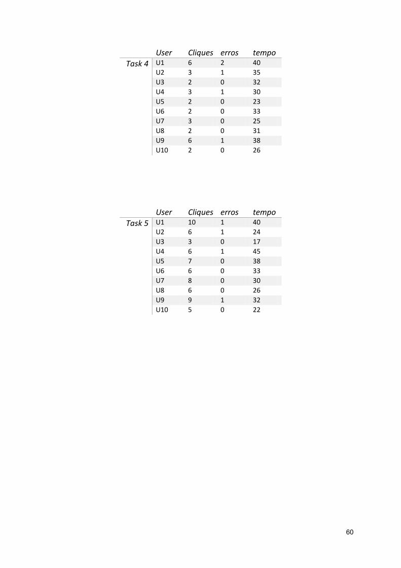
60
User Cliques erros tempo
Task 4 U1 6 2 40
U2 3 1 35
U3 2 0 32
U4 3 1 30
U5 2 0 23
U6 2 0 33
U7 3 0 25
U8 2 0 31
U9 6 1 38
U10 2 0 26
User Cliques erros tempo
Task 5 U1 10 1 40
U2 6 1 24
U3 3 0 17
U4 6 1 45
U5 7 0 38
U6 6 0 33
U7 8 0 30
U8 6 0 26
U9 9 1 32
U10 5 0 22