visualizing geographic classifications using...
TRANSCRIPT

Visualizing Geographic Classifications Using Color
Bruce A. MaxwellSwarthmore College
Swarthmore, PA [email protected]
(610)328-8081 (phone)(610)328-8082 (fax)
AbstractThis paper presents the cartographic elements of a system for classifying and visualizing high-dimensionalgeographicdatasets.Thesystemhasbeendevelopedaspartof theLandOceanInter-actions in the Coastal Zone [LOICZ] project. The goal of the system is to develop regional andglobaltypologiesof coastalzonesusinglargemulti-variabledatasets.Our implementationbringstogetherstatisticalclusteringalgorithmswith visualizationcapabilitiesto allow easyanalysisandcomprehension of the results. The two main tasks of the visualization are to allow for discrimina-tion of multiple classes and to show relationships between those classes. These are accomplishedin two different visual presentations. In both cases, the system selects colors appropriate to thepurpose. In the latter case--showing relationships--the system uses a novel iterative refinementalgorithmto selectthecolors.Theresultsshow thatthesystemis successfulatbothgeneratingtheclasses and visualizing the relationships between them.
Keywords: typology, clustering, visualization, color, color selection

Visualizing Geographic Classifications Using Color
1 Intr oduction
The Land-Ocean Interaction in the Coastal Zone project [LOICZ] is a component of the Interna-tional Geosphere-Biosphere Programme [IGBP] that focuses on the area of the earth’s surfacewhere land, ocean and atmosphere meet and interact. The overall goal of this project is to deter-mineat regionalandglobalscales:thenatureof thatdynamicinteraction;how changesin variouscompartments of the Earth system are affecting coastal zones and altering their role in globalcycles;to assesshow futurechangesin theseareaswill affect theiruseby people;and,to providea sound scientific basis for future integrated management of coastal areas on a sustainable basis[Pernetta, JC and Milliman, JD (Editors) (1995)].
A primaryLOICZ objective is developingglobalscale-estimatesof biogeochemicalfluxesof car-bon, nitrogen, and phosphorous [C, N and P] in and through the coastal zone [CZ]. The strategyadoptedis to identify ‘type-specimen’CNPbudgetsfor well-characterizedcoastalregions,to fur-theridentify thecoastalregionsaroundtheworld of whichsuchfunctionalobservationsmightbetypical, and to use this typology relationship to upscale the limited local data to an estimate ofglobal coastal zone function. Within this context, a typology is defined as a classification systemthat divides coastal zones into a set of classes according to one or more physical, geological,atmospheric, or human-related variables.
The development of an inventory of standard-format CZ budgets is in progress in the Bio-geochemical Budgets task of LOICZ (http://data.ecology.su.se/mnode/). The Typology project(http://www.nioz.nl/loicz/typo.htm) is responsible for developing the coastal classificationapproach needed for budget upscaling. One of the major strategies adopted by the typologyproject is the development of clustering and visualization techniques suitable for classifyingcoastal areas in terms of their similarity with respect to environmental variables relevant to bio-geochemical function.
Visualizationof geographicclassificationsis a fundamentalpartof thesystematictypologydevel-opment process. The process is described in detail in [Maxwell, M and Buddemeier, B (inreview)]. Appropriate visualization allows users to intuitively assess the typologies and makejudgements about the similarity of geographic classes. This in turn can identify problems withtypologies or build confidence in the results.
There are two major elements in the visualization of geographic classes. First, the user must beableto discriminatetheclassesin orderto getasenseof thespatialdistributionof individualclassmembers. Second the user needs to be able to visualize class relationships such as their overallrelative similarity.
Thefirst issueis oneof colorselectionfor maximumdiscrimination.Appropriateuserinteractioncan also add discriminability to a set of selected colors. Our solution to this problem, is to use anempirically selected set of colors for the initial ten classes, followed thereafter by randomlyselectedcolorsfrom theRGB spectrum.Weaugmentthevisualizationby giving userstheabilityto turn the coloring for a particular class on or off.
Thesecondissueinvolvesmappinghigh-dimensionaldistances--e.g.betweenN-dimensionalvec-tors, where N may be 20 to 100--to a low dimensional space--e.g. red, green, and blue [RGB].

This problem is quite different from the standard one of visualization of a single variable using acolor spectrum. This paper presents a novel solution to this mapping based on an iterative refine-ment process. The resulting colors closely match the relative similarity relationships between thegeographic classes, and provide an intuitive visual understanding of the class relationships.
We bring these tools together in the LOICZView application and demonstrate the results of thesealgorithms on a 17-variable subset of the global LOICZ data. The paper concludes with a discus-sion and directions for future work.
2 Theory and methodology
This sections provides a brief overview of the methods used in the typology development, and amore extensive description of the visualization methods.
2.1 Typology class development
There are two parts to our typology development process: 1) selecting a similarity measure formultivariate geographic data points, and 2) selecting a clustering method to generate classes ofsimilar geographic points given the similarity measure.
2.1.1 Distance measures for multi variate geographic data points
We have explored the use of several similarity measures for multivariate geographic data points.To clarify the meaning of this phrase, a data point is a physical location or area--in our dataset itconstitutes a 1-degree by 1-degree area. Each data point has a set of measurements, or variables,associated with it. These include variables like air temperature, sea surface temperature, soilmoisture, precipitation, etc. If we collect these variables into a single vector, then each data pointis represented by an n-tuple, or n-dimensional vector, that describes the geographic location.
The significant issues we face when selecting an appropriate measure of similarity between datapoints--and thus between two multi-dimensional vectors--are that 1) the variables do not all havethe same mean or standard deviation, and 2) not all of the variables are meaningful for all datapoints. For example, sea surface temperature is not meaningful for a data point that contains noocean. Likewise, soil moisture is not meaningful for a data point that contains no land. Further-more, because the variables are not necessarily normally distributed the covariance matrix of thedata points is not necessarily invertible, invalidating traditional similarity measures such as theMahalanobis distance [Harff, J and Davis, JC (1990)].
To dealwith theseproblems,wehavedefinedtwo differentsimilarity measures,onebasedon theaverage scaled error, and one based on the maximum scaled error.
We define the average scaled Euclidean [ASE] distance between two points,DA, as in (1),
(1)DA
xi yi–( )2
σi2
---------------------i Valid∈
∑card Valid( )
----------------------------------------=
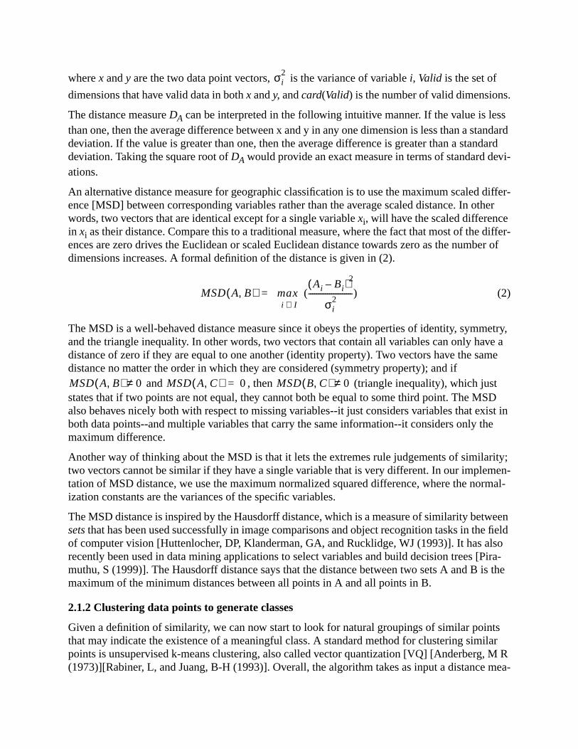
wherex andy are the two data point vectors, is the variance of variablei, Valid is the set of
dimensionsthathavevalid datain bothx andy, andcard(Valid) is thenumberof valid dimensions.
The distance measureDA can be interpreted in the following intuitive manner. If the value is lessthanone,thentheaveragedifferencebetweenx andy in any onedimensionis lessthanastandarddeviation. If the value is greater than one, then the average difference is greater than a standarddeviation.Takingthesquarerootof DA wouldprovideanexactmeasurein termsof standarddevi-ations.
An alternativedistancemeasurefor geographicclassificationis to usethemaximumscaleddiffer-ence [MSD] between corresponding variables rather than the average scaled distance. In otherwords,two vectorsthatareidenticalexceptfor asinglevariablexi, will havethescaleddifferencein xi astheirdistance.Comparethis to a traditionalmeasure,wherethefactthatmostof thediffer-ences are zero drives the Euclidean or scaled Euclidean distance towards zero as the number ofdimensions increases. A formal definition of the distance is given in (2).
(2)
The MSD is a well-behaved distance measure since it obeys the properties of identity, symmetry,and the triangle inequality. In other words, two vectors that contain all variables can only have adistance of zero if they are equal to one another (identity property). Two vectors have the samedistance no matter the order in which they are considered (symmetry property); and if
and , then (triangle inequality), which juststates that if two points are not equal, they cannot both be equal to some third point. The MSDalsobehavesnicelybothwith respectto missingvariables--itjust considersvariablesthatexist inboth data points--and multiple variables that carry the same information--it considers only themaximum difference.
Anotherwayof thinkingabouttheMSD is thatit letstheextremesrule judgementsof similarity;two vectorscannotbesimilar if they haveasinglevariablethatis verydifferent.In our implemen-tation of MSD distance, we use the maximum normalized squared difference, where the normal-ization constants are the variances of the specific variables.
TheMSD distanceis inspiredby theHausdorff distance,whichis ameasureof similarity betweensets thathasbeenusedsuccessfullyin imagecomparisonsandobjectrecognitiontasksin thefieldof computer vision [Huttenlocher, DP, Klanderman, GA, and Rucklidge, WJ (1993)]. It has alsorecently been used in data mining applications to select variables and build decision trees [Pira-muthu, S (1999)]. The Hausdorff distance says that the distance between two sets A and B is themaximum of the minimum distances between all points in A and all points in B.
2.1.2 Clustering data points to generate classes
Given a definition of similarity, we can now start to look for natural groupings of similar pointsthat may indicate the existence of a meaningful class. A standard method for clustering similarpointsis unsupervisedk-meansclustering,alsocalledvectorquantization[VQ] [Anderberg, M R(1973)][Rabiner, L, andJuang,B-H (1993)].Overall, thealgorithmtakesasinputadistancemea-
σi2
MSD A B,( ) maxi I∈
Ai Bi–( )2
σi2
-----------------------( )=
MSD A B,( ) 0≠ MSD A C,( ) 0= MSD B C,( ) 0≠

sure, a dataset, and a desired number of clusters. It then attempts to find a set of vectors that bestrepresents the dataset. Each of these vectors is the mean vector of a unique subset of the datapoints. The output of the VQ algorithm is the set of mean class vectors and a tag for each datapoint, indicating its class membership.
Since there is a random element to the VQ algorithm, it is important to run it multiple times withthesameinputs.Thebestsetof classvectorsV is thesetthatminimizestheoverall representationerror, which can be defined as the sum of the distances between each point and its nearest meanclass vector.
We select the desired number of classes using a combination of expert judgement and the infor-mation theoretic description length of the classes and the resulting representational error [Ris-sanen, J (1989)]. This process is described in more detail in [Maxwell, M and Buddemeier, B (inreview)].
2.2 Selection of colors and a user interface for maximum discrimination
Thetwo majorissuesin visualizationare1) how to enableusersto discriminatebetweendifferentclasses, and 2) how to enable users to visualize relationships between different classes.
2.2.1 Selection of colors for maximum discriminability
The selection of colors for maximum discriminability of the different classes is a much more dif-ficult problem than map-coloring, which seeks to maximize local discriminability between adja-centneighbors.Sincetheclassdevelopmentmethoddoesnot restrictthespatialcharacteristicsofthe classes--i.e. they do not have to be contiguous or located in a particular geographic area--it ispossiblefor everyclassto bespatiallylocatednext to everyotherclass.Therefore,eachclassmusthave its own unique color, and, if possible, each color must be discriminable from every othercolor.
We have taken an empirical approach to this problem based on our own observations and typicalnumbers of classes that users can usefully visualize. These empirical observations are as follows:
• It is difficult to select more that twenty colors that can be easily differentiated based on 4-6pixel-wide dots on a black background (we have empirically found it better to use a blackbackground than white when using a computer monitor),
• Users can easily visually identify points whose color is changing in response to some stimu-lus, like clicking a mouse, and
• For theLOICZ datasets,it will berarefor usersto belookingatmorethan20-30classes,andmore commonly they will be considering 10-20,
The second observation is also supported by the fact that people possess a strong ability to detectmotionin theirenvironmentthatis separatefrom theircolordetectioncapability[Sperling,G andLu, Z-L (1996)].
Thiscombinationof observationsledusto thefollowing implementation.First,wehavespecifiedby hand the colors for the first 10 classes the user wants to visualize. These ten colors are shownin Figure 1. These colors are easily discriminated by a person with normal color vision, evenwhen intermixed with points sizes of 2-4 pixels. Beyond the first ten, the colors are selected bygenerating random 24-bit values--creating 8-bit red, green, blue triples--and ensuring that each is

brightenoughto bevisible.Second,to takeadvantageof thefactthatpeoplecaneasilyseeobjectswhenthey change,wegivetheusertheability to turnthecoloringof classesonandoff, switchingthedatapointsbetweenamediumgrayandtheirselectedcolor. Thus,thepointsflashin responseto a user’s mouse clicks.
2.2.2 Iterative refinement for visualization of cluster relationships
Throughouttheprocessof clusteror regiondevelopmentandmerging it is importantto beabletovisualizetheprocessandtheresults.TheLoiczView programprovidesanintuitivegraphicaluserinterface to the set of tools that implement the typology development and visualization methodsdescribedabove.In particular, it allowstheuserto visualizeboththespatialdistributionof classesand, through color relationships, the similarity of classes.
The program uses a novel iterative refinement technique for selecting the display colors to repre-sent distances between color vectors. This is a hard problem because the distances calculatedbetweenclassesresidein ahigh-dimensionalspace--upto 100dimensions--whilecolor residesina three dimensional space. Therefore, in most cases we cannot select a set of colors whose dis-tances exactly mirrors the true distances between the mean class vectors.
As a simple example of this problem, consider five points in a five dimensional space that are allequidistantfrom oneanother. Onesetof pointsthatmeetsthiscriteriais theset{(1, 0, 0, 0, 0), (0,
1, 0, 0, 0), (0, 0, 1, 0, 0), (0, 0, 0, 1, 0), (0, 0, 0, 0, 1)}. In this case, each 5-D point is awayfrom everyotherpoint.In a3-dimensionalspace,it is only possibleto havefour pointsequidistantfrom one another--a tetragon. It is not possible to generate five points that are equidistant fromoneanotherin a3-D space.Therefore,thebestwecandowhenselectingcolorsis to approximatethe true distances in color space.
The problem can be set up as follows. First, calculate the matrix of distances between each classvector. Normalizethismatrixby dividing eachelementby thelargestelementof thematrix.Nowall of the distances are in the range [0, 1].
Second, generate a set of random colors and assign one color to each class. Now calculate thematrixof distancesbetweenthecolorsin colorspace.In thisdescriptionof thetechnique,wewilluse the RGB color space, letting each axis ranges from [0, 1]. Now we have two matrices whoseelements are in the range [0, 1]. The following algorithm will iteratively modify the class colorsso that it reduces the difference between the two matrices.
Top Row
White (1, 1, 1)
Red (1, 0, 0)
Green (0, 1, 0)
Blue (0, 0, 1)
Yellow (1, 1, 0)
Bottom Row
Violet (0.5, 0, 1)
Orange (1, 0.5, 0)
Cyan (0, 1, 1)
Pink (1, 0.5, 0.75)
Dk. Green (0, 0.5, 0)
Figure 1 Hand-picked colors for maximum discrimination between up to 10 classes.
2

Calculate the normalized class distance matrix DAssign a random color to each classSet the adjustment rate A (e.g. 20%)Loop
Calculate the color distance matrix CLet E ij be the largest magnitude element of D-C
Let I and J be the classes whose error is E ij
Let C ij be the color vector from color j to color i
Adjust the color values of I and J to reduce EUntil the matrices are close enough or we’ve looped enough
The update rule for the class colors is given in (3).
(3)
Figure 2 shows a graphical representation of the color selection process.
The number of iterations required to produce a good result is dependent upon the size of thematrix and the number of classes. For a 10x10 matrix--i.e. 10 classes--200 iterations achieves aresult that no longer changes significantly in terms of the largest error between the two matrices.For amuchlargermatrix,moreiterationsmayberequired.As eachiterationrequiresasearchfor
themaximumdifferentbetweentwo matrices,eachiterationtakesO(n2) time,wheren is thenum-ber of classes. Since this is a process that only needs to be done once per visualization, the algo-rithm is sufficiently fast.
The adjustment rate is an important parameter of the problem. The adjustment rate needs to befast enough to allow improvement, but not so large that the system overshoots good solutions. Arate of 20% appears to work well for the LOICZ dataset.
To demonstrate the process, we can show the results of the algorithm on a set of mean class vec-tors identical to the example given above: {(1, 0, 0, 0, 0), (0, 1, 0, 0, 0), (0, 0, 1, 0, 0), (0, 0, 0, 1,0), (0, 0, 0, 0, 1)}. Using200iterationsanda20%learningrate,theresultingcolorsandthetrain-ing graph are shown in Figure 3. From this example we can see that the resulting colors are satu-rated and easily discriminable from one another.
colori colori Cij AEij+=
color j color j Cij AEij–=
Calculate distancematrix D
Assign randomcolors to each class
Calculate colordistance matrix C
Find max elementof [D - C]
Update two colorsto improve D-C
If the error is smallenough, exit
Figure 2 Graphical representation of iterative algorithm

3 Experiments and results
The methods described above allows us to analyze and visualize large heterogeneous datasetssuch as the LOICZ dataset. To test and refine these methods we have applied them to a subset ofthe LOICZ dataset and compared the results with expert judgements.
Our process for developing and validating a horizontal typology (not hierarchical) is as follows.1. Select the variables to use2. Select how many classes (clusters) to create3. Apply the VQ algorithm using an appropriate distance measure4. Apply semantic labels to each cluster5. Compare with expert judgement or pre-existing typologies
For our prototype typology development we use a subset of the LOICZ dataset corresponding tothe Australia/New Zealand coastline. This dataset has a spatial resolution of 1 degree.
For this paper, which focuses on the cartographic aspects of this process, we will follow throughsteps 1 and 3 and show how the visualization helps to analyze and validate the results for a 12-class subdivision.
3.1 Variables
In this experiment the variable selection was based on two factors. First, did the variable providegood coverage of the area (<10% missing data). Second, did the variable actually provide usefulinformation(vary in a reasonablewayover thedataset).Beyondthesetwo considerations,thepri-mary concern was not to give too strong a weight to any one aspect of the environment. The endresult was a set of 17 variables.
The variables we selected included: seasonal precipitation (max and min), seasonal air tempera-ture(maxandmin), seasonalseasurfacetemperature(maxandmin), seasonalsoil moisture(maxand min), seasonal salinity (max and min), seasonal Coastal Zone Color Scanner [CZCS] (maxand min), average annual runoff, an annual evaporation proxy, average wave height, standarddeviationof elevation,andatidal mixing proxy. Precipitationandair temperatureinformationarefrom [IPCC Data Distribution Centre for Climate Change and Related Scenarios for Impacts
Figure 3 A) Training curve showing maximum error between distance andcolor matrices, B) Resulting colors for simple equidistant example.
(A) (B)
Number of iterations
Error

Assessment, CD-ROM, Version 1.0, April 1999.], the remaining variables are from the LOICZtypology dataset [LOICZ typology dataset, http://www.kellia.nioz.nl/loicz/typo.htm, 1999.]. Forthe Australasia coast we modified the LOICZ typology data by interpolating it to cover locationswith no data. For the most part this meant taking land cell variables and interpolating them ontoadjacent coastal cells, and taking sea cell variables and interpolating them onto adjacent coastalcells.
The evaporation proxy is a combination of wind speed and vapor pressure. The proxy variable istheproductof thetwo multipliedby 10(vaporpressureis watervaporpressuremultipliedby 10).The vapor pressure variable came from [IPCC Data Distribution Centre for Climate Change andRelated Scenarios for Impacts Assessment, CD-ROM, Version 1.0, April 1999.] and the windspeed from [LOICZ typology dataset, http://www.kellia.nioz.nl/loicz/typo.htm, 1999.].
Thetidal mixing proxy is acombinationof atidal form variable[semidiurnal,mixed,diurnal]andtidal range. The tidal mixing proxy is tidal range multiplied by tidal frequency, where tidal fre-quency is [semidiurnal = 2, mixed = 1.5, and diurnal = 1]. The two base variables came from[LOICZ typology dataset, http://www.kellia.nioz.nl/loicz/typo.htm, 1999.].
3.2 Cluster the data
We used the VQ algorithm using the average scaled Euclidean distance measure to generate a setof representativeclasses.To getagoodsetof classesweranit tentimesandtook thelowesterrorresult. This provided us with a reasonable set of representative classes for the data.
Figure 4(a) shows a visualization of the resulting classes by mapping them into an image usinglatitude, longitude, and using color to identify the class of each data point. Figure 4(b) shows avisualization of the same clustering result, but with the class colors selected using the iterativeselection algorithm to show the relationships between classes. Note that three distinct classesexist, while the others merge into more of a continuum in the color similarity presentation.
This observation is supported if we look at the matrix of distances between clusters. Table 1shows this matrix for the clusters in Figure 4. In each column, the most similar cluster is in bold.Note the pink and red clusters are both dissimilar to all of the other clusters (distances > 1.0),whereas the remaining clusters are all fairly similar to at least one other cluster (distances < 1.0).
(a) (b)
Figure 4 (a) 12-class clustering result for Australasia using average scaled Euclideandistance and randomly selected colors. (b) Same clustering result but with colors
selected to reflect the similarity of the classes

This relationship is echoed in the iterative color scheme, where both the pink and red clusters inFigure4(a)standout in comparisonto theirneighborsin Figure4(b).Whatis alsoindicatedin thesimilarity color scheme is that the northern clusters are fairly similar to one another but quite dif-ferentthanthesouthernclusters.This is supportedby examiningthedistancematrix.Thebrown,purple, and orange clusters are all fairly similar to one another, but are distant from the yellow,cyan, dark purple, white, and blue clusters that make up the southern area.
3.3 Comparison of average scaled Euclidean distance to the MSD distance
We can undertake the same process of typology development using the alternative MSD distancemeasure.Figure5 compares12-classclusteringsusingtheaveragescaledEuclideandistanceandthe Hausdorff distance.
Note the similarities and differences between the two results. The biggest differences occurs onthe southern and northern coasts of Australia where the southern coast apparently has fewerextreme differences (but higher average differences) than the northern coast. Thus, the MSD dis-tancedoesnotdivide thesoutherncoastinto two sectionsin a12-classclustering,but theaveragescaled Euclidean distance does.
Figure6 showsthesameclusteringsbut usesassociatescolorwith thesimilarity of theclasses.Inbothcasesthesouthcoastof New Zealandshowsupasauniquelocation.Likewise,thesoutheastcoast of Australia shows up as being similar to north New Zealand. The different between theASE and MSD results are that the North-South Australia similarity is more pronounced in theASE division than it is in the MSD division. This likely reflects the fact that many variables aredifferent between the north and south classes, but the maximum differences may be more similarto the differences between the other classes.
Table 1 Distance matrix between clusters in Figure 4
Color white red green blue yellowdark
purpleorange cyan pink
darkgreen
purple brown
white 0 3.4 0.98 0.85 0.32 0.67 2.2 0.50 2.8 0.62 2.3 2.0
red 3.4 0 2.4 4.2 3.7 4.1 3.8 3.3 6.7 3.4 3.1 2.6
green 0.98 2.4 0 2.5 1.3 1.1 1.1 0.7 5.2 0.49 0.93 0.72
blue 0.85 4.2 2.5 0 0.54 1.6 2.9 2.0 1.1 1.5 3.4 3.3
yellow 0.32 3.7 1.3 0.54 0 0.62 2.3 0.70 2.1 0.58 2.7 2.4
dk. purple 0.67 4.1 1.1 1.6 0.62 0 2.3 0.31 3.9 0.68 2.8 2.9
orange 2.2 3.8 1.1 2.9 2.3 2.3 0 2.5 5.0 0.92 0.45 0.93
cyan 0.5 3.3 0.7 2.0 0.70 0.31 2.5 0 4.5 0.82 2.4 2.3
pink 2.8 6.7 5.2 1.1 2.1 3.9 5.0 4.5 0 3.4 5.8 5.7
dk. green 0.62 3.4 0.49 1.5 0.58 0.68 0.92 0.82 3.4 0 1.4 1.2
purple 2.3 3.1 0.93 3.4 2.7 2.8 0.45 2.4 5.8 1.4 0 0.57
brown 2.0 2.6 0.72 3.3 2.4 2.9 0.93 2.3 5.7 1.2 0.57 0

4 Discussion and Future Directions
FromtheAustralasiaexample,wecanseethattheprocessappearsto producea reasonablesetofclasses.Theresultsshow broadagreementwith previousexperttypologies[Smith,SV, andCross-land, C J (1999)]. Furthermore, they highlight localized phenomena that do not show up in theexpertversion,but neverthelessexist in thedata.Notethatweobtainedtheseresultsdespiteheter-ogeneous variables with some missing data, indicating that the distance measures we used areappropriate for the task.
With respect to the visualization, our strategy for selecting colors for maximum discriminationappearsto work well. It allowsfor easydiscriminationof thedifferentclasses,asshown in Figure5. In cases where colors may be confusing, the inclusion of the ability to turn clusters on and offmakes it possible to easily distinguish class membership for each point in the visualization.
The iterative color selection for matching distances also appears to provide an intuitive visualiza-tion of similarity. Themostcommoncriticismof usersandviewersis thatthecolorselectionsarenot always aesthetically pleasing or easy to see. However, the color relationships do appear to beintuitively correct.Oneareof futurework is to objectively evaluatehow well peopleinterprettheresults of the color selection program.
Figure 5 (a) 12-class clustering using average scaled Euclidean distance.(b) 12-class clustering using MSD distance.
(a) (b)
Figure 6 (a) 12-class ASE clustering with colors related to similarity, (b) 12-classMSD cluster with colors related to similarity.
(a) (b)

A second area of future work is to look at more limited color spaces such as pure intensity. Thereason for pursuing this is to have an algorithm that anyone who can perceive intensity--but per-haps not certain colors--can use to visualize relationships. A mapping like this must be used inany situation where universal access to the information is required.
Overall this paper presents a set of methods that permit clustering, classification, and visual com-parison of environments at regional and global scales. Clustering of high-dimensionality datasetscan be based on scaled Euclidian distances in ways that permit the use of datasets that are incom-plete, not normally distributed, or otherwise unsuitable for more traditional statistical analysis.Two different distance criteria -- the average scaled Euclidean distance and the maximum scaleddistance -- provide alternative ways to explore the nature of environmental similarities and differ-ences.
Thepaperalsopresentsancillarytechniquesthatexpandtheapplicabilityandeaseof useof thesemethods. One of these is a strategy of using color and motion to visualize classes. The second isthe use of a novel color-similarity approach that permits visualization of the similarities of spa-tially distributed clusters.
Thesetechniqueshavebeenappliedto a17-variablecoastaldatasetfor Australiaandneighboringregions.Theresultsarehighly consistentwith anindependentexpert-judgementcoastaltypology,and the differences and similarities between the various approaches to cluster definition are intu-itively understandable in terms of the variables and techniques used.
The methods provide a novel and potentially powerful set of tools for classifying and visualizingrelationships between environments. Initial applications will be regionalization and globalizationof coastal C, N, P budgets as part of the LOICZ projects. However, the techniques are furtherapplicableto differentdatasets,andto issuesof globalandregionalchange.In addition,thecolorselection techniques are applicable to any application that wants to visualize high dimensionalrelationships using color.
AcknowledgementsThe author would like to thank LOICZ for their support of the typology project and the workdescribedherein.Wewouldalsoliketo thankAAAS for theEarthSystemsScienceConferencein1997in SouthDakotawhichbroughttogetherscientistsfrom avarietyof disciplinesandlaunchedthis approach to coastline typology development.

ReferencesAnderberg, M R (1973)Cluster Analysis for Applications, Academic Press, New York.
Harff, J and Davis, JC (1990) “Regionalization in Geology by Multivariate Classification”,Mathematical Geology, Vol. 22, No. 5, pp.573-588.
Huttenlocher, DP, Klanderman, GA, and Rucklidge, WJ (1993) “Comparing Images Using theHausdorff Distance”,PAMI(15), No. 9, pp. 850-863.
IPCC Data Distribution Centre for Climate Change and Related Scenarios for Impacts Assess-ment, CD-ROM, Version 1.0, April 1999.
LOICZ typology dataset, http://www.kellia.nioz.nl/loicz/typo.htm, 1999.
Maxwell, M and Buddemeier, B (in review) “Coastal Typology Development with Heteroge-neous Data Sets”,Journal of Regional Environmental Change.
Pernetta, JC and Milliman, JD (Editors) (1995)Land-Ocean Interactions in the Coastal Zone:Implementation Plan. IGBP Report No. 33. IGBP, Stockholm, 215 pp.
Piramuthu, S (1999) “The Hausdorff distance measure for feature selection in learning applica-tions”, Proceedings of the 32nd Annual Hawaii International Conference on Systems Sci-ences. IEEE Computing Society.
Rabiner, L, and Juang, B-H (1993)Fundamentals of Speech Recognition, Prentice-Hall, Engle-wood Cliffs, NJ.
Rissanen, J (1989)Stochastic Complexity in Statistical Inquiry, World Scientific Publishing Co.Ptc. Ltd., Singapore.
Smith, SV, and Crossland, C J (1999)Austalasian Estuarine Systems: Carbon, Nitrogen andPhosphorus Fluxes, LOICZ Reports & Studies No. 12, ii + 182 pp. LOICZ, Texel, The Neth-erlands.
Sperling, G and Lu, Z-L (1996)“The functional architecture of visual motion perception”,Inter-national Journal of Psychology, 1996, 31, (3/4), 362.