visualising multi dimensional data
TRANSCRIPT

Amit Kapoor@amitkaps
Visualising Multi - Dimensional Data
x
wz
y

Flatland A Romance in Many Dimensions
by Edwin Abbot (1884)
Square

A square is but a line in 2d
eye
The Square
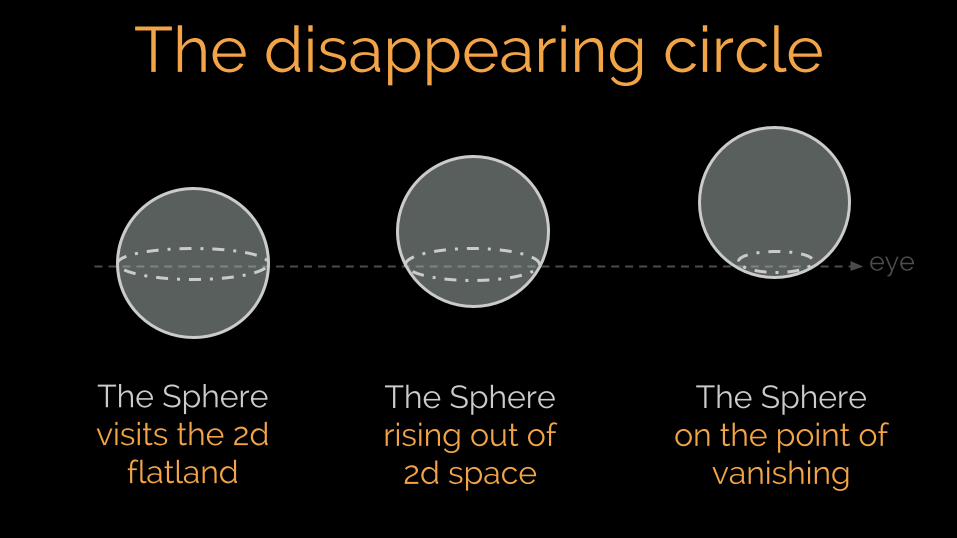
The disappearing circle
The Sphere visits the 2d
flatland
The Sphere rising out of
2d space
The Sphere on the point of
vanishing
eye

The square is a cube in 3d!
eye
The Square sees the world in
a new way!

Show, not Tell

70%of the sensory
receptors are in the eyes
50%of the brain
used for visual processing
100msto get a sense of the visual
scene
Visual Wired Brain

Symbolic Abstraction
Visual Abstraction
Phenomena
Source: Bret Victor
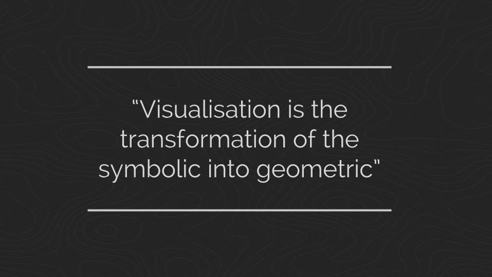
“Visualisation is the transformation of the
symbolic into geometric”
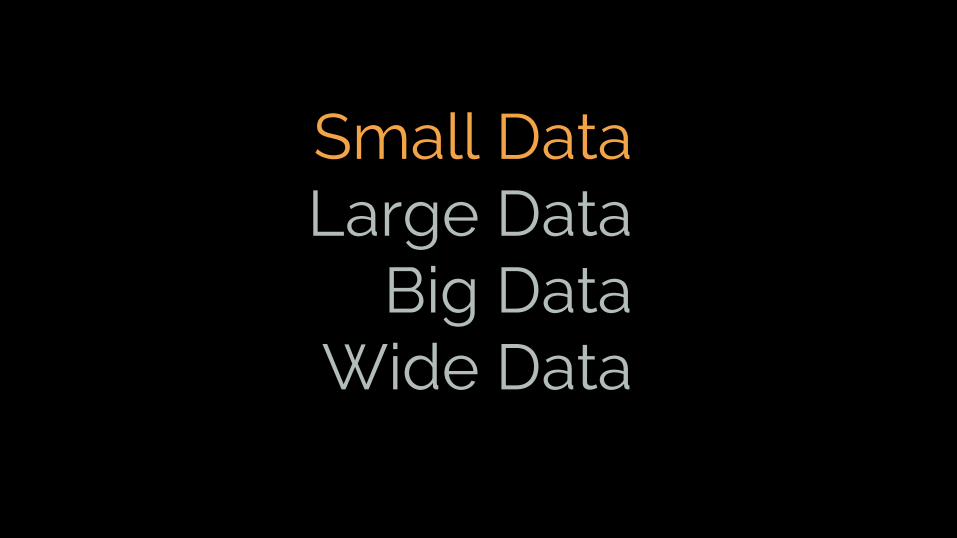
Small DataLarge Data
Big DataWide Data

Visualise Small DataArea Sales (Rs.)
North 5
East 25
West 15
South 20
Central 10

Area Sales
North 5
East 25
West 15
South 20
Central 10
AcquireData

Area Sales
North 5
East 25
West 15
South 20
Central 10
x y
1 5
2 25
3 15
4 20
5 10
x (C) = Areay (Q) = Sales
Parse Variables
AcquireData

Area Sales
North 5
East 25
West 15
South 20
Central 10
x y
1 5
2 25
3 15
4 20
5 10
x (C) = Areay (Q) = Sales
x y
20
60
100
140
180
Encode Shape & Select Scales
Parse Variables
AcquireData
x - position, y - barscale - 200 x 200

Area Sales
North 5
East 25
West 15
South 20
Central 10
x y
1 5
2 25
3 15
4 20
5 10
x (C) = Areay (Q) = Sales
x - position, y - barscale - 200 x 200
x y
20
60
100
140
180
Parse Variables
AcquireData
cartesian
Render with Coordinates
Encode Shape & Select Scales

Points Line Bar
Bar - Stacked Bar - Stagger CoordinatesSystem
Create Visualisations

CoordinatesCartesian
x
y
Dot Plot Line Chart Column Chart
WaterfallStacked Column

CoordinatesCartesian - Flip
Dot Plot Line Chart Bar Chart
CascadeStacked Bar
y
x

PolarCoordinate - X
rθ
x = θy = r
Marked Radar Line Radar CoxComb
Polar WaterfallBullseye

PolarCoordinate - Y
rθ
x = ry = θ
Target Line Track Wind Rose
Polar CascadePie Chart

Data Viz Process (Small Data)Acquire Data
Encode Shape
Select Scales
Render Coordinates
Parse Variables

gadfly
bokeh
ggplot2
matplotlib
graphics

Small DataLarge Data
Big DataWide Data

Visualise Large Data
~24,000 Pincodes
e.g.Pincode : 560076Latitude : 12.8843049°Longitude: 77.5967384°Place : Bannerghatta
Pincodesin India

Pincode Map
Scatter plot,play with alpha to
show density
But what if I want to show geographic
nature of pincode?

Pincode+ Map
Exploration of large data is iterative!
Refine Data (Filter, Transform)

Data Viz Process (Large Data)
Acquire Data
Encode Shape
Select Scales
Render Coordinates
Parse Variables
Refine Data

Small DataLarge Data
Big DataWide Data

Visualise Big Data
x,y => 1,000,000
Comparable to theNumber of Pixels
on my MacBook Air1400 x 900
Data

Data Sample
Sampling can be effective (with overweighting
unusual values)
Require multiple plots or careful
tuning parameters

Data Sample
Model
Models are great as they scale nicely.
But, visualisation is required as
“I don’t know, what I don’t know.”

Data Sample
ModelBinning
Binning can solve a lot of these challenges
“Bin - Summarize - Smooth: A framework for visualising big data” - Hadley Wickam (2013)
“imMens: Real-time Visual Querying of Big Data” - Liu,
Jiang, Heer (2013)


Tools Matter
Defaults Matter

“We are calling 2015 the year of the histogram”
Amanda Cox

“Visualising big data is the process of creating generalized histograms”
Amit Kapoor

Data Viz Process (Big Data)
Acquire Data
Encode Shape
Select Scales
Render Coordinates
Parse Variables
Filter Data
Aggregate Data
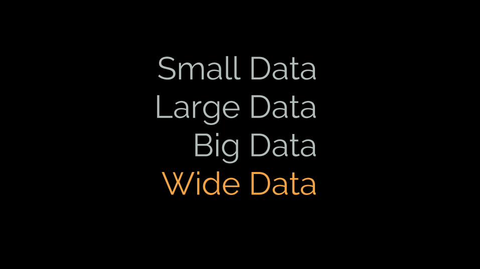
Small DataLarge Data
Big DataWide Data

Multi Dimensional Viz Standard 2d/3d
Pixel Based Approach
Glyph Approach
Geometric Transforms
Stacking Approach
Scatterplot
SPLOM
Trellis / Facets
Multiple View
Star plots
Stick Figure
Chernoff Faces
Color Icons
Parallel Coord
Table lens
Star Coords
Tours
Space Filling
Pixel Bar Chart
Spiral Technique
Treemaps
Dimensional Stacking
Hierarchical Axis

Multi Dimensional Viz Standard 2d/3d
Pixel Based Approach
Glyph Approach
Geometric Transforms
Stacking Approach
Scatterplot
SPLOM
Trellis / Facets
Multiple View
Star plots
Stick Figure
Chernoff Faces
Color Icons
Parallel Coord
Table lens
Star Coords
Tours
Space Filling
Pixel Bar Chart
Treemaps
Dimensional Stacking
Hierarchical Axis
Need for Interaction
Ease of Interpretation
Spiral Technique

Diamonds dataset50K+ observations of 10 dimensions

Diamonds dataset50K+ observations of 10 dimensions
Price of diamonds is
related to the 4C’s
price in US$
carat weight (⅕ of a gram)
cut 5 levels [Fair to ideal]
colour 7 levels [J to D]
clarity 8 levels [I1 to IF]

Diamonds dataset50K+ observations of 10 dimensions
zdepth
table width
z
y
x
x length mm
y width mm
z height mm
depth z depth %
table table width %

Diamonds dataset
price carat cut color clarity x y z depth table
326 0.23 Ideal E SI2 3.95 3.98 2.43 61.5 55
326 0.21 Premium E SI1 3.89 3.84 2.31 59.8 61
327 0.23 Good E VS1 4.05 4.07 2.31 56.9 65
334 0.29 Premium I VS2 4.2 4.23 2.63 62.4 58
335 0.31 Good J SI2 4.34 4.35 2.75 63.3 58
336 0.24 Very Good J VVS2 3.94 3.96 2.48 62.8 57
50K+ observations of 10 dimensions
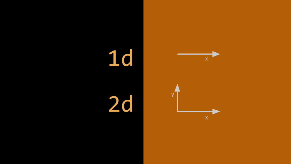
2d
1d x
x
y

Chart Options Points Bars Lines Areas
1d Quantitative
1d Categorical
2d Quantitative + Categorical
2d Categorical + Categorical
2d Quantitative + Quantitative
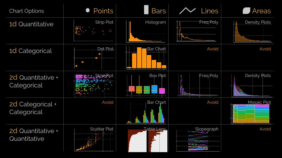
Chart Options Points Bars Lines Areas
1d Quantitative Strip Plot Histogram Freq Poly Density Plots
1d Categorical Dot Plot Bar Chart Avoid Avoid
2d Quantitative + Categorical
Strip Plot Box Plot Freq Poly Density Plots
2d Categorical + Categorical
Avoid Bar Chart Avoid Mosaic Plot
2d Quantitative + Quantitative
Scatter Plot Table Lens Slopegraph Avoid

2d Scatter Plot

2d Scatter PlotInteraction: Annotation
(4.13, 17329)
(4.50, 18531)
(5.01, 18081)

2d Scatter Plotlog transformation

2d Scatter PlotSelect or Filter
Area of InterestCarat > 1, Price > 10,000

2d Scatter PlotInteraction: Pan & Zoom

3d z
x
y

Use aesthetic for 3d
Size Color Shape

3d Scatter PlotSize for Quantitative Dim

3d Scatter PlotColor for Categorical Dim
3d Scatter PlotShapes don’t scale well

3d Scatter Plotdepth persp not good

3d Scatter PlotInteraction: Rotation

4d to 6d z
x
y
w
vu
4d Bubble PlotColor and Size

5d Bubble PlotColor, Size and Time
The Joy of Stat - Hans Rosling

Trellis / FacetsCreate Small Multiples
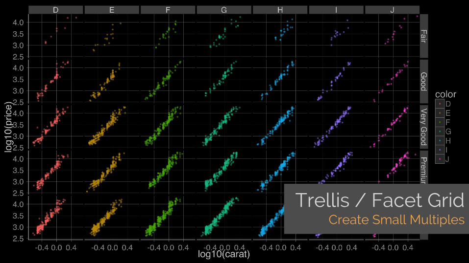
Trellis / Facet GridCreate Small Multiples

SPLOMScatterplot Matrix
Price
Carat
Table
Depth

SubplotsBinned Plot Distribution

Multiple ViewCreate Many Small Charts

Multiple ViewInteraction: Brushing & Linking


6d & more z
x
y
w
v
u

Star Stick Chernoff
Icon based Approach

Star PlotMatrix Layout
color
clarity
depth
cut
table

Star PlotPlot on X-Y location
color
clarity
depth
cut
table

Orthogonal Parallel

Parallel CoordInteraction: Sorting

Parallel CoordInteraction: Selection

Table PlotInteraction: Bin & Sort

Table PlotInteraction: Zoom & Filter

Stacked Interaction: Brushing
Mosaic Plotcut, color and clarity
Other example - Treemaps

Star Coordinates Tours & Projections
Tourr PackageEser Kandogan
Geometric Transforms

Spiral Pixel Curve Pixel Bar Chart
Pixel Bar Chart - KeimVisDB - Keim
Pixel Based Approach
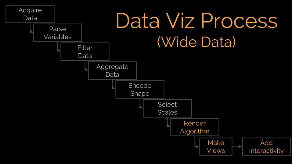
Data Viz Process (Wide Data)
Acquire Data
Encode Shape
Select Scales
Render Algorithm
Parse Variables
Filter Data
Aggregate Data
Make Views
Add Interactivity

Data Viz Process (Wide Data)
Acquire Data
Encode Shape
Select Scales
Render Algorithm
Parse Variables
Filter Data
Aggregate Data
Make Views
Add Interactivity
1. Encode wisely2. Use space and multiples 3. Add interactivity4. Reduce dimensions

Code for these Slideshttps://github.com/amitkaps/multidim
R libraries
❖ ggplot2❖ GGally❖ ggsubplot❖ scales❖ iplots/Mondrian
❖ ggvis❖ tourr❖ rgl❖ scatterplot3d
❖ dplyr❖ tabplot❖ grid❖ gridExtra

“The greatest value of a picture is when it forces
us to notice what we never expected to see”
John Tukey

Amit Kapoor@amitkaps
amitkaps.comnarrativeviz.com
Data
Visual
Story
*