visual standards guidelines · typography usage consistency in ... set type from tiny 6-point text...
TRANSCRIPT

The REALTORS® Land Institute | Chicago, IL | 800-441-5263 | [email protected] | www.rliland.com
Visual Standards Guidelines January 2017

2 | P a g e
Introduction Mission The REALTORS® Land Institute, “The Voice of Land,” provides the expertise, camaraderie,
and resources that are the foundation for all land real estate professionals to become the
best in the business.
Vision The REALTORS® Land Institute continually strives to maintain its status as the
acknowledged leader for all matters pertaining to the land real estate profession. RLI
endeavors to remain the essential membership organization for the extraordinary real estate
professionals who broker, lease, sell, develop, and manage our most precious resource: the
land.
The RLI Brand Our brand represents our mission, our vision, and our organization. It is at the core of what
we say, how we say it, and how we treat our membership. It is a culmination of who we are
and who we continue striving to be as the leading land real estate membership organization
in the industry.
Ensuring that our brand remains clear, concise, and consistent is essential to maintaining
the integrity of our brand and organization as a whole. The purpose of this document is to
provide our community with the visual guidelines for appropriately conveying the
REALTORS® Land Institute brand. Through implementation across our platforms and
membership, we will build a stronger brand that benefits all using it.
For questions regarding any matters contained within this document or pertaining to proper
brand use please contact the RLI Marketing Manager Jessa Friedrich, MBA, at 1-312-329-
8353 or [email protected].
3 | P a g e
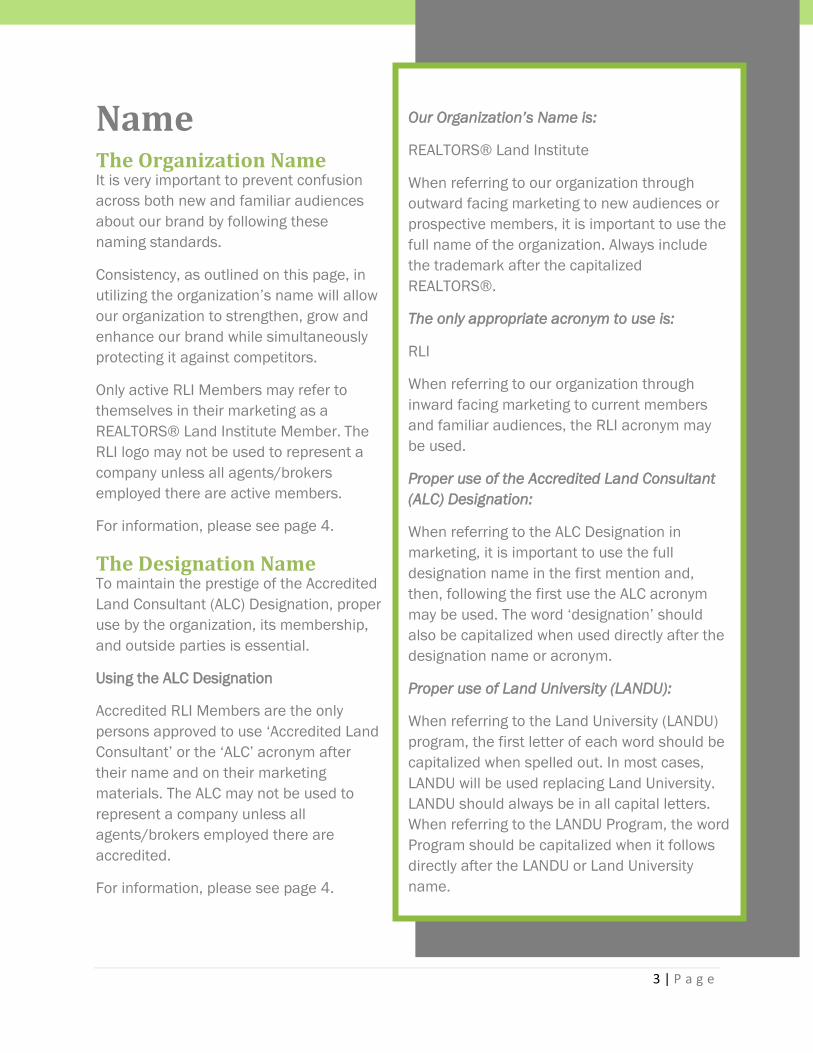
Our Organization’s Name is:
REALTORS® Land Institute
When referring to our organization through
outward facing marketing to new audiences or
prospective members, it is important to use the
full name of the organization. Always include
the trademark after the capitalized
REALTORS®.
The only appropriate acronym to use is:
RLI
When referring to our organization through
inward facing marketing to current members
and familiar audiences, the RLI acronym may
be used.
Proper use of the Accredited Land Consultant
(ALC) Designation:
When referring to the ALC Designation in
marketing, it is important to use the full
designation name in the first mention and,
then, following the first use the ALC acronym
may be used. The word ‘designation’ should
also be capitalized when used directly after the
designation name or acronym.
Proper use of Land University (LANDU):
When referring to the Land University (LANDU)
program, the first letter of each word should be
capitalized when spelled out. In most cases,
LANDU will be used replacing Land University.
LANDU should always be in all capital letters.
When referring to the LANDU Program, the word
Program should be capitalized when it follows
directly after the LANDU or Land University
name.
Name The Organization Name It is very important to prevent confusion
across both new and familiar audiences
about our brand by following these
naming standards.
Consistency, as outlined on this page, in
utilizing the organization’s name will allow
our organization to strengthen, grow and
enhance our brand while simultaneously
protecting it against competitors.
Only active RLI Members may refer to
themselves in their marketing as a
REALTORS® Land Institute Member. The
RLI logo may not be used to represent a
company unless all agents/brokers
employed there are active members.
For information, please see page 4.
The Designation Name To maintain the prestige of the Accredited
Land Consultant (ALC) Designation, proper
use by the organization, its membership,
and outside parties is essential.
Using the ALC Designation
Accredited RLI Members are the only
persons approved to use ‘Accredited Land
Consultant’ or the ‘ALC’ acronym after
their name and on their marketing
materials. The ALC may not be used to
represent a company unless all
agents/brokers employed there are
accredited.
For information, please see page 4.

4 | P a g e
Logo Usage Guidelines
REALTORS® Land Institute Logo Usage The REALTORS® Land Institute logo was carefully designed to capture both the history of
our organization, as well as, the future direction we would like to head. This logo is an
evolution of our brand with the darker greens representing our solid core values that
continue to hold true though the years and the lighter green representing the growth and
prosperity ahead.
In order to preserve and protect the RLI brand, the organization, its membership, and
outside parties should adhere to the logo use guidelines outlined within this document.
Minimum padding should be equal to the height of the word
REALTORS® in the logo.
When to use the Image Alone
The land image may be used alone when branding space is limited or when
‘REALTORS® Land Institute’ is written out near the logo; for example, on
social media sites.
Accredited Land Consultant (ALC) Logo Usage The Accredited Land Consultant logo is to be used, in accordance with the guidelines
outlined in this document, exclusively by those who hold the Accredited Land Consultant
Designation as active members of the REALTORS® Land Institute. In addition to ALCs, the
RLI organization may use the logo on marketing materials only when promoting the ALC
Designation or a member who holds it. The ALC logo may not be used to represent a whole
company unless all agents/brokers employed there are active ALCs.
Minimum padding should be equal to half the height of the ‘ALC’ lettering in
the logo.
RLI Chapter Logo Usage The RLI Chapter logo is to be used, in accordance with the guidelines outlined in this
document, exclusively by Chapters to promote themselves and their courses and events.
The Chapter logo should not be used by members of the chapter or chapter leadership to
represent themselves as a chapter member; instead, active RLI members may use the
REALTORS® Land Institute logo or the ALC logo in accordance with the guidelines outlined in
this document.

5 | P a g e
Minimum padding should be equal to the height of the word
REALTORS® in the logo.
Land University (LANDU) Logo Usage The Land University (LANDU) logo is the official logo of RLI’s LANDU Education Program. This
logo can only be used to represent official LANDU courses and events offered by RLI and its
chapters. It is a symbol within the industry of top-notch education for land real estate
professionals.
Minimum padding around the logo should be equal to the
height of the wording LAND UNIVERSITY in the logo.
Approved Logo Backgrounds In addition to using the logo on black and white backgrounds, the REALTORS® Land
Institute and Accredited Land Consultant logos may be placed over any RLI Primary Brand
Colors as defined in the RLI Color Palette on page 7.

6 | P a g e
NOT Approved Logo Usage The below examples are ways to avoid using the logos of the REALTORS® Land Institute and
Accredited Land Consultant.
Do not use only the wording of the logo.
Do not stretch, distort or rotate the logo.
Do not place the logo on a non-brand color (other than black or white) or on a gradient.

7 | P a g e
Do not alter the colors of the logo.
Approved Alternative Logo Usage The below examples are ways to use approved alternatives to the main REALTORS® Land
Institute and Accredited Land Consultant logos. These should only be used when color is not
permitted. Always use caution to ensure legibility one used backgrounds.
All Black All White
RLI Color Palette
REALTORS® Land Institute Main Brand Colors
REALTORS® Land Institute Primary Brand Colors
Forest Green Spring Green

8 | P a g e
Typography Usage
Consistency in proper use across all materials will assist in establishing a clear and concise
brand.
Print Typography When creating print marketing materials for the REALTORS® Land Institute, the below fonts
are standard.
Cambria The Cambria Font Family was designed for on-screen reading and to look good when printed
at small sizes. Cambria is part of the new Windows ClearType font collection. The Cambria
fonts have excellent legibility and readability characteristics. Cambria replaces Times New
Roman as a Windows Vista and Microsoft Office default serif font.
Charcoal
Dirt
Stone
Grass

9 | P a g e
ABCDEFGHIJKLMNOPQRSTUVWXYZ
abcdefghijklmnopqrstuvwxyz
0123456789 When to use it: Headlines, pull quotes, titles
ITC Franklin Gothic The ITC Franklin Gothic Font was designed with the idea that the same font could be used to
set type from tiny 6-point text to billboard-size letters. This digital interpretation became the
standard for the digitized ITC Franklin Gothic family. This version has four weights, with
complementary italics.
ABCDEFGHIJKLMNOPQRSTUVWXYZ
abcdefghijklmnopqrstuvwxyz
0123456789
When to use it: Subheadings, body copy, footer copy, and calls to action
Web/Digital Typography When creating web marketing materials for the REALTORS® Land Institute, the below fonts
are standard.
Georgia
The Georgia font possesses characteristics that offer outstanding legibility and readability:
large x-heights, open counters, high contrast between the regular and bold weights, ample
letter spacing, and character designs that help distinguish commonly confused letterforms.
ABCDEFGHIJKLMNOPQRSTUVWXYZ
abcdefghijklmnopqrstuvwxyz
0123456789

10 | P a g e
When to use it: Headers, pull quotes, post titles
Note: When using this font, it is appropriate to use the RLI Brand spring green or forest
green colors.
Open Sans or Helvetica
The Open Sans font is part of the Helvetica font family and is a sans-serif typeface designed
developed with an "upright stress, open forms and a neutral, yet friendly appearance" and is
"optimized for legibility across print, web, and mobile interfaces.
ABCDEFGHIJKLMNOPQRSTUVWXYZ
abcdefghijklmnopqrstuvwxyz
0123456789
When to use it: Subheadings, body copy, footer copy, and calls to action
Note: When using this font, it is appropriate to use the RLI Brand Primary charcoal color.
Hyperlinks should be made the RLI Brand spring green color when possible, underlined, and
bolded.
The RLI Voice
Communication Guidelines How the RLI brand is communicated to membership and the industry as a whole is the
defining factor in our how brand will be interpreted and received. RLI leadership, members,
staff, and outside parties all play an integral role in helping to tell the REALTORS® Land
Institute story.
It’s All About Tone
How does being a part of the REALTORS® Land Institute make you feel? Whether you are an
employee, member, part of the leadership, or a partner, hopefully, the answer is excited to
be or serve land professionals! And those are exactly the two things our tone needs to show:
Excitement and professionalism. Whether it is when writing or speaking, these two tones
need to be reflected at all times. When sharing information about being a member of the
organization, taking a course attending an event, or networking, it is important to portray a
genuine, professionally conveyed excitement.

11 | P a g e
Wrong tone: “The Land 101: Fundamentals of Land Brokerage course instructs on how to
navigate various environmental, land-use rights and restrictions, and taxation factors
associated with land transactions.”
Right tone: “Ever wonder how to navigate various environmental, land-use rights and
restrictions, and taxation factors associated with land transactions? Enhance your expertise
with valuable information that can only be found in the Land 101: Fundamentals of Land
Brokerage course.”
Web vs. Print
Consuming information online versus in print often means different approaches to reading
the material.
When writing for web versus print, keep in mind most reading done on digital platforms is
skimming:
Make it easy to find hyperlinks, directional headings, and call to actions.
Keep the copy short, both sentences and paragraphs, as often as possible.
Make the content more easily digestible by using bullet points and other formatting
and stylizing like headers and images to get the message across—be careful not to
overuse these tools.
Use direct address, not third person, as it is often perceived as too formal online.
Note: When embedding links, avoid hyperlinking phrases like “click here” and instead
hyperlink a few words that capture what is being linked to through the hyperlink (ie. ten tips
for auctions). Hyperlinks should always be bolded, underlined, and made the RLI Brand
spring green color when possible.
Templates
PPT Presentations When creating a presentation used to promote any part of our organization, all other
guidelines set in this document should be followed. To help keep our brand consistent, a
PowerPoint Template is available and should be used by all. Please avoid changing the font
sizes and keep the content on the slide light and to the point with the meat of the
presentation coming from the speaker.

12 | P a g e
Email Templates An email template is established and may be used by staff and RLI Chapters. All emails
should contain the RLI logo in the footer linking back to rliland.com.
Education Emails Newsletter Emails

13 | P a g e
Letterhead Official REALTORS® Land Institute Letterhead is available and should be used when
appropriate by RLI National.
Website Style Guide