visible vs. invisible design - envato tuts+€¦ · we can spend months to years on a single...
TRANSCRIPT
Visible vs. Invisible Design 47
Visible vs. Invisible Design48
What this chapter is about: Seeing the invisible in design. Design how us-ers think. Mental models. Cluttered vs. clean. Design patterns and interface guidelines.
esign today focuses on the details. Details are all those little things that matter to us. We can spend months to years on a single project,
and we might just be tweaking the finer details of how the type renders or working with challenging departments or clients whose motivations don’t necessarily focus on the end user. The fact is that any one website or ap-plication can mean the world to us. Making it the best it can be gives us purpose. Of course, everyone has some small detail that they take pride in, and as designers and front-end developers, we want the face of a website or application to be much more beautiful than it was before we touched it. But sometimes we are so focused on the smaller view of design that we become blind to the larger one. This part of design has been forgotten. It has become invisible.
We don’t realize that a piece is even a missing, a piece vital to effective design. When building an interface, we work with any knowledge of the user we can gather, as well as with usability basics and an idea of a style for the interface. Without a clear idea of what really works, though, we are stumbling in the dark, looking for a light switch to illuminate our design. We might not realize we are doing this; in fact, we might receive some praise from others, including the client. But if they don’t know that this piece is missing, then the praise is hollow. We can’t be great designers until we ourselves understand invisible design.
To recognize invisible design and understand how to create it, we have to look differently at the world around us. We have to open our mind to the idea that design is not only what we see, but what we don’t see. Design is a constant in this life of ours. It surrounds us and touches us daily. The book you are reading right now has been designed based on certain criteria and aesthetics. You might have flipped through the pages to examine the typography, choice of colors and organization of content. Things you might not have considered as closely are the size of the book and the binding tech-nique. Both of these are important parts of the book’s design.
D

Visible vs. Invisible Design 49
“To me, good design means as little design as possible.”— Dieter Ram
Defining design is difficult because it is so subjective. It can exist as both an abstract concept and something as concrete as a deliverable for a proj-ect. Essentially, it has no boundaries, and its definition depends on the industry. For example, a fashion designer considers textile and might want to make a bold statement to differentiate herself from other designers, whereas an interior designer might create an environment that heightens comfort and that reflects the style and taste of the homeowner.1
Basic principles and techniques of producing the visible layer of design in tools such as Photoshop are widely covered in books and online. Design is generally understood to be only what we see – a visual and primarily artistic medium of communication. However, the invisible part of design takes on several forms. Consider the pocket on your jeans. It is a certain size and shape. Your wallet was also made to be a certain size and shape so that it would fit in the pocket. No one thinks about it until they try to put their wallet in a pocket that is too small – or perhaps the wallet is too big. In this situation, someone hasn’t followed the established design pattern for one reason or another.
Likewise, when we design a website or application, we don’t (and shouldn’t) start from scratch. We start with certain patterns, and we need to understand their limitations in order to create effective solutions and experiences. In considering whether to break a particular pattern, we need to ask whether we would be alienating our users. If we ignore the rule, is that like designing a wallet that doesn’t fit the millions of jeans pockets out there? Also, if we are creating design that is invisible, where does that leave aesthetics?
In this chapter, we will explore the balance between invisible and vis-ible design. Balancing these enables us to design effective and meaningful interfaces for websites and applications.
1 John Heskett, “Toothpicks and Logos: Design in Everyday Life”. Oxford University Press, 2003.

Visible vs. Invisible Design50
Seeing the Invisible“Good design, when it’s done well, becomes invisible. It’s only when it’s done poorly that we notice it.”
— Jared Spool
Calling design “invisible” seems to go against the nature of design itself, because we understand it to be a powerful visual medium. And design-ing for interaction brings another layer of complexity. A user interface is not just a static graphic or message; it is a product that people use. Most people do not visit a website or open an application to admire the visual design (unless they are a designer). They come with certain expectations and goals. If they don’t fulfill them right away – within a few seconds for websites – they move on. Therefore, the design must provide an easy way to locate information of value and immerse the user so that they want to stay and dig deeper.2 The challenge here is that the general perception of
2 Cooper, Alan. “About Face 3: The Essentials of Interaction Design.” Wiley: 2007.
Burton Snowboards offers a beautiful shopping experience. The interactions are fitting and fun, and the interface is clean and organized. Together, the design and content tell a compel-ling brand story: http://global.burton.com

Visible vs. Invisible Design 51
what design entails is wrong: most businesses see the designer’s role as be-ing to create a superficial layer of “skin.” They commission them to create “eye candy,” an attractive veneer, nothing deeper. Design is more than this, of course. Interaction design is often described as form meeting function. Invisible design is both: a combination of form that is meaningful to the user and function that is intuitive. To understand the concept of invisible design, we have to look back at human evolution.
We hear interfaces being described as “intuitive”: “This action doesn’t feel intuitive,” or “The interactions in that app are very intuitive.” It is gen-erally defined as “easy to learn or use.” What intuitive really means is that something requires no thinking on our part to use. You could say that an intuitive, or even invisible, interface is the perfect interface. An example might be a flashing red light with a loud alert sound, which we would au-tomatically take to be a warning of some kind. The exact meaning would, of course, depend on the context.
Design has evolved with us over time. At one point, we relied only on our body for our main needs, and then we progressed to using the objects around us. Consider something as simple as drinking water. We began by cupping our hands and scooping the water to drink. A shell is similar in shape to cupped hands but is fixed and impermeable, so using it would have been an improvement.
Later, we adapted objects to solve our problems. We began to design and create tools that worked better than what already existed in nature. We created not only physical (i.e. visible) tools such as hammers and chisels, but also abstract (invisible) tools like language. Attributing meaning and expressing complex thought are among the most important designs we as humans have created. This “mental tool” allows us to articulate ideas, share knowledge and capture processes for future generations.3
This evolution of design is completely unconscious to us today. We don’t give a second thought to writing an email. We don’t think about the rules of grammar or the roots of the words we write. Sipping a cup of cof-fee during the work day also reflects this hidden evolution of design. The
3 John Heskett, “Toothpicks and Logos: Design in Everyday Life”. Oxford University Press, 2003.

Visible vs. Invisible Design52
iterations required to shape the handle and choose the glaze are invisible to us. We don’t consider this design to be “aesthetic.” It is almost beyond form and function. It is just an ordinary part of our lives that might as well have always existed. Only if a pattern were to be broken – say , the handle turned sideways – would we recognize that the design has been altered.
The designs we formulate today will become invisible to future gen-erations. Design on the Web is very young in its life cycle. We have only just begun to create the processes required to effectively design and build websites and applications. As designers, we can easily feel like we have been hired by the client to create something fresh and original, to differenti-ate them from competitors. The combination of our industry’s youth, the loosely established and misunderstood design guidelines and the pressure that clients put on us to be creative have resulted in many poor experiences.
Some rules and design patterns stem from fields that pre-date the Web’s explosion in popularity. We have evolved interaction design from fields such as human-computer interaction (HCI) and graphic design. Un-derstanding the user experience (UX) process and the patterns that have been established and come to be expected by users is important. Now that we know a bit more about this invisible layer of design, what about the visible layer? Visuals that elicit an emotional reaction and shape behavior are clearly different from designs that simply detract from the experience.
Face the InterfaceJust as when you meet someone for the first time, the first impression that a website or application makes is critical. Those initial few seconds and minutes of exposure significantly shape the relationship between customer and company. Most businesses invest a lot of time and money in their brand and identity. Over time, a good brand builds equity and differenti-ates itself from the competition. While visual branding guidelines are of-ten pushed hard by a business, they should be measured against the overall experience. If certain branding elements make for a convoluted experience and muddy the interface, then they will harm the brand.4
4 Cooper, Alan. “About Face 3: The Essentials of Interaction Design.” Wiley: 2007.
Visible vs. Invisible Design 53
“Everything should be made as simple as possible, but not simpler.”— Albert Einstein
Simplicity is the key to creating an interface that does not obstruct the user from their goal and that contributes to a good experience. Simplicity is not an absolute value, though. The most important part of an interface or experience is the user. Without the user, the application or website loses its meaning and purpose. The beauty of Einstein’s words above is the part “but not simpler.” A medical doctor’s device that displays vital information about a patient should not be simplified for the sake of simplicity alone. The essential elements should be preserved. To the average person, the device might look busy, but to the user (i.e. the doctor), it is the perfect amount of information.
Sometimes, simplicity is overrated. People want power and features with their products. We would likely prefer a complex picture of a sunset with layered streaks of color, light and clouds to a picture of a bare blue sky. We make purchases based on our comparison of which product offers more of the features we need. Paying for something that offers more feels better to us. Some cultures prefer products that are more complex. Com-plex does not mean confusing. Complexity depends on the user and their level of knowledge. If you take a pilot into a cockpit, the interface would be meaningful to them; someone untrained would consider it confusing and overwhelming. Simplicity is misunderstood as meaning “easy to use.” The perceived simplicity or complexity of a website’s interface changes based on who its primary user is.5
Creating a design that is invisible doesn’t imply that the visual design (or “eye candy,” as some refer to it) is less important; it just needs to be measured. Several studies have found that the more aesthetically appealing an interface, the greater its ease of use is perceived to be.6 Understanding users and building a flow that helps them achieve their goals is important.
5 Harris, Tom: “How Plasma Displays Work” in How Stuff Works. http://electronics.how stuffworks.com/plasma-display.htm6 Noam Tractinsky, “Aesthetics and Apparent Usability: Empirically Assessing Cultural and Methodological Issues.” http://www.sigchi.org/chi97/proceedings/paper/nt.htm

Visible vs. Invisible Design54
However, those efforts will fall short without an interface that clearly communicates actions through a beautiful visual layer. Interface design requires an understanding of many related areas, one of them being the visual medium.
Design and art professionals should be knowledgeable in fundamental visual and graphic principles such as color, composition and contrast. Even though design and art are strongly tied to the visual layer, they couldn’t be more different. Art is more about self-expression and eliciting a purely aesthetic response. The role of the designer is to cater to other people; the products they deliver should communicate information or solve specific problems for the end users.7
Graphic designers and interaction designers both understand how to create page elements for people. The difference is in the type of informa-
7 Cooper, Alan. “About Face 3: The Essentials of Interaction Design.” Wiley: 2007.
The Brooklyn Fare website strongly supports the store’s brand in its packaging and iconography. It reinforces the business and marketing goals without being overwhelming. The organization is clear, and the path the user would take to access the information they need is simple. Through clean and candid photography, a human element is conveyed: http://www.brooklynfare.com

Visible vs. Invisible Design 55
tion they communicate. A graphic designer deals with messages and aims for a visceral response to achieve a business goal. The interaction designer focuses on the surface level of an application or website, where they foster complex actions and present the structure carefully to the user. Business objectives and user goals are both important, so the interface should both support the branding of the company and communicate a clear path for the user to complete their tasks.
Evolution, Not RevolutionWe spend a lot of time thinking about and building our websites and ap-plications. Count up the amount of time we spend thinking about just a single feature and our many iterations add up quickly. We become inti-mately familiar with our own work, as we should, and these hours add up to thousands, especially if we work on one project for months or years.
We are also exposed to different designs in galleries and to new tech-niques and technologies in our industry. It’s only natural that after a certain period of time we, as an individual or team, seek out something new, whether that means realigning, redesigning, adding new features or breathing new life.
For a user, though, these changes are not small – they’re revolutionary. The user is likely exposed to only a fraction of the website or application. Even a regular visitor might average only a few minutes per visit. This adds up to mere hours of exposure over a period of years.
Moreover, they don’t come to the website hoping to see a beautiful new design. The user doesn’t care about the design the way we do. They have other things on their mind, and sitting at the computer or using their smartphone is low on their list of priorities. They would rather spend time with friends and family or watch a good movie. They have a goal in mind and need to get on and off the website as efficiently as possible.
The design should be a means for the user, not an end. The user takes comfort in knowing the path to reach the content they’re looking for. Over time, they become comfortable with the website. The design becomes in-visible to them. You need only change a design or features to find out how much users hate change. This doesn’t mean we should never change a website. If the usability is poor, then we certainly should. If a flood of
Visible vs. Invisible Design56
complaints comes in, there is obviously a need for some action. But if change is necessary, then it should be an evolution of the design rather than a revolution. The groundwork for a website or application should be solid and allow you to build on top of it.
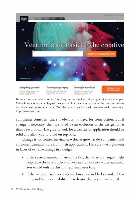
Change is, of course, inevitable: websites grow, as do companies, and customers demand more from their applications. Here are two arguments in favor of extreme change in a design:
• If the current number of visitors is low, then drastic changes might help the website or application expand rapidly to a wider audience. You would only be disrupting a small user base.
• If the website hasn’t been updated in years and lacks standard fea-tures and has poor usability, then drastic changes are warranted.
Because it services other creatives, Veer keeps its website fresh, showing inspirational examples. Maintaining a focus on finding new imagery and fonts is also important for the company because that is the main reason users visit. Over the years, it has balanced these two needs successfully: http://www.veer.com
Visible vs. Invisible Design 57
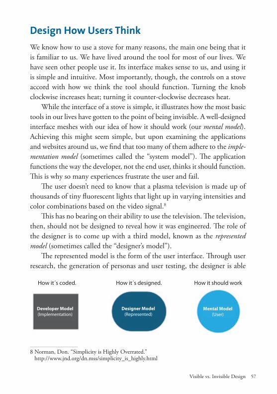
Design How Users ThinkWe know how to use a stove for many reasons, the main one being that it is familiar to us. We have lived around the tool for most of our lives. We have seen other people use it. Its interface makes sense to us, and using it is simple and intuitive. Most importantly, though, the controls on a stove accord with how we think the tool should function. Turning the knob clockwise increases heat; turning it counter-clockwise decreases heat.
While the interface of a stove is simple, it illustrates how the most basic tools in our lives have gotten to the point of being invisible. A well-designed interface meshes with our idea of how it should work (our mental model). Achieving this might seem simple, but upon examining the applications and websites around us, we find that too many of them adhere to the imple-mentation model (sometimes called the “system model”). The application functions the way the developer, not the end user, thinks it should function. This is why so many experiences frustrate the user and fail.
The user doesn’t need to know that a plasma television is made up of thousands of tiny fluorescent lights that light up in varying intensities and color combinations based on the video signal.8
This has no bearing on their ability to use the television. The television, then, should not be designed to reveal how it was engineered. The role of the designer is to come up with a third model, known as the represented model (sometimes called the “designer’s model”).
The represented model is the form of the user interface. Through user research, the generation of personas and user testing, the designer is able
8 Norman, Don. “Simplicity is Highly Overrated.” http://www.jnd.org/dn.mss/simplicity_is_highly.html
How it´s coded. How it´s designed. How it should work
Developer Model(Implementation)
Designer Model(Represented)
Mental Model(User)
Visible vs. Invisible Design58
to iterate the interface. The goal is to match the user’s mental model of the application or website as closely as possible. Not only will the experience be effective, but the interface will be invisible because it performs how a user thinks it should.
Cluttered vs. CleanOverusing design styles and techniques is easy, in which case they turn into clutter, or visual noise, in an interface. Styles should be implemented pur-posefully, in consideration of the overall goals of the application or web-site. The intended use of an application will dictate the style of its design. For example, an entertainment or educational application would probably accommodate more playful interaction and visuals than a word-processing application. In interaction design, not only can the interface become busy, but the interactions themselves might be unnecessary.
An invisibly designed interface not only works the way the user thinks it should work (according to their mental model), but also requires mini-mal interaction on their part to complete the task at hand. They are not expected to go through extra steps and complete an unrelated task just to accomplish their real task. Avoiding this might sound easy, but it occurs in applications and websites more than we probably realize, because these additional steps are inherent to many of our tools. The extra work takes a cognitive and physical toll on users every time they run into it.9
To get to Chicago, an airline traveler has to go through a long series of steps, none of which physically moves them closer to their destination. They have to wait in line, check their baggage, be assigned seating, print their ticket, go through security, wait for passengers to board the plane and so on. None of these actions gets them closer (in distance) to Chicago. A travel experience free of clutter would be to step into a pod out of the film “The Fly” and be transported directly to Chicago. These barriers, or clutter, are sometimes referred to as excise design.
Interactions that don’t directly help the user complete their task are con-sidered clutter. The job of the designer is not only to communicate the appli-cation or website’s behavior, but to remove or prevent useless interactive and
9 Cooper, Alan. “About Face 3: The Essentials of Interaction Design.” Wiley: 2007.
Visible vs. Invisible Design 59
visual clutter. As computer users, we deal with this daily. The folder system for managing files on a computer is meant to make our experience easier. But as time goes on and work accumulates, we lose track of our files. We have to use the search function to find them. We even need a toolbar at the bottom of our desktop for easy access to all of our applications. Diving into folder within folder within folder just to open an application is too much work.
Cleaning Up the Interface There are many forms of interface clutter (excise). Let’s review some of the more common ones and how they affect the user’s experience.
• Keep it flowingThe flow is the path that users take through a website or application to accomplish their task. If possible, the flow should not be interrupted. For example, don’t require the user to click on a message that confirms that a file has been saved or an email has been sent. Simply fading the message in and out accomplishes the same thing without preventing the user from doing what they were doing.
•Manage the training wheelsFirst-time users often need to be introduced gradually to an application or website; this is called “onboarding.” The user is guided through a carefully planned experience. But if you leave the training wheels on too long, the expe-rience becomes frustrating, because the user is now familiar with the website and doesn’t need the same level of help. There should always be a way to turn off this part of the experience, because beginners aren’t beginners for long.
•Once is enoughDon’t make users do something more than once if you can avoid it. For example, users should have to enter their address on a form only once. If the address is needed later in the billing section, then they should be able to pull the information they entered earlier. Many websites allow you to check a box (sometimes labeled “Remember me”) to stay signed in for a period of time so that you don’t have to re-enter your user name.

Visible vs. Invisible Design60
• Clarify the navigationUsing an icon to convey the abstract functionality of a button is a good way to tap into a user’s mental framework. This needs to be thoughtful, though, because the meanings of icons are different across cultures. Icons can even cause confusion within the same culture. Does a pencil icon mean “Write a new note” or “Edit old notes”?
Users should understand what a button does and what would happen if they click on it. If the visual or symbolic tie between a button and its purpose is not strong, then the flow breaks. The user is forced to figure out what the control does by experimenting with it. For example, when a user browses posts on a blog, they might come across links that say “Next/Pre-vious” or “Next/Back.” “Previous” could mean the last page they were on, not chronologically older posts. “Older/Newer” might be clearer.
• Keep people orientedGive the user consistent signposts and navigation. In desktop applications, we know the interface will have a menu at the top for navigation. This orients the user to where they are and where they can go. On a website, making every page look exactly the same can be disorienting. Add indica-tors to highlight the current section and help users know where they are.
• Flatten the hierarchyMost of the interfaces we encounter these days are rather flat – more a single level than a nested hierarchy. Our cars bring controls up to the surface. Fil-ing cabinets are one level deep. When it comes to websites and applications, creating nested drop-down menus and sub-navigation to allow the user to go deeper is easy. Many developers use a tree menu, but this cluttered naviga-tion reflects how the application was built, not how the user thinks. Unless you absolutely need advanced options that a small percentage of power users will access, avoid forcing users to go deep to access content and controls.

Visible vs. Invisible Design 61
• Keep it within reachPlace the navigation elements, information and most frequently used con-trols in convenient locations on the screen. Functions that will not be needed as often should be placed deeper in the website, but not removed totally, so that they don’t add noise to the interface. This relates to two important concepts in interface design:
• “Adjacent in space” places elements of an application all on the same screen. This approach gives the user immediate access to most information and controls. It also reduces the need to navigate be-tween screens, thus reducing the excise in the interface.
• “Stacked in time” splits functionality across several screens or lay-ers, like a story spread over pages in a book. By guiding the user down a clear path, you reduce the chance of them making a mis-take. You also get more screen space to guide them.
Carefully consider these approaches. If the navigation and controls aren’t mapped well or the content is split across too many layers, then the user will have to endure unnecessary navigation to get there. This is especially apparent on cell phones, where putting information adjacent in space is usually better than stacking it in time and possibly losing the user in deep-nests of screens.10
10 Edward Tufte, “iPhone Interface Design.” http://www.edwardtufte.com/bboard/q-and-a-fetch-msg?msg_id=00036T
Adjacent in Space Stacked in Time
Visible vs. Invisible Design62
Design PatternsPatterns are vital to our lives. Humans have used patterns in nature to help them hunt, plant and survive. These patterns are now invisible to us but still present. They inform our expectations. When we hear the rumble of thun-der, we understand that a storm is coming. When an application is praised as being intuitive, it means that an underlying pattern has been followed. Patterns provide a way of communicating with users without having to ex-plain everything from scratch. Patterns give us awareness and an ability to anticipate. Patterns separate meaningful design from visual noise.11
“We know that where we perceive no patterns of relationship, no design, we discover no meaning.”
— John Kouwenhoven
When starting the design process, the first impulse is to come up with some-thing creative and completely original. Clients want to differentiate them-selves from competitors, even though they will often push for an approach that is similar to that of a close rival. Getting caught up with trying to outdo another product by adding more features and making the design flashier ultimately favors the client at the expense of the user. We need to consider the goals of both the user and our client, and then present our solution in the best way possible. We shouldn’t start from scratch, but rather build on the collective psyche of our audience. We can categorize most applications into certain structures (drawn from Bill Scott and Theresa Neil’s book, Designing Web Interfaces: Principles and Patterns for Rich Interactions12):
Creation“The right structure to use when people need to create new content or modify existing content. For example, blogging, illustrating, coding, pho-to editing, diagramming.”
11 Maggie Macnab, “Decoding Design: Understanding and Using Symbols in Visual Com-munication.” How Design Books, 2008.12 Bill Scott and Theresa Neil, “Designing Web Interfaces: Principles and Patterns for Rich Interactions.” O’Reilly Media, 2009.

Visible vs. Invisible Design 63
Process“The right structure to use when people need to provide information in a structured manner. For example, product configuration, setup or installa-tion; registration forms; tax preparation; checkout; booking travel.”
Information“The right structure to use when people need to browse, compare, compre-hend information. For example, maps, news readers, dashboards, media players, online stores, etc.”
The diagram on the right highlights the common patterns by which current Web applications deliver functionality. These patterns have been es-tablished as best prac-tices for displaying information and pre-senting functionality. Like the patterns that users are familiar with in nature and street signs, these screens show what users to-day are comfortable with. Your target users might already be using a number of applica-tions with these pat-terns.
These screen patterns define the basic layout and approach we can take when starting a design. By understanding the main tasks of the user and
Courtesy of Theresa Neil, co-author of “Designing Web Interfaces,”O’Reilly Media, 2009.
Master/Detail
Spreadsheet
Form
Dashboard
Interactive Model
Palette/canvas
Parallel Panels
Search/Results
Question/Answer
Tabbed
Column Browse
Wizard
Re�ne Date
Portal
Browse

Visible vs. Invisible Design64
their overall goal, we can choose the right structure early on in the process. This limits the design to commonly recognized patterns.
If you are designing an application portal, then deviating from known portal patterns could set the application up for failure. This doesn’t mean there isn’t room for a fresh take on portals, but sticking to what users are familiar with is important. There is power in limitations. Limitations en-able us designers to focus on the design and not get caught up in adding too many options. By choosing an appropriate pattern, we can concen-trate on iterating the other details and devote more time to creating a great experience.
Making It Real
Many of today’s interfaces have a hyper-real look and sometimes act very realistically. Companies like Apple not only push this type of interface in their own applications, but also recommend the approach to design-ers working on the next generation of interfaces for devices such as the
StackExchange uses a “browse” pattern, as shown in the Web interface patterns above. The struc-ture is suited to the content: http://webapps.stackexchange.com

Visible vs. Invisible Design 65
iPad.13 This added physical dimensionality has both advantages and dis-advantages.
Using the metaphors of real objects in an interface gives users an easy way to learn how to use the application. The most famous computer meta-phor is the desktop. It stems from the graphical user interface (GUI) from the first Apple Macintosh, itself based on an early interface created by Xerox in the mid-1970s. Folders, wastebaskets and stacks of papers were all familiar elements to users and were easier to understand than the com-mand shortcuts that power users would type in to navigate. A user would have had a good idea of how to use a physical wastebasket, so they could logically assume the functionality of the computer wastebasket.14
Using familiar textures and objects from the real world also adds some fun to what might otherwise be a boring application. For example, a leath-
13 Apple, “Apple Human Interface Guidelines.” in Apple http://developer.apple.com/library/ ios/#documentation/General/Conceptual/iPadHIG/iPadHIG.pdf14 http://en.wikipedia.org/wiki/Graphical_user_interface
Flipboard is an application for the iPad that turns your social network (Facebook, Twitter, etc.) into a personal magazine. The magazine-style layout allows the user to navigate content in a familiar way, using the metaphor of a page turn, which sports a unique animation: http://www.flipboard.com

Visible vs. Invisible Design66
er trim with some realistic stitching would add beauty to a notebook ap-plication. It might also help with marketing the product. The interface is often the only “packaging” that a user sees when choosing an applica-tion to purchase. When comparing several notebook applications, the user might be most attracted to the one that looks most like a notebook, the one with all the fine details.
In addition to looking realistic, applications now also behave more realistically. If an application looks like a real-world object, it is expected to behave and respond like one, too. For example, when navigating to the next page in a book-reading application (i.e. eReader), the user – whose swiping gesture triggers the page turn – takes the realistic curl and move-ment of the pages for granted. The user already knows how real books work and so automatically understands the application. The interface be-comes invisible because of the user’s innate knowledge of books.
Interface metaphors can create many problems, too. They can quickly become limiting as the application becomes more complex. You might be forced to create awkward functionality in the application or website to fit the metaphor you have chosen. For example, with an interface that looks like pages of a book, if the content is too large for the space, then the page will need scroll bars, which goes against the way books are understood to work, thus defeating the purpose of the metaphor.15
Heavy textures and realism can clutter an interface, forcing the user to work harder to figure out what elements are clickable and where they must go to complete their task. If the user can easily tell that an element can be interacted with, then we say that the element has “affordance.”16 Most regular users of websites and applications understand the functionality of a button. In interface design, the addition of subtle dimension or vivid color tells the user that a button is actionable. This visual affordance indicates what a button or control does. But if everything in an interface has di-mension and is heavily designed, then identifying the interactive elements becomes hard. In short, users won’t know where to click.
15 Oliver Reichenstein, “Designing for iPad: Reality Check.” Information Architects. http://www.informationarchitects.jp/en/designing-for-ipad-reality-check16 Don Norman, “The Psychology of Everyday Things.” Basic Books, 1988.

Visible vs. Invisible Design 67
Don’t leverage a metaphor if it only gets you caught up in the design and clutters the interface. An excess of elements will only frustrate the user and make for a poor experience. Managing the cognitive load that a design bears on the user over time is critical.
Interface Design GuidelinesHere are some general guidelines for designing interfaces:17
• Balance style and function with purpose. Don’t design just to design.
• Group elements to create a visual hierarchy, and guide the flow at each layer by sticking to a structure.
• Be consistent. If the user understands one type of interaction or element, they should be able to transfer that knowledge to similar elements (a concept known as “inheritance”).
17 Cooper, Alan. “About Face 3: The Essentials of Interaction Design.” Wiley: 2007.
Writer is a word-processing application for the iPad. The application ignores many of the cur-rently popular metaphors and realistic touches in order to focus the user on writing. Common features such as spell-check, font selection and font sizing have been eliminated, being distractions to the task at hand. The result is an elegant and effective interface: http://informationarchitects.ch

Visible vs. Invisible Design68
• Don’t overwhelm the user. Keep superfluous things like animations and loud hover effects to a minimum.
• There should be a clear difference (visual affordance) between inter-active elements and non-interactive ones. A button should look like a button and not blend into the interface.
• Be efficient with visual elements. Get the most value from your pix-els. Limit things like type sizes and colors; rather, use certain colors to set off important elements.
• Cater to color-blind and visually impaired users: follow best practic-es, such as underlining links and using symbols (when appropriate).
• The guidelines listed here as just that: guidelines. Ignore them if another way would benefit the user more.
ConclusionAlthough interaction design is in its infancy, we have learned a lot about it. The computer and the Web have gone from something we sit down to and interact with at a desk to something we carry around with us on a smart-phone or tablet. The digital world has become a comfortable place for us to socialize, make purchases and research important decisions-basically, conduct much of our daily life.
For many people, design is merely a visual or decorative layer. It is very easy for those not in design to assume that a website or application that balances form and function, beauty and usability is simply the result of a pleasant arrangement of color, type and imagery. The flaw here, though, is in assuming that a good solution to a design problem can be found by shuffling elements around a canvas until something clicks. This devalues not only the designer’s role, but also the years of practice, study and skill that have gotten us to this point.18
A good designer understands how to balance the invisible and visible aspects of design. They create meaning and evoke emotion where there
18 Paul Rand, “A Designer’s Art.” Yale University Press, 2000.

Visible vs. Invisible Design 69
were only vague concepts, disparate images and half-baked content. Sys-tematically approaching a project with the overall goal in mind and deliv-ering a solution that satisfies both client and user are where the designer’s value lies. The designer guides the client through the process. A good de-signer grasps technological developments, speaks intelligently with devel-opers, and empathizes and creates experiences for users who have scant knowledge of technology and the Web.
The more we become connected through the screens in our pockets, homes and businesses, the more important invisible interfaces will be. Design should create meaning in our lives by showing us the best path to completing a task or achieving a goal. Interaction design doesn’t scream “Look at me!” It stands to the side and says “Do this” or “Look over here.” Through all of these smaller touch points, design can affect people and the world in a big way.
Good designers can see both the forest and the trees, the visible and invisible halves of design.
About the author“Personal growth is more important than a title.” Francisco Inchauste (1975) grew up in Michigan, and started out in graph-ic design for print, later moving into interactive design. Francisco is now a User Experience Designer for Universal Mind, working on applications for the desktop, Web, and devices. His favorite color combination is #333333 with #3399CC and his motto is do the best you can according to your abilities. Family, music, movies and running take up Francisco’s free time and he tries to enjoy a good beer once in a while. His personal message to the readers is that he hopes this book and his chapter will inspire readers in their next design project and in their continuing growth.