using excel in biostatistics general ... - kean …fosborne/bstat/excel_in_biostatistics.pdf ·...
TRANSCRIPT
USING EXCEL IN BIOSTATISTICS
General description of Excel
Excel is a spreadsheet that is part ofthe Microsoft Office packages. It has other applications besides statistics. Businesses, for example, can use Excel to keep inventory records, process orders, and compare sales. Teachers could use Excel to maintain a record of student grades. It is also an excellent way to work with data in biostatistics. Some data sets are placed on the Internet in files that are readable with Microsoft ExceL
Upon loading the program, it sets up a blank workbook. Each workbook is composed of sheets of information. Each workbook may contain up to 255 sheets. The sheet names are at the bottom, on tabs. You may change the name ofthe sheet by right clicking on its tab, selecting rename, and then type the new name. This is useful if the data is in one sheet and each graph is in a separate sheet. Each sheet is composed of columns (labeled A, B, C, etc) and rows (labeled 1,2,3, etc).
Location of statistical features
1. Some functions are built-in and can be used within cells; these can be directly accessed or obtained with the Function Wizard located on the tool bar and resembling.fx. 2. Graphs are constructed with the Chart Wizard located on the tool bar and resembling a dimensional histogram. 3. Data Analysis Tool Packs are part ofExcel's custom installation. Click on Tools, Add-ins and then wait approximately 2 minutes. Then click on the top 2 data analysis tool packs. After closing the dialog box, the words Data Analysis will be included in the Tools menu.
Getting started for general work
Entering information into Excel. Basically, there are two major ways of first entering information; either by directly typing it in or by opening an existing file.
To enter information, just type the data into cells of a worksheet. You may enter information either vertically or horizontally..You may precede each with a title, called a header row. If your information is not entirely visible, you may enlarge the size of the cell by moving the cursor to the column headings (labeled A, B, C, etc.) When the cursor changes to a vertical line with arrows pointing to both the left and right, you can move the cursor to the left or right, with the mouse, thereby changing the size of the celL Each cell is named with its column letter followed by its row number. The name ofthe cell will appear on the left side ofthe screen, right above the worksheet.
To open an existing file, click on File, Open, and then select the file to open. Usually, this will be on a disk, in drive A. You should provide your own disk for this purpose.
Save the worksheet. Once the data is typed in, it is an excellent idea to save it on a disk. Click on File, Save As, and then name the file with a title that will easily identify the data. Be sure to save it on drive A.
Bl

82
Manipulating the data. It may be necessary to manipulate your data into order make them easier to work with. Some of the common operations are described below.
A. Applying a data format
Sometimes data have special formats, such as currency. To apply a special format, highlight the data to be formatted. Click on Format and select the appropriate one.
8. Inserting new data in a specific place
Click on the row where the new data are to go before. Click on Insert, Row to create a new row. Likewise, a new column can be created by clicking first on the column and then Insert, Column.
C. Sorting the data
This is particularly useful when making a frequency table. Click on any cell within the data. Click Data, Sort and then select the fields that are to be sorted either ascending or descending. At the bottom of the screen, there is a place for the header row to be selected or not.
D. Creating a new column, based on a calculation
Suppose a frequency table has been created and it is necessary to create a relative frequency table. Assume that column A has the lower class limits and column 8 has the frequencies; both columns have header labels. In CI, type Relative Frequency. In C2, type =82 I #, where # stands for the total number of data items. Press Enter. The next box, C3, will be highlighted. Go back up to C2, move the cursor to the lower right corner, until it turns into a + sign. Holding down the left mouse button, pull the cursor down the column until you reach the last needed place. Excel will automatically change the formula to reflect each new location.
E. Copying cells to a new location
Highlight the group of cells to copy. One way to copy the cells is to press Control and C keys together. At the top of the new location, press Control and V keys together.
F. Creating a pattern ofnumbers
This is useful if when setting up class limits (for graphs) or ranks (for the normal probability plot). Type the first 2 or 3 numbers. Highlight the cells, move the mouse arrow to the lower right comer, press the le~ mouse, drag the desired amount, and release the mouse.
G. Changing the width of a column
Move the pointer so that it is on the rightmost edge of the column heading ofthe column to be extended. The pointer should change shape, resembling a vertical line with 2 arrows. Hold down the left mouse button and drag the width to the desired amount.

B3
Graphs for raw data
The basic installation of Excel has a chart wizard. Pressing a button, which looks like a three dimensional bar graph on the tool bar, accesses this. The graphs available include bar graphs, line graphs, and pie graphs. A simple default graph is highlighted in black; fancier versions are also present.
To make a graph, the first thing you will need to do is to create a frequency table, using standard techniques. If the table is not yet prepared, you will either need to enter the data into the calculator lists or into a column in ExceL The data must then be sorted.
After the frequency table has been created, the cells must be highlighted. Press the Chart Wizard button on the top row. When moving from one screen of the chart wizard to the next, be sure to use the NEXT button, rather than the FINISH button.
Generally, if the frequency table contains nominal data, Excel will not have any problems with handling the axes. If the classes are not nominal, then Excel has a slight problem. Once the chart wizard begins, you will need to click on the Series tab and remove the classes from the series to graph. On the bottom, there is a place for the category x axis. Type =(name of sheet)! (starting cell):(ending cell) for the data values.
While progressing through the chart wizard, you will be allowed to enter a title for the graph and labels for both axes. The legend box could be eliminated ifdesired. The frequencies can be entered A data table could be included. The chart wizard will ask whether you to place the chart in the sheet or a chart; it is recommended to place the graph in a new chart. Click in the top circle to accomplish this.
Once the graph is drawn, additional changes can be made. By clicking on the various components, you can change the font of printing, the color of the background, the fill pattern on the bars, the width of the bars, etc. For each correction, the mouse must be moved so that a little box with words describing what is to be changed appears. Double click the mouse to enter the dialog. To make the histogram bars connect, double click on a bar, go to the options tab, and run the gap width down to zero.
This basic technique will work for all graphs. When preparing graphs, remember that the graph should look professional and follow correct formats. If a cumulative frequency polygon is desired, the graph must start with a frequency of O. If a frequency polygon is desired, the graph must start and end with frequencies of O. Be sure to include the "invisble" class marks or boundaries for these graphs. Relative frequency graphs can also be made.
There are two other types of histogram that you may wish to make. The first one is available through a supplemental program called the Data Analysis Toolpak. This product is available separately from Duxbury Press as part of a book called Data Analysis with Microsoft Excel. It produces a histogram with a cumulative frequency percentage graph superimposed on it. The number of classes (called bins) are created automatically by Excel. If it is desired to have "nice" classes, be sure to set up the lower class limits and specify the range in the bin. Be sure to check the bottom two options (Cumulative frequency and chart) to get the graph.

B4
This graph is placed in a sheet ofExcel, rather than in a Chart. Students will need to stretch the graph, change fonts, and generally make improvements. A sample of a modified graph is below.
Average salaries of professors at 50 universities
120.00%
>. 15 (J c ~ 10 C" e u. 5
45 50 55 60 65 70 75 80 More
Salary
o +-I~-+--
100.00%
80.00% 60.00%"
40.00% 20.00%
......."'I----+- .00%
A second type of special histogram is available through the Stat-Plus add-in. It is a histogram with. a nonnal curve superimposed on it, using the mean and standard deviation of the data. Again, be sure to specify the range of values of the data. This graph is again placed in a sheet, so you will need to make changes to the design. A sample modified graph follows.
Distribution of average salaries of professors at 50 universities
"--,10.00
8 >. g 6 Q) ::::le 4 u.
2
10,.......- m
8.00 ~ CD C"l
6.00 -~
~ 4.00 z
o 2.00 3
!!!. o -+--+-+-+-+-t-t-t-t--I--t--I----1r-1--t--+ 0.00
'\b< '\tt- reOJ r8> reO;) ~coro(;:j ~~'*" ~(;:j' q.' ~. rett-· rere- ,\(;:jo ,\b<'
Overall
B5
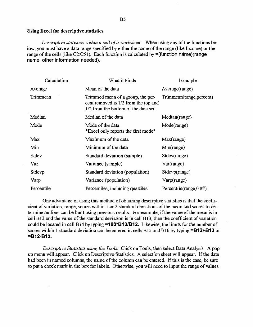
Using Excel for descriptive statistics
Descriptive statistics within a cell ofa worksheet. When using any of the functions below, you must have a data range specified by either the name of the range (like Income) or the range of the cells (like C2:C5l). Each function is calculated by =(function name)(range name, other information needed).
Calculation What it Finds Example
Average Mean of the data Average(range)
Trimmean Trimmed mean of a group, the per Trimmean(range,percent) cent removed is 1/2 from the top and 1/2 from the bottom of the data set
Median Median of the data Median(range)
Mode Mode of the data Mode(range) *Excel only reports the first mode*
Max Maximum of the data Max(range)
Min Minimum of the data Min(range)
Stdev Standard deviation (sample) Stdev(range)
Var Variance (sample) Var(range)
Stdevp Standard deviation (population) Stdevp(range)
Varp Variance (population) Varp(range)
Percentile Percentiles, including quartiles Percentile(range,O.##)
One advantage of using this method of obtaining descriptive statistics is that the coefficient of variation, range, scores within 1 or 2 standard deviations of the mean and scores to determine outliers can be built using previous results. For example, ifthe value of the mean is in cell B12 and the value of the standard deviation is in cell B13, then the coefficient of variation could be located in cell B14 by typing =100*813/812. Likewise, the limits for the number of scores within 1 standard deviation can be entered in cells B15 and B16 by typing =812+813 or =812-813.
Descriptive Statistics using the Tools. Click on Tools, then select Data Analysis. A pop up menu will appear. Click on Descriptive Statistics. A selection sheet will appear. If the data had been in named columns, the name of the column can be entered. If this is the case, be sure to put a check mark in the box for labels. Otherwise, you will need to input the range of values.

86
Near the middle of the box, record where you want the output moved to; a suggestion is to put it into a new sheet which needs to be named. Also, be sure to check the box labeled Descriptive Statistics. It is possible to do confidence intervals. It is also possible to print out the kth smallest and largest scores, if desired.
Sample output, using a data set ofoverall faculty salaries in thousands ofdollars at 50 universities is shown below:
Overall
Mean 58.195 Standard Error 0.986535 Median 56.99 Mode #N/A Standard Deviation 6.975854 Sample Variance 48.66254 Kurtosis -0.23208 Skewness 0.501573 Range 29.79 Minimum 45.75 Maximum 75.54 Sum 2909.75 Count 50
The #N/A for the mode tells us that there is no mode; however, if there is a number, be sure to check for multiple modes.
Among the values given are the standard error of the mean which has the following fonnula.
This forumla is part of the infonnation necessary in calculating a confidence intervaL
The Kurtosis value is an index which describes a distribution with respect to its flatness or peakedness, as compared to the nonnal distribution. A negative value is characteristic of a relatively flat distribution while a positive value is a relatively peaked distribution. The fonnula for calculation ofKurtosis is given below.
n(n+1) 3(n-l)2L(X-XJ4 (n-l )(n-2)(n-3) s (n-2)(n-3)
Another value isthat for Skewness. A negative skew indicates the longer tail extends in the direction of low values in the distribution; the mean should be smaller than the median. A positive skew indicates the longer tail extends in the direction ofhigh values in the distribution; the mean should be larger than the median. The fonnula for skewness is
n x-X_J3 (n-1Xn-2) L(-s

B7
Box plots
Box plots are a feature of Stat Plus. Select box plots to open the dialog box. Enter in the range of values for the data and check the header row label if appropriate. Send the output to a new sheet. Moderate outliers will be shown as a filled in circle while extreme outliers will be an open circle. Extreme outliers are beyond Q3 + 3 (Q3 - Ql) or Ql- 3(Q3 - Ql). Moderate outliers are at a distance of 1.5 times the interquartile range to 3 times the interquartile range from either Ql or Q3. A sample output is shown below:
80
70
60
50 Overall
40
30
20
10
0
Scatter plots and Regression lines
The Chart Wizard will also create a scatter plot of data. Be sure that the independent variable (x) is in the first column and the dependent variable (y) is in the second column. Highlight the data and make a the scatter plot following the general graphing procedures and storing the result in a chart.
The background should be cleared. In addition, depending on the data, the axes may need to be re-scaled as Excel tends to start both at zero. To change the axes, move the mouse until you see the name of the axes appear in a little box. Double click the mouse. On the tab labeled scale, change the minimum to a value slightly smaller than the data's minimum value.
To add a regression line, move the mouse near a data point. When the box with the word Series appears, right click the mouse. A drop down menu should appear. Click on Add Trendline. A series of different trendlines will appear. For this early work, the linear model is to be selected. Be sure to click the options tab and check the bottom 2 boxes - add equation and coefficient of determination to the graph. Otherwise, just the line will be drawn. The equation and value of r2 can be moved around on the graph. Other models are available such as the exponential growth/decay modeL

B8
Binomial probabilities
Excel has the binomial probability distribution built in. To begin a distribution, create 2 columns, labeled X and P(X). The X values are from 0 to n, where n is the number of trials. The Function Wizard will make it easier for the probabilities to be calculated. Put the cursor in the cell for the first P(X). Select the Function Wizard (recall it looks likeIx on the toolbar). Select Statistical, then within the menu, select on Binomdist. For number, enter the cell where X = 0 was found (like A2). Enter the value for n. Enter a desired probability (the value of p in the binomial formula). If not doing a cumulative, enter the word false. After finishing, drag the cell throughout the range of cells to compute the other binomial probabilities.
Once the chart of values is obtained, you could make a histogram of the data. Additional columns, to detennine the mean and standard deviation using the generic probability distribution formulas, could be created. Additionally, you could see the effect of changing the value for p on the symmetry of the distribution.
Poisson probabilities
Poisson probabilities are also available through the Function Wizard and can be utilized in much the same way. The value ofA is entered in the Wizard. Both individual and cumulative probabilities can be found.
Normal Curve Probabilities
Excel provides several functions related to the nonnal distribution. These are also accessed most readily through the Function Wizard which will guide you through the information to be entered. The table below describes these functions. These functions are particularly useful in establishing confidence intervals or doing hypothesis testing.
Function Accomplishes
Nonndist Returns the value of the cumulative probabilities; must have found the values for s, mean and standard deviation
Nonmnv Returns the z score of the cumulative probabilities; must have cumulative percents, mean and standard deviation
1N0rmsdist Returns the value of the cumulative probabilities; must have foudn the z score first
Normsinv Returns the z score of the cumulative probabilities; must have cumulative percents first
Standardize Returns a standardized z score for a specified X, mean and standard deviation

B9
Central Limit Theorem
To demonstrate the Central Limit Theorem, first, a population must be created. Click on Tools, Data Analysis, Random Number Generator. A dialog box will appear. The following information must be entered.
Number ofvariables - to put all of the numbers in one column, use I Number of random variables - any number that you desire - suggest 500 Distribution - the choices that would probably be appropriate are
Uniform - the lower and upper bounds must be entered Normal- the mean and standard deviation must be entered
Output Range - Enter the location of the upper left hand cell (AI, for example)
Next, samples must be created - this is where the tedious, time consuming works come into play. Click on Tools, Data Analysis, Sampling. Again a dialog box will appear. The following information must be entered.
Input range - the range ofvalues for the population (AI:A500, for example) Sampling method - either periodic or random; probably should use random
a Number of samples - the value for n in ax = .j;;
Output range - the first cell where the sample value is placed; values will be in a column
After the first sample is made, you will need to make additional samples of the same size, placing results in the next column of the chart. This is what takes the time. However, it does show the individual samples. After all columns are created, then the sample mean ofeach column must be obtained. In a cell below the first column's data, type =Average(start cell, end cell). The formula is then copied throughout all the samples.
In the example, 500 random decimals were created. Ten samples ofsize 5 were created. The output for the samples and their means are shown:
Sample 1 Sample 2 Sample 3 Sample 4 Sample 5 Sample 6 Sample 7 Sample 8 Sample 9 Sample 10 0.29991 0.28986 0.10269 0.48601 0.19828 0.1391 0.08243 0.09082 0.19727 0.494705 0.59304 0.71261 0.11921 0.49907 0.41173 0.00653 0.71407 0.48601 0.46587 0.639973 0.56865 0.59899 0.28062 0.2642 0.69906 0.05557 0.85076 0.97366 0.78021 0.585498 0.70309 0.5754 0.01315 0.54714 0.5439 0.923 0.80508 0.84201 0.4687 0.87582 0.75091 0.95825 0.34419 0.2327 0.12436 0.64986 0.37681 0.1908 0.69973 0.016938
Means 0.58312 0.62702 0.17197 0.40582 0.39546 0.35481 0.56583 0.51666 0.52235 0.522587
Next, at some location in the worksheet, you should find the mean and standard deviation of
both the population and the sample. Also, ~ should be found, using the
~
population standard deviation and the sample size.

BlO
Summary of values Population Mean Standard deviation
0.489554 0.289814
Sample Mean Standard deviation
0.466565 0.135795
Standard error 0.129609
What is interesting to see is that, with increased values for n, there is much less diversity in the averages. You could also graph the sample means as a histogram, if enough samples were obtained.
Normal Probability Plots
One of the underlying assumptions that applies to all the inferential work in statistics is that the data must be normally distributed. Even though it is not usually included in texts, it is a good idea to verify this assumption, especially when working on a project where data is analyzed.
Some evidence from the descriptive statistics that support (or suggest normality) are:
Proximity of mean, median and mode Range is approximately 6 times the standard deviation Inter-quartile range is approximately 1.33 times the standard deviation The percent of scores in 1 standard deviation of the mean is 68% The percent ofscores in 2 standard deviations of the mean is 95% The shape of the box plot The shape of the histogram (not recommended for small data sets)
A normal probability plot, which plots the data versus the theoretical z scores if the data were normally distributed, should result in a straight line. Ifdata are not normally distributed, then theoretically you should attempt to normalize it by one of several transformations: logarithmic, square root or reciprocal. All are readily done on ExceL The transformed data, if it appears to be a linear plot, would then be utilized for all confidence intervals and hypothesis tests, transforming final values for the interval back into the regular data values.
Directionsfor a normal probability plot:
1. Establish headings as follows: ColumnA Rank Column B Cumulative percent Column C Z score Column D Data

811
2. Enter into Column D, the data values. Sort the data in ascending order. Check to see if there are any duplicate data values.
3. Enter in Column A, starting in cell A2, the values from 1 to D, where n represents the number ofdata items.
4. If you had no duplicate data values, skip this step and go directly to step 5.
For any data points that are duplicate points, you will need to average the ranks and record that value for each of the duplicates. For example, ifyour worksheet has columns like below:
Rank Cumulative proportion Z score Data
1 13
2 13
3 13
4 14
5 15
6 15
Change it to the following:
Rank Cumulative proportion Z score Data
2 13
2 13
2 13
4 14
5.5 15
5.5 15
The 13's have rank 2 since the average of 1,2 and 3 is 2. The 15's have rank 5.5 since the average of5 and 6 is 5.5.
rank 5. To form Column B, the cumulative proportions are found by n + I . In cell B2, enter
=A2/(value for 0+1). That is, if the data had 30 values, enter =A2I31. Highlight the cell and drag to copy the formula down to the last row.
6. To form the inverse normal z scores (which are based on cumulative proportions and represent the area to the left of the z score), type in cell C2, =NORMSINV(B2). Highlight the cell and drag to copy the formula down to the last row.

B12
7. Use the chart wizard to create an XY scatter plot ofColumn C versus Column D, with the Column C being the x values. After the wizard is finished, you may want ~o readjust the values on each axis~ it is not necessary for the y scale to start at zero.
The plot of the salaries of professors at 50 universities suggests that the data are close to being normally distributed.
Probability Plot
-I-------89:00- ------.---j
•!
-3 -2 -1 0 2 3 z score
Additionally, the Stat Plus Add-in also gives a probability plot (Pplot); this is essentially the same graph with a rotation of axes and a trend line added..
Normal Probability Plot
3.00
2.00 •
~ 0 u II)
z
1.00
0.00
-1.00
••
-2.00
-3.00
45.75 50.75 55.75 60.75 65.75 70.75
Overall

B13
T distributions
Excel has, through the Function Wizard, 2 functions for T distributions. These are summarized below:
Function Accomplishes
Tdist Returns the value of the probability for the tail area for a particular t score; must have the value of t, the degrees of freedom, and the number of tails (lor 2) .
Returns the t score for a given probability ofa tail area and degrees of freedom
Tinv
Confidence Intervals
In real life statistics, a z interval is used only when the population standard deviation is known. Otherwise, a t interval is used.
To create a z interval for raw data, the values must be entered into the worksheet. The values for the mean, standard deviation and sample size must be found and put into cells. This can be done either by the individual formulas or by the descriptive statistics add-in. For illustration, assume that the mean is in cell B2, the standard deviation is in cell B3, and the sample size is in cell B4.
The steps below are the formulas to enter:
Confidence level Cell B5 Enter the value of the confidence level as a decimal Area in tail Cell B6 =(1-B5)/2 Z score Cell B7 =ABS(NORMSINV(B6» Lower limit Cell B8 =B2-B7*B3/SQRT(B4) Upper limit Cell B9 =B2+B7*B3/SQRT(B4)
Sample output is below:
Z intervals Mean 54.4 Standard Deviation 4.5 Sample size 36 Confidence level 0.9 Area in tail 0.05 Z score 1.644853 Lower limit 53.16636 Upper limit 55.63364
To create a T interval, you have a choice. If it is desired to use formulas, then the line for Z score is replaced by:
T score Cell B7 =ABS(TINV(B6,B4-1»

B14
Sample output is below:
T intervals Mean 54.4 Standard Deviation 4.5 Sample size 36 Confidence level 0.9 Area in tail 0.05 T score 2.03011 Lower limit 52.87742 Upper limit 55.92258
A second method is to enter the raw data into Excel. When choosing descriptive statistics, ·se;.· lect on the confidence level as welL Sample output is below for the speeds of 10 cars:
Speeds ofcars
Mean 69.7 Standard Error 1.626516387 Median 68.5 Mode #N/A Standard Deviation 5.143496433 Sample Variance 26.45555556 Kurtosis -0.926717627 Skewness 0.283301617 Range 16 Minimum 62 Maximum 78 Sum 697 Count 10 Confidence Level(95.0%) 3.679438498
To obtain the actual interval, you must take the mean and then both subtract and add the confidence level figure (3.6794).
In a similar fashion, you can create intervals for proportions.
X= Cell B2 Enter the value for x N= Cell B3 Enter the value for N P estimate Cell B4 =B2/B3 Q estimate Cell B5 =1-B4 Confidence level Cell B6 Enter the value of the confidence level as a decimal Area in tail Cell B7 =(1-B6)/2 Z score Cell B8 =ABS(NORMSINV(B7» Lower limit Cell B9 =B3-68*SQRT(B4*B5/B3) Upper limit Cell B10 =B3+B8*SQRT(B4*B5/B3)

B15
Sample output is shown below:
Proportion intervals x= n= p estimate q estimate confidence level area in tail z score Lower limit Upper limit
Hypothesis Testing
38 250
0.152 0.848
0.95 0.025
1.959961 0.107496 0.196504
One-sample tests are not included in Excel, but as in the case of the intervals, formulas can be created which will accomplish the task.
Sample Mean Hypothesized Mean Standard Deviation Sample size Test Statistic Alpha P value one tailed Z critical one tailed P value two tailed Z critical two tailed
Cell B2 Cell B3 Cell B4 Cell B5 Cell B6 Cell B7 Cell B8 Cell B9 Cell BlO Cell B11
Enter the value here Enter the value here Enter the value here Enter the value here =(B2-B3)/(B4ISQRT(B5)) Enter the value here =1-NORMSDIST(ABS(B6» =ABS(NORMSINV(B7» =2*B8 =ABS(NORMSINV(B7/2»
Sample output is shown below.
One Sample Z test. Sample Mean Hypothesized Mean Standard Deviation Sample size Test statistic Alpha P value one tailed Z critical one tailed P value two tailed Z critical two tailed
110 100
15 20
2.981424 0.05
0.001435 1.644853 0.002869 1.959961
In a similar fashion, tests could be set up for a T test of the mean and a Z test for proportions. For the T test, a cell with degrees of freedom could be created. The p value formulas would require the format TDIST(location of T score, location of degrees of freedom, 1) for one tailed tests. The critical value formulas would require the format TINV(location of alpha, location of degrees of freedom) for one tailed tests; in two tailed tests, make sure the value of alpha is divided by 2.

B16
Fortunately, the tests for 2 populations are part ofthe Data Analysis Tool Pack, if the raw data are presented. Available are z tests, t tests with equal population variances, t tests with unequal population variance and paired differences t tests. For each test, you need to have the data established in columns. Select on Data Analysis, choose the test, and then fill in the desired infoonation. Note that the hypothesized mean difference is asked for; in Math 124, this is treated as zero. Sample output for paired differences is shown below:
t-Test: Paired Two Sample for Means
Machine I Machine 2 Mean 17.42857143 18.42857143
···········Variance 6.619047619 10.28571429 Observations 7 7 Pearson Correlation 0.842594423 Hypothesized Mean Difference o Df 6 t Stat -1.527525232 P(T<=t) one-tail 0.088744414 t Critical one-tail 1.943180905 P(T<=t) two-tail 0.177488828 t Critical two-tail 2.446913641
ANOVA
Excel has one way ANaVA as well as two way ANaVA. The data is again entered into a worksheet in either rows or columns. Enter the Data Analysis tool pack and select on one way ANaVA. Be sure that the range specified tells the location of all of the data, including blank cells; that is, if a box were drawn around the cells specified, all the data would be found.
Sample results are shown:
Anova: Single Factor
Groups Count Sum Average Variance
Company A 4 235 58.75 170.9167
CompanyB 3 205 68.33333 400.3333
CompanyC 5 353 70.6 164.8
CompanyD 4 211 52.75 49.58333
ANaVA
Source of SS df MS F P-Value F crit Variation
Between Groups 865.6333 3 288.5444 1.632218 0.234033 3.4903
Within Groups 2121.367 12 176.7806
Total 2987 15

817
Contingency Tables
First, you must copy the tables into Excel (assuming that the raw data was not available). The row totals and column totals can be obtained by writing formulas and then dragging them across the table.
Observed
In favor Against No opinion Grand Total
Men 93 70 12 175
Women 87 32 6 125
Grand Total 180 102 18 300
To calculate the expected values, formulas for the corresponding cells need to be established. For example, the expected for Men In Favor is found by =BS*E3/ES, assuming that the worksheet was begun in cell A2.
Expected
In favor Against No opinion Grand Total
Men 105 59.5 10.5 175
Women 75 42.5 7.5 125
Grand Total 180 102 18 300
Next, set up headings as follows:
P-value Observed chi-square Alpha Critical chi-square
Click on the cell next to P-value. Click on Function Wizard, select Statistical, select CHITEST, and click Next. Enter the actual range of observed cell frequencies; do not include locations of totals. Below it enter the expected range of cell frequencies. Click finish. The p value of the test will appear.
Click on the cell next to Observed chi-square. Click on Function Wizard, select Statistical, select CIllINV and click Next. For probability, enter the cell location of the p value. For degrees of freedom, enter the degrees of freedom which must be calculated. Click finish. The test value of Chi square will be displayed.

B18
Enter a value for alpha.
Click on the cell next to Critical chi-square. Click on Function Wizard, select Statistical, select CIffiNV. For probability, enter the cell location of the p value. For degrees of freedom, enter the number. Click finish.
What is really neat, is that as you change the value of alpha, the critical value will automatically be recalculated.
P-value 0.0161411 Observed chi-square 8.2527466 Alpha 0.01 Critical chi-square 9.210351
P-value 0.0161411 Observed chi-square 8.2527466 Alpha 0.05 Critical chi-square 5.9914764