usability testing of android applications
TRANSCRIPT

USABILITY TESTING OF ANDROID APPLICATIONS
_______________
A Thesis
Presented to the
Faculty of
San Diego State University
_______________
In Partial Fulfillment
of the Requirements for the Degree
Master of Science
in
Computer Science
_______________
by
Aruna Alluri
Fall 2012


iii
Copyright © 2012
by
Aruna Alluri
All Rights Reserved

iv
DEDICATION
I want to dedicate my work to my grandparents, for their unconditional love.
v
Let's make our life easier by focusing on User-Centered-Design. —Anonymous

vi
ABSTRACT OF THE THESIS
Usability Testing of Android Applications by
Aruna Alluri Master of Science in Computer Science
San Diego State University, 2012
What is “usability”? An application or product is considered “usable”, if it has a pleasant user interface, easy to use and behaves as expected. Most companies focus on the features of application/product not on their usability. Similarly consumers purchase them based on the number of features and how it looks. In early days, when computers were new, they were only used by professionals who have the knowledge of the computers, so usability was not that big a problem. However, in today’s world, everyone uses computers, mobiles, ATMs etc. The application/product fails if it is not usable, irrespective of however many features it has. They should be designed to make it easy for the user, hence user centered design has become prominent these days. Companies, that develop application/product, should give equal importance to the usability testing, along with functionality testing. Thesis is about finding the usability problems with android based applications.

vii
TABLE OF CONTENTS
PAGE
ABSTRACT ............................................................................................................................. vi
LIST OF TABLES .....................................................................................................................x
LIST OF FIGURES ................................................................................................................. xi
ACKNOWLEDGEMENTS ................................................................................................... xiii
CHAPTER
1 INTRODUCTION .........................................................................................................1
1.1 Background ........................................................................................................1
1.2 Purpose of the Study ..........................................................................................1
2 USABILITY TESTING .................................................................................................2
2.1 Develop the Test Plan ........................................................................................3
2.1.1 Purpose of the Test....................................................................................3
2.1.2 Research Questions ...................................................................................3
2.2 Setup a Test Environment ..................................................................................4
2.3 Find and Select Participants ...............................................................................4
2.4 Prepare Test Material .........................................................................................5
2.4.1 Orientation Script ......................................................................................5
2.4.2 Nondisclosure Agreement and Recording Form .......................................6
2.4.3 General Questionnaire ..............................................................................6
2.4.4 Task Scenarios ..........................................................................................8
2.5 Conducting the Test Session ..............................................................................8
2.6 Analyze Data and Observations .........................................................................8
2.7 Report Findings and Recommendations ............................................................8
2.8 User-Centered-Design (UCD) Principles ..........................................................9
2.8.1 Affordance ................................................................................................9
2.8.2 Visibility ...................................................................................................9
2.8.3 Mapping ..................................................................................................10
2.8.4 Feedback .................................................................................................10

viii
3 ANDROID PHONE .....................................................................................................13
4 USABILITY TESTING OF ANDROID PHONE .......................................................19
4.1 Calculator Application .....................................................................................19
4.1.1 Usability Testing by Myself....................................................................19
4.1.2 Test Questions and Testing with Users ...................................................22
4.1.3 Usability Problems ..................................................................................23
4.2 Calendar Application .......................................................................................23
4.2.1 Usability Testing by Myself....................................................................23
4.2.2 Usability Questions and Testing with Users ...........................................25
4.2.3 Usability Problems ..................................................................................25
4.3 Weather Application ........................................................................................25
4.3.1 Usability Testing by Myself....................................................................25
4.3.2 Usability Questions and Testing with Users ...........................................28
4.3.3 Usability Problems ..................................................................................28
4.4 Maps Application .............................................................................................28
4.4.1 Usability Testing by Myself....................................................................29
4.4.2 Usability Questions and Testing with Users ...........................................29
4.4.3 Usability Problems ..................................................................................31
4.5 Gallery Application ..........................................................................................31
4.5.1 Usability Testing by Myself....................................................................31
4.5.2 Test Questions and Testing with Users ...................................................31
4.5.3 Usability Problems ..................................................................................33
4.6 Dolphin Browser Application ..........................................................................33
4.6.1 Usability Testing by Myself....................................................................33
4.6.2 Usability Questions and Testing with Users ...........................................37
4.6.3 Usability Problems ..................................................................................40
5 CONCLUSION ............................................................................................................41
5.1 Weather Application ........................................................................................43
5.2 Calculator Application .....................................................................................43
5.3 Calendar Application .......................................................................................44
5.4 Maps Application .............................................................................................44
5.5 Gallery Application ..........................................................................................45

ix
5.6 Dolphin Browser Application ..........................................................................45
5.7 Future Work .....................................................................................................46
REFERENCES ........................................................................................................................47
x
LIST OF TABLES
PAGE
Table 5.1. Results with the Test Users for Weather Application.............................................43
Table 5.2. Results with the Test Users for Calculator Application .........................................44
Table 5.3. Results with the Test Users for Calendar Application ............................................44
Table 5.4. Results with the Test Users for Maps Application .................................................45
Table 5.5. Results with the Test Users for Gallery Application ..............................................45
Table 5.6. Results with the Test Users for Dolphin Browser Application ..............................46
xi
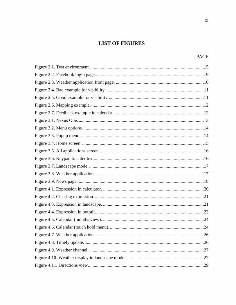
LIST OF FIGURES
PAGE
Figure 2.1. Test environment. ....................................................................................................5
Figure 2.2. Facebook login page. ...............................................................................................9
Figure 2.3. Weather application front page. ............................................................................10
Figure 2.4. Bad example for visibility. ....................................................................................11
Figure 2.5. Good example for visibility. ..................................................................................11
Figure 2.6. Mapping example. .................................................................................................12
Figure 2.7. Feedback example in calendar. ..............................................................................12
Figure 3.1. Nexus One. ............................................................................................................13
Figure 3.2. Menu options. ........................................................................................................14
Figure 3.3. Popup menu. ..........................................................................................................14
Figure 3.4. Home screen. .........................................................................................................15
Figure 3.5. All applications screen. .........................................................................................16
Figure 3.6. Keypad to enter text. ..............................................................................................16
Figure 3.7. Landscape mode. ...................................................................................................17
Figure 3.8. Weather application. ..............................................................................................17
Figure 3.9. News page. ............................................................................................................18
Figure 4.1. Expression in calculator. .......................................................................................20
Figure 4.2. Clearing expression. ..............................................................................................21
Figure 4.3. Expression in landscape. .......................................................................................21
Figure 4.4. Expression in potrait. .............................................................................................22
Figure 4.5. Calendar (months view). .......................................................................................24
Figure 4.6. Calendar (touch hold menu). .................................................................................24
Figure 4.7. Weather application. ..............................................................................................26
Figure 4.8. Timely update. .......................................................................................................26
Figure 4.9. Weather channel. ...................................................................................................27
Figure 4.10. Weather display in landscape mode. ...................................................................27
Figure 4.11. Directions view. ...................................................................................................29
xii
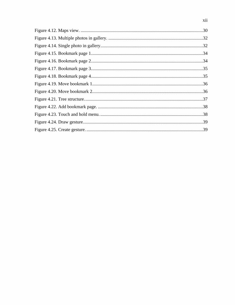
Figure 4.12. Maps view. ..........................................................................................................30
Figure 4.13. Multiple photos in gallery. ..................................................................................32
Figure 4.14. Single photo in gallery.........................................................................................32
Figure 4.15. Bookmark page 1. ................................................................................................34
Figure 4.16. Bookmark page 2. ................................................................................................34
Figure 4.17. Bookmark page 3. ................................................................................................35
Figure 4.18. Bookmark page 4. ................................................................................................35
Figure 4.19. Move bookmark 1................................................................................................36
Figure 4.20. Move bookmark 2................................................................................................36
Figure 4.21. Tree structure. ......................................................................................................37
Figure 4.22. Add bookmark page. ...........................................................................................38
Figure 4.23. Touch and hold menu. .........................................................................................38
Figure 4.24. Draw gesture. .......................................................................................................39
Figure 4.25. Create gesture. .....................................................................................................39
xiii
ACKNOWLEDGEMENTS
As a graduate student in San Diego State University and full time employee as a
software engineer, I enjoyed the courses of Dr. Whitney and Mr. Riggins. I never felt tired of
doing assignments as those are very interesting and helped in applying that knowledge
immediately in my work. Especially the courses offered by Dr Whitney helped me writing
clean code and cleared the thoughts about quality of code. The courses offered by these
professors helped me in advancing my career.
1
CHAPTER 1
INTRODUCTION
1.1 BACKGROUND
User-Centered-Design is a design paradigm that focuses on the user, not on the
system. If the system behaves as user expects then the system design is considered to be user-
centered. Usability testing is the way to find design faults in the system/product so that
usability can be improved.
Recently mobile applications are coming into the market. People are using mobile
apps for several purposes like for getting map directions, alarms, internet browsing, email
checking etc. We are not aware of the UI problems for these applications as these
applications are relatively new to the market. It is very expensive and risky to release the
application to the market without testing it with real users. So before releasing the application
to the market, we can bring in people (real users) for the usability testing and we can fix the
problems found from usability testing.
1.2 PURPOSE OF THE STUDY
Mobile devices are used by common people who don’t have any technical
knowledge. Most of the smart mobile phones available in the market, now-a-days, come with
thousands of mobile applications. Usability is very important for the application and the real
success of the application highly depends on it. Application developers should make use of
the knowledge in the world to design and to make it easy for the user. The memory overhead
for the user should be minimal while using the application. The purpose & goal of the
thesis/study is to perform usability testing on android based applications, find existing
usability faults and propose solutions to enhance their usability.
2
CHAPTER 2
USABILITY TESTING
Usability Testing is the method of testing a product considering the target users into
account and find out the usability deficiencies existing in the product. Usability study helps
eliminate design problems for the product which should improve the end user experience
with the product.
In Usability Testing users are given tasks to perform using the product and observed
to see if they have any problems performing the tasks. The moderator is the person who
conducts the usability test session. During the test session the moderator will give some tasks
to the users and asked them to perform the tasks on the application we want to test. While
user is performing the task, moderator will observe the user how he is navigating in the
application and the facial expression of the user to find out how he is reacting to the
application. While moderator is conducting the test session other persons (called observers)
can also observe the user. Facial expressions of the user and the phone screen will be video
recorded as moderator or the observers cannot catch all the expression during the test session.
The moderator and/or the observers will go through the videos thoroughly after each test
session and note down the observations. Depending on the observations, moderator/usability
team will suggest design solutions.
Real users should be considered for usability testing, but not the
programmer(s)/tester(s) that developed/tested the system. Programmer/tester already knows
how the system/product works, so they will use their ‘knowledge in the head’ (Knowledge in
the head is the knowledge acquired from the experience/education) during testing, may not
result in finding usability defects. The end user of the system/product doesn’t know the
internal details of the system. He/she uses ‘Knowledge in the world’ (Knowledge in the
world is the knowledge perceived from the environment without learning) while interfacing
with the system/product. The design challenge is to exploit ‘Knowledge in the world’ while
designing the system/product.

3
According to ‘Handbook of Usability Testing’ book the process for conducting a test
has following steps:
1. Develop the Test Plan
2. Setup a testing Environment
3. Find and Select Participants
4. Prepare Test Materials
5. Conduct the Test Sessions
6. Analyze Data and Observations
7. Report findings and Recommendations
Next few sections detail these steps and the process used in the usability testing of Android
based applications.
2.1 DEVELOP THE TEST PLAN
The test plan is like a blueprint which describes exactly how a tester will go about
testing. A test plan contains two parts: Purpose and Research questions.
2.1.1 Purpose of the Test
The goal of the “Purpose of the test” is to makes sure we have well-defined scope for
the test. The purpose of this test is to find how usable the basic features of android
applications are, can a novice user be able to use the basic features of android applications
easily. We are not focusing on the advanced features for this test.
2.1.2 Research Questions
Once we have defined the scope of the test we need specific questions we wish to
answer in the test. Below are the research questions for android applications:
How quickly can users perform common tasks? For example, in Calendar application,
how quickly user can create an event? In Calculator application, how quickly user can enter
the expression and get the result?
Which tasks are problematic? Why? For example, in Dolphin application I felt
creating new folder to save bookmark is very difficult. Is it really difficult for a regular user?
In weather application, selecting particular time and find out the temperature at that time is
tough for me. Will the real user feel the same?

4
How well do users understand symbols and icons? Symbols and icons will be used
everywhere in the applications. Is the user interpreting the symbols and icons correctly? For
example in weather application, when the user clicks on the icon , brings the timely update
of the temperature. Is this icon conveying appropriately to the user?
How easily do users switch between different modes? – Some applications will have
different modes, for example in Calculator application, user have two modes, basic and
advanced mode. Is it easy for the user to switch between two modes?
2.2 SETUP A TEST ENVIRONMENT
We have to provide pleasant environment for the user to focus on performing the task
without any distractions. We conducted test sessions in one of the conference rooms in
SDSU. Android phone is kept on the table. There are two chairs in the room, one for the test
user which is in front of the phone and other chair is for moderator which is placed behind
the test user and 45 degrees toward from the user. Two video cameras are used, one camera
is placed behind the test user to capture the android phone screen and one camera is placed in
front of the user to capture the facial expressions of the user. Camera which is capturing the
facial expressions doesn’t require monitoring as it is capturing the test user’s face all the
time. Camera capturing android phone screen requires monitoring as the test user will move
the phone while performing tasks, so one observer is monitoring this camera. The test setup
is as shown in Figure 2.1.
2.3 FIND AND SELECT PARTICIPANTS
Jacob Nielsen's theory of usability testing says that we do not need more than 5 test
users to find out the usability faults [1]. Most of the usability problems can be find out from 5
participants. We sent a mail to all the students in CS 635 and requested them to participate
voluntarily in the study if they are interested. I also asked my colleagues and SDSU students
that I have studied with if they can participate in the study. Some people came forward to
participate in the study. We selected 5 people among them who have little or no experience
with Android phones.

5
Figure 2.1. Test environment.
2.4 PREPARE TEST MATERIAL
The following test material was used for the usability testing:
Orientation script
Nondisclosure agreement and recording form
General questionnaire
Task scenarios
2.4.1 Orientation Script
IRB requires orientation script to be read to the participants at the time of test session,
which describes what will happen during the test session. It also helps to set the tone for that

6
session in the minds of the participants, and is intended to put the participant at ease. The
Orientation script read to the participant is as below:
Thank you for participating in our study. We are conducting a study in usability testing of android applications. In the study you will be given a list of tasks to be performed on android applications. Your face and the phone screen, on which you will be performing the tasks, will be video recorded. Recording your facial expressions is important to find out how you are reacting to user interface of the applications, recording phone screen is important to find out how you are navigating through the application. Details about you will not be disclosed and will be kept confidential. All information reported from this study will not include information that can identify you. Video recordings will be destroyed after the completion of the study. Participating in this study will take about 2 hours. You will spend around one and half hour to complete the tasks given below and answering the investigator’s questions about the task you’ve accomplished. You will be provided with the android phone during the study. Participation in the study is voluntary and no compensation will be provided for the participation.
2.4.2 Nondisclosure Agreement and Recording Form
If you are doing any survey and/or video recording for the study you need to take
permission from IRB (Institutional Review Board). It’s the responsibility of the moderator to
let the test user go through the nondisclosure agreement and recording form, and let the
participant know about his/her rights. So, we took permission from IRB SDSU, and made
sure to let the test user go through the consent form before the study.
2.4.3 General Questionnaire
General questionnaire was prepared to find the participant’s educational background
and experience with the smart phone.
Below is the list of questionnaire to be filled out by the participant:
1. Education background
Computer Science
Engineering
Others
2. What are you studying right now?
Freshman
Sophomore
Junior

7
Senior
Graduate First year
Graduate Second year
3. Age
Below 25
25 - 34
35 - 44
45 - 54
55 above
4. Gender
Male
Female
5. What type of phone do you own?
Android
iPhone
Black berry
Other Smart phone
Not a smart phone
6. If you have smart phone, how long you are using phone?
2 - 3 months
6 months
1 year
2+ years
7. If you have smart phone, how many applications you have downloaded?
8. How do you use phone
More time talking on phone
More time for Email and browsing
9. How many years have you been using computer
10. for browsing, how much time you spend on computer per week
Less than 5 hours
10 - 15 hours
8
15 - 20 hours
20 - 30 hours
More than 30 hours
2.4.4 Task Scenarios
I have gone through all the native applications that come with phone and some third
party applications which are interesting, and selected few applications for the study. For each
application, I have prepared a list of tasks depending on the type of usability problems I
encountered while was going through the application. These task scenarios are discussed in
the next chapter one by one.
2.5 CONDUCTING THE TEST SESSION
Before the actual test sessions began, we did a test run to make sure everything goes
fine. During the test run, we checked the focus and positioning of the cameras and seating
arrangement of the test user and the moderator. Once the test run was successful, we
contacted SDSU students for real test users. For each participant, we scheduled a test session.
We have to remind the participant one day before the test session. During the test session,
participant is given a task to perform one by one. Moderator will ask the participant questions
after the completion of the task as needed. After the test session the moderator should thank
the participant for his/her participation.
2.6 ANALYZE DATA AND OBSERVATIONS
After each test session, the captured videos are reviewed to observe the behavior of
the participant. You need to synchronize the videos to get closure look at the problems. We
have to review the note written during the interview session. If the user cannot complete any
task means there is a design problem.
2.7 REPORT FINDINGS AND RECOMMENDATIONS
After analyzing data collected during interview session and the observations from the
video, design solution has to be proposed by exploiting the user-centered-design principles.
Important User-Centered-Design principles are explained below, as mentioned in the book
'The Design of Everyday Things'.

9
2.8 USER-CENTERED-DESIGN (UCD) PRINCIPLES
The important UCD principles are Affordance, Visibility, Mapping and Feedback.
2.8.1 Affordance
Affordance refers to the perceived and actual properties of a thing.
Primarily the fundamental properties of a thing which determine how the thing could
be used [2]. Good example for affordance would be when Facebook application is opened (as
shown in Figure 2.2), login and Sign up icons looks like buttons, so the user can easily figure
out those icons are clickable/tapped. Bad example would be, in weather application (as
shown in Figure 2.3), to find more information about the weather; user has to tap on the
weather channel icon which is below the icon . Because it lacks affordance, user may not
think it can be clickable.
Figure 2.2. Facebook login page.
2.8.2 Visibility
Visibility refers to the visibility of the features. Make all the features in the
application visible so users can find out what they can do by a glance.

10
Figure 2.3. Weather application front page.
The calendar application, in months view, user can go to next month by sliding
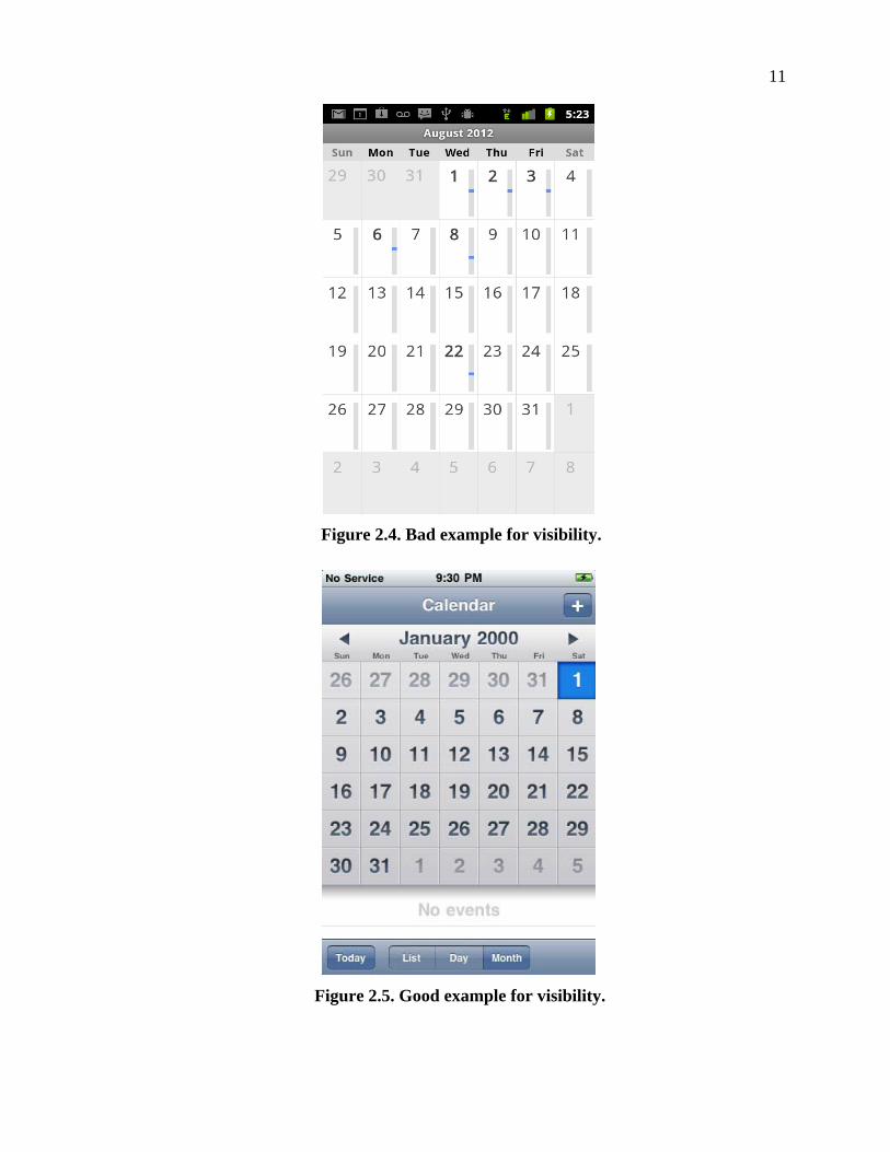
vertically. As shown in the Figure 2.4, there is no visual clue for the user to know this
feature. One solution for this problem would be to add up and down arrows on the top of the
application.
As shown in the Figure 2.5, the calendar application in iPhone has little left and right
arrows on top of the application to indicate the user to move to next and previous month.
2.8.3 Mapping
Mapping is the relationship between the movement of a control in a device and its
results in the world. As shown in Figure 2.6, in YouTube application icon is perfect
for recording a video.
2.8.4 Feedback
The user should always get a response for each and every action he/she performs on a
device which is known as feedback. As shown in Figure 2.7, In Calendar application, when
user finished creating an event, feedback will be given to the user that event has created.
11
Figure 2.4. Bad example for visibility.
Figure 2.5. Good example for visibility.

12
Figure 2.6. Mapping example.
Figure 2.7. Feedback example in calendar.
13
CHAPTER 3
ANDROID PHONE
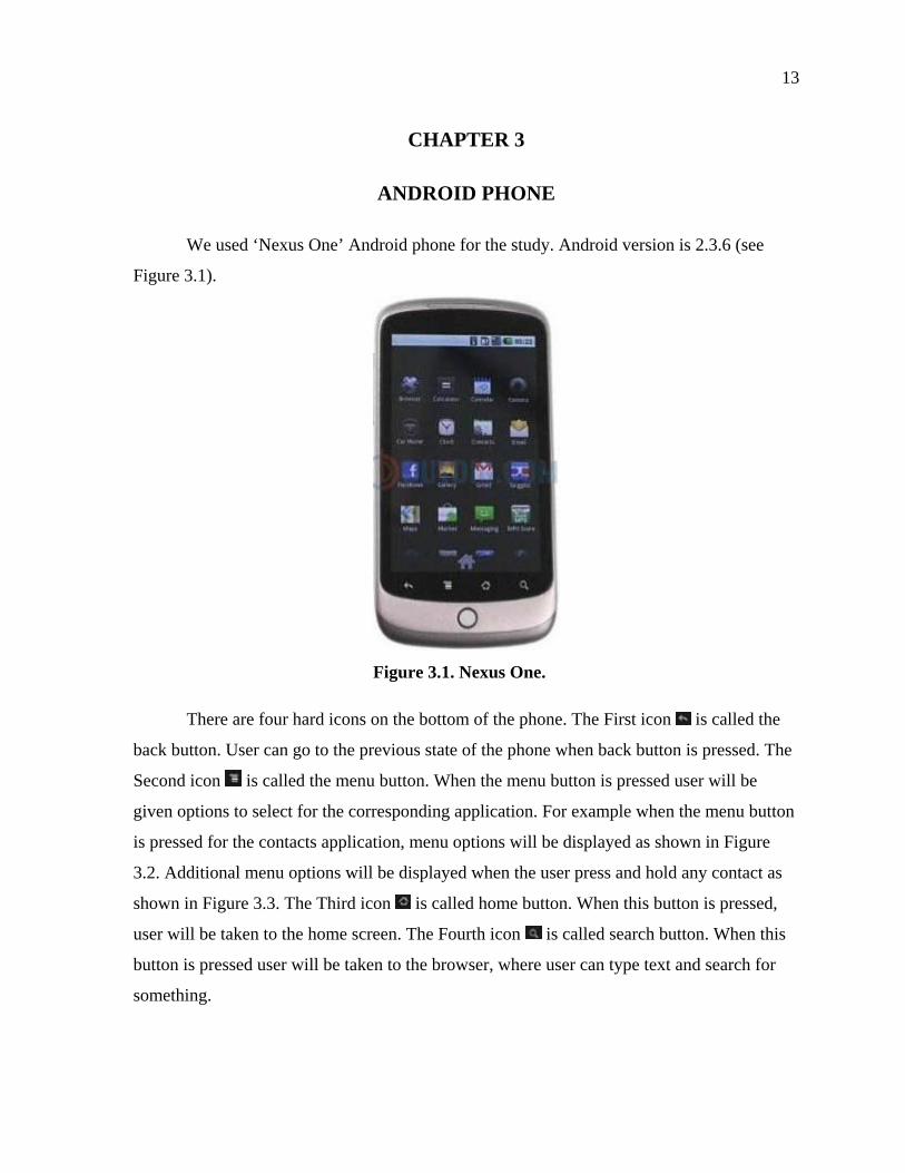
We used ‘Nexus One’ Android phone for the study. Android version is 2.3.6 (see
Figure 3.1).
Figure 3.1. Nexus One.
There are four hard icons on the bottom of the phone. The First icon is called the
back button. User can go to the previous state of the phone when back button is pressed. The
Second icon is called the menu button. When the menu button is pressed user will be
given options to select for the corresponding application. For example when the menu button
is pressed for the contacts application, menu options will be displayed as shown in Figure
3.2. Additional menu options will be displayed when the user press and hold any contact as
shown in Figure 3.3. The Third icon is called home button. When this button is pressed,
user will be taken to the home screen. The Fourth icon is called search button. When this
button is pressed user will be taken to the browser, where user can type text and search for
something.

14
Figure 3.2. Menu options.
Figure 3.3. Popup menu.
The above described icons are not aligned properly with the sensors. So it is hard for
new user to press the button. I faced difficulty initially to press the button (especially menu
button) to get the result. During usability session, test users also faced difficulty pressing the
menu button.
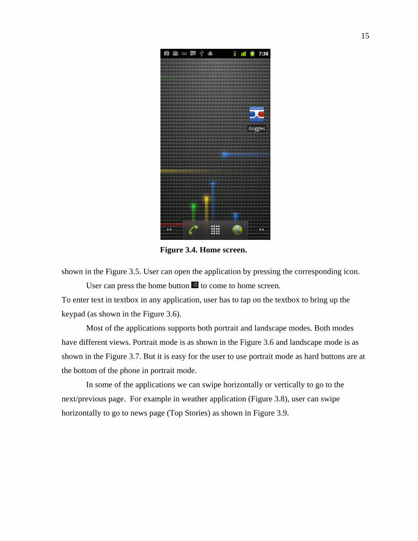
There are three soft buttons at the bottom of the screen as shown in the Figure 3.4.
When the middle button is pressed, all the applications will be presented on the screen as
15
Figure 3.4. Home screen.
shown in the Figure 3.5. User can open the application by pressing the corresponding icon.
User can press the home button to come to home screen.
To enter text in textbox in any application, user has to tap on the textbox to bring up the
keypad (as shown in the Figure 3.6).
Most of the applications supports both portrait and landscape modes. Both modes
have different views. Portrait mode is as shown in the Figure 3.6 and landscape mode is as
shown in the Figure 3.7. But it is easy for the user to use portrait mode as hard buttons are at
the bottom of the phone in portrait mode.
In some of the applications we can swipe horizontally or vertically to go to the
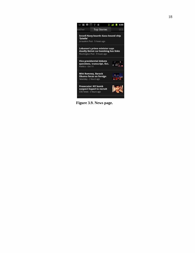
next/previous page. For example in weather application (Figure 3.8), user can swipe
horizontally to go to news page (Top Stories) as shown in Figure 3.9.

16
Figure 3.5. All applications screen.
Figure 3.6. Keypad to enter text.

17
Figure 3.7. Landscape mode.
Figure 3.8. Weather application.
18
Figure 3.9. News page.

19
CHAPTER 4
USABILITY TESTING OF ANDROID PHONE
For usability testing of Android phone, we have considered 6 applications, 5 native
applications (which come with the phone) and 1 third party application. We have gone
through all the native applications and some of the third party applications, written down the
usability problems faced by myself. Selection of the application depends on the number of
usability problems found. Following applications are selected for the study as these
applications have more usability problems.
1. Calculator application
2. Weather application
3. Calendar application
4. Maps application
5. Gallery application
6. Dolphin browser application
There are three parts for each application. In first part we will discuss about the
usability problems found by myself. In the second part we will discuss about the usability
questions, motivation behind the question and then we will discuss about how the users have
performed the task. In the last section we will discuss about the usability problems faced by
the users. Each application is described in detail in the following chapter.
4.1 CALCULATOR APPLICATION
This application can be used to perform mathematical operations. There are two
panels – basic panel and advanced panel. Basic operations can be performed using Basic
panel. Trigonometric and logarithm operations can be performed using advanced panel. User
can swipe horizontally to go to advanced panel, but there is no indication for the user.
‘Advanced panel’ can also be selected through Menu.
4.1.1 Usability Testing by Myself
1. If the user enters an expression which contains mathematical function (for example: tan (, ‘(‘will be appended to the function when any function is selected) as shown in
20
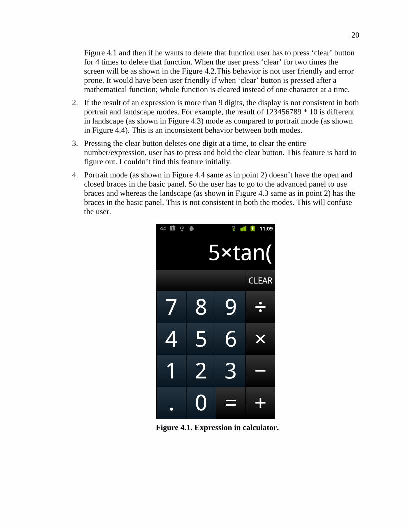
Figure 4.1 and then if he wants to delete that function user has to press ‘clear’ button for 4 times to delete that function. When the user press ‘clear’ for two times the screen will be as shown in the Figure 4.2.This behavior is not user friendly and error prone. It would have been user friendly if when ‘clear’ button is pressed after a mathematical function; whole function is cleared instead of one character at a time.
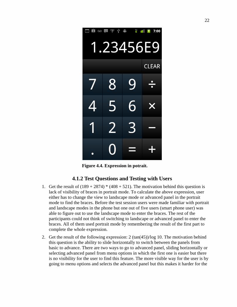
2. If the result of an expression is more than 9 digits, the display is not consistent in both portrait and landscape modes. For example, the result of 123456789 * 10 is different in landscape (as shown in Figure 4.3) mode as compared to portrait mode (as shown in Figure 4.4). This is an inconsistent behavior between both modes.
3. Pressing the clear button deletes one digit at a time, to clear the entire number/expression, user has to press and hold the clear button. This feature is hard to figure out. I couldn’t find this feature initially.
4. Portrait mode (as shown in Figure 4.4 same as in point 2) doesn’t have the open and closed braces in the basic panel. So the user has to go to the advanced panel to use braces and whereas the landscape (as shown in Figure 4.3 same as in point 2) has the braces in the basic panel. This is not consistent in both the modes. This will confuse the user.
Figure 4.1. Expression in calculator.

21
Figure 4.2. Clearing expression.
Figure 4.3. Expression in landscape.
22
Figure 4.4. Expression in potrait.
4.1.2 Test Questions and Testing with Users
1. Get the result of (189 + 2874) * (408 + 521). The motivation behind this question is lack of visibility of braces in portrait mode. To calculate the above expression, user either has to change the view to landscape mode or advanced panel in the portrait mode to find the braces. Before the test session users were made familiar with portrait and landscape modes in the phone but one out of five users (smart phone user) was able to figure out to use the landscape mode to enter the braces. The rest of the participants could not think of switching to landscape or advanced panel to enter the braces. All of them used portrait mode by remembering the result of the first part to complete the whole expression.
2. Get the result of the following expression: 2 (tan(45))/log 10. The motivation behind this question is the ability to slide horizontally to switch between the panels from basic to advance. There are two ways to go to advanced panel, sliding horizontally or selecting advanced panel from menu options in which the first one is easier but there is no visibility for the user to find this feature. The more visible way for the user is by going to menu options and selects the advanced panel but this makes it harder for the

23
user as it requires switching to advanced panel several times. Only one participant among all could learn about the sliding feature to accomplish the task.
3. When ‘clear’ button clicked what do you expect? The motivation behind this question is to find the expectation of the user when the clear button is used. One among five users was able to discover the actual functionality of the clear button and three users expected to clear the whole text when the clear button pressed and one user thought that clear button deletes one digit at a time but could not figure out how to delete entire text.
4.1.3 Usability Problems
1. There is no visual indication for the user to go to advance panel. It is very hard for the user to switch back and forth from basic panel to advance panel through menu. One solution would be when the calculation application is opened, one popup note says ‘swipe horizontally to go to advance panel’ at the bottom of the screen would be helpful for the user.
2. When clear button is pressed, one digit at a time will be deleted from the textbox. Pressing and holding the clear button deletes everything from the textbox. This is hard to find out. Solution to this problem would be there should be two buttons, one back button which clears one character at a time; second one is clear button which clears everything in the textbox.
3. Some advanced features are missing. For example common mathematical functions like square root, exponential are missing.
4. Open and close braces exist in portrait mode but not in landscape mode, no consistency among two modes portrait and landscape.
4.2 CALENDAR APPLICATION
Using this application we can manage events and set alerts and notifications.
4.2.1 Usability Testing by Myself
1. In Months view, the user can go to next month or previous month by swiping vertically but there is no visual clue for the user (as shown in the Figure 4.5).
2. In Months view to go to next or previous month user has to swipe vertically where as to go to next or previous week/day user has to swipe horizontally. This behavior is inconsistent with in the same application.
3. To create new event, touch and hold on any cell in months view will bring up a menu (as shown in the Figure 4.6) where you can select ‘new event’ option. There is a shortcut to create new event but hard to find that out as the cell lacks affordance. I took so much time for me to find that out.

24
Figure 4.5. Calendar (months view).
Figure 4.6. Calendar (touch hold menu).

25
4.2.2 Usability Questions and Testing with Users
1. Create an event (name: Test1) at 1pm on 1st of current month. The motivation behind this question is whether user could find the basic feature easily. All the participants accomplished this task successfully.
2. Create an event (name: Test2) at 1pm on last day of next month. To go to next month user has to swipe vertically but there is no visual indication for the user to do so. The motivation behind this question is to find how the user will react to this. All participants achieved this task with trial and error. Most of the participants tried horizontally first and then vertically.
3. On week’s view, create an event (name: Test3) on next Monday. User has to swipe vertically to go to next/previous month, while he/she has to swipe horizontally to go to next/previous week. Motivation behind this question is to find how the user will figure this out. Three out of five participants tried vertically first and then horizontally. But two participants tried horizontally first and accomplished the task successfully.
4. Can you find another way of creating new event? The motivation behind this question is to find out user could find the easy way to create new event without going to Menu. Two participants couldn’t find the option touch and hold the cell will bring up menu which has the option to create new event. One participant who has little experience could figure this out with trial and error. Two participants who has experience with iPhone had figured out this feature straightforwardly.
4.2.3 Usability Problems
1. No visual indication for the user to go to next or previous month/week/day.
2. There is no consistency in the same application to navigation in months/weeks/days view.
3. Date cells lack affordance to be clicked on to open short cut menu.
4.3 WEATHER APPLICATION
Using this application we can find the temperature update of the city. We can set any
city.
4.3.1 Usability Testing by Myself
1. When the weather application is opened, it displays the expected temperature for the following week will be displayed (as shown in the Figure 4.7). Timely update for current day will be displayed as shown in the Figure 4.8.There are two ways to get the timely temperature update of the city, tapping the icon ‘I’, and tapping in the middle portion of the screen. Tapping on the icon ‘I’ is hard for the user as it is very small. The easiest way is to tap on the middle portion of the screen but there is no indication for the user to do so. I found it accidentally when I was playing with the application.

26
Figure 4.7. Weather application.
Figure 4.8. Timely update.

27
2. When user taps on the weather channel icon (which is below the icon), it takes user to the weather channel website as shown in the Figure 4.9. Where you can select the city get complete information about the city weather. But this icon lacks affordance to be clicked.
3. This application supports both portrait and landscape modes. But it is very hard for the user to find the temperature in landscape mode at a particular time (as shown in Figure 4.10) as we have to slide up to see the temperature and it is nearly impossible for the user to slide up without changing the selected time.
Figure 4.9. Weather channel.
Figure 4.10. Weather display in landscape mode.

28
4.3.2 Usability Questions and Testing with Users
1. Change the location to city ‘Newark’. The motivation behind this question is to find user could find the basic feature of the application. Four out of five users finished this task very easily. One participant took extra time but achieved it.
2. Find out temperature of ‘Newark’ at 1pm in both portrait and landscape mode. To find the timely temperature update of the city you need to tap on the icon or in the middle portion of the screen. The motivation behind this question is to find out could the user find out this feature. The second thing is to find weather the icon lacks affordance to be tapped. Third thing is to find size of the icon is the issue. This feature is not obvious for the participant. Most of the participants achieved this task by trial and error. Only one participant thought the timely information can be found if icon is clicked. None of the participants could find out the temperature at particular time in landscape mode.
3. Find 10 day forecast of Newark. To find the 10 day forecast of the city we need to tap on the weather channel icon. The motivation behind this question is find out whether this icon lacks affordance. Only one participant out of five found out this feature with trial and error. Other participants couldn’t comprehend this feature.
4. What do you think of the icon ‘weather channel’? The motivation behind this question is to find what the user thinks about this icon. Four out of five participants didn’t think it can be clickable.
5. What do you think of the icon ? The motivation behind this question is to find what the user thinks about this icon. Four out of five participants though icon is for information.
4.3.3 Usability Problems
1. Weather channel icon lacks affordance
2. Middle portion of the icon which can be clicked to get the timely information lacks affordance
3. Some users find it difficult to tap on the as the size of the icon is small
4. In landscape mode, finding the temperature at a particular time is nearly impossible
4.4 MAPS APPLICATION
Maps Application is used to get the directions between two locations by various
means like car, walk, bus and bicycle routes. We can also find the information about traffic
conditions and can get street views.
There are two views in the application, Directions view and Maps view. In Directions
view user can enter source and destination address and then hit ‘Go’ button to the directions
29
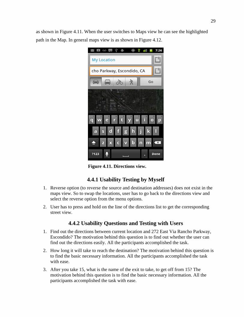
as shown in Figure 4.11. When the user switches to Maps view he can see the highlighted
path in the Map. In general maps view is as shown in Figure 4.12.
Figure 4.11. Directions view.
4.4.1 Usability Testing by Myself
1. Reverse option (to reverse the source and destination addresses) does not exist in the maps view. So to swap the locations, user has to go back to the directions view and select the reverse option from the menu options.
2. User has to press and hold on the line of the directions list to get the corresponding street view.
4.4.2 Usability Questions and Testing with Users
1. Find out the directions between current location and 272 East Via Rancho Parkway, Escondido? The motivation behind this question is to find out whether the user can find out the directions easily. All the participants accomplished the task.
2. How long it will take to reach the destination? The motivation behind this question is to find the basic necessary information. All the participants accomplished the task with ease.
3. After you take 15, what is the name of the exit to take, to get off from 15? The motivation behind this question is to find the basic necessary information. All the participants accomplished the task with ease.

30
Figure 4.12. Maps view.
4. Find out how the traffic is, on the above selected road? The motivation behind this question is to find the basic necessary information. Only one participant could accomplish the task easily. Other participants are successful with trial and error. To view the traffic user has to tap on one of the icons on top of the screen. So the motivation behind this question is if the user would be able to figure out to tap on the icon.
5. Find out the directions between 272 East via Rancho Parkway, Escondido and current location. To reverse the directions user has to go to the directions view and select the reverse menu options but it is not available in maps view. The motivation behind this question is to test if the user could figure out this option. This feature is not obvious for all the participants but all accomplished successfully after trial and error. Most of the participants were looking for some icon near the text boxes where directions will be entered.
6. Show the street view of 272 East via Rancho Parkway. To get the street view, user has to press and hold on the corresponding details of the directions. The motivation behind this question is to find out the whether the user would be able to figure out this feature. Two participants accomplished the task with trial and error. Three participants couldn’t find this feature.

31
4.4.3 Usability Problems
1. Placing the features at appropriate places where it makes sense logically. For example, placing the feature to reverse directions near the text boxes where directions will be entered would have been easier for the user.
2. Visibility problems. Giving the user options where it is visible. To see the street view user has to press and hold in the directions. This feature is hard to find out.
3. Better icons could have been used to convey the feature.
4.5 GALLERY APPLICATION
Using this application we can capture photos, videos and share it with social network
like Facebook, twitter etc. Photos can be edited, deleted or set it as wall paper. You can view
all the photos with slideshow.
4.5.1 Usability Testing by Myself
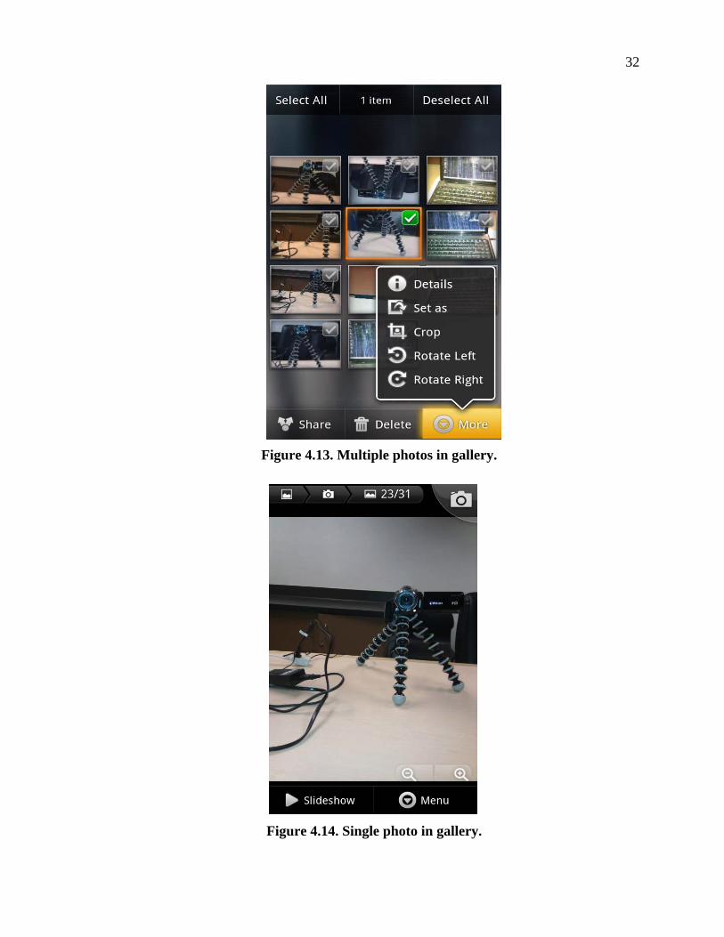
1. The menu options (delete, rotate, crop) shown when all the photos have displayed (as shown in Figure 4.13) are more appropriate when individual photo is selected.
2. Slide show will be displayed (as shown in Figure 4.14) when a photo is selected. This option is more appropriate when all the photos have displayed. Delete a photo when only one photo exists, not deleting.
4.5.2 Test Questions and Testing with Users
The motivation behind all the questions is to find weather user could perform basic
task with ease.
1. Take a photo in maximum zoom
2. Take a photo with flash ON
3. Rotate any picture by 90 degrees
4. Put Slideshow
5. Delete any picture
All the test users doesn’t have problem performing the tasks related to Gallery application as
per the simplicity of the application.
Three out of five users were given fourth question (Put Slideshow) as first question.
All three users were expecting Slideshow option when all the photos have displayed. Two
users out of those three have taken extra time to complete this feature.
32
Figure 4.13. Multiple photos in gallery.
Figure 4.14. Single photo in gallery.

33
4.5.3 Usability Problems
Menu options should be appropriate with the screen. That would make the user life
easier.
4.6 DOLPHIN BROWSER APPLICATION
Dolphin listens and lets you use your voice to search on the Internet, share on your
favorite social networks, bookmark your favorite website, navigate and more.
We can create a personal Gesture (symbol) to access the mobile and desktop websites
you use the most.
4.6.1 Usability Testing by Myself
Usually in normal browser user will be given an option to create a new folder while
adding a bookmark. In this application to create a new folder we have to tap on the ‘Quick
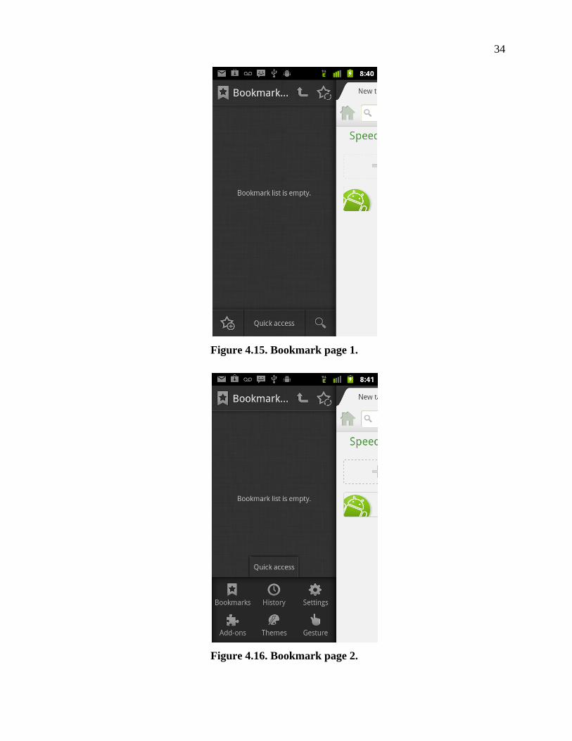
Access’ menu item in the bookmarks page (as shown in Figure 4.15 and Figure 4.16), select
Bookmarks option(from Figure 4.17) and then we have to select the ‘New folder’ menu
option(from Figure 4.18). This is very hard to figure out.
To move bookmark from one folder to other folder, for example ‘Yahoo’ bookmark
from test folder (Figure 4.19) to news folder, user has to hold icon with finger from
Figure 4.19 and drag to the top of the screen and drop on the name of the ‘test’ folder. This
will bring up to the Figure 4.20. Then user has to hold icon with finger and drop it on
the desired folder in the Figure 4.20. First of all, icon lacks affordance. Secondly this is
hard to figure out.
To open up any folder of bookmarks user has to tap on the icon in the Figure 4.20.
When we tap on the icon , the bookmarks in the corresponding folder is displayed in a
different page as shown in the Figure 4.19. When we open the bookmark folder, if the
bookmarks in that folder is displayed in the same page as a tree structure as shown in Figure
4.21, it would have been easier for the user to move the bookmarks from one folder to
another.
34
Figure 4.15. Bookmark page 1.
Figure 4.16. Bookmark page 2.

35
Figure 4.17. Bookmark page 3.
Figure 4.18. Bookmark page 4.

36
Figure 4.19. Move bookmark 1.
Figure 4.20. Move bookmark 2.

37
Figure 4.21. Tree structure.
4.6.2 Usability Questions and Testing with Users
1. Open yahoo.com. The motivation behind this question is to find user could use the basic features with ease. All the participants achieved the task successfully.
2. Add the above opened page as bookmark in folder called ‘News’. There are many steps involved to create new folder to add bookmark. The motivation behind this question is to find the user could discover this feature. All the participants were unsuccessful, couldn’t accomplish it even after taking extra time. Most of the participants were looking for an option to add folder in Add bookmark page (Figure 4.22).
3. Move the above created bookmark to folder ‘Bookmarks bar’. To move bookmark to
the other folder, user has to drag the bookmark by holding the finger on the icon from Figure 4.19 to the out of the folder. Then user has to drag it to the designated folder. This is hard to figure out. The motivation behind this question is to find the user could figure this out. All the participants were unsuccessful.
4. Delete above created bookmark. Press and holding the bookmark will display the option to delete the bookmark (As shown in the Figure 4.23). The motivation behind this question is to find out whether the user could figure out this feature. Two out of five participants could not complete the task.
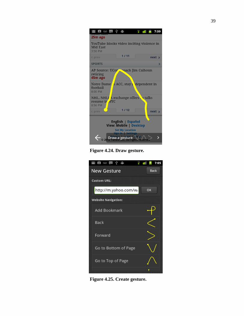
5. Open yahoo.com and use a gesture to move up and then to move down. Gesture is a new and useful feature. The motivation behind this question is to find out user could use this feature with ease. User can draw a gesture to perform an operation on the webpage. For example, The gesture as shown in the Figure 4.24 can be used to go to the top of the webpage. All the participants accomplished the task with ease.
6. Create a gesture to close all tabs. New gesture screen is as shown in the Figure 4.25. Most of the participants are confused with the Custom URL textbox on the top. Participants were trying to create new gesture by entering ‘close all tabs’ text into the Custom URL textbox. It was confusing for the participants to see the operations which already have gestures and operations which don’t have gestures in the ‘New Gesture’ page. Listing the actions which doesn’t have gestures and with title ‘Create

38
Figure 4.22. Add bookmark page.
Figure 4.23. Touch and hold menu.
39
Figure 4.24. Draw gesture.
Figure 4.25. Create gesture.

40
gestures for the following actions’ could have conveyed clear understanding for the user. Two participants took extra time but couldn’t complete the feature. Three participants could accomplish the task.
7. Open yahoo.com and then open google.com in new tab and use above created gesture to close all the tabs. Four participants accomplished the task with ease. One participant felt it hard to remember the gesture and use it.
4.6.3 Usability Problems
1. Giving the user options where it is visible. Delete bookmark option is not visible for the user. We have to press and hold the bookmark to get the delete bookmark option and the bookmark lacks affordance to be clicked on. This is hard to find out.
2. Create new folder option is not visible for the user. To create new folder user has to follow three steps, then user has to go back to add bookmark page to add the bookmark in the newly created folder. It would have been easier for the user if the option to create new folder is given in the ‘Add bookmark’ page.
3. Listing all the actions which already have gestures and which doesn’t have gestures in the New Gesture page is confusing the users.

41
CHAPTER 5
CONCLUSION
There is a misconception that usability testing is very costly. But it is not true; we can
perform usability testing on few users and get the quality results. Selecting proper users for
the test is also very important as in our study, user with no experience with smart phone
found more usability problems.
According to Jakob Nielsen, as soon as you collect data from a single test user, your insights shoot up and you have already learned almost a third of all there is to know about the usability of the design. When you test the second user, you will discover that this person does some of the same things as the first user, so there is some overlap in what you learn. People are definitely different, so there will also be something new that the second user does that you did not observe with the first user. So the second user adds some amount of new insight, but not nearly as much as the first user did. The third user will do many things that you already observed with the first user or with the second user and even some things that you have already seen twice. Plus, of course, the third user will generate a small amount of new data, even if not as much as the first and the second user did.
As you add more and more users, you learn less and less because you will keep seeing the same things again and again. There is no real need to keep observing the same thing multiple times, and you will be very motivated to go back to the drawing board and redesign the site to eliminate the usability problems.
After the fifth user, you are wasting your time by observing the same findings repeatedly but not learning much new. [1]
In our study, I can see the repetitive behavior among five users. The user with no
experience with smart phone has found more problems than other users with little experience.
Some of the tasks are obvious for the user without putting much effort. User has passed some
of the tasks by putting more effort on achieving the task. User has failed to achieve some of
the tasks.
Below are the issues listed which are violating basic user interface principles like lack
of affordance, visibility issues, mapping issues.
Affordance Issues
In Calendar application, date cells lack affordance to be clicked.
In Weather application, Weather channel icon lacks affordance.
42
In weather application, middle portion of the screen, which can be clicked to get the timely information, lacks affordance.
Visibility Issues
In Calculator application, no visibility to go to advance panel from basic panel.
In Calculator application, no visibility of braces in portrait mode.
In Calendar application, no visual indication for the user to go to next or previous month/week/day.
In Weather application, visibility of the temperature in landscape application
In Maps application, Visibility of the feature street view
In Dolphin browser, delete bookmark option is not visible for the user.
Mapping Issues
In calculator application, ‘clear’ button is not conveying its functionality.
In Dolphin Browser, option to create new folder is in the wrong place, it should have been in the ‘Add Bookmark’ page.
Conceptual Model Issue
In Gallery application, Menu options should be appropriate with the screen. That would make the user life easier.
In Weather application icon is small in size to click. In Calculator application some
advanced features are missing. In Calendar application to go to previous/ next month user has
to swipe vertically. To go to next/previous week or day user has to swipe horizontally. This
behavior is not consistent with in the same application. In Calculator application options in
landscape and portrait are not same.
In the test session, we have encouraged users to think out loud. This approach was
useful to find out some of the usability problems. As we encouraged all the users to think out
loud only two users were able to do it. The results of the test session with all the users are
described below.
Description of the Users
User 1: This user has no experience with smart phones.
User 2: This user has no experience with smart phones and was able to think out loud.
User 3: This user has little experience with Android phone and was able to think out loud.
User 4: This user has experience with iPhone.

43
User 5: This user has experience with iPhone.
In the Tables
P stands for Passed.
F stands for Failed.
O stands for Obvious.
5.1 WEATHER APPLICATION
Below are the tasks given to the users:
1. Change the location to city ‘Newark’
2. Find out temperature of ‘Newark’ at 1pm in both landscape and portrait.
3. Find 10 day forecast of ‘Newark’.
4. What do you think of the icon ‘weather channel’? For this question three users told they didn’t think that icon is clickable. One user didn’t even notice the weather channel icon. One user thought when weather channel icon is pressed, it will give some report not expected to go to the weather channel site
5. What do you think of the icon ? For this question four users responded that they thought is for the information and one user responded that she/he didn’t think of anything.
Results with the test users are as shown in Table 5.1.
Table 5.1. Results with the Test Users for Weather Application
Task User 1 User 2 User 3 User 4 User 5 1) Change location
F O O O O
2) Weather of Newark
Portrait – P Landscape- F
Portrait – P Landscape- F
Portrait– P Landscape- F
Portrait – P Landscape- F
Portrait – P Landscape- F
3) 10 day forecast
F F P F F
5.2 CALCULATOR APPLICATION
Below are the tasks given to the users:
1. Get the result of (189 + 2874) * (408 + 521)
2. Get the result of the expression: 2(tan(45))/log10
3. Calculate the following expression in portrait mode and clear it in portrait mode (1345 * 500)

44
4. Calculate the following expression in portrait mode and clear it in landscape mode (1345 * 500)
5. What do you expect when ‘clear’ button is pressed?
Results with the test users are as shown in Table 5.2.
Table 5.2. Results with the Test Users for Calculator Application
Task User 1 User 2 User 3 User 4 User 5 1) (189 + 2874) * (408 + 521)
F F F P F
2) 2(tan(45))/log10 F F P F F 3) (1345 * 500) in portrait and clear in portrait
O O O O O
4) (1345 * 500) in portrait and clear in landscape
O O O O O
5) Clear button P F F F F
5.3 CALENDAR APPLICATION
Below are the tasks given to the users:
1. Create an event (name: Test1) at 1pm on 1st of current month
2. Create an event (name: Test2) at 1pm on last day of next month
3. On week’s view, Create an event (name: Test3) on next Monday
4. Can you find another way of creating new event?
Results with the test users are as shown in Table 5.3.
Table 5.3. Results with the Test Users for Calendar Application
Task User 1 User 2 User 3 User 4 User 5 1) Create event on 1st O O O O O 2) Create event on last day P P P P P 3) Create event in weeks view
P P O O P
4) Another way of creating event
F P F P P
5.4 MAPS APPLICATION
Below are the tasks given to the users:
1. Find out the directions between current location and 272 East Via Rancho Parkway, Escondido?
2. How long it will take to reach destination?

45
3. After you take 15, what is the name of the exit to take, to get off from 15?
4. Find out how the traffic is, on the above selected route
5. Find out the directions between 272 East Via Rancho Parkway, Escondido and current location
6. Show the street view of 272 E via Rancho pkwy
Results with the test users are as shown in Table 5.4.
Table 5.4. Results with the Test Users for Maps Application
Task User 1 User 2 User 3 User 4 User 5 1) Find directions P P P P P 2) Find distance O O O O O 3) Name of exit O O O O O 4) How is the Traffic P P P P O 5) Reverse directions P P P P P 6) Street view F P F F P
5.5 GALLERY APPLICATION
Below are the tasks given to the users:
1. Take a photo in maximum zoom
2. Take a photo with flash ON
3. Rotate any picture by 90 degrees
4. Put Slideshow
5. Delete any picture
For user 3, user 4, user 5 4th task (Put slide show) is given as first task.
Results with the test users are as shown in Table 5.5.
Table 5.5. Results with the Test Users for Gallery Application
Task User 1 User 2 User 3 User 4 User 5 1) Photo with max zoom O O P P O 2) Photo with flash on O O O O O 3) Rotate picture O O O O O 4) Slide show O O P O P 5) Delete photo O O O O O
5.6 DOLPHIN BROWSER APPLICATION
Below are the tasks given to the users:
1. Open yahoo.com

46
2. Add the above opened page as bookmark in folder called ‘News’
3. Move the above created bookmark to folder ‘Bookmarks bar’
4. Delete above created bookmark
5. Open yahoo.com and use a gesture to move up and then to move down
6. Create a gesture to close all tabs
7. Open yahoo.com and then open google.com in new tab and use above created gesture to close all the tabs
Results with the test users are as shown in Table 5.6.
Table 5.6. Results with the Test Users for Dolphin Browser Application
Task User 1 User 2 User 3 User 4 User 5 1) Open yahoo.com O O O O O 2) Add bookmark to ‘News’ folder
F F F F F
3) Move bookmark P F F F F 4) Delete bookmark F P F O O 5) Use gesture O O O O O 6) Create gesture P F P P O 7)Use created gesture P P O O O
5.7 FUTURE WORK
For this study we have considered 5 participants. All participants are from technical
background. Four participants are in Age group 25 – 34. One participant is of Age group 35-
44. Four participants out of five are Female. All participants except one participant are using
smart phones (2 participants’ iPhone, 1 participant blackberry, 1 participant Android).
We prepared tasks focused on the basic features of the applications. Since mobile
applications will be used by common people, for future studies participants with no technical
background can be considered to find out the real common usability issues .Since android
phones comes with different screen sizes and with different versions of Android considering
these would be interesting. Study can include people from different age group. Advanced
features can be tested in future studies.
Except one, all the applications considered for the study are the default application
(which comes with the phone). In future study we can consider more third party applications
to find out the success of the application depend on the usability.

47
REFERENCES
[1] J. NIELSEN, Why you only need to test with 5 users. Use It, http://www.useit.com/alertbox/20000319.html, accessed October 2012, March 2000.
[2] D. NORMAN, The Design of Everyday Things, Basic Books, New York, New York, 1990.