usability aspects of mp3 players – are vesa purho’s ... · a systematic evaluation for...
TRANSCRIPT

Usability Aspects of MP3 Player Documentation
Documentation Usability Heuristics Revised – a Case Study
Juha Hämäläinen University of Tampere
School of Modern Languages and Translation Studies English Philology Pro Gradu Thesis
April 2008

Tampereen yliopisto Englantilainen filologia Kieli- ja käännöstieteiden laitos HÄMÄLÄINEN, JUHA: Usability Aspects of MP3 Player Documentation. Documentation Usability Heuristics Revised – a Case Study. Pro gradu -tutkielma, 91 sivua Kevät 2008 Tutkielman päätavoitteena on arvioida käyttäjädokumentaation käytettävyyttä Vesa Purhon (2000) sitä tarkoitusta varten laatimaa heuristiikkalistaa käyttäen. Toissijainen tavoite on arvioida tutkimuksessa käytetyn metodin ja heuristiikkojen toimivuutta käyttäjädokumentaation käytettävyyden arvioinnissa. Teoriaosassa pohditaan ensin informaatiosuunnittelun merkitystä käyttäjädokumentaation laatimisessa. Siihen liittyen tarkastellaan sitä, millainen käytetyn kielen osuus on informaatiosuunnittelussa ja miten kielelliset osatekijät vaikuttavat dokumentaation laatuun sekä millaisia tunnusmerkkejä hyvässä dokumentaatiossa on. Kohderyhmien kartoittamisen ja arvioinnin tärkeys sekä niiden suhde informaatiosuunnitteluun on olennainen osa käytettävyyden perustaa, ja niiden lisäksi pohditaan myös teknisen dokumentaation lukemiseen liittyviä motiiveja ja lukemistapoja. Tutkimuksessa tarkastellaan myös sitä, miten käytettävyys määritellään ja mistä osatekijöistä se muodostuu. Nämä osatekijät huomioon ottaen tarkastellaan arvioinnin pohjana olevia Purhon käyttäjädokumentaation käytettävyysheuristiikkoja ja niiden suhdetta ja eroja Jakob Nielsenin käyttöliittymien käytettävyysheuristiikkoihin. Tutkimusaineistona käytettiin iPod-merkkisen MP3-soittimen englanninkielistä käyttöohjetta. Ohjeista jätettiin huomiotta iPodin ja tietokoneen välinen käyttöliittymä sekä osa-alueet, jotka eivät liity MP3-tiedostojen toistamiseen tai laitteen yleisiin toimintoihin. Käyttöohje arvioitiin heuristisesti käymällä aineisto järjestelmällisesti läpi jokaista heuristiikkaa vasten arvioiden samalla, mikä löydettyjen käytettävyysongelmien vakavuusaste on. MP3-soittimen käyttäjädokumentaatio osoittautui laadultaan epätasaiseksi, ja sieltä löytyi yllättäviä ongelmia varsinkin informaation hakuun liittyen. Heuristisen arvioinnin tulokset osoittivat Purhon heuristiikkojen toimivan käytettävyysongelmien kartoittamisessa sellaisenaan myös tämäntyyppisen materiaalin arvioinnissa, mutta näin suppean kohdedokumentaation ollessa kyseessä niitä voisi myös joiltakin osin kehittää pienten dokumentaatiokokonaisuuksien arvioimista varten. Avainsanat: käytettävyys, heuristiikat, käytettävyysanalyysi, tekninen viestintä, käyttäjädokumentaatio

Table of Contents
1 Introduction ............................................................................................................ 1
1.1 Material and Method......................................................................................... 3
1.2 Organisation of This Study ............................................................................... 5
2 User Documentation for the Needs of Target Groups ........................................... 7
2.1 Design and Features of Technical Documentation ........................................... 8
2.2 Target Groups and the MP3 Player................................................................. 16
2.3 Reading Process and Motives ......................................................................... 22
3 Usability and Usability Heuristics ....................................................................... 27
3.1 Basics of Usability .......................................................................................... 28
3.2 Purho’s Documentation Usability Heuristics ................................................. 33
4 Usability Analysis of the User Documentation.................................................... 49
4.1 Motive and Method for the Analysis .............................................................. 49
4.2 Results of the Heuristic Analysis.................................................................... 51
5 Conclusions .......................................................................................................... 77
References....................................................................................................................... 87

List of Figures
Figure 1: Technical writing focus (Stratton, 1996)........................................................... 7 Figure 2: A warning in iPod and the notification text (Apple Inc., 2006a) .................... 13 Figure 3: Demographics of personal digital music player owners (adapted from the Entertainment Media Research & Olswang 2007 Digital Music Survey results) .......... 18 Figure 4: Usability framework (ISO 9241-11, 1998) ..................................................... 29 Figure 5: Using iPod menus............................................................................................ 55 Figure 6: Playing music with iPod.................................................................................. 56 Figure 7: iPod Dock connector ....................................................................................... 59 Figure 8: iPod controls.................................................................................................... 66 Figure 9: Lack of caption in iPod instructions................................................................ 69
List of Examples
Example 1: Deficient user documentation (Technical Standards, 2007)........................ 15 Example 2: iPod task sequence supporting users’ workflow ......................................... 54 Example 3: iPod troubleshooting instructions ................................................................ 59 Example 4: iPod task with preconditions and outcomes ................................................ 61 Example 5: Layout of headings, procedures, and steps.................................................. 62 Example 6: A warning and a note in iPod user manual.................................................. 64 Example 7: Information content of the Important message............................................ 64 Example 8: Instructions without a list or steps ............................................................... 68 Example 9: iPod procedure and preconditions ............................................................... 70 Example 10: Consistency of procedural information ..................................................... 72 Example 11: Layout of topics in chapter 7 ..................................................................... 73 Example 12: Notice in iPod user documentation............................................................ 74 Example 13: The summary at the beginning of chapter 2 .............................................. 76
1
1 Introduction
Now that music is bought and distributed in digital format in increasing
numbers on the Internet, the MP3 format is gradually taking over the market from the
traditional music formats, such as CDs and vinyl releases. The 2007 Digital Music
Survey conducted by Entertainment Media Research & Olswang (2007) revealed that
MP3 players or mobile phones are increasingly more popular music listening media. It
has been estimated that at some point, although not in the distant future, the traditional
music formats will be completely replaced by digital media.
The most popular and dominant digital audio file format at the moment is MP3,
and it is almost universally supported (Tech-tips, 2007). A good general description of
the MP3 audio encoding format is available in Futuremark Corporation’s (2007)
hardware dictionary:
An abbreviation of MPEG Audio-Layer 3. This is a compression algorithm developed by the Fraunhofer Institute in Germany and later standardised by the MPEG (Motion Picture Experts Group) that permits audio files to be highly compressed and yet retain excellent levels of quality. The algorithm takes advantage of the fact that human hearing is not “perfect” and that certain frequencies or groups of sounds are far less audible than others; therefore if they are removed from the original source, the modified sample will sound virtually the same. Other compression tricks are used in the algorithm too.
In short, MP3 is a compression standard which preserves quality sound in files of
reduced size which can be downloaded quickly on the Internet. There are also other
reasons why it has become extremely popular so rapidly, as the following passage from
the dissertation by Williams (2002) reveals:

2
MP3 is an open standard, meaning no one organization controls it. On the Internet, open standards win and this is why even without any significant corporate backing, MP3 is already the de facto standard. There are more MP3 listeners, software programs, and hardware devices than any other CD quality audio format in the world.
Because the number of MP3 player users increases all the time and the MP3
players have a very mixed audience, it is in current interest to investigate the usability
of MP3 player user manuals. The documentation affects the way people use the devices
and the overall listening experience and user satisfaction. Despite the widespread
popularity of MP3 players, the usability of their user documentation has not been
studied much.
For several years, usability has been one of the most important aspects of my
work. I have become acquainted with it through my work at Citec Information in the
field of technical communication, writing and editing all kinds of user documentation
from descriptions and referential texts to procedures and troubleshooting instructions.
Usability is an important and current topic. There are so many people who have at some
point been exposed to poorly written, faulty, or even incomprehensible instructions in a
user manual. A study conducted at the University of Tampere regarding the technical
communication research needs in companies (Kaleva, 2000) confirms that companies
are interested in improving their documentation. Usability, readability,
understandability, layout, and how to conduct cheap and successful usability testing
were established as being among the prime interest areas to the companies that
answered the survey. Although Kaleva’s study can be regarded as rather old, because
the field of technical communication develops so radiply, the area of the study is so vast
that there is much more work yet to be done.
3
1.1 Material and Method
The main purpose of this study is to examine MP3 player documentation
usability through heuristic analysis. The secondary purpose is to interpret the analysis
results to examine whether the currently used documentation usability heuristics are
relevant and accurate or whether they need updating.
I am going to examine the usability aspects of one particular 80GB iPod MP3
player user manual, the English version of the Fifth generation iPod late 2006 features
guide (Apple Inc., 2006a), also more informally referred to as the fifth generation iPod
user manual. The manual can be freely downloaded from the Apple Inc. web page.
This particular user manual was chosen for the analysis for the following
reasons. First, the iPod MP3 players manufactured by Apple are among the leading
MP3 players in the market at the moment as far as the sales figures go. Apple Inc.
(2007) announced in April 2007 in their press release 100 million iPods sold that
although the first iPod was sold as recently as in November 2001, 100 million iPods
have already been sold since then, and the sales figures have made iPod the best-selling
digital music player series in history.
Second, this particular iPod model has many functionalities, therefore there is a
big possibility of running into problematic procedures and situations in the instructions.
Third, the user manual is freely available on the Internet, and fourth, I have the
opportunity to analyse the instructions and procedures in practice, because I own this
particular MP3 player myself.
In the analysis I will concentrate on the general functions of the player and the
topics related to playing music. General functions and instructions in chapter iPod
Basics (Apple Inc., 2006a) include instructions for using the keys and functions, menus,
and handling the player. Topics related to playing music also include podcasts, audio

4
books, and radio, which are analysed because podcasts and audio books are often
distributed in MP3 format. The interface between iPod and the computer, that is, the use
of the iTunes software, will be left out of the scope of this research, because it would
include so many new areas and aspects to the scope that a proper in-depth analysis on
usability aspects would be impossible within the limits of this research.
I will investigate in detail, using a certain list of heuristics, the level of usability
in the manual is and whether there is a need for improvements. Heuristic analysis means
a systematic evaluation for usability in order to find the usability problems in the
documentation or in the design of a product, conducted by using a set of predefined
principles, that is, heuristics, defined especially for the purpose of usability analysis
(Nielsen, 2008a). I expect to discover errors and problematic procedures in the user
manual which may lead to the user’s frustration or even misuse of the MP3 player. My
hypothesis is that, although the heuristics I have chosen are, in my view, suitable for
evaluating the usability of documentation, they need some updating, because there are
some aspects in documentation usability for which they do not account.
I am going to discuss the ten usability heuristics of Jakob Nielsen (2008b) and
Vesa Purho (2000) in my research. Nielsen’s heuristics list is widely recognised and
very extensive for evaluating the usability of the user interfaces of software products,
but it cannot be directly used in evaluating the usability of user documentation.
However, based on Nielsen’s ten heuristics, Purho has created his own set of heuristics
for evaluating documentation usability, which I am going use in the analysis.
Although Purho’s heuristics have been previously used in heuristic evaluations,
only a few individual studies are available. Teija Salomaa (2004) and Paula Laakkonen
(2006), for example, have both written a Master’s thesis using Purho’s documentation
usability heuristics as the basis of their analysis. On the other hand, neither of them have

5
analysed the actual heuristics. Therefore, more use cases are needed so that we can
determine whether his heuristics are applicable to individual use cases and whether the
heuristics should be modified to suit the needs of documentation usability evaluation
more comprehensively.
1.2 Organisation of This Study
I will start the theory part of my thesis by discussing the role of information
design in user documentation in Chapter 2. I will also discuss the linguistic aspects of
information design and what kind of other features constitute good user documentation.
I will then discuss the importance of knowing the target groups for the products and
user documentation so that usability can be improved, and how the target groups can be
defined. Then I will address the reasons why people read documentation. Users have
different motives for reading, and the situation and motives affect how users read
documentation.
In Chapter 3, I will discuss the basics of usability and usability heuristics. As
Hargis et al. (2004, 4) write, usability is “an umbrella concept”, meaning that usability
encompasses many different and important aspects, and I will discuss the most
important ones bearing in mind the focus of this study. Purho’s list of ten
documentation usability heuristics and their relationship and differences with Nielsen’s
ten user interface usability heuristics will be considered before the actual analysis
chapter. I will discuss their relationship with the different kind of aspects of usability
discussed in the previous chapters, such as target groups and reading strategies. I will
also define how Purho’s heuristics will be used as the method for the usability analysis.
In Chapter 4, I will conduct a detailed usability analysis on the user manual in
question and analyse the findings against Purho’s usability heuristics, before reporting

6
the findings of the analysis and giving the overall severity rating of the usability
problems found.
In Chapter 5, I will finish my thesis by shortly rounding up Purho’s heuristics,
the factors that affect the usability of user documentation, and evaluating the results of
the heuristic analysis. In this chapter I will also conclude which usability aspects of user
documentation the heuristics possibly do not cover properly and discuss how the
heuristics could and should be updated.
7
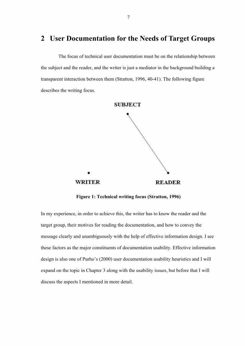
2 User Documentation for the Needs of Target Groups
The focus of technical user documentation must be on the relationship between
the subject and the reader, and the writer is just a mediator in the background building a
transparent interaction between them (Stratton, 1996, 40-41). The following figure
describes the writing focus.
Figure 1: Technical writing focus (Stratton, 1996) In my experience, in order to achieve this, the writer has to know the reader and the
target group, their motives for reading the documentation, and how to convey the
message clearly and unambiguously with the help of effective information design. I see
these factors as the major constituents of documentation usability. Effective information
design is also one of Purho’s (2000) user documentation usability heuristics and I will
expand on the topic in Chapter 3 along with the usability issues, but before that I will
discuss the aspects I mentioned in more detail.

8
2.1 Design and Features of Technical Documentation
Information design is difficult to define and describe, and there are various
names for it (Petterson, 2002, 19). In my view, the following two definitions best
describe the concept of information design when it is discussed in the context of
usability, therefore the term information design will be based on these in my thesis. The
definition by the International Institute for Information Design (2008) is the following:
Information design is the defining, planning, and shaping of the contents of a message and the environments it is presented in with the intention of achieving particular objectives in relation to the needs of users.
In my experience it summarises well the basic ideas of information design. While the
following definition is not as clear and concise, it complements the previous definition
by specifying some aspects more closely:
In order to satisfy the information needs of the intended receivers information design comprises analysis, planning, presentation and understanding of a message – its content, language and form. Regardless of the selected medium, a well designed information set will satisfy aesthetic, economic, ergonomic, as well as subject matter requirements. (Petterson, 2002, 19.)
These two definitions together present a clear and comprehensive definition of the main
aspects of information design. I will discuss effective information design and its role
and importance in usability next and these definitions will form the basis for the
discussion.
Good, clear, and usable user documentation starts with good information
design which helps the users to achieve their goals when using an application. That is,
modifying the text and figures so that they invite and motivate readers by making it
easier to see when the documentation might be useful, and by supporting readers in

9
discovering how the documentation could be used in order for them to reach their goals.
(Schriver, 1997, 11.)
When delving deeper into the specifics of effective information design in user
documentation, there are many aspects to consider. First I will deal with language. So
what is good text and good technical user documentation like? To start with, the
language is different from our everyday language and prose. Yli-Jokipii (2004, 83-85)
mentions that the language used in technical texts can be labeled as ESP, English for
specific purposes. There are certain characteristics in English language that differentiate
standard English from the language used in technology: syntactic qualities, nominal
sentences, vocabulary, and readability. The syntax of technical language differs from
that of standard English language, because the texts are often intended to be informative
or descriptive. The vocabulary is different and words have meanings different from
normal. The use of nominal sentence structures means that the language contains many
nouns, adverbs, and adjectives, making the language very concise. In my experience the
lack of relevant terminology, and the use of abstract or esoteric terminology, presents
the possibility of usability problems in user documentation, thus slowing readers down.
Purho (2000) mentions that the imperative form and active voice are important,
which is the general consensus when writing effective user instructions. It addresses the
user directly and makes it clear what to do, and it is the best way of conveying the
message, but the active voice or imperative is not necessarily, however, always the best
way to write instructions. McCaskill (1998, 10, 29) and Reep (1997, 138) list, for
example, the following situations when the use of passive voice may be more
appropriate: the actor is not important or known, the receiver should be emphasized, or
some variety is needed in a passage using an active voice. Nevertheless, these are just
exceptions to the general rule. All these aspects related to language can be used in
10
heuristic usability evaluation of user documentation. They are related to other aspects of
usability than information design, which will be discussed in more detail in Chapter 3.2.
Next I will consider some general aspects which are also related to language.
User documentation most often contains referential and instructional
information, and Nykänen (2002, 10) argues that the main purpose of this type of texts
is simply to provide information. He lists other factors that constitute good user
documentation as compared to prose: it is intended to communicate information and
guide reader’s actions, its style is neutral, the text is unambiguous and can be shortened
without losing its meaning, and it is logical and based on facts. The language in user
documentation should be, according to Walker (2001, 3), adapted to the context in
which the instructions are used, that is, how formal the representation of the message
and language used need to be. She argues that: “Such considerations influence decisions
that have to be made about, for example, method of character assembly, and use of
language and graphic and spatial conventions.” In my view this means that the use of
language is not restricted to just writing simple instructions in imperative form, but it is
connected to many other aspects of user documentation usability and information
design, such as typography, layout, and the use of illustrations.
Nykänen (2002, 9-10) asserts that accuracy and consistency of the information,
as well as the level of detail of technical information, are very important factors in texts
dealing with technology. The quantities, units, and the use of notations have to be used
in conformity with the standards and consistently within user documentation, and the
style of the writing has to be easy to read and appropriate for the chosen medium and
purpose while keeping the language itself clear and correct. In my experience
wordiness, complexity, ambiguity, inaccuracy, and incorrect language are factors that
affect the usability of user documentation to a great extent. Nykänen (2002, 14) remarks
11
that you also have to edit the pictures, typography, layout, and all other necessary
details, and that these factors contribute to the readability and usability of user
documentation.
In my estimation, it is easier for the users to read and learn simple and short
sentences which most often state only the relevant information for that exact moment
and action, instead of linking all information into large units. Yli-Jokipii (2004, 85)
argues that although there are no clear results when it comes to determining which
factors affect the readability of a technical text, it seems that unfamiliar words and terms
slow readers down. The following combination of definitions of readability by Hargis et
al. (2004, 6) and Alasilta (2000, 200) is good as a general definition: the ease of reading
words and sentences, and understanding them. But Pikulski (2002) argues that the
definition of readability should reflect the interactivity between the many characteristics
of the reader and the text. He states that a satisfactory definition which also takes into
consideration the more recent studies and theory is the following: “The level of ease or
difficulty with which text material can be understood by a particular reader who is
reading that text for a specific purpose.” In my mind this more comprehensive
definition reflects information design and target group analysis, and therefore it is
obvious from the description that readability is one of the many aspects of
documentation usability, which is why I will use Pikulski’s interpretation as the
definition of readability in this thesis. I will discuss reading techniques and motives in
Chapter 2.3, but first I will expand on the visual side of information design which
influences both readability and usability of user documentation.
Walker (2001, 3, 172) states that in information design, one has to take into
account the target group, the context of use, and the information contents. When it
comes to visual organisation, and more specifically typography, in other words the
12
style, size, and arrangement of the letters, they significantly affect how the text is read,
interpreted, and understood. By this she means that the graphic representation should be
such that it helps the users to understand the instructions. To begin with, the main title
and the other headings should describe the relevant characteristics of the content
(Alasilta, 2000, 149). Lyytikäinen and Riikonen (1995, 33) add to this by stating that
the main functions of the title are first, to get the users to read the instructions by being
interesting both visually and content-wise, and second, to provide the users an image of
the general language and feel of the documentation and its consistency. Next I will
examine the characteristics of typography and layout, and what kind of requirements
they set for information from the point of view of information design and usability.
The title should form a clear contrast with the general content and the rest of
the typography by being big, bold, or dark enough (Lyytikäinen and Riikonen, 1995,
35). Although the uppercase text or titles can be used for getting the users’ attention, it
should not be overused, because it is slower to read than normal text (Nielsen, 1993,
118-119). Mixed-case letters break up the text into shapes that users can recognise more
easily, and that kind of text can give a more professional impression than all uppercase
text (Nielsen and Loranger, 2006).
Schriver (1997, 315, 358) states that every element on the same page interacts
with one another, therefore main elements and their interaction with other elements
should be taken considered in the information design phase. Spatial cues, such as size,
position, and the size and location of the graphic elements should be carefully planned.
According to Nielsen (1993, 119), the gestalt rules for human perception should be used
to help the users understand which elements in the user manual or the product belong
together by placing them close together, inside the same boundaries, or by presenting
them in similar shapes, colours, sizes, or typography. Especially visual and
13
typographical factors are in my view important when the different needs of target
groups are evaluated, but their needs and qualities are discussed in more detail in
Chapter 2.2.
The following issues related to graphic design may present problems to the
users, which means that the usability of the user documentation suffers. If the layout is
designed poorly or there are missing captions and labels, it is harder for the users to
scan the text. Typographic cues which are used inconsistently have the same effect: if
bold type, bulleting, underlining, or indenting is used too excessively, it is difficult to
notice which parts of the text are important. Random use of symbols and icons, and
contextual mismatch between illustrations and accompanying text do not help the users
to understand the information. (Schriver, 1997, 449.)
Good graphic design is a key to a dialogue that the users understand (Nielsen,
1993, 117). Graphic devices and the layout affect how the users interpret the
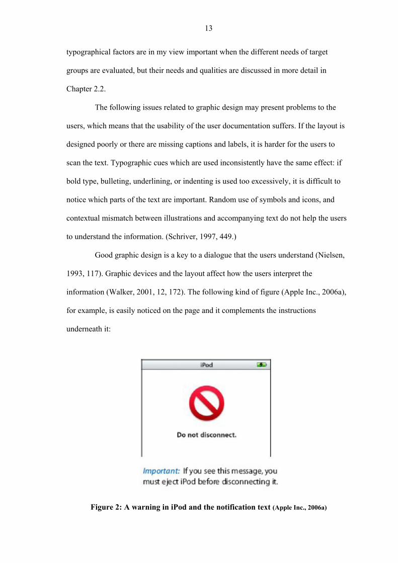
information (Walker, 2001, 12, 172). The following kind of figure (Apple Inc., 2006a),
for example, is easily noticed on the page and it complements the instructions
underneath it:
Figure 2: A warning in iPod and the notification text (Apple Inc., 2006a)
14
In my experience excess of illustrations does not convey the message clearly, especially
if they are unnecessary or if there is not enough space used to separate them from the
other information content. But the lack of illustrations may prevent the users from
understanding the message successfully. Markel (2007, 130) sums the previous ideas up
in one sentence when he writes that appropriate graphics added in right places would
simplify the instructions.
In my mind all these typographical issues discussed contribute to usability and
they can be evaluated with heuristic analysis, and as discussed earlier, those issues are
important in target group analysis, which is why graphic design should pay attention to
the colours used in the user documentation and in the actual product. Nielsen (1993,
119) suggests that the number of colours should be limited to no more than 5 to 7
different colours, because otherwise the clarity of the documentation and user interface
suffers making the information harder to remember. It should be remembered that the
documentation and the product should function without colours, because many people
are colour-blind, which means approximately 8% of the male population. An example
of functional graphics for different readers is the figure (see page 18) presenting the
MP3 player demographics in Chapter 2.2.
In my experience the purpose of user documentation is basically to provide
help for using the product and for using it more efficiently, and all these aforementioned
aspects of information design help to achieve that. Their importance to documentation
usability can be seen in the following example taken from the Technical Standards web
page (2007). It describes the assembly instructions of Butchers Trolley, which sums up
everything that can be done wrong in the information design of user documentation:

15
Example 1: Deficient user documentation (Technical Standards, 2007) The usability of the documentation and the product is severely decreased by poor
information design. The language is inconsistent and grammatically poor, instructions
are ambiguous, some steps include several procedures, and readability is substandard.
The graphics are unclear, they have no captions, graphics and text do not complement
each other (the figure is related to step 4), and the warning does not stand out either in
the procedure or in the figure.
There are many other factors related to usability than information design that
have to be considered, for example, determining the target groups and meeting the
users’ needs. Target groups, especially those of MP3 players, will be discussed next,
and usability issues will be discussed in more detail in Chapter 3.
16
2.2 Target Groups and the MP3 Player
There are different purposes for user documentation, and different user and
target groups need different kind of documentation (Lyytikäinen, 1998, 66). In the ISO
standard 9241-11 (1998) the need for user analysis and knowing the context is described
as follows:
Relevant characteristics of the users need to be described. These can include knowledge, skill, experience, education, training, physical attributes, and motor and sensory capabilities. It may be necessary to define the characteristics of different types of user, for example users having different levels of experience or performing different roles.
In my view all these aspects listed in the ISO standard 9241-11 influence how the text is
perceived, read, and understood, and what should be written and using what kind of
language – therefore all these contribute to the usability of the user documentation.
Besides the variability of the tasks, the factors that have the largest impact on
usability are the characteristics of individual users (Nielsen, 1993, 73). Therefore it is
essential to know the audience, because the more writers know about their target group,
the more likely the text is to reach its goals. The following attribute classes help to
define target groups: user types, personal attributes, tasks, equipment, technical
environment, and physical environment (ISO 9241-11, 1998). These also have an effect
on the reading process and readers’ motivation, which will be discussed in Chapter 2.3.
When defining the target group, the context of use can be narrowed down if at
least these following attributes, with which we can break down the contents of the
attribute classes just mentioned, are considered and analysed: user’s age, gender,
motivation, general knowledge, intellectual ability, is the user a primary or secondary
user, language skills, and physical environment and place at the time of the use (ISO
9241-11, 1998). Whether the attributes can or cannot be defined, they have an impact on

17
the usability of the documentation. Schriver (1997, 163) writes that in order to make
better visual and verbal decisions the target group analysis should include a comparison
between the writer and the users concerning the knowledge, values, and beliefs about
the subject. The typographic and linguistic conventions in relation to information design
were discussed in Chapter 2.1. According to her (Schriver, 1997, 164), knowledge of
the target groups helps the writers to become more considerate of the users’ needs and
point of view.
Hackos and Redish (1998, 412) state that we have to realise that it is not
enough if we just document the product, “think” about the possible audience, or use
only the product to design training materials. In information design and target group
analysis it is important to try to establish what the users need to know, what they know,
and what they do not know. The non-native users should also be taken into
consideration, according to Hoft (1995, 205), because if they have trouble
understanding the language in the user documentation, they may become frustrated and
dissatisfied, which they may direct on the product itself and choose to use another
vendor’s product instead. There is even a possibility of misuse of the product, which
may cause, for example, loss of data or damage to the product.
Although iPods and other MP3 players can be used by everyone, just as almost
any other product, it is still very important to try to define the target group, the personal
characteristics, abilities, and needs of the readers. The target group of the iPods is not
easy to define. As a broad definition, the target group could be defined consisting of a
group of people from teenagers to middle-aged users. It means that there many different
user groups within the target audience, each group possessing different skills and
characteristics, each group of course differing internally.

18
This view of the iPod target group being hard to define in detail is shared by
the Entertainment Media Research & Olswang (2007) survey which gathered data from
1,721 respondents. The results reveal that the ownership of digital music players has
spread across all demographics. Entertainment Media Research, the other party in
conducting the survey, is a leading research consultancy for music and entertainment,
and Olswang is a leading law firm known for working in the field of
telecommunications, media, and technology, for example. The following pie chart
(Figure 3) which I drew based on the statistics and figures in that survey displays these
ownership percentages in the different age groups:
Figure 3: Demographics of personal digital music player owners (adapted from the Entertainment Media Research & Olswang 2007 Digital Music Survey results)
19
This kind of variety within a target group which is very diverse presents a great
challenge to technical writers. It is difficult to design and compose user documentation
of a high level of usability with this kind of background information.
Marketing goals can help to narrow down the target group of such products as
digital music players. Although this kind of user manuals are intended to serve the
needs of all the people within the target group, some concessions have to be made,
otherwise the manual may become too extensive or too general, which decreases its
usability. The main audience often dictates the style and content of the user manual in
general, but other users are of course taken into consideration, too. When over 80% of
the users are within the age group of 13 to 34 years, as shown in the previous figure,
marketing is mainly aimed at those users, and thus the content is often based on
information about that user group, modified so that it suits the needs of the rest of the
user groups.
Anastasia Goodstein (2007) wrote an article in BusinessWeek, in which she
acknowledges the fact that marketing of the iPod is targeted specifically at young
people, especially teenagers, who are more easily influenced than adults. Users within
the age group of 13 to 24 years, who constitute more than a half of the users, are in that
marketing target group. Goodstein has read many studies about teens’ favourite brands
since 2004 and Apple seems to be at the top of every brand list. The success of iPods
and MP3 players in general is obvious in this quote:
Research from consulting firm the Keller Fay Group found that the product teens talk to each other about most is the iPod. A survey by Piper Jaffray (PJC) found that 78% of high school students own a portable media player, and that of those students, 82% own an iPod. Obsession with iPods has spread to Apple's other products – namely, the iPhone. (Goodstein, 2007.)

20
There are other surveys and studies that confirm the same outcome. For
example, Hau (2007) wrote that although Apple iPod sales during the first half of the
year went down to 71% from the 76% last year in the United States, Apple is the clear
leader. He notes that Sandisk comes second with sales of 10%, and the next three brands
are all under five per cent market share. The annual global brand value ranking by the
market research company Millward Brown Optimor (2008) reveals that Apple is one of
the biggest risers in the list with 123% increase from the last year, which lifts Apple to
the seventh place leaving behind brands such as Nokia and McDonalds. In the
technology-only category Apple is fourth – behind Google, Microsoft, and IBM.
The outward appearance of an MP3 player may affect the audience. A certain
kind of look can attract certain people. Looks and appearance are very important to
young people. But if the product is beautiful, small, and attractive besides being good
and reliable, all users are more likely to use the same brand longer and praise it to their
friends. Mattelmäki and Battarbee (2000, 161) state that usability alone does not
guarantee success, because the product has to affect the users on an emotional level and
brand loyalty comes through emotional experiences which enhance the value of the
product to the users. However, they note that background knowledge of the users helps
to develop the product in a more favourable direction.
In her article Goodstein (2007) pointed out some of the main factors that
contribute to success of Apple’s youth marketing. She stresses the importance of
meeting a real need, that is, music has always been one of the most important aspects of
teenagers’ lives. Although the product itself may meet the real needs of the users, it
does not necessarily mean that either the user documentation is usable or that the
documentation meets the users’ or even the target group’s needs.

21
Most of us have listened to music and made collections on tape to share with
friends and discuss them and socialise when we were young. Some do still, but now
using other kinds of music and storage formats. Goodstein (2007) argues that the iPod
has become the digital equivalent of mix tapes.
Besides making friends and socialising via music and shared tastes, people
express themselves through music. As Apple created the iTunes online music store
where you can buy single songs under one euro apiece instead of whole CDs, Goodstein
(2007) notes that teenagers were given free hands to create their own content.
Creativity, especially that possibility provided to the customer, sells. Not to mention the
fact that they now can have their entire music collection in one portable device.
In my opinion there is so much music available that people, whether teenagers
or adults, do not have enough money to buy as many CDs as they would like. Now that
downloading music is so easy, people download music without paying for it instead of
buying a CD. These views are supported by Goodstein (2007), Pew Internet &
American Life Project (2003), and the recent Entertainment Media Research &
Olswang (2007) survey which revealed that illegal downloading is now at its highest
level despite the signs of decline last year. The survey showed that the main reasons
behind this are: it is free (91% of respondents), can find everything looking for (42%),
and that only 33% download less for fear of being prosecuted.
This means that quite a lot of the music people have in their MP3 players has
been illegally downloaded from friends or the Internet, even according to surveys such
as the 2007 Digital Music Survey. Although the survey revealed that teenagers are the
group most likely to download more often in the future, the user groups between 18 and
34 years are inclined to increase their downloads most. (Entertainment Media Research
& Olswang, 2007.)

22
All these future prospects affect the design of the user documentation of digital
music players, because the inclination towards MP3 music format use is concentrated to
certain user groups whose needs and goals have to be taken into consideration even
more than before. This may affect the usability of user documentation, because the
content may become mainly intended for those target groups, and the usability of the
user documentation for other user groups, although they should be noted, may be left
insufficient.
Alasilta (2000, 143) and Nykänen (2002, 9) summarise the main points of
recognising the target group as the following: what do the readers want and need, what
are their preconceptions of the topic, what kind of different groups are there within the
target audience, and how skilled and interested are the readers? Reep (1997, 36)
mentions that the reading style also varies depending on the user.
2.3 Reading Process and Motives
As discussed in the previous chapter, the 2007 Digital Music Survey revealed
that although 77% of the respondents own a personal digital player, the market has not
reached saturation yet (Entertainment Media Research & Olswang, 2007). The target
group of the MP3 players is so vast that it cannot be assumed that instructions for
novice users are not needed anymore. There are even arguments against the need to
study the users, because they change when they gain knowledge through interacting
with a new product, but products are successful only if they provide users with positive
and successful first experiences (Hackos and Redish, 1998, 78).
Although the number of experienced and expert users is growing all the time,
the above-mentioned survey points out that there are still 23% of the respondents who
do not own a personal digital music player, and 11% of those stated that they intend to
purchase one during the next six months (Entertainment Media Research & Olswang,

23
2007). This means that simple and clear instructions for new users of MP3 players are
still needed. Thus, there is a need for instructions for all groups from experienced users
to novices, which keeps the target group rather varied. The reading process varies
corresponding to users’ level of expertise and their motives for reading.
Schriver (1997, 290-291) states that in general readers have four have common
motives: (1) reading to enjoy, (2) to assess, (3) to do, or (4) to learn to do. Reading for
enjoyment can be described with the feeling of satisfaction the reader gets in the
interaction with the text. This type of texts, such as short stories, novels, or newspapers,
often contain continuous narrative prose. Reading to assess means that the readers
estimate the relevance of the content of the documentation. The evaluation may be
anything from a quick glance to comprehensive evaluation, and the text may be, for
example, a report, correspondence, or a newspaper. According to Hackos and Redish
(1998, 425), the reason for reading user documentation is either to do or to learn to do.
Schriver (1997, 290-291) continues that the objective of reading to do is to perform a
task with the help of documentation. The purpose is not to interact with the
documentation but to accomplish something, thus the users often shift their attention
from the documentation to the product or object, which means that typography is
important. For example user manuals, helps, guides, and cookbooks fall into this
category. Reading to learn to do can be characterised as something that helps the users
to acquire background knowledge and understanding of how to use what they learn in
achieving their personal goals. This type of texts are often a mix of continuous prose,
itemised lists and procedural information, and illustrations.
Reep (1997, 39-40) lists the following five ways and motives for reading
technical user documentation, which reflect the different needs of the users:
1. Only the summary is used to get general information on the subject.

24
2. Users search the documentation for some specific sections or topics, for example to perform a certain task.
3. Users scan the documentation concentrating on information dealing with topics that interest them, pausing at key words.
4. Users go through analytically the entire documentation, because they need all the possible information they can get on the subject.
5. Users evaluate the documentation critically searching for faults or contradictions.
These five motives share many characteristics with Schriver’s (1997, 290-291) four
common reading motives just mentioned, but as these are more specific to technical
user documentation they can, in my experience, be used to better describe the reading
techniques and motives of MP3 player user documentation readers. Reep’s list specifies
not only the motives that users of technical documentation have, but in my experience
also the way users are most likely going to read the documentation, which will be
discussed next.
There are reading techniques for different kinds of situations, texts, and
purposes. Alasilta (2000, 40) has identified, for example, techniques from detailed
reading to skimming, mechanical to experiencing, absorbing to passing, and noticing to
analysing. The reading technique is selected based on our motives, but there are three
factors contributing to the selection of the reading technique: to which goal reading is
related, how motivating the subject is, and how skilled the reader in question is. In my
opinion these factors are related to the task of narrowing down the target group, which
was discussed in the previous chapter.
Before we can analyse the possible reading techniques and motives users are
likely to have when reading any particular user documentation, such as MP3 player user
manual, there is the challenge of motivating the users to read the instructions. Users are
surprisingly reluctant to even open up the user manual before they start to use a new
application. Based on anecdotal evidence many users are more likely not to read unless

25
they have to (Schriver, 1997, 164). Lyytikäinen and Riikonen (1995, 33) suggest that
already the title of the user manual should lure the reader into reading it, which sounds
to me a little far-fetched. But I understand the point that the title, as well as the general
look, gives the first impression of the manual, and if it is negative, the user is less likely
to turn to the manual for instructions. To begin with, the main title and the other
headings should describe the relevant characteristics of the content (Alasilta, 2000,
149). Lyytikäinen and Riikonen (1995, 33) add to this by stating that the main functions
of the title are first, to get the users to read the instructions by being interesting both
visually and content-wise, and second, to provide the users an image of the general
language and feel of the documentation and its consistency.
Johnson (1998, 118) points out that, after all, there is always a reason for using
an application and reading the instructions means just an additional delay in achieving
the desired outcome. That is, when we use an application we are so absorbed in figuring
out how to get the application to work towards our goals and that the user manual is
seen as unnecessary waste of time. Especially novice users, who want to take the
application immediately into use, do not have the time or patience to read user manuals
either before or during the action they want to perform (Johnson, 1998, 44, 82). Johnson
(1998, 44) emphasizes this view by stating that users who are learning to use a new
application need visually sensitive instructions which help them to use that product
without too much reading. In my view that type of readers are most likely to use a
skimming technique, leafing through only the topics of interest or relevance to them.
Preventing unnecessary reading and minimising the number of instructions
follows Nielsen’s (1993, 129) usability heuristic of minimising the users’ memory load,
which in turn enhances the learnability of the instructions. The aspects of usability, and
especially Nielsen’s usability heuristics, will be discussed in more detail in the next
26
chapter. Instructions are easier to read and learn if they have been written in step-by-
step procedures, and in sequences which belong together (Nielsen, 1993, 153). This
minimises the memory load, because the user does not have to go back that often or
remember the earlier passages, and it encourages the user to read the manual more. A
novice reader often reads this kind of procedures in a mechanical fashion.
The way I see it, techniques such as absorbing, analysing, and detailed reading
are usually used when the user has become acquainted with the application and wants to
learn more about its use. Experienced users may use these techniques as well, because
they are already more familiar with the product. Johnson (1998, 44) remarks that users
should not be provided with information which has been already digested – they should
have something real to read and learn instead of mindlessly reading through the user
manual.
Nykänen (2002, 13) points out that there is a positive correlation between
comprehensibility and how interesting the subject is. Users are also more likely to be
motivated to read and learn if there is a clear connection between what they are reading
and the new application to which they are applying their new knowledge (Johnson,
1998, 149). This is in connection to Nielsen’s (1993, 123) usability heuristic of
speaking the users’ language, that is, making sure that there is a connection between the
system and the real world. Johnson (1998, 148) adds that it is more likely that if the
users are comfortable and enjoy what they are doing, they will learn better.

27
3 Usability and Usability Heuristics
As mentioned in the Introduction, of all the usability testing methods I have
chosen heuristic evaluation as the basis for my research. In this chapter I will discuss
the most commonly known usability heuristics, that is, Nielsen’s heuristics, and
compare them with Purho’s documentation usability heuristics.
There are also several other methods for testing, analysing, and developing
usability and its aspects. Testing Standards Working Party (2005) have divided usability
testing into inquiries, inspections, and actual testing. They categorise interviews,
surveys, and questionnaires into inquiries, and inspections include cognitive
walkthroughs and heuristic evaluation. In addition, Nielsen (2008d) and Ovaska et al.
(2005, 6) mention several other usability evaluation methods besides those already
listed by the Testing Standards Working Party. These include think aloud protocol and
formal usability inspections.
As mentioned in the Introduction, heuristic analysis means evaluating a
product on the basis of a set of predefined principles, that is, heuristics, defined
especially for the purpose of usability analysis. Heuristic analysis is a method of
evaluating usability, but which is conducted without a test user, by a usability expert or
a group of experts (Korvenranta, 2005, 111). Evaluation is usually performed early in
the development cycle to find the usability problems and errors so that they can be
corrected (Hargis et al., 2004, 364). My conviction is that this should be done preferably
before the product is ready and in the shops, but that is not always the case, due to
financial pressure and faster product development cycles. Korvenranta (2005, 122)
notes that expert evaluations often focus on finding usability problems, which gives the
method a critical overtone. She suggests that also the well functioning parts and good
28
things about the product should be listed as positive things beside the problems – as
things that should be preserved.
3.1 Basics of Usability
Before going into the heuristics in more detail, we have to define usability.
Dimon (2004) argues that basically usability culminates to one thing: if the product
needs instructions or you have to explain it, there is room for improvement. At the same
time, he acknowledges the fact that it is very difficult to cover the complete spectrum in
one statement. By instructions he refers to manuals and large blocks of text. Dimon
clarifies this statement when he says that “…the length of your instructional text is
almost always inversely proportionate to the usability of your product.” Instructions are
still needed, because all products cannot be made so intuitive that the user has no need
for them. He advises to write concise and useful instructional manuals for users and not
to replace instructions with useless or confusing pictures. Instructions should be clear
and simple, tested with actual users, and possibly improved after user testing.
But let us go back and define what usability means in this study. The number
and scope of different variables and aspects of usability is vast, which is why there are
many different definitions of usability and how to measure it. Nielsen (2003), who is
one of the pioneers as regards usability study, has investigated human-computer
interaction and especially the usability of user interfaces. His short definition of
usability is the following: “Usability is a quality attribute that assesses how easy user
interfaces are to use. The word ‘usability’ also refers to methods for improving ease-of-
use during the design process.”
In the ISO standard 9241-11 (1998) it has been defined that to specify and
measure usability there are certain factors that have to be considered: “. . . it is
necessary to identify the goals and to decompose effectiveness, efficiency and

29
satisfaction and the components of the context of use into sub-components with
measurable and verifiable attributes.” The usability of products can be improved by
incorporating features and attributes known to benefit the users in a particular context of
use. A product can have significantly different levels of usability when used in different
contexts, because the interactions between the user, the goals, the task characteristics
and the other elements of the context of use are very complex. The following figure
depicts the main elements of usability and how they are related to each other.
Figure 4: Usability framework (ISO 9241-11, 1998) The usability framework is useful for determining the different aspects of usability and
the factors of the context of use in any given phase of the product’s development, that
is, when specifying, designing, or evaluating its usability (ISO 9241-11, 1998).
Identifying the goals, tasks, equipment, environment, and users and their needs within
the intended context of use are a part of information design and target group analysis

30
which were discussed earlier. Target group analysis directly affects the way the
documentation is designed and written, how detailed information it contains, and thus
there are effects on the usability measures, that is, effectiveness, efficiency, and
satisfaction, and these measures will be discussed in more detail in the following topics.
The target group analysis and information design also affect many other aspects of
usability.
Effectiveness and Efficiency
Effectiveness and efficiency are closely tied together. The definition of
effectiveness in the ISO standard 9241-11 (1998) is:
Measures of effectiveness relate the goals or subgoals of the user to the accuracy and completeness with which these goals can be achieved. For example if the desired goal is to accurately reproduce a two-page document in a specified format, then accuracy could be specified or measured by the number of spelling mistakes and the number of deviations from the specified format, and completeness by the number of words of the document transcribed divided by the number of words in the source document.
In short this means how well the users achieve their goals.
Efficiency is defined in the same ISO standard 9241-11 as: “Resources
expended in relation to the accuracy and completeness with which users achieve goals.”
It can be measured on different levels: human, temporal, and economic efficiency as can
be seen in the following:
Measures of efficiency relate the level of effectiveness achieved to the expenditure of resources. Relevant resources can include mental or physical effort, time, materials or financial cost. For example, human efficiency could be measured as effectiveness divided by human effort, temporal efficiency as effectiveness divided by time, or economic efficiency as effectiveness divided by cost. (ISO 9241-11, 1998.)
31
In my mind these measures include consistency, clear error messages, and giving users
feedback.
In his short definition for efficiency, Nielsen (2003) indicates that it is a
criterion that can be measured, stating that once the user has become acquainted with
the product, it can be used to measure how fast the user can perform the tasks at hand.
Alasilta (2000, 200) also states that the efficiency of a product can be measured and
defined. When it comes to the quality of texts or contents which, beside the previously
mentioned factors, determine efficiency and satisfaction, one should pay attention to
following three factors which affect the user performance:
• The user has to be able to skim through the text – presenting the reader a good
and accurate first impression of the contents. • The text has to be readable – quick to read, understandable, and possible to
memorise. • The content of different subject areas within the text has to be usable – the
reader can easily and reliably find the necessary information.
In my opinion, these above-mentioned criteria can be used to measure effectiveness and
efficiency of user documentation, but they, in turn, encompass many other important
usability-related factors when determining the usability of documentation, such as
grammatical devices, readability, typography, and understandability, which were
discussed in Chapter 2.1, and also accessibility and clarity. Walker (2001, 3) argues that
the relationship between the use of language, typography, the intended use of the
documentation, and the effectiveness of this use are fundamental.
Satisfaction
Effectiveness and efficiency indicate the performance of the users which,
together with satisfaction, can be used to measure a product’s usability in a given
context (ISO 9241-11, 1998). Nielsen’s (2003) short definition of satisfaction states that

32
it measures how pleasant the product is to use. This is supported by the ISO standard
9241-11 (1998) which describes user satisfaction in short as: “Freedom from
discomfort, and positive attitudes towards the use of the product.”
Although satisfaction can be measured, it is subjective and, therefore, more
difficult to measure and to define how much it truly affects usability. In my view it
depends on the user, and what the intended target group of the product is. There are
several user satisfaction rating scales which are related to many aspects of usability,
target group analysis, and reading motives (ISO 9241-11, 1998):
Satisfaction can be specified and measured by subjective rating on scales such as discomfort experienced, liking for the product, satisfaction with product use, or acceptability of the workload when carrying out different tasks, or the extent to which particular usability objectives (such as efficiency or learnability) have been met. Other measures of satisfaction might include the number of positive and negative comments recorded during use. Additional information can be obtained from longer-term measures such as rate of absenteeism, observation of overloading or underloading of the user's cognitive or physical workload, or from health problem reports, or the frequency with which users request transfer to another job.
According to the ISO standard 9241-11 (1998) objective measures of satisfaction
include monitoring users’ behaviour, for example, body posture and body movement,
and observing the users react physiologically. Subjective measures are based on depth
of the users’ feelings towards the product, for instance, how strong reactions and
opinions they have. As we established in Chapter 2.2, there are several different types of
users and if the target group is as varied as with MP3 players, users are bound to have
different opinions. The way I see it, what one user likes and finds satisfactory may not
satisfy another one, because each user wants the product and its logic of use to match
their own thought patterns.
33
There are also other important aspects which are related to satisfaction and
affect usability, one of which is utility. It is used to refer to the design’s functionality,
but it affects user satisfaction, too, as Nielsen’s (2003) definition of utility reveals:
“Does it do what users need?” Usability and utility are equally important, because if the
results of the users’ actions are not what they expected or wanted, it does not matter
how easy that task was to perform.
3.2 Purho’s Documentation Usability Heuristics
Nielsen (2003) has concluded that the most important quality components in
evaluating the usability of user interfaces are learnability, efficiency, memorability,
errors, and satisfaction. Although these five criteria form the basic definition of
usability and they can be applied to a great extent when evaluating the usability of any
given application or even user documentation, a thorough usability analysis requires a
more comprehensive set of heuristics than those five aforementioned aspects.
Unfortunately, as I have found out, these five above-mentioned criteria, or any
other heuristics, cannot always be applied in the information design phase. Technical
writers cannot always make a proper target group analysis because of the lack of
background information, there is less and less time to write, writers do not always have
the chance to see the actual product they are writing about, they do not have proper
input, and so on. This is, of course, mostly due to the increasing financial pressure in
companies and faster product development cycle. Usability may become sacrificed
when weighed against the product development, appealing outlook, multiple
functionalities, and the reliability and low price of the product (Keinonen, 2000, 93).
In my estimation these factors listed by Keinonen may affect the usability of user
documentation as well.

34
Nielsen (2008b) developed his famous list of ten usability heuristics for user
interface design. They are the ones most commonly used in usability evaluation, and
they will be discussed in this chapter in connection with Purho’s heuristics. Nielsen’s
list of heuristics was originally developed in collaboration with Rolf Molich in 1990,
but they have been since refined on the basis of usability problems analyses to get the
most descriptive heuristics for usability analysis.
However, there has been a lot of criticism towards Nielsen’s heuristics when
evaluating the usability of other things than user interfaces, and therefore usability
experts have developed similar methods and their own heuristics for evaluating the
usability of various different products. It is not the same thing to evaluate the usability
of a mobile phone and a web page. Usability is product specific, therefore the benefits
of a usability expert evaluation are the greatest when a product-specific list of heuristics
is designed. This naturally takes time, but once the heuristics have been designed, they
can be used several times in iteratively executed expert evaluations of the product, and
not so much planning and time is needed as in traditional usability testing.
(Korvenranta, 2005, 111, 121-123.) In my view, if it is feasible to evaluate the user
documentation with good usability heuristics in the information design phase, it is
possible to spot defects in user documentation and make corrective actions, even when
the target group cannot be narrowed down.
Purho (2000) writes that he developed his own heuristics for evaluating the
usability of documentation, because there was no such set available when he was
conducting a study on documentation usability. This set of ten heuristics was the result
of combining all kinds of different ideas about what constitutes good documentation.
But he notes that heuristics should not be used to replace proper information design,
instead they can be used for checking the necessary things in the design phase.
35
Since then, at least two theses have been written which are based on Purho’s
heuristics as mentioned in the Introduction. Salomaa (2004) studied the readability and
understandability of documentation, and she used six of Purho’s ten heuristics for
analysing the qualities of different types of documentation and their usability problems.
Laakkonen (2006), on the other hand, used all ten heuristics for analysing the use of
safety instructions in motorcycle owner’s manuals. However, neither of them evaluated
the actual heuristics, which is the secondary purpose of my research.
Match between Documentation and the Real World
In his first heuristic Purho (2000) emphasizes the need of using natural
language in user documentation:
The documentation should speak the users’ language, with words, phrases, and concepts familiar to the user, rather than system-oriented terms. Follow real-world conventions, making information appear in a natural and logical order.
This heuristic corresponds directly to Nielsen’s (2008b) first user interface usability
heuristic.
By speaking the users’ language Nielsen (1993, 123-124, 152) means that the
intention is not to use a limited set of vocabulary which contains only common words.
Instead, when the users have their own vocabulary or terminology for some application
or domain, he suggests that those specialised terms should be used in the interface rather
than everyday language. But words in nonstandard meanings should not be used unless
that nonstandard use and meaning is a common practice among the users, a part of that
area’s terminology. He also cautions against any unnecessary use of jargon. In my
opinion these principles apply to user documentation as well.
36
I will use Purho’s first heuristic in the usability analysis to evaluate the user
manual on the basis of language used in the user documentation and the presentation of
the information. That is, whether the language is standard English language and the
terminology and concepts familiar to the users of MP3 player user documentation, and
how logically the information is presented from the users’ point of view.
Match between Documentation and the Product
In his second heuristic, which is closely related to the first one, Purho (2000)
calls for consistency in the terminology used in documentation and the product:
The forms, screens, manuals, and online helps system should match so that the same terminology is used in all of them. This may contradict with ‘Match between the documentation and real world’ if the interface uses strange terminology.
The closest matches to Purho’s second principle are Nielsen’s (2008b) first heuristic
and partly his second one: “The system should always keep users informed about what
is going on, through appropriate feedback within reasonable time.” In my judgment
Nielsen’s first and second heuristic can be applied to user documentation evaluation, not
only user interfaces. As a synthesis, besides there being a match between the
documentation, or system, and the real world, the product’s status should also be visible
so that the user can match the product’s feedback to the documentation, thus preventing
error situations.
Nielsen (1993, 134) asserts that the feedback should not be provided after the
error, rather before, and that positive feedback helps the users. This helps the users, in
my view, to perceive what they are doing and whether the user documentation matches
the situation at hand. Nielsen (1993, 152) suggests that because examples are easier to

37
understand than plain descriptive text there should be enough examples available in the
documentation.
Purho’s second heuristic will be used in the usability analysis to evaluate
whether the terminology in the user manual matches the product. Illustrations of the
product, and pictures of menus and other views should match the product and the view
on the user’s screen.
Purposeful Documentation
The function of the documents should be obvious and they should be provided
in an appropriate format, as Purho (2000) states in his third heuristic:
If the documentation set contains several documents, the purpose of each type of document should be clear, as well as the intended use. The media of the documentation must be purposeful so that users get what they need. For example, people working on a rooftop installing some hardware would not necessarily be delighted with nice multimedia CD-ROMs but prefer a laminated quick reference card.
This heuristic does not directly correlate with Nielsen’s heuristics, although some
parallels can be made between writing purposeful documentation and Nielsen’s and
Purho’s first two heuristics about consistency using natural language.
Users should be provided information in an appropriate medium. For an MP3
player, for example, a CD-ROM is useless when the player is used on the move. Even a
user manual is rather excessive carriage in that case. These kinds of things should
already be taken into consideration in information design, which will be discussed in
more detail in a later topic regarding Purho’s fifth heuristic.
Although this heuristic is more appropriate for documentation sets consisting
of multiple documents, I will use Purho’s third heuristic in the analysis to evaluate

38
whether the function of the user manual is clear and it is provided in an appropriate
format for the users.
Support for Different Users
When it comes to writing user documentation, the needs of other users than
those of the target group have to be taken into consideration, as Purho (2000) remarks in
his fourth heuristic:
Documentation should support users with different levels of knowledge on the domain as well as those assigned different tasks in the domain. Any unnecessary information for a specific user must be hidden from other users or be easily overlooked. Quick reference information for expert users should be available.
Nielsen’s (2008b) seventh heuristic about the flexibility and efficiency of use points out
the same need for taking different users into consideration:
Accelerators - unseen by the novice user - may often speed up the interaction for the expert user such that the system can cater to both inexperienced and experienced users. Allow users to tailor frequent actions.
Users, especially novice users, need to be supported when they are unsure and afraid of
doing something irreversible, and therefore the exits should be clear. An easy way out,
such as a cancel button, should be provided for the users because they like to be in
control of the situation instead of feeling trapped. But, although a product could be used
with just general-level knowledge, the more experienced users should be taken into
consideration by providing them with an opportunity to perform operations they use
frequently by using accelerators or shortcuts. (Nielsen, 1993, 138-139.) This kind of
information is usually not relevant to novice users, but, in my opinion, documentation
should include information about how to take into use, for example, menus or functions

39
that normally are not seen or available in an MP3 player. Default values and settings
function as a shortcut, because users do not have to specify the settings unless they want
or need to (Nielsen, 1993, 142). Such default settings are often used in MP3 players so
that the users do not have to think about the possible settings, but they can start using
the player faster and modify the settings to better suit their needs after gaining more
experience.
The writer has to take into account the users’ level of knowledge about the
subject, because the less the reader knows about the subject, the clearer and simpler the
information has to be stated (Lyytikäinen and Riikonen, 1995, 7). As for the different
users and user groups, there are many user types and attributes to be considered, as was
discussed in Chapter 2.2.
I will use Purho’s fourth heuristic to evaluate whether the documentation
supports the users’ needs. That is, there is variation in the level of experience within the
user groups and their information needs, and the documentation should provide all users
what they need and also quick referential guidance for more experienced users.
Effective Information Design
Good information design is an important part of user documentation, because it
affects so many other aspects and measures of usability, as Purho (2000) establishes in
his fifth heuristic:
Information must be presented in a way that it is easily found and understood by the users. Short lines and paragraphs are easier to read. Graphics, tables, and lists are easy to scan and read, and appropriately used to support the information need the user has. Unnecessary graphics only slow the reading and the download time of web-based documentation. Write instructions in imperative form and address the user directly using active sentences.
40
This principle corresponds to several of Nielsen’s (2008b) heuristics: aesthetic and
minimalist design (eighth), recognition rather than recall (sixth), help and
documentation (tenth), user control and freedom (third), and error prevention (fifth) ,
which accentuates the importance of information design in constructing usable
documentation.
Aesthetic and minimalist design is what Purho’s effective information design
basically deals with. Nielsen (2008b) reminds us in his eighth principle to keep it
simple, that there should not be too much or unnecessary information to draw attention
away from the relevant information. In order to minimise how much the users have to
remember, Nielsen (1993, 121, 130-131, 152) instructs that the product and user
documentation should focus on a small set of general rules that encompass the whole
product. Every additional piece of information distracts the users from performing their
tasks and every additional function is one more thing for the users to read and learn,
thus making errors more probable. If the instructions are written according to the actual
users’ tasks and in a sequence of steps, the steps should be numbered, so that users’ do
not have to remember the previous information and tasks.
These aforementioned ideas are also emphasized in Nielsen’s (2008b) sixth
principle which can be directly applied to user documentation:
Minimize the user's memory load by making objects, actions, and options visible. The user should not have to remember information from one part of the dialogue to another. Instructions for use of the system should be visible or easily retrievable whenever appropriate.
I summarise in the following Purho’s and Nielsen’s information design related
principles which were just discussed: short paragraphs, clear layout and typography, and
easily retrievable information enable the users to understand and remember the
information. Alasilta (2000, 148) supports this when she writes that text is

41
understandable if the user can remember the relevant content without looking it up.
Clearer layout can be achieved by using vertical lists, such as bulleted or numbered
lists, which have more white space around each piece of information, thus the main
points can be understand and references more easily. Studies show that compared to
inline list they can improve usability by 47%. Wording is also important, therefore the
items should be listed using parallel phrasing which improves the flow of the text.
(Nielsen and Loranger, 2006, 279.)
In his tenth heuristic, Nielsen (2008b) states that:
Even though it is better if the system can be used without documentation, it may be necessary to provide help and documentation. Any such information should be easy to search, focused on the user's task, list concrete steps to be carried out, and not be too large.
Users should be able to perform the functions in a way that is the most effective and
productive for them (Nielsen, 1993, 116). In his third heuristic Nielsen (2008b)
encourages to allow user control and freedom by providing emergency exits when the
product does not function as they intended, because the users make mistakes every once
in a while. User support corresponds to Purho’s fifth heuristic, because user freedom is
one of the goals of effective information design. The different aspects of effective
information design were discussed in more detail in Chapter 2.1, and the impact of
target groups in the information design and usability were discussed in more detail in
Chapter 2.2.
In the analysis I will use Purho’s fifth heuristic to evaluate whether information
can be found and understood easily. That is, sentences and paragraphs should be
concise, graphics and lists should be clear and easy to read and used to support the
users’ information needs, and the graphics are not overused. The instructions should be
written in imperative form addressing the user directly.

42
Support for Various Methods for Searching Information
The design, structure, and layout of user documentation should enable different
reading and searching methods, and topics and important text passages should be as
easily recognisable as possible, as Purho (2000) defines in his sixth heuristic:
Documentation should support people with different strategies for finding information: some search through the table of contents, some use the index, some browse, and some use searches (in electronic documentation). The index should contain users’ own terminology as well as system terms, terms from international standards, and those used by competitors. The layout of documentation should support browsing so that beginnings of new chapters and important warnings and notes are easily picked up.
Users should be free to jump directly to the location where they can find the information
they need at that moment. Every section should be as independent as possible, as the
users may not have read the previous sections. (Nielsen, 1993, 140, 152.) These
principles are connected to Purho’s fifth principle of effective information design.
The main search tools are the table of contents and the index which is so
apparent when it comes to its importance and usefulness, but which still is left out of
many user manuals. The index of a user manual should contain product-related
terminology, task terminology, and synonyms, as well as terminology used by
competitors, because some users have gathered experience using other manufacturers’
products. (Nielsen, 1993, 152.)
If users cannot search for the necessary information in a way they want or need
to, and they do not find the information, it is possible that they give up searching after a
while. Therefore, the possibility of errors, disappointments, and frustration increases,
which may lead to inefficient and erroneous use of the product. These decrease the level
of user satisfaction, and all of these affect the usability of the user documentation and

43
the product. The users adapt their reading technique according to the text and their own
purposes, as was discussed in Chapter 2.3.
I will use Purho’s sixth heuristic to evaluate whether the documentation
supports different ways of searching for information. That is, there should be a table of
contents and an index available, and the documentation should support browsing so that
new chapters, notes and warnings can be easily noticed. The index should contain users’
own terminology, those concerning the product, and other manufacturers’ terminology.
Task Orientation
Purho (2000) argues in his seventh heuristic that instructional user
documentation should focus on whatever the user is supposed to do, although the
product might change, thus keeping the basic information usable:
Instructional documentation should be structured around the users’ job tasks, that is, tasks that are independent of the tools used. The job tasks remain the same although the tools may change. For example, the job task “baking bread” remains the same although the baker may do it all by hand or using latest state-of-the-art tools. This reduces the need to restructure the documentation when the product is changed. The tasks should be approximately at the same level of granularity throughout the documentation.
As discussed in Chapter 2.1 about effective information design, the user
interfaces and the layout of the user documentation should be simplified and the number
of objects and amount of information kept to a minimum. The interface or product
should match the users’ tasks (Nielsen, 1993, 115). This is closely related to Purho’s
heuristics about matching the documentation, product, and the real world.
Purho (2000) suggests building the information around the actual tasks. For
example, in this study when it comes to listening to music, the task of ‘playing music’
stays basically the same whether the music is played on an MP3 player or from a CD.

44
As Purho states in his principle above, this kind of document structure minimises the
need to restructure the user manual when the actual product changes. In this study the
change could relate to a newer version of that MP3 player or a completely new product
designed for listening to music.
I will use Purho’s seventh heuristic to evaluate whether the instructions are
structured around the users’ actual tasks and are presented at the same level of detail
throughout the documentation.
Troubleshooting
Troubleshooting instructions are extremely important, as Purho (2000) stresses
in his eighth heuristic: “The documentation should contain a troubleshooting section
giving users guidance for common problem situations and how to analyze rare
situations. All documentation related to errors must be easily accessible.” As a
description of such guidance process Nielsen (1993, 151) presents a model, originally
by Wright, in which users go through three stages when interacting with manuals and
help systems: searching, understanding, and applying. In my view this means that the
users first try to locate the information relevant to their need. After that they try to
understand the information, and then they try to execute the task as described in the
documentation.
In his ninth heuristic Nielsen (2008b) stresses the same things, the importance
to help the users to recognise, diagnose, and recover from errors, that is, to use natural
and clear and unambiguous language in error messages and troubleshooting instructions
which should indicate accurately what the problem is and what corrective actions the
user should take. Nielsen (1993, 142-143) adds that language and format used in the
error messages should be polite and neutral, not blaming the user, and not the kind that
the user might find intimidating.

45
The aspects of user documentation discussed in Purho’s (2000) first two
heuristics about using user’s language and establishing a match between documentation
and the product are closely related to troubleshooting. One of the basic principles in
information and user interface design is to realise and accept the fact that users will
make errors despite how the product or user interface is improved, and therefore error
recovery should be made as easy as possible (Nielsen, 1993, 138-139). Markel (2007,
130) points out three common reasons for error situations: the steps do not contain
enough information, all the necessary tools and equipment are not described, and it may
remain unclear to the user why the task should performed.
But Nielsen (2008b) asserts in his fifth heuristic regarding error prevention that
it would be even more important than good error messages to prevent the error
situations in the first place, for example, by eliminating the circumstances in which
errors are likely to happen. He addresses this in his third heuristic when he calls for user
control and freedom by providing the users clear emergency exits for escaping
unwanted situations or states. According to Nielsen (1993, 144), there should be a
possibility for the users to undo what they just did and a possibility to enter those
previous commands after that without starting from the beginning again.
In connection with error prevention Hoft (1995, 237) suggests that safety
information should be placed in such a way that the reader will notice the information at
the correct situation, preferably on the same page and before the procedural instructions.
She points out that the user should be able to perceive the possible dangers related to a
specific procedure when reading the instructions of the procedure. Markel (2007, 130)
summarises well what constitutes poorly written safety instructions: “. . . the safety
information follows, rather than precedes, the pertinent steps; the steps themselves are
not consistently numbered and expressed in the imperative mood. . . .” However, there

46
are different views on the placement of the warnings. Van der Meij and Gellevij (2004,
9-10) note that some research recommend placing warnings within the procedures. On
the other hand, companies have different policies on where to present the warnings, and
the decision about the placement is sometimes such that the warning is presented both
within the procedure and in a section listing all the warnings, for example. But to be
more precise on the placement, Van der Meij and Gellevij state that studies show that
the most efficient order of presenting the information to the users is to give the
instruction first and the description after it, because it emphasizes the instructive quality
of the warnings.
It would be a good idea, for example, to give users a warning message before
they perform an irreversible action. Critical error messages and warnings should remain
visible long enough, so that the users are able to discern what the problem is and figure
out what to do (Nielsen, 1993, 140). User documentation should contain
troubleshooting instructions especially regarding all major error situations with
illustrations of them so that the erroneous states can be recognised and the users are able
to recover from them. Users should also get feedback in case of system or product
failure, because if the users get no feedback, they have no idea what is wrong, and that
is the case with many products (Nielsen, 1993, 137). If a user wants to read the manual,
there is probably some kind of emergency and the user needs immediate assistance,
which indicates that good, task-oriented search tools are needed in manuals (Nielsen,
1993, 149).
I will use Purho’s eighth heuristic in the analysis to evaluate whether the
troubleshooting section in the user documentation provides the users help in common
problem situations and even in rarer cases, and whether the necessary information is
easily accessible.
47
Consistency and Standards
Purho (2000) stresses the need of consistent use of language, terminology, and
document structure and information design in his ninth heuristic:
Users should not have to wonder whether different words, situations, or actions mean the same thing. If the product has several documents, they should be consistent in their structure and the information in different documents should be designed so that no unnecessary overlapping exists. Follow platform conventions when creating the help system. Be sure that the terminology is consistent throughout the documentation suite.
There is overlap with other heuristics, such as effective information design and match
between the documentation and the product, which were discussed in the previous
topics.
Nielsen’s (2008b) fourth heuristic about consistency and standards stresses
exactly the same things as Purho’s principle. This is one of the fundamental usability
issues according to Nielsen (1993, 132), because if similar commands and actions have
the same effect, the terminology is uniform, and the same information is located in the
same place in all menus and screens, the users feel more confident in the product and
they may try exploratory learning. In my view it helps the users to recognise and
remember the information and to use the product more effectively and efficiently, thus
enhancing usability.
I will use Purho’s ninth heuristic to evaluate whether the language,
terminology, and the structure of the document are consistent. The actions and
situations should always mean the same thing.
Help on Using Documentation
In his tenth heuristic, Purho (2000) argues that: “If the documentation set is
large, provide instructions on intended use, and how it is going to be updated (if

48
separate updates are delivered).” The ideal situation according to Nielsen (1993, 148) is
when the user needs no assistance or user documentation to use the product, which is a
very challenging task to accomplish. If that goal cannot be reached, the target should be
set so that at least the use of the documentation does not need any instructions.
Although Purho’s tenth heuristic and the evaluation criteria are not that
relevant in the analysis, as just discussed, I will use this principle to evaluate whether
the user documentation contains instructions on its intended use and, more importantly,
how the possible updates to the documentation can be obtained.
We have discussed Purho’s ten heuristics, and I will next evaluate the material
against Purho’s heuristics and then evaluate how up to date Purho’s heuristics are. I will
not make a hypothesis about the heuristics or aspects that would need updating. Nielsen
(2005) states that usability guidelines become outdated if they are limited to specific
technologies. The main reason for the durability of the guidelines is the fact that they
are based on human behaviour which does not change easily – things that were difficult
for users earlier are that still today. But my conviction is that this does not mean that all
heuristics are up to date by default. I will now evaluate the material against Purho’s
heuristics and then evaluate how up to date Purho’s heuristics are.

49
4 Usability Analysis of the User Documentation
The decision about the appropriate usability testing methods and techniques is
made individually in each project and corporation (Testing Standards Working Party,
2005). In my assessment, nobody is interested in or prepared to invest more money in
usability testing and evaluation than is absolutely necessary, although they are likely to
benefit from it in the long run. The benefits of investing in proper usability study are
cumulative: costs will be reduced because there is not as much need for customer
support and the customers will be more satisfied, which is beneficial to the brand and
the image of the company, which in turn is likely to increase the market share of the
product and profits of the company.
4.1 Motive and Method for the Analysis
There are certain things we get as a result of a heuristic analysis: a list of the
usability problems, reference to the heuristics the problem violates, and possibly a
suggestion of how to fix the problem (Korvenranta, 2005, 116; Nielsen, 1993, 159).
Nielsen (1993, 159) notes that although heuristic usability analysis does not provide
solutions for fixing the problems, the solution is often so obvious that a suggestion can
be added in connection with the problem.
Korvenranta (2005, 111) argues that this method provides slightly different
results when compared to, for example, usability testing. The major flaw of this method,
according to her, is that no test user is included in the usability analysis, which Nielsen
(1993, 166) recognises as well. We get the most genuine results if we test the product or
application with actual users and ideally under as authentic use conditions as possible
(Nielsen, 1993, 165). It is not, however, always possible or worthwhile to include a test
user in the usability analysis. Testing with a test user is slow and there is not always
50
time to arrange proper usability testing (Korvenranta, 2005, 111). There is also an
underlying reliability problem in usability testing, as there are huge differences in the
skills of the test users (Nielsen, 1993, 166).
Nonetheless, some products are more difficult to test under authentic
conditions. Many people use their MP3 players when they are on the move or doing
something else than just concentrating on the music. Typical situations for listening to
music with such player are, for instance, while jogging, taking a walk, cycling, driving,
or as background music for a party. It is not likely that the users carry the manual with
them for reference, for example, in case a troubleshooting situation comes up. Therefore
I have chosen to perform a detailed, heuristic analysis instead of conducting a test with
actual users.
One evaluator cannot find all the usability problems when conducting a
heuristic usability analysis, and different evaluators often find different problems. An
ideal number would be three to five evaluators. (Korvenranta, 2005, 114; Nielsen, 1993,
155-156.) If there are not enough usability experts available, Nielsen (1993, 162)
suggests that technical writers from the documentation group could be used, because
they have a natural tendency to point out when something is difficult to explain.
Nevertheless, here I will conduct the evaluation alone, since this is a pro gradu thesis
and it is not necessary to find all the usability problems in this MP3 user manual,
because one of the aims of the study is to also test the appropriateness of Purho’s
heuristics to a new set of material and whether the heuristics should be revised.
In the course of the heuristic usability analysis I will go through the contents of
the Fifth generation iPod late 2006 features guide (Apple Inc., 2006a) thoroughly using
Purho’s (2000) ten documentation usability heuristics. For rating the severity of the

51
usability problems I will use the following severity rating scale compiled by Nielsen
(2008c):
• 0 = Problem is not a usability problem. • 1 = Cosmetic usability problem, will be fixed if there is time. • 2 = Minor usability problem, low priority. • 3 = Major usability problem, high priority, complicates the use considerately. • 4 = Catastrophic usability problem – the problem has to be fixed before
launching the product to the market.
Nielsen has defined three main factors which define the seriousness of the usability
problem: frequency (how often the problem occurs), impact (the difficulty of solving
the problem), and persistence (whether the same problem bothers every time the user
runs into it).
I will also establish how Purho’s heuristics fit into evaluating this type of
material. The analysis will focus on the PDF version of the user documentation, CD-
ROM version is not evaluated. After the analysis I will compile the results of the
usability analysis and compare the problems I discovered to Purho’s heuristics to find
out whether those heuristics need updating or not.
4.2 Results of the Heuristic Analysis
There will be overlap, because many of the heuristics are interconnected in
more ways than one, but I will keep the overlap to a minimum when presenting the
results of the analysis. Some aspects will be evaluated in more than one place, but from
the viewpoint of that particular heuristic. All graphics presented in this chapter have
been published in the analysis material, that is, in the Fifth generation iPod late 2006
features guide (Apple Inc., 2006a). At the beginning of each heuristic there is a brief
summary of the main issues the principle concerns as a reminder from Chapter 3.2.

52
I will give an estimated usability severity rating (in parentheses) for all
evaluated aspects when they are discussed and also an overall severity rating of the
heuristic in question at the end of each heuristic. I will base the overall rating on a
relative average consisting of the following aspects: the number of aspects evaluated,
the severity of those findings, and my estimation of the importance of each evaluated
aspect in relation to the other evaluated aspects. Naturally major problems influence the
overall rating more than other aspects, because they immediately decrease the level of
usability although no other usability problems would be presented by the other aspects.
The aspects that will be evaluated and rated are all included in the heuristics
discussed in Chapter 3.2. However, some aspects of the heuristics will be divided into
separate sub-aspects in the analysis, which lessens their individual importance when I
estimate the overall severity rating. I will discuss those aspects and the importance of
the findings related to such aspects under each relevant heuristic. The ratings are, of
course, subjective and we can only speculate how severe the actual users would see the
problems.
Match between documentation and the real world
This principle deals with the following issues: Is the language standard
English, and are the phrases, terminology, and concepts familiar to the users? Is the
information presented in logical order and from the users’ viewpoint?
In this heuristic Purho has included the aspect standard English language
which is a rather vague concept. That aspect could encompass a lot of other aspects
related to language. That is why I have chosen to evaluate further to get more
conclusive results of the possible problems. In my judgment standard English language
covers not only the semantics and syntax which are considered in that aspect, but also
the absence of Latin-based phrases, abbreviations, and unnecessary noun strings. The

53
aspects that differentiate standard English from the language used in the technical texts
were discussed in more detail in Chapter 2.1 in connection with information design.
The user manual is written in standard English language (0). Excessive use of
long noun strings and any Latin-based phrases or abbreviations has been avoided. Only
few terms were composed of several nouns, such as the iPod USB Power Adapter or the
Dock connector port, but their meaning is unambiguous in the context of use and they
have been illustrated as well (0).
Heuristic analysis enables us to evaluate the familiarity of the terminology and
concepts to the users, but only to a certain extent. Ultimately we can only speculate
what the actual users think and how they see the terminology as opposed their level of
knowledge. For the most part, the terminology and concepts can be expected to be
familiar to the users of MP3 player documentation although the target group is so wide
and varied, and most of the words used in the text have a clear meaning. There are,
however, some terms or concepts whose meaning is not necessarily clear to all users,
for example, iPod Dock, FireWire, and scrubber bar (2).
The iPod Dock is not necessarily familiar to all users, as it is an optional device
for Apple Inc. products such as the MP3 player in question. FireWire is an Apple Inc.
trademark which may not be familiar to users who have not used Apple’s products
previously. FireWire can be defined thus:
FireWire is a high-speed serial bus, developed by Apple and Texas Instruments, that allows for the connection of up to 63 external devices. FireWire is also commonly known as the IEEE 1394 standard. FireWire, which Apple originally developed and trademarked, may appear under different names (such as iLink or Lynx) depending on what platform or company implements the technology. (Indiana University Knowledge Base, 2008.)
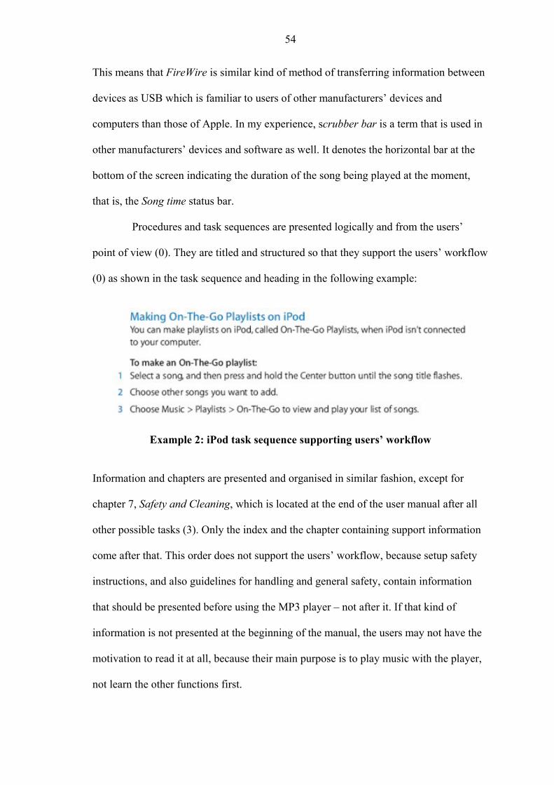
54
This means that FireWire is similar kind of method of transferring information between
devices as USB which is familiar to users of other manufacturers’ devices and
computers than those of Apple. In my experience, scrubber bar is a term that is used in
other manufacturers’ devices and software as well. It denotes the horizontal bar at the
bottom of the screen indicating the duration of the song being played at the moment,
that is, the Song time status bar.
Procedures and task sequences are presented logically and from the users’
point of view (0). They are titled and structured so that they support the users’ workflow
(0) as shown in the task sequence and heading in the following example:
Example 2: iPod task sequence supporting users’ workflow
Information and chapters are presented and organised in similar fashion, except for
chapter 7, Safety and Cleaning, which is located at the end of the user manual after all
other possible tasks (3). Only the index and the chapter containing support information
come after that. This order does not support the users’ workflow, because setup safety
instructions, and also guidelines for handling and general safety, contain information
that should be presented before using the MP3 player – not after it. If that kind of
information is not presented at the beginning of the manual, the users may not have the
motivation to read it at all, because their main purpose is to play music with the player,
not learn the other functions first.

55
In my judgment, the overall severity rating of the usability problems in the user
documentation regarding this heuristic is 2, because there are terms that are not
explained and the chapter organisation of the user documentation does not follow the
user’s workflow.
Match between documentation and the product
This principle deals with the following issues: Does the terminology in the
product match with the user documentation? Do the illustrations and descriptions
correspond to the product? Although I will not evaluate the interface between iPod and
the computer, that is, the use of the iTunes software, the illustrations of the iPod
controls and menus presented in the user documentation will be evaluated against the
actual product, thus ensuring that there is a match.
The terminology used in the user documentation corresponds with the terms
used in the product’s interface (0). The following figure, presented in the user
documentation, shows a view of the main menu before it has been customised by a user:
Figure 5: Using iPod menus

56
The names and locations of the menu items and status icons, such as Battery status,
which the user sees in the product match those in the user documentation (0). In the user
documentation the path from the top menu to the function in question is marked clearly,
for example, Music > Playlists > On-The-Go > Clear Playlist. The views and paths in
the iPod interface match those presented in the user documentation (0). The Menu title
in the user documentation matches with the actual menu and the view at the top of the
display. For example, when the path in the user documentation is described as Music >
Playlists > On-The-Go, the Menu title reads On-The-Go in that view in the product, and
in the main menu displayed above the Menu title reads iPod.
Icons and other information in the documentation match those in the product
(0). The Song time status bar and other icons such as Shuffle icon, depicted in the
following figure which is taken from the user documentation, present the same pieces of
information to the user in the product as described in the user documentation.
Figure 6: Playing music with iPod
The symbols described in the user documentation match with those the user can see on
the product (0). The same symbols are used in the user documentation to describe
actions users can perform with them.
57
The overall severity rating of the usability problems in the user documentation
regarding this heuristic is 0.
Purposeful Documentation
This principle deals with the following issues: Is the intended use of the user
documentation clear? Is the documentation provided in appropriate media?
In the evaluation of this heuristic the intended use of the user documentation is
divided into two aspects to provide more detailed results, as follows. The function of the
user documentation is otherwise clear except for the main title – iPod Features Guide.
The title refers more to describing the features incorporated in this MP3 player than to
actual MP3 player user instructions. All other headings and titles are clear and they
describe the users’ actions, for example, Setting iPod to Shuffle Songs (1). Most of the
terminology, definitions, and concepts are listed in the index, which helps to keep the
function of the documentation clear (1).
One of the major faults in this particular MP3 player, though, is that the player
does not contain a help in itself (3). Although this analysis concentrates on the user
manual and not the actual player, this is a relevant issue, because in problem situations
there is no possibility for the users to find help in problem situations while on the move
– unless they are carrying the paper manual or a laptop with them. Users should be
provided with some kind of help and instructions for using the product without the
actual manual. An appropriate medium for short instructions and troubleshooting would
be the MP3 player itself, therefore we can conclude that all the information is not
provided in an appropriate or necessary format. Of course, if the MP3 player freezes or
goes blank, an integrated help system would not be of much use in that case. If the
player does not contain a help, users should be provided some kind of short instructions

58
for using the player and for troubleshooting, or at least some kind of help in some
format.
The overall severity rating of the usability problems in the user documentation
regarding this heuristic is evaluated to be 2. The proper medium for the troubleshooting
instructions is not the PDF version only – especially the troubleshooting instructions
should be available on the go. However, that aspect should not be as important in
comparison as the other two, because the main focus here is the PDF version of the user
documentation.
Support for Different Users
This principle deals with the following issues: Does the user documentation
support the users’ needs? Is there unnecessary information for specific users?
There are all kinds of users in the MP3 player target groups, therefore the level
of knowledge and experience varies a lot, and users have different needs. Therefore the
aspects in this heuristic have been divided into more descriptive and detailed aspects.
In spite of the wide audience, the user documentation contains enough detail for its
intended audience (0), and terminology and concepts can be expected to be understood
by users of different levels of knowledge and experience. Figures in right places also
support the users. As an example, the following figure shows how the illustration
supports the instructions by presenting a context for both the use of the Dock connector
and the meaning of the term.

59
Figure 7: iPod Dock connector A figure can be used to make up for indistinctly expressed instructions, and vice versa
(Van der Meij and Gellevij, 2004, 10). In the figure above, the text is not unambiguous,
but the arrows in the figure complement the instructions.
Language used in describing errors and trouble situations is presented at a
suitable level for the intended audience. The following is an example of troubleshooting
instructions if the user cannot hear music:
Example 3: iPod troubleshooting instructions

60
The language is clear, easy, unambiguous, and not too patronising (0). Important words
and concepts are repeated in the instructions when necessary and the index provides an
access to terms, definitions, and concepts. The index contains terminology and concepts
for the needs of all users, in spite of their level of knowledge and experience (0).
The user documentation does not contain words or phrases that are redundant
for the user, and there is no real redundancy in the information provided either (0).
There is some overlap in the procedure for changing the maximum volume, because it is
explained right after setting the volume and the procedure for both is the same (1).
Some of the safety instructions in chapter 7 can be regarded as unnecessary and
patronising, but the manufacturer most likely does not want to held liable if someone
misuses iPod, and therefore the necessary safety instructions and precautions are stated
in the user documentation, although they might seem unnecessary for the users.
The overall severity rating of the usability problems in the user documentation
regarding this heuristic is 0.
Effective Information Design
This principle deals with the following issues: Can the information be found
and understood easily? Are the sentences and paragraphs concise, graphics and lists
easy to read and not overused, user’s needs supported, and is the user addressed directly
using imperative verb forms?
In this heuristic I chose to evaluate in detail the aspect of finding and
understanding information easily, which is such a general description that it could
include several sub-aspects. There are many variables besides graphics which all
together constitute that whole aspect and I think they all should be taken into

61
consideration in the evaluation. This includes, for instance, headings, layout,
notifications, and language.
The names of headings and subchapters are clear and they describe the users’
actions (0), for example, Using iPod controls, Playing music, and Adding or Removing
Items from the Main Menu.
Example 4: iPod task with preconditions and outcomes
Procedures and task sequences describe the preconditions and outcomes of the users’
actions and they are titled and structured so that they support the user’s workflow (0).
These factors make it easy for users to find and understand the information they need,
as seen in the Example 3 previously.
Although the titles and the internal structure of the procedures and task
sequences support the users’ workflow, the layout is not well designed, because
everything in the subchapters and topics is written one after another without breaks or
proper numbering. The following example shows what the headings and the text in
procedures and tasks look like:

62
Example 5: Layout of headings, procedures, and steps
The topics and subchapters are not numbered and they are not big or bold enough, and
there is not enough white space between them, which makes them unclear, because they
do not stand out properly. The second and third level headings look too much alike and
get easily mixed up and especially the third level headings are drowned amidst the short
paragraphs (3).
The grammar and the linguistic structures used in the user documentation are
correct (0), as can be seen in the following example:
If iPod is exceptionally low on power and you connect it to a USB port, it might charge for up to 30 minutes before it turns on. The display could be dark for up to 30 minutes while it charges. Leave iPod connected until it charges sufficiently. If you have an iPod USB Power adapter (available separately), you can use that to charge iPod more quickly. (Apple Inc., 2006a.)
63
There are no spelling errors or typos present (0). Linguistic connectors have been used
effectively and their meaning and purpose is unambiguous, and it is clearly indicated
whether a procedure is optional (0).
With a few exceptions, when a term, abbreviation, or concept appears for the
first time in the user documentation it is explained, as for instance Dock connector,
podcast, On-The-Go Playlist. There are some terms which are not explained at first or at
all. For example, disambiguation of the term Dock connector with the help of a figure is
presented a few pages later than where it was first mentioned in the user documentation
(2). Once the terms have been explained, the same meaning is used throughout the
documentation (0).
Paragraphs and sentences are focused and concise, most paragraphs are not
more than four lines long. The only exception is the Safety and Cleaning chapter in
which the paragraphs are overall longer than elsewhere in the documentation (2). Long
paragraphs are divided into numbered or bulleted lists, where applicable, and the lists
are clear and easy to read (0), as can be seen in Examples 3 and 4. They are used to
support the users’ information needs and do not provide redundant information.
An example of poor information design would be a situation where appropriate
graphics that would have made the instructions easier to understand have been left out
of the documentation. These recommendations and criteria are also relevant from the
troubleshooting point of view.

64
Example 6: A warning and a note in iPod user manual The example above shows how graphics can be used to help to convey the message
clearly. The instructions precede the warnings in the procedures, which is the most
efficient way of presenting the information according to Van der Meij and Gellevij
(2004, 10).
The Important messages in general are too similar in their outlook to the actual
topics and tasks, so they do not stand out, as in the following example:
Example 7: Information content of the Important message
The Important messages sometimes contain information that should be placed in a
different notification category. The example above contains information warning the
user against possible damage to data or iPod if the instructions are not followed. That
kind of information should be presented in a Warning.

65
Notes are not clearly distinguishable either, because they look too much like
the rest of the text, except for the word Note being bolded and italicised (3). The Note in
the Example 5 previously is more visible than others, because it is not in the middle of a
paragraph containing normal text, but instead under a figure and a Warning.
Nevertheless, warnings and notifications are phrased so that the users are aware of
possible physical injury, loss of data, or damage to equipment that may result from the
action, thus supporting the information needs of the users (0).
Typography and visual organisation are very important factors in how the text
is read and interpreted, as discussed in Chapter 3.2. The layout and typography should
help and support the users to understand the instructions. Graphics have not been
overused in this manual, but there are still enough of them to support the users’
information needs, and they are clear and easy to read (0), as the following illustration
of the iPod controls:

66
Figure 8: iPod controls
Symbols have been used consistently and unambiguously throughout the documentation
(0). The figure above presents the users with the various symbols on the player, but as
can be seen, the symbols cannot be easily distinguished, because the illustration shows
them in white colour against a gray background. However, they have been marked with
a line pointing to the correct place and the symbols are explained and shown in black
colour one page later in the user documentation (2).
The user is consistently addressed in the first person (0), and the tasks are
described using active voice (0) and imperative verb forms (0), and the present tense is
used (0). The language used throughout the user documentation is gender-neutral and

67
informative, clear, and unambiguous (0). Descriptions of errors and trouble situations
are written in neutral language (0).
In my judgment, the overall severity rating of the usability problems in the user
documentation regarding this heuristic is 2. The majority of the rated aspects are not
usability problems, but there are so many minor and major usability problems which
raise the overall severity rating.
Support for Various Methods for Searching Information
This principle deals with the following issues: Does the user documentation
support different ways of searching for information? Is there an index and a table of
contents, and can the notes and warnings be easily noticed? In this heuristic, the support
of different strategies for finding information contains various aspects, as discussed in
Chapter 3.2.
The user documentation supports different strategies of searching for
information, for example, the naming of the topics and subchapters is self-descriptive
and appropriate, and the table of contents is clear and focused (0). The users have the
table of contents and index at their disposal (0).
The user documentation does not contain any numbered subchapters, only
topics which are not big or bold enough to be noticed (3). The absence of numbering
makes it more difficult for the users to search for information. Notes are almost similar
to normal text, and the Important messages resemble subchapters and topics, and only
Warnings and Notices stand out from the text, when all the notification types should be
distinguishable so that browsing would be supported (3).
Long paragraphs are divided into numbered or bulleted lists, where applicable,
except in the Safety and Cleaning chapter, as shown in the following example:

68
Example 8: Instructions without a list or steps In my view the long paragraphs should be divided into lists, because now many actions
and options in that chapter are presented to the user one sentence after another as one
single paragraph, which makes the instructions more difficult to understand (2). There
are a few bulleted lists in that chapter, but much of the information is difficult to read.
The location of figures and tables is not indicated with identifiers. They do
relate to the heading under which they are presented, but the figures and tables do not
have captions. The text either continues right after the figure or there is just blank space
after it for the rest of the page, as in the following figure:

69
Figure 9: Lack of caption in iPod instructions The figures are not listed or mentioned in the index or table of contents, or otherwise
referred to in the text (3). Although the figures can be easily noticed from the text while
browsing, the absence of identifiers and captions does not support searching for
information or easy understanding.
In my judgement, the overall severity rating of the usability problems in the
user documentation regarding this heuristic is 3, due to the many severe usability
problems which are likely to complicate the use of the documentation.
Task Orientation
This principle deals with the following issues: Are the instructions structured
around the users’ tasks? Is the same level of detail used in all task sequences?
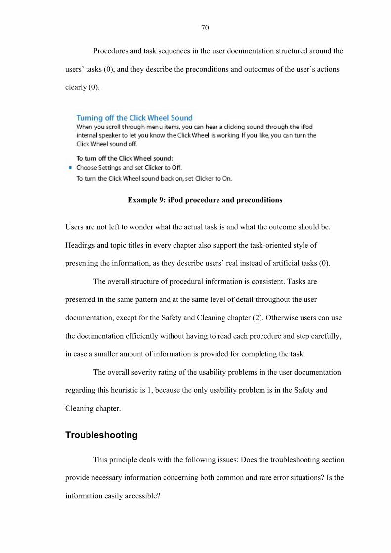
70
Procedures and task sequences in the user documentation structured around the
users’ tasks (0), and they describe the preconditions and outcomes of the user’s actions
clearly (0).
Example 9: iPod procedure and preconditions Users are not left to wonder what the actual task is and what the outcome should be.
Headings and topic titles in every chapter also support the task-oriented style of
presenting the information, as they describe users’ real instead of artificial tasks (0).
The overall structure of procedural information is consistent. Tasks are
presented in the same pattern and at the same level of detail throughout the user
documentation, except for the Safety and Cleaning chapter (2). Otherwise users can use
the documentation efficiently without having to read each procedure and step carefully,
in case a smaller amount of information is provided for completing the task.
The overall severity rating of the usability problems in the user documentation
regarding this heuristic is 1, because the only usability problem is in the Safety and
Cleaning chapter.
Troubleshooting
This principle deals with the following issues: Does the troubleshooting section
provide necessary information concerning both common and rare error situations? Is the
information easily accessible?

71
The Tips and Troubleshooting section in the user documentation first provides
basic guidance and instructions for solving common error situations, that is, the 5 Rs:
reset, retry, restart, reinstall, and restore. They present a short description of actions
that normally help in problem situations (0). If those do not help, there are several pages
of more detailed descriptions of rarer situations providing users instructions how to
recognise various other errors and recover from those situations (0).
The lack of a help in this MP3 player itself is, as established in related aspects
of the third and fifth principles, a major fault. It is a relevant issue also from the
perspective of this heuristic. Although there is a troubleshooting section in the user
documentation and it provides guidance for many kinds of problem situations, users
have no access to documentation related to errors while on the move – without a paper
copy or a laptop. Users should be able to overcome problems and recover from error
situations without having to go home and study the user manual. All such
documentation should be made easily available. The users should be provided some
kind of short instructions for troubleshooting, or at least some kind of help, and the
documentation media should support this (3).
The overall severity rating of the usability problems in the user documentation
regarding this heuristic is evaluated to be 1. There are no usability problems related to
the principle as such, but the issue of a help in the MP3 player itself is relevant, because
it is related to troubleshooting and without it there is no easy access to such information
when the user is on the move. Because it is not part of the user documentation that is
evaluated, the importance of that aspect is low although severity rating is high.
Consistency and Standards
This principle deals with the following issues: Are the language and
terminology consistent? Is the structure of the user documentation and the presented

72
information consistent? The aspect of information structure consistency is not simple,
therefore it is evaluated from a few different angles which together constitute the whole
aspect.
The overall tone of the user documentation is appropriate and consistent with
the characteristics of the genre (0), meaning technical documentation. The chosen
spelling convention is consistent (0). Contracted verb forms are used throughout the
user documentation, that is, forms don’t, won’t, isn’t, doesn’t, you’re, for example. In
the Safety and Cleaning chapter, however, both formats are used, don’t and do not (1).
The internal structure of task steps is consistent throughout the user
documentation, as shown in the following figure:
Example 10: Consistency of procedural information The overall structure of procedural information is presented in the same pattern
throughout the user documentation, except for the Safety and Cleaning chapter (2). The
menu paths are described in a consistent fashion, for instance Settings > Main Menu (0).
There is no unnecessary overlap in the user documentation (0).
The layout and construction of chapter 7, Safety and Cleaning, is not consistent
with other information in the manual that I analysed. The tasks procedures are not
placed under headings describing the tasks (2), and there are too many topics which all
look alike and get easily mixed up with other paragraphs, because the rest of the text
starts from the same line as the name of the topic, with only an additional space

73
character between them (3). The topic names are bolded, but there is no additional white
space to clearly separate the topic from the next, as the following figure shows:
Example 11: Layout of topics in chapter 7 Although there are instructions which are written in the present tense imperative
addressing the user in the first person, that information is not presented in steps, and
there is only one bulleted list containing instructional information. Instructions and
information are also listed in the same paragraph one sentence after another without lists
or steps as done in other chapters of the user documentation (2).
One possible theory for explaining the differences is that the chapter 7 may be
a single-sourced information unit. Exactly the same information content can be found in
the iPod safety guide (Apple Inc., 2006c) which is delivered with the iPod along with
the Fifth generation iPod late 2006 features guide (Apple Inc., 2006a). Only the
following sentence has been added to the beginning of the iPod safety guide: “For

74
detailed operating instructions, see the features guide for your iPod found at:
www.apple.com/manuals/ipod”. The same information content can also be found in the
user documentation of other models, and their safety guides, for example the iPod nano
safety guide (Apple Inc., 2006b). If single sourcing is applied in user documentation, all
different information modules should be linguistically, typographically, and structurally
consistent within one user manual, and they should contain only relevant information,
despite being reused in different manuals, which is not the case here. All other chapters
conform to those guidelines except the Safety and Cleaning chapter.
The location of the Safety and Cleaning chapter is not consistent with the
structure of the user documentation in general, because the structure of the rest of the
documentation supports the user’s workflow, except for this section. The chapter
contains safety and handling information, but also guidelines for cleaning and disposing
of the player, which should not be in the same chapter. It would be more logical to place
the chapter at the beginning, as most of the information in that chapter is related to
taking the MP3 player into use (3).
The information content in Warnings, Notes, Notices, and the Important
messages is not consistent (2). The Safety and Cleaning chapter contains the following
Notice which stands out well:
Example 12: Notice in iPod user documentation The meaning is also clear, but it describes possible damage to iPod if the instructions in
the Notice are not followed, therefore it should be a Warning or a Caution instead of a
Notice. Chapter 7 is the only place where a Notice is used and it is used only once,
75
which supports my theory of that chapter having been reused in many user manuals, as
the chapter is not consistent with the others.
When terms or concepts have been explained, the same meaning is used
throughout the user documentation (0). The term lanyard is used only twice, in the
Safety and Cleaning chapter. Lanyards are not even available for the Fifth Generation
iPod, but they are sold in the Apple Store (Apple Inc., 2008) for iPod nano, therefore
the term should not be mentioned in the user documentation of this particular model.
In my judgment, the overall severity rating of the usability problems in the user
documentation regarding this heuristic is 2. There are several major problems related to
consistent presentation of information and its structure, therefore a lower grade cannot
be given.
Help on Using Documentation
This principle deals with the following issues: Does the user documentation
provide instructions on its intended use? How is the documentation going to be
updated? I chose to include also service, support, and iPod-related software updates as
one important aspect of this heuristic, and because it contains characteristics of both
other aspects it cannot be straightforwardly evaluated as a part of either one of those
aspects.
At the beginning of each chapter users are provided with instructions on the
intended use of the user documentation.

76
Example 13: The summary at the beginning of chapter 2
First there is a short introductory description of what users are about to learn to do in
that particular chapter, as in the example above, and then there is a more detailed
description of the main topics and areas of information that the chapter covers (0).
Longer descriptions are summarised in a bulleted list.
As for getting the possible updates to the user documentation, there is no
explicit mention of that. The user documentation contains a section, chapter 8,
instructing the users where to get service, support, and more information on iPod, and
software updates and downloads (0). Other support and update needs are covered, but
not user documentation itself (1). It raises a question whether there is any real need for
user documentation updates in such a small documentation set as this.
The overall severity rating of the usability problems in the user documentation
regarding this heuristic is 0, because the users are provided with well organised
instructions on the use of the documentation, support information, and service. In my
estimation the documentation update needs are most likely to be minimal.

77
5 Conclusions
The main purpose of this study was to conduct a heuristic usability analysis of
MP3 player documentation using Purho’s (2000) list of ten documentation usability
heuristics. The usability evaluation was performed as an expert analysis against the
heuristics list by examining the user documentation in detail. But as usability is product-
specific, the best case scenario would be to have a product-specific list of heuristics
which could then be reused several times (Korvenranta, 2005, 122-123). Such list was
not, however, available. The secondary purpose of my thesis was to examine how
suitable Purho’s heuristics are in evaluating new material such as an MP3 player user
manual and whether some of the heuristics have become outdated.
The purpose of a user documentation usability evaluation is to reveal possible
problems in using and understanding the user documentation, preferably in the early
development phase and also before the product and documentation are released to the
customers. Before the actual usability evaluation there are matters that should be taken
into consideration in the information design phase, most importantly the users. Target
group analysis provides important information about the users, thus enabling further
development regarding the usability of the product and the user documentation. It
provides personal details about the users, for example, age, gender, level of experience,
and general knowledge. Users also have different motives for reading and the
environment and situation influence their reading style. As discussed in Chapter 2, these
all affect information design which forms the basis for constructing the actual user
documentation, and through it they relate to the usability of the user documentation.
As a combination of the most important basic aspects in defining and
evaluating usability we can list the following factors from the short definitions of
78
Nielsen (2003) and the ISO standard 9241-11 (1998): learnability, efficiency,
memorability, errors, and satisfaction, as well as the contextual components, that is, the
user, task, equipment, and environment. In a comprehensive usability evaluation a set of
more detailed heuristics is needed, because usability encompasses so many other
attributes, many of which are related to information design and target group analysis.
Therefore the analysis was performed on the basis of Purho’s general documentation
usability heuristics. An estimated usability severity rating was given for all individual
aspects related to the heuristics, and an overall severity rating was given at the end of
each heuristic. The ratings, especially the overall rating, were subjective, because no
actual users were used in this type of usability analysis.
Purho’s first heuristic, match between documentation and the real world,
focuses mostly on language, words, phrases, and concepts. The lexicon and morphology
correlate with standard English language and simple and unambiguous sentence
structures of the MP3 player documentation support the real-world conventions –
consequently it can be considered that the language and text are easily understood by
the users. Technical jargon and acronyms have been avoided, and terminology and
concepts can be expected to be familiar to the users. Procedures, except in the Safety
and Cleaning chapter, are logical and support the users’ workflow. All findings
considered, my overall assessment is that the usability problems related to this heuristic
are minor and should be given a low priority.
In the second heuristic, match between documentation and the product, there
were no usability problems found. Terminology in the user documentation corresponds
with the terms used in the product, and also symbols, menus, statuses, and icons match
with the users see in the product.

79
The third heuristic, purposeful documentation, concentrates on the purpose of
the user documentation and whether it is provided in appropriate format. The function
of the user documentation is clear, except for the main title, iPod Features Guide, which
suggests that the user documentation concentrates on describing the features of the MP3
player not the instructions for using it. Other headings and titles are unambiguous and
they reflect the users’ actions. Terms, definitions, and concepts are listed in the index,
except iPod Dock, FireWire, scrubber bar, and lanyards. The biggest problem was that
the player does not contain a help in itself, which should, in my judgment, be included
so that the necessary information is provided in an appropriate format. My conclusion is
that the usability problems related to this heuristic are minor and of a low priority.
The fourth heuristic, support for different users, is closely related to target
group analysis and the users’ needs, that is, the types of people that read the user
documentation in question and how or why they read it. The MP3 player target groups
are varied and there are all kinds of users, but the user documentation provides enough
detail for the intended audience. Important concepts are repeated when necessary and
there are no redundant words, phrases, or information. Figures are placed so that they
support the users. Language is easy to understand, unambiguous, and presented at a
suitable level for the intended audience. There were only few findings regarding this
heuristic, but they are not usability problems.
The fifth heuristic, effective information design, mainly concerns finding and
understanding the information, and typographic conventions that are easy to understand
and support the users’ needs. Headings and topic names are self-descriptive, and
procedures are presented from the users’ point of view, supporting the workflow, which
make the information easier to understand and find. However, subchapters are not
numbered, typeface is not distinct enough, and they lack the white space between them.

80
Third level headings, especially the task headings, blend with the text paragraphs.
Terms and concepts are explained when they are presented for the first time, except
iPod Dock, FireWire, scrubber bar, and lanyards, and the same meaning is used after
that. Paragraphs and sentences are focused and concise, and numbered and bulleted lists
instead of long instructive paragraphs, except in the Safety and Cleaning chapter which
is not consistent with the other chapters. Notifications are phrased well, but their
visibility varies – only warnings can be clearly distinguished. Graphics are not overused
and they support easy understanding. The text is grammatically and linguistically
correct, gender-neutral, informative, there are no spelling errors, and weak sentence
structures and excessive use of passive voice are avoided. Users are addressed in the
first person, using active voice, imperative verb forms, and present tense. Although
information design covers various other aspects, these were the main aspects related to
this heuristic. All findings and their importance considered, my overall assessment is
that the usability problems related to this heuristic are minor and should be given a low
priority.
The sixth heuristic, support for various methods for searching information,
presented more severe and numerous usability problems than I anticipated. There were
positive things as well, for instance the names of the topics and subchapters are
descriptive and appropriate, and the table of contents is clear and focused. But there are
no numbered subchapters, only topics which are not distinct from the text and tasks, not
big or bold enough. Notification types are not visible enough, and tables and figures do
not have captions and they are not listed either in the table of contents or the index.
There are different strategies for reading and searching for information, but the user
documentation does not sufficiently support different types of reading processes. As an
overall estimation of the findings related to this principle, there were major usability
81
problems which should be given high priority, because they complicate the use and
decrease the level of usability considerably.
In the seventh heuristic, task orientation, there were only cosmetic usability
problems in my estimation. Task sequences were presented from the users’ viewpoint
and according to their workflow, and all preconditions and outcomes were clear. The
overall structure of procedural information is consistent and presented in the same
parallel pattern and at the same level of detail throughout the documentation.
The eighth heuristic, troubleshooting, also presented mainly cosmetic usability
problems. The user documentation includes unambiguous short descriptions for
common and general error situations – the 5 Rs. There are several more detailed
descriptions for rarer situations related to error recovery. As regards the accessibility of
the troubleshooting instructions, the user documentation provides an easy access, but as
mentioned, the player does not contain a help in itself, thus providing no help on the
move.
In the ninth heuristic, consistency and standards, the consistency of language,
terminology, and the structure were evaluated, and whether the actions and situations
mean the same thing. Grammatical constructions are consistent and there are no
nonparallel headings. The Safety and Cleaning chapter is not consistent with the other
chapters: task topics are not placed under headings, and the topics look too much alike
and there is no additional white space between the topics. Instructions and tasks are
most often written in the same paragraph, instead of using bulleted and numbered lists.
The structure of the chapter does not support the users’ workflow, the location of the
Safety and Cleaning is not consistent with the structure of the documentation, and safety
and handling instructions should not be in the same chapter with instructions for
cleaning and disposing of the player.

82
All findings and their importance considered the usability problems were in my
judgment minor and of a low priority, as nearly all bigger problems were related to one
chapter – Safety and Cleaning.
As regards the tenth heuristic, help on using documentation, the overall
estimation was that the findings are not usability problems. Users are provided with
instructions on the intended use of the user documentation at the beginning of each
chapter. After a short introductory description there is a more detailed description of the
main topics and areas. Possible updates to the user documentation are not mentioned,
but users are instructed where to get service, support, and more information on iPod.
Overall, the method chosen for this study was, in my opinion, successful, as it
enabled a detailed evaluation of the user documentation and revealed problems that
were not visible at first. Based on the evaluation results, the overall usability of the Fifth
generation iPod late 2006 features guide (Apple Inc., 2006a) proved to be uneven. Most
of the findings were cosmetic and minor usability problems with which users can be
expected to cope. The language and the structure of the task sequences proved to be
much better than I anticipated. On the other hand, the number of major usability
problems and their source came as a surprise. I expected to find usability problems, but
neither as numerous and severe as the analysis revealed nor related to the aspects I
discovered. All in all, it can be argued that this user documentation is usable enough to
guide the users through their tasks, but there is still much room for improvement –
especially when it comes to searching for information.
The secondary purpose of this study was to establish whether Purho’s
heuristics list is outdated or still suitable, and in case the list is not up-to-date, to
conclude which usability aspects of user documentation the heuristics do not cover
properly and how the heuristics could be updated.

83
In my estimation, I managed to gather sufficient data during the usability
evaluation to be able to evaluate the functionality of Purho’s heuristics in this context.
In general, they are well suited for user documentation usability evaluation and are still
up-to-date, but in my view they could be updated and improved, because a few
important aspects of usability are not accounted for and there is also some redundancy
in Purho’s principles. Based on the analysis, I concluded that the more detailed aspects
that Purho’s heuristics do not thoroughly or at all account for are predictability,
memorability, error prevention, and user control and freedom, and I will now give an
overview of these aspects.
With predictability we can evaluate how intuitive and easy the user
documentation is to use and learn. Consistency of the user documentation and proper
information design help to achieve these goals, as especially effective information
design is interconnected with all the other heuristics. Predictability is very closely
related to the match between documentation and the real world, and the aspect of logical
order of information, and if procedural information is predictable, it also supports
different users. Of course users have their own opinions of what is predictable or
intuitive, based on their own internal models, but information design can be based on
what most people would find predictable according to target group analysis.
Memorability is closely related to predictability. If the user documentation and
product are predictable to use, it is easier for the users to remember the instructions.
Nielsen (2003) established memorability as a part of the five most important quality
components in evaluating the usability of user interfaces. Memorability evaluates how
easily users are able to reestablish their proficiency when they use the product after an
interval. Purho’s (2000) fifth heuristic, effective information design, emphasizes easy
understanding and reading, typographical aspects, and addressing the users directly,
84
among others. Memorability is closely related to these and, although it is difficult to
evaluate in an expert evaluation without actual users, it could in my estimation be
incorporated as an aspect in the detailed description of the fifth heuristic. It could also
be integrated into the second heuristic, because it pertains to the match between
documentation and the product.
In my opinion Purho’s tenth heuristic, help on using documentation, is rather
irrelevant when evaluating small document sets and individual user manuals, such as the
one used in this study, because the need for user documentation updates is not that
great. That principle also covers the intended use of the user documentation, but the
same aspect is covered by the third heuristic, purposeful documentation. In my view
they could be combined as a single heuristic. Purposeful documentation evaluates
whether the function of the user documentation is clear and the documentation provided
in an appropriate format and medium for the users. The aspect information on
documentation updates could be included in that heuristic.
As a replacement for Purho’s tenth heuristic I would add a new heuristic,
which, in my judgment, covers some of the other weaknesses in Purho’s heuristics list.
Nielsen’s (2008b) heuristics list included the following two principles: error prevention,
and user control and freedom. In error prevention Nielsen suggests to eliminate error-
prone situations and to ask the users for confirmation before performing the action. In
user control and freedom he points out that users make mistakes and they need
emergency exits, such as undo and redo. These Nielsen’s two heuristics are related to
each other and Purho’s (2000) list does not directly cover these aspects. There are
related heuristics and aspects, for example in troubleshooting and effective information
design, but the aspects mentioned above are not included in those either.

85
Although user control and freedom is not directly applicable to user
documentation evaluation, it can be used to evaluate several aspects related to those.
Therefore, I would suggest a new heuristic called user freedom and error tolerance,
which I composed by modifying the Nielsen’s heuristics just mentioned and adding a
few aspects more suited for user documentation analysis:
Users should be given freedom to proceed with their tasks at a pace they need and to switch between tasks when they need. Users should be allowed to make mistakes. Despite incorrect actions, users should be able to complete the task sequences with the intended results with minimal corrective actions. Descriptions of the corrective actions should be clear, near, and visible, in addition to a troubleshooting section.
Some of the aspects are closely related to Purho’s heuristics, especially match between
documentation and the product, and information design, but not directly. On the other
hand, this description is also very much related to Purho’s troubleshooting heuristic.
Most of this could be incorporated into that heuristic, thus improving it.
Few individual studies have been made using Purho’s documentation usability
heuristics and none of the previous studies have evaluated Purho’s heuristics as well. As
this was the first study to pursue that angle besides using the heuristics, I had no real
reference material to use or criticise besides Purho’s heuristics and the evaluation
results. However, I managed to identify possible deficiencies in the heuristics and
propose a few improvements, although the heuristics proved to be generally functional
and up-to-date for usability evaluation. Nevertheless, more case studies would be
needed to properly assess whether Purho’s principles actually need updating or whether
this study is just a statistical anomaly or subject to partiality on my behalf. Even more
use cases would be needed to assess the revised heuristics list to come up with
suggestions for further improvements to my revisions – which are completely
theoretical at present. Both lists could be used in a usability evaluation in parallel and

86
compare the outcome and findings produced by each list. It might reveal what kind or
size of user documentation the two lists are most suited for. The parallel evaluation
might reveal the benefits and drawbacks of all the heuristics, thus presenting
information on which aspects would constitute the new tenth heuristic. But such matters
are not in the scope of this study and they will be left for future studies on this field.
87
References
Empirical material
Apple Inc. 2006a. Fifth generation iPod late 2006 features guide. URL: <manuals.info.apple.com/en/iPod_Late_2006_Features_Guide.pdf>. (Referred January 25th, 2008.)
Literature
Alasilta, Anja. 2000. Verkkoajan viestintä. Rt-Print Oy, Helsinki. Hackos, JoAnn T. & Janice C. Redish. 1998. User and task analysis for interface design. New York: John Wiley & Sons. Hargis, Gretchen & Michelle Carey & Ann Kilty Hernandez & Polly Hughes & Deirdre Longo & Shannon Rouiller & Elizabeth Wilde. 2004. Developing quality technical information. A handbook for writers and editors. (2nd ed.) IBM Press, New Jersey. Hoft, Nancy L. 1995. International technical communication. How to export information about high technology. New York: John Wiley & Sons, Inc. International Organization for Standardization. 1998. ISO 9241-11. Ergonomic requirements for office work with visual display terminals (VDTs) – Part 11: Guidance on usability. Geneva. Johnson, Robert R. 1998. User-centered technology. A rhetorical theory for computers and other mundane artifacts. State University of New York Press, Albany. Keinonen, Turkka. 2000. Yksiulotteinen käytettävyys. In Keinonen, Turkka (ed.). Miten käytettävyys muotoillaan. Nokia Oyj, pp. 92-105. Korvenranta, Heta. 2005. Asiantuntija-arvioinnit. In Ovaska, Saila & Anne Aula & Päivi Majaranta (eds.). Käytettävyystutkimuksen menetelmät. Tampereen Yliopisto, Tietojenkäsittelytieteiden laitos, Tampere, pp. 111-124. Laakkonen, Paula. 2006. Safety information in motorcycle manuals. Pro gradu thesis, University of Tampere. Lyytikäinen, Kata & Hannu Riikonen. 1995. Painotuotteen suunnittelu. Opetushallitus. Lyytikäinen, Virpi. 1998. Rakenteisuuden hyödyntäminen elektronisissa dokumenteissa. SGML-pohjaisen dokumentaation tutkimus ja käyttö Suomessa 1997. Teknologiakatsaus 57/98, Teknologian Kehittämiskeskus (Tekes).

88
Markel, Mike. 2007. Instructor’s resource manual to technical communication. (8th ed.) (PDF) Bedford/ St. Martins, Boston. Mattelmäki, Tuuli & Katja Battarbee. 2000. Elämykset muotoilun lähtökohtana. In Keinonen, Turkka (ed.). Miten käytettävyys muotoillaan. Nokia Oyj, pp. 142-163. McCaskill, Mary K. 1998. Grammar, punctuation, and capitalization. A handbook for technical writers and editors. (PDF version.) Langley Research Center, Hampton, Virginia. Nielsen, Jakob & Hoa Loranger. 2006. Prioritizing web usability. New Riders Press, Berkeley. Nielsen, Jakob. 1993. Usability engineering. Academic Press, Cambridge, Massachusetts. Nykänen, Olli. 2002. Toimivaa tekstiä. Opas tekniikasta kirjoittaville. Helsinki: Tekniikan Akateemisten Liitto TEK. Ovaska, Saila & Anne Aula & Päivi Majaranta (eds.). 2005. Käytettävyystutkimuksen menetelmät. Tampereen Yliopisto, Tietojenkäsittelytieteiden laitos, Tampere. Petterson, Rune. 2002. Information design: An introduction. Document design companion series, V. 3. John Benjamins Publishing Company. Reep, Diana C. 1997. Technical writing – Principles, strategies, and readings. (3rd ed.) Boston: Allyn and Bacon. Salomaa, Teija. 2004. Dokumentaation luettavuus ja ymmärrettävyys – useiden muuttujien summa. Pro gradu thesis, University of Tampere. Schriver, Karen A. 1997. Dynamics in document design. John Wiley and Sons Inc, New York. Stratton, Charles R. 1996. Technical writing: What it is and what it isn’t. In Jones, Dan (ed.). Defining technical communication. Society for Technical Communication, Inc, pp. 39-42. Van der Meij, Hans & Mark Gellevij. 2004. The four components of a procedure. In IEEE transactions on professional communication, Vol. 47, No. 1, March 2004, 5-14. Walker, Sue. 2001. Typography and language in everyday life. Prescriptions and practices. Harlow: (Longman); Pearson Education Limited. Yli-Jokipii, Hilkka. 2004. Tekniikan kieli tutkimuksen ja kääntämisen näkökulmasta. In Tommola, Jouko (ed.). Kieli, teksti ja kääntäminen – Language, text and translation. Turun Yliopisto, Englannin kielen kääntäminen ja tulkkaus, Turku, pp. 81-93.

89
Online material
Apple Inc. 2007. 100 million iPods sold. In Apple – Media & analyst info – Press releases 04/2007. URL: <http://www.apple.com/pr/library/2007/04/09ipod.html>. (Referred November 23th, 2007.) Apple Inc. 2006b. iPod nano safety guide. URL: <http://manuals.info.apple.com/en/iPod_nano_Safety.pdf>. (Referred March 28th, 2008.) Apple Inc. 2006c. iPod safety guide. URL: <http://manuals.info.apple.com/en/iPod_Safety.pdf> (Referred February 18th, 2008.) Apple Inc. 2008. Apple Store (U.S.) – Lanyard. URL: <http://store.apple.com/1-800-MY-APPLE/WebObjects/AppleStore.woa/wa/RSLID?find=lanyard>. (Referred April 16th, 2008.) Dimon, Garrett. 2004. Instructions not needed. URL: <http://www.yourtotalsite.com/archives/usability/instructions_not_needed/Default.aspx>. (Referred February 8th, 2008.) Entertainment Media Research & Olswang. 2007. The digital music survey 2007. URL: <http://www.olswang.com/dms07/default.asp>. (Referred February 12th, 2008.) Futuremark Corporation. 2007. Hardware dictionary. URL: <http://www.futuremark.com/community/hardwarevocabulary/3/#M>. (Referred February 28th, 2008.) Goodstein, Anastasia. 2007. BusinessWeek: Teen marketing: Apple’s the master. URL: <http://www.businessweek.com/technology/content/aug2007/tc20070815_636359.htm?chan=search>. (Referred February 12th, 2008.) Hau, Louis. 2007. Forbes: Taking on the iPod. URL: <http://www.forbes.com/technology/2007/09/11/apple-sandisk-ipod-tech-personal-cx_lh_0911sandisk.html>. (Referred November 25th, 2007.) Indiana University Knowledge Base. 2008. What is FireWire or IEEE 1394? URL: <http://kb.iu.edu/data/ahxe.html>. (Referred March 24th, 2008.) International Institute for Information Design. 2008. Definitions. URL: <http://www.iiid.net/Definitions.htm>. (Referred March 31st, 2008.) Kaleva, Lassi. 2000. Selvitys yritysten teknisen viestinnän tutkimustarpeista. (Teknologian kehittämiskeskuksen (Tekes) rahoittama Ihminen, kone ja tekninen viestintä -tutkimusprojekti.) URL: <www.uta.fi/~trtysu/mmtc/suomi/selvitystyo.html>. (Referred February 12th, 2008.)

90
Millward Brown Optimor. 2008. Top 100 most powerful brands – 2008 report. URL: <http://www.millwardbrown.com/Sites/Optimor/Media/Pdfs/en/BrandZ/BrandZ-2008-Report.pdf>. (Referred April 22nd, 2008.) Nielsen, Jakob. 2005. Durability of usability guidelines. URL: <http://www.useit.com/alertbox/20050117.html>. (Referred November 24th, 2007.) Nielsen, Jakob. 2008a. Heuristic evaluation. URL: <http://www.useit.com/papers/heuristic/>. (Referred November 23th, 2007.) Nielsen, Jakob. 2008b. Heuristics for user interface design. URL: <http://www.useit.com/papers/heuristic/heuristic_list.html>. (Referred November 15th, 2007.) Nielsen, Jakob. 2008c. Severity ratings for usability problems. URL: <http://www.useit.com/papers/heuristic/severityrating.html>. (Referred January 26th, 2008.) Nielsen, Jakob. 2008d. Summary of usability inspection methods. URL: <http://www.useit.com/papers/heuristic/inspection_summary.html>. (Referred January 12th, 2008.) Nielsen, Jakob. 2003. Usability 101: Introduction to usability. URL: <http://www.useit.com/alertbox/20030825.html>. (Referred November 15th, 2007.) Pew Internet & American Life Project. 2003. Music downloading, file-sharing and copyright. URL: <http://www.pewinternet.org/pdfs/PIP_Copyright_Memo.pdf>. (Referred January 12th, 2008.) Pikulski, John J. 2002. Readability. URL: <http://www.eduplace.com/state/author/pikulski.pdf>. (Referred April 22nd, 2008.) Purho, Vesa. 2000. Heuristic inspections for documentation – 10 recommended documentation heuristics. STC usability SIG newsletter, Vol. 6, No. 4. URL: <http://www.stcsig.org/usability/newsletter/0004-docsheuristics.html>. (Referred November 15th, 2007.) Tech-tips. 2007. Tech tip 111 – Audio file formats. URL: <http://www.geeks.com/techtips/2007/techtips-28Jan07.htm>. (Referred February 28th, 2008.) Technical Standards. 2007. 2003 worst manual contest winners. URL: <http://www.techstandards.com/2003winner.htm>. (Referred April 22nd, 2008.) Testing Standards Working Party. 2005. Usability guidelines. URL: <http://www.testingstandards.co.uk/usability_guidelines.htm>. (Referred November 15th, 2007.) Williams, Martin. 2002. The implications of MP3 technology and digital distribution on the international music industry and its stakeholders. URL:

91
<http://www.silvermania.co.uk/dissertation.htm#_Toc499408650>. (Referred January 15th, 2008.)