u.s. private sector job quailty index red cover
TRANSCRIPT

The U.S. Private Sector Job Quality Index®
Daniel Alpert, Jeffrey Ferry, Robert C. Hockett, Amir Khaleghi
NOVEMBER 2019
Table of Contents
Acknowledgements
The authors wish to thank and acknowledge the contributions to this paper, and/or the funding and other support of the Job Quality Index project, of the following individuals and institutions: The University of Missouri Kansas City (Department of Economics); Professor Scott T. Fullwiler, Professor Mathew Forstater and Mr. Lindokuhle M. Simelane. The Coalition for a Prosperous America; Mr. Michael Stumo, Mr. Steven L. Byers, Mr. Marc Fasteau and Mr. Daniel DiMicco. The Global Institute for Sustainable Prosperity and Denison University; Professor Fadhel Kaboub. The Levy Economics Institute at Bard College. The Clarke Business Law Institute of Cornell Law School. The Cornell Research Academy for Development, Law and Economics; Professor Kaushik Basu. Westwood Capital LLC.
Introduction 2 Part I | Need for the JQI: The Unmeasured Problem with American Jobs 5
A. The Weakening Trend B. The JQI: A Dynamic Measurement of Effective
Underemployment Part II | Construction of the JQI: Capturing and Tracking the Data 21
A. Further Limiting and Qualifying Notes Part III | Applying the JQI: Illuminating Areas of Confusion in Economic Transmission 28
A. The Phillip’s Curve and its Descendants B. Domestic Sovereign Interest Rates C. U.S. Balance of Trade in Goods and the Impact of the
JQI on Household Incomes and Consumption D. Productivity and Capacity Utilization E. Non-Residential Fixed Investment F. The Relationship of the JQI to Other Endogenous and
Exogenous Factors Over Time Part IV | Further Developing the JQI: What the Future Holds for the Index 48
A. Monthly Releases and Revisions B. Further Granularization within Industry Sectors C. Additional Intra-Sectoral Analysis D. Pre-1990 Emulations E. Development of the JQI-2
Part V | Conclusion: An Index for our Time 53
1

The U.S. Private Sector Job Quality Index
Daniel Alpert, Jeffrey Ferry, Robert C. Hockett and Amir Khaleghi 1
Abstract
The Job Quality Index (JQI) assesses job quality in the United States by measuring 2
desirable higher-wage/higher-hour jobs versus lower-wage/lower-hour jobs. The JQI results also may serve as a proxy for the overall health of the U.S. jobs market, since the index enables month-by-month tracking of the direction and degree of change in high-to-low job composition. By tracking this information, policymakers and financial market participants can be more fully informed of past developments, current trends, and likely future developments in the absence of policy intervention. Economists and international organizations have in recent years developed other, complementary conceptions of job quality such as those addressing the emotional satisfaction employees derive from their jobs. For the purposes of this paper, “job quality” means the weekly dollar-income a job generates for an employee. Payment, after all, is a primary reason why people work: the income generated by a job being necessary to maintain a standard of living, to provide for the essentials of life and, hopefully, to save for retirement, among other things. This paper presents the rationale for development of the JQI, the mathematical properties of the index, the design of its ongoing release and maintenance, the utility of the JQI in understanding related economic phenomena, and the JQI’s application to economic and market forecasting.
Introduction
The size and composition of the U.S. labor force have changed substantially over the past quarter century. The number of positions below the mean level of weekly wages (weekly hours worked multiplied by hourly
wages) increased materially from the 1990s through the present decade. The percentage of
private U.S. jobs in the service-providing sectors increased steadily from approximately 55% during the years immediately following the end of World War II through the end of the Great Recession in 2009. However, the percentage has remained flat—at around 83.5%— since that point. While service-sector growth as a percentage of all jobs has
Mr. Alpert is an adjunct professor at Cornell Law School, a senior fellow in macroeconomics and finance at the school’s Jack C. Clarke Business Law Institute and 1
founding managing partner of the investment bank, Westwood Capital, LLC. Mr. Ferry is chief economist at the Coalition for a Prosperous America (CPA), a nonpartisan association of U.S. labor and manufacturing interests. Dr. Hockett is the Edward Cornell Professor of Law, specializing in finance and economics at Cornell Law School. Mr. Khaleghi is a Research Fellow at the Global Institute for Sustainable Prosperity (GISP) and a PhD student in economics at the University of Missouri–Kansas City (UMKC). The project described in this paper was originally conceived by Mr. Alpert and developed by a consortium of Cornell-Clarke, CPA, GISP, and UMKC.
The Cornell-CPA Job Quality Index® (JQI®) is patent pending and the property of JQI IP Holdings, LLC.2
2

leveled off, job quality continues to worsen. 3
Capturing this decline in job quality is critical to understanding the broader economy: the JQI provides this information.
The reporting of employment data by the U.S. government, the media, business economists, as well as by other entities providing analytics, has lacked insight to the quality of America’s employment as most workers interpret it—the basic metric of weekly dollar income that a job generates for a worker. The focus on head l ine j ob coun t s and unemployment rates thus encourages the d i ssemina t ion and broadcas t o f an employment “story” that is incomplete and, often, inaccurate in its assessment of the health of the national economy.
Some economists also tend to view many changes in the employment situation as lagging indicators of the general health or weakness of the economy at large. Yet employment is the primary driver of aggregate demand in an economy, such as that of the United States, in which consumption counts for over two-thirds of total GDP.
The data necessary to report on the quality-related health of the U.S. jobs base already exists in large part. In fact, the data has materially improved since 1990, when the U.S. Bureau of Labor Statistics (BLS) broadened the sectoral analysis on which it reports monthly. The BLS again expanded its reporting in 2000, when it moved to monthly
reporting of such data for all employees, as opposed to traditional monthly wages and hours data reporting on production and nonsupervisory workers. As a result, the metrics and calculations captured in the JQI suggest that the data might work as a leading, not a lagging, indicators of fluctuations in such demand . Surprisingly, the data as 4
analyzed with the JQI also tend to predict the performances of many other salient metrics of the national economy and—in the end—financial markets too.
The JQI is aimed at assessing—on a monthly basis—the degree to which the number of jobs in the United States is weighted towards more desirable higher-wage/higher-hour jobs versus lower-wage/lower-hour jobs, which can serve as a proxy for the overall health of the U.S. jobs market, the national economy, and worldwide financial markets. Quantifying phenomena that have been noted recently—in part icular, the observably increased dependence of U.S. workers on low-wage/low-hour jobs over the past quarter century—enables month-by-month tracking of the direction and degree of change in job composition. The JQI can significantly improve decision making of policymakers as well as better-inform participants in the financial markets.
Cornell-Clarke plans to publish monthly revisions to the JQI contemporaneously with the monthly release of U.S. employment data by the BLS (generally on the first Friday of each calendar month). The initial form of the
Many broad factors, most discussed below, might underpin the deterioration in relative job quality in the U.S. that the JQI reveals. Among these factors are (i) a 3
greater dependence on labor, as opposed to capital investment, to address upswings in the business cycle given that the Great Recession, and other economic circumstances, having reduced business confidence necessary to engage in expansion of plants and acquisition of new equipment; (ii) the advent of “just-in-time” labor practices, featuring the scheduling workers' shifts with little advance notice, that are subject to cancelation hours before they are due to begin; and (iii) the existence of exogenous sources of labor – especially in the goods producing and high-value-added service sectors (intellectual property creation, financial services and communications/information services sectors) to which production can be shifted as demand and costs dictate.
See, inter alia, the discussion in Part III hereof.4
3

i n d e x c o v e r s o n l y p r o d u c t i o n a n d nonsuperv isory workers ( JQI-1) . A companion index (JQI-2), will cover all employees, and is expected to be available in November 2020.
Parts I and IV of this paper examine correlative and causal connections (or lack thereof) between (i) the overall deterioration of the index through the three cycles represented in the underlying data; and, (ii) labor force changes, global trade patterns, domestic productivity, as well as other factors contributing to job quality deterioration. It is important to note, however, that considerable additional work on these observations is warranted and will follow.
Par t I o f th i s paper d iscusses the macroeconomic factors underlying the index’s intra-cyclical and secular trends. It also addresses the gaps that the JQI fills in understanding one of the most salient puzzles to have emerged within macroeconomics in recent decades: the breakdown in the t radi t ional correla t ion between low unemployment, and higher wages and inflation. Part II explains the development of the JQI in more technical detail, setting forth the assumptions and algorithms inherent in its generation. Part III discusses the relationship and potential forecasting usefulness of the index in connection with other economic data. Part IV discusses future maintenance and expansion of the index. Part V offers a conclusion to the paper.
4

Part I | Need for the JQI: The Unmeasured Problem with American Jobs
What is a job? As basic as that question may seem, it lies at the heart of what the JQI aims to illustrate. The word itself has meanings (per the Oxford English Dictionaries) ranging from “a paid position of regular employment” to a “task or piece of work.” A job, in advanced economies, can be synonymous with a career position, the execution of a discrete project, or the daily hiring out of one’s labor. In mid-20th century industrialized countries, one’s place of employment was a material factor in one’s overall identity. But just as changes to the social fabric of advanced nations have risen to politically troublesome levels, so has the consensus definition of “job” been disrupted.
This multivariate environment regarding the definition of a job should rightly be reflected in the analysis of employment in general. However, ana lys i s o f t he na t iona l employment situation largely misses that there are growing differences among jobs.
For example, while the BLS Current Employment Statistics (CES) covers approximately 180 distinct job categories in fairly minute detail, focus falls mostly on (1) the number of employed persons relative to the size of the labor force; (2) the numbers of jobs being created or being lost; and average hourly wages paid to employees; and (3) the number of hours worked by same each week.
Yet, despite substantial decreases in the rate of unemployment and the creation of a large
number of new jobs in the U.S. and other a d v a n c e d n a t i o n s i n r e c e n t y e a r s , improvements in hourly wages and worker incomes have been lackluster. And the U.S. labor force participation rate (LFPR) has only modestly recovered since the Great Recession . These contrasting phenomena 5
suggest that something more ominous is plaguing the U.S. employment situation.
Many observers of U.S. employment have generally failed to recognize the relative quality of the overall pool of existing jobs in the country, and how that has changed over t ime. The history of private sector employment in the U.S. over the past three decades is one of overall degradation in the ability of many American jobs to support households—even those with multiple jobholders. The JQI illustrates that part of the reason for this is that the U.S. has, over the relevant period, become more dependent on jobs that offer fewer hours of work at lower relative wages.
There are many additional questions that arise when we dig into the American jobs landscape and its changes over the past several decades. Among them are:
- What is the distribution of U.S. jobs, as between lower-wage/lower-hours positions and higher-wage/higher-hours positions, and how has this changed over time?
- Within those two cohorts, what is the trajectory of weekly pay (hourly wages times hours worked) and how do the trajectories of the two cohorts relate to one another?
- To what extent does the increase in
LFPR rose from a seasonally-adjusted low of 62.4% in September 2015, to only 63.2% August 2019 (the same level as January 2019, with some erosion/recovery in 5
between) —relative to its level of 66% on the eve of the recession and 67% in 1999.
5

lower-wage/lower-hours positions, relative to higher-wage/higher-hours positions, stem from the emergence of the so-called “gig” economy in which multiple positions are held by individual workers?
- What is the relationship between hours worked and hourly wages—and what portion of the failure of lower quality jobs to provide adequate livings for many workers rests with each of these factors?
- Is increasing global trade connected to adverse changes in job quality in the U.S.?
- Within the cohorts of lower-wage/lower-hours jobs and higher-wage/higher-hours jobs, how have the constituent positions changed over time and what might any such change tell us about industrial investment and development?
- Has the U.S., as a practical matter, “maxed out” on service sector employment as a percentage of total jobs, and if so what does this mean for future wages growth in the services sector?
- What are the connections between the JQI and other aspects of recent economic history?
- Finally, are periodic changes in the JQI predictive of changes in economic performance in near-future periods?
To show how the JQI helps to answer these questions, we must first explain what the JQI measures. And this in effect takes us back to the question with which we opened this
section: What is a job?
Broadly speaking, jobs as tracked by the JQI are defined by reference to data on private sector (nongovernmental) employment provided by third party employers—it does not include self-employed workers. In the first iteration of the JQI being presented in this paper, the index covers only production and nonsupervisory (P&NS) positions, which account for approximately 82.3% of the total number of private sector job positions in the country . Data on P&NS positions offers far 6
greater historical granularity than data incorporating management and supervisory positions (the remaining 17.6% of U.S. jobs) during periods prior to current century. It is especially useful for purposes of cross-temporal comparison. We expect to introduce a JQI-2 index by the end of 2020, which will run and be maintained side-by-side with the original JQI-1 index. This will track all private sector jobs, with data commencing in 2000.
In addition to making clear the subset of jobs to which the JQI applies, some additional clarification is in order in connection with the concept of “employment,” on the one hand and “jobs,” on the other. The JQI does not measure the quality of employment, it measures the quality of jobs in terms of earning capacity and skew in the distribution of such earnings. The BLS Current Population Survey (CPS) contains data on employment and indicates that, as of September 2019, some 158.3 million people were employed (for at least one hour within the survey reference week) in the U.S. This 7
As of September 2019, there were 129.1 million private sector jobs in the United States, of which 106.2 million were P&NS positions.6
U.S. Bureau of Labor Statistics, The Employment Situation – September 2019, October 4, 2019, Table A-17
6

contrasts with a total of 151.7 million non-farm jobs, per the CES . The difference 8
between the two is accounted for by the inclusion in the CPS (and exclusion from the CES) of agricultural, self-employed, household, and unpaid family workers with at least 15 hours of weekly work, as well as those on leave without pay. Conversely, only 9
workers above the age of 16 are counted in the CPS, whereas all jobs—regardless of the age of the holder, or the number of hours worked (part time or full time) —are counted in the CES. Finally, the CES does not identify workers who perform more than one job. 10
(See page 12 for further discussion about multiple job-holding.)
The JQI is an analysis of weekly incomes earned by the holders of each of the private sector P&NS jobs in U.S. It derives its data from the hourly wages paid, and hours worked by, holders of jobs in 180 separate sectors of the American economy (A discussion of the data is included in Part II). Some o f these sec to r s a re fu r the r disaggregated to allocate positions into sub-groups reflecting wage data derived from the BLS Occupational Employment Statistics Survey (OES), which allocation is updated annually following the release of the OES. This disaggregation effectively results in the creation of subsectors providing for even more useful granularity . 11
While the mechanics of the index (described in greater detail in Part II of this paper) are
important to understand, the JQI itself is a fairly simple measure. The index divides all categories of jobs in the U.S. into high and low quality by calculating the mean weekly income (hourly wages multiplied by hours worked) of all P&NS jobs and then calculates the number of P&NS jobs that are above or below that mean. An index reading of 100 would indicate an even distribution, as between high and low quality jobs. Readings below 100 indicate a greater concentration in lower quality (those below the mean) positions, and a reading above 100 would greater concentration in high quality (above the mean) positions.
Of particular note is the fact that the JQI is close to a real-time read on the quality of U.S. jobs as just defined. It is designed to be recalculated and released on the same day as the release of the U.S. Employment Situation report by the BLS, at the beginning of each month with reference to the month prior, and 12
adjustments to the two preceding months. The JQI will be revised in early July of each year to incorporate annual changes in subsector wage cohorts reported in the Occupational Employment Statistics Survey revisions in May of each year.
We accordingly believe that the JQI provides a more current alternative measure of the U.S. employment situation, the trend of which that will be significantly more predictive of (1) near-term labor slack or shortages, (2) wage pressure or its absence, (3) per-household
Ibid, Table B-1, https://www.bls.gov/news.release/pdf/empsit.pdf 8
U.S. Bureau of Labor Statistics, Comparing Employment from the BLS Household and Payroll Surveys, https://www.bls.gov/web/empsit/ces_cps_trends.htm 9
Ibid10
See section Part III for a detailed description of the use of the OES data in the JQI. Note that it is expected that the OES adjustment will be applied to further sectors 11
in the future.
https://www.bls.gov/ces/publications/news-release-schedule.htm 12
7
income and demand and, to an extent, (4) overall economic growth than are currently tracked job formation, the unemployment rate or hourly wage growth on their own. Unlike the latter three conventional measures, the JQI has the capacity to highlight what we refer to as the level of “effect ive underemployment” of the labor force that is dependent on the type and mix of jobs available.
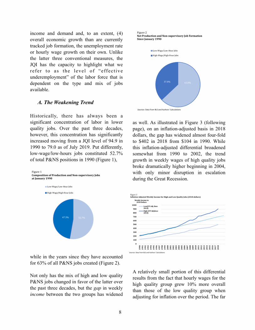
A. The Weakening Trend
Historically, there has always been a significant concentration of labor in lower quality jobs. Over the past three decades, however, this concentration has significantly increased moving from a JQI level of 94.9 in 1990 to 79.0 as of July 2019. Put differently, low-wage/low-hours jobs constituted 52.7% of total P&NS positions in 1990 (Figure 1),
while in the years since they have accounted for 63% of all P&NS jobs created (Figure 2).
Not only has the mix of high and low quality P&NS jobs changed in favor of the latter over the past three decades, but the gap in weekly income between the two groups has widened
as well. As illustrated in Figure 3 (following page), on an inflation-adjusted basis in 2018 dollars, the gap has widened almost four-fold to $402 in 2018 from $104 in 1990. While this inflation-adjusted differential broadened somewhat from 1990 to 2002, the trend growth in weekly wages of high quality jobs broke dramatically higher beginning in 2004, with only minor disruption in escalation during the Great Recession.
A relatively small portion of this differential results from the fact that hourly wages for the high quality group grew 10% more overall than those of the low quality group when adjusting for inflation over the period. The far
8
52.7%47.3%
Figure1CompositionofProductionandNon-supervisoryJobsatJanuary1990
Low-Wage/Low-HourJobs
High-Wage/High-HourJobs
Sources: Data from BLS and Authors' Calculations
63.0%37.0%
Figure2NetProductionandNon-supervisoryJobFormationSinceJanuary1990
Low-Wage/Low-HourJobs
High-Wage/High-HourJobs
Sources: Data from BLS and Authors' Calculations
0
100
200
300
400
500
600
700
800
900
1000
1990
1991
1992
1993
1994
1995
1996
1997
1998
1999
2000
2001
2002
2003
2004
2005
2006
2007
2008
2009
2010
2011
2012
2013
2014
2015
2016
2017
2018
WeeklyIncomein2018Dollars
Low(CPIAdj,Base2018)High(CPIAdj,Base2018)
Sources: Data from BLS and Authors' Calculations
Figure3InflationAdjustedWeeklyIncomeforHighandLowQualityJobs(2018dollars)

greater portion of the differential between the cohorts results from (a) the dramatic difference in hours worked on high quality vs. low quality P&NS jobs and (b) the fact that low quality jobs have seen a net reduction in hours worked per week of 6/10ths of an hour from 1990 to 2018 (and a full hour from their peak 31.0 hours worked in 1999 to 30.0 hours today). In contrast, high quality jobs have essentially held flat over the same period at 38.3 hours per week, shaving only 24 minutes from their all-time high levels in 1997 (Figure 4).
The foregoing phenomena are, of course, linked to underlying changes in the nature of the economy and employment. Putting aside for the moment the fact that the changing mix of private sector jobs in the U.S. economy (favoring lower quality positions) is a factor in delivering the persistent declines in labor’s share of overall production, it is useful to examine related shifts in employment patterns
that may be connected with the weakening trends. Specifically, three areas warrant further attention: (i) increases in service sector employment, (ii) changes in the number of people working part time, and (iii) changes in the number of workers who are self-employed, including those in the “gig” economy.
The U.S. economy, especially after the Great Recession, has reached a point that might prove to be “peak service employment.” This claim would be difficult to prove, but it stands
to reason that there must be a level of goods production that an economy must retain (construction, mining, heavy industrial goods, food, energy, etc.) simply by virtue of geography and physics . The history of the 13
situation is, in any event, quite clear. In the ear ly 1960s , pr ivate service sector employment stood at approximately 58% of total private sector employment. By 1990,
These being, principally, the immutability of venue of the construction, mining, and energy generation sectors as well as the economic inefficiencies in moving 13
production offshore of some heavy manufacturing along with the production of certain perishable goods.
9
29
31
33
35
37
39
19901991199219931994199519961997199819992000200120022003200420052006200720082009201020112012201320142015201620172018
WeeklyHours
Figure4WeeklyAverageHoursforLowQualityvsHighQualityProductionandNon-SupervisoryJobs
WeeklyHoursofLow-Wage/Low-HoursProductionandNon-supervisoryJobs
WeeklyHoursofHigh-Wage/High-HoursProductionandNon-supervisoryJobs
Sources: Data from BLS and Authors' Calculations

private service sector employment had risen to approximately 73% of the total—a figure that rose steadily until the Great Recession, during which it jumped to its persisting level of approximately 83% (Figure 5). As the ratio has held steady since (for an unprecedented period of nearly a decade) it may be that around 17% is a lower bound where goods production is concerned.
As weekly earnings of services sector jobs have, to an increasing degree, materially lagged those of jobs in the goods- producing sector (Figure 6), an increase of the percentage of service sector jobs would naturally result in an increase in the number of jobs below the mean, as reflected in the JQI. This is undoubtedly a principal, but by no means the only, factor delivering the results observed in this paper. Conversely, however, attention should also be given to the failure of the services sector itself to generate a thriving employment situation, contrary to often positive reports regarding service jobs of the information/digital age . Taken as a 14
whole, weekly earnings of services sector P&NS employees, relative to those in the
goods p roduc ing s ec to r, f e l l mos t dramatically during the 1970s and early 1980s, when the ratio declined from roughly 92% to 67% (Figure 7). The recovery thereafter did correspond with the high productivity boost seen in the early internet technology era from 1995 through 2003, but has stalled since with the ratio actually down-trending from 2015 through 2018, to 73.25%
at the end of last year.
The issues of part-time and self-employed workers (which are addressed together due to their intersectionality at a number of levels), can be encapsulated in two principal observations that are relevant to the importance of the JQI, and run somewhat
See, for example, https://www.mckinsey.com/featured-insights/employment-and-growth/technology-jobs-and-the-future-of-work 14
10
68%
70%
72%
74%
76%
78%
80%
82%
84%
86%
1990
1992
1994
1996
1998
2000
2002
2004
2006
2008
2010
2012
2014
2016
2018
ServiceJobsasa%ofallPrivateSectorJobs
Figure5PrivateServiceProvidingJobsasaPercentageofallPrivateSectorJobs
Sources: Data from BLS
0
200
400
600
800
1,000
1964
1968
1972
1976
1980
1984
1988
1992
1996
2000
2004
2008
2012
2016
Avg.WeeklyEarning$'s
GoodsProducingSectorServicesSector
Sources: Data from BLS
Figure6AverageWeeklyEarningsofPrivateSectorProductionandNon-Supervisory
65%
70%
75%
80%
85%
90%
95%
1964196619681970197219741976197819801982198419861988199019921994199619982000200220042006200820102012201420162018
ServiceSectorWagesas%ofGoodsSectorWages
Sources: Data from BLS and Authors' Calculations
Figure 7WeeklyEarningsofEmployeesinServicesSectorasaPercentageofthoseintheGoodsProducingSector(atyearend)

contrary to conventional wisdom . 15
First, as to part-time employment, while workers reporting that they worked fewer than 35 hours per week (one or more jobs) spiked during the last recession to nearly 20% of those employed, the level at the end of 2018 was 17.8%, approximately equal to that of the mid-1980s . The number of part-time 16
workers who would prefer full time employment remained higher for longer after
the Great Recession than was typical in the past, but has subsided significantly to near-
normal levels since then. While rising 17
measurably on a nominal basis since the Great Recession as in prior recoveries, the number of workers reporting employment in multiple jobs (one or both of which, again, per the CPS may or may not be jobs with third-party employers) as a percentage of those employed has been declining fairly steadily since 1996 and has fluctuated between an historic low in the range of 4.75%
to 5.25% for the past 10 years (Figure 8).
See, for example, https://www2.deloitte.com/us/en/insights/focus/human-capital-trends/2019/alternative-workforce-gig-economy.html 15
U.S. Bureau of Labor Statistics, Current Population Survey, Household Data Annual Averages, Table 19 - Persons at work in agriculture and nonagricultural 16
industries by hours of work
U.S. Bureau of Labor Statistics, Current Population Survey, Household Data Annual Averages, Table 20 - Persons at work 1 to 34 hours in all and in nonagricultural 17
industries by reason for working less than 35 hours and usual full- or part-time status.
11
0.045
0.05
0.055
0.06
0.065
6500
6700
6900
7100
7300
7500
7700
7900
8100
8300
8500
1994199519961997199819992000200120022003200420052006200720082009201020112012201320142015201620172018
%ofEmployedNo.ofWorkers(1000's)
Figure8MultipleJobholdersperCurrentPopulationSurvey
NumberofWorkersHoldingMultipleJobs(000s)
MultipleJobholdersasaPercentageofthoseEmployed
Sources: Data from BLS and Authors' Calculations

Second, with regard to the national economy’s dependence on self-employment and gig working, we observe that the data is not generally supportive of what has become a somewhat popular narrative regarding substantial changes in modes of work . While 18
there are approximately 15 million loosely-defined “self-employed” workers in the U.S., if we exclude workers in self-owned incorporated businesses (which generally employ others as well) —about 40% of the total —the self-employment rate has 19
declined over the past decades. What most 20
people would typically think of as self-employed individuals numbered 9.6 million workers in 2016—and BLS projects this number to increase to 10.3 million by 2026. 21
Furthermore, self-employment is heavily concentrated among older workers. Another 22
way of tracking self-employment as well as dependence on agricultural, household and unpaid family work is to calculate the variance between the number of workers counted as employed under the CPS and the number of non-farm jobs at establishments in the CES (this would eliminate establishment owner/employees among other things). Figure 9 illustrates that, by this latter measure, the differential as a percentage of total employed is hardly at a high—it is actually near multi-decade lows—and that most Americans depend on third-party employment for their livelihoods.
The data do not support arguments that a material change in the style of employment in
the U.S. has occurred. The problem in the U.S. employment situation is that the quality of the jobs that are on offer (as measured by relative weekly pay) has, by and large, been declining. And that fact is (a) one of the principal drivers of the sustained depression of the U.S. labor force participation rate and increase in the number of workers marginally attached to the labor force; and (b) a missing
link in assessments of labor slack and job openings in the U.S.
Jobs that do not offer pay that maintains the living standards of workers often go
See footnote 1618
https://www.bls.gov/spotlight/2016/self-employment-in-the-united-states/pdf/self-employment-in-the-united-states.htm19
Hipple, Steven and Hammond, Laura, Self-employment in the United States, U.S. Bureau of Labor Statistics, March 201620
See https://www.bls.gov/careeroutlook/2018/article/self-employment.htm 21
Hipple and Hammond, op cit. 22
12
0%
1%
2%
3%
4%
5%
6%
7%
8%
9%
199019921994199619982000200220042006200820102012201420162018
-
20,000
40,000
60,000
80,000
100,000
120,000
140,000
160,000
180,000
%TotalEmployed
NumberofEmployed(in1000's)
TotalNon-farm(CES)(Raxis)
TotalEmployed(CPS)(Raxis)
Sources: Data from BLS
Figure9ComparisonofNumberofEmployedvs.NumberofNon-farmJobs

unfilled . Conversely, if 55.7% of P&NS jobs 23
provide a collective average of just under 30 hours a week of work (often on uncertain 24
schedules), there are a lot of workers with excess labor that they can contribute to the economy. The nation is not in need of more low-wage/low-hours jobs.
B. The JQI: A Dynamic Measurement of Effective Underemployment
Having examined the shortcomings of the more prominent measures of the national economy’s employment situation as well as several factors that present a picture of employment substantially at odds with low U3 unemployment and putatively high job 25
creation over the past several years as conventionally measured, t is now time to examine the JQI itself. First, the JQI is employed in taking a look back to observe data from 1990 through the most recent month for which BLS data is available. Second, this paper discusses interpretation of the JQI output relative to the nation’s recent economic history. Part II of this paper p r o v i d e s t h e t e c h n i c a l , a l g e b r a i c methodology.
The JQI is presented as a three-month rolling average of monthly readings. This is done to address month over month variability which is too volatile to be a reliable directional trend measure. Nonetheless, for the purposes of this paper, monthly readings are also referenced , 26
which We do not envision releasing/announcing monthly data by itself with our JQI updates, although it will be available on the JQI data site.
Even utilizing a three-month rolling average of monthly readings, the JQI tends to be remarkably predictive of changes in underlying economic conditions and financial indicators, labor force changes, global trade patterns, domestic productivity, foreign exchange, and other factors effecting domestic job quality. More about that Part IV.
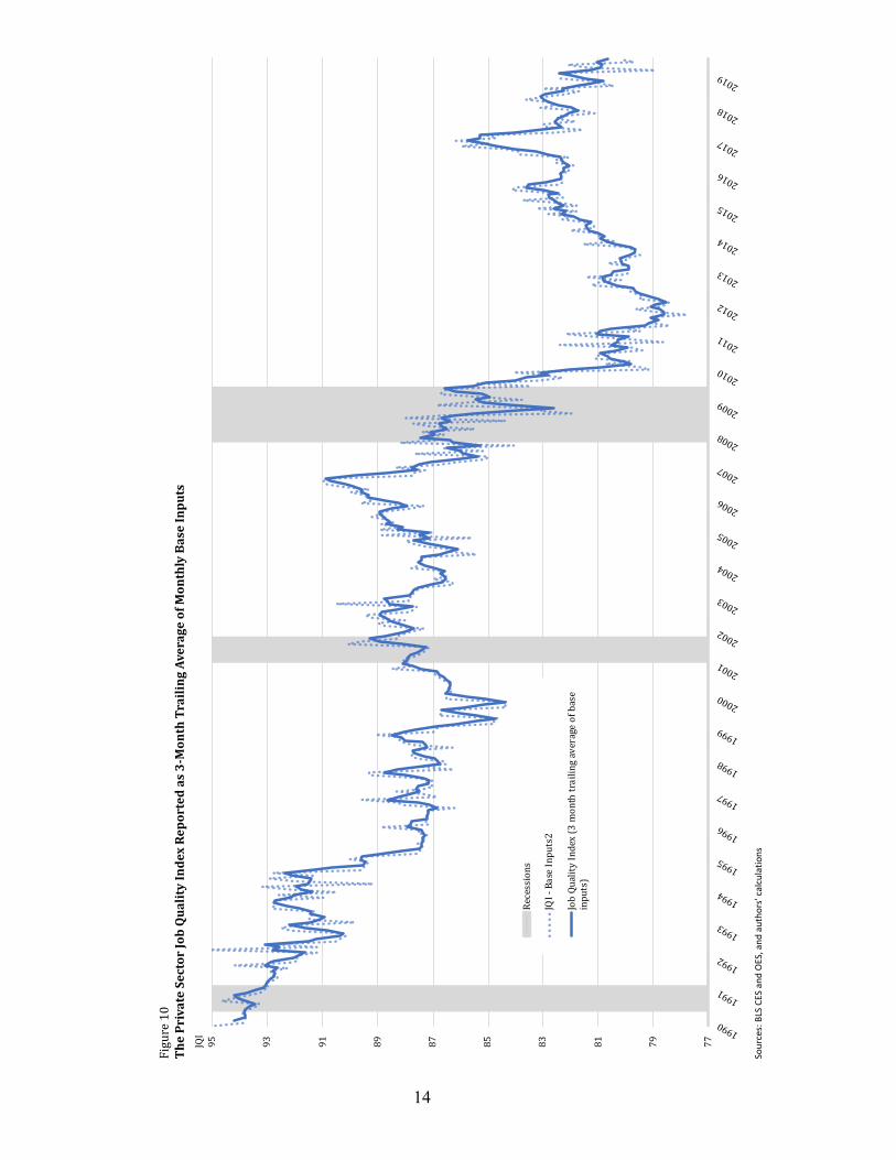
We are not suggesting, however, that the JQI replace other measures of employment or unemployment. Current measures of employment or unemployment are extremely useful. The JQI is complementary to those other measures. Figure 10, sets forth the JQI from 1990 through August 2019 : 27
[Remainder of page intentionally left blank.]
See discussion of reservation wages in the following section B.23
As of June 2019, 55.7% of all P&NS jobs were characterized as low-wage/low-hours under the JQI methodology.24
U-3 is the BLS “headline” level of unemployment, measuring the percentage of the Labor Force (as somewhat narrowly defined by the BLS) that is unemployed. 25
Broader measures of unemployment are also published by the BLS. In this connection it is useful to note that while U-3 stood at a 50-year low at 3.5% in September 2019, its U-6 unemployment rate is typical for late stage recoveries, at approximately 7%.
Figure 10, on the next page, incorporates monthly data as a partially transparent series behind the principally reported three month average.26
Reflecting the BLS Employment Situation report released on September 6, 2019.27
13
14
77798183858789919395
1990
1991
1992
1993
1994
1995
1996
1997
1998
1999
2000
2001
2002
2003
2004
2005
2006
2007
2008
2009
2010
2011
2012
2013
2014
2015
2016
2017
2018
2019
JQI
Figure10
ThePrivateSectorJobQualityIndexReportedas3-MonthTrailingAverageofM
onthlyBaseInputs
Recessions
JQI-BaseInputs2
JobQualityIndex(3monthtrailingaverageofbase
inputs)
Sour
ces:
BLS
CES
and
OES,
and
aut
hors
' cal
cula
tions

Figure 10 demonstrates the overall decline from 1990 to present. The decline confirms sustained and steadily mounting dependence of the U.S. employment situation on private P&NS jobs that are below the mean level of weekly wages. There are also two time periods of substantial erosion in the index level: 1994 to 1999, and the period surrounding the Great Recession itself . In 28
neither case did the stability and partial recovery that followed restore the index to its level prior to those declines. This is an indication of the long term, secular nature of the factors that contribute to the JQI readings. Notably, movements in the JQI are not particularly correlated with recession; it is important to note that the first big decline occurred during the expansion of the late 1990s. The index was steady during the 2001 recession, and its second big decline occurred during and after the Great Recession. There 29
is admittedly some cyclical patterning evidenced in the JQI output, but this is o v e r w h e l m e d b y a l a r g e r s e c u l a r phenomenon.
What is the secular phenomenon, and is it always persistently negative? As mentioned previously, the most prominent factor associated with the multi-decade decline in the JQI is the relative devaluation of U.S domestic labor that followed the 30
emergence of exogenous sources of labor, principally in the post-socialist economies after the collapse of the doctrinaire
communist governments. This has been especially noteworthy in the goods-producing and, more recently, high-value-added service sectors (intellectual property creation, financial services, and communications/information services sectors) to which production can be shifted as demand and costs dictate . This dynamic from a domestic 31
labor value perspective, as mentioned earlier, has been decidedly and relentless negative. There have, however, been periods of moderation as other influences have asserted themselves, as shown in the Part III.
The result is “effective underemployment” within the domestic labor force. This stems chiefly from two contributing factors: (i) more workers employed in jobs offering fewer hours of work; and (ii) fewer workers drawn into the labor force – not because of a dearth of jobs, but because the jobs available don’t materially change their financial realities, relative to not working.
Figure 11 (following page) illustrates the downward trend in hours worked in private sector production and non-supervisory jobs from 1990 to 2018. This loss of hours (across the spectrum of high- and low-quality jobs, but heavily concentrated in the low-quality positions) totals almost exactly one full hour per week. Based on the 2018 year-end 34 hour/week average for the 105,244,000 P&NS jobs, that translates into the unutilized man/hour equivalent of 3.1 million jobs ((105,244,000 x 1 hour)/34 average hours)).
From 1994 through 1999, the JQI fell by 14.3%. During the period surrounding the Great Recession and its aftermath, late 2008 through 2011, the JQI fell by 28
14.1%, as illustrated in Figure 10.
Although continued deterioration to the employment situation following the technical end of a recession is not unexpected.29
As reflected in the long term stagnation, and substantial periods of decline, in real household median income and the stagnation of real weekly incomes of those in 30
P&NS jobs, from 1999 to 2016 – unprecedented in the post-World War II period.
See, among other works, Spence, Michael and Hlatshwayo, Sandile, The Evolving Structure of the American Economy and the Employment Challenge, Council on 31
Foreign Relations, March 2011, and Alpert, Daniel, The Age of Oversupply: Overcoming the Greatest Challenge to the Global Economy, Penguin Portfolio, August 2014 (paperback edition).
15

Observed in a more extreme example, the JQI’s definition of high-quality jobs (those above mean weekly earnings) provided an average of 38.26 hours of weekly work at year-end 2018, compared with low quality (those below the mean) which provided 29.98 hours. If the average P&NS worker in a low-quality job were working for the same number of average hours as those in high quality jobs, that would translate into the unutilized worker/hour equivalent of a whopping 12.6 million jobs:
Some low-quality jobs are short hour-positions because some workers are seeking limited work hours.
However, other low-quality, short-hour jobs are kept by employers so that some workers do not qualify for mandated benefit thresholds. As the ratio of low-hours jobs 32
increases to a larger percentage of the total (holding constant the percentage of multiple jobholders), overall labor utilization declines as a result. While declines may not occur to the extent indicated in the calculation immediately above, it is most likely to a greater degree than the loss of one hour of work among all P&NS jobs, as calculated two paragraphs back. The answer, logically, lies somewhere in between these two examples.
Overall, the foregoing analysis of JQI data certainly points more to the existence of hidden labor slack than otherwise. A similar indicator can be seen in more conventional data, using the JQI as confirmation.
Economists and many others in the general
An analysis of the data (Figure 11) does not support a temporal trend towards shorter hours related to the oft-cited commencement of the requirements under the 32
Affordable Care Act (ACA), enacted in 2010 and becoming fully effective in 2014.
16
33
33.2
33.4
33.6
33.8
34
34.2
34.4
34.6
198919901991199219931994199519961997199819992000200120022003200420052006200720082009201020112012201320142015201620172018
Avg.WeeklyHoursWorked
Figure11AverageWeeklyHoursWorkedPrivateSectorProductionandNon-SupervisoryJobs
Sources: Data from BLS
Average Hours/Week High Quality 38.26 Average Hours/Week Low Quality 29.98 Variance 8.28 Low Quality P&NS Jobs x 58,044,000 “Underworked Hours” 480,604,320 Divided by High Quality Hours/Week 38.26 Unutilized Worker-Hours in Equivalent Jobs 12,561,535
54
56
58
60
62
64
66
68
1960196219651968197119731976197919821984198719901993199519982001200420062009201220152017
LaborForceParticipationRateEmployment-PopulationRatio
Sources: Data from BLS
Figure12U.S.LaborForceParticipationRate andEmploymentPopulationRatio
LaborForceParticipationRateandEmployment-PopulationRatio%

public are by now all too familiar with the graph in Figure 12, illustrating the material decline in the labor force participation rate (LFPR) and the employment population (EP) ratio in the U.S. during the 21st century and, especially, since the Great Recession . These 33
phenomena are most frequently chalked up to the aging of the U.S. population, and that is a significant factor. But solely relying on that explanation, or even largely doing so, can be misleading . 34
The median age of the U.S. population has grown from a modern era low of about 28 years in the 1970s, to nearly 38 years of age today . Yet the rate of aging in the present decade (during which 35
the LFPR and EP have remained most depressed), given the sheer size of the millennial generation, is slower than in the past and appears to be leveling off . 36
Decade Change in Years 1980s 2.9
1990s 2.4 2000s 1.9 2011-2017 0.8
That leads us to look at a further breakdown of the civilian noninstitutional population
(CNIP) and LFPR in Figures 13 and 14, respectively. As illustrated in the first of the
The LFPR being the ratio of those regarded as being in the labor force to the civilian noninstitutional population (CNIP), and the employment population ratio (EP) 33
being those employed as a percentage of the CNIP.
See, for example, https://www.piie.com/blogs/realtime-economic-issues-watch/aging-population-explains-most-not-all-decline-us-labor-force34
U.S. Census Bureau35
Ibid, with authors’ calculations.36
17
0%
5%
10%
15%
20%
25%
50%
55%
60%
65%
70%
75%
80%
85%
90%
Jan-60
Jan-63
Jan-66
Jan-69
Jan-72
Jan-75
Jan-78
Jan-81
Jan-84
Jan-87
Jan-90
Jan-93
Jan-96
Jan-99
Jan-02
Jan-05
Jan-08
Jan-11
Jan-14
Jan-17
LaborForceParticipationRate%
LaborForceParticipationRate%
Figure14LaborForceParticipationRatebyCohort
LaborForceParcipationRate(LFPR):16andolder(Laxis)LFPR:16to24(Laxis)
Sources: Data from BLS
48%
50%
52%
54%
56%
58%
10%
12%
14%
16%
18%
20%
22%
24%
19601963196619691972197519781981198419871990199319961999200220052008201120142017
AgeChortsas%ofTotal
AgeCohortsas%ofTotal
CNIP16-24(LAxis)CNIP55-64(LAxis)CNIP64+(LAxis)CNIP25-54(Laxis)
Sources: Data from BLS
Figure13CivilianNon-institutionalPopulations(CNIP)AgeCohortsasa%ofTotal
two figures, the current era is not the first time that the CNIP of the prime-working-age 25 to 54-year-old cohort has declined dramatically as a percentage of the total CNIP. The same thing happened in the 1960s/early 1970s, but was the result of an enormous influx of people into the 16 to 24-year-old cohort (the baby boomers). Nevertheless, the LFPR of the prime-aged cohort increased during that period from below 70% to around 85%, as shown in 37
Figure 14. The participation rates of the oldest cohorts (55 to 64 and over 65 years of age, respectively) were roughly the same as they are today – roughly 63% and 20%, respectively.
Along with the rise in the 16 to 24-year-old CNIP cohort in the 1960s/early 1970s came an increase in the labor force participation of
that cohort—a fairly dramatic increase to 69.1% from 54.4% over 15 years. This is, among other things, indicative of the jobs available to that cohort which, back in that period, had an approximate college completion level ranging from only 11% and 15%, and a high school completion level of 65% to 75%, depending on the year of measurement . It is reasonable to assume, 38
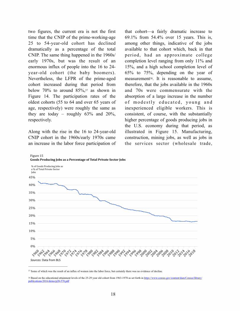
therefore, that the jobs available in the 1960s and 70s were commensurate with the absorption of a large increase in the number o f m o d e s t l y e d u c a t e d , y o u n g a n d inexperienced eligible workers. This is consistent, of course, with the substantially higher percentage of goods producing jobs in the U.S. economy during that period, as illustrated in Figure 15. Manufacturing, construction, mining jobs, as well as jobs in the services sector (wholesale trade,
Some of which was the result of an influx of women into the labor force, but certainly there was no evidence of decline.37
Based on the educational attainment levels of the 25-29 year old cohort from 1963-1978 as set forth in https://www.census.gov/content/dam/Census/library/38
publications/2016/demo/p20-578.pdf
18
0%
5%
10%
15%
20%
25%
30%
35%
40%
45%
196019621964196619681970197219741976197819801982198419861988199019921994199619982000200220042006200820102012201420162018
%ofGoodsProducingJobsasa%ofTotalPrivateSectorJobs
Figure15GoodsProducingJobsasaPercentageofTotalPrivateSectorJobs
Sources: Data from BLS

transportation, and utilities, among others) that support them, are, today as in earlier periods, generally higher quality (from a JQI perspective) than the services jobs that
dominate job formation in 21st century America. But what happens if those jobs are no longer abundant?
Figure 14 illustrated that—unlike the rising trend of LFPR among the prime-aged 25 to 54-year-old cohort during the 1960s and ‘70s (while its relative percentage of the CNIP was declining) — today we have a depressed level of LFPR recovery (following a substantial decline during this century) among prime-aged workers. Moreover, the LFPR of the 16 to 24-year-old cohort is over 13 percentage points below its peak. The latter is certainly related in part to young people, 18 to 24 years old, pursuing higher education at a rate of 35.6%, as opposed to 28.6% in 1991 , but 39
that modest difference cannot account for the fall off in LFPR.
We believe the answer to the question of why LFPR is depressed among the younger and prime aged cohorts discussed above rests with the “reservation wages” of those cohorts. A reservation wage is generally described as the lowest wage rate at which a worker would 40
be willing to accept a particular type of job. While the reservation wage differs with the ages and income/wealth levels of various workers, it is obviously very much connected with the quality of jobs on offer. As the overall quality (in JQI terms) of the broad universe of jobs declines, it stands to reason that more jobs will prove unattractive from a reservation wage (earnings) perspective to any given age cohort of workers.
While a substantial amount of additional analysis will be required to fully address the connection between low LFPR among prime and younger cohorts and JQI levels, two phenomena are worthy of closer examination:
(i) L i m i t e d s o c i a l s e c u r i t y escalations/postponement of benefits (and eroding private pension arrangements) and slow-to-stagnant levels of median household wealth growth among Americans aged 55 and older has lagged the cost of retirement , 41
forcing more of the population to work into their later years; and
(ii) Younger people take advantage of alternative support structures (e.g. living with parents) with more frequency, which can reduce their l iv ing expenses and avoid household formation costs for longer . 42
Thus, we would argue that the reservation wages of the young and, to some extent, prime workers are not being met by many of the jobs on offer, while the reservation wages of the older cohorts are relatively low and are attracting higher participation.
www.higheredinfo.com 39
Although we suggest focusing on total weekly earnings, to factor in hours of work offered.40
Government Accountability Office, Report to the Ranking Member, Subcommittee on Primary Health and 41
Retirement Security, Committee on Health, Education, Labor, and Pensions, U.S. Senate, May 2015 with updates.
The New York Times, “The New 30-something,” March 2, 2019 https://www.nytimes.com/2019/03/02/style/financial-independence-30s.html42
19

Unemployment benefits, disability benefits and food assistance programs also provide an obvious floor to reservation wages, and it is reasonable to expect that with declining overall job quality, a larger percentage of jobs will tend to bump up against this floor.
The JQI provides an effective real-time readout of effective underemployment and the likelihood or absence of slack in the overall labor force.
We now proceed, in Part II, to set forth how the JQI is constructed.
[Remainder of page intentionally left blank.]
20

Part II | Construction of the JQI: Capturing and Tracking the Data
The JQI analyzes a representative sample of the economy using P&NS data from 180 different industry groups spanning across all 20 super-sectors into which the BLS groups establishments and, therefore, the jobs they offer. The principal data utilized is contained in the Current Employment Survey (CES, also often referred to as the establishment survey) P&NS data on average weekly hours (AWH), average hourly wage (AHW) and total employment for each given industry group (seasonally adjusted, in all cases). In developing the JQI, the goal was to ensure it could be produced on a monthly basis contemporaneously with the release of new CES data from the Bureau of Labor Statistics. The BLS consistently maintains the CES on a monthly basis and has done so in some version of its current form since 1990 (previously, from 1938 to 1989, the establishment survey was considerably less granular).
With almost 30 years of available CES data covering P&NS jobs, in its present form, we have been able to introduce a near real-time alternative measure of the U.S. employment situation that would have previously been difficult to fabricate. We believe that the JQI may be significantly more predictive and informative, relative to conventional m e a s u r e s , r e g a r d i n g l e v e l s o f underemployment and labor force slack. Currently, no other jobs-related index that offers the ability to observe intertemporal changes in the make-up of the U.S. employment base together with the capacity for near real time updates reflecting new monthly data.
The process for constructing the JQI begins with establishing a Quality Job Benchmark for each given month. The benchmark value is indicated by the average weighted weekly wage within the set of 180 industry groups, and weighted for the number of jobs in each group. Once the benchmark is established for that given month, each industry group is sorted into low or high quality by comparing each group’s specific weekly wage to the quality benchmark. If an industry’s weekly wage for the month is below (above) the benchmark, then it is considered low (high)-quality job.
Once the data are sorted, the total number of high-quality jobs is divided by the total number of low-quality jobs for that given month. This ratio represents the preliminary JQI value. As mentioned in Part 1, an index reading of 100 would indicate an even distribution. Readings below 100 indicate a greater concentration in/prevalence of lower-quality (those below the mean) positions, and a reading above 100 indicates greater concentration/prevalence of higher-quality positions. An important point to keep note of is that the total number of “jobs” is represented by the total number of positions, as opposed to workers) for that given industry group. The arithmetic used for calculation of the preliminary JQI is listed in detail below this section.
The Preliminary JQI measure is then further adjusted in the case of certain industries that (i) support a significantly large number of jobs, relative to other industry groups that are used in computing the JQI, and (ii) generate weekly wages at or near the quality benchmark and contain a sufficient number of jobs such that minor movements in weekly wages would have the effect of “flipping”
21

them from one side of the quality benchmark to the other from month to month, thereby resulting in unintended statistical noise that can be easily remedied . In the case of such 43
“flip categories” of industry groups in which a large number of employees can potentially flit from low- to high-quality and vice versa, we utilize additional data—described below—to further divide such industry groups into subgroups.
A hypothetical example of such a flip category, for example, would be an industry group that includes 1 million employees with occupations that include both engineer and desk clerk. Of those 1 million employees, 100,000 are engineers with the other 900,000 being desk clerks. The engineers earn five times more than the desk clerks, so the average weekly income of the entire group will average within a few percentage points of
the Job Quality Benchmark in any given month. Were the engineers’ income to skew the income of the entire group just marginally above the Job Quality Benchmark then, ceteris paribus, all 1 million employees would be considered to have a high-quality job under the basic formulation of the JQI. In reality, of course, only the 100,000 engineers have a high-quality job. Moreover, were the differences between the average weekly incomes of the entire group sufficiently close to the Job Quality Benchmark, absent any corrective measures, minor changes in the number of engineers and desk clerks within the large group of one million employees would have the effect of flipping the entire category from one side of the Job Quality Benchmark mean to the other from month to month.
To address such larger groups of employees, we parameterize such a flip category as an industry that contains more than a million employees and has an average weekly wage that typically falls within +/- 10% of the Job Quality Benchmark for a time span of ten or more years. Flip category industries are separated into subcategories below which further sub-category analysis would render little-to-no material difference in the internal composition of high income to lower income jobs, with the outcome of the flip category adjustments being the elimination of large and distortive groups suddenly moving from one side of the Quality Benchmark mean to the other during the life of the index (although the sub-categories may exhibit such moves). Industries that satisfy this parameter for the period of the study to date are listed below:
Flip Category P&NS Employees (December 2018) Education 3,197,100 Offices of Physicians 2,202,000 Depository Credit Intermediation 1,277,600 Food Manufacturing 1,276,300
In the aggregate, these four categories comprise just over 7.5% of all private sector P&NS jobs in the U.S.
For purposes of the JQI, the above sectors are subdivided using data provided by the annual Occupational Employment Statistics (OES)
Statistical noise resulting from movements slightly above or below the benchmark for such large industries thereby overstating the significance of movements 43
within the JQI itself, due to the sharp shifts that result from such a “flip.”
22

survey, which is released by the BLS annually in late March or early April. The OES provides a more detailed breakdown of the wages for each occupation in each industry group. To maintain consistency, OES occupations in the foregoing flip categories that involve supervisory roles are not included. Information from the OES is applied to assess how many jobs within each flip industry are high- or low-quality occupations from the standpoint of weekly income and thereby split the larger industry category into subcategories. For this analysis, the OES data is filtered to only include major occupations within each industry; usually, this includes up to 24 different occupations.
Weekly wages derived from the OES are then compared to the weekly wage benchmarks used in the preliminary JQI index. The occupations are then assigned a quality of high or low depending on whether they are above or below the benchmark.
After this comparison is complete, the next step is to sum up the total number high-quality jobs and dividing it by the total 44
number of jobs. This results in the percentage of high-quality jobs (and, correspondingly, low-quality jobs) for each of the flip categories. The relative percentage of high-quality/low-quality jobs is now used to normalize and adjust each flip category. This is done by multiplying the percentage of high-quality/low-quality jobs by the CES
employment count so that each flip category industry is split into two groups, which are then independently used in the overall JQI calculation. Because the OES data is released annually, the intra-year percentage divisions of the flip category industry groups is adjusted annually, as well. It is the intent of the authors that these percentage divisions (which do not change dramatically from year to year) be revised each year to commence with JQI data released beginning in May of each year, through to the following April.
Finally, while the JQI will be released each month within hours of the release of the BLS U.S. Employment Situation data (generally on the first Friday of each month), it should be noted that certain industry subgroup data lags data for larger categories by one month. Furthermore, while the raw JQI is otherwise statistically consistent from month to month, even the adjustments heretofore mentioned do not remove all distracting statistical noise in movements of the index from month to month. The JQI is more useful to other analysis and forecasting when observed on the basis of a three-month moving average, and the headline JQI index will be reported as such. Raw monthly data will be made available as well.
For purposes of transparency and to aid further study, the JQI calculations are below.
Jobs are indicated by the number of employees for that given occupation. 44
23
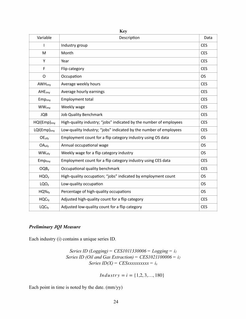
Key
Preliminary JQI Measure
Each industry (i) contains a unique series ID.
Series ID (Logging) = CES1011330006 = Logging = i1
Series ID (Oil and Gas Extraction) = CES1021100006 = i2
Series ID(X) = CESxxxxxxxxxx = ix
Each point in time is noted by the date. (mm/yy)
Variable Descrip,on Data
I Industry group CES
M Month CES
Y Year CES
F Flip category CES
O Occupa,on OS
AWHimy Average weekly hours CES
AHEimy Average hourly earnings CES
Empimy Employment total CES
WWimy Weekly wage CES
JQB Job Quality Benchmark CES
HQI(Emp)imy High-quality industry; “jobs” indicated by the number of employees CES
LQI(Emp)imy Low-quality Industry; “jobs” indicated by the number of employees CES
OEofy Employment count for a flip category industry using OS data OS
OAofy Annual occupa,onal wage OS
WWofy Weekly wage for a flip category industry OS
Empfmy Employment count for a flip category industry using CES data CES
OQBy Occupa,onal quality benchmark CES
HQOy High-quality occupa,on; “jobs” indicated by employment count OS
LQOy Low-quality occupa,on OS
HQ%fy Percentage of high-quality occupa,ons OS
HQCfy Adjusted high-quality count for a flip category CES
LQCfy Adjusted low-quality count for a flip category CES
Industr y = i = {1,2, 3,…, 180}
24

}
Step 1) Calculate Job Quality Benchmark
1. Find Weekly Wage
1.2 Find Weighted Average Weekly Wage for entire industry group
Step 2) Find Count of High-Quality and Low-Quality Jobs
2.1 Industry is high quality if its weekly wage is greater than the job quality benchmark
2.2 The job count for a high-quality industry is indicated by the employment number
2.3 Industry is low quality if its weekly wage is less than the job quality benchmark
2.4 The job count for a low-quality industry is indicated by the employment number
Step 3) Calculate the Preliminary JQI
Pre-
Adjusted JQI Measure WW Flip Category Parameters • Industry has high average of “flipping” above and below the high-quality benchmark
• Industry contains at least 1 million employees
• If industry(ix) satisfy the above parameters, then ix=fx
Year= y = {1,2,3…29}
Step 1) Calculate the annual average for the Job Quality Benchmark
Month = m = {01,02, 03…, 12}Year = y = {1,2, 3…, 29
W Wimy = (AWHimy*AHEimy)
JQBmy =∑ (W Wimy*Empimy)
∑ (Empimy)
W Wimy > JQBmy ∴ HQI
High Qualit y Industr y = HQI(Empimy)
W Wimy < JQBmy ∴ LQI
L ow Qualit y Industr y = LQI(Empimy)
JQImy =∑ HQI(Empimy)∑ LQI(Empimy)
Flip Categor y = f = {1,2, 3,4}Occupat ion = o = {1,2, 3…24}
25

Step 2) Find Count of High-Quality and Low-Quality Occupations Within Each Flip Category
2.1 Establish a weekly wage for each occupation within a flip category using OES data
2.2 Compare each flip category’s weekly wage to the annual Job Quality Benchmark
2.2.1 Occupation is high quality if its weekly wage is greater than the annual job quality benchmark
2.2.2 Occupation is low quality if its weekly wage is less than the annual job quality benchmark
Step 3) Find the percentage of high-quality occupations within each flip category
Step 4) The adjustment calculation
4.1 For this process, the employment numbers ((Empfmy) given by the CES were used to indicate each flip category’s job count
4.2 Use the percentage of high-quality occupations to normalize the employment of flip categories within the Pre-JQI.
4.2.1 Find the count of high-quality jobs for each flip category by multiplying HQ%fy and Empfmy
4.2.2 Find the count of low-quality jobs for each flip category by multiplying 1-HQ%fy and Empfmy
4.3 Adjust the employment numbers in the pre-JQI by first removing all flip category employment numbers
4.4 Recalculate the Pre-JQI using the adjusted employment numbers.
JQBy = ∑ JQBmy /12
W Wof y = OAof y /52.143
W Wof y > JQBy ∴ HQOof y
High Qualit y Occupat ion = HQO(OEof y)
W Wof y < JQBy ∴ LQOof y
L ow Qualit y Occupat ion = LQO(OEof y)
HQ%f y =∑ HQOof y∑ OEof y
HQCf y = HQ%f y*Empfmy
LQCf y = (1 − HQ%f y)*Empfmy
ad jEmpimy = ∑ Empimy − ∑ Empfmy
26

Pre-
4.5 Complete JQI adjustment calculation by adding in the flip categories that are sorted into high and low occupations.
A. Further Limiting and Qualifying Notes
As with all large data sets, there are limitations and qualifiers to the way the inputs are used in the JQI model. There are differences in the values used in the CES and OES surveys. Differences in values between the CES and OS survey were common for each flip category but was most noticeable in the education category. Nevertheless, as the OES data is only being used to subdivide P&NS employment in the education sector, and that sector—large as it is—constitutes just under 3% of total P&NS employment in the U.S., we feel comfortable with the necessary approximations we have made in certain instances.
Education is also special case for the JQI itself. Its values must be derived each month because the CES aggregates education and health services into one consolidated super- sector. The CES only reports job count, hourly wage, and hours worked data for P&NS workers in the healthcare component, with the education information broken out in
the data covering all employees). For the JQI, education is calculated by comparing the Education and Health Services Sector to the Health Services industry group. Employment is found by finding the difference between the two groups. For average weekly hours and average hourly wages, algebra is used to find the averages for education alone by using values from the first and second group.
Use of the occupational data also restricts the livability of our index. Essentially, by using the OES, it locks in a certain ratio of high-quality and low-quality jobs for that specific flip category. That ratio is used for the entire year, until the next occupational survey is released. Therefore, during the year, the only thing that changes is the amount of people added to the high- and low-quality job group but the ratio remains constant. For this reason, this paper is limited to four flip category industries, although conceivably we could apply the OES data breakdowns to more sectors in order to further reduce month over month volatility of the JQI. The present construct of the index thus admittedly favors real-time accuracy at the expense of some monthly volatility—an intentional choice in order to enable the JQI to reflect the most recent data available.
JQImy =∑ HQI(ad jEmpimy)∑ LQI(ad jEmpimy)
ad j − JQImy =∑ HQI(Ad jEmpimy) + HQC(CES )f y
∑ LQI(Ad jEmpimy) + LQC(CES )f y
27

Part III | Applying the JQI: Illuminating Areas of Confusion in Economic Transmission
Economic theory derives from observations of data coupled wi th ins ights in to transmission of that data to economic outcomes. It is the posited or hypothesized transmission mechanisms themselves—often readily observable in the physical sciences, but far less so in the social sciences—that constitute the theory that is taught and endlessly debated.
Over time, economic theory develops a canon, with future data analyzed within the categories and confines of canonical literature. That literature, by defining the pertinent data to be analyzed, then serves to reduce the rigor with which the theorized transmission mechanisms, which led to the theory in the first place, are challenged. In other words, as circumstances giving rise to traditionally observed data change, from one period of humankind’s organization of society to another, economic tenets are slow to change with circumstances. As a result, the profession, together with market participants and policymakers, too often focus on the same data points as it has in the past.
Thus, the introduction of a new metric c l a i m i n g r e l e v a n c e t o p r e v a i l i n g circumstances requires not only explanations of why the new metric is necessary and how it has been developed, but also an examination of how it closes a gap in existing understandings of the transmission of particular data to various economic outcomes. The more correlative the use of a new
operator is with outcomes that should logically proceed from it, the more valuable it likely is. If it rises to the level of proximate causation, the new data point becomes supremely relevant. Accordingly, this portion of the paper highlights implications that the JQI appears to bear for certain relations and other subjects that have figured prominently in economic and financial theory in recent decades, including (a) employment and aggregate demand, (b) domestic sovereign interest rates, (c) trade balances, (d) productivity and capacity utilization, e) non-residential fixed investment, and (f) sundry additional phenomena. The purpose of this section is not meant to be exhaustive with regard to the foregoing, but is intended to encourage additional debate and research, some of which will require a considerably wider pool of talent and fortitude.
A. The Phillip’s Curve and its Descendants
One of the persistent conundrums in macroeconomics is the recent apparent disconnect in the relationship between levels of unemployment and wage and price inflation. This relationship, explored by Samuelson and Solow in 1960, was based on data first observed by A. William Phillips of New Zealand in 1958. The relevance of the resulting “Phillips Curve,” relating lower unemployment to higher levels of inflation, 45
has been batted around by economists and policymakers for decades, and remains—in various modified forms—part of central bank policy consideration to this day.
With the historically low levels of U-3
But, as Friedman et. al. demonstrated in the late-1960s, not necessarily the converse.45
28

unemployment in the United States achieved during the latter part of the 2010s, defying all earlier expectations of a natural rate of unemployment, we would have expected to see a dramatic increase in wage inflation, and demand-pull general price inflation as a result. Yet, as shown in Figure 16, the relationship between unemployment and inflation has substantially eroded—beginning as early as the late-1980s. Figure 16 employs inflation in personal consumption expenditures (as opposed to wages) to express the Phillips Curve relationship . 46
In this century, particularly during the present decade, some of the apparent disconnect is likely linked to slack in the labor force represented by lower participation rates among prime and younger workers. Lower
labor force participation rates (LFPR) is 47
often evidence of an inclination of potential workers to give up low-income employment in favor of family or public support.
A far more substantial factor severing the earlier connections between unemployment and inflation, however, is the changed composition of the employment base itself. The channel through which this occurs is fairly simple: If a greater proportion of jobs produce incomes below the mean of all jobs (i.e. a reduction in the level of the JQI), than they did in the past, then an increase in the proportion of people working will have a lesser impact on household incomes—and therefore aggregate demand—than in the past. The lower the increase in aggregate demand, the lower the demand-pull inflation that would result from a greater increase thereof. Figure 17, illustrates changes in the U-3 unemployment rate indexing for both the JQI and 16 to 54-year-old noninstitutional population LFPR . As observed, the former 48
has a substantially greater impact than the
Data and graph style courtesy of Michael Ng, David Wessel, and Louise Sheiner of The Hutchins Center of The Brookings Institute, see further https://46
www.brookings.edu/blog/up-front/2018/08/21/the-hutchins-center-explains-the-phillips-curve/ (used with permission).
People aged 55 year and older in the civilian non-institutional population (CNIP) are excluded from this discussion to avoid the impact of a clearly aging U.S. 47
population.
Figure 29 utilizes the U-3 rate, as opposed to a broader unemployment measure—such as the BLS’s U-6—because we believe the broader measures, capturing 48
discouraged and marginally attached workers and which have increased dramatically since the Great Recession, is potentially driven by phenomena incorporated in falling job quality as measured by the JQI. This approach avoids the potential of “double counting” of the same factors.
29
-3%
-2%
-1%
0%
1%
2%
3%
-3 -2 -1 0 1 2 3 4 5 6
ChangeinPCEInflation
2008-2018
1986-2007
1960-1985
Sources: Data from BEA and CBO
Figure16TheFlatteningPhillipsCurveRelationshipBetweenUnemploymentandInflation
Unemployment Gap(betweenCBOestimateoflong-runNAIRUandactualU-3unemploymentrate)
Figure 17
Source: Data from BLS and the JQI
latter, and is arguably more directly tied to the lack of transmission of marginal additional employment to aggregate demand than is the actual slack in the labor force represented by the LFPR. In addition to showing (black dashed line at approximately the 4.5% level) that the “effective” U-3 rate, thus indexed, is not at a low today (it was lower after the expansion of the 1990s), it is also likely, if we had a longer JQI series (i.e. dating back before 1990), that we would see a different set of slopes to the Phillips Curve. The reason for this, we believe, is that a change in the mix of jobs on offer can fairly dramatically impact the ability of increased levels of employment to influence aggregate demand, and therefore demand-pull inflation. Simply put, as a greater proportion of jobs offer a
lower-than-average level of weekly incomes, the aggregates are correspondingly drawn downwards.
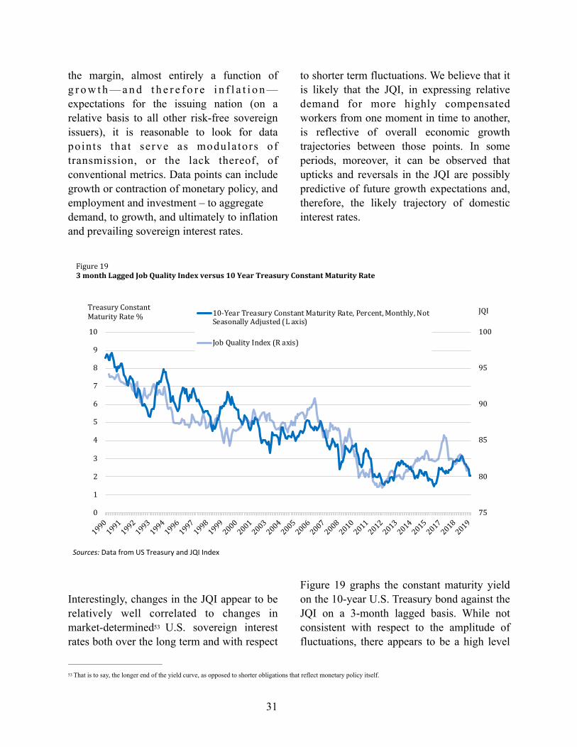
Thus, the failure of recent dramatic declines in U-3 is modulated by significantly less salutary income growth than in past periods. The foregoing constraint on demand growth is reflected in other economic metrics as well, as described further below.
B. Domestic Sovereign Interest Rates
The relative supply and demand in an economy is, notwithstanding the claims of 49
monetarist economists to the contrary , the 50
proximate cause of inflation and deflation. As we have seen this century, while money supply can influence production and consumption, unless the supply of money transmits relatively broadly to primary 51
investment and employment, the increase or 52
decrease in the supply of money itself will not have the impact intended by monetary policymakers.
The transmission rate of increased broad money supply to aggregate demand has
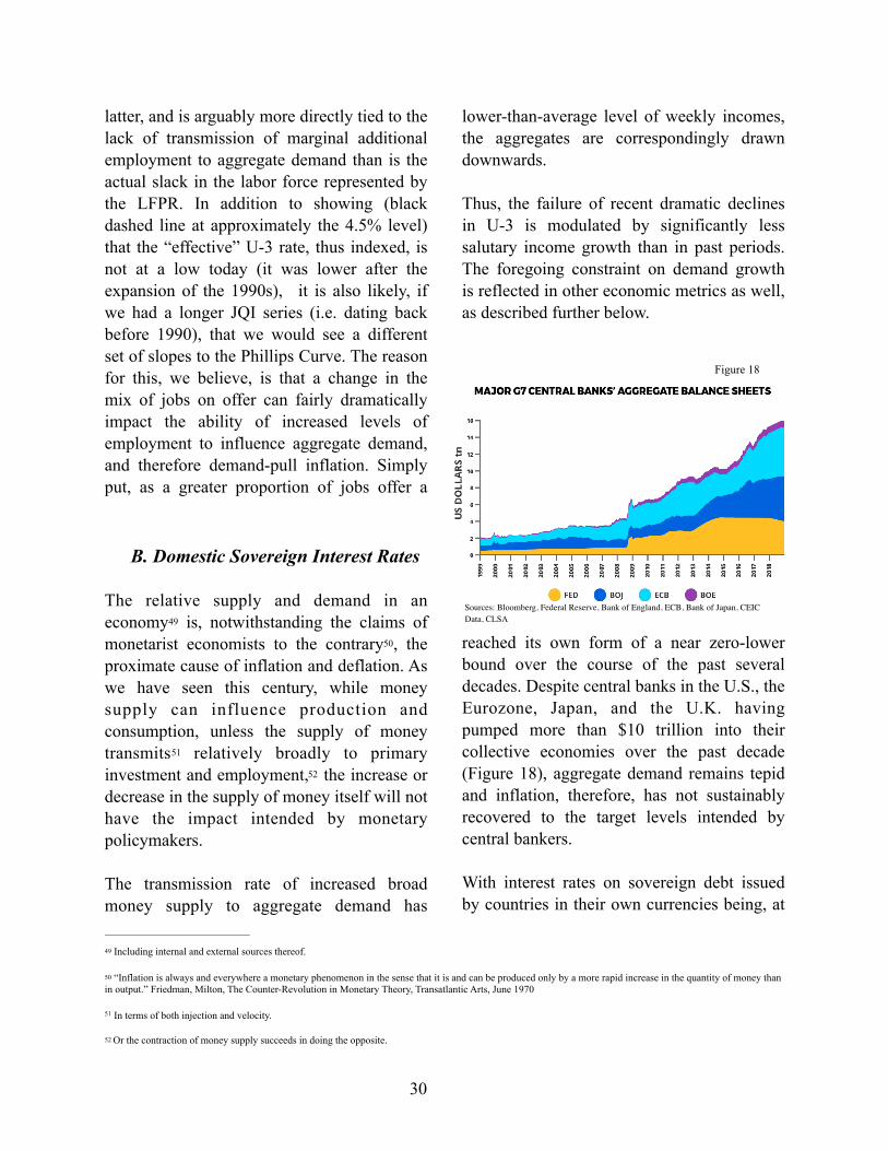
reached its own form of a near zero-lower bound over the course of the past several decades. Despite central banks in the U.S., the Eurozone, Japan, and the U.K. having pumped more than $10 trillion into their collective economies over the past decade (Figure 18), aggregate demand remains tepid and inflation, therefore, has not sustainably recovered to the target levels intended by central bankers. With interest rates on sovereign debt issued by countries in their own currencies being, at
Including internal and external sources thereof.49
“Inflation is always and everywhere a monetary phenomenon in the sense that it is and can be produced only by a more rapid increase in the quantity of money than 50
in output.” Friedman, Milton, The Counter-Revolution in Monetary Theory, Transatlantic Arts, June 1970
In terms of both injection and velocity.51
Or the contraction of money supply succeeds in doing the opposite.52
30
Figure 18
Sources: Bloomberg, Federal Reserve, Bank of England, ECB, Bank of Japan, CEIC Data, CLSA
the margin, almost entirely a function of g r o w t h — a n d t h e r e f o r e i n f l a t i o n —expectations for the issuing nation (on a relative basis to all other risk-free sovereign issuers), it is reasonable to look for data points that serve as modulators of transmission, or the lack thereof, of conventional metrics. Data points can include growth or contraction of monetary policy, and employment and investment – to aggregate demand, to growth, and ultimately to inflation and prevailing sovereign interest rates.
Interestingly, changes in the JQI appear to be relatively well correlated to changes in market-determined U.S. sovereign interest 53
rates both over the long term and with respect
to shorter term fluctuations. We believe that it is likely that the JQI, in expressing relative demand for more highly compensated workers from one moment in time to another, is reflective of overall economic growth trajectories between those points. In some periods, moreover, it can be observed that upticks and reversals in the JQI are possibly predictive of future growth expectations and, therefore, the likely trajectory of domestic interest rates.
Figure 19 graphs the constant maturity yield on the 10-year U.S. Treasury bond against the JQI on a 3-month lagged basis. While not consistent with respect to the amplitude of fluctuations, there appears to be a high level
That is to say, the longer end of the yield curve, as opposed to shorter obligations that reflect monetary policy itself.53
31
75
80
85
90
95
100
0
1
2
3
4
5
6
7
8
9
10
19901991199219931994199619971998199920002001200320042005200620072008201020112012201320142015201720182019
JQITreasuryConstantMaturityRate% 10-YearTreasuryConstantMaturityRate,Percent,Monthly,Not
SeasonallyAdjusted(Laxis)
JobQualityIndex(Raxis)
Sources: Data from US Treasury and JQI Index
Figure193monthLaggedJobQualityIndexversus10YearTreasuryConstantMaturityRate

of correlation in terms of directionality, particularly in the second half (last 15 years) of the graph. In other words, turns in the direction of the JQI appear to be associated with turns in the direction of bond yields. This phenomenon implies a potential predictive use for the JQI in the financial markets and for economic policymaking.
C. U.S. Balance of Trade in Goods and the Impact of the JQI on H o u s e h o l d I n c o m e s a n d Consumption
The decline in the JQI over the past three decades as discussed in Part I is coincident with the decline in goods producing jobs in the U.S., which fell from 25.6% to 16.4% of all private sector positions during the period. But it is also more directly connected to the fact that nearly all of the jobs that replaced the lost goods producing positions were in traditionally low-wage/low-hours sectors. While not entirely comprehensive, Figure 20 illustrates the decline in the percentage of goods-producing jobs relative to the total 54
number of private sector jobs from 1990 through 2018. It also shows that it was growth in the relative percentage of retail,
administrative and waste services, healthcare and social assistance, and leisure and hospitality jobs (all sub-par in terms of average wages and hours worked) that made up the difference.
O f c o u r s e , i n a s m u c h a s A m e r i c a n consumption has continued to rise, the goods consumed had to be produced by someone—even as U.S. goods production jobs plummeted. As evidenced by the U.S. balance of trade over the past several decades, goods consumed by Americans at the margin came increasingly to be manufactured abroad. As Figure 21 illustrates, but for the period from 2000 until 2008, changes in the JQI tend to mirror changes in the overall U.S. trade deficit—over the medium term in the 1990s and, increasingly, on a short-term basis since the Great Recession.
It should be noted that the dramatic decline of the trade deficit during the recession was not related to any improvement in the U.S. employment situation—the U.S. was losing millions of jobs at the time—but rather to the dramatic reduction in aggregate demand
Which also fell nominally by 2.24 million positions.54
32
Figure 20
Source: BLS
72
74
76
78
80
82
84
86
88
90
92
-6.0%
-5.5%
-5.0%
-4.5%
-4.0%
-3.5%
-3.0%
-2.5%
-2.0%
-1.5%
-1.0%
199920002001200220032004200520062007200820092010201120122013201420152016201720182019
JQITradeDeficitGoods%
Figure21U.S.TradeDeficitinGoodsvs.JobQualityIndex
U.S.TradeDeficitinGoodsasaPercentageofGDP(Laxis)JobQualityIndex-endofquarter(Raxis)
Sources: BEA and JQI Index

typical of a severe recession.
But, as discussed further below in Section F, the lack of correlation between the trade balance and the JQI actually offers a “teachable moment” with respect to the way the overall U.S. economy functions. As stated earlier, it is worth remembering that, despite the erosion of the U.S. manufacturing economy that occurred in the 1990s, not only
did the jobs picture stabilize and even improve somewhat as measured by the JQI, but American consumption of goods from abroad hit a record as measured in terms of the trade deficit in goods-only relative to U.S. GDP (Figure 22).
Moreover, when petroleum products are removed from this analysis , the goods trade 55
While the U.S. has been a substantial net importer of oil in the 2000s, that is no longer the case.55
33
70
75
80
85
90
95
100
-0.06
-0.05
-0.04
-0.03
-0.02
-0.01
0
199019921994199619982000200220042006200820102012201420162018
JQITradeDeficitasa%ofGDP
Figure22U.S.TradeDeficitvs.JobQualityIndex
U.S.TradeDeficitasaPrecentageofGDP(Laxis)JobQualityIndex-endofquarter(Raxis)
Sources: BEA and JQI Index
72
74
76
78
80
82
84
86
88
90
92
-7.0%
-6.0%
-5.0%
-4.0%
-3.0%
-2.0%
-1.0%
1999200
0200
1200
2200
3200
4200
5200
6200
7200
8200
9201
0201
1201
2201
3201
4201
5201
6201
7201
8201
9
JQI
TradeDeficitinGoodsEx-Petroleumasa%ofGDP
Figure23U.S.TradeDeficitinGoodsEx-Petroleumvs.JobQualityIndex
U.S.TradeDeficitinGoodsEx-PetroleumasaPercentageofGDP(Laxis)JobQualityIndex-endofquarter(Raxis)
Sources: BEA and JQI Index
Figure 24

deficit, ex-petroleum, reveals itself more dramatically. Further, the departure of the trade deficit from the behavior of the JQI in both the 2000s and recent years is more notable (Figure 23 on the previous page).
The JQI slightly recovered during the periods of low U-3 unemployment (Figure 17, page 29). However, the longer term trend in the job quality mix has been declining. In fact, the JQI in the periods following each recession since 1990 has failed to sustain a recovery to the stabilized level of the period immediately preceding it. In these periods, the additional demand generated by higher levels of employment has not been channeled into investment in domestic production. As a result, there is not an uptick in higher-quality jobs (See Part III, Section E).And, as evidenced in Figure 24, real median household income has not advanced appreciably above, and during the first decade of this century was below, the level reached at the end of the expansion of the 1990s. Overall household income has increased more—but the gains have been concentrated in households at the very top of the wealth and income distribution, which have a lower propensity to consume . 56
How, then, did the U.S. experience so much demand leakage even as it experienced 20 years of relative stagnation (and even decline) in household incomes?
The missing ingredient is the massive explosion in household debt which transmitted, directly and indirectly, to
consumption. U.S. aggregate household debt rose from $6.8 trillion in December 1999, to a peak of $14.7 trillion in September 2008, an increase of 216% in less than eight years. As illustrated in Figure 25, this equated to a movement from under 70% of GDP to just a
hair under 100% of GDP during that period. The enormous increase in household debt was concentrated in the mortgage sector, fueling the high levels of mortgage equity withdrawals shown below in Figure 26. To a 57
lesser but still quite material extent, all other forms of household credit including—among
The marginal propensity to consume (MPC) is lower at the higher wealth quintiles. For low-wealth households, the MPC is 10 times larger than it is for wealthy 56
households. (Fisher, Johnson, Smeeding and Thompson, Estimating the Marginal Propensity to Consume Using the Distributions of Income, Consumption and Wealth, Federal Reserve Bank of Boston, February 2019)
Figure 26 is a graph created by the website www.calculatedriskblog.com utilizing data and methodology first developed by James Kennedy and Alan Greenspan 57
inhttps://www.federalreserve.gov/pubs/feds/2007/200720/200720pap.pdf
34
$0T
$2T
$4T
$6T
$8T
$10T
$12T
$14T
$16T
40%
50%
60%
70%
80%
90%
100%
19901991199319941996199719992000200220032005200620082009201120122014201520172018
HouseDebt$TrillionsHouseholdDebt
asa%ofGDP
Figure25U.S.HouseholdDebt
HouseholdDebtasPercentageofGDPHousholdDebtinTrillions
Sources: Federal Reserve Board
-8%
-6%
-4%
-2%
0%
2%
4%
6%
8%
10%
12%
19801981198219831984198519861987198819891990199119921993199419951996199719981999200020012002200320042005200620072008200920102011201220132014201520162017201820192020
PercentofDisposablePersonalIncome
Source: http://www.calculatedriskblog.com/
MortgageEquityWithdrawalasaPercentofDisposablePersonalIncome(NSA)Recession Calculated(FlowofFunds,SingleFamilyInvestment) KennedyGreenspanMEW(dataended2008)
Figure26
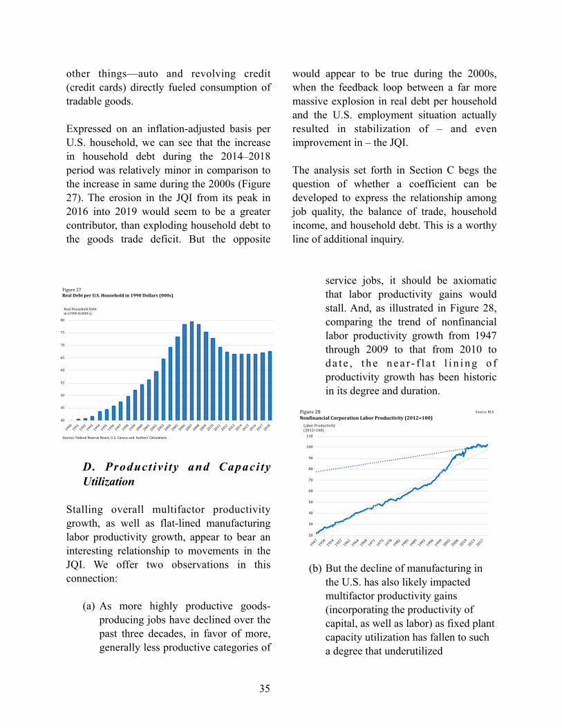
other things—auto and revolving credit (credit cards) directly fueled consumption of tradable goods.
Expressed on an inflation-adjusted basis per U.S. household, we can see that the increase in household debt during the 2014–2018 period was relatively minor in comparison to the increase in same during the 2000s (Figure 27). The erosion in the JQI from its peak in 2016 into 2019 would seem to be a greater contributor, than exploding household debt to the goods trade deficit. But the opposite
would appear to be true during the 2000s, when the feedback loop between a far more massive explosion in real debt per household and the U.S. employment situation actually resulted in stabilization of – and even improvement in – the JQI.
The analysis set forth in Section C begs the question of whether a coefficient can be developed to express the relationship among job quality, the balance of trade, household income, and household debt. This is a worthy line of additional inquiry.
D. Product iv i ty and Capaci ty Utilization
Stalling overall multifactor productivity growth, as well as flat-lined manufacturing labor productivity growth, appear to bear an interesting relationship to movements in the JQI. We offer two observations in this connection:
(a) As more highly productive goods-producing jobs have declined over the past three decades, in favor of more, generally less productive categories of
service jobs, it should be axiomatic that labor productivity gains would stall. And, as illustrated in Figure 28, comparing the trend of nonfinancial labor productivity growth from 1947 through 2009 to that from 2010 to d a t e , t h e n e a r - f l a t l i n i n g o f productivity growth has been historic in its degree and duration.
(b) But the decline of manufacturing in the U.S. has also likely impacted multifactor productivity gains (incorporating the productivity of capital, as well as labor) as fixed plant capacity utilization has fallen to such a degree that underutilized
35
40
45
50
55
60
65
70
75
80
19901991199219931994199519961997199819992000200120022003200420052006200720082009201020112012201320142015201620172018
RealHouseholdDebtin(1990$1000's)
Figure27RealDebtperU.S.Householdin1990Dollars(000s)
Sources: Federal Reserve Board, U.S. Census and Authors' Calculations
20
30
40
50
60
70
80
90
100
110
194719501954195719611964196819711975197819821985198919921996199920032006201020132017
LaborProductivity(2012=100)
Figure28NonfinancialCorporationLaborProductivity(2012=100)
Source:BLS

investments in existing capacity are acting as an encumbrance on overall productivity. Taking a closer look at nonfinancial corporation labor productivity growth during the period of the most substantial shifts in the employment situation in the U.S. is revealing. After all, the stall in labor productivity growth did not appear until after the Great Recession, and it is reasonable to inquire as to why this was so, despite the evident earlier deterioration in the quality of American jobs as measured by the JQI.
Figure 29 is helpful in this regard—dividing the period of 1980 through present day into historical chapters, each with their own
influence on labor productivity growth trends, as follows:
(1) The initial period in Figure 40, from 1980 through 1995 (yellow) reflects a continuation of the traditional post-World War II U.S. productivity growth t r e n d s . W h i l e t h e i m p a c t o f globalization was beginning to be felt in the JQI, which had declined by about 5% from 1990 through 1995, the full onslaught was yet to materialize.
(2) As discussed earlier in Part I, section 3, the IT Revolution (red), from 1996 through 2004, resulted in a record pace of post-World War II labor productivity growth that produced
36
50
60
70
80
90
100
110
Mar-80
Feb-81
Jan-82
Dec-82
Nov-83
Oct-84
Sep-85
Aug-86
Jul-87
Jun-88
May-89
Apr-90
Mar-91
Feb-92
Jan-93
Dec-93
Nov-94
Oct-95
Sep-96
Aug-97
Jul-98
Jun-99
May-00
Apr-01
Mar-02
Feb-03
Jan-04
Dec-04
Nov-05
Oct-06
Sep-07
Aug-08
Jul-09
Jun-10
May-11
Apr-12
Mar-13
Feb-14
Jan-15
Dec-15
Nov-16
Oct-17
Sep-18
LaborProductivity
(2012=100)
Figure29
U.S.NonfinancialCorporationLaborProductivity(2012=100)
1980-1995
TheITRevolution
2005-2007(3)
TheGreatRecession
2010-
Source: BLS

new high quality jobs and, as shown in Figure 10, stabilized the JQI within a band of 84.3 and 89.3 through the eight year period—beginning and ending the period at a level of about 87.
(3) Labor productivity growth returned to pre-IT Revolution trend from 2005 through the eve of the Great Recession. Yet, the JQI spiked further, reaching 90.9 in October of 2006, before beginning its long decline through early 2012. This spike, as p r e v i o u s l y d i s c u s s e d , w a s substantially due to the enormity of household debt expansion, resulting in employment and consumpt ion behavior that was both instigated by the making of trillions of dollars of loans that were not supported by household income growth and, therefore, unsustainable.
(4) The Great Recession saw a spike in labor productivity for all the wrong reasons (not unusual in recessions). While the early part of the recession saw productivity dip as output fell, commencing in September 2008, nearly 9 million jobs were lost in the U.S. Job losses occurred at a more rapid pace than decline in output, producing the indicated spike.
(5) The full impact of deteriorated job q u a l i t y i s r e f l e c t e d i n t h e u n p r e c e d e n t e d l o w r a t e o f nonfinancial corporation labor productivity growth since the end of the Great Recession. Essentially, the
“masks” of the IT Revolution and a household debt bubble have been removed, revealing an economy substantially more dependent of less productive employment.
Because the above period (5) affords less than a decade of data, it may be too early to reach any definitive conclusions regarding the connection between job quality and nonfinancial corporation labor productivity. Yet Figure 30, which zooms in on the present decade and lags the JQI by one quarter relative to the productivity data, suggests that the connection in worthy of monitoring going forward. It may well be that changes in job quality provide the answer to the stalled labor productivity. More granular and longer-term data will determine if this is the case.
Nonfarm multifactor productivity (see Figure 31 following page) has fared better than labor productivity since 1990 . But, interestingly, 58
multifactor productivity in manufacturing has declined significantly since prior to the Great Recession (Figure 32). The problem isn’t labor productivity in manufacturing, although
http://gabriel-zucman.eu/files/PSZ2018QJE.pdf 58
37
77
78
79
80
81
82
83
84
85
86
97
98
99
100
101
102
103
2010
2011
2012
2013
2014
2015
2016
2017
2018
2019
JQI
Non-financialCorporationLaborProductivity(2012=100)
NonfinancialCorporationLaborProductivity(2012=100)(Laxis)
EndofQuarterJobQualityIndex(Raxis)
Sources: Data from BLS
Figure30NonfinancialCorporationLaborProductivityvs.EndofQuarterJQILagged3Months

it has flat-lined . Productivity involves the 59
real value of output relative to labor hours or – in the broader multifactor measure – the totality of factors necessary to produce same. Thus, if unit consumption is held static, a reduction in unit pricing would have a depressive effect on productivity.
The downward trend in mult ifactor productivity in manufacturing is materially worse for nondurable goods than for durable
goods (Figure 32). Non-durables, such as apparel, foodstuffs, chemicals, and plastics saw little productivity growth even earlier in the period of accelerating globalization, and are particularly vulnerable to import price declines. It appears that the consumption of more units at lower prices from abroad have reduced the value of units of domestic output (this would apply to durable goods facing high levels of import competition, as well).
But what is of particular interest with regard to the erosion of manufacturing multifactor productivity, relative to the JQI, is the accompanying attrition of domestic capacity utilization over the past three decades. Figure 32 shows the post-recession decline in manufacturing multifactor productivity that is uncharacteristic of the two preceding cycles . 60
Clearly illustrated is the overall trend decline in manufacturing capacity utilization over nearly 30 years. Further, failure of the utilization rate to recover to prior cyclical highs correlates somewhat with the JQI trend
While not a principal subject for this paper, it is worth noting that the erosion in manufacturing productivity in the U.S. is particularly alarming inasmuch as it has 59
traditionally been the manufacturing channel that has introduced the value of advances in technology to economies at large.
The BLS did not measure the multifactor productivity prior to 1987.60
38
80
85
90
95
100
105
199019921994199619982000200220042006200820102012201420162018
Multi-factorProductivity(2012=100)
Figure31Multi-factorProductivityIndex(2012=100)
Sources: Data from BLS
Figure 32

decline over the same period (Figure 33).
Declining productivity and deteriorating
capacity utilization are no doubt linked to the erosion of U.S. job quality, as measured by the JQI. These factors are, in turn, connected with weak growth in wages and labor compensation in general. But we believe that they may also be connected with upward redistribution of income to high-wage workers, as discussed in Part I . Post-Great 61
Recession labor and multifactor productivity growth trends will become clearer with the passage of time, further revealing connections with the performance of the JQI.
E. Non-Residential Fixed Investment
The decline in U.S. job quality over the past three decades is linked substantially to a decline in goods-producing jobs. One factor in the economy that is highly correlated with
the availability of goods-producing jobs is investment in fixed assets. Clearly, residential fixed assets are a principal driver of construction jobs and—to the extent that they are not offset by imports—materials production. With respect to manufacturing employment, the expansion is generally correlated with investment in plants and equipment. Such investment also results in additional construction jobs and a broad array of generally well-paying jobs that support goods production . It is useful, in this 62
c o n n e c t i o n , t o m o n i t o r l e v e l s o f nonresidential fixed investment and to consider the relationship between such investment trends and the JQI.
It is important to note that nonresidential fixed investment is a broad category and incorporates assets that may or may not have a high correlation with improvement in high quality employment. For this analysis, non-residential fixed investment is separated into two categories, the first consisting of nonresidential structures and (mostly) industrial equipment, and the second consisting of intellectual property assets and in fo rma t ion p roces s ing equ ipmen t . Intellectual property investment (software, media, patentable drugs, to name a few) do have some salutary employment aspects associated with them, but the number of jobs created in the production thereof, although often well-paid, is not broad. Information processing equipment (computing and communications for the most part) is arguably “labor-saving” and may not only be imported itself, but may actually eliminate better-paid positions domestically.
See Baker, Dean, The Productivity to Paycheck Gap: 2019 Update, Center for Economic and Policy Research, September 201961
Durable goods manufacturing, for example, creates 7.4 indirect jobs for every 1 manufacturing job. https://www.epi.org/publication/updated-employment-62
multipliers-for-the-u-s-economy/
39
50
55
60
65
70
75
80
85
90
7577
7981
8385
8789
9193
95
19901991199319951997199820002002200420052007200920112012201420162018
ManufacturingCapapcityUtilization%JQI
Figure33ManufacturingCapacityUtilizationandJobQualityIndex
JobQualityIndex
Sources: Data from BEA and JQI

As Figures 34 and 35 illustrate, the proportion of investment in intellectual property and
information processing equipment, relative to total nonresidential fixed investment in the U.S., has increased markedly since 1990—particularly since the Great Recession. Some of this has been due to strong end-demand for the content and products (whether or not manufactured domestically) represented by these assets, but – for the most part – the relative increase has been due to a leveling off, or contraction, of investment in nonresidential structures and industrial equipment.
Figures 36 and 37 compare investment in the two groups on an inflation-adjusted basis. It is notable that real investment in nonresidential structures and industrial equipment, after crashing during the recession and its aftermath, barely recovered its level of 2008 by the end of 2018, despite a 20% increase in real gross domestic production during that period. It should be further noted that the short-lived uptick in nonresidential fixed asset investment in 2018 following the Tax Cut and Jobs Act of December 2017 was seen more in information processing equipment and intellectual property investment, on a relative
basis, than in any period in history.
Unsurprisingly, anemic real investment in nonresidential structures and industrial equipment, relative to the broader category of
nonresidential fixed investment is mirrored, over the medium and long term in movements of the JQI (Figure 38) . Further examination 63
b y m a r k e t p a r t i c i p a n t s , e c o n o m i c policymakers, and the academe of the connection between the “quality” of nonresidential fixed investment (in terms of its impact on higher wage/higher hours employment) is warranted. Over time,
Note that the period during which the JQI and investment in Figure 38 markedly diverge, corresponds with the bubble-era of the 2000s, during which job quality 63
benefited from the economic forces described earlier in section C of this Part III.
40
0
500
1000
1500
2000
2500
3000
3500
1990
1992
1994
1996
1998
2000
2002
2004
2006
2008
2010
2012
2014
2016
2018
Investmentin$billions
Figure34ComponentsofPrivateandGovernmentNon-residentialFixedInvestment
Structures
OtherIndustrialandGovenrmentEquipmentInformationProcessingEquipmentIntellectualPropertyProducts
Sources: Data from BEA
0%
10%
20%
30%
40%
50%
60%
70%
80%
90%
100%
1990
1992
1994
1996
1998
2000
2002
2004
2006
2008
2010
2012
2014
2016
2018
FixedInvestment%
Figure35ComponentsofPrivateandGovernmentNon-residentialFixedInvestment
IntellectualPropertyProductsInformationProcessingEquipmentOtherIndustrialandGovenrmentEquipmentStructures
Sources: Data from BEA and Authors' Calculations
54%
55%
56%
57%
58%
59%
60%
61%
62%
63%
500
600
700
800
900
1000
1100
1990
1992
1994
1996
1998
2000
2002
2004
2006
2008
2010
2012
2014
2016
2018
%ofNon-residentialFixedInvestment
Investment($Billions)
StructuresandNon-informationProcessingEquipment(in1990dollars)PercentofTotalNon-residentialFixedInvestment
Sources: Data from BEA and Authors' Calculations
Figure36Non-residentialStructureandNon-InformationProcessingEquipmentInvestment($billions)
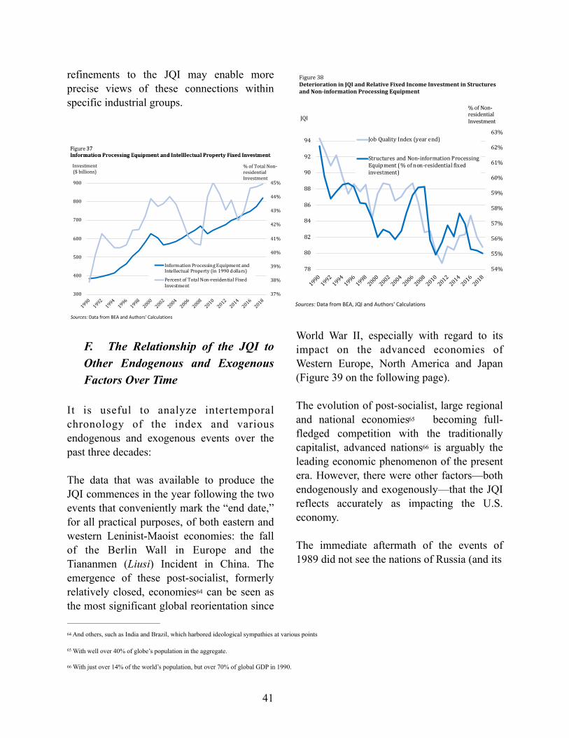
refinements to the JQI may enable more precise views of these connections within specific industrial groups.
F. The Relationship of the JQI to Other Endogenous and Exogenous Factors Over Time
It is useful to analyze intertemporal chronology of the index and various endogenous and exogenous events over the past three decades:
The data that was available to produce the JQI commences in the year following the two events that conveniently mark the “end date,” for all practical purposes, of both eastern and western Leninist-Maoist economies: the fall of the Berlin Wall in Europe and the Tiananmen (Liusi) Incident in China. The emergence of these post-socialist, formerly relatively closed, economies can be seen as 64
the most significant global reorientation since
World War II, especially with regard to its impact on the advanced economies of Western Europe, North America and Japan (Figure 39 on the following page).
The evolution of post-socialist, large regional and national economies becoming full-65
fledged competition with the traditionally capitalist, advanced nations is arguably the 66
leading economic phenomenon of the present era. However, there were other factors—both endogenously and exogenously—that the JQI reflects accurately as impacting the U.S. economy.
The immediate aftermath of the events of 1989 did not see the nations of Russia (and its
And others, such as India and Brazil, which harbored ideological sympathies at various points64
With well over 40% of globe’s population in the aggregate.65
With just over 14% of the world’s population, but over 70% of global GDP in 1990.66
41
37%
38%
39%
40%
41%
42%
43%
44%
45%
300
400
500
600
700
800
900
1990
1992
1994
1996
1998
2000
2002
2004
2006
2008
2010
2012
2014
2016
2018
%ofTotalNon-residentialInvestment
Investment($billions)
InformationProcessingEquipmentandIntellectualProperty(in1990dollars)
PercentofTotalNon-residentialFixedInvestment
Sources: Data from BEA and Authors' Calculations
54%
55%
56%
57%
58%
59%
60%
61%
62%
63%
78
80
82
84
86
88
90
92
94
199019921994199619982000200220042006200820102012201420162018
%ofNon-residentialInvestmentJQI
JobQualityIndex(yearend)
StructuresandNon-informationProcessingEquipment(%ofnon-residentialfixedinvestment)
Sources: Data from BEA, JQI and Authors' Calculations
Figure38DeteriorationinJQIandRelativeFixedIncomeInvestmentinStructuresandNon-informationProcessingEquipment

42
77798183858789919395 199019
9019
9119
9219
9319
9419
9519
9519
9619
9719
9819
9920
0020
0020
0120
0220
0320
0420
0520
0520
0620
0720
0820
0920
1020
1020
1120
1220
1320
1420
1520
1520
1620
1720
1820
19JQIFig
ure39
ThePrivateSectorJobQualityIndexReporteda3-MonthTrailingAverageofM
onthlyBaseInputs
Recession
s
JobQ
ualityIndex(3monthtrailingaverageofbase
inputs)
TheAsianTiger
Shock
Sources:
Data
from
BLS
and
Aut
hors
' Cal
cula
tions
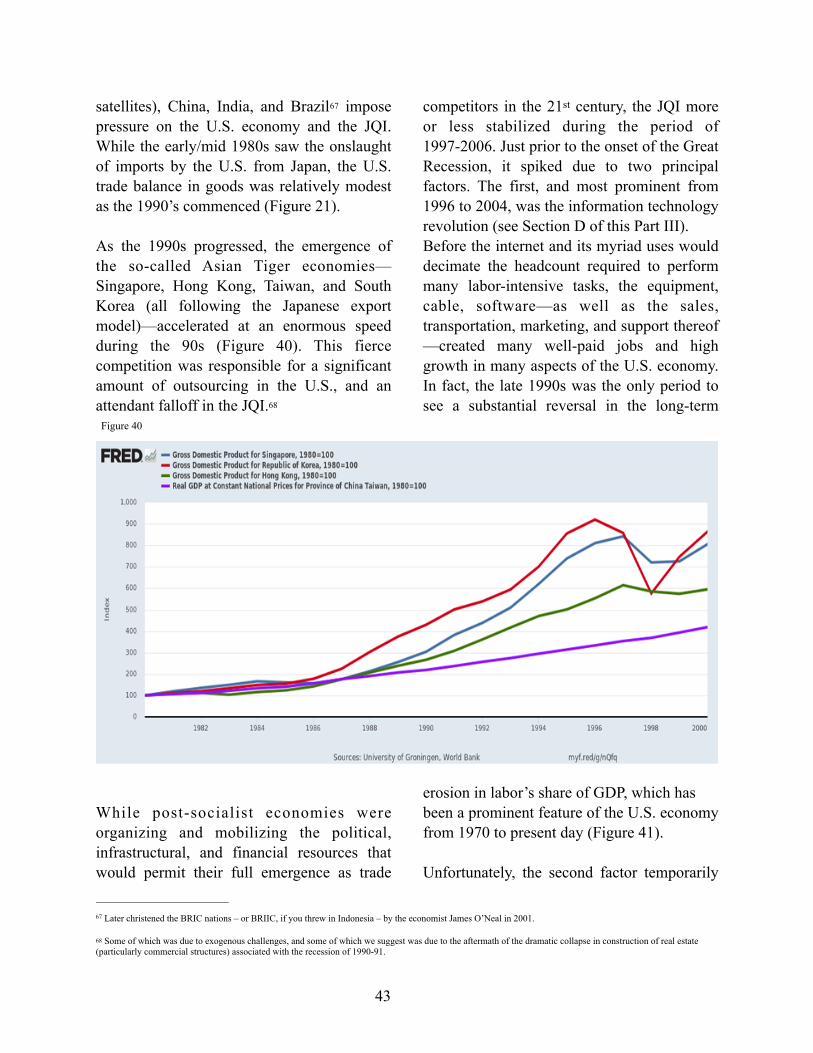
satellites), China, India, and Brazil impose 67
pressure on the U.S. economy and the JQI. While the early/mid 1980s saw the onslaught of imports by the U.S. from Japan, the U.S. trade balance in goods was relatively modest as the 1990’s commenced (Figure 21).
As the 1990s progressed, the emergence of the so-called Asian Tiger economies—Singapore, Hong Kong, Taiwan, and South Korea (all following the Japanese export model)—accelerated at an enormous speed during the 90s (Figure 40). This fierce competition was responsible for a significant amount of outsourcing in the U.S., and an attendant falloff in the JQI. 68
While post-socialist economies were organizing and mobilizing the political, infrastructural, and financial resources that would permit their full emergence as trade
competitors in the 21st century, the JQI more or less stabilized during the period of 1997-2006. Just prior to the onset of the Great Recession, it spiked due to two principal factors. The first, and most prominent from 1996 to 2004, was the information technology revolution (see Section D of this Part III). Before the internet and its myriad uses would decimate the headcount required to perform many labor-intensive tasks, the equipment, cable, software—as well as the sales, transportation, marketing, and support thereof—created many well-paid jobs and high growth in many aspects of the U.S. economy. In fact, the late 1990s was the only period to see a substantial reversal in the long-term
erosion in labor’s share of GDP, which has been a prominent feature of the U.S. economy from 1970 to present day (Figure 41).
Unfortunately, the second factor temporarily
Later christened the BRIC nations – or BRIIC, if you threw in Indonesia – by the economist James O’Neal in 2001.67
Some of which was due to exogenous challenges, and some of which we suggest was due to the aftermath of the dramatic collapse in construction of real estate 68
(particularly commercial structures) associated with the recession of 1990-91.
43
Figure 40

muting further erosion in the JQI during the ten years from 1997-2006 (and, for a time, even reversing it) was the meteoric rise in household debt that we discussed in Section C. The collapse of the housing and credit bubbles not only resulted in the Great Recession; it revealed the impact on the U.S. employment situation of global economic imbalances and the related loss of higher quality jobs in the tradable goods sector and i n t h e m a n y s e c t o r s t h a t s u p p o r t manufacturing. Global oversupply-induced disinflation yielded a tendency toward persistent secular stagnation in the U.S., and the full force of globalization became firmly entrenched in the anemic U.S. economic recovery from the recession.
The JQI fell by 13.5% from its 2006 peak to its 2012 trough and, since then, has failed to sustain a recovery to even its lowest levels from 1990 through 2008, save for a brief moment in the first quarter of 2017. Today, the JQI stands at only 4.2% above its all-time 2012 low and is 13.1% below its 1990 level.
The index has been generally down trending since early 2017, and that calls for a closer look at recent years.
As noted above , the index peaked significantly, albeit briefly, in early 2017—with the beginning and end points of its spike
44
Figure 41
-5
5
15
25
35
45
55
65
8081828384858687888990
3/15/2016
4/15/2016
5/13/2016
6/15/2016
7/15/2016
8/15/2016
9/15/2016
10/14/2016
11/15/2016
12/15/2016
1/13/2017
2/15/2017
3/15/2017
4/14/2017
5/15/2017
6/15/2017
7/14/2017
%ChangeJQI
PrivateSectorJobQuailityIndex(3monthtrailingaverage-leftaxis)
ChangeinConstructionandManufacturingEmploymentforProductionandNon-supervisoryworkers(3monthtrailingaverage-rightaxis)
Sources: Data from BLS and Authors' Calculations
Figure42JQISpikein2016/2017RelativetoChangeinEmploymentinU.S.ConstructionandManufacturingandIndustrialProduction

running from the summer of 2016 to the summer of the following year. The move, as shown in Figure 10 and in closer detail in Figure 42 (previous page), was substantial and defined, and coincided with an equally truncated period of growth in industrial production and related employment in the 69
high-wage/high-hours construction and manufacturing sectors (Figure 42). Of particular interest is the substantial dollar appreciation (Figure 43) against other currencies which, may have ultimately l imited fur ther growth in domest ic manufacturing, and which may have been responsible for the brevity of the rebound in manufacturing. This is particularly evident in the aggressive devaluation of the Euro and the Chinese RMB against the dollar from September-December of 2016 (Figure 44) as the economies of Europe and China began to slow.
The period also coincided with 13.4% rise in equity markets over the nine months from
July 2016 through March 2017 (Figure 45, following page) – often associated with investor confidence following the election of Donald Trump as U.S. president. The rally was not entirely driven by the election since the S&P 500 had already advanced from approximately 1,870 to approximately 2,120 during the eight months prior to the vote. The equity rally was likely sustained by the
election results, but had its antecedent in the household income growth illustrated in Figure 24. The JQI’s reversion, commencing in early
Illustrated in Figure 43 is the six month diffusion index of the U.S. Industrial Production data (percent of the series where production increased in the indicated time 69
span plus ½ of the percentage that were unchanged) – indexes under 50 mean more industries are producing less.
45
Figure 44
118119120121122123124125126127128
Mar-16
Apr-16
May-16
Jun-16Jul-16
Aug-16
Sep-16
Oct-16
Nov-16
Dec-16
Jan-17
Feb-17
Mar-17
Apr-17
May-17
Jun-17Jul-17
TradeWeightedU.S.DollarIndex
Figure43TradeWeightedU.S.DollarIndex:Broad,Goods
Sources: Data from Federal Reserve Board of Governors

2017, proved to be a robust indicator of a sharp turn in industrial activity even as markets and many forecasters predicted a sustained uptick in the recovery. The continuing reversion of the index to the level prior to its upward acceleration of 2016, and its deterioration since, is notable and consistent with the anemic improvement to average incomes in the years since.
~~~
The twin “demons” of economic analysis are causality and correlation. There is always a temptation to highlight relationships that appear to be noteworthy—and are in fact correlative during certain periods. The difficulty arises in teasing apart from such correlations the factors that are truly causal. The intermediary between the two rests in the “reliability” of the transmission from one factor to another. In other words, one can look inside a combustion engine in a motor vehicle and detect the pistons moving up and down to drive the crankshaft. And one can similarly
observe the tires of the vehicle rotating and propelling it forward. But if there is no transmission to transfer the energy of one to the other, there is no movement.
The relationships between the JQI and the various other factors discussed here range from causality to correlation. In some instances, deteriorating job quality in the U.S. is reflective of exogenous factors (e.g., inexpensive global labor and the persistently strong dollar that makes imports to the U.S. cheap and its exports expensive for other countries). In other instances, the poor domestic job quality is itself responsible stagnation of domestic household incomes, demand, and—ultimately—growth, despite the recovery (or even historic lows) in unemployment and generally steady job formation.
This connectivity, be it causal or merely correlative, requires close examination and testing of transmission mechanics to put
46
Figure 45
chicken and egg in correct order. The JQI is filling in a critical (and heretofore generally absent) piece of the economic puzzle. correlative, requires close examination and testing of transmission mechanics to put chicken and egg in correct order. The JQI is filling in a critical (and heretofore generally absent) piece of the economic puzzle.
The authors look forward to monitoring its periodic advances and rollovers as a forecasting tool. Further use of the JQI, in combination with other indicators, can better explain the failure of various factors—that have traditionally been viewed as directly having influence on one another—to perform as expected.
47

Part IV | Further Developing the JQI: What the Future Holds for the Index
Because the JQI demonstrates so much potential, further work is planned, and include: (i) updates and revisions to the JQI; (ii) expanding the further breakdowns of the 180 existing JQI sectors, using OES data and appropriate estimates (where dependable data is available); (iii) further intra-sectoral analysis using methodologies developed for the full index, as well as estimates drawn from OES and other data; (iv) back-construction of index value emulations (for periods prior to 1990), using OES and other data; and (v) construction of a “JQI-2” index encompassing all jobs, as opposed to just production and nonsupervisory positions.
A. Monthly Releases and Revisions
The JQI will be updated and revised monthly, contemporaneously with the release of new data from the BLS, which normally occurs on the first Friday of each month. Once the BLS data is released, our automated data collection application extracts from BLS databases all the data necessary for updating and revising the JQI. Conveniently, the JQI application utilizes the industry identification structure established by the BLS, which permits the extraction of data relating to the specific industries of interest. Each industry and data category are paired with a unique 13-digit series ID and the JQI application uses this ID for contacting and retrieving the necessary data from the BLS. For example, the Logging industry, total employment is indicated by the North American Industry Classification System (NAICS) code: CES1011330006, whereas Average Weekly Hours and Average
Hourly Earnings for Logging are indicated by CES1011330007 and CES1011330008. The JQI consists of 180 industries, equaling to 540 unique NAICS Series IDs that our tool uses to gather the necessary employment data. Once collected, we then format the data for calculation and implementation for the purposes of the Job Quality Index. Afterwards, we follow that calculation steps, described in the section prior, in order to complete the updating process and provide for any revisions to prior months’ data.
The monthly BLS data is typically released at 8:30 a.m, Washington, DC time. The JQI update and revision announcement will be released by 12:00p.m. The releases will highlight underlying causes of any material changes to the index and will note changes in trend direction as the same become evident.
It is not uncommon for changes to occur within the BLS surveys. When such changes occur, the JQI system will add any new NAICS sub-sector series IDs to the a p p l i c a t i o n c o d e a n d i t w i l l t h e n automatically collect the additional data for that industry. To the extent that the BLS has provided historic data for any new industry sub-sector, the JQI will be revised accordingly for all periods covered by such new data, with a one-month lag from the time of the new data release by the BLS to its incorporation in the JQI. The same would be the case for any industry sub-sector that is eliminated from tracking by the BLS.
There are also cases where the BLS will choose to combine existing industries. Typically, these combinations will result with no significant change to the JQI data collection process. Although on rare occasions, a “flip category” will be changed,
48

and this requires changes made in the old survey to the new survey. This type of change was seen only once during the period reflected in the original JQI index released as part of this paper (1990 to date). This instance involved changes to the Depositary Credit Intermediation sector. Starting in May 2017, OES aggregated various industries together to form larger industry groups, which resulted in w o r k e r s f r o m D e p o s i t o r y C r e d i t Intermediation combining with Activities Related to Credit Intermediation. Due to the interaction between the CES and OES survey within the adjustment process, it is important that the data structure is synchronized to maintain statistical accuracy going forward. But in these instances, it was determined not to back-engineer every forthcoming instance of this type, as doing so would likely result in convolution of the maintenance procedure.
The JQI automated data collection, organization, and calculation procedure can be modified to investigate a large variety of economic issues related to a breakdown of the relationship between low and high qualities of employment, the trajectories of weekly pay between high/low cohorts, and how the quality of employment affects inflation in both wages and non-asset pricing, and the trajectories of weekly pay between high/low cohorts. Our current index highlights P&NS workers, which currently accounts for 82.3% of private sector jobs, but—as detailed in section 5 —broader coverage of the JQI to include all private sector jobs is planned.
B. Further Granularization within Industry Sectors
As the JQI continues to develop, the authors intend to expand use of the OES data to
subdivide more of the JQI’s 180 industrial sectors by major occupations within each industry – just as has been done with respect to the four “flip categories” of industries that produce average weekly wages that hover around the JQI weekly wage benchmarks. Of the 180 industry categories used in calculating the JQI, there are 23 industries (other than the existing four flip categories) that employ 1 million or more P&NS workers. About half of the remaining such categories are high quality per the JQI algorithm. The P&NS workers employed in these remaining 1 million+ industry sectors (other than those in the flip category industries) comprise about 46% of all P&NS workers and thus have material statistical relevance.
While the average weekly wage levels in most of the foregoing 23 categories are sufficiently high or low enough to leave any further subdivision without material relevance to the JQI resultant, we believe that—because only P&NS workers are included (and therefore higher-paid management workers are excluded already) — it is not unlikely that there are a significant number of jobs in otherwise high-weekly wage industries that would fall into the low-quality categories. In other words, it is more likely that the JQI algorithm, as presently constructed, overrepresents the number of high quality jobs. It is therefore worthwhile to continue refinement of the index along these lines.
In connection with the foregoing, information from the OES will be applied to assess how many jobs within each of the 23 identified industr ies are high- or low-qual i ty occupations from the standpoint of weekly income and thereby split each such industry category into two subcategories. For this
49

analysis the OES data will continue to be filtered to only include major occupations within each industry, which normally includes up to 24 different occupations.
Weekly wages derived from the OES will then be compared to the weekly wage benchmarks used in the preliminary JQI index. The occupations will then be assigned a quality of high or low depending on whether they are above or below the benchmark.
As with the existing flip categories, the authors will take the total number of high-quality jobs and divide it by the total number of jobs. This will result in the percentage of high-quality jobs (and, correspondingly, low-quality jobs) for each of the 23 categories. The relative percentage of high-quality/low-quality jobs will then be used to normalize and adjust each flip category by multiplying the percentage of high-quality/low-quality jobs by the CES employment count so that each such industry is split into two groups, which are then independently utilized in the overall JQI calculation.
As with the flip categories, these percentage divisions (which do not change dramatically from year to year) will be revised each year to commence with JQI data released beginning in May of each year, through to the following April. The division of the remaining 23 categories – and complete back-adjustments to the JQI, is planned for November 2020.
C. Additional Intra-Sectoral Analysis
The relevance of JQI analysis is supported by the large size of the database being examined and the duration of the observations. Yet, while smaller and more time-compressed data
sets would be somewhat less statistically significant, the ability to apply the JQI algorithm to sectors within the U.S. employment base clearly exists.
Over the coming year, a variety of intra-sectoral analyses are planned for the purpose of examining trends in specific super-sectors. In the first instance, separate analyses are planned for the goods- producing and services master-sectors, respectively. Analysis of the largest super-sectors (those with 10 million or more employees), will follow, and will specifically include:
■ Manufacturing ■ Trade, transportation, and utilities ■ Retail trade ■ Education and healthcare ■ Professional and business services ■ Leisure and hospitality
The foregoing super-sectors and the two master-sectors discussed above will result in a total of eight sub-series that can be published on a monthly basis. These sub-series might shed some additional light on shifts in the quality of jobs (as defined in this paper), within the respective master- and sub-sectors described above, over the period of time for which dependable data is available.
As ever-smaller data sets are examined, the resultant output will be increasingly more reliant on the OES breakdowns within individual industry sectors, as discussed above. There should be sufficient data for the eight sub-series outlined above to obtain statistically relevant conclusions using the JQI rubric.
Valuable—but less statistically rigorous—observations can be obtained in connection
50

with shifts in job quality within individual larger industry sectors. And the BLS collects certain data – while unpublished in a manner in which it can effectively be utilized by the JQI model – which may be available via cooperation with the Bureau. The OES data will also permit certain additional estimations regarding shifts in individual industry job quality.
Accordingly, the JQI project team hopes to make available to interested parties customized analyses of sub-supersectoral and individual industry cohorts.
D. Pre-1990 Emulations
One thus-far-unanswered question with regard to the evident deterioration in job quality since 1990 is how long the negative trend existed prior to that year. As discussed, the granularity of the BLS data necessary to produce the JQI was not involved for P&NS jobs until 1990, and for all jobs until 2000.
Nevertheless, occupational data from other sources (including the OES) may yield some ability to produce emulations of the JQI calculations prior to 1990. Our focus in this regard will be the period from 1970 through 1990, in that such 20-year period saw the ini t ia l round of post-World War II globalization from the global oil crisis and stagflation of the 1970s through the pinnacle of Japan’s competitive strength in the 1980s. The 1980s also saw the commencement of the sustained growth in the number of service sector jobs relative to goods producing jobs in the United States.
While the resulting emulations will not have the accuracy of the JQI data for the period of 1990 onwards, we believe that they will
afford informative comparisons and will seek to pursue the research necessary to develop them over the coming years.
E. Development of the JQI-2
It is the authors’ intention to develop a broader “JQI-2” index as a companion to the original Job Quality Index. The JQI-2 will incorporate all private sector jobs covered by the CES – as opposed to the P&NS jobs (83% of all private sector jobs) covered by the original version of the index presented herein.
There are, however, two notable challenges regarding the development of a version of the index covering managerial and supervisory jobs:
(i) the data available in connection with such positions is less granular prior to the year 2000, than it is for P&NS jobs from 1990—1999; and
(ii) including managerial positions will inevitably introduce the problem of skew in favor of the highest earning “1%” of jobs that command magnitudes greater in come than the ba lance o f managerial and supervisory jobs.
We expect to address the first issue with the approximate solut ions to the back-engineering of the primary index as described in Section 4. There is, of course, the option of merely commencing the JQI-2 with the 2000 data—the industrial transition of the 1990s should yield important observations. It will, nevertheless, not be a perfect match with the primary index.
The second problem is more complex. One of the difficulties with employment data
51

averages over the past three decades is the increasing degree to which compensation, and economic rent extraction, have become commingled. At the very high end of job holders—measured in weekly incomes—is a group of managers and manager-owners receiving wage and bonus income that demonstrably exceeds the value of the labor they are providing on the job. Their ability to obtain such economic rents—even without ownership in many cases—emanates from a number of factors. These include, among other things, (i) the limited number of such positions in establishments as a whole; (ii) the loss of direct influence by public shareholders (and in some cases, even boards) over-compensation and other corporate governance matters amidst the acceleration of “money manager capitalism; ” (iii) an increase in the 70
number/size of owner-managed companies contemporaneous with the great concentration of wealth resulting from, and permitting, same; and (iv) the “expertization” of executive compensation by consulting firms heavily beholden to the senior executives that retain their services (however indirectly).
It will therefore be necessary, in developing a JQI-2 to more specifically analyze actual positions held and, most likely, exclude the thin layer of the super-highly compensated from such broader index entirely. Still, capturing 98% to 99% of total positions in the private sector should prove quite helpful. We look forward to introducing this companion product.
Minsky, Hyman P. Ph.D., "Money Manager Capitalism" (1989). Hyman P. Minsky Archive. 13. 70
https://digitalcommons.bard.edu/hm_archive/13
52
Part V | Conclusion: An Index for our Time
It is well-known that the US manufacturing workforce has declined dramatically in the past three decades. Until 1990, decline in the US manufacturing workforce was gradual. In 1970, the US had 17.8 million manufacturing workers. In 1990, 20 years later, the figure had edged down to 17.7 million. Ten years later, it was down 2.4 percent to 17.3 million manufacturing workers.
But in the decade fol lowing 2000, manufacturing employment fell off a cliff. By 2010, manufacturing employment was down a shocking 33.2 percent at 11.5 million. Since 2010, the figure has crept up only somewhat, to reach 12.8 million in May 2019.
Meanwhile, the total US working population has grown dramatically over those years. In 1970, manufacturing workers accounted for 22.6 percent of total US civilian employment. As of May 2019, they accounted for just 8.2 percent of the total.
An important question surrounding the decline of manufacturing is whether those leaving manufacturing are transitioning into better or worse jobs. As we built our new Job Quality Index, we explored the shifting composition of the US workforce to see if we could measure the economic fates of the millions who have left manufacturing and, as reflected in Figure 32 in Part IV of this paper, the answer is that lost manufacturing jobs were chiefly replaced by lower-wage/lower hours service jobs.
But the shift to what we have concluded herein is a “peak service” economy did not just touch on the manufacturing, or even the
broader goods-producing, sector. It impacted a slew of mostly well-paying jobs that supported such production. And these factors persist.
Moreover, the patterns of change in the U.S. employment situation do not support the oft-touted notion that technological change has b e e n r e s p o n s i b l e f o r t h e l o s s o f manufacturing and support jobs. I f technological change were the dominant factor, one would expect to see technological change driving similar double-digit declines in many other sectors. But that has not happened. For example, transportation and warehousing should have been heavily impacted by technology. The rise of Amazon, with its highly automated warehouses, and the emergence of a series of software companies that automate inventory management should have made this sector more productive, i.e. less labor-intensive. Yet it expanded employment by 23.6 percent increase in the period. Other service sectors also showed job growth. What made manufacturing unique was not technological job loss, but the massive loss of market share, revenue, and jobs to foreign manufacturers.
It is true that many advances occurred in Professional and Technical Services Jobs, just as one would expect following the internet revolution and the enormous diffusion of information and communication technology through every brook, rill, rivulet and creek of the economy. Professional and Technical Services offers high pay, growth in employee numbers, and the opportunity to increase productivity. Employment is up 41 percent in this sector and the average weekly pay for nonmanagerial workers of $1,575 exceeds the pay of many other industries. This is the heart of the “moving to higher ground” argument
53
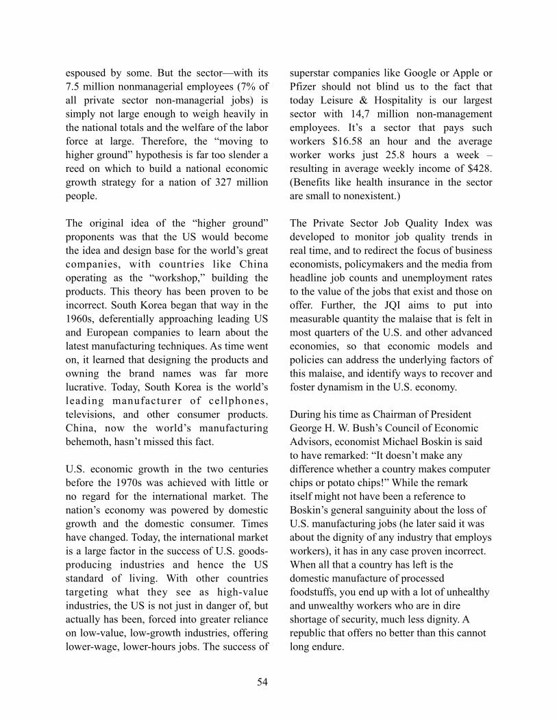
espoused by some. But the sector—with its 7.5 million nonmanagerial employees (7% of all private sector non-managerial jobs) is simply not large enough to weigh heavily in the national totals and the welfare of the labor force at large. Therefore, the “moving to higher ground” hypothesis is far too slender a reed on which to build a national economic growth strategy for a nation of 327 million people.
The original idea of the “higher ground” proponents was that the US would become the idea and design base for the world’s great companies, with countries like China operating as the “workshop,” building the products. This theory has been proven to be incorrect. South Korea began that way in the 1960s, deferentially approaching leading US and European companies to learn about the latest manufacturing techniques. As time went on, it learned that designing the products and owning the brand names was far more lucrative. Today, South Korea is the world’s leading manufacturer of cellphones, televisions, and other consumer products. China, now the world’s manufacturing behemoth, hasn’t missed this fact.
U.S. economic growth in the two centuries before the 1970s was achieved with little or no regard for the international market. The nation’s economy was powered by domestic growth and the domestic consumer. Times have changed. Today, the international market is a large factor in the success of U.S. goods-producing industries and hence the US standard of living. With other countries targeting what they see as high-value industries, the US is not just in danger of, but actually has been, forced into greater reliance on low-value, low-growth industries, offering lower-wage, lower-hours jobs. The success of
superstar companies like Google or Apple or Pfizer should not blind us to the fact that today Leisure & Hospitality is our largest sector with 14,7 million non-management employees. It’s a sector that pays such workers $16.58 an hour and the average worker works just 25.8 hours a week – resulting in average weekly income of $428. (Benefits like health insurance in the sector are small to nonexistent.)
The Private Sector Job Quality Index was developed to monitor job quality trends in real time, and to redirect the focus of business economists, policymakers and the media from headline job counts and unemployment rates to the value of the jobs that exist and those on offer. Further, the JQI aims to put into measurable quantity the malaise that is felt in most quarters of the U.S. and other advanced economies, so that economic models and policies can address the underlying factors of this malaise, and identify ways to recover and foster dynamism in the U.S. economy.
During his time as Chairman of President George H. W. Bush’s Council of Economic Advisors, economist Michael Boskin is said to have remarked: “It doesn’t make any difference whether a country makes computer chips or potato chips!” While the remark itself might not have been a reference to Boskin’s general sanguinity about the loss of U.S. manufacturing jobs (he later said it was about the dignity of any industry that employs workers), it has in any case proven incorrect. When all that a country has left is the domestic manufacture of processed foodstuffs, you end up with a lot of unhealthy and unwealthy workers who are in dire shortage of security, much less dignity. A republic that offers no better than this cannot long endure.
54