typography
DESCRIPTION
What is Typography ?TRANSCRIPT

107
CHAPTER 7
Typography
TYPOGRAPHY IS ABOUT the design of text, which covers a very wide range of things:books, posters, and websites are all textual. Typography goes beyond the letterson screen or paper: It’s also concerned with the space around the text, the wayit sits on a page or screen, and the size and proportions of those mediums. Inthis chapter we’re sticking closely to the core typographic concerns for the Web.You’ll learn how to use type intelligently and to set text so that it works for you.
The typographer’s job is to make things clear and to make things work—tomake sure that the text is legible and that the underlying structures in the author’smanuscript (such as headings, chapters, and sections) are accurately reflected inthe final work.
Typography on the Web
Typography on the Web is different from typography in print in many ways, andalthough the principles hold across the media, the ways in which those principlesare applied differ. Things that are “free” in print, such as resolution and a stablepage size, are all but impossible on the Web, and things that are “free” on the Web,such as color, interaction, and rich media, are expensive or impossible in print. Ifyou play to the strengths of the Web, then there’s no reason why web typographycan’t be as effective as print typography.
You’ve already seen how limited user and author control of presentationwas before CSS. The typographic possibilities offered by CSS are, by comparisonto <font>, vast. In fact, the more advanced CSS selectors begin to take CSS toa level where things impossible in print page layout applications are possible onthe Web. CSS covers all the basic typographic options well: The author has con-trol over type, size, color, interlinear space, and space above and below blocks oftext. This control can be exerted over block-level elements, such as <p>, as wellas inline elements, such as <em> and <strong>. The property inheritance offeredby CSS means that you can cascade typographic decisions through a document,only overriding when you need to. In short, it’s powerful stuff.

Chapter 7
108
Figure 7-1. Common typographic terms
Type Basics
First, some definitions of terms. A typeface is a set of characters drawn from thesame design. Times and Arial are typefaces. Strictly speaking, Times Regular andTimes Bold are different typefaces, but they’re part of the same typeface family.The term font is often used interchangeably with typeface, but it shouldn’t reallybe. A font is a software implementation of a typeface; it’s a collection of everycharacter available in that typeface. Although everyone has something calledTimes installed on their computer, the implementations differ. If you’re on a PC,you’ve got a different piece of code from the Times on a Mac. Beyond platform,you have format (Postscript Type 1, TrueType, OpenType, and the UNIX bitmapformats), version (1.0 and so on), and even name (Monotype.com and AndaleMono are the same typeface). Even though the font files are different, the type-face—the design—is the same.
In metal typesetting (the way most printing happened until the 1960s),a character was called a printing type and was a piece of metal with a reversedimage of the character in relief on its face. The character was cast on the bodyof the type, and the size of the type referred to the size of metal body of the type,not the size of the character. This way of thinking about type has persisted intodigital type and, although a type’s body has no real equivalent on screen, digitaltype is still sized according to this notional body. font-size: 12px doesn’t refer tothe distance between the top of the ascenders and the bottom of the descenders(see Figure 7-1); it refers to the size of this invisible, imaginary body.
Type has a baseline, which is an imaginary line that the bottoms of charac-ters sit on. With metal type the baseline was at a predetermined standard

Typography
109
Figure 7-2. Ranging and nonranging figures
height, which meant that different typefaces cast at the same body size wouldline up with one another neatly. The same applies in digital type; the baseline iswhat allows text of different sizes and in different typefaces to align. Althoughthe baseline is an imaginary line, the same way that the body of digital type isimaginary, it has a concrete result: You can see where the baseline is, unlike thebody. The cap height of the type is the imaginary line on which the tops of capi-tal letters sit.
The distance between the baseline and the top of the lowercase letters iscalled the x-height. X-height is also a convenient way to refer to the imaginaryline that cuts across the top of a line of text, in the same way that the baselineruns below it. The x-height is where visual alignment with the top of lines of texthappens. The space between lines is called interlinear space. The best way tomeasure it is from baseline to baseline.
Interlinear space is often called leading, a name that originally referred tothe process of increasing the space between lines of metal type, by putting thinstrips of lead in between the lines. With digital typography you aren’t limited tojust adding space, and there aren’t any physical type bodies anymore to put thelead between. Interlinear space is a much clearer term—in fact, it was the indus-try term before desktop publishing (DTP) came along and, for some reason,resurrected the old term.
Typographers and printers have traditionally referred to numbers in twoways: figures and numerals. Figures are usually used to refer to Arabic numbers(1, 2, 3, and so on) and numerals to Roman numbers (I, II, III, and so on). Thereare two kinds of figures: ranging and nonranging. Ranging figures are all the sameheight—that of a capital letter. Nonranging figures are different heights. Rangingfigures are also called lining figures, and nonranging figures are also called non-lining and old-style figures. In Figure 7-2, ranging figures are the lower line.
When body text is referred to in this chapter, what’s meant is the main text—the text that is read. Elements of typography concerned with the main text forma subsection of typography called text typography. Elements concerned withlarge-scale type manipulation, type-as-image, such as advertising typography,form a subsection known as display typography. CSS is good for text typographyand not so good for display typography, although you can apply everything you’lllearn in this chapter to display typography.
When it comes to dealing with blocks of text (paragraphs and pages),typographers often refer to the “color” of the block. They aren’t referring to theactual color of ink used to print the text; rather, they’re referring to the visual
Chapter 7
110
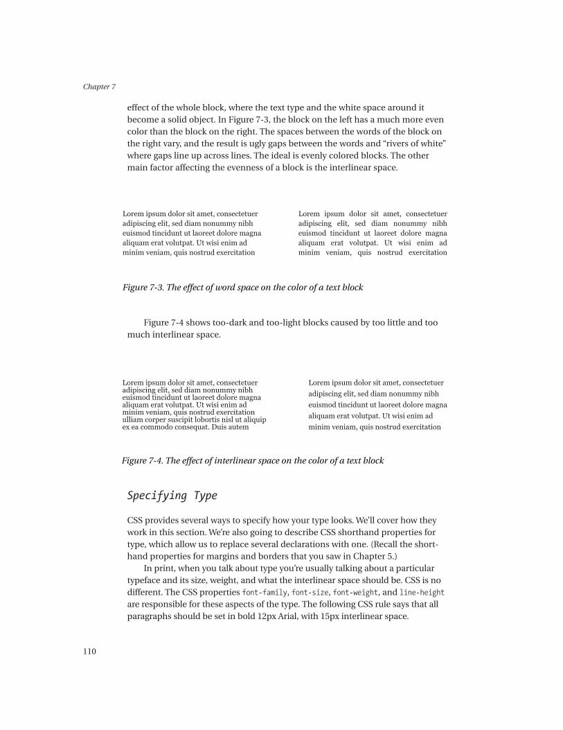
effect of the whole block, where the text type and the white space around itbecome a solid object. In Figure 7-3, the block on the left has a much more evencolor than the block on the right. The spaces between the words of the block onthe right vary, and the result is ugly gaps between the words and “rivers of white”where gaps line up across lines. The ideal is evenly colored blocks. The othermain factor affecting the evenness of a block is the interlinear space.
Figure 7-4 shows too-dark and too-light blocks caused by too little and toomuch interlinear space.
Specifying Type
CSS provides several ways to specify how your type looks. We’ll cover how theywork in this section. We’re also going to describe CSS shorthand properties fortype, which allow us to replace several declarations with one. (Recall the short-hand properties for margins and borders that you saw in Chapter 5.)
In print, when you talk about type you’re usually talking about a particulartypeface and its size, weight, and what the interlinear space should be. CSS is nodifferent. The CSS properties font-family, font-size, font-weight, and line-heightare responsible for these aspects of the type. The following CSS rule says that allparagraphs should be set in bold 12px Arial, with 15px interlinear space.
Figure 7-3. The effect of word space on the color of a text block
Figure 7-4. The effect of interlinear space on the color of a text block

Typography
111
p {
font-family: Arial;
font-size: 12px;
font-weight: bold;
line-height: 15px;
}
That’s pretty easy to understand, but we’ll expand on each of these proper-ties here. There are a few other simple properties that control how type looks:font-style controls whether your type is italicized or not, and text-decorationcontrols details such as underlining. A quick modification to the last rule givesus bold, italic, underlined 12px Arial, with 15px interlinear space:
p {
font-family: Arial;
font-size: 12px;
font-weight: bold;
line-height: 15px;
font-style: italic;
text-decoration: underline;
}
In the sections that follow, we’ll walk through the properties.
font-family
The font-family property specifies which typeface the browser should use. In itssimplest form, all that it needs is a single name. Because typefaces live in fontfiles on the client and not everyone has the same typefaces, sometimes you mayspecify a typeface that not everyone using your site has. font-family providesa mechanism for dealing with this: It accepts a comma-separated list of names,and it will try each in turn until it succeeds in matching an installed font. CSSalso provides a list of generic typeface families that you can use. If one of thesegeneric families is the last item in a list, then, if all else has failed, you havesome degree of assurance that you’ll get a serifed typeface and not a sans-serif.It’s a good idea to get into the habit of finishing font-family declarations witha generic family.
Some of you may be wondering about serif and sans-serif. Simply put,serifs are the sharp ends of strokes on typefaces, such as Times. Sans-seriftypefaces don’t have any serifs. The illustrations in Table 7-1 should make thedistinctions clear.

Chapter 7
112
Table 7-1. The Generic font-family Values
Sample Name Description
serif Serifed typefaces, such as Times or
New Century Schoolbook.
sans-serif Typefaces without serifs, such as Arial
or Helvetica.
cursive Typefaces that look like calligraphic
writing, such as Zapf Chancery or
Caflisch Script.
fantasy Typefaces that don’t fit into any other
category. IE 5 for Mac (IE5/Mac)
defaults fantasy to Comic Sans, and
the CSS1 specification gives “Wild
West” wood type (the ornate poster
letters) as an example.
monospace Typefaces in which all the letters
occupy the same amount of
horizontal space, such as Courier or
Andale Mono.
When you use font names that contain white space, you need to enclosethem in quotes. Here’s an example:
font-family: "New Century Schoolbook", "Times New Roman", Times, serif;
In all these cases, you’re specifying a typeface’s name, so you need to get thespelling right.
font-size
The font-size property controls the size of your type. As you saw earlier on inthe chapter, type isn’t sized according to the distance between the top of theascender and the bottom of the descender; rather, it’s sized according to theinvisible “body” of the type.

Typography
113
Figure 7-5. Two typefaces with different x-heights shown at the same font-size
In addition to that confusion, other factors affect how big type looks. Thex-height of typefaces varies a lot, and type with a smaller x-height looks smallerthan type with a larger x-height. For example, compare Times and Georgia inFigure 7-5.
As you can see, despite both fonts being declared as 12px, Times looks a lotsmaller than Georgia because it has a smaller x-height. Another result of Times’ssmall x-height is that its characters are narrower than Georgia’s.
font-size accepts a value in one of the units that CSS understands, which wecovered in Chapter 5. The physical units (pt, cm, inch, and so on) are only useful forprint stylesheets. It’s best to stick to CSS’s relative units for screen work: px, em, and %.
NOTE Yes, CSS considers pixels to be a relative unit. Don’t worry about it—itonly means that a 1200dpi laser printer isn’t supposed to think that 12px textshould really be rendered at 12 of the printer’s pixels (or letters 1/100 of aninch high).
In addition to accepting lengths, there’s also a set of absolute size keywordsfor use with font-size, although they’re absolute only in name—there’s a lot ofambiguity about how big they should actually be. These sizes equate roughly withthe <font size="n"> you may be used to. There are recommended scaling factorsbetween the values for working out the final size, but the two CSS specificationsrecommend different factors (1.5 in CSS1 and 1.2 in CSS2). This, together withthe unpredictability of the result, rules out their use unless your layout doesn’tneed any more precision than this system provides.
font-size: xx-small;
font-size: x-small;
font-size: small;

Chapter 7
114
Figure 7-6. Interlinear space
font-size: medium; /* roughly equivalent to <font size="3"> */
font-size: large;
font-size: x-large;
font-size: xx-large;
There are two font-size-specific keywords (very similar to the previous key-word values). smaller and larger make your type smaller or larger than theirparent element’s type. The browser should use the absolute size keywords we justcovered to decide what the final size of the adjusted type should be. For example,making medium type larger will result in large type. If your type’s parent elementwasn’t sized using an absolute size keyword, then the browser is supposed to“lock on” to a keyword value if the parent’s size is close to one of the keywords.
The most interesting possibilities for font-size are offered by relative units.The usual relative length units are available, and the “Relative Units: Describingthe Relationships Between Elements” section at the end of this chapter revolvesaround relative units. Getting to grips with em is a very good idea—it can quicklytransform your site’s CSS maintainability. The normal relative CSS units (em and%) work, as discussed in Chapter 5. These are usually the best units to go for, withpx coming in third.
line-height
Interlinear space is controlled with the line-height property. The line-heightproperty is possibly the greatest single contribution that CSS has made to webtypography. Before line-height, we were stuck with the browser maker’s stan-dards for interlinear space, which, as far as reading large amounts of text goes,were awful. The default is for the tightly set text shown in Figure 7-6.

Typography
115
If the interlinear space is set too tightly or too loosely, the reader will often“double” (i.e., reread the line he or she just finished reading). A good rule of thumbfor body text is to set interlinear space to 1.5 times the type size. As the measure(the width of your text column) increases, you may well need to increase the inter-linear space of text in that column. In general use, 1.5 will work very well. We gointo more detail on measure later in the chapter.
You’ll need to consider larger text, such as headings and pull quotes, differ-ently. Larger text often will look best set quite tightly with a small interlinearspace. You should experiment until you find a value that works and looks rightfor your needs.
CSS doesn’t think about interlinear space as being from baseline to baseline.It considers what it calls leading and half-leading. Basically, it works out the dif-ference between the font-size and the line-height, then it adds (or subtracts)half to the top and half to the bottom to produce the final line box, as shown inFigure 7-7.
If the preceding text had a font-size of 12px and a line-height of 14px,then 1px of space would be added above and 1px would be added below. If theline-height was 15px (a better value under the circumstances), then that extrapixel has to go either above or below. Mozilla and Netscape 6+ put the extrapixel below; IE5/Mac puts it above.
You can use any of the standard CSS units to specify line-height, as well asnumeric values. Numeric values are used as relative multipliers, exactly like theother CSS relative units. For example, line-height: 2; will give you 24px inter-linear space if your type has a font-size of 12px. line-height specified usingrelative values is always based on that element’s font-size.
Let’s look at some examples:
body {
font: 12px Georgia;
}
h1 {
font-size: 1em;
line-height: 1.5;
Figure 7-7. A line of type showing the extra space above and below caused byadding interlinear space

Chapter 7
116
font-weight: bold;
margin: 1em 0 0 0;
}
p {
margin: 0;
}
p.one {
font-size: 1em;
line-height: 1.5em;
}
p.two {
font-size: 1em;
line-height: 1em;
}
<body>
<h1>Size: 1em, line-height: 1.5em</h1>
<p class="one">Lorem ipsum...</p>
<h1>Size: 1.2em, line-height: 1.5em</h1>
<p class="two">Lorem ipsum...</p>
</body>
Figure 7-8 shows the results.
font-weight
You have two ways to specify font-weight in CSS, one absolute and one relative.The absolute method is easy: Specify either bold or normal weight:
Figure 7-8. Examples of font-size and line-height

Typography
117
font-weight: bold;
font-weight: normal;
The relative method uses the keywords bolder and lighter to make your typechange weight. The only things to watch out for are making bold type bolder andnormal type lighter, which don’t work.
font-weight: bolder;
font-weight: lighter;
font-style
The font-style property controls the italicization of text.There are actually two ways of creating a typeface that slopes like an italic.
The first is to redraw the whole typeface as an italic (for type-spotters, these trueitalics tend to have single-story as). Their most important aspect is that they weredrawn from scratch to be italics. The other way is to simply slope the charactersin an existing typeface by about 15 degrees. These are known as oblique typefaces.Figure 7-9 compares a line of characters in an oblique typeface to the true italic ofthe same typeface.
The declaration font-style: italic attempts to use the true italic variantof the current typeface specified by font family. If there isn’t one, it falls backto an oblique typeface, which will be created for you if it isn’t already there.A font-style: oblique declaration will give a real or created oblique typeface.The declaration font-style: normal will cancel out any italics currently inforce and give you an upright typeface.
font-variant
The font-variant property controls whether a small-capitals variant of the cur-rent typeface should be used. Small capitals are, simply, capital letters that arethe same size as lowercase letters: small caps compared to ALL CAPS.
Figure 7-9. Oblique (top) and italic type

Chapter 7
118
This property accepts two values: small-caps and normal. The firstswitches small caps on, and the second cancels it. Browser support isn’t bad:IE 5 for Windows (IE5/Windows) renders it incorrectly (with all-capitalsinstead), Safari 1.1 and Netscape Navigator 4 (NN4) ignore it, but all theother big browsers get it right.
The big problem with this is that the CSS specification says that only lower-case letters should be made into small caps, and one of the main typographicuses of small caps is for abbreviations and acronyms (such as IBM or NATO).This is the nub of the problem: Using lowercase letters for abbreviations (and foracronyms that haven’t been around long enough to lose their capitals) makes itdifficult to identify them as being an acronym. There are HTML tags for thesesituations (<acronym> and <abbr>), but browser support is patchy (even amongnon-CSS user agents such as Lynx).
The other problem with font-variant is that it’s not likely that real small caps,as opposed to scaled normal capitals, will be available reliably. Scaled normal capi-tals are smaller, but they don’t have the correct proportions. This is usually a biggerproblem in print, where the difference is very noticeable, but the usual browser-generated small caps are bigger than lowercase letters and quite hard to distinguishfrom normal caps unless there are some normal caps nearby to compare against.
If you want to use small caps in text, then it’s likely you’re aiming fortypographic sophistication and subtlety. Browsers ignoring or misrenderingfont-variant will ruin that. Essentially, font-variant is problematic andworth avoiding.
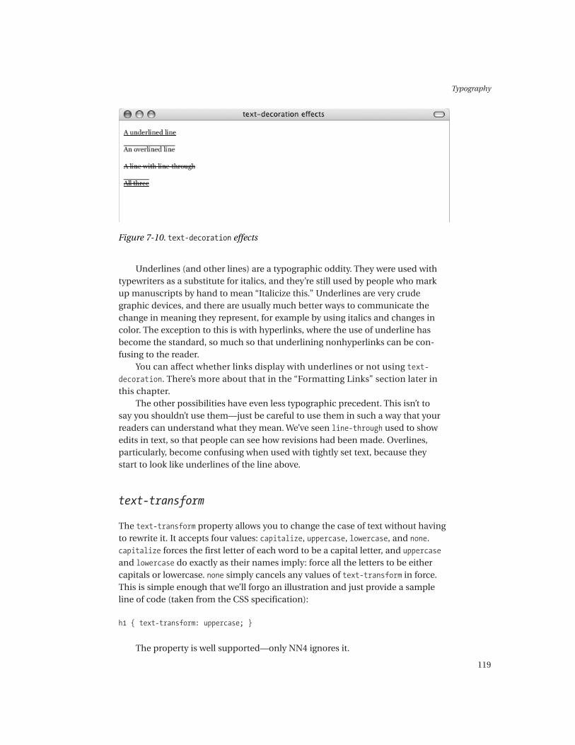
text-decoration
The text-decoration property allows you to decorate text, for example withunderlines. It accepts the following values: none, underline, overline, and line-through. You can use combinations of more than one value in a declaration toget several decorations at once. However, you shouldn’t combine none with anyother values, as it overrides and cancels them out.
text-decoration: underline;
text-decoration: overline;
text-decoration: line-through;
text-decoration: underline overline line-through;
Figure 7-10 shows the effects.
Typography
119
Underlines (and other lines) are a typographic oddity. They were used withtypewriters as a substitute for italics, and they’re still used by people who markup manuscripts by hand to mean “Italicize this.” Underlines are very crudegraphic devices, and there are usually much better ways to communicate thechange in meaning they represent, for example by using italics and changes incolor. The exception to this is with hyperlinks, where the use of underline hasbecome the standard, so much so that underlining nonhyperlinks can be con-fusing to the reader.
You can affect whether links display with underlines or not using text-
decoration. There’s more about that in the “Formatting Links” section later inthis chapter.
The other possibilities have even less typographic precedent. This isn’t tosay you shouldn’t use them—just be careful to use them in such a way that yourreaders can understand what they mean. We’ve seen line-through used to showedits in text, so that people can see how revisions had been made. Overlines,particularly, become confusing when used with tightly set text, because theystart to look like underlines of the line above.
text-transform
The text-transform property allows you to change the case of text without havingto rewrite it. It accepts four values: capitalize, uppercase, lowercase, and none.capitalize forces the first letter of each word to be a capital letter, and uppercaseand lowercase do exactly as their names imply: force all the letters to be eithercapitals or lowercase. none simply cancels any values of text-transform in force.This is simple enough that we’ll forgo an illustration and just provide a sampleline of code (taken from the CSS specification):
h1 { text-transform: uppercase; }
The property is well supported—only NN4 ignores it.
Figure 7-10. text-decoration effects

Chapter 7
120
font: Shorthand Property
There’s one final property we need to look at here. The font: shorthand propertyallows you to combine all the font- properties and line-height into one declara-tion. It’s also a fairly intuitive way to do it:
font: bold italic 12px/15px Verdana, sans-serif;
font: 1em/1.5em Georgia, serif;
If you’ve ever come across a typographic layout with type details, you’llprobably get the basic gist of the previous declarations.
The format of the font: declaration is pretty simple. It first takes values foreach of font-style, font-weight, and font-variant. If one of these values isn’texplicitly mentioned, then it’s set to normal. This is the best way to set values tonormal. The order of these first values doesn’t matter, because each value is a dif-ferent string. After these, a value for font-size is given. If you want to declare anexplicit line-height value, then follow the font-size value with a slash and thenthe line-height value. The last set of values should be a font-family declaration.
There are a couple of catches with this, which primarily relate to browserbugs. IE5/Mac doesn’t respect a font: declaration that makes a heading unbold.This was fixed in IE5.1/Mac. Netscape 6/7 and Mozilla don’t like you to declarefont-style or font-weight as normal, even though it’s perfectly legal CSS. Odd thingshappen if you do.
Despite this, the font: property can save lines and lines of code and makeyour font-related declarations easier to understand. Figure 7-11 shows an exam-ple of the use of the font: shorthand property.

Typography
121
Color and Type
Color in typography needs to be approached with some care. It’s very easy tomake text hard to read by making it a color with little contrast from the back-ground. Fortunately, the CSS behind it is very simple. The vast majority of thissection is concerned with choosing and using colors with type.
To recap from Chapter 5, the CSS property for the color of type is thecolor property, as you would expect. You set the background of either a block(for a block-level element) or the relevant part of a line (for an inline element)with the background-color property.
The primary use of color in text typography has traditionally been for dif-ferentiating elements, often headings. Differentiating with color is mainly anexercise in creating contrast between the thing that is being differentiated andits surroundings. This means the background as well as the surrounding text.Red and black have traditionally been paired in print, because both colors arestrong and contrast with white and each other.
In continuous text, contrast is still the critical factor, but there are other con-cerns too. The choice of background is important. Most novels aren’t printed onhigh-white paper; rather, they’re printed on off-white paper. This is because thecontrast between the high-white paper and black ink is too harsh and becomesfatiguing. Essentially, there can be too much contrast. There are two ways to deal
Figure 7-11. Using the font: shorthand property
Chapter 7
122
with this onscreen. One is to use a slightly colored background, and the otheris to use nonblack type. Setting your type in a very dark gray actually makesa significant difference to the harshness of black-on-white type (for example,rgb(30,30,30) or #333333), even though it’s hard to pin down exactly what it isthat’s different.
The main things to remember with color and text type are that there needs tobe sufficient contrast between the text and the background, and that text darkerthan its background is likely to be easier to read, especially for long periods oftime. You need to carefully think through how you differentiate things. There areother kinds of contrast besides color—contrasts in size and weight—so you maywell find that some text needs less obvious color changes to make it stand outthan others, or that using color means that size and/or weight changes can bereduced without reducing how much the type stands out.
Another excellent use of color changes is to suggest relationships betweenelements. For example, with a visited link, you need the change in state fromunvisited to visited to be clear to the user, but you’ll also want to suggest thatboth are part of the same kind of element: the link. Another example is whena site wants to use a background color in a main text column that is related tothe strong foreground color it uses for the space around its menus. In the firstcase, a darker shade of the unvisited link color would be appropriate, and in thesecond, a lighter shade of the strong color would work.
The red, green, blue (RGB) color model doesn’t provide an easy way to changecolors based on those kinds of criteria. RGB color really isn’t intuitive, but there isa color model that is intuitive: the hue, lightness, saturation (HLS) model. HLS isalso called HSB and HSV (hue, saturation, brightness and hue, saturation, value).In HLS, hue controls the kind of color you get (red, orange, green), lightness con-trols how bright a color is (zero lightness always equals black, full lightness alwaysequals white), and saturation controls how strong a color is (the lower the value,the more washed out the result; no saturation gives grayscale). In HSB and HSV,brightness and value are synonyms, but they aren’t the same as lightness.Brightness or value of 100% doesn’t give white; it gives maximum color bright-ness, which is the same as 50% lightness.
Adjusting one value at a time will give a series of colors that are related to eachother, even if they have different hues, or lightnesses (or saturation), depending onwhich value you adjusted to make your series. If you wanted to build a palette usingvarying shades of red for headings so that you could avoid size or weight changesbetween headings, this would be the way to build them.
HLS values aren’t yet directly supported in CSS (although they’re proposedfor CSS3), so some software is needed to create and change their values into RGBvalues (either rgb(x,x,x) or hex). Adobe GoLive and Macromedia Dreamweaverboth offer this, as do most paint or photo-editing packages.

Typography
123
Measure
Measure is the typographic term for the width of a column of text. The measure ofa column affects the way it reads as much as the way it looks, so the fact that it’spossible to resize columns of text on the fly in a web page doesn’t always make ita good thing to do, in either visual or legibility terms. No matter what legibilityresearch disagrees about (whether serif or sans-serif text is more legible, for exam-ple), the research says this with some certainty: There is such a thing as a line that’stoo long or too short. The optimum seems to be about 50 to 70 characters per linein print, and this translates to screen as well.
The first problem with measure is that, as you saw at the beginning of thechapter, different typefaces have characters with different widths, so a measurethat produces 65 characters per line in one typeface will give a different numberof characters per line in another. For example, in a measure of 33em, Georgiaaverages 67 characters per line, whereas Times averages 86.
There are a couple of other significant issues with CSS and measure. Thefirst is the issue of layout composition in browser windows of varying sizes.The other is the issue of specifying a measure accurately. The first issue won’t goaway if you use a liquid layout. If you fix your measure, then your text columnwon’t shrink and expand, and your layout won’t be as liquid as it was. You needto make decisions about those kind of tradeoffs carefully, but you do need read-able text.
The issue of accuracy is a much simpler issue in CSS. Although working outwhat a good measure is when your type size is fixed is easy, working it out whenyour type size can change (either because you use the user’s defaults or becauseyou provide user control over it) is impossible using absolute units. Relative units,however, make it much easier. The em is based on the current type size, so a widthset to a certain number of ems will shrink and expand (in pixel terms) as yourtype does. A measure of 33em will always fit an average of 67 characters usingGeorgia, no matter whether the font size of the text is 12px or 24px.
Table 7-2 lists some common typefaces and the measure needed to getaround 65 characters per line. Figure 7-12 shows different measures.
Table 7-2. Typefaces and the Measures Needed for About 65 Characters per Line
Typeface Measure Characters per Line
Arial 30em 64
Verdana 35em 64
Times 27em 66
Georgia 33em 67
Palatino 30em 65

Chapter 7
124
Influencing Line Breaks
You have several ways to influence where a line will break. The first is how long theline is, which we covered in the previous section. The second is the use of <br />elements to force a line break. The third is for the browser to respect where theauthor has made line breaks in the code, for example using <pre> blocks.
The CSS property white-space controls how the browser deals with whitespace characters (spaces, tabs, and returns) in the code. The default setting,normal, causes the browser to ignore runs of spaces and the other white spacecharacters in text. If you have several returns in the code of what ought to bea single line, the browser won’t recognize them and you’ll get a single line.
The other two values for white-space, pre and nowrap, cause the browser torespect white space in your code or to never break the text of a particular ele-ment into lines, respectively:
body {
font: 12px/1.5em Georgia, serif;
}
h1 {
font: bold 12px/1.5em Georgia, serif;
margin: 0.75em 0 0 0;
}
p {
white-space: normal;
margin: 0;
}
Figure 7-12. Different measures

Typography
125
div.pre p {
white-space: pre;
}
div.nowrap p {
white-space: nowrap;
}
<body>
<div>
<h1>white-space: normal</h1>
<p>Lorem ipsum dolor sit amet, consectetuer adipiscing elit,
sed diam nonummy nibh euismod tincidunt ut laoreet dolore
magna aliquam erat volutpat.
Ut wisi enim ad minim veniam, quis nostrud.</p>
</div>
<div class="pre">
<h1>white-space: pre</h1>
<p>Lorem ipsum dolor sit amet, consectetuer adipiscing elit,
sed diam nonummy nibh euismod tincidunt ut laoreet dolore
magna aliquam erat volutpat.
Ut wisi enim ad minim veniam, quis nostrud.</p>
</div>
<div class="nowrap">
<h1>white-space: nowrap</h1>
<p>Lorem ipsum dolor sit amet, consectetuer adipiscing elit,
sed diam nonummy nibh euismod tincidunt ut laoreet dolore
magna aliquam erat volutpat.
Ut wisi enim ad minim veniam, quis nostrud.</p>
</div>
<div class="pre">
<h1>white-space: pre</h1>
<p>Lorem ipsum dolor sit amet, consectetuer adipiscing elit,
sed diam nonummy nibh euismod tincidunt ut laoreet dolore
magna aliquam erat volutpat.
Ut wisi enim ad minim veniam, quis nostrud.</p>
</div>
</body>
Figure 7-13 shows the effect of the different values of white-space.

Chapter 7
126
Figure 7-13. The effect of different values of white-space
The thing to remember, as illustrated in Figure 7-13, is that respectingwhite space in the code means all the white space—tabs and runs of spacestoo—so indenting your code (for readability, say) will give you indented text inthe browser.
CAUTION IE 6 supports the white-space property only when it’s in Standardsmode. If it’s in Quirks mode, it will ignore white-space. NN4 supports pre, butnot nowrap.
There are some semantic problems with using white-space to alter line-breakingbehavior. An element that doesn’t normally have the pre value associated with it willbe treated as if it had white-space: normal set in a browser that doesn’t understandCSS. If you were to set, say, poetry using hard returns in the code and white-space:pre to force the browser to render them, then in a speech browser your poem wouldlikely become experimental prose.
These issues aren’t so problematic when it comes to normal paragraphs. Ifyou were to control your line breaks in a paragraph using white-space: pre, thenin a non-CSS browser all you’d lose would be the line breaks and none of thesemantics. Your paragraph would still be a paragraph. However, the editing andmaintenance cost associated with this is enormous. If you spend hours sorting

Typography
127
out perfect line-endings for your text and then add or take away a word somewhere,you’ll ruin at least a paragraph’s worth of line endings. Every edit is followed by thecost of reworking your line endings, no matter how trivial.
white-space: nowrap, on the other hand, won’t cause you any problems withediting, but a paragraph with white-space: nowrap set will render as one line,even if it contains the complete works of Tolstoy. <br /> elements will cause linebreaks in paragraphs so afflicted, but you’re back to the problem of editingrequirements.
In short, unless you’re doing something that would normally require the<pre> tag, then avoid white-space. If you’re doing something that would normallyrequire the <pre> tag, then use the <pre> tag. In short, then, avoid white-space.
Type Blocks
Once you move from characters and lines of text to paragraphs, you begin todeal with the issues of blocks of type. How these blocks relate to each other iscritical, because it’s at this level of detail that logical and visual hierarchies ofinformation must be communicated. The way that the spaces between para-graphs in continuous text, as well as headings and paragraphs, work was one ofthe biggest problems web typography had before CSS, because the prescribedoptions available were crude at best. This section aims to teach you enoughabout typography at a block level to make your text work, both visually andfunctionally, and to teach you how to achieve this with CSS.
The main task you face when dealing with blocks of type is to make the rela-tionships between them clear. For example, if your most important headingslook less important than your third-level headings, then your users are going tobe confused and have a hard time figuring out what’s what. Equally, if your userscan’t tell where one paragraph ends and another begins, then you’ve also gotproblems. In a good design you’ll be able to tell what the most important thingon a page is and where paragraphs begin and end, and you’ll be able to differen-tiate between paragraphs of different types (for example, body text and marginalnotes). You can use space, indentation, color, and many other properties toachieve this.
Paragraphs in Continuous Text
In continuous text, where there’s a lot of text in one stream (an article, for exam-ple), you need to make sure that the reader can distinguish between paragraphs,and you also need to make sure that you don’t separate them to the degree thatthey begin to look like separate objects instead of part of the same text flow.

Chapter 7
128
There are two main approaches to working with paragraphs: indentation andextra vertical space.
With indentation it’s common to indent the first line of a paragraph, withoutadding extra space above the paragraph. The first paragraph in a sequence, how-ever, is normally not indented. Indentation is the norm in book typography;a good indent is usually around one line space—the value of line-height. However,you may need to vary this if your interlinear space is significantly different. Ifyou choose to add extra vertical space, then it’s common to not indent the firstlines of the paragraphs, as shown in Figure 7-14.
The other major variable that you need to look at is the justification (oralignment) of the text—whether it’s set ranged-left, ranged-right, centered, orjustified. In the ranged-left setting, the left edge of the text column is straightand the right is ragged. Ranged-right is the reverse of ranged-left. The centeredsetting centers each line in the column, leaving both edges ragged. The justifiedsetting keeps both left and right edges straight by varying the space betweenwords as necessary. The ranged-left setting is also called ragged-right, left-aligned, and unjustified (the ranged-right setting has other names like this).
The main problem with justification (which is essentially the process ofdeciding where and how to break lines) in web browsers is that no browsers
Figure 7-14. Different methods of separating paragraphs

Typography
129
make intelligent decisions about line breaking. To compound this, there’s no wayto influence line breaks without resorting to <br /> tags, using the white-spaceproperty, or using the <pre> element.
Many people regard the justified setting, where left and right margins arestraight, as the most legible in print, and there are arguments for and against this.However, on screen the justified setting is usually much less legible than ranged-left for the simple reason that browsers don’t hyphenate, and hyphenation isessential if you want to get a decent justified setting. To keep the right marginstraight, the browser has to introduce extra space between words, and often lotsof space, which makes reading difficult. The ranged-left setting, in contrast, usesequal space between words, with the right edge left ragged. The default value forjustification gives you ranged-left text, so it’s not normally necessary to specify it.
The CSS properties responsible for text indents and justification are text-indent and text-align, respectively. The text-indent property just needs a lengthvalue, and text-align takes one of four possible values: left, right, center, orjustify. NN4 doesn’t accept justify. If you want to use indentation, don’t forgetto override the default margins on <p> or you’ll get extra space anyway. The fol-lowing code produces the output illustrated previously:
body {
font-size: 12px;
}
h1 {
font: bold 1em/1.5em Georgia, serif;
margin: 0;
padding: 0;
}
div {
margin: 2em 0 0 5em;
width: 33em;
font: 1em/1.5em Georgia, serif;
}
div.space p {
margin: 0.5em 0 0 0;
padding: 0;
}
div.space p.first {
margin: 0;
}
div.indent p {
margin: 0;
padding: 0;
text-indent: 1.5em;

Chapter 7
130
}
div.indent p.first {
text-indent: 0;
}
<div class="space">
<h1>Paragraphs separated by space</h1>
<p class="first">Lorem ipsum dolor sit amet...</p>
<p>Li Europan lingues es membres del sam familie...</p>
</div>
<div class="indent">
<h1>Paragraphs separated by indenting</h1>
<p class="first">Lorem ipsum dolor sit amet...</p>
<p>Li Europan lingues es membres del sam familie...</p>
<p>Li Europan lingues es membres del sam familie...</p>
</div>
The alternative to the previous, more complex markup is to use CSS2’s adja-cent selectors, as in the following example, which will produce an identical resultto the previous, more complex code in a browser that understands the selector.In IE 6, which doesn’t understand the selector, it will simply follow the rules inthe p selector and produce a half-line gap between the paragraphs.
p {
margin: 0 0 0.75em 0;
padding: 0;
text-indent: 0em;
}
p+p {
text-indent: 1.5em;
margin: 0;
}
<h1>Paragraphs separated by indenting</h1>
<p>Lorem ipsum dolor sit amet...</p>
<p>Li Europan lingues es membres del sam familie...</p>
<p>Li Europan lingues es membres del sam familie...</p>
Separating paragraphs with space is simply a matter of adjusting the marginsand/or padding on the paragraphs. You can specify whatever value you want, sothe main question becomes how much space?
When it comes to separating paragraphs with extra space, a whole linespace is normally far too much; the gap becomes a gaping hole. But if thespace between two paragraphs isn’t detectably bigger than the space betweenlines, then your paragraphs will appear to be one homogenous lump. This ten-dency is made worse when the last line in a paragraph is a full (or nearly full)

Typography
131
line. Whether a space works is largely dependent on the measure of the text,with a longer measure needing a larger space. Try a quarter or half of the valueof line-height to start with, and modify it based on how well you think itworks. Although working in quarter-line increments may seem overly precise,it’s not: A quarter of a line is actually quite a large space. With 1.5em interlinearspace, working in increments of 0.25em (1/6 of a line space) is a good way tofind out what works. When you’re experimenting, always try to use severalparagraphs of several lines—and certainly more than in the next example,which is short because of space restrictions. Figure 7-15 shows paragraphsseparated by a space, which grows by 1/6 of a line at a time.
The Space Between Blocks
The critical thing to remember about separating blocks of type with space is thatparagraphs and headings are just block-level elements in CSS and follow the boxmodel, as described in Chapter 4. There’s a big catch related to this: Paragraph
Figure 7-15. Different size gaps between paragraphs

Chapter 7
132
and heading margins collapse exactly the same way that more obviously block-like blocks do. It also means that you use the properties padding and margin tospecify space around text blocks.
Designing the space between blocks of type is a balancing act. Things thatdon’t belong to each other (such as headings) need to look like they don’t belongto each other, and things that do belong to each other (such as paragraphs) needto look like they belong to each other, but not like they’re a single object. Withshort paragraphs, for example, too much space between them will begin to makethem look like list items or a publicity blurb from a brochure, rather than para-graphs that are part of a single text stream.
Adding to your task is the fact that all the space—horizontal and vertical—around a block affects the way that relationships between your blocks will work.There’s no easy rule to govern how you should manage the space between blocks.You need to be aware of the space around and within the blocks, and experimentuntil you find combinations that work. The best idea is to start with the criticalbits, such as interlinear space and the spaces between paragraphs, and work upthrough headings to whole blocks of text.
The CSS itself is relatively simple. You’ve already encountered margin andpadding, and space between blocks is simply an application of these. Choosingwhether to use one (and which one) or both, is often going to be decided for you:The rest of your layout (and factors such as margin collapsing) will affect yourdecision. All things being equal, it won’t really matter which you use, because thevisual effect will be identical in most cases.
In the last couple of examples you saw that the space between the firstparagraph and the heading was removed, because having the space there isunnecessary and having the heading tightly bound, visually, to the paragraphsfollowing it makes it clear to which paragraphs the heading is related. The fol-lowing excerpt (from the first space between paragraphs examples) shows that:
div.space p {
margin: 0.5em 0 0 0;
padding: 0;
}
div.space p.first {
margin: 0;
}
<div class="space">
<h1>Paragraphs separated by space</h1>
<p class="first">Lorem ipsum dolor sit amet...</p>
</div>
There are other situations in which you would want to adjust the spacebetween two text elements. One such situation is when a heading is immediatelyfollowed by another heading (usually a subordinate heading). The subordinate

Typography
133
heading normally needs a similar amount of space before it to the main heading,as shown in Figure 7-16.
However, when a subordinate heading immediately follows the main head-ing, the amount of space it would usually require after text is too much, and itlooks wrong after the main heading, as shown in Figure 7-17.
The solution is to reduce the amount of space between the two, as shown inFigure 7-18.
Figure 7-16. Space between text and heading
Figure 7-17. Space between two headings, unaltered
Figure 7-18. Space between two headings, after reduction

Chapter 7
134
All three examples were produced from this code:
body {
font: 12px/1.5em Georgia, serif;
}
h1 {
font: bold 1.25em/1.5em Georgia, serif;
margin: 0.8em 0 0 0;
}
h2 {
font: bold 1em/1.5em Georgia, serif;
margin: 0.75em 0 0 0;
}
p {
margin: 0 0 0.75em 0;
width: 33em;
}
h2.post-h1 {
margin: 0.25em 0 0 0;
}
<body>
<h1>A very important heading</h1>
<p>Lorem ipsum dolor sit amet...</p>
<h2>A less important heading</h2>
<p>Lorem ipsum dolor sit amet...</p>
<h1>Another important heading</h1>
<h2>Immediately followed by another heading</h2>
<p>Lorem ipsum dolor sit amet...</p>
<h1>Another important heading</h1>
<h2 class="post-h1">Immediately followed by another heading</h2>
<p>Lorem ipsum dolor sit amet...</p>
</body>
As with paragraph indentation, an easier solution is to use CSS2 adjacentselectors. The following CSS makes it unnecessary to use classes on the headingsand, as before, if the browser doesn’t support the selector nothing drastic hap-pens, the user simply gets the normal space between blocks you defined:
h1 + h2 {
margin: 0.25em 0 0 0;
}

Typography
135
Above or Below?
You may well be tempted to add a bit of space above a paragraph and a bit of spacebelow, until things look “about right.” This isn’t the best policy for several reasons.
The primary reason is that this will inevitably come back and bite you. If youhave specified extra space above and below your type block, then there will comea point at which you introduce a new kind of block—say a heading, quotation, orreference—and the space you want to get around that block isn’t possible becauseof a bit of extra space around a paragraph style, which you can’t change withoutchanging headings . . . and so on, ad nauseam. Although collapsing margins willsometimes produce the result you want, most often there will be situations inwhich you want less margin than there is already (margins collapse to the largest)or no margin at all.
Another good reason is the difficulty you may have in working out how muchspace there was supposed to be between paragraphs compared with how muchthere actually is. A system where you stick to just space above, or just space below,eliminates uncertainties and ought to make integrating new kinds of block intoyour design later on a lot easier. The best choice is usually to have extra space abovea block. The space around any one block then doesn’t affect the space around fol-lowing blocks, and this is usually the behavior you want. In exceptional situationsyou use a slightly altered style, or more tightly constructed selectors, as you wouldfor other exceptional behavior, such as removing paragraph space immediatelyafter a heading.
Headings
Headings can be a thorny issue. They play a vital role in making content easyto navigate and understand, but they’re often, in design terms, just slappedtogether. The heading structures available in plain HTML are visually quitecrude. However, through CSS, it’s possible to make headings that provide clar-ity in the navigation and integrate design elements together. There are threebig issues to take into account:
• Can you tell the headings apart?
• Can you tell what the order of importance of the headings is?
• Will the headings work with your text?
The typographic options available to you with headings are, as always: type,weight, size, space, and color. You usually need to use only one or two of thesevariables; if you start changing all of them at once, then each heading will most
Chapter 7
136
likely lose any sense of coherence or sequence. If your headings have visual char-acteristics in common—if they look related to each other—then your readersstand a much better chance of being able to usefully pick out what’s happeningwith your headings.
There are several things to note about the way that headings do and don’thave to look. For example, headings don’t have to be in bold, and they don’t haveto all be different sizes either. The key is making your headings distinct fromyour body text. The next few examples show some possibilities, but they by nomeans represent an exhaustive list.
All the examples use the following markup, and their rulesets are listed aftereach one:
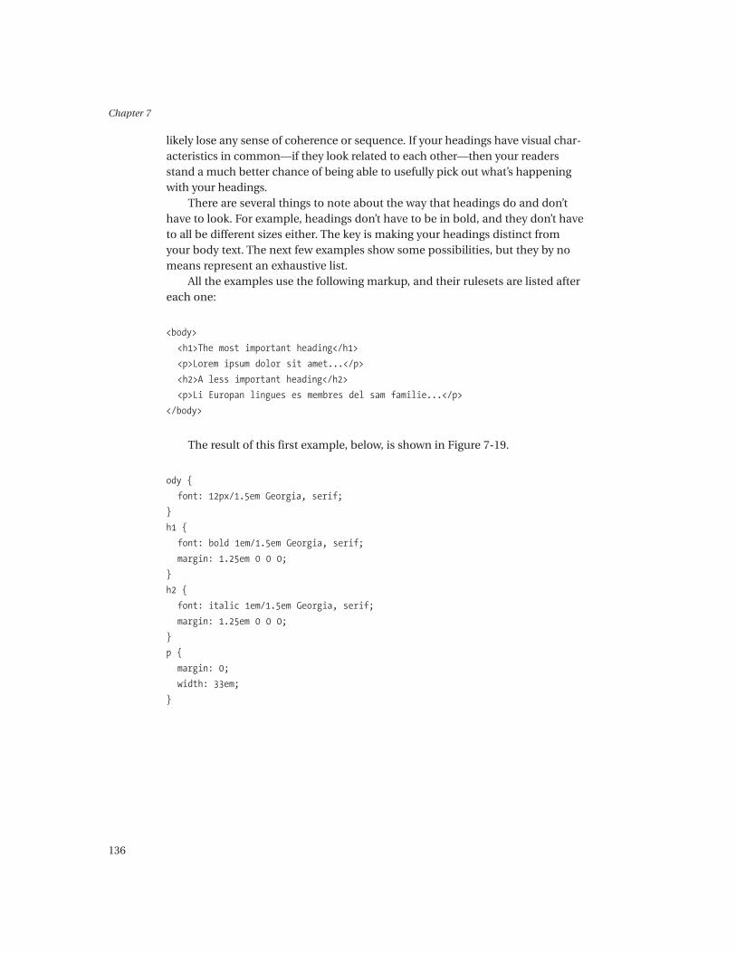
<body>
<h1>The most important heading</h1>
<p>Lorem ipsum dolor sit amet...</p>
<h2>A less important heading</h2>
<p>Li Europan lingues es membres del sam familie...</p>
</body>
The result of this first example, below, is shown in Figure 7-19.
ody {
font: 12px/1.5em Georgia, serif;
}
h1 {
font: bold 1em/1.5em Georgia, serif;
margin: 1.25em 0 0 0;
}
h2 {
font: italic 1em/1.5em Georgia, serif;
margin: 1.25em 0 0 0;
}
p {
margin: 0;
width: 33em;
}

Typography
137
The result of this second example is shown in Figure 7-20.
body {
font: 12px/1.5em Georgia, serif;
}
h1 {
font: bold 1.5em/1em Verdana, sans-serif;
margin: 1.25em 0 0 0;
}
h2 {
font: 1.5em/1em Verdana, sans-serif;
margin: 1.25em 0 0 0;
}
p {
margin: 0;
width: 33em;
}
Figure 7-19. Headings example 1
Figure 7-20. Headings example 2

Chapter 7
138
Figure 7-21. Headings example 2a
This example is almost identical to the previous example, except that theheading type is 1.2em instead of 1.5em. This has pushed the screen size of thenormal sans-serif type down to the point where the strokes are only 1px wide, andit’s much harder to tell the second heading from the body text. Also worth notingis that in the first example it’s much harder to tell the normal sans-serif from thebold. Figure 7-21 shows the result.
body {
font: 12px/1.5em Georgia, serif;
}
h1 {
font: bold 1.2em/1.25em Verdana, sans-serif;
margin: 1.25em 0 0 0;
}
h2 {
font: 1.2em/1.25em Verdana, sans-serif;
margin: 1.25em 0 0 0;
}
p {
margin: 0;
width: 33em;
}
This example uses a larger size of the type than that used for the body text.The size difference is enough that bold isn’t necessary for readers to tell theheading apart from the body text. Figure 7-22 shows the result.
body {
font: 12px/1.5em Georgia, serif;
}

Typography
139
Figure 7-22. Headings example 3
h1 {
font: 1.5em/1em Georgia, serif;
margin: 0.5em 0 0.25em 0;
}
p {
margin: 0;
width: 33em;
}
This example uses outdented (aka hanging indent) italic at the same size asthe text. The outdenting has the advantage of being very easy to pick out againstthe left edge of text. Figure 7-23 shows the result.
body {
font: 12px/1.5em Georgia, serif;
}
h1 {
font: italic 1em/1.5em Georgia, serif;
margin: 0.75em 0 0 0;
}
p {
margin: 0 0 0 1em;
width: 33em;
}
Figure 7-23. Headings example 4

Chapter 7
140
On a structural note, please don’t use styled paragraphs to represent headings.WYSIWYG editors can make it very easy to do this, even without your noticing.Also, please don’t jump around the headings just to get a different default size orweight—that’s what the CSS is for. On a contradictory note, NN4 forces all head-ings to have a certain amount of vertical space around them, and on the Mac itforces headings to be bold too, so you may need to balance these two issues if youcode for NN4.
Lists
The purpose of a list is simple: to present a collection of items. The formattingof lists, however, presents some relatively complex design decisions. You have todecide how to separate out the items, whether to use some kind of visual cue forthis, and how you should differentiate the list from its surroundings. If you’recoding for NN4, look to the end of this section for information on the problemsit has with lists and CSS.
If you choose some kind of visual cue or marker to visually separate items,then there are a variety of possibilities, only some of which will be appropriatefor a particular situation.
There are two main kinds of cues in lists: specific cues and nonspecific cues,which essentially map to ordered (numbered) and unordered (bulleted) lists: <ol>and <ul>. CSS provides both types, so the primary guide to which to use has tobe what the list is doing. Specific cues enforce some kind of sequence on a list,whether that’s an order for doing things in or an order of importance, whetheryou like it or not. Nonspecific cues, on the other hand, don’t enforce a sequence,but they do still allow list items to be picked out accurately. In technical docu-ments, ordered lists are used only when the order is important, if the order inwhich the parts of a task are performed dictates the success or failure of the task,for example. The nature of the list may be such that you don’t need any cues atall to tell the reader that it’s a list or help the reader find each item.
In CSS it’s the <li> element itself that’s styled. If you were to set the displayproperty on an <li> element to inline or block, then it would stop acting likea list item and no longer generate a marker or incrementing counters (<li>s havedisplay: list-item set by default). You can also set the display property on anotherelement to list-item and it will start to behave like a list item. It’s also possible tomake <ol>s appear as <ul>s, which subverts the meaning of the tags and is, gen-erally speaking, a bad idea. <ol> and <ul> don’t actually control list item styling,although they do contain the list items, so their padding, borders, and marginsimpact the whole list.
Three CSS properties, list-style-position, list-style-image, and list-style-type, and one shorthand property, list-style, are related to lists. Wecover all of these properties in the next few sections.

Typography
141
list-style-position
If you’re dealing with cues such as numbers or bullets, then the next question iswhere to put them. The default is to put the marker outside the content box, butit’s also possible to put the marker inside the content box generated by the listitem, as shown in Figure 7-24.
Figure 7-24. List marker positions
When the marker is outside the list item’s content box, it has no effect on thelayout, much the same as an absolutely positioned box. The CSS to control thisis very simple: Set list-style-position to either inside or outside. The default isoutside.
li {
list-style-position: inside;
}
CAUTION If the list item happens to be flush with the left edge of the pageand has list-style-position: outside, then the marker will disappear offthe side of the page!
The list-style- properties are inherited and only affect display: list-item
elements (only <li>s by default), so you can simply style <ul> instead of <li>and the properties will be inherited by the <li>s, which generally makes forsimpler CSS:
ul {
list-style-position: outside;
}

Chapter 7
142
Figure 7-25. Alignment of list items
By and large the best option is to have the marker outside the content boxof the item. This gives clear separation of the marker, making it easy to pick out(more of a problem with lists using an alphabetical numbering scheme). If themarker is hung outside the list item’s content box, then it becomes possible toalign the left edge of the list item (not the marker) with the left edge of the sur-rounding text. The HTML default is to indent the list items. Figure 7-25 showsboth options.
While the CSS specification is ambiguous about precisely where the markershould be when outside is specified, most browsers render it a little bit outsidethe main content box. You can’t control the marker’s position with CSS.
Marker Clipping in Internet Explorer
It’s worth talking about a problem IE has with lists here. You can see from theexample that padding has been used on the <ul> whose <li>s align with themain column edge, instead of controlling the margin. This is because IE clips

Typography
143
any list markers that extend beyond the padding edge of a <ul> or <ol>. This isshown nicely in Figure 7-26 (with both IE and Firebird shown for comparison).
Figure 7-26 shows three lists, each with one item, and was generated by thefollowing code, which sets the padding and margins on <li>s to 0 for the sake ofthe example. What’s accomplished with the <ul>’s left padding could also beaccomplished with left margin set on the <li>s.
ul {
list-style-type: square;
list-style-position: outside;
width: 33em;
padding: 0.5em;
border: 1px solid black;
margin: 0.75em 0 0 1.5em;
}
ul.one {
padding-left: 0;
}
Figure 7-26. A list marker being clipped in IE (top) and displayed correctly inFirebird (bottom)

Chapter 7
144
ul.two {
padding-left: 1em;
}
ul.three {
padding-left: 1.5em;
}
li {
padding: 0;
margin: 0;
border: 1px dashed black;
}
Once you know about the problem, it’s normally trivial to work around it.
list-style-type and list-style-image
list-style-type and list-style-image control the types of cues used for the list,with the first offering a preset range of markers and the second offering the abil-ity to use an image in place of a marker.
list-style-type is straightforward. There’s a fairly wide selection of values tochoose from, offering nonspecific markers for unordered lists and specific mark-ers for ordered lists. The specific markers come in the various numbering schemesyou’d expect: European-Arabic (1, 2, 3, and so on), Roman (i, ii, iii, and so on), andalphabetic (a through z):
/* nonspecific markers */
list-style-type: disc; /* solid circle */
list-style-type: circle; /* outline circle */
list-style-type: square; /* solid square */
/* specific markers */
list-style-type: decimal; /* European-Arabic numerals (1,2,3,4...) */
list-style-type: lower-roman; /* Lowercase roman (i,ii,iii,iv...) */
list-style-type: upper-roman; /* Uppercase roman (I,II,III,IV...) */
list-style-type: lower-alpha; /* Lowercase alphabetic (a,b,c,d...) */
list-style-type: upper-alpha; /* Uppercase alphabetic (A,B,C,D...) */
/* special case */
list-style-type: none; /* no marker */

Typography
145
The default for <ul>s is list-style-type: disc; for <ol>s the default is list-style-type: decimal. To use an image for the marker, use list-style-image. It takesa URL as its value in the form you’ve seen in @import rules: url(list-marker.png). Ifthe browser supports it and the image is available, then the image will be displayedinstead of the normal list marker; otherwise, the browser will fall back to list-style-type. This example specifies a list with square markers outside the contentbox and a list with a simple image for a marker:
p {
margin: 0 0 0 1.5em;
padding: 0;
border: 1px dotted black;
}
ul {
list-style-type: square;
list-style-position: outside;
padding: 0;
border: 1px solid black;
margin: 0;
}
li {
margin: 0 0 0 1.5em;
padding: 0;
}
ul.image {
list-style-image: url("square.gif");
}
<p>Lorem ipsum dolor sit amet...</p>
<ul>
<li>Li Europan lingues es membres del sam familie...</li>
<li>Li Europan lingues es membres del sam familie...</li>
</ul>
<ul class="image">
<li>Li Europan lingues es membres del sam familie...</li>
<li>Li Europan lingues es membres del sam familie...</li>
</ul>
Figure 7-27 shows the result.

Chapter 7
146
list-style Shorthand Property
There’s a list-style shorthand property, which is very similar to the font: short-hand property. With it you can specify the marker type, image, and positiontogether.
ul { list-style: disc outside; }
The syntax is very straightforward: a value for list-style-image, followed bya value for list-style-type, and then a value for list-style-position. All the val-ues are optional and can be used in any order.
ul { list-style: disc; }
ul { list-style: url(pretty_disc.png) disc outside; }
ul { list-style: url(pretty_disc.png) outside; }
Greater Control
There will, of course, be times when you need more specific control over individ-ual <li> elements. You’ll often want to put some space between list items, especiallyif you’re separating paragraphs with extra space. Deal with the basic formattingdecisions in a <ul> style, and then style <li> to add the extras. If you need tochange the way that <li> is styled (for example, if you have <ol>s and <ul>s), then
Figure 7-27. Simple list-style-type and list-style-image example

Typography
147
using contextual selectors with your ruleset (of the form ul li { /*styles*/ }) isnormally enough to catch the differences without resorting to class or id attri-butes in your markup. The following ruleset is from the second list in Figure 7-25:
ul {
list-style-type: square;
list-style-position: outside;
margin: 0.75em 0 0 1em;
padding: 0 0 0 1.5em;
width: 33em;
border: 1px dotted black;
}
li {
margin: 0.75em 0 0 0;
}
Netscape Navigator 4 Problems
NN4’s support for lists in CSS is seriously flawed. Not only are several of theproperties unsupported, but also setting some others will cause the list to berendered incorrectly. Table 7-3 shows what isn’t supported.
Table 7-3. Summary of NN4 Problems with CSS Lists
Problem Notes
list-style-image is unsupported. If you also specified list-style-type in
your ruleset, you’ll get that marker.
list-style-position is unsupported. You’re stuck with the default: outside.
Having this property present doesn’t break
anything, though.
Setting margin-left, margin-right, margin-top, margin-bottom, and
padding-left, or padding-right on corresponding padding properties don’t
a <ul> or <ol> element causes the trigger this. If you’ve set list-style-type
list-style-type to be forgotten and to none, it still gets reset to disc.
reset to the default: disc for <ul>
and decimal for <ol>.

Chapter 7
148
Lorem ipsum dolor sit amet, consectetuer adipiscing elit, sed
diam nonummy nibh euismod tincidunt ut laoreet dolore
magna aliquam erat volutpat. Ut wisi enim ad minim veniam,
Figure 7-28. Line boxes within a <p> block
Table 7-3. Summary of NN4 Problems with CSS Lists (continued)
Problem Notes
Setting margins or padding on an Applying margin-top or padding-top to an
<li> element produces bizarre results. <li> element doesn’t work and causes the
cumulative inter-item margin to be
applied above the first <li> only. Applying
margin-bottom or padding-bottom causes
the list item content to be displaced
downward from the marker, leaving the
marker floating above the content. Setting
left or right margins or padding causes the
marker to disappear altogether.
Styling an <li> element directly only This concerns inline properties such as
styles the marker. color and font. A workaround is to enclose
the whole <li> content in a <span>
element and style that.
Inline Boxes
Inline boxes are the other major kind of box in CSS. All your text is laid out usinginline boxes once you get past the gross characteristics you’ve specified by stylingparagraphs and <div>s. A paragraph will probably contain several inline boxes,starting with one for each line. If your paragraph has no inline elements in it,then that’s it, but if it has some—<strong>, for instance—then they get their owninline boxes and things get more complicated. Figure 7-28 shows a simple para-graph with one box per line.
The block-level element, which is <p> in this example, has a series of lineboxes made from the contents of <p>, but they aren’t associated with inline ele-ments such as <strong>. CSS calls these boxes anonymous inline boxes. The solidbox represents the inline boxes, the dashed line represents the total line box
Typography
149
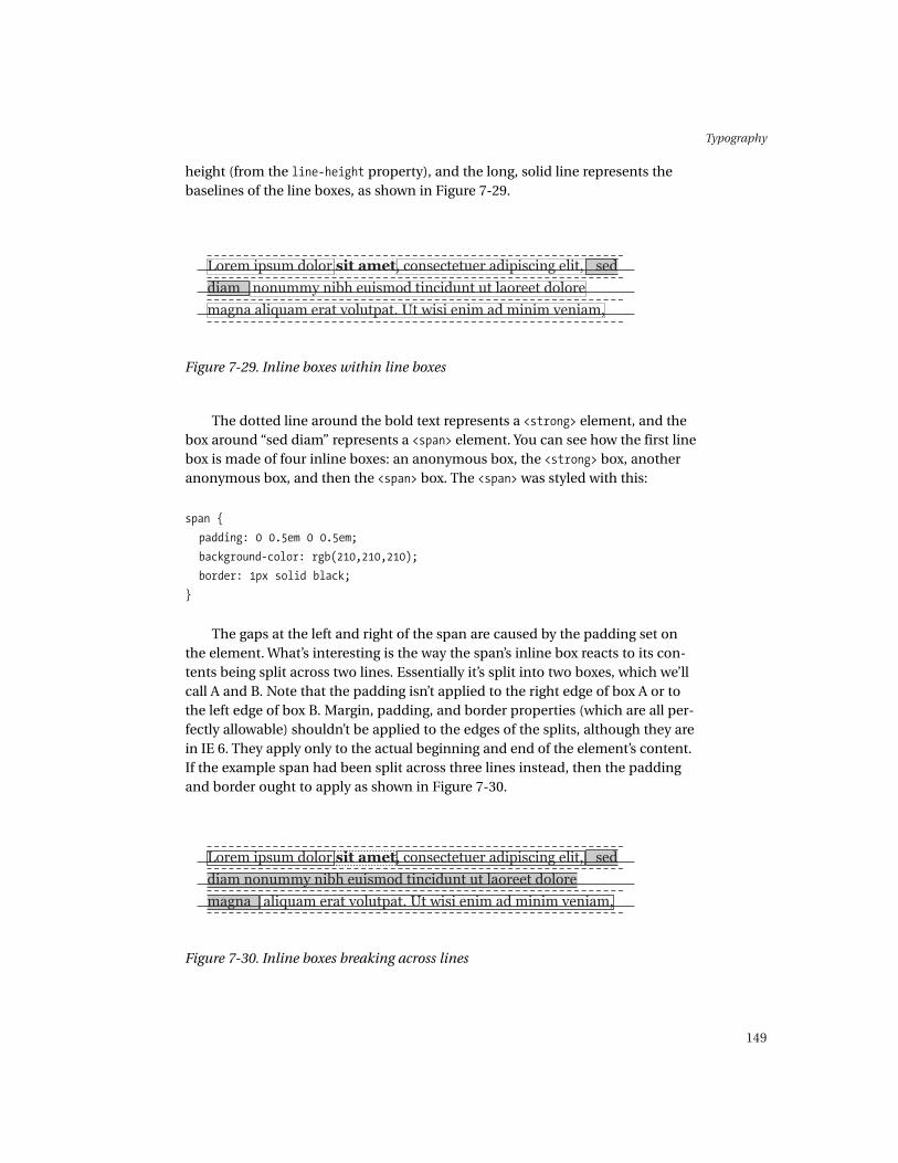
Figure 7-29. Inline boxes within line boxes
Figure 7-30. Inline boxes breaking across lines
height (from the line-height property), and the long, solid line represents thebaselines of the line boxes, as shown in Figure 7-29.
The dotted line around the bold text represents a <strong> element, and thebox around “sed diam” represents a <span> element. You can see how the first linebox is made of four inline boxes: an anonymous box, the <strong> box, anotheranonymous box, and then the <span> box. The <span> was styled with this:
span {
padding: 0 0.5em 0 0.5em;
background-color: rgb(210,210,210);
border: 1px solid black;
}
The gaps at the left and right of the span are caused by the padding set onthe element. What’s interesting is the way the span’s inline box reacts to its con-tents being split across two lines. Essentially it’s split into two boxes, which we’llcall A and B. Note that the padding isn’t applied to the right edge of box A or tothe left edge of box B. Margin, padding, and border properties (which are all per-fectly allowable) shouldn’t be applied to the edges of the splits, although they arein IE 6. They apply only to the actual beginning and end of the element’s content.If the example span had been split across three lines instead, then the paddingand border ought to apply as shown in Figure 7-30.
Chapter 7
150
Any vertical borders, margins, or padding that would be pushed outside theline box don’t increase its height; they spill over above and below the line box.The exact behavior when this happens varies across browsers. In IE6/Windowsand Mozilla/Netscape 6+, things that spill above sit on top of the previous line,whereas things that spill below sit under the next line. In IE5/Mac, things thatspill out (above or below) sit in front of the previous and next lines.
You should note that setting margins or padding on an inline element inNN4 causes the element to be rendered as a block-level element, as if you’ve setdisplay: block on it. Setting margins, padding, or borders on an inline elementworks fine in IE 6, but has no effect in IE5/Windows.
The typography associated with inline formatting is concerned with differ-entiating little meanings within the text: emphasis and quotation, for example.This is subtler than block-level typography and needs a correspondingly subtlehand. You can specify that the HTML element <em> use type that is 2 pixels biggerthan the norm, but you can almost certainly also differentiate <em> from its sur-roundings with the use of italic, bold, or color (usually not in combination). Inthe majority of texts, hyperlinks will be the most inline typography you have toworry about, and there’s a section on those coming up in this chapter, but some-times you’ll have to deal with a much wider range of inline elements. It’s importantto know what you have to deal with so that your solutions to each of the inlinetasks don’t clash with each other.
Formatting Links
Links are the original web typographic irritant, because (among other things)they change their appearance dynamically, something traditional typographywas never equipped to deal with. Tim Berners-Lee thought that links should beunderlined, which isn’t a bad idea. Underlining is rare in print, and so it wasn’tweighed down with associations. He also decided that links should be blue,which, debatably, isn’t quite so clever. There have been raging arguments aboutthe “correct” link color. This is one of the rare occurrences when using two vari-ables (color and underlining) to differentiate an element actually works: Onevariable (color) tells you it’s different from surrounding text and gives you stateinformation (visited and unvisited), and the other variable (underlining) indi-cates that it’s a dynamic element.
Because by default the color of a link changes depending on its state, but theunderlining doesn’t, it’s the underline that has gained an almost universal mean-ing: link.
TIP Because underlining is rare and has become associated with links, it’susually a good idea to avoid using it for anything other than links.

Typography
151
There are three states exclusive to links: link, which is the basic, unvisited,and inactive state; visited; and active. There’s also a fourth state, hover, whichother elements can have too. hover is the state when the user’s mouse is hoveringover a link. In the sections that follow we look in detail at each of these states.
The element used for linking is the <a> tag. The first thing to remember isthat the <a> tag does more than provide links: It can also act as an anchor forlinks. CSS recognizes the distinction and, as you saw in Chapter 5, provides sev-eral pseudo-classes to access them. Traditionally, <a>s used as anchors had nographical effect on their content. If you directly style the <a> tag, you may dis-cover unexpected side effects elsewhere. An <h1> element whose text you nestedinside an <a name> tag for internal page navigation would turn the same shadeof red as your links, for example. The four states are accessed in CSS using thepseudo-classes :link, :visited, :hover, and :active.
Each state can have a different typographic treatment. Whether each stateneeds a different treatment is another matter. The main consideration is the jobthe link is doing. A sitewide navigation menu and links within body text willprobably need different treatments. You might not want your sitewide menu tohave a different treatment once visited, but you’ll almost certainly want visitedbody text links to be different. We go through some of the possibilities and con-siderations in the next sections.
The one major gotcha to watch for with pseudo-classes relates to the waythat the cascade determines which selectors match which elements. The loweran item comes in a stylesheet, the more important it is. Also, because you canapply only one selector of a particular importance to an element, if more thanone equally important selector matches, then whichever is lower in the stylesheetwill win. In the next example, all three a selectors have equal importance. Whilea link is unvisited, mousing over a link will match the a:hover rule, which willoverride the a:link rule, giving your link an underline. Once you’ve visited a link,then a:link no longer matches, and a:visited matches instead. Now, when youmouse over the link, the a:hover can’t override the a:visited rule because itdoesn’t “win” the battle of the selectors; you won’t get any underlining on a vis-ited link. If you were to reverse a:visited and a:hover, then a:hover would win,and visited links would get underlining when they’re moused over too.
a:link {
color: rgb(210,0,0);
text-decoration: none;
}
a:hover {
text-decoration: underline
}
/* a:visited trumps a:hover because of document order priority */

Chapter 7
152
a:visited {
color: rgb(175,0,0);
text-decoration: none;
}
The Default Link State
The default state of your links is critical. The important thing isn’t that your linksare blue and underlined, but that they’re clearly recognizable and their nature ismade apparent.
Color works very well for links. Certain people, notably Jakob Nielsen, arguefor strictly following the blue-underlined link convention. However, others arguethat because red is a color naturally associated with grabbing attention, it shouldbe used for links instead of blue. There’s something valuable in both points ofview, but they should be taken as guidelines.
Generalizing both of these views provides a useful approach: We shouldestablish and follow consistently link-formatting conventions within sites thatmake use of color that contrasts with our text. Of course, there are sites that delib-erately make the default state of their links pretty much indistinguishable fromtheir text. If part of their reason for being is “play and exploration,” this may wellbe an approach that their users enjoy. If the site in question is an e-commercesite, though, this isn’t a good idea.
If you do choose to rely solely on underlining to differentiate your links,ensure that you enforce this with a text-decoration declaration. Not everyonesurfs with underlining of links on by default.
The Visited State
Visited links usually need to be differentiated from unvisited links. This helpsusers remember where they’ve been, and often where they’ve come from.However, there are circumstances in which you don’t want to treat visited linksdifferently—perhaps in a sitewide navigation menu, for example, which justwants to sit quietly and be available when it’s needed. These decisions dependon the context in which the links appear.
In general, if you want to differentiate visited links from unvisited links andthe surrounding text, use a darker shade of your default link color. This has theadvantage of retaining a graphic connection with the original link, while alsobecoming less visually important.

Typography
153
The Hover State
When the user hovers the cursor over a link, without clicking it, the hover stateis entered. Hover is a very good way of clearly indicating that some text really isa link. A good application of this state is to toggle the link’s underlining—barelinks gain an underline briefly, and underlined ones lose it. This helps to rein-force that the link is an active thing as well as invoke the links-are-underlinedconvention. Whatever method you choose, the point should always be to con-firm to the user that the link is an interactive element and that it’s respondingto them. It’s important to note that :hover doesn’t work in NN4.
The Active State
Links are only active while you’re clicking them. As often as not, an extra levelof visual coding in this state won’t really enhance your site. If you do feel thatyou need to use this state then, given that it only applies when activating a link,a style that concretely demonstrates this may well be what you want—a changein background color for the link or something similarly dramatic.
Other Link Possibilities
You can do other things with links that can make a significant difference in theirutility. Most sites, for example, have links that point to internal pages and linksthat point to external pages. Differentiating these kinds of links makes a lot ofsense. Very often, sites use small graphics to indicate this, but there’s no reasonwhy it can’t be done more elegantly with simple typography. If you have a linkstyle that uses a color to denote links, then italicizing the external links will markthem as different but maintain their “linkness.”
Some sites give written clues to the occurrence of links—for example, “Tofind out more, visit the official fan site.” Even without the underline, it’s not hardto guess where the link is. Such links will still work effectively without being boldand colored and underlined. A more subtle approach could work well, but only ifyou’re sure of (or have control of) the editorial policy regarding links. If you can’tguarantee that 100% of the links you want to treat in a particular way are goingto be verbally signposted in that way, then it’s not worth risking stray links get-ting visually lost.
If your different classes of links (navigation bar links and links within themain text, perhaps) are contained within different structures (container <div>s,for example), then it’s often a relatively easy matter to discriminate betweenthem with selectors. Most often a simple descendant selector will do:

Chapter 7
154
Figure 7-31. Positioning inline boxes vertically within a line box
div#navbar a:link { /* rules */ }
div#content a:link { /* rules */ }
In other circumstances (say, when differentiating internal and external linkswithin the main body of a page), you may well have to add classes (or maybeeven IDs in some situations) to your links or to parent elements closer to the text.
a.className:link { /* rules */ }
a#specialLink:link { /* rules */ }
p.externalLinks a:link { /* rules */ }
There are a lot of possibilities for both the problems and their solutions, soit’s always good to experiment.
Superior and Inferior Text
There are many things in text that need to be picked out from their surround-ings, but that also must not interrupt their surroundings. Good examples of thisare the verse numbers in the Bible and references to footnotes in text. The usualtactic is to use smaller type for these references and lift them slightly above orslightly below the normal flow of text. When numbers (figures) are treated in thisway, they’re usually referred to as either superior or inferior figures. With textthis is often called superscript or subscript. Fundamentally they’re the samething. The advantage of this tactic is that readers are familiar with it.
It may well not be enough to simply specify that the text should be “superior”or “inferior.” You need to give thought to the type you’re using. Georgia, for exam-ple, has nonranging figures, and the kind of variance in size, say between a 1 andan 8, will produce poor visual results. It’s worth switching to a sans-serif font withranging figures (such as Verdana or Arial) if you want very small figures. (For a dis-cussion of ranging and non-ranging figures, see the “Type Basics” section of thischapter.)
You’ve already seen how line boxes are made from one or more inline boxes.If you pop your reference inside a <span> element, then it gets its own inline boxin the line that you can slide up and down within the line (see Figure 7-31).
Typography
155
This is done with the vertical-align property, which affects only inline ele-ments (and table cells; see Chapter 9 for more information). It takes one ofseveral possible values:
• baseline: Simply aligns the baseline of the inline element with the mainbaseline
• sub: Moves the element’s baseline to the position the browser thinks is cor-rect for subscript
• super: Moves the element’s baseline to the position the browser thinks iscorrect for superscript
There are several other values that vertical-align can take, but their imple-mentation differs enough between platforms that it’s worth avoiding them andsticking with the preceding three, which should be more than enough for whatyou want to do.
Note that setting vertical-align to sub or super doesn’t change the font-sizeof the element. You should be aware of HTML’s <sub> and <sup> elements, whichindicate sub- and superscript (but likewise don’t alter font-size) and are perfectlyvalid HTML. There’s no reason why you shouldn’t use them over an anonymouselement such as <span>. Often you’ll want superior or inferior elements for refer-ences, when it makes sense to directly style the <a>. The only markup argumentagainst them is that they’re style elements like <b> or <i>, and so tie their presen-tation into your content, which isn’t always a good thing. They are, however,supported by NN4, which ignores vertical-align.
The sizing of the superior or inferior elements is crucial. Be aware that youcan’t go below 8px without seriously undermining the legibility of the type, evenif they’re figures. If you’re using letters, then going below 9px will cause you realproblems. You should note that we’re not talking about specifying sizes in pxhere; we’re talking about the size of the character bitmaps output to the screenbecause of whatever units you were using. If you’re sizing using relative units,then be sure to test with the size that you’re scaling from set down to smallersizes, to ensure that your just-so superior figures don’t become an unusablemess if the user overrides your type size. If you use relative units for the rest ofyour text, but absolute sizes for references, beware of your relatively-sized textbeing considerably different in size from your references.
If you have more than one set of superior or inferior elements (for example,the notes and verse system found in most Bibles), then you’ll want to pay atten-tion to making sure that they can be told apart. Color is likely to be the bestoption at small sizes because it doesn’t involve using another set of bitmaps, asitalic or bold would. At larger sizes, switching from serif to sans-serif or to italicwill probably prove effective. Another option is to switch from figures to letters.This kind of styling is difficult to get right; experimentation is essential.

Chapter 7
156
Figure 7-32. Relative sizing of superior and inferior text
p {
font: 12px/1.5em Georgia, serif;
}
a.reference:link {
font: 9px/1em verdana, sans-serif;
vertical-align: super;
}
Figure 7-32 shows various relatively-sized examples of superior and infe-rior text.
Typography
157
Relative Units: Describing the RelationshipsBetween Elements
As you’ve seen throughout this chapter, the job of specifying sizes and position ofthe various elements that make up the text of a page—text, headings, and links—generally becomes an exercise in establishing visual relationships between thoseelements. No matter whether you specify in absolute or relative units, this remainstrue. If you had specified body text to be 12px in size and headings to be 16px, andthen you changed the body text to be 16px, it’s unlikely that you would leave theheadings as they were. The visual relationship that gave the elements their mean-ing (headings being more important than body text, to put it crudely) would bedamaged.
Using relative units and inheritance together enables these relationshipsto be preserved automatically as the size of a common ancestor changes. Theimplications reach far wider than the way that type is specified. You can applythe same techniques to boxes. You saw this earlier when we covered measure,which we specified using the width property. With measure we tied the width ofa block containing text to the size of the text within it. There’s no reason why youcan’t then tie that block’s height or (through careful construction of rulesets andmarkup) make good use of inheritance to tie all a page’s elements together, sothat it’s possible to scale, or allow user control over, entire pages from a singlepoint. The result is that you can build a page that doesn’t depend on overridingthe user’s preferences to look the way that you intended. This ability to retainproportions is a fantastic step forward. Proportions are one of the most basicdesign elements. The Golden Section isn’t a list of approved rectangles, afterall—it’s a ratio of height to width that allows an infinite number of good-lookingrectangles to be made.
body { font-size: 12px; }
p { font-size: 1em; }
h1 { font-size: 1.5em; }
<body>
<h1>A heading</h1>
<p>Some body text</p>
</body>
Because the heading and paragraph share the same parent, they automati-cally share the same base font-size, inherited from <body>. Because their ownfont-size properties are set using ems, they’ll always be directly related by thesame proportion.
There are, of course, limitations to this technique. Although the internal pro-portions of type remain constant as it changes in size, the way that type reacts toits surroundings does change, and so the design needs to change to reflect that.

Chapter 7
158
This is really only a problem when you’re working on a very large or very small scalewith a design that originally worked somewhere in the middle of the extremes.Though it’s unlikely that you’ll have a design that begins to look awful at a certainsize—there isn’t enough space on screen for that—you’ll have to consider whathappens when small sizes of type scale up or down, because the bitmaps drawn onscreen vary greatly at small sizes (as you saw in the superior and inferior text exam-ple earlier). This isn’t a warning against this technique—it’s merely a warning thatextensive testing is always a good thing.
The other thing to watch out for is nested relative sizes. You need to becareful where and how you set relative sizes. For example, take the rule div{ font-size: 1.5em; }. If you were to nest a <div> within another <div>, anychildren of that inner <div> would inherit a size of 2.25em (or 1.5em *1.5em), which is probably not what you wanted.
Practicalities
As you already know, ems are calculated with respect to the font-size of an ele-ment. Things start to get more complex at this point because only the font-sizeof an element is calculated with respect to its parent. All the element’s otherproperties (margin, padding, line-height, and so on) are calculated with respect tothat element’s own font-size. That means that in the following ruleset andmarkup sample, the margins of each element will not be the same:
p {
font-size: 1em;
margin: 0 0 0 2em;
}
h1 {
font-size: 1.5em;
margin: 0 0 0 2em;
}
<div>
<h1>A heading</h1>
<p>Some body text</p>
</div>
Figure 7-33 shows the result.

Typography
159
Figure 7-34. Using padding on a parent element to avoid problems with marginwidths
Figure 7-33. Relative units giving rise to unequal side margins
A lot of the time that isn’t the behavior that you want, but at other times(with measure, for example), it is. The solution is, first of all, to think carefullyabout what you want to do visually. Second, you should make sure that yourmarkup is good markup. Clear markup is often vital to using relative units totheir full potential. In the preceding example, the way to get a straight left mar-gin is to avoid using margins on the paragraph and heading elements, andinstead use margins or padding on their common parent. Making good use ofrelative units requires more discipline than just specifying in absolute units.
div {
padding: 0 0 0 2em;
}
p {
font-size: 1em;
margin: 0;
}
h1 {
font-size: 1.5em;
margin: 0;
}
<div>
<h1>A heading</h1>
<p>Some body text</p>
</div>
Figure 7-34 shows the result of using padding on a parent element.
Here are some fairly simple strategies for making effective use of ems:
• Pick an element as the basis for your visual relationships. Arrange yourruleset so that this element has a font-size of 1em. Normally this wouldbe the body text, but anything else would work provided it serves to helpyou keep what’s going on clear.
• Use sensible units—0.565em is never likely to produce exact, scalable, andcross-platform results.
• Write well-thought-out markup (see Chapters 2 and 3 for pointers).
• Make good use of ancestor elements and inheritance to provide some ofthe visual formatting of text elements.
• Plan, refine, and, above all, experiment.
There are things to watch out for, primarily at small sizes. Precise changes totype set at small sizes, perhaps in a legal notice at the bottom of a page, can bea pain. Relative units may not always be able to provide the changes because ofthe resolution of the screen: 0.8em of 12px equals 8.6px, and browsers can’t ren-der fractions of a pixel. These fractions need to be rounded. The usual conventionswould make 0.8em of 12px equals 9px. 0.7em of 12px equals 8.4px, but roundingwould make it 8px. These two examples show that a slight difference in specifiedsize can become a significant difference in result size. Often you can overcomethese problems with some fairly simple math, but they can prove infuriating.
Pixels, Scaling, and Internet Explorer
It’s worth pointing out that IE doesn’t allow for text sized in px to be scaled usingthe text zoom feature. This is an accessibility problem, especially if you’ve gone tothe trouble of building your site entirely with ems or % from a px-based font-size
value on <body> precisely so that people can scale the text if they have a visualimpairment (or just want bigger text) while preserving your carefully-sized designfor everyone else. If you want to allow users to scale your design in IE, then it’sa fully-relative design or bust, I’m afraid.
Summary
Text is the underpinning of the Web—people read the Web. Good typography isessential to making the users’ experience as easy and useful as possible. The abil-ity of good typography to pick out meaning, signpost information, and provide
Chapter 7
160
ways for readers to navigate within a document makes it valuable. Typographydoesn’t have to be flashy, showy, or overstated to do its job, and in fact thesethings don’t normally help at all. Typography is about making information, struc-ture, and meaning clear. The visual and typographic possibilities open to the webtypographer are now essentially the same as those open to the print typographer,thanks to CSS. A web typographer, working with a knowledge of the constraintsand opportunities of the medium, can bring the same kind of functionality to texton the Web as their traditional counterpart can to print.
Typography
161
