tutorial - how to create a wheel view
DESCRIPTION
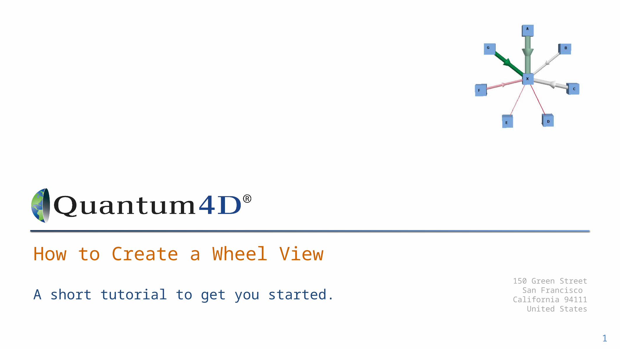
Shows how to create a simple dynamic wheel chart from your spreadsheet using Quantum4DTRANSCRIPT
150 Green StreetSan Francisco
California 94111United States
A short tutorial to get you started.
How to Create a Wheel View
1
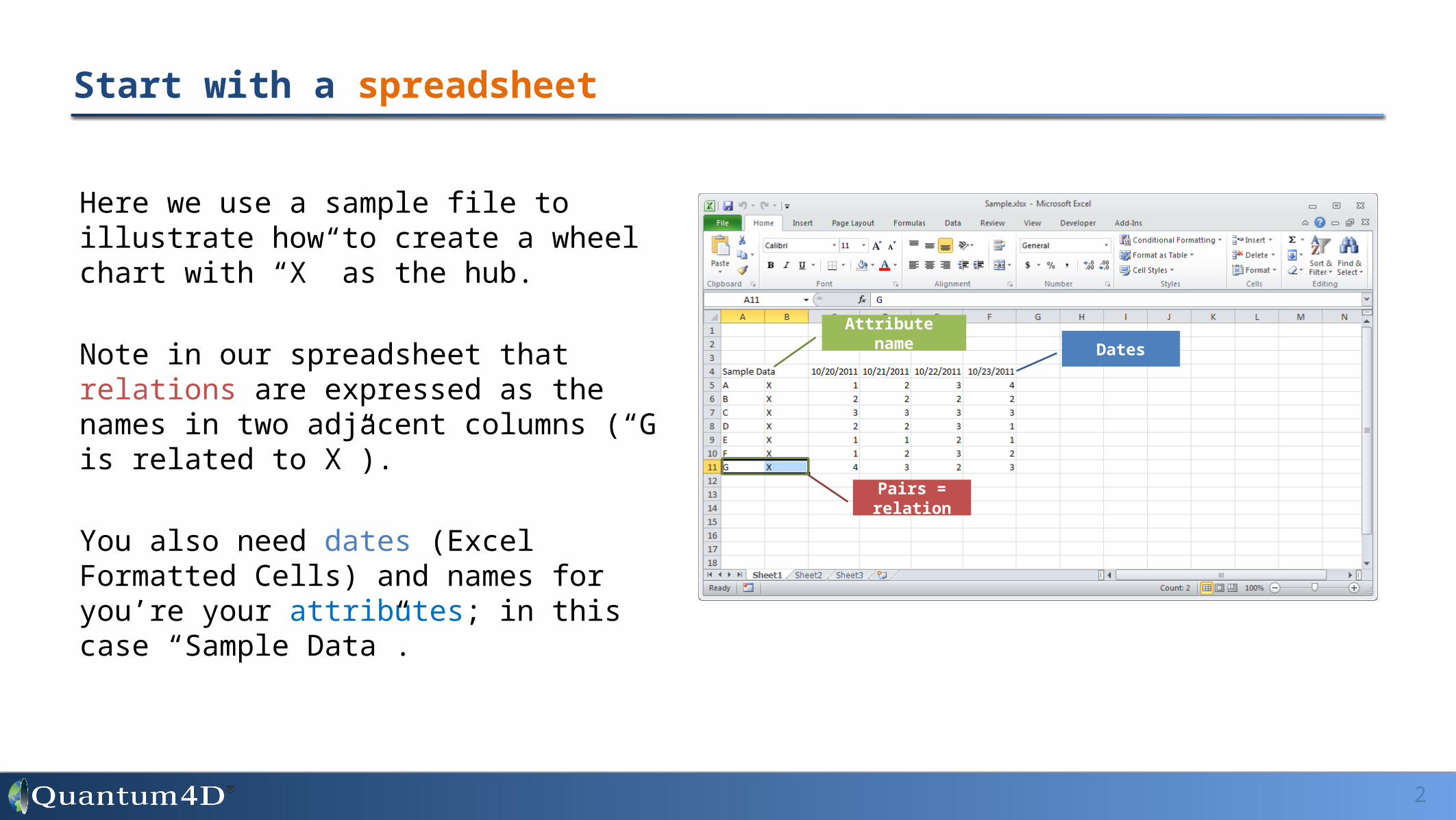
Here we use a sample file to illustrate how to create a wheel chart with “X” as the hub.
Note in our spreadsheet that relations are expressed as the names in two adjacent columns (“G is related to X”).
You also need dates (Excel Formatted Cells) and names for you’re your attributes; in this case “Sample Data”.
Start with a spreadsheet
2
Attribute nameDates
Pairs = relation

Launch the Quantum4D Excel add-in and select the rows with your relations; then press “Object(s)” button. This will highlight the two columns as red.
Use the Excel Add-in to tag data; two adjacent columns to make relations
3
Objects
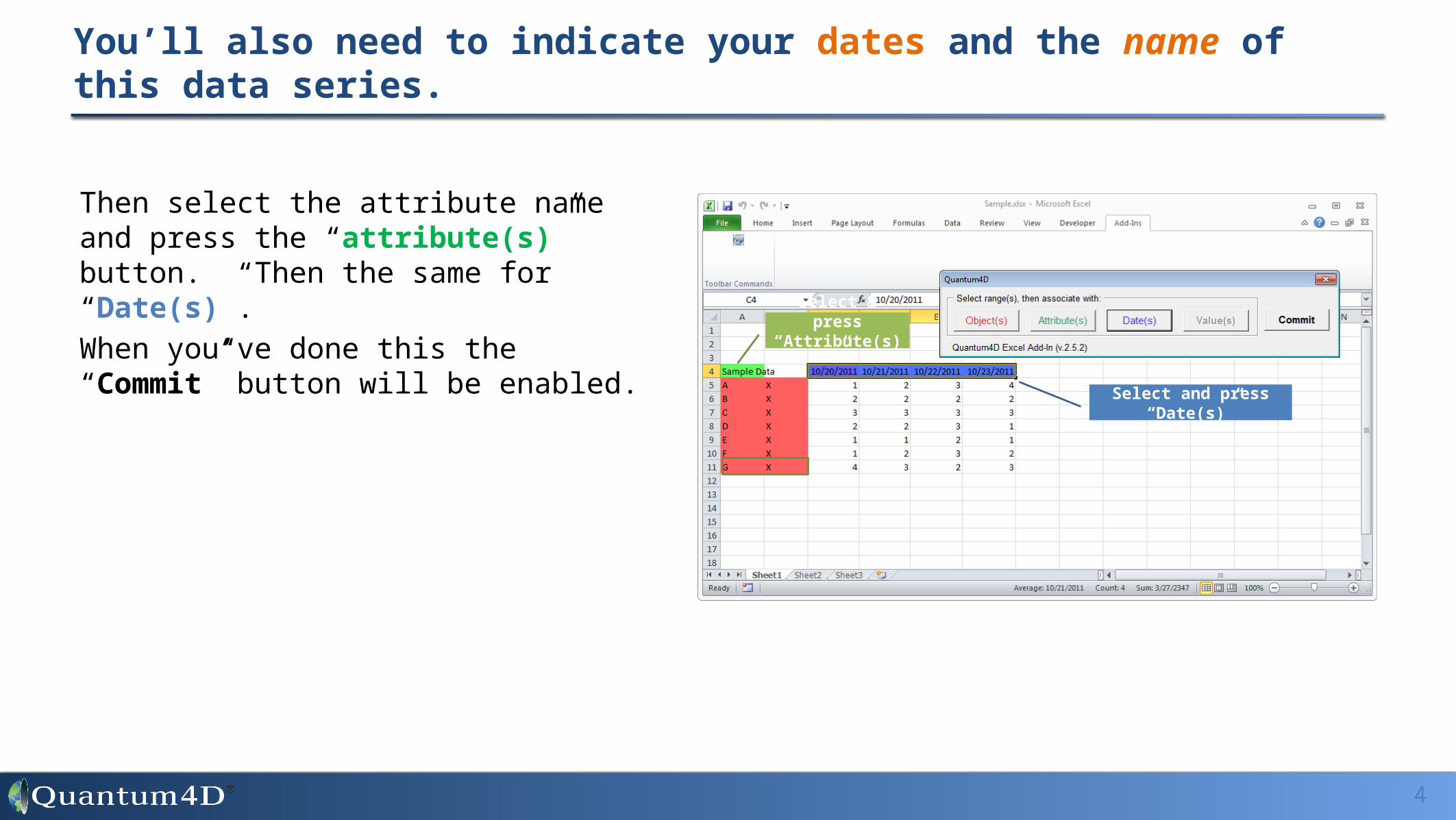
Then select the attribute name and press the “attribute(s)” button. Then the same for “Date(s)”.
When you’ve done this the “Commit” button will be enabled.
You’ll also need to indicate your dates and the name of this data series.
4
Select & press “Attribute(s)”
Select and press “Date(s)”
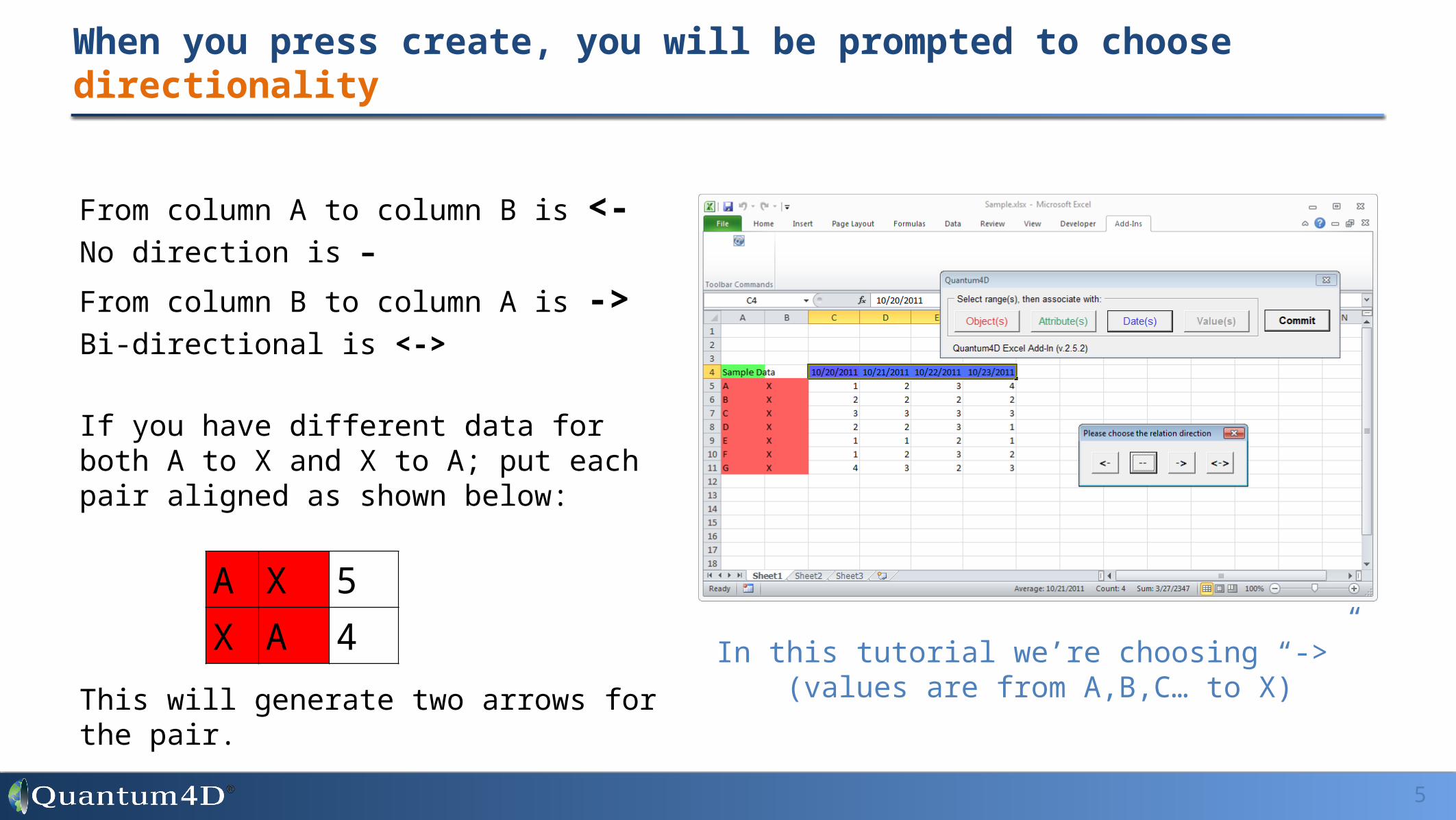
When you press create, you will be prompted to choose directionality
5
From column A to column B is <-No direction is –
From column B to column A is ->Bi-directional is <->
If you have different data for both A to X and X to A; put each pair aligned as shown below:
This will generate two arrows for the pair.
A X 5X A 4
In this tutorial we’re choosing “->” (values are from A,B,C… to X)

You’ll then be prompted to save the file
6
The add-in creates a new “Q4D” sheet in your workbook when it saves. This holds the tags that Quantum4D uses to import your data.
Later you can modify the ranges they specify if you increase the data in your import.
To do that change the references in column B to include your new entities, dates or data.
Your Data is ready for Import into Quantum4D

Launch Quantum4D and create a new space where we’ll import the data.
7
Launch Quantum4D. Then double click on a repository; we suggest you start with “My Spaces.” This is your own local database on you computer.
Once it is open, right click and choose “new space” as shown to the right. Name your space and you’ll automatically enter it.
(it will be empty at first so the screen won’t look different)
Create a new Workspace in My Spaces.

Right click your new space and import the data.
8
Once created you’ll see your new space as a blue icon in the tree. Right click that and select “Import...”
Then select the tagged file saved using the Add-in and import.
Your new space will be blue (this indicates it’s your
current space).

Select the Wheel Chart from the Lens menu of options.
9
The wheel chart is pre-configured and available under more… and then expand Network Graph (shown below).
Drag the lens onto the 3D workspace.
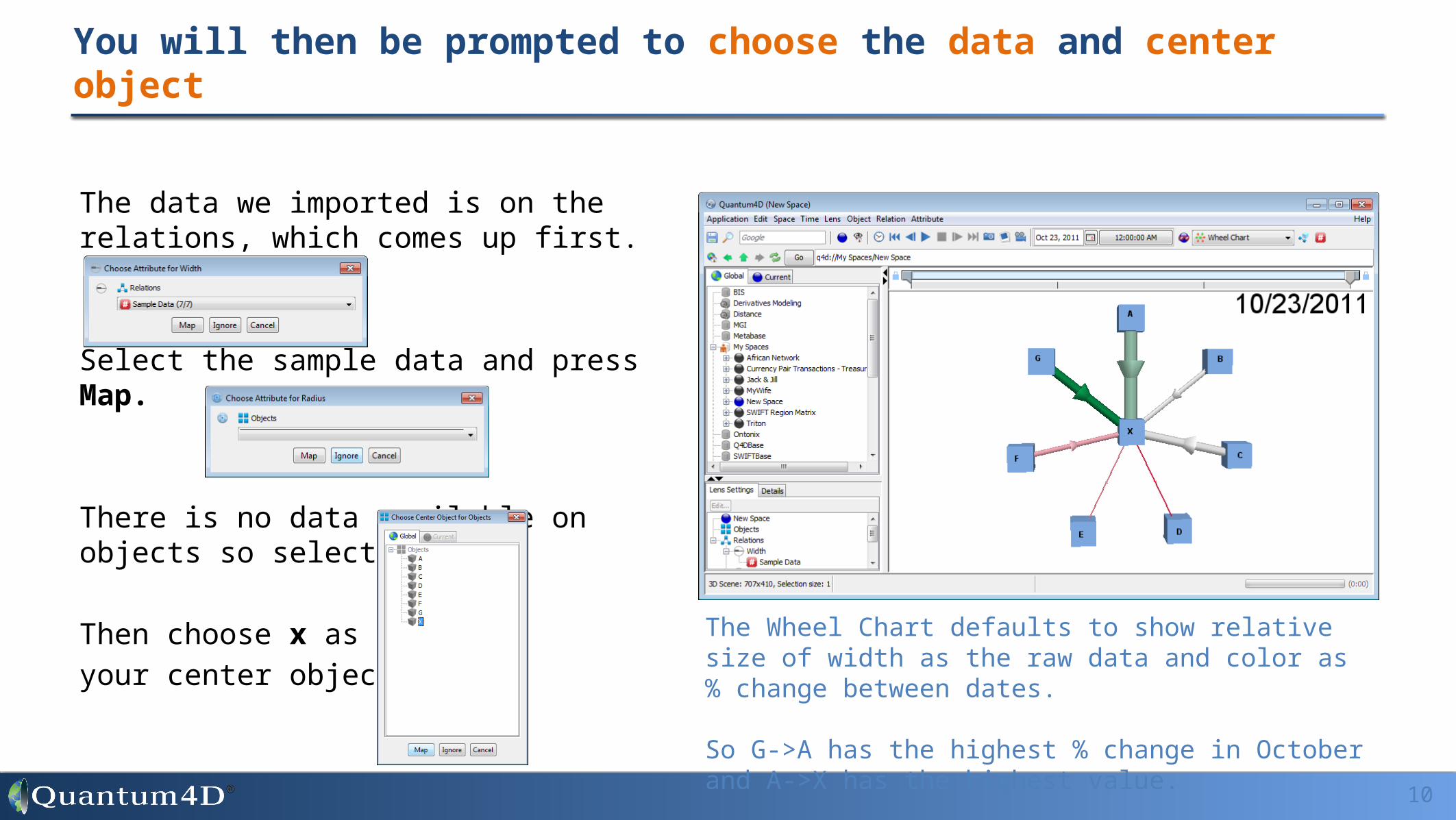
You will then be prompted to choose the data and center object
10
The data we imported is on the relations, which comes up first.
Select the sample data and press Map.
There is no data available on objects so select ignore.
Then choose x as
your center object. The Wheel Chart defaults to show relative size of width as the raw data and color as % change between dates. So G->A has the highest % change in October and A->X has the highest value.
Animate Time Series• Press the play button on the tool bar or manually scroll through time using slider at the top of
the 3D space.
Display Values• Click in the 3D space and press the “w” key; this will show the width values.• Now press the “c” key; this will display the color value.
Change Values• On the lower right you should see a Lens Settings controls. You can double click either Width
or Color and changed the period for % chg. • You can also add annotation (i.e. color is a percent – see drop down and instructions in
Reference guide).
Other basic things you can try now
11

Remote attributes: to get data off the relation onto objects; use “relation(a)” on the object group for the feature and choose a from the drop down list on the feature panel.
– See attached Remote Attributes quick tutorial for more details.– In the sample, try adding “sum” to the start of the formula on radius for objects; so that it reads as sum(relation(a)) note that the middle object
gains a value.
Ranking: the key formula is rank(a,peers(a)))<=10 where 10 can be switched to 20 for ‘top 20’ etc… use with visibility.– See attached Ranking quick tutorial for more details– Also, in the sample file, you’ll find that you can apply a working version of this formula by checking the box on the feature panel to turn on visibility
(all preconfigured).
Alerts: to learn more about alerts, connect to an existing Quantum4D databases and see what’s changing in the world.– Go to the main menu, applications> Alert Watch and click o.k. (no need to choose a date range limiter). This should produce a long list of
spaces where alerts have been applied.– You should be able to copy and paste the formulas from those. Note – you’ll want to set the standard deviation threshold to higher values to
more volatile corridors.
Proportion of total: as a bonus in the sample, we’ve mapped ‘proportion of total’ expressed as a percent. To do that you need to create a sum of children on the relations group and then map strength to “a/b” and expressed it as a percentage of the total.
Other more advance things you’ll find in the Q4D sample and online.
12