the treat issue - iggesund paperboard · the treat issue inspire.3 — 2016 issue 54 a magazine...
TRANSCRIPT

THE TREAT ISSUEIN
SP
IRE
.3—
20
16
Issue
54
A
MA
GA
ZIN
E F
RO
M IG
GE
SU
ND
PA
PE
RB
OA
RD
Visual identity through the eyes of Sawdust / Sandra Noel on customer care Mastering laser cutting in 5 steps / How K-BEAUTY conquered the world
This Guy PUTSRomance ON
YOUR Feet
Meet Marc, luxury shoes virtuoso and Mr. Hare founder.p. 16

INS
PIR
E.3
—2
016
p
.2
E
DIT
OR
’S N
OT
E
F I R S T / E D I T O R ’ S N O T E
It’s hard to think of a more subjective term than “luxury”.
To one person it’s a relaxing moment at home on the sofa with a cup of tea after the children have fallen asleep. To someone else it involves diamonds, champagne and a private jet to exotic sunshine destinations.
Wherever your own idea of luxury exists on this sliding scale, we hope that this issue of Inspire – the 54th – contains something that seems luxurious to you.
For the nostalgia fan we’ve sought out a terrific piece of retro in the form of NASA’s graphic identity from 1974, with instructions on everything from signs to space rockets. For lovers of typography we’ve met Jonathan Quainton and Rob Gonzalez, otherwise known as Sawdust and perhaps the world’s hottest graphic design duo right now. And for all of you who appreciate slightly longer articles, we’ve been to London to meet Marc Hare, who runs a global shoe empire from a basement in Notting Hill, and we’ve explored how and why Korean beauty products – K-Beauty – have become a world-wide phenomenon.
Of course, luxury is not the only thing that is subjective. Inspiration is also very much a personal matter. Inspiring you, our readers, is also the primary aim of this magazine. That’s why we’d love to hear from you how you think we’re doing.
Starting with the previous issue, we’ve restyled both the form and structure of Inspire and now we are naturally keen to hear what you think of it. So do send us your overwhelming praise, furious criticism or simply a subjective line or two about what you like or lack in the magazine.
Dialogue with our readers. Now that’s a luxury for me!
Elisabeth Östlin, Editor in ChiefMarket Communications
P.S. Share your opinions on Inspire by taking the survey at iggesund.com. The 50 first submissions will receive a pair of VR glasses made with Invercote.
Pamper us with your thoughts
The story
behind the
cover
When we decided that the theme of this issue would be “treat” we quickly booked an interview with Marc Hare. He makes and sells luxury men’s shoes via his brand Mr. Hare (and packs them in bags made of Invercote). The cover photo was taken in his new shop in Notting Hill, London by Andreas Bleckmann.
But to make this issue even more special we also wanted to enclose an extra treat for read-ers. We turned to one of the world’s most eminent designers, Frans van Heertum, and asked him to develop a gift to you in collaboration with the laser cutting firm Point to Paper. He calls it a windmill. Touch it, spin it, save it!
Raphael Gianelli-Meriano photographed Sandra Noel, page 8.
“Luxury is time. To think. To write. To make mistakes. To go surfing, take a long walk in the nature – or to do exactly nothing at all.”
Caroline Hainer wrote the story on K-Beauty, page 22.
“Luxury to me is taking long naps in the middle of the day, preferably late afternoon, with someone I like a lot. To be able to do nothing and enjoy it is the ultimate luxury.”
Andreas Bleckmann photo-graphed Sawdust and Marc Hare, page 12 and 16.
“A recent, completely unnecessary purchase of a portable Wi-Fi SERIF smart TV, could be con-sidered an indulgence. So, a cable free environ-ment and strawberry tart please.”
WHAT’S YOUR DEFINITION OF LUXURY?
?
Hello contributor, we have a question for you too:
painting—Owain Thomas

INS
PIR
E.3
—2
016
p
. 3
CO
NT
EN
T
CONTENTReinventing Rockefeller with Invercote. p. 4 Iggesund right now! p. 7Table-tennis, abstract cars and green luxury stays. p. 9The design duo that hates trends. p. 12
From Brixton to the catwalk. How Marc Hare renewed luxury shoes. p. 16
Is there a cure for wrap rage? p. 27
F I R S T
I N N O V A T I O N
R E S E T
B U S I N E S S
Address:Iggesund PaperboardSE-825 80 Iggesund, SwedenPhone +46 650 280 [email protected]
Publisher:Charlotte Lagerwald (respon-sible under Swedish press law)
Editor in Chief:Elisabeth Ö[email protected]
Editorial committee:Véronique Lafrance, Lydia Lippmann, Winnie Halpin, Ian Huskinson, Staffan Sjöberg, Elisabeth Östlin, Jessica Tommila
Publishing agency:Content InnovationÖstgötagatan 12, SE-116 25 Stockholm
Editors:Johan Lindberg [email protected]
Johan Å[email protected]
Art Director:Johan [email protected]
Prepress:Lena Hoxter
Printing:Strokirk-Landströms, Lidköping, SwedenÅgrenshuset, Örnsköldsvik, Sweden
Contributors:Anders Bergmark, Andreas Bleckmann, Caroline Hainer, Rolf Lavergren, Andreas Lind, John Lichtwardt, Magnus Voll Mathiassen, Raphael Gianelli-Meriano, Matilda Sveningsson
Translations:Fenela Childs Comactiva Language Partner TransPerfect
ISSN 1404-2436
Inspire aims to inform and enter-tain with stories and photos that are not restricted to the scope of Iggesund’s own business. As its name suggests, the idea is to be inspirational and not to infringe on a company or person’s image rights or intellectual property.
K-Beauty has made its way west. Let’s get to the bottom of the hype! p. 22
New York Times Magazine cover illustration by Sawdust
INS
PIR
E.3
—2
016
p
. 4
S
UC
CE
SS
ST
OR
IES
F I R S T / S U C C E S S S T O R I E S
The areas of application are innumerable and diverse. Skyscrapers, sweets and socks – you can never go wrong with Invercote.
A paperboard for all purposes
Rockefeller in InvercoteBrand: RXR RealtyProduct: 75 Rockefeller PlazaDesigners: Mark J. Williams & Reza FarahaniPaperboard: Invercote Creato. 75 Rockefeller Plaza is one of Manhattan’s most famous landmarks. When it became time to totally renovate the skyscraper, the owner RXR Realty used the creative team of agency YMEE (You, Me & Everyone Else) to do direct marketing under the concept “The Rebirth of a Landmark”.
The campaign mater-ial to receive the most attention was a 3D pop-up book that was printed in 700 copies and distributed to the most highly reputed real estate agents on the American East Coast.
“The greatest hurdle to overcome was ad-equately trying to convey the massive transform-ation, both inside and out, while showcasing the archi tectural enhance-ments with a modern appeal,” explains Mark J. Williams at YMEE. — [Longer story at iggesund.com]
photo—Martin Adolfsson, Matilda Sveningsson, Rolf Lavergren
“We printed the 3D pop-up on Invercote Creato 260 and 350 g/m². It has an outstanding blend of colour reproduction and rigidity. We are already utilising it in the produc-tion of another piece.”

INS
PIR
E.3
—2
016
p
. 5
SU
CC
ES
S S
TO
RIE
S
Made in FranceBrand: BleuforêtProduct: HosieryPrinter: Imprimerie l’OrmontPaperboard: Invercote G
A French origin and the highest quality textiles. These key criteria have transformed the hosiery manufacturer Bleuforêt in north-eastern France into one of the most sought- after brands in the hosiery market.
The fact that the highest quality and “Made in France” were the most important criteria when Bleuforêt chose the printer for its packaging is there-fore hardly a surprise.Imprimerie l’Ormont could supply precisely that.
At the start of their cooperation, Imprimerie l’Ormont used paperboard from another manufactur-er but after problems of scoring and other irregu-larities, Invercote G is now the primary paperboard for Bleuforêt.
“It has very good print-ability, is very malleable and folds well. It keeps its shape and is easily machined. Bleuforêt is all about quality. The pack aging they use has to follow that, which is why they want to use Invercote G,” Francis Bianchi, Tech-nical Director at Imprimerie l’Ormont explains. — [Longer story at iggesund.com]
The art of making people smileBrand: Thorntons Product: ConfectioneryPaperboard: Invercote
Almost as British as the Queen herself. That’s one way of describing the UK confectionery manufactur-er Thorntons from Derby-shire, England.
And just like so many other British institutions, it is by focusing on quality since it was founded in 1911 that Thorntons has made it-self a self-evident favourite among lovers of chocolate, fudge and toffee around the world.
Thorntons itself says “we specialise in making people smile” and its bestselling range includes customised gift boxes for birthdays, weddings and other major life events. Both Invercote and Incada are among the paper-boards used by Thorntons. —
“BLEUFORÊT IS ALL ABOUT QUALITY, WHICH IS WHY THEY WANT TO USE INVERCOTE G”— Francis Bianchi, Imprimerie l’Ormont
Why Invercote? Because it
doesn’t crack!
INS
PIR
E.3
—2
016
p
. 6
B
ES
T P
RA
CT
ICE
F I R S T / S U C C E S S S T O R I E S
Beauty giant chooses InvercoteBrand: AmorePacificProduct: Beauty & CosmeticsPaperboard: Invercote
In Cheonan, two hours from the South Korean capital of Seoul, stands a gigantic building of 36,500 m2. Architecturally it is more reminiscent of an art museum in an inter-national metropolis than the factory building it actu-ally is. But it is not just any factory. This is where the South Korean beauty giant AmorePacific produces packaging, exclusive shopping bags and special paper for its products through its sub-sidiary Pacific Package. Since 2015, Invercote has been one of the paper-boards used for the 360 million packages that leave the factory every year. The crucial factor in choosing Invercote was its excellent properties on conversion.
“The main advantage is that Invercote is stiffer and stronger than competing products. If paperboard is too rigid it can break when folded, but Invercote can be bent and folded without rupturing,” says Daewan Kim, head of Pacific Pack-age’s development team. — [Longer story at iggesund.com]
More about K-beauty,
AmorePacific and Invercote
on pages 22–26.
photo—Dylan Goldby
“INVERCOTE IS STIFFER AND STRONGER THAN COMPETING PAPERBOARDS. IT CAN BE FOLDED WITHOUT RUPTURING.”— Daewan Kim, Pacific Package

INS
PIR
E.3
—2
016
p
. 7 IG
GE
SU
ND
NO
W
A selection of current highlights from the ever-happening universe of Iggesund Paperboard.
photo—Rolf Lavergren F I R S T / I G G E S U N D N O W
IGGESUND NOW
IGGESUND FOCUSES ON JAPANThis autumn the doors of a new sales office in Japan open as part of Iggesund Paperboard’s move towards an even greater global sales focus with the Asia Pacific region as an important component. Invercote is the cornerstone of the new venture and it is hoped this flagship product will be a perfect fit for the Japan-ese market with its widely known demands for premium quality.
Asia is now the world’s largest market for paperboard and in such a market there is room for a top- quality product like Invercote. The paper-board has long been represented in Japan by the paper merchants Takeo with a focus on the packaging and graphics market. This arrangement will continue and the new sales office will further develop new business op-portunities in the premium packaging and graphic segments.“Quality is ex-
tremely important in Japan. Hygiene, purity, and taste and odour neutrality are just some of the aspects that are emphasised more in this market than in many others. That’s why we believe Invercote has terrific opportunities to do well here,” says Ivan Chong, President of Iggesund Paperboard’s Asia Pacific operations. —
WORKINGTON MILL TURNS 50Iggesund’s mill in Workington, Cumbria, UK is celebrating the fiftieth anniversary of its founding in 1966. For almost 30 of those years Iggesund has owned the mill. Since the turn of the millennium about 200 million pounds have been invested in the mill, which now has a high technological standard and is a good demonstration of paperboard’s environmental advantages over other packaging materials. —
A TASTE OF SWEDENIs there a parallel between artfully prepared Swedish culinary deli-cacies and Invercote’s unique attrib-utes? We like to think so. Iggesund will bring its very own Swedish chefs to Chicago on 29 September for A Taste of Sweden – a not-to-be missed event. To register and learn more about the event go to iggesund.com. —
DESIGNERS’ EXPERIENCEThe Iggesund Design Experience is an annual event to which a lucky few designers are invited to Iggesund in the north of Sweden. They get to visit the mill where the world-leading paperboard Invercote is manufac-tured and indulge in a three-day unique learning experience. In late August designers from around the world arrived in Iggesund for a crash course in how to make the most out of materials, and how their design can minimise the strain on the envi-ronment. —
Workington Mill in Cumbria, UK.
Cloudberry, a Swedish delicacy.
Tokyo from
above.

INS
PIR
E.3
—2
016
p
. 8
E
VE
RY
WH
ER
E I
GG
ES
UN
D
F I R S T / E V E R Y W H E R E I G G E S U N D
Building long-term relations
“The most import-ant thing in my job is to establish and maintain long-term relationships with our customers. Over the years we may not have grown hugely in terms of the number of customers but we grow alongside them. In my role as account manager in France I deal with between 60 and 70 customers.
“When I had just started at Iggesund – it was ten years ago now (gosh, how fast time goes!) – the French beauty brand Clarins was a big customer. They used Incada Silk for their skincare products. But then one day the buyer rang me up and said their marketing depart-ment had decided they should use another paper-board that had a bluer hue. I lost 600 tonnes in the
photo—Raphael Gianelli-Meriano
Sandra Noel is account manager for Iggesund Paperboard in the sought-after French market. What is required to keep demanding customers in a good mood (apart from an impeccable product)?
made of Incada, which by then we had improved, and one was made of the competitor’s paperboard that they had chosen to work with. She chose Incada! Then after a while, they de-cided to review their graphic profile and that was our chance. Now they were also ready to reconsider their packaging. We did some trials with Invercote and presto – five years after we first lost the customer – they were back.” —
blink of an eye and there was nothing I could do about it. But you must never give up.
“Then and there I began a long journey to try to get the customer back. I took photos of cartons made of this com-petitor paperboard in various duty free shops and sent them to my contacts at Clarins to show them how fast the shade was fading. I knew them well enough that I could do so without offending them – they know I only want the best for them. Finally I got a meeting and did a blind test. I put two cartons in front of the buyer and asked her to choose the one she thought was best. One was
Do you work at
a French company? Would you also
like to work with Sandra? Send an email to: sandra.

INS
PIR
E.3
—2
016
p
. 9
ED
ITO
R’S
PIC
K
F I R S T / E D I T O R ’ S P I C K
An actor turns fallen trees into must-have design. A shoe company abstracts a Lamborghini. And a Kickstarter project takes us back to the future of NASA design. Enjoy!
Ping-Pong, Lamborghinis and retro NASA design
Knock on WoodBefore actor Nick Offerman achieved cult status as Ron Swanson in NBC’s sitcom Parks and Recreation he opened a woodworking shop in East Los Angeles. How much Nick now has time to work with wood between roles is unclear but his Offerman Woodshop is pro-ducing more awesome things than ever. The Offerman’s woodworking collective now consists of eight men and women who work with trad-itional craft techniques on naturally fallen trees from urban LA or northern California. Their projects encompass everything from furniture and home interiors to canoes and pinball tables. And, not least, table tennis tables. — offermanwoodshop.com
Johan Åberg scans the internet and travels the world to serve you with the cool stuff.
Whiskey Pong: Solid cherry folding bases, hand veneered madrone top with holly inlays, hand-caned net, tung oil finish. Designed by Michele Diener & RH Lee.
photo—John Lichtwardt
INS
PIR
E.2
—2
016
p
. 10
E
DIT
OR
’S P
ICK
F I R S T / E D I T O R ’ S P I C K
Back to the Future
A terrific dialogue survives from 1974 when the New York agency Danne & Blackburn presented its proposal for a new logo for its potential client, NASA.
Richard Danne and Bruce Blackburn had suggested that the old blue logo should be replaced with four simplified letters. In bright red, against conventions as blue signified sky and coolness. So now they were waiting eagerly for feedback from NASA admin-istrator Dr. James Fletcher and his dep-uty, George Low.
Fletcher: “I’m not comfortable with those letters. Some-thing is missing.”
Low: “Well, yes, the cross stroke is gone from the A.”
Fletcher: “Yes, and that bothers me.”
Low: “Why?” Fletcher: “I don’t
feel we are getting our money’s worth!”
Against expect-ations, Danne & Blackburn were awarded the brief to develop NASA’s new graphic identity. It was in use until 1992, when NASA readopt-ed its old logo. After a successful Kick-starter campaign the graphic identity is now available in book form. —
Three reasons to stay green:Living with style while on the road and still helping the environ-ment are no longer irreconcilable. The sustainability trend has now also reached the hotel industry, where green is the new black. Siobhan O’Neill of the Green Hotelier industry organisation picks out three luxury hotels that are leading the way towards sustainability in their industry.
1. ITC Grand Chola – Chennai, India: “ITC Grand Chola is the world’s largest LEED Platinum certified green hotel.”
2. The Harmony Hotel – Nosara, Costa Rica:“A winner of the Green Hotelier Awards 2016. The hotels’ packaging is mostly made from palm, banana, coffee or sugar cane fibres.”
3. Soneva Fushi – The Maldives: “Guests pay a 2% carbon tax to offset the footprint of their holiday.”
1
2
3
The Abstract Lamborghini
By gradually lowering the 3D resolution of the iconic Lambor-ghini Countach from 1971, the Dutch shoe comp any United Nude created the Lo Res Lamborghini, which won the Wallpaper Design Award 2016. The abstract pared-down car is more a concep-tual design experiment than a conventional car but can be driven in up to 50 km/h and resembles a living sculpture on the road. —
1 2 3 4 5 6
INS
PIR
E.3
—2
016
p
. 11 E
DIT
OR
’S P
ICK
NASA Graphics Standard Manual is now available at standardsmanual.com and costs 79 dollars, including a guaranteed nostalgia trip back to the future as it looked like in 1974.

INS
PIR
E.3
—2
016
p
. 12
O
UR
BE
ST
WO
RK
F I R S T / O U R B E S T W O R K
RG: “Jonathan and I met while studying graphic design. We worked on a number of projects together that proved successful, or at least we thought so at the time. We naively vowed to some-day set up our own studio, and seven years later, in 2006, we bit the bullet.”
JQ: “I genuinely believe that our naivety when we first es-tablished the studio has worked to our advantage. We didn’t have any preconceived ideas. Only the belief that if we put everything we had into the work, then clients would eventually find us.”
RG: “The way we divide work between us is fluid. I work more closely with image making, mostly typographic, whereas Jonathan focuses mainly on the base letterforms, typefaces and font creation. However, it’s not uncommon for us to do it the other way around. This continuous crossover enables us to form a dynamic that keeps us pushing and exploring.”
JQ: “We try to avoid trends like the plague. Our focus lies on producing work that excites us, and, to challenge conven-tion, you have to avoid the expected and draw from the unexpected. Rob and I really enjoy surprising people
by constantly moving into dif-ferent spheres of thought and execution with our work.”
RG: “When you create some-thing, your instinct is to share it. You want people to experience it, feel it, question it, think about it. You want a reaction. In that sense I’m proud of what we’ve achieved to date.” —
London-based Sawdust has become one of the world’s most talked-about design duos. Discover the secrets behind the creative partnership of Jonathan Quainton and Rob Gonzalez.
“We avoid trends like the plague”
by—Johan Åberg portrait—Andreas Bleckmann
Jonathan Quainton
Rob Gonzalez

“PUSH HARDER, SUPPRESS EGO AGAIN”
Don’t miss the design process of Sawdust, and more work at iggesund.com
Sawdust cherry picks personal favourites among their numerous award-winning projects.
INS
PIR
E.3
—2
016
p
. 13
OU
R B
ES
T W
OR
K
Poster for Transport for London celebrating the 100th anniversary of the Johnston typeface.
Masthead and icon design for Wired UK used across social media channels and special editions.
Display typeface for NBA basketball player Kobe Bryant, an initiative that saw the font used across his Nike product range. Client: Nike Basketball
Number designs for Wired UK’s annual The Wired World in 2016 issue.
Cover design and typographic illustrations for the 1,000th issue of Esquire magazine.
Custom typeface for Quattro Everyday, an article for Audi Magazine UK. The one-off special feature focused on their Quattro range of cars — one for each day of the week.
Artwork for a Coca- Cola exhibition held at the High Museum of Art in Atlanta, Georgia. The event saluted the iconic bottle and its special place in the worlds of art, design and commerce over the past 100 years.
Typographic illustra-tion for Wired’s annual Design Issue, focusing on architecture and cities around the world.

F I R S T / H O W T O
INS
PIR
E.2
—2
016
p
. 14
H
OW
TO
The Tulip and the Windmill – a Design Plus project
Frans van Heertum is creative director of the award-winning Dutch agency Van Heertum Design and the mind behind the beautiful art piece that comes with this issue of Inspire.
The Tulip and the Windmill is part something you call Design Plus. What is that?
“We have developed a different approach to the design process, which is called Design Plus. We use our network to involve pro-duction experts at a very early stage in the process. Knowing beforehand what can and what definitely cannot be achieved with a design project is the key of the Design Plus method.”
Where did you get the idea from?“Each year we try to find a pro-
ject that shows something new, so we ask the companies in our network if they have something exciting going on. When Joep Hoffmans at Point to Paper told us about their new laser cutting ma-chine I immediately knew it could be such a project.”
What was your next step? “What I wanted to do required
really good paperboard so I asked Iggesund if they wanted to be involved – and they were positive. The idea was to use a double layer of paperboard and make holes in the upper layer by die cutting so people could see something else through the paperboard. The laser cutting machine makes it possible to create the holes with a totally different precision than before, which gives totally new possibilities of creating new 3D effects with paperboard, and that is very important in packaging these days.”
And the design itself?“To create the right effect of
movement, we thought of a rotat-
ing windmill that can be glimpsed through the laser cut holes. We wanted to add beautiful colours and were inspired by Dutch flowers. We made the flowers by embossing the paperboard but we let them stay white, so that the colour instead comes ‘out of the paperboard’ via the windmill.” —
Frans van Heertum, founder and owner of Van Heertum Design.

INS
PIR
E.3
—2
016
p
. 15
HO
W T
O
2Choose the substrate carefully “Most substrates are not developed for laser cutting. Make sure to test all the substrates, since their properties greatly influence the end result of laser cutting. Not only the paperboard but also the ink, the coating and the laminate have a big effect on the end result. Ask a laser spe-cialist for more advice before going forward.”
3
Express your creativity“The limitations of traditional die-cutting belong to the past. With laser cutting you can give an extra dimension to your printed materials! The only thing you need is a digital vectorised file. Where traditional cutting stops, laser cutting takes over. Be-cause of the ability of the process, the great precision and the high flexibility of edition size, the creative possi-bilities are endless.”
Refine your design with laser cutting
Point to Paper are laser cutting experts – and one of the partners in The Tulip and the Windmill project. We asked their CEO Joep Hoffmanns for a five-step guide to laser cutting.
1Do more with laser tech-niques“Laser cutting all starts with mirrors. In the laser head there are moving mirrors. The laser comes from one point through the mir-rors and swirls across the paper. It’s nothing like a traditional plot-ter. The process starts from one very specific point, which makes it fast. And the thinner the laser is, the faster it goes. The small diam-eter of the laser beam cuts, creases, en-graves, perfor ates, per-sonalises and etches complex and detailed illustrations, patterns, texts and images. All possible techniques can be used in combi-nation with each other just by changing the parameters in the com-puter.”
4
Forget about burn marks“Laser cutting works with heat but generally speaking there will be no burn marks if you use the newest laser cutting technology. So when you are choos-ing your laser cutting partner, make sure to ask exactly which ma-chines they have. Laser cutting smells because it’s burning. We have solutions to remove the smell and then we can perfume the sheets. This is totally unique.”
5Do test runs“Not convinced yet? Not sure about the end result you have in mind? Then do a laser test and let the results convince you. With the right knowledge and laser cutting equip-ment, a new world of cutting is right in front of you.” —

I N N O V A T I O N / L U X U R Y

INS
PIR
E.2
—2
016
p
. 17 LU
XU
RY
MAKINGLUXURY ROMANTIC
by—Johan Lindbergphotos—Andreas Bleckmann
A Jamaican-British surfer from a run-down London suburb has rejuvenated the market for men’s luxury shoes. Inspire visits Marc Hare, founder of

INS
PIR
E.2
—2
016
p
. 18
LU
XU
RY The year 2008 does not start well.
First Marc Hare loses his high-flying job at a global fashion house. Two weeks later he falls during a friendly football match and hurts his knee so badly he has to give up his great passion, surfing. A month or so later his marriage hits the rocks and ends in divorce.
What do you do when your life falls down around you? How do you pick yourself up and keep on going? The answer is easy: You go to Anda-lusia and eat tapas.
It is there, on the outdoor patio of a modest restaurant outside Seville, that Marc’s gaze becomes fixed on the shoes of a man at the next-door table. They are a pair of simply woven farmer’s shoes not unlike those on the feet of the other guests. But these particular shoes have something that makes Marc keep looking at them and put his beer glass down on the table. Maybe if he changes a seam there, adds a mate-rial and alters the colour? Discreetly he takes out his camera phone and snaps a photo.
It’s a photo he has saved, because it was then and there that he realised what he would do for the rest of his life.
May 2016. It’s a Wednesday after-noon and it’s raining in London. On a bustling Portobello Road people are picking their way carefully along the pavement, trying to avoid stepping in the puddles. Englishmen are protective of their shoes. We turn in onto Powis Terrace. Now a quiet road, 50 years ago it was perhaps the
most swinging street in swinging London. This was the home of Ossie Clark, the fashion designer who dressed London’s hippest cats, the legendary café The L Room and artist David Hockney’s combined two-storey flat and studio. It is from the house opposite Hockney’s that a young, relaxed and well-dressed father steps out through an unassuming white door with a baby stroller in one hand and a large shopping bag in the other. The shopping bag is what has brought us to London. With its intense pink against an elegant black and bronze background, the bag shrieks “Mr. Hare”. It is impossible to miss this bag. It is a mobile advertising column for Marc Hare shoes. What material is it made of? That’s right – Invercote.
Marc Hare helps the customer out of the shop and meets us on the opposite side of the road. The shop has not even been open for a week but customers have already found their way here. There was already a Mr. Hare shop in central London, in the exclusive Mayfair district. But coming to the shop on Powis Terrace means getting closer to the heart of the company. Marc manages the whole business from here together with his nine-member team. They also do all the online sales from the office one floor below the shop. Marc
has a new relationship and a young baby at home. After the interview he will go home and say good-bye to his family before flying to Porto, Portugal for a meeting with a new factory.
“I finished my holiday in An-dalusia and when I came back to London I put together a PowerPoint presentation to convince myself this was doable. It took me five minutes to come up with the name. I thought ‘Mr. Hare, wow, that’s a brilliant name for a shoe brand.’”
His journey to launching his own shoe brand has been long and wind-ing. He studied business at London College of Fashion at the end of the 1980s and then worked as a PR con-sultant at Lynne Franks PR (the PR company that inspired the TV series Absolutely Fabulous). After a couple of years he moved on and founded his own PR agency working for men’s fashion houses, record companies and artists. But despite such inter-esting clients, the PR industry never felt quite right to him.
“I ended up getting a lot of marketing consultancy jobs for streetwear and sportswear brands. That distracted me for a good eight years. I became very disillusioned. You present something for the cli-ents and they take it away and make something totally different out of it. I could never point at something and say ‘Look what I’ve done, I’m really proud of this!’”
Among his last customers were three young men who had just writ-ten a guidebook to the best surfing in Europe. They planned to open a shop in Notting Hill to be called Low Pressure. After having helped them with PR for a while, Marc asked if he could start working for them directly.
“We never made any money but we counted our success in how many weeks we were surfing and snowboarding without paying for it ourselves, and in the name of that, we were millionaires every year. But like all things you do as a young enthusiast, the company fell apart like a rock band.”
He then went to the Swedish fashion brand J.Lindeberg and after only six months he became head of global marketing. After a few years the company was sold and people were let go, including Marc.
“Everything I’ve ever done prior to this is what led up to what I’m now doing.”
We’re each sitting in a chair in the middle of the carpeted shop, surrounded by exclusive men’s
TMarc Hare’s shoe style don’ts:
1
Don’t hide them“If your trousers bunch up it makes you look about a foot taller. And you can actually see your shoes because they’re not covered in the trousers.”
2
Don’t ignore them“We’ve done a lot of teaching people how to polish and how to take care of a pair of shoes. It’s part of a culture that has just disappeared in the sneak-er age.”
3
Don’t wear them“From the minute you start using your shoes, you’re con-stantly destroying them. The best thing for a pair of shoes is for you to just not wear them.”
INS
PIR
E.2
—2
016
p
. 19
LUX
UR
Y
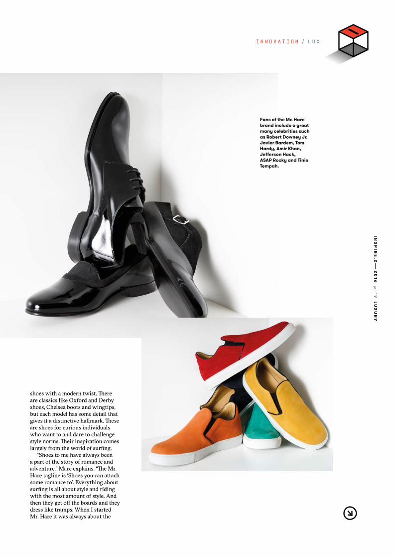
Fans of the Mr. Hare brand include a great many celebrities such as Robert Downey Jr, Javier Bardem, Tom Hardy, Amir Khan, Jefferson Hack, ASAP Rocky and Tinie Tempah.
I N N O V A T I O N / L U X U R Y
shoes with a modern twist. There are classics like Oxford and Derby shoes, Chelsea boots and wingtips, but each model has some detail that gives it a distinctive hallmark. These are shoes for curious individuals who want to and dare to challenge style norms. Their inspiration comes largely from the world of surfing.
“Shoes to me have always been a part of the story of romance and adventure,” Marc explains. “The Mr. Hare tagline is ‘Shoes you can attach some romance to’. Everything about surfing is all about style and riding with the most amount of style. And then they get off the boards and they dress like tramps. When I started Mr. Hare it was always about the
INS
PIR
E.2
—2
016
p
. 2
0
LUX
UR
Y
romance and adventure of being continuously stylish – once you got out of the water.”
As well as surfing, one other form of culture has always influenced Marc both as a person and as a shoe designer: music.
“Around the age of 10 I really got into The Specials and all that kind of rude boy music. The big part of being into that was the shoes they were wearing, like the College loafers, brogues, Dr. Martens. Music has had much more influence than surfing, and that has come full circle because now we’ve actually got artists wear-ing our shoes when they receive Grammy Awards.”
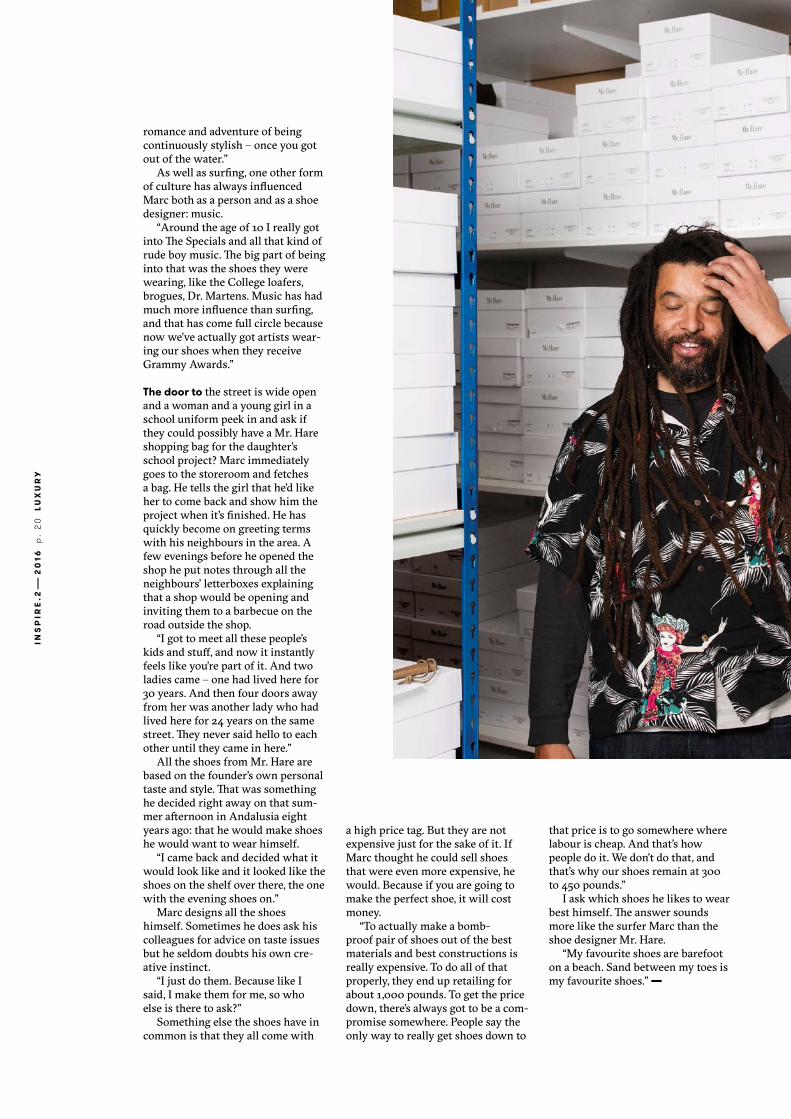
The door to the street is wide open and a woman and a young girl in a school uniform peek in and ask if they could possibly have a Mr. Hare shopping bag for the daughter’s school project? Marc immediately goes to the storeroom and fetches a bag. He tells the girl that he’d like her to come back and show him the project when it’s finished. He has quickly become on greeting terms with his neighbours in the area. A few evenings before he opened the shop he put notes through all the neighbours’ letterboxes explaining that a shop would be opening and inviting them to a barbecue on the road outside the shop.
“I got to meet all these people’s kids and stuff, and now it instantly feels like you’re part of it. And two ladies came – one had lived here for 30 years. And then four doors away from her was another lady who had lived here for 24 years on the same street. They never said hello to each other until they came in here.”
All the shoes from Mr. Hare are based on the founder’s own personal taste and style. That was something he decided right away on that sum-mer afternoon in Andalusia eight years ago: that he would make shoes he would want to wear himself.
“I came back and decided what it would look like and it looked like the shoes on the shelf over there, the one with the evening shoes on.”
Marc designs all the shoes himself. Sometimes he does ask his colleagues for advice on taste issues but he seldom doubts his own cre-ative instinct.
“I just do them. Because like I said, I make them for me, so who else is there to ask?”
Something else the shoes have in common is that they all come with
a high price tag. But they are not expensive just for the sake of it. If Marc thought he could sell shoes that were even more expensive, he would. Because if you are going to make the perfect shoe, it will cost money.
“To actually make a bomb-proof pair of shoes out of the best materials and best constructions is really expensive. To do all of that properly, they end up retailing for about 1,000 pounds. To get the price down, there’s always got to be a com-promise somewhere. People say the only way to really get shoes down to
that price is to go somewhere where labour is cheap. And that’s how people do it. We don’t do that, and that’s why our shoes remain at 300 to 450 pounds.”
I ask which shoes he likes to wear best himself. The answer sounds more like the surfer Marc than the shoe designer Mr. Hare.
“My favourite shoes are barefoot on a beach. Sand between my toes is my favourite shoes.” —

INS
PIR
E.2
—2
016
p
. 21
LUX
UR
Y
More stories on how Invercote elevates premium brands at iggesund.com
Julian Morey on the Mr. Hare graphics
Which typeface does the Mr. Hare logotype come in, and why did you go with this par-ticular one?
“The Mr. Hare logotype is be-spoke, which means it is hand-drawn especially by Mr. Hare, you won’t find it anywhere else. Originally when Marc started the company he created all the graphics and used a Didot typeface for the logo which he slightly condensed. Using this as a start-ing point I applied some TLC. On the bag I had to draw two versions, the smaller is the standard logotype, the larger logo had to be more condensed so that it could fit into the shape of the bag.”
In what way do you think the Mr Hare logotype/typography conveys the exclusive products?
During the 20th century the Didone genre of typefaces became aligned with luxury fashion; the logo for Giorgio Armani and time-less mastheads for Harper’s Bazaar and Vogue are classic ex-amples. The Didot’s high contrast strokes have an elegance and precision that makes them feel crafted and tailored.
Could you describe the process behind the design of the Mr. Hare shopping bag?
“I presented Marc with 10 or so different concepts for the de-sign, of this was one that was developed into final artwork. I came up with the colours, I chose black and dark metallic brown for the back-ground as I wanted two colours that would stand back and be subtly differ-ent. I knew red would work well with black and that pink works well with brown and again I wanted two more colours that are subtly different.” —
“JAMAICANS ARE INHER-ENTLY VERY, VERY PROUD OF THEIR APPEARANCE, AND I THINK COMING FROM A JAMAICAN BACKGROUND PLAYED A BIG PART IN IT.”
Didot
Julian Morey is a London based graphic design consultant specialising in typography and typeface design. His clients have included advertising agencies, nightclubs, depart-ment stores and luxury brands. More of his work for Mr. Hare can be viewed at www.abc-xyz.co.uk/view/mr_hare.
MO
RG
AN
O’D
ON
OVA
N

INS
PIR
E.2
—2
016
s.
22
M
OT
HE
RB
OA
RD
X X X / X X XB U S I N E S S / K - B E A U T Y

by—Caroline Hainer illustration—Magnus Voll Mathiassen
Ever since Gangnam Style danced its way into the West by setting a
YouTube viewing record, Korean pop culture has been as hot as kimchi.
Caroline Hainer seeks out the secret behind K-Beauty, the beauty trend that
is literally on the whole world’s lips.
INS
PIR
E.3
—2
016
p
. 23
K
-BE
AU
TY
H O W
C O N Q U E R E D T H E
W O R L D
K-Beauty

INS
PIR
E.3
—2
016
p
. 2
4
K-B
EA
UT
Y
B U S I N E S S / K - B E A U T Y
In 2014 the British beauty brand Rodial successfully launched an entire skincare series based on the myth of “dragon’s blood”, a sap from a special tree in South America called croton lechleri. Dragon’s blood is said to have been used by South American women for centuries to heal wounds and protect the skin – common claims when marketing beauty products with an exotic nat-ural ingredient.
Maybe it works, maybe it doesn’t. Who knows? Whatever the case, trying it out will cost you about 150 euro.
This is a telling example of how the beauty industry works. Con-sumers must surely have a lurking suspicion that a product sounds a bit too good to be true but the hope that it will indeed work appears to be even greater. That’s how it’s been ever since the beauty industry first began.
Neither the industry nor consum-ers stop hunting for the Next Big In-gredient. Only yesterday it was stem cells; before that it was algae and plankton that would give us the skin of our dreams. And the more exotic and strange an ingredient sounds, the more attractive it seems to be.
So what will be the next big ingredient?
Many people would bet on snail slime. It has been used in South Korea for ages and is said to be both healing and anti-inflammatory. And
no other country has been so trendy on the beauty scene over the past five years than South Korea.
To understand why Korean beauty products – or K-Beauty as the trend is called – have conquered the beauty industry recently, we must start by expanding our perspective.
“The Korean wave” is the term used to describe how interest in South Korean popular culture as a whole has grown over the past decade, first through Asia and then globally.
The symbol of this trend is, of course, rapper Psy and his pecu-liar song Gangnam Style, which in December 2012 became the most-viewed video on YouTube with two billion views. Simply put, we can say that Psy’s distinctive dance step not only opened the world’s eyes to Korean pop music, known as K-Pop, but also firmly put South Korea on the global pop culture map.
Just like Korean pop culture in general, K-Beauty first began expanding in Asia. The average Ko-rean woman uses between 10 and 17 skincare products daily, and Korean TV series often feature product placements and dialogue about beauty and beauty routines. A TV character can casually remark that another character has beautiful skin and ask what products she uses. As Korean TV series became ever more popular in the rest of Asia, so, too, grew interest in Korean women’s strict beauty routines.
However, the main reason why K-Beauty has become a global hit in the beauty world goes beyond popular culture. What provoked the greatest curiosity and paved the way for commercial success are the ani-mal ingredients traditionally used in
South Korea. To Western eyes, they are just strange enough ingredients from a just exotic enough country. A perfect combination in the perpetual hunt for the Next Big Ingredient.
Take, for example, horse oil, which is extracted from horse fat and said to be extremely rehydrating. Or nightingale droppings, which are claimed to make the skin softer and are used in “Geisha Facials” at exclu-sive spas (Victoria Beckham is said to be a fan, claim the British gossip magazines.) Or that anti-inflamma-tory snail slime that has become the symbol of the new exotic Korean beauty wave.
“Beauty companies love to single out a new miracle ingredient from the rain forest, French countryside or China,” says the internationally recognised beauty expert Paula Begoun in her podcast Paula’s Choice. “You never hear of any revolutionary ingredient being discovered in a lab in New York.”
I“SO WHAT WILL BE THE NEXT BIG INGREDIENT?MANY PEOPLE WOULD BET ON SNAIL SLIME.”
The Face of Korean Beauty: With her iconic platinum blond-dyed hair, Korean-born Soo Joo Park is the freshest face in fashion these days. Park, who moved to California as a teenager, worked with Chanel, Max Mara and Tom Ford before she became L’Oréal’s first Asian-American spokes-model in 2015.
AD
AM
KA
TZ S
IND
ING
/ T
RU
NK
AR
CH
IVE

Begoun has carved out a career from reviewing beauty products based on their ingredients, and has written the bestseller Don’t Go to the Cosmetics Counter Without Me. She points out that beauty goes in trends just like everything else.
“Recently it was Japan, with Shiseido and SK-II, that were seen to be skincare geniuses. Now an entire industry agrees it’s South Korea.”
Somehow it is still surprising that South Korea in particular is in fashion right now. The country has no real natural resources of its own. No oil, gas or even minerals. It is also very small – just a third the size of Germany. Electronics and cars have traditionally been South Korea’s major exports but now beauty products are well on their way to be-coming the next big export success. The Korean authorities naturally perceive the export possi-bilities and take the beauty industry very seriously. In
recent years big investments have been made in beauty technology to further promote exports.
The investment has borne fruit. Five years ago there were about 1,200 beauty brands in the country. Today the figure is nearly 9,000 and in 2014 South Korea for the first time exported more beauty prod-ucts than it imported. The USA is now the third-largest importer of Korean beauty products after China and Hong Kong. Today Korean beauty brands like Drunk Elephant, TonyMoly and Too Cool For School are stocked by major chains like Sephora and Urban Outfitters in the USA.
Alicia Yoon is the founder of the webshop Peach & Lily, which sells and distributes Korean beauty products to the West,
especially the USA. She travels regularly to South Korea, where she was born, to hunt out new brands. Her task has become increasingly
K-Beauty on InvercoteAmorePacific is one of the lead-ing players in the South Korean beauty industry. In 2010 it cre-ated a subsidiary, Pacific Pack-age, which manufactures pack-ages, bags and special papers for the Asian beauty giant. Since October 2015 Invercote is one of the paperboards used by AmorePacific.
36,500 m2
The size of Pacific Package’s factory in Cheonan.
The number of finished packages that left the factory in 2015.
AmorePacific’s increased sales over the past three years.
360 m
30 %
INS
PIR
E.3
—2
016
p
. 2
6
K-B
EA
UT
Y
tough given the market’s expansion and the huge number of new brands that are popping up.
“I always insist on meeting the brand’s chief chemist,” she says. “I want to hear their philosophy and see how their products are made. The vast majority of older Korean women buy their products from a dermatologist or beauty therapist. It’s a serious business.”
South Korea is also a good inspiration for the big Western beauty companies, who are keen to see women in the West follow the example of Korean women and start using more skincare products in their beauty routine. Previously the Western routine has involved far fewer products and a “less is more” approach. Over the past decade this attitude has changed at the same rate as the beauty industry has grown.
Today the traditional European beauty brands also have products in their range that are clearly inspired
by South Korea. The Korean beauty products that really took off in the West were the BB creams and their successors, the CC creams. These multi-creams, which smooth out the skin’s surface and even out skin tones, grew hugely in the USA and then Europe in about 2013.
Basically all the big brands from Georgio Armani to L’Oréal now have their own BB and CC creams. K-Beauty has even found its way to the Nordic countries. Kicks is the Nordic region’s biggest retail beauty chain and has just launched multi- masks under its own name.
“With K-Beauty, the focus is above all on skincare,” says Caisa Jansson, who is the editor-in-chief of Kicks’ own magazine. “Many brands we stock have released their own ver-sions of Asian bestsellers in the past year, such as night masks. We’re also seeing that essences that are import-ant in the Korean skincare routine are also starting to find their way onto our shelves. Just a few years ago this type of product didn’t exist here in Europe.”
By now most consumers with an interest in beauty products may well have heard of BB creams but might not know of their Korean origins. It’s easier to remember horse oil and nightingale droppings. And some-how that’s also part of the attraction – the possibility of a new, as yet untried miracle ingredient that will give our skin a more youthful glow than ever before.
Maybe it really could be the snail slime? —
Hope for
4 beauty trends from Korea
1
The South-Korean bestseller, BB cream first stood for “Blemish Balm” and was used as a full-cover day cream and acne treatment. It is now “Beauty Balm” for all skin problems.
2
Sleeping masks focus on peeling and are applied before bed time and washed off in the morning.
3
Serums, boosters and essences all come from South Korea. Essences are a hybrid of a skin toner and a step between cleansing and applying a serum or moisturiser. It is said that the active ingredients are helped by the essence to penetrate the skin more deeply.
4
Cushion foundation is applied with a sponge (the “cushion”) which thanks to its pores gives “the world’s most even foundation”.
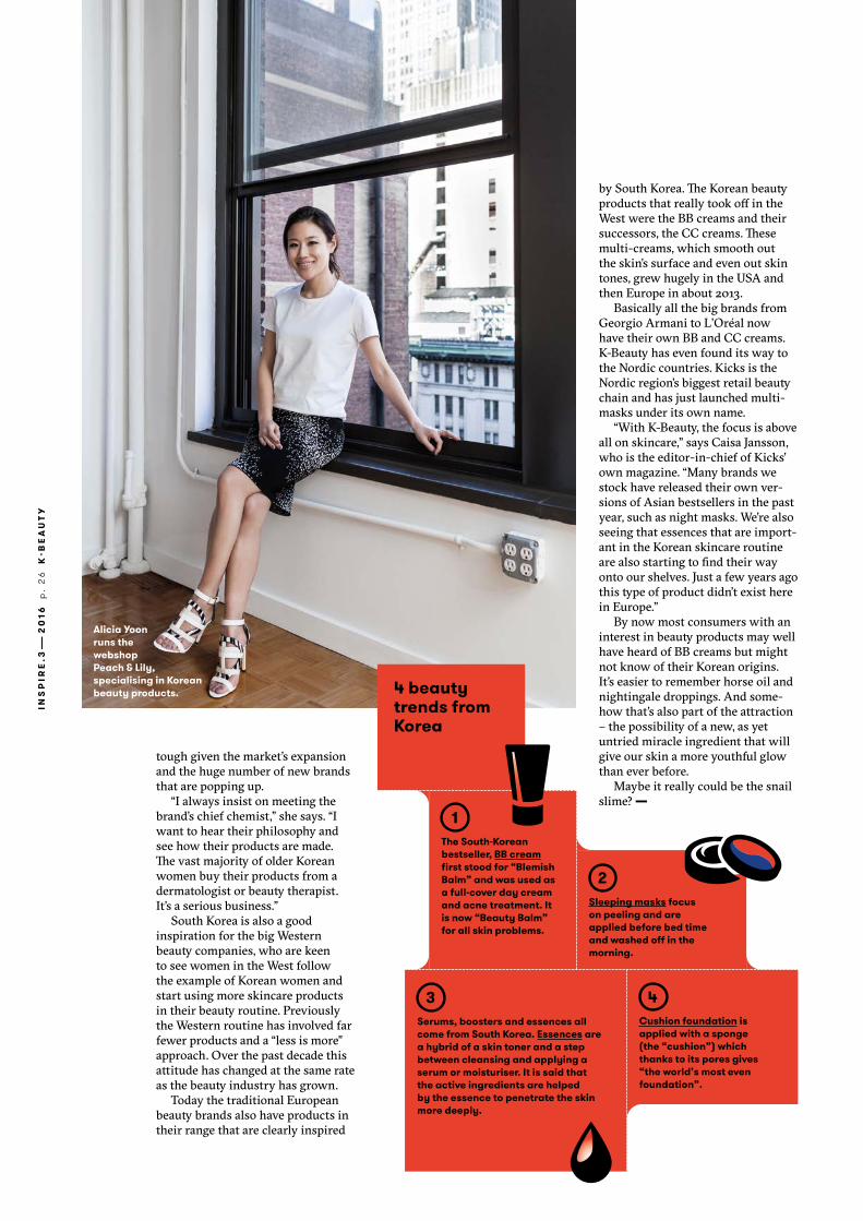
Alicia Yoon runs the webshop Peach & Lily, specialising in Korean beauty products.

INS
PIR
E.3
—2
016
p
. 27
IT’S
A W
RA
P
As companies put easily opened paperboard
around their products sold online, it sends a
glimmer of hope to all wrap ragers out there.
Hope forby—Johan Åberg photo—Getty Images R E S E T / I T ’ S A W R A P
A red mist spreads across your
field of view. Frustration boils up
in your gut. A single thought runs
through your mind over and over:
This d@#%ed packet is going to
open NOW if it’s the last thing I
do!If you recognise this scenario
you are among the millions of
people who experience wrap
rage when they can’t peel off
the plastic film around a product
or force their way through the
detestable hard plastic clamshell
that encloses electronic products
and toys.Even though this situation has
been widely recognised for at
least a decade, companies have
stubbornly continued to use hard-
to-open packaging that can send
us into a rage. They do so despite
studies showing that we physical-
ly hurt ourselves when in frustra-
tion we use sharp objects to stab
at packaging that refuses to open
– and we go so far as to refuse
to buy products with irritating
packaging.Finally, though, the increasing
shift to selling online is creating
a glimmer of hope for all wrap
ragers. Goods sold online do not
wrap ragers
risk being interfered with or sto-len, which is manufacturers’ fa-vourite argument for their impreg-nable packaging. Replacing hard plastic with paperboard for online sales is often cheaper and more environmentally benign – and as a bonus it protects consumers from physical and mental suffering. Best of all, it really works! New statistics from amazon.com show that “irritation-free packaging”
on average reduces negative cus-
tomer feedback by 73 per cent.
So have faith, better times are
coming. With a bit of luck it won’t
be long before you no longer have
to reach for the scissors to force
your way through the packag-
ing of your brand new … yes,
scissors. —

Cover printing:
PAPERBOARD— Invercote G 240 g/m²
PRINTING TECHNIQUES— Four colour offset and a fifth colour (PMS 802) with the reverse side out
Four colour offset on the print side
FINISHING TECHNIQUES— Spot UV varnish on the PMS green text parts
CO
160
35
E
Inspire, a source of inspiration, provided by Iggesund Paperboard, home of Invercote and Incada.