the thompson sampler - boston society of architects · pdf filethe thompson sampler...
TRANSCRIPT

16 ab | ArchitectureBoston
The Thompson Sampler
Architectural legacies are unpredictable. For one thing, there are no
guarantees that a physical legacy will endure. In the first half of the 20th
century, as the profession of architecture grew in stature, the field had
appeal for anyone with an immortality complex: a significant commission
had staying power. In the age of the tear-down, however, there are no
assurances of permanence when even office towers and museums can
be demolished to make way for the next new thing.
Even those structures that do survive are subject to changing inter-
pretations, passing in and out of fashion. A few buildings are so
extraordinary that their iconic status endures, their initial innovation
still apparent. Some suffer from the flattery of imitation, blanderized
by their own success. (How many visitors to the Hyatt Regency in
Atlanta know or care that it was the first atrium hotel, designed by
John Portman in 1967?)
But an architectural legacy is not necessarily a constructed legacy.
Some buildings launch ideas that are more fully or more successfully
developed later in other projects. Some lead to a new direction in
the architect’s career and work. And some serve as reminders of a road
not taken — an architectural direction abandoned due to economic,
political, or cultural forces.
The projects included in the following sampler of Ben Thompson’s
work suggest the range of his considerable influence and represent
different aspects of his architectural legacy. What they have in common
is a more ineffable legacy — their influence on the people who worked
on them, who have occupied them, and who have delighted in their
generous contributions to the communities in which they were built.
— Elizabeth S. Padjen faia
Five buildings, five views of an architectural legacy.
Spring 2011 | ab 17
It was perhaps the worst building Ben Thompson ever designed.
The roof leaked. The house was drafty. There was no privacy. Form did
not follow function. I should know. I grew up there.
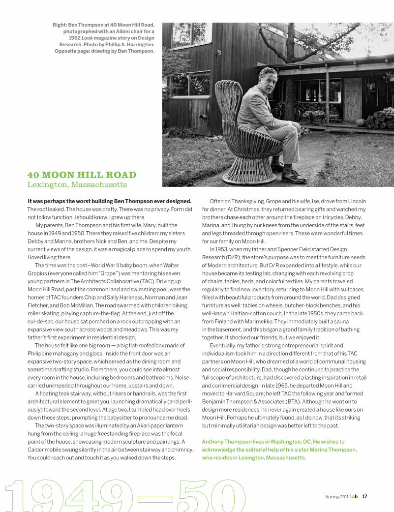
My parents, Ben Thompson and his first wife, Mary, built the
house in 1949 and 1950. There they raised five children: my sisters
Debby and Marina, brothers Nick and Ben, and me. Despite my
current views of the design, it was a magical place to spend my youth.
I loved living there.
The time was the post–World War II baby boom, when Walter
Gropius (everyone called him “Grope”) was mentoring his seven
young partners in The Architects Collaborative (TAC). Driving up
Moon Hill Road, past the common land and swimming pool, were the
homes of TAC founders Chip and Sally Harkness, Norman and Jean
Fletcher, and Bob McMillan. The road swarmed with children biking,
roller skating, playing capture-the-flag. At the end, just off the
cul-de-sac, our house sat perched on a rock outcropping with an
expansive view south across woods and meadows. This was my
father’s first experiment in residential design.
The house felt like one big room — a big flat-roofed box made of
Philippine mahogany and glass. Inside the front door was an
expansive two-story space, which served as the dining room and
sometime drafting studio. From there, you could see into almost
every room in the house, including bedrooms and bathrooms. Noise
carried unimpeded throughout our home, upstairs and down.
A floating teak stairway, without risers or handrails, was the first
architectural element to greet you, launching dramatically (and peril-
ously) toward the second level. At age two, I tumbled head over heels
down those steps, prompting the babysitter to pronounce me dead.
The two-story space was illuminated by an Akari paper lantern
hung from the ceiling; a huge freestanding fireplace was the focal
point of the house, showcasing modern sculpture and paintings. A
Calder mobile swung silently in the air between stairway and chimney.
You could reach out and touch it as you walked down the steps.
Often on Thanksgiving, Grope and his wife, Ise, drove from Lincoln
for dinner. At Christmas, they returned bearing gifts and watched my
brothers chase each other around the fireplace on tricycles. Debby,
Marina, and I hung by our knees from the underside of the stairs, feet
and legs threaded through open risers. These were wonderful times
for our family on Moon Hill.
In 1953, when my father and Spencer Field started Design
Research (D/R), the store’s purpose was to meet the furniture needs
of Modern architecture. But D/R expanded into a lifestyle, while our
house became its testing lab, changing with each revolving crop
of chairs, tables, beds, and colorful textiles. My parents traveled
regularly to find new inventory, returning to Moon Hill with suitcases
filled with beautiful products from around the world. Dad designed
furniture as well: tables on wheels, butcher-block benches, and his
well-known Haitian-cotton couch. In the late 1950s, they came back
from Finland with Marimekko. They immediately built a sauna
in the basement, and this began a grand family tradition of bathing
together. It shocked our friends, but we enjoyed it.
Eventually, my father’s strong entrepreneurial spirit and
individualism took him in a direction different from that of his TAC
partners on Moon Hill, who dreamed of a world of communal housing
and social responsibility. Dad, though he continued to practice the
full scope of architecture, had discovered a lasting inspiration in retail
and commercial design. In late 1965, he departed Moon Hill and
moved to Harvard Square; he left TAC the following year and formed
Benjamin Thompson & Associates (BTA). Although he went on to
design more residences, he never again created a house like ours on
Moon Hill. Perhaps he ultimately found, as I do now, that its striking
but minimally utilitarian design was better left to the past.
Anthony Thompson lives in Washington, DC. He wishes to
acknowledge the editorial help of his sister Marina Thompson,
who resides in Lexington, Massachusetts.
40 Moon Hill RoadLexington, Massachusetts
Right: Ben Thompson at 40 Moon Hill Road, photographed with an Albini chair for a
1962 Look magazine story on Design Research. Photo by Phillip A. Harrington.
Opposite page: drawing by Ben Thompson.

18 ab | ArchitectureBoston
Boylston Hall after its 1959 renovation. Photo courtesy Harvard News Office.
When Ben Thompson, then a principal of The Architects
Collaborative, remodeled Harvard’s Boylston Hall in 1959, it had
already undergone a century of expansion and renovation. But none
of the previous modifications was as startling or influential as his
thoroughly Modern approach.
Originally designed by Paul Schulze as a chemistry laboratory
and museum, Boylston Hall was built in 1857 in an Italian
Renaissance style. In 1871, Peabody & Stearns topped the Italian
palazzo base with a Second Empire mansard story, providing an
additional floor. Over the next 50 years, the building was renovated
several more times.
In 1959, Harvard hoped to build a center for the study of modern
languages on the site of Boylston Hall but was constrained by the
terms of the donor’s bequest from razing the antiquated building.
Charged with remodeling the structure, Thompson faced an
ambitious task, requiring a 40 percent increase in floor area.
Unlike Peabody & Stearns, Thompson and his team intended to
transform the building from the inside. The solution was to insert
new floors into the monumental floor-to-floor heights of the original
building — in effect, inserting a new office building into the historic
structure. Two principles of European Modernism were well suited to
this problem: the “free plan,” a floor plan that serves as a neutral
canvas; and the “free façade,” a building enclosure that is untied to
the organization of the interior space. But the Boylston “free façade”
was not a Modern construction at all; it was instead the historic
granite mass.
The architects showcased their Modern interior through sheets
of glass fitted to the stone openings with minimal steel frames,
inventing a new window system incorporating a spandrel panel to
accommodate the new floor level and a minimal vertical mullion
to allow office partitions to be framed to the center of the window
openings. This treatment radically transformed the architecture of
the building.
The appeal of the design was immediate. First, in an environment
Boylston Hall, HaRvaRd UniveRsityCambridge, Massachusetts
in which tradition was revered, it had a refreshingly subversive
quality: the new design brilliantly opposed the restraints of the
building’s history and multiple styles. Second was its utopianism.
New office floors replaced the historic stair hall and chambers with
neutral space; people animated the building. Third was its assertion
of flexibility; its repetitive elements offered an aesthetic of systems
design that was synonymous with the Modern Movement.
Thompson’s solution is still powerful because of its unspoken
connections to the traditions of American Modernism. Providing
views to the interior was a generous act of openness unique in
Harvard Yard, where buildings were typically shuttered by the grill-
like character of historic windows; it continues to be an invitation to
engage in the building. The drive to reduce and simplify, dramatized in
this design through the geometry of wall and void, is a fundamentally
American impulse at the root of this country’s embrace of Modernism;
here was a historic building that was suddenly spare and abstract.
Finally, Thompson’s precise aesthetic reveals a reverence for craft as
a fusion of beauty and usefulness; historic granite and modern glass
are valued equally and brought into a harmony independent of
traditional styles.
Ben Thompson’s work evolved from these qualities of engagement,
abstraction, and craftsmanship by always transforming problems
into aesthetic opportunities. His was the anti-authoritarian world
of the craftsman and artist who builds with material fact, speaks of
common life, and invents from necessity. Thompson’s work was cool
in the ’60s because it reflected the aspirations of its time. The lesson
of Boylston Hall today is a vision of tradition invigorated by modern
life, of past and present beautifully joined in the contrast of the
abstract order of its architecture and the emotional impact of stone
and glass.
Robert Olson aia is the principal of Robert Olson + Associates in
Boston, which completed an extensive renovation of Boylston
Hall in 1998.

Spring 2011 | ab 19
The Design Research building has won architecture’s highest
honors, yet it is rarely discussed purely as an architectural icon;
conversations usually include a stew of memories from the D/R
retailing story that birthed it: loving Marimekko; watching the people,
products, and activity from the outside in; discovering a store that
felt like a party everyone was invited to.
Ben wouldn’t have had it any other way.
“Any architecture must be secondary to people.”
When I worked at BTA, I was swept up by Ben’s humanist
approach to design. To him, architecture was a backdrop for the living
of a joyful and dynamic life; he had little interest in the creation of
architectural masterpieces. D/R was designed to serve other
passions: the seduction of “must have” merchandise, the buzz of
a bustling market, the poetry and energy of movement.
A “non-building” (Ben’s term), D/R was the quintessential
product of that approach: a showcase for beautifully designed
merchandise that didn’t compete with its surroundings. Its
ethereal design consists of floating minimalist concrete slabs
cantilevered from raw concrete columns, enclosed by a totally
transparent glass skin. Its open corners invite the world in, and the
faceted façade combines reflection and transparency, in what
Ben described as a “kaleidoscope of people, shadows, buildings,
and clouds.”
“If you can see it, you want it.”
Ben loved the products he sold, believed in their ability to enrich
life and home, and understood how to showcase them.
“If you can see it, you want it,” he would say, and the D/R building
embodied that philosophy as one large, multifloored display window.
We see all-glass design in today’s Apple stores, but in 1968, it was a
revolutionary retail concept. The building’s transparent skin erased
the distinction between interior and exterior, leading the 1971 BSA
Honor Award Jury to note that “the life of the building extends to the
life of the street.” The brick sidewalks continue into the interior, which
Ben described as a “high, airy lobby, not unlike the plaza where a
festive street bazaar is in progress.”
The interior kept shoppers moving through the store: Staggered
half floors beckoned upstairs — the climb up short stair runs
seemed inviting, not daunting, thus solving an eternal challenge for
retailers. On every floor, an open, wall-less plan, enhanced by natural
materials — brick, wood, sisal, and cork — complemented the merch-
andise and the building structure, creating an endless showroom.
Ben’s worldview shaped a design philosophy that valued research
and experience over intellectual theories. I remember working on
a handrail design and being sent out into Harvard Square to find and
feel well-designed handrails. Ben always strived for excellence and
enjoyed researching new ideas. D/R’s famous glass skin itself is an
example. It began as a conventional storefront system with mullions
but, when the design team discovered a new technology allowing
glass to be engineered as free-floating unframed panels with silicone
joints and metal clips, Ben approved the innovative system, which
was new to the US market.
“Markets depend on movement.”
What is Harvard Square without window-shopping, and what is
the D/R building if not window-shopping on a grand scale? It mined
the connection between products and people, magnifying the
activity inside.
“Good markets and fairs thrive on movement and action,” Ben
said. “They don’t happen in architectural ‘masterpieces,’ but in
lively spaces that mix people and functions.” In its visible, market-
inspired bustle, the D/R building glowed out to the street,
particularly at night.
It still does. Now on its third retailer and fourth decade, its faceted
glass box endures, and I can’t imagine Harvard Square without it.
Wendy Prellwitz aia is a founding principal of Prellwitz Chilinski
Associates in Cambridge, Massachusetts. She was a designer at
BTA from 1976 to 1980.
D/R building in 1969, before the 1970 construction of 44 Brattle Street (to left of photo) by Sert, Jackson and Associates, which, with buildings by TAC and Earl R. Flansburgh on Story Street, constructed for their own offices, formed “Architects’ Corner.” Photo by Ezra Stoller © Esto.
design ReseaRcHCambridge, Massachusetts
20 ab | ArchitectureBoston
It is easy these days to dismiss Quincy Market — as the Faneuil
Hall Marketplace is commonly known. The whole idea of an urban
“festival marketplace” is now so familiar as to be uninteresting; an idea
exhausted by multiple, unworthy imitators across American cities,
(while still influential and being discovered across rapidly urbanizing
Asia). Still, although the activities of shopping, dining, and people
watching (not to mention juggler- and clown-watching) are common-
place, the place itself remains, well, distinctive, special, venerable.
Whereas the Design Research building (as Cantabrigians still refer
to Thompson’s other landmark of retail architecture) is about the
display of the things inside, and so is dependent on being full, the
Market is about a place in the city and the appeal of a promenade.
The appeal of the Marketplace has never been primarily about the
stuff being sold there, as critical as sales are to its financial stability.
Ben Thompson was among the first Modernists to figure out the
power of intertwining history, commerce, and leisure in the cause of
contemporary urbanity. Even as the enclosed, “atrium-ed” suburban
shopping malls were gaining popularity, Thompson foresaw that
a simulacrum of a traditional street was ultimately unlikely to be as
satisfying as the real thing. Yet he understood that the traditional
street required modernization, not to accommodate cars, but to
rev up the attributes of promenading for a modern society. The
magic of Quincy Market lies in the seductions, encounters, and small
pleasures experienced along a walk.
A certain urbanistic alchemy was required to revive the
downtrodden downtown in the mid-1970s. Saving some parts of the
city’s heritage from the prowling imminent wrecking ball of urban
renewal was key. To come upon these reimagined long-shuttered
warehouses when they first opened was to experience something
short of a miracle. The setting seemed at once modern yet historic,
unprecedented yet traditional, certainly new but somehow also
familiar, and now meant to be enjoyed! It was uncanny to discover
that these utilitarian, everyday structures — in a Bostonian’s
memory forever grimy, decrepit, and inaccessible — could be
marvelous porous containers capable of accommodating goods
and people in equal measure. Faneuil Hall’s restored presence and
historic status surely added to the aura, but it is precisely the casual
embrace of a national landmark, not its dominance, that resonated
for a modern culture of flaneurs. The Market also reintroduced
suburbanites to the pleasures of visiting downtown and reassuring
them that it was safe to do so.
What’s more, a long civic corridor had materialized, tying the
newest urban-renewed parts of the city to one of its oldest precincts.
A connection was made between the then recently completed, heroic
yet somewhat unsettling Government Center and Boston’s ancient,
fitfully reawakening waterfront. This was a gift. City Hall and its Plaza
had tried their darnedest to turn their back to the old Dock Square
and its dilapidated structures from a bygone era. But here was
sprung a “bridge” from the present to the past, with the bridging
elements themselves being old and new. City Hall Plaza, not often
loved, would surely be less visited, and less tolerated, were it not
for the adjacent marketplace serving as its counterpoint. And the
waterfront, too, would be less often reached were it not for the
funneling outward from the Market.
No matter that Bostonians take Quincy Market for granted
these days. Thanks to Ben Thompson’s intuitive understanding
of the importance to cities of experiential, tactile, visual, olfactory
connectivity, the Marketplace revived the pulse of the city, once
again becoming the fulcrum of the city center’s public realm.
Though largely ceded to a visitor economy, and perhaps over-
programmed, the Marketplace reminds us well of the primal
pleasures of city life.
Alex Krieger faia is a principal of Chan Krieger NBBJ in Cambridge,
Massachusetts, and professor in practice of urban design at the
Harvard Graduate School of Design.
FaneUil Hall MaRKetPlace (QUincy MaRKet)Boston, Massachusetts
Photo © 1977 Steve Rosenthal.

Spring 2011 | ab 21
It was the early ’80s, and Ben Thompson’s design practice was at
its height of productivity following the resounding success of Faneuil
Hall Marketplace. The focus of the practice was clear: seeking the
perfect balance between Modernism, which represented the firm’s
true roots, and the very essence of what makes a building or a city
livable and vibrant.
Then along came a new commission for Ben and a new building
type for BTA — the Ordway Music Theater. With it came the beginning
of a new era in theater design.
The design effort on the Ordway began, as always, by learning all
we could of recent precedents for this particular building type. The
discovery startled us: architectural Modernism had not been good
for the performing arts. Actors, directors, musicians, and conductors
all largely reviled the results. The theater design giants of the time,
Kevin Roche and John Dinkledoo, Caudill Rowlett and Scott, and Max
Abramovitz, to name but a few, had seemingly fallen victim to too
much “form follows function,” too much acoustical engineering, and
too much architectural democracy.
The theater and concert hall work of the 1960s and ’70s
represented a large body of publicly funded structures, each aimed
at reaching maximum audience capacity, efficiency, and acoustical
perfection. The structures were monumental in scale — sometimes
scale-less. Auditoriums featured “acoustically shaped” walls and
ceilings. Floor plans emphasized crowd management: continental
seating, with seemingly endless rows of identical seats, swiftly
moved patrons to and from their adjacent parked cars. The buildings
were grand, with soaring lobbies and gigantic staircases, but
something just wasn’t right. The patron experience had been boiled
down to the bare essentials of functionality. The ceremony and
celebration of attending a live performance with others had been
designed out of the overall experience.
Equally distressing was the experience of the performers onstage.
They looked out into a venue with overwhelming scale, a sea of
human bodies. The actor, the musician, the conductor — still the
same size as ever — suddenly seemed diminished and unable to
artistically or emotionally connect with the blur of anonymous faces.
So our design-precedent search rolled back the clock and largely
skipped the latest decades of design. We looked at venues across
the globe, some hundreds of years old. After months of slideshow
immersion, we began to define the essentials of why these historic
buildings worked so well and were so revered: We needed aisles —
for it is in the aisles that we meet friends and share in the common
enjoyment of the arts. And why not have people “on the walls”? Not
only is it great to see other happy patrons smiling back at you, but the
proximity of those very patrons also connects the performers with
their audience.
Once we discovered that acoustician Larry Kirkegaard shared
these observations, we soon learned that boxes, balconies, aisle
railings — all the elements that served our humanistic goals — made
a positive contribution to the natural acoustical qualities of the room.
Somehow these attributes had been lost.
And so the Ordway Music Theater design journey began,
combining a new understanding of performance spaces with BTA’s
experience with urban theater, pulling the excitement of the
performing arts into the city itself. After its heralded opening in 1985,
the design community took notice; a new paradigm had been set.
Hardly a performance hall has since been built, regardless of its
signature style, that does not populate the walls with people, gather
them in aisles, and foster a celebration of the arts. That’s the legacy
of the Ordway.
Scott Wilson aia is a principal of Wilson Butler Architects in
Boston. From 1981 to 1993, he was a designer at BTA, where he
was project architect for the Ordway Theater and the Broward
Center for the Performing Arts, which his firm is currently
renovating.
Photo © 1985 Steve Rosenthal.
oRdway MUsic tHeateRSt. Paul, Minnesota