the lumineers analysis
TRANSCRIPT
T H E
L U M I N E E R SA N A L Y S I S
I C O N O G R A P H Y
The clothing of the characters in this image is iconic of the indie/folk genre and therefore makes the band more
obviously related to this genre, meaning people who favour this specific music type may find this
album easy to approach once they’ve come into contact with the
advertisement due to it holding so much information about the band just
from the clothing they’re wearing.
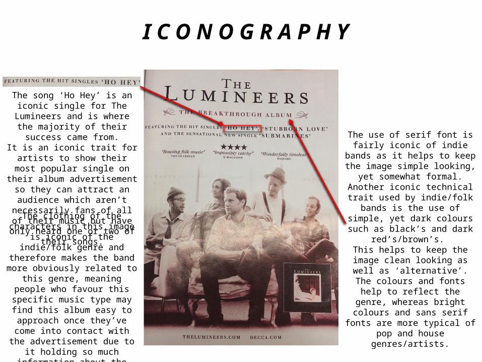
The song ‘Ho Hey’ is an iconic single for The Lumineers and is where the majority of their success came from.It is an iconic trait for artists to show
their most popular single on their album advertisement so they can attract an audience which aren’t
necessarily fans of all of their music but have only heard one or two of
their songs.
The use of serif font is fairly iconic of indie bands as it helps to keep the
image simple looking, yet somewhat formal. Another iconic technical trait used by indie/folk bands is the use of
simple, yet dark colours such as black’s and dark red’s/brown’s.
This helps to keep the image clean looking as well as ‘alternative’. The
colours and fonts help to reflect the genre, whereas bright colours and sans serif fonts are more typical of
pop and house genres/artists.
C H A R A C T E R S
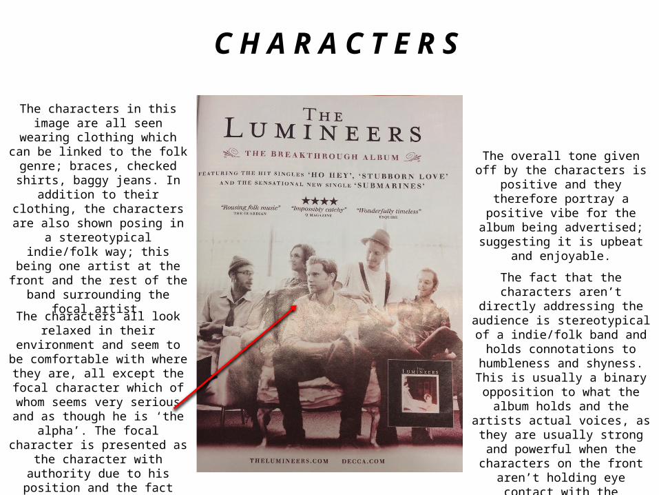
The characters in this image are all seen wearing clothing which can be
linked to the folk genre; braces, checked shirts, baggy jeans. In addition to their clothing, the
characters are also shown posing in a stereotypical indie/folk way; this
being one artist at the front and the rest of the band surrounding the focal
artist.
The characters all look relaxed in their environment and seem to be
comfortable with where they are, all except the focal character which of whom seems very serious and as though he is ‘the alpha’. The focal
character is presented as the character with authority due to his position and the fact that he seems
bigger than his surrounding characters.
The overall tone given off by the characters is positive and they
therefore portray a positive vibe for the album being advertised;
suggesting it is upbeat and enjoyable.
The fact that the characters aren’t directly addressing the audience is
stereotypical of a indie/folk band and holds connotations to humbleness
and shyness. This is usually a binary opposition to what the album holds and the artists actual voices, as they
are usually strong and powerful when the characters on the front aren’t
holding eye contact with the audience.
S E T T I N G
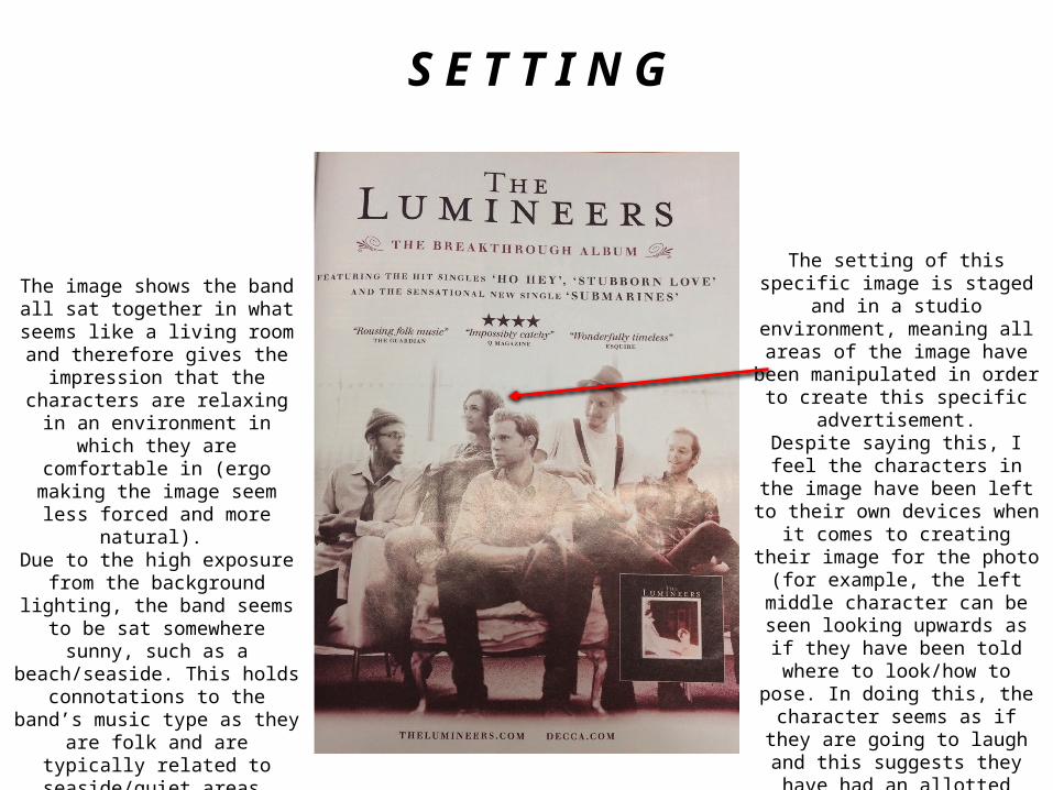
The image shows the band all sat together in what seems like a living
room and therefore gives the impression that the characters are
relaxing in an environment in which they are comfortable in (ergo making the image seem less forced and more
natural). Due to the high exposure from the
background lighting, the band seems to be sat somewhere sunny, such as a
beach/seaside. This holds connotations to the band’s music type
as they are folk and are typically related to seaside/quiet areas.
The setting of this specific image is staged and in a studio environment, meaning all areas of the image have been manipulated in order to create
this specific advertisement.Despite saying this, I feel the
characters in the image have been left to their own devices when it comes to creating their image for the photo (for
example, the left middle character can be seen looking upwards as if
they have been told where to look/how to pose. In doing this, the character seems as if they are going to laugh and this suggests they have
had an allotted amount of freedom in their positionings).
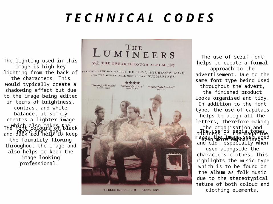
T E C H N I C A L C O D E S
The use of serif font helps to create a formal approach to the
advertisement. Due to the same font type being used throughout the
advert, the finished product looks organised and tidy.
In addition to the font type, the use of capitals helps to align all the letters, therefore making the organisation and tidiness of the magazine even
more emphasised.
The use of sepia tones makes the image seem aged and old, especially when used alongside the characters
clothes. This highlights the music type which is to be found on the album as
folk music due to the stereotypical nature of both colour and clothing
elements.
The lighting used in this image is high key lighting from the back of the
characters. This would typically create a shadowing effect but due to the
image being edited in terms of brightness, contrast and white
balance, it simply creates a lighter image which also makes the photo
seem aged.
The font colours of black and dark red help to keep the formality flowing
throughout the image and also helps to keep the image looking
professional.