the designer's guide to typography
DESCRIPTION
a type workbook to assist designer's in what's right and wrong in typographyTRANSCRIPT

THE DESIGNER’S GUIDE TO:
TYPOGRAPHY

Designed by Amber Peebles
For Typography 02—Eppelheimer
At the University of Kansas, Spring 2013
Text for the book from source:
Mac is Not A Typewriter by Robin Williams
This book is not to be sold to the public and is intended
to be used by the designer as a learning tool and typographic reference.
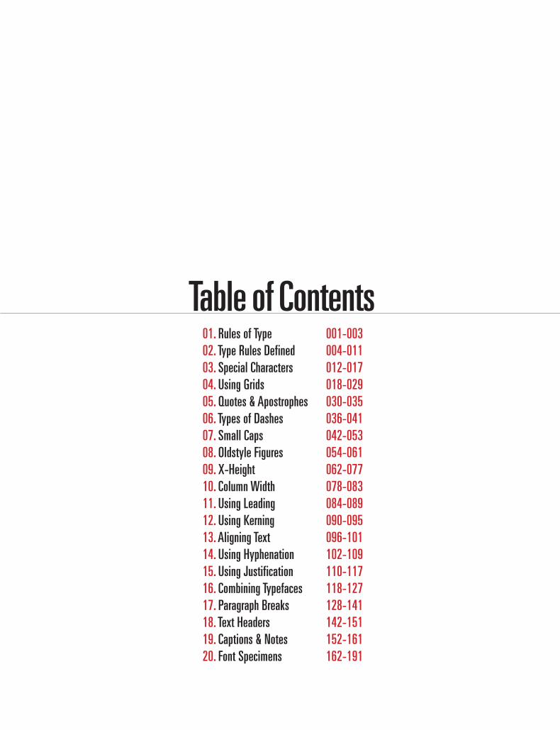
Table of Contents01. Rules of Type 02. Type Rules Defined 03. Special Characters 04. Using Grids 05. Quotes & Apostrophes 06. Types of Dashes 07. Small Caps 08. Oldstyle Figures 09. X-Height 10. Column Width 11. Using Leading 12. Using Kerning13. Aligning Text 14. Using Hyphenation 15. Using Justification 16. Combining Typefaces 17. Paragraph Breaks 18. Text Headers 19. Captions & Notes 20. Font Specimens
001-003004-011012-017018-029 030-035036-041042-053054-061062-077078-083084-089090-095096-101102-109110-117118-127128-141142-151152-161162-191

/1
RULES OF TYPE

Rules of Type
The following is a compendium of the rules established in this book. You might want to check through them each time you complete a publication.
Rules 1-27

/03Rules of Type
one
Typographic Rules 1. Insert only a single space after all punctuation. 2. Use proper ‘em’ dashes, ‘en’ dashes, and hyphens. 3. Use proper quote and apostrophe marks. 4. Use true small caps. 5. Add letter spacing to capitalized text and small caps. 6. Use old style figures when appropriate. 7. Use caps properly. 8. Use the ellipsis character and not three periods. 9. Use copyright, register, and trademark marks properly.10. Avoid underlined text.11. Increase line spacing to improve readability in body text.12. Use 9-12 points for body copy.13. Don’t alter the original typeface.14. Use serifs and sans serifs in appropriate places. 15. Decrease line length and increase margins.16. Avoid letterspacing lowercase body copy.17. Word spacing should be fairly close.18. Use ideal column widths. 19. Justification can be appropriate in certain places. 20. Choose the alignment that fits.21. Use kerning in headlines. 22. Avoid beginning three consecutive lines with the same word.23. Always spell check. 24. Avoid widows and orphans.25. Don’t rely on software to judge where hyphens should be placed.26. In continuous text, mark paragraphs after the first with an indent.27. Items in a series do not use a comma before the word “and.”


/5
TYPE RULES DEFINED
1.2.3.4.5.6.
Typographic Rules 1-27 Defined.
…
Type Rules Defined
/07
twoType Rules Defined
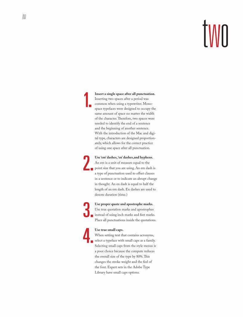
Insert a single space after all punctuation.Inserting two spaces after a period was common when using a typewriter. Mono-space typefaces were designed to occupy the same amount of space no matter the width of the character. Therefore, two spaces were needed to identify the end of a sentence and the beginning of another sentence. With the introduction of the Mac and digi-tal type, characters are designed proportion-ately, which allows for the correct practice of using one space after all punctuation.
Use ‘em’ dashes, ‘en’ dashes,and hyphens. An em is a unit of measure equal to the point size that you are using. An em dash is a type of punctuation used to offset clauses in a sentence or to indicate an abrupt change in thought. An en dash is equal to half the length of an em dash. En dashes are used to denote duration (time.)
Use proper quote and apostrophe marks. Use true quotation marks and apostrophes instead of using inch marks and feet marks. Place all punctuations inside the quotations.
1.
Use true small caps.When setting text that contains acronyms, select a typeface with small caps as a family. Selecting small caps from the style menus is a poor choice because the compute reduces the overall size of the type by 80%. This changes the stroke weight and the feel of the font. Expert sets in the Adobe Type Library have small caps options.
2 .
3 .4 .
Kern capitalized text and small caps. Letterspacing is the amount of space be-tween characters in a word. Some software programs caller letterspacing tracking. Use positive number values (to about 2 or 3) to open up letterspacing to capitalized text and small caps, except when periods are used between characters.
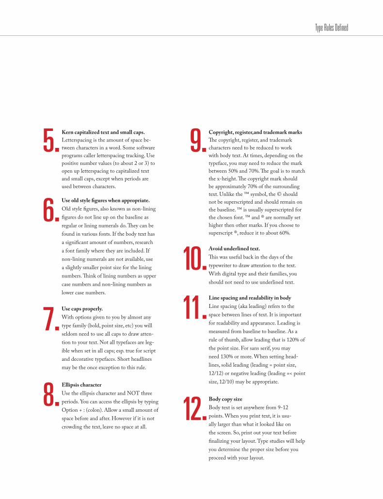
5 . Copyright, register,and trademark marks The copyright, register, and trademark characters need to be reduced to work with body text. At times, depending on the typeface, you may need to reduce the mark between 50% and 70%. The goal is to match the x-height. The copyright mark should be approximately 70% of the surrounding text. Unlike the ™ symbol, the © should not be superscripted and should remain on the baseline. ™ is usually superscripted for the chosen font. ™ and ® are normally set higher then other marks. If you choose to superscript ®, reduce it to about 60%.
9 .
Use old style figures when appropriate. Old style figures, also known as non-lining figures do not line up on the baseline as regular or lining numerals do. They can be found in various fonts. If the body text has a significant amount of numbers, research a font family where they are included. If non-lining numerals are not available, use a slightly smaller point size for the lining numbers. Think of lining numbers as upper case numbers and non-lining numbers as lower case numbers.
6 .
Use caps properly. With options given to you by almost any type family (bold, point size, etc) you will seldom need to use all caps to draw atten-tion to your text. Not all typefaces are leg-ible when set in all caps; esp. true for script and decorative typefaces. Short headlines may be the once exception to this rule.
7 .
Ellipsis character Use the ellipsis character and NOT three periods. You can access the ellipsis by typing Option + : (colon). Allow a small amount of space before and after. However if it is not crowding the text, leave no space at all.
8 .
Avoid underlined text. This was useful back in the days of the typewriter to draw attention to the text. With digital type and their families, you should not need to use underlined text.
10 .Line spacing and readability in bodyLine spacing (aka leading) refers to the space between lines of text. It is important for readability and appearance. Leading is measured from baseline to baseline. As a rule of thumb, allow leading that is 120% of the point size. For sans serif, you may need 130% or more. When setting head-lines, solid leading (leading = point size, 12/12) or negative leading (leading =< point size, 12/10) may be appropriate.
11 .
Body copy size Body text is set anywhere from 9-12 points. When you print text, it is usu-ally larger than what it looked like on the screen. So, print out your text before finalizing your layout. Type studies will help you determine the proper size before you proceed with your layout.
Type Rules Defined
12 .
/09Type Rules Defined
Altering fonts Don’t alter the original typeface by stretch-ing or condensing the letters improperly. Certain type families provide you with a lot of flexibility, so you should not need to destroy/alter text.
13 . Word spacing should be fairly close. For text meant for extended reading, the amount of space between words in a paragraph should be fairly close–about the width of a lowercase “i.” If the word spacing is too close, it appears as one giant word and legibility is decreased. Keep the spaces between words fairly thin, and consistent. Legibility of fonts
Sans serif typefaces work well for headlines and to set text that is aligned to vertical/horizontal lines. Certain sans serif typefaces which are not very geometrical work well for body copy (Frutiger, Meta, Scala, etc.)
14 .Decrease line length and increase margins.Line length is a measure of text on one line. Any measure between 45 and 75 characters is comfortable for single column widths. The ideal measure for body text length is 66 characters (counting both letters, punctua-tion, and spaces.) For multiple columns, a measure between 40-50 characters is ideal.
15 .
Avoid letterspacing lowercase body copy. Don’t letterspace body copy as it really hampers legibility. Use letterspacing when working with caps. small caps, numbers and display text where looser type spacing may increase legibility.
16 .
Ideal column width For single-column pages, 4.25 inches is ideal. For two-column width, columns can be as narrow as 2 inches. Turning on the hyphenation feature can improve word spacing and you’ll avoid 3 hyphens in a row.
18 .Justification of textJustification can be appropriate in certain places. However, it can create certain problems such as rivers and word spacing. Adjusting size of margins, decreasing body copy size, turning on auto hyphenatation and manually hyphenating the text are all examples of possible solutions.
19 .
Choose the alignment that fits.Make sure the alignment chosen for all areas of text are legible and consistent with the design and guidelines. Left-aligned text is easier to read and set. Justified text is harder to set w/o inevitable word spacing problems. Right-aligned and centered are generally not used for body copy.
20 .
17.
Kerning in headlines Adjust the space between two particular letters to allow for more consistent negative sapce. Larger type calls for more kerning.
21 . Rules of hyphenation Don’t rely on the software to judge where hyphens should be placed. At the end of lines, leave at least two characters behind and take at least three forward. For exam-ple, “ele-gantly” is acceptable, but “elegant-ly” is not because it takes too little of the word to the next line. Avoid leaving the stub end of a hyphenated word or any word shorter then four letters as the last line of a paragraph. Avoid more then 3 consecutive hyphenated lines. Avoid hyphenating or breaking proper names and titles. Creating a non-breaking space before and after the name will ensure no break.
25 .Same words for three consecutive linesSince software programs deal with line breaks automatically based upon a number of variables, it is possible to have paragraphs with consecutive lines beginning with the same word. When this happens simply adjust the text to avoid/fix the problem.
22 .
Always spell check.Once you are finished with your design, spell check the text using both of the following: A. Use spell=check option that comes with the software you are using for the project. B. Print the document and read it. The monitor and design of the document will make text look perfect when it may not be. Even if text is given to you by a client, check it. Never ever assume that it is correct. Keep a dictionary close as well.
23 .
Avoid widows and orphans.Widows are either single words alone on a line or single sentences alone on a new page. Orphans are single lines of copy alone at the end of a page.
24 .
IndentsIn continuous text, mark all paragraphs after the first with an indent of at least one “em” (3 spaces). Do NOT use three spaces but rather use the tabs or indents option in
26 .Items in a series Items in a series do not use a comma before the word “and.” (i.e., ‘peaches, apples and oranges.’) The comma is never needed.
27 .
Type Rules Defined

/11Type Rules Defined
No other design discipline requires so much learning and training as typography.” — Dmitry Kirsanov
“


/13
SPECIAL CHARACTERS
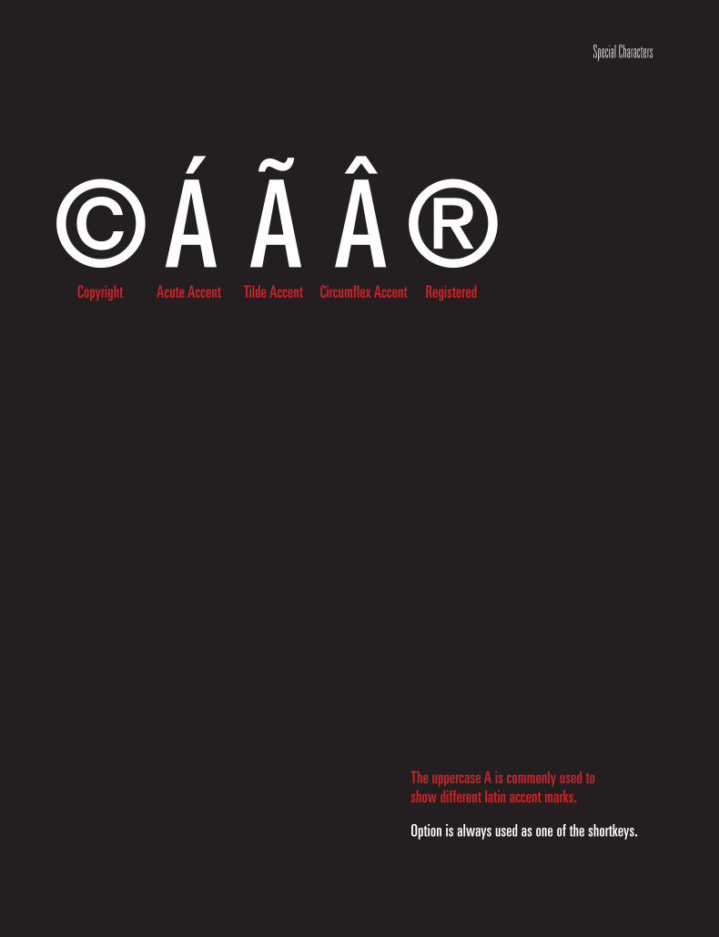
©RegisteredCircumflex Accent Tilde Accent Acute AccentCopyright
®Á à Â
The uppercase A is commonly used to show different latin accent marks.
Option is always used as one of the shortkeys.
Special Characters

/15
The following is a list of the most often-used special characters and accent marks. These are the key combinations for just about every accent you might need when using text.
threeSpecial Characters
Opening Double QuoteClosing Double Quote Opening Single Quote Closing Single Quote
ApostropheEn Dash
Em Dash Ellipsis
Bullet Ligature off an I
Ligature off an L Copyright Trademark Registered
Degree Symbol Cent Symbol Euro Symbol Fraction Bar
Acute Accent Grave Accent
Diaeresis Tilde Accent
Circumflex Accent
“”‘’’–—…•fifl©™®°¢€ ⁄ ´`¨˜ˆ
Option [ Option Shift [Option ]Option Shift ]Option Shift ] Option Hyphen Option Shift Hyphen Option ;Option 8Option Shift 5 Option Shift 6 Option g Option 2 Option r Option Shift 8 Option $ Option Shift 2 Option Shift 1Option eOption ~ Option uOption nOption i

Copyright, Register And Trademark Marks The copyright, register, and trademark characters need to be reduced to work with body text. At times, depending on the typeface, you may need to reduce the mark between 50% and 70%. The goal is to match the x-height. The copyright mark should be approximately 70% of the surrounding text. Unlike the ™ symbol, the © should NOT be superscripted and should remain on the baseline. ™ is usually superscripted for the chosen font. ™ and ® are normally set higher then other marks. If you choose to superscript ®, reduce it by about 60%.
Ellipsis Character Use the ellipsis character and not three periods. You can access the ellipsis by typing Option + : (colon). Allow a small amount of space before and after. However if it is not crowding the text, leave no space at all.
Accent Marks Remember, to set an accent mark over a letter, press the Option key and the letter, then press the letter you want under it.
Special Characters

/17
There is no single approach within typography that applies to everything.” — Shelley Gruendler
“
Special Characters

/19
USING GRIDS
Using Grids
5x5 4x5 3x4
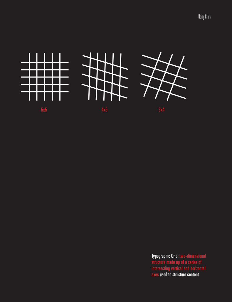
Typographic Grid: two-dimensional structure made up of a series of intersecting vertical and horizontal axes used to structure content

/21
fourUsing Grids
The Grid When Designing a layout and working with text
and/or images the use of a grid is essential, as it
is the basis on which information is organized
and clarified, ensuring legibility. The grid provides
a framework were text, image and space can be
combined into a cohesive manner.
A grid subdivides a page vertically and horizon-
tally into margins, columns, inter-column spaces,
lines of type, and spaces between blocks of type
and images. These subdivisions form the basis of
a modular and systematic approach to the layout,
particularly for multipage documents, making
the design process quicker, and ensuring visual
consistency between related pages.
At its most basic, the sizes of a grid’s compo-
nent parts are determined by ease of reading and
handling. From the sizes of type to the overall
page or sheet size, decision-making is derived
from physiology and the psychology of perception
as much as by aesthetics. Type sizes are generally
determined by hierarchy—captions smaller than
body text and so on—column widths by optimum
word counts of eight to ten words to the line, and
overall layout by the need to group related items.
This all sounds rather formulaic, and easy. But
designers whose grids produce dynamic or very
subtle results take these rules as a starting point
only, developing flexible structures in which their
sensibility can flourish.
Grids often need to be designed to give more
flexibility than the single column of text per page
( Jan Tschichold's grid). This is due to to a change
in our reading patterns. Grid structures have to
accommodate a greater variety of material such as
photographs, illustrations, headings, captions, ref-
erences, charts; they need to be more complicated
than a grid using only text and may utilize more
modules. The design of the grid had to be relevant
to the purpose, and is there as an organizing tool.

Using Grids
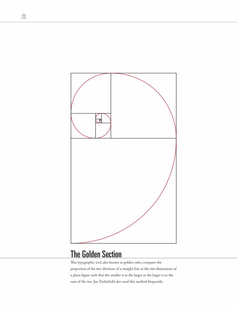
Tschichold GridJan Tschichold popularized a historical reconstruction of a method in the twentith century that is still used in book design to
divide a page in pleasing proportions. The geometric solution works for any page width:height ratio, and enables the book designer
to position the text body in a specific area of the page.
/23Using Grids
The Golden SectionThis typographic tool, also known as golden ratio, compares the
proportion of the two divisions of a straight line or the two dimensions of
a plane figure such that the smaller is to the larger as the larger is to the
sum of the two. Jan Tschichold also used this method frequently.
Using Grids
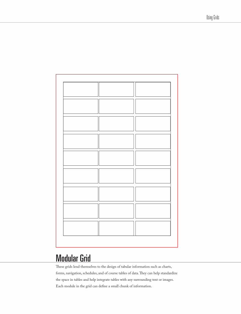
Modular Grid These grids lend themselves to the design of tabular information such as charts,
forms, navigation, schedules, and of course tables of data. They can help standardize
the space in tables and help integrate tables with any surrounding text or images.
Each module in the grid can define a small chunk of information.

/25Using Grids
Typograhic Column GridThese grids are good when discontinuous information needs to be presented. You
might have various asides, pull quotes, etc in your design, which can occupy different
columns in the grid. One column might be reserved for text, another for images, and yet
another for image captions. This leads to a large amount of flexibility when organizing.
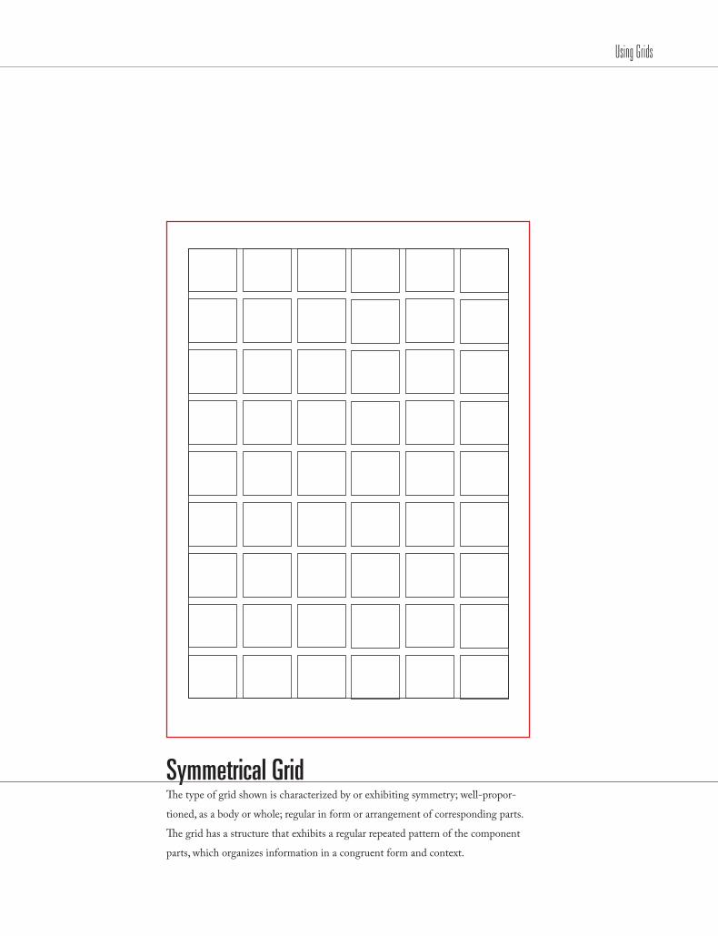
Symmetrical GridThe type of grid shown is characterized by or exhibiting symmetry; well-propor-
tioned, as a body or whole; regular in form or arrangement of corresponding parts.
The grid has a structure that exhibits a regular repeated pattern of the component
parts, which organizes information in a congruent form and context.
Using Grids

/27
Asymmetrical GridThis type of grid is known for asymmetrically organizing the design elements in
a mathematically-constructed way to create visual unity in a composition, but in a
more expressive light. This is opposite of the symmetrical grid style.
Using Grids
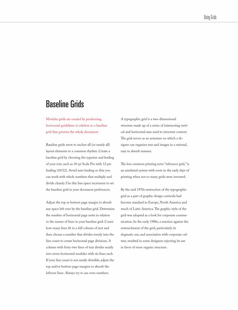
Baseline Grids Modular grids are created by positioning
horizontal guidelines in relation to a baseline
grid that governs the whole document.
Baseline grids serve to anchor all (or nearly all)
layout elements to a common rhythm. Create a
baseline grid by choosing the typesize and leading
of your text, such as 10-pt Scala Pro with 12 pts
leading (10/12). Avoid auto leading so that you
can work with whole numbers that multiply and
divide cleanly. Use this line space increment to set
the baseline grid in your document preferences.
Adjust the top or bottom page margin to absorb
any space left over by the baseline grid. Determine
the number of horizontal page units in relation
to the numer of lines in your baseline grid. Count
how many lines fit in a full column of text and
then choose a number that divides evenly into the
line count to create horizontal page divisions. A
column with forty-two lines of text divides neatly
into seven horizontal modules with six lines each.
If your line count is not neatly divisible, adjust the
top and/or bottom page margins to absorb the
leftover lines. Always try to use even numbers.
A typographic grid is a two-dimensional
structure made up of a series of intersecting verti-
cal and horizontal axes used to structure content.
The grid serves as an armature on which a de-
signer can organize text and images in a rational,
easy to absorb manner.
The less common printing term “reference grid,” is
an unrelated system with roots in the early days of
printing when not so many grids were invented.
By the mid 1970s instruction of the typographic
grid as a part of graphic design curricula had
become standard in Europe, North America and
much of Latin America. The graphic style of the
grid was adopted as a look for corporate commu-
nication. In the early 1980s, a reaction against the
entrenchment of the grid, particularly its
dogmatic use, and association with corporate cul-
ture, resulted in some designers rejecting its use
in favor of more organic structure.
Using Grids

/29
Baseline GridThese specific grids serve to anchor all (or nearly all) layout elements to a common rhythm.
To create a succesful and visually pleasing baseline grid designers start by choosing the typesize
and leading of the textual content that will be used in their composition.
Using Grids


/31
QUOTES & APOSTROPHES

Apostrophe: ’ Opening double quote: “ Closing double quote: ” Opening single quote: ‘ Closing single quote: ’
““‘Type: Option Shift ]Type: Option [Type: Option Shift ]Type: Option [Type: Option Shift ]
’‘ Apostrophe Foot mark Opening double quote Inch mark Opening single quote
Quotes & Apostrophes

/33
QuotesUse true quotation marks and apostrophes
instead of using inch marks and feet marks. Place
all punctuations inside the quotation marks.
Use real quotation marks—never those
grotesque generic marks that actually symbolize
ditto/inch or foot marks: use “and”—not “and”.
Most software applications will convert the
typewriter quotes to t he real quotes for you
automatically as you type. Check the preferences
for your application—you’ll find a check box to
tell your application to automatically set some-
thing like “typographer’s quotes,” “smart quotes,”
or “curly quotes.” Then as you type using the
standard ditto key (“), the software will set the
correct quotation marks for you.
It is necessary to know how to set smart quotes/
real quotes yourself because sometimes the soft-
ware doesn’t do it or does it wrong.
ApostrophesAs an aside, people often are confused about
where the apostrophe belongs. There are a couple
of rules that work very well.
For possessives: Turn the phrase around.
The apostrophe will be placed after whatever
word you end up with. For example, in the phrase
the boys’ camp, to know where to place the
apostrophe say to yourself, “The camp belongs to
the boys.” The phrase the boy’s camp says
“The camp belongs to the boy.”
“The big exception to this is “its.” “Its” used as a
possessive never has an apostrophe! The word it
only has an apostrophe as a contraction — “it’s”
always means “it is” or “it has.” Always.
It may be easier to remember if you recall that
yours, hers, and his don’t use apostrophes—and
neither should its. Ever.
fiveQuotes & Apostrophes

ContractionsThe apostrophe replaces the missing letter.
For example: your’re always means you are; the apostrophe is replacing the a from are. That’s an easy way to distinguish it from your as in your house and to make sure you don’t say: Your going to the store.
As previously noted, it’s means “it is”; the apos-trophe is indicating where the i is left out. Don’t means “do not”; the apostrophe is indicating where the o is left out.
For omission of letters: In a phrase such as Rock ’n’ Roll, there should be an apostrophe before and after the n, because the a and the d are both left out. And don’t turn the first apostrophe around —just because it appears in front of the letter does not mean you need to use the opposite single quote. An apostrophe is still the appropriate mark.
In a phrase such as House o’ Fashion, the apostro-phe takes the place of the f. There is not earthly reason for an apostrophe to be set before the o.
In a phrase such as Gone Fishin’ the same pattern is followed—the g is missing.
In a date when part of the year is left out, an apostrophe needs to indicate the missing year. In the 80s would mean the temperature; In the ’80s would mean the decade. (Notice there is no apostrophe before the s! Why would there be? It is not possessive, nor is it a contraction— it is simply plural.
Quotes & Apostrophes
/35
Bridge Clearance: 16’7”The young man stood 6’2”.The length of the wall is 153’9”.
Quotes & Apostrophes

/37
TYPES OF DASHES
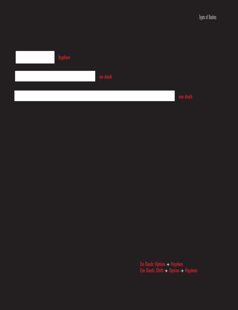
- –—hyphen
en dash
em dash
En Dash: Option + Hyphen Em Dash: Shift + Option + Hyphen
Types of Dashes

/39
— DashesUse proper ‘em’ dashes, ‘en’ dashes, and hyphens.
Never use two hyphens instead of a dash.
Everyone knows what a hyphens is —that tiny
little dash that belongs in some words, like
mother-in-law, or in phone numbers. It’s also
used to break a word at the end of a line.
You might have been taught to use or given
text that uses a double hyphen -- to indicate a
dash. This is a typewriter convention because
typewriters didn’t have the real dash used in
professional typesetting. On a Mac, no one needs
to use the double hyphen—we have a profes-
sional em dash, the long one, such as you see in
this sentence. We also have an en dash, which is
a little shorter than the em dash.
An em is a unit of measure equal to the point
size that you are using. An em dash is a type of
punctuation used to offset clauses in a sentence
or to indicate an abrupt change in thought. An
en dash is equal to half the length of an em dash.
En dashes are used to denote duration (time.)
A hyphen is one third of the em rule and is used
to link words. It serves as a compound modifier
where two words become one, such as x-height.
A hyphen is also used to break works at syllables
in text blocks, such as these.
An en dash is half of the em rule (the width of a
capital N) and is used between words that indicate
a duration, such as time or months or years. Use it
where you might otherwise use the word “to.”
In a page layout application, the en dash can be
used with a thin space on either side of it. If you
want you can kern it so it is not a full space.
The em dash is twice as long as the en dash—it’s
about the size of a capital letter M in whatever
size and typeface you’re using at the moment. This
dash is often used in place of a colon or paren-
theses, or it might indicate an abrupt change in
thought, or it’s used in a spot where a period is too
strong and a comma is too weak. It is also used for
attribution of text. —Mac is not a Typewriter
Our equivalent on the typewriter was the double
hyphen, but now we have a real em dash.
sixTypes of Dashes
Types of Dashes
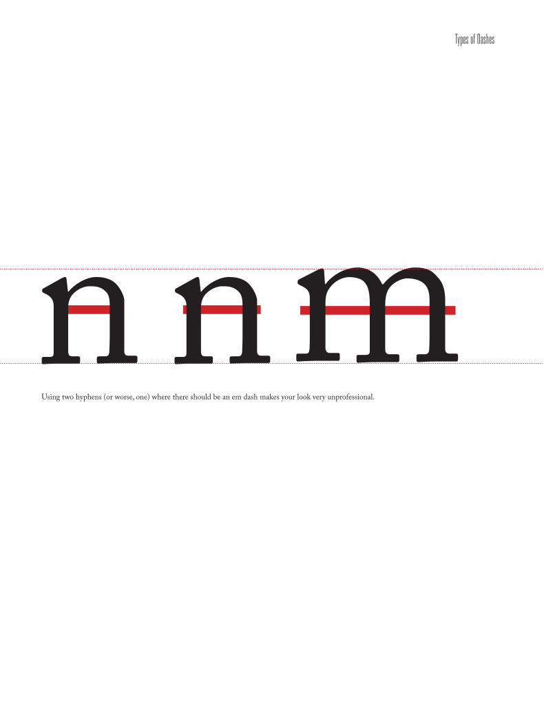
—–‐ nmnUsing two hyphens (or worse, one) where there should be an em dash makes your look very unprofessional.

/41Types of Dashes
—Negative space is magical. Create it. Don’t just fill it up.” —Timothy Samara
“


/43
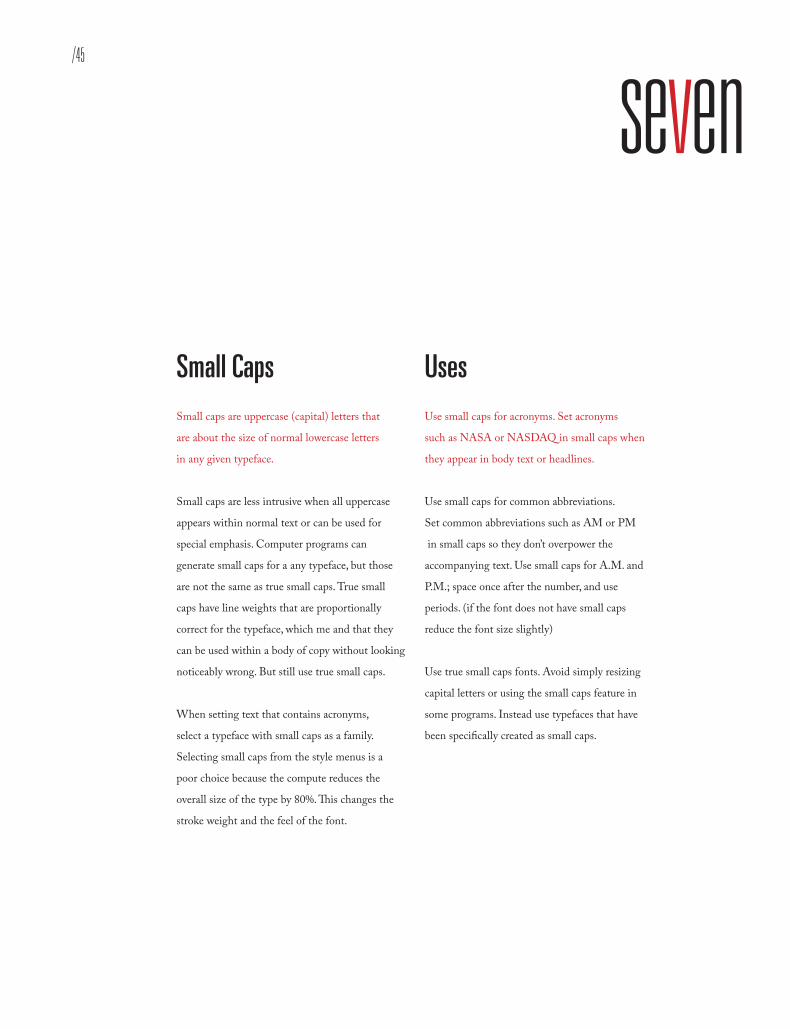
SMALL CAPS

A a AUppercase Lowercase Small Caps
(Fake)
Use small caps for acronyms.Use small caps for abbreviations.Use true small caps fonts.
ASmall Caps
(True)
Small Caps
/45
seven
Use small caps for acronyms.Use small caps for abbreviations.Use true small caps fonts.
Small Caps
Small Caps Small caps are uppercase (capital) letters that
are about the size of normal lowercase letters
in any given typeface.
Small caps are less intrusive when all uppercase
appears within normal text or can be used for
special emphasis. Computer programs can
generate small caps for a any typeface, but those
are not the same as true small caps. True small
caps have line weights that are proportionally
correct for the typeface, which me and that they
can be used within a body of copy without looking
noticeably wrong. But still use true small caps.
When setting text that contains acronyms,
select a typeface with small caps as a family.
Selecting small caps from the style menus is a
poor choice because the compute reduces the
overall size of the type by 80%. This changes the
stroke weight and the feel of the font.
Uses Use small caps for acronyms. Set acronyms
such as NASA or NASDAQ in small caps when
they appear in body text or headlines.
Use small caps for common abbreviations.
Set common abbreviations such as AM or PM
in small caps so they don’t overpower the
accompanying text. Use small caps for A.M. and
P.M.; space once after the number, and use
periods. (if the font does not have small caps
reduce the font size slightly)
Use true small caps fonts. Avoid simply resizing
capital letters or using the small caps feature in
some programs. Instead use typefaces that have
been specifically created as small caps.
Small Caps
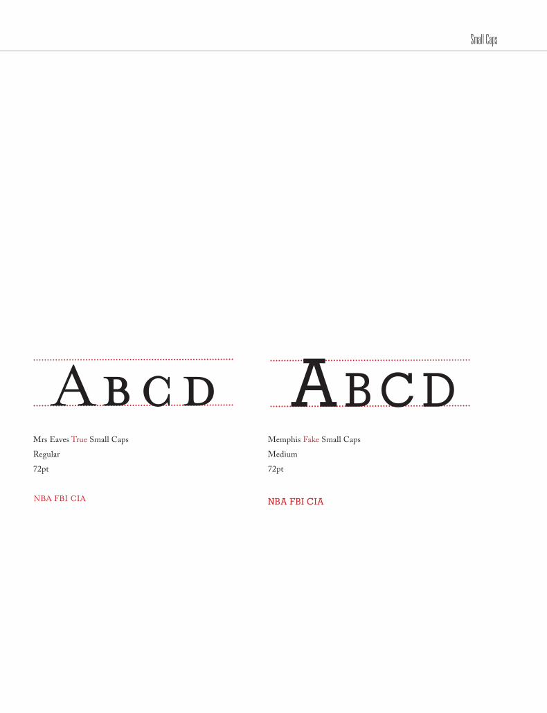
Mrs Eaves True Small Caps
Regular
72pt
Memphis Fake Small Caps
Medium
72pt
NBA FBI CIA NBA FBI CIA
Abcd AB C d

/47Small Caps
Caslon 3 True Small Caps
Roman
72pt
Akzidenz Grotesk Fake Small Caps
Regular
72pt
NBA FBI CIA NBA FBI CIA
Abcd AB C d
Small Caps
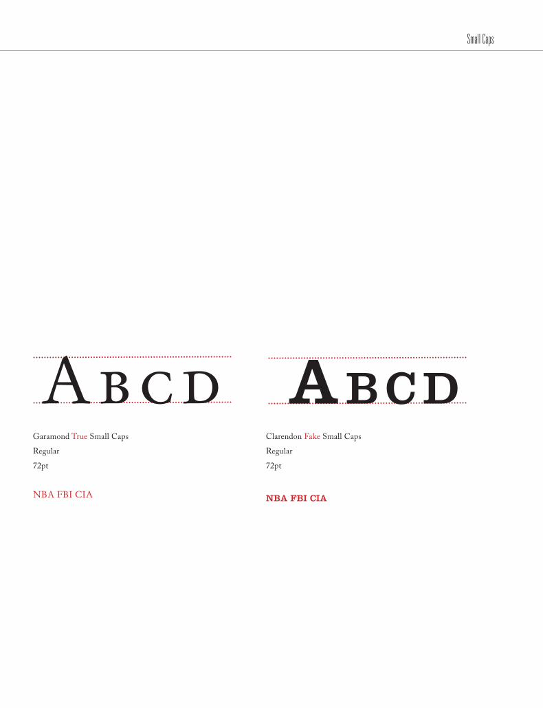
Garamond True Small Caps
Regular
72pt
Abcd AbcdClarendon Fake Small Caps
Regular
72pt
NBA FBI CIA NbA FbI cIA
/49Small Caps
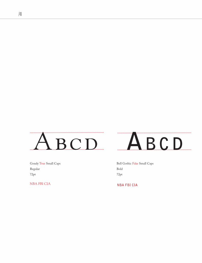
Abcd Ab c dGoudy True Small Caps
Regular
72pt
Bell Gothic Fake Small Caps
Bold
72pt
NBA FBI CIA NbA FbI cIA

Small Caps
New Baskerville True Small Caps
Regular
72pt
Cheltenham Fake Small Caps
Book
72pt
NBA FBI CIA NBA FBI CIA
AB C dAbcd

/51Small Caps
Bodoni True Small Caps
Roman
72pt
Belizio Fake Small Caps
Medium
72pt
NBA FBI CIA NBA FBI CIA
AbcdAbcd
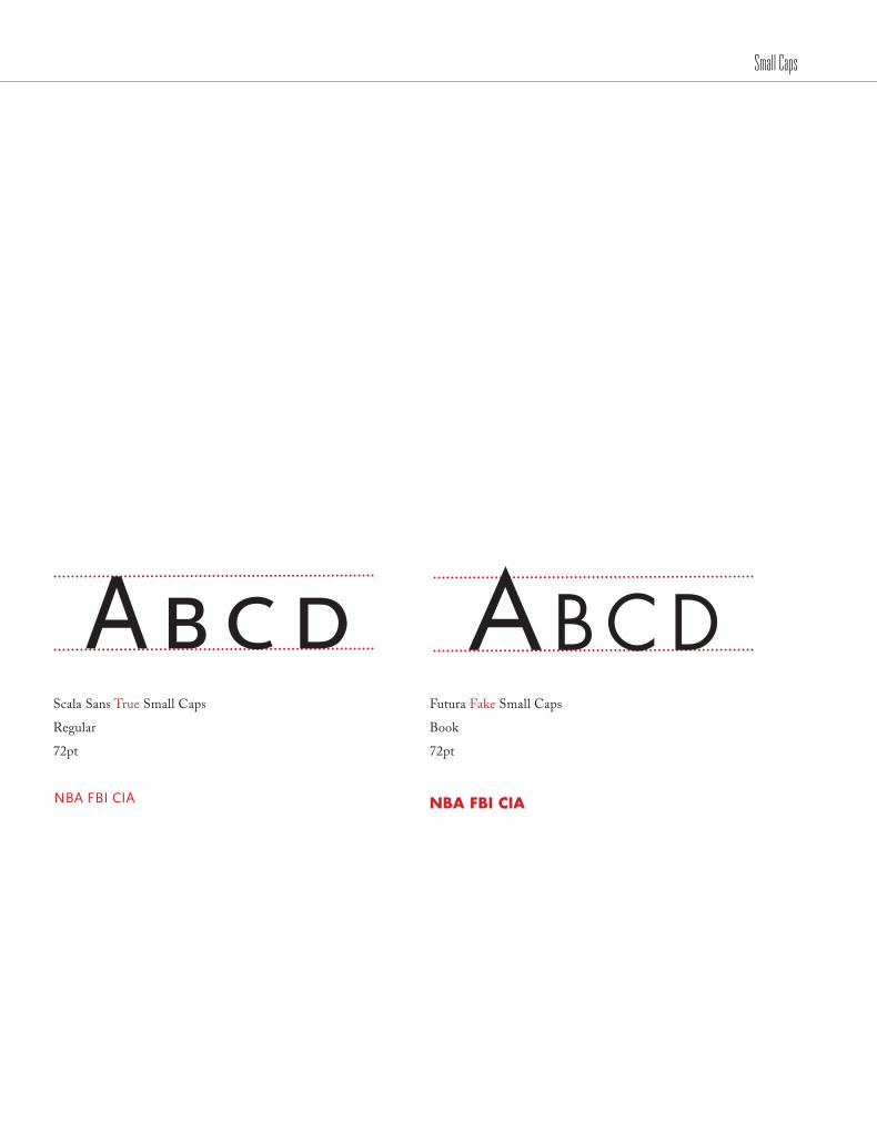
Scala Sans True Small Caps
Regular
72pt
Futura Fake Small Caps
Book
72pt
Small Caps
NBA FBI CIA NBA FBI CIA
Abcd Abcd

/53
Cholla True Small Caps
Wide
72pt
Rockwell Fake Small Caps
Regular
72pt
Small Caps
NBA FBI CIA NBA FBI CIA
Abcd AB C d

/55
OLDSTYLE FIGURES

4389762 4389762
Oldstyle Figures
Regular Figures
Regular (lining) figures (numerals) rest on the baseline. Oldstyle (Non-lining) figures (numerals) have descenders that fall below the baseline. Only some fonts have oldstyle.
Oldstyle Figures
/57
eightOldstyle Figures
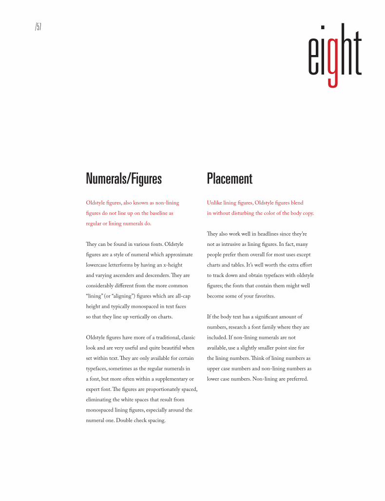
Numerals/FiguresOldstyle figures, also known as non-lining
figures do not line up on the baseline as
regular or lining numerals do.
They can be found in various fonts. Oldstyle
figures are a style of numeral which approximate
lowercase letterforms by having an x-height
and varying ascenders and descenders. They are
considerably different from the more common
“lining” (or “aligning”) figures which are all-cap
height and typically monospaced in text faces
so that they line up vertically on charts.
Oldstyle figures have more of a traditional, classic
look and are very useful and quite beautiful when
set within text. They are only available for certain
typefaces, sometimes as the regular numerals in
a font, but more often within a supplementary or
expert font. The figures are proportionately spaced,
eliminating the white spaces that result from
monospaced lining figures, especially around the
numeral one. Double check spacing.
Placement Unlike lining figures, Oldstyle figures blend
in without disturbing the color of the body copy.
They also work well in headlines since they’re
not as intrusive as lining figures. In fact, many
people prefer them overall for most uses except
charts and tables. It’s well worth the extra effort
to track down and obtain typefaces with oldstyle
figures; the fonts that contain them might well
become some of your favorites.
If the body text has a significant amount of
numbers, research a font family where they are
included. If non-lining numerals are not
available, use a slightly smaller point size for
the lining numbers. Think of lining numbers as
upper case numbers and non-lining numbers as
lower case numbers. Non-lining are preferred.

Oldstyle Figures
1213417102332312.5 134.017.81023.4323.0
Oldstyle Figures
New Basker vi l l e
12134
171023
32312.5
134.017.8
1023.4
323.0
1213417102332312.5 134.017.81023.4323.0
Oldstyle Figures
Bauer Bodoni
1213417
102332312.5
134.017.8
1023.4
323.0

/59Oldstyle Figures
1213417102332312.5 134.017.81023.4323.0
Bauer Bodoni
1213417102332312.5 134.017.81023.4323.0
Oldstyle Figures
Bookman
12134
171023
32312.5
134.017.8
1023.4323.0
1213417102332312.5 134.017.81023.4323.0
Oldstyle Figures
L inotype Didot
12134
17102332312.5
134.017.8
1023.4
323.0

Oldstyle Figures
1213417102332312.5 134.017.81023.4323.0
Oldstyle Figures
Chol la Wide
12134
171023
32312.5
134.017.8
1023.4
323.0
1213417102332312.5 134.017.81023.4323.0
Oldstyle Figures
Cas lon 540
12134
171023
32312.5
134.017.8
1023.4
323.0
/61Oldstyle Figures
1213417102332312.5 134.017.81023.4323.0
Caslon 540
1213417102332312.5 134.017.81023.4323.0
Oldstyle Figures
Palat ino
12134
171023
32312.5
134.017.8
1023.4
323.0
1213417102332312.5 134.017.81023.4323.0
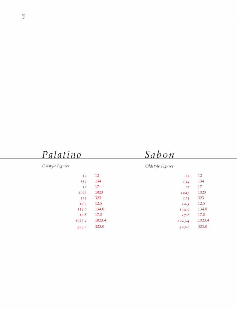
Oldstyle Figures
Sabon
12134
171023
32312.5
134.017.8
1023.4
323.0


/63
X-HEIGHT

Adobe Caslon Regular
X-height: distance a font exceeds or receeds between the baseline and mean line.
X-Height
X x

/65
nine
X-height: distance a font exceeds or receeds between the baseline and mean line.
X-Height
Type Legibility Readability and legibility are two key
elements of printed text that typographer
strive to maximize.
Readability extended amount of text – such
as an article, book, or annual report – is easy
to read. Legibility refers to whether an refers
to whether a short burst of text – such as a
headline catalog listing, or stop sign – is
instantly recognizable.
There are several factors that determine whether
a text is readable. When deciding what typeface
should be used for a job, consideration should be
given to the typeface and its x-height. It is impor-
tant to understand how a block of text can express
a message through its texture/color, therefore
suiting a particular design solution. Fonts set in
the same size, same leading and column width
will produce varying degrees of “color”.
Typographic Color In typography, color can also describe the
balance between black and white on the page of
text. A typeface’s color is determined by stroke
width, x-height, character width and serif styles.
As a designer, if you are only asked to make
the text readable on the page the following
questions should be asked:
Who is to read it?
Someone that wants to read it? Someone
that has to read it?
How will it be read?
Quickly. In passing. Focused. Near. Far.

X-Height
A typeface’s color is determined by stroke width, x-height, character width and serif styles.
/67
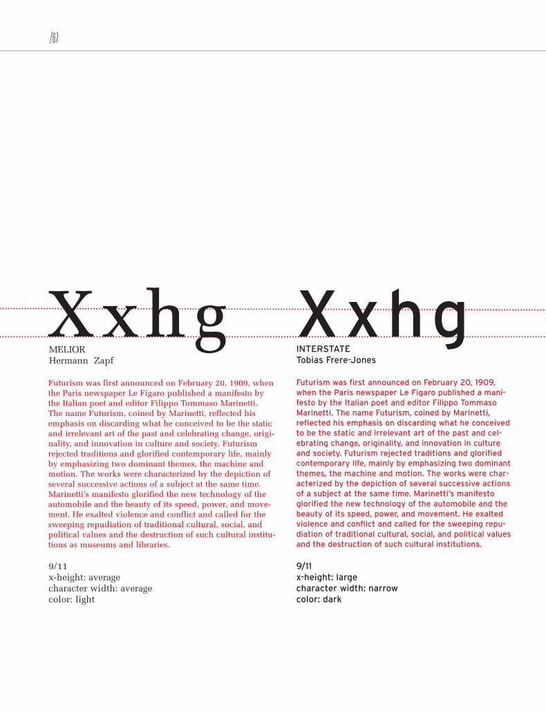
Futurism was first announced on February 20, 1909, when the Paris newspaper Le Figaro published a manifesto by the Italian poet and editor Filippo Tommaso Marinetti. The name Futurism, coined by Marinetti, reflected his emphasis on discarding what he conceived to be the static and irrelevant art of the past and celebrating change, origi-nality, and innovation in culture and society. Futurism rejected traditions and glorified contemporary life, mainly by emphasizing two dominant themes, the machine and motion. The works were characterized by the depiction of several successive actions of a subject at the same time. Marinetti’s manifesto glorified the new technology of the automobile and the beauty of its speed, power, and move-ment. He exalted violence and conflict and called for the sweeping repudiation of traditional cultural, social, and political values and the destruction of such cultural institu-tions as museums and libraries.
MELIORHermann Zapf
9/11 x-height: average character width: average color: light
Futurism was first announced on February 20, 1909, when the Paris newspaper Le Figaro published a mani-festo by the Italian poet and editor Filippo Tommaso Marinetti. The name Futurism, coined by Marinetti, reflected his emphasis on discarding what he conceived to be the static and irrelevant art of the past and cel-ebrating change, originality, and innovation in culture and society. Futurism rejected traditions and glorified contemporary life, mainly by emphasizing two dominant themes, the machine and motion. The works were char-acterized by the depiction of several successive actions of a subject at the same time. Marinetti’s manifesto glorified the new technology of the automobile and the beauty of its speed, power, and movement. He exalted violence and conflict and called for the sweeping repu-diation of traditional cultural, social, and political values and the destruction of such cultural institutions.
INTERSTATE Tobias Frere-Jones
9/11 x-height: large character width: narrow color: dark
X-Height
XxhgXxhg

Futurism was first announced on February 20, 1909, when the Paris newspaper Le Figaro published a manifesto by the Italian poet and editor Filippo Tommaso Marinetti. The name Futurism, coined by Marinetti, reflected his emphasis on discarding what he conceived to be the static and irrelevant art of the past and celebrating change, originality, and innovation in culture and society. Futurism rejected traditions and glorified contemporary life, mainly by emphasiz-ing two dominant themes, the machine and motion. The works were characterized by the depiction of several successive actions of a subject at the same time. Marinetti’s manifesto glorified the new technology of the automobile and the beauty of its speed, power, and movement. He exalted violence and conflict and called for the sweeping repudiation of traditional cultural, social, and political val-ues and the destruction of such cultural institutions as museums.
mrs eavesZuzana Licko
9/11 x-height: small character width: average color: light
Futurism was first announced on February 20, 1909, when the Paris newspaper Le Figaro published a mani-festo by the Italian poet and editor Filippo Tommaso Marinetti. The name Futurism, coined by Marinetti, reflected his emphasis on discarding what he con-ceived to be the static and irrelevant art of the past and celebrating change, originality, and innovation in culture and society. Futurism rejected traditions and glorified contemporary life, mainly by emphasizing two dominant themes, the machine and motion. The works were characterized by the depiction of several succes-sive actions of a subject at the same time. Marinetti’s manifesto glorified the new technology of the automo-bile and the beauty of its speed and power.
UNIVERSAdrian Frutiger
x-height: average character width: narrow color: dark
XxhgXxhg
X-Height
/69
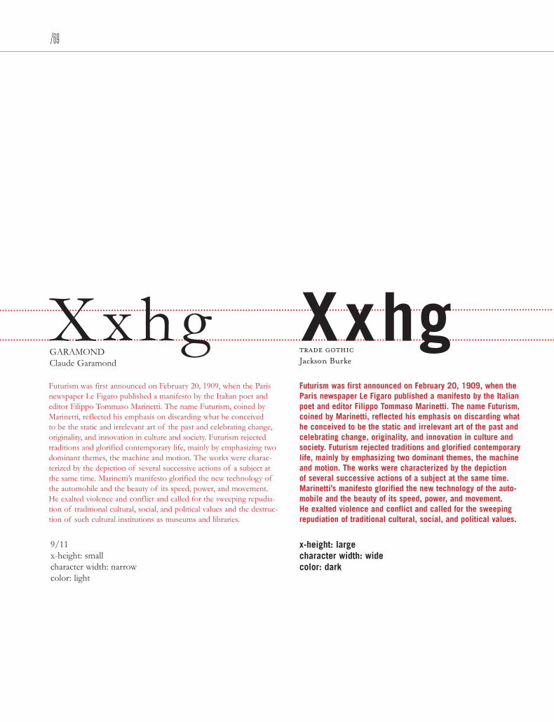
Futurism was first announced on February 20, 1909, when the Paris newspaper Le Figaro published a manifesto by the Italian poet and editor Filippo Tommaso Marinetti. The name Futurism, coined by Marinetti, reflected his emphasis on discarding what he conceived to be the static and irrelevant art of the past and celebrating change, originality, and innovation in culture and society. Futurism rejected traditions and glorified contemporary life, mainly by emphasizing two dominant themes, the machine and motion. The works were charac-terized by the depiction of several successive actions of a subject at the same time. Marinetti’s manifesto glorified the new technology of the automobile and the beauty of its speed, power, and movement. He exalted violence and conflict and called for the sweeping repudia-tion of traditional cultural, social, and political values and the destruc-tion of such cultural institutions as museums and libraries.
GARAMOND Claude Garamond
9/11 x-height: small character width: narrow color: light
Futurism was first announced on February 20, 1909, when the Paris newspaper Le Figaro published a manifesto by the Italian poet and editor Filippo Tommaso Marinetti. The name Futurism, coined by Marinetti, reflected his emphasis on discarding what he conceived to be the static and irrelevant art of the past and celebrating change, originality, and innovation in culture and society. Futurism rejected traditions and glorified contemporary life, mainly by emphasizing two dominant themes, the machine and motion. The works were characterized by the depiction of several successive actions of a subject at the same time. Marinetti’s manifesto glorified the new technology of the auto-mobile and the beauty of its speed, power, and movement. He exalted violence and conflict and called for the sweeping repudiation of traditional cultural, social, and political values.
trade gothic Jackson Burke
x-height: large character width: wide color: dark
XxhgXxhg
X-Height
Futurism was first announced on February 20, 1909, when the Paris newspaper Le Figaro published a manifesto by the Italian poet and editor Filippo Tommaso Marinetti. The name Futurism, coined by Marinetti, reflected his emphasis on discard-ing what he conceived to be the static and irrelevant art of the past and celebrating change, originality, and innovation in cul-ture and society. Futurism rejected traditions and glorified con-temporary life, mainly by emphasizing two dominant themes, the machine and motion. The works were characterized by the depiction of several successive actions of a subject at the same time. Marinetti’s manifesto glorified the new technology of the automobile and the beauty of its speed, power, and movement. He exalted violence and conflict and called for the sweeping repudiation of traditional cultural, social, and political values and the destruction of such cultural institutions as museums.
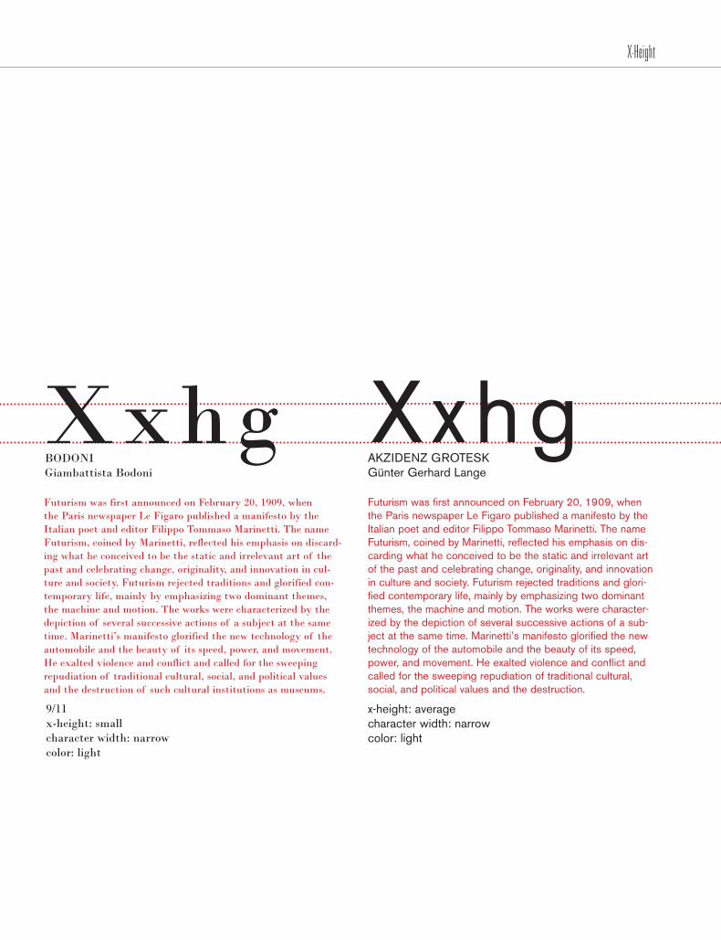
BODONI Giambattista Bodoni
9/11 x-height: small character width: narrow color: light
Futurism was first announced on February 20, 1909, when the Paris newspaper Le Figaro published a manifesto by the Italian poet and editor Filippo Tommaso Marinetti. The name Futurism, coined by Marinetti, reflected his emphasis on dis-carding what he conceived to be the static and irrelevant art of the past and celebrating change, originality, and innovation in culture and society. Futurism rejected traditions and glori-fied contemporary life, mainly by emphasizing two dominant themes, the machine and motion. The works were character-ized by the depiction of several successive actions of a sub-ject at the same time. Marinetti’s manifesto glorified the new technology of the automobile and the beauty of its speed, power, and movement. He exalted violence and conflict and called for the sweeping repudiation of traditional cultural, social, and political values and the destruction.
AKZIDENZ GROTESK Günter Gerhard Lange
x-height: average character width: narrow color: light
XxhgXxhg
X-Height
/71
Futurism was first announced on February 20, 1909, when the Paris newspaper Le Figaro published a manifesto by the Italian poet and editor Filippo Tommaso Marinetti. The name Futurism, coined by Marinetti, reflected his emphasis on discarding what he conceived to be the static and irrel-evant art of the past and celebrating change, originality, and innovation in culture and society. Futurism rejected traditions and glorified contemporary life, mainly by emphasizing two dominant themes, the machine and motion. The works were characterized by the depiction of several successive actions of a subject at the same time. Marinetti’s manifesto glorified the new technology of the automobile and the beauty of its speed, power, and movement. He exalted violence and con-flict and called for the sweeping repudiation of traditional cultural, social, and political values and the destruction.
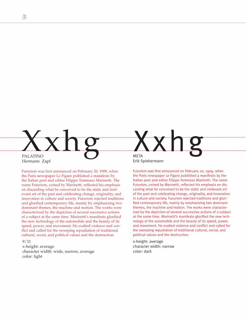
PALATINO Hermann Zapf
9/11 x-height: average character width: wide, narrow, average color: light
Futurism was first announced on February 20, 1909, when the Paris newspaper Le Figaro published a manifesto by the Italian poet and editor Filippo Tommaso Marinetti. The name Futurism, coined by Marinetti, reflected his emphasis on dis-carding what he conceived to be the static and irrelevant art of the past and celebrating change, originality, and innovation in culture and society. Futurism rejected traditions and glori-fied contemporary life, mainly by emphasizing two dominant themes, the machine and motion. The works were character-ized by the depiction of several successive actions of a subject at the same time. Marinetti’s manifesto glorified the new tech-nology of the automobile and the beauty of its speed, power, and movement. He exalted violence and conflict and called for the sweeping repudiation of traditional cultural, social, and political values and the destruction.
METAErik Spiekermann
x-height: average character width: narrow color: dark
XxhgXxhg
X-Height

Futurism was first announced on February 20, 1909, when the Paris newspaper Le Figaro published a manifesto by the Italian poet and editor Filippo Tommaso Marinetti. The name Futurism, coined by Marinetti, reflected his emphasis on discarding what he conceived to be the static and irrelevant art of the past and celebrating change, originality, and innovation in culture and society. Futurism rejected traditions and glorified contemporary life, mainly by emphasizing two dominant themes, the machine and motion. The works were characterized by the depiction of several successive actions of a subject at the same time. Marinetti’s manifesto glorified the new technology of the automobile and the beauty of its speed, power, and movement. He exalted violence and conflict and called for the sweeping repudiation of traditional cultural, social, and political val-ues and the destruction of such cultural institutions as museums.
BEMBO Francesco Griffo
9/11 x-height: small character width: narrow color: light
Futurism was first announced on February 20, 1909, when the Paris newspaper Le Figaro published a manifesto by the Italian poet and editor Filippo Tommaso Marinetti. The name Futurism, coined by Marinetti, reflected his emphasis on dis-carding what he conceived to be the static and irrelevant art of the past and celebrating change, originality, and innovation in culture and society. Futurism rejected traditions and glori-fied contemporary life, mainly by emphasizing two dominant themes, the machine and motion. The works were characterized by the depiction of several successive actions of a subject at the same time. Marinetti’s manifesto glorified the new technol-ogy of the automobile and the beauty of its speed, power, and movement. He exalted violence and conflict and called for the sweeping repudiation of traditional cultural, social, and politi-cal values and the destruction of such cultural institutions.
BELL GOTHICChauncey H. Griffith
x-height: average character width: narrow color: light
XxhgXxhg
X-Height

/73
Futurism was first announced on February 20, 1909, when the Paris newspaper Le Figaro published a manifesto by the Italian poet and editor Filippo Tommaso Marinetti. The name Futurism, coined by Marinetti, reflected his emphasis on discarding what he conceived to be the static and irrelevant art of the past and celebrating change, originality, and innovation in culture and society. Futurism rejected traditions and glorified contemporary life, mainly by emphasizing two dominant themes, the machine and motion. The works were characterized by the depic-tion of several successive actions of a subject at the same time. Marinetti’s manifesto glorified the new technology of the automobile and the beauty.
BELIZIO David Berlow
9/11 x-height: large character width: wide color: dark
Futurism was first announced on February 20, 1909, when the Paris newspaper Le Figaro published a manifesto by the Italian poet and editor Filippo Tommaso Marinetti. The name Futurism, coined by Marinetti, reflected his emphasis on discarding what he conceived to be the static and irrelevant art of the past and celebrating change, originality, and innovation in culture and society. Futurism rejected traditions and glorified contemporary life, mainly by emphasizing two dominant themes, the machine and motion. The works were characterized by the depiction of several successive actions of a subject at the same time. Marinetti’s manifesto glorified the new technology of the automobile and the beauty of its speed, power, and movement. He exalted violence and conflict and called for the sweeping repudiation of traditional cultural, social, and political val-ues and the destruction of such cultural institutions as museums.
FRUTIGERAdrian Frutiger
x-height: large character width: narrow color: dark
XxhgXxhg
X-Height
Futurism was first announced on February 20, 1909, when the Paris newspaper Le Figaro published a manifesto by the Italian poet and editor Filippo Tommaso Marinetti. The name Futurism, coined by Marinetti, reflected his emphasis on discarding what he conceived to be the static and irrelevant art of the past and cel-ebrating change, originality, and innovation in culture and society. Futurism rejected traditions and glorified contemporary life, mainly by emphasizing two dominant themes, the machine and motion. The works were characterized by the depiction of several successive actions of a subject at the same time. Marinetti’s manifesto glorified the new technology of the automobile and the beauty of its speed, power, and movement. He exalted violence and conflict and called for the sweeping repudiation of traditional cultural, social, and political values and the destruction of such cultural institutions.
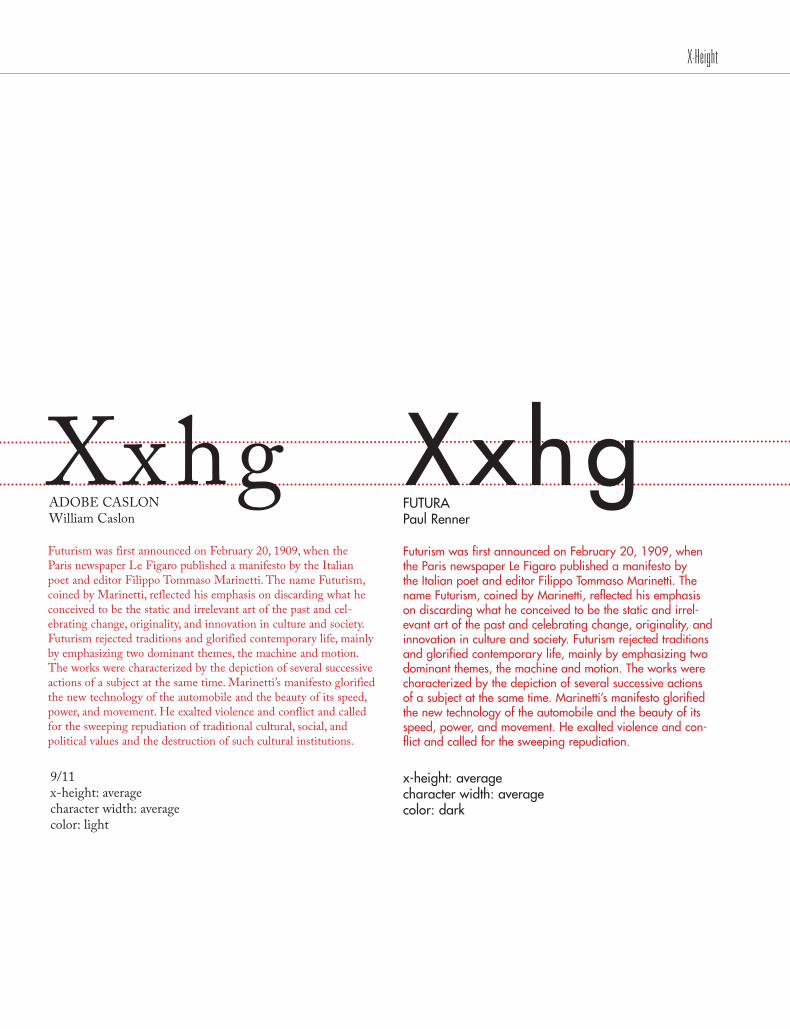
ADOBE CASLON William Caslon
9/11 x-height: average character width: average color: light
Futurism was first announced on February 20, 1909, when the Paris newspaper Le Figaro published a manifesto by the Italian poet and editor Filippo Tommaso Marinetti. The name Futurism, coined by Marinetti, reflected his emphasis on discarding what he conceived to be the static and irrel-evant art of the past and celebrating change, originality, and innovation in culture and society. Futurism rejected traditions and glorified contemporary life, mainly by emphasizing two dominant themes, the machine and motion. The works were characterized by the depiction of several successive actions of a subject at the same time. Marinetti’s manifesto glorified the new technology of the automobile and the beauty of its speed, power, and movement. He exalted violence and con-flict and called for the sweeping repudiation.
FUTURA Paul Renner
x-height: average character width: average color: dark
XxhgXxhg
X-Height
/75
Futurism was first announced on February 20, 1909, when the Paris newspaper Le Figaro published a manifesto by the Italian poet and editor Filippo Tommaso Marinetti. The name Futurism, coined by Marinetti, reflected his emphasis on discarding what he conceived to be the static and irrelevant art of the past and celebrating change, originality, and innovation in culture and society. Futurism rejected traditions and glorified contemporary life, mainly by emphasizing two dominant themes, the machine and motion. The works were characterized by the depic-tion of several successive actions of a subject at the same time. Marinetti’s manifesto glorified the new technology of the automobile and the beauty of its speed, power, and movement. He exalted violence.
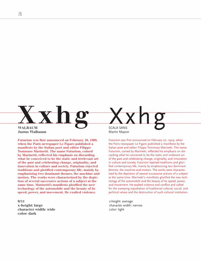
WALBAUMJustus Walbaum
9/11 x-height: large character width: wide color: dark
Futurism was first announced on February 20, 1909, when the Paris newspaper Le Figaro published a manifesto by the Italian poet and editor Filippo Tommaso Marinetti. The name Futurism, coined by Marinetti, reflected his emphasis on dis-carding what he conceived to be the static and irrelevant art of the past and celebrating change, originality, and innovation in culture and society. Futurism rejected traditions and glori-fied contemporary life, mainly by emphasizing two dominant themes, the machine and motion. The works were character-ized by the depiction of several successive actions of a subject at the same time. Marinetti’s manifesto glorified the new tech-nology of the automobile and the beauty of its speed, power, and movement. He exalted violence and conflict and called for the sweeping repudiation of traditional cultural, social, and political values and the destruction of such cultural institution.
SCALA SANS Martin Majoor
x-height: average character width: narrow color: light
XxhgXxhg
X-Height

Futurism was first announced on February 20, 1909, when the Paris newspaper Le Figaro published a manifesto by the Italian poet and editor Filippo Tommaso Marinetti. The name Futurism, coined by Marinetti, reflected his emphasis on dis-carding what he conceived to be the static and irrelevant art of the past and celebrating change, originality, and innovation in culture and society. Futurism rejected traditions and glori-fied contemporary life, mainly by emphasizing two dominant themes, the machine and motion. The works were character-ized by the depiction of several successive actions of a subject at the same time. Marinetti’s manifesto glorified the new tech-nology of the automobile and the beauty of its speed, power, and movement. He exalted violence and conflict and called for the sweeping repudiation of traditional cultural, social, and political values and the destruction of such cultural institution.
SABON Jan Tschichold
9/11 x-height: average character width: wide color: dark
Futurism was first announced on February 20, 1909, when the Paris newspaper Le Figaro published a manifesto by the Italian poet and editor Filippo Tommaso Marinetti. The name Futurism, coined by Marinetti, reflected his emphasis on discarding what he conceived to be the static and irrelevant art of the past and celebrating change, originality, and inno-vation in culture and society. Futurism rejected traditions and glorified contemporary life, mainly by emphasizing two dominant themes, the machine and motion. The works were characterized by the depiction of several successive actions of a subject at the same time. Marinetti’s manifesto glorified the new technology of the automobile and the beauty of its speed, power, and movement. He exalted violence and conflict and called for the sweeping repudiation of traditional cultural, social, and political values and the destruction.
FRANKLIN GOTHIC Morris Fuller Benton
x-height: large character width: narrow color: light
XxhgXxhg
X-Height
/77
Type needs a human eye for the fine tuning. Don’t rely on the software to do a designer’s job.” —Robin Williams
“
X-Height


/79
COLUMN WIDTH
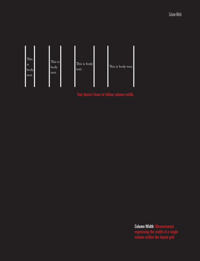
Column Width
This is body text.
This is body text.
This is body text.
This is body text.
Text doesn’t have to follow column width.
Column Width: Measurement expressing the width of a single column within the layout grid

/81
tenColumn Width
Column Width: Measurement expressing the width of a single column within the layout grid
Determine Line LengthA general guideline for determining if your
line length is long enough to satisfactorily
justify the text:
The line length in picas should be about twice
the point size of the type; that is, if the type you
are using is 12 point, the line length should be at
least 24 picas (24 picas is 4 inches-simply divide
the number of picas by 6, as there are 6 picas
per inch). Thus 9-point type should be on an
18-pica line (3 inches) before you try to justify
it, and 18-point type should be on a 36-pica line
(6 inches). The rulers in most programs can be
changed to picas, if you like.

Wide Column A general guideline for determining if your line length is long
enough to satisfactorily justify the text: the line length in picas
should be about twice the point size of the type; that is, if the
type you are using is 12 point, the line length should be at least
24 picas (24 picas is 4 inches-simply divide the number of picas
by 6, as there are 6 picas per inch). Thus 9-point type should
be on an 18-pica line (3 inches) before you try to justify it, and
18-point type should be on a 36-pica line (6 inches). The rulers
in most programs can be changed to picas, if you like.
Narrow ColumnA general guideline for
determining if your line length
is long enough to satisfactorily
justify the text: the line length
in picas should be about twice
the point size of the type; that
is, if the type you are using
is 12 point, the line length
should be at least 24 picas (24
picas is 4 inches-simply divide
the number of picas by 6, as
there are 6 picas per inch).
Thus 9-point type should be
on an 18-pica line (3 inches)
before you try to justify it, and
18-point type should be on
a 36-pica line (6 inches). The
rulers in most programs can be
changed to picas, if you like.
Column Width
/83
It is the designer’s task to matchform with content; to create an authoritative document.” — Nick Shinn
“
Column Width


/85
USING LEADING

Using Leading
Less distance between lines.
More distance between lines.
40/25
40/60
Leading: the distance between the baselines of successive lines of type

/87
elevenUsing Leading
Leading: the distance between the baselines of successive lines of type
History Spacing within a paragraph should be consistent.
We often set an initial cap or a word in a larger
point size than the rest of the text. This affects
the linespacing, or leading (the space between
the lines of type); if even one letter or word is
larger, the linespacing adjusts to fit the larger
character(s), creating uneven spacing.
The history of the term leading may give you a
better grasp of what leading itself accomplishes
and how you can best adjust it.
Until the early ’70s (yes the 1970s), all printed
type was set in hot metal. Each letter – each
and every little letter – was cast onto a tiny piece
of lead backwards so when printed the letter
would be facing the right direction. All of these
letters were lined up in a row, with other tiny
pieces of blank metal stuck between the words
to separate them correctly.
PointsNow, the type was measured in points, just like
the type on the Mac (72 points per inch).
The leading was also measured in points. If the
type was 10 points high and the little piece of lead
inserted between the lines was 2 points high, then
the 2 points was added onto the point size of the
type and the leading was called 12 point.
It’s usually possible to correct the spacing,
depending on the program you’re creating it in.
If your application allows you to adjust the lead-
ing, then select the entire paragraph and reset the
leading to what it originally was for the smaller
type. Sometimes you can adjust the leading, but
it won’t let you go smaller than the auto-leading
for the larger size, the one that’s disruptive; in that
case you’ll need to adjust the line spacing for the
entire paragraph to match the larger size.

Normal Linespacing within a paragraph should
be consistent. We often set an initial cap or
a word in a larger point size than the rest
of the text. This affects the linespacing, or
leading (the space between the lines
of type); if even one letter or word is larger,
the linespacing adjusts to fit the larger
character(s), creating uneven spacing.
Not Enough Linespacing within a paragraph should be consistent. We often set an initial cap or a word in a larger point size than the rest of the text. This affects the linespacing, or leading (the space between the lines of type); if even one letter or word is larger, the linespacing adjusts to fit the larger character(s), creating uneven spacing.
Too Much Linespacing within a paragraph should be
consistent. We often set an initial cap or
a word in a larger point size than the rest
of the text. This affects the linespacing, or
leading (the space between the lines of
type); if even one letter or word is larger,
the linespacing adjusts to fit the larger
character(s), creating uneven spacing.
Leading: 14pt Leading: 9pt Leading: 22pt
Using Leading
/89
Type is a beautiful group of letters, not a group of beautiful letters.” —Matthew Carter
“
Using Leading


/91
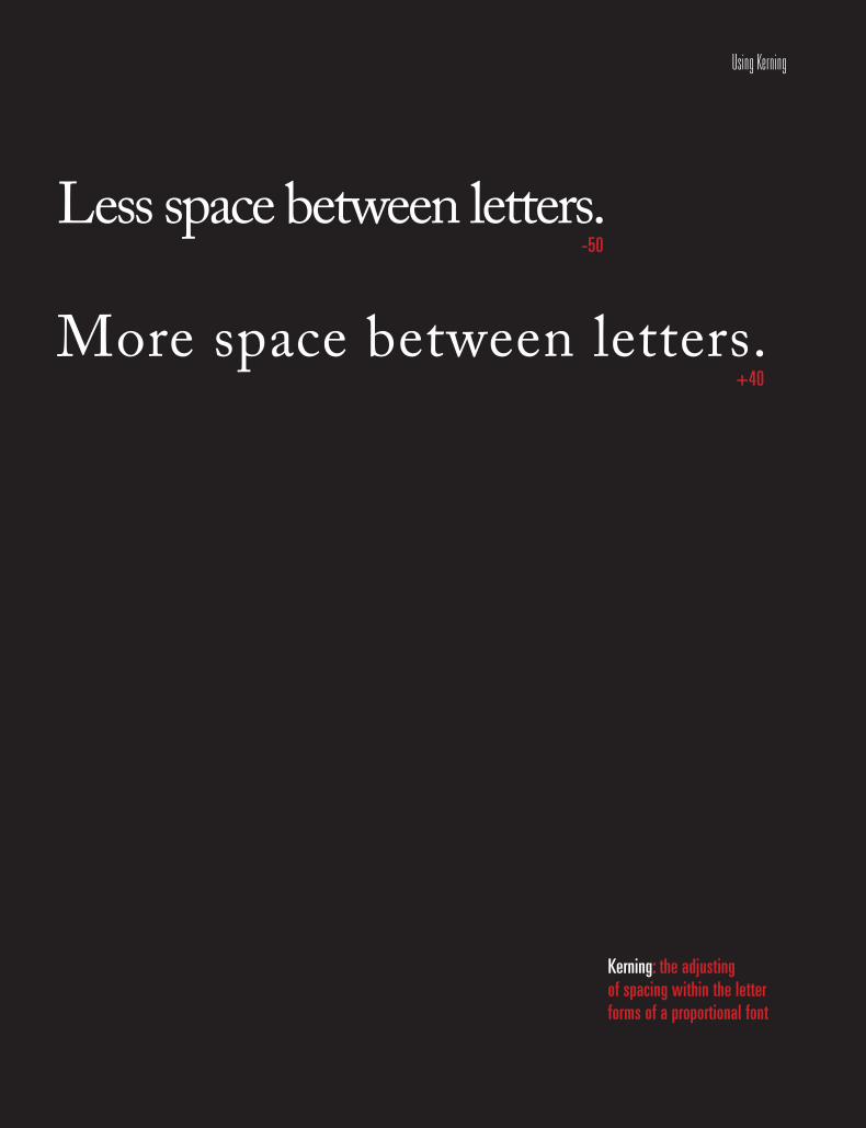
USING KERNING
Using Kerning
Less space between letters.
More space between letters.
-50
+40
Kerning: the adjustingof spacing within the letterforms of a proportional font
/93
twelveUsing Kerning
Less space between letters.
Kerning: the adjustingof spacing within the letterforms of a proportional font
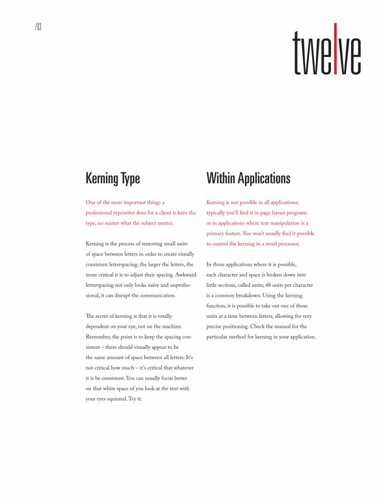
Kerning Type One of the most important things a
professional typesetter does for a client is kern the
type, no matter what the subject matter.
Kerning is the process of removing small units
of space between letters in order to create visually
consistent letterspacing; the larger the letters, the
more critical it is to adjust their spacing. Awkward
letterspacing not only looks naïve and unprofes-
sional, it can disrupt the communication.
The secret of kerning is that it is totally
dependent on your eye, not on the machine.
Remember, the point is to keep the spacing con-
sistent – there should visually appear to be
the same amount of space between all letters. It’s
not critical how much – it’s critical that whatever
it is be consistent. You can usually focus better
on that white space of you look at the text with
your eyes squinted. Try it.
Within Applications Kerning is not possible in all applications;
typically you’ll find it in page layout programs
or in applications where text manipulation is a
primary feature. You won’t usually find it possible
to control the kerning in a word processor.
In those applications where it is possible,
each character and space is broken down into
little sections, called units; 48 units per character
is a common breakdown. Using the kerning
function, it is possible to take out one of those
units at a time between letters, allowing for very
precise positioning. Check the manual for the
particular method for kerning in your application.
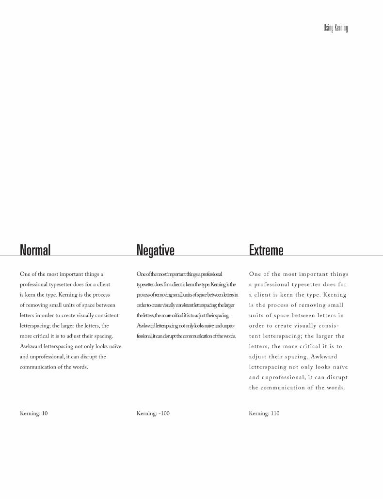
Normal One of the most important things a
professional typesetter does for a client
is kern the type. Kerning is the process
of removing small units of space between
letters in order to create visually consistent
letterspacing; the larger the letters, the
more critical it is to adjust their spacing.
Awkward letterspacing not only looks naïve
and unprofessional, it can disrupt the
communication of the words.
Negative One of the most important things a professional
typesetter does for a client is kern the type. Kerning is the
process of removing small units of space between letters in
order to create visually consistent letterspacing; the larger
the letters, the more critical it is to adjust their spacing.
Awkward letterspacing not only looks naïve and unpro-
fessional, it can disrupt the communication of the words.
Extreme One of the most impor tant th ings
a profess iona l t ypese t te r does for
a c l i ent i s kern the t ype. Kerning
i s the process o f removing smal l
un i t s o f space between le t te r s in
order to c rea te v i sua l l y cons i s-
tent l e t te r spac ing ; the l a rger the
l e t te r s , the more c r i t i c a l i t i s to
ad jus t the i r spac ing. Awkward
le t te r spac ing not on l y looks na ïve
and unprofess iona l , i t c an d i s rupt
the communicat ion of the words .
Kerning: 10 Kerning: -100 Kerning: 110
Using Kerning
I do not think of type as something that should only be readable. It should be beautiful.” — Ed Benguiat
“
Using Kerning /95


/97
ALIGNING TEXT

Left Aligned (Ragged Right)
Centered Justified (Last Line Left Aligned)
No matter what alignment you are using, remember to pay close attention to hyphenation and character spacing.
Aligning Text
/99
thirteenAlignments In unjustified text, the text block is set with
normal letter and word spacing.
Because of the even word spacing the text will
have an even texture – no large spaces between
words. The lines will naturally vary in length. a
ragged text block can integrate with the layout
and add visual interest to the page. The difficulty is
making the ragged edge have a pleasing silhouette.
When the first line in the text is longer than the
second, it becomes separate from the layout and
creates a box-like shape. This destroys one of the
advantages of unjustified text. The ragged edge
needs to have a life, but a narrow column can
be less active. Another advantage to ragged text
is less hyphenation is needed. Therefore, names,
dates or words which are normally read together
can stay together and not be seperated.
If someone insists that fully justified text is better
than left-aligned text, tell them they are wrong.
If someone else tells you that left-aligned text is
better than justified text, tell them they are wrong.
It’s a personal preference.
Right and Wrong If they are both wrong, then what’s right?
Alignment is only a small piece of the puzzle.
What works for one design might be totally inap-
propriate for another layout. As with all layouts, it
depends on the purpose of the piece, the audience
and its expectations, the fonts, the margins and
white space, and other elements on the page. The
most appropriate choice is the alignment that
works for that particular design.
As with all layouts, alignment depends on the
purpose of the piece, the audience and its
expectations, the fonts, the margins and white
space, and other elements on the page. The most
appropriate choice is the alignment that works
for that particular design.
No matter what alignment you use, remember
to pay close attention to hyphenation and word/
character spacing as well to insure that your text
is as readable as possible.
There will undoubtedly be well-meaning friends,
business associates, clients, and others who will
question your choices. Be prepared to explain why
you chose the alignment you did and be prepared.
Aligning Text

Left-Aligned, Ragged Right 1. Often considered more informal, but also friendlier than justified text.
2. The ragged right edge adds an element of attractive white space.
3. May require extra attention to hyphenation to keep right margin from being too ragged.
4. Generally type set left-aligned is easier to work with (requires less time, attention, and tweaking from designers to make it look good).
Centered,All Lines 1. There is nothing inherently wrong with choosing to use centered text.
2. As with ragged right or fully-justified text alignment, what works for one design might be totally inappropriate for another layout.
3. There are simply fewer situations where centered text is appropriate.
4. When in doubt, don’t center it.
Justified,Last Line Ragged 1. Often considered more formal, but also less friendly than left-aligned text.
2. Usually allows for more characters per line, packing more into the same amount of space (than the same text set left-aligned).
3. May require extra attention to word and char-acter spacing and hyphenation to avoid unsightly rivers of white space running through the text.
4. May be more familiar to readers in some types of publications, such as books and newspapers.
5. Some people are naturally drawn to the “neat-ness” of text that lines up on the left and right.
Aligning Text

/101Aligning Text
Right and wrong don’t exist in design. There is only effective and non-effective communication.” — Peter Bilak
“


/103
USING HYPENATION

Using Hypenation - Hypen
At the end of lines, leave at least two characters behind and take at least three forward.
/105
fourteen
At the end of lines, leave at least two characters behind and take at least three forward.
Hyphenating Don’t rely on the software to judge where
hyphens should be placed.
At the end of lines, leave at least two characters
behind and take at least three forward. For ex-
ample, “ele-gantly” is acceptable, but “elegant-
ly” is not because it takes too little of the word
to the next line. Avoid leaving the stub end of a
hyphenated word or any word shorter then four
letters as the last line of a paragraph. Avoid
more then 3 consecutive hyphenated lines.
Avoid hyphenating or breaking proper names
and titles. Creating a non-breaking space
before and after the name will ensure that the
name will not break. Avoid beginning three
consecutive lines with the same word repeated.
Since software programs deal with line breaks
automatically based upon a number of vari-
ables, it is possible to have paragraphs with
consecutive lines beginning with the same
word. When this happens simply adjust the
text to avoid/fix the problem.

Hyphenation Rules1. Avoid widows in all paragraphs (one word on the last line of a paragraph)
2. Avoid hyphenating or line breaks for proper names and proper nouns.
3. Leave a least two characters on the line and three following the hyphen.
4. Avoid beginning three consecutive lines in a paragraph with the same word.
5. Avoid ending lines with the words: the, of, at, a, by, etc.
6. Never hyphenate a words in a headline and avoid hyphenation in any callouts.
Using Hypenation

/107
The serif typeface sat ele-gantly on the baseline grid of the book spread.

/109
USING JUSTIFICATION
Using Justification
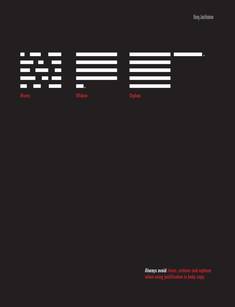
Rivers
.
.
Widow Orphan
Always avoid rivers, widows and orphans when using justification in body copy.
/111
fifteenUsing Justification
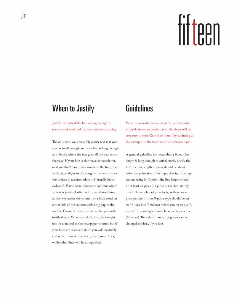
When to Justify Justify text only if the line is long enough to
prevent awkward and inconsistent word spacing.
The only time you can safely justify text is if your
type is small enough and your line is long enough,
as in books where the text goes all the way across
the page. If your line is shorter, as in newsletter,
or if you don’t have many words on the line, than
as the type aligns to the margins the words space
themselves to accommodate it. It usually looks
awkward. You’ve seen newspaper columns where
all text is justified, often with a word stretching
all the way across the column, or a little word on
either side of the column with a big gap in the
middle. Gross. But that’s what can happen with
justified type. When you do it, the effect might
not be as radical as the newspaper column, but if
your lines are relatively short, you will inevitably
end up with uncomfortable gaps in some lines,
while other lines will be all squished.
Guidelines When your work comes out of the printer, turn
it upside down and squint at it. The rivers will be
very easy to spot. Get rid of them. Try squinting at
the example on the bottom of the previous page.
A general guideline for determining if your line
length is long enough to satisfactorily justify the
text: the line length in picas should be about
twice the point size of the type; that is, if the type
you are using is 12 point, the line length should
be at least 24 picas (24 picas is 4 inches-simply
divide the number of picas by 6, as there are 6
picas per inch). Thus 9-point type should be on
an 18-pica line (3 inches) before you try to justify
it, and 18-point type should be on a 36-pica line
(6 inches). The rulers in most programs can be
changed to picas, if you like.

Rivers In typography, rivers, or rivers of white, are
visually unattractive gaps appearing to run
down a paragraph of text. They can occur with
any spacing, though they are most noticeable
with wide word spaces caused by either full text
justification or monospaced fonts.
Widows and OrphansNever leave widows and orphans bereft on the
page. Avoid both of these situations. If you
have editing privileges, rewrite the copy, or at
least add or delete a word or two. Sometimes
you can remove spacing from the letters, words,
or lines, depending on which program you’re
working in. Sometimes widening a margin just
a hair will do it. But it must be done. Widows
and orphans on a page are wrong.
Widows When a paragraph ends and leaves fewer
than seven characters (not words, characters) on
the last line, that line is called a widow. Worse
than leaving one word at the end of a line is
leaving part of a word, the other part being
paraphrased on the line above.
OrphanWhen the last line of a paragraph, be it ever so
long, won’t fit at the bottom of a column and
must end itself at the top of the next column,
that is an orphan. Always correct this.
Using Justification

/113
Universe 59 One of the most important things a professional typesetter does
for a client is kern the type. Kerning is the process of removing
small units of space between letters in order to create visually
consistent letterspacing; the larger the letters, the more critical it
is to adjust their spacing. Awkward letterspacing not only looks
naïve and unprofessional, it can disrupt the communication of
the words.
Interstate One of the most important things a pro-
fessional typesetter does for a client is
kern the type. Kerning is the process of
removing small units of space between
letters in order to create visually con-
sistent letterspacing; the larger the
letters, the more critical it is to adjust
their spacing. Awkward letterspacing
not only looks naïve and unprofession-
al, it can disrupt the communication of
the words.
Scala Sans One of the most important things a pro-
fessional typesetter does for a client is
kern the type. Kerning is the process of
removing small units of space between let-
ters in order to create visually consistent
letterspacing; the larger the letters, the
more critical it is to adjust their spacing.
Awkward letterspacing not only looks na-
ïve and unprofessional, it can disrupt the
communication of the words.
Min: 80%
Desired: 100%
Maximum: 133%
Problems: Widow, Letter spacing too small
Min: 83%
Desired: 103%
Maximum: 136%
Problems: Rivers, Widows
Min: 90%
Desired: 110%
Maximum: 143%
Problem: None, Most comfortable setting
Using Justification
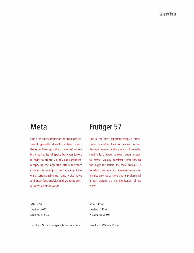
MetaOne of the most important things a profes-
sional typesetter does for a client is kern
the type. Kerning is the process of remov-
ing small units of space between letters
in order to create visually consistent let-
terspacing; the larger the letters, the more
critical it is to adjust their spacing. Awk-
ward letterspacing not only looks naïve
and unprofessional, it can disrupt the com-
munication of the words.
Frutiger 57 One of the most important things a profes-
sional typesetter does for a client is kern
the type. Kerning is the process of removing
small units of space between letters in order
to create visually consistent letterspacing;
the larger the letters, the more critical it is
to adjust their spacing. Awkward letterspac-
ing not only looks naïve and unprofessional,
it can disrupt the communication of the
words.
Min: 60%
Desired: 60%
Maximum: 60%
Problem: Not enoug space between words
Min: 150%
Desired: 150%
Maximum: 200%
Problems: Widow, Rivers
Using Justification

/115
Goudy One of the most important things a pro-
fessional typesetter does for a client is
kern the type. Kerning is the process of
removing small units of space between let-
ters in order to create visually consistent
letterspacing; the larger the letters, the
more critical it is to adjust their spacing.
Awkward letterspacing not only looks na-
ïve and unprofessional, it can disrupt the
communication of the words.
Bembo One of the most important things a profession-
al typesetter does for a client is kern the type.
Kerning is the process of removing small units
of space between letters in order to create visu-
ally consistent letterspacing; the larger the let-
ters, the more critical it is to adjust their spacing.
Awkward letterspacing not only looks naïve
and unprofessional, it can disrupt the commu-
nication of the words.
Belizio One of the most important things
a professional typesetter does for
a client is kern the type. Kerning
is the process of removing small
units of space between letters in
order to create visually consis-
tent letterspacing; the larger the
letters, the more critical it is to
adjust their spacing. Awkward
letterspacing not only looks naïve
and unprofessional, it can disrupt
the communication of the words.
Min: 100%
Desired: 120%
Maximum: 130%
Problem: Rivers
Min: %
Desired: 100%
Maximum: 133%
Problem: Not enough space between words
Min: 70%
Desired: 90%
Maximum: 110%
Problem: Rivers, Large word spacing
Using Justification
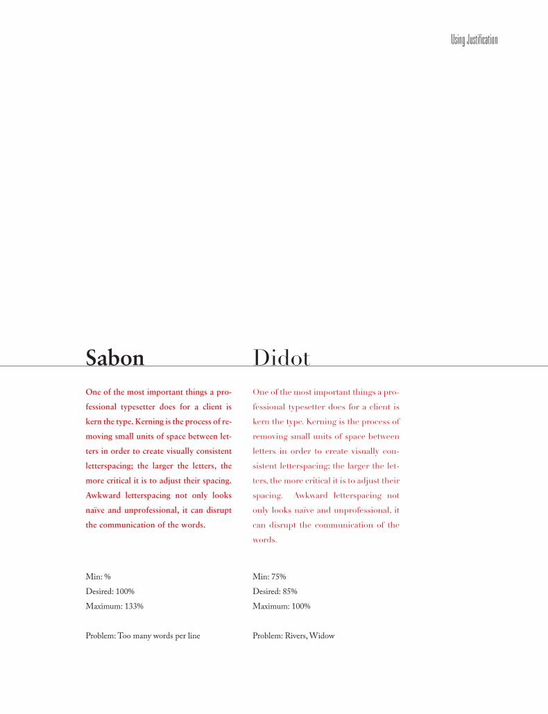
SabonOne of the most important things a pro-
fessional typesetter does for a client is
kern the type. Kerning is the process of re-
moving small units of space between let-
ters in order to create visually consistent
letterspacing; the larger the letters, the
more critical it is to adjust their spacing.
Awkward letterspacing not only looks
naïve and unprofessional, it can disrupt
the communication of the words.
Didot One of the most important things a pro-
fessional typesetter does for a client is
kern the type. Kerning is the process of
removing small units of space between
letters in order to create visually con-
sistent letterspacing; the larger the let-
ters, the more critical it is to adjust their
spacing. Awkward letterspacing not
only looks naïve and unprofessional, it
can disrupt the communication of the
words.
Min: %
Desired: 100%
Maximum: 133%
Problem: Too many words per line
Min: 75%
Desired: 85%
Maximum: 100%
Problem: Rivers, Widow
Using Justification

/117
Design is the method of putting form and content together.” — Paul Rand
“
Using Justification

/119
COMBINING TYPEFACES

Combining Typefaces
Aa Aa Adobe Caslon Univers 59
It is best to combine serif fonts with san serif fonts. Either one can be used in various ways.
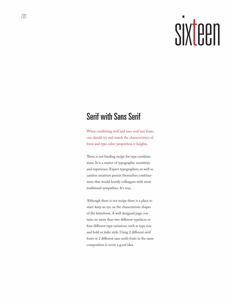
/121
sixteenCombining Typefaces
It is best to combine serif fonts with san serif fonts. Either one can be used in various ways.
Serif with Sans Serif When combining serif and sans serif text fonts,
one should try and match the characteristics of
form and type color: proportion, x-heights.
There is not binding recipe for type combina-
tions. It is a matter of typographic sensitivity
and experience. Expert typographers, as well as
careless amateurs permit themselves combina-
tions that would horrify colleagues with more
traditional sympathies. It’s true.
Although there is not recipe there is a place to
start: keep an eye on the characteristic shapes
of the letterform. A well designed page con-
tains no more than two different typefaces or
four different type variations such as type size
and bold or italic style. Using 2 different serif
fonts or 2 different sans serifs fonts in the same
composition is never a good idea.

WORDS IN LIBERTYA Prologue to FuturismFuturism was first announced on February 20, 1909, when the Paris newspaper Le Figaro published a manifesto by the Italian poet and editor Filippo Tommaso Marinetti. The name Futurism, coined by Marinetti, reflected his emphasis on discarding what he conceived to be the static and irrelevant art of the past and celebrating change, originality, and innovation in culture and society. Futurism rejected traditions and glorified contemporary life, mainly by emphasiz-ing two dominant themes, the machine and motion. The works were characterized by the depiction of several successive actions of a subject at the same time. Marinetti’s manifesto glorified the new technology of the automobile and the beauty of its speed, power, and movement. He exalted violence and conflict and called for the sweeping repudiation of traditional cultural, social, and political values and the destruction of such cultural institutions as museums.
WORDS IN LIBERTYA Prologue to FuturismFuturism was first announced on February 20, 1909, when the Paris newspaper Le Figaro published a manifesto by the Italian poet and editor Filippo Tommaso Marinetti. The name Futurism, coined by Marinetti, reflected his emphasis on discarding what he conceived to be the static and irrelevant art of the past and celebrating change, originality, and innovation in culture and society. Futurism rejected traditions and glorified contemporary life, mainly by emphasizing two dominant themes, the machine and motion. The works were characterized by the depiction of several successive actions of a subject at the same time. Marinetti’s manifesto glorified the new technology of the automobile and the beauty of its speed, power, and movement. He exalted violence and conflict and called for the sweeping repudiation of traditional cultural, social, and political val-ues and the destruction of such cultural institutions as museums.
aa BB ee GG gg DIN 24PT/12PT : GROTESQUE SANS SERIF
MRS EAVES 9PT: TRANSITIONAL SERIF
These two fonts work well together based on the typeface stroke weight and character width.
aa BB ee GG gg
META 24PT/12PT : HUMANIST SANS SERIF
BEMBO 9PT: OLD STYLE SERIF
These two fonts work well together based on the typeface stroke weight and character width.
Combining Typefaces

/123
WORDS IN LIBERTYA Prologue to FuturismFuturism was first announced on February 20, 1909, when the Paris newspaper Le Figaro published a manifesto by the Italian poet and editor Filippo Tommaso Marinetti. The name Futurism, coined by Marinetti, reflected his emphasis on discarding what he conceived to be the static and irrelevant art of the past and celebrating change, originality, and inno-vation in culture and society. Futurism rejected traditions and glorified contemporary life, mainly by emphasizing two dominant themes, the machine and motion. The works were characterized by the depiction of several successive actions of a subject at the same time. Marinetti’s manifesto glorified the new technology of the automobile and the beauty of its speed, power, and movement. He exalted violence and con-flict and called for the sweeping repudiation of traditional cultural, social, and political values and the destruction of such cultural institutions as museums.
WORDS IN LIBERTYA Prologue to FuturismFuturism was first announced on February 20, 1909, when the Paris newspaper Le Figaro published a manifesto by the Italian poet and editor Filippo Tommaso Marinetti. The name Futurism, coined by Marinetti, reflected his emphasis on discarding what he conceived to be the static and irrelevant art of the past and celebrating change, origi-nality, and innovation in culture and society. Futurism rejected traditions and glorified contemporary life, mainly by emphasizing two dominant themes, the machine and motion. The works were characterized by the depiction of several successive actions of a subject at the same time. Marinetti’s manifesto glorified the new technology of the automobile and the beauty of its speed, power, and move-ment. He exalted violence and conflict and called for the sweeping repudiation of traditional cultural, social, and political values and the destruction of such culture.
aa BB ee GG gg FRANKLIN GOTHIC 24PT/12PT : GROTESQUE SANS SERIF
PALATINO 9PT: OLD STYLE SERIF
These two fonts work well together based on the typeface stroke weight and character width.
aa BB ee GG gg
FUTURA 24PT/12PT : GEOMETRIC SANS SERIF
MELIOR 9PT: TRANSITIONAL SERIF
These two fonts work well together based on the typeface stroke weight and character width.
Combining Typefaces
WORDS IN LIBERTYA Prologue to FuturismFuturism was first announced on February 20, 1909, when the Paris newspaper Le Figaro published a manifesto by the Italian poet and editor Filippo Tommaso Marinetti. The name Futurism, coined by Marinetti, reflected his emphasis on discarding what he conceived to be the static and irrelevant art of the past and celebrating change, origi-nality, and innovation in culture and society. Futurism rejected traditions and glorified contemporary life, mainly by emphasizing two dominant themes, the machine and motion. The works were characterized by the depiction of several successive actions of a subject at the same time. Marinetti’s manifesto glorified the new technology of the automobile and the beauty of its speed, power, and move-ment. He exalted violence and conflict and called for the sweeping repudiation of traditional cultural, social, and political values and the destruction of such culture.
WORDS IN LIBERTYA Prologue to Futurism
Futurism was first announced on February 20, 1909, when the Paris newspaper Le Figaro published a manifesto by the Italian poet and editor Filippo Tommaso Marinetti. The name Futurism, coined by Marinetti, reflected his emphasis on discarding what he conceived to be the static and irrelevant art of the past and celebrating change, originality, and innovation in culture and society. Futurism rejected traditions and glorified contemporary life, mainly by emphasizing two dominant themes, the machine and motion. The works were characterized by the depic-tion of several successive actions of a subject at the same time. Marinetti’s manifesto glorified the new technology of the automobile and the beauty of its speed, power, and movement. He exalted violence and conflict and called for the sweeping repudiation.
aa BB ee GG gg
ROTIS SANS 24PT/12PT : HUMANIST SANS SERIF
MELIOR 9PT: TRANSITIONAL SERIF
These two fonts work well together based on the typeface stroke weight and character width.
aa BB ee GG gg INTERSTATE 24PT/12PT : GEOMETRIC SANS SERIF
WALBAUM 9PT: MODERN SERIF
These two fonts work well together based on the typeface stroke weight and character width.
Combining Typefaces

/125
WORDS IN LIBERTYA Prologue to FuturismFuturism was first announced on February 20, 1909, when the Paris newspaper Le Figaro published a manifesto by the Italian poet and editor Filippo Tommaso Marinetti. The name Futurism, coined by Marinetti, reflected his emphasis on discarding what he conceived to be the static and irrelevant art of the past and celebrating change, originality, and innovation in culture and society. Futurism rejected traditions and glorified contemporary life, mainly by emphasizing two dominant themes, the machine and motion. The works were charac-terized by the depiction of several successive actions of a subject at the same time. Marinetti’s manifesto glorified the new technology of the automobile and the beauty of its speed, power, and movement. He exalted violence and conflict and called for the sweeping repudiation of traditional cultural, social, and political values and the destruction of such cultural institutions as museums.
WORDS IN LIBERTYA Prologue to FuturismFuturism was first announced on February 20, 1909, when the Paris newspaper Le Figaro published a manifesto by the Italian poet and editor Filippo Tommaso Marinetti. The name Futurism, coined by Marinetti, reflected his emphasis on discarding what he conceived to be the static and irrelevant art of the past and celebrating change, originality, and innovation in culture and society. Futurism rejected traditions and glorified contemporary life, mainly by emphasizing two dominant themes, the machine and motion. The works were characterized by the depiction of several successive actions of a subject at the same time. Marinetti’s manifesto glorified the new technology of the automobile and the beauty of its speed, power, and movement. He exalted violence and conflict and called for the sweeping repudiation of traditional cultural, social, and political values and the destruction of such culture.
aa BB ee GG gg
NEWS GOTHIC 24PT/12PT : GROTESQUE SANS SERIF
FILOSOFIA 9PT: MODERN SERIF
These two fonts work well together based on the typeface stroke weight and character width.
aa BB ee GG gg
FUTURA 24PT/12PT : GEOMETRIC SANS SERIF
ROCKWELL 9PT: SLAB SERIF
These two fonts work well together based on the typeface stroke weight and character width.
Combining Typefaces

WORDS IN LIBERTYA Prologue to FuturismFuturism was first announced on February 20, 1909, when the Paris newspaper Le Figaro published a manifesto by the Italian poet and editor Filippo Tommaso Marinetti. The name Futurism, coined by Marinetti, reflected his emphasis on discarding what he conceived to be the static and irrelevant art of the past and celebrating change, originality, and innovation in culture and soci-ety. Futurism rejected traditions and glorified contempo-rary life, mainly by emphasizing two dominant themes, the machine and motion. The works were characterized by the depiction of several successive actions of a sub-ject at the same time. Marinetti’s manifesto glorified the new technology of the automobile and the beauty of its speed, power, and movement. He exalted violence and conflict and called for the sweeping repudiation of tradi-tional cultural, social, and political values.
WORDS IN LIBERTYA Prologue to FuturismFuturism was first announced on February 20, 1909, when the Paris newspaper Le Figaro published a manifesto by the Italian poet and editor Filippo Tommaso Marinetti. The name Futurism, coined by Marinetti, reflected his emphasis on discarding what he conceived to be the static and irrel-evant art of the past and celebrating change, originality, and innovation in culture and society. Futurism rejected traditions and glorified contemporary life, mainly by emphasizing two dominant themes, the machine and motion. The works were characterized by the depiction of several successive actions of a subject at the same time. Marinetti’s manifesto glorified the new technology of the automobile and the beauty of its speed, power, and movement. He exalted violence and con-flict and called for the sweeping repudiation of traditional cultural, social, and political values and the destruction of such cultural institutions as museums.
aa BB ee GG gg
GILL SANS 24PT/12PT : HUMANIST SANS SERIF
MEMPHIS 9PT: SLAB SERIF
These two fonts work well together based on the typeface stroke weight and character width.
aa BB ee GG gg
FRUTIGER 24PT/12PT : GEOMETRIC SANS SERIF
NEW BASKERVILLE 9PT: NEW TRANSITIONAL SERIF
These two fonts work well together based on the typeface stroke weight and character width.
Combining Typefaces
/127
A man who works with his hands, his brain and his heartis an graphic designer.” —Louis Nizer
“
Combining Typefaces


/129
PARAGRAPH BREAKS

Correct(Indent after 1st paragraph)
Incorrect(2 returns used)
Incorrect(1st paragraph indented)
Paragraph Breaks
1. Do not indent the first paragraph.2. Following paragraphs are separated by leading.3. The amount of indent is equal to the leading.4. Never hit two returns between paragraphs.
/131
seventeen
1. Do not indent the first paragraph.2. Following paragraphs are separated by leading.3. The amount of indent is equal to the leading.4. Never hit two returns between paragraphs.
Breaking Paragraphs Paragraph breaks set a rhythm for the reader.
The breaks have a relationship with the column
of text as well as the page margins. A break
may be introduced as an indentation, as a space
or both. The overall page feel will be influenced
by your choice so be consistent.
Rules Regarding Paragraph Breaks:1. The first line at the beginning of anarticle should be flushed left (do not indent the first paragraph ever).
2. Block paragraphs are flushed left and are separated by extra leading, not a full return.
3. The amount of an indent is equal to the leading (sometimes needs a bit more).
4. Never hit two returns between paragraphs.

Futurism Futurism was first announced on Febru-ary 20, 1909, when the Paris newspaper Le Figaro published a manifesto by the Italian poet and editor Filippo Tommaso Marinet-ti. The name Futurism, coined by Marinetti, reflected his emphasis on discarding what he conceived to be the static and irrelevant art of the past and celebrating change, originality, and innovation in culture and society. Futurism rejected traditions and glorified contemporary life, mainly by emphasizing two dominant themes, the machine and motion. The manifesto’s rheto-ric was passionately bombastic; its tone was aggressive and inflammatory and was purposely intended to inspire public anger and amazement, to arouse controversy, and to attract widespread attention.
But it is the movements which survive, oddly, here where we live and work as poets and artists: or, if not the movements, then their sense of art as an life itself. All of which, as futurism, had come sharply into focus by the start of the world war: a first radical mix of art and life, the epitome in the poplar mind of an avant-garde. It was, on both its Russian & Italian sides, the first great “art” movement led by poets; and if its means now sometimes seem exaggerated or unripe in retrospect, they carry within them the seed of all that we were later to become.
While Marinetti’s opening manifesto for Italian Futurism bristled with a polemical stance in favor of the transformed present (1909), the later manifestos of Futurist poets and artists offered formal, “technical” approaches to the works then getting under way. The key term —still resonant today — was parole in liberta, by which poetry was to become “an uninterrupted sequence of new images… a strict but of images or analogies, to be cast into the mysterious sea of phenomena.” This freedom-of-the-world, while it resembled other forms of collage and of image juxtaposition, more fully explored the use of innovative and expres-sive typography in the visual presentation of language, as set in motion by forerunners like Mallarme. Outrageous and aggressive, the Futurists' performances mixed declama-tion and gesture, events and surroundings, indifference and engagement, to break the barriers between themselves and those who came to jeer or cheer them.
`
´
Paragraph Breaks
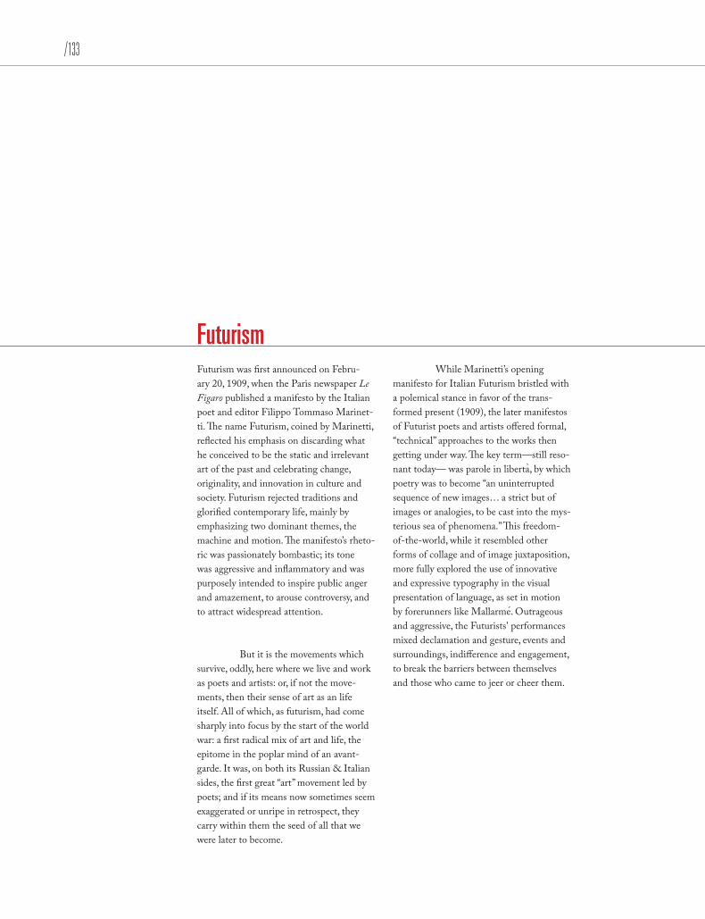
/133
Futurism Futurism was first announced on Febru-ary 20, 1909, when the Paris newspaper Le Figaro published a manifesto by the Italian poet and editor Filippo Tommaso Marinet-ti. The name Futurism, coined by Marinetti, reflected his emphasis on discarding what he conceived to be the static and irrelevant art of the past and celebrating change, originality, and innovation in culture and society. Futurism rejected traditions and glorified contemporary life, mainly by emphasizing two dominant themes, the machine and motion. The manifesto’s rheto-ric was passionately bombastic; its tone was aggressive and inflammatory and was purposely intended to inspire public anger and amazement, to arouse controversy, and to attract widespread attention.
But it is the movements which survive, oddly, here where we live and work as poets and artists: or, if not the move-ments, then their sense of art as an life itself. All of which, as futurism, had come sharply into focus by the start of the world war: a first radical mix of art and life, the epitome in the poplar mind of an avant-garde. It was, on both its Russian & Italian sides, the first great “art” movement led by poets; and if its means now sometimes seem exaggerated or unripe in retrospect, they carry within them the seed of all that we were later to become.
While Marinetti’s opening manifesto for Italian Futurism bristled with a polemical stance in favor of the trans-formed present (1909), the later manifestos of Futurist poets and artists offered formal, “technical” approaches to the works then getting under way. The key term —still reso-nant today — was parole in liberta, by which poetry was to become “an uninterrupted sequence of new images… a strict but of images or analogies, to be cast into the mys-terious sea of phenomena.” This freedom-of-the-world, while it resembled other forms of collage and of image juxtaposition, more fully explored the use of innovative and expressive typography in the visual presentation of language, as set in motion by forerunners like Mallarme. Outrageous and aggressive, the Futurists' performances mixed declamation and gesture, events and surroundings, indifference and engagement, to break the barriers between themselves and those who came to jeer or cheer them.
`
´

Futurism Futurism was first announced on Febru-ary 20, 1909, when the Paris newspaper Le Figaro published a manifesto by the Italian poet and editor Filippo Tommaso Marinet-ti. The name Futurism, coined by Marinetti, reflected his emphasis on discarding what he conceived to be the static and irrelevant art of the past and celebrating change, originality, and innovation in culture and society. Futurism rejected traditions and glorified contemporary life, mainly by emphasizing two dominant themes, the machine and motion. The manifesto’s rheto-ric was passionately bombastic; its tone was aggressive and inflammatory and was purposely intended to inspire public anger and amazement, to arouse controversy, and to attract widespread attention.
Movements But it is the movements which survive, oddly, here where we live and work as poets and artists: or, if not the movements, then their sense of art as an life itself. All of which, as futurism, had come sharply into focus by the start of the world war: a first radical mix of art and life, the epitome in the poplar mind of an avant-garde. It was, on both its Russian & Italian sides, the first great “art” movement led by poets; and if its means now sometimes seem exaggerated or unripe in retrospect, they carry within them the seed of all that we were later to become.
ManifestosWhile Marinetti’s opening manifesto for Italian Futurism bristled with a polemical stance in favor of the transformed present (1909), the later manifestos of Futurist poets and artists offered formal, “technical” approaches to the works then getting under way. The key term —still resonant today — was parole in liberta, by which poetry was to become “an uninterrupted sequence of new images… a strict but of images or analogies, to be cast into the mysterious sea of phenomena.” This freedom-of-the-world, while it resembled other forms of collage and of image juxtaposition, more fully explored the use of innovative and expres-sive typography in the visual presentation of language, as set in motion by forerunners like Mallarme. Outrageous and aggressive, the Futurists' performances mixed declama-tion and gesture, events and surroundings, indifference and engagement, to break the barriers between themselves and those who came to jeer or cheer them.
`
´
Paragraph Breaks
/135
Futurism Futurism was first announced on Febru-ary 20, 1909, when the Paris newspaper Le Figaro published a manifesto by the Italian poet and editor Filippo Tommaso Marinet-ti. The name Futurism, coined by Marinetti, reflected his emphasis on discarding what he conceived to be the static and irrelevant art of the past and celebrating change, originality, and innovation in culture and society. Futurism rejected traditions and glorified contemporary life, mainly by emphasizing two dominant themes, the machine and motion. The manifesto’s rheto-ric was passionately bombastic; its tone was aggressive and inflammatory and was purposely intended to inspire public anger and amazement, to arouse controversy, and to attract widespread attention.
But it is the movements which survive, oddly, here where we live and work as poets and artists: or, if not the movements, then their sense of art as an life itself. All of which, as futurism, had come sharply into focus by the start of the world war: a first radical mix of art and life, the epitome in the poplar mind of an avant-garde. It was, on both its Russian & Italian sides, the first great “art” movement led by poets; and if its means now sometimes seem exaggerated or unripe in retrospect, they carry within them the seed of all that we were later to become.
While Marinetti’s opening manifesto for Italian Futurism bristled with a polemical stance in favor of the transformed present (1909), the later manifestos of Futurist poets and artists offered formal, “technical” approaches to the works then getting under way. The key term —still resonant today — was parole in liberta, by which poetry was to become “an uninterrupted sequence of new images… a strict but of images or analogies, to be cast into the mysterious sea of phenomena.” This freedom-of-the-world, while it resembled other forms of collage and of image juxtaposition, more fully explored the use of innovative and expres-sive typography in the visual presentation of language, as set in motion by forerunners like Mallarme. Outrageous and aggressive, the Futurists' performances mixed declama-tion and gesture, events and surroundings, indifference and engagement, to break the barriers between themselves and those who came to jeer or cheer them.
`
´
1
2
3

Futurism FUTURISM was first announced on Feb-ruary 20, 1909, when the Paris newspaper Le Figaro published a manifesto by the Italian poet and editor Filippo Tommaso Marinetti. The name Futurism, coined by Marinetti, reflected his emphasis on discarding what he conceived to be the static and irrelevant art of the past and celebrating change, originality, and in-novation in culture and society. Futurism rejected traditions and glorified contem-porary life, mainly by emphasizing two dominant themes, the machine and motion. The manifesto’s rhetoric was passionately bombastic; its tone was aggressive and inflammatory and was purposely intended to inspire public anger and amazement, to arouse controversy, and to attract wide-spread attention. BUT it is the movements which survive, oddly, here where we live and work as poets and artists: or, if not the movements, then their sense of art as an life itself. All of which, as futurism, had come sharply into focus by the start of the world war: a first radical mix of art and life, the epitome in the poplar mind of an avant-garde. It was, on both its Russian & Italian sides, the first great “art” movement led by poets; and if its means now sometimes seem exaggerated or unripe in retrospect, they carry within them the seed of all that we were later to become.
WHILE Marinetti’s opening manifesto for Italian Futurism bristled with a polemical stance in favor of the transformed present (1909), the later manifestos of Futurist poets and artists offered formal, “technical” approaches to the works then getting under way. The key term —still resonant today — was parole in liberta, by which poetry was to become “an uninterrupted sequence of new images… a strict but of images or analogies, to be cast into the mysterious sea of phenomena.” This freedom-of-the-world, while it resembled other forms of collage and of image juxtaposition, more fully explored the use of innovative and expres-sive typography in the visual presentation of language, as set in motion by forerunners like Mallarme. Outrageous and aggressive, the Futurists' performances mixed declama-tion and gesture, events and surroundings, indifference and engagement, to break the barriers between themselves and those who came to jeer or cheer them.
`
´
Paragraph Breaks

/137
Futurism Futurism was first announced on February 20, 1909, when the Paris news-paper Le Figaro published a manifesto by the Italian poet and editor Filippo Tommaso Marinetti. The name Futurism, coined by Marinetti, reflected his empha-sis on discarding what he conceived to be the static and irrelevant art of the past and celebrating change, originality, and innovation in culture and society. Futurism rejected traditions and glorified contem-porary life, mainly by emphasizing two dominant themes, the machine and motion. The manifesto’s rhetoric was passionately bombastic; its tone was aggressive and inflammatory and was purposely intended to inspire public anger and amazement, to arouse controversy, and to attract widespread attention.
But it is the movements which survive, oddly, here where we live and work as poets and artists: or, if not the movements, then their sense of art as an life itself. All of which, as futurism, had come sharply into focus by the start of the world war: a first radical mix of art and life, the epitome in the poplar mind of an avant-garde. It was, on both its Russian & Italian sides, the first great “art” movement led by poets; and if its means now sometimes seem exaggerated or unripe in retrospect, they carry within them the seed of all that we were later to become.
While Marinetti’s opening manifesto for Italian Futurism bristled with a polemical stance in favor of the transformed present (1909), the later manifestos of Futurist poets and artists offered formal, “technical” approaches to the works then getting under way. The key term —still resonant today — was parole in liberta, by which poetry was to become “an uninterrupted sequence of new images… a strict but of images or analogies, to be cast into the mysterious sea of phenomena.” This freedom-of-the-world, while it resembled other forms of collage and of image juxtaposition, more fully explored the use of innovative and expres-sive typography in the visual presentation of language, as set in motion by forerunners like Mallarme. Outrageous and aggressive, the Futurists' performances mixed declama-tion and gesture, events and surroundings, indifference and engagement, to break the barriers between themselves and those who came to jeer or cheer them.
`
´

Futurism uturism was first announced on February 20, 1909, when the Paris newspaper Le Figaro published a manifesto by the Italian poet and editor Filippo Tommaso Marinet-ti. The name Futurism, coined by Marinetti, reflected his emphasis on discarding what he conceived to be the static and irrelevant art of the past and celebrating change, originality, and innovation in culture and society. Futurism rejected traditions and glorified contemporary life, mainly by emphasizing two dominant themes, the machine and motion. The manifesto’s rheto-ric was passionately bombastic; its tone was aggressive and inflammatory and was purposely intended to inspire public anger and amazement, to arouse controversy, and to attract widespread attention.
ut it is the movements which survive, oddly, here where we live and work as poets and artists: or, if not the movements, then their sense of art as an life itself. All of which, as futurism, had come sharply into focus by the start of the world war: a first radical mix of art and life, the epitome in the poplar mind of an avant-garde. It was, on both its Russian & Italian sides, the first great “art” movement led by poets; and if its means now sometimes seem exaggerated or unripe in retrospect, they carry within them the seed of all that we were later to become.
hile Marinetti’s opening manifesto for Italian Futurism bristled with a polemical stance in favor of the transformed present (1909), the later manifestos of Futurist poets and artists offered formal, “technical” approaches to the works then getting under way. The key term —still resonant today — was parole in liberta, by which poetry was to become “an uninterrupted sequence of new images… a strict but of images or analogies, to be cast into the mysterious sea of phenomena.” This freedom-of-the-world, while it resembled other forms of collage and of image juxtaposition, more fully explored the use of innovative and expres-sive typography in the visual presentation of language, as set in motion by forerunners like Mallarme. Outrageous and aggressive, the Futurists' performances mixed declama-tion and gesture, events and surroundings, indifference and engagement, to break the barriers between themselves and those who came to jeer or cheer them.
`
´
F
B
W
Paragraph Breaks

/139
Futurism Futurism was first announced on Febru-ary 20, 1909, when the Paris newspaper Le Figaro published a manifesto by the Italian poet and editor Filippo Tommaso Marinet-ti. The name Futurism, coined by Marinetti, reflected his emphasis on discarding what he conceived to be the static and irrelevant art of the past and celebrating change, originality, and innovation in culture and society. Futurism rejected traditions and glorified contemporary life, mainly by emphasizing two dominant themes, the machine and motion. The manifesto’s rheto-ric was passionately bombastic; its tone was aggressive and inflammatory and was purposely intended to inspire public anger and amazement, to arouse controversy, and to attract widespread attention.
But it is the movements which survive, oddly, here where we live and work as poets and artists: or, if not the movements, then their sense of art as an life itself. All of which, as futurism, had come sharply into focus by the start of the world war: a first radical mix of art and life, the epitome in the poplar mind of an avant-garde. It was, on both its Russian & Italian sides, the first great “art” movement led by poets; and if its means now sometimes seem exaggerated or unripe in retrospect, they carry within them the seed of all that we were later to become.
While Marinetti’s opening manifesto for Italian Futurism bristled with a polemical stance in favor of the transformed present (1909), the later manifestos of Futurist poets and artists offered formal, “technical” approaches to the works then getting under way. The key term —still resonant today — was parole in liberta, by which poetry was to become “an uninterrupted sequence of new images… a strict but of images or analogies, to be cast into the mysterious sea of phenomena.” This freedom-of-the-world, while it resembled other forms of collage and of image juxtaposition, more fully explored the use of innovative and expres-sive typography in the visual presentation of language, as set in motion by forerunners like Mallarme. Outrageous and aggressive, the Futurists' performances mixed declama-tion and gesture, events and surroundings, indifference and engagement, to break the barriers between themselves and those who came to jeer or cheer them.
`
´
Paragraph Breaks
/141
Futurism Futurism was first announced on Febru-ary 20, 1909, when the Paris newspaper Le Figaro published a manifesto by the Italian poet and editor Filippo Tommaso Marinet-ti. The name Futurism, coined by Marinetti, reflected his emphasis on discarding what he conceived to be the static and irrelevant art of the past and celebrating change, originality, and innovation in culture and society. Futurism rejected traditions and glorified contemporary life, mainly by emphasizing two dominant themes, the machine and motion. The manifesto’s rheto-ric was passionately bombastic; its tone was aggressive and inflammatory and was purposely intended to inspire public anger and amazement, to arouse controversy, and to attract widespread attention.
But it is the movements which survive, oddly, here where we live and work as poets and artists: or, if not the movements, then their sense of art as an life itself. All of which, as futurism, had come sharply into focus by the start of the world war: a first radical mix of art and life, the epitome in the poplar mind of an avant-garde. It was, on both its Russian & Italian sides, the first great “art” movement led by poets; and if its means now sometimes seem exaggerated or unripe in retrospect, they carry within them the seed of all that we were later to become.
While Marinetti’s opening manifesto for Italian Futurism bristled with a polemical stance in favor of the transformed present (1909), the later manifestos of Futurist poets and artists offered formal, “technical” approaches to the works then getting under way. The key term —still resonant today — was parole in liberta, by which poetry was to become “an uninterrupted sequence of new images… a strict but of images or analogies, to be cast into the mysterious sea of phenomena.” This freedom-of-the-world, while it resembled other forms of collage and of image juxtaposition, more fully explored the use of innovative and expres-sive typography in the visual presentation of language, as set in motion by forerunners like Mallarme. Outrageous and aggressive, the Futurists' performances mixed declama-tion and gesture, events and surroundings, indifference and engagement, to break the barriers between themselves and those who came to jeer or cheer them.
`
´


/143
TEXT HEADERS

Text Headers
Headline Subhead This is body text.
Use kerning on headlines
Headline: a caption or title at the top of an article Subhead: a caption or title for a portion of an article
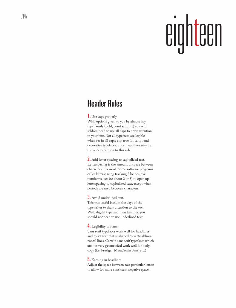
/145
eighteenText Headers
Headline: a caption or title at the top of an article Subhead: a caption or title for a portion of an article
Header Rules 1. Use caps properly. With options given to you by almost any type family (bold, point size, etc) you will seldom need to use all caps to draw attentionto your text. Not all typefaces are legible when set in all caps; esp. true for script and decorative typefaces. Short headlines may be the once exception to this rule.
2. Add letter spacing to capitalized text.Letterspacing is the amount of space between characters in a word. Some software programs caller letterspacing tracking. Use positive number values (to about 2 or 3) to open up letterspacing to capitalized text, except when periods are used between characters.
3. Avoid underlined text. This was useful back in the days of the typewriter to draw attention to the text. With digital type and their families, you should not need to use underlined text.
4. Legibility of fonts.Sans serif typefaces work well for headlines and to set text that is aligned to vertical/hori-zontal lines. Certain sans serif typefaces which are not very geometrical work well for body copy (i.e. Frutiger, Meta, Scala Sans, etc.)
5. Kerning in headlines. Adjust the space between two particular letters to allow for more consistent negative space.

A Prologue to Futurism Futurism was first announced on Febru-ary 20, 1909, when the Paris newspaper Le Figaro published a manifesto by the Italian poet and editor Filippo Tommaso Marinet-ti. The name Futurism, coined by Marinetti, reflected his emphasis on discarding what he conceived to be the static and irrelevant art of the past and celebrating change, originality, and innovation in culture and society. Futurism rejected traditions and glorified contemporary life, mainly by emphasizing two dominant themes, the machine and motion. The manifesto’s rheto-ric was passionately bombastic; its tone was aggressive and inflammatory and was purposely intended to inspire public anger and amazement, to arouse controversy, and to attract widespread attention.
Radical Mix Of Art And LifeBut it is the movements which survive, oddly, here where we live and work as poets and artists: or, if not the movements, then their sense of art as an life itself. All of which, as futurism, had come sharply into focus by the start of the world war: a first radical mix of art and life, the epitome in the poplar mind of an avant-garde. It was, on both its Russian & Italian sides, the first great “art” movement led by poets; and if its means now sometimes seem exaggerated or unripe in retrospect, they carry within them the seed of all that we were later to become.
While Marinetti’s opening manifesto for Italian Futurism bristled with a polemical stance in favor of the transformed present (1909), the later manifestos of Futurist poets and artists offered formal, “technical” approaches to the works then getting under way. The key term —still resonant today — was parole in liberta, by which poetry was to become “an uninterrupted sequence of new images… a strict but of images or analogies, to be cast into the mysterious sea of phenomena.” This freedom-of-the-world, while it resembled other forms of collage and of image juxtaposition, more fully explored the use of innovative and expres-sive typography in the visual presentation of language, as set in motion by forerunners like Mallarme. Outrageous and aggressive, the Futurists' performances mixed declama-tion and gesture, events and surroundings, indifference and engagement, to break the barriers between themselves and those who came to jeer or cheer them.
`
´
Wo r d s I n L i b e r t y
Text Headers
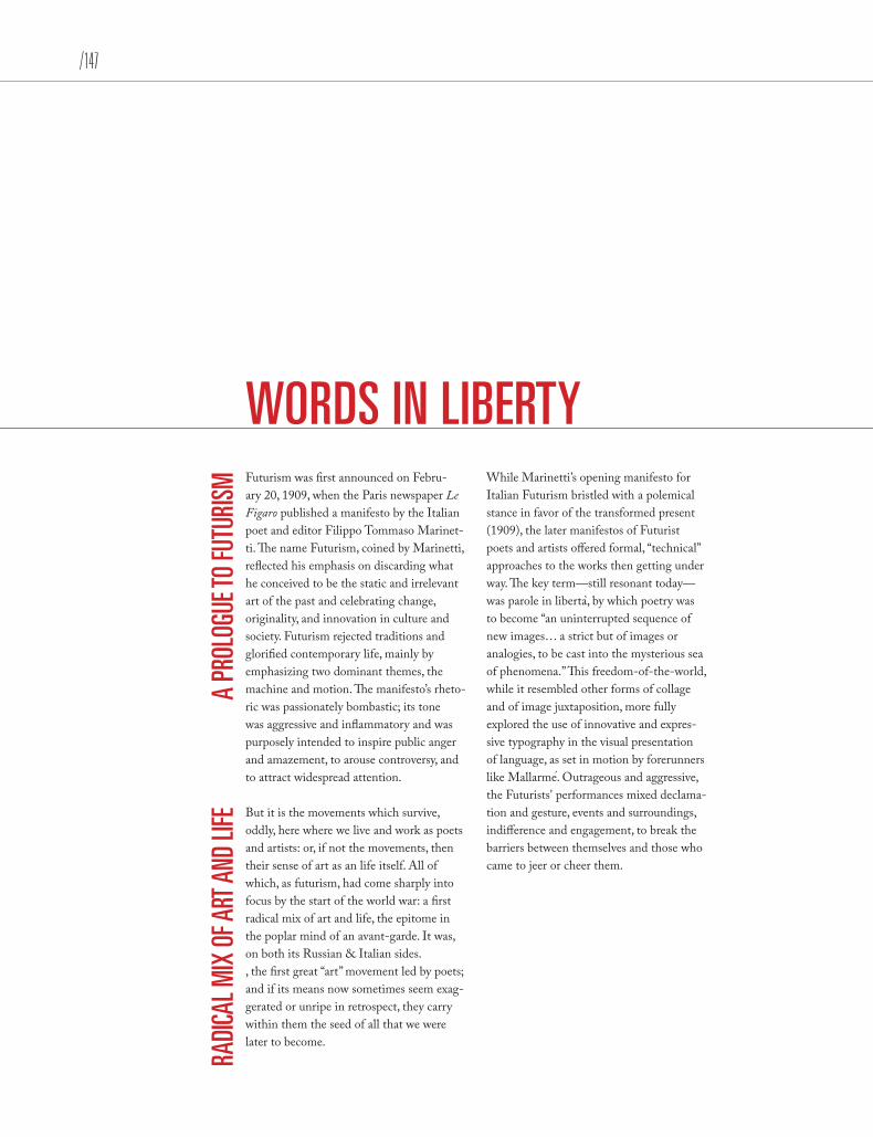
/147
Futurism was first announced on Febru-ary 20, 1909, when the Paris newspaper Le Figaro published a manifesto by the Italian poet and editor Filippo Tommaso Marinet-ti. The name Futurism, coined by Marinetti, reflected his emphasis on discarding what he conceived to be the static and irrelevant art of the past and celebrating change, originality, and innovation in culture and society. Futurism rejected traditions and glorified contemporary life, mainly by emphasizing two dominant themes, the machine and motion. The manifesto’s rheto-ric was passionately bombastic; its tone was aggressive and inflammatory and was purposely intended to inspire public anger and amazement, to arouse controversy, and to attract widespread attention.
But it is the movements which survive, oddly, here where we live and work as poets and artists: or, if not the movements, then their sense of art as an life itself. All of which, as futurism, had come sharply into focus by the start of the world war: a first radical mix of art and life, the epitome in the poplar mind of an avant-garde. It was, on both its Russian & Italian sides., the first great “art” movement led by poets; and if its means now sometimes seem exag-gerated or unripe in retrospect, they carry within them the seed of all that we were later to become.
While Marinetti’s opening manifesto for Italian Futurism bristled with a polemical stance in favor of the transformed present (1909), the later manifestos of Futurist poets and artists offered formal, “technical” approaches to the works then getting under way. The key term —still resonant today — was parole in liberta, by which poetry was to become “an uninterrupted sequence of new images… a strict but of images or analogies, to be cast into the mysterious sea of phenomena.” This freedom-of-the-world, while it resembled other forms of collage and of image juxtaposition, more fully explored the use of innovative and expres-sive typography in the visual presentation of language, as set in motion by forerunners like Mallarme. Outrageous and aggressive, the Futurists' performances mixed declama-tion and gesture, events and surroundings, indifference and engagement, to break the barriers between themselves and those who came to jeer or cheer them.
`
´
WORDS IN LIBERTY
A PR
OLOG
UE TO
FUTU
RISM
RADI
CAL M
IX O
F ART
AND
LIFE
Text Headers
Futurism was first announced on Febru-ary 20, 1909, when the Paris newspaper Le Figaro published a manifesto by the Italian poet and editor Filippo Tommaso Marinet-ti. The name Futurism, coined by Marinetti, reflected his emphasis on discarding what he conceived to be the static and irrelevant art of the past and celebrating change, originality, and innovation in culture and society. Futurism rejected traditions and glorified contemporary life, mainly by emphasizing two dominant themes, the machine and motion. The manifesto’s rheto-ric was passionately bombastic; its tone was aggressive and inflammatory and was purposely intended to inspire public anger and amazement, to arouse controversy, and to attract widespread attention.
But it is the movements which survive, oddly, here where we live and work as poets and artists: or, if not the movements, then their sense of art as an life itself. All of which, as futurism, had come sharply into focus by the start of the world war: a first radical mix of art and life, the epitome in the poplar mind of an avant-garde. It was, on both its Russian & Italian sides, the first great “art” movement led by poets; and if its means now sometimes seem exaggerated or unripe in retrospect, they carry within them the seed of all that we were later to become.
While Marinetti’s opening manifesto for Italian Futurism bristled with a polemical stance in favor of the transformed present (1909), the later manifestos of Futurist poets and artists offered formal, “technical” approaches to the works then getting under way. The key term —still resonant today — was parole in liberta, by which poetry was to become “an uninterrupted sequence of new images… a strict but of images or analogies, to be cast into the mysterious sea of phenomena.” This freedom-of-the-world, while it resembled other forms of collage and of image juxtaposition, more fully explored the use of innovative and expres-sive typography in the visual presentation of language, as set in motion by forerunners like Mallarme. Outrageous and aggressive, the Futurists' performances mixed declama-tion and gesture, events and surroundings, indifference and engagement, to break the barriers between themselves and those who came to jeer or cheer them.
`
´
WORDS IN LIBERTY A Prologue to Futurism
Radical Mix Of Art And Life
Text Headers
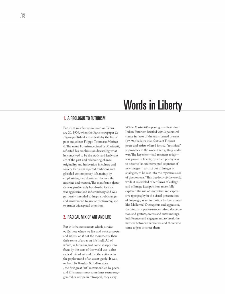
/149
1. A PROLOGUE TO FUTURISM Futurism was first announced on Febru-ary 20, 1909, when the Paris newspaper Le Figaro published a manifesto by the Italian poet and editor Filippo Tommaso Marinet-ti. The name Futurism, coined by Marinetti, reflected his emphasis on discarding what he conceived to be the static and irrelevant art of the past and celebrating change, originality, and innovation in culture and society. Futurism rejected traditions and glorified contemporary life, mainly by emphasizing two dominant themes, the machine and motion. The manifesto’s rheto-ric was passionately bombastic; its tone was aggressive and inflammatory and was purposely intended to inspire public anger and amazement, to arouse controversy, and to attract widespread attention.
2. RADICAL MIX OF ART AND LIFE
But it is the movements which survive, oddly, here where we live and work as poets and artists: or, if not the movements, then their sense of art as an life itself. All of which, as futurism, had come sharply into focus by the start of the world war: a first radical mix of art and life, the epitome in the poplar mind of an avant-garde. It was, on both its Russian & Italian sides., the first great “art” movement led by poets; and if its means now sometimes seem exag-gerated or unripe in retrospect, they carry
While Marinetti’s opening manifesto for Italian Futurism bristled with a polemical stance in favor of the transformed present (1909), the later manifestos of Futurist poets and artists offered formal, “technical” approaches to the works then getting under way. The key term —still resonant today — was parole in liberta, by which poetry was to become “an uninterrupted sequence of new images… a strict but of images or analogies, to be cast into the mysterious sea of phenomena.” This freedom-of-the-world, while it resembled other forms of collage and of image juxtaposition, more fully explored the use of innovative and expres-sive typography in the visual presentation of language, as set in motion by forerunners like Mallarme. Outrageous and aggressive, the Futurists' performances mixed declama-tion and gesture, events and surroundings, indifference and engagement, to break the barriers between themselves and those who came to jeer or cheer them.
`
´
Words in Liberty
Text Headers

• A PROLOGUE TO FUTURISM Futurism was first announced on Febru-ary 20, 1909, when the Paris newspaper Le Figaro published a manifesto by the Italian poet and editor Filippo Tommaso Marinet-ti. The name Futurism, coined by Marinetti, reflected his emphasis on discarding what he conceived to be the static and irrelevant art of the past and celebrating change, originality, and innovation in culture and society. Futurism rejected traditions and glorified contemporary life, mainly by emphasizing two dominant themes, the machine and motion. The manifesto’s rheto-ric was passionately bombastic; its tone was aggressive and inflammatory and was purposely intended to inspire public anger and amazement, to arouse controversy, and to attract widespread attention.
• RADICAL MIX OF ART AND LIFEBut it is the movements which survive, oddly, here where we live and work as poets and artists: or, if not the movements, then their sense of art as an life itself. All of which, as futurism, had come sharply into focus by the start of the world war: a first radical mix of art and life, the epitome in the poplar mind of an avant-garde. It was, on both its Russian & Italian sides, the first great “art” movement led by poets; and if its means now sometimes seem exaggerated or unripe in retrospect, they carry within them the seed of all that we were later to become.
While Marinetti’s opening manifesto for Italian Futurism bristled with a polemical stance in favor of the transformed present (1909), the later manifestos of Futurist poets and artists offered formal, “technical” approaches to the works then getting under way. The key term —still resonant today — was parole in liberta, by which poetry was to become “an uninterrupted sequence of new images… a strict but of images or analogies, to be cast into the mysterious sea of phenomena.” This freedom-of-the-world, while it resembled other forms of collage and of image juxtaposition, more fully explored the use of innovative and expres-sive typography in the visual presentation of language, as set in motion by forerunners like Mallarme. Outrageous and aggressive, the Futurists' performances mixed declama-tion and gesture, events and surroundings, indifference and engagement, to break the barriers between themselves and those who came to jeer or cheer them.
`
´
Words in Liberty
Text Headers

/151
Futurism was first announced on Febru-ary 20, 1909, when the Paris newspaper Le Figaro published a manifesto by the Italian poet and editor Filippo Tommaso Marinet-ti. The name Futurism, coined by Marinetti, reflected his emphasis on discarding what he conceived to be the static and irrelevant art of the past and celebrating change, originality, and innovation in culture and society. Futurism rejected traditions and glorified contemporary life, mainly by emphasizing two dominant themes, the machine and motion. The manifesto’s rheto-ric was passionately bombastic; its tone was aggressive and inflammatory and was purposely intended to inspire public anger and amazement, to arouse controversy, and to attract widespread attention.
But it is the movements which survive, oddly, here where we live and work as poets and artists: or, if not the movements, then their sense of art as an life itself. All of which, as futurism, had come sharply into focus by the start of the world war: a first radical mix of art and life, the epitome in the poplar mind of an avant-garde. It was, on both its Russian & Italian sides. The first great “art” movement led by poets; and if its means now sometimes seem exaggerated or unripe in retrospect, they carry within them the seed of all that we were later to become.
While Marinetti’s opening manifesto for Italian Futurism bristled with a polemical stance in favor of the transformed present (1909), the later manifestos of Futurist poets and artists offered formal, “technical” approaches to the works then getting under way. The key term —still resonant today — was parole in liberta, by which poetry was to become “an uninterrupted sequence of new images… a strict but of images or analogies, to be cast into the mysterious sea of phenomena.” This freedom-of-the-world, while it resembled other forms of collage and of image juxtaposition, more fully explored the use of innovative and expres-sive typography in the visual presentation of language, as set in motion by forerunners like Mallarme. Outrageous and aggressive, the Futurists' performances mixed declama-tion and gesture, events and surroundings, indifference and engagement, to break the barriers between themselves and those who came to jeer or cheer them.
`
´
WORDS IN LIBERTY A Prologue to Futurism
Radical Mix Of Art And Life
Text Headers


/153
CAPTION & NOTES

Captions & Notes
.1
.*
Numerals or asterisks can be used for footnotes.
Footnotes
/155
nineteen
Footnotes and Endnotes Footnotes and endnotes are necessary
components of scholarly and technical writing.
They’re also frequently used by writers of
fiction, from Herman Melville (Moby-Dick)
to contemporary novelists. Whether their intent
is academic or artistic, footnotes present special
typographic challenges.
Specifically, a footnote is a text element at the
bottom of a page of a book or manuscript that
provides additional information about a point
made in the main text. The footnote might pro-
vide deeper background, offer an alternate
interpretation or provide a citation for the source
of a quote, idea or statistic. Endnotes serve the
same purpose but are grouped together at the end
of a chapter, article or book, rather than at the
bottom of each page (using numerals).
Design of Notes These general guidelines will help you design
footnotes and endnotes that are readable, legible
and economical in space. (Note that academic
presses and journals can be sticklers for format:
before proceeding, check with your client or
publisher to see if they have a specific stylesheet
that must be followed.)
Numbers or Symbols: Footnotes are most
often indicated by placing a superscript numeral
immediately after the text to be referenced. The
same superscript numeral then precedes the
footnoted text at the bottom of the page.
Numbering footnotes is essential when there are
many of them, but if footnotes are few they can be
marked with a dagger, asterisk, or other
symbol instead. Endnotes should always use
numerals to facilitate easy referencing.
Size: Footnotes and endnotes are set smaller than
body text. The difference in size is usually about
two points, but this can vary depending on the
size, style and legibility of the main text. Even
though they’re smaller, footnotes and endnotes
should still remain at a readable size.
A Prologue to Futurism Futurism was first announced on Febru-ary 20, 1909, when the Paris newspaper Le Figaro published a manifesto by the Italian poet and editor Filippo Tommaso Marinet-ti. The name Futurism, coined by Marinetti, reflected his emphasis on discarding what he conceived to be the static and irrelevant art of the past and celebrating change, originality, and innovation in culture and society. 1 Futurism rejected traditions and glorified contemporary life, mainly by emphasizing two dominant themes, the machine and motion. The manifesto’s rheto-ric was passionately bombastic; its tone was aggressive and inflammatory and was purposely intended to inspire public anger and amazement, to arouse controversy, and to attract widespread attention.
Radical Mix Of Art And LifeBut it is the movements which survive, oddly, here where we live and work as poets and artists: or, if not the movements, then their sense of art as an life itself. All of which, as futurism, had come sharply into focus by the start of the world war: a first radical mix of art and life, the epitome in the poplar mind of an avant-garde. It was, on both its Russian & Italian sides, the first great “art” movement led by poets; and if its means now sometimes seem exaggerated or unripe in retrospect, they carry within them the seed of all that we were later to become.
While Marinetti’s opening manifesto for Italian Futurism bristled with a polemical stance in favor of the transformed present (1909), the later manifestos of Futurist poets and artists offered formal, “technical” approaches to the works then getting under way. The key term —still resonant today — was parole in liberta 2, by which poetry was to become “an uninterrupted sequence of new images… a strict but of images or analogies, to be cast into the mysterious sea of phenomena.” This freedom-of-the-world, while it resembled other forms of collage and of image juxtaposition, more fully explored the use of innovative and expres-sive typography in the visual presentation of language, as set in motion by forerunners like Mallarme. Outrageous and aggressive, the Futurists’ performances mixed declama-tion and gesture, events and surroundings, indifference and engagement, to break the barriers between themselves and those who came to jeer or cheer them. Wrote Marinetti selbst 3 (circa 1915), “Everything of any value is theatrical.”
`
´
Wo r d s I n L i b e r t y
1. Philip Meggs, History of Graphic Design, Van Nostrand Reinhold, 19882. parole in liberta = words set free (liberty)3. selbst = himself
Captions & Notes
/157
Futurism was first announced on Febru-ary 20, 1909, when the Paris newspaper Le Figaro published a manifesto by the Italian poet and editor Filippo Tommaso Marinet-ti. The name Futurism, coined by Marinetti, reflected his emphasis on discarding what he conceived to be the static and irrelevant art of the past and celebrating change, originality, and innovation in culture and society. 1 Futurism rejected traditions and glorified contemporary life, mainly by emphasizing two dominant themes, the machine and motion. The manifesto’s rheto-ric was passionately bombastic; its tone was aggressive and inflammatory and was purposely intended to inspire public anger and amazement, to arouse controversy, and to attract widespread attention.
But it is the movements which survive, oddly, here where we live and work as poets and artists: or, if not the movements, then their sense of art as an life itself. All of which, as futurism, had come sharply into focus by the start of the world war: a first radical mix of art and life, the epitome in the poplar mind of an avant-garde. It was, on both its Russian & Italian sides., the first great “art” movement led by poets; and if its means now sometimes seem exag-gerated or unripe in retrospect, they carry within them the seed of all that we were later to become.
While Marinetti’s opening manifesto for Italian Futurism bristled with a polemical stance in favor of the transformed present (1909), the later manifestos of Futurist poets and artists offered formal, “technical” approaches to the works then getting under way. The key term —still resonant today — was parole in liberta 2, by which poetry was to become “an uninterrupted sequence of new images… a strict but of images or analogies, to be cast into the mysterious sea of phenomena.” This freedom-of-the-world, while it resembled other forms of collage and of image juxtaposition, more fully explored the use of innovative and expres-sive typography in the visual presentation of language, as set in motion by forerunners like Mallarme. Outrageous and aggressive, the Futurists’ performances mixed declama-tion and gesture, events and surroundings, indifference and engagement, to break the barriers between themselves and those who came to jeer or cheer them. Wrote Marinetti selbst 3 (circa 1915), “Everything of any value is theatrical.”
`
´
WORDS IN LIBERTY
A PR
OLOG
UE TO
FUTU
RISM
RADI
CAL M
IX O
F ART
AND
LIFE
1. Philip Meggs, History of Graphic Design, Van Nostrand Reinhold, 1988 2. parole in liberta = words set free (liberty) 3. selbst = himself
Futurism was first announced on Febru-ary 20, 1909, when the Paris newspaper Le Figaro published a manifesto by the Italian poet and editor Filippo Tommaso Marinet-ti. The name Futurism, coined by Marinetti, reflected his emphasis on discarding what he conceived to be the static and irrelevant art of the past and celebrating change, originality, and innovation in culture and society 1. Futurism rejected traditions and glorified contemporary life, mainly by emphasizing two dominant themes, the machine and motion. The manifesto’s rheto-ric was passionately bombastic; its tone was aggressive and inflammatory and was purposely intended to inspire public anger and amazement, to arouse controversy, and to attract widespread attention.
But it is the movements which survive, oddly, here where we live and work as poets and artists: or, if not the movements, then their sense of art as an life itself. All of which, as futurism, had come sharply into focus by the start of the world war: a first radical mix of art and life, the epitome in the poplar mind of an avant-garde. It was, on both its Russian & Italian sides, the first great “art” movement led by poets; and if its means now sometimes seem exaggerated or unripe in retrospect, they carry within them the seed of all that we were later to become.
While Marinetti’s opening manifesto for Italian Futurism bristled with a polemical stance in favor of the transformed present (1909), the later manifestos of Futurist poets and artists offered formal, “technical” approaches to the works then getting under way. The key term —still resonant today — was parole in liberta 2, by which poetry was to become “an uninterrupted sequence of new images… a strict but of images or analogies, to be cast into the mysterious sea of phenomena.” This freedom-of-the-world, while it resembled other forms of collage and of image juxtaposition, more fully explored the use of innovative and expres-sive typography in the visual presentation of language, as set in motion by forerunners like Mallarme. Outrageous and aggressive, the Futurists’ performances mixed declama-tion and gesture, events and surroundings, indifference and engagement, to break the barriers between themselves and those who came to jeer or cheer them. Wrote Marinetti selbst 3 (circa 1915), “Everything of any value is theatrical.”
`
´
WORDS IN LIBERTY A Prologue to Futurism
Radical Mix Of Art And Life
2. parole in liberta = words set free (liberty)3. selbst = himself
1. Philip Meggs, History of Graphic Design, Van Nostrand Reinhold, 1988
Captions & Notes
/159
1. A PROLOGUE TO FUTURISM Futurism was first announced on Febru-ary 20, 1909, when the Paris newspaper Le Figaro published a manifesto by the Italian poet and editor Filippo Tommaso Marinet-ti. The name Futurism, coined by Marinetti, reflected his emphasis on discarding what he conceived to be the static and irrelevant art of the past and celebrating change, originality, and innovation in culture and society *. Futurism rejected traditions and glorified contemporary life, mainly by emphasizing two dominant themes, the machine and motion. The manifesto’s rheto-ric was passionately bombastic; its tone was aggressive and inflammatory and was purposely intended to inspire public anger and amazement, to arouse controversy, and to attract widespread attention.
2. RADICAL MIX OF ART AND LIFE
But it is the movements which survive, oddly, here where we live and work as poets and artists: or, if not the movements, then their sense of art as an life itself. All of which, as futurism, had come sharply into focus by the start of the world war: a first radical mix of art and life, the epitome in the poplar mind of an avant-garde. It was, on both its Russian & Italian sides., the first great “art” movement led by poets; and if its means now sometimes seem exag-
While Marinetti’s opening manifesto for Italian Futurism bristled with a polemical stance in favor of the transformed present (1909), the later manifestos of Futurist poets and artists offered formal, “technical” approaches to the works then getting under way. The key term —still resonant today — was parole in liberta *, by which poetry was to become “an uninterrupted sequence of new images… a strict but of images or analogies, to be cast into the mysterious sea of phenomena.” This freedom-of-the-world, while it resembled other forms of collage and of image juxtaposition, more fully explored the use of innovative and expres-sive typography in the visual presentation of language, as set in motion by forerunners like Mallarme. Outrageous and aggressive, the Futurists’ performances mixed declama-tion and gesture, events and surroundings, indifference and engagement, to break the barriers between themselves and those who came to jeer or cheer them. Wrote Marinetti selbst * (circa 1915), “Everything of any value is theatrical.”
`
´
Words in Liberty (* Philip Meggs, History of Graphic Design, Van Nostrand Reinhold, 1988)
(* parole in liberta = words set free (liberty))(* selbst = himself )

• A PROLOGUE TO FUTURISM Futurism was first announced on Febru-ary 20, 1909, when the Paris newspaper Le Figaro published a manifesto by the Italian poet and editor Filippo Tommaso Marinet-ti. The name Futurism, coined by Marinetti, reflected his emphasis on discarding what he conceived to be the static and irrelevant art of the past and celebrating change, originality, and innovation in culture and society 1. Futurism rejected traditions and glorified contemporary life, mainly by emphasizing two dominant themes, the machine and motion. The manifesto’s rheto-ric was passionately bombastic; its tone was aggressive and inflammatory and was purposely intended to inspire public anger and amazement, to arouse controversy, and to attract widespread attention.
• RADICAL MIX OF ART AND LIFEBut it is the movements which survive, oddly, here where we live and work as poets and artists: or, if not the movements, then their sense of art as an life itself. All of which, as futurism, had come sharply into focus by the start of the world war: a first radical mix of art and life, the epitome in the poplar mind of an avant-garde. It was, on both its Russian & Italian sides, the first great “art” movement led by poets; and if its means now sometimes seem exaggerated or unripe in retrospect, they carry within them the seed of all that we were later to become.
While Marinetti’s opening manifesto for Italian Futurism bristled with a polemical stance in favor of the transformed present (1909), the later manifestos of Futurist poets and artists offered formal, “technical” approaches to the works then getting under way. The key term —still resonant today — was parole in liberta 2, by which poetry was to become “an uninterrupted sequence of new images… a strict but of images or analogies, to be cast into the mysterious sea of phenomena.” This freedom-of-the-world, while it resembled other forms of collage and of image juxtaposition, more fully explored the use of innovative and expres-sive typography in the visual presentation of language, as set in motion by forerunners like Mallarme. Outrageous and aggressive, the Futurists’ performances mixed declama-tion and gesture, events and surroundings, indifference and engagement, to break the barriers between themselves and those who came to jeer or cheer them. Wrote Marinetti selbst 3 (circa 1915), “Everything of any value is theatrical.”
`
´
Words in Liberty
1. Philip Meggs, History of Graphic Design, Van Nostrand Reinhold, 1988
2. parole in liberta = words set free (liberty)
3. selbst = himself
Captions & Notes

/161
Futurism was first announced on Febru-ary 20, 1909, when the Paris newspaper Le Figaro published a manifesto by the Italian poet and editor Filippo Tommaso Marinet-ti. The name Futurism, coined by Marinetti, reflected his emphasis on discarding what he conceived to be the static and irrelevant art of the past and celebrating change, originality, and innovation in culture and society. *Futurism rejected traditions and glorified contemporary life, mainly by emphasizing two dominant themes, the machine and motion. The manifesto’s rheto-ric was passionately bombastic; its tone was aggressive and inflammatory and was purposely intended to inspire public anger and amazement, to arouse controversy, and to attract widespread attention.
But it is the movements which survive, oddly, here where we live and work as poets and artists: or, if not the movements, then their sense of art as an life itself. All of which, as futurism, had come sharply into focus by the start of the world war: a first radical mix of art and life, the epitome in the poplar mind of an avant-garde. It was, on both its Russian & Italian sides. The first great “art” movement led by poets; and if its means now sometimes seem exaggerated or unripe in retrospect, they carry within them the seed of all that we were later to become.
While Marinetti’s opening manifesto for Italian Futurism bristled with a polemical stance in favor of the transformed present (1909), the later manifestos of Futurist poets and artists offered formal, “technical” approaches to the works then getting under way. The key term —still resonant today — was parole in liberta *, by which poetry was to become “an uninterrupted sequence of new images… a strict but of images or analogies, to be cast into the mysterious sea of phenomena.” This freedom-of-the-world, while it resembled other forms of collage and of image juxtaposition, more fully explored the use of innovative and expres-sive typography in the visual presentation of language, as set in motion by forerunners like Mallarme. Outrageous and aggressive, the Futurists’ performances mixed declama-tion and gesture, events and surroundings, indifference and engagement, to break the barriers between themselves and those who came to jeer or cheer them. Wrote Mari-netti selbst * (circa 1915), “Everything of any value is theatrical.”
`
´
WORDS IN LIBERTY A Prologue to Futurism
Radical Mix Of Art And Life
* Philip Meggs, History of Graphic Design, Van Nostrand Reinhold, 1988* parole in liberta = words set free (liberty)* selbst = himself


/163
FONT SPECIMENS

Font Specimens
Abc 123
Adobe Caslon Regular
Adobe Caslon Italic
There are too many fonts that exist, for anyone to memorize them all without seeing both letters and numerals in different styles.
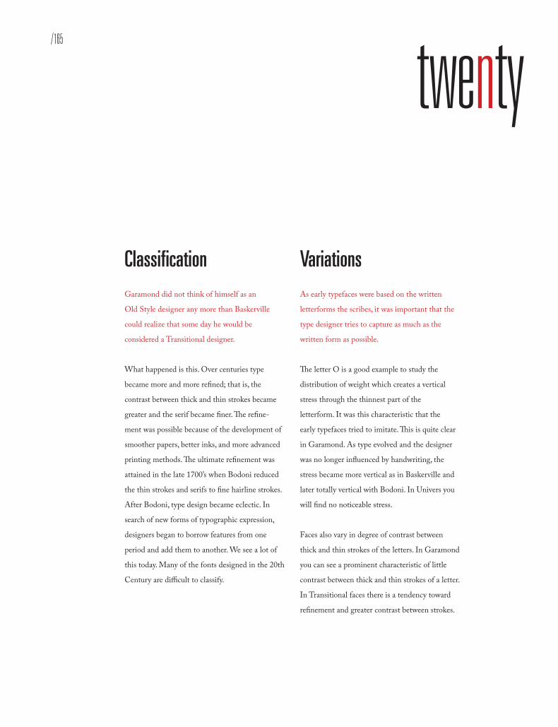
/165Font Specimens
twenty
Classification Garamond did not think of himself as an
Old Style designer any more than Baskerville
could realize that some day he would be
considered a Transitional designer.
What happened is this. Over centuries type
became more and more refined; that is, the
contrast between thick and thin strokes became
greater and the serif became finer. The refine-
ment was possible because of the development of
smoother papers, better inks, and more advanced
printing methods. The ultimate refinement was
attained in the late 1700’s when Bodoni reduced
the thin strokes and serifs to fine hairline strokes.
After Bodoni, type design became eclectic. In
search of new forms of typographic expression,
designers began to borrow features from one
period and add them to another. We see a lot of
this today. Many of the fonts designed in the 20th
Century are difficult to classify.
Variations As early typefaces were based on the written
letterforms the scribes, it was important that the
type designer tries to capture as much as the
written form as possible.
The letter O is a good example to study the
distribution of weight which creates a vertical
stress through the thinnest part of the
letterform. It was this characteristic that the
early typefaces tried to imitate. This is quite clear
in Garamond. As type evolved and the designer
was no longer influenced by handwriting, the
stress became more vertical as in Baskerville and
later totally vertical with Bodoni. In Univers you
will find no noticeable stress.
Faces also vary in degree of contrast between
thick and thin strokes of the letters. In Garamond
you can see a prominent characteristic of little
contrast between thick and thin strokes of a letter.
In Transitional faces there is a tendency toward
refinement and greater contrast between strokes.
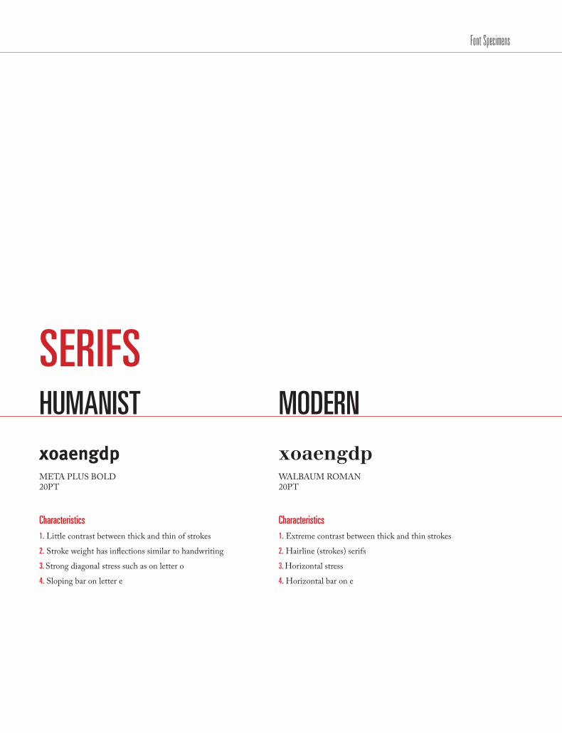
HUMANIST
xoaengdpMETA PLUS BOLD 20PT
Characteristics 1. Little contrast between thick and thin of strokes
2. Stroke weight has inflections similar to handwriting
3. Strong diagonal stress such as on letter o
4. Sloping bar on letter e
SERIFS MODERN
xoaengdpWALBAUM ROMAN 20PT
Characteristics 1. Extreme contrast between thick and thin strokes
2. Hairline (strokes) serifs
3. Horizontal stress
4. Horizontal bar on e
Font Specimens

/167
OLDSTYLE
xoaengdpBEMBO BOLD 20PT
Characteristics 1. Scooped serifs, sturdy without being heavy
2. Horizontal bar on e
3. Diagonal stress is less prominent
4. Shorter x-height
NEW TRANSITIONAL
xoaengdpNEW BASKERVILLE BOLD 20PT
Characteristics 1. Typefaces hard to hold up under poor printing
2. Shorter ascenders, descenders
3. Tall x-height
4. Contrast between thick and thin strokes
Font Specimens

TRANSITIONAL
xoaengdpMRS EAVES BOLD 20PT
Characteristics 1. Contrast between thick and thin strokes pronounced
2. Tall x-height
3. Bracketed serifs
4. Very slight diagonal stress
SLAB SERIF
xoaengdpROCKWELL REGULAR 20PT
Characteristics 1. Mono weight
2. Square end serifs
3. Strong horizontal stress such as on letters
4. Horizontal bar on e
Font Specimens

/169
XOAENGDPEach type classification has its own unique characteristics, such as stroke weight, descenders, and ascenders for its own font list.
Font Specimens

GROTESQUE
xoaengdpAKZIDENZ GROTESK BOLD 20PT
Characteristics 1. Slight contrast in the stroke weight
2. Slight squareness to the curves
3. Usually a tall x-height : short ascenders and descenders
4. Usually a two story lowercase a
SAN SERIFS GEOMETRIC
xoaengdpFUTURA MEDIUM 20PT
Characteristics 1. Close to mono weight
2. A little wider set of type
3. Constructed from simple shapes like circles
4. Usually a one story a
Font Specimens
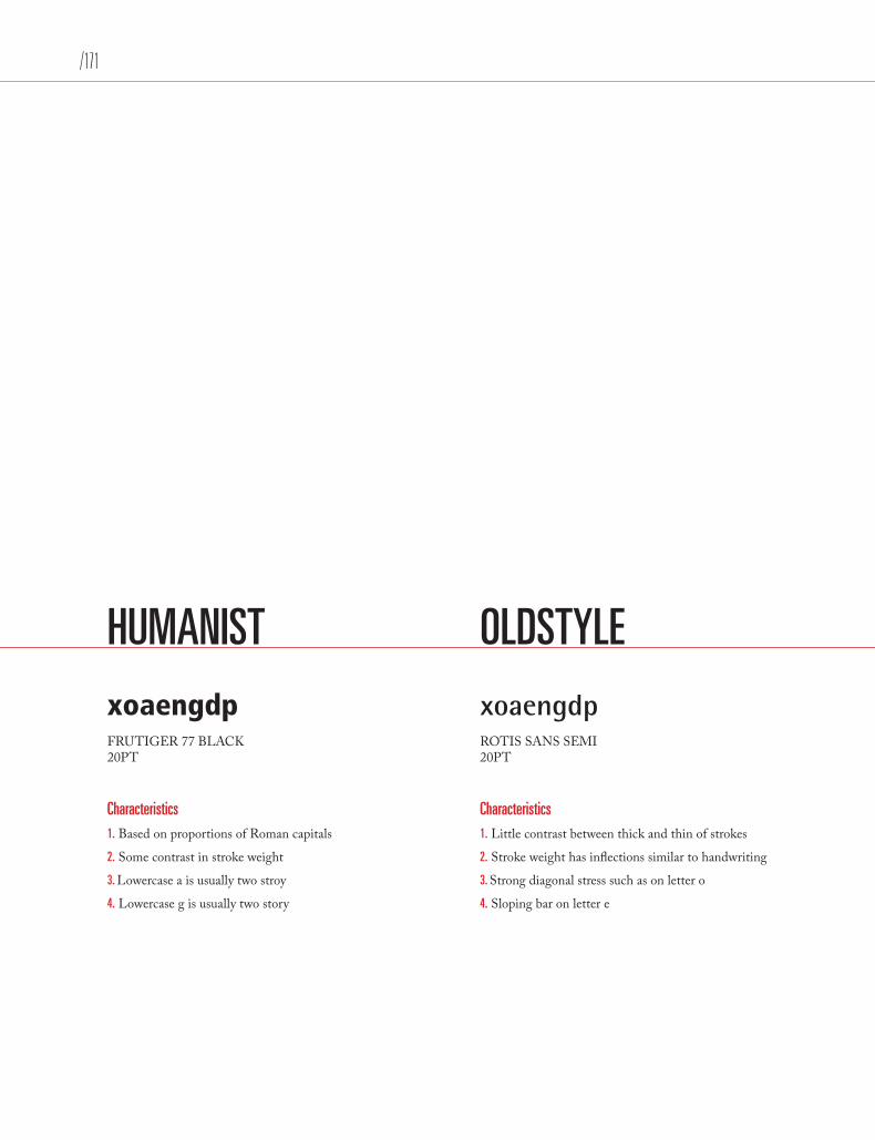
/171
HUMANIST
xoaengdpFRUTIGER 77 BLACK 20PT
Characteristics 1. Based on proportions of Roman capitals
2. Some contrast in stroke weight
3. Lowercase a is usually two stroy
4. Lowercase g is usually two story
OLDSTYLE
xoaengdpROTIS SANS SEMI 20PT
Characteristics 1. Little contrast between thick and thin of strokes
2. Stroke weight has inflections similar to handwriting
3. Strong diagonal stress such as on letter o
4. Sloping bar on letter e
Font Specimens

Classification: San Serif
REGULAR
BOLD
SUPER
AKZIDENZ GROTESK
MaxogGdQRstA basic system for classifying typefaces was devised in the nineteenth century, when printers sought to identify a heritage for their own craft analogous to that of art history. Humanist letterforms are closely connected to calligraphy and the movement of the hand. Transitional and modern typefaces are more abstract and less organic. These three main groups correspond roughly to the Renaissance, Baroque, and Enlightenment periods in art and literature. Designers in the twentieth and twenty-first centuries have continued to create new typefaces based on historic characteristics.
A basic system for classifying typefaces was devised in the nineteenth century, when printers sought to identify a heritage for their own craft analogous to that of art history. Humanist letterforms are closely connected to calligraphy and the movement of the hand. Transitional and modern typefaces are more abstract and less organic. These three main groups correspond roughly to the Renaissance, Baroque, and Enlightenment periods in art and literature. Designers in the twentieth and twenty-first centuries have continued to create new typefaces based on historic characteristics.
Aa Bb Cc Dd Ee Ff Gg Hh Ii Jj Kk Ll Mm Nn Oo Pp Qq Rr Ss Tt Uu Vv Ww Xx Yy Zz 1 2 3 4 5 6 7 8 9 0 ( ) { } ? ! @ & *
Aa Bb Cc Dd Ee Ff Gg Hh Ii Jj Kk Ll Mm Nn Oo Pp Qq Rr Ss Tt Uu Vv Ww Xx Yy Zz 1 2 3 4 5 6 7 8 9 0 ( ) { } ? ! @ & *
Aa Bb Cc Dd Ee Ff Gg Hh Ii Jj Kk Ll Mm Nn Oo Pp Qq Rr Ss Tt Uu Vv Ww Xx Yy Zz 1 2 3 4 5 6 7 8 9 0 ( ) { } ? ! @ & *
ITALIC
Aa Bb Cc Dd Ee Ff Gg Hh Ii Jj Kk Ll Mm Nn Oo Pp Qq Rr Ss Tt Uu Vv Ww Xx Yy Zz 1 2 3 4 5 6 7 8 9 0 ( ) { } ? ! @ & *
Font Specimens

/173
Classification: Slab Serif
REGULAR
BOLD
BLACK
BELIZIO
MaxogGdQRstA basic system for classifying typefaces was devised in the nineteenth century, when printers sought to identify a heritage for their own craft analogous to that of art history. Humanist letterforms are closely connected to calligraphy and the movement of the hand. Transitional and modern typefaces are more abstract and less organic. These three main groups correspond roughly to the Renaissance, Baroque, and Enlightenment periods in art and literature. Designers in the twentieth and twenty-first centuries have continued to create new typefaces based on historic characteristics.
A basic system for classifying typefaces was devised in the nineteenth century, when printers sought to identify a heritage for their own craft analogous to that of art history. Humanist letterforms are closely connected to calligraphy and the movement of the hand. Transitional and modern typefaces are more abstract and less organic. These three main groups correspond roughly to the Renaissance, Baroque, and Enlightenment periods in art and literature. Designers in the twentieth and twenty-first centuries have continued to create new typefaces based on historic characteristics.
Aa Bb Cc Dd Ee Ff Gg Hh Ii Jj Kk Ll Mm Nn Oo Pp Qq Rr Ss Tt Uu Vv Ww Xx Yy Zz 1 2 3 4 5 6 7 8 9 0 ( ) { } ? ! @ & *
Aa Bb Cc Dd Ee Ff Gg Hh Ii Jj Kk Ll Mm Nn Oo Pp Qq Rr Ss Tt Uu Vv Ww Xx Yy Zz 1 2 3 4 5 6 7 8 9 0 ( ) { } ? ! @
Aa Bb Cc Dd Ee Ff Gg Hh Ii Jj Kk Ll Mm Nn Oo Pp Qq Rr Ss Tt Uu Vv Ww Xx Yy Zz 1 2 3 4 5 6 7 8 9 0 ( ) { } ? !
ITALIC
Aa Bb Cc Dd Ee Ff Gg Hh Ii Jj Kk Ll Mm Nn Oo Pp Qq Rr Ss Tt Uu Vv Ww Xx Yy Zz 1 2 3 4 5 6 7 8 9 0 ( ) { } ? ! @ & *
Font Specimens
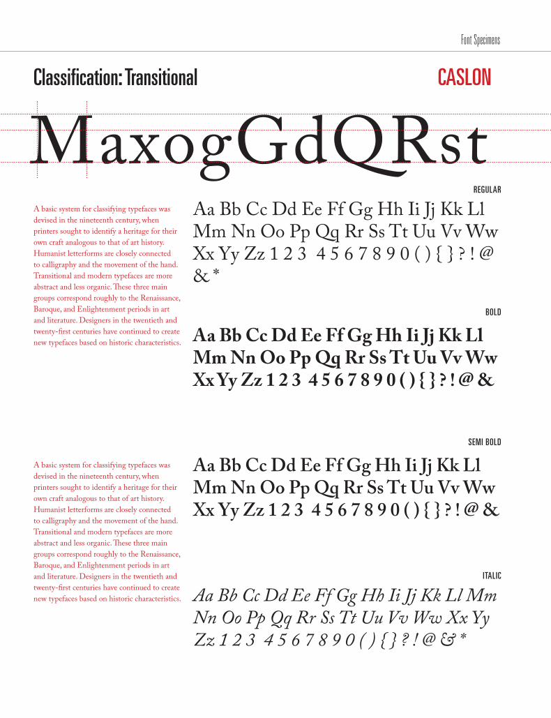
Classification: Transitional
REGULAR
BOLD
SEMI BOLD
CASLON
MaxogGdQRstA basic system for classifying typefaces was devised in the nineteenth century, when printers sought to identify a heritage for their own craft analogous to that of art history. Humanist letterforms are closely connected to calligraphy and the movement of the hand. Transitional and modern typefaces are more abstract and less organic. These three main groups correspond roughly to the Renaissance, Baroque, and Enlightenment periods in art and literature. Designers in the twentieth and twenty-first centuries have continued to create new typefaces based on historic characteristics.
A basic system for classifying typefaces was devised in the nineteenth century, when printers sought to identify a heritage for their own craft analogous to that of art history. Humanist letterforms are closely connected to calligraphy and the movement of the hand. Transitional and modern typefaces are more abstract and less organic. These three main groups correspond roughly to the Renaissance, Baroque, and Enlightenment periods in art and literature. Designers in the twentieth and twenty-first centuries have continued to create new typefaces based on historic characteristics.
Aa Bb Cc Dd Ee Ff Gg Hh Ii Jj Kk Ll Mm Nn Oo Pp Qq Rr Ss Tt Uu Vv Ww Xx Yy Zz 1 2 3 4 5 6 7 8 9 0 ( ) { } ? ! @ & *
Aa Bb Cc Dd Ee Ff Gg Hh Ii Jj Kk Ll Mm Nn Oo Pp Qq Rr Ss Tt Uu Vv Ww Xx Yy Zz 1 2 3 4 5 6 7 8 9 0 ( ) { } ? ! @ &
Aa Bb Cc Dd Ee Ff Gg Hh Ii Jj Kk Ll Mm Nn Oo Pp Qq Rr Ss Tt Uu Vv Ww Xx Yy Zz 1 2 3 4 5 6 7 8 9 0 ( ) { } ? ! @ &
ITALIC
Aa Bb Cc Dd Ee Ff Gg Hh Ii Jj Kk Ll Mm Nn Oo Pp Qq Rr Ss Tt Uu Vv Ww Xx Yy Zz 1 2 3 4 5 6 7 8 9 0 ( ) { } ? ! @ & *
Font Specimens
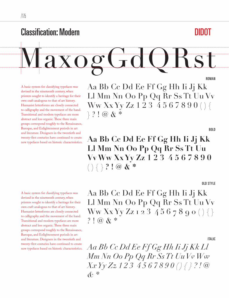
/175
Classification: Modern
ROMAN
BOLD
OLD STYLE
DIDOT
MaxogGdQRstA basic system for classifying typefaces was devised in the nineteenth century, when printers sought to identify a heritage for their own craft analogous to that of art history. Humanist letterforms are closely connected to calligraphy and the movement of the hand. Transitional and modern typefaces are more abstract and less organic. These three main groups correspond roughly to the Renaissance, Baroque, and Enlightenment periods in art and literature. Designers in the twentieth and twenty-first centuries have continued to create new typefaces based on historic characteristics.
A basic system for classifying typefaces was devised in the nineteenth century, when printers sought to identify a heritage for their own craft analogous to that of art history. Humanist letterforms are closely connected to calligraphy and the movement of the hand. Transitional and modern typefaces are more abstract and less organic. These three main groups correspond roughly to the Renaissance, Baroque, and Enlightenment periods in art and literature. Designers in the twentieth and twenty-first centuries have continued to create new typefaces based on historic characteristics.
Aa Bb Cc Dd Ee Ff Gg Hh Ii Jj Kk Ll Mm Nn Oo Pp Qq Rr Ss Tt Uu Vv Ww Xx Yy Zz 1 2 3 4 5 6 7 8 9 0 ( ) { } ? ! @ & *
Aa Bb Cc Dd Ee Ff Gg Hh Ii Jj Kk Ll Mm Nn Oo Pp Qq Rr Ss Tt Uu Vv Ww Xx Yy Zz 1 2 3 4 5 6 7 8 9 0 ( ) { } ? ! @ & *
Aa Bb Cc Dd Ee Ff Gg Hh Ii Jj Kk Ll Mm Nn Oo Pp Qq Rr Ss Tt Uu Vv Ww Xx Yy Zz 1 2 3 4 5 6 7 8 9 0 ( ) { } ? ! @ & *
ITALIC
Aa Bb Cc Dd Ee Ff Gg Hh Ii Jj Kk Ll Mm Nn Oo Pp Qq Rr Ss Tt Uu Vv Ww Xx Yy Zz 1 2 3 4 5 6 7 8 9 0 ( ) { } ? ! @ & *
Font Specimens
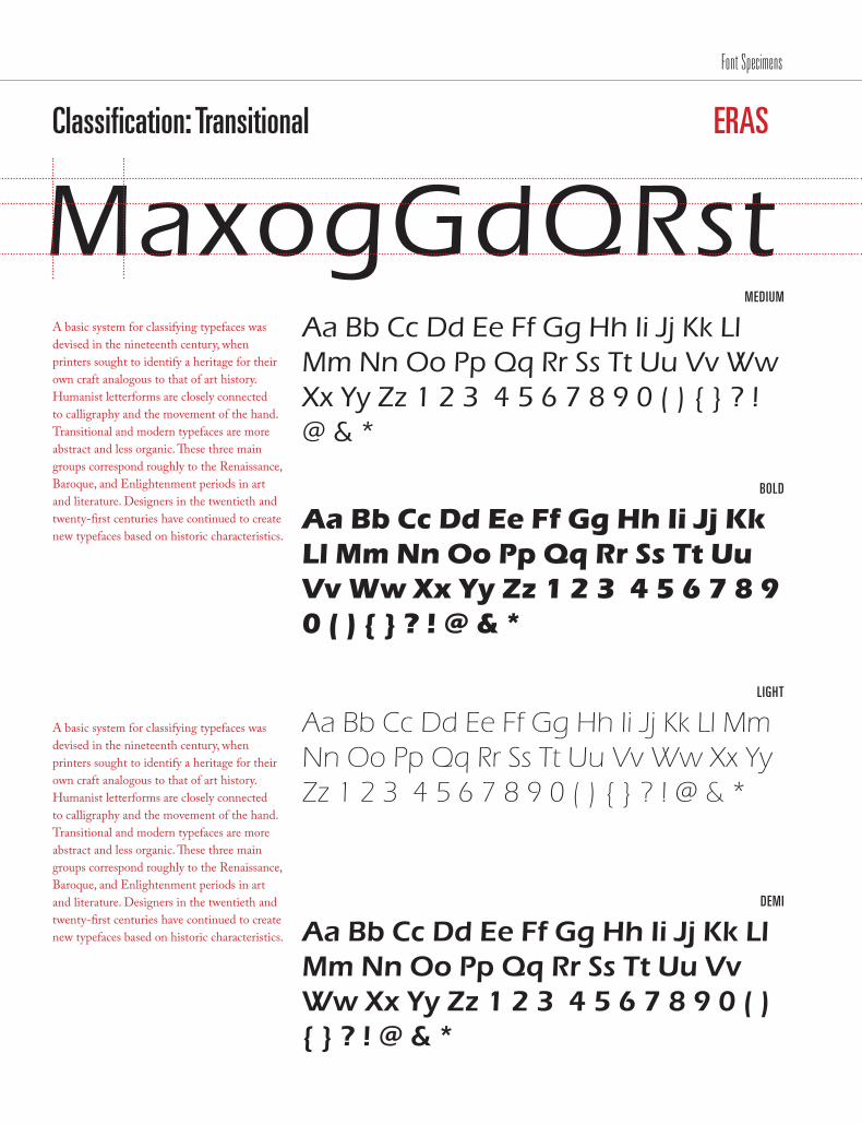
Classification: Transitional
MEDIUM
BOLD
LIGHT
ERAS
MaxogGdQRstA basic system for classifying typefaces was devised in the nineteenth century, when printers sought to identify a heritage for their own craft analogous to that of art history. Humanist letterforms are closely connected to calligraphy and the movement of the hand. Transitional and modern typefaces are more abstract and less organic. These three main groups correspond roughly to the Renaissance, Baroque, and Enlightenment periods in art and literature. Designers in the twentieth and twenty-first centuries have continued to create new typefaces based on historic characteristics.
A basic system for classifying typefaces was devised in the nineteenth century, when printers sought to identify a heritage for their own craft analogous to that of art history. Humanist letterforms are closely connected to calligraphy and the movement of the hand. Transitional and modern typefaces are more abstract and less organic. These three main groups correspond roughly to the Renaissance, Baroque, and Enlightenment periods in art and literature. Designers in the twentieth and twenty-first centuries have continued to create new typefaces based on historic characteristics.
Aa Bb Cc Dd Ee Ff Gg Hh Ii Jj Kk Ll Mm Nn Oo Pp Qq Rr Ss Tt Uu Vv Ww Xx Yy Zz 1 2 3 4 5 6 7 8 9 0 ( ) { } ? ! @ & *
Aa Bb Cc Dd Ee Ff Gg Hh Ii Jj Kk Ll Mm Nn Oo Pp Qq Rr Ss Tt Uu Vv Ww Xx Yy Zz 1 2 3 4 5 6 7 8 9 0 ( ) { } ? ! @ & *
Aa Bb Cc Dd Ee Ff Gg Hh Ii Jj Kk Ll Mm Nn Oo Pp Qq Rr Ss Tt Uu Vv Ww Xx Yy Zz 1 2 3 4 5 6 7 8 9 0 ( ) { } ? ! @ & *
DEMI
Aa Bb Cc Dd Ee Ff Gg Hh Ii Jj Kk Ll Mm Nn Oo Pp Qq Rr Ss Tt Uu Vv Ww Xx Yy Zz 1 2 3 4 5 6 7 8 9 0 ( ) { } ? ! @ & *
Font Specimens
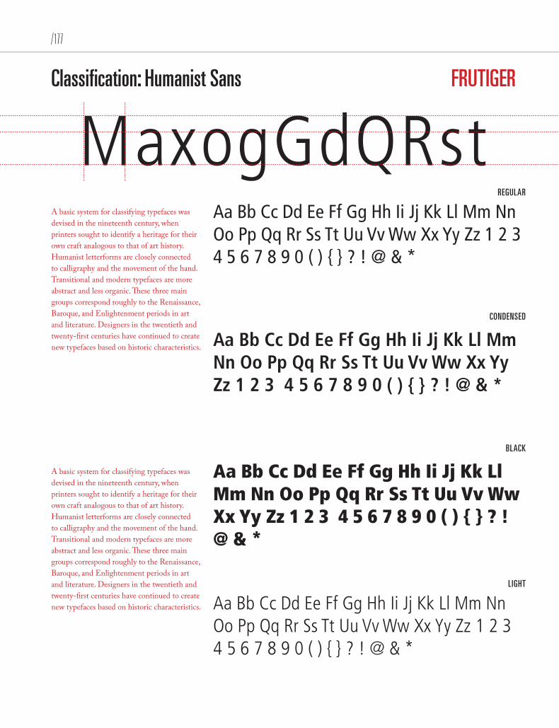
/177
Classification: Humanist Sans
REGULAR
CONDENSED
BLACK
FRUTIGER
MaxogGdQRstA basic system for classifying typefaces was devised in the nineteenth century, when printers sought to identify a heritage for their own craft analogous to that of art history. Humanist letterforms are closely connected to calligraphy and the movement of the hand. Transitional and modern typefaces are more abstract and less organic. These three main groups correspond roughly to the Renaissance, Baroque, and Enlightenment periods in art and literature. Designers in the twentieth and twenty-first centuries have continued to create new typefaces based on historic characteristics.
A basic system for classifying typefaces was devised in the nineteenth century, when printers sought to identify a heritage for their own craft analogous to that of art history. Humanist letterforms are closely connected to calligraphy and the movement of the hand. Transitional and modern typefaces are more abstract and less organic. These three main groups correspond roughly to the Renaissance, Baroque, and Enlightenment periods in art and literature. Designers in the twentieth and twenty-first centuries have continued to create new typefaces based on historic characteristics.
Aa Bb Cc Dd Ee Ff Gg Hh Ii Jj Kk Ll Mm Nn Oo Pp Qq Rr Ss Tt Uu Vv Ww Xx Yy Zz 1 2 3 4 5 6 7 8 9 0 ( ) { } ? ! @ & *
Aa Bb Cc Dd Ee Ff Gg Hh Ii Jj Kk Ll Mm Nn Oo Pp Qq Rr Ss Tt Uu Vv Ww Xx Yy Zz 1 2 3 4 5 6 7 8 9 0 ( ) { } ? ! @ & *
Aa Bb Cc Dd Ee Ff Gg Hh Ii Jj Kk Ll Mm Nn Oo Pp Qq Rr Ss Tt Uu Vv Ww Xx Yy Zz 1 2 3 4 5 6 7 8 9 0 ( ) { } ? ! @ & *
LIGHT
Aa Bb Cc Dd Ee Ff Gg Hh Ii Jj Kk Ll Mm Nn Oo Pp Qq Rr Ss Tt Uu Vv Ww Xx Yy Zz 1 2 3 4 5 6 7 8 9 0 ( ) { } ? ! @ & *
Font Specimens
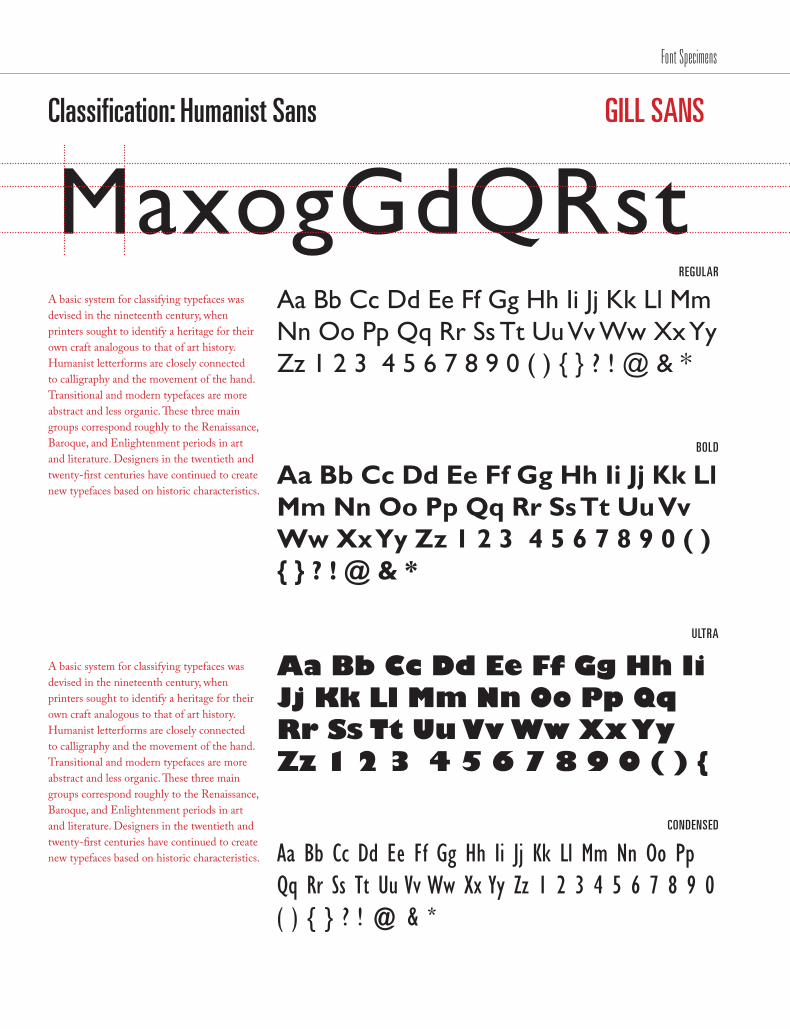
Classification: Humanist Sans
REGULAR
BOLD
ULTRA
GILL SANS
MaxogGdQRstA basic system for classifying typefaces was devised in the nineteenth century, when printers sought to identify a heritage for their own craft analogous to that of art history. Humanist letterforms are closely connected to calligraphy and the movement of the hand. Transitional and modern typefaces are more abstract and less organic. These three main groups correspond roughly to the Renaissance, Baroque, and Enlightenment periods in art and literature. Designers in the twentieth and twenty-first centuries have continued to create new typefaces based on historic characteristics.
A basic system for classifying typefaces was devised in the nineteenth century, when printers sought to identify a heritage for their own craft analogous to that of art history. Humanist letterforms are closely connected to calligraphy and the movement of the hand. Transitional and modern typefaces are more abstract and less organic. These three main groups correspond roughly to the Renaissance, Baroque, and Enlightenment periods in art and literature. Designers in the twentieth and twenty-first centuries have continued to create new typefaces based on historic characteristics.
Aa Bb Cc Dd Ee Ff Gg Hh Ii Jj Kk Ll Mm Nn Oo Pp Qq Rr Ss Tt Uu Vv Ww Xx Yy Zz 1 2 3 4 5 6 7 8 9 0 ( ) { } ? ! @ & *
Aa Bb Cc Dd Ee Ff Gg Hh Ii Jj Kk Ll Mm Nn Oo Pp Qq Rr Ss Tt Uu Vv Ww Xx Yy Zz 1 2 3 4 5 6 7 8 9 0 ( ) { } ? ! @ & *
Aa Bb Cc Dd Ee Ff Gg Hh Ii Jj Kk Ll Mm Nn Oo Pp Qq Rr Ss Tt Uu Vv Ww Xx Yy Zz 1 2 3 4 5 6 7 8 9 0 ( ) {
CONDENSED
Aa Bb Cc Dd Ee Ff Gg Hh Ii Jj Kk Ll Mm Nn Oo Pp Qq Rr Ss Tt Uu Vv Ww Xx Yy Zz 1 2 3 4 5 6 7 8 9 0 ( ) { } ? ! @ & *
Font Specimens

/179
Classification: Grotesque
REGULAR
BOLD
LIGHT
HELVETICA NEUE
MaxogGdQRstA basic system for classifying typefaces was devised in the nineteenth century, when printers sought to identify a heritage for their own craft analogous to that of art history. Humanist letterforms are closely connected to calligraphy and the movement of the hand. Transitional and modern typefaces are more abstract and less organic. These three main groups correspond roughly to the Renaissance, Baroque, and Enlightenment periods in art and literature. Designers in the twentieth and twenty-first centuries have continued to create new typefaces based on historic characteristics.
A basic system for classifying typefaces was devised in the nineteenth century, when printers sought to identify a heritage for their own craft analogous to that of art history. Humanist letterforms are closely connected to calligraphy and the movement of the hand. Transitional and modern typefaces are more abstract and less organic. These three main groups correspond roughly to the Renaissance, Baroque, and Enlightenment periods in art and literature. Designers in the twentieth and twenty-first centuries have continued to create new typefaces based on historic characteristics.
Aa Bb Cc Dd Ee Ff Gg Hh Ii Jj Kk Ll Mm Nn Oo Pp Qq Rr Ss Tt Uu Vv Ww Xx Yy Zz 1 2 3 4 5 6 7 8 9 0 ( ) { } ? ! @ & *
Aa Bb Cc Dd Ee Ff Gg Hh Ii Jj Kk Ll Mm Nn Oo Pp Qq Rr Ss Tt Uu Vv Ww Xx Yy Zz 1 2 3 4 5 6 7 8 9 0 ( ) { } ? ! @ & *
Aa Bb Cc Dd Ee Ff Gg Hh Ii Jj Kk Ll Mm Nn Oo Pp Qq Rr Ss Tt Uu Vv Ww Xx Yy Zz 1 2 3 4 5 6 7 8 9 0 ( ) { } ? ! @ & *
ITALIC
Aa Bb Cc Dd Ee Ff Gg Hh Ii Jj Kk Ll Mm Nn Oo Pp Qq Rr Ss Tt Uu Vv Ww Xx Yy Zz 1 2 3 4 5 6 7 8 9 0 ( ) { } ? ! @ & *
Font Specimens

Classification: Grotesque
REGULAR
BOLD
CONDENSED
INTERSTATE
MaxogGdQRstA basic system for classifying typefaces was devised in the nineteenth century, when printers sought to identify a heritage for their own craft analogous to that of art history. Humanist letterforms are closely connected to calligraphy and the movement of the hand. Transitional and modern typefaces are more abstract and less organic. These three main groups correspond roughly to the Renaissance, Baroque, and Enlightenment periods in art and literature. Designers in the twentieth and twenty-first centuries have continued to create new typefaces based on historic characteristics.
A basic system for classifying typefaces was devised in the nineteenth century, when printers sought to identify a heritage for their own craft analogous to that of art history. Humanist letterforms are closely connected to calligraphy and the movement of the hand. Transitional and modern typefaces are more abstract and less organic. These three main groups correspond roughly to the Renaissance, Baroque, and Enlightenment periods in art and literature. Designers in the twentieth and twenty-first centuries have continued to create new typefaces based on historic characteristics.
Aa Bb Cc Dd Ee Ff Gg Hh Ii Jj Kk Ll Mm Nn Oo Pp Qq Rr Ss Tt Uu Vv Ww Xx Yy Zz 1 2 3 4 5 6 7 8 9 0 ( ) { } ? ! @ & *
Aa Bb Cc Dd Ee Ff Gg Hh Ii Jj Kk Ll Mm Nn Oo Pp Qq Rr Ss Tt Uu Vv Ww Xx Yy Zz 1 2 3 4 5 6 7 8 9 0 ( ) { } ? ! @ & *
Aa Bb Cc Dd Ee Ff Gg Hh Ii Jj Kk Ll Mm Nn Oo Pp Qq Rr Ss Tt Uu Vv Ww Xx Yy Zz 1 2 3 4 5 6 7 8 9 0 ( ) { } ? ! @ & *
BLACK
Aa Bb Cc Dd Ee Ff Gg Hh Ii Jj Kk Ll Mm Nn Oo Pp Qq Rr Ss Tt Uu Vv Ww Xx Yy Zz 1 2 3 4 5 6 7 8 9 0 ( ) { } ? ! @ & *
Font Specimens
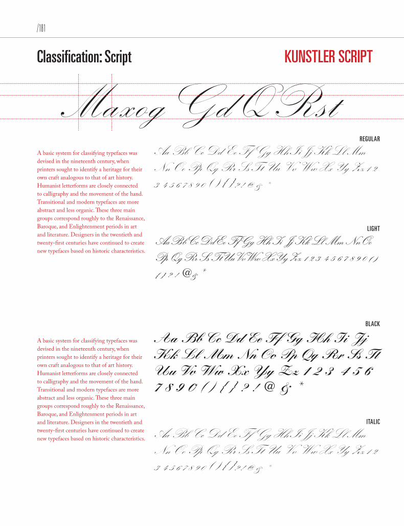
/181
Classification: Script
REGULAR
LIGHT
BLACK
KUNSTLER SCRIPT
MaxogGdQRstA basic system for classifying typefaces was devised in the nineteenth century, when printers sought to identify a heritage for their own craft analogous to that of art history. Humanist letterforms are closely connected to calligraphy and the movement of the hand. Transitional and modern typefaces are more abstract and less organic. These three main groups correspond roughly to the Renaissance, Baroque, and Enlightenment periods in art and literature. Designers in the twentieth and twenty-first centuries have continued to create new typefaces based on historic characteristics.
A basic system for classifying typefaces was devised in the nineteenth century, when printers sought to identify a heritage for their own craft analogous to that of art history. Humanist letterforms are closely connected to calligraphy and the movement of the hand. Transitional and modern typefaces are more abstract and less organic. These three main groups correspond roughly to the Renaissance, Baroque, and Enlightenment periods in art and literature. Designers in the twentieth and twenty-first centuries have continued to create new typefaces based on historic characteristics.
Aa Bb Cc Dd Ee Ff Gg Hh Ii Jj Kk Ll Mm Nn Oo Pp Qq Rr Ss Tt Uu Vv Ww Xx Yy Zz 1 2 3 4 5 6 7 8 9 0 ( ) { } ? ! @ & *
Aa Bb Cc Dd Ee Ff Gg Hh Ii Jj Kk Ll Mm Nn Oo Pp Qq Rr Ss Tt Uu Vv Ww Xx Yy Zz 1 2 3 4 5 6 7 8 9 0 ( ) { } ? ! @ & *
Aa Bb Cc Dd Ee Ff Gg Hh Ii Jj Kk Ll Mm Nn Oo Pp Qq Rr Ss Tt Uu Vv Ww Xx Yy Zz 1 2 3 4 5 6 7 8 9 0 ( ) { } ? ! @ & *
ITALIC
Aa Bb Cc Dd Ee Ff Gg Hh Ii Jj Kk Ll Mm Nn Oo Pp Qq Rr Ss Tt Uu Vv Ww Xx Yy Zz 1 2 3 4 5 6 7 8 9 0 ( ) { } ? ! @ & *
Font Specimens

Classification: Slab Serif
MEDIUM
LIGHT
EXTRA
MEMPHIS
MaxogGdQRstA basic system for classifying typefaces was devised in the nineteenth century, when printers sought to identify a heritage for their own craft analogous to that of art history. Humanist letterforms are closely connected to calligraphy and the movement of the hand. Transitional and modern typefaces are more abstract and less organic. These three main groups correspond roughly to the Renaissance, Baroque, and Enlightenment periods in art and literature. Designers in the twentieth and twenty-first centuries have continued to create new typefaces based on historic characteristics.
A basic system for classifying typefaces was devised in the nineteenth century, when printers sought to identify a heritage for their own craft analogous to that of art history. Humanist letterforms are closely connected to calligraphy and the movement of the hand. Transitional and modern typefaces are more abstract and less organic. These three main groups correspond roughly to the Renaissance, Baroque, and Enlightenment periods in art and literature. Designers in the twentieth and twenty-first centuries have continued to create new typefaces based on historic characteristics.
Aa Bb Cc Dd Ee Ff Gg Hh Ii Jj Kk Ll Mm Nn Oo Pp Qq Rr Ss Tt Uu Vv Ww Xx Yy Zz 1 2 3 4 5 6 7 8 9 0 ( ) { } ? ! @ & *
Aa Bb Cc Dd Ee Ff Gg Hh Ii Jj Kk Ll Mm Nn Oo Pp Qq Rr Ss Tt Uu Vv Ww Xx Yy Zz 1 2 3 4 5 6 7 8 9 0 ( ) { } ? ! @ & *
Aa Bb Cc Dd Ee Ff Gg Hh Ii Jj Kk Ll Mm Nn Oo Pp Qq Rr Ss Tt Uu Vv Ww Xx Yy Zz 1 2 3 4 5 6 7 8 9 0 ( ) { } ? ! @ & *
ITALIC
Aa Bb Cc Dd Ee Ff Gg Hh Ii Jj Kk Ll Mm Nn Oo Pp Qq Rr Ss Tt Uu Vv Ww Xx Yy Zz 1 2 3 4 5 6 7 8 9 0 ( ) { } ? ! @ & *
Font Specimens
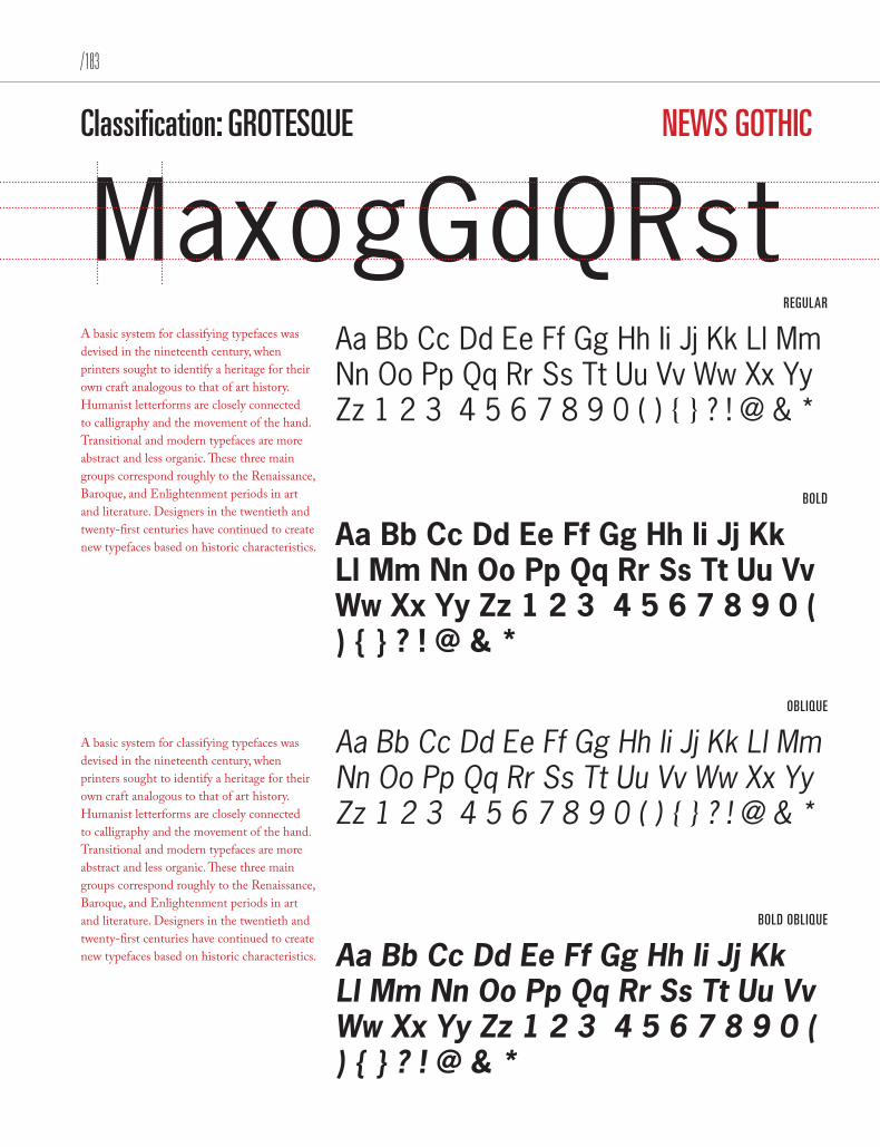
/183
Classification: GROTESQUE
REGULAR
BOLD
OBLIQUE
NEWS GOTHIC
MaxogGdQRstA basic system for classifying typefaces was devised in the nineteenth century, when printers sought to identify a heritage for their own craft analogous to that of art history. Humanist letterforms are closely connected to calligraphy and the movement of the hand. Transitional and modern typefaces are more abstract and less organic. These three main groups correspond roughly to the Renaissance, Baroque, and Enlightenment periods in art and literature. Designers in the twentieth and twenty-first centuries have continued to create new typefaces based on historic characteristics.
A basic system for classifying typefaces was devised in the nineteenth century, when printers sought to identify a heritage for their own craft analogous to that of art history. Humanist letterforms are closely connected to calligraphy and the movement of the hand. Transitional and modern typefaces are more abstract and less organic. These three main groups correspond roughly to the Renaissance, Baroque, and Enlightenment periods in art and literature. Designers in the twentieth and twenty-first centuries have continued to create new typefaces based on historic characteristics.
Aa Bb Cc Dd Ee Ff Gg Hh Ii Jj Kk Ll Mm Nn Oo Pp Qq Rr Ss Tt Uu Vv Ww Xx Yy Zz 1 2 3 4 5 6 7 8 9 0 ( ) { } ? ! @ & *
Aa Bb Cc Dd Ee Ff Gg Hh Ii Jj Kk Ll Mm Nn Oo Pp Qq Rr Ss Tt Uu Vv Ww Xx Yy Zz 1 2 3 4 5 6 7 8 9 0 ( ) { } ? ! @ & *
Aa Bb Cc Dd Ee Ff Gg Hh Ii Jj Kk Ll Mm Nn Oo Pp Qq Rr Ss Tt Uu Vv Ww Xx Yy Zz 1 2 3 4 5 6 7 8 9 0 ( ) { } ? ! @ & *
BOLD OBLIQUE
Aa Bb Cc Dd Ee Ff Gg Hh Ii Jj Kk Ll Mm Nn Oo Pp Qq Rr Ss Tt Uu Vv Ww Xx Yy Zz 1 2 3 4 5 6 7 8 9 0 ( ) { } ? ! @ & *
Font Specimens
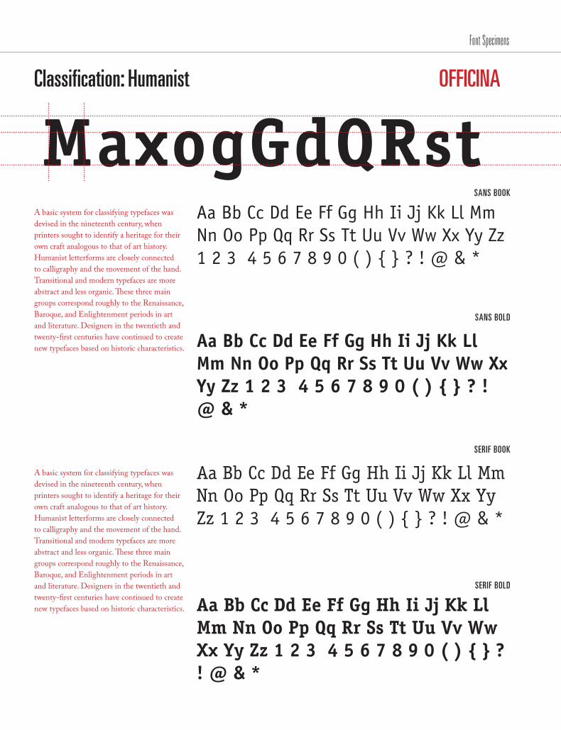
Classification: Humanist
SANS BOOK
SANS BOLD
SERIF BOOK
OFFICINA
MaxogGdQRstA basic system for classifying typefaces was devised in the nineteenth century, when printers sought to identify a heritage for their own craft analogous to that of art history. Humanist letterforms are closely connected to calligraphy and the movement of the hand. Transitional and modern typefaces are more abstract and less organic. These three main groups correspond roughly to the Renaissance, Baroque, and Enlightenment periods in art and literature. Designers in the twentieth and twenty-first centuries have continued to create new typefaces based on historic characteristics.
A basic system for classifying typefaces was devised in the nineteenth century, when printers sought to identify a heritage for their own craft analogous to that of art history. Humanist letterforms are closely connected to calligraphy and the movement of the hand. Transitional and modern typefaces are more abstract and less organic. These three main groups correspond roughly to the Renaissance, Baroque, and Enlightenment periods in art and literature. Designers in the twentieth and twenty-first centuries have continued to create new typefaces based on historic characteristics.
Aa Bb Cc Dd Ee Ff Gg Hh Ii Jj Kk Ll Mm Nn Oo Pp Qq Rr Ss Tt Uu Vv Ww Xx Yy Zz 1 2 3 4 5 6 7 8 9 0 ( ) { } ? ! @ & *
Aa Bb Cc Dd Ee Ff Gg Hh Ii Jj Kk Ll Mm Nn Oo Pp Qq Rr Ss Tt Uu Vv Ww Xx Yy Zz 1 2 3 4 5 6 7 8 9 0 ( ) { } ? ! @ & *
Aa Bb Cc Dd Ee Ff Gg Hh Ii Jj Kk Ll Mm Nn Oo Pp Qq Rr Ss Tt Uu Vv Ww Xx Yy Zz 1 2 3 4 5 6 7 8 9 0 ( ) { } ? ! @ & *
SERIF BOLD
Aa Bb Cc Dd Ee Ff Gg Hh Ii Jj Kk Ll Mm Nn Oo Pp Qq Rr Ss Tt Uu Vv Ww Xx Yy Zz 1 2 3 4 5 6 7 8 9 0 ( ) { } ? ! @ & *
Font Specimens
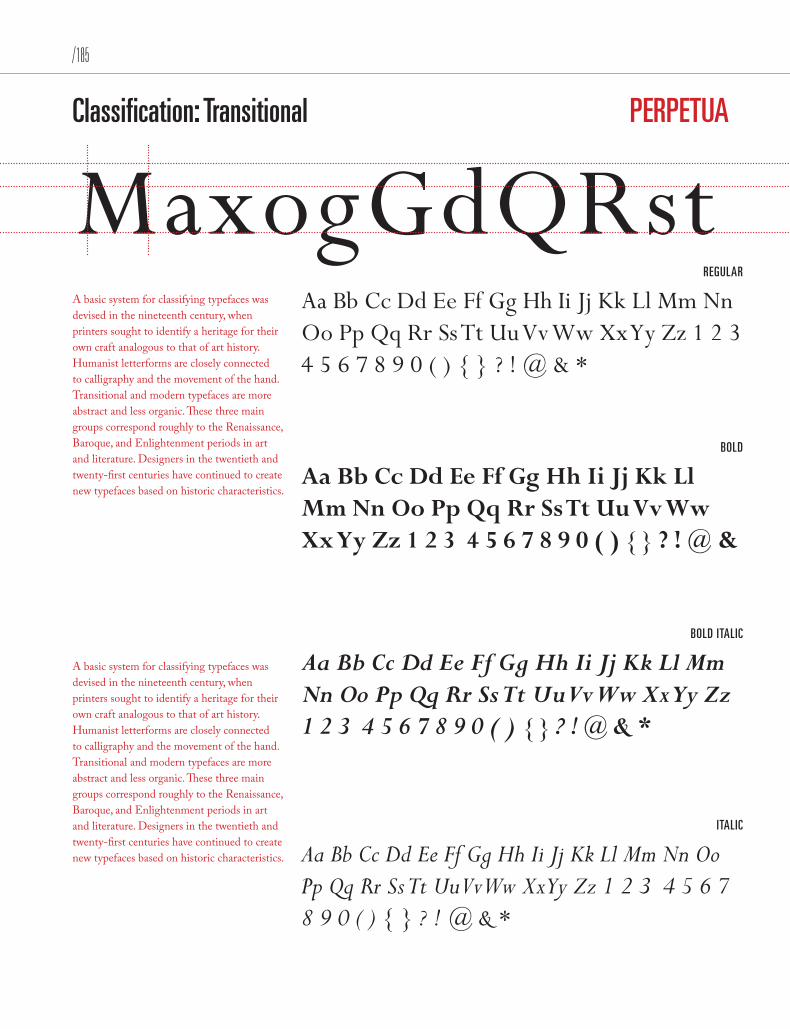
/185
Classification: Transitional
REGULAR
BOLD
BOLD ITALIC
PERPETUA
MaxogGdQRstA basic system for classifying typefaces was devised in the nineteenth century, when printers sought to identify a heritage for their own craft analogous to that of art history. Humanist letterforms are closely connected to calligraphy and the movement of the hand. Transitional and modern typefaces are more abstract and less organic. These three main groups correspond roughly to the Renaissance, Baroque, and Enlightenment periods in art and literature. Designers in the twentieth and twenty-first centuries have continued to create new typefaces based on historic characteristics.
A basic system for classifying typefaces was devised in the nineteenth century, when printers sought to identify a heritage for their own craft analogous to that of art history. Humanist letterforms are closely connected to calligraphy and the movement of the hand. Transitional and modern typefaces are more abstract and less organic. These three main groups correspond roughly to the Renaissance, Baroque, and Enlightenment periods in art and literature. Designers in the twentieth and twenty-first centuries have continued to create new typefaces based on historic characteristics.
Aa Bb Cc Dd Ee Ff Gg Hh Ii Jj Kk Ll Mm Nn Oo Pp Qq Rr Ss Tt Uu Vv Ww Xx Yy Zz 1 2 3 4 5 6 7 8 9 0 ( ) { } ? ! @ & *
Aa Bb Cc Dd Ee Ff Gg Hh Ii Jj Kk Ll Mm Nn Oo Pp Qq Rr Ss Tt Uu Vv Ww Xx Yy Zz 1 2 3 4 5 6 7 8 9 0 ( ) { } ? ! @ &
Aa Bb Cc Dd Ee Ff Gg Hh Ii Jj Kk Ll Mm Nn Oo Pp Qq Rr Ss Tt Uu Vv Ww Xx Yy Zz 1 2 3 4 5 6 7 8 9 0 ( ) { } ? ! @ & *
ITALIC
Aa Bb Cc Dd Ee Ff Gg Hh Ii Jj Kk Ll Mm Nn Oo Pp Qq Rr Ss Tt Uu Vv Ww Xx Yy Zz 1 2 3 4 5 6 7 8 9 0 ( ) { } ? ! @ & *
Font Specimens

Classification: Humanist
SERIF REGULAR
SERIF SEMI
SANS SERIF REGULAR
ROTIS
MaxogGdQRstA basic system for classifying typefaces was devised in the nineteenth century, when printers sought to identify a heritage for their own craft analogous to that of art history. Humanist letterforms are closely connected to calligraphy and the movement of the hand. Transitional and modern typefaces are more abstract and less organic. These three main groups correspond roughly to the Renaissance, Baroque, and Enlightenment periods in art and literature. Designers in the twentieth and twenty-first centuries have continued to create new typefaces based on historic characteristics.
A basic system for classifying typefaces was devised in the nineteenth century, when printers sought to identify a heritage for their own craft analogous to that of art history. Humanist letterforms are closely connected to calligraphy and the movement of the hand. Transitional and modern typefaces are more abstract and less organic. These three main groups correspond roughly to the Renaissance, Baroque, and Enlightenment periods in art and literature. Designers in the twentieth and twenty-first centuries have continued to create new typefaces based on historic characteristics.
Aa Bb Cc Dd Ee Ff Gg Hh Ii Jj Kk Ll Mm Nn Oo Pp Qq Rr Ss Tt Uu Vv Ww Xx Yy Zz 1 2 3 4 5 6 7 8 9 0 ( ) { } ? ! @ & *
Aa Bb Cc Dd Ee Ff Gg Hh Ii Jj Kk Ll Mm Nn Oo Pp Qq Rr Ss Tt Uu Vv Ww Xx Yy Zz 1 2 3 4 5 6 7 8 9 0 ( ) { } ? ! @ & *
Aa Bb Cc Dd Ee Ff Gg Hh Ii Jj Kk Ll Mm Nn Oo Pp Qq Rr Ss Tt Uu Vv Ww Xx Yy Zz 1 2 3 4 5 6 7 8 9 0 ( ) { } ? ! @ &
SANS SERIF SEMI
Aa Bb Cc Dd Ee Ff Gg Hh Ii Jj Kk Ll Mm Nn Oo Pp Qq Rr Ss Tt Uu Vv Ww Xx Yy Zz 1 2 3 4 5 6 7 8 9 0 ( ) { } ? ! @ & *
Font Specimens

/187
Classification: Old Style
REGULAR
OLDSTYLE BOLD
SMALL CAPS
SABON
MaxogGdQRstA basic system for classifying typefaces was devised in the nineteenth century, when printers sought to identify a heritage for their own craft analogous to that of art history. Humanist letterforms are closely connected to calligraphy and the movement of the hand. Transitional and modern typefaces are more abstract and less organic. These three main groups correspond roughly to the Renaissance, Baroque, and Enlightenment periods in art and literature. Designers in the twentieth and twenty-first centuries have continued to create new typefaces based on historic characteristics.
A basic system for classifying typefaces was devised in the nineteenth century, when printers sought to identify a heritage for their own craft analogous to that of art history. Humanist letterforms are closely connected to calligraphy and the movement of the hand. Transitional and modern typefaces are more abstract and less organic. These three main groups correspond roughly to the Renaissance, Baroque, and Enlightenment periods in art and literature. Designers in the twentieth and twenty-first centuries have continued to create new typefaces based on historic characteristics.
Aa Bb Cc Dd Ee Ff Gg Hh Ii Jj Kk Ll Mm Nn Oo Pp Qq Rr Ss Tt Uu Vv Ww Xx Yy Zz 1 2 3 4 5 6 7 8 9 0 ( ) { } ? ! @ & *
Aa Bb Cc Dd Ee Ff Gg Hh Ii Jj Kk Ll Mm Nn Oo Pp Qq Rr Ss Tt Uu Vv Ww Xx Yy Zz 1 2 3 4 5 6 7 8 9 0 ( ) { } ? ! @ & *
Aa Bb Cc Dd Ee Ff Gg Hh Ii Jj Kk Ll Mm Nn Oo Pp Qq Rr Ss Tt Uu Vv Ww Xx Yy Zz 1 2 3 4 5 6 7 8 9 0 ( ) { } ? ! @ & *
OLDSTYLE ITALIC
Aa Bb Cc Dd Ee Ff Gg Hh Ii Jj Kk Ll Mm Nn Oo Pp Qq Rr Ss Tt Uu Vv Ww Xx Yy Zz 1 2 3 4 5 6 7 8 9 0 ( ) { } ? ! @ & *
Font Specimens

Classification: Humanist Sans
EXTENDED
EXTENDED BOLD
REGULAR
TRADE GOTHIC
MaxogGdQRstA basic system for classifying typefaces was devised in the nineteenth century, when printers sought to identify a heritage for their own craft analogous to that of art history. Humanist letterforms are closely connected to calligraphy and the movement of the hand. Transitional and modern typefaces are more abstract and less organic. These three main groups correspond roughly to the Renaissance, Baroque, and Enlightenment periods in art and literature. Designers in the twentieth and twenty-first centuries have continued to create new typefaces based on historic characteristics.
A basic system for classifying typefaces was devised in the nineteenth century, when printers sought to identify a heritage for their own craft analogous to that of art history. Humanist letterforms are closely connected to calligraphy and the movement of the hand. Transitional and modern typefaces are more abstract and less organic. These three main groups correspond roughly to the Renaissance, Baroque, and Enlightenment periods in art and literature. Designers in the twentieth and twenty-first centuries have continued to create new typefaces based on historic characteristics.
Aa Bb Cc Dd Ee Ff Gg Hh Ii Jj Kk Ll Mm Nn Oo Pp Qq Rr Ss Tt Uu Vv Ww Xx Yy Zz 1 2 3 4 5 6 7 8 9 0 ( ) { } ? ! @
Aa Bb Cc Dd Ee Ff Gg Hh Ii Jj Kk Ll Mm Nn Oo Pp Qq Rr Ss Tt Uu Vv Ww Xx Yy Zz 1 2 3 4 5 6 7 8 9 0 ( ) { } ? ! @
Aa Bb Cc Dd Ee Ff Gg Hh Ii Jj Kk Ll Mm Nn Oo Pp Qq Rr Ss Tt Uu Vv Ww Xx Yy Zz 1 2 3 4 5 6 7 8 9 0 ( ) { } ? ! @ & *
ITALIC
Aa Bb Cc Dd Ee Ff Gg Hh Ii Jj Kk Ll Mm Nn Oo Pp Qq Rr Ss Tt Uu Vv Ww Xx Yy Zz 1 2 3 4 5 6 7 8 9 0 ( ) { } ? ! @ & *
Font Specimens

/189
Classification: New Transitional
REGULAR
BOLD
MEDIUM
VOLTA
MaxogGdQRstA basic system for classifying typefaces was devised in the nineteenth century, when printers sought to identify a heritage for their own craft analogous to that of art history. Humanist letterforms are closely connected to calligraphy and the movement of the hand. Transitional and modern typefaces are more abstract and less organic. These three main groups correspond roughly to the Renaissance, Baroque, and Enlightenment periods in art and literature. Designers in the twentieth and twenty-first centuries have continued to create new typefaces based on historic characteristics.
A basic system for classifying typefaces was devised in the nineteenth century, when printers sought to identify a heritage for their own craft analogous to that of art history. Humanist letterforms are closely connected to calligraphy and the movement of the hand. Transitional and modern typefaces are more abstract and less organic. These three main groups correspond roughly to the Renaissance, Baroque, and Enlightenment periods in art and literature. Designers in the twentieth and twenty-first centuries have continued to create new typefaces based on historic characteristics.
Aa Bb Cc Dd Ee Ff Gg Hh Ii Jj Kk Ll Mm Nn Oo Pp Qq Rr Ss Tt Uu Vv Ww Xx Yy Zz 1 2 3 4 5 6 7 8 9 0 ( ) { } ? ! @ & *
Aa Bb Cc Dd Ee Ff Gg Hh Ii Jj Kk Ll Mm Nn Oo Pp Qq Rr Ss Tt Uu Vv Ww Xx Yy Zz 1 2 3 4 5 6 7 8 9
Aa Bb Cc Dd Ee Ff Gg Hh Ii Jj Kk Ll Mm Nn Oo Pp Qq Rr Ss Tt Uu Vv Ww Xx Yy Zz 1 2 3 4 5 6 7 8 9 0 ( ) { } ? ! @ &
MEDIUM ITALIC
Aa Bb Cc Dd Ee Ff Gg Hh Ii Jj Kk Ll Mm Nn Oo Pp Qq Rr Ss Tt Uu Vv Ww Xx Yy Zz 1 2 3 4 5 6 7 8 9 0 ( ) { } ? ! @ & *
Font Specimens
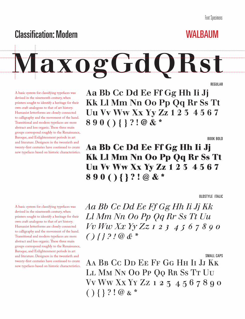
Classification: Modern
REGULAR
BOOK BOLD
OLDSTYLE ITALIC
WALBAUM
MaxogGdQRstA basic system for classifying typefaces was devised in the nineteenth century, when printers sought to identify a heritage for their own craft analogous to that of art history. Humanist letterforms are closely connected to calligraphy and the movement of the hand. Transitional and modern typefaces are more abstract and less organic. These three main groups correspond roughly to the Renaissance, Baroque, and Enlightenment periods in art and literature. Designers in the twentieth and twenty-first centuries have continued to create new typefaces based on historic characteristics.
A basic system for classifying typefaces was devised in the nineteenth century, when printers sought to identify a heritage for their own craft analogous to that of art history. Humanist letterforms are closely connected to calligraphy and the movement of the hand. Transitional and modern typefaces are more abstract and less organic. These three main groups correspond roughly to the Renaissance, Baroque, and Enlightenment periods in art and literature. Designers in the twentieth and twenty-first centuries have continued to create new typefaces based on historic characteristics.
Aa Bb Cc Dd Ee Ff Gg Hh Ii Jj Kk Ll Mm Nn Oo Pp Qq Rr Ss Tt Uu Vv Ww Xx Yy Zz 1 2 3 4 5 6 7 8 9 0 ( ) { } ? ! @ & *
Aa Bb Cc Dd Ee Ff Gg Hh Ii Jj Kk Ll Mm Nn Oo Pp Qq Rr Ss Tt Uu Vv Ww Xx Yy Zz 1 2 3 4 5 6 7 8 9 0 ( ) { } ? ! @ & *
Aa Bb Cc Dd Ee Ff Gg Hh Ii Jj Kk Ll Mm Nn Oo Pp Qq Rr Ss Tt Uu Vv Ww Xx Yy Zz 1 2 3 4 5 6 7 8 9 0 ( ) { } ? ! @ & *
SMALL CAPS
Aa Bb Cc Dd Ee Ff Gg Hh Ii Jj Kk Ll Mm Nn Oo Pp Qq Rr Ss Tt Uu Vv Ww Xx Yy Zz 1 2 3 4 5 6 7 8 9 0 ( ) { } ? ! @ & *
Font Specimens
/191
There will never be a true end to any design. Innovation is a constant thing.” —Paul Rand
“
Font Specimens
