technical bulletin #2 - sprezzatura :: making … · appendix i - combobox control style settings...
TRANSCRIPT
© Copyright Sprezzatura Ltd 1999 Page 1
REVMEDIA - “The Developer’s Link Technical Briefings #2 OpenInsight for Workgroups Compiled Window Structures
All rights reserved. Page 1
© Copyright Sprezzatura Ltd 1999 Page 2
SPREZZATURA
Sprezzatura Ltd Northumberland House
11 The Pavement Popes Lane
Ealing W5 4NG
UK
+44 208 832 7470 (Phone) +44 208 832 7471 (Fax)
Sprezzatura Inc
1800 JFK Boulevard Suite 300
Philadelphia PA 19103
USA
+1 267 238 3814 (Phone) +1 267 238 3714 (Fax)
Sprezzatura (Australia)
9 Wahroonga Court Rowville
Australia 3178
+61 3 9759 6719 (Phone) +61 3 9759 7075 (Fax)
http://www.sprezzatura.com
All rights reserved. Page 2

© Copyright Sprezzatura Ltd 1999 Page 3
COPYRIGHT NOTICE ©1999 Sprezzatura Ltd. All rights reserved. 1999 Sprezzatura, Inc. All rights reserved. Portions copyright Microsoft Corporation Inc Portions copyright Revelation Technologies, Inc. No portion of this journal (other than code segments) may be reproduced by any means, be it photocopied, digitised, transcribed, transmitted, reduced to any electronic medium or machine readable form, nor translated into any other language without the prior written consent of Sprezzatura Ltd or Sprezzatura, Inc. The moral rights of the authors have been asserted. Disclaimer - Whilst every effort is made to ensure accuracy of the information contained herein, neither Sprezzatura Ltd nor Sprezzatura Inc. can accept no liability for the failure of anything documented herein to work nor for damage resulting from the application of methods/techniques learned herein. This documentation has not been updated to reflect changes to the product since 1999. TRADEMARK NOTICE REVMEDIA - The Developer’s Link is a trademark of Sprezzatura Ltd REVMEDIA - FKB is a trademark of Sprezzatura Ltd OpenInsight is a trademark of Revelation Technologies Inc. trading as Revelation Software. Microsoft, Windows™, and MS-DOS are registered trademarks of Microsoft Corporation. All other product names are trademarks or registered trademarks of their respective owners. Printed in the United Kingdom.
All rights reserved. Page 3

© Copyright Sprezzatura Ltd 1999 Page 4
CHAPTER 1 - INTRODUCTION ............................................................................................................. 6
CHAPTER 2 - OPENINSIGHT WINDOW STRUCTURE - AN OVERVIEW.................................... 8 LOCATION OF WINDOWS ............................................................................................................................. 9
CHAPTER 3 - CONTROL LISTS........................................................................................................... 13 WINDOW FRAME INFORMATION................................................................................................................ 14 EDITBOX INFORMATION ......................................................................................................................... 18 EDITFIELD INFORMATION ...................................................................................................................... 22 EDITTABLE INFORMATION..................................................................................................................... 26 CHECKBOX INFORMATION..................................................................................................................... 30 COMBOBOX INFORMATION.................................................................................................................... 33 LISTBOX INFORMATION.......................................................................................................................... 37 PUSHBUTTON INFORMATION ................................................................................................................ 41 RADIOBUTTON INFORMATION.............................................................................................................. 45 RADIOGROUP INFORMATION................................................................................................................. 49 HSCROLLBAR INFORMATION ................................................................................................................ 52 VSCROLLBAR INFORMATION ................................................................................................................ 55 ICON INFORMATION................................................................................................................................. 58 BITMAP INFORMATION............................................................................................................................ 61 GROUPBOX INFORMATION..................................................................................................................... 64 STATIC INFORMATION............................................................................................................................. 67 PUSHBMP INFORMATION ........................................................................................................................ 70 RADIOBMP INFORMATION...................................................................................................................... 74 CHECKBMP INFORMATION..................................................................................................................... 78 RTFBOX INFORMATION........................................................................................................................... 82 MDI FRAME INFORMATION....................................................................................................................... 85 MENU INFORMATION............................................................................................................................... 89
CHAPTER 4 - JOIN MAPS ..................................................................................................................... 92
CHAPTER 5 - ROW MAPS..................................................................................................................... 94
CHAPTER 6 - MASTER ROW MAPS................................................................................................... 95
CHAPTER 7 - CONTROL MAPS........................................................................................................... 96
CHAPTER 8 - KEY MAPS ...................................................................................................................... 97
CHAPTER 9 - CONTROL SEMANTICS .............................................................................................. 98
CHAPTER 10 - SYSTEM INFORMATION ........................................................................................ 103
APPENDIX A - VALID CONTROL TYPES .................................................................................. 104
APPENDIX B - OPENINSIGHT EVENT TYPES ......................................................................... 106
APPENDIX C - JOIN TABLE DELETE INFORMATION ......................................................... 112
APPENDIX D - WINDOWS™ SDK STYLES................................................................................ 114
APPENDIX E - PS STYLES............................................................................................................. 116
APPENDIX F - FONT STRUCTURE ............................................................................................. 119
All rights reserved. Page 4
© Copyright Sprezzatura Ltd 1999 Page 5
APPENDIX G - EDIT CONTROL STYLE SETTINGS ................................................................ 121
APPENDIX H - BUTTON CONTROL STYLE SETTINGS ......................................................... 125
APPENDIX I - COMBOBOX CONTROL STYLE SETTINGS.................................................. 127
APPENDIX J - LISTBOX CONTROL STYLE SETTINGS ........................................................ 129
APPENDIX K - NOTES COLUMN LINK STRUCTURE............................................................. 133
APPENDIX L - EDITTABLE CONTROL STYLE SETTINGS................................................... 135
APPENDIX M - SCROLLBAR CONTROL STYLE SETTINGS ................................................. 137
APPENDIX N - MENU STYLES ..................................................................................................... 139
APPENDIX O - VIRTUAL KEY CODES ....................................................................................... 140
APPENDIX P - COLOR DEFINITIONS........................................................................................ 144
All rights reserved. Page 5
© Copyright Sprezzatura Ltd 1999 Page 6
Chapter 1 - Introduction
Welcome to the REVMEDIA Technical Briefing “OpenInsight Compiled Window Structures”.
REVMEDIA Technical Briefings are designed to continue where the documentation provided with OpenInsight, leaves off. They are not intended to replace existing documentation, rather to supplement them. As such, they will only infrequently reproduce information published elsewhere. Where such a case exists, the sources will be credited.
This document is designed to provide a complete reference work to the structure of a compiled OpenInsight Window, that is, a window as it is stored in SYSREPOSWINEXES.
It is assumed that the reader is already a competent OpenInsight programmer, if this is not the case, very little of this document will make sense.
This document was prepared using OpenInsight for Workgroups Version 3.6 and 3.7. Any table referenced is part of either the main application or the Examples application. Previous versions of OpenInsight for Workgroups may contain different structures and layouts.
All rights reserved. Page 6

© Copyright Sprezzatura Ltd 1999 Page 7
All rights reserved. Page 7
© Copyright Sprezzatura Ltd 1999 Page 8
Chapter 2 - OpenInsight Window Structure - An Overview
This chapter provides an overview of the issues which will be addressed within the rest of the document.
It deals with the following issues: -
• Location of Windows
• Makeup of window
All rights reserved. Page 8

© Copyright Sprezzatura Ltd 1999 Page 9
Location of Windows
Compiled OpenInsight Windows are stored in the SYSREPOSWINEXES table in the REVBOOT directory. Normally a REPOSITORY NEW, or REPOSITORY WRITE method during window compilation places them there. In this way the system ensures that it knows the rights associated with an entity.
If a Compiled Window does not have an associated SYSREPOS entity, it will not be accessible from an OpenInsight application. For this reason it is not recommended that new Compiled Window Structures be written directly to the SYSREPOSWINEXES table. Instead the OpenInsight REPOSITORY functions should be used. The entity type for a Compiled Window is OIWINEXE. While performing our testing, we modified the Compiled Windows in an Advanced Revelation editor. If you do not have a copy of Advanced Revelation, we suggest obtaining one. You cannot perform these types of edits through OpenInsight’s System Editor. If you need to modify Compiled Windows through OpenInsight, you will have to make your modification programmatically and use Repository Function calls.
Declare Function Repository RetVal = Repository(A,B,C,D,E,F,G,H,I,J,K,L) where
A The method to execute, in this case “NEW”
B The name of the Window to update. Note that as this instruction is going to update the SYSREPOS as well as the SYSREPOSWINS, the fully qualified entity identifier is required. This takes the form AppName*OIWINEXE**WinName.
C The State to set the entity to. This is an incompletely specified repository flag which was intended to show the stage of the development life-cycle that had been reached by the entity. It has not yet been fully implemented. Can safely be set to null.
D The Publishable flag. Whether the entity should be deployed when the RDK is used. Since you normally want to deploy a compiled window, a setting of 0 might be advisable here.
E The Shareable flag. Whether the entity should be made available to any applications that inherit from the current application. It would be usual to set this to true although the circumstances of your application will dictate this.
All rights reserved. Page 9

© Copyright Sprezzatura Ltd 1999 Page 10
F A field mark delimited list of the entities that this entity is used by. These should have the structure of valid SYSREPOS keys. Note that the REPOSITORY function will not validate these to actually exist. In fact if the rows do not exist in the SYSREPOS table it will create them complete with links to the entity being created.
G A field mark delimited list of the entities that this entity uses. These should have the structure of valid SYSREPOS keys. Note that the REPOSITORY function will not validate these to actually exist. In fact if the rows do not exist in the SYSREPOS table it will create them complete with links to the entity being created.
H A field mark delimited list of document entities associated with this entity. These should have the structure of valid SYSREPOS keys. Note that the REPOSITORY function will not validate these to actually exist. In fact if the rows do not exist in the SYSREPOS table it will create them complete with links to the entity being created.
I A value mark delimited list of users with access permissions for this entity. Note that the REPOSITORY function will not validate these to actually exist, nor will it create them for you.
J A value mark delimited list of users with update permissions for this entity. Note that the REPOSITORY function will not validate these to actually exist, nor will it create them for you.
K The SYSREPOS title to give this entity.
L The Compiled Window Row to actually write to the SYSREPOSWINEXES table.
Note that subsequent updates to the window structure can be made directly by writing to the SYSREPOSWINEXES table. This will update the window itself but will not record the fact that updates have been performed. Alternatively the REPOSITORY WRITE method can be used. This takes the same parameters as the REPOSITORY NEW but parameter A is set to “WRITE not “NEW”. This method can also be used to update any of the details given in the SYSREPOS table. Do not pass a null Compiled Window definition however or you will overwrite the existing definition with null!
All rights reserved. Page 10
© Copyright Sprezzatura Ltd 1999 Page 11
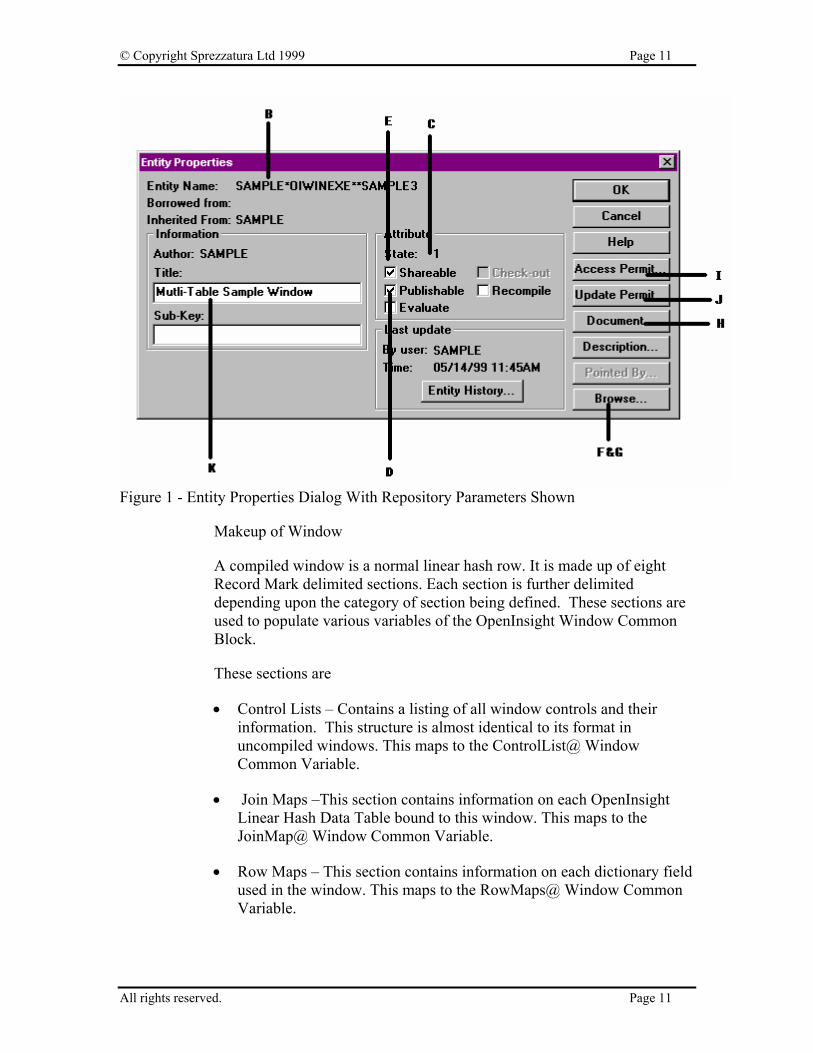
Figure 1 - Entity Properties Dialog With Repository Parameters Shown
Makeup of Window
A compiled window is a normal linear hash row. It is made up of eight Record Mark delimited sections. Each section is further delimited depending upon the category of section being defined. These sections are used to populate various variables of the OpenInsight Window Common Block.
These sections are
• Control Lists – Contains a listing of all window controls and their information. This structure is almost identical to its format in uncompiled windows. This maps to the ControlList@ Window Common Variable.
• Join Maps –This section contains information on each OpenInsight Linear Hash Data Table bound to this window. This maps to the JoinMap@ Window Common Variable.
• Row Maps – This section contains information on each dictionary field used in the window. This maps to the RowMaps@ Window Common Variable.
All rights reserved. Page 11

© Copyright Sprezzatura Ltd 1999 Page 12
• Master Row Maps – This section contains information on how each dictionary field maps to window controls. This maps to the MasterRowMap@ Window Common Variable.
• Control Maps – This section contains a list of window controls. This maps to the ControlMap@ Window Common Variable.
• Key Maps – This section contains a listing of the window controls mapped to key prompts. This maps to the KeyMap@ Window Common Variable.
• Control Semantics – This section contains information about each control as it related to OpenInsight specific issues, for example prompt validation and prompt recalculation. This maps to the ControlSemantics@ Window Common Variable.
• System Information – Appears to contain the serial number of the last engine that compiled the window.
The layouts of most of these fields can be found in the OIWIN_EQUATES include record.
All rights reserved. Page 12
© Copyright Sprezzatura Ltd 1999 Page 13
Chapter 3 - Control Lists
The Control Lists section is almost identical to that in its uncompiled version. It is a field mark delimited array with each control as a separate field. The window information is stored first, followed by standard window controls in tabbed order.
All rights reserved. Page 13

© Copyright Sprezzatura Ltd 1999 Page 14
Window Frame Information
This section outlines the Control Lists information for the base window frame.
< 0, 1 > The name of the WINDOW.
< 0, 2 > This field is believed to the control class and thus should always be null.
< 0, 3 > The control type, in this case WINDOW.
< 0, 4 > The owner window or parent object. Setting this has the same effect as the ParentID parameter in the START_WINDOW function.
< 0, 5 > The X location of the WINDOW in pixels with 0 as the origin at the top left corner of the parent object.
< 0, 6 > The Y location of the WINDOW in pixels with 0 as the origin at the top left corner of the parent object.
< 0, 7 > The width of the WINDOW in pixels.
< 0, 8 > The height of the WINDOW in pixels.
< 0, 9 > The WINDOW title.
< 0, 10 > A boolean value indicating if the WINDOW is enabled. True means the WINDOW is enabled
< 0, 11 > A boolean value indicating if the WINDOW is visible. True means the WINDOW is visible.
< 0, 12 > The Microsoft Windows™ SDK Style of the WINDOW. See Appendix D for more information. - Windows™ SDK Styles
< 0, 13 > The Presentation Server (PS) style of the WINDOW. There are settings that are not adequately catered for by the Windows™ SDK style setting that PS still needs to be able to set. This additional style bit allows these pieces of information to be sent to PS and thence to the WinAPI. See Appendix E - PS Styles for more information.
< 0, 14 > This field is not used for WINDOW definitions.
All rights reserved. Page 14
© Copyright Sprezzatura Ltd 1999 Page 15
< 0, 15 > The information for the WINDOW’s bitmap. This would be the background bitmap for the WINDOW.
< 0, 0, 1 > The full repository name for the bitmap.
< 0, 0, 2 > The subkey for the entity.
< 0, 16 > The information for the WINDOW’s icon
< 0, 0, 1 > The full repository name for the icon.
< 0, 0, 2 > The subkey for the entity
< 0, 17 > Background color of the WINDOW expressed as an RGB value. For default leave null. By setting this value, you are setting the default foreground/font color for the window.. See Appendix P
for color code definitions. -
Color Definitions
< 0, 18 > Foreground/font color of the WINDOW expressed as an RGB value. For default set to 0. By setting this value, you are setting the default foreground/font color for the window. If you are using 3D controls, then static text boxes are not affected by this setting. See Appendix P - Color Definitions for color code definitions.
< 0, 19 > This field is not used for WINDOW frame definitions.
< 0, 20 > This field is not used for WINDOW frame definitions.
< 0, 21 > Text mark delimited list of event handlers names for which a script has been defined. The event handler itself will be stored in SYSREPOSEVENTEXES with a key constructed as follows :-
EventName*ParamCnt*SysReposEventExesKey
e.g. OPTIONS*2*SAMPLE*OPTIONS*MYWIN.CONTROL. NOTE: All WINDOW frames will have CLOSE*3*SYSPROG*CLOSE.WINDOW.OIWIN* defined. This allows the standard OpenInsight close event to process. Without this event, your WINDOW will not close properly.
< 0, 22 > This field contains WindowName*OIWIN, which would appear to indicate a repository type.
< 0, 23 > This field is not used for WINDOW frame definitions.
< 0, 24 > This field is not used for WINDOW frame definitions.
All rights reserved. Page 15

© Copyright Sprezzatura Ltd 1999 Page 16
< 0, 25 > The first delimited value is a 4 byte hex word, with the first two bytes being the top range of the scroll bar and the final two bytes being the lower range of the scroll bar.
The second delimited value does not appear to have an effect.
To interpret use the following code snippet
Number = Iconv( HexValue, “MX” )
FourBytes = Oconv(Number, “MB”)
FourBytes = Oconv(FourBytes, “R(0)#32”)
Lower = Iconv(FourBytes[17,16], “MB”)
Upper = Iconv(FourBytes[1, 16], “MB”)
Note that unlike the scroll bars, the window’s scroll bar values are stored in hex.
< 0, 26 > A 4 byte hex word, with the first two bytes being the numerator and the final two bytes being the denominator. The resultant fraction is how many increments to move when the scroll bar area is clicked in, rather than the scroll button being pushed.
The second delimited value appears to have no affect.
< 0, 27 > This field is unused in WINDOW frame definitions.
< 0, 28 > This field is unused in WINDOW frame definitions.
< 0, 29 > This field is unused in WINDOW frame definitions.
< 0, 30 > This field is unused in WINDOW frame definitions.
< 0, 31 > This field is unused in WINDOW frame definitions.
< 0, 32 > This field is unused in WINDOW frame definitions.
< 0, 33 > This field is unused in WINDOW frame definitions.
< 0, 34 > This field is unused in WINDOW frame definitions.
< 0, 35 > This field is unused in WINDOW frame definitions.
< 0, 36 > This field is unused in WINDOW frame definitions.
< 0, 37 > This field is unused in WINDOW frame definitions.
All rights reserved. Page 16
© Copyright Sprezzatura Ltd 1999 Page 17
< 0, 38 > This field is unused in WINDOW frame definitions.
< 0, 39 > This field is unused in WINDOW frame definitions.
< 0, 40 > This field is unused in WINDOW frame definitions.
< 0, 41 > This field is unused in WINDOW frame definitions.
< 0, 42 > This field is unused in WINDOW frame definitions.
< 0, 43 > This field is unused in WINDOW frame definitions.
< 0, 44 > This field is unused in WINDOW frame definitions.
< 0, 45 > This field is unused in WINDOW frame definitions.
All rights reserved. Page 17

© Copyright Sprezzatura Ltd 1999 Page 18
EDITBOX Information
This section outlines the Control Lists information for an EDITBOX control. An EDITBOX is a control that allows the user to enter multiple lines of text, delimited with a carriage return/linefeed. An EDITBOX is also used in place of an EDITFIELD when the developer wishes to have a control be right-justified. An EDITBOX allows for some additional style bit settings that an EDITFIELD does not.
< 0, 1 > The fully qualified name of the EDITBOX, for example MYWINDOW.EDITBOX_1
< 0, 2 > This field is believed to the control class and thus should always be null.
< 0, 3 > The control type, in this case EDITBOX.
< 0, 4 > The parent object for this EDITBOX. This is normally the name of the window.
< 0, 5 > The X location of the EDITBOX in pixels with 0 as the origin at the top left corner of the parent object.
< 0, 6 > The Y location of the EDITBOX in pixels with 0 as the origin at the top left corner of the parent object. If this is a multi-page window, this field will be followed by page number information in the format YVal:Page. The page number is stored as an offset from the base page 0 so the second page would be referenced as 1. For example a control 23 pixels down on page 2 would be referenced as 23:1. That same control on page 3 would be referenced as 23:2.
< 0, 7 > The width of the EDITBOX in pixels.
< 0, 8 > The height of the EDITBOX in pixels.
< 0, 9 > Any default text, pre-defined for the control. This is different from the default value. It is the text entered in the Text box in the EDITBOX properties window. Multiple lines are delimited by carriage return/line feeds (0x0D0A or Char(13):Char(10) ).
< 0, 10 > A boolean value indicating if the EDITBOX is enabled. True means the EDITBOX is enabled.
< 0, 11 > A boolean value indicating if the EDITBOX is visible. True means the EDITBOX is visible.
All rights reserved. Page 18
© Copyright Sprezzatura Ltd 1999 Page 19
< 0, 12 > The Microsoft Windows™ SDK Style of the EDITBOX. See Appendix D for more information. - Windows™ SDK Styles
< 0, 13 > The Presentation Server (PS) style of the EDITBOX. There are settings that are not adequately catered for by the Windows™ SDK style setting that PS still needs to be able to set. This additional style bit allows these pieces of information to be sent to PS and thence to the WinAPI. See Appendix E - PS Styles for more information.
< 0, 14 > The fully qualified non static control that is immediately prior to this EDITBOX in the tab order.
< 0, 15 > This field is not used for EDITBOX definitions.
< 0, 16 > This field is not used for EDITBOX definitions.
< 0, 17 > Background color of the EDITBOX expressed as an RGB value. For default leave null. The default color is the background color defined for the WINDOW frame definition. See Appendix P
for color code definitions. -
Color Definitions
- Color Definitions
< 0, 18 > Foreground color of the EDITBOX expressed as an RGB value. For default set to 0. The default color is the background color defined for the WINDOW frame definition. See Appendix P
for color code definitions.
< 0, 19 > Font of the EDITBOX. Text mark delimited array having structure as detailed in Appendix F - Font Structure. For default set to MS Sans Serif¹-11¹700¹0¹0¹0¹0¹34¹0¹1¹2¹1¹0¹0.
< 0, 20 > This field is not used in EDITBOX definitions.
< 0, 21 > Text mark delimited list of event handlers names for which a script has been defined. The event handler itself will be stored in SYSREPOSEVENTEXES with a key constructed as follows :-
EventName*ParamCnt*SysReposEventExesKey
e.g. OPTIONS*2*SAMPLE*OPTIONS*MYWIN.CONTROL
EDITBOX definitions will always have
GOTFOCUS*2*SYSPROG*GOTFOCUS..OIWIN* LOSTFOCUS*2*SYSPROG*LOSTFOCUS..OIWIN*
All rights reserved. Page 19
© Copyright Sprezzatura Ltd 1999 Page 20
even if no other event has been defined. If a GotFocus or LostFocus event for this control has created, then that line is replaced with a field specific definition.
CHANGED*3*SAMPLE*CHANGED*MYWIN.CONTROL GOTFOCUS*3*SAMPLE*GOTFOCUS*MYWIN.CONTROL LOSTFOCUS*4*SYSPROG*LOSTFOCUS..OIWIN*
Notice the ParamCnt for a user defined LostFocus and GotFocus events are not the same as those for the system defined.
< 0, 22 > This field does not appear to be used in EDITBOX definitions.
< 0, 23 > This field does not appear to be used in EDITBOX definitions.
< 0, 24 > This field does not appear to be used in EDITBOX definitions.
< 0, 25 > This field does not appear to be used in EDITBOX definitions.
< 0, 26 > This field does not appear to be used in EDITBOX definitions.
< 0, 27 > The maximum number of characters allowed for data entry. Carriage returns and line feeds each count as characters. The system prevents further data entry to the prompt when this value is reached.
< 0, 28 > This field does not appear to be used in EDITBOX definitions.
< 0, 29 > This field does not appear to be used in EDITBOX definitions.
< 0, 30 > This field does not appear to be used in EDITBOX definitions.
< 0, 31 > This field does not appear to be used in EDITBOX definitions.
< 0, 32 > This field does not appear to be used in EDITBOX definitions.
< 0, 33 > This field does not appear to be used in EDITBOX definitions.
< 0, 34 > This field does not appear to be used in EDITBOX definitions.
< 0, 35 > This field does not appear to be used in EDITBOX definitions.
< 0, 36 > This field does not appear to be used in EDITBOX definitions.
< 0, 37 > This field does not appear to be used in EDITBOX definitions.
< 0, 38 > This field does not appear to be used in EDITBOX definitions.
< 0, 39 > This field does not appear to be used in EDITBOX definitions.
All rights reserved. Page 20

© Copyright Sprezzatura Ltd 1999 Page 21
< 0, 40 > This field does not appear to be used in EDITBOX definitions.
< 0, 41 > DDE Link Type. Valid values are HOT WARM, AUTO and OFF.
< 0, 42 > DDE Item value for this EDITBOX.
< 0, 43 > DDE Topic value for this EDITBOX.
< 0, 44 > DDE Service value for this EDITBOX.
< 0, 45 > DDE Timeout value for this EDITBOX.
All rights reserved. Page 21
© Copyright Sprezzatura Ltd 1999 Page 22
EDITFIELD Information
An EDITFIELD is a single line control that allows the end user to enter in text. This control is limited to a single line of left justified text. If more control of the EDITFIELD is required, the developer should consider using an EDITBOX control instead.
< 0, 1 > The fully qualified name of the EDITFIELD, for example MYWINDOW.EDITFIELD_1
< 0, 2 > This field is believed to the control class and thus should always be null.
< 0, 3 > The control type, in this case EDITFIELD.
< 0, 4 > The parent object for this EDITFIELD. This is normally the name of the window.
< 0, 5 > The X location of the EDITFIELD in pixels with 0 as the origin at the top left corner of the parent object.
< 0, 6 > The Y location of the EDITFIELD in pixels with 0 as the origin at the top left corner of the parent object. If this is a multi-page window, this field will be followed by page number information in the format YVal:Page. The page number is stored as an offset from the base page 0 so the second page would be referenced as 1. For example a control 23 pixels down on page 2 would be referenced as 23:1. That same control on page 3 would be referenced as 23:2.
< 0, 7 > The width of the EDITFIELD in pixels
< 0, 8 > The height of the EDITFIELD in pixels.
< 0, 9 > The text of the EDITFIELD. This is different from the default value. It is the text entered in the Text box in the EDITFIELD properties window.
< 0, 10 > A boolean value indicating if the EDITFIELD is enabled. True means the EDITFIELD is enabled
< 0, 11 > A boolean value indicating if the EDITFIELD is visible. True means the EDITFIELD is visible.
< 0, 12 > The Microsoft Windows™ SDK Style of the EDITFIELD. See Appendix D for more information. - Windows™ SDK Styles
All rights reserved. Page 22

© Copyright Sprezzatura Ltd 1999 Page 23
< 0, 13 > The Presentation Server (PS) style of the EDITFIELD. There are settings that are not adequately catered for by the Windows™ SDK style setting that PS still needs to be able to set. This additional style bit allows these pieces of information to be sent to PS and thence to the WinAPI. See Appendix E - PS Styles for more information.
< 0, 14 > The fully qualified non static control that is immediately prior to this EDITFIELD in the tab order.
< 0, 15 > This field is not used in EDITFIELD definitions.
< 0, 16 > This field is not used in EDITFIELD definitions.
< 0, 17 > Background color of the EDITFIELD expressed as an RGB value. For default leave null. The default color is the background color defined for the WINDOW frame definition. See Appendix P
for color code definitions. -
Color Definitions
- Color Definitions
< 0, 18 > Foreground color of the EDITFIELD expressed as an RGB value. For default set to 0. The default color is the background color defined for the WINDOW frame definition. See Appendix P
for color code definitions.
< 0, 19 > Font of the EDITFIELD. Text mark delimited array having structure as detailed in Appendix F - Font Structure. For default set to MS Sans Serif¹-11¹700¹0¹0¹0¹0¹34¹0¹1¹2¹1¹0¹0.
< 0, 20 > This field does not appear to be used in EDITFIELD definitions.
< 0, 21 > Text mark delimited list of event handlers names for which a script has been defined. The event handler itself will be stored in SYSREPOSEVENTEXES with a key constructed as follows:
EventName*ParamCnt*SysReposEventExesKey
e.g. OPTIONS*2*SAMPLE*OPTIONS*MYWIN.CONTROL
EDITFIELD definitions will always have
GOTFOCUS*2*SYSPROG*GOTFOCUS..OIWIN* LOSTFOCUS*2*SYSPROG*LOSTFOCUS..OIWIN*
even if no other event has been defined. If a GotFocus or LostFocus event for this control has created, then that line is replaced with a field specific definition
All rights reserved. Page 23

© Copyright Sprezzatura Ltd 1999 Page 24
CHANGED*3*SAMPLE*CHANGED*MYWIN.CONTROL GOTFOCUS*3*SAMPLE*GOTFOCUS*MYWIN.CONTROL LOSTFOCUS*4*SYSPROG*LOSTFOCUS..OIWIN*
Notice the ParamCnt for a user defined LostFocus and GotFocus events are not the same as those for the system defined.
< 0, 22 > This field does not appear to be used in EDITFIELD definitions.
< 0, 23 > This field does not appear to be used in EDITFIELD definitions.
< 0, 24 > This field does not appear to be used in EDITFIELD definitions.
< 0, 25 > This field does not appear to be used in EDITFIELD definitions.
< 0, 26 > This field does not appear to be used in EDITFIELD definitions.
< 0, 27 > The maximum number of characters allowed for data entry. The system prevents further data entry to the prompt when this value is reached.
< 0, 28 > This field does not appear to be used in EDITFIELD definitions.
< 0, 29 > This field does not appear to be used in EDITFIELD definitions.
< 0, 30 > This field does not appear to be used in EDITFIELD definitions.
< 0, 31 > This field does not appear to be used in EDITFIELD definitions.
< 0, 32 > This field does not appear to be used in EDITFIELD definitions.
< 0, 33 > This field does not appear to be used in EDITFIELD definitions.
< 0, 34 > This field does not appear to be used in EDITFIELD definitions.
< 0, 35 > This field does not appear to be used in EDITFIELD definitions.
< 0, 36 > This field does not appear to be used in EDITFIELD definitions.
< 0, 37 > This field does not appear to be used in EDITFIELD definitions.
< 0, 38 > This field does not appear to be used in EDITFIELD definitions.
< 0, 39 > This field does not appear to be used in EDITFIELD definitions.
< 0, 40 > This field does not appear to be used in EDITFIELD definitions.
< 0, 41 > DDE Link Type. Valid values are HOT WARM, AUTO and OFF.
All rights reserved. Page 24

© Copyright Sprezzatura Ltd 1999 Page 25
< 0, 42 > DDE Item value for this EDITFIELD control.
< 0, 43 > DDE Topic value for this EDITFIELD control.
< 0, 44 > DDE Service value for this EDITFIELD control.
< 0, 45 > DDE Timeout value for this EDITFIELD.
All rights reserved. Page 25
© Copyright Sprezzatura Ltd 1999 Page 26
EDITTABLE Information
An EDITTABLE is a spreadsheet like control. It’s useful for collecting associated multi-value information or other table/grid requirements.
< 0, 1 > The fully qualified name of the EDITTABLE, for example MYWINDOW.EDITTABLE_1
< 0, 2 > This field is believed to the control class and thus should always be null.
< 0, 3 > The control type, in this case EDITTABLE.
< 0, 4 > The parent object for this control. This is normally the name of the window.
< 0, 5 > The X location of the EDITTABLE in pixels with 0 as the origin at the top left corner of the parent object.
< 0, 6 > The Y location of the EDITTABLE in pixels with 0 as the origin at the top left corner of the parent object. If this is a multi-page window, this field will be followed by page number information in the format YVal:Page. The page number is stored as an offset from the base page 0 so the second page would be referenced as 1. For example a control 23 pixels down on page 2 would be referenced as 23:1. That same control on page 3 would be referenced as 23:2.
< 0, 7 > The width of the EDITTABLE in pixels.
< 0, 8 > The height of the EDITTABLE in pixels.
< 0, 9 > This field is not used for EDITTABLE definitions.
< 0, 10 > A boolean value indicating if the EDITTABLE is enabled. True means the EDITTABLE is enabled
< 0, 11 > A boolean value indicating if the EDITTABLE is visible. True means the EDITTABLE is visible.
< 0, 12 > The Microsoft Windows™ SDK Style of the EDITTABLE. See Appendix D for more information. - Windows™ SDK Styles
< 0, 13 > The Presentation Server (PS) style of the EDITTABLE. There are settings that are not adequately catered for by the Windows™ SDK style setting that PS still needs to be able to set. This
All rights reserved. Page 26

© Copyright Sprezzatura Ltd 1999 Page 27
additional style bit allows these pieces of information to be sent to PS and thence to the WinAPI. See Appendix E - PS Styles for more information.
< 0, 14 > The fully qualified non static control that is immediately prior to this EDITTABLE in the tab order.
< 0, 15 > This field is not used in EDITTABLE definitions.
< 0, 16 > This field is not used in EDITTABLE definitions.
< 0, 17 > Background color of the EDITTABLE expressed as an RGB value. For default leave null. This values sets the default for the entire EDITTABLE. It is not used to set specific columns. The default color is the background color defined for the WINDOW frame definition. See Appendix P - Color Definitions for color code definitions.
< 0, 18 > Foreground color of the EDITTABLE expressed as an RGB value. For default set to 0. This values sets the default for entire EDITTABLE. It is not used to set specific columns. The default color is the background color defined for the WINDOW frame definition. See Appendix P for color code definitions.
- Color Definitions
< 0, 19 > Font of the EDITTABLE. Text mark delimited array having structure as detailed in Appendix F - Font Structure. For default set to MS Sans Serif¹-11¹700¹0¹0¹0¹0¹34¹0¹1¹2¹1¹0¹0. This values sets the default for entire EDITTABLE. It is not used to set specific columns.
< 0, 20 > This field is not used in EDITTABLE definitions.
< 0, 21 > Text mark delimited list of event handlers names for which a script has been defined. The event handler itself will be stored in SYSREPOSEVENTEXES with a key constructed as follows :-
EventName*ParamCnt*SysReposEventExesKey
e.g. OPTIONS*2*SAMPLE*OPTIONS*MYWIN.CONTROL
EDITTABLE definitions will always have
DELETEROW*4*SYSPROG*DELETEROW.EDITTABLE.OIWIN* GOTFOCUS*2*SYSPROG*GOTFOCUS..OIWIN* INSERTROW*3*SYSPROG*INSERTROW.EDITTABLE.OIWIN* LOSTFOCUS*2*SYSPROG*LOSTFOCUS..OIWIN* POSCHANGED*2*SYSPROG*POSCHANGED..OIWIN*
All rights reserved. Page 27

© Copyright Sprezzatura Ltd 1999 Page 28
defined even if no other event has been defined. If any of the default events are modified, then that line is replaced with a field specific definition
DELETEROW*4*SAMPLE*DELETEROW* MYWIN.CONTROL GOTFOCUS*3*SAMPLE*GOTFOCUS* MYWIN.CONTROL INSERTROW*3*SAMPLE*INSERTROW* MYWIN.CONTROL LOSTFOCUS*4*SAMPLE*LOSTFOCUS* MYWIN.CONTROL POSCHANGED*4*SAMPLE*POSCHANGED* MYWIN.CONTROL
Notice the ParamCnt for a user defined LostFocus, GotFocus and PosChanged events are not the same as those for the system defined.
< 0, 22 > This field is not used in an EDITTABLE definition.
< 0, 23 > This field contains text that will be pre-loaded into the EDITTABLE. It serves the same purpose as field 9 does in editlines and editboxes. Each EDITTABLE row of text is delimited by subvalue marks. Each column within the row is delimited by text marks.
apple√jacksⁿbaker√kurtⁿcharlie√parkerⁿdelta√forceⁿecho√chamber
apple√jacks baker√kurt charlie√parker delta√force echo√chamber
< 0, 24 > This field is not used in an EDITTABLE definition.
< 0, 25 > This field is not used in an EDITTABLE definition.
< 0, 26 > This field is not used in an EDITTABLE definition.
< 0, 27 > The maximum number of characters allowed for data entry. This is a sub-value mark delimited list marking each column. It’s interesting to note that when this field is used in conjunction with field 23 (predefined data) that one extra character is initially displayed. (Results determined using the example text from Field 23).
< 0, 28 > The number of columns in the EDITTABLE.
All rights reserved. Page 28

© Copyright Sprezzatura Ltd 1999 Page 29
< 0, 29 > The row limit for an EDITTABLE. 0 means unlimited rows. –1 means greater than 64K of data can be stored in the EDITTABLE. At first this might seem identical. The difference is that with 0, there is no limit to the number of rows. However, the EDITTABLE is limited to 64K of data. If you have very few columns with very little text, you could possible squeeze over 60,000 rows in the EDITTABLE. However, if you have 5 columns filled with large amounts of text, you could be limited to 20,000 rows. The –1, which also allows unlimited rows, does not care about the 64K limit so can theoretically have millions of rows.
< 0, 30 > A sub-value mark delimited listing of EDITTABLE column styles. See Appendix L for a listing of column styles.
- EditTable Control Style Settings
< 0, 31 > A sub-value mark delimited listing of EDITTABLE column widths. The first field is the width of the row number list. The actual columns start with position 2.
< 0, 32 > A sub-value mark delimited listing of EDITTABLE column text labels.
< 0, 33 > This field is not used in EDITTABLE definitions.
< 0, 34 > This field is not used in EDITTABLE definitions.
< 0, 35 > This field is not used in EDITTABLE definitions.
< 0, 36 > This field is not used in EDITTABLE definitions.
< 0, 37 > This field is not used in EDITTABLE definitions.
< 0, 38 > This field is not used in EDITTABLE definitions.
< 0, 39 > This field is not used in EDITTABLE definitions.
< 0, 40 > This field is not used in EDITTABLE definitions.
< 0, 41 > This field is not used in EDITTABLE definitions.
< 0, 42 > This field is not used in EDITTABLE definitions.
< 0, 43 > This field is not used in EDITTABLE definitions.
< 0, 44 > This field is not used in EDITTABLE definitions.
< 0, 45 > This field is not used in EDITTABLE definitions.
All rights reserved. Page 29

© Copyright Sprezzatura Ltd 1999 Page 30
CHECKBOX Information
A checkbox is a control with a 2 or 3 way toggle switch.
< 0, 1 > The fully qualified name of the CHECKBOX, for example MYWINDOW.CHECKBOX_1
< 0, 2 > This field is believed to the control class and thus should always be null.
< 0, 3 > The control type, in this case CHECKBOX.
< 0, 4 > The parent object for this CHECKBOX. This is normally the name of the window.
< 0, 5 > The X location of the CHECKBOX in pixels with 0 as the origin at the top left corner of the parent object.
< 0, 6 > The Y location of the CHECKBOX in pixels with 0 as the origin at the top left corner of the parent object. If this is a multi-page window, this field will be followed by page number information in the format YVal:Page The page number is stored as an offset from the base page 0 so the second page would be referenced as 1. For example a control 23 pixels down on page 2 would be referenced as 23:1. That same control on page 3 would be referenced as 23:2.
< 0, 7 > The width of the CHECKBOX in pixels.
< 0, 8 > The height of the CHECKBOX in pixels.
< 0, 9 > The text of the CHECKBOX.
< 0, 10 > A boolean value indicating if the CHECKBOX is enabled. True means the CHECKOUT is enabled.
< 0, 11 > A boolean value indicating if the CHECKBOX is visible. True means the CHECKOUT is visible.
< 0, 12 > The Microsoft Windows™ SDK Style of the CHECKBOX. See Appendix D for more information. - Windows™ SDK Styles
< 0, 13 > The Presentation Server (PS) style of the CHECKBOX. There are settings that are not adequately catered for by the Windows™ SDK style setting that PS still needs to be able to set. This additional style bit allows these pieces of information to be sent to
All rights reserved. Page 30

© Copyright Sprezzatura Ltd 1999 Page 31
PS and thence to the WinAPI. See Appendix E - PS Styles for more information.
< 0, 14 > The fully qualified non static control that is immediately prior to this CHECKBOX in the tab order.
< 0, 15 > This field is not used for CHECKBOX definitions. If you wish to use the image description field, you must use a CHECKBMP control.
< 0, 16 > This field is not used for CHECKBOX definitions.
< 0, 17 > Background color of the CHECKBOX expressed as an RGB value. For default leave null. The default color is the background color defined for the WINDOW frame definition. See Appendix P for color code definitions. - Color Definitions
- Color Definitions
CLICK*2*SYSPROG*CLICK..OIWIN*
< 0, 18 > Foreground color of the CHECKBOX expressed as an RGB value. For default set to 0. The default color is the background color defined for the WINDOW frame definition. See Appendix P for color code definitions.
< 0, 19 > Font of the CHECKBOX. Text mark delimited array having structure as detailed in Appendix F - Font Structure. For default set to MS Sans Serif¹-11¹700¹0¹0¹0¹0¹34¹0¹1¹2¹1¹0¹0.
< 0, 20 > This field is not used for CHECKBOX definitions.
< 0, 21 > Text mark delimited list of event handlers names for which a script has been defined. The event handler itself will be stored in SYSREPOSEVENTEXES with a key constructed as follows :-
EventName*ParamCnt*SysReposEventExesKey
e.g. OPTIONS*2*SAMPLE*OPTIONS*MYWIN.CONTROL
CHECKBOX definitions will always have
defined even if no other event has been defined. If any of the default events are modified, then that line is replaced with a field specific definition
CLICK*2*SAMPLE*CLICK*MYWIN.CONTROL
< 0, 22 > This field is not used for CHECKBOX definitions.
< 0, 23 > This field is not used for CHECKBOX definitions.
All rights reserved. Page 31

© Copyright Sprezzatura Ltd 1999 Page 32
< 0, 24 > This field contains a boolean value indicating if the CHECKBOX is checked. If this is a 3 state CHECKBOX, then a 2 is used to signify the additional state.
< 0, 25 > This field is not used for CHECKBOX definitions.
< 0, 26 > This field is not used for CHECKBOX definitions.
< 0, 27 > This field is not used in a CHECKBOX definition.
< 0, 28 > This field is not used in a CHECKBOX definition.
< 0, 29 > This field is not used in a CHECKBOX definition.
< 0, 30 > This field is not used in a CHECKBOX definition.
< 0, 31 > This field is not used in a CHECKBOX definition.
< 0, 32 > This field is not used in a CHECKBOX definition.
< 0, 33 > This field is not used in a CHECKBOX definition.
< 0, 34 > This field is not used in a CHECKBOX definition.
< 0, 35 > This field is not used in a CHECKBOX definition.
< 0, 36 > This field is not used in a CHECKBOX definition.
< 0, 37 > This field is not used in a CHECKBOX definition.
< 0, 38 > This field is not used in a CHECKBOX definition.
< 0, 39 > This field is not used in a CHECKBOX definition.
< 0, 40 > This field is not used in a CHECKBOX definition.
< 0, 41 > This field is not used in a CHECKBOX definition.
< 0, 42 > This field is not used in a CHECKBOX definition.
< 0, 43 > This field is not used in a CHECKBOX definition.
< 0, 44 > This field is not used in a CHECKBOX definition.
< 0, 45 > This field is not used in a CHECKBOX definition.
All rights reserved. Page 32
© Copyright Sprezzatura Ltd 1999 Page 33
COMBOBOX Information
A COMBOBOX is a control that contains a dropdown pick-list. This control can be defined such that any text can be entered into the associated field or only those items in the dropdown list can be chosen. You can also choose to have the dropdown list permanently displayed.
< 0, 1 > The fully qualified name of the COMBOBOX, for example MYWINDOW.COMBO
< 0, 2 > This field is believed to the control class and thus should always be null.
< 0, 3 > The control type, in this case COMBOBOX.
< 0, 4 > The parent object for this COMBOBOX. This is normally the name of the window.
< 0, 5 > The X location of the COMBOBOX in pixels with 0 as the origin at the top left corner of the parent object.
< 0, 6 > The Y location of the COMBOBOX in pixels with 0 as the origin at the top left corner of the parent object. If this is a multi-page window, this field will be followed by page number information in the format YVal:Page. The page number is stored as an offset from the base page 0 so the second page would be referenced as 1. For example a control 23 pixels down on page 2 would be referenced as 23:1. That same control on page 3 would be referenced as 23:2.
< 0, 7 > The width of the COMBOBOX in pixels.
< 0, 8 > The height of the expanded COMBOBOX in pixels.
< 0, 9 > The default text of the COMBOBOX. This is the text that appears in the EDITFIELD section, not in the DROPDOWN LIST section. This is the Default Selection option in the Combo Box properties window.
< 0, 10 > A boolean value indicating if the COMBOBOX is enabled. True means the COMBOBOX is enabled.
< 0, 11 > A boolean value indicating if the COMBOBOX is visible. True means the COMBOBOX is visible.
All rights reserved. Page 33
© Copyright Sprezzatura Ltd 1999 Page 34
< 0, 12 > The Microsoft Windows™ SDK Style of the COMBOBOX. See Appendix D for more information. The SDK styles are used to determine if this is a dropdown, dropdown-list or simple combo box. See Appendix I
for more information.
- Windows™ SDK Styles
- ComboBox Control Style Settings
< 0, 13 > The Presentation Server (PS) style of the COMBOBOX. There are settings that are not adequately catered for by the Windows™ SDK style setting that PS still needs to be able to set. This additional style bit allows these pieces of information to be sent to PS and thence to the WinAPI. See Appendix E - PS Styles for more information.
< 0, 14 > The fully qualified non static control that is immediately prior to this COMBOBOX in the tab order.
< 0, 15 > This field is not used in COMBOBOX definitions.
< 0, 16 > This field is not used in COMBOBOX definitions.
< 0, 17 > Background color of the EDITLINE portion of the COMBOBOX expressed as an RGB value. For default leave null. The default color is the background color defined for the WINDOW frame definition. See Appendix P for color code definitions.
- Color Definitions
- Color Definitions
< 0, 18 > Foreground color of the EDITLINE portion of the COMBOBOX expressed as an RGB value. For default set to 0. The default color is the foreground color defined for the WINDOW frame definition. See Appendix P for color code definitions.
< 0, 19 > Font of the COMBOBOX. Text mark delimited array having structure as detailed in Appendix F - Font Structure. For default set to MS Sans Serif¹-11¹700¹0¹0¹0¹0¹34¹0¹1¹2¹1¹0¹0.
< 0, 20 > This field is not used in COMBOBOX definitions.
< 0, 21 > Text mark delimited list of event handlers names for which a script has been defined. The event handler itself will be stored in SYSREPOSEVENTEXES with a key constructed as follows :-
EventName*ParamCnt*SysReposEventExesKey
e.g. OPTIONS*2*SAMPLE*OPTIONS*MYWIN.CONTROL
COMBOBOX definitions will always have
All rights reserved. Page 34
© Copyright Sprezzatura Ltd 1999 Page 35
GOTFOCUS*2*SYSPROG*GOTFOCUS..OIWIN* LOSTFOCUS*2*SYSPROG*LOSTFOCUS..OIWIN*
defined even if no other event has been defined. If any of the default events are modified, then that line is replaced with a field specific definition
GOTFOCUS*3*SAMPLE*GOTFOCUS* MYWIN.CONTROL LOSTFOCUS*4*SAMPLE*LOSTFOCUS* MYWIN.CONTROL
< 0, 22 > This field is not used in a COMBOBOX definition.
< 0, 23 > A sub-value mark delimited list of predefined entries that will appear in the dropdown list box.
< 0, 24 > This field is not used in a COMBOBOX definition.
< 0, 25 > This field is not used in a COMBOBOX definition.
< 0, 26 > This field is not used in a COMBOBOX definition.
< 0, 27 > The maximum number of characters allowed for data entry. This does not affect values selected from a combo box.
< 0, 28 > This field is not used in a COMBOBOX definition.
< 0, 29 > This field is not used in a COMBOBOX definition.
< 0, 30 > This field is not used in a COMBOBOX definition.
< 0, 31 > This field is not used in a COMBOBOX definition.
< 0, 32 > This field is not used in a COMBOBOX definition.
< 0, 33 > This field is not used in a COMBOBOX definition.
< 0, 34 > This field is not used in a COMBOBOX definition.
< 0, 35 > This field is not used in a COMBOBOX definition.
< 0, 36 > This field is not used in a COMBOBOX definition.
< 0, 37 > This field is not used in a COMBOBOX definition.
< 0, 38 > This field is not used in a COMBOBOX definition.
< 0, 39 > This field is not used in a COMBOBOX definition.
< 0, 40 > This field is not used in a COMBOBOX definition.
All rights reserved. Page 35
© Copyright Sprezzatura Ltd 1999 Page 36
< 0, 41 > This field is not used in a COMBOBOX definition.
< 0, 42 > This field is not used in a COMBOBOX definition.
< 0, 43 > This field is not used in a COMBOBOX definition.
< 0, 44 > This field is not used in a COMBOBOX definition.
< 0, 45 > This field is not used in a COMBOBOX definition.
All rights reserved. Page 36
© Copyright Sprezzatura Ltd 1999 Page 37
LISTBOX Information
This section outlines the Control Lists information for a LISTBOX control. A LISTBOX is a control that allows a user to select one or more of predefined items.
< 0, 1 > The fully qualified name of the LISTBOX, for example MYWINDOW.EDITBOX_1
< 0, 2 > This field is believed to the control class and thus should always be null.
< 0, 3 > The control type, in this case LISTBOX.
< 0, 4 > The parent object for this LISTBOX. This is normally the name of the window.
< 0, 5 > The X location of the LISTBOX in pixels with 0 as the origin at the top left corner of the parent object.
< 0, 6 > The Y location of the LISTBOX in pixels with 0 as the origin at the top left corner of the parent object. If this is a multi-page window, this field will be followed by page number information in the format YVal:Page. The page number is stored as an offset from the base page 0 so the second page would be referenced as 1. For example a control 23 pixels down on page 2 would be referenced as 23:1. That same control on page 3 would be referenced as 23:2.
< 0, 7 > The width of the LISTBOX in pixels.
< 0, 8 > The height of the LISTBOX in pixels.
< 0, 9 > This field is not used in LISTBOX definitions.
< 0, 10 > A boolean value indicating if the LISTBOX is enabled. True means the LISTBOX is enabled.
< 0, 11 > A boolean value indicating if the LISTBOX is visible. True means the LISTBOX is visible.
< 0, 12 > The Microsoft Windows™ SDK Style of the LISTBOX. See Appendix D for more information. - Windows™ SDK Styles
< 0, 13 > The Presentation Server (PS) style of the LISTBOX. There are settings that are not adequately catered for by the Windows™
All rights reserved. Page 37
© Copyright Sprezzatura Ltd 1999 Page 38
SDK style setting that PS still needs to be able to set. This additional style bit allows these pieces of information to be sent to PS and thence to the WinAPI. See Appendix E - PS Styles for more information.
< 0, 14 > The fully qualified non static control that is immediately prior to this LISTBOX in the tab order.
< 0, 15 > The information for the LISTBOX’s bitmap
< 0, 0, 1 > The full repository name for the bitmap.
< 0, 0, 2 > The subkey for the entity.
To use this field, you must have the bitmap option enabled for the listbox.
< 0, 16 > This field is not used in LISTBOX definitions.
< 0, 17 > Background color of the LISTBOX expressed as an RGB value. For default leave null. The default color is the background color defined for the WINDOW frame definition. See Appendix P
for color code definitions. -
Color Definitions
- Color Definitions
< 0, 18 > Foreground color of the LISTBOX expressed as an RGB value. For default set to 0. The default color is the foreground color defined for the WINDOW frame definition. See Appendix P
for color code definitions.
< 0, 19 > Font of the LISTBOX. Text mark delimited array having structure as detailed in Appendix F . For default set to MS Sans Serif¹-11¹700¹0¹0¹0¹0¹34¹0¹1¹2¹1¹0¹0.
- Font Structure
< 0, 20 > This field is not used in LISTBOX definitions.
< 0, 21 > Text mark delimited list of event handlers names for which a script has been defined. The event handler itself will be stored in SYSREPOSEVENTEXES with a key constructed as follows :-
EventName*ParamCnt*SysReposEventExesKey
e.g. OPTIONS*2*SAMPLE*OPTIONS*MYWIN.CONTROL
LISTBOX definitions will always have
GOTFOCUS*2*SYSPROG*GOTFOCUS..OIWIN* LOSTFOCUS*2*SYSPROG*LOSTFOCUS..OIWIN*
All rights reserved. Page 38

© Copyright Sprezzatura Ltd 1999 Page 39
defined even if no other event has been defined. If any of the default events are modified, then that line is replaced with a field specific definition
GOTFOCUS*3*SAMPLE*GOTFOCUS* MYWIN.CONTROL LOSTFOCUS*4*SAMPLE*LOSTFOCUS* MYWIN.CONTROL
< 0, 22 > This field is not used in LISTBOX definitions.
< 0, 23 > A sub-value mark delimited list of predefined entries for a list box.
< 0, 24 > This field is not used in LISTBOX definitions.
< 0, 25 > This field is not used in LISTBOX definitions.
< 0, 26 > This field is not used in LISTBOX definitions.
< 0, 27 > This field is not used in LISTBOX definitions.
< 0, 28 > The number of images in the bitmap associated with this LISTBOX.
< 0, 29 > This field is not used in LISTBOX definitions.
< 0, 30 > This field is not used in LISTBOX definitions.
< 0, 31 > This field is not used in LISTBOX definitions.
< 0, 32 > This field is not used in LISTBOX definitions.
< 0, 33 > This field is not used in LISTBOX definitions.
< 0, 34 > This field is not used in LISTBOX definitions.
< 0, 35 > This field is not used in LISTBOX definitions.
< 0, 36 > This field is not used in LISTBOX definitions.
< 0, 37 > This field is not used in LISTBOX definitions.
< 0, 38 > This field is not used in LISTBOX definitions.
< 0, 39 > This field is not used in LISTBOX definitions.
< 0, 40 > This field is not used in LISTBOX definitions.
< 0, 41 > This field is not used in LISTBOX definitions.
All rights reserved. Page 39

© Copyright Sprezzatura Ltd 1999 Page 40
< 0, 42 > This field is not used in LISTBOX definitions.
< 0, 43 > This field is not used in LISTBOX definitions.
< 0, 44 > This field is not used in LISTBOX definitions.
< 0, 45 > This field is not used in LISTBOX definitions.
All rights reserved. Page 40
© Copyright Sprezzatura Ltd 1999 Page 41
PUSHBUTTON Information
A PUSHBUTTON and a PUSHBMP are essentially the same control. The difference is in the control type, a style bit (BS_OWNERDRAW$ in the SDK styles) and the bitmap information. It is important to choose carefully which control type you require. Each field must be set correctly for the control to display properly.
< 0, 1 > The fully qualified name of the PUSHBUTTON, for example MYWINDOW.PUSHBUTTON_1.
< 0, 2 > This field is believed to the control class and thus should always be null.
< 0, 3 > The control type, in this case PUSHBUTTON.
< 0, 4 > The parent object for this PUSHBUTTON. This is normally the name of the window.
< 0, 5 > The X location of the PUSHBUTTON in pixels with 0 as the origin at the top left corner of the parent object.
< 0, 6 > The Y location of the PUSHBUTTON in pixels with 0 as the origin at the top left corner of the parent object. If this is a multi-page window, this field will be followed by page number information in the format YVal:Page. The page number is stored as an offset from the base page 0 so the second page would be referenced as 1. For example a control 23 pixels down on page 2 would be referenced as 23:1. That same control on page 3 would be referenced as 23:2.
< 0, 7 > The width of the PUSHBUTTON in pixels
< 0, 8 > The height of the PUSHBUTTON in pixels.
< 0, 9 > The text of the PUSHBUTTON.
< 0, 10 > A boolean value indicating if the PUSHBUTTON is enabled. True means the PUSHBUTTON is enabled
< 0, 11 > A boolean value indicating if the PUSHBUTTON is visible. True means the PUSHBUTTON is visible.
< 0, 12 > The Microsoft Windows™ SDK Style of the PUSHBUTTON. See Appendix D for more information. - Windows™ SDK Styles
All rights reserved. Page 41
© Copyright Sprezzatura Ltd 1999 Page 42
< 0, 13 > The Presentation Server (PS) style of the PUSHBUTTON. There are settings that are not adequately catered for by the Windows™ SDK style setting that PS still needs to be able to set. This additional style bit allows these pieces of information to be sent to PS and thence to the WinAPI. See Appendix E - PS Styles for more information.
< 0, 14 > The fully qualified non static control that is immediately prior to this PUSHBUTTON in the tab order.
< 0, 15 > This field is unused for PUSHBUTTON controls. It is used for PUSHBMP controls. This is the first field difference between a PUSHBUTTON and a PUSHBMP. The other field difference contains the number of images in the displayed bitmap.
< 0, 16 > This field is unused in PUSHBUTTON controls.
< 0, 17 > This field is unused in PUSHBUTTON controls. The background of a PUSHBUTTON is always grey < 0, 18 > Foreground color of the PUSHBUTTON expressed as an RGB value. For default set to 0. The default color is the foreground color defined for the WINDOW frame definition. See Appendix P
for color code definitions. Foreground colors are only enabled when 3D controls are enabled. Foreground colors are also a function of CTL3D.DLL. Some versions alllow foreground colors, others do not. Revelation ships a version that allows colors as part of the OpenInsight client installation.
- Color Definitions
< 0, 19 > Font of the PUSHBUTTON. Text mark delimited array having structure as detailed in Appendix F - Font Structure. For default set to MS Sans Serif¹-11¹700¹0¹0¹0¹0¹34¹0¹1¹2¹1¹0¹0.
< 0, 20 > This field is unused for PUSHBUTTON controls.
< 0, 21 > Text mark delimited list of event handlers names for which a script has been defined. The event handler itself will be stored in SYSREPOSEVENTEXES with a key constructed as follows :-
EventName*ParamCnt*SysReposEventExesKey
e.g. OPTIONS*2*SAMPLE*OPTIONS*MYWIN.CONTROL
PUSHBUTTON definitions will always have
CLICK*2*SYSPROG*CLICK..OIWIN*
All rights reserved. Page 42
© Copyright Sprezzatura Ltd 1999 Page 43
defined even if no other event has been defined. If any of the default events are modified, then that line is replaced with a field specific definition
CLICK*2*SAMPLE*CLICK*MYWIN.CONTROL
< 0, 22 > This field is not used in a PUSHBUTTON control definition.
< 0, 23 > This field is not used in a PUSHBUTTON control definition.
< 0, 24 > This field is not used in a PUSHBUTTON control definition.
< 0, 25 > This field is not used in a PUSHBUTTON control definition.
< 0, 26 > This field is not used in a PUSHBUTTON control definition.
< 0, 27 > This field is not used in a PUSHBUTTON control definition.
< 0, 28 > This field is not used in a PUSHBUTTON control definition. It is the final field difference between a PUSHBUTTON and a PUSHBMP. It would contain the number of images in the associated bitmap.
< 0, 29 > This field is not used in a PUSHBUTTON control definition.
< 0, 30 > This field is not used in a PUSHBUTTON control definition.
< 0, 31 > This field is not used in a PUSHBUTTON control definition.
< 0, 32 > This field is not used in a PUSHBUTTON control definition.
< 0, 33 > This field is not used in a PUSHBUTTON control definition.
< 0, 34 > This field is not used in a PUSHBUTTON control definition.
< 0, 35 > This field is not used in a PUSHBUTTON control definition.
< 0, 36 > This field is not used in a PUSHBUTTON control definition.
< 0, 37 > This field is not used in a PUSHBUTTON control definition.
< 0, 38 > This field is not used in a PUSHBUTTON control definition.
< 0, 39 > This field is not used in a PUSHBUTTON control definition.
< 0, 40 > This field is not used in a PUSHBUTTON control definition.
< 0, 41 > This field is not used in a PUSHBUTTON control definition.
All rights reserved. Page 43

© Copyright Sprezzatura Ltd 1999 Page 44
< 0, 42 > This field is not used in a PUSHBUTTON control definition.
< 0, 43 > This field is not used in a PUSHBUTTON control definition.
< 0, 44 > This field is not used in a PUSHBUTTON control definition.
< 0, 45 > This field is not used in a PUSHBUTTON control definition.
All rights reserved. Page 44
© Copyright Sprezzatura Ltd 1999 Page 45
RADIOBUTTON Information
RADIOBUTTON controls are the actual radio buttons that appear on the screen. These are different from RADIOGROUP controls, which do not appear on the screen. See RADIOGROUPS for more information.
< 0, 1 > The fully qualified name of the RADIOBUTTON, for example MYWINDOW.RADIO_1.Label 1 Note the space in the example given. The RADIOBUTTON itself has a fully qualified name of WindowName.RadioGroupName.DisplayLabelForThisButton. This is what separates each option from the other. Each radio button is actually a separate Windows control and needs a unique fully qualified name.
< 0, 2 > This field is believed to the control class and thus should always be null.
< 0, 3 > The control type, in this case RADIOBUTTON.
< 0, 4 > The parent object for this RADIOBUTTON. This is normally the name of the RADDIOGROUP this RADIOBUTTON is a part of.
< 0, 5 > The X location of the RADIOBUTTON in pixels with 0 as the origin at the top left corner of the parent object. Unlike other controls where the parent object is the window, the parent object for RADIOBUTTON controls is usually a RADIOGROUP.
< 0, 6 > The Y location of the RADIOBUTTON in pixels with 0 as the origin at the top left corner of the parent object. If this is a multi-page window, this field will be followed by page number information in the format YVal:Page. The page number is stored as an offset from the base page 0 so the second page would be referenced as 1. For example a control 23 pixels down on page 2 would be referenced as 23:1. That same control on page 3 would be referenced as 23:2.
< 0, 7 > The width of the RADIOBUTTON in pixels.
< 0, 8 > The height of the RADIOBUTTON in pixels.
< 0, 9 > This is the text label for the RADIOBUTTON. It is the value you see on the screen.
All rights reserved. Page 45
© Copyright Sprezzatura Ltd 1999 Page 46
< 0, 10 > A boolean value indicating if the RADIOBUTTON is enabled. True means the RADIOBUTTON is enabled. You can use this to disable a specific radio button in the group.
< 0, 11 > A boolean value indicating if the RADIOBUTTON is visible. True means the RADIOBUTTON is visible. You can use this to make a specific radio button in the group invisible.
< 0, 12 > The Microsoft Windows™ SDK Style of the RADIOBUTTON. See Appendix D for more information. It is this value that determines this is a RADIOBUTTON, not a CHECKBOX or other button type.
- Windows™ SDK Styles
< 0, 13 > The Presentation Server (PS) style of the control. There are settings that are not adequately catered for by the Windows™ SDK style setting that PS still needs to be able to set. This additional style bit allows these pieces of information to be sent to PS and thence to the WinAPI. See Appendix E - PS Styles for more information.
< 0, 14 > This field is unused in RADIOBUTTON definitions.
< 0, 15 > This field is unused in RADIOBUTTON definitions.
< 0, 16 > This field is unused in RADIOBUTTON definitions.
< 0, 17 > Background color of the RADIOBUTTON expressed as an RGB value as defined in the Form Designer. This can be set independently for each RADIOBUTTON in a RADIOGROUP. The default color is the background color defined for the WINDOW frame definition. See Appendix P - Color Definitions for color code definitions.
< 0, 18 > Foreground color of the RADIOBUTTON expressed as an RGB value as defined in the Form Designer. This can be set independently for each RADIOBUTTON in a RADIOGROUP. The default color is the foreground color defined for the WINDOW frame definition. See Appendix P - Color Definitions for color code definitions.
< 0, 19 > Font of the RADIOBUTTON. Text mark delimited array having structure as detailed in Appendix F - Font Structure as defined in the Form Designer. This can be set independently for each RADIOBUTTON in a RADIOGROUP.
< 0, 20 > This field is not used in a RADIOBUTTON definition.
All rights reserved. Page 46
© Copyright Sprezzatura Ltd 1999 Page 47
< 0, 21 > Text mark delimited list of event handlers names for which a script has been defined. The event handler itself will be stored in SYSREPOSEVENTEXES with a key constructed as follows :-
EventName*ParamCnt*SysReposEventExesKey
e.g. OPTIONS*2*SAMPLE*OPTIONS*MYWIN.CONTROL
By default, a RADIOBUTTON takes its event information from the RADIOGROUP it belongs to. However, if you define an event handler here, it will override the default RADIOGROUP event script.
< 0, 22 > This field is not used in the RADIOBUTTON definition.
< 0, 23 > This field is not used in the RADIOBUTTON definition.
< 0, 24 > This field contains the button value for the RADIOBUTTON. Note, this is the internal value, not the label displayed on the screen.
< 0, 25 > This field is not used in RADIOBUTTON definitions.
< 0, 26 > This field is not used in RADIOBUTTON definitions.
< 0, 27 > This field is not used in RADIOBUTTON definitions.
< 0, 28 > This field is not used in RADIOBUTTON definitions.
< 0, 29 > This field is not used in RADIOBUTTON definitions.
< 0, 30 > This field is not used in RADIOBUTTON definitions.
< 0, 31 > This field is not used in RADIOBUTTON definitions.
< 0, 32 > This field is not used in RADIOBUTTON definitions.
< 0, 33 > This field is not used in RADIOBUTTON definitions.
< 0, 34 > This field is not used in RADIOBUTTON definitions.
< 0, 35 > This field is not used in RADIOBUTTON definitions.
< 0, 36 > This field is not used in RADIOBUTTON definitions.
< 0, 37 > This field is not used in RADIOBUTTON definitions.
< 0, 38 > This field is not used in RADIOBUTTON definitions.
All rights reserved. Page 47
© Copyright Sprezzatura Ltd 1999 Page 48
< 0, 39 > This field is not used in RADIOBUTTON definitions.
< 0, 40 > This field is not used in RADIOBUTTON definitions.
< 0, 41 > This field is not used in RADIOBUTTON definitions.
< 0, 42 > This field is not used in RADIOBUTTON definitions.
< 0, 43 > This field is not used in RADIOBUTTON definitions.
< 0, 44 > This field is not used in RADIOBUTTON definitions.
< 0, 45 > This field is not used in RADIOBUTTON definitions.
All rights reserved. Page 48

© Copyright Sprezzatura Ltd 1999 Page 49
RADIOGROUP Information
RADIOGROUP controls are used to group RADIOBUTTONS into mutually exclusive groups. See RADIOBUTTONS for more information. Also, please read the Microsoft Windows™ SDK for more information on button definition and types.
< 0, 1 > The fully qualified name of the RADIOGROUP, for example MYWINDOW.RADIO_1
< 0, 2 > This field is believed to the control class and thus should always be null.
< 0, 3 > The control type, in this case RADIOGROUP.
< 0, 4 > The parent object for this RADIOGROUP. This is normally the name of the window.
< 0, 5 > The X location of the RADIOGROUP in pixels with 0 as the origin at the top left corner of the parent object.
< 0, 6 > The Y location of the RADIOGROUP in pixels with 0 as the origin at the top left corner of the parent object. If this is a multi-page window, this field will be followed by page number information in the format YVal:Page. The page number is stored as an offset from the base page 0 so the second page would be referenced as 1. For example a control 23 pixels down on page 2 would be referenced as 23:1. That same control on page 3 would be referenced as 23:2.
< 0, 7 > The width of the RADIOGROUP in pixels
< 0, 8 > The height of the RADIOGROUP in pixels.
< 0, 9 > This field is not used in RADIOGROUP definitions.
< 0, 10 > A boolean value indicating if the RADIOGROUP is enabled. True means the RADIOGROUP is enabled
< 0, 11 > A boolean value indicating if the RADIOGROUP is visible. True means the RADIOGROUP is visible.
< 0, 12 > The Microsoft Windows™ SDK Style of the control. See Appendix D for more information. - Windows™ SDK Styles
All rights reserved. Page 49

© Copyright Sprezzatura Ltd 1999 Page 50
< 0, 13 > The Presentation Server (PS) style of the control. There are settings that are not adequately catered for by the Windows™ SDK style setting that PS still needs to be able to set. This additional style bit allows these pieces of information to be sent to PS and thence to the WinAPI. See Appendix E - PS Styles for more information.
< 0, 14 > This field is unused in RADIOGROUP definitions.
< 0, 15 > This field is unused in RADIOGROUP definitions.
< 0, 16 > This field is unused in RADIOGROUP definitions.
< 0, 17 > Background color of the RADIOGROUP expressed as an RGB value as defined in the Form Designer. This value is not used at runtime as each RADIOBUTTON maintains its own background color information.
< 0, 18 > Foreground color of the RADIOGROUP expressed as an RGB value as defined in the Form Designer. This value is not used at runtime as each RADIOBUTTON maintains its own foreground color information.
< 0, 19 > Font of the RADIOGROUP. Text mark delimited array having structure as detailed in Appendix F - Font Structure as defined in the Form Designer. This value is not used at runtime as each RADIOBUTTON maintains its own font information
< 0, 20 > This field is not used in a RADIOGROUP definition.
< 0, 21 > Text mark delimited list of event handlers names for which a script has been defined. The event handler itself will be stored in SYSREPOSEVENTEXES with a key constructed as follows :-
EventName*ParamCnt*SysReposEventExesKey
e.g. OPTIONS*2*SAMPLE*OPTIONS*MYWIN.CONTROL
RADIOGROUP definitions will always have
CLICK*2*SYSPROG*CLICK..OIWIN*
defined even if no other event has been defined. If any of the default events are modified, then that line is replaced with a field specific definition
CLICK*2*SAMPLE*CLICK*MYWINDOW.RADIOGROUP
All rights reserved. Page 50
© Copyright Sprezzatura Ltd 1999 Page 51
< 0, 22 > This field is not used in the RADIOGROUP definition.
< 0, 23 > This field is not used in the RADIOGROUP definition.
This field contains the default value for the RADIOGROUP. < 0, 24 > Note, this is the internal text value, not the control name of the
creen.
< 0, 45 > This field is not used in RADIOGROUP definitions.
particular radio button nor the label displayed on the s
< 0, 25 > This field is not used in RADIOGROUP definitions.
< 0, 26 > This field is not used in RADIOGROUP definitions.
< 0, 27 > This field is not used in RADIOGROUP definitions.
< 0, 28 > This field is not used in RADIOGROUP definitions.
< 0, 29 > This field is not used in RADIOGROUP definitions.
< 0, 30 > This field is not used in RADIOGROUP definitions.
< 0, 31 > This field is not used in RADIOGROUP definitions.
< 0, 32 > This field is not used in RADIOGROUP definitions.
< 0, 33 > This field is not used in RADIOGROUP definitions.
< 0, 34 > This field is not used in RADIOGROUP definitions.
< 0, 35 > This field is not used in RADIOGROUP definitions.
< 0, 36 > This field is not used in RADIOGROUP definitions.
< 0, 37 > This field is not used in RADIOGROUP definitions.
< 0, 38 > This field is not used in RADIOGROUP definitions.
< 0, 39 > This field is not used in RADIOGROUP definitions.
< 0, 40 > This field is not used in RADIOGROUP definitions.
< 0, 41 > This field is not used in RADIOGROUP definitions..
< 0, 42 > This field is not used in RADIOGROUP definitions.
< 0, 43 > This field is not used in RADIOGROUP definitions.
< 0, 44 > This field is not used in RADIOGROUP definitions.
All rights reserved. Page 51

© Copyright Sprezzatura Ltd 1999 Page 52
HSCROLLBAR Information
An HSCROLLBAR control is a horizontal scroll bar.
< 0, 1 > The fully qualified name of the HSCROLLBAR, for example MYWINDOW.HSCROLL_1
< 0, 2 > This field is believed to the control class and thus should always be null.
< 0, 3 > The control type, in this case HSCROLLBAR.
< 0, 4 > The parent object for this HSCROLLBAR. This is normally the name of the window.
< 0, 5 > The X location of the HSCROLLBAR in pixels with 0 as the origin at the top left corner of the parent object.
< 0, 6 > The Y location of the HSCROLLBAR in pixels with 0 as the origin at the top left corner of the parent object. If this is a multi-page window, this field will be followed by page number information in the format YVal:Page. The page number is stored as an offset from the base page 0 so the second page would be referenced as 1. For example a control 23 pixels down on page 2 would be referenced as 23:1. That same control on page 3 would be referenced as 23:2.
< 0, 7 > The width of the HSCROLLBAR in pixels.
< 0, 8 > The height of the HSCROLLBAR in pixels.
< 0, 9 > This field is not used in HSCROLLBAR definitions.
< 0, 10 > A boolean value indicating if the HSCROLLBAR is enabled. True means the HSCROLLBAR is enabled.
< 0, 11 > A boolean value indicating if the HSCROLLBAR is visible. True means the HSCROLLBAR is visible.
< 0, 12 > The Microsoft Windows™ SDK Style of the HSCROLLBAR. See Appendix D for more information. - Windows™ SDK Styles
< 0, 13 > The Presentation Server (PS) style of the HSCROLLBAR. There are settings that are not adequately catered for by the Windows™ SDK style setting that PS still needs to be able to set. This additional style bit allows these pieces of information to be sent to
All rights reserved. Page 52

© Copyright Sprezzatura Ltd 1999 Page 53
PS and thence to the WinAPI. See Appendix E - PS Styles for more information.
< 0, 14 > The fully qualified non static control that is immediately prior to this HSCROLLBAR in the tab order.
< 0, 15 > This field is not used in HSCROLLBAR definitions.
< 0, 16 > This field is not used in HSCROLLBAR definitions.
< 0, 17 > Background color of the HSCROLLBAR expressed as an RGB value. For default leave null. The default color is the background color defined for the WINDOW frame definition. See Appendix P for color code definitions. - Color Definitions
< 0, 18 > This field is not used in HSCROLLBAR definitions.
< 0, 19 > This field is not used in HSCROLLBAR definitions. However, it seems to always be set to MS Sans Serif¹-11¹700¹0¹0¹0¹0¹34¹0¹1¹2¹1¹0¹0.
< 0, 20 > This field is not used in HSCROLLBAR definitions.
< 0, 21 > Text mark delimited list of event handlers names for which a script has been defined. The event handler itself will be stored in SYSREPOSEVENTEXES with a key constructed as follows :-
EventName*ParamCnt*SysReposEventExesKey
e.g. OPTIONS*2*SAMPLE*OPTIONS*MYWIN.CONTROL
There are no default definitions for HSCROLLBAR controls.
< 0, 22 > This field is not used in HSCROLLBAR definitions.
< 0, 23 > This field is not used in HSCROLLBAR definitions.
< 0, 24 > This field is not used in HSCROLLBAR definitions.
< 0, 25 > The first delimited value is a 4 byte word, with the first two bytes being the top range of the scroll bar and the final two bytes being the lower range of the scroll bar.
The second delimited value does not appear to have an effect.
To interpret use the following code snippet
FourBytes = Oconv(Number, “MB”)
All rights reserved. Page 53

© Copyright Sprezzatura Ltd 1999 Page 54
FourBytes = Oconv(FourBytes, “R(0)#32”)
Lower = Iconv(FourBytes[17,16], “MB”)
Upper = Iconv(FourBytes[1, 16], “MB”)
< 0, 26 > A 4 byte word, with the first two bytes being the numerator and the final two bytes being the denominator. The resultant fraction is how many increments to move when the scroll bar area is clicked in, rather than the scroll button being pushed.
< 0, 27 > This field is not used in HSCROLLBAR definitions.
< 0, 28 > This field is not used in HSCROLLBAR definitions.
< 0, 29 > This field is not used in HSCROLLBAR definitions.
< 0, 30 > This field is not used in HSCROLLBAR definitions.
< 0, 31 > This field is not used in HSCROLLBAR definitions.
< 0, 32 > This field is not used in HSCROLLBAR definitions.
< 0, 33 > This field is not used in HSCROLLBAR definitions.
< 0, 34 > This field is not used in HSCROLLBAR definitions.
< 0, 35 > This field is not used in HSCROLLBAR definitions.
< 0, 36 > This field is not used in HSCROLLBAR definitions.
< 0, 37 > This field is not used in HSCROLLBAR definitions.
< 0, 38 > This field is not used in HSCROLLBAR definitions.
< 0, 39 > This field is not used in HSCROLLBAR definitions.
< 0, 40 > This field is not used in HSCROLLBAR definitions.
< 0, 41 > This field is not used in HSCROLLBAR definitions.
< 0, 42 > This field is not used in HSCROLLBAR definitions.
< 0, 43 > This field is not used in HSCROLLBAR definitions.
< 0, 44 > This field is not used in HSCROLLBAR definitions.
< 0, 45 > This field is not used in HSCROLLBAR definitions.
All rights reserved. Page 54
© Copyright Sprezzatura Ltd 1999 Page 55
VSCROLLBAR Information
A VSCROLLBAR control is a horizontal scroll bar.
< 0, 1 > The fully qualified name of the VSCROLLBAR, for example MYWINDOW.HSCROLL_1
< 0, 2 > This field is believed to the control class and thus should always be null.
< 0, 3 > The control type, in this case VSCROLLBAR.
< 0, 4 > The parent object for this VSCROLLBAR. This is normally the name of the window.
< 0, 5 > The X location of the VSCROLLBAR in pixels with 0 as the origin at the top left corner of the parent object.
< 0, 6 > The Y location of the VSCROLLBAR in pixels with 0 as the origin at the top left corner of the parent object. If this is a multi-page window, this field will be followed by page number information in the format YVal:Page. The page number is stored as an offset from the base page 0 so the second page would be referenced as 1. For example a control 23 pixels down on page 2 would be referenced as 23:1. That same control on page 3 would be referenced as 23:2.
< 0, 7 > The width of the VSCROLLBAR in pixels
< 0, 8 > The height of the VSCROLLBAR in pixels.
< 0, 9 > This field is not used in VSCROLLBAR definitions.
< 0, 10 > A boolean value indicating if the VSCROLLBAR is enabled. True means the VSCROLLBAR is enabled
< 0, 11 > A boolean value indicating if the VSCROLLBAR is visible. True means the VSCROLLBAR is visible.
< 0, 12 > The Microsoft Windows™ SDK Style of the VSCROLLBAR. See Appendix D for more information. - Windows™ SDK Styles
< 0, 13 > The Presentation Server (PS) style of the VSCROLLBAR. There are settings that are not adequately catered for by the Windows™ SDK style setting that PS still needs to be able to set. This additional style bit allows these pieces of information to be sent to
All rights reserved. Page 55

© Copyright Sprezzatura Ltd 1999 Page 56
PS and thence to the WinAPI. See Appendix E - PS Styles for more information.
< 0, 14 > The fully qualified non static control that is immediately prior to this VSCROLLBAR in the tab order.
< 0, 15 > This field is not used in VSCROLLBAR definitions.
< 0, 16 > This field is not used in VSCROLLBAR definitions.
< 0, 17 > Background color of the VSCROLLBAR expressed as an RGB value. For default leave null. The default color is the background color defined for the WINDOW frame definition. See Appendix P for color code definitions. - Color Definitions
< 0, 18 > This field is not used in VSCROLLBAR definitions.
< 0, 19 > This field is not used in VSCROLLBAR definitions. However, it seems to always be set to MS Sans Serif¹-11¹700¹0¹0¹0¹0¹34¹0¹1¹2¹1¹0¹0.
< 0, 20 > This field is not used in VSCROLLBAR definitions.
< 0, 21 > Text mark delimited list of event handlers names for which a script has been defined. The event handler itself will be stored in SYSREPOSEVENTEXES with a key constructed as follows :-
EventName*ParamCnt*SysReposEventExesKey
e.g. OPTIONS*2*SAMPLE*OPTIONS*MYWIN.CONTROL
There are no default definitions for VSCROLLBAR controls.
< 0, 22 > This field is not used in VSCROLLBAR definitions.
< 0, 23 > This field is not used in VSCROLLBAR definitions.
< 0, 24 > This field is not used in VSCROLLBAR definitions.
< 0, 25 > The first delimited value is a 4 byte word, with the first two bytes being the top range of the scroll bar and the final two bytes being the lower range of the scroll bar.
The second delimited value does not appear to have an effect.
To interpret use the following code snippet
FourBytes = Oconv(Number, “MB”)
All rights reserved. Page 56
© Copyright Sprezzatura Ltd 1999 Page 57
FourBytes = Oconv(FourBytes, “R(0)#32”)
Lower = Iconv(FourBytes[17,16], “MB”)
Upper = Iconv(FourBytes[1, 16], “MB”)
< 0, 26 > A 4 byte word, with the first two bytes being the numerator and the final two bytes being the denominator. The resultant fraction is how many increments to move when the scroll bar area is clicked in, rather than the scroll button being pushed.
< 0, 27 > This field is not used in VSCROLLBAR definitions.
< 0, 28 > This field is not used in VSCROLLBAR definitions.
< 0, 29 > This field is not used in VSCROLLBAR definitions.
< 0, 30 > This field is not used in VSCROLLBAR definitions.
< 0, 31 > This field is not used in VSCROLLBAR definitions.
< 0, 32 > This field is not used in VSCROLLBAR definitions.
< 0, 33 > This field is not used in VSCROLLBAR definitions.
< 0, 34 > This field is not used in VSCROLLBAR definitions.
< 0, 35 > This field is not used in VSCROLLBAR definitions.
< 0, 36 > This field is not used in VSCROLLBAR definitions.
< 0, 37 > This field is not used in VSCROLLBAR definitions.
< 0, 38 > This field is not used in VSCROLLBAR definitions.
< 0, 39 > This field is not used in VSCROLLBAR definitions.
< 0, 40 > This field is not used in VSCROLLBAR definitions.
< 0, 41 > This field is not used in VSCROLLBAR definitions.
< 0, 42 > This field is not used in VSCROLLBAR definitions.
< 0, 43 > This field is not used in VSCROLLBAR definitions.
< 0, 44 > This field is not used in VSCROLLBAR definitions.
< 0, 45 > This field is not used in VSCROLLBAR definitions.
All rights reserved. Page 57
© Copyright Sprezzatura Ltd 1999 Page 58
ICON Information
An ICON control is a movable icon you can place on the window. The appearance of the icon is determined by the operating system.
< 0, 1 > The fully qualified name of the ICON, for example MYWINDOW.ICON_1
< 0, 2 > This field is believed to the control class and thus should always be null.
< 0, 3 > The control type, in this case ICON.
< 0, 4 > The parent object for this ICON. This is normally the name of the window.
< 0, 5 > The initial X location of the ICON in pixels with 0 as the origin at the top left corner of the parent object.
< 0, 6 > The initial Y location of the ICON in pixels with 0 as the origin at the top left corner of the parent object. If this is a multi-page window, this field will be followed by page number information in the format YVal:Page. The page number is stored as an offset from the base page 0 so the second page would be referenced as 1. For example a control 23 pixels down on page 2 would be referenced as 23:1. That same control on page 3 would be referenced as 23:2.
< 0, 7 > This field is not used in ICON definitions.
< 0, 8 > This field is not used in ICON definitions.
< 0, 9 > The text of the ICON.
< 0, 10 > A boolean value indicating if the ICON is enabled. True means the ICON is enabled
< 0, 11 > A boolean value indicating if the ICON is visible. True means the ICON is visible.
< 0, 12 > The Microsoft Windows™ SDK Style of the ICON. See Appendix D for more information. - Windows™ SDK Styles
< 0, 13 > The Presentation Server (PS) style of the ICON. There are settings that are not adequately catered for by the Windows™ SDK style setting that PS still needs to be able to set. This
All rights reserved. Page 58

© Copyright Sprezzatura Ltd 1999 Page 59
additional style bit allows these pieces of information to be sent to PS and thence to the WinAPI. See Appendix E - PS Styles for more information.
< 0, 14 > The fully qualified non static control that is immediately prior to this ICON in the tab order.
< 0, 15 > This field is not used in ICON definitions.
< 0, 16 > The information for the control’s icon
< 0, 0, 1 > The full repository name for the icon.
< 0, 0, 2 > The subkey for the entity
< 0, 17 > This field is not used in ICON definitions.
< 0, 18 > This field is not used in ICON definitions.
< 0, 19 > This field is not used in ICON definitions.
< 0, 20 > This field is not used in ICON definitions.
< 0, 21 > Text mark delimited list of event handlers names for which a script has been defined. The event handler itself will be stored in SYSREPOSEVENTEXES with a key constructed as follows :-
EventName*ParamCnt*SysReposEventExesKey
e.g. OPTIONS*2*SAMPLE*OPTIONS*MYWIN.CONTROL
There are no default events for an ICON control
< 0, 22 > This field is not used in ICON definitions.
< 0, 23 > This field is not used in ICON definitions.
< 0, 24 > This field is not used in ICON definitions.
< 0, 25 > This field is not used in ICON definitions.
< 0, 26 > This field is not used in ICON definitions.
< 0, 27 > This field is not used in ICON definitions.
< 0, 28 > This field is not used in ICON definitions.
< 0, 29 > This field is not used in ICON definitions.
All rights reserved. Page 59
© Copyright Sprezzatura Ltd 1999 Page 60
< 0, 30 > This field is not used in ICON definitions.
< 0, 31 > This field is not used in ICON definitions.
< 0, 32 > This field is not used in ICON definitions.
< 0, 33 > This field is not used in ICON definitions.
< 0, 34 > This field is not used in ICON definitions.
< 0, 35 > This field is not used in ICON definitions.
< 0, 36 > This field is not used in ICON definitions.
< 0, 37 > This field is not used in ICON definitions.
< 0, 38 > This field is not used in ICON definitions.
< 0, 39 > This field is not used in ICON definitions.
< 0, 40 > This field is not used in ICON definitions.
< 0, 41 > This field is not used in ICON definitions.
< 0, 42 > This field is not used in ICON definitions.
< 0, 43 > This field is not used in ICON definitions.
< 0, 44 > This field is not used in ICON definitions.
< 0, 45 > This field is not used in ICON definitions.
All rights reserved. Page 60

© Copyright Sprezzatura Ltd 1999 Page 61
BITMAP Information
An BITMAP control is a fixed graphic you can place on the window.
< 0, 1 > The fully qualified name of the BITMAP, for example MYWINDOW.BITMAP_1
< 0, 2 > This field is believed to the control class and thus should always be null.
< 0, 3 > The control type, in this case BITMAP.
< 0, 4 > The parent object for this BITMAP. This is normally the name of the window.
< 0, 5 > The initial X location of the BITMAP in pixels with 0 as the origin at the top left corner of the parent object.
< 0, 6 > The initial Y location of the BITMAP in pixels with 0 as the origin at the top left corner of the parent object. If this is a multi-page window, this field will be followed by page number information in the format YVal:Page. The page number is stored as an offset from the base page 0 so the second page would be referenced as 1. For example a control 23 pixels down on page 2 would be referenced as 23:1. That same control on page 3 would be referenced as 23:2.
< 0, 7 > The width of the BITMAP in pixels
< 0, 8 > The height of the BITMAP in pixels.
< 0, 9 > This field is not used in BITMAP definitions.
< 0, 10 > A boolean value indicating if the BITMAP is enabled. True means the BITMAP is enabled. While normally, this setting has no effect, disabling the BITMAP will prevent WINMSG events from occurring.
< 0, 11 > A boolean value indicating if the BITMAP is visible. True means the BITMAP is visible.
< 0, 12 > The Microsoft Windows™ SDK Style of the BITMAP. See Appendix D for more information. - Windows™ SDK Styles
< 0, 13 > The Presentation Server (PS) style of the BITMAP. There are settings that are not adequately catered for by the Windows™
All rights reserved. Page 61
© Copyright Sprezzatura Ltd 1999 Page 62
SDK style setting that PS still needs to be able to set. This additional style bit allows these pieces of information to be sent to PS and thence to the WinAPI. See Appendix E - PS Styles for more information.
< 0, 14 > This field is not used in BITMAP definitions.
< 0, 15 > The information for the BITMAP
< 0, 0, 1 > The full repository name for the BITMAP.
< 0, 0, 2 > The subkey for the entity
< 0, 16 > This field is not used in BITMAP definitions.
< 0, 17 > This field is not used in BITMAP definitions.
< 0, 18 > This field is not used in BITMAP definitions.
< 0, 19 > This field is not used in BITMAP definitions.
< 0, 20 > This field is not used in BITMAP definitions.
< 0, 21 > This field contains the construct for the event handler. As far as we can tell, only WINMSG events seem to be executed.. The event handler itself will be stored in SYSREPOSEVENTEXES with a key constructed as follows :-
EventName*ParamCnt*SysReposEventExesKey
e.g. WINMSG*6*SAMPLE*WINMSG*MYWIN.CONTROL
There are no default events for a BITMAP control
< 0, 22 > This field is not used in BITMAP definitions.
< 0, 23 > This field is not used in BITMAP definitions.
< 0, 24 > This field is not used in BITMAP definitions.
< 0, 25 > This field is not used in BITMAP definitions.
< 0, 26 > This field is not used in BITMAP definitions.
< 0, 27 > This field is not used in BITMAP definitions.
< 0, 28 > This field is not used in BITMAP definitions.
< 0, 29 > This field is not used in BITMAP definitions.
All rights reserved. Page 62
© Copyright Sprezzatura Ltd 1999 Page 63
< 0, 30 > This field is not used in BITMAP definitions.
< 0, 31 > This field is not used in BITMAP definitions.
< 0, 32 > This field is not used in BITMAP definitions.
< 0, 33 > This field is not used in BITMAP definitions.
< 0, 34 > This field is not used in BITMAP definitions.
< 0, 35 > This field is not used in BITMAP definitions.
< 0, 36 > This field is not used in BITMAP definitions.
< 0, 37 > This field is not used in BITMAP definitions.
< 0, 38 > This field is not used in BITMAP definitions.
< 0, 39 > This field is not used in BITMAP definitions.
< 0, 40 > This field is not used in BITMAP definitions.
< 0, 41 > This field is not used in BITMAP definitions.
< 0, 42 > This field is not used in BITMAP definitions.
< 0, 43 > This field is not used in BITMAP definitions.
< 0, 44 > This field is not used in BITMAP definitions.
< 0, 45 > This field is not used in BITMAP definitions.
All rights reserved. Page 63
© Copyright Sprezzatura Ltd 1999 Page 64
GROUPBOX Information
A GROUPBOX is a chiselled square outline useful for grouping controls into discrete sections.
< 0, 1 > The fully qualified name of the GROUPBOX, for example MYWINDOW.GROUP_1
< 0, 2 > This field is believed to the control class and thus should always be null.
< 0, 3 > The control type, in this case GROUPBOX.
< 0, 4 > The parent object for this GROUPBOX. This is normally the name of the window.
< 0, 5 > The X location of the GROUPBOX in pixels with 0 as the origin at the top left corner of the parent object.
< 0, 6 > The Y location of the GROUPBOX in pixels with 0 as the origin at the top left corner of the parent object. If this is a multi-page window, this field will be followed by page number information in the format YVal:Page. The page number is stored as an offset from the base page 0 so the second page would be referenced as 1. For example a control 23 pixels down on page 2 would be referenced as 23:1. That same control on page 3 would be referenced as 23:2.
< 0, 7 > The width of the GROUPBOX in pixels
< 0, 8 > The height of the GROUPBOX in pixels.
< 0, 9 > The text of the GROUPBOX.
< 0, 10 > A boolean value indicating if the GROUPBOX is enabled. True means the GROUPBOX is enabled. When you use the SET_PROPERTY function to enabled or disable a GROUPBOX, all controls with positions within that GROUPBOX are enabled or disabled as well. However, using this field to set the enabled property does not have that affect. If you wish to enable or disable or controls positioned within a GROUPBOX, you must either set the property of each control or use the SET_PROPERTY function during the create event.
< 0, 11 > A boolean value indicating if the GROUPBOX is visible. True means the GROUPBOX is visible. When you use the
All rights reserved. Page 64

© Copyright Sprezzatura Ltd 1999 Page 65
SET_PROPERTY function to make a GROUPBOX visible or invisible, all controls with positions within that GROUPBOX are made visible or invisible as well. However, using this field to set the visible property does not have that affect. If you wish to make all controls positioned within a GROUPBOX visible or invisible, you must either set the property of each control or use the SET_PROPERTY function during the create event.
< 0, 12 > The Microsoft Windows™ SDK Style of the GROUPBOX. See Appendix D for more information. - Windows™ SDK Styles
< 0, 13 > The Presentation Server (PS) style of the GROUPBOX. There are settings that are not adequately catered for by the Windows™ SDK style setting that PS still needs to be able to set. This additional style bit allows these pieces of information to be sent to PS and thence to the WinAPI. See Appendix E - PS Styles for more information.
< 0, 14 > This field is not used in GROUPBOX definitions.
< 0, 15 > This field is not used in GROUPBOX definitions.
< 0, 16 > This field is not used in GROUPBOX definitions.
< 0, 17 > Background color of the GROUPBOX expressed as an RGB value. For default leave null. The default color is the background color defined for the WINDOW frame definition. See Appendix P for color code definitions. - Color Definitions
- Color Definitions
< 0, 18 > Foreground color of the GROUPBOX expressed as an RGB value. For default set to 0. The default color is the foreground color defined for the WINDOW frame definition. See Appendix P for color code definitions.
< 0, 19 > Font of the GROUPBOX. Text mark delimited array having structure as detailed in Appendix F - Font Structure. For default set to MS Sans Serif¹-11¹700¹0¹0¹0¹0¹34¹0¹1¹2¹1¹0¹0.
< 0, 20 > This field is not used in GROUPBOX definitions.
< 0, 21 > This field contains the construct for the event handler. As far as we can tell, only WINMSG events seem to be executed.. The event handler itself will be stored in SYSREPOSEVENTEXES with a key constructed as follows :-
EventName*ParamCnt*SysReposEventExesKey
e.g. WINMSG*6*SAMPLE*WINMSG*MYWIN.CONTROL
All rights reserved. Page 65

© Copyright Sprezzatura Ltd 1999 Page 66
There are no default events for a GROUPBOX control
< 0, 22 > This field is not used in GROUPBOX definitions.
< 0, 23 > This field is not used in GROUPBOX definitions.
< 0, 24 > This field is not used in GROUPBOX definitions.
< 0, 25 > This field is not used in GROUPBOX definitions.
< 0, 26 > This field is not used in GROUPBOX definitions.
< 0, 27 > This field is not used in GROUPBOX definitions.
< 0, 28 > This field is not used in GROUPBOX definitions.
< 0, 29 > This field is not used in GROUPBOX definitions.
< 0, 30 > This field is not used in GROUPBOX definitions.
< 0, 31 > This field is not used in GROUPBOX definitions.
< 0, 32 > This field is not used in GROUPBOX definitions.
< 0, 33 > This field is not used in GROUPBOX definitions.
< 0, 34 > This field is not used in GROUPBOX definitions.
< 0, 35 > This field is not used in GROUPBOX definitions.
< 0, 36 > This field is not used in GROUPBOX definitions.
< 0, 37 > This field is not used in GROUPBOX definitions.
< 0, 38 > This field is not used in GROUPBOX definitions.
< 0, 39 > This field is not used in GROUPBOX definitions.
< 0, 40 > This field is not used in GROUPBOX definitions.
< 0, 41 > This field is not used in GROUPBOX definitions.
< 0, 42 > This field is not used in GROUPBOX definitions.
< 0, 43 > This field is not used in GROUPBOX definitions.
< 0, 44 > This field is not used in GROUPBOX definitions.
< 0, 45 > This field is not used in GROUPBOX definitions.
All rights reserved. Page 66
© Copyright Sprezzatura Ltd 1999 Page 67
STATIC Information
A STATIC control is a control consisting of simple text. It is normally used as a label.
< 0, 1 > The fully qualified name of the STATIC, for example MYWINDOW.TEXT_1
< 0, 2 > This field is believed to the control class and thus should always be null.
< 0, 3 > The control type, in this case STATIC.
< 0, 4 > The parent object for this STATIC. This is normally the name of the window.
< 0, 5 > The X location of the STATIC in pixels with 0 as the origin at the top left corner of the parent object.
< 0, 6 > The Y location of the STATIC in pixels with 0 as the origin at the top left corner of the parent object. If this is a multi-page window, this field will be followed by page number information in the format YVal:Page. The page number is stored as an offset from the base page 0 so the second page would be referenced as 1. For example a control 23 pixels down on page 2 would be referenced as 23:1. That same control on page 3 would be referenced as 23:2.
< 0, 7 > The width of the STATIC in pixels.
< 0, 8 > The height of the STATIC in pixels.
< 0, 9 > The text of the STATIC control.
< 0, 10 > A boolean value indicating if the STATIC is enabled. True means the STATIC is enabled.
< 0, 11 > A boolean value indicating if the STATIC is visible. True means the control is visible.
< 0, 12 > The Microsoft Windows™ SDK Style of the STATIC. See Appendix D for more information. - Windows™ SDK Styles
< 0, 13 > The Presentation Server (PS) style of the STATIC. There are settings that are not adequately catered for by the Windows™ SDK style setting that PS still needs to be able to set. This additional style bit allows these pieces of information to be sent to
All rights reserved. Page 67
© Copyright Sprezzatura Ltd 1999 Page 68
PS and thence to the WinAPI. See Appendix E - PS Styles for more information.
< 0, 14 > This field is not used in STATIC definitions.
< 0, 15 > This field is not used in STATIC definitions.
< 0, 16 > This field is not used in STATIC definitions.
< 0, 17 > Background color of the STATIC expressed as an RGB value. For default leave null. The default color is the background color defined for the WINDOW frame definition. See Appendix P
for color code definitions. -
Color Definitions
- Color Definitions
< 0, 18 > Foreground color of the STATIC expressed as an RGB value. For default set to 0. The default color is the foreground color defined for the WINDOW frame definition. See Appendix P
for color code definitions.
< 0, 19 > Font of the STATIC control. Text mark delimited array having structure as detailed in Appendix F - Font Structure. For default set to MS Sans Serif¹-11¹700¹0¹0¹0¹0¹34¹0¹1¹2¹1¹0¹0.
< 0, 20 > This field is not used in STATIC definitions.
< 0, 21 > This field contains the construct for the event handler. As far as we can tell, only WINMSG and SUBMIT events seem to be executed. The event handler itself will be stored in SYSREPOSEVENTEXES with a key constructed as follows :-
EventName*ParamCnt*SysReposEventExesKey
e.g. WINMSG*6*SAMPLE*WINMSG*MYWIN.CONTROL
There are no default events for a STATIC control.
< 0, 22 > This field is not used in STATIC definitions.
< 0, 23 > This field is not used in STATIC definitions.
< 0, 24 > This field is not used in STATIC definitions.
< 0, 25 > This field is not used in STATIC definitions.
< 0, 26 > This field is not used in STATIC definitions.
< 0, 27 > This field is not used in STATIC definitions.
< 0, 28 > This field is not used in STATIC definitions.
All rights reserved. Page 68
© Copyright Sprezzatura Ltd 1999 Page 69
< 0, 29 > This field is not used in STATIC definitions.
< 0, 30 > This field is not used in STATIC definitions.
< 0, 31 > This field is not used in STATIC definitions.
< 0, 32 > This field is not used in STATIC definitions.
< 0, 33 > This field is not used in STATIC definitions.
< 0, 34 > This field is not used in STATIC definitions.
< 0, 35 > This field is not used in STATIC definitions.
< 0, 36 > This field is not used in STATIC definitions.
< 0, 37 > This field is not used in STATIC definitions.
< 0, 38 > This field is not used in STATIC definitions.
< 0, 39 > This field is not used in STATIC definitions.
< 0, 40 > This field is not used in STATIC definitions.
< 0, 41 > This field is not used in STATIC definitions.
< 0, 42 > This field is not used in STATIC definitions.
< 0, 43 > This field is not used in STATIC definitions.
< 0, 44 > This field is not used in STATIC definitions.
< 0, 45 > This field is not used in STATIC definitions.
All rights reserved. Page 69
© Copyright Sprezzatura Ltd 1999 Page 70
PUSHBMP Information
A PUSHBMP and a PUSHBUTTON are essentially the same control. The difference is in the control type, a style bit (BS_OWNERDRAW$ in the SDK styles) and the bitmap information. It is important to choose carefully which control you are after. Each field must be set correctly for the control to display properly.
< 0, 1 > The fully qualified name of the PUSHBMP, for example MYWINDOW.PUSHBMP_1.
< 0, 2 > This field is believed to the control class and thus should always be null.
< 0, 3 > The control type, in this case PUSHBMP.
< 0, 4 > The parent object for this PUSHBMP. This is normally the name of the window.
< 0, 5 > The X location of the PUSHBMP in pixels with 0 as the origin at the top left corner of the parent object.
< 0, 6 > The Y location of the PUSHBMP in pixels with 0 as the origin at the top left corner of the parent object. If this is a multi-page window, this field will be followed by page number information in the format YVal:Page. The page number is stored as an offset from the base page 0 so the second page would be referenced as 1. For example a control 23 pixels down on page 2 would be referenced as 23:1. That same control on page 3 would be referenced as 23:2.
< 0, 7 > The width of the PUSHBMP in pixels
< 0, 8 > The height of the PUSHBMP in pixels.
< 0, 9 > The text of the PUSHBMP. This field is used for two purposes, “bubble help” and status line text. Bubble help is the little help bubble that appears over a PUSHBMP when you leave the cursor there for a while. Status line text is text that appears on the status line while the button is depressed. The status line is the control identified by the STATUSLINE property of the parent window. The field is delimited with the | (pipe) character. Text that appears before the pipe is status line text. Text that appears after the pipe is bubble help text.
All rights reserved. Page 70

© Copyright Sprezzatura Ltd 1999 Page 71
< 0, 10 > A boolean value indicating if the PUSHBMP is enabled. True means the PUSHBMP is enabled.
< 0, 11 > A boolean value indicating if the PUSHBMP is visible. True means the PUSHBMP is visible.
< 0, 12 > The Microsoft Windows™ SDK Style of the PUSHBMP. BS_OWNERDRAW$ is always set for a PUSHBMP. See Appendix D for more information. - Windows™ SDK Styles
< 0, 13 > The Presentation Server (PS) style of the PUSHBMP. There are settings that are not adequately catered for by the Windows™ SDK style setting that PS still needs to be able to set. This additional style bit allows these pieces of information to be sent to PS and thence to the WinAPI. See Appendix E - PS Styles for more information.
< 0, 14 > The fully qualified non static control that is immediately prior to this PUSHBMP in the tab order.
< 0, 15 > The information for the PUSHBMP’s bitmap.
< 0, 0, 1 > The full repository name for the BITMAP.
< 0, 0, 2 > The subkey for the entity
This is the first field difference between a PUSHBMP and a PUSHBUTTON. A PUSHBUTTON does not have a bitmap to display.
< 0, 16 > This field is unused in PUSHBMP controls.
< 0, 17 > This field is unused in PUSHBMP controls. The background of a PUSHBMP is always grey.
< 0, 18 > Foreground color of the control expressed as an RGB value. For default set to 0. The default color is the foreground color defined for the WINDOW frame definition. See Appendix P
for color code definitions. - Color
Definitions
< 0, 19 > Font of the control. Text mark delimited array having structure as detailed in Appendix F . For default set to MS Sans Serif¹-11¹700¹0¹0¹0¹0¹34¹0¹1¹2¹1¹0¹0.
- Font Structure
< 0, 20 > This field is unused for PUSHBMP controls.
All rights reserved. Page 71

© Copyright Sprezzatura Ltd 1999 Page 72
< 0, 21 > Text mark delimited list of event handlers names for which a script has been defined. The event handler itself will be stored in SYSREPOSEVENTEXES with a key constructed as follows :-
EventName*ParamCnt*SysReposEventExesKey
e.g. OPTIONS*2*SAMPLE*OPTIONS*MYWIN.CONTROL
PUSHBMPS definitions will always have
CLICK*2*SYSPROG*CLICK..OIWIN*
defined even if no other event has been defined. If any of the default events are modified, then that line is replaced with a field specific definition
CLICK*2*SAMPLE*CLICK*MYWIN.CONTROL
< 0, 22 > This field is not used in a PUSHBMP control definition.
< 0, 23 > This field is not used in a PUSHBMP control definition.
< 0, 24 > This field is not used in a PUSHBMP control definition.
< 0, 25 > This field is not used in a PUSHBMP control definition.
< 0, 26 > This field is not used in a PUSHBMP control definition.
< 0, 27 > This field is not used in a PUSHBMP control definition.
< 0, 28 > This field contains the number of images in the bitmap associated with PUSHBMP control. This field is not used in a PUSHBUTTON control definition. It is the final field difference between a PUSHBMP and a PUSHBMP.
< 0, 29 > This field is not used in a PUSHBMP control definition.
< 0, 30 > This field is not used in a PUSHBMP control definition.
< 0, 31 > This field is not used in a PUSHBMP control definition.
< 0, 32 > This field is not used in a PUSHBMP control definition.
< 0, 33 > This field is not used in a PUSHBMP control definition.
< 0, 34 > This field is not used in a PUSHBMP control definition.
< 0, 35 > This field is not used in a PUSHBMP control definition.
All rights reserved. Page 72

© Copyright Sprezzatura Ltd 1999 Page 73
< 0, 36 > This field is not used in a PUSHBMP control definition.
< 0, 37 > This field is not used in a PUSHBMP control definition.
< 0, 38 > This field is not used in a PUSHBMP control definition.
< 0, 39 > This field is not used in a PUSHBMP control definition.
< 0, 40 > This field is not used in a PUSHBMP control definition.
< 0, 41 > This field is not used in a PUSHBMP control definition.
< 0, 42 > This field is not used in a PUSHBMP control definition.
< 0, 43 > This field is not used in a PUSHBMP control definition.
< 0, 44 > This field is not used in a PUSHBMP control definition.
< 0, 45 > This field is not used in a PUSHBMP control definition.
All rights reserved. Page 73

© Copyright Sprezzatura Ltd 1999 Page 74
RADIOBMP Information
RADIOBMP controls are radio buttons that display a bitmap. Generally, these would be used for the Tab functionality of OpenInsight. You could also use it when you need exclusive graphic displays. You cannot create this control through the form designer so you must edit the window record or modify the structure during the create event of the window.
< 0, 1 > The fully qualified name of the RADIOBMP, for example MYWINDOW.RADIO_1.Label 1 Note the space in the example given. The RADIOBMP itself has a fully qualified name of WindowName.RadioGroupName.DisplayLabelForThisButton. This is what separates each option from the other. Each radio button is actually a separate Windows control and needs a unique fully qualified name.
< 0, 2 > This field is believed to the control class and thus should always be null.
< 0, 3 > The control type, in this case RADIOBMP.
< 0, 4 > The parent object for this RADIOBMP. This is normally the name of the RADIOGROUP this RADIOBMP is a part of.
< 0, 5 > The X location of the RADIOBMP in pixels with 0 as the origin at the top left corner of the parent object.
< 0, 6 > The Y location of the RADIOBMP in pixels with 0 as the origin at the top left corner of the parent object. If this is a multi-page window, this field will be followed by page number information in the format YVal:Page. The page number is stored as an offset from the base page 0 so the second page would be referenced as 1. For example a control 23 pixels down on page 2 would be referenced as 23:1. That same control on page 3 would be referenced as 23:2.
< 0, 7 > The width of the RADIOBMP in pixels.
< 0, 8 > The height of the RADIOBMP in pixels.
< 0, 9 > This is the text label for the RADIOBMP. It is the value you see on the screen.
All rights reserved. Page 74

© Copyright Sprezzatura Ltd 1999 Page 75
< 0, 10 > A boolean value indicating if the RADIOBMP is enabled. True means the RADIOBMP is enabled. You can use this to disable a specific radio button in the group.
< 0, 11 > A boolean value indicating if the RADIOBMP is visible. True means the RADIOBMP is visible. You can use this make a specific radio button in the group invisible.
< 0, 12 > The Microsoft Windows™ SDK Style of the RADIOBMP. See Appendix D for more information. It is this value that determines this is a RADIOBMP, not a CHECKBOX or other button type.
- Windows™ SDK Styles
< 0, 13 > The Presentation Server (PS) style of the control. There are settings that are not adequately catered for by the Windows™ SDK style setting that PS still needs to be able to set. This additional style bit allows these pieces of information to be sent to PS and thence to the WinAPI. See Appendix E - PS Styles for more information.
< 0, 14 > This field is unused in RADIOBMP definitions.
< 0, 15 > The information for the RADIOBMP control’s bitmap.
< 0, 0, 1 > The full repository name for the BITMAP.
< 0, 0, 2 > The subkey for the entity
< 0, 16 > This field is unused in RADIOBMP definitions.
< 0, 17 > Background color of the RADIOBMP expressed as an RGB value as defined in the Form Designer. This can be set independently for each RADIOBMP in a RADIOGROUP. The default color is the background color defined for the WINDOW frame definition. See Appendix P for color code definitions. - Color Definitions
- Color Definitions
< 0, 18 > Foreground color of the RADIOBMP expressed as an RGB value as defined in the Form Designer. This can be set independently for each RADIOBMP in a RADIOGROUP. The default color is the foreground color defined for the WINDOW frame definition. See Appendix P for color code definitions.
< 0, 19 > Font of the RADIOBMP. Text mark delimited array having structure as detailed in Appendix F - Font Structure as defined in the Form Designer. This can be set independently for each RADIOBMP in a RADIOGROUP.
< 0, 20 > This field is not used in a RADIOBMP definition.
All rights reserved. Page 75

© Copyright Sprezzatura Ltd 1999 Page 76
< 0, 21 > Text mark delimited list of event handlers names for which a script has been defined. The event handler itself will be stored in SYSREPOSEVENTEXES with a key constructed as follows :-
EventName*ParamCnt*SysReposEventExesKey
e.g. OPTIONS*2*SAMPLE*OPTIONS*MYWIN.CONTROL
By default, a RADIOBMP takes its event information from the RADIOGROUP it belongs to. However, if you define an event handler here, it will override the default RADIOGROUP event script.
< 0, 22 > This field is not used in the RADIOBMP definition.
< 0, 23 > This field is not used in the RADIOBMP definition.
< 0, 24 > This field contains the button value for the RADIOBMP. Note, this is the internal value, not the label displayed on the screen.
< 0, 25 > This field is not used in RADIOBMP definitions.
< 0, 26 > This field is not used in RADIOBMP definitions.
< 0, 27 > This field is not used in RADIOBMP definitions.
< 0, 28 > This field is not used in RADIOBMP definitions.
< 0, 29 > This field is not used in RADIOBMP definitions.
< 0, 30 > This field is not used in RADIOBMP definitions.
< 0, 31 > This field is not used in RADIOBMP definitions.
< 0, 32 > This field is not used in RADIOBMP definitions.
< 0, 33 > This field is not used in RADIOBMP definitions.
< 0, 34 > This field is not used in RADIOBMP definitions.
< 0, 35 > This field is not used in RADIOBMP definitions.
< 0, 36 > This field is not used in RADIOBMP definitions.
< 0, 37 > This field is not used in RADIOBMP definitions.
< 0, 38 > This field is not used in RADIOBMP definitions.
< 0, 39 > This field is not used in RADIOBMP definitions.
All rights reserved. Page 76

© Copyright Sprezzatura Ltd 1999 Page 77
< 0, 40 > This field is not used in RADIOBMP definitions.
< 0, 41 > This field is not used in RADIOBMP definitions.
< 0, 42 > This field is not used in RADIOBMP definitions.
< 0, 43 > This field is not used in RADIOBMP definitions.
< 0, 44 > This field is not used in RADIOBMP definitions.
< 0, 45 > This field is not used in RADIOBMP definitions.
All rights reserved. Page 77

© Copyright Sprezzatura Ltd 1999 Page 78
CHECKBMP Information
< 0, 1 > The fully qualified name of the checkbox, for example MYWINDOW.CHECKBMP_1
< 0, 2 > This field is believed to the control class and thus should always be null.
< 0, 3 > The control type, in this case CHECKBMP.
< 0, 4 > The parent object for this CHECKBMP. This is normally the name of the window.
< 0, 5 > The X location of the CHECKBMP in pixels with 0 as the origin at the top left corner of the parent object.
< 0, 6 > The Y location of the CHECKBMP in pixels with 0 as the origin at the top left corner of the parent object. If this is a multi-page window, this field will be followed by page number information in the format YVal:Page. The page number is stored as an offset from the base page 0 so the second page would be referenced as 1. For example a control 23 pixels down on page 2 would be referenced as 23:1. That same control on page 3 would be referenced as 23:2.
< 0, 7 > The width of the CHECKBMP in pixels.
< 0, 8 > The height of the CHECKBMP in pixels.
< 0, 9 > The text of the CHECKBMP. This field is used for two purposes, “bubble help” and status line text. Bubble help is the little help bubble that appears over a PUSHBMP when you leave the cursor there for a while. Status line text is text that appears on the status line while the button is depressed. The status line is the control identified by the STATUSLINE property of the parent window. The field is delimited with the | (pipe) character. Text that appears before the pipe is status line text. Text that appears after the pipe is bubble help text.
< 0, 10 > A boolean value indicating if the CHECKBMP is enabled. True means the CHECKBMP is enabled.
< 0, 11 > A boolean value indicating if the CHECKBMP is visible. True means the CHECKBMP is visible.
All rights reserved. Page 78

© Copyright Sprezzatura Ltd 1999 Page 79
< 0, 12 > The Microsoft Windows™ SDK Style of the CHECKBMP. See Appendix D for more information. - Windows™ SDK Styles
< 0, 13 > The Presentation Server (PS) style of the CHECKBMP. There are settings that are not adequately catered for by the Windows™ SDK style setting that PS still needs to be able to set. This additional style bit allows these pieces of information to be sent to PS and thence to the WinAPI. See Appendix E - PS Styles for more information.
< 0, 14 > The fully qualified non static control that is immediately prior to this control in the tab order.
< 0, 15 > The information for the CHECKBMP control’s bitmap.
< 0, 0, 1 > The full repository name for the BITMAP.
< 0, 0, 2 > The subkey for the entity
< 0, 16 > This field is not used for CHECKBMP definitions.
< 0, 17 > Background color of the CHECKBMP expressed as an RGB value. For default leave null. The default color is the background color defined for the WINDOW frame definition. See Appendix P for color code definitions. - Color Definitions
- Color Definitions
< 0, 18 > Foreground color of the CHECKBMP expressed as an RGB value. For default set to 0. The default color is the foreground color defined for the WINDOW frame definition. See Appendix P for color code definitions.
< 0, 19 > Font of the CHECKBMP. Text mark delimited array having structure as detailed in Appendix F - Font Structure. For default set to MS Sans Serif¹-11¹700¹0¹0¹0¹0¹34¹0¹1¹2¹1¹0¹0.
< 0, 20 > This field is not used for CHECKBMP definitions.
< 0, 21 > Text mark delimited list of event handlers names for which a script has been defined. The event handler itself will be stored in SYSREPOSEVENTEXES with a key constructed as follows :-
EventName*ParamCnt*SysReposEventExesKey
e.g. OPTIONS*2*SAMPLE*OPTIONS*MYWIN.CONTROL
CHECKBMP definitions will always have
All rights reserved. Page 79

© Copyright Sprezzatura Ltd 1999 Page 80
CLICK*2*SYSPROG*CLICK..OIWIN*
defined even if no o ther event has been defined. If any of the default events are modified, then that line is replaced with a field
< 0, 24 > This field contains a boolean value indicating if the CHECKBMP
try.
< 0, 28 > The number of images in the bitmap associated for this
specific definition
CLICK*2*SAMPLE*CLICK*MYWIN.CONTROL
< 0, 22 > This field is not used for CHECKBMP definitions.
< 0, 23 > This field is not used for CHECKBMP definitions.
is checked.
< 0, 25 > This field is not used for CHECKBMP definitions.
< 0, 26 > This field is not used for CHECKBMP definitions.
< 0, 27 > The maximum number of characters allowed for data en
CHECKBMP.
< 0, 29 > This field is not used in a CHECKBMP definition.
< 0, 30 > This field is not used in a CHECKBMP definition.
< 0, 31 > This field is not used in a CHECKBMP definition.
< 0, 32 > This field is not used in a CHECKBMP definition.
< 0, 33 > This field is not used in a CHECKBMP definition.
< 0, 34 > This field is not used in a CHECKBMP definition.
< 0, 35 > This field is not used in a CHECKBMP definition.
< 0, 36 > This field is not used in a CHECKBMP definition.
< 0, 37 > This field is not used in a CHECKBMP definition.
< 0, 38 > This field is not used in a CHECKBMP definition.
< 0, 39 > This field is not used in a CHECKBMP definition.
< 0, 40 > This field is not used in a CHECKBMP definition.
< 0, 41 > This field is not used in a CHECKBMP definition.
All rights reserved. Page 80
© Copyright Sprezzatura Ltd 1999 Page 81
< 0, 42 > This field is not used in a CHECKBMP definition.
< 0, 43 > This field is not used in a CHECKBMP definition.
< 0, 44 > This field is not used in a CHECKBMP definition.
< 0, 45 > This field is not used in a CHECKBMP definition.
All rights reserved. Page 81

© Copyright Sprezzatura Ltd 1999 Page 82
RTFBOX Information
A RTFBOX is a read-only control which will display rich text information.
< 0, 1 > The fully qualified name of the RTFBOX, for example MYWINDOW.RTFBOX_1
< 0, 2 > This field is believed to the control class and thus should always be null.
< 0, 3 > The control type, in this case RTFBOX.
< 0, 4 > The parent object for this control. This is normally the name of the window.
< 0, 5 > The X location of the RTFBOX in pixels with 0 as the origin at the top left corner of the parent object.
< 0, 6 > The Y location of the RTFBOX in pixels with 0 as the origin at the top left corner of the parent object. If this is a multi-page window, this field will be followed by page number information in the format YVal:Page. The page number is stored as an offset from the base page 0 so the second page would be referenced as 1. For example a control 23 pixels down on page 2 would be referenced as 23:1. That same control on page 3 would be referenced as 23:2.
< 0, 7 > The width of the RTFBOX in pixels.
< 0, 8 > The height of the RTFBOX in pixels.
< 0, 9 > Any default text, pre-defined text for the control. This is different from the default value. It is the text entered in the Text box in the RTFBOX properties window. Multiple lines are delimited by carriage return/line feeds (0x0D0A or Char(13):Char(10) )
< 0, 10 > A boolean value indicating if the RTFBOX is enabled. True means the RTFBOX is enabled
< 0, 11 > A boolean value indicating if the RTFBOX is visible. True means the RTFBOX is visible.
< 0, 12 > The Microsoft Windows™ SDK Style of the RTFBOX. See Appendix D for more information. - Windows™ SDK Styles
All rights reserved. Page 82
© Copyright Sprezzatura Ltd 1999 Page 83
< 0, 13 > The Presentation Server (PS) style of the RTFBOX. There are settings that are not adequately catered for by the Windows™ SDK style setting that PS still needs to be able to set. This additional style bit allows these pieces of information to be sent to PS and thence to the WinAPI. See Appendix E - PS Styles for more information.
< 0, 14 > The fully qualified non static control that is immediately prior to this control in the tab order.
< 0, 15 > This field is not used for RTFBOX definitions.
< 0, 16 > This field is not used for RTFBOX definitions.
< 0, 17 > This field is not used for RTFBOX definitions.Background colour
< 0, 18 > This field is not used for RTFBOX definitions.Foreground colour
< 0, 19 > Font of the RTFBOX. Text mark delimited array having structure as detailed in Appendix F . For default set to MS Sans Serif¹-11¹700¹0¹0¹0¹0¹34¹0¹1¹2¹1¹0¹0.
- Font Structure
< 0, 20 > This field is not used in RTFBOX definitions.
< 0, 21 > Text mark delimited list of event handlers names for which a script has been defined. The event handler itself will be stored in SYSREPOSEVENTEXES with a key constructed as follows :-
EventName*ParamCnt*SysReposEventExesKey
e.g. OPTIONS*2*SAMPLE*OPTIONS*MYWIN.CONTROL
RTFBOX definitions will always have
GOTFOCUS*2*SYSPROG*GOTFOCUS..OIWIN* LOSTFOCUS*2*SYSPROG*LOSTFOCUS..OIWIN*
even if no other event has been defined. If a GotFocus or LostFocus event for this control has created, then that line is replaced with a field specific definition
CHANGED*3*SAMPLE*CHANGED*MYWIN.CONTROL GOTFOCUS*3*SAMPLE*GOTFOCUS*MYWIN.CONTROL LOSTFOCUS*4*SYSPROG*LOSTFOCUS..OIWIN*
Notice the ParamCnt for a user defined LostFocus and GotFocus events are not the same as those for the system defined.
< 0, 22 > This field does not appear to be used in RTFBOX definitions.
All rights reserved. Page 83

© Copyright Sprezzatura Ltd 1999 Page 84
< 0, 23 > This field does not appear to be used in RTFBOX definitions.
< 0, 24 > This field does not appear to be used in RTFBOX definitions.
< 0, 25 > This field does not appear to be used in RTFBOX definitions.
< 0, 26 > This field does not appear to be used in RTFBOX definitions.
< 0, 27 > The maximum number of characters allowed for data entry. Carriage returns and line feeds each count as characters.
< 0, 28 > This field does not appear to be used in RTFBOX definitions.
< 0, 29 > This field does not appear to be used in RTFBOX definitions.
< 0, 30 > This field does not appear to be used in RTFBOX definitions.
< 0, 31 > This field does not appear to be used in RTFBOX definitions.
< 0, 32 > This field does not appear to be used in RTFBOX definitions.
< 0, 33 > This field does not appear to be used in RTFBOX definitions.
< 0, 34 > This field does not appear to be used in RTFBOX definitions.
< 0, 35 > This field does not appear to be used in RTFBOX definitions.
< 0, 36 > This field does not appear to be used in RTFBOX definitions.
< 0, 37 > This field does not appear to be used in RTFBOX definitions.
< 0, 38 > This field does not appear to be used in RTFBOX definitions.
< 0, 39 > This field does not appear to be used in RTFBOX definitions.
< 0, 40 > This field does not appear to be used in RTFBOX definitions.
< 0, 41 > DDE Link Type. Valid values are HOT WARM, AUTO and OFF.
< 0, 42 > DDE Item value for this RTFBOX.
< 0, 43 > DDE Topic value for this RTFBOX.
< 0, 44 > DDE Service value for this RTFBOX.
< 0, 45 > DDE Timeout value for this RTFBOX.
All rights reserved. Page 84
© Copyright Sprezzatura Ltd 1999 Page 85
MDI Frame Information
This section contains information about the MDI Frame. The MDI Frame is a special type of control that is only created when you choose New MDI Frame off the File-New menu from the Form Designer.
It’s important to note that while and MDI Frame is a special type of control, all the normal Microsoft Windows control rules still apply. Every OpenInsight window which exists inside an MDI Frame has the frame as parent. This means that as the parent is moved, enabled, or made visible or invisible, the child window will take on that property as well.
< 0, 1 > The fully qualified name of the MDICLIENT, for example MYWINDOW.MDICLIENT. The control name for an MDI Frame is always MDICLIENT.
< 0, 2 > This field is believed to the control class and thus should always be null.
< 0, 3 > The control type, in this case MDICLIENT.
< 0, 4 > The parent object for this control. This is normally the name of the window.
< 0, 5 > The X location of the MDICLIENT in pixels with 0 as the origin at the top left corner of the parent object.
< 0, 6 > The Y location of the MDICLIENT in pixels with 0 as the origin at the top left corner of the parent object. If this is a multi-page window, this field will be followed by page number information in the format YVal:Page. The page number is stored as an offset from the base page 0 so the second page would be referenced as 1. For example a control 23 pixels down on page 2 would be referenced as 23:1. That same control on page 3 would be referenced as 23:2.
< 0, 7 > The width of the MDICLIENT in pixels
< 0, 8 > The height of the MDICLIENT in pixels.
< 0, 9 > This field is not used in MDICLIENT definitions.
< 0, 10 > A boolean value indicating if the MDICLIENT is enabled. True means the MDICLIENT is enabled.
All rights reserved. Page 85

© Copyright Sprezzatura Ltd 1999 Page 86
< 0, 11 > A boolean value indicating if the MDICLIENT is visible. True means the MDICLIENT is visible.
< 0, 12 > The Microsoft Windows™ SDK Style of the MDIFRAME. See Appendix D for more information. - Windows™ SDK Styles
< 0, 13 > The Presentation Server (PS) style of the MDIFRAME. There are settings that are not adequately catered for by the Windows™ SDK style setting that PS still needs to be able to set. This additional style bit allows these pieces of information to be sent to PS and thence to the WinAPI. See Appendix E - PS Styles for more information.
< 0, 14 > This field does not appear to be used in MDICLIENT definitions.
< 0, 15 > This field does not appear to be used in MDICLIENT definitions.
< 0, 16 > This field does not appear to be used in MDICLIENT definitions.
< 0, 17 > This field does not appear to be used in MDICLIENT definitions.
< 0, 18 > This field does not appear to be used in MDICLIENT definitions.
< 0, 19 > This field does not appear to be used in MDICLIENT definitions.
< 0, 20 > This field does not appear to be used in MDICLIENT definitions.
< 0, 21 > This field does not appear to be used in MDICLIENT definitions.
< 0, 22 > This field does not appear to be used in MDICLIENT definitions.
< 0, 23 > This field does not appear to be used in MDICLIENT definitions.
< 0, 24 > This field does not appear to be used in MDICLIENT definitions.
< 0, 25 > This field does not appear to be used in MDICLIENT definitions.
< 0, 26 > This field does not appear to be used in MDICLIENT definitions.
< 0, 27 > This field does not appear to be used in MDICLIENT definitions.
< 0, 28 > This field does not appear to be used in MDICLIENT definitions.
< 0, 29 > This field does not appear to be used in MDICLIENT definitions.
< 0, 30 > This field does not appear to be used in MDICLIENT definitions.
< 0, 31 > This field does not appear to be used in MDICLIENT definitions.
All rights reserved. Page 86
© Copyright Sprezzatura Ltd 1999 Page 87
< 0, 32 > This field does not appear to be used in MDICLIENT definitions.
< 0, 33 > This field does not appear to be used in MDICLIENT definitions.
< 0, 34 > This field does not appear to be used in MDICLIENT definitions.
< 0, 35 > This field does not appear to be used in MDICLIENT definitions.
< 0, 36 > This field does not appear to be used in MDICLIENT definitions.
< 0, 37 > This field does not appear to be used in MDICLIENT definitions.
< 0, 38 > This field does not appear to be used in MDICLIENT definitions.
< 0, 39 > This field does not appear to be used in MDICLIENT definitions.
< 0, 40 > This field does not appear to be used in MDICLIENT definitions.
< 0, 41 > This field does not appear to be used in MDICLIENT definitions.
< 0, 42 > This field does not appear to be used in MDICLIENT definitions.
< 0, 43 > This field does not appear to be used in MDICLIENT definitions.
< 0, 44 > This field does not appear to be used in MDICLIENT definitions.
< 0, 45 > This field does not appear to be used in MDICLIENT definitions.
All rights reserved. Page 87

© Copyright Sprezzatura Ltd 1999 Page 88
All rights reserved. Page 88

© Copyright Sprezzatura Ltd 1999 Page 89
MENU Information
Menu structures are slightly different from the other controls. Each menu item is stored as a separate VM field.
< 0, 1> The name of the MENU control, which is always WindowName.MENU, for example MYWINDOW.MENU
< 0, 2 > This field is believed to the control class and thus should always be null.
< 0, 3 > The control type, in this case MENU.
< 0, 4 > The parent object for this control. This is normally the name of the window.
Starting with field 5, the control definition begins to hold the individual menu items. Each item is a stored in successive fields sub-value mark delimited
< 0, 0, 1 > The type of menu this MENU item is. MENU fields can either be ITEM or POPUP. A POPUP type menu is any menu that has sub-menus. An ITEM type menu is a menu that performs an action.
< 0, 0, 2 > This field tells Windows that this is the last of this menu type. There will be one for POPUP and one for ITEM. It contains a boolean 1 or 0. A value of 1 means this is the last of the menu type.
< 0, 0, 3 > The fully qualified control name for this menu item. The control name is a composite of all of it’s parent menus. For example, in the menu item below, the final menu item has a control name of SAMPLE10.MENU.TOPLEVEL1.LEVEL1SUB2.LEVEL1SUB2PART3
All rights reserved. Page 89

© Copyright Sprezzatura Ltd 1999 Page 90
< 0, 0, 4 > The display text of the menu item.
< 0, 0, 5 > This field indicates if the menu is enabled or disabled. Unlike other controls, a logical true or 1 in this field means the control is disabled, or greyed out. If you wish to enabled this control, this should be set to logical false, or 0.
< 0, 0, 6 > This field indicates if the menu item is checked. A logical true means the item is checked.
< 0, 0, 7 > This field indicated if the menu item is invisible or visible. Unlike other controls, a logical true or 1 means the control is invisible, or hidden. If you wish to display this menu option, this should be set to logical false, or 0.
< 0, 0, 8 > ASCII representation of the virtual code for the accelerator key for this menu option. If < 255 then this can just be interpreted as the virtual code for a key (See Appendix O ). If > 255 then this is a two byte representation with the first byte being the key-state and the second being the key itself.
In this representation, Shift is 0100h, Ctrl is 0200h and Alt is 0400h, in ASCII, 256, 512 and 1024 respectively.
Thus a value of 801 would be 0321h. Referring to Appendix A we see that 21 is Page Up, and 03 is made up of 01h (shift)
All rights reserved. Page 90

© Copyright Sprezzatura Ltd 1999 Page 91
plus 02h (ctrl). Thus the accelerator key would be Ctrl-Shift-PageUp.
< 0, 0, 9 > This field contains the help text defined for this menu.
< 0, 0, 10 > This item appears to be unused in MENU definitions.
< 0, 0, 11 > This field contains the menu items style settings. See Appendix N – Menu Styles for more information
All rights reserved. Page 91
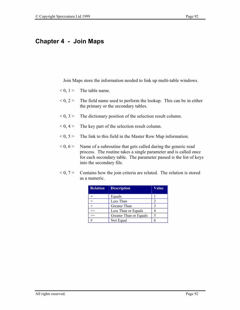
© Copyright Sprezzatura Ltd 1999 Page 92
Chapter 4 - Join Maps
Join Maps store the information needed to link up multi-table windows.
< 0, 1 > The table name.
< 0, 2 > The field name used to perform the lookup. This can be in either the primary or the secondary tables.
< 0, 3 > The dictionary position of the selection result column.
< 0, 4 > The key part of the selection result column.
< 0, 5 > The link to this field in the Master Row Map information.
< 0, 6 > Name of a subroutine that gets called during the generic read process. The routine takes a single parameter and is called once for each secondary table. The parameter passed is the list of keys into the secondary file.
< 0, 7 > Contains how the join criteria are related. The relation is stored as a numeric.
Relation Description Value
= Equals 1 < Less Than 2 > Greater Than 3 <= Less Than or Equals 4 >= Greater Than or Equals 5 # Not Equal 6
All rights reserved. Page 92
© Copyright Sprezzatura Ltd 1999 Page 93
< 0, 8 > The control that holds the key to the secondary file. If the control is an edittable, then there is a text mark delimiting the column in the edittable.
< 0, 9 > The dictionary field position of the source column.
< 0, 10 > Boolean value indicating whether inserts are allowed through the join fields.
< 0, 11 > Boolean value indicating whether updates are allowed through the join fields.
< 0, 12 > Boolean value indicating whether explicit deletes are allowed through the join fields. See Appendix B, Table 1 for more information on explicit and implicit deletes.
< 0, 13 > Boolean value indicating whether implicit deletes are allowed through the join fields. See Appendix B, Table 1 for more information on explicit and implicit deletes.
< 0, 14 > Appears to be set to 0 for the first table, and 1 for all others. The equates seem to imply that this field is used for a read optimisation.
All rights reserved. Page 93
© Copyright Sprezzatura Ltd 1999 Page 94
Chapter 5 - Row Maps
The Row Maps field contains information on each field used in the window. This is different from the Master Row Maps field which contains information on how the controls link up to the form. While it could have been possible for Revelation to have combined these sections into one, they do serve different purposes. This section is used to store information about the dictionary and the database fields. The master row map is used to map a field to a control.
< 0, 0, 1 > The field name of the dictionary or column.
< 0, 0, 2 > The field position of the dictionary or column.
< 0, 0, 3 > The key part of the dictionary or column.
< 0, 0, 4 > The location of this item in the MasterRowMap structure.
< 0, 0, 5 > The OCONV values for this dictionary or column.
< 0, 0, 6 > The ICONV values for this dictionary or column.
< 0, 0, 7 > A boolean value indicating if the field defined by the dictionary as multi-valued. Appears to be Null for Dataset fields.
All rights reserved. Page 94
© Copyright Sprezzatura Ltd 1999 Page 95
Chapter 6 - Master Row Maps
Master Row Maps are what link the window to the data. It is the mapping that allows the Presentation Server to link with OpenEngine.
< 0, 1 > The fully qualified control, WindowName.Control name. The CUST_ID editline in window SAMPLE1 would have SAMPLE1.CUST_ID in this field.
< 0, 2 > If the control is an edittable, this field represents the column for this data value. If the control is not an edittable, this field contains 1.
< 0, 3 > The type of control. See Appendix A for a list of control types.
< 0, 4 > The position of the control as stored in the Control Lists. Generally this is the same as the tab order. However, the system stores window information as field 1. If there are any group boxes, they are stored starting with field 2. Finally, the window controls are stored in tab order.
< 0, 5 > The table the control is associated with. This maps to the @FM position of the Join Maps.
All rights reserved. Page 95

© Copyright Sprezzatura Ltd 1999 Page 96
Chapter 7 - Control Maps
Control Maps simply contain a field mark delimited list of all controls. The window name is the first control, the menu is the last control, and all other controls, excluding group boxes, are stored in tab order.
All rights reserved. Page 96
© Copyright Sprezzatura Ltd 1999 Page 97
Chapter 8 - Key Maps
Key maps are used to determine which controls are keys to the primary file. Secondary key information is not used here. It would seem to be a listing of controls that must be filled to trigger the read event.
< 0, 1 > The fully qualified control name.
< 0, 2 > The type of control.
< 0, 3 > The position of this control in the control map. This field does not appear to be used for datasets.
All rights reserved. Page 97

© Copyright Sprezzatura Ltd 1999 Page 98
Chapter 9 - Control Semantics
Control Semantics is used for a similar purpose as Control Lists. However, this section contains information required by Presentation Server instead of Microsoft Windows. This section contains information on making the window flow. You could think of it as the information that makes the window an OpenInsight window as opposed to any old screen window.
Each control is field mark delimited and is stored on a one to one basis with the items in Control Lists.
After the control information, there is a blank field containing 8 value marks and then the menu quick event information.
Standard Window Controls
< 0, 1 > Holds the table or dataset name associated with this control. In an edittable, a control can contain more than one table or dataset association. If so, this field will be sub-value mark delimited.
< 0, 2 > This field holds the column name associated with this control. This field can be sub-value mark delimited.
< 0, 3 > This field hold the database position number of this control. This field can be sub-value mark delimited.
< 0, 4 > For OpenInsight tables, this field contains the key part number. This field can be sub-value mark delimited.
< 0, 5 > This field contains the OCONV value applied to the control. This field can be sub-value mark delimited.
< 0, 6 > This field contains the ICONV value applied to the control. This field can be sub-value mark delimited.
< 0, 7 > For OpenInsight tables, this field contains a boolean value if the field is defined in the dictionary as multi-valued. This field can be sub-value mark delimited if defining EDITTABLE controls. This field is null if not using OpenInsight tables.
All rights reserved. Page 98
© Copyright Sprezzatura Ltd 1999 Page 99
< 0, 8 > This field contains a listing of all the QuickEvents for the control. Each event is delimited by a sub-value mark. If there are any QuickEvents, there is always a trailing sub-value mark. If there are no QuickEvents, then this field is null.
< 0, 9 > This field contains the information for the QuickEvents Each Event is sub value mark delimited. The fields below are text mark delimited per event. All fields are stored, even if they are empty, so each QuickEvent will have five text marks stored.
< 0, 0, 1 > This field determines what type of QuickEvent is being executed. Valid types are R for Repository and E for Event. Confusing as this might be, the R maps to the Entity Radio Button while the E maps to the Control/Window Radio button.
< 0, 0, 2 > This field determines what message is sent to the QuickEvent. For R type QuickEvents, this is always EXECUTE. For E type QuickEvents, this can be any valid OpenInsight Event. See Appendix B for a listing of valid events.
< 0, 0, 3 > This field determines who the message is sent to. For R type QuickEvents, this is always a fully qualified repository name. For E type QuickEvents, this is always a fully qualified control name where the Window Name is always @WINDOW.
< 0, 0, 4 > This field contains the parameters passed to the QuickEvent. Multiple parameters are delimited by sub-text marks.
< 0, 0, 5 > This field contains the control to return the information in. The control name is a fully qualified control. Unlike the recipient information field, this field does not use @WINDOW but uses the real window name. If this field is not filled in, it contains a null value.
< 0, 0, 6 > The property to place the returned information in. If this field is not filled in, it contains a null value.
< 0, 10 > Appears to be unused
All rights reserved. Page 99

© Copyright Sprezzatura Ltd 1999 Page 100
< 0, 11 > Appears to indicate whether other controls are updated if this field changes. It’s always set to a logical TRUE for the key field and is always set if another control uses this control as the value for an XLATE.
< 0, 12 > The controls that map to the same field as this control. For example, if you place a protected KEY field on each page of the window, they would be linked through this field. If there are multiple linked fields, they are @TM delimited.
< 0, 0, 1 > The position of the control as stored in the Control Lists. Generally this is the same as the tab order.
< 0, 0, 2 > The table the control is associated with. This maps to the @FM position of the Join Maps.
< 0, 13 > If this control is a key, this field contains the table number for that key.
< 0, 14 > The controls that will be updated by this control. Always followed by a sub-text mark and the number 1. It would appear that the second column indicates the table number, however no other values seem to have any effect.
< 0, 15 > Appears to be unused. Setting this value seems to have no effect. The value is loaded into OIWIN_COMM when the window loads.
< 0, 16 > Contains the initial value of the control the last time it was entered.
< 0, 17 > Set to logical True$ ( 1 ) if the control is required.
< 0, 18 > The default value for the control.
< 0, 19 > According to OIWIN_EQUATES, this field is used for Lotus Notes. Since the authors do not have Lotus Notes, we were unable to verify and validate the purpose of this field.
< 0, 20 > This field maintains information about Datasets. There is different information stored depending on whether the current control is defining the window or a specific control.
Window Information
< 0, 0, 1 > Fully qualified repository name of each data set in the window.
All rights reserved. Page 100
© Copyright Sprezzatura Ltd 1999 Page 101
< 0, 0, 2 > Appears to be unused
< 0, 0, 3 > The name of the connection object used by this dataset.
Control Information
< 0, 0, 1 > The ordinal number of the dataset used by this control. The ordinal number is the field count number of the dataset as outlined in the Window Information.
< 0, 0, 2 > The Dataset column name this control is associated with.
< 0, 0, 3 > The Dataset datatype this control is associated with.
< 0, 21 > If the control fiield is mapped to a Dataset, this field seems to contain the literal “DATASET”. There will be one instance of DATASET for each delimited item in field 20.
Quick Event Menu Information
This section of the Control Lists contains information on the menu’s quick event structure. Only menu quick events are stored here. Control quick events are stored with the control information. The QuickEvent information is stored in fields 8 and 9 and matches exactly with the structure for standard controls.
< 0, 8 > This field contains a listing of all the QuickEvents for the control. Each event is delimited by a sub-value mark. If there are any QuickEvents, there is always a trailing sub-value mark. If there are no QuickEvents, then this field is null.
< 0, 9 > This field contains the information for the QuickEvents Each Event is sub value mark delimited. The fields below are text mark delimited per event. All fields are stored, even if they are empty, so each QuickEvent will have five text marks stored.
< 0, 0, 1 > This field determines what type of QuickEvent is being executed. Valid types are R for Repository and E for Event. Confusing as this might be, the R maps to the Entity Radio Button while the E maps to the Control/Window Radio button.
All rights reserved. Page 101

© Copyright Sprezzatura Ltd 1999 Page 102
< 0, 0, 2 > This field determines what message is sent to the QuickEvent. For R type QuickEvents, this is always EXECUTE. For E type QuickEvents, this can be any valid OpenInsight Event. See Appendix B for a listing of valid events.
< 0, 0, 3 > This field determines who the message is sent to. For R type QuickEvents, this is always a fully qualified repository name. For E type QuickEvents, this is always a fully qualified control name where the Window Name is always @WINDOW.
< 0, 0, 4 > This field contains the parameters past to the QuickEvent. Multi parameters are delimited by sub-text marks.
< 0, 0, 5 > This field contains the control to return the information in. The control name is a fully qualified control. Unlike the recipient information field, this field does not use @WINDOW but uses the real window name. If this field is not filled in, it contains a null value.
< 0, 0, 6 > The property to place the returned information in. If this field is not filled in, it contains a null value.
All rights reserved. Page 102
© Copyright Sprezzatura Ltd 1999 Page 103
Chapter 10 - System Information
This section contains information about the images that appear in the window. These images can be icons or bitmaps. Field 2 is only used for icon images. Field 3 is only used for bitmap type images. Only the window (control number 1) should ever have an icon and a bitmap reference.
< 0, 1 > Control number from ControlList
< 0, 2 > For the control’s icon, the serial number of the OENGINE.EXE that was loaded when this form was compiled.
< 0, 3 > For the control’s bitmap, the serial number of the OENGINE.EXE that was loaded when this form was compiled.
All rights reserved. Page 103

© Copyright Sprezzatura Ltd 1999 Page 104
Appendix A - Valid Control Types
The following is the list of valid OpenInsight control types
WINDOW
EDITBOX
EDITFIELD
EDITTABLE
CHECKBOX
COMBOBOX
LISTBOX
PUSHBUTTON
RADIOBUTTON
RADIOGROUP
HSCROLLBAR
VSCROLLBAR
ICON
MENU
BITMAP
GROUPBOX
STATIC
PUSHBMP
All rights reserved. Page 104

© Copyright Sprezzatura Ltd 1999 Page 105
RADIOBMP
CHECKBMP
RTFBOX
MDICLIENT
All rights reserved. Page 105
© Copyright Sprezzatura Ltd 1999 Page 106
Appendix B - OpenInsight Event Types
These are the valid event types for OpenInsight. BITMAP WINMSG CtrlEntID, CtrlClassID,hWnd, Message, wParam, lParam CHECKBOX CALCULATE CtrlEntID, CtrlClassID,CtrlColumn CLICK CtrlEntID, CtrlClassID GOTFOCUS CtrlEntID, CtrlClassID,PrevFocusID HELP CtrlEntID, CtrlClassID LOSTFOCUS CtrlEntID, CtrlClassID,Flag,FocusID NOTES CtrlEntID, CtrlClassID OMNIEVENT CtrlEntID,
CtrlClassID,Message,Param1,Param2,Param3,Param4 WINMSG CtrlEntID, CtrlClassID,hWnd, Message, wParam, lParam COMBOBOX CALCULATE CtrlEntID, CtrlClassID,CtrlColumn CHANGED CtrlEntID, CtrlClassID,NewData CHAR CtrlEntID,
CtrlClassID,VirtCode,ScanCode,CtrlKey,ShiftKey,AltKey DBLCLK CtrlEntID, CtrlClassID,CtrlKey,ShiftKey,MouseButton DDEADVISE CtrlEntID, CtrlClassID,NewData DDEERROR CtrlEntID, CtrlClassID DROPDOWN CtrlEntID, CtrlClassID,EditLineText DSOSETPARAM CtrlEntID, CtrlClassID,DSOId,ParamNo,ParamVal GOTFOCUS CtrlEntID, CtrlClassID,PrevFocusID HELP CtrlEntID, CtrlClassID LOSTFOCUS CtrlEntID, CtrlClassID,Flag,FocusID NOTES CtrlEntID, CtrlClassID OMNIEVENT CtrlEntID,
CtrlClassID,Message,Param1,Param2,Param3,Param4 WINMSG CtrlEntID, CtrlClassID,hWnd, Message, wParam, lParam EDITBOX CALCULATE CtrlEntID, CtrlClassID,CtrlColumn CHANGED CtrlEntID, CtrlClassID,NewData CHAR CtrlEntID,
All rights reserved. Page 106

© Copyright Sprezzatura Ltd 1999 Page 107
CtrlClassID,VirtCode,ScanCode,CtrlKey,ShiftKey,AltKey CLICK CtrlEntID, CtrlClassID DBLCLK CtrlEntID, CtrlClassID DDEADVISE CtrlEntID, CtrlClassID,NewData DDEERROR CtrlEntID, CtrlClassID DSOSETPARAM CtrlEntID, CtrlClassID,DSOId,ParamNo,ParamVal GOTFOCUS CtrlEntID, CtrlClassID,PrevFocusID HELP CtrlEntID, CtrlClassID LOSTFOCUS CtrlEntID, CtrlClassID,Flag,FocusID NOTES CtrlEntID, CtrlClassID OMNIEVENT CtrlEntID,
CtrlClassID,Message,Param1,Param2,Param3,Param4 OPTIONS CtrlEntID, CtrlClassID WINMSG CtrlEntID, CtrlClassID,hWnd, Message, wParam, lParam EDITFIELD CALCULATE CtrlEntID, CtrlClassID,CtrlColumn CHANGED CtrlEntID, CtrlClassID,NewData CHAR CtrlEntID,
CtrlClassID,VirtCode,ScanCode,CtrlKey,ShiftKey,AltKey DDEADVISE CtrlEntID, CtrlClassID,NewData DDEERROR CtrlEntID, CtrlClassID DSOSETPARAM CtrlEntID, CtrlClassID,DSOId,ParamNo,ParamVal GOTFOCUS CtrlEntID, CtrlClassID,PrevFocusID HELP CtrlEntID, CtrlClassID LOSTFOCUS CtrlEntID, CtrlClassID,Flag,FocusID NOTES CtrlEntID, CtrlClassID OMNIEVENT CtrlEntID,
CtrlClassID,Message,Param1,Param2,Param3,Param4 OPTIONS CtrlEntID, CtrlClassID WINMSG CtrlEntID, CtrlClassID,hWnd, Message, wParam, lParam EDITTABLE CALCULATE CtrlEntID, CtrlClassID,CtrlColumn CHANGED CtrlEntID, CtrlClassID,NewData CHAR CtrlEntID,
CtrlClassID,VirtCode,ScanCode,CtrlKey,ShiftKey,Altkey CLICK CtrlEntID, CtrlClassID COLSIZE CtrlEntID, CtrlClassID DBLCLK CtrlEntID, CtrlClassID,CtrlKey,ShiftKey,MouseButton DELETEROW CtrlEntID, CtrlClassID,RowNum,RowData DSOSETPARAM CtrlEntID, CtrlClassID,DSOId,ParamNo,ParamVal,CtrlCoords GOTFOCUS CtrlEntID, CtrlClassID,PrevFocusID HELP CtrlEntID, CtrlClassID HSCROLL CtrlEntID, CtrlClassID,Value INSERTROW CtrlEntID, CtrlClassID,RowNum LOSTFOCUS CtrlEntID, CtrlClassID,Flag,FocusID NOTES CtrlEntID, CtrlClassID OMNIEVENT CtrlEntID,
CtrlClassID,Message,Param1,Param2,Param3,Param4 OPTIONS CtrlEntID, CtrlClassID
All rights reserved. Page 107
© Copyright Sprezzatura Ltd 1999 Page 108
POSCHANGED CtrlEntID, CtrlClassID,NextColumn,NextRow VSCROLL CtrlEntID, CtrlClassID,Value WINMSG CtrlEntID, CtrlClassID,hWnd, Message, wParam, lParam GROUPBOX WINMSG CtrlEntID, CtrlClassID,hWnd, Message, wParam, lParam HSCROLL CALCULATE CtrlEntID, CtrlClassID,CtrlColumn GOTFOCUS CtrlEntID, CtrlClassID,PrevFocusID HELP CtrlEntID, CtrlClassID HSCROLL CtrlEntID, CtrlClassID,Value LOSTFOCUS CtrlEntID, CtrlClassID,Flag,FocusID NOTES CtrlEntID, CtrlClassID OMNIEVENT CtrlEntID,
CtrlClassID,Message,Param1,Param2,Param3,Param4 WINMSG CtrlEntID, CtrlClassID,hWnd, Message, wParam, lParam ICON CLICK CtrlEntID, CtrlClassID DBLCLK CtrlEntID, CtrlClassID,CtrlKey,ShiftKey,MouseButton GOTFOCUS CtrlEntID, CtrlClassID,PrevFocusID HELP CtrlEntID, CtrlClassID LOSTFOCUS CtrlEntID, CtrlClassID,Flag,FocusID NOTES CtrlEntID, CtrlClassID OMNIEVENT CtrlEntID,
CtrlClassID,Message,Param1,Param2,Param3,Param4 LISTBOX CALCULATE CtrlEntID, CtrlClassID,CtrlColumn CHANGED CtrlEntID, CtrlClassID,NewData CHAR CtrlEntID,
CtrlClassID,VirtCode,ScanCode,CtrlKey,ShiftKey,AltKey DBLCLK CtrlEntID, CtrlClassID,CtrlKey,ShiftKey,MouseButton GOTFOCUS CtrlEntID, CtrlClassID,PrevFocusID HELP CtrlEntID, CtrlClassID LOSTFOCUS CtrlEntID, CtrlClassID,Flag,FocusID NOTES CtrlEntID, CtrlClassID OMNIEVENT CtrlEntID,
CtrlClassID,Message,Param1,Param2,Param3,Param4 WINMSG CtrlEntID, CtrlClassID,hWnd, Message, wParam, lParam MENU MENU CtrlEntID, CtrlClassID
All rights reserved. Page 108
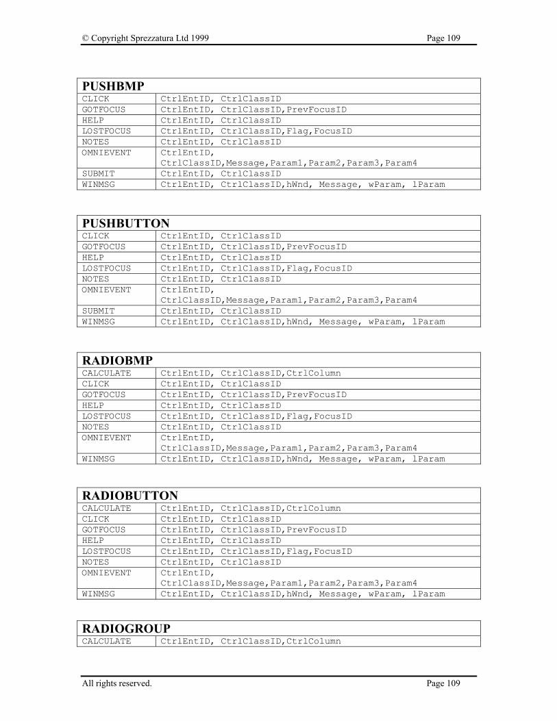
© Copyright Sprezzatura Ltd 1999 Page 109
PUSHBMP CLICK CtrlEntID, CtrlClassID GOTFOCUS CtrlEntID, CtrlClassID,PrevFocusID HELP CtrlEntID, CtrlClassID LOSTFOCUS CtrlEntID, CtrlClassID,Flag,FocusID NOTES CtrlEntID, CtrlClassID OMNIEVENT CtrlEntID,
CtrlClassID,Message,Param1,Param2,Param3,Param4 SUBMIT CtrlEntID, CtrlClassID WINMSG CtrlEntID, CtrlClassID,hWnd, Message, wParam, lParam PUSHBUTTON CLICK CtrlEntID, CtrlClassID GOTFOCUS CtrlEntID, CtrlClassID,PrevFocusID HELP CtrlEntID, CtrlClassID LOSTFOCUS CtrlEntID, CtrlClassID,Flag,FocusID NOTES CtrlEntID, CtrlClassID OMNIEVENT CtrlEntID,
CtrlClassID,Message,Param1,Param2,Param3,Param4 SUBMIT CtrlEntID, CtrlClassID WINMSG CtrlEntID, CtrlClassID,hWnd, Message, wParam, lParam RADIOBMP CALCULATE CtrlEntID, CtrlClassID,CtrlColumn CLICK CtrlEntID, CtrlClassID GOTFOCUS CtrlEntID, CtrlClassID,PrevFocusID HELP CtrlEntID, CtrlClassID LOSTFOCUS CtrlEntID, CtrlClassID,Flag,FocusID NOTES CtrlEntID, CtrlClassID OMNIEVENT CtrlEntID,
CtrlClassID,Message,Param1,Param2,Param3,Param4 WINMSG CtrlEntID, CtrlClassID,hWnd, Message, wParam, lParam RADIOBUTTON CALCULATE CtrlEntID, CtrlClassID,CtrlColumn CLICK CtrlEntID, CtrlClassID GOTFOCUS CtrlEntID, CtrlClassID,PrevFocusID HELP CtrlEntID, CtrlClassID LOSTFOCUS CtrlEntID, CtrlClassID,Flag,FocusID NOTES CtrlEntID, CtrlClassID OMNIEVENT CtrlEntID,
CtrlClassID,Message,Param1,Param2,Param3,Param4 WINMSG CtrlEntID, CtrlClassID,hWnd, Message, wParam, lParam RADIOGROUP CALCULATE CtrlEntID, CtrlClassID,CtrlColumn
All rights reserved. Page 109

© Copyright Sprezzatura Ltd 1999 Page 110
CLICK CtrlEntID, CtrlClassID GOTFOCUS CtrlEntID, CtrlClassID,PrevFocusID HELP CtrlEntID, CtrlClassID LOSTFOCUS CtrlEntID, CtrlClassID,Flag,FocusID NOTES CtrlEntID, CtrlClassID OMNIEVENT CtrlEntID,
CtrlClassID,Message,Param1,Param2,Param3,Param4 WINMSG CtrlEntID, CtrlClassID,hWnd, Message, wParam, lParam STATIC SUBMIT CtrlEntID, CtrlClassID WINMSG CtrlEntID, CtrlClassID,hWnd, Message, wParam, lParam VSCROLL CALCULATE CtrlEntID, CtrlClassID,CtrlColumn GOTFOCUS CtrlEntID, CtrlClassID,PrevFocusID HELP CtrlEntID, CtrlClassID LOSTFOCUS CtrlEntID, CtrlClassID,Flag,FocusID NOTES CtrlEntID, CtrlClassID OMNIEVENT CtrlEntID,
CtrlClassID,Message,Param1,Param2,Param3,Param4 VSCROLL CtrlEntID, CtrlClassID,Value WINMSG CtrlEntID, CtrlClassID,hWnd, Message, wParam, lParam WINDOW ACTIVATED CtrlEntID, CtrlClassID ARRANGEICONS CtrlEntID, CtrlClassID BUTTONDOWN CtrlEntID,
CtrlClassID,xDown,yDown,xUp,yUp,CtrlKey,ShiftKey,MouseButton
BUTTONUP CtrlEntID, CtrlClassID,xDown,yDown,xUp,yUp,CtrlKey,ShiftKey,MouseButton
CALCULATE CtrlEntID, CtrlClassID,CtrlColumn CASCADE CtrlEntID, CtrlClassID CLEAR CtrlEntID,
CtrlClassID,bSaveKey,bSuppressWarning,bMaintainFocus,CtrlIDFocus
CLOSE CtrlEntID, CtrlClassID,CancelFlag CREATE CtrlEntID, CtrlClassID,CreateParam DDEEROR CtrlEntID, CtrlClassID DELETE CtrlEntID, CtrlClassID DSOABS CtrlEntID, CtrlClassID,DSOId,RowNum,RefreshForm DSOCLEAR CtrlEntID, CtrlClassID,DSOId,PreserveArgs DSOCOMMIT CtrlEntID,
CtrlClassID,DSOId,ExecuteAfterCommit,CommitTransaction DSODELETE CtrlEntID, CtrlClassID,DSOId DSOEXECUTE CtrlEntID, CtrlClassID,DSOId DSOFIRST CtrlEntID, CtrlClassID,DSOId
All rights reserved. Page 110
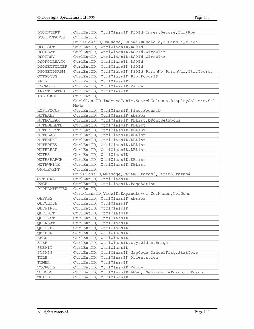
© Copyright Sprezzatura Ltd 1999 Page 111
DSOINSERT CtrlEntID, CtrlClassID,DSOId,InsertBefore,InitRow DSOINSTANCE CtrlEntID,
CtrlClassID,DSOName,XOName,DSHandle,XOHandle,Flags DSOLAST CtrlEntID, CtrlClassID,DSOId DSONEXT CtrlEntID, CtrlClassID,DSOId,Circular DSOPREV CtrlEntID, CtrlClassID,DSOId,Circular DSOROLLBACK CtrlEntID, CtrlClassID,DSOId DSOSETFILTER CtrlEntID, CtrlClassID,DSOId DSOSETPARAM CtrlEntID, CtrlClassID,DSOId,ParamNo,ParamVal,CtrlCoords GOTFOCUS CtrlEntID, CtrlClassID,PrevFocusID HELP CtrlEntID, CtrlClassID HSCROLL CtrlEntID, CtrlClassID,Value INACTIVATED CtrlEntID, CtrlClassID IXLOOKUP CtrlEntID,
CtrlClassID,IndexedTable,SearchColumns,DisplayColumns,SelMode
LOSTFOCUS CtrlEntID, CtrlClassID,Flag,FocusID NOTEABS CtrlEntID, CtrlClassID,AbsPos NOTECLEAR CtrlEntID, CtrlClassID,DBList,bDontSetFocus NOTEDELETE CtrlEntID, CtrlClassID,DBList NOTEFIRST CtrlEntID, CtrlClassID,DBLIST NOTELAST CtrlEntID, CtrlClassID,DBList NOTENEXT CtrlEntID, CtrlClassID,DBList NOTEPREV CtrlEntID, CtrlClassID,DBList NOTEREAD CtrlEntID, CtrlClassID,DBList NOTES CtrlEntID, CtrlClassID NOTESEARCH CtrlEntID, CtrlClassID,DBlist NOTEWRITE CtrlEntID, CtrlClassID,DBList OMNIEVENT CtrlEntID,
CtrlClassID,Message,Param1,Param2,Param3,Param4 OPTIONS CtrlEntID, CtrlClassID PAGE CtrlEntID, CtrlClassID,PageAction POPULATEVIEW CtrlEntID,
CtrlClassID,ViewID,ExpandLevel,ColNames,ColNums QBFABS CtrlEntID, CtrlClassID,AbsPos QBFCLOSE CtrlEntID, CtrlClassID QBFFIRST CtrlEntID, CtrlClassID QBFINIT CtrlEntID, CtrlClassID QBFLAST CtrlEntID, CtrlClassID QBFNEXT CtrlEntID, CtrlClassID QBFPREV CtrlEntID, CtrlClassID QBFRUN CtrlEntID, CtrlClassID READ CtrlEntID, CtrlClassID SIZE CtrlEntID, CtrlClassID,x,y,Width,Height SUBMIT CtrlEntID, CtrlClassID SYSMSG CtrlEntID, CtrlClassID,MsgCode,CancelFlag,StatCode TILE CtrlEntID, CtrlClassID,Orientation TIMER CtrlEntID, CtrlClassID VSCROLL CtrlEntID, CtrlClassID,Value WINMSG CtrlEntID, CtrlClassID,hWnd, Message, wParam, lParam WRITE CtrlEntID, CtrlClassID
All rights reserved. Page 111

© Copyright Sprezzatura Ltd 1999 Page 112
Appendix C - Join Table Delete Information
When working with Joined Tables, you must create links from each table. Generally, a field in the primary table is the key to the secondary tables. In a simple multi-table window, you will find that for display purposes, it appears exactly as if you used symbolics. The difference is that in a multi-table window, you have actually read in the secondary record. With that read, comes all the effects of real read, locking, updating and deleting. OpenInsight’s Join Selection Criteria allows for two different types of deletes, implicit and explicit. The on-line help for OpenInsight describes implicit delete as
When selected, this allows the associated record in the ordinal component to be deleted, when the joined record in the primary ordinal component is deleted. This option is selected for the primary ordinal component by default. This option is cleared by default for ordinal components.
The on-line help for explicit deletes is described as
When selected, this prevents deletion of the associated record in the ordinal component when the joined record in the primary ordinal component is deleted. The record in the ordinal component must be explicitly deleted, not through a relational operation. This option is selected for the primary component by default. This option is cleared by default for ordinal components.
This information, while accurate, is not all that crystal clear. Table 1 outlines the actions occurred when setting all possible delete values on a simple data entry form. In the illustrations below, the PURCHASE_ORDERS and STOCK tables from the Example Application were used. A small window was created joining the STK_NO column PURCHASE_ORDER table with the STK_NAME and STK_DESC fields in STOCK table. The most interesting effect was the Implicit Delete setting on the PURCHASE_ORDERS table. When this option was disabled, the standard “OK to delete the entry?” message did not appear. However, when Explicit Delete was enabled for the STOCK file, the records were deleted without warning.
All rights reserved. Page 112
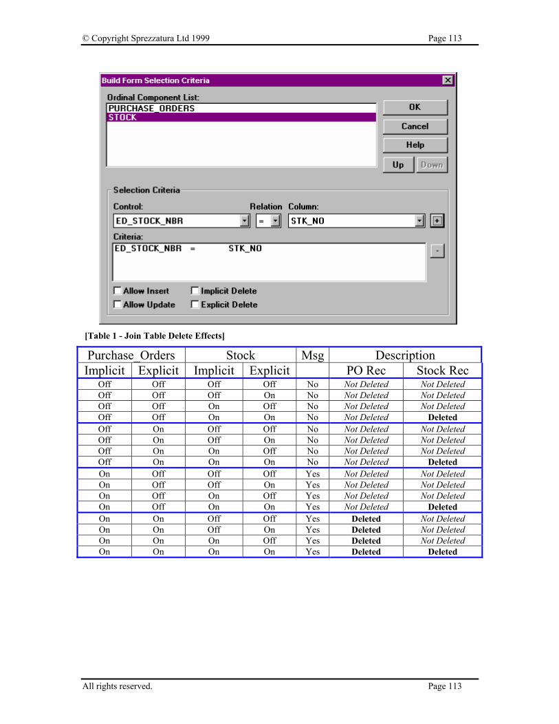
© Copyright Sprezzatura Ltd 1999 Page 113
[Table 1 - Join Table Delete Effects]
Purchase_Orders Stock Msg Description Implicit Explicit Implicit Explicit PO Rec Stock Rec
Off Off Off Off No Not Deleted Not Deleted Off Off Off On No Not Deleted Not Deleted Off Off On Off No Not Deleted Not Deleted Off Off On On No Not Deleted Deleted Off On Off Off No Not Deleted Not Deleted Off On Off On No Not Deleted Not Deleted Off On On Off No Not Deleted Not Deleted Off On On On No Not Deleted Deleted On Off Off Off Yes Not Deleted Not Deleted On Off Off On Yes Not Deleted Not Deleted On Off On Off Yes Not Deleted Not Deleted On Off On On Yes Not Deleted Deleted On On Off Off Yes Deleted Not Deleted On On Off On Yes Deleted Not Deleted On On On Off Yes Deleted Not Deleted On On On On Yes Deleted Deleted
All rights reserved. Page 113
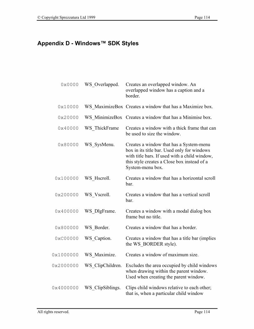
© Copyright Sprezzatura Ltd 1999 Page 114
Appendix D - Windows™ SDK Styles
0x0000 WS_Overlapped. Creates an overlapped window. An overlapped window has a caption and a border.
0x10000 WS_MaximizeBox Creates a window that has a Maximize box.
0x20000 WS_MinimizeBox Creates a window that has a Minimise box.
0x40000 WS_ThickFrame Creates a window with a thick frame that can be used to size the window.
0x80000 WS_SysMenu. Creates a window that has a System-menu box in its title bar. Used only for windows with title bars. If used with a child window, this style creates a Close box instead of a System-menu box.
0x100000 WS_Hscroll. Creates a window that has a horizontal scroll bar.
0x200000 WS_Vscroll. Creates a window that has a vertical scroll bar.
0x400000 WS_DlgFrame. Creates a window with a modal dialog box frame but no title.
0x800000 WS_Border. Creates a window that has a border.
0xC00000 WS_Caption. Creates a window that has a title bar (implies the WS_BORDER style).
0x1000000 WS_Maximize. Creates a window of maximum size.
0x2000000 WS_ClipChildren. Excludes the area occupied by child windows when drawing within the parent window. Used when creating the parent window.
0x4000000 WS_ClipSiblings. Clips child windows relative to each other; that is, when a particular child window
All rights reserved. Page 114
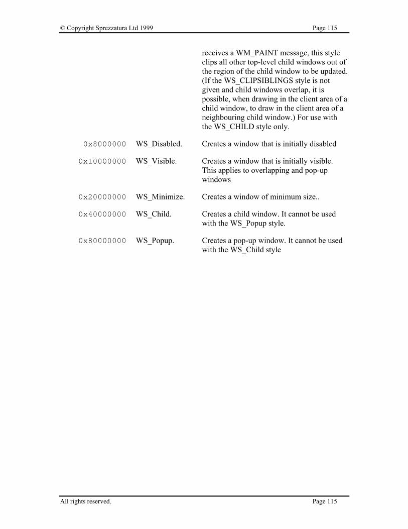
© Copyright Sprezzatura Ltd 1999 Page 115
receives a WM_PAINT message, this style clips all other top-level child windows out of the region of the child window to be updated. (If the WS_CLIPSIBLINGS style is not given and child windows overlap, it is possible, when drawing in the client area of a child window, to draw in the client area of a neighbouring child window.) For use with the WS_CHILD style only.
0x8000000 WS_Disabled. Creates a window that is initially disabled
0x10000000 WS_Visible. Creates a window that is initially visible. This applies to overlapping and pop-up windows
0x20000000 WS_Minimize. Creates a window of minimum size..
0x40000000 WS_Child. Creates a child window. It cannot be used with the WS_Popup style.
0x80000000 WS_Popup. Creates a pop-up window. It cannot be used with the WS_Child style
All rights reserved. Page 115
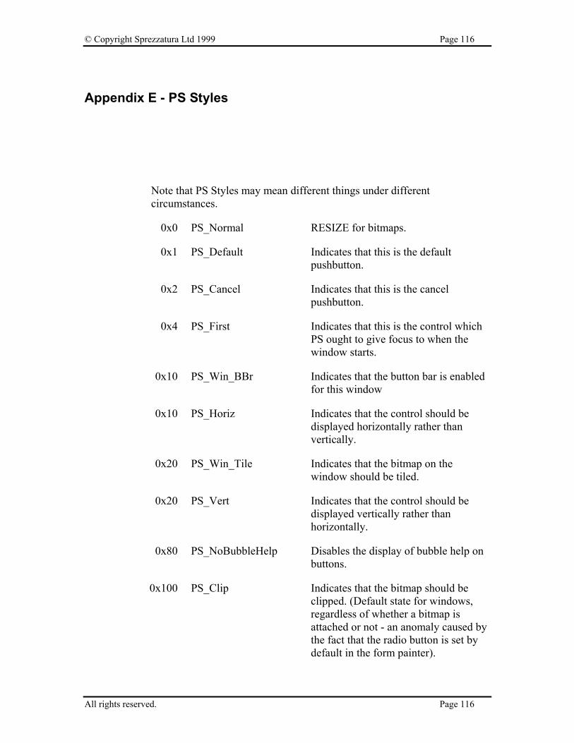
© Copyright Sprezzatura Ltd 1999 Page 116
Appendix E - PS Styles
Note that PS Styles may mean different things under different circumstances.
0x0 PS_Normal RESIZE for bitmaps.
0x1 PS_Default Indicates that this is the default pushbutton.
0x2 PS_Cancel Indicates that this is the cancel pushbutton.
0x4 PS_First Indicates that this is the control which PS ought to give focus to when the window starts.
0x10 PS_Win_BBr Indicates that the button bar is enabled for this window
0x10 PS_Horiz Indicates that the control should be displayed horizontally rather than vertically.
0x20 PS_Win_Tile Indicates that the bitmap on the window should be tiled.
0x20 PS_Vert Indicates that the control should be displayed vertically rather than horizontally.
0x80 PS_NoBubbleHelp Disables the display of bubble help on buttons.
0x100 PS_Clip Indicates that the bitmap should be clipped. (Default state for windows, regardless of whether a bitmap is attached or not - an anomaly caused by the fact that the radio button is set by default in the form painter).
All rights reserved. Page 116

© Copyright Sprezzatura Ltd 1999 Page 117
0x100 PS_RTF Indicate that the editbox is a rich text format control.
0x100 PS_Hierarchical Indicates that the listbox is hierarchical.
0x100 PS_KeepScrollBars Indicates that a control should always display scroll bars even when the amount of data in the control does not warrant it.
0x200 PS_AutoIconArrange If set, an MDI frame will not allow the user to select the position of the iconised child windows. It will insist on automatically arranging them. Note, the icons are not fixed in place, rather as the user moves them, the system restores them to their original location.
0x400 PS_Combine Combine text and bitmap on a control
0x400 PS_Overlap Indicates overlapping tabs on a listbox.
0x800 PS_IgnoreAccelerator If this style bit is set, accelerator keys defined for controls (NB controls not menus) will be ignored.
0x1000 PS_DialogBox Indicates that the window is a dialog box.
0x1000 PS_RightAnchor Anchor the control to the right.
0x2000 PS_Pages Indicates that this is a multi-page window
0x2000 PS_BottomAnchor Anchor the control to the bottom
0x4000 PS_MultiInstance Allow multiple instances of the window in an MDI frame.
0x4000 PS_AutoSizeWidth Automatically size the width of the control.
0x8000 PS_No3D Indicates that 3D controls ought not to be enabled for this window.
0x8000 PS_AutoSizeDepth Automatically size the depth of the control.
All rights reserved. Page 117

© Copyright Sprezzatura Ltd 1999 Page 118
0x1000000 PS_Enter Indicates that Enter should be treated as a double click on a listbox
0x4000000 PS_InitCollapsed Indicates that a hierarchical listbox ought to start off collapsed rather than expanded.
All rights reserved. Page 118
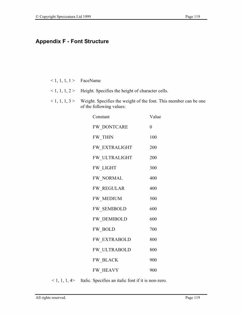
© Copyright Sprezzatura Ltd 1999 Page 119
Appendix F - Font Structure
< 1, 1, 1, 1 > FaceName
< 1, 1, 1, 2 > Height. Specifies the height of character cells.
< 1, 1, 1, 3 > Weight. Specifies the weight of the font. This member can be one of the following values:
Constant Value
FW_DONTCARE 0
FW_THIN 100
FW_EXTRALIGHT 200
FW_ULTRALIGHT 200
FW_LIGHT 300
FW_NORMAL 400
FW_REGULAR 400
FW_MEDIUM 500
FW_SEMIBOLD 600
FW_DEMIBOLD 600
FW_BOLD 700
FW_EXTRABOLD 800
FW_ULTRABOLD 800
FW_BLACK 900
FW_HEAVY 900
< 1, 1, 1, 4> Italic. Specifies an italic font if it is non-zero.
All rights reserved. Page 119
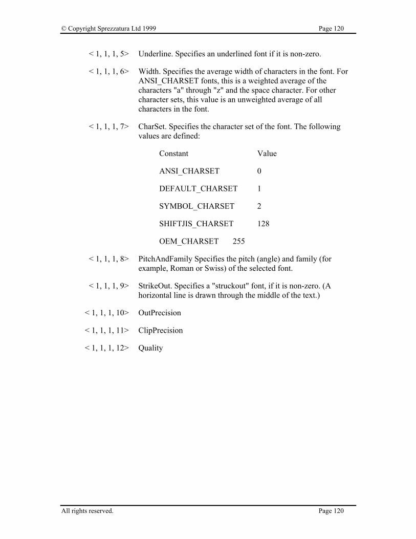
© Copyright Sprezzatura Ltd 1999 Page 120
< 1, 1, 1, 5> Underline. Specifies an underlined font if it is non-zero.
< 1, 1, 1, 6> Width. Specifies the average width of characters in the font. For ANSI_CHARSET fonts, this is a weighted average of the characters "a" through "z" and the space character. For other character sets, this value is an unweighted average of all characters in the font.
< 1, 1, 1, 7> CharSet. Specifies the character set of the font. The following values are defined:
Constant Value
ANSI_CHARSET 0
DEFAULT_CHARSET 1
SYMBOL_CHARSET 2
SHIFTJIS_CHARSET 128
OEM_CHARSET 255
< 1, 1, 1, 8> PitchAndFamily Specifies the pitch (angle) and family (for example, Roman or Swiss) of the selected font.
< 1, 1, 1, 9> StrikeOut. Specifies a "struckout" font, if it is non-zero. (A horizontal line is drawn through the middle of the text.)
< 1, 1, 1, 10> OutPrecision
< 1, 1, 1, 11> ClipPrecision
< 1, 1, 1, 12> Quality
All rights reserved. Page 120

© Copyright Sprezzatura Ltd 1999 Page 121
Appendix G - Edit Control Style Settings
0x0 ES_Left Left aligns text.
0x1 ES_Center Centres text in a multiline edit control.
0x2 ES_Right Right aligns text in a multiline edit control.
0x4 ES_Multiline Designates a multiline edit control. (The default is single-line edit control.)
When the multiline edit control is in a dialog box, the default response to pressing the ENTER key is to activate the default button. To use the ENTER key as a carriage return, an application should use the ES_WANTRETURN style.
When the multiline edit control is not in a dialog box and the ES_AUTOVSCROLL style is specified, the edit control shows as many lines as possible and scrolls vertically when the user presses the ENTER key. If ES_AUTOVSCROLL is not specified, the edit control shows as many lines as possible and beeps if the user presses ENTER when no more lines can be displayed.
If the ES_AUTOHSCROLL style is specified, the multiline edit control automatically scrolls horizontally when the caret goes past the right edge of the control. To start a new line, the user must press ENTER. If ES_AUTOHSCROLL is not specified, the control automatically wraps words to the beginning of the next line when necessary. A new line is also started if the user presses ENTER. The position of the wordwrap is determined by the window size.
All rights reserved. Page 121
© Copyright Sprezzatura Ltd 1999 Page 122
If the window size changes, the wordwrap position changes and the text is redisplayed.
Multiline edit controls can have scroll bars. An edit control with scroll bars processes its own scroll bar messages. Edit controls without scroll bars scroll as described in the previous two paragraphs and process any scroll messages sent by the parent window.
0x8 ES_Uppercase Converts all characters to uppercase as they are typed into the edit control.
0x10 ES_Lowercase Converts all characters to lowercase as they are typed into the edit control.
0x20 ES_Password Displays all characters as an asterisk (*) as they are typed into the edit control. An application can use the EM_SETPASSWORDCHAR message to change the character that is displayed.
0x40 ES_AutoVScroll Automatically scrolls text up one page when the user presses ENTER on the last line.
0x80 ES_AutoHScroll Automatically scrolls text to the right by 10 characters when the user types a character at the end of the line. When the user presses the ENTER key, the control scrolls all text back to position zero.
0x100 ES_NoHideSel Negates the default behaviour for an edit control. The default behaviour is to hide the selection when the control loses the input focus and invert the selection when the control receives the input focus.
0x400 ES_OemConvert Converts text entered in the edit control from the Windows character set to the OEM character set and then back to the Windows set. This ensures proper character conversion when the application calls the AnsiToOem function to convert a Windows string in the edit control to OEM characters. This style is most useful for edit controls that contain filenames.
All rights reserved. Page 122

© Copyright Sprezzatura Ltd 1999 Page 123
0x800 ES_ReadOnly Prevents the user from typing or editing text in the edit control.
0x1000 ES_WantReturn Specifies that a carriage return be inserted when the user presses the ENTER key while entering text into a multiline edit control in a dialog box. If this style is not specified, pressing the ENTER key has the same effect as pressing the dialog box's default push button. This style has no effect on a single-line edit control.
All rights reserved. Page 123

© Copyright Sprezzatura Ltd 1999 Page 124
All rights reserved. Page 124

© Copyright Sprezzatura Ltd 1999 Page 125
Appendix H - Button Control Style Settings
0x0 BS_PushButton Creates a push button that posts a WM_COMMAND message to the owner window when the user selects the button.
0x1 BS_DefPushButton Creates a button that has a heavy black border. The user can select this button by pressing the ENTER key. This style is useful for enabling the user to quickly select the most likely option (the default option).
0x2 BS_CheckBox Creates a small square that has text displayed to its right (unless this style is combined with the BS_LEFTTEXT style).
0x3 BS_AutoCheckBox Creates a button that is the same as a check box, except that an X appears in the check box when the user selects the box; the X disappears (is cleared) the next time the user selects the box.
0x4 BS_RadioButton Creates a small circle that has text displayed to its right (unless this style is combined with the BS_LEFTTEXT style). Radio buttons are usually used in groups of related but mutually exclusive choices.
0x5 BS_3State Creates a button that is the same as a check box, except that the box can be greyed (dimmed) as well as checked. The greyed state is used to show that the state of the check box is not determined.
0x6 BS_Auto3State Creates a button that is the same as a three-state check box, except that the box changes its state when the user selects it. The state cycles through checked, greyed, and normal.
All rights reserved. Page 125
© Copyright Sprezzatura Ltd 1999 Page 126
0x7 BS_GroupBox Creates a rectangle in which other controls can be grouped. Any text associated with this style is displayed in the rectangle's upper-left corner.
0x9 BS_AutoRadio Button Creates a button that is the same as a radio
button, except that when the user selects it, the button automatically highlights itself and clears (removes the selection from) any other buttons in the same group.
0xA BS_PushBox creates a push-box control, which is identical to a pushbutton, except that it does not display a button face or frame; only the text appears..
0xB BS_OwnerDraw Creates an owner-drawn button. The owner window receives a WM_MEASUREITEM message when the button is created, and it receives a WM_DRAWITEM message when a visual aspect of the button has changed. The BS_OWNERDRAW style cannot be combined with any other button styles.
0x20 BS_LeftText Places text on the left side of the radio button or check box when combined with a radio button or check box style.
All rights reserved. Page 126
© Copyright Sprezzatura Ltd 1999 Page 127
Appendix I - ComboBox Control Style Settings
0x1 CBS_Simple Displays the list box at all times. The current selection in the list box is displayed in the edit control.
0x2 CBS_DropDown Similar to CBS_SIMPLE, except that the list box is not displayed unless the user selects an icon next to the edit control.
0x3 CBS_DropDownList Similar to CBS_DROPDOWN, except that the edit control is replaced by a static text item that displays the current selection in the list box.
0x10 CBS_OwnerDrawFixed Specifies that the owner of the list box is responsible for drawing its contents and that the items in the list box are all the same height. The owner window receives a WM_MEASUREITEM message when the combo box is created and a WM_DRAWITEM message when a visual aspect of the combo box has changed.
0x20 CBS_OwnerDrawVariable Specifies that the owner of the list box is responsible for drawing its contents and that the items in the list box are variable in height. The owner window receives a WM_MEASUREITEM message for each item in the combo box when the combo box is created and a WM_DRAWITEM message whenever the visual aspect of the combo box changes.
All rights reserved. Page 127

© Copyright Sprezzatura Ltd 1999 Page 128
0x40 CBS_AutoHScroll Automatically scrolls the text in the edit control to the right when the user types a character at the end of the line. If this style is not set, only text that fits within the rectangular boundary is allowed.
0x80 CBS_OEMConvert Converts text entered in the combo-box edit control from the Windows character set to the OEM character set and then back to the Windows set. This ensures proper character conversion when the application calls the AnsiToOem function to convert a Windows string in the combo box to OEM characters. This style is most useful for combo boxes that contain filenames and applies only to combo boxes created with the CBS_SIMPLE or CBS_DROPDOWN styles.
0x100 CBS_Sort Automatically sorts strings entered into the list box.
0x200 CBS_HasStrings Specifies that an owner-drawn combo box contains items consisting of strings. The combo box maintains the memory and pointers for the strings so the application can use the CB_GETLBTEXT message to retrieve the text for a particular item.
0x400 CBS_NoIntegralHeight Specifies that the size of the combo box is exactly the size specified by the application when it created the combo box. Normally, Windows sizes a combo box so that the combo box does not display partial items.
0x800 CBS_DisableNoScroll Shows a disabled vertical scroll bar in the list box when the box does not contain enough items to scroll. Without this style, the scroll bar is hidden when the list box does not contain enough items.
All rights reserved. Page 128
© Copyright Sprezzatura Ltd 1999 Page 129
Appendix J - ListBox Control Style Settings
0x1 LBS_Notify Notifies the parent window with an input message whenever the user clicks or double-clicks a string.
0x2 LBS_Sort Sorts strings in the list box alphabetically.
0x4 LBS_NoRedraw Specifies that the list box's appearance is not updated when changes are made. This style can be changed at any time by sending a WM_SETREDRAW message.
0x8 LBS_MultipleSel Turns string selection on or off each time the user clicks or double-clicks the string. Any number of strings can be selected.
0x10 LBS_OwnerDrawFixed Specifies that the owner of the list box is responsible for drawing its contents and that the items in the list box are the same height. The owner window receives a WM_MEASUREITEM message when the list box is created and a WM_DRAWITEM message when a visual aspect of the list box has changed.
0x20 LBS_OwnerDrawVariable Specifies that the owner of the list box is responsible for drawing its contents and that the items in the list box are variable in height. The owner window receives a WM_MEASUREITEM message for each item in the combo box when the combo box is created and a WM_DRAWITEM message
All rights reserved. Page 129
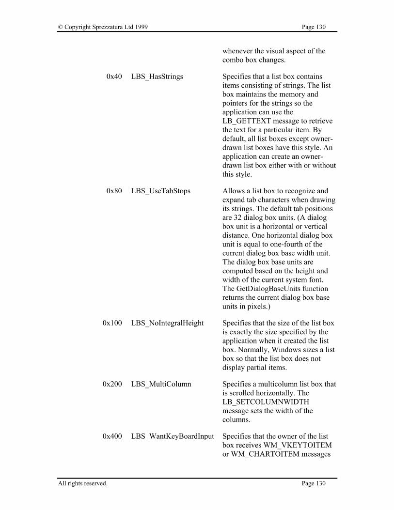
© Copyright Sprezzatura Ltd 1999 Page 130
whenever the visual aspect of the combo box changes.
0x40 LBS_HasStrings Specifies that a list box contains items consisting of strings. The list box maintains the memory and pointers for the strings so the application can use the LB_GETTEXT message to retrieve the text for a particular item. By default, all list boxes except owner-drawn list boxes have this style. An application can create an owner-drawn list box either with or without this style.
0x80 LBS_UseTabStops Allows a list box to recognize and expand tab characters when drawing its strings. The default tab positions are 32 dialog box units. (A dialog box unit is a horizontal or vertical distance. One horizontal dialog box unit is equal to one-fourth of the current dialog box base width unit. The dialog box base units are computed based on the height and width of the current system font. The GetDialogBaseUnits function returns the current dialog box base units in pixels.)
0x100 LBS_NoIntegralHeight Specifies that the size of the list box is exactly the size specified by the application when it created the list box. Normally, Windows sizes a list box so that the list box does not display partial items.
0x200 LBS_MultiColumn Specifies a multicolumn list box that is scrolled horizontally. The LB_SETCOLUMNWIDTH message sets the width of the columns.
0x400 LBS_WantKeyBoardInput Specifies that the owner of the list box receives WM_VKEYTOITEM or WM_CHARTOITEM messages
All rights reserved. Page 130
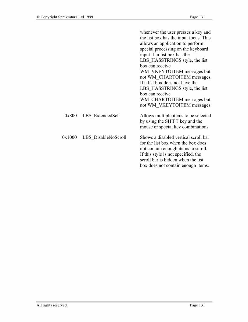
© Copyright Sprezzatura Ltd 1999 Page 131
whenever the user presses a key and the list box has the input focus. This allows an application to perform special processing on the keyboard input. If a list box has the LBS_HASSTRINGS style, the list box can receive WM_VKEYTOITEM messages but not WM_CHARTOITEM messages. If a list box does not have the LBS_HASSTRINGS style, the list box can receive WM_CHARTOITEM messages but not WM_VKEYTOITEM messages.
0x800 LBS_ExtendedSel Allows multiple items to be selected by using the SHIFT key and the mouse or special key combinations.
0x1000 LBS_DisableNoScroll Shows a disabled vertical scroll bar for the list box when the box does not contain enough items to scroll. If this style is not specified, the scroll bar is hidden when the list box does not contain enough items.
All rights reserved. Page 131

© Copyright Sprezzatura Ltd 1999 Page 132
All rights reserved. Page 132
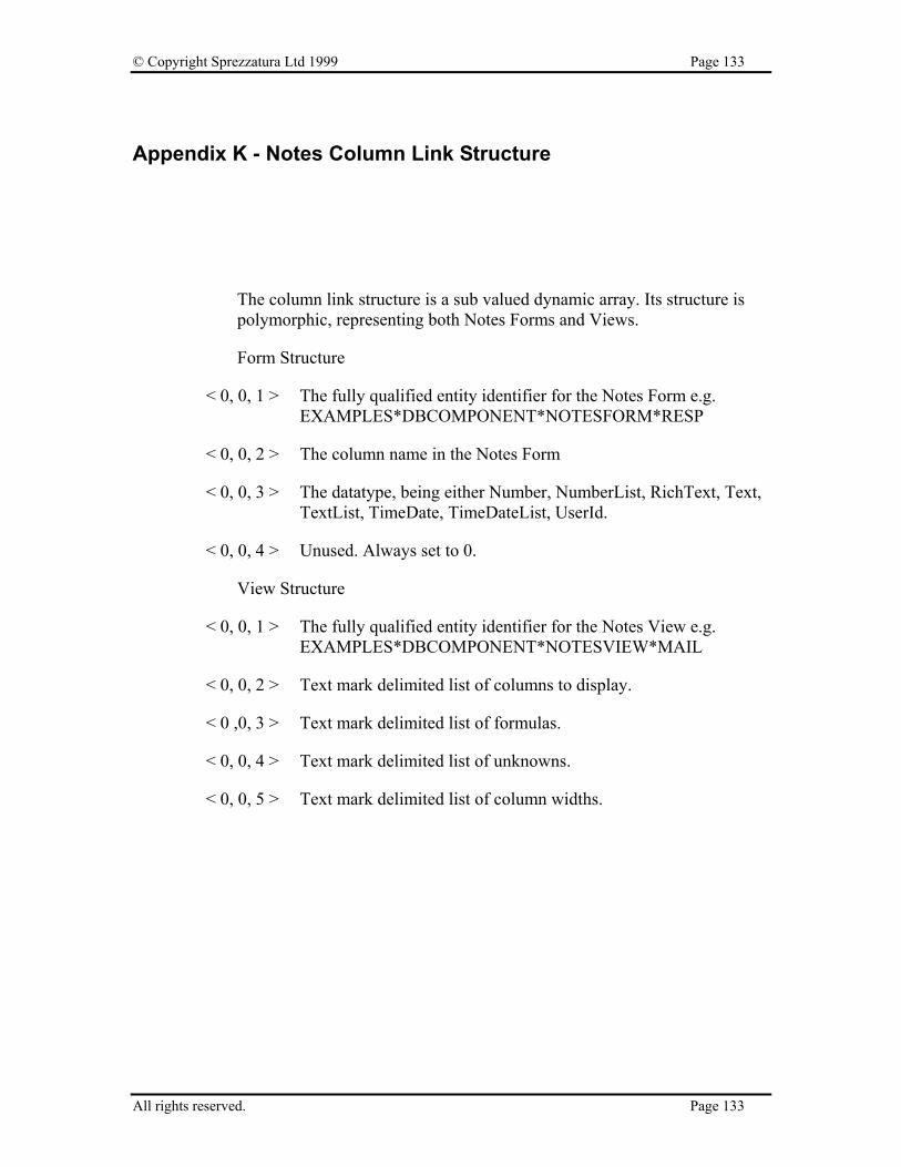
© Copyright Sprezzatura Ltd 1999 Page 133
Appendix K - Notes Column Link Structure
The column link structure is a sub valued dynamic array. Its structure is polymorphic, representing both Notes Forms and Views.
Form Structure
< 0, 0, 1 > The fully qualified entity identifier for the Notes Form e.g. EXAMPLES*DBCOMPONENT*NOTESFORM*RESP
< 0, 0, 2 > The column name in the Notes Form
< 0, 0, 3 > The datatype, being either Number, NumberList, RichText, Text, TextList, TimeDate, TimeDateList, UserId.
< 0, 0, 4 > Unused. Always set to 0.
View Structure
< 0, 0, 1 > The fully qualified entity identifier for the Notes View e.g. EXAMPLES*DBCOMPONENT*NOTESVIEW*MAIL
< 0, 0, 2 > Text mark delimited list of columns to display.
< 0 ,0, 3 > Text mark delimited list of formulas.
< 0, 0, 4 > Text mark delimited list of unknowns.
< 0, 0, 5 > Text mark delimited list of column widths.
All rights reserved. Page 133

© Copyright Sprezzatura Ltd 1999 Page 134
All rights reserved. Page 134

© Copyright Sprezzatura Ltd 1999 Page 135
Appendix L - EditTable Control Style Settings
Note that there are two types of sub-control within the EditTable, the Table itself and all of the columns. Each type has its own styles.
Table Styles
0x8 DTS_Resize Whether users are allowed to resize columns.
0x40 DTS_Hgrid Whether horizontal grid lines should be displayed
0x80 DTS_Vgrid Whether vertical grid lines should be displayed.
0x100 DTS_RowSelect Whether rows or tuples (column/row intersections) are selected.
0x200 DTS_MultiRow Whether multiple rows may be selected (as in a multi-choice popup).
0x400 DTS_ColSelect Permit selection of entire column.
0x1000 DTS_LargeData Whether data ought to be stored in Virtual Memory and thus be allowed to be greater than 64K. Equivalent to setting “No Rows” to -1.
0x2000 DTS_RowButtons Whether rows ought to display buttons down the left of the table.
0x4000 DTS_RowNumbers Whether the buttons displayed by DTS_RowButtons ought to have numbers.
Column Styles
0x1 DTCS_Resize Whether this column may be resized by the user.
0x2 DTCS_Fixed
All rights reserved. Page 135

© Copyright Sprezzatura Ltd 1999 Page 136
0x4 DTCS_Edit
0x8 DTCS_Protect Whether the column should be protected from amendment.
0x20 DTCS_Hidden Whether the column is present but hidden from user interaction.
0x40 DTCS_Centre Whether the data is centred.
0x80 DTCS_Right Whether the data is right justified.
0x100 DTCS_HeadCentre Whether the heading is centred.
0x200 DTCS_HeadRight Whether the heading is right justified.
0x2000 DTCS_Locked Whether the column is locked (to prevent scrolling).
0x4000 DTCS_SortAsc Whether the column should be sorted in ascending left justified order.
0x800 DTCS_SortDes Whether the column should be sorted in descending left justified order.
All rights reserved. Page 136

© Copyright Sprezzatura Ltd 1999 Page 137
Appendix M - ScrollBar Control Style Settings
0x0 SBS_Horz Designates a horizontal scroll bar. If neither the SBS_BOTTOMALIGN nor SBS_TOPALIGN style is specified, the scroll bar has the height, width, and position specified by the CreateWindow parameters.
0x1 SBS_Vert Designates a vertical scroll bar. If neither the SBS_RIGHTALIGN nor SBS_LEFTALIGN style is specified, the scroll bar has the height, width, and position specified by the CreateWindow parameters.
0x2 SBS_TopAlign Aligns the top edge of the scroll bar with the top edge of the rectangle defined by the CreateWindow parameters. The scroll bar has the default height for system scroll bars. Used with the SBS_HORZ style.
0x2 SBS_LeftAlign Aligns the left edge of the scroll bar with the left edge of the rectangle defined by the CreateWindow parameters. The scroll bar has the default width for system scroll bars. Used with the SBS_VERT style.
0x4 SBS_BottomAlign Aligns the bottom edge of the scroll bar with the bottom edge of the rectangle defined by the following CreateWindow parameters: x, y, nWidth, and nHeight. The scroll bar has the default height for system scroll bars. Used with the SBS_HORZ style.
0x4 SBS_RightAlign Aligns the right edge of the scroll bar with the right edge of the rectangle defined by the CreateWindow parameters. The scroll bar has the default width for system scroll bars. Used with the SBS_VERT style.
0x2 SBS_SizeBoxTopLeftAlign
All rights reserved. Page 137

© Copyright Sprezzatura Ltd 1999 Page 138
Aligns the upper-left corner of the size box with the upper-left corner of the rectangle specified by the following CreateWindow parameters: x, y, nWidth, and nHeight. The size box has the default size for system size boxes. Used with the SBS_SIZEBOX style.
0x4 SBS_SizeBoxBottonRightAlign
Aligns the lower-right corner of the size box with the lower-right corner of the rectangle specified by the CreateWindow parameters. The size box has the default size for system size boxes. Used with the SBS_SIZEBOX style.
0x8 SBS_SizeBox Designates a size box. If neither the SBS_SIZEBOXBOTTOMRIGHTALIGN nor SBS_SIZEBOXTOPLEFTALIGN style is specified, the size box has the height, width, and position specified by the CreateWindow parameters.
All rights reserved. Page 138

© Copyright Sprezzatura Ltd 1999 Page 139
Appendix N - Menu Styles
0x1 AutoCheck$ Defines the autocheck proprety
0x2 BeginGroup$ Defines this menu item to mark the beginning of a group.
0x4 EndGroup$ Defines this menu item to mark the end of a group.
0x10 NoGenEvent$ Do not generate an event
0x20 GenLostFocus$ Generate a lost focus event
0x40 PassEvent$ Pass event to MDI frame
0x80 FrameProp$ Use MDI Frame Properties
All rights reserved. Page 139
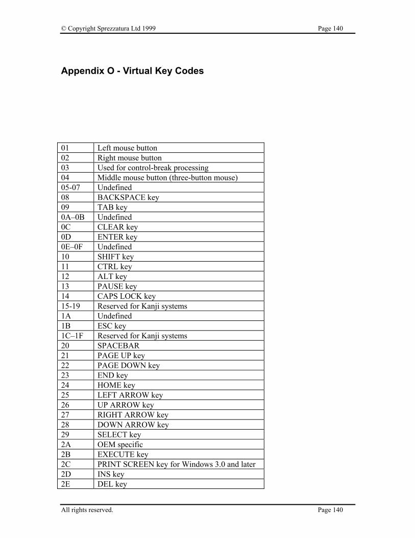
© Copyright Sprezzatura Ltd 1999 Page 140
Appendix O - Virtual Key Codes
01 Left mouse button 02 Right mouse button 03 Used for control-break processing 04 Middle mouse button (three-button mouse) 05-07 Undefined 08 BACKSPACE key 09 TAB key 0A–0B Undefined 0C CLEAR key 0D ENTER key 0E–0F Undefined 10 SHIFT key 11 CTRL key 12 ALT key 13 PAUSE key 14 CAPS LOCK key 15-19 Reserved for Kanji systems 1A Undefined 1B ESC key 1C–1F Reserved for Kanji systems 20 SPACEBAR 21 PAGE UP key 22 PAGE DOWN key 23 END key 24 HOME key 25 LEFT ARROW key 26 UP ARROW key 27 RIGHT ARROW key 28 DOWN ARROW key 29 SELECT key 2A OEM specific 2B EXECUTE key 2C PRINT SCREEN key for Windows 3.0 and later 2D INS key 2E DEL key
All rights reserved. Page 140
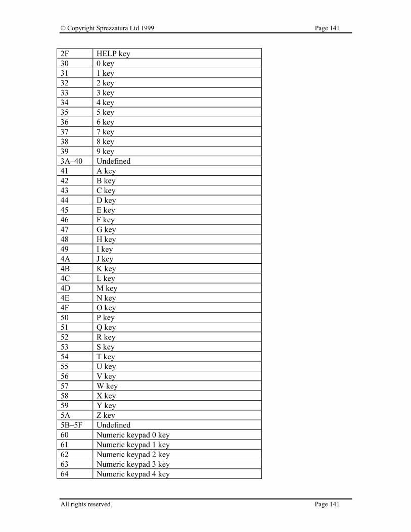
© Copyright Sprezzatura Ltd 1999 Page 141
2F HELP key 30 0 key 31 1 key 32 2 key 33 3 key 34 4 key 35 5 key 36 6 key 37 7 key 38 8 key 39 9 key 3A–40 Undefined 41 A key 42 B key 43 C key 44 D key 45 E key 46 F key 47 G key 48 H key 49 I key 4A J key 4B K key 4C L key 4D M key 4E N key 4F O key 50 P key 51 Q key 52 R key 53 S key 54 T key 55 U key 56 V key 57 W key 58 X key 59 Y key 5A Z key 5B–5F Undefined 60 Numeric keypad 0 key 61 Numeric keypad 1 key 62 Numeric keypad 2 key 63 Numeric keypad 3 key 64 Numeric keypad 4 key
All rights reserved. Page 141
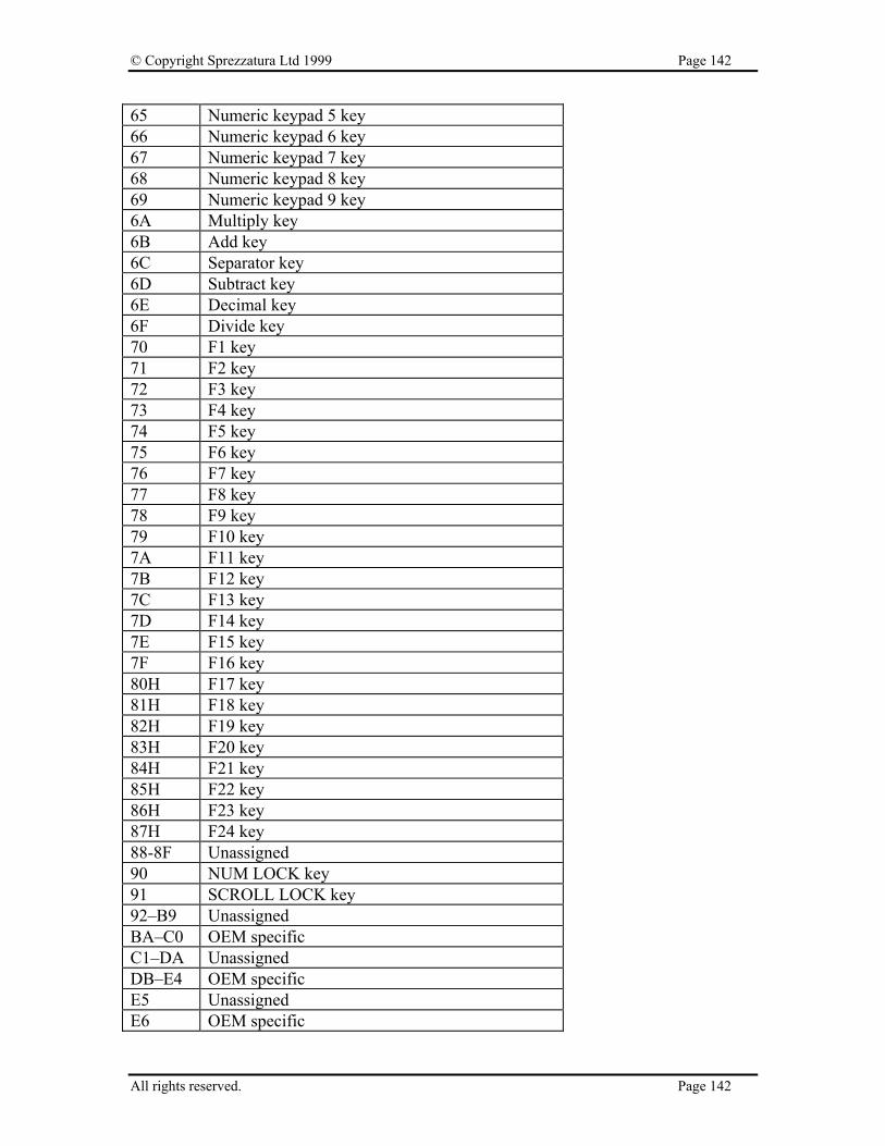
© Copyright Sprezzatura Ltd 1999 Page 142
65 Numeric keypad 5 key 66 Numeric keypad 6 key 67 Numeric keypad 7 key 68 Numeric keypad 8 key 69 Numeric keypad 9 key 6A Multiply key 6B Add key 6C Separator key 6D Subtract key 6E Decimal key 6F Divide key 70 F1 key 71 F2 key 72 F3 key 73 F4 key 74 F5 key 75 F6 key 76 F7 key 77 F8 key 78 F9 key 79 F10 key 7A F11 key 7B F12 key 7C F13 key 7D F14 key 7E F15 key 7F F16 key 80H F17 key 81H F18 key 82H F19 key 83H F20 key 84H F21 key 85H F22 key 86H F23 key 87H F24 key 88-8F Unassigned 90 NUM LOCK key 91 SCROLL LOCK key 92–B9 Unassigned BA–C0 OEM specific C1–DA Unassigned DB–E4 OEM specific E5 Unassigned E6 OEM specific
All rights reserved. Page 142
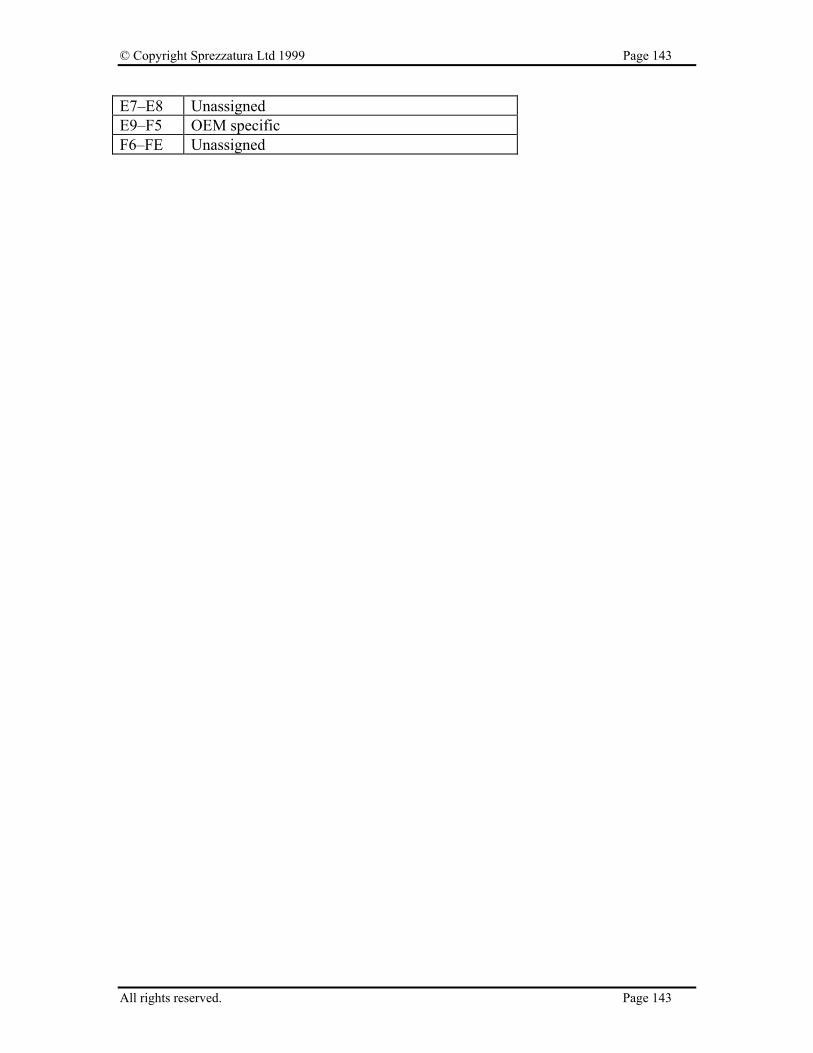
© Copyright Sprezzatura Ltd 1999 Page 143
E7–E8 Unassigned E9–F5 OEM specific F6–FE Unassigned
All rights reserved. Page 143

© Copyright Sprezzatura Ltd 1999 Page 144
Appendix P - Color Definitions
Color Name Decimal Value Hex Value USEPARENT$ 0 \000000\ BLACK$ 1 \FFFFFF\ RED$ 255 \0000FF\ ORANGE$ 33023 \0080FF\ GREEN$ 65280 \00FF00\ YELLOW$ 65535 \00FFFF\ GREY$ 12632256 \C0C0C0\ BLUE$ 16711680 \FF0000\ PURPLE$ 16711808 \FF0080\ MAGENTA$ 16711935 \FF00FF\ CYAN$ 16776960 \FFFF00\ WHITE$ 16777215 \FFFFFF\ COLOR_SCROLLBAR$ 2147483648 \80000000\ COLOR_BACKGROUND 2164260864 \81000000\ COLOR_ACTIVECAPTION$ 2181038080 \82000000\ COLOR_INACTIVECAPTION$ 2197815296 \83000000\ COLOR_MENU$ 2214592512 \84000000\ COLOR_WINDOW$ 2231369728 \85000000\ COLOR_WINDOWFRAME$ 2248146944 \86000000\ COLOR_MENUTEXT$ 2264924160 \87000000\ COLOR_WINDOWTEXT$ 2281701376 \88000000\ COLOR_CAPTIONTEXT$ 2298478592 \89000000\ COLOR_ACTIVEBORDER$ 2315255808 \8A000000\ COLOR_INACTIVEBORDER$ 2332033024 \8B000000\ COLOR_APPWORKSPACE$ 2348810240 \8C000000\ COLOR_HIGHLIGHT$ 2365587456 \8D000000\ COLOR_HIGHLIGHTTEXT$ 2382364672 \8E000000\ COLOR_BTNFACE$ 2399141888 \8F000000\ COLOR_BTNSHADOW$ 2415919104 \90000000\ COLOR_GRAYTEXT$ 2432696320 \91000000\ COLOR_BTNTEXT$ 2449473536 \92000000\ COLOR_INACTIVECAPTIONTEXT$ 2466250752 \93000000\ COLOR_BTNHIGHLIGHT$ 2483027968 \94000000\
All rights reserved. Page 144

© Copyright Sprezzatura Ltd 1999 Page 145
INDEX
ControlList@, 11 ControlMap@, 12
4 ControlSemantics@, 12
4 byte word, 16, 60, 61, 64, 65 D
A Default, 127 Document entities, 10 DTCS_Centre, 148 Access permissions, 10 DTCS_Edit, 148 DTCS_Fixed, 148 DTCS_HeadCentre, 148 B DTCS_HeadRight, 148 DTCS_Hidden, 148
Background color, 15. See DTCS_Locked, 148 Background colour, 15, 20, 24, 28, 33, 37, 42, 51, 56,
60, 64, 74, 78, 85, 89 DTCS_Protect, 148 DTCS_Resize, 148
bitmap, 15, 42, 43, 45, 46, 48, 80, 81, 82, 84, 85, 89, 90, 114
DTCS_Right, 148 DTCS_SortAsc, 148
Bitmap, 127, 128 DTCS_SortDes, 148 BITMAP Information, 4, 70 DTS_ColSelect, 147 BS_3State, 136 DTS_Hgrid, 147 BS_Auto3State, 137 DTS_LargeData, 147 BS_AutoCheckBox, 136 DTS_MultiRow, 147 BS_AutoRadioButton, 137 DTS_Resize, 147 BS_CheckBox, 136 DTS_RowButtons, 147 BS_DefPushButton, 136 DTS_RowNumbers, 147 BS_GroupBox, 137 DTS_RowSelect, 147 BS_LeftText, 137 DTS_Vgrid, 147 BS_OwnerDraw, 137 BS_PushBox, 137
E BS_PushButton, 136 BS_RadioButton, 136 Button Control Style Settings, 136 Edit Control Style Settings, 132
EDITBOX, 4, 19, 20, 21, 22, 23, 41, 115, 117 EDITBOX Information, 4, 19 C EDITFIELD, 4, 19, 23, 24, 25, 26, 36, 115, 118 EDITFIELD Information, 4, 23
CBS_AutoHScroll, 139 EDITTABLE, 4, 27, 28, 29, 30, 31, 110, 115, 118 CBS_DisableNoScroll, 140 EditTable Control Style Settings, 147 CBS_DropDown, 138 EDITTABLE Information, 4, 27 CBS_HasStrings, 139 enabled, 14, 20, 23, 27, 32, 37, 41, 42, 46, 51, 55, 59,
63, 67, 70, 73, 77, 81, 85, 88, 92, 96, 101, 123, 127, 129
CBS_NoIntegralHeight, 139 CBS_OEMConvert, 139 CBS_OwnerDrawFixed, 138 Entity identifier, 9, 145 CBS_OwnerDrawVariable, 138 ES_AutoHScroll, 133 CBS_Simple, 138 ES_AutoVScroll, 133 CBS_Sort, 139 ES_Center, 132 CHECKBMP Information, 4, 88 ES_Left, 132 CHECKBOX, 4, 32, 33, 34, 35, 51, 85, 115, 117 ES_Lowercase, 133 CHECKBOX Information, 4, 32 ES_Multiline, 132 Column, 148 ES_NoHideSel, 133 COMBOBOX, 4, 36, 37, 38, 39, 40, 115, 117 ES_OemConvert, 133 ComboBox Control Style Settings, 138 ES_Password, 133 COMBOBOX Information, 4, 36 ES_ReadOnly, 134 Control Lists, 4, 11, 13, 14, 19, 41, 106, 109, 111, 112 ES_Right, 132 Control Maps, 4, 12, 107 ES_Uppercase, 133 Control Semantics, 4, 12, 109 ES_WantReturn, 134
All rights reserved. Page 145
© Copyright Sprezzatura Ltd 1999 Page 146
LISTBOX, 4, 41, 42, 43, 44, 115, 119 Event handler names, 15, 21, 25, 29, 33, 38, 43, 47, 52, 56, 60, 64, 68, 82, 86, 89, 93 ListBox Control Style Settings, 141
LISTBOX Information, 4, 41 event handlers, 15, 21, 25, 29, 33, 38, 43, 47, 52, 56, 60, 64, 68, 82, 86, 89, 93 Lower, 16, 61, 65
F M
Font, 20, 24, 28, 33, 38, 42, 47, 52, 56, 74, 78, 81, 86, 89, 93, 130
Master Row Map, 103 Master Row Maps, 12, 105
Foreground color, 15 MasterRowMap@, 12 Foreground colour, 15, 20, 24, 28, 33, 37, 42, 46, 52,
56, 74, 78, 81, 85, 89 MDI Frame Information, 4, 96 Menu, 125 MENU Information, 100 Menu Styles, 151
G Method, 9
GROUPBOX Information, 4, 73 N
H NEW, 11 Notes Column Link Structure, 145
HSCROLL, 132 HSCROLLBAR Information, 4, 59
O
I Oconv, 16, 61, 65 OIWINEXE, 9
ICON Information, 4, 67 Iconv, 16, 61, 65
P
J parent object, 14, 19, 23, 27, 32, 36, 41, 45, 50, 55, 59, 63, 67, 70, 73, 77, 80, 84, 88, 92, 96, 100
Popup, 126 Join Maps, 4, 11, 103, 106, 111 Presentation Server, 14, 20, 24, 28, 33, 37, 42, 46, 51,
56, 59, 63, 68, 71, 74, 77, 81, 85, 89, 93, 97, 106, 109
JoinMap@, 12
PS Styles, 15, 20, 24, 28, 33, 37, 42, 46, 51, 56, 60, 64, 68, 71, 74, 78, 81, 85, 89, 93, 97, 127 K
Publishable, 9 Key Maps, 4, 12, 108 PUSHBMP Information, 4, 80 KeyMap@, 12 PUSHBUTTON, 4, 45, 46, 47, 48, 49, 80, 81, 82, 115,
120 PUSHBUTTON Information, 4, 45
L
Q LBS_DisableNoScroll, 143 LBS_ExtendedSel, 143 LBS_HasStrings, 142 QuickEvents, 110, 112, 113 LBS_MultiColumn, 143 LBS_MultipleSel, 141
R LBS_NoIntegralHeight, 142 LBS_NoRedraw, 141 LBS_Notify, 141
RADIOBMP Information, 4, 84 LBS_OwnerDrawFixed, 141 RADIOBUTTON, 4, 50, 51, 52, 53, 54, 56, 115, 120 LBS_OwnerDrawVariable, 141 RADIOBUTTON Information, 4, 50 LBS_Sort, 141 RADIOGROUP Information, 4, 55 LBS_UseTabStops, 142
LBS_WantKeyBoardInput, 143
All rights reserved. Page 146
© Copyright Sprezzatura Ltd 1999 Page 147
Uses, 10 repository, 9, 15, 16, 42, 68, 71, 81, 85, 89, 110, 112, 113
Repository, 9 V REPOSITORY, 9, 10
Row Maps, 4, 12, 105, 106 RowMaps@, 12 Virtual Key Codes, 152 RTFBOX Information, 4, 92 visible, 14, 20, 24, 28, 32, 37, 41, 46, 51, 55, 59, 63,
67, 70, 74, 77, 81, 85, 88, 92, 96, 97, 101, 126 VSCROLL, 132
S VSCROLLBAR Information, 4, 63
SBS_BottomAlign, 149 W SBS_Horz, 149
SBS_LeftAlign, 149 SBS_RightAlign, 149 WINDOW, 14, 15, 16, 17, 18, 20, 24, 28, 33, 37, 42,
46, 52, 60, 64, 74, 78, 81, 85, 89, 110, 111, 113, 115, 121, 156
SBS_SizeBox, 150 SBS_SizeBoxBottonRightAlign, 150 SBS_SizeBoxTopLeftAlign, 150 WRITE, 11 SBS_TopAlign, 149 WS_Border., 125 SBS_Vert, 149 WS_Caption., 125 ScrollBar Control Style Settings, 149 WS_Child., 126 SDK Style, 14, 20, 24, 28, 33, 37, 42, 46, 51, 55, 59,
63, 67, 70, 74, 77, 81, 85, 89, 93, 97, 125 WS_ClipChildren., 126 WS_ClipSiblings., 126
Separator, 154 WS_Disabled., 126 Shareable, 10 WS_DlgFrame., 125 State, 9 WS_Hscroll., 125 STATIC Information, 4, 77 WS_Maximize., 126 Styles, 127, 147, 148 WS_MaximizeBox, 125 SYSREPOS, 9, 10, 11 WS_Minimize, 125, 126 SYSREPOSEVENTEXES, 15, 21, 25, 29, 34, 38, 43,
47, 52, 56, 60, 64, 68, 71, 75, 78, 82, 86, 90, 93 WS_MinimizeBox, 125 WS_Overlapped, 125
SYSREPOSWINEXES, 10 WS_Popup, 126 SYSREPOSWINS, 6, 9 WS_SysMenu, 125
WS_ThickFrame, 125 WS_Visible, 126
T WS_Vscroll., 125
tab order, 20, 24, 28, 33, 37, 42, 46, 60, 64, 68, 81, 89, 93, 106, 107, 111 X
tab position, 142 Table, 147 X location, 14, 19, 23, 27, 32, 36, 41, 45, 50, 55, 59,
63, 67, 70, 73, 77, 80, 84, 88, 92, 96 Title, 10
U Y Update permissions, 10 Y location, 14, 19, 23, 27, 32, 36, 41, 45, 50, 55, 59,
63, 67, 70, 73, 77, 80, 84, 88, 92, 96 Upper, 16, 61, 65 Used by, 10
All rights reserved. Page 147

© Copyright Sprezzatura Ltd 1999 Page 148
All rights reserved. Page 148