supplementary table 1 spearman rank correlations between d n
TRANSCRIPT

Supplementary Table 1 Spearman rank correlations between dN , dS (estimated by PAML)and recombination rate for both broad- and fine-scale recombination rates.
correlation p-valuedN and broad-scale recombination rate 0.053 1.4× 10⁻⁷
dS and broad-scale recombination rate 0.211 < 10−16
dN and fine-scale recombination rate 0.059 5.9× 10⁻⁹
dS and fine-scale recombination rate 0.153 < 10−16
1

Supplementary Table 2 Summary of linear models and Spearman correlation tests com-paring broad- and fine-scale recombination rates, after stratification into dN/dS bins. Threesets of linear models and correlations were tested for genes in three different dN/dS bins. 10%of the genes all have the minimum dN/dS value (0.0001); these were placed in the lowest bin.The central 85% of genes and the top 5% of genes by dN/dS comprise the second and thirdbins. For the linear models, the fine-scale recombination rate is estimated using broad-scalerecombination rate as the predictor and requiring the intercept to be 0 (results are similarwhen not requiring the intercept to be zero). Spearman’s ρ and the associated p-value aregiven for correlation tests of the correlation between fine- and broad-scale recombinationrates.
linear models Spearman correlationsdN/dS bin slope std. error p-value ρ p-valuelow 10% 0.79 0.031 < 10−16 0.35 < 10−16
medium 85% 0.84 0.011 < 10−16 0.35 < 10−16
high 5% 0.83 0.050 < 10−16 0.37 < 10−16
2
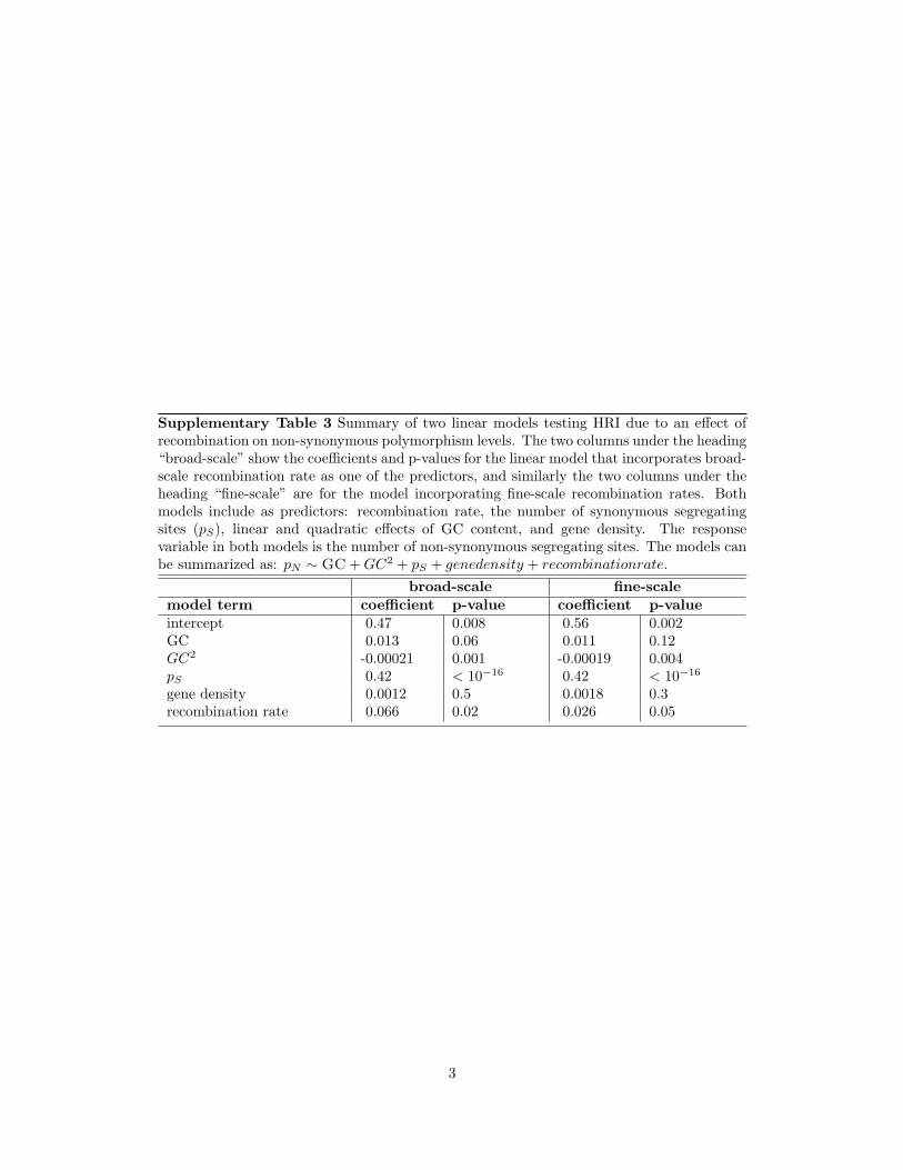
Supplementary Table 3 Summary of two linear models testing HRI due to an effect ofrecombination on non-synonymous polymorphism levels. The two columns under the heading“broad-scale” show the coefficients and p-values for the linear model that incorporates broad-scale recombination rate as one of the predictors, and similarly the two columns under theheading “fine-scale” are for the model incorporating fine-scale recombination rates. Bothmodels include as predictors: recombination rate, the number of synonymous segregatingsites (pS), linear and quadratic effects of GC content, and gene density. The responsevariable in both models is the number of non-synonymous segregating sites. The models canbe summarized as: pN ∼ GC + GC2 + pS + genedensity + recombinationrate.
broad-scale fine-scalemodel term coefficient p-value coefficient p-valueintercept 0.47 0.008 0.56 0.002GC 0.013 0.06 0.011 0.12GC2 -0.00021 0.001 -0.00019 0.004pS 0.42 < 10−16 0.42 < 10−16
gene density 0.0012 0.5 0.0018 0.3recombination rate 0.066 0.02 0.026 0.05
3

(a)
(b)
(c) percent in low recombination partition
p-va
lue
0 10 20 30 40 50 60 70 80 90 100
10.
10.
01
0.13
0.17
0.2
med
ian
dN/d
S
low tailhigh tail
percent in low recombination partition
p-va
lue
0 10 20 30 40 50 60 70 80 90 100
10.
10.
010.
001
1e-0
4
0.12
0.16
0.19
0.22
0.25
med
ian
dN/d
S
low tailhigh tail
Supplementary Figure 1: Summary of Wilcoxon rank sum tests of whether partitions of thedata into high and low recombination-rate bins have significantly different median dN/dS val-ues. (a) Broad-scale recombination rates. (b) Fine-scale recombination rates. (c) Examplesof three partitions of the broad-scale recombination rates into high and low recombination-rate bins. (a-b) The horizontal axis indicates the percent of the dataset, sorted by recombi-nation rate, that is placed in the low recombination rate bin. Tests were performed for eachone-percent increment of genes included in the low tail. The gray bars indicate the p-valueof each two-tailed, two sample, Wilcoxson rank sum test, as indicated by the left-hand axis.The colored lines show the mean dN/dS ratio of genes in the low (blue) and high (red)recombination-rate bins, which is quantified on the right-hand axis.
4

chr 1 chr 22
chr 2 chr 21
chr 3 chr 20
chr 4 chr 19
chr 5 chr 18
chr 6 chr 17
chr 7 chr 16
chr 8 chr 15
chr 9 chr 14
chr 10 chr 13
chr 11
chr 12 chr X
Supplementary Figure 2: Plots of broad-scale recombination rates for each chromosome.The recombination rate is plotted on the vertical axis as a function of physical position. Thehorizontal and vertical axes are on the same scale across chromosomal plots. Blue boxes markregions spanning 4 cM, centered on the centromeres. Hash marks above each plot indicatethe locations of genes in our data set, with genes falling in the lowest 2% of recombinationrates genome wide indicated in red.
5
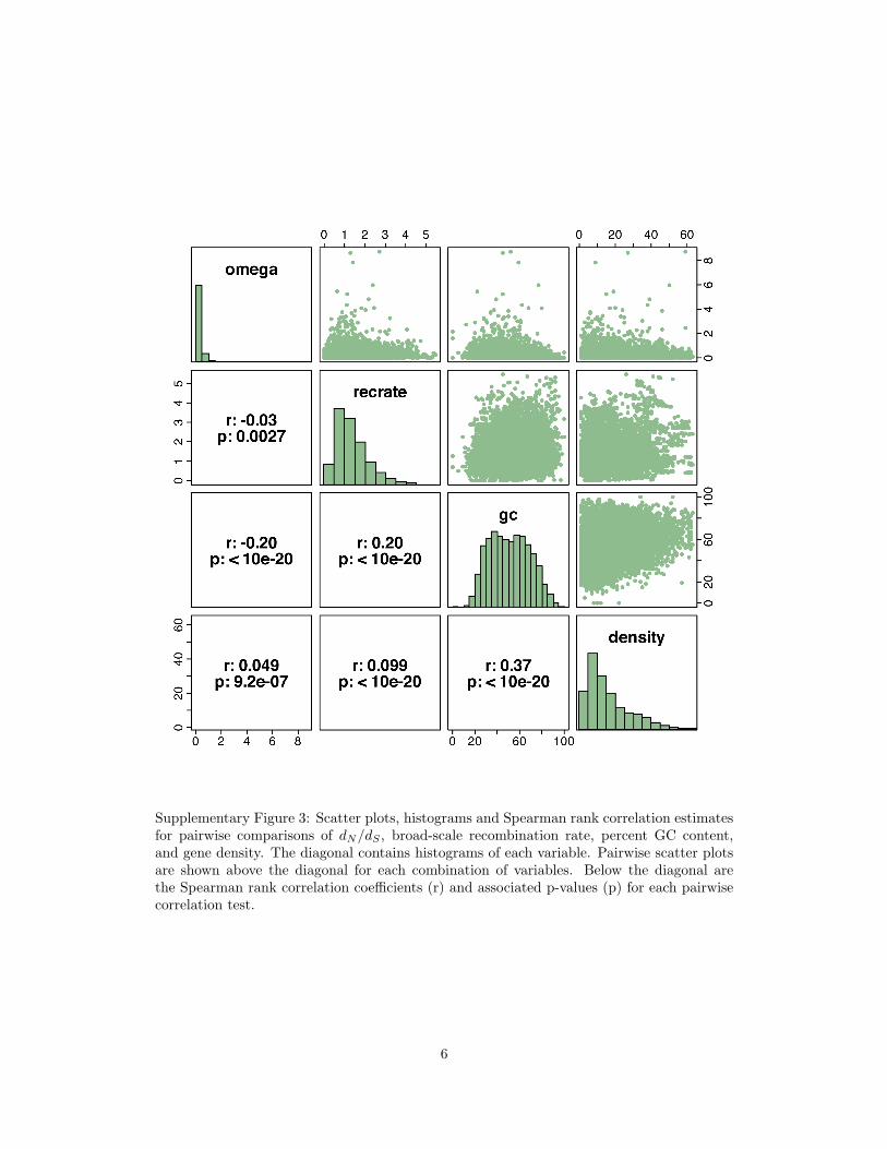
Supplementary Figure 3: Scatter plots, histograms and Spearman rank correlation estimatesfor pairwise comparisons of dN/dS , broad-scale recombination rate, percent GC content,and gene density. The diagonal contains histograms of each variable. Pairwise scatter plotsare shown above the diagonal for each combination of variables. Below the diagonal arethe Spearman rank correlation coefficients (r) and associated p-values (p) for each pairwisecorrelation test.
6

Supplementary Figure 4: Highly non-linear relationship between GC content and normalizeddN/dS (estimated by PAML). The horizontal axis shows GC4 content, which is GC contentcalculated at codon third positions when the codons encoding the amino acid are four-folddegenerate; the vertical axis shows quantile-normalized dN/dS (see Methods). The solid,red line shows the fit of a linear model with first order and second order predictors of GCcontent, while the dotted, purple line shows a lowess fit for comparison.
7

TR
OX
RE
KI
PR
HY
CY
TP
TC
SM
NU
DI
RM
IC
EM
TF
UN
CA
CB
MF
LG
PH
SS
MTCH
0.1 0.2 0.3 0.4 0.5
1214
1618
2022
category mean dN/dS
cate
gory
mea
n ge
ne d
ensi
ty (g
enes
/Mb)
IC:
MT:
KI:
CB:
PH:
CY:
RM:
NU:
CH:
LG:
TR:
TP:
TF:
MF:
SS:
HY:
TC:
EM:
PR:
RE:
OX:
CA:
UN:
SM:
DI:
Ion channel (398)Membrane traffic protein (254)Kinase (583)Select calcium binding protein (278)Phosphatase (216)Cytoskeletal protein (279)Select regulatory molecule (297)Nucleic acid binding (277)Chaperone (145)Ligase (377)Transferase (1035)Transporter (132)Transcription factor (505)Miscellaneous function (136)Synthase and synthetase (168)Hydrolase (828)Transfer/carrier protein (2562)Extracellular matrix (152)Protease (118)Receptor (351)Oxidoreductase (174)Cell adhesion molecule (119)Molecular function unclassified (98)Signaling molecule (160)Defense/immunity protein (81)
significance (p-value)1 0.01 1e-04 1e-06 1e-08 1e-10 1e-12 1e-14 1e-16 1e-18 1e-20
Supplementary Figure 5: Scatter plot of dN/dS and gene density (genes/Mb) means foreach category of PANTHER molecular functions. This figure suggests that a few (i.e. de-fense/immunity and ion channel) functional categories are contributing heavily to the corre-lation between dN/dS and gene density. Two-letter codes indicate the PANTHER molecularfunction category for which mean dN/dS and mean density were calculated. PANTHERmolecular function categories are listed on the right with the two-letter abbreviation andthe number of genes in the indicated category shown in parentheses. Only categories withmore than 80 genes are shown. The location on the scatter plot of the two-letter categorycode indicates the dN/dS (horizontal axis) and gene density (vertical axis) calculated forgenes in the indicated category. Boxes below each two-letter category abbreviation indicatethe significance of a two-sided, two-sample unpaired Student’s t-test of whether genes withthe indicated molecular function have a significantly different mean dN/dS (left colored box)or significantly different mean gene density (right colored box) than genes without the in-dicated functional annotation among their annotations. Significance levels are color-codedby p-value, as indicated by the bar below the scatter plot. Boxes colored white are notsignificant at the 0.05 level.
8
∗
∗
∗
∗
∗
∗∗
7.5810.50 0.21 0.18 0.68 0.67 0.14 0.44 7.2710.5510.5211.4211.7012.1812.9017.1111.4217.9811.7018.1912.1918.6812.9219.38
GC conten
t
GC conten
t square
d
recombinati
on rate
(cM / M
b)
log reco
mbination ra
te
cM / g
ene
log (cM / g
ene)
gene d
ensit
y (gen
es / M
b)
log gene d
ensit
y
PANTHER categ
ory
percentvariationexplained
∗
∗
∗
∗
∗
∗∗
7.6510.55 0.08 0.07 0.34 0.27 0.21 0.50 7.3010.5610.5810.8710.7212.4013.0617.1910.8717.5010.7217.3512.4218.9613.1019.61
GC conten
t
GC conten
t square
d
recombinati
on rate
(cM / M
b)
log reco
mbination ra
te
cM / g
ene
log (cM / g
ene)
gene d
ensit
y (gen
es / M
b)
log gene d
ensit
y
PANTHER categ
ory
percentvariationexplained
1
0.1
0.01
0.001
1e-04
1e-05
1e-06
1e-07
<1e-08
p-value
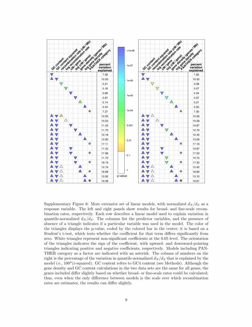
Supplementary Figure 6: More extensive set of linear models, with normalized dN/dS as aresponse variable. The left and right panels show results for broad- and fine-scale recom-bination rates, respectively. Each row describes a linear model used to explain variation inquantile-normalized dN/dS . The columns list the predictor variables, and the presence ofabsence of a triangle indicates if a particular variable was used in the model. The color ofthe triangles displays the p-value, coded by the colored bar in the center; it is based on aStudent’s t-test, which tests whether the coefficient for that term differs significantly fromzero. White triangles represent non-significant coefficients at the 0.05 level. The orientationof the triangles indicates the sign of the coefficient, with upward- and downward-pointingtriangles indicating positive and negative coefficients, respectively. Models including PAN-THER category as a factor are indicated with an asterisk. The column of numbers on theright is the percentage of the variation in quantile-normalized dN/dS that is explained by themodel i.e., 100*(r-squared). GC content refers to GC4 content (see Methods). Although thegene density and GC content calculations in the two data sets are the same for all genes, thegenes included differ slightly based on whether broad- or fine-scale rates could be calculated;thus, even when the only difference between models is the scale over which recombinationrates are estimates, the results can differ slightly.
9
!
!
!
!
!
!!
1.5818
1.7517
0.0002
0.0069
0.9206
1.0115
0.8178
1.3906
7.0637
1.8336
1.7799
2.8139
3.1202
3.7469
4.5607
8.5659
2.8139
9.5575
3.1202
9.8182
3.7810
10.4508
4.5943
11.2499
GC c
ontent
GC c
ontent s
quared
reco
mbin
atio
n rate
(cM
/ M
b)
log re
com
binat
ion ra
te
cM / gen
e
log (c
M / gen
e)
gene
densi
ty (g
enes
/ M
b)
log g
ene
densi
ty
PANTH
ER c
ateg
ory
percentvariationexplained
!
!
!
!
!
!!
1.5813
1.7451
0.0002
0.0007
0.3639
0.2016
0.9755
1.5121
7.3601
1.7685
1.7988
2.1087
1.9141
3.9632
4.7048
8.8188
2.1087
9.1540
1.9141
8.9731
4.0122
10.9708
4.7679
11.6626
GC c
ontent
GC c
ontent s
quared
reco
mbin
atio
n rate
(cM
/ M
b)
log re
com
binat
ion ra
te
cM / gen
e
log (c
M / gen
e)
gene
densi
ty (g
enes
/ M
b)
log g
ene
densi
ty
PANTH
ER c
ateg
ory
percentvariationexplained
1
0.1
0.01
0.001
1e-04
1e-05
1e-06
1e-07
<1e-08
p-value
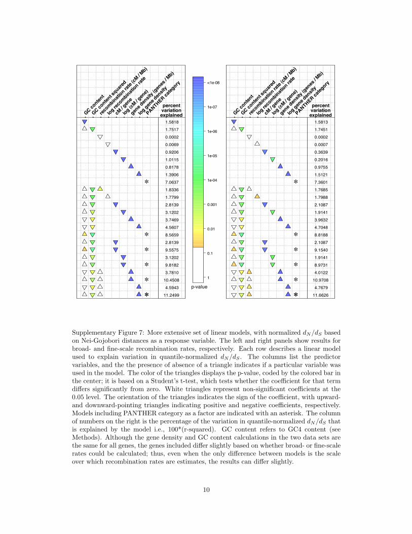
Supplementary Figure 7: More extensive set of linear models, with normalized dN/dS basedon Nei-Gojobori distances as a response variable. The left and right panels show results forbroad- and fine-scale recombination rates, respectively. Each row describes a linear modelused to explain variation in quantile-normalized dN/dS . The columns list the predictorvariables, and the the presence of absence of a triangle indicates if a particular variable wasused in the model. The color of the triangles displays the p-value, coded by the colored bar inthe center; it is based on a Student’s t-test, which tests whether the coefficient for that termdiffers significantly from zero. White triangles represent non-significant coefficients at the0.05 level. The orientation of the triangles indicates the sign of the coefficient, with upward-and downward-pointing triangles indicating positive and negative coefficients, respectively.Models including PANTHER category as a factor are indicated with an asterisk. The columnof numbers on the right is the percentage of the variation in quantile-normalized dN/dS thatis explained by the model i.e., 100*(r-squared). GC content refers to GC4 content (seeMethods). Although the gene density and GC content calculations in the two data sets arethe same for all genes, the genes included differ slightly based on whether broad- or fine-scalerates could be calculated; thus, even when the only difference between models is the scaleover which recombination rates are estimates, the results can differ slightly.
10
!
!
!
!
!
!!
8.05
10.81
0.41
0.39
0.62
0.70
0.03
0.28
7.19
10.82
10.81
11.72
12.22
12.26
13.07
17.37
11.72
18.24
12.22
18.75
12.26
18.77
13.07
19.58
GC c
ontent
GC c
ontent s
quared
reco
mbin
atio
n rate
(cM
/ M
b)
log re
com
binat
ion ra
te
cM / gen
e
log (c
M / gen
e)
gene
densi
ty (g
enes
/ M
b)
log g
ene
densi
ty
PANTH
ER c
ateg
ory
percentvariationexplained
!
!
!
!
!
!!
8.09
10.80
0.06
0.08
0.24
0.24
0.07
0.35
7.49
10.82
10.84
11.04
10.97
12.38
13.15
17.63
11.04
17.86
10.97
17.81
12.42
19.12
13.20
19.88
GC c
ontent
GC c
ontent s
quared
reco
mbin
atio
n rate
(cM
/ M
b)
log re
com
binat
ion ra
te
cM / gen
e
log (c
M / gen
e)
gene
densi
ty (g
enes
/ M
b)
log g
ene
densi
ty
PANTH
ER c
ateg
ory
percentvariationexplained
1
0.1
0.01
0.001
1e-04
1e-05
1e-06
1e-07
<1e-08
p-value
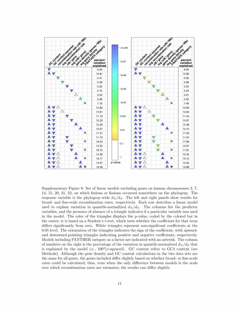
Supplementary Figure 8: Set of linear models excluding genes on human chromosomes 2, 7,14, 15, 20, 21, 22, on which fusions or fissions occurred somewhere on the phylogeny. Theresponse variable is the phylogeny-wide dN/dS . The left and right panels show results forbroad- and fine-scale recombination rates, respectively. Each row describes a linear modelused to explain variation in quantile-normalized dN/dS . The columns list the predictorvariables, and the presence of absence of a triangle indicates if a particular variable was usedin the model. The color of the triangles displays the p-value, coded by the colored bar inthe center; it is based on a Student’s t-test, which tests whether the coefficient for that termdiffers significantly from zero. White triangles represent non-significant coefficients at the0.05 level. The orientation of the triangles indicates the sign of the coefficient, with upward-and downward-pointing triangles indicating positive and negative coefficients, respectively.Models including PANTHER category as a factor are indicated with an asterisk. The columnof numbers on the right is the percentage of the variation in quantile-normalized dN/dS thatis explained by the model i.e., 100*(r-squared). GC content refers to GC4 content (seeMethods). Although the gene density and GC content calculations in the two data sets arethe same for all genes, the genes included differ slightly based on whether broad- or fine-scalerates could be calculated; thus, even when the only difference between models is the scaleover which recombination rates are estimates, the results can differ slightly.
11

!
!
!
!
!
!!
5.03
7.18
0.07
0.14
0.17
0.22
0.03
0.13
3.02
7.18
7.18
7.37
7.34
8.03
8.34
9.81
7.37
9.99
7.34
9.95
8.03
10.61
8.34
10.87
GC c
ontent
GC c
ontent s
quared
reco
mbin
atio
n rate
(cM
/ M
b)
log re
com
binat
ion ra
te
cM / gen
e
log (c
M / gen
e)
gene
densi
ty (g
enes
/ M
b)
log g
ene
densi
ty
PANTH
ER c
ateg
ory
percentvariationexplained
1
0.1
0.01
0.001
1e-04
1e-05
1e-06
1e-07
<1e-08
p-value
Supplementary Figure 9: Set of linear models with quantile-normalized human-lineage-specific dN/dS as the response variable. Data for fine-scale recombination rates are shown.Each row describes a linear model used to explain variation in quantile-normalized dN/dS .The columns list the predictor variables, and the presence of absence of a triangle indicatesif a particular variable was used in the model. The color of the triangles displays the p-value, coded by the colored bar in the center; it is based on a Student’s t-test, which testswhether the coefficient for that term differs significantly from zero. White triangles repre-sent non-significant coefficients at the 0.05 level. The orientation of the triangles indicatesthe sign of the coefficient, with upward- and downward-pointing triangles indicating positiveand negative coefficients, respectively. Models including PANTHER category as a factor areindicated with an asterisk. The column of numbers on the right is the percentage of thevariation in quantile-normalized dN/dS that is explained by the model i.e., 100*(r-squared).GC content refers to GC4 content (see Methods). Although the gene density and GC con-tent calculations in the two data sets are the same for all genes, the genes included differslightly based on whether broad- or fine-scale rates could be calculated; thus, even when theonly difference between models is the scale over which recombination rates are estimates,the results can differ slightly.
12

15 20 25 30 35 40 45 50
-0.0
6-0
.04
-0.0
20.
000.
020.
04
percent in each tail
rho
15 20 25 30 35 40 45 50
-0.0
6-0
.04
-0.0
20.
000.
020.
04
percent in each tail
rho
high tail correlation, insignificanthigh tail correlation, significantlow tail correlation, insignificantlow tail correlation, significant
Supplementary Figure 10: Summary of Spearman rank correlation tests of the correlationbetween dN/dS and the recombination rate for both broad-scale (top panel) and fine-scale(bottom panel) rates. Tests were performed on sets of genes that lie in either the highor low tail of the distribution of dN/dS estimates, excluding genes with no observed non-synonymous substitutions (see Methods). The horizontal axis indicates the percent of genesincluded in either the low tail or the high tail. For tests of genes in the low tail, tests wereconducted in increments of one percent of the genes, starting at the genes with the low15% of dN/dS scores, followed by genes with the low 16% of dN/dS scores, etc. Tests ofgenes in the high tail were conducted similarly. The height of each colored line indicatesthe Spearman rank correlation coefficient calculated for that test. Tan solid or dotted linesrepresent tests for correlations among genes in the high tail of dN/dS , while blue solid ordotted lines represent tests for correlations among genes in the low tail of dN/dS . Dottedlines represent tests that are not significant at the 0.01 level, while solid lines indicatessignificant tests at this level.
13

500 1000 1500 2000-0.0
40.
000.
040.
08
genes in each tail
rho
500 1000 1500 2000
-0.1
0-0
.05
0.00
0.05
genes in each tail
rho
positively selected tail, insignificantpositively selected tail, significantnegatiely selected tail, insignificantnegatiely selected tail, significant
Supplementary Figure 11: Summary of Spearman rank correlation tests of the correlationbetween dN/dS and the recombination rate for both broad-scale (top panel) and fine-scale(bottom panel) rates. Tests were performed on sets of genes that lie in either the high or lowtail of the distribution of γ estimates, excluding genes with no observed non-synonymoussubstitutions (see Methods). The horizontal axis indicates the number of genes included ineither the low tail or the high tail. Tests were conducted in increments of 50 genes, startingwith 100 genes. The height of each colored line indicates the Spearman rank correlationcoefficient calculated for that test. Tan solid or dotted lines represent tests for correlationsamong genes potentially evolving under positive selection (high γ estimates), while blue solidor dotted lines represent tests for correlations among genes more likely to be evolving underpurifying selection (low γ estimates). Dotted lines represent tests that are not significant atthe 0.01 level, while solid lines indicates significant tests at this level.
14

mean omega (dN/dS)
0 0.1 0.2 0.3 0.4 0.5
Ion channel (136)Membrane traffic protein (160)Kinase (278)Select calcium binding protein (118)Phosphatase (119)Cytoskeletal protein (297)Select regulatory molecule (505)Nucleic acid binding (1035)Chaperone (81)Ligase (174)Transferase (398)Transporter (277)Transcription factor (828)Miscellaneous function (351)Synthase and synthetase (98)Hydrolase (279)Transfer/carrier protein (145)
Extracellular matrix (168)Protease (216)Receptor (583)
Oxidoreductase (254)Cell adhesion molecule (152)
Molecular function unclassified (2562)Signaling molecule (377)
Defense/immunity protein (132)
significance (p-value)
1 0.1 0.001 1e-05 1e-07 1e-09 1e-11 1e-13 1e-15 1e-17 1e-19
Supplementary Figure 12: Summary of mean dN/dS values for sets of genes based on thePANTHER classification of molecular functions. The length of each colored bar indicatesthe deviation of the category mean from the grand mean over all genes. Bars are ordered bythe deviation from the grand mean. Colors indicate the p-value for a two-sample, two-tailedStudent’s t-test comparing dN/dS values for genes annotated as having the indicated molec-ular function and genes that do not have the indicated annotation among their annotations.White bars indicate non-significant tests at the 0.05 level. Numbers in parentheses indicatethe number of genes annotated as having a given molecular function.
15

gene density (genes/Mb)
12 13 14 15 16 17 18 19 20 21 22
Ion channel (136)Extracellular matrix (168)Phosphatase (119)Ligase (174)Receptor (583)Transferase (398)Synthase and synthetase (98)Signaling molecule (377)Select regulatory molecule (505)Protease (216)Molecular function unclassified (2571)Oxidoreductase (254)Transporter (277)
Hydrolase (279)Cell adhesion molecule (152)
Kinase (278)Chaperone (81)
Membrane traffic protein (161)Transcription factor (828)
Nucleic acid binding (1035)Select calcium binding protein (118)
Transfer/carrier protein (145)Cytoskeletal protein (297)
Miscellaneous function (351)Defense/immunity protein (132)
significance (p-value)
1 0.1 0.01 0.001 1e-04 1e-05
Supplementary Figure 13: Summary of mean density (genes/Mb) values for sets of genesbased on the PANTHER classification of molecular functions. The length of each coloredbar indicates the deviation of the category mean from the grand mean over all genes. Barsare ordered by the deviation from the grand mean. Colors indicate the p-value for a two-sample, two-tailed Student’s t-test comparing density values for genes annotated as havingthe indicated molecular function and genes that do not have the indicated annotation amongtheir annotations. White bars indicate non-significant tests at the 0.05 level. Numbers inparentheses indicate the number of genes annotated as having a given molecular function.
16
correlation
-0.20 -0.10 0.00 0.05 0.10 0.15 0.20
Synthase and synthetase (95)Oxidoreductase (240)Transcription factor (780)Membrane traffic protein (154)Signaling molecule (363)Transferase (377)Transfer/carrier protein (137)Ligase (166)Phosphatase (113)Transporter (270)Nucleic acid binding (982)Molecular function unclassified (2419)Ion channel (132)
Cytoskeletal protein (284)Receptor (557)
Cell adhesion molecule (142)Kinase (264)
Protease (207)Miscellaneous function (332)
Select calcium binding protein (114)Hydrolase (272)
Select regulatory molecule (481)Extracellular matrix (164)
Defense/immunity protein (128)
significance
1 0.1 0.01
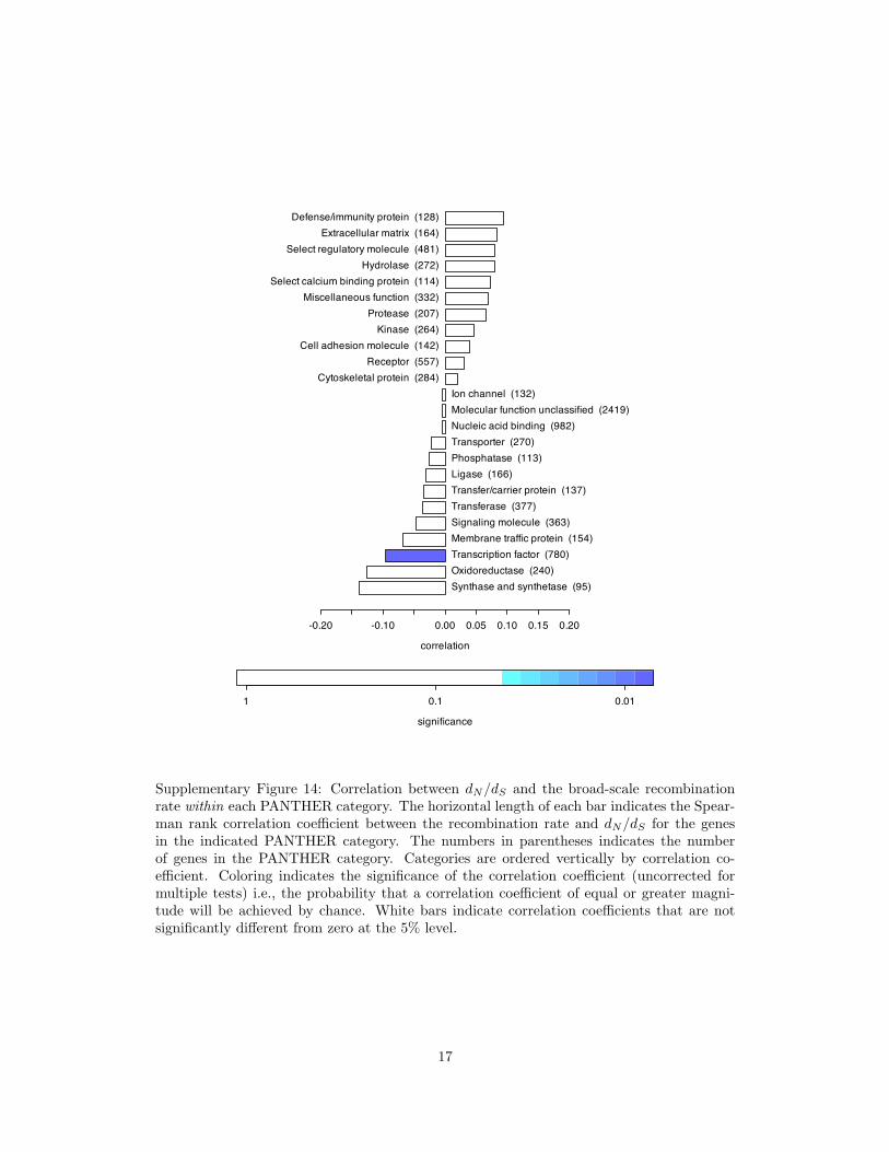
Supplementary Figure 14: Correlation between dN/dS and the broad-scale recombinationrate within each PANTHER category. The horizontal length of each bar indicates the Spear-man rank correlation coefficient between the recombination rate and dN/dS for the genesin the indicated PANTHER category. The numbers in parentheses indicates the numberof genes in the PANTHER category. Categories are ordered vertically by correlation co-efficient. Coloring indicates the significance of the correlation coefficient (uncorrected formultiple tests) i.e., the probability that a correlation coefficient of equal or greater magni-tude will be achieved by chance. White bars indicate correlation coefficients that are notsignificantly different from zero at the 5% level.
17

correlation
-0.20 -0.10 0.00 0.05 0.10 0.15 0.20
Oxidoreductase (249)Transporter (272)Ligase (164)Select calcium binding protein (113)Membrane traffic protein (160)Molecular function unclassified (2450)Transfer/carrier protein (140)Signaling molecule (372)Kinase (269)Transferase (375)Synthase and synthetase (97)Extracellular matrix (164)Cytoskeletal protein (282)Protease (211)
Transcription factor (775)Phosphatase (118)
Miscellaneous function (329)Receptor (559)
Nucleic acid binding (990)Ion channel (131)
Cell adhesion molecule (146)Hydrolase (271)
Select regulatory molecule (489)Defense/immunity protein (127)
significance
1 0.1 0.01
Supplementary Figure 15: Correlation between dN/dS and the fine-scale recombination ratewithin each PANTHER category. The horizontal length of each bar indicates the Spearmanrank correlation coefficient between the recombination rate and dN/dS for the genes in theindicated PANTHER category. The numbers in parentheses indicates the number of genesin the PANTHER category. Categories are ordered vertically by correlation coefficient.Coloring indicates the significance of the correlation coefficient (uncorrected for multipletests) i.e., the probability that a correlation coefficient of equal or greater magnitude willbe achieved by chance. White bars indicate correlation coefficients that are not significantlydifferent from zero at the 5% level.
18

Supplementary Figure 16: Quantile normalization of dN/dS . (a) Original distribution ofdN/dS . (b) Distribution of the quantile-normalized dN/dS values. (c) QQ-plot showingthe relationship between the empirical and theoretical quantiles. (d) Distribution of log-transformed dN/dS values.
19