story book evaluation
TRANSCRIPT

Graphic Narrative Evaluation

Use this template to help you evaluate your project.
You should give specific details about your work.
You should provide both written and visual examples to explain your project.
You should find areas to praise in your work. Be specific about why you think they are good or why you are proud of them.
You should also find areas that could be improved. Look for areas that you could make better if you went back to them. Be specific about what you would improve.
Add additional slides as you need to. Don’t be restricted by what is here.
Any blank slides should be deleted before submission.
Does your final product reflect your original intentions?
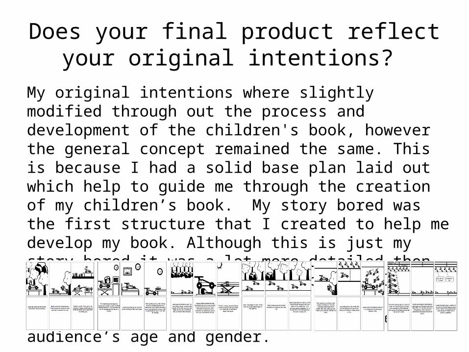
My original intentions where slightly modified through out the process and development of the children's book, however the general concept remained the same. This is because I had a solid base plan laid out which help to guide me through the creation of my children’s book. My story bored was the first structure that I created to help me develop my book. Although this is just my story bored it was a lot more detailed then my final book. This was to help me really understand what the book would be like and how I could simplify it to fit my target audience’s age and gender.
Storyboards Storyboards

My digital flat plan was relatively simple, as all a really wanted it to do was to give me a rough idea of how to lay out the structure of my children’s book. I simply created it out of boxes and used text to shoe and describe where everything would go. This proved really useful when it came to creating my final book, as I could easily go and check what the rough structure for my book was when designing each page.
The story line for my book and illustrations both had adjustments made to them, however they both presented my original intentions towards the book and created a good finished product. My story did have some spelling mistakes in it which did lead to some confusion later on in the development of my book. When writing my final script a would look back at my story to help me with the written lines for each page and their where some spelling which confused me a bit.

When writing my final script a would look back at my story to help If I were to do my story bored again I would have tried to put more detail into the illustrations as this would have helped a lot more later on in the creation of my book. When designing each page from scratch on Photoshop it was really helpful to have my story bored to look at. However when your starring at a blank page on your screen it is hard to no where to start and it would have been much more helpful to have some more detail in the illustrations on my story bored. This would have given me a much better idea of where to start. Using my digital flat plan as a base to work from helped to create the structure of the book. Although having this digital flat plan to work from I did change a lot of the positioning of the text in my final book. The digital flat plan was a bit to boring and wouldn’t have capture a child's attention as well as the positioning in my final book. The structure of the digital flat plan was helpful to work from but to dull for my final children’s book there for did have to modify bits to create a more eye catching and exciting final book.

How well have you constructed your images?
I am very pleased with the final result of my images and how they represent each sentence in the book. I have used texture in places where necessary and I also used a varied selection of colours to help capture a child's attention. The substantial amount of detail in Lauda the race car is to enable him to stand out from the background. Lauda is the main character (Hero) in my story and I put a lot of time and effort into making him a spectacular race car that children will love and remember. He is created with different shades of red, a very common colour for Hero's in a story. Over the years the colour red has been remembered as the goodies colour in stories, for example Superman, Spiderman and Roary the racing car.It has gradually become the favourite colour ofmany children. This will help to present Lauda as the goody (Hero) in the story.

I have used different types of texture in various places in myBook, for example the floors in Laudas house and in the Hospital. I did this to help create a more realistic effect that so Lauda the race car didn’t stand out so muchthat it ruined the image.
I believe my images where constructed very well although I can still pick out problems with them, I think the over all appearance though and my final illustrations are brilliant. There are a few mistakes or problems with the appearances in places but nothing so major that I would have had to redo the whole page. These mistakes might not be noticeable to a child or purchaser as the only reason we see them is because we’re are looking for them.

How well have you used text to anchor your images
My English skills are average but I have a real problem with spelling so I got several people to proof reed my text. When righting text for a child especially one that is just learning to read, you need to simply explain and link the text to you’re images. This will make them feel smart and happy that they figured out how the two interlock, but also they will not have had to put to much effort into understanding how the text and illustration connect as it is self explanatory. The images where created around the sentences for each page. This means they images are explained very well by the text as they were made to fit it.

Is your product suitable for your audience?
My book is aimed at children in the age range of 5-8 years. The book is written mainly for the male audience. The aim was that the older generation of my target audience would be able to read the book them selves where as the younger generation would have to have the book read to them. I believe my book is suitable for the target audience as it is simple enough for your average 5 year old to try and read maybe with a bit of help from and adult. It is easy enough for 8 year olds to read and understand but still exciting enough for them want to read it. At a young age children have short attention spans so by adding a lot of different colours they have a lot more to focus on. I helped to make the book interesting to a child by making the illustration simple but bright. Nothing has to much detail in the background its all simple with simple bright colours to keep the child's attention.
What do you like/dislike about the techniques you have used?
I have used different techniques to create different appearances for the background and the cars. After spending such a long time Rotoscoping and designing Lauda the race car I new I would not have enough time to do other characters. Therefor I used the saturation tool and changed the colour each Lauda to create new characters. One of the other normal race cars became green after playing around with the settings of the saturation. The Mean race car needed to look like a bady and have colours that don’t mix. After a long time trying different colours I used the saturation tool to make the mean race car many different types of purple, which when all placed next to each other, look ghastly.

To create the grass shown on several slides and the desert sand shown on the first slide I used a tool called colour range. Colour range helped me to add texture to these parts of the book by taking another picture and using some of the texture from that to put over the colour of sand or grass I had chosen. This helped to create a more interesting and realistic effect. However there where a few problems with some of the texture I added. Some of them I didn’t have time to change. One was that there were some lines in-between the texture layer of the grass. This was very noticeable in some places, luckily though I had time to change them. Unfortunately though in some area I did not have time to change them, although they were not as revealing as the others lines.
I used a technique called rotoscoping an all full lot, for example to create Lauda, the ambulance and the various other objects. Rotoscoping is where you use an existing image and draw round the outline with a line tool and then remove the image to be left with yours.

What do you like/dislike about how your final product looks?
I am very happy with my final result and the appearance of the book. It is very interesting for a child and meats my target markets requirements. The book has lots of colour and each colour is used to represent a goody or bady to keep the child interested. The script was written by me and I believe fits the story line very well, however the story line was based of two different things. The first was the formula one driver, Niki Lauda, and his crash and the second is Roary the race car from the children's cartoon episodes.
There are a few problems with my book still as I did not have time to finish it. I believe that I could have spent more time and effort on presenting certain pages.
The last page is an example of this as Lauda has just one the three race championship and it’s the happy ending to the book that all children want. However I could have spent more time making the page look glamorous and exciting. His podium was to dull and simple it needed to look more realistic to help it stand out better. The trophies as well could have been more exciting with bright colours to keep the child enthusiastic about Lauda win.

Why did you include the content you used?
The foreground images where always in more detail to help give a better understanding of the image. The heart monitor in the hospital was there to show that Lauda was hurt and needed medical attention. This helps to build up the child's understanding of what is happening in the book. The backgrounds where usually very simple to help the foreground images to stand out. The base of the backgrounds where usually grass and in one case sand. This was so they didn’t bring to much attention away from the foreground images. They were also simple colours which helped them settle in the background.
What signs, symbols or codes have your used in your work?
The colour of the the race car is different shades of red, because of two reasons. The first is because I based Lauda on a Ferrari which has a distinctive Red colour and Ferraris are the one car that at some point in a Childs life will want when they grow up. The second is that Red is the favorite colour of many children and will help to imbed the vision of Lauda the race car in their minds. These reason for the colours and shading of the car have many connotations and will help to keep people reminded of the book.
The races where all held on the same race track which was designed with grass and trees around it. The colours of the track were all completely different from the main character which was very useful as it was easy to make him stand out in the foreground.

What representations can be found in your work?
My book is made about race cars which is generally seen as a male sport in this world so the chances are that my book will appeal more to boys rather then girls. The book is written as if child wrote it so it is more understandable and interesting to them. The bright colours in the illustrations and the simple and short text is designed to keep the child interested in the book as well as enjoy it. Lauda the race car is a male from his name and he is based of Niki Lauda a male racing driver although this is not stated in the book any where. The Race cars are any gender as they have not been given one, they are also any race and could have any religion. My main purpose was to give them a human life form as if the child could interact with them.
What style have you employed in your products?
The has a casual style and simple style, there is a main base in all of the backgrounds for example the grass and race track. However there are different bits of detail on each page like the advertising on the railings of the race track. I like the simple casual style of my book as it is the sort of style that would appeal to my target market and would be approved by their parents or guardians. I also used simple colours as these appeal to younger children. These colours were used all the way through the book for example the tree trunks where brown and the tree tops where green. The simples colours were used as a theme through out the book. Lauda the race car was created with different shades of red.

Lauda the race car was created with different shades of red. This was so he would stand out from the simple colours surrounding him. The main effect these simple colours had where that they created a cartoon effect throughout the book which was the style I wanted in my book.

What were the strengths and weaknesses of the pre-production and planning
The were many stages to planning which became more important as I got closer to designing my children’s book. The first stages of planning where difficult as I did not know how to manage my time as I couldn’t estimate how long things would take to do. The other main challenge was to come up with ideas for my book. After coming up with an indicial idea I began to do some research on it. This really helped as I began to have an idea of how my book would be created. After looking for certain episodes and cartoon strips of race car cartoons I had to come up with another idea. This meant writing my own script, however it was based on a few different stories.
The main planning began by creating a story bored. This gave me a good understanding of how I would create my children’s book.

Although when creating my story bored there where a few problems, for example I could not create some objects or images that I wanted too. Instead I had to write them down underneath the illustrations so I would remember them when it came to creating my actual children’s book.
After this I made a digital flat plan to give myself a rough idea of how I would lay out my book. This was very simple and would begin to get to time consuming if I added to much detail to it. Instead I kept it very simple and use text to describe what would happen in my actual children’s book. This was much less time consuming and left me with more time writing my final script.
My spelling is very poor and to make sure their were no spelling mistakes I had several different people check my script. After checking through it myself I took a few lines out that where unnecessary and this would make it easier for children to read and understand.
Historical and cultural contextThere have been many products produced like mine but the most similar one was the one that gave my idea for my book. This was Roary the racing car which is a children's cartoon show that has also produced children’s books. Roary is a red race car which has to tackle problems that occur at his race track. The story line is a lot different to mine but the idea of a race car with human features is the same.
My story is the same as Niki Laudas in rush as he has a bad crash but comes back from it to race and win a championship. The difference is mine is much more simple so it is appealing to a child.