sm5312 week 1: web design basics1 web sites: the design basics nick foxall
Post on 22-Dec-2015
215 views
TRANSCRIPT

SM5312 week 1: web design basics 1
Web Sites: The Design Basics
Nick Foxall

SM5312 week 1: web design basics 2
Web Sites: The Design Basics
“Design is not just what it looks like and feels like. Design is how it works.”
Steve Jobs

SM5312 week 1: web design basics 3
Principles of Web Design
1. Get it Right
Ensuring the site works properly, as intended, delivering the right information / services / experience to the user.
2. Make it Nice
Ensuring any visit to a site is a pleasant and rewarding one.
Bottom line: usability

SM5312 week 1: web design basics 4
What is a Web Page?
A Web page is…
the basic element of the Web.
not a physical object, but a collection of data that can be transmitted over the Internet and is displayed by a user agent, such as a Web browser.
can contain time-based and interactive elements, but are subject to limitations imposed by maximum data rates and the diversity of hardware and software.
QuickTime™ and aTIFF (Uncompressed) decompressor
are needed to see this picture.

SM5312 week 1: web design basics 5
What is a Web Site?
A Web site is a set of conceptually related Web pages, connected by links.
Links connect Web pages into a network of hypermedia.
The pages making up a site usually exhibit a unified style and layout.
Typing a Web site’s address takes you to its home page, which usually provides an introduction to the site and links to other pages.

SM5312 week 1: web design basics 6
Key Design Considerations
1. Content
2. Navigation
3. Layout
4. Personality

SM5312 week 1: web design basics 7
Content
Purpose / Objectives:
What is the purpose of the site? What do you want to put “out there”? What do you want to achieve?
Flexibility
What do you want to do now? What do you want to do later?
How will the content change over time?
1

SM5312 week 1: web design basics 8
Content
Define the types of content for your site:Text
Images / photos
Video
Flash Animation
Downloadables (PDFs, etc.)
Sort and categorize that content:e.g.
• Overview info (for the home page), • contact info• profile/background info• service/product info
1

SM5312 week 1: web design basics 9
Navigation & Architecture
Define the main sections of your site
Limit to 7 or 8 main sections (ideally 6 or less), which will always be available in your main navigation, or main menu bar
Name those sections using clear, self-explanatory words
Sub-sections
List out sub-sections that might come under one of your main sections
e.g. a portfolio section might have subsections entitled
• Photos
• Paintings
• Websites
• Videos
2

SM5312 week 1: web design basics 10
Navigation & Architecture
Information Architecture Models
1. All-in-one: the simplest possible model. Everything goes on a single Home page.
2. Flat Pattern: where all pages are arranged as peers, and every one is accessible from every other one.
Common for simple sites, where there are a few standard topics, such as: Home, About Us, Contact Us, Products. Also called a 'monocline grouping'.
2

SM5312 week 1: web design basics 11
Information Architecture Models
3. Index: like the flat structure, with an additional list of contents. Often organised in some way, to make stuff easier to find. E.g. a list of files in a web directory (the index page), or an index of people's names ordered by last name.
Navigation & Architecture2

SM5312 week 1: web design basics 12
Information Architecture Models
4. Strict Hierarchy: describes a system where you can only access a lower-level page via its parent. Many data models have strict parent-child relationships, such as Message boards, Threads and Posts. Every thread belongs to one message board; a message board can have many (child) threads. Each thread can have one or more subsequent (child) posts.
CAVEAT: Even if there's a strictly hierarchical real-world model, that doesn't mean that a strict hierarchy is the best way to represent it online. Consider your users' goals and contexts of use. For example, while it's possible to arrange all products by product category, that might not be the most intuitive way for a user to find it. Supermarkets often place the same items in more than one place, knowing that consumers will think about them and look for them under more than one category.
Navigation & Architecture2

SM5312 week 1: web design basics 13
Information Architecture Models
5. Multi-dimensional Hierarchy: where there are many ways of browsing to the same content. In a way, several hierarchies co-exist, overlaid on the same content. The structure of the content can appear to be different, depending on the mode you're looking in.
E.G. Amazon.com
Navigation & Architecture2

SM5312 week 1: web design basics 14
Information Architecture Models
5. Search: strictly more a navigation tool than an architecture, a search tool is often built into a site's architecture. Search functions present a dynamic view of a set of content, and offer instant links to each result. This allows users to jump straight to content, without having to browse through hierarchies or indexes.
Navigation & Architecture2

SM5312 week 1: web design basics 15
Layout (page layout)
No hard and fast rules, but…
…a number of common formats have evolved.
These layout formats work, because they offer flexibility without sacrificing usability / readability.
Most web page designs today use some form of multicolumn layout:
Because long lines of text (i.e. that are very wide) are difficult to read, and because they can comply with Web Standards (more about web standards later…).
3

SM5312 week 1: web design basics 16
Layout: position in browser3
Fixed width,Left alignedThe page (i.e. the area that encloses all the key content) is always aligned to the left edge of the browser window, no matter how wide the user makes the window.
santafecounty.com

SM5312 week 1: web design basics 17
Layout: position in browser3
Fixed width,centre floatedThe page is aligned in the centre of the browser window, no matter how wide the user makes the window.
This is called ‘floating’ the page in the window area: many designers prefer this, because it can help ‘stage’ the page design, providing even margins on both the left and right of the page.
sumagency.com
mpa-i.org

SM5312 week 1: web design basics 18
Layout: position in browser3
Liquid, or flexible widthThe page is usually left-aligned in the browser window, but the page can also expand to fill the window if the user makes the window area larger (i.e. pulls the window out to the right).
The width of the page can be also be specified as a percentage of the browser window width as well, e.g. the page may stretch across 70% of the browser window, leaving a 30% margin area on the right side.
Multicolumn hybrid pages can also be made, where one column is always a fixed width, while another column expands according to the browser width.
Rhizome.org

SM5312 week 1: web design basics 19
Layout: grids3
A layout gridCreating a layout grid for your page design is a key step in generating visual consistency for your site.
Most sites today have a fixed-height header area at the top (which usually runs the full width of the page), with a variable height content area below (that can be divided into columns).
Header area
Content area

SM5312 week 1: web design basics 20
Layout: grids3
Creative, but consistentYou don’t have to follow the same format as everybody else, but at least make your design consistent.
plainsimple.dk
This designer’s site uses an innovative centre-floated box to ‘stage’ his site, but within the box is a simple narrow-header, 2-column grid.

SM5312 week 1: web design basics 21
Layout: columns3
2 columnsOne large column for main content;
One small column for supplementary content, such as links to additional pages (latest links, etc), or advertising panels, sponsor’s links, etc.
revolutiontea.com
mezzoblue.com
Header area
Column 1 Column 2

SM5312 week 1: web design basics 22
Layout: columns3
3 columnsOne large column for main content;
One small column for supplementary content, such as links to additional pages (latest links, etc);
A second small column for advertising panels, sponsor’s links, or other tertiary content.
we-make-money-not-art.com
alistapart.com
Header area
Column 1 Column 2 Column 3

SM5312 week 1: web design basics 23
Layout: columns3
2- and 3-column mixGo through the different sections of the www.alistapart.com site. Notice how they use 3 columns for some pages (e.g. the home page, where there are links to various articles and sponsors), and 2 columns for others (e.g. article pages, where the focus is the discussion itself).
You can mix 2- and 3-column layouts but do it within a consistent grid
Header area

SM5312 week 1: web design basics 24
Layout: columns3
More than 3 columnsApple’s redesigned website (as of June 2007) uses a 5-column grid.
apple.com
SM5312 week 1: web design basics 25
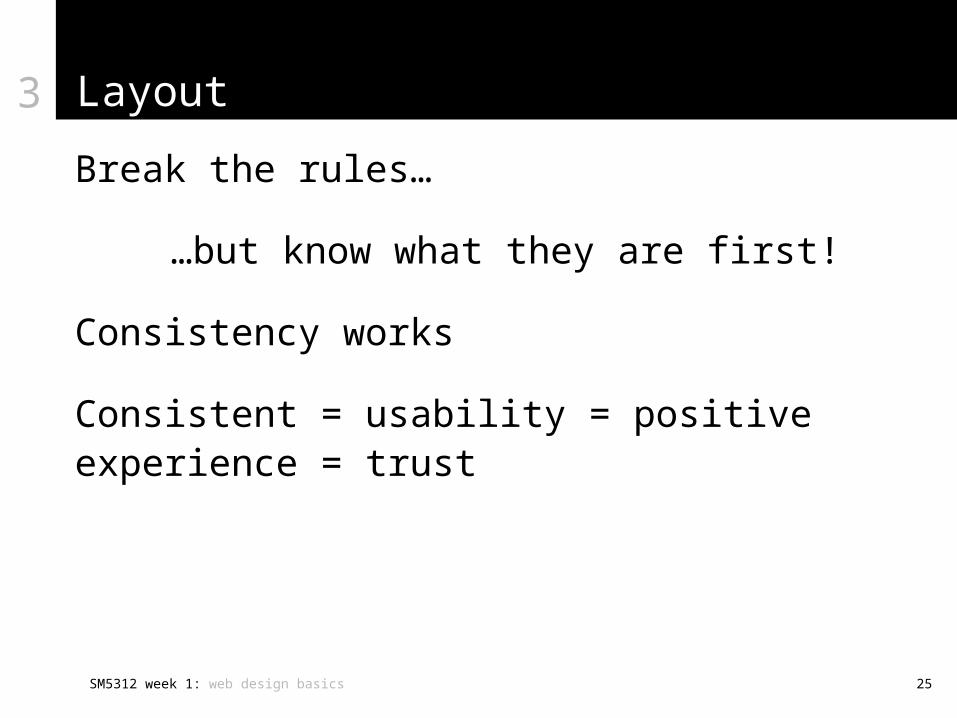
Layout
Break the rules…
…but know what they are first!
Consistency works
Consistent = usability = positive experience = trust
3

SM5312 week 1: web design basics 26
Personality
The visual look-and-feel of a web site (mostly)
What is the overall message that you want to put across?
What is the image you want to project?
How will the visitor engage with your site?
What is the experience you want to generate?
In the corporate world, this is called branding.
4

SM5312 week 1: web design basics 27
Personality
Visual look-and-feel:
Use of colour and graphic elements (shadows, etc.) to accent or offset page areas
Colour schemes:
• Defining a colour palette for your site• White on black, or black on white
Typography:
• Deciding the types of font to use (serif or sans serif)• Limiting the number of fonts used• Determining size of fonts, line spacing, paragraph spacing,
margins, font colours, etc.
4

SM5312 week 1: web design basics 28
And finally…
When things go wrong! Sites that don’t work:fargohomes.com
• Complex and confusing navigation: too many buttons that are difficult to read
globalaigs.org
• Bad colour scheme and ill-defined layout. Use of HMTL frames is discouraged these days
frysteel.com
• Unnecessary and pointless use of Flash animations
vatican.va
• Using graphics to create everything on the page leads to usability/accessibility issues, as well as download overhead