sandra martinez, ph.d. apply texas team student information systems university of texas at austin
TRANSCRIPT

Usability Testing - Determining if a website is easy to use
Sandra Martinez, Ph.D.Apply Texas TeamStudent Information SystemsUniversity of Texas at Austin

A product is usable if people can accomplish necessary tasks quickly and easily .
This includes hardware, software, menus, icons, messages, quick reference, online help, manuals & other documentation and training.
From Dumas & Redish, A Practical Guide to Usability Testing, Revised Edition. 1999
What makes a product usable?

To evaluate a product by testing it on actual users or people similar to real users.
To discover errors and areas for improvement by observing people using the product.
To measure efficiency, accuracy, recall, and emotional responses of test subjects.
What are the goals of usability testing?
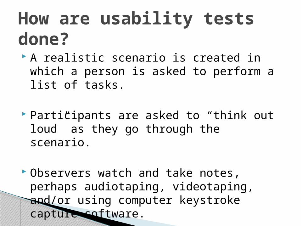
A realistic scenario is created in which a person is asked to perform a list of tasks.
Participants are asked to “think out loud” as they go through the scenario.
Observers watch and take notes, perhaps audiotaping, videotaping, and/or using computer keystroke capture software.
How are usability tests done?

Testing should be done “iteratively from predesign, through early design, and throughout development.”
From Dumas & Redish, A Practical Guide to Usability Testing, Revised Edition. 1999
When should usability tests be done?
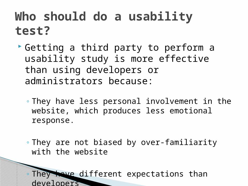
Getting a third party to perform a usability study is more effective than using developers or administrators because:
◦ They have less personal involvement in the website, which produces less emotional response.
◦ They are not biased by over-familiarity with the website
◦ They have different expectations than developers
Who should do a usability test?
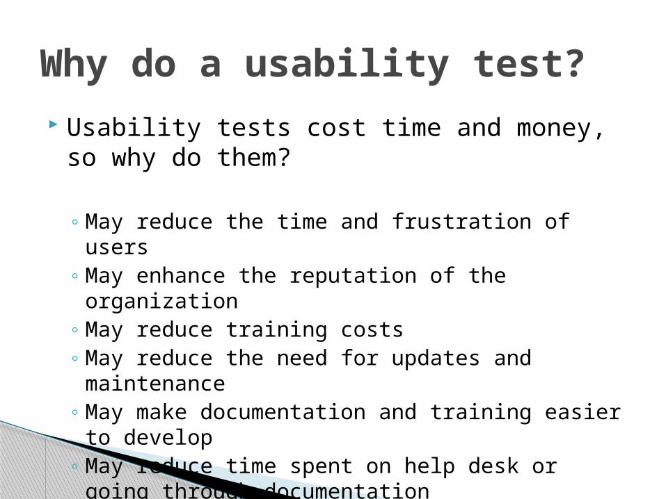
Usability tests cost time and money, so why do them?
◦ May reduce the time and frustration of users◦ May enhance the reputation of the organization◦ May reduce training costs◦ May reduce the need for updates and
maintenance◦ May make documentation and training easier to
develop◦ May reduce time spent on help desk or going
through documentation
Why do a usability test?

In the spring of 2010, Garrett Stettler, a Master’s student in the UT School of Information, performed a usability study for Apply Texas (for free!)
Apply Texas is the common admission and scholarship application used by most colleges and universities in the state of Texas
The Apply Texas Usability Study

It is written and maintained by analysts from the University of Texas at Austin through a contract with the Texas Higher Education Coordinating Board, a state agency tasked with providing leadership and coordination for the Texas higher education system.
It changes yearly based on requests from the Apply Texas Advisory Committee, a statewide committee whose members are from 2 year and 4 year schools, and from public and private schools.
Apply Texas

◦Find and fix simple errors
◦Find and fix big, urgent problems
◦Create list of usability issues for the Apply Texas Advisory Committee to prioritize
◦Create list of suggested changes for the Apply Texas Advisory Committee
The goals of our study
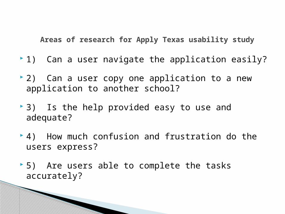
1) Can a user navigate the application easily?
2) Can a user copy one application to a new application to another school?
3) Is the help provided easy to use and adequate?
4) How much confusion and frustration do the users express?
5) Are users able to complete the tasks accurately?
Areas of research for Apply Texas usability study

8 postsecondary-bound Texas high school students
2 postsecondary-bound high school students from other states
2 current college students (transfer)
1 prospective graduate student
1 “non-traditional” adult returning to school
1 pilot participant
Usability study participants

Tasks by Group Group A (“new”
users)
1. Create account, input profile information
2. Start and complete a new application
3. Enter essay information
4. Enter scholarship information
5. Logout
Group B (“returning” users)
1. Retrieve forgotten password
2. View/edit a saved profile
3. View/edit a saved application
4. View/edit saved essays
5. Copy an existing application

Critical concerns
Major concerns
Moderate concerns
Minor concerns
Levels of Concern

Description of critical concerns:
Critical data may be lost, or
The user may not be able to complete the task, or
The user may not want to continue using the application
Critical concerns

Description of major concerns:
Users can accomplish the task but only with considerable frustration and/or unnecessary steps
Non-critical data may be lost
The user has great difficulty in circumventing the problem
Users can overcome the problem only after they have been shown how to perform the task
Major concerns
Description of moderate concerns:
The user is able to complete the task in most cases but it takes some effort to get around the problem
The user may need to investigate several links or pathways through the system to determine which option will allow them to accomplish the intended task
Users will most likely remember how to perform the task on subsequent encounters with the system
Moderate concerns

Description of minor concerns:
The concern is an irritant for the user
There is a cosmetic problem
There is a typographical error
Minor concerns

Error handling
◦ In Apply Texas, error messages are grouped at the top of the page, but are not highlighted within the page itself.
◦ Observation showed that participants tended to skim over error messages and use a “trial-and-error” approach to correcting the error
Example of major concerns
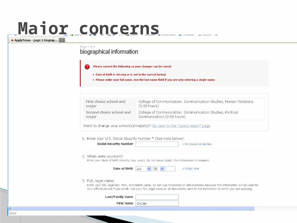
Major concerns
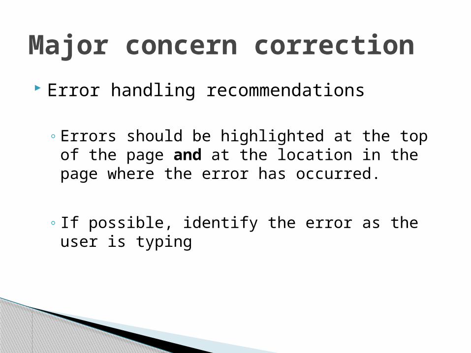
Error handling recommendations
◦ Errors should be highlighted at the top of the page and at the location in the page where the error has occurred.
◦ If possible, identify the error as the user is typing
Major concern correction

Buttons or important information appear ‘below the fold’
Some participants had difficulty completing a task if the continue button required scrolling
Example of moderate concerns

Example of moderate concerns
Continue button off the screen

Moderate concern correction
For new cycle, continue button moved to top of page
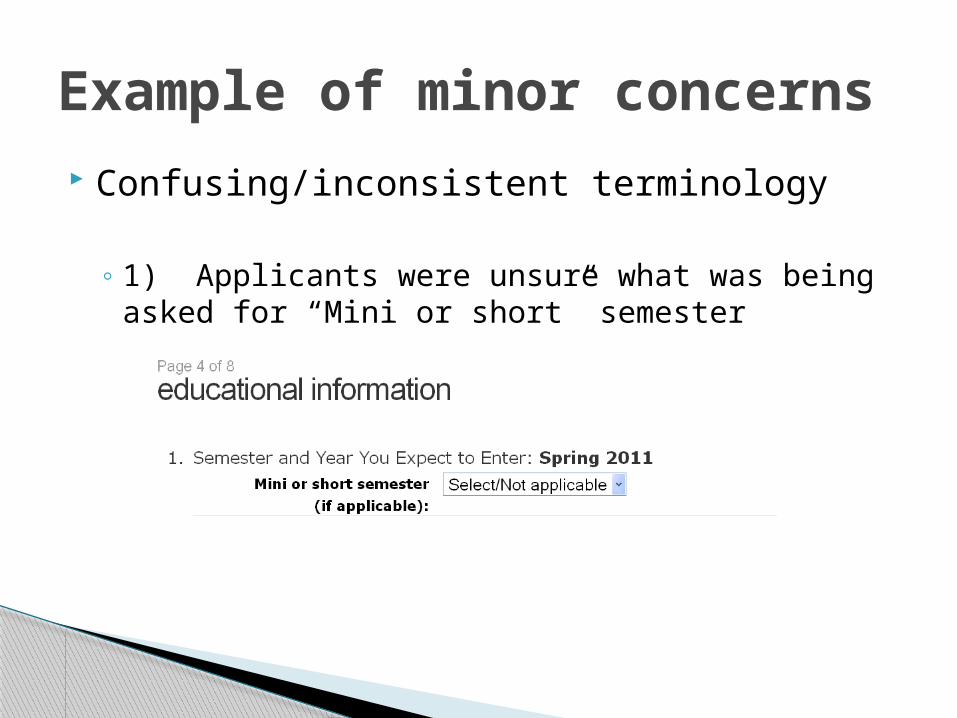
Confusing/inconsistent terminology
◦ 1) Applicants were unsure what was being asked for “Mini or short” semester
Example of minor concerns
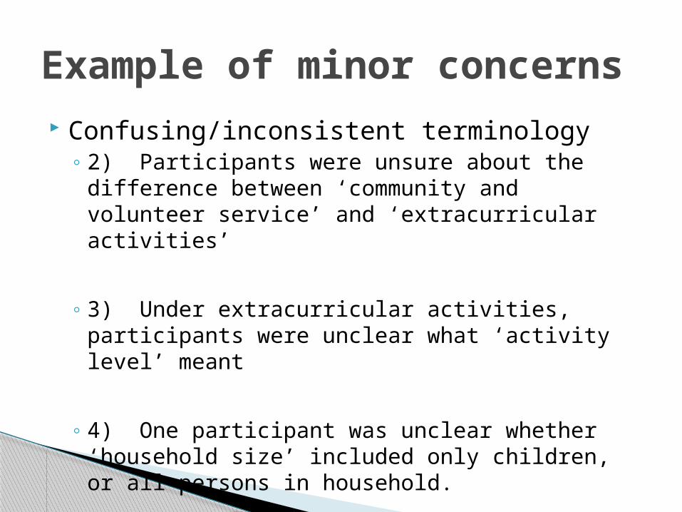
Confusing/inconsistent terminology◦ 2) Participants were unsure about the difference
between ‘community and volunteer service’ and ‘extracurricular activities’
◦ 3) Under extracurricular activities, participants were unclear what ‘activity level’ meant
◦ 4) One participant was unclear whether ‘household size’ included only children, or all persons in household.
Example of minor concerns
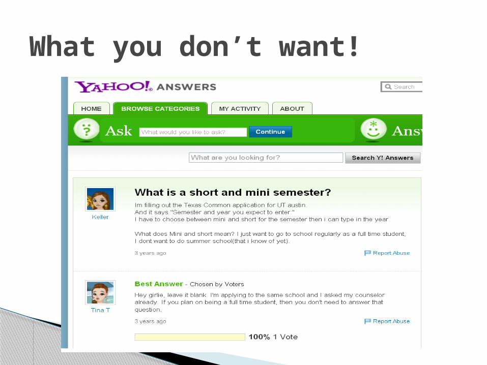
What you don’t want!
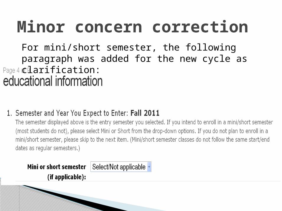
Minor concern correctionFor mini/short semester, the following paragraph was added for the new cycle as clarification:

Overall, Apply Texas was found to be a fairly usable product, with no critical concerns
Many improvements to reduce frustration could be done fairly easily
Some improvements will require reworking certain modules or processes
Usability Study

Selling the idea of a usability test may not be easy, due to the cost and time involved. But your college may have someone who can perform a usability test fairly inexpensively.
Very often, problems are not technical, and can be fixed with a minimum of effort.
It is helpful to have a list of usability problems that can be prioritized, once it is known which problems cause the most trouble to users.
Summary
Questions?
Usability Study