ryan may media studies portfolio
TRANSCRIPT
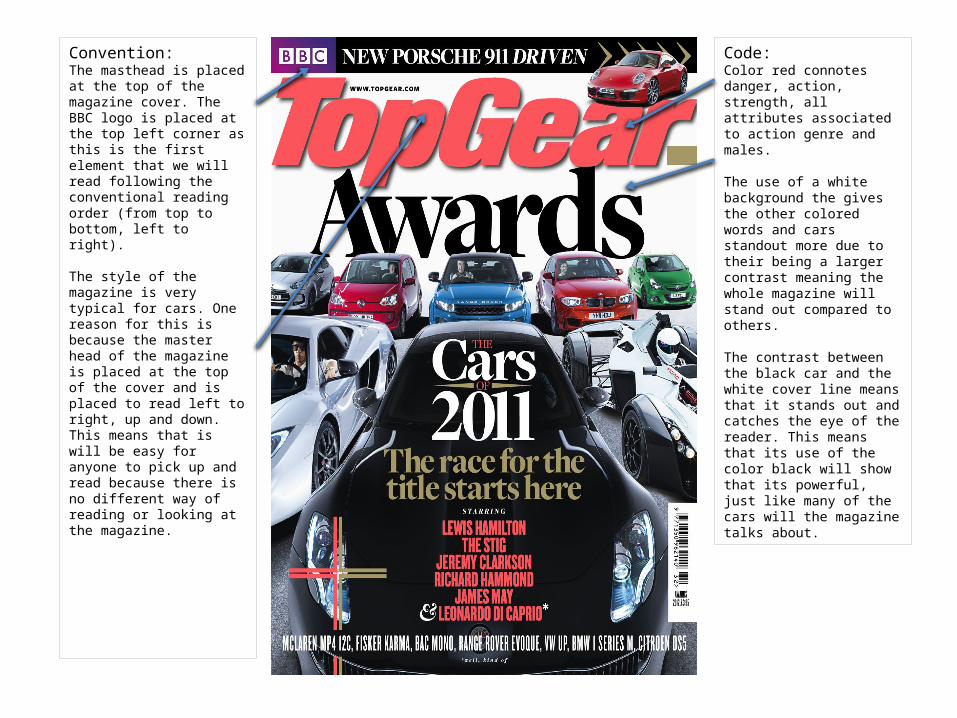
Convention:The masthead is placed at the top of the magazine cover. The BBC logo is placed at the top left corner as this is the first element that we will read following the conventional reading order (from top to bottom, left to right).
The style of the magazine is very typical for cars. One reason for this is because the master head of the magazine is placed at the top of the cover and is placed to read left to right, up and down. This means that is will be easy for anyone to pick up and read because there is no different way of reading or looking at the magazine.
Code:Color red connotes danger, action, strength, all attributes associated to action genre and males.
The use of a white background the gives the other colored words and cars standout more due to their being a larger contrast meaning the whole magazine will stand out compared to others.
The contrast between the black car and the white cover line means that it stands out and catches the eye of the reader. This means that its use of the color black will show that its powerful, just like many of the cars will the magazine talks about.
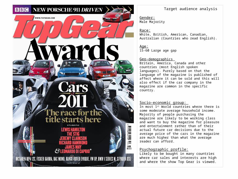
Target audience analysis
Gender: Male Majority
Race:White, British, American, Canadian, Australian (Countries who read English).
Age: 15-60 Large age gap
Geo-demographics Britain, America, Canada and other countries (most English spoken languages). Purely based on that the language of the magazine is published of affect where it can be sold and this will also effect if the car company in the magazine are common in the specific country.
Socio-economic group: In most 1st World countries where there is some moderate average household income. Majority of people purchasing the magazine are likely to be working class and want to buy the magazine for pleasure and entertainment rather than of their actual future car decisions due to the average price of the cars in the magazine are much higher than what the average reader can afford.
Psychographic profile:Likely to be bought in many countries where car sales and interests are high and where the show Top Gear is viewed.
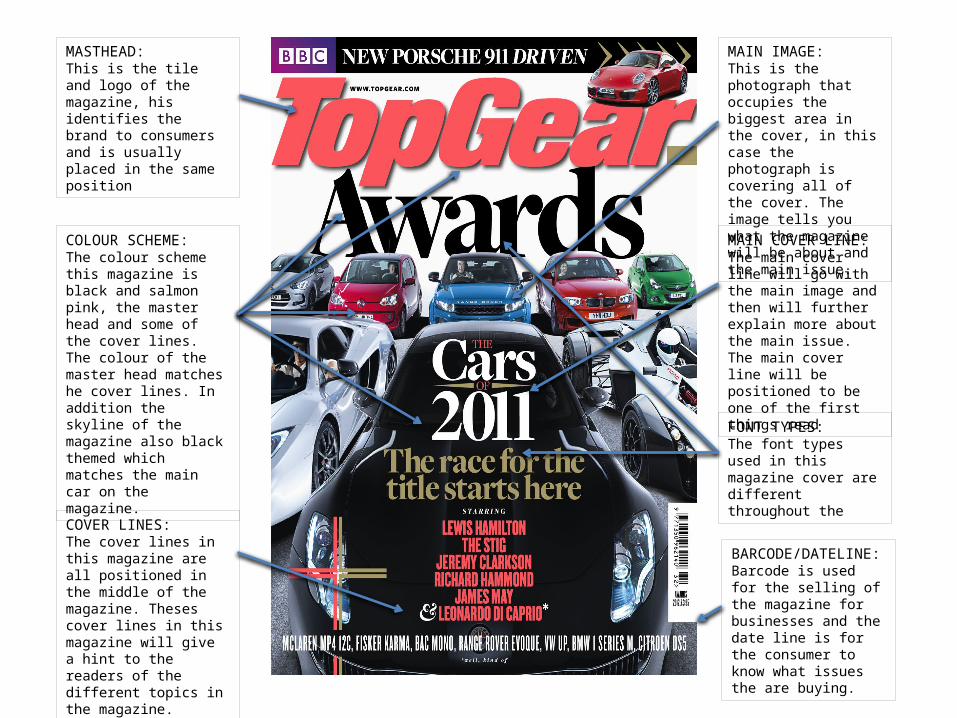
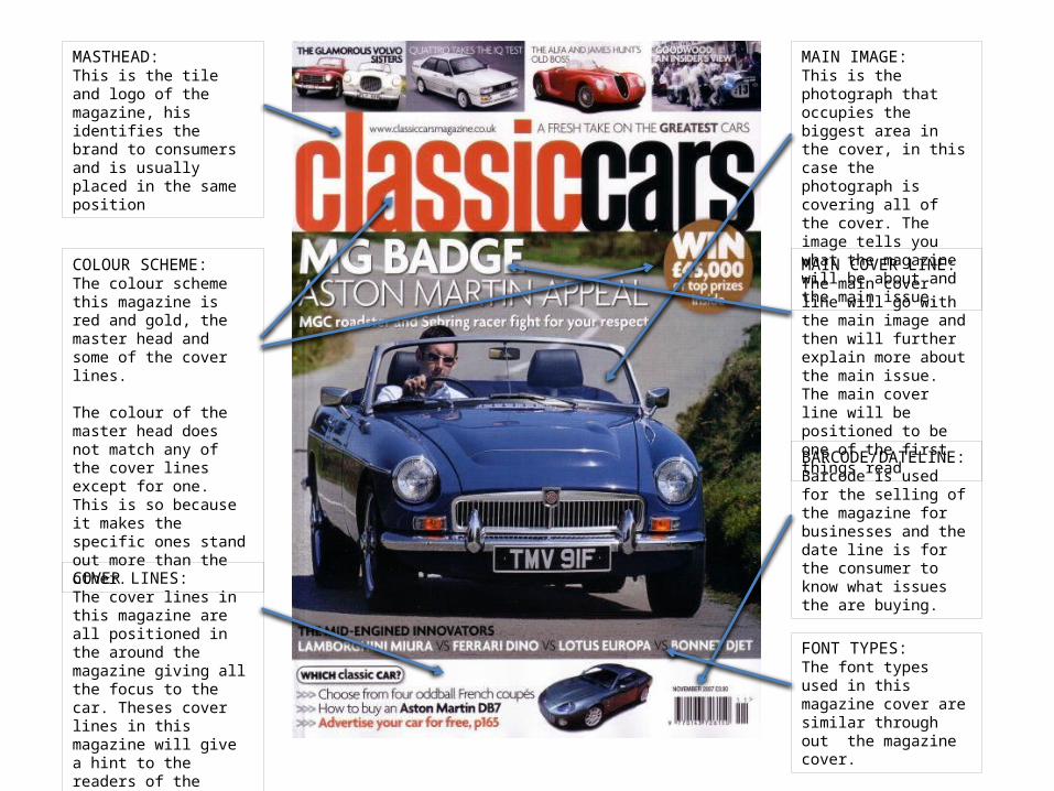
MASTHEAD:This is the tile and logo of the magazine, his identifies the brand to consumers and is usually placed in the same position
COVER LINES:The cover lines in this magazine are all positioned in the middle of the magazine. Theses cover lines in this magazine will give a hint to the readers of the different topics in the magazine.
FONT TYPES: The font types used in this magazine cover are different throughout the
COLOUR SCHEME:The colour scheme this magazine is black and salmon pink, the master head and some of the cover lines. The colour of the master head matches he cover lines. In addition the skyline of the magazine also black themed which matches the main car on the magazine.
MAIN COVER LINE:The main cover line will go with the main image and then will further explain more about the main issue. The main cover line will be positioned to be one of the first things read
MAIN IMAGE: This is the photograph that occupies the biggest area in the cover, in this case the photograph is covering all of the cover. The image tells you what the magazine will be about and the main issue.
BARCODE/DATELINE: Barcode is used for the selling of the magazine for businesses and the date line is for the consumer to know what issues the are buying.
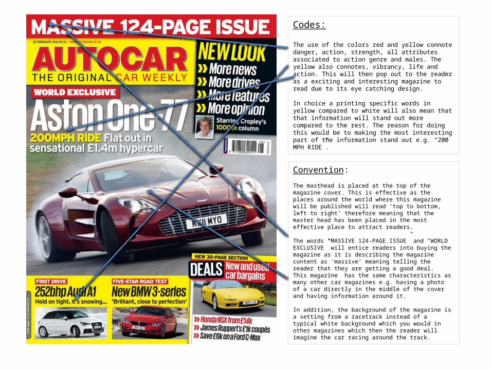
Codes:
The use of the colors red and yellow connote danger, action, strength, all attributes associated to action genre and males. The yellow also connotes, vibrancy, life and action. This will then pop out to the reader as a exciting and interesting magazine to read due to its eye catching design.
In choice a printing specific words in yellow compared to white will also mean that that information will stand out more compared to the rest. The reason for doing this would be to making the most interesting part of the information stand out e.g. “200 MPH RIDE”.
Convention:
The masthead is placed at the top of the magazine cover. This is effective as the places around the world where this magazine will be published will read ‘top to bottom, left to right’ therefore meaning that the master head has been placed in the most effective place to attract readers.
The words “MASSIVE 124-PAGE ISSUE” and “WORLD EXCLUSIVE” will entice readers into buying the magazine as it is describing the magazine content as ‘massive’ meaning telling the reader that they are getting a good deal. This magazine has the same characteristics as many other car magazines e.g. having a photo of a car directly in the middle of the cover and having information around it.
In addition, the background of the magazine is a setting from a racetrack instead of a typical white background which you would in other magazines which then the reader will imagine the car racing around the track.

Target audience analysis:
Gender: Male
Race: White, British, American, Canadian, Australian (Countries who read English).
Age: 20-60
Geo-demographics: Britain, America, Canada (most English spoken languages) Purely based on that the language of the magazine is published of affect where it can be sold and this will also effect if the car company in the magazine are common in the specific country.
Socio-economic group: The group of people who will purchase this type of magazine are most likely to be working class. They’ll purchase and this read this magazine due to their interest in the cars which the magazine will write about. Not many people who will buy this car magazine will purposely buy this magazine to aid their next car choose to buy due to the relatively high price of the cars in which they talk about.
Psychographic profile: Most people in countries where this magazine will think of cars as a sign of wealth. Many people aspire and hope to one day have an expensive, fast, luxury car in their life. Most people who own cars use them in their day to day live to aid their transport needs. Most the average driver want to have a car that is quite, refined, economical, reasonable performance and reasonable running costs.

MASTHEAD:This is the tile and logo of the magazine, his identifies the brand to consumers and is usually placed in the same position
COVER LINES:The cover lines in this magazine are all positioned in the around the magazine giving all the focus to the car. Theses cover lines in this magazine will give a hint to the readers of the different topics in the magazine.
FONT TYPES: The font types used in this magazine cover are different throughout the
COLOUR SCHEME:The colour scheme this magazine is red and yellow, the master head and some of the cover lines.
The colour of the master head matches he cover lines. In addition the skyline of the magazine also matches the colour theme.
MAIN COVER LINE:The main cover line will go with the main image and then will further explain more about the main issue. The main cover line will be positioned to be one of the first things read
MAIN IMAGE: This is the photograph that occupies the biggest area in the cover, in this case the photograph is covering all of the cover. The image tells you what the magazine will be about and the main issue.
BARCODE/DATELINE: Barcode is used for the selling of the magazine for businesses and the date line is for the consumer to know what issues the are buying.

Code:
The high use of the color red makes the whole magazine standout due to its high contrast levels between red and white. This means that the front cover of the magazine will be highly noticeable compared to others.
In addition the small use of the color yellow is used to tell readers some of the most vital information. Such as “OFFICAL” and “BIGGEST-SELLING”. This means the use of these colors will make the reader notice them more in a bid to entice them in.
Convection:The style of the car magazine is very similar when you compare it to other magazines. One example of this is the use of the red color theme which is a them that is used in magazine such as ‘What Car?’.
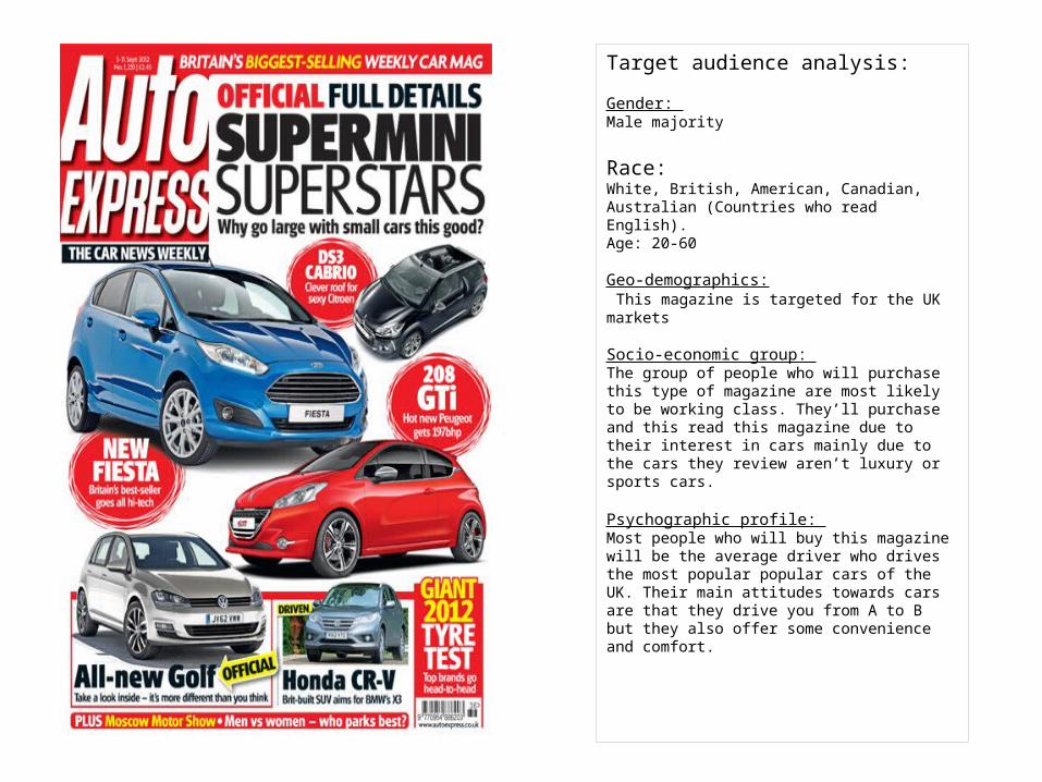
Target audience analysis:
Gender: Male majority
Race: White, British, American, Canadian, Australian (Countries who read English).Age: 20-60
Geo-demographics: This magazine is targeted for the UK markets
Socio-economic group: The group of people who will purchase this type of magazine are most likely to be working class. They’ll purchase and this read this magazine due to their interest in cars mainly due to the cars they review aren’t luxury or sports cars.
Psychographic profile: Most people who will buy this magazine will be the average driver who drives the most popular popular cars of the UK. Their main attitudes towards cars are that they drive you from A to B but they also offer some convenience and comfort.

MASTHEAD:This is the tile and logo of the magazine, his identifies the brand and is usually placed at the top and in the middle however in this case it is positioned on the left.
COVER LINES:The cover lines in this magazine are all over the magazine next to the corresponding image . Theses cover lines in this magazine will give a hint to the readers of the different topics in the magazine.
FONT TYPES: The font types used in this magazine cover are all the same/similar
COLOUR SCHEME:The colour scheme this magazine is red, the master head and some of the cover lines backgrounds. The colour of the master head matches he cover lines. In addition the skyline of the magazine also red themed which matches the overall theme of the magazine.
MAIN COVER LINE:The main cover line will go with the main images and then will further explain more about the main issue. The main cover line will be positioned to be one of the first things read
MAIN IMAGE: This is the photograph that occupies the biggest area in the cover, in this case the photograph is covering all of the cover. The image tells you what the magazine will be about and the main issue.
BARCODE/DATELINE: Barcode is used for the selling of the magazine for businesses and the date line is for the consumer to know what issues the are buying.
DATE:The date of the magazine is there for the consumer to know was issue and date the magazine was released.
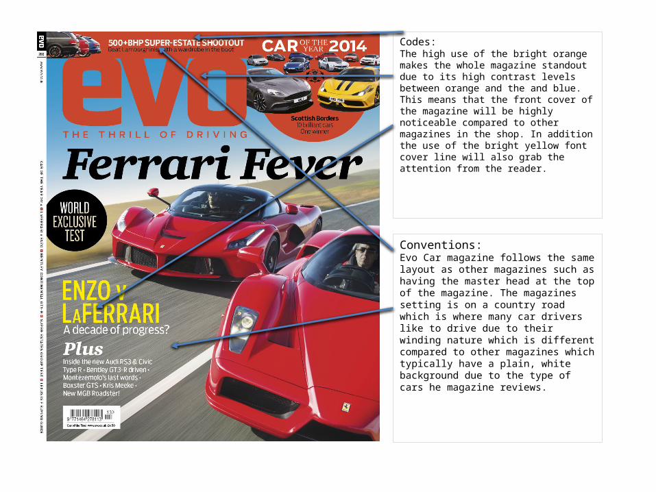
Codes:The high use of the bright orange makes the whole magazine standout due to its high contrast levels between orange and the and blue. This means that the front cover of the magazine will be highly noticeable compared to other magazines in the shop. In addition the use of the bright yellow font cover line will also grab the attention from the reader.
Conventions: Evo Car magazine follows the same layout as other magazines such as having the master head at the top of the magazine. The magazines setting is on a country road which is where many car drivers like to drive due to their winding nature which is different compared to other magazines which typically have a plain, white background due to the type of cars he magazine reviews.

Target audience analysis:
Gender: Male Majority
Race: White, British, American, Canadian, Australian (Countries who read English).
Age: 25- 55 Geo-demographics:Britain, America, Canada (most English spoken languages) Purely based on that the language of the magazine is published of affect where it can be sold. This car magazine is British so is being sold the most in Britain than anywhere else
Socio-economic group:The group of people who will purchase this type of magazine are most likely to be working class. They’ll purchase and this read this magazine due to their interest in the cars which the magazine will write about. Not many people who will buy this car magazine will purposely buy this magazine to aid their next car choose to buy due to the relatively high price of the cars in which they talk about. There choice to buy the magazine is down to pleasure.
Psychographic profile: Most people in countries where this magazine will think of cars as a sign of wealth and personality. Many people aspire and hope to one day have an expensive, fast, luxury car in their life. Most people who own cars use them in their day to day live to aid their transport needs rather than pleasure. The average driver wants to have a car that is quite, refined, economical, reasonable performance and reasonable running costs rather than something which is unpractical in their life.

MASTHEAD:This is the tile and logo of the magazine, his identifies the brand to consumers and is usually placed in the same position
COVER LINES:The cover lines in this magazine are all positioned in the around the magazine giving all the focus to the car. Theses cover lines in this magazine will give a hint to the readers of the different topics in the magazine.
FONT TYPES: The font types used in this magazine cover are different throughout.
COLOUR SCHEME:The colour scheme this magazine is red and yellow, the master head and some of the cover lines.
The colour of the master head is different to the main cover line so it stands out more from the other cover lines.
MAIN COVER LINE:The main cover line will go with the main image and then will further explain more about the main issue. The main cover line will be positioned to be one of the first things read
MAIN IMAGE: This is the photograph that occupies the biggest area in the cover, in this case the photograph is covering all of the cover. The image tells you what the magazine will be about and the main issue.
BARCODE/DATELINE: Barcode is used for the selling of the magazine for businesses and the date line is for the consumer to know what issues the are buying.
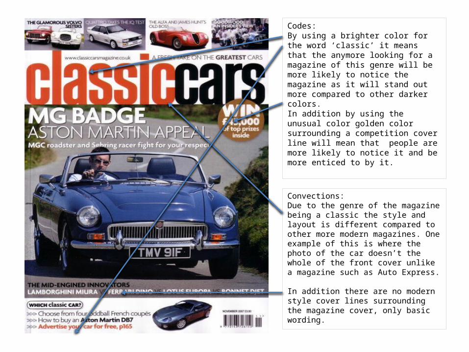
Codes:By using a brighter color for the word ‘classic’ it means that the anymore looking for a magazine of this genre will be more likely to notice the magazine as it will stand out more compared to other darker colors. In addition by using the unusual color golden color surrounding a competition cover line will mean that people are more likely to notice it and be more enticed to by it.
Convections:Due to the genre of the magazine being a classic the style and layout is different compared to other more modern magazines. One example of this is where the photo of the car doesn’t the whole of the front cover unlike a magazine such as Auto Express.
In addition there are no modern style cover lines surrounding the magazine cover, only basic wording.
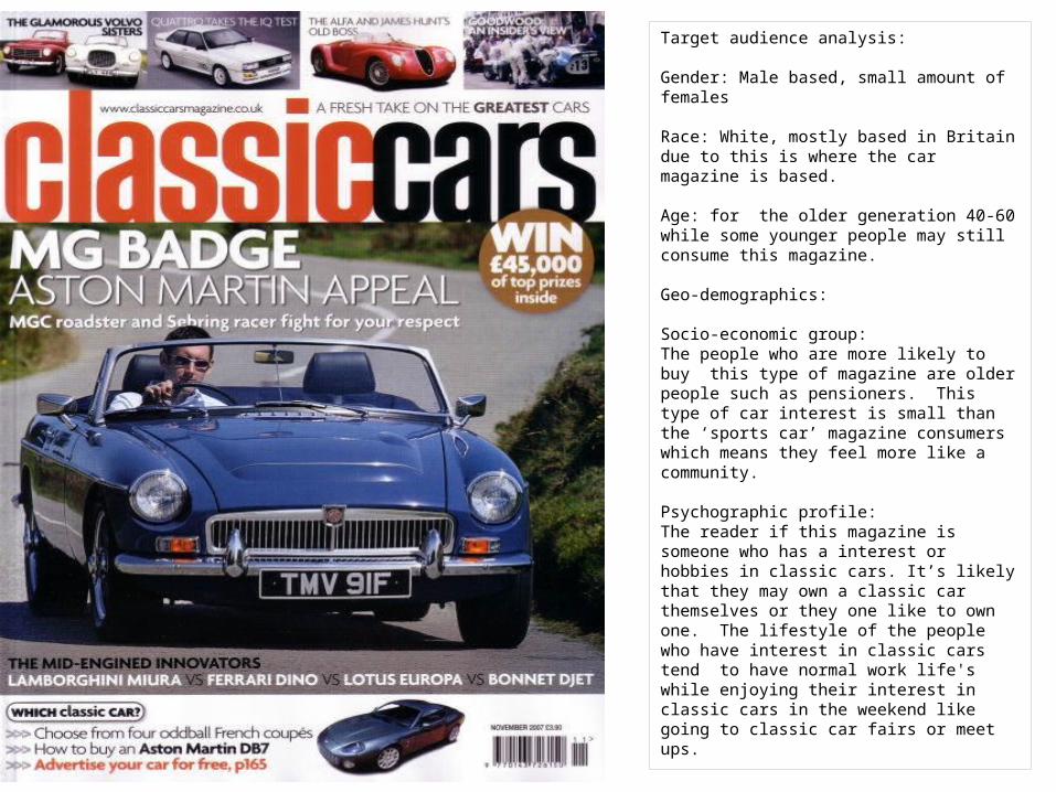
Target audience analysis:
Gender: Male based, small amount of females
Race: White, mostly based in Britain due to this is where the car magazine is based.
Age: for the older generation 40-60 while some younger people may still consume this magazine.
Geo-demographics:
Socio-economic group: The people who are more likely to buy this type of magazine are older people such as pensioners. This type of car interest is small than the ‘sports car’ magazine consumers which means they feel more like a community.
Psychographic profile: The reader if this magazine is someone who has a interest or hobbies in classic cars. It’s likely that they may own a classic car themselves or they one like to own one. The lifestyle of the people who have interest in classic cars tend to have normal work life's while enjoying their interest in classic cars in the weekend like going to classic car fairs or meet ups.
MASTHEAD:This is the tile and logo of the magazine, his identifies the brand to consumers and is usually placed in the same position
COVER LINES:The cover lines in this magazine are all positioned in the around the magazine giving all the focus to the car. Theses cover lines in this magazine will give a hint to the readers of the different topics in the magazine.
FONT TYPES: The font types used in this magazine cover are similar through out the magazine cover.
COLOUR SCHEME:The colour scheme this magazine is red and gold, the master head and some of the cover lines.
The colour of the master head does not match any of the cover lines except for one. This is so because it makes the specific ones stand out more than the other.
MAIN COVER LINE:The main cover line will go with the main image and then will further explain more about the main issue. The main cover line will be positioned to be one of the first things read
MAIN IMAGE: This is the photograph that occupies the biggest area in the cover, in this case the photograph is covering all of the cover. The image tells you what the magazine will be about and the main issue.
BARCODE/DATELINE: Barcode is used for the selling of the magazine for businesses and the date line is for the consumer to know what issues the are buying.
Audience classification
The socio-economic model•The basis for this system is the purchasing power of a particular sector of society which conforms a particular sector of the audience.•Classification:Group A: Doctors, lawyers, senior managers of large-scale organisations (very well paid professionals)Group B: Middle management, teachers, liberal professionals (fairly well paid professionals)Group C1: ‘White collar’ bank clerks, junior management, nurses.Group C2: Skilled ‘blue collar’ workers such as electricians, plumbers,...Group D: Semi and unskilled manual such as retailers, drivers, waiters,...Group E: Students, pensioners, unemployed.

Conventions
• Conventions are the typical characteristics particular to a specific genre. For example the characters, storyline, setting, music and sound effects, etc.
• The term convention refers to the repetition and reinforcement of normative values.
Audience classification
The psychographic model.
Values (political, social, religious)Culture (High culture vs. Popular culture)AttitudesLifestyles (habits and hobbies)
Audience profiling
Demographic profiling model• The most basic form of identification for target
audiences.• Very simplistic way of defining an audience as it
assumes that everyone in a very broad group has the same attitudes.
Psychographic profiling model• Target audiences directly through their needs and
desires, which is more effective for advertisers, broadcasters and publishers.
• Advertisers aim to link the ideologies of the product to those of the consumer.
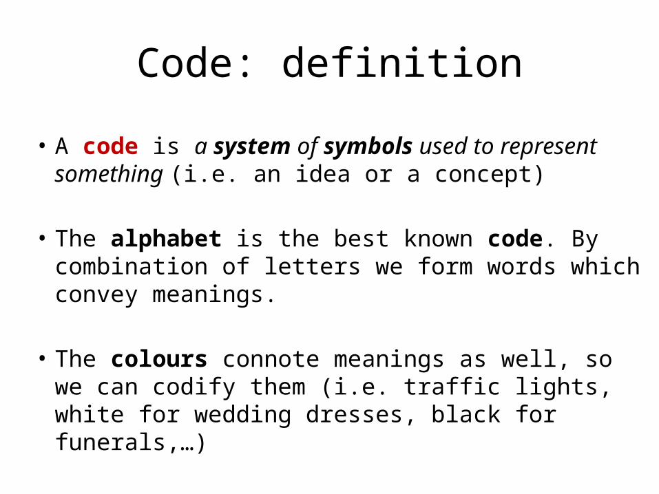
Code: definition
• A code is a system of symbols used to represent something (i.e. an idea or a concept)
• The alphabet is the best known code. By combination of letters we form words which convey meanings.
• The colours connote meanings as well, so we can codify them (i.e. traffic lights, white for wedding dresses, black for funerals,…)
Codes and conventions
How do we know which genre a film fits into? In other words, how can we identify a genre?
• We can identify a genre by its codes and conventions.

Case Study: Breaking BadIdentify codes in this opening sequence:
https://www.youtube.com/watch?v=HEmx23LwFhI

Case Study: Breaking BadIdentify codes in this teaser poster.
This serif font types are the ones used in the opening title credits.
Colour green usually associated with chemistry .
Smoke associated with combustion and chemical reactions
Use of periodic table elements symbols
Repetition and difference
• The effect of any genre is only possible if there is a previous basic knowledge and understanding of a media product.
• It is a system where expectation and surprise are established by involving both REPETITION and DIFFERENCE.
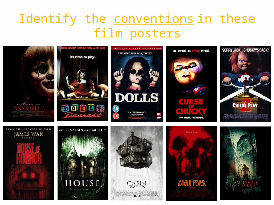
Identify the conventions in these film posters
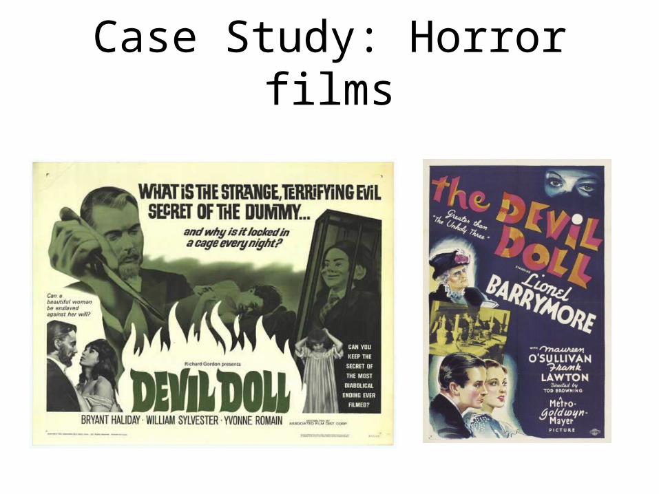
Case Study: Horror films

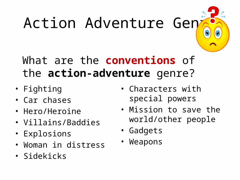
Action Adventure Genre
Identify the codes in these action-adventure film posters.
Action Adventure Genre
• Fighting• Car chases• Hero/Heroine• Villains/Baddies• Explosions• Woman in distress• Sidekicks
• Characters with special powers
• Mission to save the world/other people
• Gadgets• Weapons
What are the conventions of the action-adventure genre?

Codes and conventions recap
All genres are defined by a series of codes and conventions.
Codes are a system of symbols used to communicate a message or idea.
Conventions are the repetition and reinforcement of normative values.
Lets have a look at how does this work on magazine covers.

CODE: Colour pink. Conventionally is a colour associated with femininity. Here is used to represent femininity and appeal to a female target audience. It also matches the soft lip tone of the model in the image.
CONVENTION:The model in the cover is a well known actress. She apeals to a female target audience and portraits the main contents of this magazine genre: fashion, beauty and celebrity.
CONVENTION: The size of the masthead is the biggest text in the cover. This is because the masthead is the name/title of the magazine.
CONVENTION:The model’s face is in front of the masthead, while this is still easily legible

Audience classification
Types of audience:
• Mass audience: The largest one. Consumes mainstream or popular culture texts such as soup operas, sit-coms, reality shows and sports.
• Niche audiences: Much smaller and diverse than mass audience but usually very influential. Very attractive to advertisers of relevant products and sufficiently reliable to enable continuation of a media text due to consistent revenue being generated by sales. (i.e. BBC4 is aimed at a niche audience who are interested in cultural/artistic programmes)

Audience classification
Audience profiling consist in segmenting the audience according to particular characteristics of the targeted audience.This is often done by advertisers to identify ‘types’ of consumers.There are many ways in which audience can be segmented or profiled:•The socio-economic model •The demographic model•The psychographic model

Audience classification
The socio-economic model•The basis for this system is the purchasing power of a particular sector of society which conforms a particular sector of the audience.•Classification:Group A: Doctors, lawyers, senior managers of large-scale organisations (very well paid professionals)Group B: Middle management, teachers, liberal professionals (fairly well paid professionals)Group C1: ‘White collar’ bank clerks, junior management, nurses.Group C2: Skilled ‘blue collar’ workers such as electricians, plumbers,...Group D: Semi and unskilled manual such as retailers, drivers, waiters,...Group E: Students, pensioners, unemployed.

Audience classification
The demographic model.
More diverse criteria for segmenting and profiling the audience, according to criteria such as:AgeGender RaceGeo-demographics (where do they live: U.S.A., China,
Nigeria, U.K., Spain,...)Class/Incomes Interests and beliefs.

Audience profiling
Demographic profiling model• The most basic form of identification for target
audiences.• Very simplistic way of defining an audience as it
assumes that everyone in a very broad group has the same attitudes.
Psychographic profiling model• Target audiences directly through their needs and
desires, which is more effective for advertisers, broadcasters and publishers.
• Advertisers aim to link the ideologies of the product to those of the consumer.
Audience profiling
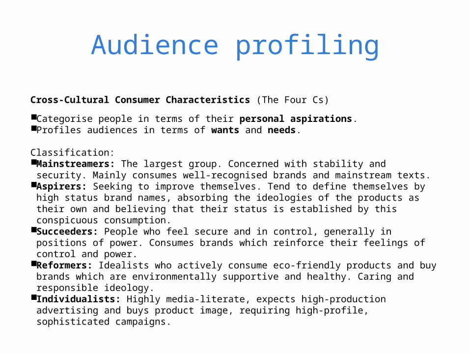
Cross-Cultural Consumer Characteristics (The Four Cs)
Categorise people in terms of their personal aspirations. Profiles audiences in terms of wants and needs.
Classification: Mainstreamers: The largest group. Concerned with stability and security. Mainly
consumes well-recognised brands and mainstream texts. Aspirers: Seeking to improve themselves. Tend to define themselves by high
status brand names, absorbing the ideologies of the products as their own and believing that their status is established by this conspicuous consumption.
Succeeders: People who feel secure and in control, generally in positions of power. Consumes brands which reinforce their feelings of control and power.
Reformers: Idealists who actively consume eco-friendly products and buy brands which are environmentally supportive and healthy. Caring and responsible ideology.
Individualists: Highly media-literate, expects high-production advertising and buys product image, requiring high-profile, sophisticated campaigns.

1. BELONGERS- Traditional, conservative conformists; family-orientated, like security, hate change and like a strong community
2. EMULATORS-Young people searching for an identity, desiring to fit into adult world, but can be discouraged about prospects.
3. EMULATOR-ACHIEVERS- Successful, enjoy acquiring things and buy brand names.
4. SOCIETALLY CONSCIOUS ACHIEVERS- Inner peace and environment more important than financial success; want personal fulfilment, lovers of outdoors and fitness, like to experiment.
5. NEEDS DIRECTED- Survivors on incomes that only allow needs and not wants to be fulfilled; pensioners and those on unemployment benefits, for example.
Audience profiling