responsive web design - doit.maryland.gov · responsive web design is not only about adjustable...
TRANSCRIPT

RESPONSIVE WEB DESIGN
Webcom Meeting April 17, 2013

Responsive Design: Definition
A responsive website responds to the user’s:
• screen size
• platform/browser
• device
• orientation
Provides an optimal viewing experience across all devices using the same codebase and content.

Statistics
Mobile users will exceed desktop users by 2014: (Morgan Stanley)
Over 30% of Americans own a tablet computer or e-reader
69% of US mobile users access the internet on their phones daily
25% of US users access the web ONLY through their mobile device
In the US many mobile-only users are older people and many come from lower income households
17% of visitors accessed Maryland.gov through their mobile devices

Myths of Mobile
Mobile users are rushed and distracted Mobile users can and should be as relaxed as desktop users
Mobile = Less Mobile users expect to be able to do as much as desktop users
Complexity is a dirty word Mobile users don’t mind complexity, as long as content is clearly presented and easy to navigate
Extra taps and clicks are evil Users are happy to click more if the clicks are meaningful and logical
The mobile web is different from the desktop web There is no difference. We need to make the web accessible from all devices.

Best Practices
Start Small (Mobile First) Mobile first does not mean mobile only!
Content Audit Responsive design should be driven by the website content
Make It Modular Dividing up content will make RWD easier to implement
Exit Photoshop, Enter Browser The sooner the site can be viewed in a browser, the better
Test Always In different browsers, monitors and devices

How is Responsive Web Design Achieved?
Adaptive layout - intelligent use of CSS media queries to modify the layout in ways that suit different screen sizes.
Fluid grids and layouts - uses relative units like percentages instead of fixed-width units like pixels.
Flexible media/images - images and other media (like videos) are scaled using relative units so they don’t expand beyond their containing element.

How is Responsive Web Design Achieved?
Media Queries
Combines a media type and a condition to specify how web content will appear on a particular device.
Conditions such as min-width, max-width, device-width and orientation control how content is displayed differently.
For example, max-width sets a maximum browser width that a certain set of styles would apply to.

State Agency Template
The template was built using the Twitter Bootstrap framework.
The framework includes grids, layouts and media queries
Template is ready for design and markup

State Agency Template
Be aware of areas that have the greatest potential to break the responsiveness of the templates:
• Fixed-width images and other media
• Tables
• Fixed-width columns

State Agency Template –Images
Image height and width are not declared in the code
The CSS resizes the images as needed.
Set maximum width of image to 100% of the browser width – image will size with browser

State Agency Template - Tables
http://css-tricks.com/examples/ResponsiveTables/responsive.php

State Agency Template – Content
Content will re-format itself
Elements DROP left
to right – what’s on the RIGHT in desktop will be at the BOTTOM on mobile.
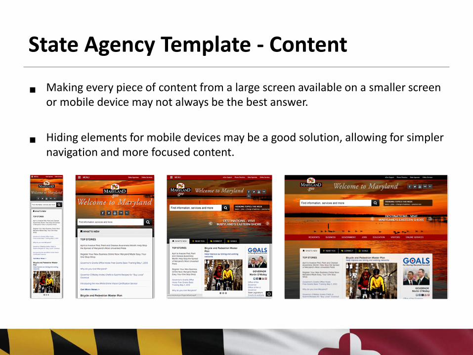
State Agency Template - Content
Making every piece of content from a large screen available on a smaller screen or mobile device may not always be the best answer.
Hiding elements for mobile devices may be a good solution, allowing for simpler navigation and more focused content.

Conclusion
Responsive Web Design is not only about adjustable screen resolutions and automatically resizable images, but rather about a whole new way of thinking about design.
The goal is to provide a consistent user experience across sizes and devices.
A responsive site should be more cost-effective than separate device-specific sites because code, assets, and process are shared and reused.

Additional Resources
Smashing Magazine: Responsive Web Design: What It Is and How To Use It http://coding.smashingmagazine.com/2011/01/12/guidelines-for-responsive-web-design/
CSS Tricks: Media Queries for Standard Devices http://css-tricks.com/snippets/css/media-queries-for-standard-devices/
1st Web Designer: A Brief Overview of Responsive Design http://www.1stwebdesigner.com/design/responsive-design-overview/
Responsive Web Design: A Visual Guide http://net.tutsplus.com/tutorials/html-css-techniques/responsive-web-design-a-visual-guide/
