rbdms data miner study findings - gwpc data miner... · background information • the rbdms public...
TRANSCRIPT
RBDMS Data Miner Study Findings
112/2/2016
Background Information
• The RBDMS Public User Interface, known internally as Data Miner, was designed for state agency employees to have off-site access to oil and gas data as well as provide oil and gas data transparency to the public. The GWPC recognizes that these public-facing websites are now perfectly situated to provide more transparency for state oil and gas activity and regulation. The point of the Data Miner update is to step towards modernizing the user interface and functionality to serve a wider variety of audiences.
12/2/2016 2
General Info About Focus Groups
• Four main target audiences were identified as users that the final user interface should be designed for.– Public – citizens, media, community groups: This category includes a wide variety of
users. Media and community groups may be looking for both bulk data and data more specific to a certain well. The general public will most likely find the interactive map feature to be the most useful to find information about a specific site or well.
– Academia/researcher: Users in this group are primarily focused on downloading all of the data available and then manipulating and analyzing it themselves. They want to look at the data from a high level to be able to identify trends that can inform decisions and policy-making.
– State agencies and officials: Users in this group want a mix of reports, bulk data, and site-specific data.
– Federal government officials/staff: Users in this group are looking for data in a way similar to state agencies and officials.
12/2/2016 3
Goals for Data Miner UI
• Reduce staff time with public by having an easier to navigate/user friendly site for public to self-serve data
• Increase public confidence with transparency
• Modernize UI and user experience
• Make basic reports easier for public and state agency members
• Printable reports
12/2/2016 4
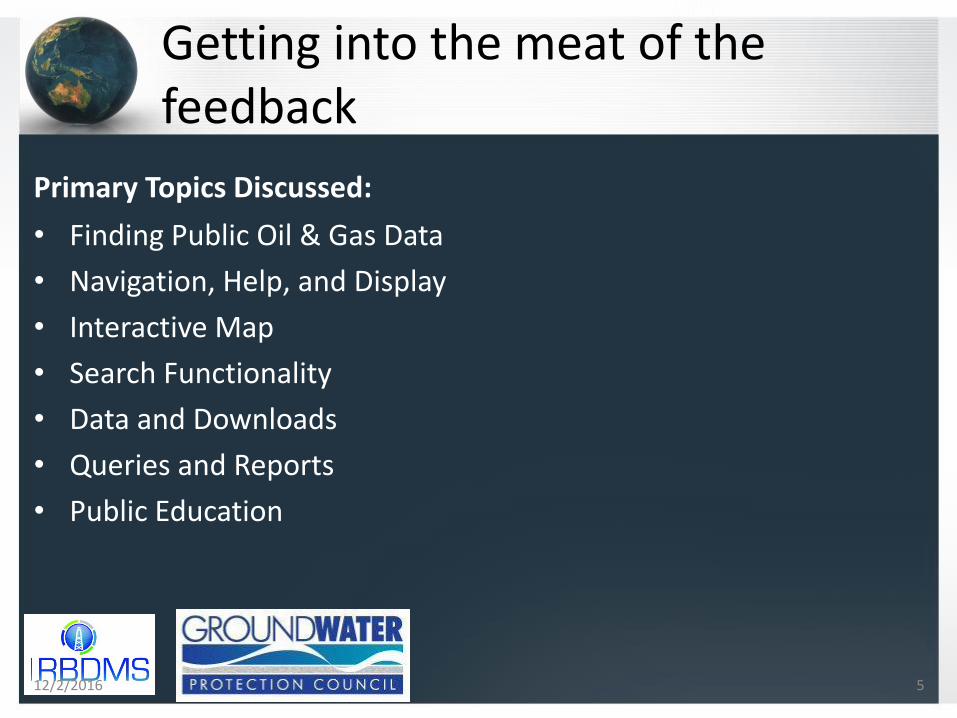
Getting into the meat of the feedback
Primary Topics Discussed:
• Finding Public Oil & Gas Data
• Navigation, Help, and Display
• Interactive Map
• Search Functionality
• Data and Downloads
• Queries and Reports
• Public Education
12/2/2016 5
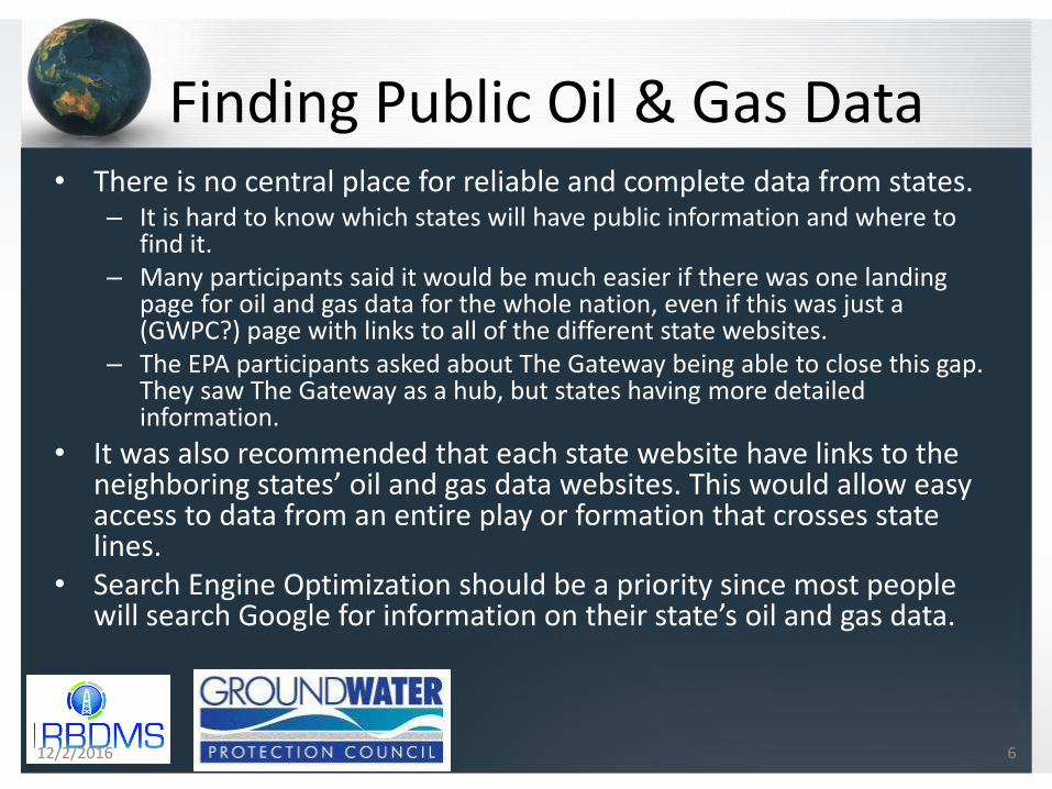
Finding Public Oil & Gas Data• There is no central place for reliable and complete data from states.
– It is hard to know which states will have public information and where to find it.
– Many participants said it would be much easier if there was one landing page for oil and gas data for the whole nation, even if this was just a (GWPC?) page with links to all of the different state websites.
– The EPA participants asked about The Gateway being able to close this gap. They saw The Gateway as a hub, but states having more detailed information.
• It was also recommended that each state website have links to the neighboring states’ oil and gas data websites. This would allow easy access to data from an entire play or formation that crosses state lines.
• Search Engine Optimization should be a priority since most people will search Google for information on their state’s oil and gas data.
12/2/2016 6
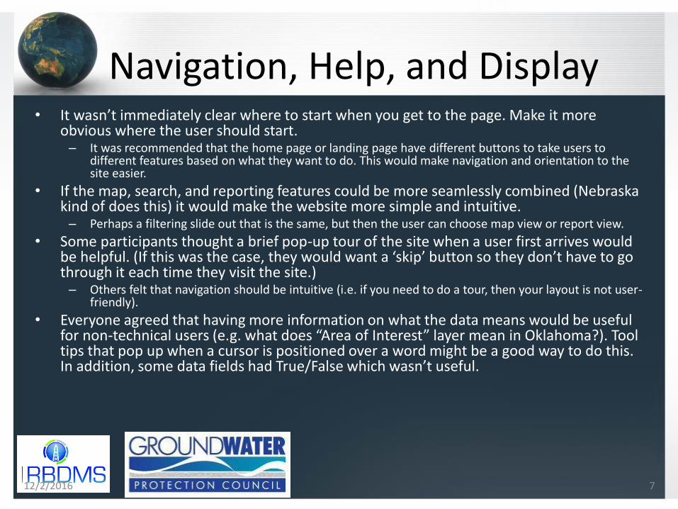
Navigation, Help, and Display• It wasn’t immediately clear where to start when you get to the page. Make it more
obvious where the user should start.– It was recommended that the home page or landing page have different buttons to take users to
different features based on what they want to do. This would make navigation and orientation to the site easier.
• If the map, search, and reporting features could be more seamlessly combined (Nebraska kind of does this) it would make the website more simple and intuitive.– Perhaps a filtering slide out that is the same, but then the user can choose map view or report view.
• Some participants thought a brief pop-up tour of the site when a user first arrives would be helpful. (If this was the case, they would want a ‘skip’ button so they don’t have to go through it each time they visit the site.)– Others felt that navigation should be intuitive (i.e. if you need to do a tour, then your layout is not user-
friendly).
• Everyone agreed that having more information on what the data means would be useful for non-technical users (e.g. what does “Area of Interest” layer mean in Oklahoma?). Tool tips that pop up when a cursor is positioned over a word might be a good way to do this. In addition, some data fields had True/False which wasn’t useful.
12/2/2016 7

Navigation, Help, and Display cont.
• Many participants did not even notice the help features and those that did find them thought they were too technical. They should be much more prominent.
• It was pointed out that best practice is to design for mobile first and then it will be accessible to other devices. With people bringing Surface tablets to conferences and using mobile phones to access websites, this is an important consideration.
• Speed and responsiveness of the map and queries are important.
• Users should be able to manipulate their view to display the features that are most useful to them (e.g. full screen map vs. search/query options).
12/2/2016 8
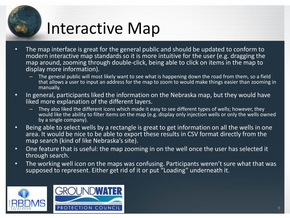
Interactive Map• The map interface is great for the general public and should be updated to conform to
modern interactive map standards so it is more intuitive for the user (e.g. dragging the map around, zooming through double-click, being able to click on items in the map to display more information).– The general public will most likely want to see what is happening down the road from them, so a field
that allows a user to input an address for the map to zoom to would make things easier than zooming in manually.
• In general, participants liked the information on the Nebraska map, but they would have liked more explanation of the different layers.– They also liked the different icons which made it easy to see different types of wells; however, they
would like the ability to filter items on the map (e.g. display only injection wells or only the wells owned by a single company).
• Being able to select wells by a rectangle is great to get information on all the wells in one area. It would be nice to be able to export these results in CSV format directly from the map search (kind of like Nebraska’s site).
• One feature that is useful: the map zooming in on the well once the user has selected it through search.
• The working well icon on the maps was confusing. Participants weren’t sure what that was supposed to represent. Either get rid of it or put “Loading” underneath it.
12/2/2016 9
Search Functionality• The search feature should explain which categories you can
search on (e.g. API number, company name, etc.). Without this information the user doesn’t know if (s)he is asking the right questions.– Participants found the Advanced Filter searches on the Arkansas and
Oklahoma websites more useful than the Nebraska search feature.
– Alternatively, if the search feature could function more like a Google search, it would return a lot more results.
• It was pointed out that it is frustrating to have to search by the API number since only industry and regulators would have such specifics.
12/2/2016 10
Data and Downloads• Lack of consistency in the data from state to state is a barrier.
• Researchers would like to interact with the data via 1) Bulk download through one click to get everything at once (e.g. all well information). 2) Queries where a user can limit the records returned. This is especially useful for users who can’t handle large file downloads. This would also help local officials who might only be interested in one county.
• Participants would like to see as much data on the public websites as possible. They want to decide for themselves what is useful and what isn’t. More data is always better.– They also want the data available to go as far back in time as possible.
– PDF’s are not very useful and they sometimes make journalists feel like the government is trying to make data analysis hard. This does not build trust in the regulatory agencies.
• On the reviewed websites, they found the tabs displaying the well-specific data easy to navigate.
12/2/2016 11
Data and Downloads cont.• Participants liked the data export options, especially Nebraska’s
where the user can just click an icon next to the search results. (Although the printer icon was confusing.)
• Participants said that CSV files were the most versatile option for downloads.
• There should be a date on the website displaying when the data was last updated, or this could be detailed in a metadata document.– Being able to easily download only the new data since the user’s last visit
could be accomplished by a user log-in system or a query by date of upload.– Email notifications when the data is updated would also be helpful. *
• California’s online data website was recommended as more user friendly and intuitive. Colorado’s website was also cited as a great way to get aggregate data. More information can be found in Appendix A / Public – citizens, media, community groups / Data and Downloads.
12/2/2016 12

Queries and Reports• These features should be more prominent so they are easily found.
• Don’t limit search results if at all possible. If limits have to be placed for speed considerations, make sure bulk downloads are available.
• Some participants would like to be able to have discreet queries without having to go to the map.
• A menu that allowed users to drill down to specific data would be useful (e.g. basic well information, production data, incidents, etc.)
• Predefined queries for “Frequently Searched Queries” and advanced searches would be helpful as long as it doesn’t overwhelm the user interface.
12/2/2016 13
Public Education• The EPA participants pointed out that these public facing
websites are a great opportunity to educate the public about oil and gas.
• One feature that was mentioned specifically was to improve the wellbore diagrams on Nebraska’s site with tool tips and by adding groundwater locations to show drinking water source in relation to the depth of the well.
12/2/2016 14