prof. anselm spoerriscils@rutgersmultimedia production course visual & web design – overview...
Post on 19-Dec-2015
220 views
TRANSCRIPT

Prof. Anselm SpoerriSCILS@Rutgers Multimedia Production Course
Visual & Web Design – Overview
Graphic Design Brief History of Graphic Design Education
Communication Model
Practical Foundation
Swiss Design School & Grid SystemTypography
Grid Construction
Grid System – Heuristics
Web DesignUser Behavior Design Implications Design Specifics
Summary
Requirements for Web Pages
Food for EyesColors MagazineMore Colors
Visual Essay AssignmentVisual Storytelling

Prof. Anselm SpoerriSCILS@Rutgers Multimedia Production Course
Graphic Design
Graphic Design– Brief History of Graphic Design Education– Communication Model– Practical Foundation– Swiss Design School & Grid System
Sources– Katherine McCoy, “Education in an Adolescent Profession”– Josef Mueller-Brockmann, “Grid Systems in graphic design”
Prof. Anselm SpoerriSCILS@Rutgers Multimedia Production Course
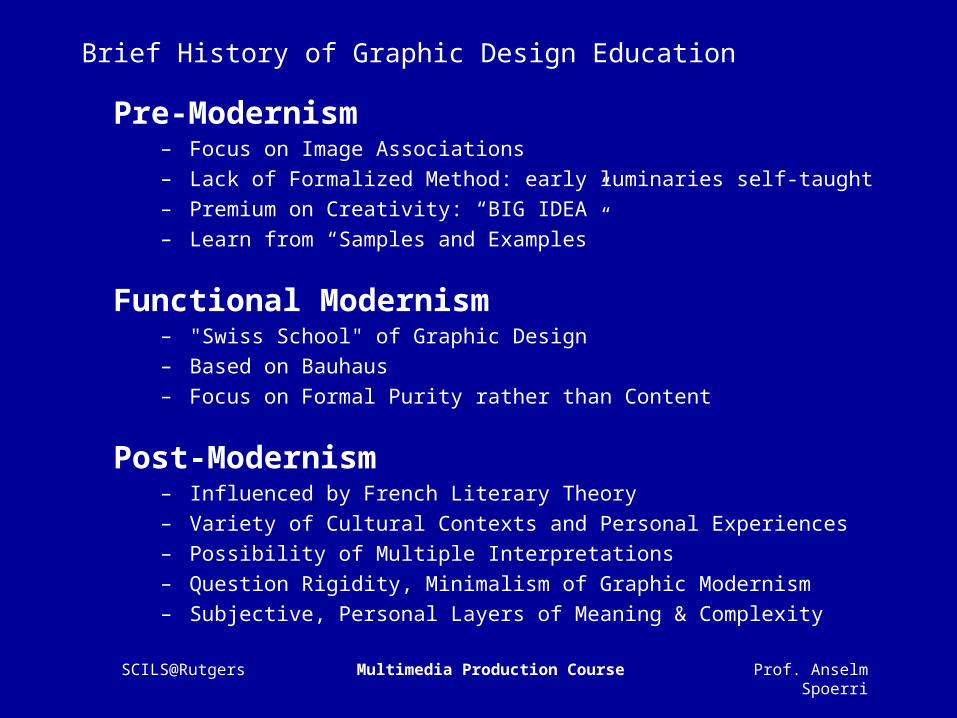
Brief History of Graphic Design Education
Pre-Modernism– Focus on Image Associations– Lack of Formalized Method: early luminaries self-taught– Premium on Creativity: “BIG IDEA”– Learn from “Samples and Examples”
Functional Modernism– "Swiss School" of Graphic Design– Based on Bauhaus– Focus on Formal Purity rather than Content
Post-Modernism– Influenced by French Literary Theory– Variety of Cultural Contexts and Personal Experiences– Possibility of Multiple Interpretations – Question Rigidity, Minimalism of Graphic Modernism – Subjective, Personal Layers of Meaning & Complexity

Prof. Anselm SpoerriSCILS@Rutgers Multimedia Production Course
Communication Model - Sender
Sender Transmitter ReceiverDesign School
Pre-Modernism Functional Modernism Post-Modernism
Guiding Discipline
Art Science Language
Focus on
Personal content and creativity
Systematic presentation of objective information
Audience's response due to different cultures and subjective experiences

Prof. Anselm SpoerriSCILS@Rutgers Multimedia Production Course
Communication Model - Transmitter
Sender Transmitter ReceiverDesign School
Pre-Modernism Functional Modernism Post-Modernism
Guiding Discipline
Art Science Language
Focus on
Personal content and creativity
Systematic presentation of objective information
Audience's response due to different cultures and subjective experiences
Prof. Anselm SpoerriSCILS@Rutgers Multimedia Production Course
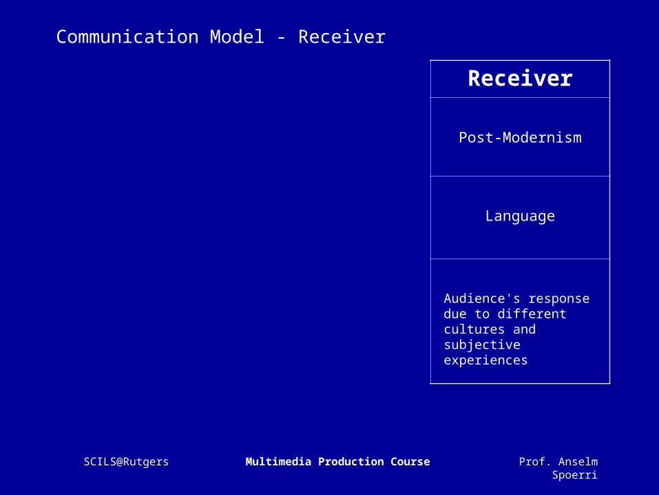
Communication Model - Receiver
Sender Transmitter ReceiverDesign School
Pre-Modernism Functional Modernism Post-Modernism
Guiding Discipline
Art Science Language
Focus on
Personal content and creativity
Systematic presentation of objective information
Audience's response due to different cultures and subjective experiences

Prof. Anselm SpoerriSCILS@Rutgers Multimedia Production Course
Communication Model
Sender Transmitter ReceiverDesign School
Pre-Modernism Functional Modernism Post-Modernism
Guiding Discipline
Art Science Language
Focus on
Personal content and creativity
Systematic presentation of objective information
Audience's response due to different cultures and subjective experiences

Prof. Anselm SpoerriSCILS@Rutgers Multimedia Production Course
Future of Graphic Design
Digital Communications Design – Different Design Strategy than Perfectionist Graphic Design– Less Control, More Conceptual, More Interaction– Users Co-Creators
Requires Deeper Understanding of the Communications Process
Combines Art, Science and Language
Needed Expertise– Multimedia Design: Visual Art, Music, Film– Communications Theory– Cognitive & Perceptual Psychology– Social Sciences & Cultural Anthropology– Computer Science

Prof. Anselm SpoerriSCILS@Rutgers Multimedia Production Course
Practical Graphic Design
Graphic Design = Organic Process– Cultural, Contextual, Personal– Client & Designer Interaction
Good Design is “Stolen”– Emulate what speaks to you
Need Practical Foundation– Functional Swiss Design School– Grid Systems

Prof. Anselm SpoerriSCILS@Rutgers Multimedia Production Course
Swiss Design School
Based on Bauhaus– Form follows Function – Minimalism, Universality, Rationality, Abstraction and Structure
Focus on Formal Purity rather than Content
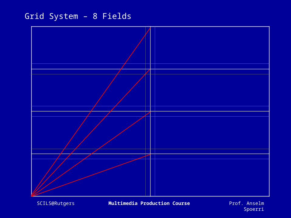
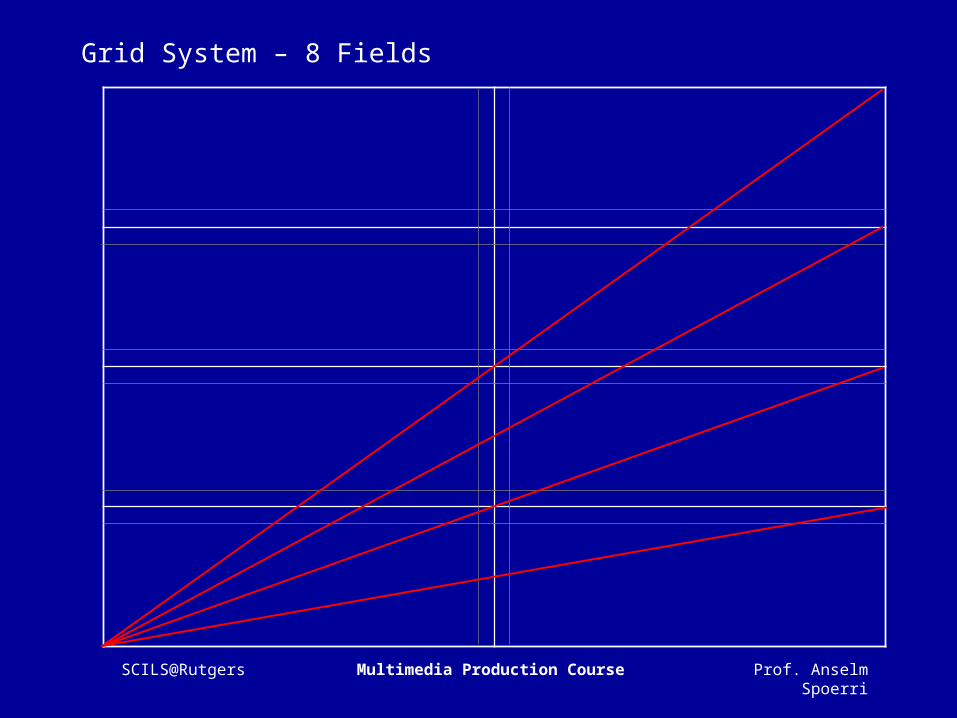
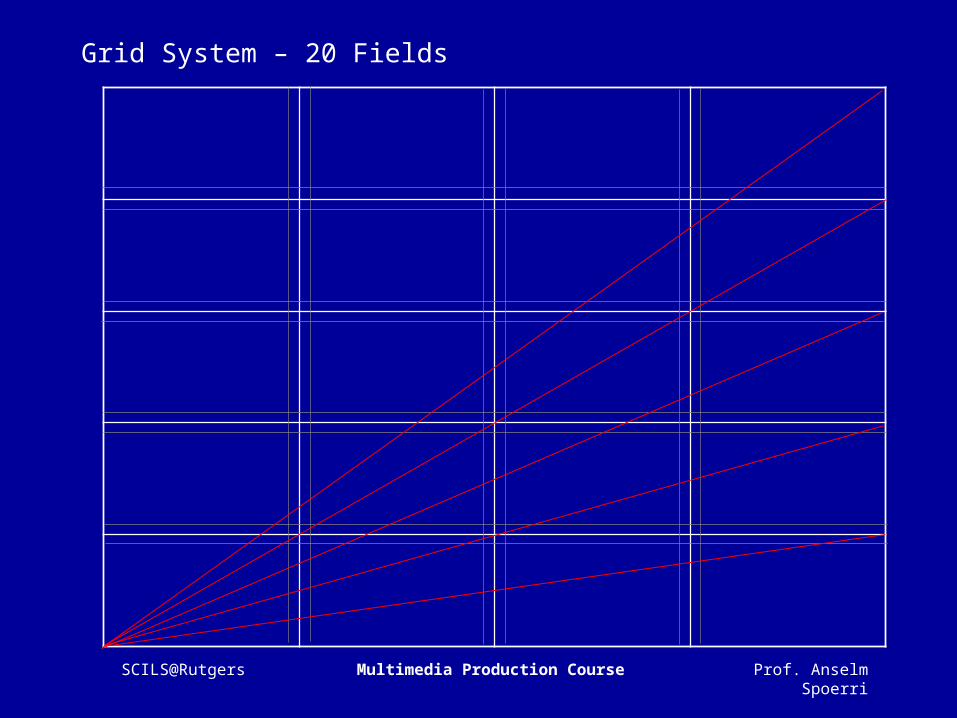
Grid System– Divide 2-D plane or 3-D space into Smaller Fields– Intermediate Space so that Captions and Pictures Don’t Touch

Prof. Anselm SpoerriSCILS@Rutgers Multimedia Production Course
Grid System – 8 Fields Example

Prof. Anselm SpoerriSCILS@Rutgers Multimedia Production Course
Grid System – 8 Fields Example
The great Swiss innovators of the 1950s and 1960s
can be seen as representing the classic phase of
modernism, the heirs to Bauhaus graphic design
and other early modern European graphic
designers. These Swiss innovators applied the
Bauhaus functionalist ethic to a systematic graphic
method that shared the Bauhaus values of
minimalism, universality, rationality, abstraction
and structural expressionism. This fresh and highly
professional graphic design was first transmitted
beyond Switzerland to the rest of Europe and the
U.S. through Swiss design magazines and a few
books, notably Graphis and the "Swiss" bibles by
Muller-Brockmann, Gertsner, Hoffmann and Ruder.
Then, in the late 1960s, several professional offices
began to practice these ideas to solve the needs of
large corporate clients in Holland, Great Britain,
Canada and the U.S.
The method, symbolized by the typeface Helvetica,
was enthusiastically adopted by several corporate
and institutional design groups, including Container
Corporation, Ciba-Geigy, Herman Miller, IBM and
Massachusetts Institute of Technology. Montreal's
Expo '67 was a feast of Helvetica and systematic
environmental signage, as well as advanced
architecture. Eventually, American corporate culture
embraced "Swiss" school graphic design as the ideal
corporate style. Although "Swiss" graphic design was
first adopted in U.S. by professionals in their design
practices, soon several leading U.S. graphic design
schools followed suit, going directly to the source.
Caption Text
Swiss Design School

Prof. Anselm SpoerriSCILS@Rutgers Multimedia Production Course
Grid System – 8 Fields Example
Swiss Design School
Caption Text
The method, symbolized by the typeface Helvetica,
was enthusiastically adopted by several corporate
and institutional design groups, including Container
Corporation, Ciba-Geigy, Herman Miller, IBM and
Massachusetts Institute of Technology. Montreal's
Expo '67 was a feast of Helvetica and systematic
environmental signage, as well as advanced
architecture. Eventually, American corporate culture
embraced "Swiss" school graphic design as the ideal
corporate style. Although "Swiss" graphic design was
first adopted in U.S. by professionals in their design
practices, soon several leading U.S. graphic design
schools followed suit, going directly to the source.
The great Swiss innovators of the 1950s and 1960s
can be seen as representing the classic phase of
modernism, the heirs to Bauhaus graphic design
and other early modern European graphic
designers. These Swiss innovators applied the
Bauhaus functionalist ethic to a systematic graphic
method that shared the Bauhaus values of
minimalism, universality, rationality, abstraction
and structural expressionism. This fresh and highly
professional graphic design was first transmitted
beyond Switzerland to the rest of Europe and the
U.S. through Swiss design magazines and a few
books, notably Graphis and the "Swiss" bibles by
Muller-Brockmann, Gertsner, Hoffmann and Ruder.
Then, in the late 1960s, several professional offices
began to practice these ideas to solve the needs of
large corporate clients in Holland, Great Britain,
Canada and the U.S.

Prof. Anselm SpoerriSCILS@Rutgers Multimedia Production Course
Grid System - Motivation
Solve Visual Problems with Greater Speed & Confidence
Maintain Consistency– Title Location– Annotations Location– Image Rhythm
Create Visual Hierarchy & Rhythm
Invisible Guiding Hand
Information Presented Clearly & Logically – Read More Quickly– Understood Better– Better Recall
Prof. Anselm SpoerriSCILS@Rutgers Multimedia Production Course
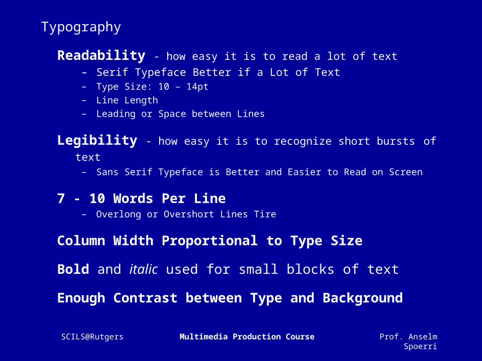
Typography
Readability - how easy it is to read a lot of text– Serif Typeface Better if a Lot of Text– Type Size: 10 – 14pt– Line Length– Leading or Space between Lines
Legibility - how easy it is to recognize short bursts of text – Sans Serif Typeface is Better and Easier to Read on Screen
7 - 10 Words Per Line– Overlong or Overshort Lines Tire
Column Width Proportional to Type Size
Bold and italic used for small blocks of text
Enough Contrast between Type and Background

Prof. Anselm SpoerriSCILS@Rutgers Multimedia Production Course
Grid Construction
Need to Know How Much Text and How Many Images to Be Placed
Each Work Raises Many Questions– How Many Columns?– White Space and Margins Have Visual Function?– Annotations, Footnotes, Captions?– Large and Small Images? How Many?
Each Work Requires its Own Specific Grid– Create Small Sketch– Number of Columns Depends on Type Size– Wider Columns Need Larger Type Size than Narrow Columns
Prof. Anselm SpoerriSCILS@Rutgers Multimedia Production Course
Grid System – 8 Fields
Prof. Anselm SpoerriSCILS@Rutgers Multimedia Production Course
Grid System – 8 Fields
Prof. Anselm SpoerriSCILS@Rutgers Multimedia Production Course
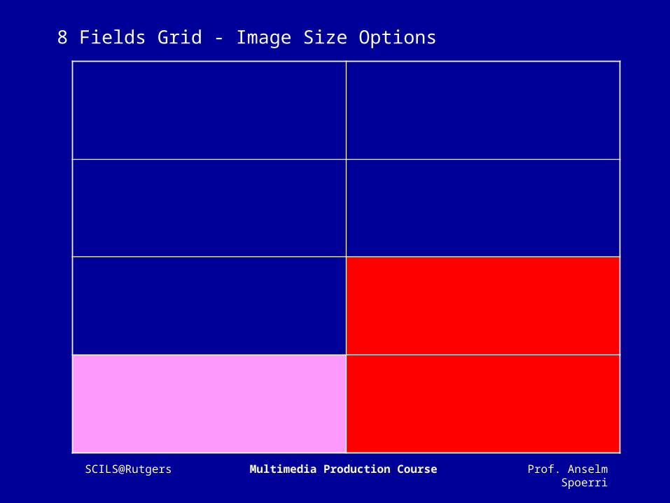
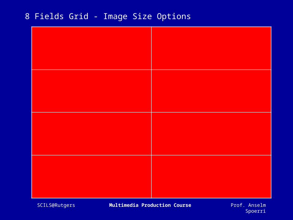
8 Fields Grid - Image Size Options

Prof. Anselm SpoerriSCILS@Rutgers Multimedia Production Course
8 Fields Grid - Image Size Options

Prof. Anselm SpoerriSCILS@Rutgers Multimedia Production Course
8 Fields Grid - Image Size Options

Prof. Anselm SpoerriSCILS@Rutgers Multimedia Production Course
8 Fields Grid - Image Size Options

Prof. Anselm SpoerriSCILS@Rutgers Multimedia Production Course
8 Fields Grid - Image Size Options
Prof. Anselm SpoerriSCILS@Rutgers Multimedia Production Course
8 Fields Grid - Image Size Options
Prof. Anselm SpoerriSCILS@Rutgers Multimedia Production Course
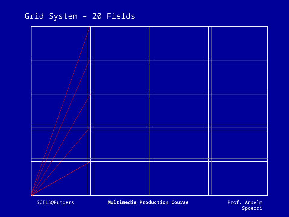
Grid System – 20 Fields

Prof. Anselm SpoerriSCILS@Rutgers Multimedia Production Course
Grid System – 20 Fields

Prof. Anselm SpoerriSCILS@Rutgers Multimedia Production Course
Grid System – 20 Fields
Prof. Anselm SpoerriSCILS@Rutgers Multimedia Production Course
Grid System – 20 Fields
Prof. Anselm SpoerriSCILS@Rutgers Multimedia Production Course
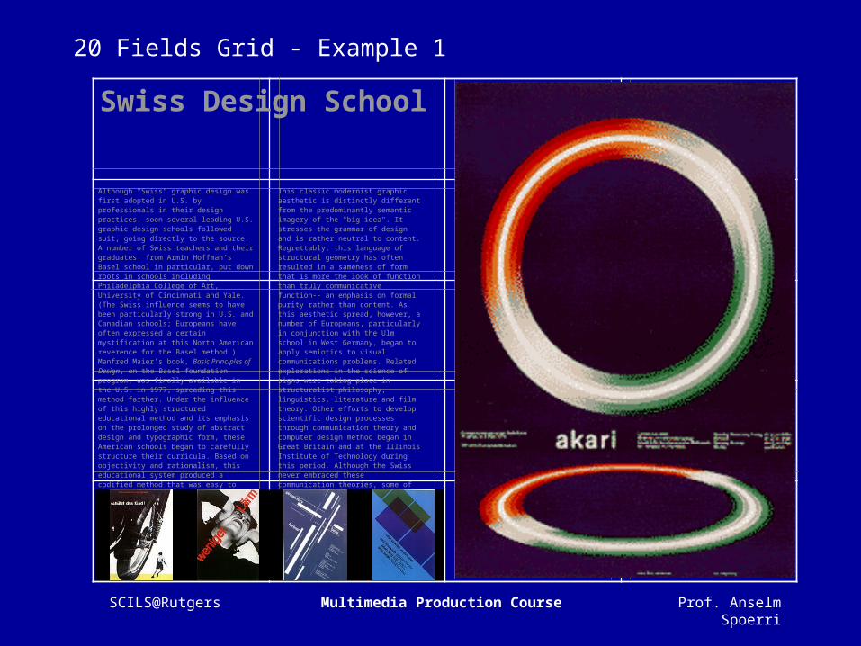
20 Fields Grid - Example 1
Although "Swiss" graphic design was first adopted in U.S. by professionals in their design practices, soon several leading U.S. graphic design schools followed suit, going directly to the source. A number of Swiss teachers and their graduates, from Armin Hoffman's Basel school in particular, put down roots in schools including Philadelphia College of Art, University of Cincinnati and Yale. (The Swiss influence seems to have been particularly strong in U.S. and Canadian schools; Europeans have often expressed a certain mystification at this North American reverence for the Basel method.) Manfred Maier's book, Basic Principles of Design, on the Basel foundation program, was finally available in the U.S. in 1977, spreading this method farther. Under the influence of this highly structured educational method and its emphasis on the prolonged study of abstract design and typographic form, these American schools began to carefully structure their curricula. Based on objectivity and rationalism, this educational system produced a codified method that was easy to communicate to students, giving them a foundation for a visual design process and composition ..
This classic modernist graphic aesthetic is distinctly different from the predominantly semantic imagery of the "big idea". It stresses the grammar of design and is rather neutral to content. Regrettably, this language of structural geometry has often resulted in a sameness of form that is more the look of function than truly communicative function-- an emphasis on formal purity rather than content. As this aesthetic spread, however, a number of Europeans, particularly in conjunction with the Ulm school in West Germany, began to apply semiotics to visual communications problems. Related explorations in the science of signs were taking place in structuralist philosophy, linguistics, literature and film theory. Other efforts to develop scientific design processes through communication theory and computer design method began in Great Britain and at the Illinois Institute of Technology during this period. Although the Swiss never embraced these communication theories, some of the sounder graphic design schools outside Switzerland have gradually begun to incorporate theory into their curricula …
Swiss Design School

Prof. Anselm SpoerriSCILS@Rutgers Multimedia Production Course
20 Fields Grid - Example 2
Although "Swiss" graphic design was first adopted in U.S. by professionals in their design practices, soon several leading U.S. graphic design schools followed suit, going directly to the source. A number of Swiss teachers and their graduates, from Armin Hoffman's Basel school in particular, put down roots in schools including Philadelphia College of Art, University of Cincinnati and Yale.
Swiss Design School
(The Swiss influence seems to have been particularly strong in U.S. and Canadian schools; Europeans have often expressed a certain mystification at this North American reverence for the Basel method.) Manfred Maier's book, Basic Principles of Design, on the Basel foundation program, was finally available in the U.S. in 1977, spreading this method farther.
Under the influence of this highly structured educational method and its emphasis on the prolonged study of abstract design and typographic form, these American schools began to carefully structure their curricula. Based on objectivity and rationalism, this educational system produced a codified method that was easy to communicate to students, giving them a foundation for a
visual design process and composition that went far beyond the superficial emulation of their heroes.This classic modernist graphic aesthetic is distinctly different from the predominantly semantic imagery of the "big idea". It stresses the grammar of design and is rather neutral to content.
Poster Designs byJosef Muller-Brockmann
Caption describing the poster designs. When they were created. Who the client was and their effectiveness.

Prof. Anselm SpoerriSCILS@Rutgers Multimedia Production Course
20 Fields Grid - Example 2a
Swiss Design School
Poster Designs byJosef Muller-Brockmann
Caption describing the poster designs. When they were created. Who the client was and their effectiveness.
Although "Swiss" graphic design was first adopted in U.S. by professionals in their design practices, soon several leading U.S. graphic design schools followed suit, going directly to the source. A number of Swiss teachers and their graduates, from Armin Hoffman's Basel school in particular, put down roots in schools including Philadelphia College of Art, University of Cincinnati and Yale.
(The Swiss influence seems to have been particularly strong in U.S. and Canadian schools; Europeans have often expressed a certain mystification at this North American reverence for the Basel method.) Manfred Maier's book, Basic Principles of Design, on the Basel foundation program, was finally available in the U.S. in 1977, spreading this method farther.
Under the influence of this highly structured educational method and its emphasis on the prolonged study of abstract design and typographic form, these American schools began to carefully structure their curricula. Based on objectivity and rationalism, this educational system produced a codified method that was easy to communicate to students, giving them a foundation for a
visual design process and composition that went far beyond the superficial emulation of their heroes.This classic modernist graphic aesthetic is distinctly different from the predominantly semantic imagery of the "big idea". It stresses the grammar of design and is rather neutral to content.

Prof. Anselm SpoerriSCILS@Rutgers Multimedia Production Course
Grid System – Heuristics
One Column– Little Freedom for Pictures in Small, Medium and Large Size
Two Columns– Text can go in First Column– Illustrations, Images in the Second Column– Text and Images can be Placed in Same Column
Three Columns– Variety of Ways of Placing Text and Graphics
Four Columns– If a lot of Text or Images Need to be Placed– Statistics with Copious Figures and Graphs– Can be Subdivided into 8 or 16 columns

Prof. Anselm SpoerriSCILS@Rutgers Multimedia Production Course
Web Guiding Principles
Diversity of Users & Rapid Change– Diverse users, diverse computers, diverse skills, diverse …– Rapid evolution of technology and expectations– Short attention span
Common Sense– No right way to design
Make it short– More likely to be used and remembered– Cut in ½ and cut in ½ again
Don't make me think– Get rid of question marks - each item has clear purpose
Make it work at a glance– People have little time
Support intented task - manage expectations

Prof. Anselm SpoerriSCILS@Rutgers Multimedia Production Course
Basic Design Principles
Alignment– Don't Mix Alignment Styles - Simplicity– Create Sufficient Left Margin– Constrain Total Width of Page
Proximity– Related Things Close Together
– Spatial Separation = Conceptual Separation
Repetition & Consistency– Grid Layout, Navigation, Graphics Color Coding, Typeface– Creates Ease of Use
Contrast– Bigger, Bolder, Color, Spatial Distance– Guide the Eye and Create Visual Hierarchy

Prof. Anselm SpoerriSCILS@Rutgers Multimedia Production Course
User Behavior
Scan pages - don't read them
Look for anything = Search Interest Decide quickly Choose first “reasonable item”
Muddle through Don't figure out how things work Resist forming models
Stick to what works
Prof. Anselm SpoerriSCILS@Rutgers Multimedia Production Course
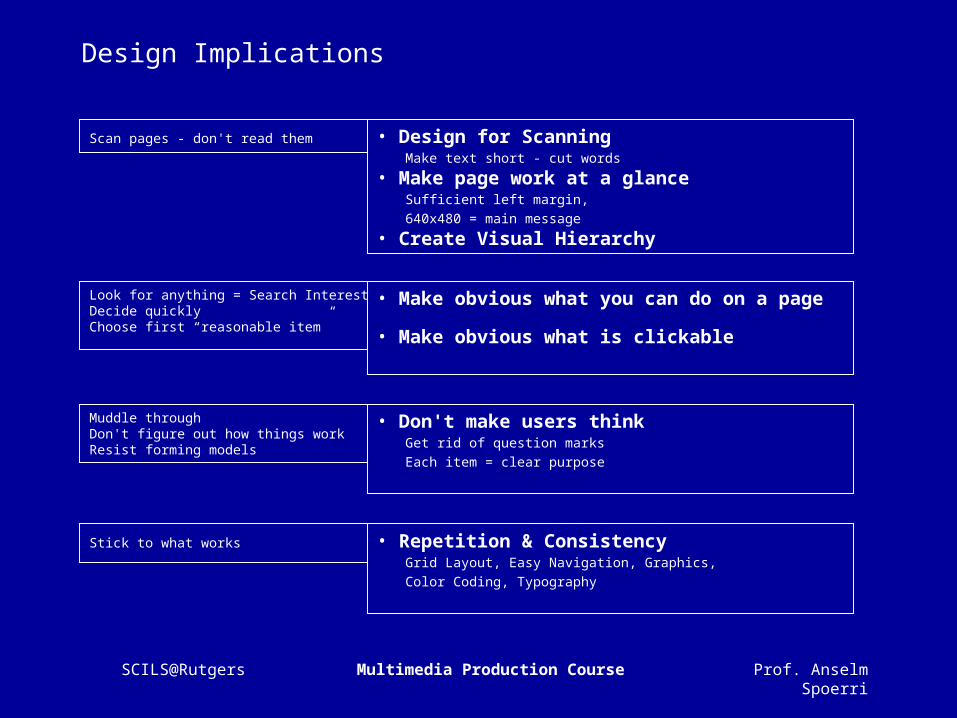
Design Implications
Scan pages - don't read them • Design for Scanning Make text short - cut words • Make page work at a glance Sufficient left margin, 640x480 = main message
• Create Visual Hierarchy
Look for anything = Search Interest Decide quickly Choose first “reasonable item”
• Make obvious what you can do on a page
• Make obvious what is clickable
Muddle through Don't figure out how things work Resist forming models
• Don't make users think Get rid of question marks Each item = clear purpose
Stick to what works • Repetition & Consistency Grid Layout, Easy Navigation, Graphics, Color Coding, Typography
Prof. Anselm SpoerriSCILS@Rutgers Multimedia Production Course
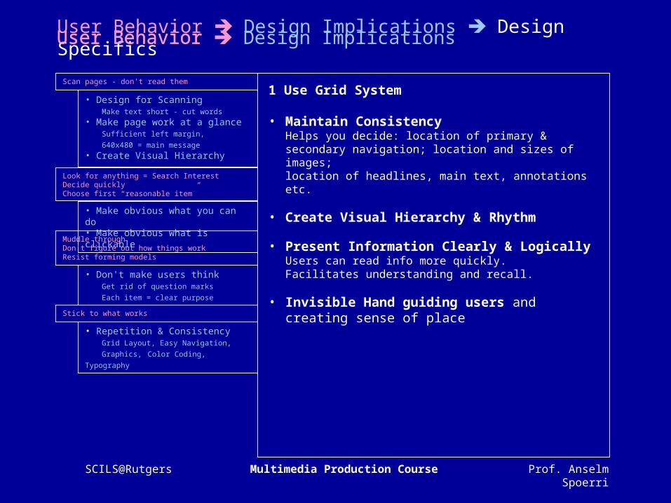
User Behavior Design Implications Design Specifics
1 Use Grid System
• Maintain ConsistencyHelps you decide: location of primary & secondary navigation; location and sizes of images; location of headlines, main text, annotations etc.
• Create Visual Hierarchy & Rhythm
• Present Information Clearly & LogicallyUsers can read info more quickly.Facilitates understanding and recall.
• Invisible Hand guiding users and creating sense of place
• Design for Scanning Make text short - cut words • Make page work at a glance Sufficient left margin, 640x480 = main message• Create Visual Hierarchy
• Make obvious what you can do • Make obvious what is clickable
• Don't make users think Get rid of question marks
Each item = clear purpose
• Repetition & Consistency Grid Layout, Easy Navigation,
Graphics, Color Coding, Typography
User Behavior Design ImplicationsUser Behavior Design Implications Design Specifics
Scan pages - don't read them
Look for anything = Search Interest Decide quickly Choose first “reasonable item”
Muddle through Don't figure out how things work Resist forming models
Stick to what works
User Behavior

Prof. Anselm SpoerriSCILS@Rutgers Multimedia Production Course
User Behavior Design Implications Design Specifics
2 Create Visual Hierarchy & Guide Eye
• Important Things = Visually Prominent(More Important = Larger / Sharp Contrast)Use headlines to guide the eye
• Visual ContrastUse sharp changes in size (headline), light intensity (bold), color, texture, motion to create contrast.
• Proximity: related things spatially closeSpatial separation = conceptual separation.Don't mix alignment styles.
• Use Grouping & Nesting to Increase Information Density (Short-term Memory = 3-7)Use bounding shapes.
• Design for Scanning Make text short - cut words • Make page work at a glance Sufficient left margin, 640x480 = main message• Create Visual Hierarchy
• Make obvious what you can do • Make obvious what is clickable
• Don't make users think Get rid of question marks
Each item = clear purpose
• Repetition & Consistency Grid Layout, Easy Navigation,
Graphics, Color Coding, Typography
User Behavior Design ImplicationsUser Behavior Design Implications Design Specifics
Scan pages - don't read them
Look for anything = Search Interest Decide quickly Choose first “reasonable item”
Muddle through Don't figure out how things work Resist forming models
Stick to what works
User Behavior
Prof. Anselm SpoerriSCILS@Rutgers Multimedia Production Course
User Behavior Design Implications Design Specifics
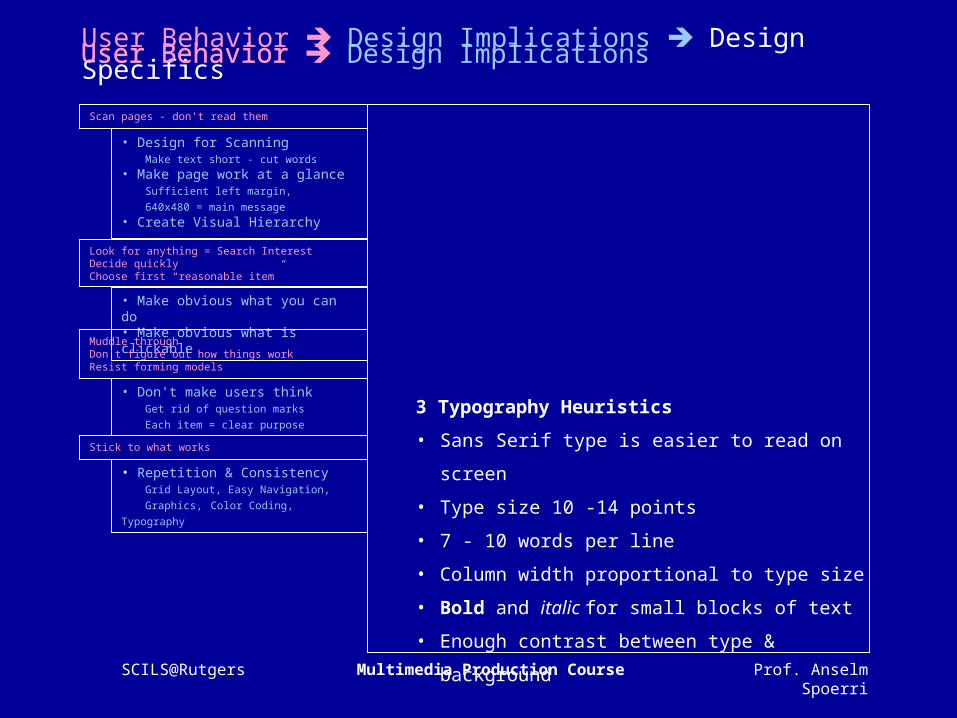
3 Typography Heuristics
• Sans Serif type is easier to read on screen
• Type size 10 -14 points
• 7 - 10 words per line
• Column width proportional to type size
• Bold and italic for small blocks of text
• Enough contrast between type & background
• Design for Scanning Make text short - cut words • Make page work at a glance Sufficient left margin, 640x480 = main message• Create Visual Hierarchy
• Make obvious what you can do • Make obvious what is clickable
• Don't make users think Get rid of question marks
Each item = clear purpose
• Repetition & Consistency Grid Layout, Easy Navigation,
Graphics, Color Coding, Typography
User Behavior Design ImplicationsUser Behavior Design Implications Design Specifics
Scan pages - don't read them
Look for anything = Search Interest Decide quickly Choose first “reasonable item”
Muddle through Don't figure out how things work Resist forming models
Stick to what works
User Behavior

Prof. Anselm SpoerriSCILS@Rutgers Multimedia Production Course
User Behavior Design Implications Design Specifics
1 Use Grid System• Maintain Consistency
Helps you decide: location of primary & secondary navigation; location and sizes of images; location of headlines, main text, annotations etc.
• Create Visual Hierarchy & Rhythm • Present Information Clearly & Logically
Users can read info more quickly.Facilitates understanding and recall.
• Invisible Hand guiding users and creating sense of place
2 Create Visual Hierarchy & Guide Eye • Important Things = Visually Prominent
(More Important = Larger / Sharp Contrast)Use headlines to guide the eye
• Visual ContrastUse sharp changes in size (headline), light intensity (bold), color, texture, motion to create contrast.
• Proximity: related things spatially close.Spatial separation = conceptual separation.Don't mix alignment styles.
• Use Grouping & Nesting to Increase Information Density (Short-term Memory = 3-7)Use bounding shapes.
3 Typography Heuristics • Sans Serif type is easier to read on screen • Type size 10 -14 points • 7 - 10 words per line • Column width proportional to type size • Bold and italic used for small blocks of text • Enough contrast between type and background
• Design for Scanning Make text short - cut words • Make page work at a glance Sufficient left margin, 640x480 = main message• Create Visual Hierarchy
• Make obvious what you can do • Make obvious what is clickable
• Don't make users think Get rid of question marks
Each item = clear purpose
• Repetition & Consistency Grid Layout, Easy Navigation,
Graphics, Color Coding, Typography
User Behavior Design ImplicationsUser Behavior Design Implications Design Specifics
Scan pages - don't read them
Look for anything = Search Interest Decide quickly Choose first “reasonable item”
Muddle through Don't figure out how things work Resist forming models
Stick to what works
User Behavior
Prof. Anselm SpoerriSCILS@Rutgers Multimedia Production Course
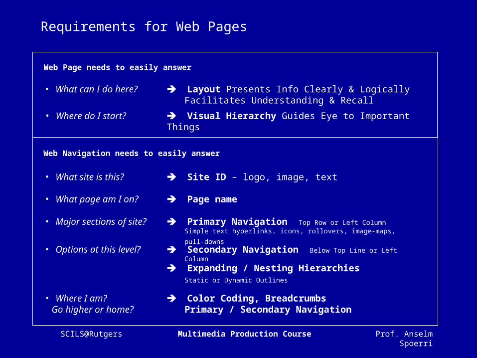
Requirements for Web Pages
Layout Presents Info Clearly & LogicallyFacilitates Understanding & Recall
Visual Hierarchy Guides Eye to Important Things• Where do I start?
• What can I do here?
• What site is this?
• What page am I on?
• Options at this level?
• Where I am? Go higher or home?
• Major sections of site?
Web Page needs to easily answer
Web Navigation needs to easily answer
Site ID – logo, image, text
Page name
Primary Navigation Top Row or Left Column
Simple text hyperlinks, icons, rollovers, image-maps, pull-downs
Secondary Navigation Below Top Line or Left Column
Expanding / Nesting Hierarchies Static or Dynamic Outlines
Color Coding, BreadcrumbsPrimary / Secondary Navigation
Prof. Anselm SpoerriSCILS@Rutgers Multimedia Production Course
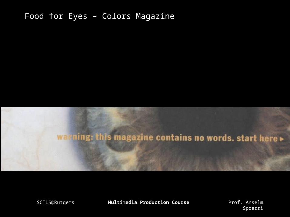
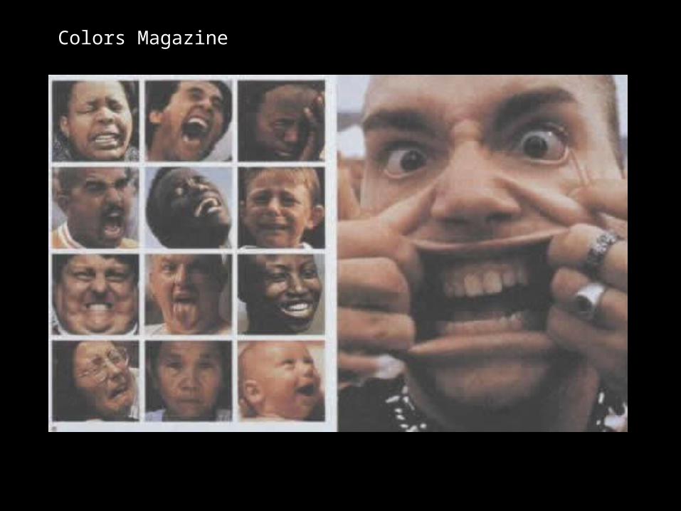
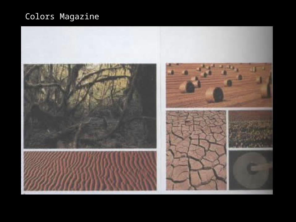
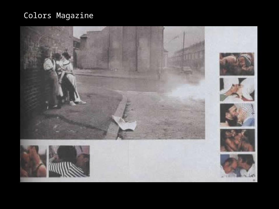
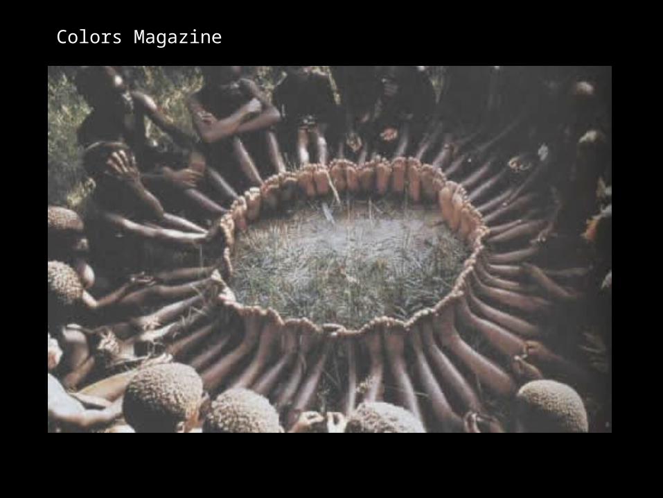
Food for Eyes – Colors Magazine

Prof. Anselm SpoerriSCILS@Rutgers Multimedia Production Course
Color Magazine

Prof. Anselm SpoerriSCILS@Rutgers Multimedia Production Course
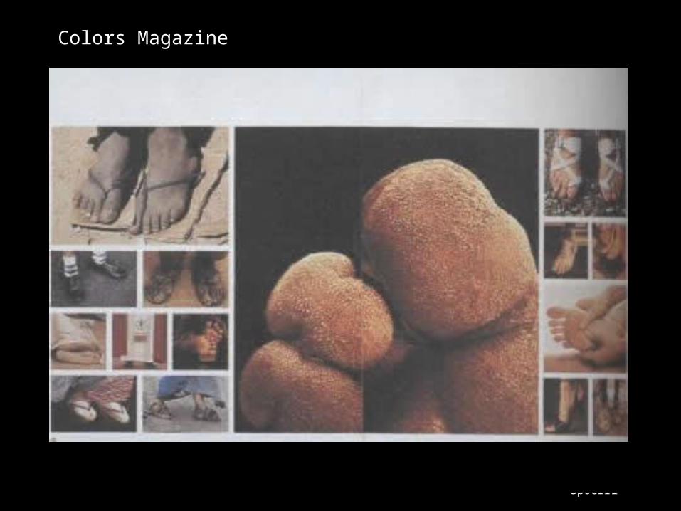
Colors Magazine
Prof. Anselm SpoerriSCILS@Rutgers Multimedia Production Course
Colors Magazine

Prof. Anselm SpoerriSCILS@Rutgers Multimedia Production Course
Colors Magazine

Prof. Anselm SpoerriSCILS@Rutgers Multimedia Production Course
Colors Magazine
Prof. Anselm SpoerriSCILS@Rutgers Multimedia Production Course
Colors Magazine
Prof. Anselm SpoerriSCILS@Rutgers Multimedia Production Course
Colors Magazine

Prof. Anselm SpoerriSCILS@Rutgers Multimedia Production Course
Colors Magazine

Prof. Anselm SpoerriSCILS@Rutgers Multimedia Production Course
Colors Magazine

Prof. Anselm SpoerriSCILS@Rutgers Multimedia Production Course
Colors Magazine
Prof. Anselm SpoerriSCILS@Rutgers Multimedia Production Course
Colors Magazine

Prof. Anselm SpoerriSCILS@Rutgers Multimedia Production Course
Colors Magazine

Prof. Anselm SpoerriSCILS@Rutgers Multimedia Production Course
Colors Magazine
Prof. Anselm SpoerriSCILS@Rutgers Multimedia Production Course
Colors Magazine
Prof. Anselm SpoerriSCILS@Rutgers Multimedia Production Course
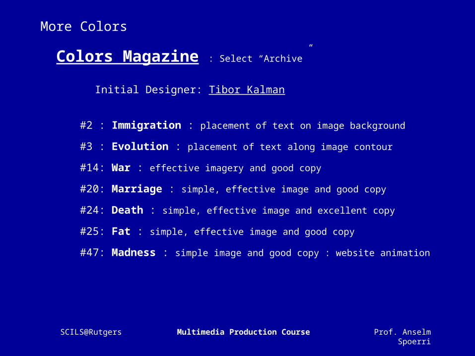
More Colors
Colors Magazine : Select “Archive”
Initial Designer: Tibor Kalman
#2 : Immigration : placement of text on image background
#3 : Evolution : placement of text along image contour
#14: War : effective imagery and good copy
#20: Marriage : simple, effective image and good copy
#24: Death : simple, effective image and excellent copy
#25: Fat : simple, effective image and good copy
#47: Madness : simple image and good copy : website animation

Prof. Anselm SpoerriSCILS@Rutgers Multimedia Production Course
Visual Essay - Goal
Visual Storytelling
Visualize idea you want to communicate
Create Layout of images & limited text that "tells visual story”
Create layouts with clear Visual Hierarchy & good rhythm
Ask: What is most important?
Images = "adjectives“ in story
– Close ups, Faces, Detail, Shows action, Matching reaction
Make sure that key idea is visible “above the fold” (640x480 area)
Introduce pauses in your animated GIFs.
Can use several animated GIFs to guide the eye across page
Prof. Anselm SpoerriSCILS@Rutgers Multimedia Production Course
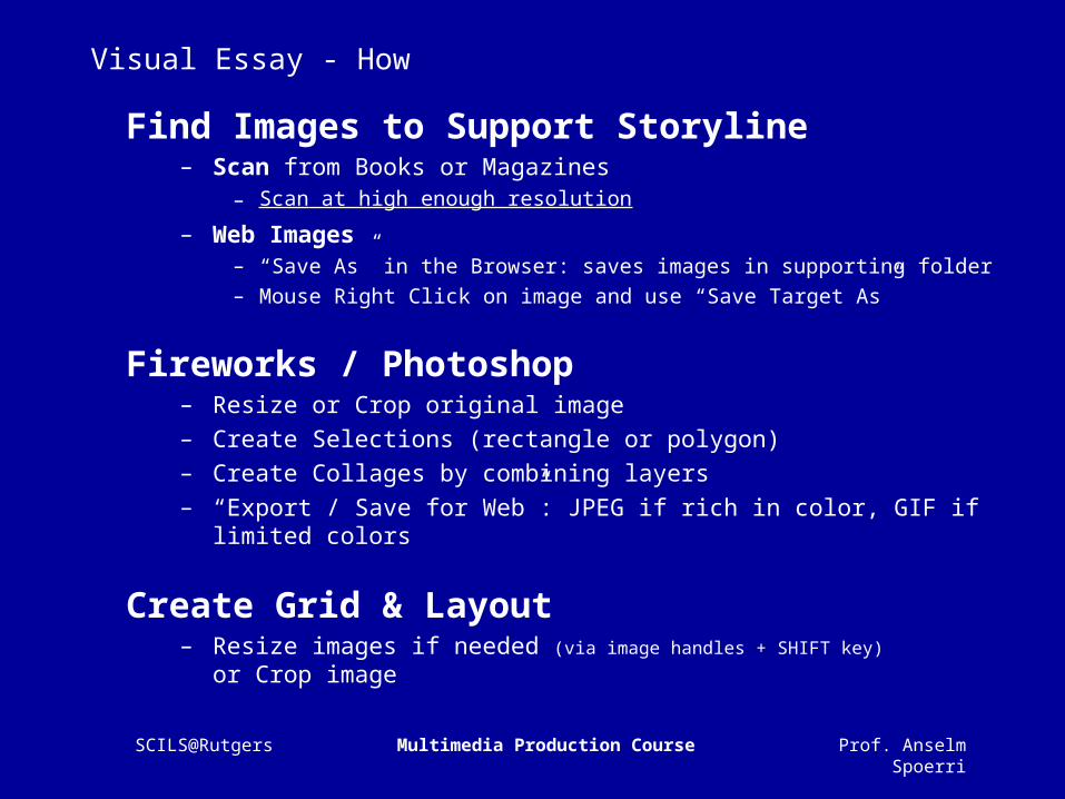
Visual Essay - How
Find Images to Support Storyline– Scan from Books or Magazines
– Scan at high enough resolution
– Web Images– “Save As” in the Browser: saves images in supporting folder– Mouse Right Click on image and use “Save Target As”
Fireworks / Photoshop– Resize or Crop original image– Create Selections (rectangle or polygon)– Create Collages by combining layers– “Export / Save for Web”: JPEG if rich in color, GIF if limited colors
Create Grid & Layout– Resize images if needed (via image handles + SHIFT key)
or Crop image