presentation4
TRANSCRIPT

Throughout my magazine I used a lot of programmes to complete my final product. One of which was particularly useful, was that of photoshop as it was ideal for editing photos quickly. For example I used the lasso tool when cutting around my photographs, it was effective because it was quick and simple, resulting in me saving time and my magazine looking more professional. I firstly used to magic wand tool to get rid of most of the background, but then used the lasso tool to get the finer details with the straight edge.
BEFORE
AFTER
PHOTOSHOP

Photoshop also helped me enhance my photos to the very best. For my font cover I raised the contrast to make it more appealing to the eye, highlighting every detail, but I also decreased the saturation to give it a more vintagey look which I think works well as it's a bit different as it's striking because it's not black and white, but it still has some colour it it which I think grabs the readers attention. I also combined the use of props by using a gutair, as I think it highlights the fact its a music magazine, but it also gives it a more professional look, but also adding variation to my photographs.
PHOTOSHOP

When taking my photographs, I feel I wasn't particularly adventurous in the way I didn't use many techniques when taking them. I didn't really use any particular lighting or background, as I was more interested in the pose of the model, with the prop of the guitar and the style/fashion of them. Although I did play around with the use of different angles and produced more appealing photographs than if I hadn't, such as the angle of the one on the left of the article page. Although I did heavily rely on a lot of editing and filters, mainly on photoshop, such as raising the brightness which could have been avoided if I had looked into lighting/lamps.
PHOTOGRAPHY
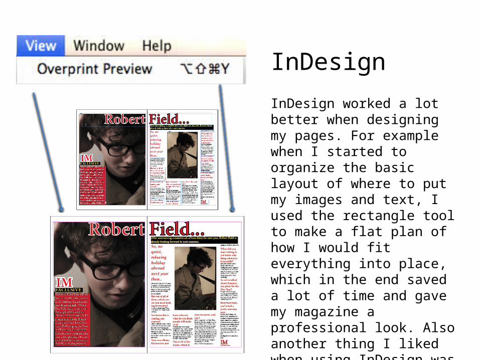
InDesign worked a lot better when designing my pages. For example when I started to organize the basic layout of where to put my images and text, I used the rectangle tool to make a flat plan of how I would fit everything into place, which in the end saved a lot of time and gave my magazine a professional look. Also another thing I liked when using InDesign was that I was able to preview my magazine without all the box outlines so I could easily see free space and it was easier to re-arrange things when needed.
InDesign

On my cover magazine mainly, but also in my article I used to stroke tool quite a lot. It worked really well because it made my magazine more attractive and eye catching but it also helped with clarity. The black, bold stroke around the red/white helped emphasize words and capture the audiences eye. It also created a really nice contrast against the light background of the photo.
InDesign