presentation2 re-design a website
TRANSCRIPT

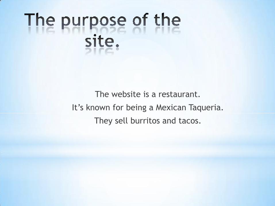
The website is a restaurant.
It’s known for being a Mexican Taqueria.
They sell burritos and tacos.

There is no specific audience.
It’s for everyone.


HOME ABOUT MENU LOCATIONS SHOP CONTACT
GORDOTAQUERIA
OPEN
10am-10pm
Slideshow of the
restaurant and
costumers!!!!!!!
Serving the
Bay Area
since 1977

Navigating Home, Menu, and About are the
important ones. Well, because they hold all the
important information.
Menu: has products and prices.
About: has media, history, shop, awards, outside
lands, and FAQs.
Home: lets you get to the information fast.

There is a hierarchy of info. in both websites.
The hierarchy of info. in the website I was designing starts
at the center of the page. The logo to me seems to be the
highest, then followed by the picture of the restaurant.

The hierarchy of info. in the website starts with the pictures and
then it’s followed by the logo.

The hierarchy will affect the design because the
hierarchy changes where you look first. Also, now that
it has been redesign, it will make people focus on the
the restaurant and its logo. Before it was just showing
the logo and pictures.
