power bi desktop lab - maner solutions · power bi desktop lab this is a hands on lab for users...
TRANSCRIPT

POWER BI DESKTOP LAB
This is a hands on lab for users that have little or no experience with Power BI. We will go through a guided
exercise to create a report for the factious company Mom & Pop Promotions LLC. While this exercise will focus
on sales data, Power BI is useful for analyzing any kind of data. From Membership trends to Gross Margin
analysis to geographic studies. Power BI helps sort through mountains of data to create an interactive report so
stakeholders can gain useful insights into their organization.
This session will only touch on a few of the numerous features available in this powerful free reporting tool
available at https://powerbi.microsoft.com/en-us/downloads/. To take full advantage of Power BI and share
your reports and dashboards online with others in your organization you will need Power BI Pro. Power BI Pro is
the online companion to the desktop version and is available for a fee as part of Office 365.
Today we will create the following report:

2
Overview
Attaching Data
Navigation
Relationships
Data View
Edit Queries
Reports
If We Had More Time / Try it at Home - Hierarchies
Attaching Data
From the main menu choose Get Data, then select More… at the bottom of the window. Use the scroll bar to
review the options.

3
Getting data from Excel. Choose Excel from the Get Data menu. On the desktop there is a folder called Maner
Lab. Inside are 4 files (Customers, Item List, Order History and Regions), will use these to create our report. Start
by choosing the Customers spreadsheet. From the navigator screen that will open up select the Customers
worksheet (not Table3). Then click Load.
When the file is loaded you should see the data – make sure you have slected the Data view icon.
4
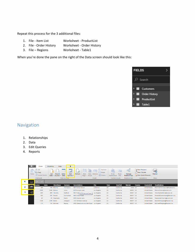
Repeat this process for the 3 additional files:
1. File - Item List Worksheet - ProductList
2. File - Order History Worksheet - Order History
3. File – Regions Worksheet - Table1
When you’re done the pane on the right of the Data screen should look like this:
Navigation
1. Relationships
2. Data
3. Edit Queries
4. Reports

5
Relationships
When you click on the Relationship icon you should see this:
We’re going to rearrange these tables by dragging them so they look like this:
Next we’re going to elongate the Customer table so we can see all the fields and setup relationships.
First we’re going to drag the Company Code field from the Customer Table to the Cust Code field of the Order
History table. This should create a grey line between the 2 tables. When you click on the line it will turn yellow
and show which fields are related.
Next we’ll connect the Product Code field in the Order History table to the Part# field in the ProductList table.
When you’re done the tables should look like this. You may not have a yellow line but there should be lines
connecting each table:
6
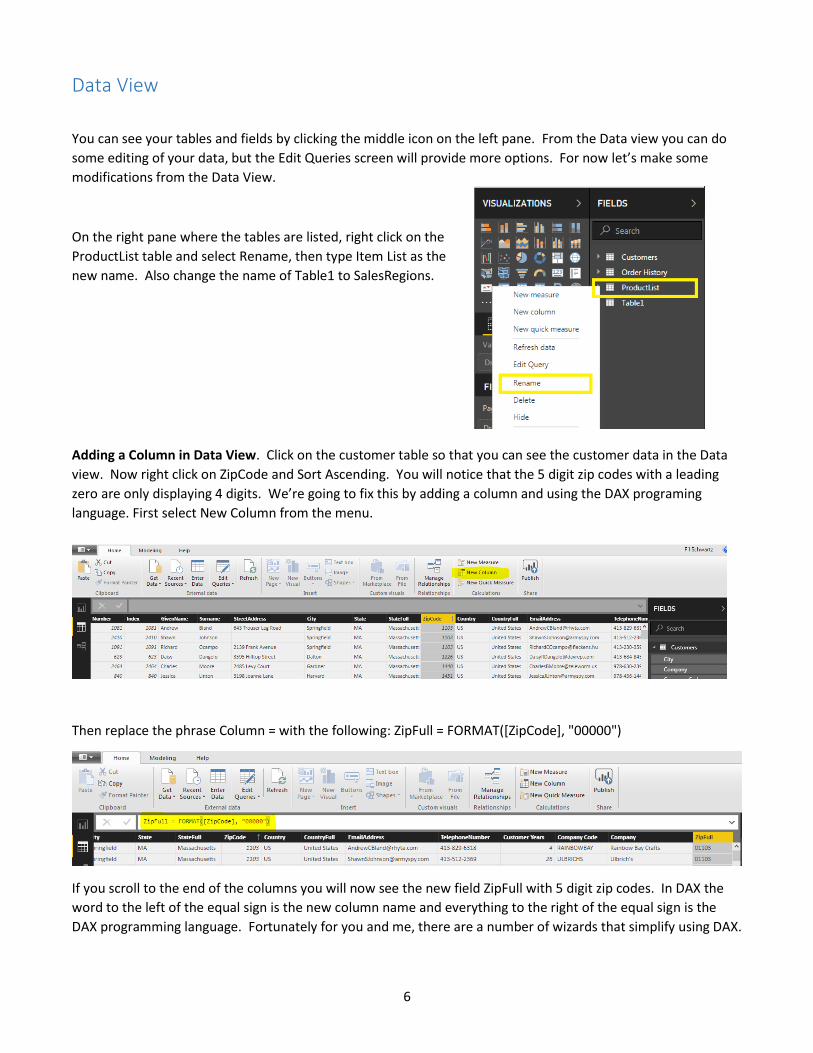
Data View
You can see your tables and fields by clicking the middle icon on the left pane. From the Data view you can do
some editing of your data, but the Edit Queries screen will provide more options. For now let’s make some
modifications from the Data View.
On the right pane where the tables are listed, right click on the
ProductList table and select Rename, then type Item List as the
new name. Also change the name of Table1 to SalesRegions.
Adding a Column in Data View. Click on the customer table so that you can see the customer data in the Data
view. Now right click on ZipCode and Sort Ascending. You will notice that the 5 digit zip codes with a leading
zero are only displaying 4 digits. We’re going to fix this by adding a column and using the DAX programing
language. First select New Column from the menu.
Then replace the phrase Column = with the following: ZipFull = FORMAT([ZipCode], "00000")
If you scroll to the end of the columns you will now see the new field ZipFull with 5 digit zip codes. In DAX the
word to the left of the equal sign is the new column name and everything to the right of the equal sign is the
DAX programming language. Fortunately for you and me, there are a number of wizards that simplify using DAX.

7
Edit Queries
When you click on the Edit Queries icon a new window opens, displaying tables in the left hand pane, data from
the currently selected table in the center and a settings/properties pane on the right side.
Add a Custom Column. Click on the Order History table. You will notice that this file has a QTY field and a Unit
Price field but no Sales Total. With the Order History table set as the currently displayed table, select the Add
Column tab. Then select add Custom Column from the menu bar. Change the New column name to Sales. Next
double click on QTY to insert it in the formula field. Type an * to add it to the formula then double click on Unit
Price. Your screen should look like this:
Click OK to
add the
Sales field to
this table.
8
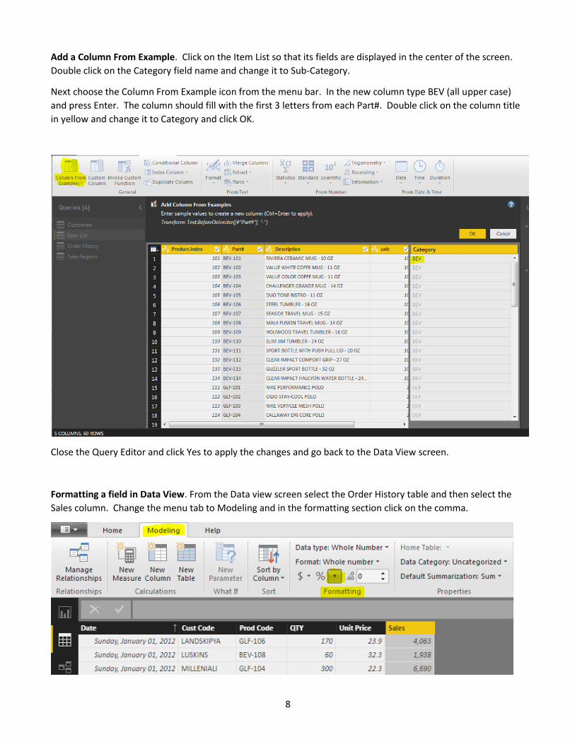
Add a Column From Example. Click on the Item List so that its fields are displayed in the center of the screen.
Double click on the Category field name and change it to Sub-Category.
Next choose the Column From Example icon from the menu bar. In the new column type BEV (all upper case)
and press Enter. The column should fill with the first 3 letters from each Part#. Double click on the column title
in yellow and change it to Category and click OK.
Close the Query Editor and click Yes to apply the changes and go back to the Data View screen.
Formatting a field in Data View. From the Data view screen select the Order History table and then select the
Sales column. Change the menu tab to Modeling and in the formatting section click on the comma.

9
Reports
Adding a Matrix. 1. Click on the Report Icon on the left pane. 2. From the menu bar choose New Visual. 3. From
the VISUALIZATION pane choose Matrix from the 5th row, 4th column.
When working with Visualizations it’s VERY important to not click your mouse in the white space outside of the
current visualization you are working with – you may find yourself modifying something other than the
visualization you were working on.
Next, from the tables in the right pane expand the Item List table to see its fields. Drag the field named Category
to the VISUALIZATIONS pane and place it just below Rows. Next, open the Order History field list and drag the
Date field to just below Columns. Next, drag the Sales field to just below Values. You should expand the width
of this visualization to about 2/3 of the white space.

10
Formatting a visualization. From the visualization pane find and select the
Paint Roller icon. Expand the Values section and scroll down to Text Size.
Adjust to 11 point. Scroll back up to Column Headers and change the Text Size
to 11 point, also change the alignment from Auto to Center. Now change the
Row Headers to 11 point as well.
To change the Column width place your cursor in the column header just to the far right of each field and drag
the field to enlarge it.
11
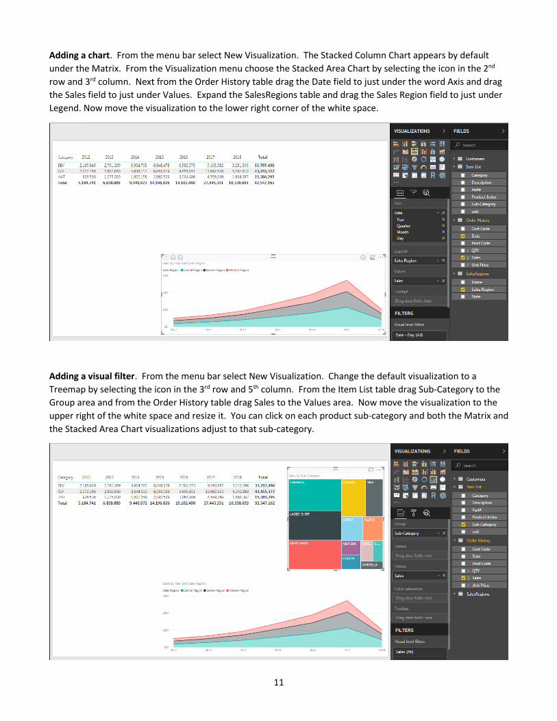
Adding a chart. From the menu bar select New Visualization. The Stacked Column Chart appears by default
under the Matrix. From the Visualization menu choose the Stacked Area Chart by selecting the icon in the 2nd
row and 3rd column. Next from the Order History table drag the Date field to just under the word Axis and drag
the Sales field to just under Values. Expand the SalesRegions table and drag the Sales Region field to just under
Legend. Now move the visualization to the lower right corner of the white space.
Adding a visual filter. From the menu bar select New Visualization. Change the default visualization to a
Treemap by selecting the icon in the 3rd row and 5th column. From the Item List table drag Sub-Category to the
Group area and from the Order History table drag Sales to the Values area. Now move the visualization to the
upper right of the white space and resize it. You can click on each product sub-category and both the Matrix and
the Stacked Area Chart visualizations adjust to that sub-category.

12
Adding a slicer. From the menu bar select New Visualization. Change the default
visualization to a Slicer by selecting the icon in the 5th row and 2nd column. From the
Order History table drag the Date field to just below the word Field.
The default visualization will show a range filter. You
can change this by clicking on the small down arrow in
the upper right corner and selecting List. The default list
will include every day in the Order History.
To make the list more useful go back to the Field area and
select the small down arrow to the right of Date. Now
select Date Hierarchy. This will change the slicer to years.

13
After a little resizing and moving around your report should look like this:
Adding a Report Title. Begin by clicking in the Matrix area to make it the active visualization and move it down
about an inch from the top of the whitespace. From the Menu Bar select Text Box. Move and resize the Text
Box to fix above the Matrix visualization. Type Mom & Pop Promotions LLC in the text box and change the font
to 36 point bold and center it. Now highlight the text and from the dropdown arrow next to the A select a color.
Changing the page title. At the bottom of the
report double click on Page 1 and rename it to
Sales by Sub-Category & Region.
14
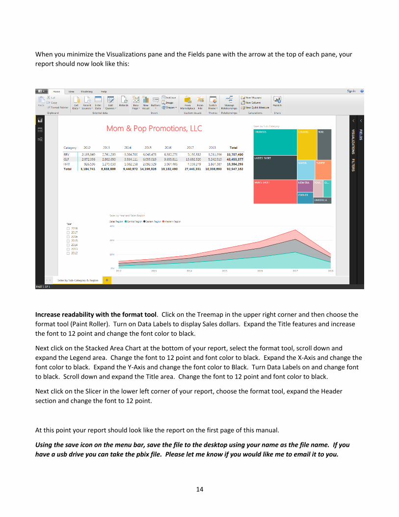
When you minimize the Visualizations pane and the Fields pane with the arrow at the top of each pane, your
report should now look like this:
Increase readability with the format tool. Click on the Treemap in the upper right corner and then choose the
format tool (Paint Roller). Turn on Data Labels to display Sales dollars. Expand the Title features and increase
the font to 12 point and change the font color to black.
Next click on the Stacked Area Chart at the bottom of your report, select the format tool, scroll down and
expand the Legend area. Change the font to 12 point and font color to black. Expand the X-Axis and change the
font color to black. Expand the Y-Axis and change the font color to Black. Turn Data Labels on and change font
to black. Scroll down and expand the Title area. Change the font to 12 point and font color to black.
Next click on the Slicer in the lower left corner of your report, choose the format tool, expand the Header
section and change the font to 12 point.
At this point your report should look like the report on the first page of this manual.
Using the save icon on the menu bar, save the file to the desktop using your name as the file name. If you
have a usb drive you can take the pbix file. Please let me know if you would like me to email it to you.
15
If We Had More Time / Try it at Home - Hierarchies
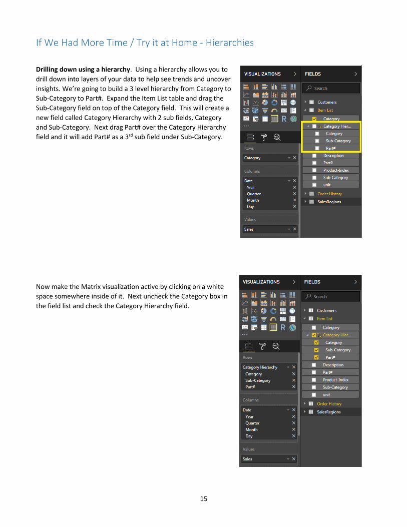
Drilling down using a hierarchy. Using a hierarchy allows you to
drill down into layers of your data to help see trends and uncover
insights. We’re going to build a 3 level hierarchy from Category to
Sub-Category to Part#. Expand the Item List table and drag the
Sub-Category field on top of the Category field. This will create a
new field called Category Hierarchy with 2 sub fields, Category
and Sub-Category. Next drag Part# over the Category Hierarchy
field and it will add Part# as a 3rd sub field under Sub-Category.
Now make the Matrix visualization active by clicking on a white
space somewhere inside of it. Next uncheck the Category box in
the field list and check the Category Hierarchy field.
16
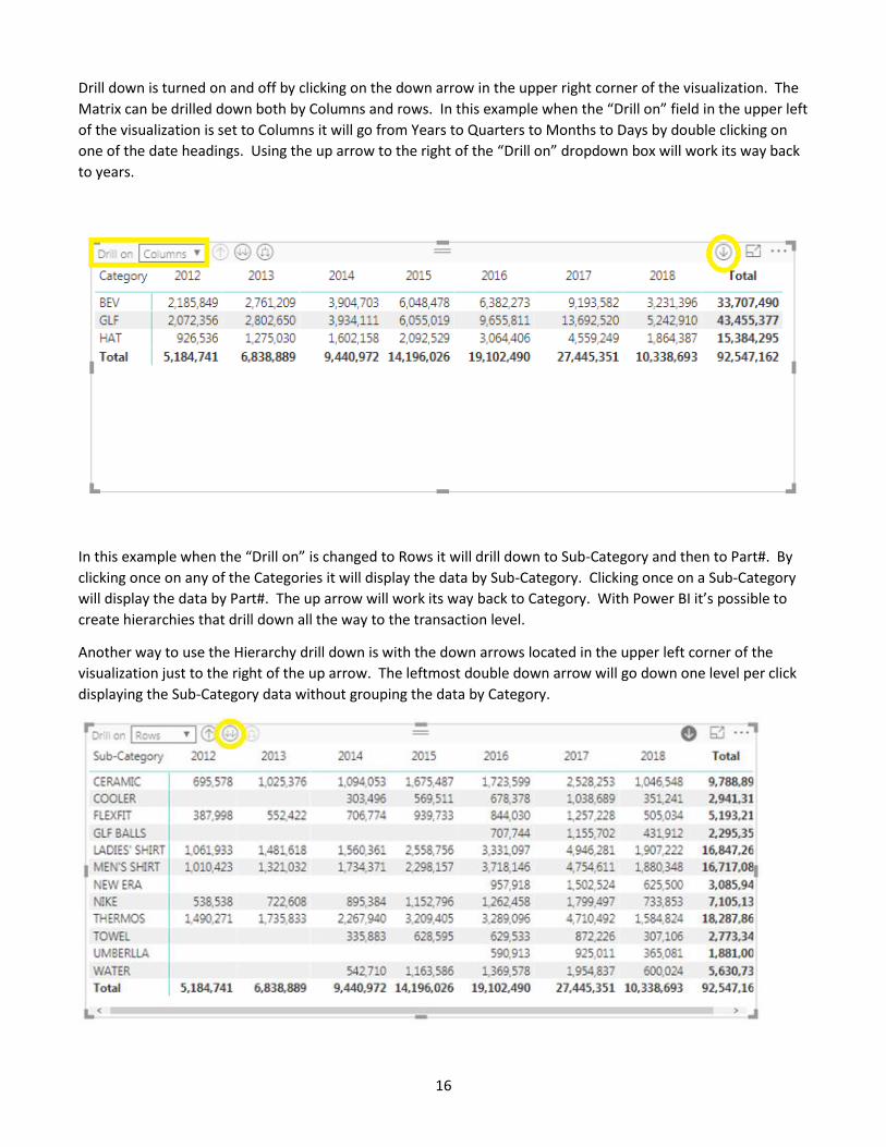
Drill down is turned on and off by clicking on the down arrow in the upper right corner of the visualization. The
Matrix can be drilled down both by Columns and rows. In this example when the “Drill on” field in the upper left
of the visualization is set to Columns it will go from Years to Quarters to Months to Days by double clicking on
one of the date headings. Using the up arrow to the right of the “Drill on” dropdown box will work its way back
to years.
In this example when the “Drill on” is changed to Rows it will drill down to Sub-Category and then to Part#. By
clicking once on any of the Categories it will display the data by Sub-Category. Clicking once on a Sub-Category
will display the data by Part#. The up arrow will work its way back to Category. With Power BI it’s possible to
create hierarchies that drill down all the way to the transaction level.
Another way to use the Hierarchy drill down is with the down arrows located in the upper left corner of the
visualization just to the right of the up arrow. The leftmost double down arrow will go down one level per click
displaying the Sub-Category data without grouping the data by Category.
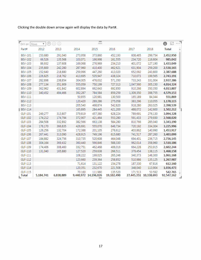
17
Clicking the double down arrow again will display the data by Part#.

18
Using the second double down arrow displays the data with totals for the previous level(s).