noº 2 - microsofttransformmag.blob.core.windows.net/media/4128/transawards_na_2016... · 26...
TRANSCRIPT

2noº
G O L DS I L V E R
B R O N Z E
Transawards_NA_2016_17Oct16.indd 1 20/10/2016 16:08
Transform magazine
Transform Awards North America
26 October 2016
New York
an audio brand consultancy
we givebrands athen we teach them to sing.
ivaudiobranding.com | @ivgroup | facebook.com/ivgroup
usiV LLC622 Hamilton Avenue Nashville, TN 37203p: +1.615.320.1444
euiV2 GmbHSchmickstr.18D-60314 Frankfurtfon: +49.69.99999.300.82
s t ra t e g y c o n t e n t r e s e a r c h management
Transawards_NA_2016_17Oct16.indd 2 20/10/2016 16:08

Transform ConferenceAsia-Pacific
November 2016
Hong Kong
The Middle East Brand Summit
May 2017
Dubai
Transform ConferenceNorth America
October 2016
New York
Transform magazine
Transform Awards North America
26 October 2016
New York
an audio brand consultancy
we givebrands athen we teach them to sing.
ivaudiobranding.com | @ivgroup | facebook.com/ivgroup
usiV LLC622 Hamilton Avenue Nashville, TN 37203p: +1.615.320.1444
euiV2 GmbHSchmickstr.18D-60314 Frankfurtfon: +49.69.99999.300.82
s t ra t e g y c o n t e n t r e s e a r c h management
Transawards_NA_2016_17Oct16.indd 3 20/10/2016 16:08

LONDON / GENEVA / MADRID / FRANKFURT / BARCELONA / ZURICH
A leading provider in film production & webcasting services
www.world-television.com
Get in touch and see how we can bring your brand to life
Helping brands to tell their story for 25 years.
wecreate. wedeliver.
020 7243 7350
Transawards_NA_2016_17Oct16.indd 4 20/10/2016 16:08

Contents
05
Welcome
Growing up in southern California, I accompanied my mother to our local Lucky supermarket, used Tupperware at home and visited the Limited (and Limited Too) on regular trips to the mall. Years later, and these brands are all winner’s at tonight’s Transform Awards North America.
From household names like Tupperware to new brands like Brar’s, excellence in rebranding and brand development is apparent in all of tonight’s winners. The Transform Awards North America is proud to honor those who put brand at the heart of the business and who carefully cultivate a brand strategy. Winners tonight are reflective of the best brand development in North America has to offer.
Grand Prix winner Tupperware built its brand from the inside out and its recent brand evolution is no different. Focusing on its employees and its sales partners, it changed the tone of voice, design language and perception of the 68 year-old company. Pearson’s new brand is designed to unify the previously disjointed company under one banner and bring all of its sub-brands together internally and externally.
I am immensely proud of the companies celebrated at tonight’s awards – from those I’ve grown up with to those that are new to the public. Their work sets the benchmark in rebranding and brand development and I only hope to see more excellent work at the 2017 Transform Awards.
Brittany GolobEditorTransform magazine
06 Meet the judges08 The winners11 Opinion: Talking about change
The Awards
Content
12 Best use of a visual property 13 Best use of copy style/tone of voice 14 Best use of packaging15 Best brand experience Best wayfinding or signage16 Best use of audio branding Best use of typography Process
17 Best internal communications during a brand development project18 Opinion: Sailing the choppy waters of change20 Best implementation of a brand development project Best implementation of a brand development project across multiple markets
Strategy
21 Best naming strategy22 Best creative strategy23 Best brand evolution24 Best strategic/creative development of a new brand
Type
25 Best corporate rebrand following a merger or acquisition26 Opinion: Is disruptive the new steady?28 Best brand development project to reflect changed mission/values/positioning29 Best brand consolidation Best rebrand of a digital property31 Opinion: Distill what’s essential
Sector
32 Best visual identity from the charity/NGO/non-profit sector33 Best visual identity from the education sector 34 Opinion: Bringing B2B to life during an M&A36 Best visual identity from the financial services sector37 Best visual identity from the healthcare & pharmaceuticals sector Best visual identity from the industrial & basic materials sector38 Best visual identity from the professional services sector39 Best visual identity from the retail sector40 Opinion: Audio branding dos and don’ts42 Best visual identity from the technology, media & telecommunications sector43 Best visual identity from the travel & leisure sector 45 Best overall visual identity46 Grand Prix
LONDON / GENEVA / MADRID / FRANKFURT / BARCELONA / ZURICH
A leading provider in film production & webcasting services
www.world-television.com
Get in touch and see how we can bring your brand to life
Helping brands to tell their story for 25 years.
wecreate. wedeliver.
020 7243 7350
Transawards_NA_2016_17Oct16.indd 5 20/10/2016 16:08
Kevin Jasmin, senior manager, brand strategy, TD AmeritradeKevin has served as the brand strategy lead at TD Ameritrade for four years. He has helped the organization define a single brand purpose, simplify its brand architecture and engage associates in brand-building efforts across the client experience. Earlier, he worked for branding firms Lippincott and Interbrand where he gained exposure to brand challenges across industries, geographies and company life cycles. He has 12 years of experience in the branding profession and has consulted for several global organizations including Citi, Bank of America, Microsoft and Thomson Reuters.
Meet the judges
Marion Andrivet, founder, the Branding JournalMarion is the founder of the Branding Journal, an independent website for worldwide news, insights and case studies about brand strategies. She also works for a global advertising agency with clients such as L’Oréal, MasterCard and Nestlé. Passionate about branding, Marion loves to search for the best brand strategies and case studies from all over the world, providing the Branding Journal’s readers with a multicultural overview of the industry.
Brian Brewer, head of marketing & communications, Cancer Research InstituteBrian is director of marketing and communications for the Cancer Research Institute, a US non-profit organization dedicated to the discovery and development of immunotherapies for all types of cancer. Brian oversees brand strategy and audience engagement and creates educational programming stemming from mission-matched partnerships with corporate sponsors and nonprofit collaborations. He holds a master’s of public administration from NYU and a bachelor of arts from Brandeis University.
Kelley Damore, EVP of content and brand director, UBM TechKelley has helped build technology media brands for more than 20 years. Now, she oversees the brand, editorial operations and strategy for UBM’s technology portfolio of community sites, including InformationWeek, Dark Reading and Network Computing. Kelley also executes UBM’s vision of producing premier content across online and live events, while expanding and enhancing the company’s online communities. Kelley has won the prestigious Jesse H. Neal, ASBPEs, and TABPI Eddie awards. She has appeared on CNBC and holds a bachelor’s from the College of the Holy Cross and a master’s from Harvard University’s Kennedy School of Government.
Nancy Donner, vice president for communications and marketing, New York Institute of TechnologyNancy has spent the better part of her career working to promote education, culture and organizations devoted to the social good. She is currently vice president for communications and marketing at New York Institute of Technology, leading the university’s integrated marketing efforts, locally and globally. Previously, Nancy served as VP at both the New School – where she led efforts to amplify the university’s brand and improve its reputation, and at the New York Public Library – where she oversaw promotional strategies for one of the world’s largest not-for-profit institutions.
Hector Duarte, VP channel marketing, PineBridge InvestmentHector is the vice president of channel marketing for PineBridge Investments in New York. He joined the firm in 2007 and is responsible for developing targeted, multilingual marketing programs tailored to PineBridge’s various investor channels across the Americas. Prior to this role, he executed and implemented a new brand identity as the result of PineBridge’s divestiture from AIG in 2010. Before PineBridge, Hector spent eight years at Strategy Studio, a New York-based brand design agency serving a variety of businesses from Fortune 500 companies to non-profit organizations. Hector studied communication design at Parsons School of Design.
David Ferreira, brand manager, City of MississaugaDavid is the City of Mississauga’s brand manager, and led the city’s branding project that began in 2013. Along with brand promotion and reputation management, David also holds responsibilities for market research, citizen engagement and business planning. He holds an MBA from Wilfrid Laurier University and has worked at the City of Mississauga since 2008. David is passionate about developing authentic, research driven marketing solutions and promoting Mississauga’s brand story to the world.
Iain Hamilton, manager, international brand communications, Foresters FinancialIain is an experienced creative professional with over 20 years of work building brands across an integrated platform spanning traditional media and new technology. He is currently the manager of international brand communications at financial services group, Foresters. He was the business lead on the company’s 2012 international rebrand, charged with aligning brand architecture and strategy across multiple business lines in Canada, US and UK.
06
Transawards_NA_2016_17Oct16.indd 6 20/10/2016 16:08
Amanda Pullinger, CEO, 100 Women in Hedge FundsAmanda is the CEO of 100 Women in Hedge Funds. She leads a small team and manages over 350 volunteers globally, overseeing the operations of the organization, which now has over 13,000 members in 20 locations. Amanda is chairman of the board of the HALO Trust and serves on the advisory board of the Oxford Alumni Association of NY. She is a member of the British Academy of Film and Television Arts and a fellow of the Royal Society of Arts. Amanda graduated from Oxford University in 1987 and earned an MBA from La Salle University in 1998.
Karen Starns, senior vice president, global marketing, PearsonKaren is the senior leader at Pearson responsible for Pearson’s almost 1,500 marketers worldwide, accountable for brand, research and insights, customer marketing, campaigns, creative strategy and development, digital marketing, paid, owned, operated channels, talent and capability. Prior to Pearson, Karen was the marketing leader at Amazon, responsible for global advertising planning, global media and Amazon’s brand strategy. During 20 plus years in a variety of marketing roles, Karen has developed expertise in disciplines including brand strategy, strategic partnerships, advertising and media, demand generation, CRM, digital marketing and product launches.
Erin Stoeber, vice president, marketing & communications, Lustgarten FoundationErin is a marketing and communications executive with non-profit, agency and in-house experience. She recently joined the Lustgarten Foundation for Pancreatic Cancer Research as its first vice president of marketing and communications to lead its rebranding effort and expand the foundation’s national presence. Prior to Lustgarten, she was vice president of marketing and communications for the Chron’s & Colitis Foundation America (CCFA). In her role at CCFA, she restructured the marketing department, implemented internal and external communications strategies and refined messaging across all areas of the Foundation.
Nic Strahl, director of marketing for new developments, Citi HabitatsOver the past 10 years, Nic has leveraged her multimedia marketing experience to expand the reach of brands at the local, national and international level. In her current role as the director of marketing for new developments at real estate firm Citi Habitats, Nic develops end-to-end visual branding and marketing roll-out strategies for projects that are revolutionizing the New York City skyline. A born and bred New Yorker, she has worked and traveled in North America, Europe, India, Russia and Israel.
Dennis Thomas, senior director, global branding, SAPDennis is senior director, global branding at SAP, managing all aspects of design and visual experience for the past five years. Prior to that, he spent over 25 years with brand agencies such as Siegel+Gale, Wolff Olins, and Brand Union. He brings brands to life through a process both strategically driven and visually rich and innovative, assuring consistent expression and alignment across all touchpoints in all media. He has designed and implemented programs for Caterpillar, Pfizer, American Express, DuPont, the Ford Foundation, HP, US Air Force, Harley-Davidson, 3M, Dell and Caterpillar.
Susan Waldman, chief marketing & communications officer, Meals on Wheels AmericaAt Meals on Wheels America, Susan led both a comprehensive rebranding effort for the national organization and its state and local programs across the country. Additionally, she drove the creation, launch and management of the Meals on Wheels Ad Council volunteer recruitment campaign under the theme ‘America, Let’s Do Lunch.’ Previously, Susan was founding partner at Forge Branding where she worked for brands including the Campaign for Tobacco Free Kids, the Corporation for Public Broadcasting, National Audubon Society. Before that, Susan was director of advertising for Northwest Airlines and headed national advertising for Walt Disney World.
LIKE UStransformsays
FOLLOW US@TransformEvents#TransNA
FOLLOW UStransform_magazine
Transawards_NA_2016_17Oct16.indd 7 20/10/2016 16:08
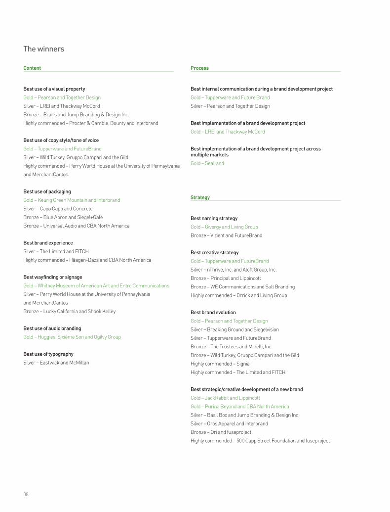
The winners
Content
Best use of a visual property
Gold – Pearson and Together Design
Silver – LREI and Thackway McCord
Bronze – Brar’s and Jump Branding & Design Inc.
Highly commended – Procter & Gamble, Bounty and Interbrand
Best use of copy style/tone of voice
Gold – Tupperware and FutureBrand
Silver – Wild Turkey, Gruppo Campari and the Gild
Highly commended – Perry World House at the University of Pennsylvania
and MerchantCantos
Best use of packaging
Gold – Keurig Green Mountain and Interbrand
Silver – Capo Capo and Concrete
Bronze – Blue Apron and Siegel+Gale
Bronze – Universal Audio and CBA North America
Best brand experience
Silver – The Limited and FITCH
Highly commended – Häagen-Dazs and CBA North America
Best wayfinding or signage
Gold – Whitney Museum of American Art and Entro Communications
Silver – Perry World House at the University of Pennsylvania
and MerchantCantos
Bronze – Lucky California and Shook Kelley
Best use of audio branding
Gold – Huggies, Sixième Son and Ogilvy Group
Best use of typography
Silver – Eastwick and McMillan
Process
Best internal communication during a brand development project
Gold – Tupperware and Future Brand
Silver – Pearson and Together Design
Best implementation of a brand development project
Gold – LREI and Thackway McCord
Best implementation of a brand development project across multiple markets
Gold – SeaLand
Strategy
Best naming strategy
Gold – Givergy and Living Group
Bronze – Vizient and FutureBrand
Best creative strategy
Gold – Tupperware and FutureBrand
Silver – nThrive, Inc. and Aloft Group, Inc.
Bronze – Principal and Lippincott
Bronze – WE Communications and Salt Branding
Highly commended – Orrick and Living Group
Best brand evolution
Gold – Pearson and Together Design
Silver – Breaking Ground and Siegelvision
Silver – Tupperware and FutureBrand
Bronze – The Trustees and Minelli, Inc.
Bronze – Wild Turkey, Gruppo Campari and the Gild
Highly commended – Signia
Highly commended – The Limited and FITCH
Best strategic/creative development of a new brand
Gold – JackRabbit and Lippincott
Gold – Purina Beyond and CBA North America
Silver – Basil Box and Jump Branding & Design Inc.
Silver – Oros Apparel and Interbrand
Bronze – Ori and fuseproject
Highly commended – 500 Capp Street Foundation and fuseproject
08
Transawards_NA_2016_17Oct16.indd 8 20/10/2016 16:08
Type
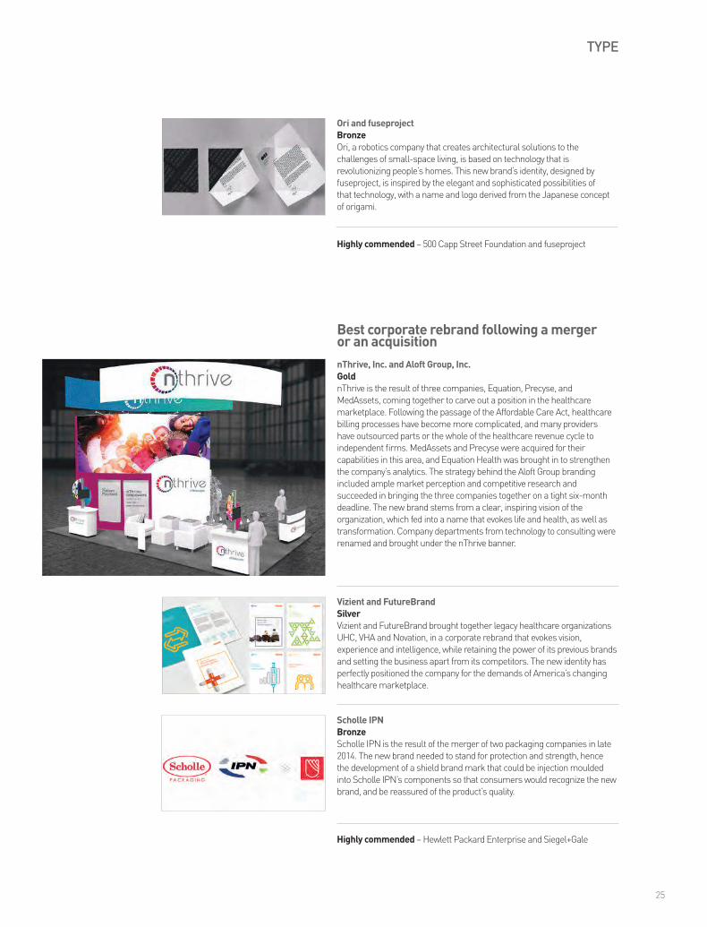
Best corporate rebrand following a merger or an acquisition
Gold – nThrive, Inc. and Aloft Group, Inc.
Silver – Vizient and FutureBrand
Bronze – Scholle IPN
Highly commended – Hewlett Packard Enterprise and Siegel+Gale
Best brand development project to reflect changed mission/values/positioning
Gold – Givergy and Living Group
Silver – Viant and fuseproject
Bronze – Ashurst and Living Group
Highly commended – Brar’s and Jump Branding & Design Inc.
Highly commended – Orrick and Living Group
Best brand consolidation
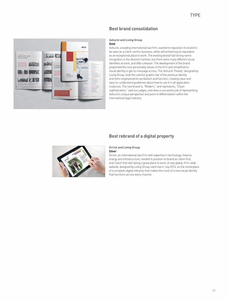
Gold – Ashurst and Living Group
Best rebrand of a digital property
Silver – Orrick and Living Group
Sector
Best visual identity from the charity/NGO/non-profit sector
Gold – Heritage of Pride and FutureBrand
Silver – Run for America and the Partners (New York)
Bronze – Avenues for Justice and Brand Union
Highly commended – The Center for Discovery and Brand Union
Best visual identity from the education sector
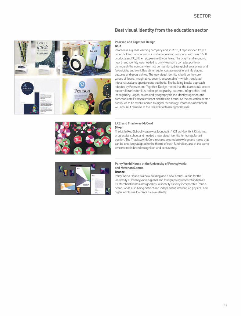
Gold – Pearson and Together Design
Silver – LREI and Thackway McCord
Bronze – Perry World House at the University of Pennsylvania
and MerchantCantos
Best visual identity from the financial services sector
Gold – CFM and Living Group
Bronze – Principal and Lippincott
Best visual identity from the healthcare & pharmaceuticals sector
Gold – nThrive, Inc. and Aloft Group, Inc.
Silver – Vizient and FutureBrand
Best visual identity from the industrial & basic materials sector
Gold – Scholle IPN
Best visual identity from the professional services sector
Gold – WE Communications and Salt Branding
Silver – Orrick and Living Group
Bronze – Ashurst and Living Group
Best visual identity from the retail sector
Gold – JackRabbit and Lippincott
Silver – Ashley Furniture HomeStore and Interbrand
Bronze – Bite Beauty Amuse Bouche and Concrete
Bronze – Capo Capo and Concrete
Highly commended – Mountain equipment Co-op and Concrete
Best visual identity from the technology, media & telecommunications sector
Gold – Givergy and Living Group
Bronze – Hewlett Packard Enterprise and Siegel+Gale
Best visual identity from the travel & leisure sector
Gold – Taos Ski Valley and Origin Design & Communications Ltd
Best overall visual identity
Pearson and Together Design
Grand Prix
Tupperware and FutureBrand
09
Transawards_NA_2016_17Oct16.indd 9 20/10/2016 16:08

www.transformmagazine.net/subscribe
Take out a print subscription for only $90. Available quarterly.
The global publication for brand development
and rebranding.
Transawards_NA_2016_17Oct16.indd 10 20/10/2016 16:08

Talking about change
What does ‘change’ mean for nonprofits? Organizations that are committed to change in a way that, arguably, nobody else is? Their work is the embodiment of change. They change the lives and circumstances of people in our communities, and can improve the prospects of the planet. Change is a concept they focus on every single day, staffed by people who dedicate a sizable portion of their lives to achieving audacious goals – from ending the suffering caused by cancer, to creating empowered futures for women in emerging economies.
Asking the question about change of ourselves, though – whatever the type of organization we are – is daunting. Nonprofits that sprang to life as the brainchild or passion project of an individual or group inspired to make a difference may initially rely on the belief and charisma of a founder or community to propel the narrative. Brand and image may not feel like the most important thing for the organization to focus on at the start, not to mention that being cause-based, money is channeled first and foremost into initiatives that have a direct impact.
Later on, when you want the way your organization looks to be differentiated from others in the same space, and to build more meaningful interactions with supporters, work needs to be done to bring coherence and clarity to the brand. It’s a rewarding process, but it can feel uncomfortable to those closely connected to the organization and its history. We recently sat with a prospective client whose charity is dedicated to supporting those impacted by suicide. They wanted to change their logo, their name and their identity, but were nervous about whether stakeholders and supporters would come on this journey with them. Some were so grateful for what this organization had done for them, they had the existing logo tattooed onto their bodies.
When we approach a challenge like this, we know that we’re not really the experts – those are the people who work day in, day out on the cause, and know their organization inside and out. Second, we’ll never say, “Everything is broken and needs to be fixed.” It’s our job to navigate the existing narrative, and the history of how the current brand developed. We play the role of both detective and psychologist, hoping to shine a light on the forgotten truths and associated insights. We then go about unlocking a solution that sets strong foundations for the organization to achieve its future goals – everything from growing its funding and expanding its network, to better supporting its employees and beneficiaries.
At the end of a project, there’s often a sigh of relief. Partly because we’re past any of those sticky moments that invariably arise – honoring the needs of the organization, and the multiple stakeholders requires careful compromise and balance – but also because the results are so impactful for the organization. We recently worked with a client focused on building better global healthcare solutions, and in our final meeting they couldn’t wait to get their hands on the collateral to use for an important upcoming presentation and networking event. Committing to change and upheaval in the short term would mean, the client said, “Huge savings on time and money, and massive improvements in their ability to operate efficiently in the long term.”
To be a great organization, change should be a constant. But it’s also good to remember – when you’re in the middle of a rebrand – that nothing is permanent.
Jessica Lehmann is associate director, strategy at Brand Union
11
Transawards_NA_2016_17Oct16.indd 11 20/10/2016 16:08

CONTENT
Brar’s and Jump Branding & Design Inc.BronzeBrar’s, a purveyor of Indian sweets, needed a new visual look and feel for the company’s packaging and its physical spaces, to firmly position it in the fast-casual quality sector. Brar’s new visual identity, by Jump Branding, refers to the food, people and iconic architecture of India, blended with contemporary graphics and textures to avoid stereotyping.
Best use of a visual property
Highly commended – Procter & Gamble, Bounty and Interbrand
Pearson and Together DesignGoldIn 2015, Pearson repositioned from a broad holding company into a unified operating company, with over 1,500 products and 38,000 employees in 80 countries. Pearson’s work with Together Design was a true collaboration, as the companies worked together to develop a bright and engaging new brand identity. The new visuals were built on the core values of ‘brave, imaginative, decent, accountable’ – which translated into a natural and spontaneous aesthetic. The building blocks approach adopted by Pearson and Together Design meant that the team could create custom libraries for illustration, photography, patterns, infographics and iconography. Logos, colors and typography tie the identity together, and communicate Pearson’s vibrant and flexible brand. Judges praised this entry, calling it “Excellent,” “Brilliant,” and “Modern and clean.” Pearson, “Harnessed the power of a new brand to tell the story of its transition,” said one judge, “Uniting various businesses and its employees under a single masterbrand.” For this achievement, it is a deserving gold winner.
LREI and Thackway McCordSilverThe Little Red School House (LREI) needed a new visual identity for its regular art auction, a key fundraising event. The new logo and name for the auction were developed by Thackway McCord to build an identity that is creative and consistent. As a result, brand recognition is up, and fundraising targets have been exceeded year on year.
12
Transawards_NA_2016_17Oct16.indd 12 20/10/2016 16:08

CONTENT
Wild Turkey, Gruppo Campari and the GildSilverWild Turkey was a brand with plenty of respect in the industry – but consumers didn’t have the same connection with the bourbon company. The new position, developed by the Gild, focused on turning some of the brand’s more negative connotations into positive attributes, transforming old-fashioned into classic and different into unique.
Tupperware and FutureBrandGoldConversation has always been central to the Tupperware brand. The company’s success has been built on its unique direct sales model, and so when the time came to develop a new brand, Tupperware wanted to make sure it acknowledged and enhanced its verbal identity. FutureBrand worked with Tupperware to make sure its key personality traits – surprising, radiant, helpful and real – were fully embedded into its language at all levels, from the brand book, to a launch video, to catalogues and other collateral. “Smart,” “Engaging,” and, “Bold,” were just a few of the words our judges used to describe the evolution of this brand, which brought Tupperware firmly into the 21st century. Tupperware’s new verbal brand puts confidence at the front and center of all of its written communication, taking transactional moments and rendering them inspirational. “Look out Martha Stewart!” one of our judges said, “Tupperware is back with a vengeance.”
Best use of copy style/tone of voice
Highly commended – Perry World House at the University of Pennsylvania and MerchantCantos
13
Transawards_NA_2016_17Oct16.indd 13 20/10/2016 16:08

CONTENT
Blue Apron and Siegel+GaleBronzeAs Blue Apron expanded its offering beyond the food and recipe delivery service that made its name, Siegel+Gale came on board to refresh the packaging and allow expansion into wine delivery, as well as creating room for future developments. Bold, cheeky iconography and a logo signature system are key to the new packaging.
Best use of packaging
Keurig Green Mountain and InterbrandGoldGreen Mountain Coffee looked to the many different ways in which people consume and enjoy its products to provide the underpinning for this gold-winning entry. Green Mountain, which makes cups for Keurig machines, was competing with big names in the consumer coffee market, from Starbucks to Dunkin’ Donuts, but with Interbrand the company realized that its broad portfolio could become an asset. The new brand packaging is cohesive across a range of products, from core offerings to seasonal flavors (the ever popular autumnal pumpkin among them), super-premium organic and special reserve. Building on a strategic refresh of the entire brand, the new packaging helps Green Mountain to stand out on shelves, and communicates the brand’s heritage through lush greens and landscapes. Our judges called the packaging, “Innovative,” “Strong,” and, “Appealing,” and commended the work for bringing out, “The potential for this long-standing brand to move forward and raise their profile, not just to existing customers, but to discerning coffee drinkers.”
Capo Capo and ConcreteSilverCapo Capo is an unusual product – a challenger to the well-established market of Italian aperitivi rossi. The Concrete-developed strategy was born out of a brand identity that brought together the romantic connotations of Italian spirits with contemporary cocktail culture, resulting in distinctive, modern, vibrant packaging that creates an instant yearning for the mountains and valleys of the Italian Alps.
Universal Audio and CBA North AmericaBronzeUniversal Audio has been a leading brand in the recording industry since the 1950s, when it began to make professional recording equipment. But as the company started making mass market products, a new language and packaging were needed to appeal to a whole new audience. In came CBA North America and the resulting huge commercial success of the premium range has proved the effectiveness of the strategy.
14
Transawards_NA_2016_17Oct16.indd 14 20/10/2016 16:08
CONTENT
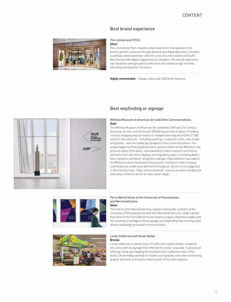
Best brand experience
The Limited and FITCHSilverThe Limited and Fitch created a retail experience that appeals to the brand’s perfect customer through physical and digital elements, including a carefully edited wardrobe collection, a touchscreen station and Outfit Bars that provide digital suggestions for shoppers.The overall experience has raised the average spend at the store and created a high-end feel, refreshing the brand for the future.
Highly commended – Häagen-Dazs and CBA North America
Perry World House at the University of Pennsylvania and MerchantCantosSilverThe hub for international teaching, research and public outreach at the University of Pennsylvania worked with MerchantCantos to create a brand that drew on the Perry World House’s physical space, distinctive angles and the university’s heritage to build signage and wayfinding that is strong, bold, vibrant and deeply grounded in time and place.
Whitney Museum of American Art and Entro CommunicationsGoldThe Whitney Museum of American Art celebrates 20th and 21st century American art over nine floors and 220,000 square feet of space. Providing a smart, engaging way for visitors to navigate their way around the 21,000 works in the collection – including paintings, sculptures, films, new media and photos – was the challenge handed to Entro Communications. The project began by thinking about how to ground visitors to the Whitney in the physical reality of the place, and expanded to take in exterior and interior elements from electronic displays and regulatory signs, to ticketing desks, level indicators and donor recognition signage. Close attention was paid to the Whitney’s distinctive brand at every point, resulting in clean, tranquil, unorthodox yet unobtrusive elements throughout. As one of our judges put it, the outcomes are, “Clear and uncluttered,” easy to use when needed, but otherwise content to let the art take center stage.
Best wayfinding or signage
Lucky California and Shook KelleyBronze Lucky California, a revived chain of Californian supermarkets, needed to tell a story with its signage that reflected the stores’ seasonal, multicultural offerings, while also tapping into the distinctive ‘California-ness’ of the brand. Shook Kelley worked on modern iconography, vivid colors and strong graphic elements to bring the diverse parts of the store together.
15
Transawards_NA_2016_17Oct16.indd 15 20/10/2016 16:08

CONTENT
Best use of audio branding
Huggies, Sixième Son and Ogilvy GroupGoldThe diaper market is expanding rapidly – and to match that expansion, Kimberly-Clark is focusing on emerging markets to drive business growth. Huggies was using music in many different ways around the world to represent its brand, creating confusion and failing to support the brand meaning. The new audio brand by Sixième Son is focused on the interplay of mother and baby voices, to support the core brand value of a secure bond between mother and child. A central composition begins with a mother and baby communicating in hums and nonverbal sounds, and develops as the child grows, ending with the sound of a toddler, matching the journey that users of Huggies experience. The audio brand has been used since launch in Huggies commercials in Latin America, the Caribbean, Russia, and the US, as well as in brand videos, in all its different permutations – evoking delight, love and identification for all listeners.
Eastwick and McMillanSilverTech-focused communications agency Eastwick had a strong reputation among its clients, but was seen as boutique, rather than vital and up-to-date. Its new typographic brand, by McMillan, is bold, dynamic, easily-applied and colorful, with great flexibility for applications onscreen, in printed material and in experiential settings.
Best use of typography
16
Transawards_NA_2016_17Oct16.indd 16 20/10/2016 16:08

PROCESS
Pearson and Together DesignSilverWhen Pearson repositioned from a broad holding company into a unified operating company, with over 38,000 employees in 80 countries, communicating with employees was at the heart of the strategy. The flexible new brand identity by Together Design was launched internally first, and events were held around the world to get employees engaged and enabled to deliver the rebrand.
Tupperware and FutureBrandGoldConversation has always been central to the Tupperware brand. The company’s success has been built on its unique direct sales model, and internal communication is just as important to Tupperware as external conversation. FutureBrand worked with Tupperware to make sure its key personality traits – surprising, radiant, helpful and real – were embedded in its internal communications throughout the rebrand. Confidence is the central message that Tupperware wanted to project to its employees, known as associates, and this took the form of communicating at every stage of the brand launch. Materials were created specifically to get associates engaged and on-board with the new brand, empowering them to confidently represent the new brand. From revealing key elements internally first, to creating a brand book celebrating Tupperware and its culture, communication was front and center during the brand development, resulting in a successful, compelling rollout that has excited current associates and spurred the recruitment of new team members.
Best internal communication during a brand development project
17
Transawards_NA_2016_17Oct16.indd 17 20/10/2016 16:08

Sailing the choppy waters of change
Change requires courage. But during times of significant change, courage is in high demand and short supply, as unimaginable complexity comes into sharp relief. Times of change bring with them new leadership, new talent requirements, new customers, new competitors and new goals. These incredibly disruptive realities can discourage the kind of bold brand-building needed to capitalize on these pivotal moments.
Whatever is sparking the change; be it inorganic (mergers, acquisitions or spinoffs) or organic moments of transformation (evolving in the face of disruption), organizations must look to the power of a singular brand – one that’s grounded in context, guided by purpose, built with ambition, and designed to excite – to ride the wave of change.
As we all know, customers, employees, influencers and investors have a finely tuned sense for what is true and authentic. Our ‘BS meters’ are strong and our access to information is unprecedented. The best brands are built on truth: historical truths, current truths and future truths.
Guide an exercise in discovery, not invention, to bridge the gap between where the brand is today and the powerful strategic opportunity in the future. There is always plenty to unearth and preserve. And be prepared to challenge the historical truths – not everything that surfaces in the excavation process is worth keeping. As context shifts, so too does the value of these truths.
Indifference is the enemy in times of brand transformation. Have the courage to build a brand with a point of view, with a clear sense of purpose, ambition and aspiration. Resist the urge to be everything to everyone. The ability to know what is on-brand – and perhaps more importantly – what is off-brand, is an essential filter for the endless choices and decisions that are made in times of change.
Build your point of view with an understanding of your context – what matters most to customers, to employees, in the market and culturally, but don’t be limited by that understanding. Transformational brands are tethered in reality but not constrained by it. Be prepared to be unpopular with some audiences. You may not appeal to everyone, but you will build a powerful bond with the people who are truly important to your future.
Today people seek brands that live their values through the actions they take and the experiences they create. Symbols and slogans used to be the name of the game in rebranding efforts, but today signature experiences, products and services and useful content that pays off on the brand promise are the keys to gaining real traction. Whether it is customer service, product development or CSR activities, it is particularly important that everyone involved with the brand understands and embodies its values.
Equal parts Usain Bolt and Mo Farrah, significant moments of change require both stamina and tenacity to break through to the other side. They are fueled by coordinated quick wins, while keeping the big picture in mind and nailing each milestone along the way. There is undeniable value in that first big splash, but many brands emerge with gusto they can’t sustain. Overdoing it, then ultimately under delivering, diminishes authenticity. Keeping an eye on both consistency and continuity will build a strong, sustainable brand.
To ask people to do things differently – to take different actions and make different choices –requires a level of inspiration that goes well beyond the rational. Transformational brands should be vivid. They should have charisma. The organization should feel it. Customers should feel it. They should see themselves in it. And they must want it to be right for them, not just know that it is.
Be human. Be relatable. Be better than jargon. Involve your people in the change by allowing them to have input along the brand development journey. Create moments of dialogue and co-creation throughout the transformation so people feel a sense of ownership and investment in the outcomes.
Kari Blanchard is executive strategy director at FutureBrand
18
Transawards_NA_2016_17Oct16.indd 18 20/10/2016 16:08

Honey, this may be our defining moment.
Opportunity is knocking. A moment that will impact your company’s reputation is on the horizon. Count on it. It could be a new CEO, an IPO, a merger or spin off, the launch of a new product or a competitive threat of some kind. Many see these defining moments as hurdles. We see them as opportunities to strengthen your company’s brand and build value into your business.
RESEARCH / BRAND STRATEGY / BRAND ARCHITECTURE / NAMING / IDENTITY / COMMUNICATIONS / DIGITAL / MEASUREMENT
thackwaymccord.com / 212 995 1391
Transawards_NA_2016_17Oct16.indd 19 20/10/2016 16:08

PROCESS
Best implementation of a brand development projectLREI and Thackway McCordGoldThe Little Red School House (LREI) was founded in 1921 as New York City’s first progressive school. Now, almost a century later, a new visual identity was needed for LREI’s regular art auction, a key fundraising event. Putting the new Thackway McCord-designed logo and name in place meant expanding the traditional marketing plan into social media, with campaigns launched on Facebook, Instagram and Snapchat to engage with influential users. The online efforts were matched by an offline campaign, including flyposting, badges and printed invitations. Moreover, the new brand has been implemented with consistency to match the innovation – each year, the central logo remains the same, ensuring brand recognition, but a unique visual identity is created to highlight the changing theme of the event, from ‘Focusing on the community’ in 2014 to ‘A digital presence’ in 2016. This approach ensures the brand never stales, but remains both stable and up to date.
Best implementation of a brand development project across multiple marketsSeaLandGoldSeaLand was launched in January 2015, 59 years after the original SeaLand kickstarted the international shipping industry as it is today. The new SeaLand, serving the ocean transportation shipping needs of the intra-Americas region, needed a brand that built on the legacy of the original emblem, but that also looked forward and represented new opportunities. The implementation of the new brand across the Americas involved events in locations from São Paulo, Brazil, to Santo Domingo, in the Dominican Republic, Miami, Florida, and Uruapan, Mexico. Reviving the brand across multiple markets was a complex task, helped by the staying power of the SeaLand name, and the dedication of the team implementing the new identity. Judges said the new SeaLand brand was modern and broad, and that it dealt well with the challenge of an extremely varied target audience, operating in at least three languages and across two continents.
20
Transawards_NA_2016_17Oct16.indd 20 20/10/2016 16:08

STRATEGY
Vizient and FutureBrandBronzeVizient is America’s largest member-owned healthcare services company, bringing together the legacy healthcare organizations UHC, VHA and Novation in the wake of the Affordable Care Act. The FutureBrand-developed Vizient brand name is as visionary as the company’s aims, evoking vision, experience and intelligence, and setting the business apart from its competitors.
Givergy and Living GroupGoldGivergy, one of the world’s largest online and silent auction technology companies, raises over $40m a year for charities and corporate foundations. But prior to its recent rebrand, the company was operating under two separate names: iBid in the UK and Daana in North America. It was recognized that this strategy no longer worked in a global, growing market, and was preventing the launch of new products and the development of a cohesive internal culture. Living Group created a new identity and unified brand under the Givergy name – a name designed to resonate with the company’s audiences, evoking ‘giving,’ ‘events,’ and ‘energy’ in a single word. The name then fed into a visual identity that is bright, colorful, practical and engaging, and has provoked the coming relaunch of the business. The entire rebrand was also accomplished within six weeks, a truly impressive achievement.
Best naming strategy
21
Transawards_NA_2016_17Oct16.indd 21 20/10/2016 16:08

STRATEGY
Principal and LippincottBronzePrincipal is a financial services firm with over a century of history, but its brand no longer reflected the future-facing focus of the company. The strategy of this brand development project, delivered by Lippincott, involved a global study of over 1,200 employees, gleaning insights that fed into the new visual and verbal identity.
Best creative strategy
Tupperware and FutureBrandGoldTupperware is a household name, and conversation has always been central to its brand, with its unique direct sales model at the heart of its success. The creative strategy behind updating the Tupperware identity was built on celebrating the company’s legacy – and enabling it to move forward, into the future of the brand. Both the visual identity and verbal identity of the brand were overhauled: FutureBrand extended the Tupperware wordmark across the entire, previously disparate, family of brands, and modified it to appear more simple, bold and timeless. The verbal identity embedded the brand’s key personality traits – surprising, radiant, helpful and real – into its internal and external communications. The brand development was at all times controlled by the strategy of reminding consumers of Tupperware’s heritage, and informing them about the company’s strong social values. “A flawless execution,” wrote one judge, “Transforming what was perceived as a functional, commodified brand into a highly contemporary, stylish and purpose-driven lifestyle brand.”
nThrive, Inc. and Aloft Group, Inc.SilvernThrive is the result of three companies, Equation, Precyse and MedAssets, coming together to carve out a position in the healthcare marketplace. The strategy behind the branding, by Aloft Group, included ample market perception and competitive research, and succeeded in bringing the three companies together on a tight six-month deadline.
WE Communications and Salt BrandingBronzeGlobal public relations firm WE Communications needed to capture what was unique and authentic about the brand. Working with Salt Branding to develop the new identity, stakeholders including senior management, leading clients and industry partners were interviewed by WE to reveal the core proposition and personality of the organization, feeding into the central creative concept of the brand development.
Highly commended – Orrick and Living Group
22
Transawards_NA_2016_17Oct16.indd 22 20/10/2016 16:08

STRATEGY
Breaking Ground and SiegelvisionSilverBreaking Ground was previously known as Common Ground, an organization that aimed to end homelessness in New York. The new brand by Siegelvision, a slight but powerful difference, broadens Breaking Ground’s focus onto building and restoring lives, while maintaining the strong brand equity the organization has developed over the past two decades of working to help others.
Pearson and Together DesignGoldIn 2015, Pearson repositioned itself from a broad holding company into a unified operating company, with over 1,500 products and 38,000 employees in 80 countries. Pearson’s work with Together Design was a true collaboration, as the companies worked together to develop a bright and engaging new brand identity. The existing brand was more or less simply a logo, designed for print and with no digital consideration. Evolving the Pearson brand meant building on the company’s heritage while looking to the future, being accessible for all learners, and being easy to implement. The new identity brings together the disparate elements of Pearson under a visual logo that captures the excitement and curiosity of learning. The company’s brand promise, ‘let learning flourish,’ is in line with Pearson’s history, but also encapsulates a forward-facing approach. Launched in January 2016 with an ongoing global rollout, the new brand has been enthusiastically embraced by employees, with 75% already incorporating it into their day-to-day work.
Best brand evolution
The Trustees and Minelli, Inc.BronzeThe Trustees manages Reservations, a large land conservation organization in Massachusetts that cares for over 100 special locations. A decade ago, Minelli created the institution’s first brand identity, so it was perfectly placed to evolve the brand and reposition it for the future, reflecting the organization’s increased public presence and aspirations.
Tupperware and FutureBrandSilverTupperware is a household name, and conversation has always been central to its brand, with its unique direct sales model at the heart of its success. Updating the Tupperware identity – a feat undertaken by FutureBrand – meant celebrating the company’s legacy – and enabling it to move forward with confidence at its heart.
Highly commended – Signia Highly commended – The Limited and FITCH
Wild Turkey, Gruppo Campari and the GildBronzeBourbon producer Wild Turkey was well-respected within the beverages industry, but the brand needed to evolve so that consumers felt the same connection. The rebrand, by the Gild, overhauled the visual identity and packaging, maintaining continuity through visual clues but creating an undeniable modern, premium look.
23
Transawards_NA_2016_17Oct16.indd 23 20/10/2016 16:08

STRATEGY
Oros Apparel and InterbrandSilverOros Apparel is a new company, built on unique technology, that sells outerwear that’s thinner, warmer and more flexible than the existing market produces. Its Interbrand-designed identity matches the aspirations of its ideal consumers, who seek adventure and want their apparel to empower that quest, reflecting the ultimate in challenge and conquest.
Best strategic/creative development of a new brand
Purina Beyond and CBA North AmericaGoldPurina Beyond has taken the existing Purina brand and created a completely new identity. Purina had the reputation of being functional, but it wasn’t capturing the imagination of consumers or making an impact on shelves. Purina Beyond, developed by CBA North America, is a new range of nutritionally complete natural dog and cat food, with packaging design that takes visual clues from trends in organic and natural food. Whole ingredients are foregrounded, and the presence of essential vitamins and minerals, as well as the absence of less desirable elements such as added artificial coloring or preservatives. The new brand uses the name recognition of Purina, but is clearly differentiated in every element of its identity. Purina Beyond is now a market leader in natural dog and cat food, having exceeded sales goals by over 15%. “Great to see the breakthrough that the brand work has had in supporting stellar sales results,” wrote one of our judges.
Basil Box and Jump Branding & Design Inc.SilverBasil Box is a brand that has been developed from the ground up, to create an identity for a restaurant where hungry visitors can mix and match ingredients inspired by the street markets of Thailand and Vietnam. The new brand needed to work in a range of store types, from small counters to large fast-casual spaces, and Jump Branding has successfully met those demands with a flexible, modern identity.
JackRabbit and LippincottGoldIn 2014, several running specialty stores in New York were brought together by Finish Line to create a group of brands that would serve runners across the country. This group continued to grow over the course of 2015, swelling to 50 stores, meaning there was an opportunity to build a strong new lifestyle brand that would resonate with consumers and staff. The JackRabbit name was chosen to build on existing brand equity (one of the original stores was called JackRabbit Sports), but it also pushes the company forward. It evokes running and active lifestyles, but it isn’t explicit or limited. The new visual identity is mature and fluid, with a distinctive color story and friendly typography. Lippincott helped JackRabbit develop this new brand through experiences in-store and out in the community, beginning with a strong launch at the 2015 New York City marathon.
24
Transawards_NA_2016_17Oct16.indd 24 20/10/2016 16:08
Best corporate rebrand following a merger or an acquisition
TYPE
Ori and fuseprojectBronze Ori, a robotics company that creates architectural solutions to the challenges of small-space living, is based on technology that is revolutionizing people’s homes. This new brand’s identity, designed by fuseproject, is inspired by the elegant and sophisticated possibilities of that technology, with a name and logo derived from the Japanese concept of origami.
Highly commended – 500 Capp Street Foundation and fuseproject
Vizient and FutureBrandSilverVizient and FutureBrand brought together legacy healthcare organizations UHC, VHA and Novation, in a corporate rebrand that evokes vision, experience and intelligence, while retaining the power of its previous brands and setting the business apart from its competitors. The new identity has perfectly positioned the company for the demands of America’s changing healthcare marketplace.
nThrive, Inc. and Aloft Group, Inc.GoldnThrive is the result of three companies, Equation, Precyse, and MedAssets, coming together to carve out a position in the healthcare marketplace. Following the passage of the Affordable Care Act, healthcare billing processes have become more complicated, and many providers have outsourced parts or the whole of the healthcare revenue cycle to independent firms. MedAssets and Precyse were acquired for their capabilities in this area, and Equation Health was brought in to strengthen the company’s analytics. The strategy behind the Aloft Group branding included ample market perception and competitive research and succeeded in bringing the three companies together on a tight six-month deadline. The new brand stems from a clear, inspiring vision of the organization, which fed into a name that evokes life and health, as well as transformation. Company departments from technology to consulting were renamed and brought under the nThrive banner.
Scholle IPNBronze Scholle IPN is the result of the merger of two packaging companies in late 2014. The new brand needed to stand for protection and strength, hence the development of a shield brand mark that could be injection moulded into Scholle IPN’s components so that consumers would recognize the new brand, and be reassured of the product’s quality.
Highly commended – Hewlett Packard Enterprise and Siegel+Gale
25
Transawards_NA_2016_17Oct16.indd 25 20/10/2016 16:08

Is disruptive the new steady?
Our colleagues in our North America, Asia and European offices all agree that we seem to inhabit a new kind of business world where disruptive seems to be the new normal. Challenger brands are snapping at everyone’s heels. Brands like Uber appear on the scene and grow quickly. These brands benefit from not being tied to outdated legacy technology and from having access to rapid investment so they can build a highly successful business in a few months. Traditional taxi companies can’t move fast enough to catch up and suddenly there is a whole new way to get a taxi.
While Uber might seem to be the epitome of a new disruptive business tearing up the rule books – it actually follows a traditional brand approach that guarantees notice: being famous for one thing. Strip away Uber’s apps and the magic of seeing your car edging closer on a map and you realize that it just focuses on a single concept: making getting something easier.
Being remembered for one thing is a great strategy when the marketplace is crowded, or in the case of the European market in a period of uncertainty around Brexit. Car brands have survived on this strategy for decades. By selling competing and largely identical products, car manufacturers have been forced to own a distinctive part of the market – Audi with its focus on technology, Volvo with its commitment to safety and Porsche selling performance excellence – are examples of them all pushing one major differentiator and maintaining a clear space between their brands.
Uber’s simple and broad concept of ease and convenience makes it easy for it to extend this idea into other arenas. UberEats now makes ordering local takeaway and getting it delivered easier too. Just where Uber will go next is anyone’s guess, but it will certainly be an extension of its overall brand focus on making something you want easier to get.
The good news is that to compete in this new business environment, you don’t have to be an agile challenger brand with a breakthrough business model. But you certainly do need to know and consistently communicate what makes you different.
Every business in any sector or geography needs to think hard about what it does really well and clearly express it. To ensure they stand out, businesses need to be able to answer yes to these questions: Does your brand capture and express that one thing that you do better than anyone else? Is that different to your competitors? Does your staff understand what makes you different and can they express it? Do all your marketing touchpoints reinforce this difference? Are your customers ambassadors for the brand?
Expressing the one thing that makes you famous is key to maintaining brand awareness and competing. Your clients will be looking for clarity and reassurance when confronted by a sea of noise. They will look for businesses that stand out and are clear about what they do.
If you can’t think of the one thing that your brand does better than any other, then the chances are that no one else can either. When those people are your potential customers, you will likely be left behind by both challenger and traditional brands alike.
Duncan Shaw is executive creative director at Living Group
26
Transformation starts with differenceEven the strongest brands need to know how they are different and have the edge over the competition.
We strengthen brands, giving them that edge. We make them work across media and across continents – so they can transform your business. Living. Creating difference.
Contact Kate Shaw on +1 (646) 453 7056 or email [email protected] to have a chat. www.living-group.com
Creating Difference
11000_85_LG_Advertising_TransformAwards_2016_210x275_AW.indd 1 17/10/2016 09:27Transawards_NA_2016_17Oct16.indd 26 20/10/2016 16:08
Transformation starts with differenceEven the strongest brands need to know how they are different and have the edge over the competition.
We strengthen brands, giving them that edge. We make them work across media and across continents – so they can transform your business. Living. Creating difference.
Contact Kate Shaw on +1 (646) 453 7056 or email [email protected] to have a chat. www.living-group.com
Creating Difference
11000_85_LG_Advertising_TransformAwards_2016_210x275_AW.indd 1 17/10/2016 09:27Transawards_NA_2016_17Oct16.indd 27 20/10/2016 16:08

TYPE
Ashurst and Living GroupBronzeAshurst, a leading international law firm, wanted to reposition its brand to be seen as a client-centric business, while still enhancing its reputation as an exceptional place to work. Living Group’s development of the brand pinpointed the core personality values of the firm and simplified its visual identity to get its message across.
Best brand development project to reflect changed mission/values/positioningGivergy and Living GroupGoldPrior to Givergy’s recent rebrand, the company was operating under two separate names: iBid in the UK and Daana in North America. This strategy no longer worked in a global, growing market, and was preventing the launch of new products and the development of a cohesive internal culture. The company is one of the world’s largest online and silent auction technology businesses, and it raises over $40m a year for charities and corporate foundations. In order to develop the brand before relaunching in the US, Canada, Europe and Asia, Living Group created a new identity and unified brand under the Givergy name – a name designed to resonate with the company’s audiences, evoking ‘giving,’ ‘events,’ and ‘energy’ in a single word. The new name and brand have been a catalyst for change, uniting the firm and driving growth globally, and it was accomplished within just six weeks.
Viant and fuseprojectSilverViant, previously known as Interactive Media Holdings, is the public-facing brand that has emerged from the previously disconnected collection of media companies. The new Viant brand, developed by fuseproject, is clear and concise, with a visual identity that personifies its differentiation within a diffuse and changing marketplace.
Highly commended – Brar’s and Jump Branding & Design Inc.Highly commended – Orrick and Living Group
28
Transawards_NA_2016_17Oct16.indd 28 20/10/2016 16:08
TYPE
Ashurst and Living GroupGoldAshurst, a leading international law firm, wanted to reposition its brand to be seen as a client-centric business, while still enhancing its reputation as an exceptional place to work. The existing brand had strong name recognition in the desired markets, but there were many different visual identities at work, and little cohesion. The development of the brand pinpointed the core personality values of the firm and simplified its visual identity to get its message across. The ‘Ashurst Thread,’ designed by Living Group, took the colorful graphic bar of the previous identity and retro-engineered its symbolism and function, creating clear and easy-to-understand guidelines about how to use it in all application instances. The new brand is, “Modern,” and represents, “Clean sophistication,” said our judges, and does a successful job of representing Ashurst’s unique perspective and point of differentiation within the international legal industry.
Best brand consolidation
Orrick and Living GroupSilverOrrick, an international law firm with expertise in technology, finance, energy and infrastructure, needed to position its brand as client-first, and match that with being a great place to work. A new global, firm-wide website, designed by Living Group, went live in July 2016, as the centerpiece of a complete digital rebrand, that makes the most of a new visual identity that functions across every channel.
Best rebrand of a digital property
29
Transawards_NA_2016_17Oct16.indd 29 20/10/2016 16:08

www.transformmagazine.net/awards
Enter on or before 7 November 2016 for £100 discount. Final deadline is 28 November.
awardseurope
2017
Enter on or before 9 January 2017 for $100 discount. Final deadline is 6 February.
2017
awardsmena
UPCOMING AWARDS OPEN FOR ENTRIES
Transawards_NA_2016_17Oct16.indd 30 20/10/2016 16:08

Distill what’s essential
Marvin “Popcorn” Sutton was a famous moonshiner from around the Misty Mountains of Tennessee. He was known for his overalls, scraggly beard and talent for making corn-whiskey from an illegal copper still. He refined, purified and distilled an authentic Scottish-Irish recipe handed down from his grandfather.
If he were still alive, Sutton would also have a talent for brand development. Because while he knew nothing about positioning or strategy in a disruptive, digital economy, Sutton had an understanding of what’s essential. He knew how to distill a thing down to what made it genuine and unique – the quality that makes a brand essential to people.
Today, becoming an essential brand is more critical than ever because the audience runs the show. They’re the judge, jury, social media buzz, evangelist and critic. They dictate market share, stock price and product viability. They make the call on whether a brand is iconic or generic, relevant or unworthy.
How does a new brand make an impression in this chaotic environment? How does an established brand attempt to change a perception?
At Salt Branding, we believe the answer is to distill that essential quality. Much like Sutton’s copper still, it’s a reductive process that reveals the essence of your brand promise. This is where customer insight, business strategy and market opportunity intersect. It’s a ruthless exercise that both simplifies the story and intensifies every single after effect.
When the core message is crystallized, it’s the most modern of memes – instantly understood, rapidly shared and culturally embedded. It’s a clarity that creates momentum and energy; an idea that jumps effortlessly across medium, channel, touchpoint and experience.
It goes beyond a differentiated positioning statement. Essential is about engaging with your audience. This can take the form of an idea, a fresh name, a new visual expression or reinvention of message and tonality. It can drive change that’s internal, external and global in scope.
Discovering the essential is what drives many of our clients. From Disney to Google or Zenni to Twitter, brands who know who they are and what they do are highly skilled at opening a conversation with their customers.
Essential brands know how to make an emotional connection that’s genuine and engaging –whether that’s a whisky, financial service or new techo-gadget. They tell powerful and compelling stories, create richer experiences and build enduring relationships. In today’s hyper-speed and uber-busy world, that is how you reach people.
While moonshiner Sutton is gone, his small batch, 88 proof whiskey has now become well-known outside of Tennessee. Our advice for brands is something he knew all along: distill out the superfluous and discover what makes you essential.
Matt Walsh is associate creative director at Salt Branding
31
Transawards_NA_2016_17Oct16.indd 31 20/10/2016 16:08

SECTOR
Avenues for Justice and Brand UnionBronzeAvenues for Justice, previously known as the Andrew Glover Youth Program, is a pioneering alternative to incarceration program in New York. Its new visual identity, by Brand Union, is confident, polished and modern, leading to increased funding and online activity in the months since the new brand was launched.
Best visual identity from the charity/NGO/non-profit sectorHeritage of Pride and FutureBrandGoldHeritage of Pride is the organizing foundation behind Stonewall 50, which in 2019 will mark 50 years since the Stonewall Uprising, and 50 years of progress for LGBT rights. Heritage of Pride tasked FutureBrand with four major considerations: conveying the message of Stonewall to younger generations, creating momentum behind the biggest Pride event ever, honouring the past 50 years at the same time as setting the stage for the next 50, and allowing for partnerships with other Pride organizations. The new visual identity takes its inspiration from the core attributes of the movement – brave, personal, modern and inclusive – and reinterprets the classic flag iconography. The broad range of applications demonstrated in this entry captured the flexibility and distinctive nature of the new brand, providing a strong platform for the future of Pride. Our judges called it, “Strong and vibrant,” “Compelling and engaging,” and, “Really powerful stuff!”
Run for America and the Partners (New York)SilverRun for America is designed to re-engage Americans with local elective governments, and its identity needed to be both authentically American as well as distinctive. The identity also had to be easily adaptable to large and small applications, the challenge of which was perfectly met by the Partners-designed modular logo and its many transformations.
Highly commended – The Center for Discovery and Brand Union
32
Transawards_NA_2016_17Oct16.indd 32 20/10/2016 16:08
SECTOR
LREI and Thackway McCordSilverThe Little Red School House was founded in 1921 as New York City’s first progressive school and needed a new visual identity for its regular art auction. The Thackway McCord rebrand created a new logo and name that can be creatively adapted to the theme of each fundraiser, and at the same time maintain brand recognition and consistency.
Pearson and Together DesignGoldPearson is a global learning company and, in 2015, it repositioned from a broad holding company into a unified operating company, with over 1,500 products and 38,000 employees in 80 countries. The bright and engaging new brand identity was needed to unify Pearson’s complex portfolio, distinguish the company from its competitors, drive global awareness and favorability, and work flexibly for audiences across different life stages, cultures and geographies. The new visual identity is built on the core values of ‘brave, imaginative, decent, accountable’ – which translated into a natural and spontaneous aesthetic. The building blocks approach adopted by Pearson and Together Design meant that the team could create custom libraries for illustration, photography, patterns, infographics and iconography. Logos, colors and typography tie the identity together, and communicate Pearson’s vibrant and flexible brand. As the education sector continues to be revolutionized by digital technology, Pearson’s new brand will ensure it remains at the forefront of learning worldwide.
Best visual identity from the education sector
Perry World House at the University of Pennsylvania and MerchantCantosBronze Perry World House is a new building and a new brand – a hub for the University of Pennsylvania’s global and foreign policy research initiatives. Its MerchantCantos-designed visual identity cleverly incorporates Penn’s brand, while also being distinct and independent, drawing on physical and digital attributes to create its own identity.
33
Transawards_NA_2016_17Oct16.indd 33 20/10/2016 16:08

Bringing B2B to life during an M&A
In October 2015, the Hewlett-Packard Company announced its intention to split into two separate entities, signaling the largest corporate demerger in history. Siegel+Gale defined a new brand experience for the spinoff entity – Hewlett Packard Enterprise (HPE). This notable transformation provides insight into how brands are approaching the future. In an increasingly connected world, with seemingly limitless customer touchpoints, a brand can no longer exist as a static entity. It must be built to evolve and live in simultaneous environments.
When building a brand identity, design should be guided by both the business imperative and the context in which the brand lives. A brand’s visual identity should first and foremost align with its core strategy, and if it’s not moving that strategy forward, it’s not doing its job.
We live in a world of constant change, where static brand identities no longer make sense. In an effort to distance themselves from a monolithic past, today’s brands need agile design systems that can be activated across a wide variety of touchpoints and evolve with changing platforms. Because brands live in this landscape of change, the branding process is now more iterative, resulting in flexible visual identities that push conceptual boundaries. For example, HPE’s identity recently launched its ‘Accelerating Beyond’ campaign in which its identity and HPE innovations were featured in the latest Star Trek movie, Star Trek Beyond. That wouldn’t have happened 10 years ago.
For HPE, Siegel+Gale created ‘The Element,’ an icon built around the brand’s promise, ‘Together we propel your business further.’ It’s a symbol of many things: a frame to create a point of focus, a window on partnership and a symbol of HPE’s imperative to remain agile, decisive and fast in an ever-changing world.
When branding during a merger, acquisition or spinoff, it’s imperative to first understand what is meant to be achieved. In the case of HPE, the spinoff emphasized the new entity’s focus on enterprise IT by delivering advanced technology solutions that transform businesses. The new identity would have to reflect this purpose today and in the future.
Brand is often an overlooked asset during an M&A. There is typically a hyper focus on the financial, operational and logistical components of a business deal, but establishing a strong brand at this time has significant advantages. Launching a new identity in isolation can be jarring, potentially evoking suspicion and confusion among customers and even employees. Major company events can provide an opportunity for brands to reflect, not only on their identity but also their employees, communications, brand story and customer engagement.
Visual identity is inextricably tied to a company’s business strategy. It was no exception for HPE. And the fact that HPE is a B2B brand played a major part in how we approached our collaboration.
It’s important to note that today, B2B and B2C branding are more alike than you would think. It’s taken for granted that branding is a key driver in B2C business. But for today’s B2B brands, emotional connection also drives the bottom line. Brands have to think hard about how to reach their audience. The fact that HPE is partnering with Hollywood as part of its ‘Accelerating Beyond’ campaign is a testament to its provocative and forward-thinking approach. Decision makers that purchase enterprise services, solutions or hardware are no longer influenced solely by price or the quality of an offering, but also by a strong brand experience. The visual identity must reflect not only what the brand stands for, but also how people feel about it.
Anne Swan is executive creative director at Siegel+Gale
34
Transawards_NA_2016_17Oct16.indd 34 20/10/2016 16:08

Siegel+Gale is a global brand strategy, design and experience firm. Using facts, intuition and creativity, we blend science with art, unlocking the power of simplicity to help organizations realize their full potential.
C O N N EC T I N GI D E A SW I T H A U D I E N C E S
G E TI N T O U C H
JEFF [email protected] www.merchantcantos.com
Brand, Investor Communications,Employee Engagement & Sustainability.
Transawards_NA_2016_17Oct16.indd 35 20/10/2016 16:08
SECTOR
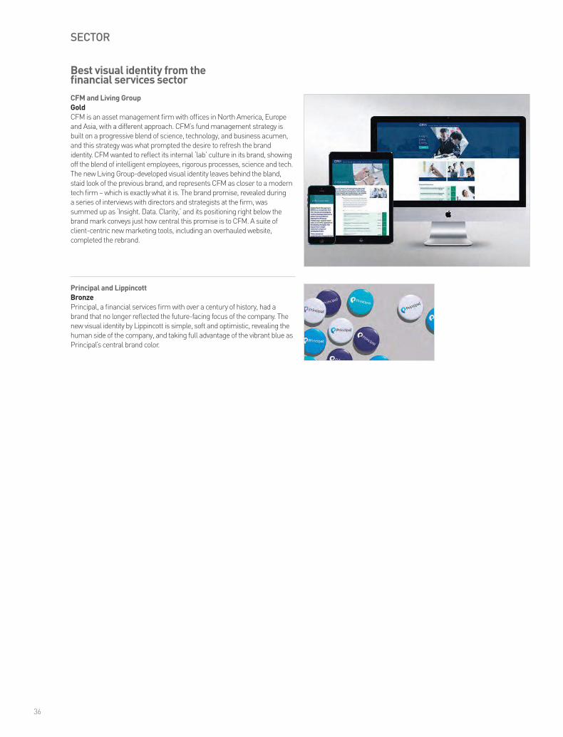
Best visual identity from the financial services sectorCFM and Living GroupGoldCFM is an asset management firm with offices in North America, Europe and Asia, with a different approach. CFM’s fund management strategy is built on a progressive blend of science, technology, and business acumen, and this strategy was what prompted the desire to refresh the brand identity. CFM wanted to reflect its internal ‘lab’ culture in its brand, showing off the blend of intelligent employees, rigorous processes, science and tech. The new Living Group-developed visual identity leaves behind the bland, staid look of the previous brand, and represents CFM as closer to a modern tech firm – which is exactly what it is. The brand promise, revealed during a series of interviews with directors and strategists at the firm, was summed up as ‘Insight. Data. Clarity,’ and its positioning right below the brand mark conveys just how central this promise is to CFM. A suite of client-centric new marketing tools, including an overhauled website, completed the rebrand.
Principal and LippincottBronzePrincipal, a financial services firm with over a century of history, had a brand that no longer reflected the future-facing focus of the company. The new visual identity by Lippincott is simple, soft and optimistic, revealing the human side of the company, and taking full advantage of the vibrant blue as Principal’s central brand color.
36
Transawards_NA_2016_17Oct16.indd 36 20/10/2016 16:08

SECTOR
Vizient and FutureBrandSilverVizient brought together the legacy healthcare organizations UHC, VHA and Novation, and its new brand evokes vision, experience and intelligence, while retaining the power of its previous brands and setting the business apart from its competitors. FutureBrand worked to create a new logo, bold color palette and confident imagery to feed into this strong visual identity.
nThrive, Inc. and Aloft Group, Inc.GoldFollowing the passage of the Affordable Care Act, healthcare billing processes have become more complicated, and many providers have outsourced parts or the whole of the healthcare revenue cycle to independent firms. nThrive is the result of three companies, Equation, Precyse and MedAssets, coming together to fulfil this gap in the marketplace – MedAssets and Precyse were acquired for their healthcare revenue expertise, and Equation Health was brought in to strengthen the company’s analytics. Aloft Group’s branding of the new organization started with a clear, inspiring vision of the organization, which fed into a name that evokes life and health, as well as transformation. Company departments from technology to consulting were renamed and brought under the nThrive banner. A logo was designed to create a sensation of movement and energy, represented a company that will grow and expand, yet remain connected to its core values, and the color story is cohesive, warm and vibrant.
Best visual identity from the healthcare & pharmaceuticals sector
37
Best visual identity from the industrial & basic materials sectorScholle IPNGoldScholle IPN is the result of the merger of two packaging companies in late 2014. The company produces billions of items that are used in the flexible packaging of food, beverage and non–food products, from components used in boxed wine to soda fountains, and many others. The new brand needed to stand for protection and strength, hence the development of a shield brand mark, inspired by natural elements as well as the company’s products. This brand mark is injection moulded into Scholle IPN’s components so that consumers would recognize the new brand, and be reassured of the product’s quality. The new visual identity also builds on the four core values of Scholle IPN: safe, natural, economic and sustainable. “Thoughtful,” “Strategic,” and, “Fresh,” were some of our judges’ comments, while one wrote, “The notion of a seal of approval, a form that can build equity and recognition over time, is spot on.”
Transawards_NA_2016_17Oct16.indd 37 20/10/2016 16:08

SECTOR
Ashurst and Living GroupBronzeAshurst, a leading international law firm, had an existing reputation as an exceptional place to work, which it wanted to maintain while also projecting the client-centric focus of the business. Its brand development by Living Group took the core personality values of the firm and created a cohesive, simple identity to get its message across to clients and employees alike.
Best visual identity from the professional services sectorWE Communications and Salt BrandingGoldGlobal public relations firm WE Communications needed to capture what was unique and authentic about its brand. In developing the new identity, stakeholders including senior management, leading clients and industry partners were interviewed to reveal the core proposition and personality of WE, feeding into the central creative concept of the brand development. This key element became the idea of ‘the impact zone’ – WE operates at the intersection of people, technology and brands, and this inspired creative work by Salt Branding centered on visual juxtapositions. The visual identity of WE grew out of these juxtaposed images, inspiring a new logo, a fusion alphabet and a strong graphic identity. A complete redesign of the WE website followed, as well as launch events, a lecture series for thought leaders, billboards and even branded sneakers. “Beautiful,” said one judge. “Different and fresh,” said another, as well as commending the strong implementation of the new brand.
Orrick and Living GroupSilverOrrick, an international law firm with expertise in technology, finance, energy and infrastructure, wanted to position itself as client-first and a great place to work. A complete digital rebrand and a new visual identity by Living Group more than ably met the challenge of conveying what sets Orrick apart from a crowded marketplace.
38
Transawards_NA_2016_17Oct16.indd 38 20/10/2016 16:08

SECTOR
Ashley Furniture HomeStore and InterbrandSilverAshley Furniture Industries had a strong manufacturing heritage, but needed to invest in its retail brand in order to have a strong position in the sector. Ashley HomeStore’s new brand, by Interbrand, is positioned as a trusted partner for the home, combining the core messages of great value and inspiring individual style.
JackRabbit and LippincottGoldIn 2014, several running specialty stores in New York were brought together. This group continued to grow over the course of 2015, swelling to 50 stores, creating an opportunity to build a strong new lifestyle brand that would resonate with consumers and staff. The JackRabbit name was chosen to build on existing brand equity of one of the original stores. But it also pushes the company forward. It evokes running and active lifestyles, but it isn’t explicit or limited. The new visual identity is mature and fluid, with a distinctive color story and friendly typography. Lippincott helped JackRabbit develop this new brand through experiences in-store and in the community, beginning with a strong launch at the 2015 New York City marathon. “Beautiful,” said two of our judges, and, “Fast and modern.” The new identity, said another, is versatile, and an innovative way to meet the challenge of a new brand.
Best visual identity from the retail sector
Capo Capo and ConcreteBronzeThis unusual product – a new aperitivo rosso – challenges a heritage market. The retail strategy was carried out through distinctive packaging by Concrete that represented the brand identity of a marriage of Italian romance with contemporary cocktail culture, and the visual identity is unmistakably distinctive, modern and vibrant.
Bite Beauty Amuse Bouche and ConcreteBronze Bite Beauty launched a line of natural lip products in 2012 with limited marketing, but the launch of its new Amuse Bouche line was an opportunity to tell a bigger story. Custom packaging and a digital microsite by Concrete helped the new line to stand out, and reinforced Bite’s commitment to natural, healthy ingredients.
Highly commended – Mountain equipment Co-op and Concrete
39
Transawards_NA_2016_17Oct16.indd 39 20/10/2016 16:08

Audio branding dos and don’ts
Audio branding builds brand value. Your brand deserves a coherent system of sound and music created specifically to convey its values and advantages of your brand. Your brand can make every touchpoint a relationship-builder. Any company with a brand identity and a style guide should also have audio identity and an audio style guide.
Don’t leave audio strategy until the last minute. Just like creating your visual brand’s foundation strategy and elements, plan your music and sound at the outset. Don’t confuse audio branding with entertainment. It has a strategic, trust-building job to do. Your goal is to completely define the audio universe for your brand, just as your graphic standards define your brand’s complete visual universe.
Don’t forget that impact without meaning can be distracting and counterproductive. Your audio footprint must convey the brand’s essence, promise and values. Even if your colleagues love nostalgic music, don’t be tempted to use it if your brand stands for forward-thinking innovation. Don’t choose a piece of music just because you like it. Ask instead, “What does it say?” Music is a universal language. Be deliberate in the way you select music for your tactical marketing. Once you’ve established your audio DNA and audio logo, this becomes easier. Don’t repeat the same music mindlessly. Adapt it to the context.
Don’t confuse music production houses with audio branding experts, even if they claim to be able to create audio logos. Branding experts are focused on finding a way to make your brand distinctive in the category and precise in its communication of brand essence, promise and values.
Articulate what your brand ideally represents before addressing what the audio brand must do. Because your audio identity’s role is to express the core of your brand essence, the first task is to fully define it. Only then can you design the music that expresses it. Think of your audio brand as a system of distinctive sounds and music, not as a jingle or even a standalone audio logo at the end of a television or pre-roll commercial.
Investigate the audio approaches your direct and indirect competitors are using, so you can stand out – just like you would for your visual brand. Enumerate your key audio touchpoints, including your branded content, your on-hold music, your trade show booth, your radio and TV spots, your app-opening sounds, your events, your parking lots, corridors and more. In different situations the audience has different needs. Make sure you use the right music to support those needs in various circumstances. The identity system for your audio brand will be designed to be coherent within the overall brand but must be adaptable to fit each setting.
Whenever your visual logo animates onto the screen, plan to adjust your audio logo at the same time. The most powerful branding tool in your kit will be your multi-sensory end frame.
Colleen Fahey is US managing director at Sixième Son
40
Transawards_NA_2016_17Oct16.indd 40 20/10/2016 16:08

Transawards_NA_2016_17Oct16.indd 41 20/10/2016 16:08

SECTOR
Hewlett Packard Enterprise and Siegel+GaleBronzeHewlett Packard Enterprise (HPE) was one of the companies that resulted from the largest corporate demerger in history, the split of the Hewlett-Packard Company. HPE’s fresh visual identity by Siegel+Gale retains the remarkable legacy and brand value of its origins, while also demonstrating the new purpose and promise of the business.
Givergy and Living GroupGoldGivergy, one of the world’s largest online and silent auction technology companies, raises over $40m a year for charities and corporate foundations. It had been operating under two distinct brands: iBid in the UK and Daana in North America. Bringing the two brands together into one cohesive identity meant that Givergy could grow further, enabling the launch of new products across markets and the development of a single internal culture. The Givergy name evokes ‘giving,’ ‘events’ and ‘energy,’ and the visual identity matches the sector by creating a bright, colorful, practical and engaging look for the brand. “Impactful and engaging,” “Appealing and accessible,” and, “Very smart,” our judges wrote of Living Group’s brand strategy. Givergy has now been relaunched in the US, Canada, Europe and Asia, after just six weeks to turn around the brand and successfully embed the new identity.
Best visual identity from the technology, media & telecommunications sector
42
Transawards_NA_2016_17Oct16.indd 42 20/10/2016 16:08

Best visual identity from the travel & leisure sectorTaos Ski Valley and Origin Design & Communications LtdGoldTaos Ski Valley sits high in the Sangre de Cristo mountain range of New Mexico, a year-round resort for sophisticated adventurers. The development of a hotel at the base of the valley, named the Blake in honour of ski pioneer Ernie Blake, required a brand identity to match the tastes of the target guest. The new brand by Origin Design incorporates the region’s unique heritage, a fusion of European, Hispanic and Native American cultures, and focuses on the guest experience. The Blake’s identity is as much about the intimate details of a guest’s stay as it is about the big elements, and this fed into the visual brand of the hotel. The logo and language evoke the hotel’s eclectic heritage and majestic setting, and the brand experience planned for visitors will reflect the blend of local, regional and international flavors that set this hotel and location apart in the travel and leisure marketplace.
SECTOR
43
Transawards_NA_2016_17Oct16.indd 43 20/10/2016 16:08

Transawards_NA_2016_17Oct16.indd 44 20/10/2016 16:08
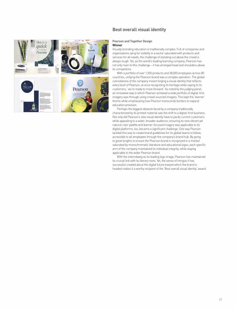
Pearson and Together DesignWinnerVisually branding education is traditionally complex. Full of companies and organizations vying for visibility in a sector saturated with products and services for all needs, the challenge of standing out above the crowd is always tough. Yet, as the world’s leading learning company, Pearson has not only risen to this challenge – it has emerged head and shoulders above its competitors.
With a portfolio of over 1,500 products and 38,000 employees across 80 countries, unifying the Pearson brand was a complex operation. The global connotations of the company meant forging a visual identity that reflects every facet of Pearson, at once recognizing its heritage while saying to its customers, ‘we’re ready to move forward.’ As noted by the judging panel, an innovative way in which Pearson achieved a wide portfolio of digital-first imagery was through using crowd-sourced imagery. This kept the ‘learner’ theme while emphasizing how Pearson transcends borders to expand education provision.
Perhaps the biggest obstacle faced by a company traditionally characterized by its printed material was the shift to a digital-first business. Not only did Pearson’s new visual identity have to pacify current customers while appealing to a wider, broader audience; ensuring its new vibrant yet natural color palette and learner-focused imagery was applicable to its digital platforms, too, became a significant challenge. One way Pearson tackled this was to create brand guidelines for its global teams to follow, accessible to all employees through the company’s brand hub. By going to great lengths to ensure the Pearson brand is recognized in a market saturated by monochromatic literature and educational logos, each specific arm of the company maintained its individual integrity, while staying applicable to the wider Pearson brand.
With the interrobang as its leading logo image, Pearson has maintained its crucial link with its literary roots. Yet, the sense of intrigue it has successful created about the digital future toward which the brand is headed makes it a worthy recipient of the ‘Best overall visual identity’ award.
Best overall visual identity
45
Transawards_NA_2016_17Oct16.indd 45 20/10/2016 16:08

Grand Prix
Tupperware and FutureBrandWinnerTupperware and FutureBrand approached a branding challenge in a way that can best be summed up by its tagline, ‘Confidence becomes you.’ Contemporizing a global brand whose name has come to represent its entire category, was a daunting task that took creativity and talent.
Going beyond brand modernization, FutureBrand also took the opportunity to celebrate Tupperware’s rich heritage in empowering women since the 1950s. Known for its classic food storage containers and unique direct sales model, Tupperware needed to bring the overshadowed suite of food prep and cooking solutions back to light.
Branding a global community, in addition to its products, is challenging. Tupperware and FutureBrand first unveiled the company’s new brand signature to its internal community before rolling it out to the public. Through an evolved voice and new personality attributes, Tupperware now exemplifies the confidence it has in its vision, customers and products.
Tupperware and FutureBrand have collected a silver for ‘Best brand evolution’ and three gold awards for ‘Best use of copy style/tone of voice,’ ‘Best internal communication during a brand development project’ and the coveted ‘Best creative strategy’ category.
Tupperware’s ability to reestablish itself as a timeless brand, while elevating its community through empowerment, make it this year’s Grand Prix winner.
46
www.tisaglobal.com
Creating SynergySimply put, there is no other sign company around the globe with more brand implementation experience than The International Sign Alliance. While our name may be new, collaborating partners, Pearce Signs and Philadelphia Sign, have over three centuries of signage, brand implementation and large-scale program management between them. Our longevity alone does not define our success. We are the first choice of global corporations for sign and re-branding services because of our high quality products, best-in-class solutions, competitive pricing and a renowned dedication to client satisfaction. There is virtually no situation or challenge we have not met or business sector we have not served. And, both part-ners have continuously been at the forefront of sign industry innovations – whether in material advances, break-through technologies or new methodologies. TISA can produce your most complex designs, and manage tight turnarounds on any scale with the time-tested strategies, value engineering and tactical experience you’d expect from a world leader.
The International Sign Alliance brings your brand to life around the world. In the last decade, we have provided more than $1.2 billion (USD) of products and services to clients from Singapore to London to New York City. No matter how many signs or how many sites, we translate the creative expression of your brand into a realistic experience that engages your customers through sign on every continent. TISA can deliver your brand message to your audience, when and where you need to be.
TISA_Transform_2016.indd 1 10/12/16 4:32 PMTransawards_NA_2016_17Oct16.indd 46 20/10/2016 16:08

www.tisaglobal.com
Creating SynergySimply put, there is no other sign company around the globe with more brand implementation experience than The International Sign Alliance. While our name may be new, collaborating partners, Pearce Signs and Philadelphia Sign, have over three centuries of signage, brand implementation and large-scale program management between them. Our longevity alone does not define our success. We are the first choice of global corporations for sign and re-branding services because of our high quality products, best-in-class solutions, competitive pricing and a renowned dedication to client satisfaction. There is virtually no situation or challenge we have not met or business sector we have not served. And, both part-ners have continuously been at the forefront of sign industry innovations – whether in material advances, break-through technologies or new methodologies. TISA can produce your most complex designs, and manage tight turnarounds on any scale with the time-tested strategies, value engineering and tactical experience you’d expect from a world leader.
The International Sign Alliance brings your brand to life around the world. In the last decade, we have provided more than $1.2 billion (USD) of products and services to clients from Singapore to London to New York City. No matter how many signs or how many sites, we translate the creative expression of your brand into a realistic experience that engages your customers through sign on every continent. TISA can deliver your brand message to your audience, when and where you need to be.
TISA_Transform_2016.indd 1 10/12/16 4:32 PMTransawards_NA_2016_17Oct16.indd 47 20/10/2016 16:08

The Transform Awards has honored brand development and rebranding
projects for the past seven years. From big global agencies to small local work, the awards recognize excellence
and reward innovation in branding.
Transform magazine | +44 20 7498 7008#TransNA | @TransformEvents
www.transformmagazine.net
Transawards_NA_2016_17Oct16.indd 48 20/10/2016 16:08