new york state common core - mathematics curriculum
TRANSCRIPT

Module 2: Descriptive Statistics Date: 8/16/13
1
© 2013 Common Core, Inc. Some rights reserved. commoncore.org This work is licensed under a Creative Commons Attribution-NonCommercial-ShareAlike 3.0 Unported License.
New York State Common Core
Mathematics Curriculum
ALGEBRA I • MODULE 2 Table of Contents1
Descriptive Statistics Module Overview ............................................................................................................................................ 3
Topic A: Shapes and Centers of Distributions (S-ID.1, S-ID.2, S-ID.3) ................................................................ 9
Lesson 1: Distributions and Their Shapes ............................................................................................10
Lesson 2: Describing the Center of a Distribution ...............................................................................21
Lesson 3: Estimating Centers and Interpreting the Mean as a Balance Point .......................................32
Topic B: Describing Variability and Comparing Distributions (S-ID.1, S-ID.2, S-ID.3) .........................................41
Lesson 4: Summarizing Deviations from the Mean .............................................................................42
Lesson 5: Measuring Variability for Symmetrical Distributions ............................................................50
Lesson 6: Interpreting the Standard Deviation ....................................................................................59
Lesson 7: Measuring Variability for Skewed Distributions (Interquartile Range) ..................................68
Lesson 8: Comparing Distributions .....................................................................................................79
Mid-Module Assessment and Rubric ..............................................................................................................86 Topics A through B (assessment 1 day, return 0 days, remediation or further applications 1 day)
Topic C: Categorical Data on Two Variables (S-ID.5, S-ID.9) .............................................................................97
Lesson 9: Summarizing Bivariate Categorical Data ..............................................................................98
Lesson 10: Summarizing Bivariate Categorical Data with Relative Frequencies .................................106
Lesson 11: Conditional Relative Frequencies and Association ...........................................................114
Topic D: Numerical Data on Two Variables (S-ID.6, S-ID.7, S-ID.8, S-ID.9) ......................................................126
Lessons 12–13: Relationships between Two Numerical Variables .....................................................127
Lesson 14: Modeling Relationships with a Line .................................................................................150
Lesson 15: Interpreting Residuals from a Line ...................................................................................163
Lesson 16: More on Modeling Relationships with a Line ...................................................................174
Lessons 17–18: Analyzing Residuals ..................................................................................................184
Lesson 19: Interpreting Correlation ..................................................................................................201
1 Each lesson is ONE day and ONE day is considered a 45 minute period.
Module 2: Descriptive Statistics Date: 8/16/13
2
© 2013 Common Core, Inc. Some rights reserved. commoncore.org This work is licensed under a Creative Commons Attribution-NonCommercial-ShareAlike 3.0 Unported License.
M2 Module Overview NYS COMMON CORE MATHEMATICS CURRICULUM
ALGEBRA I
Lesson 20: Analyzing Data Collected on Two Variables .....................................................................219
End-of-Module Assessment and Rubric .......................................................................................................222 Topics A through D (assessment 1 day, return 1 day, remediation or further applications 1 day)

Module 2: Descriptive Statistics Date: 8/16/13
3
© 2013 Common Core, Inc. Some rights reserved. commoncore.org This work is licensed under a Creative Commons Attribution-NonCommercial-ShareAlike 3.0 Unported License.
M2 Module Overview NYS COMMON CORE MATHEMATICS CURRICULUM
ALGEBRA I
Algebra I • Module 2
Descriptive Statistics
OVERVIEW In this module, students reconnect with and deepen their understanding of statistics and probability concepts first introduced in Grades 6, 7, and 8. There is variability in data, and this variability often makes learning from data challenging. Students develop a set of tools for understanding and interpreting variability in data, and begin to make more informed decisions from data. Students work with data distributions of various shapes, centers, and spreads. Measures of center and measures of spread are developed as ways of describing distributions. The choice of appropriate measures of center and spread is tied to distribution shape. Symmetric data distributions are summarized by the mean and mean absolute deviation or standard deviation. The median and the interquartile range summarize data distributions that are skewed. Students calculate and interpret measures of center and spread and compare data distributions using numerical measures and visual representations.
Students build on their experience with bivariate quantitative data from Grade 8; they expand their understanding of linear relationships by connecting the data distribution to a model and informally assessing the selected model using residuals and residual plots. Students explore positive and negative linear relationships and use the correlation coefficient to describe the strength and direction of linear relationships. Students also analyze bivariate categorical data using two-way frequency tables and relative frequency tables. The possible association between two categorical variables is explored by using data summarized in a table to analyze differences in conditional relative frequencies.
This module sets the stage for more extensive work with sampling and inference in later grades.
Focus Standards
Summarize, represent, and interpret data on a single count or measurement variable.
S-ID.1 Represent data with plots on the real number line (dot plots, histograms, and box plots).
S-ID.2 Use statistics appropriate to the shape of the data distribution to compare center (median, mean) and spread (interquartile range, standard deviation) of two or more different data sets.
S-ID.3 Interpret differences in shape, center, and spread in the context of the data sets, accounting for possible effects of extreme data points (outliers).

Module 2: Descriptive Statistics Date: 8/16/13
4
© 2013 Common Core, Inc. Some rights reserved. commoncore.org This work is licensed under a Creative Commons Attribution-NonCommercial-ShareAlike 3.0 Unported License.
M2 Module Overview NYS COMMON CORE MATHEMATICS CURRICULUM
ALGEBRA I
Summarize, represent, and interpret data on two categorical and quantitative variables.
S-ID.5 Summarize categorical data for two categories in two-way frequency tables. Interpret relative frequencies in the context of the data (including joint, marginal, and conditional relative frequencies). Recognize possible associations and trends in the data.
S-ID.6 Represent data on two quantitative variables on a scatter plot and describe how the variables are related.
a. Fit a function to the data; use functions fitted to data to solve problems in the context of the data. Use given functions or choose a function suggested by the context. Emphasize linear, quadratic, and exponential models.
b. Informally assess the fit of a function by plotting and analyzing residuals.
c. Fit a linear function for a scatter plot that suggests a linear association.
Interpret linear models.
S-ID.7 Interpret the slope (rate of change) and the intercept (constant term) of a linear model in the context of the data.
S-ID.8 Compute (using technology) and interpret the correlation coefficient of a linear fit.
S-ID.9 Distinguish between correlation and causation.
Foundational Standards
Develop understanding of statistical variability.
6.SP.1 Recognize a statistical question as one that anticipates variability in the data related to the question and accounts for it in the answers. For example, “How old am I?” is not a statistical question, but “How old are the students in my school?” is a statistical question because one anticipates variability in students’ ages.
6.SP.2 Understand that a set of data collected to answer a statistical question has a distribution which can be described by its center, spread, and overall shape.
6.SP.3 Recognize that a measure of center for a numerical data set summarizes all of its values with a single number, while a measure of variation describes how its values vary with a single number.
Summarize and describe distributions.
6.SP.4 Display numerical data in plots on a number line, including dot plots, histograms, and box plots.

Module 2: Descriptive Statistics Date: 8/16/13
5
© 2013 Common Core, Inc. Some rights reserved. commoncore.org This work is licensed under a Creative Commons Attribution-NonCommercial-ShareAlike 3.0 Unported License.
M2 Module Overview NYS COMMON CORE MATHEMATICS CURRICULUM
ALGEBRA I
6.SP.5 Summarize numerical data sets in relation to their context such as by:
a. Reporting the number of observations.
b. Describing the nature of the attribute under investigation, including how it was measured and its units of measurement.
c. Giving quantitative measures of center (median and/or mean) and variability (interquartile range and/or mean absolute deviation), as well as describing any overall pattern and any striking deviations from the overall pattern with reference to the context in which the data were gathered.
d. Relating the choice of measures of center and variability to the shape of the data distribution and the context in which the data were gathered.
Investigate patterns of association in bivariate data.
8.SP.1 Construct and interpret scatter plots for bivariate measurement data to investigate patterns of association between two quantities. Describe patterns such as clustering, outliers, positive or negative association, linear association, and nonlinear association.
8.SP.2 Know that straight lines are widely used to model relationships between two quantitative variables. For scatter plots that suggest a linear association, informally fit a straight line, and informally assess the model fit by judging the closeness of the data points to the line.
8.SP.3 Use the equation of a linear model to solve problems in the context of bivariate measurement data, interpreting the slope and intercept. For example, in a linear model for a biology experiment, interpret a slope of 1.5 cm/hr as meaning that an additional hour of sunlight each day is associated with an additional 1.5 cm in mature plant height.
8.SP.4 Understand that patterns of association can also be seen in bivariate categorical data by displaying frequencies and relative frequencies in a two-way table. Construct and interpret a two-way table summarizing data on two categorical variables collected from the same subjects. Use relative frequencies calculated for rows or columns to describe possible association between the two variables. For example, collect data from students in your class on whether or not they have a curfew on school nights and whether or not they have assigned chores at home. Is there evidence that those who have a curfew also tend to have chores?
Focus Standards for Mathematical Practice MP.1 Make sense of problems and persevere in solving them. Students choose an appropriate
method of analysis based on problem context. They consider how the data were collected and how data can be summarized to answer statistical questions. Students select a graphical display appropriate to the problem context. They select numerical summaries appropriate to the shape of the data distribution. Students use multiple representations and numerical summaries and then determine the most appropriate representation and summary for a given data distribution.

Module 2: Descriptive Statistics Date: 8/16/13
6
© 2013 Common Core, Inc. Some rights reserved. commoncore.org This work is licensed under a Creative Commons Attribution-NonCommercial-ShareAlike 3.0 Unported License.
M2 Module Overview NYS COMMON CORE MATHEMATICS CURRICULUM
ALGEBRA I
MP.2 Reason abstractly and quantitatively. Students pose statistical questions and reason about how to collect and interpret data in order to answer these questions. Students form summaries of data using graphs, two-way tables, and other representations that are appropriate for a given context and the statistical question they are trying to answer. Students reason about whether two variables are associated by considering conditional relative frequencies.
MP.3 Construct viable arguments and critique the reasoning of others. Students examine the shape, center, and variability of a data distribution and use characteristics of the data distribution to communicate the answer to a statistical question in the form of a poster presentation. Students also have an opportunity to critique poster presentations made by other students.
MP.4 Model with mathematics. Students construct and interpret two-way tables to summarize bivariate categorical data. Students graph bivariate numerical data using a scatterplot and propose a linear, exponential, quadratic, or other model to describe the relationship between two numerical variables. Students use residuals and residual plots to assess if a linear model is an appropriate way to summarize the relationship between two numerical variables.
MP.5 Use appropriate tools strategically. Students visualize data distributions and relationships between numerical variables using graphing software. They select and analyze models that are fit using appropriate technology to determine whether or not the model is appropriate. Students use visual representations of data distributions from technology to answer statistical questions.
MP.6 Attend to precision. Students interpret and communicate conclusions in context based on graphical and numerical data summaries. Students use statistical terminology appropriately.
Terminology
New or Recently Introduced Terms
Skewed data distributions (A data distribution is said to be skewed if the distribution is not symmetric with respect to its mean. Left-skewed or skewed to the left is indicated by the data spreading out longer (like a tail) on the left side. Right-skewed or skewed to the right is indicated by the data spreading out longer (like a tail) on the right side.)
Outliers (An outlier of a finite numerical data set is a value that is greater than 𝑄3 by a distance of 1.5 ∙ 𝐼𝑄𝑅 or a value that is less than 𝑄1 by a distance of 1.5 ∙ 𝐼𝑄𝑅. Outliers are usually identified by an “*” or a “•” in a box plot.)
Sample standard deviation (The sample variance for a numerical sample data set of 𝑛 values is the sum of the squared distances the values are from the mean divided by (𝑛 − 1). The sample standard deviation is the principle (positive) square root of the sample variance.)
Interquartile range (The interquartile range (or 𝐼𝑄𝑅) is the distance between the first quartile and the second quartile: 𝐼𝑄𝑅 = 𝑄3 − 𝑄1. The 𝐼𝑄𝑅 describes variability by identifying the length of the interval that contains the middle 50% of the data values.)

Module 2: Descriptive Statistics Date: 8/16/13
7
© 2013 Common Core, Inc. Some rights reserved. commoncore.org This work is licensed under a Creative Commons Attribution-NonCommercial-ShareAlike 3.0 Unported License.
M2 Module Overview NYS COMMON CORE MATHEMATICS CURRICULUM
ALGEBRA I
Association (A statistical association is any relationship between measures of two types of quantities so that one is statistically dependent on the other.)
Conditional relative frequency (A conditional relative frequency compares a frequency count to the marginal total that represents the condition of interest.)
Residual (The residual of the data point (𝑥𝑖 , 𝑦𝑖) is the (actual 𝑦𝑖-value) - (predicted 𝑦-value) for the
given 𝑥𝑖.)
Residual plot (Given a bivariate data set and linear equation used to model the data set, a residual plot is the graph of all ordered pairs determined as follows: for each data point (𝑥𝑖 , 𝑦𝑖) in the data set, the first entry of the ordered pair is the 𝑥-value of the data point and the second entry is the residual of the data point.)
Correlation coefficient (The correlation coefficient, often denoted by 𝑟, is a number between −1 and +1 inclusively that measures the strength and direction of a linear relationship between the two types of quantities. If 𝑟 = 1 (likewise, 𝑟 = −1), then the graph of data points of the bivariate data set lie on a line of positive slope (negative slope).)
Familiar Terms and Symbols2
Mean
Median
Data distribution
Variability
Mean absolute deviation
Box plot
Quartile
Suggested Tools and Representations Graphing calculator
Spreadsheet software
Dot plot
Box plot
Histogram
Residual plot
2 These are terms and symbols students have seen previously.

Module 2: Descriptive Statistics Date: 8/16/13
8
© 2013 Common Core, Inc. Some rights reserved. commoncore.org This work is licensed under a Creative Commons Attribution-NonCommercial-ShareAlike 3.0 Unported License.
M2 Module Overview NYS COMMON CORE MATHEMATICS CURRICULUM
ALGEBRA I
Assessment Summary
Assessment Type Administered Format Standards Addressed
Mid-Module Assessment Task
After Topic B Constructed response with rubric S-ID.1, S-ID.2, S-ID.3
End-of-Module Assessment Task
After Topic D Constructed response with rubric S-ID.2, S-ID.3, S-ID.5, S-ID.6, S-ID.7, S-ID.8, S-ID.9

Topic B: Describing Variability and Comparing Distributions Date: 8/16/13
41
© 2013 Common Core, Inc. Some rights reserved. commoncore.org This work is licensed under a Creative Commons Attribution-NonCommercial-ShareAlike 3.0 Unported License.
New York State Common Core
Mathematics Curriculum
ALGEBRA I • MODULE 2 Topic B:
Describing Variability and Comparing
Distributions
S-ID.1, S-ID.2, S-ID.3
Focus Standard: S-ID.1 Represent data with plots on the real number line (dot plots, histograms, and
box plots).
S-ID.2 Use statistics appropriate to the shape of the data distribution to compare
center (median, mean) and spread (interquartile range, standard deviation) of
two or more different data sets.
S-ID.3 Interpret differences in shape, center, and spread in the context of the data
sets, accounting for possible effects of extreme data points (outliers).
Instructional Days: 5
Lesson 4: Summarizing Deviations from the Mean
Lesson 5: Measuring Variability for Symmetrical Distributions
Lesson 6: Interpreting the Standard Deviation
Lesson 7: Measuring Variability for Skewed Distributions (Interquartile Range)
Lesson 8: Comparing Distributions
In Topic B, students reconnect with methods for describing variability first seen in Grade 6. Topic B deepens students’ understanding of measures of variability by connecting a measure of the center of a data distribution to an appropriate measure of variability. The mean is used as a measure of center when the distribution is more symmetrical. Students calculate and interpret the mean absolute deviation and the standard deviation to describe variability for data distributions that are approximately symmetric. The median is used as a measure of center for distributions that are more skewed, and students interpret the interquartile range as a measure of variability for data distributions that are not symmetric. Students match histograms to box plots for various distributions based on an understanding of center and variability. Students describe data distributions in terms of shape, a measure of center, and a measure of variability from the center.

Lesson 4: Summarizing Deviations from the Mean Date: 8/15/13
42
© 2013 Common Core, Inc. Some rights reserved. commoncore.org
NYS COMMON CORE MATHEMATICS CURRICULUM
This work is licensed under a Creative Commons Attribution-NonCommercial-ShareAlike 3.0 Unported License.
M2 Lesson 4
ALGEBRA I
Lesson 4: Summarizing Deviations from the Mean
Student Outcomes
Students calculate the deviations from the mean for two symmetrical data sets that have the same means.
Students interpret deviations that are generally larger as identifying distributions that have a greater spread or variability than a distribution in which the deviations are generally smaller.
Lesson Notes
The lesson prepares students for a future understanding of the standard deviation of a data set, focusing on the role of
the deviations from the mean. Students practice calculating deviations from the mean and generalize their calculations
by relating them to the expression 𝑥 − �̅�. Students reflect on the relationship between the sizes of the deviations from
the mean and the spread (variability) of the distribution.
Classwork
Exercises 1–4 (15 minutes)
Discuss Exercises 1–4 as a class.
Exercises 1–4
A consumers’ organization is planning a study of the various brands of batteries that are available. As part of its planning,
it measures lifetime (how long a battery can be used before it must be replaced) for each of six batteries of Brand A and
eight batteries of Brand B. Dot plots showing the battery lives for each brand are shown below.
1. Does one brand of battery tend to last longer, or are they roughly the same? What calculations could you do in
order to compare the battery lives of the two brands?
It should be clear from the dot plot that the two brands are roughly the same in terms of expected battery life. One
way of making this comparison would be to calculate the means for the two brands. The means are 101 hours for
Brand A and 100.5 hours for Brand B, so there is very little difference between the two.
2. Do the battery lives tend to differ more from battery to battery for Brand A or for Brand B?
The dot plot shows that the variability in battery life is greater for Brand B than for Brand A.
3. Would you prefer a battery brand that has battery lives that do not vary much from battery to battery? Why or why
not?
We prefer a brand with small variability in lifespan because these batteries will be more consistent and more
predictable.

Lesson 4: Summarizing Deviations from the Mean Date: 8/15/13
43
© 2013 Common Core, Inc. Some rights reserved. commoncore.org
NYS COMMON CORE MATHEMATICS CURRICULUM
This work is licensed under a Creative Commons Attribution-NonCommercial-ShareAlike 3.0 Unported License.
M2 Lesson 4
ALGEBRA I
Ask:
What would I mean by “variability” in the set of battery lives. How could I measure it?
Allow students to discuss ideas. Perhaps some will come up with a general idea of the differences between the mean
and the values. Perhaps some students will notice the term deviation from the mean in the table that follows the
questions just completed. If not:
Notice that in the next table in your packet (Brand A), the second row says, “Deviation from the mean”. How do you suppose you might fill in this row of the table?
The table below shows the lives (in hours) of the Brand A batteries.
Life (Hours) 83 94 96 106 113 114
Deviation from the Mean -18 -7 -5 +5 +12 +13
4. Calculate the deviations from the mean for the remaining values, and write your answers in the appropriate places
in the table.
The table below shows the battery lives and the deviations from the mean for Brand B.
Life (Hours) 73 76 92 94 110 117 118 124
Deviation from the Mean −27.5 −24.5 −8.5 −6.5 9.5 16.5 17.5 23.5
Guide students to conclude the following, and work a couple of examples as a group:
To calculate the deviations from the mean we take each data value, 𝑥, and subtract the mean, �̅�, from that data value. The mean for Brand A was 101 hours.
The deviation from the mean for the battery whose life was 114 is 𝑥 − �̅� = 114 − 101 = 13.
For the battery whose life was 83 hours, the deviation from the mean is 83 − 101 = −18.
Students finish filling in the table independently (Exercise 4) and confirm answers with a neighbor.
What do you notice about the values you came up with?
Anticipated response: the values that are greater than the mean have positive deviations from the
mean, and the values that are less than the mean have negative deviations from the mean.
Notice the next table showing deviations from the mean for Brand B.
Ignoring the sign of the deviation, which data set tends to have larger deviations from the mean, A or B?
Why do you think that is?
Encourage students to summarize that the greater the variability (spread) of the distribution, the
greater the deviations from the mean.
What do the deviations from the mean look like on the dot plot?
MP.1
Lesson 4: Summarizing Deviations from the Mean Date: 8/15/13
44
© 2013 Common Core, Inc. Some rights reserved. commoncore.org
NYS COMMON CORE MATHEMATICS CURRICULUM
This work is licensed under a Creative Commons Attribution-NonCommercial-ShareAlike 3.0 Unported License.
M2 Lesson 4
ALGEBRA I
You could draw or project the dot plot for the Brand A batteries on the board, and students might volunteer to come to
the front of the room, locate the mean on the dot plot, and show on the dot plot the distances of the points from the
mean. This is an important step toward a full understanding of deviations from the mean.
After seeing the deviations from the mean for Brand B, students will see that this second brand has deviations from the
mean that are generally larger than those for Brand A. This comes about as a result of the fact that the distribution for
Brand B has a greater spread than the distribution for Brand A.
Exercises 5–10 (10 minutes)
Allow students to work Exercises 5–10 independently and then compare their answers with a neighbor. Frame
discussions around any disagreements between students.
Exercises 5–10
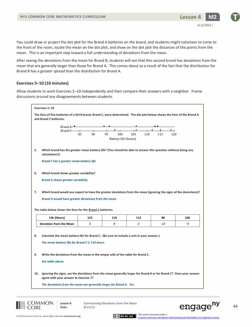
The lives of five batteries of a third brand, Brand C, were determined. The dot plot below shows the lives of the Brand A
and Brand C batteries.
Brand ABrand C
120115110105100959085
Battery life (hours)
5. Which brand has the greater mean battery life? (You should be able to answer this question without doing any
calculations!)
Brand C has a greater mean battery life.
6. Which brand shows greater variability?
Brand A shows greater variability.
7. Which brand would you expect to have the greater deviations from the mean (ignoring the signs of the deviations)?
Brand A would have greater deviations from the mean.
The table below shows the lives for the Brand C batteries.
Life (Hours) 115 119 112 98 106
Deviation from the Mean 5 9 2 -12 -4
8. Calculate the mean battery life for Brand C. (Be sure to include a unit in your answer.)
The mean battery life for Brand C is 110 hours.
9. Write the deviations from the mean in the empty cells of the table for Brand C.
See table above.
10. Ignoring the signs, are the deviations from the mean generally larger for Brand A or for Brand C? Does your answer
agree with your answer to Exercise 7?
The deviations from the mean are generally larger for Brand A. Yes.
Lesson 4: Summarizing Deviations from the Mean Date: 8/15/13
45
© 2013 Common Core, Inc. Some rights reserved. commoncore.org
NYS COMMON CORE MATHEMATICS CURRICULUM
This work is licensed under a Creative Commons Attribution-NonCommercial-ShareAlike 3.0 Unported License.
M2 Lesson 4
ALGEBRA I
Exercises 11–15 (10 minutes)
Allow students to work Exercises 11–15 independently and then compare their answers with a neighbor. Frame
discussions around any disagreements between students.
Exercises 11–15
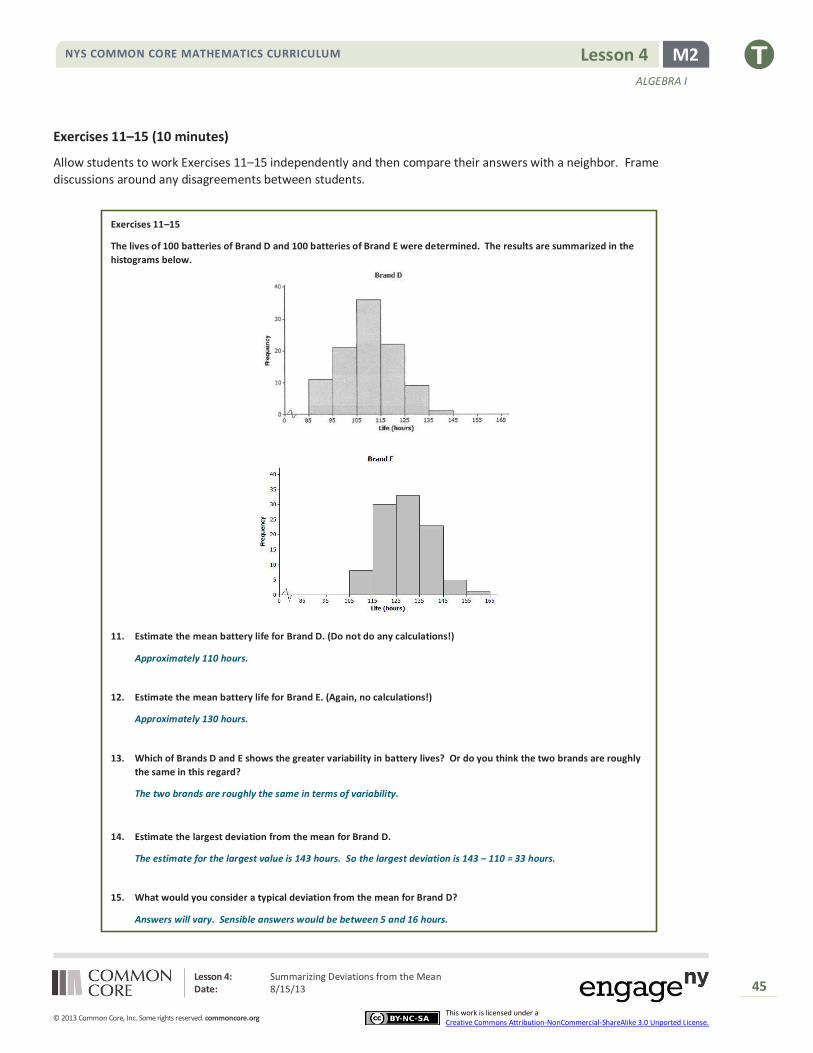
The lives of 100 batteries of Brand D and 100 batteries of Brand E were determined. The results are summarized in the
histograms below.
11. Estimate the mean battery life for Brand D. (Do not do any calculations!)
Approximately 110 hours.
12. Estimate the mean battery life for Brand E. (Again, no calculations!)
Approximately 130 hours.
13. Which of Brands D and E shows the greater variability in battery lives? Or do you think the two brands are roughly
the same in this regard?
The two brands are roughly the same in terms of variability.
14. Estimate the largest deviation from the mean for Brand D.
The estimate for the largest value is 143 hours. So the largest deviation is 143 – 110 = 33 hours.
15. What would you consider a typical deviation from the mean for Brand D?
Answers will vary. Sensible answers would be between 5 and 16 hours.
Lesson 4: Summarizing Deviations from the Mean Date: 8/15/13
46
© 2013 Common Core, Inc. Some rights reserved. commoncore.org
NYS COMMON CORE MATHEMATICS CURRICULUM
This work is licensed under a Creative Commons Attribution-NonCommercial-ShareAlike 3.0 Unported License.
M2 Lesson 4
ALGEBRA I
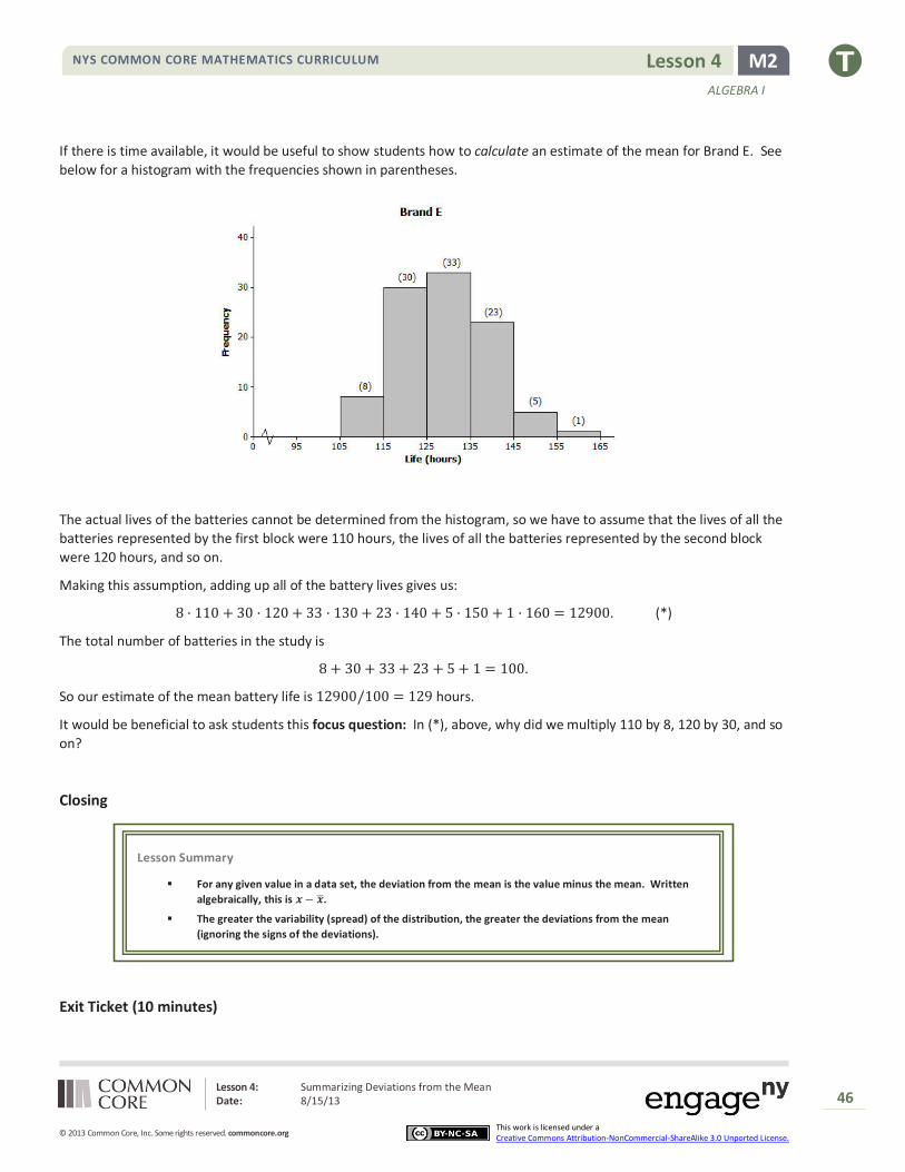
If there is time available, it would be useful to show students how to calculate an estimate of the mean for Brand E. See
below for a histogram with the frequencies shown in parentheses.
The actual lives of the batteries cannot be determined from the histogram, so we have to assume that the lives of all the
batteries represented by the first block were 110 hours, the lives of all the batteries represented by the second block
were 120 hours, and so on.
Making this assumption, adding up all of the battery lives gives us:
8 · 110 + 30 · 120 + 33 · 130 + 23 · 140 + 5 · 150 + 1 · 160 = 12900. (*)
The total number of batteries in the study is
8 + 30 + 33 + 23 + 5 + 1 = 100.
So our estimate of the mean battery life is 12900/100 = 129 hours.
It would be beneficial to ask students this focus question: In (*), above, why did we multiply 110 by 8, 120 by 30, and so
on?
Closing
Exit Ticket (10 minutes)
Lesson Summary
For any given value in a data set, the deviation from the mean is the value minus the mean. Written
algebraically, this is 𝒙 − �̅�.
The greater the variability (spread) of the distribution, the greater the deviations from the mean
(ignoring the signs of the deviations).
Lesson 4: Summarizing Deviations from the Mean Date: 8/15/13
47
© 2013 Common Core, Inc. Some rights reserved. commoncore.org
NYS COMMON CORE MATHEMATICS CURRICULUM
This work is licensed under a Creative Commons Attribution-NonCommercial-ShareAlike 3.0 Unported License.
M2 Lesson 4
ALGEBRA I
Name ___________________________________________________ Date____________________
Lesson 4: Summarizing Deviations from the Mean
Exit Ticket
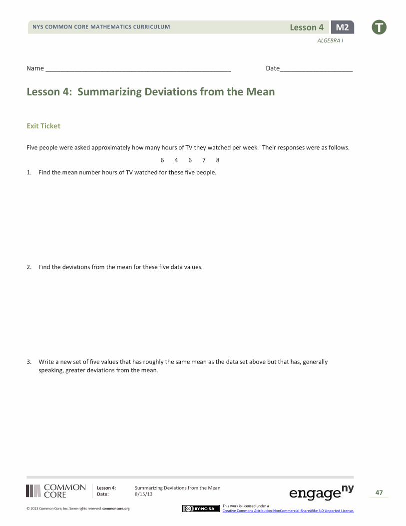
Five people were asked approximately how many hours of TV they watched per week. Their responses were as follows.
6 4 6 7 8
1. Find the mean number hours of TV watched for these five people.
2. Find the deviations from the mean for these five data values.
3. Write a new set of five values that has roughly the same mean as the data set above but that has, generally
speaking, greater deviations from the mean.

Lesson 4: Summarizing Deviations from the Mean Date: 8/15/13
48
© 2013 Common Core, Inc. Some rights reserved. commoncore.org
NYS COMMON CORE MATHEMATICS CURRICULUM
This work is licensed under a Creative Commons Attribution-NonCommercial-ShareAlike 3.0 Unported License.
M2 Lesson 4
ALGEBRA I
Exit Ticket Sample Solutions
The following solutions indicate an understanding of the objectives of this lesson:
Five people were asked approximately how many hours of TV they watched per week. Their responses were as follows.
6 4 6 7 8
1. Find the mean number hours of TV watched for these five people.
𝑴𝒆𝒂𝒏 = (𝟔 + 𝟒 + 𝟔 + 𝟕 + 𝟖)/𝟓 = 𝟔. 𝟐
2. Find the deviations from the mean for these five data values.
The deviations from the mean are −𝟎. 𝟐, −𝟐. 𝟐, −𝟎. 𝟐, 𝟎. 𝟖, 𝟏. 𝟖.
3. Write a new set of five values that has roughly the same mean as the data set above, but that has, generally
speaking, greater deviations from the mean.
There are many correct answers to this question. Check that students’ answers contain five numbers, that the mean
is around 6.2, and that the spread of the numbers is obviously greater than that of the original set of five values.
Here is one example: 0, 0, 0, 15, 16.
Problem Set Sample Solutions
1. Ten members of a high school girls’ basketball team were asked how many hours they studied in a typical week.
Their responses (in hours) were 20, 13, 10, 6, 13, 10, 13, 11, 11, 10.
a. Using the axis given below, draw a dot plot of these values. (Remember, when there are repeated values,
stack the dots with one above the other.)
20191817161514131211109876
Study Time (Hours)
b. Calculate the mean study time for these students.
Mean = 11.7
c. Calculate the deviations from the mean for these study times, and write your answers in the appropriate
places in the table below.
Number of
Hours Studied 20 13 10 6 13 10 13 11 11 10
Deviation from
the Mean 8.3 1.3 −1.7 −5.7 1.3 −1.7 1.3 −0.7 −0.7 −1.7

Lesson 4: Summarizing Deviations from the Mean Date: 8/15/13
49
© 2013 Common Core, Inc. Some rights reserved. commoncore.org
NYS COMMON CORE MATHEMATICS CURRICULUM
This work is licensed under a Creative Commons Attribution-NonCommercial-ShareAlike 3.0 Unported License.
M2 Lesson 4
ALGEBRA I
d. The study times for fourteen girls from the soccer team at the same school as the one above are shown in the
dot plot below.
24232221201918171615141312111098765432
Study time (hours)
Based on the data, would the deviations from the mean (ignoring the sign of the deviations) be greater or less for
the soccer players than for the basketball players?
The spread of the distribution of study times for the soccer players is greater than that for the basketball players.
So the deviations from the mean would be greater for the soccer players than for the basketball players.
2. All the members of a high school softball team were asked how many hours they studied in a typical week. The
results are shown in the histogram below.
(The data set in this question comes from Core Math Tools, www.nctm.org.)
a. We can see from the histogram that four students studied around 5 hours per week. How many students
studied around 15 hours per week?
Eleven students studied around 15 hours per week.
b. How many students were there in total?
𝑵𝒖𝒎𝒃𝒆𝒓 𝒐𝒇 𝒔𝒕𝒖𝒅𝒆𝒏𝒕𝒔 = 𝟒 + 𝟓 + 𝟏𝟏 + 𝟗 + 𝟓 + 𝟏 + 𝟎 + 𝟏 = 𝟑𝟔
c. Suppose that the four students represented by the histogram bar centered at 5 had all studied exactly 5
hours, the five students represented by the next histogram bar had all studied exactly 10 hours, and so on. If
you were to add up the study times for all of the students, what result would you get?
𝟒 · 𝟓 + 𝟓 · 𝟏𝟎 + 𝟏𝟏 · 𝟏𝟓 + 𝟗 · 𝟐𝟎 + 𝟓 · 𝟐𝟓 + 𝟏 · 𝟑𝟎 + 𝟎 · 𝟑𝟓 + 𝟏 · 𝟒𝟎 = 𝟔𝟏𝟎
d. What is the mean study time for these students?
𝑴𝒆𝒂𝒏 = 𝟔𝟏𝟎/𝟑𝟔 = 𝟏𝟔. 𝟗𝟒
e. What would you consider to be a typical deviation from the mean for this data set?
Answers will vary. A correct answer would be something between 4 and 10 hours. (The mean absolute
deviation from the mean for the original data set was 5.2 and the standard deviation was 7.1.)

Lesson 5: Measuring Variability for Symmetrical Distributions Date: 8/15/13
50
© 2013 Common Core, Inc. Some rights reserved. commoncore.org
NYS COMMON CORE MATHEMATICS CURRICULUM
This work is licensed under a Creative Commons Attribution-NonCommercial-ShareAlike 3.0 Unported License.
M2 Lesson 5
ALGEBRA I
Lesson 5: Measuring Variability for Symmetrical
Distributions
Student Outcomes
Students calculate the standard deviation for a set of data.
Students interpret the standard deviation as a typical distance from the mean.
Lesson Notes
In this lesson, students calculate standard deviation for the first time and examine the process for its calculation more
closely. Through questioning and discussion, students link each step in the process to its meaning in the context of the
problem and explore the many questions about the rationale behind the development of the formula. Guiding questions
and responses to facilitate this discussion are provided as the closing discussion for this lesson. However, it is
recommended to allow the discussion to occur at any point in the lesson when students are asking questions about the
calculation of standard deviation.
Classwork
Example 1 (12 minutes): Calculating the Standard Deviation
Discuss the following points with students using the dot plot and students’ previous results in Lesson 4.
In Lesson 4, we looked at what might be a typical deviation from the mean. We’ll now develop a way to use
the deviations from the mean to calculate a measure of variability called the standard deviation.
Let’s return to the battery lifetimes of Brand A from Lesson 4. Look at the dot plot of the lives of the Brand A
batteries.
Example 1: Calculating the Standard Deviation
Here’s a dot plot of the lives of the Brand A batteries from Lesson 4.
The mean was 101 hours. Mark the location of the mean on the dot plot above.
What is a typical distance or deviation from the mean for these Brand A batteries?
Around 10 hours.
Now let’s explore a more common measure of deviation from the mean—the standard deviation.
1.

Lesson 5: Measuring Variability for Symmetrical Distributions Date: 8/15/13
51
© 2013 Common Core, Inc. Some rights reserved. commoncore.org
NYS COMMON CORE MATHEMATICS CURRICULUM
This work is licensed under a Creative Commons Attribution-NonCommercial-ShareAlike 3.0 Unported License.
M2 Lesson 5
ALGEBRA I
Walk students through the steps in their lesson resources for Example 1.
How do you measure variability of this data set? One way is by calculating standard deviation.
First, find each deviation from the mean.
Then, square the deviations from the mean. For example, when the deviation from the mean is −18, the
squared deviation from the mean is (−𝟏𝟖)𝟐 = 𝟑𝟐𝟒.
Life (Hours) 83 94 96 106 113 114
Deviation from the Mean −18 −7 −5 5 12 13
Squared Deviations from the Mean 324 49 25 25 144 169
Add up the squared deviations:
𝟑𝟐𝟒 + 𝟒𝟗 + 𝟐𝟓 + 𝟐𝟓 + 𝟏𝟒𝟒 + 𝟏𝟔𝟗 = 𝟕𝟑𝟔.
This result is the sum of the squared deviations.
The number of values in the data set is denoted by 𝒏. In this example 𝒏 is 6.
You divide the sum of the squared deviations by n −𝟏, which here is 𝟔 − 𝟏 = 𝟓:
𝟕𝟑𝟔
𝟓= 𝟏𝟒𝟕. 𝟐
Finally, you take the square root of 𝟏𝟒𝟕. 𝟐, which to the nearest hundredth is 𝟏𝟐. 𝟏𝟑.
That is the standard deviation! It seems like a very complicated process at first, but you’ll soon get used to it.
We conclude that a typical deviation of a Brand A lifetime from the mean lifetime for Brand A is 𝟏𝟐. 𝟏𝟑 hours. The unit of
standard deviation is always the same as the unit of the original data set. So, here the standard deviation to the nearest
hundredth, with the unit, is 𝟏𝟐. 𝟏𝟑 hours. How close is the answer to the typical deviation that you estimated at the
beginning of the lesson?
How close is the answer to the typical deviation that you estimated at the beginning of the lesson?
It’s fairly close to the typical deviation of around 10 hours.
The value of 12.13 could be considered to be reasonably close to the earlier estimate of 10. The fact that the standard
deviation is a little larger than the earlier estimate could be attributed to the effect of the point at 83. The standard
deviation is affected more by values with comparatively large deviations from the mean than, for example, is the mean
absolute deviation that the students learned in Grade 6.
This is a good time to mention precision when calculating the standard deviation. Encourage students, when calculating
the standard deviation, to use several decimal places in the value that they use for the mean. Explain that students
might get somewhat varying answers for the standard deviation depending on how far they round the value of the
mean.
Lesson 5: Measuring Variability for Symmetrical Distributions Date: 8/15/13
52
© 2013 Common Core, Inc. Some rights reserved. commoncore.org
NYS COMMON CORE MATHEMATICS CURRICULUM
This work is licensed under a Creative Commons Attribution-NonCommercial-ShareAlike 3.0 Unported License.
M2 Lesson 5
ALGEBRA I
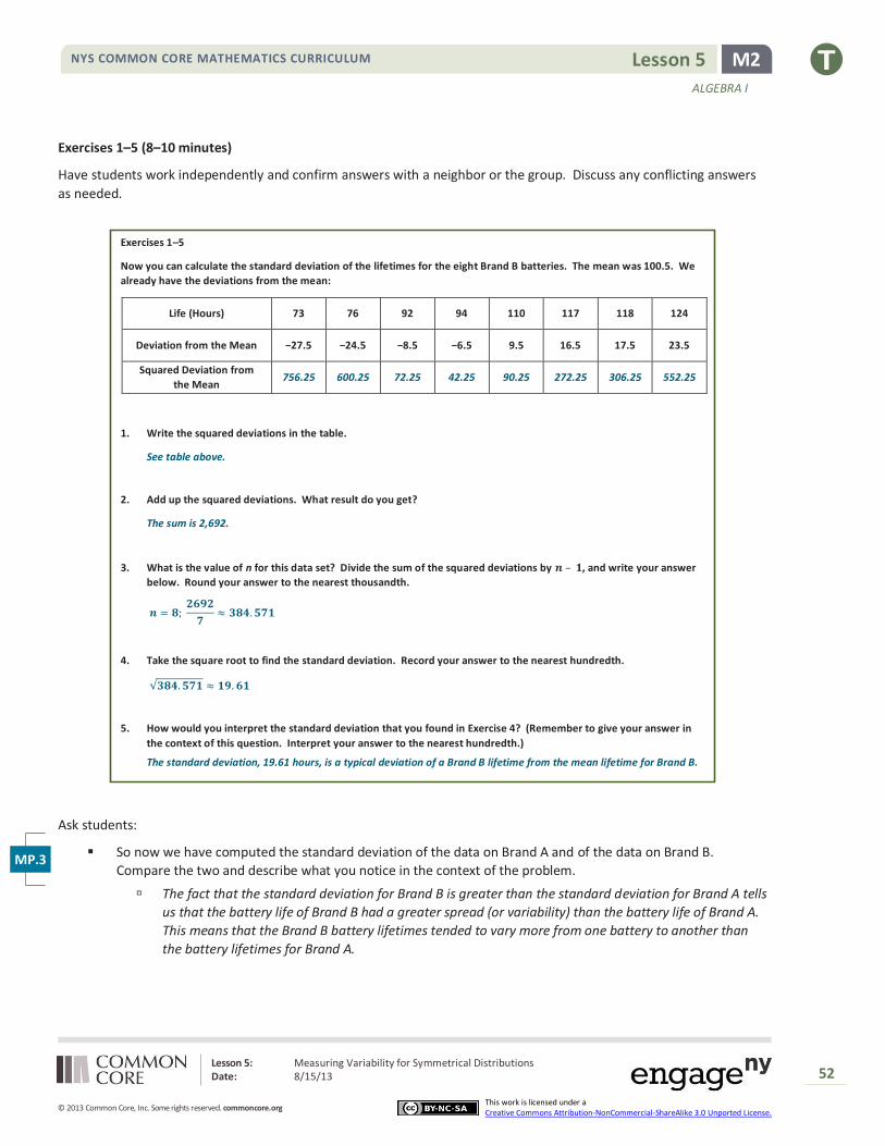
Exercises 1–5 (8–10 minutes)
Have students work independently and confirm answers with a neighbor or the group. Discuss any conflicting answers
as needed.
Exercises 1–5
Now you can calculate the standard deviation of the lifetimes for the eight Brand B batteries. The mean was 100.5. We
already have the deviations from the mean:
Life (Hours) 73 76 92 94 110 117 118 124
Deviation from the Mean −27.5 −24.5 −8.5 −6.5 9.5 16.5 17.5 23.5
Squared Deviation from
the Mean 756.25 600.25 72.25 42.25 90.25 272.25 306.25 552.25
1. Write the squared deviations in the table.
See table above.
2. Add up the squared deviations. What result do you get?
The sum is 2,692.
3. What is the value of n for this data set? Divide the sum of the squared deviations by 𝒏 – 𝟏, and write your answer
below. Round your answer to the nearest thousandth.
𝒏 = 𝟖; 𝟐𝟔𝟗𝟐
𝟕≈ 𝟑𝟖𝟒. 𝟓𝟕𝟏
4. Take the square root to find the standard deviation. Record your answer to the nearest hundredth.
√𝟑𝟖𝟒. 𝟓𝟕𝟏 ≈ 𝟏𝟗. 𝟔𝟏
5. How would you interpret the standard deviation that you found in Exercise 4? (Remember to give your answer in
the context of this question. Interpret your answer to the nearest hundredth.)
The standard deviation, 19.61 hours, is a typical deviation of a Brand B lifetime from the mean lifetime for Brand B.
Ask students:
So now we have computed the standard deviation of the data on Brand A and of the data on Brand B.
Compare the two and describe what you notice in the context of the problem.
The fact that the standard deviation for Brand B is greater than the standard deviation for Brand A tells
us that the battery life of Brand B had a greater spread (or variability) than the battery life of Brand A.
This means that the Brand B battery lifetimes tended to vary more from one battery to another than
the battery lifetimes for Brand A.
MP.3

Lesson 5: Measuring Variability for Symmetrical Distributions Date: 8/15/13
53
© 2013 Common Core, Inc. Some rights reserved. commoncore.org
NYS COMMON CORE MATHEMATICS CURRICULUM
This work is licensed under a Creative Commons Attribution-NonCommercial-ShareAlike 3.0 Unported License.
M2 Lesson 5
ALGEBRA I
Exercises 6–7 (8–10 minutes)
Have students work independently, and confirm answers with a neighbor or the group. Discuss any conflicting answers
as needed.
Exercises 6–7
Jenna has bought a new hybrid car. Each week for a period of seven weeks, she has noted the fuel efficiency (in miles per
gallon) of her car. The results are shown below.
𝟒𝟓 𝟒𝟒 𝟒𝟑 𝟒𝟒 𝟒𝟓 𝟒𝟒 𝟒𝟑
6. Calculate the standard deviation of these results to the nearest hundredth. Be sure to show your work.
The mean is 𝟒𝟒.
The deviations from the mean are 𝟏, 𝟎, −𝟏, 𝟎, 𝟏, 𝟎, −𝟏.
The squared deviations from the mean are 𝟏, 𝟎, 𝟏, 𝟎, 𝟏, 𝟎, 𝟏.
The sum of the squared deviations is 𝟒.
𝒏 = 𝟕; 𝟒
𝟔≈ 𝟎. 𝟔𝟔𝟕
The standard deviation is √𝟎. 𝟔𝟔𝟕 ≈ 𝟎. 𝟖𝟐 miles per gallon.
7. What is the meaning of the standard deviation you found in Exercise 6?
The standard deviation, 𝟎. 𝟖𝟐 miles per gallon, is a typical deviation of a weekly fuel efficiency value from the mean
weekly fuel efficiency.
Closing (5–10 minutes)
What result would we get if we just added the deviations from the mean?
Zero. This value highlights the fact that the mean is the balance point for the original distribution.
Why do you suppose that we square each deviation?
This is one way to avoid the numbers adding to zero. By squaring the deviations we make sure that all the numbers are positive.
Students might also ask why we square the deviations and then take the square root at the end. Why not just find the
average of the absolute values of the deviations from the mean? The answer is that the two approaches give different
answers. (The square root of an average of squares of positive numbers is different from the average of the original set
of numbers.) However, this idea of finding the mean of the absolute values of the deviations is a perfectly valid measure
of the variability of a data set. This measure of spread is known as the mean absolute deviation (MAD), and students
used this measure in previous years. The reason that variance and standard deviation are used more commonly than the
mean absolute deviation is that the variance (and therefore the standard deviation) turns out to behave very nicely,
mathematically, and is therefore useful for developing relatively straightforward techniques of statistical analysis.

Lesson 5: Measuring Variability for Symmetrical Distributions Date: 8/15/13
54
© 2013 Common Core, Inc. Some rights reserved. commoncore.org
NYS COMMON CORE MATHEMATICS CURRICULUM
This work is licensed under a Creative Commons Attribution-NonCommercial-ShareAlike 3.0 Unported License.
M2 Lesson 5
ALGEBRA I
Why do we take the square root?
Before taking the square root, we have a
typical squared deviation from the mean.
It is easier to interpret a typical deviation
from the mean than a typical squared
deviation from the mean because a
typical deviation has the same units as
the original data. For example, the
typical deviation from the mean for the
battery life data is expressed in hours
rather than hours2.
Why did we divide by 𝑛 − 1 instead of 𝑛?
We only use 𝑛 − 1 whenever we are
calculating the standard deviation using
sample data. Careful study has shown
that using 𝑛 − 1 gives the best estimate
of the standard deviation for the entire
population. If we have data from an
entire population, we would divide by n
instead of 𝑛 − 1. (See note box below
for a detailed explanation.)
What does standard deviation measure? How
can we summarize what we are attempting to compute?
The value of the standard deviation is
close to the average distance of
observations from the mean. It can be
interpreted as a typical deviation from
the mean.
How does the spread of the distribution relate to the value of the standard deviation?
The larger the spread of the distribution, the larger the standard deviation.
Who can write a formula for standard deviation,
𝑠?
Encourage students to attempt to write
the formula without assistance, perhaps
comparing their results with their peers.
𝑠 = √∑(𝑥 − �̅�)2
𝑛 − 1
The following explanation is for teachers. This topic is
addressed throughout a study of statistics:
More info on why we divide by 𝒏 − 𝟏 and not 𝒏:
It is helpful to first explore the variance. The variance of a
set of values is the square of the standard deviation. So to
calculate the variance you go through the same process,
but you do not take the square root at the end.
Suppose, for a start, that you have a very large population
of values, for example, the heights of all the people in a
country. You can think of the variance of this population
as being calculated using a division by 𝑛 (although, since
the population is very large, the difference between using
𝑛 or 𝑛 − 1 for the population is extremely small).
Imagine now taking a random sample from the population
(such as taking a random sample of people from the
country and measuring their heights). You will use the
variance of the sample as an estimate of the variance of
the population. If you were to use division by 𝑛 in
calculating the variance of the sample the result that you
would get would tend to be a little too small as an
estimate of the population variance. (To be a little more
precise about this, the sample variance would sometimes
be smaller and sometimes larger than the population
variance. But, on average, over all possible samples, the
sample variance will be a little too small.)
So, something has to be done about the formula for the
sample variance in order to fix this problem of its
tendency to be too small as an estimate of the population
variance. It turns out, mathematically, that replacing the
𝑛 with 𝑛 − 1 has exactly the desired effect. Now, when
you divide by 𝑛 − 1, rather than 𝑛, even though the
sample variance will sometimes be greater and sometimes
less than the population variance, on average the sample
variance will be correct as an estimator of the population
variance.

Lesson 5: Measuring Variability for Symmetrical Distributions Date: 8/15/13
55
© 2013 Common Core, Inc. Some rights reserved. commoncore.org
NYS COMMON CORE MATHEMATICS CURRICULUM
This work is licensed under a Creative Commons Attribution-NonCommercial-ShareAlike 3.0 Unported License.
M2 Lesson 5
ALGEBRA I
In this formula,
𝑥 is a value from the original data set,
𝑥 − �̅� is a deviation of the value, 𝑥, from the mean, �̅�,
(𝑥 − �̅�)2 is a squared deviation from the mean,
∑(𝑥 − �̅�)2 is the sum of the squared deviations,
∑(𝑥−�̅�)2
𝑛−1 is the result of dividing the sum of the squared deviations by 𝑛 − 1,
and so, √∑(𝑥−�̅�)2
𝑛−1 is the standard deviation.
Exit Ticket (10 minutes)
Lesson Summary
The standard deviation measures a typical deviation from the mean.
To calculate the standard deviation,
1. Find the mean of the data set;
2. Calculate the deviations from the mean;
3. Square the deviations from the mean;
4. Add up the squared deviations;
5. Divide by 𝒏 − 𝟏 (if you are working with a data from a sample, which is the most
common case);
6. Take the square root.
The unit of the standard deviation is always the same as the unit of the original data set.
The larger the standard deviation, the greater the spread (variability) of the data set.

Lesson 5: Measuring Variability for Symmetrical Distributions Date: 8/15/13
56
© 2013 Common Core, Inc. Some rights reserved. commoncore.org
NYS COMMON CORE MATHEMATICS CURRICULUM
This work is licensed under a Creative Commons Attribution-NonCommercial-ShareAlike 3.0 Unported License.
M2 Lesson 5
ALGEBRA I
Name ___________________________________________________ Date____________________
Lesson 5: Measuring Variability for Symmetrical Distributions
Exit Ticket 1. Look at the dot plot below.
109876543210
Value
Dotplot of Value
a. Estimate the mean of this data set.
b. Remember that the standard deviation measures a typical deviation from the mean. The standard deviation of
this data set is either 3.2, 6.2, or 9.2. Which of these values is correct for the standard deviation?
2. Three data sets are shown in the dot plots below.
3029282726252423222120
Data Set 1
Data Set 2
Data Set 3
a. Which data set has the smallest standard deviation of the three? Justify your answer.
b. Which data set has the largest standard deviation of the three? Justify your answer.

Lesson 5: Measuring Variability for Symmetrical Distributions Date: 8/15/13
57
© 2013 Common Core, Inc. Some rights reserved. commoncore.org
NYS COMMON CORE MATHEMATICS CURRICULUM
This work is licensed under a Creative Commons Attribution-NonCommercial-ShareAlike 3.0 Unported License.
M2 Lesson 5
ALGEBRA I
Exit Ticket Sample Solutions
The following solutions indicate an understanding of the objectives of this lesson:
1. Look at the dot plot below.
109876543210
Value
Dotplot of Value
a. Estimate the mean of this data set.
The mean of the data set is 5, so any number above 4 and below 6 would be acceptable as an estimate of the
mean.
b. Remember that the standard deviation measures a typical deviation from the mean. The standard deviation
of this data set is either 3.2, 6.2, or 9.2. Which of these values is correct for the standard deviation?
The greatest deviation from the mean is 5 (found by calculating 10 – 5 or 0 – 5), and so a typical deviation
from the mean must be less than 5. So 3.2 must be chosen as the standard deviation.
2. Three data sets are shown in the dot plots below.
3029282726252423222120
Data Set 1
Data Set 2
Data Set 3
a. Which data set has the smallest standard deviation of the three? Justify your answer.
Data Set 1
b. Which data set has the largest standard deviation of the three? Justify your answer.
Data Set 2
Problem Set Sample Solutions
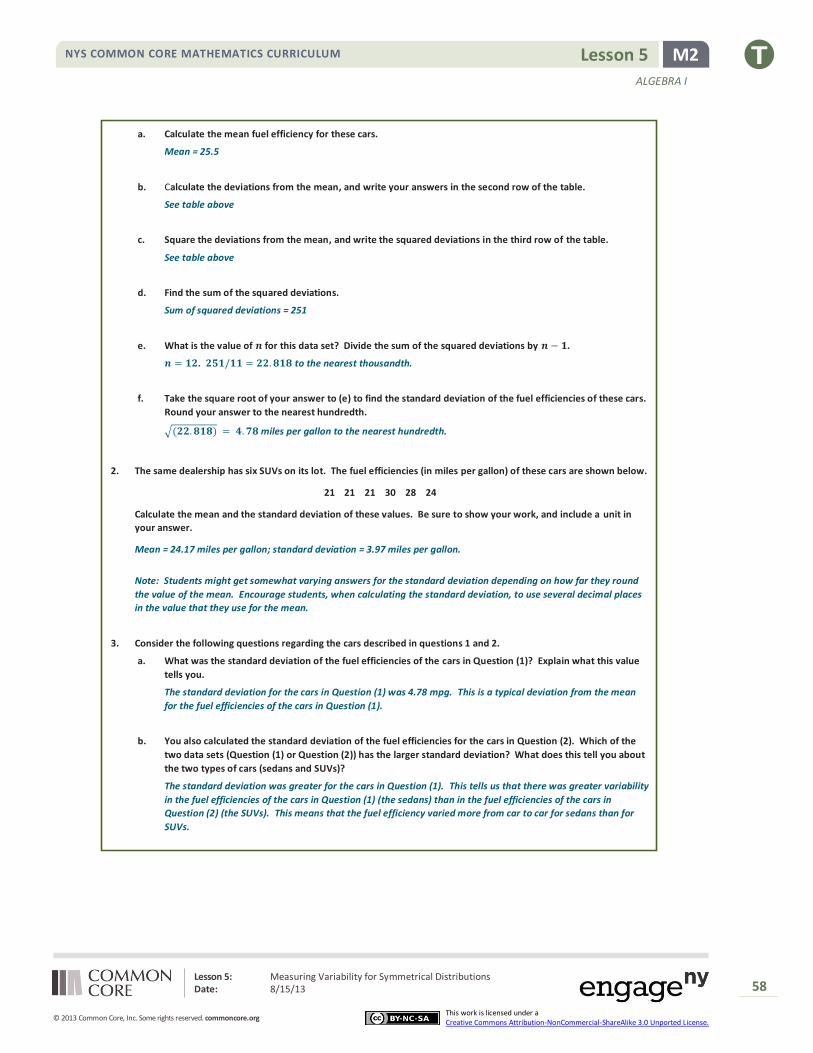
1. A small car dealership has twelve sedan cars on its lot. The fuel efficiency (mpg) values of the cars are given in the
table below. Complete the table as directed below.
Fuel Efficiency
(miles per
gallon)
29 35 24 25 21 21 18 28 31 26 26 22
Deviation from
the Mean 3.5 9.5 −1.5 −0.5 −4.5 −4.5 −7.5 2.5 5.5 0.5 0.5 -3.5
Squared
Deviation from
the Mean
12.25 90.25 2.25 0.25 20.25 20.25 56.25 6.25 30.25 0.25 0.25 12.25
Lesson 5: Measuring Variability for Symmetrical Distributions Date: 8/15/13
58
© 2013 Common Core, Inc. Some rights reserved. commoncore.org
NYS COMMON CORE MATHEMATICS CURRICULUM
This work is licensed under a Creative Commons Attribution-NonCommercial-ShareAlike 3.0 Unported License.
M2 Lesson 5
ALGEBRA I
a. Calculate the mean fuel efficiency for these cars.
Mean = 25.5
b. Calculate the deviations from the mean, and write your answers in the second row of the table.
See table above
c. Square the deviations from the mean, and write the squared deviations in the third row of the table.
See table above
d. Find the sum of the squared deviations.
Sum of squared deviations = 251
e. What is the value of 𝒏 for this data set? Divide the sum of the squared deviations by 𝒏 − 𝟏.
𝒏 = 𝟏𝟐. 𝟐𝟓𝟏/𝟏𝟏 = 𝟐𝟐. 𝟖𝟏𝟖 to the nearest thousandth.
f. Take the square root of your answer to (e) to find the standard deviation of the fuel efficiencies of these cars.
Round your answer to the nearest hundredth.
√(𝟐𝟐. 𝟖𝟏𝟖) = 𝟒. 𝟕𝟖 miles per gallon to the nearest hundredth.
2. The same dealership has six SUVs on its lot. The fuel efficiencies (in miles per gallon) of these cars are shown below.
21 21 21 30 28 24
Calculate the mean and the standard deviation of these values. Be sure to show your work, and include a unit in
your answer.
Mean = 24.17 miles per gallon; standard deviation = 3.97 miles per gallon.
Note: Students might get somewhat varying answers for the standard deviation depending on how far they round
the value of the mean. Encourage students, when calculating the standard deviation, to use several decimal places
in the value that they use for the mean.
3. Consider the following questions regarding the cars described in questions 1 and 2.
a. What was the standard deviation of the fuel efficiencies of the cars in Question (1)? Explain what this value
tells you.
The standard deviation for the cars in Question (1) was 4.78 mpg. This is a typical deviation from the mean
for the fuel efficiencies of the cars in Question (1).
b. You also calculated the standard deviation of the fuel efficiencies for the cars in Question (2). Which of the
two data sets (Question (1) or Question (2)) has the larger standard deviation? What does this tell you about
the two types of cars (sedans and SUVs)?
The standard deviation was greater for the cars in Question (1). This tells us that there was greater variability
in the fuel efficiencies of the cars in Question (1) (the sedans) than in the fuel efficiencies of the cars in
Question (2) (the SUVs). This means that the fuel efficiency varied more from car to car for sedans than for
SUVs.

Lesson 6: Interpreting the Standard Deviation Date: 8/15/13
59
© 2013 Common Core, Inc. Some rights reserved. commoncore.org
NYS COMMON CORE MATHEMATICS CURRICULUM
This work is licensed under a Creative Commons Attribution-NonCommercial-ShareAlike 3.0 Unported License.
M2 Lesson 6
ALGEBRA I
Lesson 6: Interpreting the Standard Deviation
Student Outcomes
Students calculate the standard deviation of a sample with the aid of a calculator.
Students compare the relative variability of distributions using standard deviations.
Lesson Notes
Students use a calculator to compute the mean and the standard deviation of a data set and compare the variability of
data sets where the differences in variability are less obvious than in previous lessons. Additionally, students continue to
refine their knowledge of standard deviation and how it measures a typical deviation from the mean.
Classwork
Example 1 (10 minutes)
Use a calculator to find the mean and standard deviation.
Example 1
Your teacher will show you how to use a calculator to find the mean and standard deviation for the following set of data.
A set of eight men had heights (in inches) as shown below.
67.0 70.9 67.6 69.8 69.7 70.9 68.7 67.2
Indicate the mean and standard deviation you obtained from your calculator to the nearest hundredth.
Mean: 68.98 inches
Standard Deviation: 1.59 inches
Show students the steps to calculate the mean and the standard deviation of a data set using a calculator or statistical
software. The following steps outline the steps of the statistical features for the TI-83 or TI-84 calculators (one of several
calculators used by high school students):
1. From the home screen, press STAT, ENTER to access the stat editor.
2. If there are already numbers in L1, clear the data from L1 by moving the cursor to “L1” and pressing CLEAR, ENTER.
3. Move the cursor to the first element of L1, type the first data value, and press enter. Continue entering the
remaining data values to L1 in the same way.
4. Press 2ND, QUIT to return to the home screen.
5. Press STAT, select CALC, select 1-Var Stats, press ENTER.
6. The screen should now show summary statistics for your data set. The mean is the �̅� value, and the standard deviation is the 𝑠𝑥 value.

Lesson 6: Interpreting the Standard Deviation Date: 8/15/13
60
© 2013 Common Core, Inc. Some rights reserved. commoncore.org
NYS COMMON CORE MATHEMATICS CURRICULUM
This work is licensed under a Creative Commons Attribution-NonCommercial-ShareAlike 3.0 Unported License.
M2 Lesson 6
ALGEBRA I
Note: Instructions may vary based on the type of calculator or software used. The instructions above are based on using
data stored in L1. If data is stored in another list, it will need to be referred to after selecting 1-Var Stats in step 5. For
example, if data was entered in L2:
5. Press STAT, select CALC, select 1-Var Stats, and then refer to L2. This is done by pressing 2ND, L2 (i.e., “2ND” and then the “2” key). The screen will display 1-Var Stats L2. Then press ENTER.
Exercise 1 (5 minutes)
Students should practice finding the mean and standard deviation on their own.
Exercise 1
The heights (in inches) of 9 women were as shown below.
68.4 70.9 67.4 67.7 67.1 69.2 66.0 70.3 67.6
Use the statistical features of your calculator or computer software to find the mean and the standard deviation of these
heights to the nearest hundredth.
Mean: 68.29 inches
Standard Deviation: 1.58 inches
Exercise 2 (5 minutes)
Be sure that students understand how the numbers that are entered relate to the dot plot given in the example as they
enter the data into a calculator.
Ask students the following question to determine if they understand the dot plot:
What is the meaning of the single dot at 4?
Only one person answered all four questions.
A common misconception is that a student answered Question 4 of the survey and not that a person answered four
questions.
Allow students to attempt the problem independently. Sample responses are listed on the next page. If needed,
scaffold with the following:
The dot plot tells us that one person answered 0 questions, two people answered 1 question, four people answered 2 questions, two people answered 3 questions, and one person answered 4 questions.
We can find the mean and the standard deviation of these results by entering these numbers into a calculator:
0 1 1 2 2 2 2 3 3 4

Lesson 6: Interpreting the Standard Deviation Date: 8/15/13
61
© 2013 Common Core, Inc. Some rights reserved. commoncore.org
NYS COMMON CORE MATHEMATICS CURRICULUM
This work is licensed under a Creative Commons Attribution-NonCommercial-ShareAlike 3.0 Unported License.
M2 Lesson 6
ALGEBRA I
Exercise 2
Ten people attended a talk at a conference. At the end of the talk, the attendees were given a questionnaire that
consisted of four questions. The questions were optional, so it was possible that some attendees might answer none of
the questions while others might answer 1, 2, 3, or all 4 of the questions (so the possible numbers of questions answered
are 0, 1, 2, 3, and 4).
Suppose that the numbers of questions answered by each of the ten people were as shown in the dot plot below.
Use the statistical features of your calculator to find the mean and the standard deviation of the data set.
Mean: ____2_____
Standard Deviation: ____1.15____
Exercise 3 (5 minutes)
Students should practice finding the standard deviation on their own. The data is uniformly distributed in this problem,
and its standard deviation will be compared to Exercise 3.
Exercise 3
Suppose the dot plot looked like this:
a. Use your calculator to find the mean and the standard deviation of this distribution.
Mean = 2
Standard deviation = 1.49
b. Remember that the size of the standard deviation is related to the size of the deviations from the mean.
Explain why the standard deviation of this distribution is greater than the standard deviation in Example 3.
The points in Example 4 are generally further from the mean than the points in Example 3, and the standard
deviation is consequently larger. Notice there is greater clustering of the points around the central value and
less variability in Example 3.

Lesson 6: Interpreting the Standard Deviation Date: 8/15/13
62
© 2013 Common Core, Inc. Some rights reserved. commoncore.org
NYS COMMON CORE MATHEMATICS CURRICULUM
This work is licensed under a Creative Commons Attribution-NonCommercial-ShareAlike 3.0 Unported License.
M2 Lesson 6
ALGEBRA I
Optionally, draw the following on the board, and compare the diagrams to re-enforce the idea.
Exercise 4 (5 minutes)
Students work on this question individually and then compare notes with a neighbor. Students construct the plot and
evaluate (without calculating) the mean and standard deviation of the data set where there is no variability.
Exercise 4
Suppose that every person answers all four questions on the questionnaire.
a. What would the dot plot look like?
b. What is the mean number of questions answered? (You should be able to answer without doing any
calculations!)
Mean = 4
c. What is the standard deviation? (Again, don’t do any calculations!)
The standard deviation is 0 because all deviations from the mean are 0. There is no variation in the data.
Mound Shaped:
Uniform:
MP.1

Lesson 6: Interpreting the Standard Deviation Date: 8/15/13
63
© 2013 Common Core, Inc. Some rights reserved. commoncore.org
NYS COMMON CORE MATHEMATICS CURRICULUM
This work is licensed under a Creative Commons Attribution-NonCommercial-ShareAlike 3.0 Unported License.
M2 Lesson 6
ALGEBRA I
Exercise 5 (10 minutes)
Again, it would be a good idea for students to think about this themselves and then to discuss the problem with a
neighbor.
Exercise 5
a. Continue to think about the situation previously described where the numbers of questions answered by
each of ten people was recorded. Draw the dot plot of the distribution of possible data values that has the
largest possible standard deviation. (There were ten people at the talk, so there should be ten dots in your
dot plot.) Use the scale given below.
Place the data points as far from the mean as possible.
b. Explain why the distribution you have drawn has a larger standard deviation than the distribution in Exercise
4.
The standard deviation of this distribution is larger than that of the one in Example 4 because the deviations
from the mean here are all greater than or equal to the deviations from the mean in Example 4.
Note for Exercise 5a: The answer to this question is not necessarily obvious, but one way to think of it is that by moving
one of the dots from 0 to 4 we are clustering more of the points together; the points at zero are isolated from those at 4,
but by moving one dot from 0 to 4 there are now fewer dots suffering this degree of isolation than there were
previously.
Closing
Exit Ticket (5 minutes)
Lesson Summary
The mean and the standard deviation of a data set can be found directly using the statistical features of
a calculator.
The size of the standard deviation is related to the sizes of the deviations from the mean. Therefore,
the standard deviation is minimized when all the numbers in the data set are the same and is
maximized when the deviations from the mean are made as large as possible.
MP.2

Lesson 6: Interpreting the Standard Deviation Date: 8/15/13
64
© 2013 Common Core, Inc. Some rights reserved. commoncore.org
NYS COMMON CORE MATHEMATICS CURRICULUM
This work is licensed under a Creative Commons Attribution-NonCommercial-ShareAlike 3.0 Unported License.
M2 Lesson 6
ALGEBRA I
Name ___________________________________________________ Date____________________
Lesson 6: Interpreting the Standard Deviation
Exit Ticket 1. Use the statistical features of your calculator to find the standard deviation to the nearest tenth of a data set of the
miles per gallon from a sample of five cars.
24.9 24.7 24.7 23.4 27.9
2. Suppose that a teacher plans to give four students a quiz. The minimum possible score on the quiz is 0, and the
maximum possible score is 10.
a. What is the smallest possible standard deviation of the students’ scores? Give an example of a possible set of
four student scores that would have this standard deviation.
b. What is the set of four student scores that would make the standard deviation as large as it could possibly be?
Use your calculator to find this largest possible standard deviation.

Lesson 6: Interpreting the Standard Deviation Date: 8/15/13
65
© 2013 Common Core, Inc. Some rights reserved. commoncore.org
NYS COMMON CORE MATHEMATICS CURRICULUM
This work is licensed under a Creative Commons Attribution-NonCommercial-ShareAlike 3.0 Unported License.
M2 Lesson 6
ALGEBRA I
Exit Ticket Sample Solutions
The following solutions indicate an understanding of the objectives of this lesson:
1. Use the statistical features of your calculator to find the standard deviation to the nearest tenth of a data set of the
miles per gallon from a sample of five cars.
24.9 24.7 24.7 23.4 27.9
Mean = 25.1 miles per gallon to the nearest tenth; standard deviation = 1.7 miles per gallon to the nearest tenth.
2. Suppose that a teacher plans to give four students a quiz. The minimum possible score on the quiz is 0 and the
maximum possible score is 10.
a. What is the smallest possible standard deviation of the students’ scores? Give an example of a possible set of
four student scores that would have this standard deviation.
The minimum possible standard deviation is 0. This will come about if all the students receive the same score
(for example, if every student scores an 8 on the quiz).
b. What is the set of four student scores that would make the standard deviation as large as it could possibly
be? Use your calculator to find this largest possible standard deviation.
0, 0, 10, 10. Standard deviation = 5.77 to the nearest hundredth.
Problem Set Sample Solutions
In order to complete the problem set, students must have access to a graphing calculator.
1. At a track meet there were three men’s 100m races. The sprinters’ times were recorded to the nearest 1/10 of a
second. The results of the three races are shown in the dot plots below.
Race 1
Race 2
Race 3

Lesson 6: Interpreting the Standard Deviation Date: 8/15/13
66
© 2013 Common Core, Inc. Some rights reserved. commoncore.org
NYS COMMON CORE MATHEMATICS CURRICULUM
This work is licensed under a Creative Commons Attribution-NonCommercial-ShareAlike 3.0 Unported License.
M2 Lesson 6
ALGEBRA I
a. Remember that the size of the standard deviation is related to the sizes of the deviations from the mean.
Without doing any calculations, indicate which of the three races has the smallest standard deviation of
times. Justify your answer.
Race 3 as several race times are clustered around the mean.
b. Which race had the largest standard deviation of times? (Again, don’t do any calculations!) Justify your
answer.
Race 2 as the race times are spread out from the mean.
c. Roughly what would be the standard deviation in Race 1? (Remember that the standard deviation is a typical
deviation from the mean. So, here you are looking for a typical deviation from the mean, in seconds, for Race
1.)
Around 0.5–1.0 second would be a sensible answer.
d. Use your calculator to find the mean and the standard deviation for each of the three races. Write your
answers in the table below to the nearest thousandth.
Mean Standard Deviation
Race 1 11.725 0.767
Race 2 11.813 1.013
Race 3 11.737 0.741
e. How close were your answers (a–c) to the actual values?
Answers vary based on students’ responses.
2. A large city, which we will call City A, held a marathon. Suppose that the ages of the participants in the marathon
that took place in City A were summarized in the histogram below.
a. Make an estimate of the mean age of the participants in the City A marathon.
Around 40 years would be a sensible estimate.

Lesson 6: Interpreting the Standard Deviation Date: 8/15/13
67
© 2013 Common Core, Inc. Some rights reserved. commoncore.org
NYS COMMON CORE MATHEMATICS CURRICULUM
This work is licensed under a Creative Commons Attribution-NonCommercial-ShareAlike 3.0 Unported License.
M2 Lesson 6
ALGEBRA I
b. Make an estimate of the standard deviation of the ages of the participants in the City A marathon.
Between 8 and 15 years would be a sensible estimate.
A smaller city, City B, also held a marathon. However, City B restricted the number of people of each age category
who could take part to 100. The ages of the participants are summarized in the histogram below.
c. Approximately what was the mean age of the participants in the City B marathon? Approximately what was
the standard deviation of the ages?
Mean is around 53 years; standard deviation is between 15 and 25 years.
d. Explain why the standard deviation of the ages in the City B marathon is greater than the standard deviation
of the ages for the City A marathon.
In City A, there was greater clustering around the mean age than in City B. In City B, the deviations from the
mean are generally greater than in City A, so the standard deviation for City B is greater than the standard
deviation for City A.

Lesson 7: Measuring Variability for Skewed Distributions (Interquartile Range) Date: 8/15/13
68
© 2013 Common Core, Inc. Some rights reserved. commoncore.org
NYS COMMON CORE MATHEMATICS CURRICULUM
This work is licensed under a Creative Commons Attribution-NonCommercial-ShareAlike 3.0 Unported License.
M2 Lesson 7
ALGEBRA I
Lesson 7: Measuring Variability for Skewed Distributions
(Interquartile Range)
Student Outcomes
Students explain why a median is a better description of a typical value for a skewed distribution.
Students calculate the 5-number summary of a data set.
Students construct a box plot based on the 5-number summary and calculate the interquartile range (IQR).
Students interpret the IQR as a description of variability in the data.
Students identify outliers in a data distribution.
Lesson Notes
Distributions that are not symmetrical pose some challenges in students’ thinking about center and variability. The
observation that the distribution is not symmetrical is straightforward. The difficult part is to select a measure of center
and a measure of variability around that center. In Lesson 3 students learned that, because the mean can be affected by
unusual values in the data set, the median is a better description of a typical data value for a skewed distribution. This
lesson addresses what measure of variability is appropriate for a skewed data distribution. Students construct a box plot
of the data using the 5-number summary and describe variability using the interquartile range.
Classwork
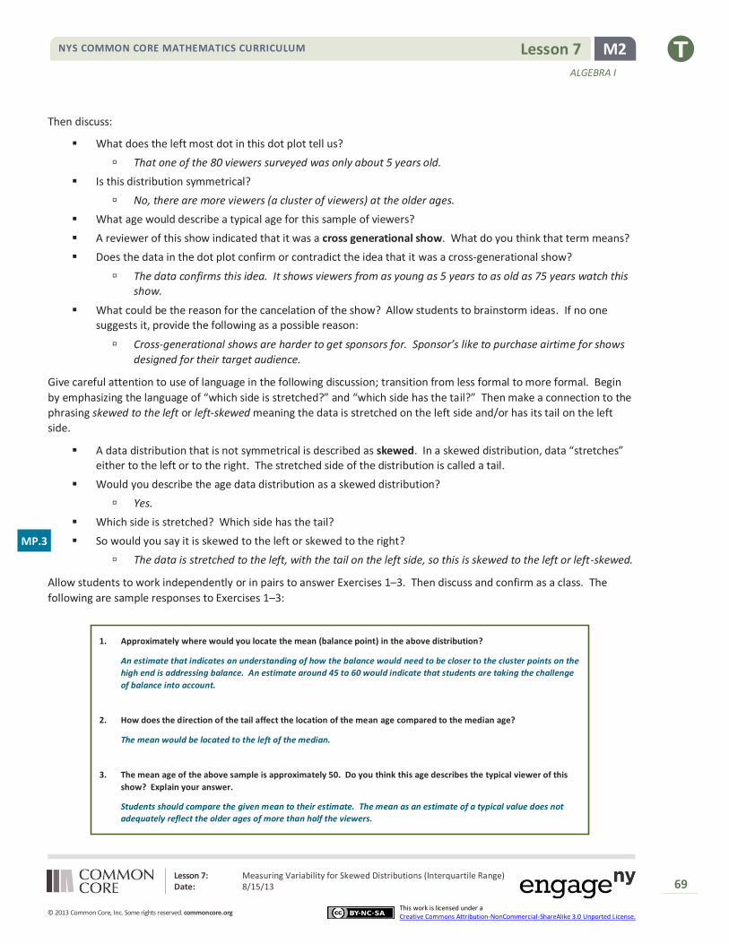
Exercises 1–3 (12 minutes): Skewed Data and its Measure of Center
Verbally introduce the data set as described in the introductory paragraph and dot plot shown below:
Exercises 1–3: Skewed Data and its Measure of Center
Consider the following scenario. A television game show, “Fact or Fiction”, was canceled after nine shows. Many people
watched the nine shows and were rather upset when it was taken off the air. A random sample of eighty viewers of the
show was selected. Viewers in the sample responded to several questions. The dot plot below shows the distribution of
ages of these eighty viewers:
Lesson 7: Measuring Variability for Skewed Distributions (Interquartile Range) Date: 8/15/13
69
© 2013 Common Core, Inc. Some rights reserved. commoncore.org
NYS COMMON CORE MATHEMATICS CURRICULUM
This work is licensed under a Creative Commons Attribution-NonCommercial-ShareAlike 3.0 Unported License.
M2 Lesson 7
ALGEBRA I
Then discuss:
What does the left most dot in this dot plot tell us?
That one of the 80 viewers surveyed was only about 5 years old.
Is this distribution symmetrical?
No, there are more viewers (a cluster of viewers) at the older ages.
What age would describe a typical age for this sample of viewers?
A reviewer of this show indicated that it was a cross generational show. What do you think that term means?
Does the data in the dot plot confirm or contradict the idea that it was a cross-generational show?
The data confirms this idea. It shows viewers from as young as 5 years to as old as 75 years watch this show.
What could be the reason for the cancelation of the show? Allow students to brainstorm ideas. If no one suggests it, provide the following as a possible reason:
Cross-generational shows are harder to get sponsors for. Sponsor’s like to purchase airtime for shows
designed for their target audience.
Give careful attention to use of language in the following discussion; transition from less formal to more formal. Begin
by emphasizing the language of “which side is stretched?” and “which side has the tail?” Then make a connection to the
phrasing skewed to the left or left-skewed meaning the data is stretched on the left side and/or has its tail on the left
side.
A data distribution that is not symmetrical is described as skewed. In a skewed distribution, data “stretches” either to the left or to the right. The stretched side of the distribution is called a tail.
Would you describe the age data distribution as a skewed distribution?
Yes.
Which side is stretched? Which side has the tail?
So would you say it is skewed to the left or skewed to the right?
The data is stretched to the left, with the tail on the left side, so this is skewed to the left or left-skewed.
Allow students to work independently or in pairs to answer Exercises 1–3. Then discuss and confirm as a class. The
following are sample responses to Exercises 1–3:
1. Approximately where would you locate the mean (balance point) in the above distribution?
An estimate that indicates an understanding of how the balance would need to be closer to the cluster points on the
high end is addressing balance. An estimate around 45 to 60 would indicate that students are taking the challenge
of balance into account.
2. How does the direction of the tail affect the location of the mean age compared to the median age?
The mean would be located to the left of the median.
3. The mean age of the above sample is approximately 50. Do you think this age describes the typical viewer of this
show? Explain your answer.
Students should compare the given mean to their estimate. The mean as an estimate of a typical value does not
adequately reflect the older ages of more than half the viewers.
MP.3

Lesson 7: Measuring Variability for Skewed Distributions (Interquartile Range) Date: 8/15/13
70
© 2013 Common Core, Inc. Some rights reserved. commoncore.org
NYS COMMON CORE MATHEMATICS CURRICULUM
This work is licensed under a Creative Commons Attribution-NonCommercial-ShareAlike 3.0 Unported License.
M2 Lesson 7
ALGEBRA I
Exercises 4–8 (10 minutes): Constructing and Interpreting the Box Plot
Recall from Grade 6 that the values of the 5-number summary are used when constructing a box plot of a data set.
What does a box plot look like? Who can draw a quick sketch of a box plot?
Allow a student to come to the board to draw a sketch of what a box plot looks like.
What are the values in the 5-number summary, and how do they related to the creation of the box plot?
Take input from the class, and add the correct input to the sketch on the board.
Students complete Exercise 4, constructing a box plot for the data set on top of the existing dot plot.
Exercises 4–8: Constructing and Interpreting the Box Plot
4. Using the above dot plot, construct a box plot over the dot plot by completing the following steps:
i. Locate the middle 40 observations, and draw a box around these values.
ii. Calculate the median, and then draw a line in the box at the location of the median.
iii. Draw a line that extends from the upper end of the box to the largest observation in the data set.
iv. Draw a line that extends from the lower edge of the box to the minimum value in the data set.

Lesson 7: Measuring Variability for Skewed Distributions (Interquartile Range) Date: 8/15/13
71
© 2013 Common Core, Inc. Some rights reserved. commoncore.org
NYS COMMON CORE MATHEMATICS CURRICULUM
This work is licensed under a Creative Commons Attribution-NonCommercial-ShareAlike 3.0 Unported License.
M2 Lesson 7
ALGEBRA I
Students complete Exercises 5–8 and confirm answers with a peer or as a class.
5. Recall that the 5 values used to construct the dot plot make up the 5-number summary. What is the 5-number
summary for this data set of ages?
Minimum age: 5
Lower quartile or Q1: 40
Median Age: 60
Upper quartile or Q3: 70
Maximum age: 75
6. What percent of the data does the box part of the box plot capture?
The box captures 50% of the viewers.
7. What percent of the data falls between the minimum value and Q1?
25% of the viewers fall between the minimum value and Q1.
8. What percent of the data falls between Q3 and the maximum value?
25% of the viewers fall between Q3 and the maximum value.
Exercises 9–14 (8 minutes)
The questions in this exercise (listed below) represent an application that should be discussed as students work through
the exercise independently or in small groups. Discuss with students how advertising is linked to an audience. Consider
the following questions to introduce this application:
Have you ever bought something (for example, clothes) or attended a movie or bought tickets to a concert
based on an ad you saw on either the Internet or television? If yes, what did you buy, and what attracted you to the ad?
A school is interested in drawing attention to an upcoming play. Where did you think they would place
advertisements for the play? Why?

Lesson 7: Measuring Variability for Skewed Distributions (Interquartile Range) Date: 8/15/13
72
© 2013 Common Core, Inc. Some rights reserved. commoncore.org
NYS COMMON CORE MATHEMATICS CURRICULUM
This work is licensed under a Creative Commons Attribution-NonCommercial-ShareAlike 3.0 Unported License.
M2 Lesson 7
ALGEBRA I
Exercises 9–14
An advertising agency researched the ages of viewers most interested in various types of television ads. Consider the
following summaries:
Ages Target Products or Services
30–45 Electronics, home goods, cars
46–55 Financial services, appliances, furniture
56–72 Retirement planning, cruises, health care services
9. The mean age of the people surveyed is approximately 50 years old. As a result, the producers of the show decided
to obtain advertisers for a typical viewer of 50 years old. According to the table, what products or services do you
think the producers will target? Based on the sample, what percent of the people surveyed would have been
interested in these commercials if the advertising table were accurate?
The target audience would be viewers 46 to 55 years old, so the producers would focus on ads for financial services,
appliances, and furniture. 12 out of 80 viewers, or 15 %, are in that range.
10. The show failed to generate interest the advertisers hoped. As a result, they stopped advertising on the show, and
the show was cancelled. Kristin made the argument that a better age to describe the typical viewer is the median
age. What is the median age of the sample? What products or services does the advertising table suggest for
viewers if the median age is considered as a description of the typical viewer?
The median age is 60 years old. The target audience based on the median would include the ages 56 to 72 years old.
Target products for this group are retirement planning, cruises, and health care services.
11. What percent of the people surveyed would be interested in the products or services suggested by the advertising
table if the median age were used to describe a typical viewer?
31 of the 80 viewers are 56 to 72 years old or approximately 39%.
12. What percent of the viewers have ages between Q1 and Q3? The difference between Q3 and Q1, or Q3 – Q1, is
called the interquartile range or IQR. What is the interquartile range (IQR) for this data distribution?
Approximately 50% of the viewers are located between Q1 and Q3. The IQR is: 70 – 40 or 30 years.
13. The IQR provides a summary of the variability for a skewed data distribution. The IQR is a number that specifies the
length of the interval that contains the middle half of the ages of viewers. Do you think producers of the show
would prefer a show that has a small or large interquartile range? Explain your answer.
A smaller IQR indicates less variability, so it may be easier to target advertisements to a particular group.
A larger IQR indicates more variability, which means the show is popular across generations but harder to target
advertising.
14. Do you agree with Kristin’s argument that the median age provides a better description of a typical viewer? Explain
your answer.
The median is a better description of a typical viewer for this audience because the distribution is skewed.

Lesson 7: Measuring Variability for Skewed Distributions (Interquartile Range) Date: 8/15/13
73
© 2013 Common Core, Inc. Some rights reserved. commoncore.org
NYS COMMON CORE MATHEMATICS CURRICULUM
This work is licensed under a Creative Commons Attribution-NonCommercial-ShareAlike 3.0 Unported License.
M2 Lesson 7
ALGEBRA I
Exercises 15–20 (10 minutes): Outliers
In Grade 6, unusual data values were described as extreme data values. This example provides a more formal definition
of an extreme value and shows how extreme values can be displayed in a box plot. Extreme values that fit this definition
are called outliers. Identification of extreme values becomes important as students continue to work with box plots.
Discuss the data in the box plot, and have students work individually or in pairs to answer the questions.
Exercises 15–20: Outliers
Students at Waldo High School are involved in a special project that involves communicating with people in Kenya.
Consider a box plot of the ages of 200 randomly selected people from Kenya:
A data distribution may contain extreme data (specific data values that are unusually large or unusually small relative to
the median and the interquartile range). A box plot can be used to display extreme data values that are identified as
outliers.
The “*” in the box plot are the ages of four people from this sample. Based on the sample, these four ages were
considered outliers.
15. Estimate the values of the four ages represented by an *.
Allow for reasonable estimates. For example, 72, 77, 82, and 100 years old.
An outlier is defined to be any data value that is more than 𝟏. 𝟓 × (𝑰𝑸𝑹) away from the nearest quartile.
16. What is the median age of the sample of ages from Kenya? What are the approximate values of Q1 and Q3? What
is the approximate IQR of this sample?
The median age is approximately 18 years old. Q1 is approximately 7 years old, and Q3 is approximately 32 years
old. The approximate IQR is 25 years.
17. Multiply the IQR by 1.5. What value do you get?
𝟏. 𝟓 × 𝟐𝟓 is 𝟑𝟕. 𝟓 years.
Lesson 7: Measuring Variability for Skewed Distributions (Interquartile Range) Date: 8/15/13
74
© 2013 Common Core, Inc. Some rights reserved. commoncore.org
NYS COMMON CORE MATHEMATICS CURRICULUM
This work is licensed under a Creative Commons Attribution-NonCommercial-ShareAlike 3.0 Unported License.
M2 Lesson 7
ALGEBRA I
18. Add 𝟏. 𝟓 × (𝑰𝑸𝑹) to the 3rd quartile age (Q3). What do you notice about the four ages identified by an *?
𝟑𝟕. 𝟓 + 𝟑𝟐 is 𝟔𝟗. 𝟓 years, or approximately 𝟕𝟎 years. The four ages identified by an * are all greater than this value.
19. Are there any age values that are less than 𝑸𝟏 − 𝟏. 𝟓 × (𝑰𝑸𝑹)? If so, these ages would also be considered outliers.
𝟕 − 𝟑𝟕. 𝟓 = −𝟑𝟎. 𝟓 years. There are no ages less than this value.
20. Explain why there is no * on the low side of the box plot for ages of the people in the sample from Kenya.
An outlier on the lower end would have to be a negative age, which is not possible.
Closing
Exit Ticket (5 minutes)
Lesson Summary Non-symmetrical data distributions are referred to as skewed.
Left-skewed or skewed to the left means the data spreads out longer (like a tail) on the left side.
Right-skewed or skewed to the right means the data spreads out longer (like a tail) on the right side.
The center of a skewed data distribution is described by the median.
Variability of a skewed data distribution is described by the interquartile range (IQR).
The IQR describes variability by specifying the length of the interval that contains the middle 50% of the
data values.
Outliers in a data set are defined as those values more than 1.5(IQR) from the nearest quartile. Outliers
are usually identified by an “*” or a “•” in a box plot.

Lesson 7: Measuring Variability for Skewed Distributions (Interquartile Range) Date: 8/15/13
75
© 2013 Common Core, Inc. Some rights reserved. commoncore.org
NYS COMMON CORE MATHEMATICS CURRICULUM
This work is licensed under a Creative Commons Attribution-NonCommercial-ShareAlike 3.0 Unported License.
M2 Lesson 7
ALGEBRA I
Name ___________________________________________________ Date____________________
Lesson 7: Measuring Variability for Skewed Distributions
(Interquartile Range)
Exit Ticket
1. A data set consisting of the number of hours each of 40 students watched television over the weekend has a
minimum value of 3 hours, a Q1 value of 5 hours, a median value of 6 hours, a Q3 value of 9 hours, and a maximum value of 12 hours. Draw a box plot representing this data distribution.
2. What is the interquartile range (IQR) for this distribution? What percent of the students fall within this interval?
3. Do you think the data distribution represented by the box plot is a skewed distribution? Why or why not?
4. Estimate the typical number of hours students watched television. Explain why you chose this value.

Lesson 7: Measuring Variability for Skewed Distributions (Interquartile Range) Date: 8/15/13
76
© 2013 Common Core, Inc. Some rights reserved. commoncore.org
NYS COMMON CORE MATHEMATICS CURRICULUM
This work is licensed under a Creative Commons Attribution-NonCommercial-ShareAlike 3.0 Unported License.
M2 Lesson 7
ALGEBRA I
Exit Ticket Sample Solutions
The following solutions indicate an understanding of the objectives of this lesson:
1. A data set consisting of the number of hours each of 40 students watched television over the weekend has a
minimum value of 3 hours, a Q1 value of 5 hours, a median value of 6 hours, a Q3 value of 9 hours, and a maximum
value of 12 hours. Draw a box plot representing this data distribution.
Students should sketch a box plot with the minimum value at 3 hours, a Q1 at 5 hours, a median at 6 hours, a Q3 at 9
hours, and a maximum value at 12 hours.
2. What is the interquartile range (IQR) for this distribution? What percent of the students fall within this interval?
The interquartile range is 4 hours. 50% of the students fall within this interval.
3. Do you think the data distribution represented by the box plot is a skewed distribution? Why or why not?
You would speculate that this distribution is skewed as 50% of the data would be between 3 and 6 hours, while 50%
would be between 6 and 12 hours. There would be the same number of dots in the smaller interval from 3 to 6 as
there would be in the wider interval of 6 to 12.
4. Estimate the typical number of hours students watched television. Explain why you chose this value.
As this is a skewed data distribution, the most appropriate estimate of a typical number of hours would be the
median or 6 hours.
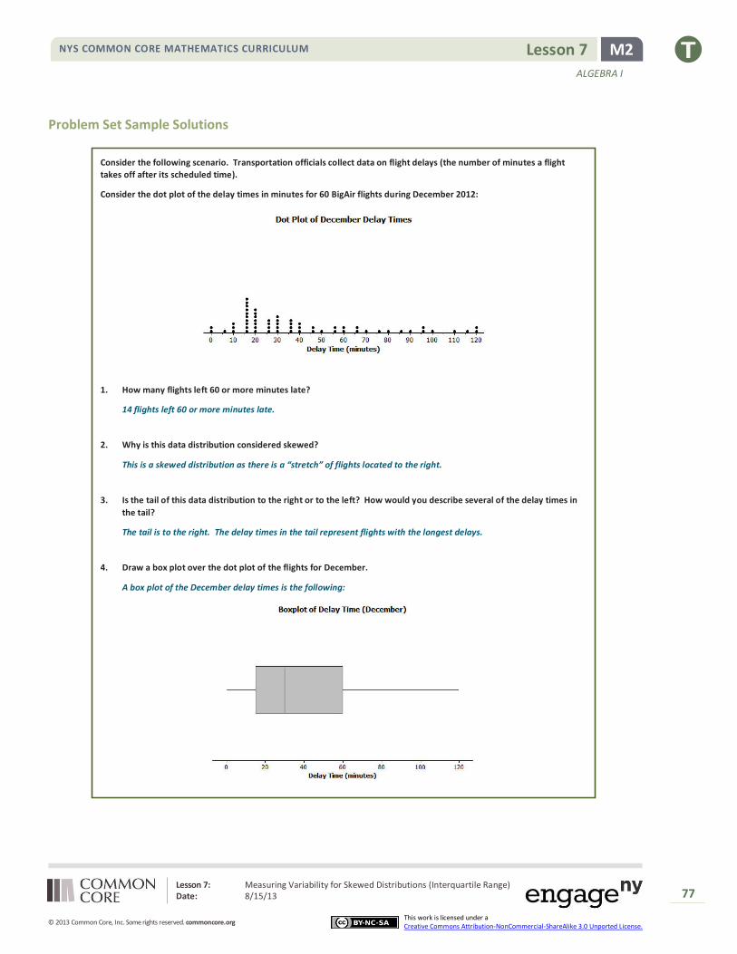
Lesson 7: Measuring Variability for Skewed Distributions (Interquartile Range) Date: 8/15/13
77
© 2013 Common Core, Inc. Some rights reserved. commoncore.org
NYS COMMON CORE MATHEMATICS CURRICULUM
This work is licensed under a Creative Commons Attribution-NonCommercial-ShareAlike 3.0 Unported License.
M2 Lesson 7
ALGEBRA I
Problem Set Sample Solutions
Consider the following scenario. Transportation officials collect data on flight delays (the number of minutes a flight
takes off after its scheduled time).
Consider the dot plot of the delay times in minutes for 60 BigAir flights during December 2012:
1. How many flights left 60 or more minutes late?
14 flights left 60 or more minutes late.
2. Why is this data distribution considered skewed?
This is a skewed distribution as there is a “stretch” of flights located to the right.
3. Is the tail of this data distribution to the right or to the left? How would you describe several of the delay times in
the tail?
The tail is to the right. The delay times in the tail represent flights with the longest delays.
4. Draw a box plot over the dot plot of the flights for December.
A box plot of the December delay times is the following:
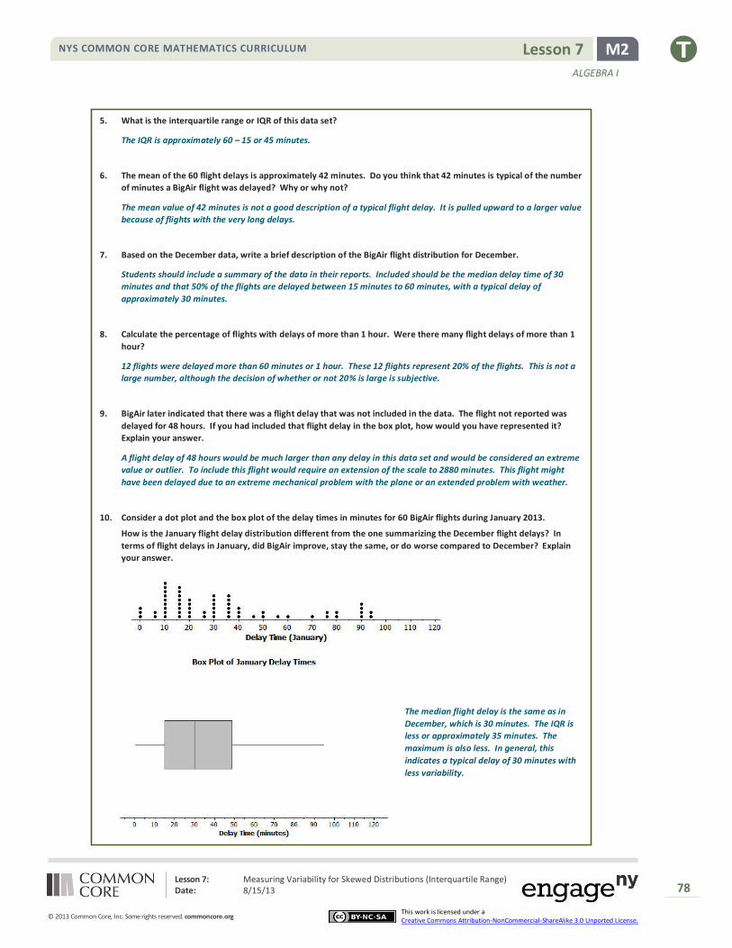
Lesson 7: Measuring Variability for Skewed Distributions (Interquartile Range) Date: 8/15/13
78
© 2013 Common Core, Inc. Some rights reserved. commoncore.org
NYS COMMON CORE MATHEMATICS CURRICULUM
This work is licensed under a Creative Commons Attribution-NonCommercial-ShareAlike 3.0 Unported License.
M2 Lesson 7
ALGEBRA I
5. What is the interquartile range or IQR of this data set?
The IQR is approximately 60 – 15 or 45 minutes.
6. The mean of the 60 flight delays is approximately 42 minutes. Do you think that 42 minutes is typical of the number
of minutes a BigAir flight was delayed? Why or why not?
The mean value of 42 minutes is not a good description of a typical flight delay. It is pulled upward to a larger value
because of flights with the very long delays.
7. Based on the December data, write a brief description of the BigAir flight distribution for December.
Students should include a summary of the data in their reports. Included should be the median delay time of 30
minutes and that 50% of the flights are delayed between 15 minutes to 60 minutes, with a typical delay of
approximately 30 minutes.
8. Calculate the percentage of flights with delays of more than 1 hour. Were there many flight delays of more than 1
hour?
12 flights were delayed more than 60 minutes or 1 hour. These 12 flights represent 20% of the flights. This is not a
large number, although the decision of whether or not 20% is large is subjective.
9. BigAir later indicated that there was a flight delay that was not included in the data. The flight not reported was
delayed for 48 hours. If you had included that flight delay in the box plot, how would you have represented it?
Explain your answer.
A flight delay of 48 hours would be much larger than any delay in this data set and would be considered an extreme
value or outlier. To include this flight would require an extension of the scale to 2880 minutes. This flight might
have been delayed due to an extreme mechanical problem with the plane or an extended problem with weather.
10. Consider a dot plot and the box plot of the delay times in minutes for 60 BigAir flights during January 2013.
How is the January flight delay distribution different from the one summarizing the December flight delays? In
terms of flight delays in January, did BigAir improve, stay the same, or do worse compared to December? Explain
your answer.
The median flight delay is the same as in
December, which is 30 minutes. The IQR is
less or approximately 35 minutes. The
maximum is also less. In general, this
indicates a typical delay of 30 minutes with
less variability.
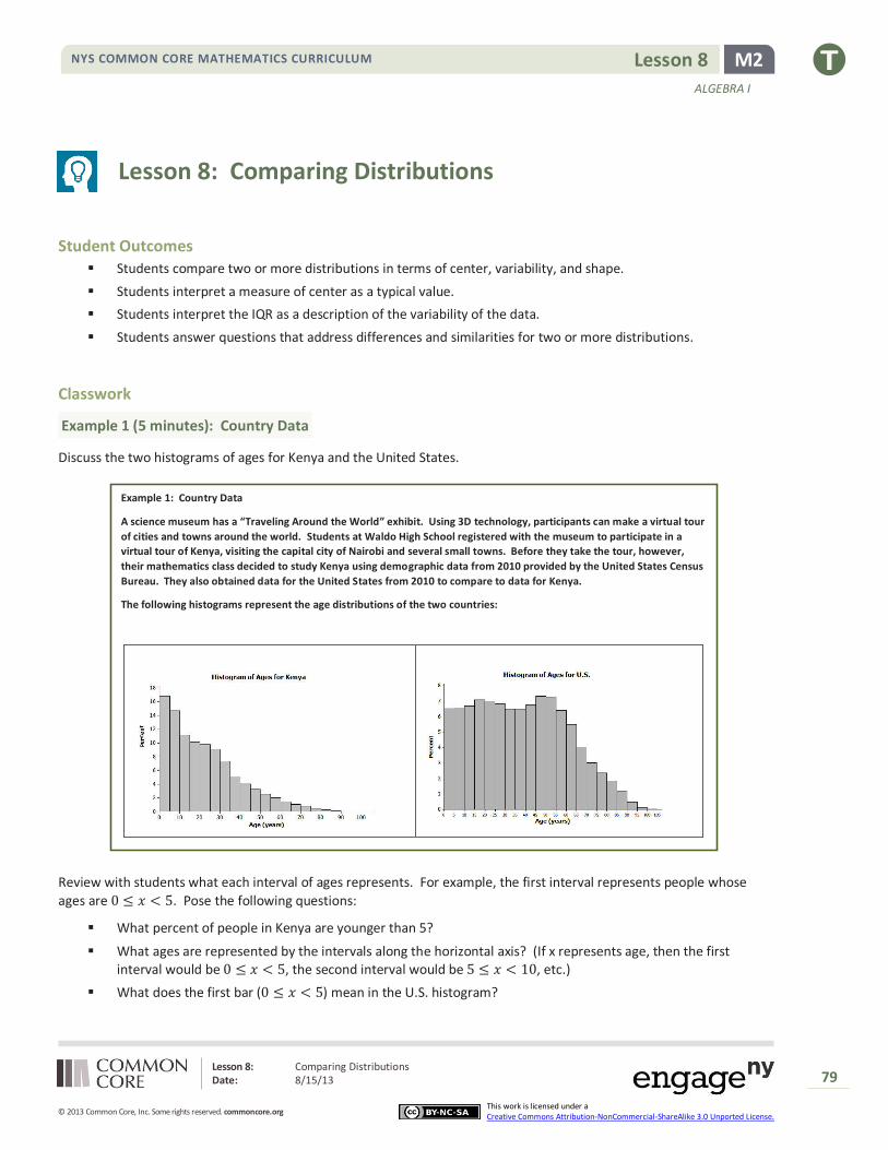
Lesson 8: Comparing Distributions Date: 8/15/13
79
© 2013 Common Core, Inc. Some rights reserved. commoncore.org
NYS COMMON CORE MATHEMATICS CURRICULUM
This work is licensed under a Creative Commons Attribution-NonCommercial-ShareAlike 3.0 Unported License.
M2 Lesson 8
ALGEBRA I
Lesson 8: Comparing Distributions
Student Outcomes
Students compare two or more distributions in terms of center, variability, and shape.
Students interpret a measure of center as a typical value.
Students interpret the IQR as a description of the variability of the data.
Students answer questions that address differences and similarities for two or more distributions.
Classwork
Example 1 (5 minutes): Country Data
Discuss the two histograms of ages for Kenya and the United States.
Example 1: Country Data
A science museum has a “Traveling Around the World” exhibit. Using 3D technology, participants can make a virtual tour
of cities and towns around the world. Students at Waldo High School registered with the museum to participate in a
virtual tour of Kenya, visiting the capital city of Nairobi and several small towns. Before they take the tour, however,
their mathematics class decided to study Kenya using demographic data from 2010 provided by the United States Census
Bureau. They also obtained data for the United States from 2010 to compare to data for Kenya.
The following histograms represent the age distributions of the two countries:
Review with students what each interval of ages represents. For example, the first interval represents people whose
ages are 0 ≤ 𝑥 < 5. Pose the following questions:
What percent of people in Kenya are younger than 5?
What ages are represented by the intervals along the horizontal axis? (If x represents age, then the first interval would be 0 ≤ 𝑥 < 5, the second interval would be 5 ≤ 𝑥 < 10, etc.)
What does the first bar (0 ≤ 𝑥 < 5) mean in the U.S. histogram?

Lesson 8: Comparing Distributions Date: 8/15/13
80
© 2013 Common Core, Inc. Some rights reserved. commoncore.org
NYS COMMON CORE MATHEMATICS CURRICULUM
This work is licensed under a Creative Commons Attribution-NonCommercial-ShareAlike 3.0 Unported License.
M2 Lesson 8
ALGEBRA I
Exercises 1–8 (15 minutes)
Allow students to work independently or in small groups on Exercises 1–8. Then discuss and confirm as a class.
Exercises 1–8
1. How do the shapes of the two histograms differ?
The bars in the Kenya histogram slowly decline; the distribution is skewed with a tail to the right. The bars in the
U.S. histogram are even for a while, then show a more rapid decline.
2. Approximately what percent of people in Kenya are between the ages of 0 and 10 years?
Approximately 32% (15% are ages 0 to 5 years, and 17% are ages 5 to 10 years.)
3. Approximately what percent of people in the United States are between the ages of 0 and 10 years?
Approximately 13%
4. Approximately what percent of people in Kenya are 60 years or older?
Approximately 6.5%
5. Approximately what percent of people in the United States are 60 years or older?
Approximately 18%
6. The population of Kenya in 2010 was approximately 41 million people. What is the approximate number of people
in Kenya between the ages of 0 and 10 years?
32% of 41 million people is approximately 13,120,000 people.
7. The population of the United States in 2010 was approximately 309 million people. What is the approximate
number of people in the United States between the ages of 0 and 10 years?
13% of 309 million people is approximately 40 million people.
8. The Waldo High School students started planning for their virtual visit of the neighborhoods in Nairobi and several
towns in Kenya. Do you think they will see many teenagers? Will they see many senior citizens who are 70 or
older? Explain your answer based on the histogram.
Adding a portion of the percent of people in the 10 to 14 years old group and the percent of people 15 to 19 years old
approximates the estimate of the percent of teenagers. About 15% represents teenagers. Students are likely to see
teenagers as this is relatively large percent of the population. According to the histogram, approximately 3% of the
population in Kenya is 70 or older. As a result, students are unlikely to see many senior citizens 70 or older.

Lesson 8: Comparing Distributions Date: 8/15/13
81
© 2013 Common Core, Inc. Some rights reserved. commoncore.org
NYS COMMON CORE MATHEMATICS CURRICULUM
This work is licensed under a Creative Commons Attribution-NonCommercial-ShareAlike 3.0 Unported License.
M2 Lesson 8
ALGEBRA I
Example 2 (5 minutes): Learning More about the Countries using Box Plots and Histograms
Verbally introduce the box plots of Kenya ages and United States ages.
Example 2 (5 minutes): Learning More about the Countries using Box Plots and Histograms
A random sample of 200 people from Kenya in 2010 was discussed in previous lessons. A random sample of 200 people
from the United States is also available for study. Box plots constructed using the ages of the people in these two
samples are shown below.
Then discuss:
What information is displayed in a box plot?
Median, minimum and maximum values, quartiles, IQR.
What does the (*) represent on the box plot for Kenya?
Extreme values or outliers.
Can we find this same information in the histograms from Example 1?
No. Median, Q1, Q2, minimum and maximum are not clear from a histogram. It could only be used to
estimate these values.
Remind students that the histogram represents the entire population of Kenya, whereas the box plot only represents a sample of 200 people.
Exercises 9–16 (15–20 minutes)
Allow students to work independently or in small groups on Exercises 9–16. Then discuss and confirm as a class.
Exercises 9–16
9. Adrian, a senior at Waldo High School, stated that the box plots indicate the United States has a lot of older people
compared to Kenya. Would you agree? How would you describe the difference in the ages of people in these two
countries based on the above box plots?
Yes, the population of the United States has a much greater percent of people in the older age intervals.
MP.3

Lesson 8: Comparing Distributions Date: 8/15/13
82
© 2013 Common Core, Inc. Some rights reserved. commoncore.org
NYS COMMON CORE MATHEMATICS CURRICULUM
This work is licensed under a Creative Commons Attribution-NonCommercial-ShareAlike 3.0 Unported License.
M2 Lesson 8
ALGEBRA I
10. Estimate the median age of a person in Kenya and the median age of a person in the United States using the box
plots.
The median Kenyan age is slightly less than 20 years, while the median U.S. age is slightly less than 40 years.
11. Using the box plot, 25% of the people in the United States are younger than what age? How did you determine that
age?
25% are younger than approximately 18 years. I used the value of Q1, or the first quartile.
12. Using the box plots, approximately what percent of people in Kenya are younger than 18 years old?
Approximately 50% of the people in Kenya are less than 18 years old.
13. Could you have estimated the mean age of a person from Kenya using the box plot? Explain your answer.
No, the box plot does not provide an estimate of the mean age.
14. The mean age of people in the United States is approximately 38 years. Using the histogram, estimate the percent
of people in the United States who are younger than the mean age in the United States.
Approximately 50% of the U.S. population is less than 38 years old.
15. If the median age is used to describe a “typical” person in Kenya, what percent of people in Kenya is younger than
the median age? Is the mean or median age a better description of a “typical” person in Kenya? Explain your
answer.
50% of the people in Kenya are less than the median age. The median is a better indicator of a typical age because
the distribution is skewed.
16. What is the IQR of the ages in the sample from the United States? What is the IQR of the ages in the sample from
Kenya? If the IQR’s are used to compare countries, what does a smaller IQR indicate about a country? Use Kenya
and the United States to explain your answer.
The IQR for the United States: 58 – 18 = 40 years; the IQR for Kenya: 36 – 7 = 31 years. A smaller IQR indicates that
more of the sample is around the median age, which you can see from looking at the histogram.
Closing
Exit Ticket (5 minutes)
Lesson Summary Histograms show the general shape of a distribution.
Box plots are created from the 5-number summary of a data set.
A box plot identifies the median, minimum and maximum values, and the upper and lower quartiles.
The interquartile range (IQR) describes how the data is spread around the median; it is the length of the
interval that contains 50% of the data values.
The median is used as a measure of the center when a distribution is skewed or contains outliers.

Lesson 8: Comparing Distributions Date: 8/15/13
83
© 2013 Common Core, Inc. Some rights reserved. commoncore.org
NYS COMMON CORE MATHEMATICS CURRICULUM
This work is licensed under a Creative Commons Attribution-NonCommercial-ShareAlike 3.0 Unported License.
M2 Lesson 8
ALGEBRA I
Name ___________________________________________________ Date____________________
Lesson 8: Comparing Distributions
Exit Ticket
1. Using the histograms of the population distributions of the United States and Kenya in 2010, approximately what
percent of the people in the United States were between 15 and 50 years old? Approximately what percent of the
people in Kenya were between 15 and 50 years old?
2. What 5-year interval of ages represented in the 2010 histogram of the United States age distribution has the most
people?
3. Why is the mean age greater than the median age for people in Kenya?
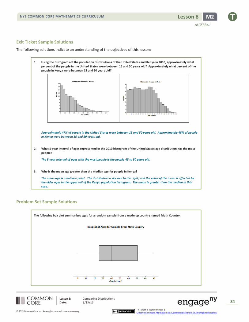
Lesson 8: Comparing Distributions Date: 8/15/13
84
© 2013 Common Core, Inc. Some rights reserved. commoncore.org
NYS COMMON CORE MATHEMATICS CURRICULUM
This work is licensed under a Creative Commons Attribution-NonCommercial-ShareAlike 3.0 Unported License.
M2 Lesson 8
ALGEBRA I
Exit Ticket Sample Solutions
The following solutions indicate an understanding of the objectives of this lesson:
1. Using the histograms of the population distributions of the United States and Kenya in 2010, approximately what
percent of the people in the United States were between 15 and 50 years old? Approximately what percent of the
people in Kenya were between 15 and 50 years old?
Approximately 47% of people in the United States were between 15 and 50 years old. Approximately 48% of people
in Kenya were between 15 and 50 years old.
2. What 5-year interval of ages represented in the 2010 histogram of the United States age distribution has the most
people?
The 5-year interval of ages with the most people is the people 45 to 50 years old.
3. Why is the mean age greater than the median age for people in Kenya?
The mean age is a balance point. The distribution is skewed to the right, and the value of the mean is affected by
the older ages in the upper tail of the Kenya population histogram. The mean is greater than the median in this
case.
Problem Set Sample Solutions
The following box plot summarizes ages for a random sample from a made up country named Math Country.

Lesson 8: Comparing Distributions Date: 8/15/13
85
© 2013 Common Core, Inc. Some rights reserved. commoncore.org
NYS COMMON CORE MATHEMATICS CURRICULUM
This work is licensed under a Creative Commons Attribution-NonCommercial-ShareAlike 3.0 Unported License.
M2 Lesson 8
ALGEBRA I
1. Make up your own sample of forty ages that could be represented by the box plot for Math Country. Use a dot plot
to represent the ages of the forty people in Math Country.
Many possible dot plots would be correct. Analyze individually. Ten of the ages need to be between 0 and 25 years
old, ten of the ages need to be between 25 and 40 years old, ten of the ages need to be between 40 and 70 years old,
and ten of the ages need to between 70 and 90 years old.
2. Is the sample of forty ages represented in your dot plot of Math Country the only sample that could be represented
by the box plot? Explain your answer.
There are many possible dot plots that might be represented by this box plot. Any data set with the same 5–number
summary would result in this same box plot.
3. The following is a dot plot of sixty ages from a random sample of people from Japan in 2010.
Draw a box plot over this dot plot.
The following is the box plot of the ages of the sample of people from Japan:
4. Based on your box plot, would the median age of people in Japan be closer to the median age of people in Kenya or
the United States? Justify your answer.
The median age of Japan would be closer to the median age of the United States than to the median age of Kenya.
The box plot indicates the median age of Japan is approximately 45 years old. This median age is even greater than
the median age of the United States.
5. What does the box plot of this sample from Japan indicate about the possible differences in the age distributions of
people from Japan and Kenya?
A much greater percent of the people in Japan are in the older age groups than is the case for Kenya.
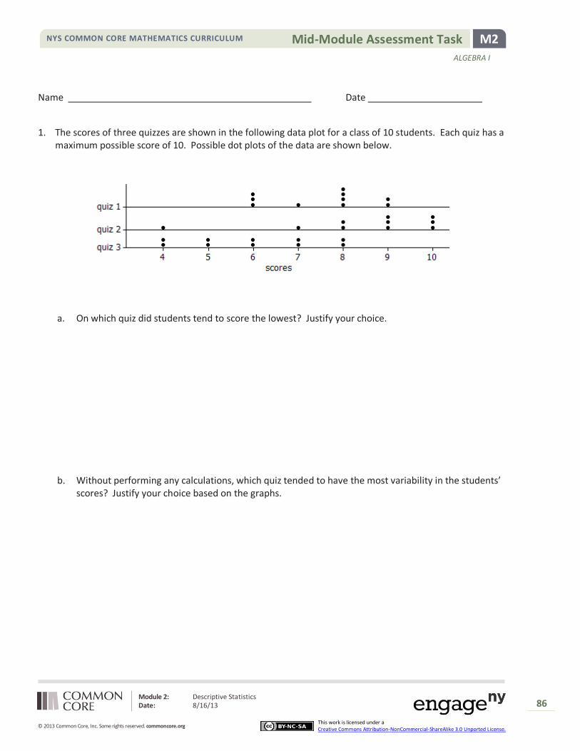
Module 2: Descriptive Statistics Date: 8/16/13
86
© 2013 Common Core, Inc. Some rights reserved. commoncore.org This work is licensed under a Creative Commons Attribution-NonCommercial-ShareAlike 3.0 Unported License.
M2 Mid-Module Assessment Task NYS COMMON CORE MATHEMATICS CURRICULUM
ALGEBRA I
Name Date
1. The scores of three quizzes are shown in the following data plot for a class of 10 students. Each quiz has a maximum possible score of 10. Possible dot plots of the data are shown below.
a. On which quiz did students tend to score the lowest? Justify your choice.
b. Without performing any calculations, which quiz tended to have the most variability in the students’ scores? Justify your choice based on the graphs.
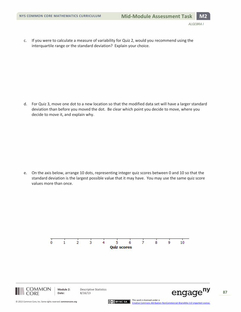
Module 2: Descriptive Statistics Date: 8/16/13
87
© 2013 Common Core, Inc. Some rights reserved. commoncore.org This work is licensed under a Creative Commons Attribution-NonCommercial-ShareAlike 3.0 Unported License.
M2 Mid-Module Assessment Task NYS COMMON CORE MATHEMATICS CURRICULUM
ALGEBRA I
c. If you were to calculate a measure of variability for Quiz 2, would you recommend using the interquartile range or the standard deviation? Explain your choice.
d. For Quiz 3, move one dot to a new location so that the modified data set will have a larger standard deviation than before you moved the dot. Be clear which point you decide to move, where you decide to move it, and explain why.
e. On the axis below, arrange 10 dots, representing integer quiz scores between 0 and 10 so that the standard deviation is the largest possible value that it may have. You may use the same quiz score values more than once.

Module 2: Descriptive Statistics Date: 8/16/13
88
© 2013 Common Core, Inc. Some rights reserved. commoncore.org This work is licensed under a Creative Commons Attribution-NonCommercial-ShareAlike 3.0 Unported License.
M2 Mid-Module Assessment Task NYS COMMON CORE MATHEMATICS CURRICULUM
ALGEBRA I
Use the following definitions to answer questions (f) - (h).
The midrange of a data set is defined to be the average of the minimum and maximum values: (min + max)/2.
The midhinge of a data set is defined to be the average of the first quartile (Q1) and the third quartile (Q3): (Q1+Q3)/2.
f. Is the midrange a measure of center or a measure of spread? Explain.
g. Is the midhinge a measure of center or a measure of spread? Explain.
h. Suppose the lowest score for Quiz 2 was changed from 4 to 2, and the midrange and midhinge are recomputed, which will change more? A. Midrange B. Midhinge C. They will change the same amount. D. Cannot be determined
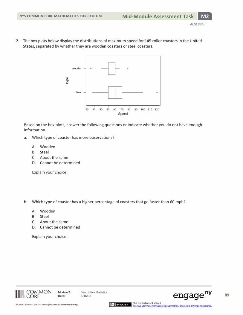
Module 2: Descriptive Statistics Date: 8/16/13
89
© 2013 Common Core, Inc. Some rights reserved. commoncore.org This work is licensed under a Creative Commons Attribution-NonCommercial-ShareAlike 3.0 Unported License.
M2 Mid-Module Assessment Task NYS COMMON CORE MATHEMATICS CURRICULUM
ALGEBRA I
2. The box plots below display the distributions of maximum speed for 145 roller coasters in the United States, separated by whether they are wooden coasters or steel coasters.
Based on the box plots, answer the following questions or indicate whether you do not have enough information.
a. Which type of coaster has more observations?
A. Wooden B. Steel C. About the same D. Cannot be determined
Explain your choice:
b. Which type of coaster has a higher percentage of coasters that go faster than 60 mph?
A. Wooden B. Steel C. About the same D. Cannot be determined
Explain your choice:
1201101009080706050403020
Wooden
Steel
Speed
Typ
e
Module 2: Descriptive Statistics Date: 8/16/13
90
© 2013 Common Core, Inc. Some rights reserved. commoncore.org This work is licensed under a Creative Commons Attribution-NonCommercial-ShareAlike 3.0 Unported License.
M2 Mid-Module Assessment Task NYS COMMON CORE MATHEMATICS CURRICULUM
ALGEBRA I
c. Which type of coaster has a higher percentage of coasters that go faster than 50 mph?
A. Wooden B. Steel C. About the same D. Cannot be determined
Explain your choice:
d. Which type of coaster has a higher percentage of coasters that go faster than 48 mph?
A. Wooden B. Steel C. About the same D. Cannot be determined
Explain your choice:
e. Write 2–3 sentences comparing the two types of coasters with respect to which type of coaster normally goes faster.

Module 2: Descriptive Statistics Date: 8/16/13
91
© 2013 Common Core, Inc. Some rights reserved. commoncore.org This work is licensed under a Creative Commons Attribution-NonCommercial-ShareAlike 3.0 Unported License.
M2 Mid-Module Assessment Task NYS COMMON CORE MATHEMATICS CURRICULUM
ALGEBRA I
A Progression Toward Mastery
Assessment Task Item
STEP 1 Missing or incorrect answer and little evidence of reasoning or application of mathematics to solve the problem
STEP 2 Missing or incorrect answer but evidence of some reasoning or application of mathematics to solve the problem
STEP 3 A correct answer with some evidence of reasoning or application of mathematics to solve the problem, or an incorrect answer with substantial evidence of solid reasoning or application of mathematics to solve the problem
STEP 4 A correct answer supported by substantial evidence of solid reasoning or application of mathematics to solve the problem
1
a
S-ID.2
Student fails to address the tendency for lower scores.
Student picks quiz 2 because of the low outlier at 4 points rather than focusing on the overall distribution.
Student chooses quiz 3 but does not give a full explanation for their choice.
Student uses an appropriate measure of center (e.g., mean or median) to explain their choice of quiz 3 as the quiz students tended to score the lowest on.
b
S-ID.3
Student fails to address the idea of spread or variability or clustering.
Student picks quiz 1 because the heights of the stacks are most irregular.
Student picks quiz 3 but does not give a full explanation for their choice or picks quiz 2 based on one score (the low outlier) as opposed to the overall tendency.
Student chooses quiz 3 and uses an appropriate justification such as stating that the data ranges from 4 to 8.
c
S-ID.2
Student does not make a clear choice between SD and IQR.
Student does not justify choice based on shape of distribution or on presence of outlier.
Student considers the distribution symmetric and chooses the standard deviation.
Student chooses the IQR in an attempt to reduce the impact of the one extreme observation.
d
S-ID.2
Student does not clearly explain how dot will be moved.
Student adds a dot near the center of the distribution (e.g., 5-7) or student moves a dot toward the center of the distribution.
Student’s dot is moved to change the heights of the stacks of the dots.
Student’s dot is moved to be further from the mean of the distribution (without much change in the mean of the distribution).

Module 2: Descriptive Statistics Date: 8/16/13
92
© 2013 Common Core, Inc. Some rights reserved. commoncore.org This work is licensed under a Creative Commons Attribution-NonCommercial-ShareAlike 3.0 Unported License.
M2 Mid-Module Assessment Task NYS COMMON CORE MATHEMATICS CURRICULUM
ALGEBRA I
e
S-ID.2
Student’s placement of dots does not appear to focus on spreading the values as far apart as possible.
Student focuses on having as many different values as possible or on having as much change in the heights to the stacks as possible.
Student spreads the dots out as far as possible without using repeat values (with justification) or does not split the dots into two equal pieces at the two extremes.
Student places half the dots at zero and half the dots at ten.
f
S-ID.2
Student selects measure of spread with a weaker explanation.
Student selects measure of spread because of the use of the max and min values.
Student selects measure of center but does not fully explain reasoning.
Student selects measure of center and discusses how the value will correspond to a “middle” number.
g
S-ID.2
Student selects measure of spread with a weaker explanation.
Student selects measure of spread because of the use of the quartile values.
Student selects measure of center but does not fully explain reasoning.
Student selects measure of center and discusses how the value will correspond to a “middle” number.
h
S-ID.2
Student fails to address the question.
Student selects midrange.
Student selects midrange but does not give a clear explanation.
Student selects midrange and discusses lack of impact on calculation of extreme values.
2 a
S-ID.1
A or C. N/A B. Student often thinks the longer boxplot indicates more observations.
D. The quartiles tell us about percentages not about counts.
b
S-ID.1
A, C or D. N/A Student selects B but justifies based on the steel coasters having a longer box to the right of 60.
B. Student compares the median of steel (50% above) to upper quartile of wooden (only 25% above).
c
S-ID.1
A or D. N/A Student selects B and justifies based on the steel coasters having a longer box to the right of 50.
C. Student cites the similarity of the two lower quartiles.
d
S-ID.1
A or C. N/A B. Student justification focuses on the length of the whisker.
D. Does not clearly correspond to one of the quartiles.
e
S-ID.1
Student does not address which type of coaster goes faster.
Student makes a weak comparison without clear justification or context or student focuses on the one steel coaster at 120 mph.
Student describes shape, center, and spread, but does not focus in on center or fails to give some numerical justification with the description of center.
Student describes the center of the distribution and gives some numerical evidence (e.g., median, Q3).

Module 2: Descriptive Statistics Date: 8/16/13
93
© 2013 Common Core, Inc. Some rights reserved. commoncore.org This work is licensed under a Creative Commons Attribution-NonCommercial-ShareAlike 3.0 Unported License.
M2 Mid-Module Assessment Task NYS COMMON CORE MATHEMATICS CURRICULUM
ALGEBRA I
Module 2: Descriptive Statistics Date: 8/16/13
94
© 2013 Common Core, Inc. Some rights reserved. commoncore.org This work is licensed under a Creative Commons Attribution-NonCommercial-ShareAlike 3.0 Unported License.
M2 Mid-Module Assessment Task NYS COMMON CORE MATHEMATICS CURRICULUM
ALGEBRA I

Module 2: Descriptive Statistics Date: 8/16/13
95
© 2013 Common Core, Inc. Some rights reserved. commoncore.org This work is licensed under a Creative Commons Attribution-NonCommercial-ShareAlike 3.0 Unported License.
M2 Mid-Module Assessment Task NYS COMMON CORE MATHEMATICS CURRICULUM
ALGEBRA I

Module 2: Descriptive Statistics Date: 8/16/13
96
© 2013 Common Core, Inc. Some rights reserved. commoncore.org This work is licensed under a Creative Commons Attribution-NonCommercial-ShareAlike 3.0 Unported License.
M2 Mid-Module Assessment Task NYS COMMON CORE MATHEMATICS CURRICULUM
ALGEBRA I