new plastic weapons - — shinntypeshinntype.com/wp-content/uploads/newplast.pdf · it is not the...
TRANSCRIPT

New plastic weaponsBy Nick ShinnGraphic Exchange Jan./Feb. 2004

Graphic design is not information architecture. It is not a serviceindustry. It is not a means of self-expression. It is not computer effects. It is not the manipulation of style referents.
The graphic designer’s primary task is to create new forms.(You could say the same about any creative work, and it would betrue.)
Robert Motherwell, objecting to the layers of meaning thathad been attached to his paintings and those of peers such asJackson Pollock, explained: “Plastic automatism is very little aquestion of the unconscious. It is much more a plastic weaponwith which to create new forms.” Meaning was incidental. Hejust wanted to paint new stuff, and for a while action painting wasa concept that made that possible.
Consider the typefaces shown here as plastic weapons. Thefirepower lies in the original ideas that structure their formal language. No revivals. No retro. No rip-offs. And above all, nome-too redundancy.
That spirit will inform any work in which they are used.
LINGUA (above) by Eric Olson
processtypefoundry.comThe OpenType font format can contain large numbers of contex-tual ligatures. This has been most exploited in scripts such asZapfino, known for the single wordmark/glyph that sets when theletters Z-a-p-f-i-n-o are typed. However, the true design potentialof this new format was suggested, before its invention, by themany bizarre ligatures Zuzana Licko created for Mrs Eaves (nowavailable as Emigre’s first OpenType font). This new way of con-necting letters exists not to mimic the look of writing, nor to paro-dy the kludges of metal type, but as an aesthetic development ofthe ability of digital font software to manage huge sets of multi-character glyphs.
Eric Olson has picked up the ball with Lingua.Realizing that some kind of limitcheck was required on the
interminable, meaningless task of creating thousands of ligaturesfor every possible character combination, Olson refined hischoice of combinations by statistical analysis, to 200 of those most
prevalent in the English language. Two weeks of feature newspa-per articles and one novel were fed into the specially builtLigature Counter application. The resulting letter pair comboswere then averaged and used for the Lingua ligatures.
Experimental design that follows the principles of What-if?and Because-we-can! redefines beauty. The most elegant solu-tions to previously unposed problems are shocking and ugly intheir strangeness. The stark angularity of Lingua is not a whim ofOlson’s: it is the logical outcome of putting ligatures where nonehave gone before. As one begins to appreciate the way that formhere follows function, the beauty emerges.
SEBASTIAN by Frantisek Storm
stormtype.comIn the realm of historical fiction, Frantisek Storm displays a con-vincing verité. Steeped in the Baroque ethos, Sebastian purportsto be a sans serif type from 100 years before the invention of thegenre. The pretense is conveyed not merely by the generous pro-portions of the letters and features such as the “st” ligature, butalso by a dog-eared irregularity of stroke which simulates the arte-facts of rough letterpress printing.
Certainly, we have seen anachronism before, but of thehumanist kind (Gill, Syntax, Optima) and with a smooth, 20thcentury fluidity. Though close in structure, Peter Bil’ak’s Eureka
G r a p h i c E x c h a n g e
Ten radical 21st Century type designs. Reviewed by Nick Shinn

Sans, also an angular, Slavic grotesque with small x-height, has acontemporary, refined, even color. Primitive and spicy, Sebastianconveys the exotic glamour of impossible worlds.
DALLIANCE by Frank Heine
emigre.comIf Sebastian is to be considered an historical fiction, DallianceRoman is historical fantasy. (Neither being a reiteration of histori-cal fact, they are “retro” merely by allusion.)
Proceeding from the Script, which is fairly faithfully based onthe writing in a war map of 1798, Frank Heine has concocted a roman style of antique yet ahistorical provenance. With Post-modern nerve and verve, most of the roman shapes were concep-tualized by backslanting the italic.
The capitals have enough lower case forms to create a unicasevibe in all-cap setting, both harking back to uncials and black-letter, while relating to the standard mixed case model (BradburyThompson’s Typeface 26), and current flirtations with experimen-tal alphabets. Copious ligatures, ornaments and flourishes meanjust one thing for typographers: playtime!
Against the brutal norm of text configured for the efficienttransmission of literal data, the heresy of Dalliance counters:linger awhile, enjoy the typography.
LUX SANS by Greg Lindy
http://lux.thirstype.comIn the wake of Quay Sans (1990) and especially Meta (1991), acontemporary genre of dull, functional European sans serif faceshas emerged, published by the German FontFont brand. Fago,
Info, and Zine (for some reason, a four-letter name is a requisite)are somewhat condensed, squarish, nuanced in finish, and withan evenness of character width (especially noticeable in the capi-tals). Greg Lindy’s latest face, Section, is another such exercise inorthodoxy—although Sect would have been a more appropriatename.
Prior to this, Lindy had designed the altogether more interest-ing Lux Sans, a marvellous combination of sustained inventionand utility. Lux Sans is an unlikely candidate for popularity. It isnot dumped on the market in vast quantities, free to anyone whoowns a major Adobe application; it is only distributed at onesource, Thirstype; and it does have a few quirks—but what arethese if not assets?
There are three features of particular note. First is the cursive form of the lower case italic. Usually in a
humanist sans, the italic is quite similar in form to the roman,and slightly narrower. In Lux Sans, the spacious fit of the romanis maintained in the italic, and the added little tails create a styleof marked emphasis.
Second is the thickness of the angled strokes leading into thejoint in lowercase forms, such as n, u. In the asymmetric countersof the b, p, d and q, the calligraphic, humanist origin of this fea-ture is clearly demonstrated. This structure is also found in Thesisand Scala Sans, which appear to be two faces Lindy is playingoff—he has quoted the splayed M of Thesis, and the asymmetricw of Scala Sans. However, he does this not to steal cachet, but toset up his major development, the third feature, which is the“lower case” joint at the top of the B, D, P, and R.
In as much as it creates an extra short, protruding stroke, thisdetail is repeated in the A and W. The novel B has precedents—in Goudy Sans, for instance—so this is clearly a face in the classictradition. Its quirks are not contemporary (as with Infinity, below),so it has a wide range of application.
In all, the features that make Lux Sans unique are integratedto create a consistently purposeful typeface, an alternative to thosebland, generic sans faces that are everywhere and nowhere, sayingnothing.
INFINITY by chester and Rick Valicenti
thirstype.comModernity is easy to fake, by using the proven modern types ofprior eras, such as the 1930s (Futura, DIN), the 1950s (Helvetica),
G r a p h i c E x c h a n g e

or the 1970s (Frutiger, aka Myriad). Without the benefit of histori-cal perspective, it’s hard to say what is, so far, the quintessentially21st Century sans, but I would hazard a guess that Infinity would-n’t be far off the mark. Most significant is its Post-modern com-plexity, establishing its character deftly in three separate areas,and in each of them by subtle distinction: letter form, curveshape, and detail.
Firstly, in the lower case, there is an ellipsis of certain letterparts, in particular, it looks as if many of the vertical stems areincomplete. Secondly, and this is related, each full curve is notconsistent, but partly straight, and the transition between thestaight and bent part of these strokes is abrupt. And thirdly is themannerist, arbitrary treatment of terminals, some rounded, otherscleanly cut.
Overall, what ties these design themes together is an ambiva-lent relationship between straight and round: that which is usual-ly straight is made somewhat round; that which is usually round issomewhat straightened. A metrosexual type.
KLAXON by Rian Hughes
devicefonts.co.uk or veer.comAs befits a product of Device Fonts, Klaxon is descended fromprimitive electrical numerical displays developed by engineers inthe 1960s for watches, elevators, and stove tops. This high-techlook was captured by Alan Meeks in the 1981 typeface LCD(Letraset).
Another forebear is Fregio Mecano, an Italian typeface of the1920s whose every character could be composed, and reconfig-ured in various proportions, from 20 basic segments. An iterationof this is available digitally as CG Section.
Pixelization, or construction from a uniform field of elements,is a dominant force in this broad genre, but the idea of construct-ing characters from complex modular components, and havingthat modularity show as texture, is quite distinct. It is apparent inseveral recent typefaces, for instance Simon Schmidt’s Delay(Fountain). In some cases, such as Stephan Müller’s Airport(FontFont), the texture is the whole point of the exercise.
So, what at first seems to be a straightforward type categoryreveals a spectrum of motivations between function and effect.
Klaxon is in it for the effect. It’s an ingenious design construct-ed on a unique framework, but Hughes, playing to the crowd, hassacrificed strict functionality for the sake of smooth appearance:
the V is a cheat, and because the typeface is not monowidth, thepotential for a unique kind of motion animation is thwarted.Nonetheless, on its own terms, this is a quite brilliant typeface.
UNIBODY by Helmling, Jacobs, and Kortemäki
underware.nlAnti-aliasing: turn it off. This “pixel” typeface family is designedspecifically for Flash MX and Photoshop at 8 pt. size, giving asharp, bitmapped quality on low resolution screens.
Unibody stands out from the pixel font crowd with two typo-graphically sophisticated design features. Firstly, it comes in a co-ordinated family of five styles: Regular, Italic, Bold, Black, andSmall Caps. And secondly, the Italic tackles the nasty jaggies andexcessive slant customary in pixel italics, by going upright. Theletter forms are sufficiently italic, and the width is narrower thanthe Roman, so its function as a contrast font is quite clear.
PERLA by Gareth Hague
veer.comUsing the same formal vocabulary as Bodoni and Didot, Hague’splayful equalized-height didone will produce—by a careful dispo-sition of capital, lowercase, and alternate forms—wordmarks andtext with the rich quality of custom typography. As with Dalliance,the variety of alternates gives typographers the opportunity to exer-cise their discrimination in a very hands-on manner.
In its own way, Bodoni is as modernist as Futura. Just don’tconsider serifs or stress contrast as historical signifiers, but as plas-tic features—rationalize and extemporize, and there you havePerla: modern jazz.
G r a p h i c E x c h a n g e
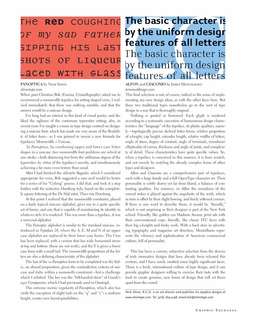
PANOPTICA by Nick Shinn
shinntype.comWhen poet Christian Bök (Eunoia, Crystallography) asked me torecommend a monowidth typeface for setting shaped verse, I real-ized immediately that there was nothing suitable, and that theanswer would be a unicase design.
I’ve long had an interest in this kind of visual poetry, and dis-liked the ugliness of the customary typewriter setting; also, inrecent years I’ve taught a course in type design centred on design-ing a unicase font, which has made me very aware of the flexibili-ty of letter form—so I was primed to invent a new formula fortypefaces: Monowidth + Unicase.
In Panoptica, by combining upper and lower case lettershapes in a unicase, two monowidth font problems are solved atone stroke—both distancing text from the utilitarian stigma of thetypewriter, by virtue of the typeface’s novelty, and simultaneouslyachieving a far more even texture than usual.
After I had finished the old-style Regular, which I consideredappropriate for verse, Bök suggested a sans serif would be betterfor a series of his “Cyborg” poems. I did that, and took it a stepfurther with the reductive Doesburg style, based on the complete-ly square lettering of the De Stijl artist, Theo von Doesburg.
At this point I realized that the monowidth constraint, placedon a fairly typical unicase alphabet, gives rise to a quite specificset of forms, and one that is capable of maintaining its identity inwhatever style it is rendered. This was more than a typeface, it wasa universal alphabet.
The Panoptic alphabet is similar to the standard unicase, in-troduced in Typeface 26, where the A, E, M and N of an uppercase alphabet are replaced by their lower case forms. The I toohas been replaced, with a version that has wide horizontal stemsat top and bottom (these are not serifs), and the Y is given a lowercase form with a small tail. The monowidth proportions of the let-ters are also a defining characteristic of the alphabet.
The last of the 10 Panoptica fonts to be completed was the Ital-ic, an absurd proposition, given the contradictory criteria of uni-case and italic within a monowith constraint—but a challengewhich I relished. The key was the “left-handed stress” of Goudy’s1927 Companion, which I had previously used in Oneleigh.
The extreme metric regularity of Panoptica, which also has(with the exception of slight tails on the “q” and “y”) a uniformheight, creates new layout possibilities.
ALFON and GIACOMO by James Montalbano
terminaldesign.comThis final selection is not, of course, radical in the sense of imple-menting any new design ideas, as with the other faces here. Butthese two traditional types nonetheless go to the root of typedesign in a way that is thoroughly original.
Nothing is quoted or borrowed. Each glyph is renderedaccording to a systematic execution of harmonious design charac-teristics: the “language” of the typeface, its plastic qualities, name-ly—topologically precise skeletal letter forms, relative proportionof x-height, cap height, extender length, relative widths of letters,angle of stress, degree of contrast, angle of terminals, roundness/ellipticality of curves, thickness and angle of joints, and complexi-ty of detail. These characteristics have quite specific values. So,when a typeface is conceived in this manner, it is from scratch,and not merely by restyling the already complex forms of othertypes and designers.
Alfon and Giacomo are a comprehensive pair of typefaces,each with a large family and a full OpenType character set. Theirpersonality is subtly drawn yet far from bland, a balance of con-trasting qualities. For instance, in Alfon the roundness of thecurved stokes is played against the angularity of the serifs, whichin turn is offset by their slight bowing, and finely softened corners.If there is one word to describe them, it would be “friendly,”which is not surprising as their designer is part of the New Yorkschool. Friendly, like golden era Madison Avenue print ads withtheir conversational copy; friendly, like classic ITC faces withtheir big x-heights and funky serifs. With a back story in advertis-ing typography and magazine art direction, Montalbano repre-sents the vibrancy and sophistication of American commercialculture, full of personality.
This has been a cursory, subjective selection from the dozensof truly innovative designs that have already been released thiscentury, and I have surely omitted some highly significant faces.There is a lively, international culture of type design, and it canprovide graphic designers willing to exercise their taste with thetools to create genuine, new forms of design that will set themapart from the crowd.
Nick Shinn, R.G.D. is an art director and publishes his typeface designs at
www.shinntype.com. Tel. (416) 769-4198, email:[email protected].
G r a p h i c E x c h a n g e