new face of toi.com do we need it?. present toi.com homepage content has evolved, design has not...
TRANSCRIPT
New face of TOI.com
Do we need it?

Present TOI.com homepage
Content has evolved, design has not
Caters to original thought: print edition on the net
Design decay: Ad/content-led modifications
Heavy page weight by international standards

What’s current
Homepage main entrypoint, showcases few stories
No provision for display of sections on homepage
Too many animated banners, hurts surfers’ eyes
Nav panel on left very long
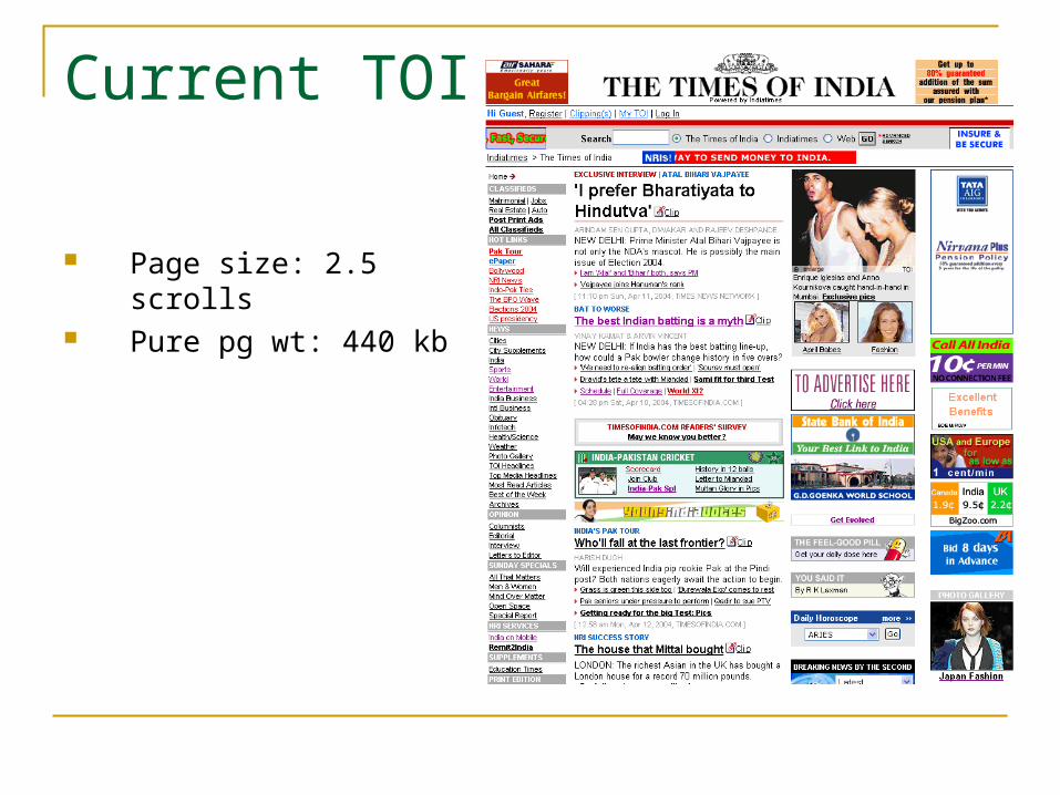
Current TOI
Page size: 2.5 scrolls Pure pg wt: 440 kb

Benchmarking: Global news websitesNew York Times
Page size: 5.5 scrolls Pure pg wt: 237 kb
Navigation:
Classifieds on top of bar,
with distinct gifs
Content hierarchy
according to usage pattern
No ads in central content
area
Content: Plenty of white
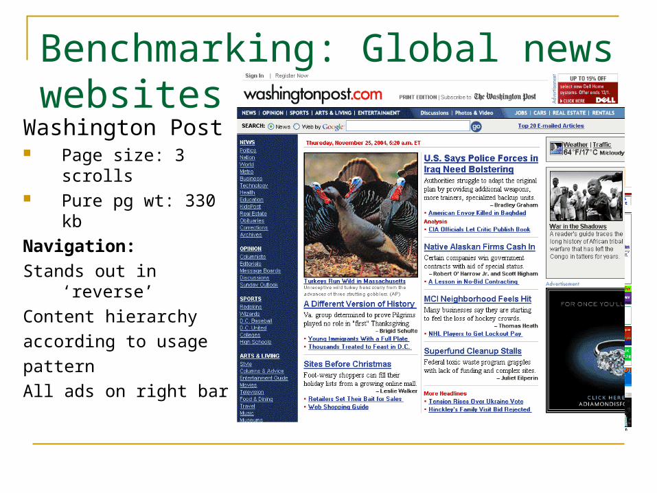
Benchmarking: Global news websites
Washington Post Page size: 3 scrolls Pure pg wt: 330 kb
Navigation:
Stands out in ‘reverse’
Content hierarchy
according to usage
pattern
All ads on right bar

Benchmarking: Global news websites
LA Times Page size: 3.5 scrolls Pure pg wt: 294 kb
Navigation:
Leads with registration, classifieds, local LA news (Calenderlive)
Content hierarchy according to usage
Content links on background colour to make them stand out

Benchmarking: Global news websitesCNN Page size: 2 scrolls Pure pg wt: 294 kbNavigation:Content hierarchy
according to usageContent links on
background colour to make them stand out
Business and sports links lead to sister sites (cnnmoney/cnnsi)
Display of all sections bottom of page

Rationale
Interface Structure

What the new design has
Neater, more legible, clutter free UI
Higher visibility display to paid propositions
Clear demarcation of content and ad areas

Prevent Design Decay
Set Ad rules: demarcation of slots; guidelines on animated ads; process-flows for creating slots.
Ensure that grid is not compromised at any cost. Content must have clearly defined modules.

Rationale
Navigation

Task Orientation
Top placement of most used links
Merging of scarcely used categories into popular ones

Rationale
Category Display on Home

Drive Usage
Display best in each highly popular category on home
Once on a story, devices like “Related Stories” capture user interest.
Benchmarks: NYT, CNN, WP etc.

Rationale
Masthead Modification

Online Brand
Consistency & Conformity
All Indiatimes websites have a left aligned masthead.
Times of India Online is the only notable standout at the moment.
Left alignment of the masthead would reinforce consistent experience for the user and the advertiser