multivariate glyphs for multi-object clusters
TRANSCRIPT

Multivariate Glyphs for Multi-Object Clusters
Eleanor Boyle Chlan∗
Johns Hopkins University
Whiting School of Engineering
Penny Rheingans†
University of Maryland,
Baltimore County
ABSTRACT
Aggregating items can simplify the display of huge quantities ofdata values at the cost of losing information about the attribute val-ues of the individual items. We propose a distribution glyph, in bothtwo- and three-dimensional forms, which specifically addresses theconcept of how the aggregated data is distributed over the possiblerange of values. It is capable of displaying distribution, variabilityand extent information for up to four attributes at a time of multi-variate, clustered data. User studies validate the concept, showingthat both glyphs are just as good as raw data and the 3D glyph isbetter for answering some questions.
CR Categories: H.5.2 [Information Interfaces and Presentation]:User Interfaces—Evaluation/methodology; I.3.6 [Computer Graph-ics]: Methodology and Techniques—Interaction Techniques;
Keywords: information visualization, multivariate visualization,distribution, aggregated data
1 INTRODUCTION
Glyphs usually represent individual, multivariate items. For exam-ple, in the context of census data, we could imagine a glyph rep-resenting an individual, where the shape implied the type of paidemployment, the color implied an age range, and size was associ-ated salary. Supplementation with additional features would encodeaddition attributes of the data, but it still only reflects the one indi-vidual. It would not tell us the average salary for a group or rangeof ages of those working in a particular type of job. Also, with largequantities of data it is probable to have more data items than can bereasonably comprehended by the average viewer. Besides, the moreitems to be displayed, the greater the likelihood that significant sub-sets will be occluded. With large quantities of data, it is commonto aggregate items to make the data more cognitively manageable.Clustering [8] is a popular method. However, an unfortunate sideeffect of showing aggregated data as a single entity is the loss of theunderlying values associated with the individual data items. Sim-ply displaying a glyph at the centroid of the clustered data fails toshow the extent and variability of the clustered data items. Averagedata values are useful but not sufficient. A group composed only ofteenagers and senior citizens may be indistinguishable from a groupcomposed only of middle aged people. Therefore, we also wish toget a sense of whether the data is scattered across a wide range orfocused on a narrow range of some attribute, if the distribution isuniform or skewed, and what the actual extent of the data is. Ourgoal is to facilitate aggregation by designing a compact glyph pro-viding as much information as raw data.
Inspired by Tukey Box plots [14], we seek to restore some of thelost information of clustered data by displaying summary and distri-bution information about the cluster’s contents. We have developed
∗e-mail: [email protected]†e-mail:[email protected]
a distribution glyph which shows mean, standard deviation, and ex-tent, and also implies distribution of the data in the cluster. Twouser studies show that the distribution glyph is just as good as theraw data in terms of correctness and preference. The 3D versionof the glyph was shown to be superior to raw data for answeringquestions about average values and distribution.
2 RELATED WORK
There is a rich body of research on the topic of using glyphs to dis-play information. Colin Ware’s book [16] gives basic backgroundon standard glyphs, where the emphasis is on finding useful meth-ods to encode additional information into symbols.
Histograms and scatter-plots are examples of very simple glyphs,which are useful for showing smaller amounts of data with few at-tributes [3]. There are numerous glyph types which represent indi-vidual data items [2, 5, 9, 10, 12].
There has been less research on methods to show composite data.Hendley et al. have developed a scheme called Narcissus [7] whichcasts a translucent isosurface around the cluster, visually convertingthe cluster into a simpler item. This does not solve the cognitivemanagement problem for huge data sets since the individual glyphsare still displayed. In a similar vein, Sprenger et al. [13] cast anisosurface around the clusters created with a hierarchical, agglom-erative partitioning algorithm called H-BLOB. Fua, et al. [6] usea variation of parallel coordinates to display aggregated, clustereddata. Tukey box plots [14] show extent and a limited sense of vari-ability for two-dimensional data. See the example in Figure 1. Theydisplay a box representing the second and third quartile of the datawith the median marked. The box is supplemented with lines thatshow the extent of the first and fourth quartiles. Outliers may beshown as well. The size of the box is visually compared to theoverall range of the data to obtain an impression of the distributionof the data.
Figure 1: Tukey Box Plot Example
Other than Tukey box plots, which illustrate 2-dimensional data,glyphs do not show extent and variability for an attribute of inter-est. The glyphs discussed here represent a good cross-section ofthe kinds of multivariate glyphs available. Typical problems rangefrom being overly abstract to being difficult to compare attributesacross objects. In addition, none of these can handle aggregateddata and nor show variability and extent of the data.
141
IEEE Symposium on Information Visualization 2005October 23-25, Minneapolis, MN, USA0-7803-9464-X/05/$20.00 ©2005 IEEE.

Figure 2: Test Images with Age, Education and Salary Mapped to X, Y and Color (a) Data Only - Shown as Dots (b) Combined Image withAll Shells (c) Extent Shell
3 APPROACH
Since we want to imply the range of all the data values in the setwithout explicitly drawing them, we need to show the extent anddistribution of the data. The distribution glyph has been inspiredby Tukey box plots and is explicitly designed to show the average,standard deviation, and distribution of three attributes of the dataset.
3.1 Two Dimensional Distribution Glyph
The two dimensional (2D) distribution glyph consists of threenested shells. The innermost or ”average” shell is an ellipse withthe size of the axes of the ellipse tied to the standard deviation ofthe data attributes mapped to the X and Y axes. It is centered on theaverage value of each of the two attributes. The middle or ”vari-ability” shell is an ellipse with the size of the axes tied to twice thestandard deviation of the attributes mapped to the X and Y axes.The outer or ”distribution” shell is an ellipse with the size of theaxes tied to the minimum and maximum values of the attributesmapped to the X and Y axes.
A simulated test data set is shown in Figure 2(a). The full glyphcorresponding to this data is shown in (b), while just the distributionshell is shown in (c). Note that the distribution shell corresponds tothe limits of the data in both X and Y, in this case to the positions ofthe outliers, which are about halfway up the Y axis, near 0 and near978 in X. Since the shell is elliptical, it is normal for points to occuroutside the ”corners” of the ellipse. The shell is not trying to showthe exact area covered by the data, but is trying to imply its extent.In the middle variability shell, we see the data is reasonably tightlydistributed in the X direction but much more broadly distributed inthe Y direction. Note that the variability shell has been clipped bythe distribution shell. This supports the notion that the distributionshell implies the limits of where data will be found. Finally, we seethat the inner or average shell shows that the average is about 365 inX and about 283 in Y. The standard deviation is about 90 in X andabout 170 in Y. The average in X and Y is clearly offset from thecenter of the distribution ellipse, implying skew or an asymmetricbell curve.
A third attribute is mapped to color. Since we are not able touse physical size to imply average, variability, and distribution, aswe do for the attributes mapped to X and Y, we map the color withdifferent methods for each shell. The inner shell still represents theaverage, the middle shell still implies variability, and the outer shellstill implies the distribution or extent by giving us an idea of wherethe data points actually lie in the color spectrum.
For the inner average shell, the attribute associated with color isaveraged over all the data points. The average is then interpretedusing the HSV color model. For the average shell in Figure 2(b),the data points range in color from 423 to 477.
Variability is implied in the middle variability shell through colorsaturation. The shell is colored by interpreting the attribute of eachdata item associated with color in terms of HSV. The essentiallycylindrical HSV colors are converted to rectangular coordinates andaveraged. This method of averaging the color tends to desaturatethe shell color when it is generated by widely varying values. If thedata points all have very similar values, the shell color will tend tobe highly saturated. Looking at the test data in Figure 2(c), we seethat the color of the variability shell is essentially white, implying abroad distribution of color values in the data set.
The outer distribution shell implies different concentrations ofdata values in different regions of the data set. The shell is coloredby taking a weighted average of the colors of the data points locatedin wedge shaped windows around the ellipse. The user specifies thesize in degrees of the wedge originating from the center of the el-lipse. The color calculation finds all of the data points in the wedgeand weights each point inversely by its distance from a target point,which is centered in the wedge on the edge of the ellipse. Pointscloser to the edge contribute more to the color than points near thecenter or significantly outside the edge. The calculated color is as-signed to the target point on the edge of the ellipse. The averagevalue colors the point at the center of the ellipse. The color be-tween the center and the edge is automatically interpolated. Sectorsof the ellipse with few points are more transparent than sectors withmore points. The distribution shell is shown at full opacity when thenumber of points in the sector exceeds half of the number of pointspossible if they are distributed perfectly uniformly. The number ofpoints in the window is divided by this threshold to get a densityvalue that controls the transparency of the color.
For the distribution shell in Figure 2(c), the wedge is +/- two de-grees. Transparency starts to occur when the number of points inthe window falls below five. The average of this data for attributeis between 370 and 423. The upper half is dominated by valuesin the 639 to 693 range yet has sub-concentrations on the 531 to585 range. The lower left is dominated by data with low (yellow)values of the attribute, again with some sub-concentrations around423. The lower right is transparent, indicating few or no points inthat region. This implies most of the data is in the left half and thereare some outliers to the extreme right. The broad value distribu-tion implied by the middle variability shell is substantiated by thedistribution shell which clearly shows color from yellow throughmagenta. In looking at (a) we can see there are also orange val-ued points which are too few to contribute to the coloring of thedistribution shell.
Figure 3 shows the relationship of several nodes in a hierarchi-cally clustered set of census data [15]. In Figure 4, we see a series ofexamples of the two-dimensional distribution glyph using this data.The data in question has been clustered using the standard algo-rithm K-means. The K-means algorithm was applied repeatedly tothe results to impose a hierarchy on the data set. All the figures have
142

Figure 3: Relationship of Nodes in Clustered Census Data
the education level mapped to the x-axis, the marital status mappedto the Y-axis, and age mapped to color. Similarly, marital statusstarts at zero to represent three categories of ”Married” and con-tinues through separated, divorced and widowed to never married.The node in Figure 4(a) is Node A from Figure 3. You can see that,while the data in this part of the tree is broadly distributed, most islocated in a smaller region centered in the lower right quadrant withsome outliers. The white color of the variability shell shows a widedistribution of age. The average age is in the 35 to 41 range. NodeB in Figure 4(b) is the child of the node in (a). The range of educa-tion and marital status is similar to the parent node but the age is alittle more narrowly distributed, the variability shell having a bluercast than the variability shell of the glyph in (a). The average age isalso noticeably higher. Nodes D and E are shown in Figure 4(c) and(d). Node E seems to have the highest average age of all the nodesin this section of the tree. Although it has a smaller range of edu-cation and marital status, there are fewer outliers. As you descendthough the hierarchy, the nodes reflect smaller and smaller rangesof the associated attributes. This is reflected by smaller sizes in Xand Y and more saturated color in the variability shell. In Nodes Dand F (Figure 4(c) and (e)), we see the node has become sufficientlycohesive in age that we can no longer distinguish the variability andaverage shells from each other. At the highest level in Node A, thedistribution shell is almost white, telling us clearly that age is notbig factor in the high level clustering of this data. For comparison,the Node A is redrawn in Figure 5(a) with the color attribute nowmapped to hours worked per week. Clearly, the hours worked perweek is a major factor in the clustering. Figure 5(b), shows thecorresponding raw data, illustrating a common problem that occurswhen representing a high dimensional set in a reduced number ofdimensions. There are more than 3000 points in (a) but hundredsof points end up as collocated in (b) since each attribute has only alimited number of possible values.
3.2 Three Dimensional Distribution Glyph
A three-dimensional (3D) version of the glyph allows an additionalattribute to be summarized for the data set and more appropriatelyfits into existing visualizations in 3D. The three dimensional Dis-tribution Glyph is implemented like the two dimensional versionexcept that a third attribute is mapped to the Z axis. The ellipsesbecome ellipsoids. The size of the average shell represents standarddeviation, the size of the variability shell represents twice the stan-dard deviation, and the size of the distribution shell represents theminimum and maximum values. However, simply adding a dimen-sion to the 2D model is not adequate. When properly shaded andlighted, all the viewer would see would be the distribution shell. It’s
Figure 4: Related Nodes in Clustered Census Data with Education,Marital Status,and Age Mapped to X, Y, and Color (a) Node A (b)Node B (c) Node D (d) Node E (e) Node F
143

Figure 5: Census Data Example Node A Colored by Hours workedPer Week (a) 2D Glyph (b) Raw data
important to be able see the inner and middle shells with the colorsaccurately rendered. Some viewers may also find it more difficultto accurately perceive the shapes and relationships in a static 3Dimage.
In order to see all three ellipsoids, the distribution shell is shownas a solid with every other row of triangles omitted. The variabilityshell is also shown as a solid, but with every other sector of longi-tude omitted. The overlay of the variability and distribution shellscreates a basket weave though which the average shell can be seen.This methods allows all three shells to be seen without the mislead-ing color changes that would occur if the variability and distributionshells were sufficiently transparent to allow the average shell to beseen [11]. Showing the density of points via transparency is omit-ted.
Like the 2D model, the color of the average shell represents theaverage value of the fourth attribute which is then mapped to color.The color of the variability shell represents the average of the colorsafter the attribute values are converted to color values. The color ofthe distribution shell is calculated by taking the weighted averageof the color of all the points in a three dimensional wedge centeredon a point on the surface of the ellipsoid.
A simulated test data set is shown in Figure 6(a). The averageshell corresponding to this data is shown in (b). Note the averagecolor is 394 to 453.
The variability shell is shown with the average shell in Fig-ure 6(c). The color of the variability shell is essentially white, im-plying a broad distribution of color values in the data set. This issubstantiated by the raw data which clearly shows colors from yel-low through magenta. In looking at the raw data in Figure 6(a), wecan see there are also orange valued points which are too few tocontribute to the coloring of the distribution shell.
The distribution shell is shown in Figure 6(d) and the completeglyph is shown in (e). The imposition of the distribution shell overthe variability shell creates the basket weave effect noted above butstill allows the average shell to be seen. To make it easier to see thereal extent of the data in 3D, the 3D glyph has been supplementedwith the convex hull of the points in the dataset. The hull is calcu- Figure 6: Test Image with Age, Education, Hours Worked and Salary
Mapped to X, Y, Z and Color (a) Raw Data (b) Average Shell (c)Average and Variability Shells (d) Distribution Shell (e) CompleteGlyph
144

Figure 7: Test Image with Age, Education, Hours Worked and SalaryMapped to X, Y, Z and Color - Convex Hull
lated using the freeware Qhull [1]. Figure 7 shows the convex hullcorresponding to Figure 6(d).
Previous research has shown that 3D can be more powerful andmore easily understood than 2D when supplemented with rota-tion [4], so the image can be viewed from multiple positions. Tothat end, the 3D distribution glyph can be rotated in two directionsusing the arrow keys on the keyboard. In addition, shells can beshown individually. Therefore, the variability shell is no longerclipped by the distribution shell.
Examples of the three dimensional glyph are shown in Figures 8and 9. The node in Figure 8(a) shows the root node of the dataset in Figure 3. Age is shown in color and it is obvious from thecolor of the inner shell that the average age of the entire set is be-tween 36 and 43. The white color of the middle shell indicates thatthe ages are fairly broadly distributed. The upper parts of the outershell show concentrated regions of ages 23 to 56. Education level isshown along the red X axis where higher values indicate more edu-cation. The data set includes people with no education as well as alllevels of education. The average education is higher than the mid-point. Education is relatively narrowly distributed. The ages of thepeople in the Node A are similar to the root but Node A represents asubset with a higher educational level. The education level of NodeB is similar to Node A, however Node B clearly has a smaller rangeof ages, as shown by the more cyan color of the middle shell andthe lack of yellows in the outer shell. The average age of this groupis in the 50 to 56 range, but the presence of purple and tiny amountsof magenta in the outer shell indicate that the group includes elderlypeople. The average age of Node C is higher than Node B and isin the 56 to 63 years range. The more saturated color of the mid-dle shell means the age distribution is narrower than in the parent.Marital status is shown along the white Z axis. Married is zero andnever married is six with various categories of single in between.Marital status is broadly distributed with the average closer to mar-ried than to never married, offsetting the middle shell from the outershell. This trend continues in the nodes in Figure 9. The averageage of Node E is in the 63 to 70 range. The distribution of ages isquite narrow as indicated by the highly saturated color of the mid-dle shell. The blue Y axis shows occupation categories. ClearlyNode E has a broader range of occupation than its sibling, NodeD. Node F clearly has a narrower, more highly educated group ofpeople than its sibling in Node G.
Both versions of the glyph execute in linear time with respect
Figure 8: Related Nodes in Clustered Census Data - 3D Glyph Show-ing Age, Education, Occupation and Marital Status Mapped to Color,X, Y and Z (a) Root (b) Node A (c) Node B (d) Node C
to the size of the data set. The color calculation for the outer ordistribution shell is quadratic.
145

Table 1: 2D Accuracy Results Showing Mean Percentage Correct By Question for Ten Subjects Using T-test Paired Two Sample with alpha=.05
Questions Mean Glyphs Mean Dots t-value p-value1) What is the average value of the X-attribute? .73 .63 0.68 0.552) What is the range of the Y-attribute? .65 .68 -0.23 0.843) What is the range of the color attribute? .10 .43 -2.03 0.14For each remaining question, if color was salary, X was age and Y was education level:4) Is salary narrowly distributed? .83 .88 -0.77 0.505) Is age narrowly distributed? .88 .93 -0.58 0.606) Is education level narrowly distributed? .80 .83 -0.17 0.877) Is salary uniformly distributed across age and education level? .58 .68 -0.56 0.618) Is there a correlation between salary and age? .83 .93 -1.10 0.359) Is this distribution skewed or lopsided in age and education level? .93 .70 3.00 0.0610) Roughly, how many poor, well educated people, middle aged people are in this set? .75 .63 0.78 0.49
4 USER STUDIES
Our intention with the Distribution Glyph was to create a user-friendly glyph that made it feasible for information to be extractedfrom the aggregated data without resorting to the underlying data.To test this, we conducted a user study for each version of the dis-tribution glyph, comparing the distribution glyph with the raw data.The primary hypothesis was that the Distribution Glyph was justas useful as raw data for answering basic statistical questions onthe data. Timing, correctness and user-preference were measured.These are fully factorial, within-subject experiments.
4.1 Experimental Design
Ten subjects participated in the 2D study and 16 subject participatedin the 3D study. Most were students, ranging in age from 18 to30, and were pre-screened to have a minimum level of computerskills. All had normal or corrected-to-normal acuity and normalcolor vision. None had previously participated in a user study forthis project. No subject participated in both studies.
The experiment started with subject training. The subject wasshown a series of slides which explained the two visualizations.The raw data is displayed as dots. For the distribution glyph, eachshell was explained and shown with examples. Samples are shownin Figure 2(b) and Figure 6(d). The subjects were allowed as muchtime as they wanted to review the training material and ask ques-tions. In the 3D study, subjects were given the opportunity to prac-tice the rotation and image manipulation options and to answersome sample questions as part of the training. For both studies,the user task was to answer the questions about the images. SeeTable 1 and Table 2 for the specific questions.
In the timed portion of the 2D study, a subject was shown a setof four representations of the same type and answered the sameten questions for each one. Then the subject was shown the samefour data sets rendered in the other visualization and again the sub-ject answered the same ten questions about each one. For the 3Dstudy, there were two representations in each set and twelve ques-tions. Subjects were encouraged to take as much time as neededto answer the questions before moving on, but were not permittedto make direct comparisons or go back. Half the subjects viewedthe visualizations in one order and half in the other order. After thetimed portion, the subjects answered a brief questionnaire. Subjectstook anywhere from 30 minutes to 75 minutes to complete the stud-ies, including the training time. Subjects were not informed of theaccuracy of their responses.
4.2 2D Results
Correct answers to the statistical questions on each data set werecounted and compared by question across the two visualization
types. A standard paired t-test with two tails was used. Table 1shows the mean number of correct answers for all subjects on eachquestion for each visualization type. It also shows the t-value cal-culated by the test and gives the probability that the means wouldbe the same by random chance. The standard cutoff is .05. Bythat standard, none of the glyph means are significantly differentfrom the corresponding dots (raw data) mean. Question 9 comesvery close to meeting that standard (p=0.06). This question asksthe subject to estimate if there is skew in the distribution.
4.3 2D Discussion
Even based on a few subjects, it is easy to see that this glyph re-quires a substantial investment in experience. It is complex enoughthat training and practice is necessary to use it successfully. In fact,there is a clear decrease in the time needed to process the distri-bution glyph as subjects progress through the set. Analysis alsoshows that the interaction of the subjects with the data sets overtime infers an advantage to the glyphs over the dots. Interestinglyenough subjects with no or minimal experience in code develop-ment showed no clear disadvantage in terms of training times toreview the visualizations or in correctness. Also, experience play-ing computer games, even in 3D, seemed to impart a minimal ad-vantage to reviewing the dots visualizations but none to reviewingthe glyphs. Although no statistically significant preferences wereidentified overall, some of the more experienced subjects preferredthe distribution glyph and thought it was better for answering thequestions. Although statistically significant differences could notbe found, the order in which subjects viewed the visualizationsseemed to influence the study. It is interesting to note that all thesubjects, who viewed the glyphs first, answered more questions cor-rectly about both sets of visualizations than did the subjects whoviewed the dots first. This means that people learn something withthe glyphs that they do not learn with the raw data. Overall, therewas equal preference for the two types, however all subjects pre-ferred the type they viewed first. The two sets of visualizationsaveraged similarly as easy or hard to understand, but subjects view-ing the dots first found them easier to understand. Overall, subjectspreferred the glyphs, preferred the training for the glyphs and feltthey were more useful and easier for answering questions. Again,subject preference seemed to be tied to which set of visualizationsthe subject viewed first.
4.4 3D Results
As with the 2D study, correct answers to the statistical questionson each data set were counted and compared by question across thetwo visualization types. A standard paired t-test with two tails wasused. Table 2 shows the mean number of correct answers for allsubjects on each question for each visualization type. It also shows
146
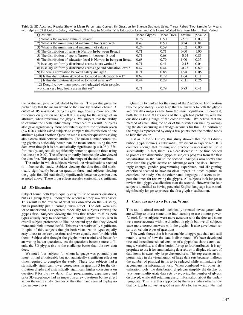
Table 2: 3D Accuracy Results Showing Mean Percentage Correct By Question for Sixteen Subjects Using T-test Paired Two Sample for Meanswith alpha=.05 if Color is Salary Per Week, X is Age in Months, Y is Education Level and Z is Hours Worked in a Four Month Test Period
Questions Mean Glyphs Mean Dots t-value p-value1) What is the average value of salary? 0.76 0.50 -2.32 0.032) What is the minimum and maximum hours worked? 0.47 0.50 0.24 0.813) What is the minimum and maximum of salary? 0.24 0.59 3.52 0.004) The distribution of salary is Narrow In-between Broad? 0.71 0.71 0.00 1.005) The distribution of age is Narrow In-between Broad 0.71 0.68 -0.24 0.816) The distribution of education level is Narrow In-between Broad 0.68 0.79 1.00 0.337) Is salary uniformly distributed across hours worked? 0.71 0.41 -2.15 0.048) Is salary uniformly distributed across age and education level? 0.47 0.44 -0.23 0.829) Is there a correlation between salary and age? 0.71 0.88 1.98 0.0610) Is this distribution skewed or lopsided in education level? 0.62 0.79 1.64 0.1111) Is this distribution skewed or lopsided in salary? 0.44 0.29 -1.15 0.2612) Roughly, how many poor, well educated older people,working very long hours are in this set? 0.71 0.79 0.83 0.41
the t-value and p-value calculated by the test. The p-value gives theprobability that the means would be the same by random chance. Acutoff of .05 was used. Subjects gave significantly more accurateresponses on question one (p = 0.03), asking for the average of anattribute, when reviewing the glyphs. We suspect that the abilityto examine the shells individually influenced this result. Subjectsalso gave significantly more accurate responses for question seven(p = 0.04), which asked subjects to compare the distribution of oneattribute against another. Question nine is a harder questions askingabout correlation between attributes. The mean number correct us-ing glyphs is noticeably better than the mean correct using the rawdata even though it is not statistically significant (p = 0.06 ). Un-fortunately, subjects did significantly better on question three usingthe dots (p = 0.00). The effect is primarily from people who viewedthe dots first. This question asked the range of the color attribute.
The order in which subjects viewed the visualizations seemedto influence the study. Subject viewing the dots firsts did statis-tically significantly better on question three, and subjects viewingthe glyphs first did statistically significantly better on question one,as noted above. These order effects are also statistically significant.
4.5 3D Discussion
Subject found both types equally easy to use to answer questions,but as a group they all thought the second set they saw was easier.This result is the reverse of what was observed on the 2D study,but is probably just a learning curve effect. The dots were eas-ier to understand, as expected, especially for subjects viewing theglyphs first. Subjects viewing the dots first tended to think bothtypes equally easy to understand. A learning curve is also seen inoverall subject preference to like the second type that they viewedmore and think it more useful. This was not statistically significant.In spite of this, subjects thought both visualization types equallyeasy to use to answer questions and were equally comfortable withthem. Subject also thought the glyphs more useful and better foranswering harder questions. As the questions become more diffi-cult, the 3D glyphs rise to the challenge better than the raw datadoes.
We noted four subjects for whom language was potentially anissue. It had a noticeable but not statistically significant effect ontimes required to complete the study. These four subjects had astatistically significant lower correctness on question 3 for the dis-tribution glyphs and a statistically significant higher correctness onquestion 9 for the raw data. Prior programming experience andprior 3D experience had an impact on a few questions but no effectacross the entire study. Gender on the other hand seemed to play norole in correctness.
Question two asked for the range of the Z attribute. For questiontwo the probability is very high that the answers to both the glyphsand raw data images came from the same population. In contrast,both the 2D and 3D versions of the glyph had problems with thequestions asking range of the color attribute. We believe that themethod of calculating the color of the distribution shell by averag-ing the data occurring in a wedge accounts for this. If a portion ofthe range is represented by only a few points then the method tendsto hide that color.
Just as in the 2D study, this study showed that the 3D distri-bution glyph requires a substantial investment in experience. It iscomplex enough that training and practice is necessary to use itsuccessfully. In fact, there is a clear decrease in the time neededto process the distribution glyph as subjects progress from the firstvisualization in the pair to the second. Analysis also shows thatover time the glyphs accrue an advantage over the dots. Interest-ingly enough, gender, programming experience, and 3D gamingexperience seemed to have no clear impact on times required tocomplete the study. On the other hand, language did seem to im-pact the times for reviewing the glyphs. All subjects took longer toreview first glyph visualization than the second. However the foursubjects identified as having potential English language issues tooksignificantly longer to process the first glyph visualization.
5 CONCLUSIONS AND FUTURE WORK
This tool is aimed towards technically oriented investigators whoare willing to invest some time into learning to use a more power-ful tool. Some subjects were more accurate with the dots and somewere more accurate with the distribution glyph but overall subjectsgave more correct answers with the glyphs. It also gave better re-sults on certain types of questions.
This work shows that it is reasonable to aggregate data and stillretain a sense of how the data is distributed. We have developedtwo and three dimensional versions of a glyph that show extent, av-erage, variability, and distribution for up to four attributes. It is ap-propriate to use it for summarizing data sets or to display clusters ofdata items in extremely large clustered sets. This represents an im-portant step in the visualization of large data sets because it allowsthe number of physical items to be reduced while minimizing theaccompanying information loss. When combined with other vis-ualization tools, the distribution glyph can simplify the display ofvery large, multivariate data sets by reducing the number of glyphsdisplayed, while still retaining useful information about the under-lying data. This is further supported by the user studies which showthat the glyphs are just as good as raw data for answering statistical
147

Figure 9: Related Nodes in Clustered Census Data - 3D Glyph Show-ing Age, Education, Occupation and Marital Status Mapped to Color,X, Y and Z (a) Node D (b) Node E (c) Node F (d) Node G
questions. It further shows that for some questions it is even better.A user study comparing the glyphs to data represented by cen-
troids should provide further insight into the usefulness of theglyphs. A feature to display multiple, related nodes in a data set
would allow more comparison across the data sets.
6 ACKNOWLEDGMENTS
This work supported in part by the Department of Defense(CADIP), the National Science Foundation (0121288) and theAT&T Foundation.
REFERENCES
[1] C. B. Barber, D. P. Dobkin, and H. T. Huddanpaa. The quickhull algo-rithm for convex hulls. ACM Transactions on Mathematical Software,22(4):469–483, December 1996.
[2] Mei C. Chuah and Stephen G. Eick. Information rich glyphs for soft-ware management. IEEE Computer Graphics and Applications, pages2–7, July–August 1998.
[3] William S. Cleveland. Visualizing Data. Hobart Press, Summit, NJ,1993.
[4] Andy Cockburn and Bruce McKenzie. 3d or not 3d? evaluating theeffect of the third dimension in a document management system. InProceedings of CHI’01, pages 434–441, New York, NY, May 2001.Addison-Wesley Publishing Co.
[5] David Ebert, James Kukla, Christopher Shaw, Amen Zwa, Ian Sobo-roff, and D. Aaron Roberts. Automatic shape interpolation for glyph-based information visualization. IEEE Visualization, October 1997.
[6] Ying-Huey Fua, Matthew O. Ward, and Elke A. Rundensteiner. Hier-archical parallel coordinates for exploration of large datasets. In Pro-ceedings of the conference on Visualization ’99, pages 43–50. IEEEComputer Society Press, 1999.
[7] R. J. Hendley, N. S. Drew, A. M. Wood, and R. Beale. Narcissus: Vi-sualizing information. In Nahum D. Gershon and Steve Eick, editors,Proceedings Symposium on Information Visualization, pages 90–96.IEEE Computer Society Press, 1995.
[8] A. K. Jain, M. N. Murty, and P. J. Flynn. Data clustering: A review.ACM Computing Surveys, 31(3):264–323, 1999.
[9] Eser Kandogan. Visualizing multi-dimensional clusters, trends, andoutliers using star coordinates. In Proceedings of KDD-2001, SanFrancisco, 2001.
[10] Martin Kraus and Thomas Ertl. Interactive data exploration with cus-tomized glyphs. In Proceedings of WSCG’01, pages 20–23, 2001.
[11] Penny Rheingans. Opacity-modulating triangular textures for irregularsurfaces. In Proceedings of IEEE Visualization ’96, pages 219–225.IEEE Computer Society Press, October 1996.
[12] Randall M. Rohrer, John L. Sibert, and David S. Ebert. A shape-based visual interface for text retrieval. IEEE Computer Graphics andApplications, pages 2–8, September/October 1999.
[13] T. C. Sprenger, R. Brunella, and M. H. Gross. H-blob: A hierarchicalvisual clustering method using implicit surfaces. In Proceedings Sym-posium on Information Visualization, pages 61–68. IEEE ComputerSociety Press, October 2000.
[14] John W. Tukey. Exploratory Data Analysis. Series in Behavioral Sci-ence: Quantitative Methods. Addison-Wesley, 1977. page 39.
[15] University of California, Irvine. UCI Machine Learning Repository,1999.
[16] Colin Ware. Information Visualization Perception for Design. MorganKaufmann Publishers, San Francisco, CA, 2000.
148