module ii. technical
TRANSCRIPT

Module II. Technical
6. Infographic course
Topic 2. Realization of an infographic
Lesson 1. Effectiveness of
infographics and data visualizations

Module II. Technical
Infographic course
Topic 2.Realization of an infographic Lesson 1.Effectiveness of infographics and data visualizations
This lesson has been prepared to make students understand the usefulness of visualizing data and information, provided that they respect some rules that make information visualization truly effective.

Module II. Technical
Infographic course
Topic 2.Realization of an infographic Lesson 1.Effectiveness of infographics and data visualizations
In this lesson, we will learn:
The usefulness and theeffectiveness of infographics and data visualizations in facilitating understanding andengagement.
Photo credits by Ewan Robertson, Unsplash

Module II. Technical
Infographic course
Topic 2.Realization of an infographic Lesson 1.Effectiveness of infographics and data visualizations
Infographic and Data
Visualization
Photo credits by Joshua Sortino, Unsplash
Module II. Technical
Infographic course
Topic 2.Realization of an infographic Lesson 1.Effectiveness of infographics and data visualizations
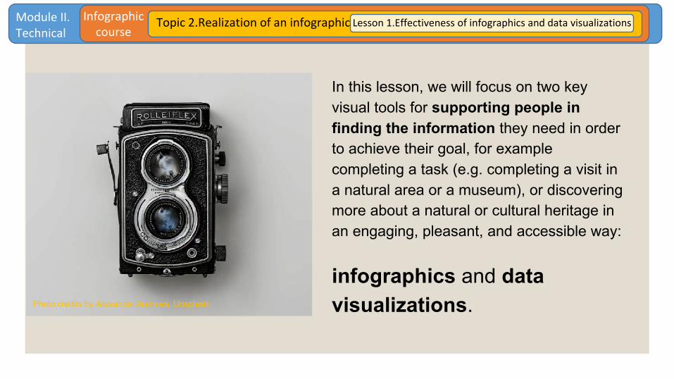
In this lesson, we will focus on two key visual tools for supporting people in finding the information they need in order to achieve their goal, for example completing a task (e.g. completing a visit in a natural area or a museum), or discovering more about a natural or cultural heritage in an engaging, pleasant, and accessible way:
infographics and data visualizations.Photo credits by Alexander Andrews, Unsplash

Module II. Technical
Infographic course
Topic 2.Realization of an infographic Lesson 1.Effectiveness of infographics and data visualizations
Both Infographics and data visualizations are information visualizations:
● The first ones present data already giving an interpretation of that dataset.
● The second ones generally give more freedom to the user in analysing and managing the raw data. Photo credits by Michael Dziedzic, Unsplash

Module II. Technical
Infographic course
Topic 2.Realization of an infographic Lesson 1.Effectiveness of infographics and data visualizations
Although usually data visualizations are more powerful tools in exploring and dealing with data, all kinds of information visualisations can make them more
readable and easily understandable.
Photo credits by Joyce McCown, Unsplash

Module II. Technical
Infographic course
Topic 2.Realization of an infographic Lesson 1.Effectiveness of infographics and data visualizations
Infographics and data visualizations can be static or interactive representations of information and data.
In the latter case, they need a user interface allowing people to interact with data and information.
Photo credits by Katya Austin, Unsplash

Module II. Technical
Infographic course
Topic 2.Realization of an infographic Lesson 1.Effectiveness of infographics and data visualizations
For example, in the following figures, you can see the “Dive into Intangible Cultural Heritage” project, an interactive visualization using web-semantics and graphic visualization to show and navigate through the elements inscribed on UNESCO’s Lists.
Sources Fig.1: https://www.visualcinnamon.com/portfolio/intangible-cultural-heritage/ Sources Fig.2: https://ich.unesco.org/dive/constellation

Module II. Technical
Infographic course
Topic 2.Realization of an infographic Lesson 1.Effectiveness of infographics and data visualizations
Since this is an interactive information visualization, visit the website for a more enjoyable experience: https://ich.unesco.org/dive/constellation
You can interact with the visualized data and also change type of data visualization using the functionalities of the User Interface.
Source: https://www.visualcinnamon.com/portfolio/intangible-cultural-heritage/

Module II. Technical
Infographic course
Topic 2.Realization of an infographic Lesson 1.Effectiveness of infographics and data visualizations
It is possible to realize amazing infographicswith data analysis and representation.They can be effectively used in infographics for telling a story by presenting data in a structured way about a specific topic, as the image shows.Source: https://www.nationalgeographic.com/magazine/2018/05/infographic-bird-song-artificial-light-pollution/

Module II. Technical
Infographic course
Topic 2.Realization of an infographic Lesson 1.Effectiveness of infographics and data visualizations
Data visualizations usually require some expertise, since they can be really demanding in making sense of data. So, it is useful to have a basic knowledge
about how to deal with data in order to create effective information visualizations.
Photo credits by Tim Gouw, Unsplash

Module II. Technical
Infographic course
Topic 2.Realization of an infographic Lesson 1.Effectiveness of infographics and data visualizations
Data Analysis and
Representation
Photo credits by Martin Sanchez, Unsplash

Module II. Technical
Infographic course
Topic 2.Realization of an infographic Lesson 1.Effectiveness of infographics and data visualizations
Here a few basic considerationsabout analysis and representation of data.
Of course, this is not an exhaustive dissertation about a complex and evolving field of science. However, it is enough for coming to create an infographic at the end of this course.
Photo credits by Danielle MacInnes, Unsplash

Module II. Technical
Infographic course
Topic 2.Realization of an infographic Lesson 1.Effectiveness of infographics and data visualizations
Data visualization is visually presenting structured or unstructured data by using graphical techniques.
Why is Data Visualization important?
● It helps people in understanding data and information faster.
● It helps finding connections, i.e. insight and key patterns, between tons of information.
● It is suitable to engage people.Photo credits by David Travis, Unsplash

Module II. Technical
Infographic course
Topic 2.Realization of an infographic Lesson 1.Effectiveness of infographics and data visualizations
How can data be represented?● Simple forms and shapes, i.e. simple visual
representation of data of only two dimensions (charts and graphs, or animated visualizations).
● Static images or dynamic, such as interactive visualizations, that can change with the actions of the user, and videos.
● Historical data, i.e. referred to past events, or in real time, i.e. referred to ongoing events.
Photo credits by KOBU Agency, Unsplash

Module II. Technical
Infographic course
Topic 2.Realization of an infographic Lesson 1.Effectiveness of infographics and data visualizations
Importanceof
informationvisualization
Photo credits by Good Good Good, Unsplash

Module II. Technical
Infographic course
Topic 2.Realization of an infographic Lesson 1.Effectiveness of infographics and data visualizations
Information visualization makes knowledge more accessible by simplifyinglarge dataset and offering an interpretation of rather complex issues (or simply of issues better conveyed by images) through an intuitive story and a catchy design.
They capture attention, make understandablehard-to-grasp concepts, provide a clear picture about the interest topic, and create engagement.
Indeed, infographic and data visualization are a form of communication.
Source:https://jess3.com/projects/googleculturalinsticase-studies-and-infographics/#gallery-5

Module II. Technical
Infographic course
Topic 2.Realization of an infographic Lesson 1.Effectiveness of infographics and data visualizations
Applied to natural and cultural heritage, information visualization can be a useful tool for engaging people and making them aware of unknown resources or peculiarities.
It also can favour a better relationship with the organization delivering the information.
Photo credits by Michał Parzuchowski, Unsplash

Module II. Technical
Infographic course
Topic 2.Realization of an infographic Lesson 1.Effectiveness of infographics and data visualizations
For example, the infographics designer Simon Scarr realized this infographic to show the prolific career of Pablo Picasso in more detail.The information visualization was created since there was an exhibition at the museum showing just a tiny fraction of all the work the painter produced in his lifetime.
Source: http://www.simonscarr.com/picasso
Indication (key) about how to read the infographic.

Module II. Technical
Infographic course
Topic 2.Realization of an infographic Lesson 1.Effectiveness of infographics and data visualizations
Infographics and data visualizations can also be less elaborated, but they remain an opportunityto promote heritage in an easy-to-access and widespread way, as these examples show.
Source:https://www.behance.net/gallery/16226213/Infographic-Travel-Posters
Source:https://www.spot.ph/entertainment/57493/infographic-the-rizal-monument
Source:https://visitgranada.net/facts-about-alhambra

Module II. Technical
Infographic course
Topic 2.Realization of an infographic Lesson 1.Effectiveness of infographics and data visualizations
How to make effective
infographics and data
visualizationsPhoto credits by Amy Shamblen, Unsplash

Module II. Technical
Infographic course
Topic 2.Realization of an infographic Lesson 1.Effectiveness of infographics and data visualizations
Photo credits by Green Chameleon, Unsplash
Remember that a good information visualization, as well as a good user interface, always meets the user needs.
So in designing your infographic or data visualization, ask yourself:
● What information does the user need?
● Why does the user need that information?
● What will the user do to find or after finding the information (interaction)?
● Does the information provided effectively support the user in reaching his/her goal?

Module II. Technical
Infographic course
Topic 2.Realization of an infographic Lesson 1.Effectiveness of infographics and data visualizations
After that, you should focus on how and where collecting the information and data to be inserted in the infographic: it is fundamental to follow an adequate
process for gathering, elaborating, analysing, and synthesizing data.
PhotocreditsbyUgneVasyliute,Unsplash

Module II. Technical
Infographic course
Topic 2.Realization of an infographic Lesson 1.Effectiveness of infographics and data visualizations
This figure represents the framework introduced by Hilary Mason and Chris Wiggins in 2010.
It shows the process that data scientists usually follow when analysing data.Source: https://www.guide2research.com/research/how-to-become-a-data-scientist

Module II. Technical
Infographic course
Topic 2.Realization of an infographic Lesson 1.Effectiveness of infographics and data visualizations
Photo credits by Bruno Nascimento, Unsplash
The 5 key steps in the data science process are:
● Obtain data: e.g., from surveys, queries from databases, and online repositories.
● Scrub data: e.g., cleaning data to be as error-free and uniform as possible, filtering data, and converting formats.
● Explore data: e.g., using descriptive statistics and data visualization.
● Model data: e.g., clustering and categorizing data, using machine learning algorithms.
● Interpret results: e.g., making meaningful conclusions from data.

Module II. Technical
Infographic course
Topic 2.Realization of an infographic Lesson 1.Effectiveness of infographics and data visualizations
Please note that in creating an infographic you do not necessarily need to conduct advanced statistical analysis, you can just refer to a simple data table for collecting data.
What really matters is referring to reliable and appropriate sources, and that the informationprovided is coherent with your project.
Referring to sources, you can find different typologies of data. The following list is not exhaustive, but present a quite good variety of possible sources for data about natural and cultural heritage.
Photo credits by Mel Poole, Unsplash

Module II. Technical
Infographic course
Topic 2.Realization of an infographic Lesson 1.Effectiveness of infographics and data visualizations
● Data collected from research: E.g. quantitative data derived from surveys, etc.
● Open data: Data freely available to everyone to use and re-publish as they wish.
● Big data: Large quantity of data (volume), from different sources.
● Crowdsourcing: Data produced by a large group of people (e.g. thematic maps from the geodata produced by our smartphones).
● Sentiment analysis: Data useful to analyse the “sentiment” (i.e. affective states and subjective information) of people, for example from social media.
Photo credits by Omar Flores, Unsplash

Module II. Technical
Infographic course
Topic 2.Realization of an infographic Lesson 1.Effectiveness of infographics and data visualizations
Example of infographic that takes its data from a survey.
Source: https://graphs.net/few-things-to-do-in-edinburgh.html; https://www.kaplaninternational.com/.
Example of Open Data repository about cultural heritage. Source: https://www.europeandataportal.eu/en.

Module II. Technical
Infographic course
Topic 2.Realization of an infographic Lesson 1.Effectiveness of infographics and data visualizations
Summing up, there are some steps mostly dealing with usability and reliability, that you need to follow in order to create effective infographics and
data visualizations. Following, some suggestions.
Photo credits by Daniil Silantev, Unsplash

Module II. Technical
Infographic course
Topic 2.Realization of an infographic Lesson 1.Effectiveness of infographics and data visualizations
A focus on usability and user experience is needed in the design of infographics and data visualizations. It includes:
● Before creating an infographic or data visualization, identifying its specific purpose.
● Selecting the right information to visualize.● Selecting the right graphic to visualize information.● Understanding the right information from the data
representation.● Focusing on how people can use the data
visualization (the effect of the data) and their subsequent actions.
● Focusing on how people can interact with the data (user-centric approach).
Photo credits by Lidya Nada, Unsplash

Module II. Technical
Infographic course
Topic 2.Realization of an infographic Lesson 1.Effectiveness of infographics and data visualizations
A focus on reliability is particularly needed for data visualization. It includes:● Checking and citing the sources.● Standardising sources.● Ensuring the quality of data collection techniques.● Focusing on the completeness of data.● Making sure that data are appropriately stored.● Making sure that the chosen mode and model for the data
analysis are correct.● Ensuring that the privacy is respected.● Avoiding the prejudices.● Avoiding confusing charts.● Giving clear instructions and keys to read the information visualization.● Reporting clear and functioning URLs of the data sources.

Module II. Technical
Infographic course
Topic 2.Realization of an infographic Lesson 1.Effectiveness of infographics and data visualizations
Lastly, here some quick tips and rules for creating effective infographics and data visualizations:
● Adopt a minimalistic approach and use a simple language (less is more).
● If you use data, make sure they are really relevant, accurate, useful, and not biased. Moreover, check information and cite sources.
● Use graphs and charts immediately readable and easy to interact with, if it is the case. Give some clear legends, or keys, that can facilitate the reading of the data.
● Favour storytelling, since pictures tell a thousand stories. Be sure to create a coherent story.
Photo credits by Javier Allegue Barros, Unsplash

Module II. Technical
Infographic course
Topic 2.Realization of an infographic Lesson 1.Effectiveness of infographics and data visualizations
● Make more evident the most importantelements you want people to focus on.Use icons (or other symbols) to conveymore instantaneous messages, especially ifyou have limited space.
● Present information in a clear manner, do not be ambiguous.Create interaction and information flows thatdo not confuse or overwhelm the user.
● Remember the Gestalt rules and the basicvisual elements in UX and keep in mind thatcolours, typefaces, and icons can conveyspecific meanings.
● Always keep your user at the centre!Photo credits by Rowen Smith, Unsplash

Module II. Technical
Infographic course
Topic 2.Realization of an infographic Lesson 1.Effectiveness of infographics and data visualizations
Conclusions
This introduction to infographics makes us understand how useful they are in favouring people’s comprehension of data and information and it makes us reflect on how to make them truly effective.

Module II. Technical
Infographic course
Topic 2.Realization of an infographic Lesson 1.Effectiveness of infographics and data visualizations
Content realized by Link Campus University
Thank you for your attention!