mobile user experience
DESCRIPTION
My talk at Mobile 2.0 Europe, on Mobile User Experience: or more specifically, how we work UX into our product development at Future Platforms, and some lessons we've learned doing this.TRANSCRIPT

Mobile 2.0 Europe, 18th June 2009
Mobile User ExperienceLessons learned the hard way

Why bother?

It turns out we’re not so different

This works for us.
Maybe it can work for you.

Keep designers, developers and stakeholders close

Be constructively self-critical
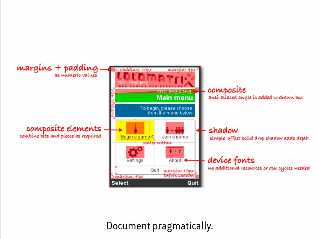
Document pragmatically.

Detailed Specification
Background blue has a 4px curvature. The width of the menu should be 100% width on the actual screen area (defined in BaseScreenDescription of this document). If possible, the menu items/options should have a padding 2px smaller than the very outermost edge.
Inactive Menu ItemsBackground and highlights, as detailed above. They have an outline color of (#D7F2FF). The two blue colours should be of equal height. Font colour is #05303E.
Active Menu ItemsBackground and highlights, as detailed above. They have an outline color of (#FFFFFF). The two orange colours should be of equal height.Font colour is #FFFFFF.
Selection of optionsItems can be selected via up or down on the D-PAD. There are no transitions when selecting menu items.The menu items have 2px padding between each other vertically
ComponentSpecification
ClientBBC
ProjectBBC Bitesize
SummaryThe softkey menu bar, to be displayed at the bottom of the canvas. This will display labels associated with the left soft key (LSK) and the right soft key (RSK). Directional prompts in the form of arrows may also be displayed in the center of this bar by means of graphical assets, although dynamically drawn arrows may be an option.
UsageThis is used throughout the application on all screen sizes. It will not be used on the splash screen.
StatesThis component has active and inactive states. Active states may include menus and feedback in the form of modal popups. Active states are described in detail in SoftKeyMenu component and ModalFeedback component.This component is activated via LSK, RSK, FIRE, and D-PAD.
Design SpecificationBelow are examples of the CanvasSoftKeysBar.
The text for the LSK (CanvasSoftkeysBar_LSK_text) should be left aligned with the CanvasTitleBar_text item for consistency. It should have equal margins at the top, bottom, left. The text for the RSK (CanvasSoftkeysBar_LSK_text) should have equal margins at the top, bottom, right.
Left and right margins should be the same for both LSK and RSK text items.
The color of the text of both soft key labels is #FFFFFF, the weight of the text is normal.
Refer to screen documents for language assets.
ComponentSpecification
ClientBBC
ProjectBBC Bitesize
Name
Reference CanvasSoftKeysBarSoft Keys Bar
SummaryA general title bar to name the canvas currently active.This bar may include pagination to the right hand side when needed. It may also include prompts for the user, such as arrows to indicate next/previous canvas.
UsageThis is used throughout the application on all screen sizes. It will not be used on the splash screen.
StatesIt may display a pagination state depending on where it is in the application.
Design SpecificationBelow is an example of the CanvasTitleBar at 240x320.
Ideally the text (CanvasTitleBar_text) should have equal margins at the top, bottom, left. The text should also be aligned centrally along the vertical axis . The color of the text is #333333, the weight of the text is bold. It may be necessary to truncate this text on smaller screens, or define text on a per screen basis. Refer to screen documents for language assets. On some screens, where additional assets are displayed on the right hand side, it will be necessary to limit the width of CanvasTitleBar_text.
ComponentSpecification
ClientBBC
ProjectBBC Bitesize
Name
Reference CanvasTitleBarTitle Bar
SummaryThe base screen used throughout the application. This includes all components and their positioning on screen.
UsageThis is used throughout the application - there are different descriptions for 176px wide screens and 240px and above screens.
Design ExampleExamples of 240x320 screen, and 176x200 screen.
ComponentSpecification
ClientBBC
ProjectBBC Bitesize
Name
Reference BaseScreenDescriptionBase Screen Description
Document pragmatically.

Go for a walk and make some friends.

“Wireframes are pretty much there. Should be able to
sign them off next week.”
81 revisions later
Plan to deal with change: you will, anyway.

Plan to increment and iterate

Thinking about scalable design

Never finish.

Thank you.
tomhume.orgwww.futureplatforms.com