microsoft excel 2010 - uf health information · pdf filemicrosoft excel 2010 ... your chart....
TRANSCRIPT

Email: [email protected] Web Page: http://training.health.ufl.edu
Microsoft Excel 2010 Charts and Graphs

Updated 10/17/2011
Microsoft Excel 2010: Charts and Graphs 2.0 hours
Topics include data groupings; creating and modifying charts; chart types; source data; chart options; chart locations; formatting; adding trend lines and error bars. This workshop assumes some prior experience with Excel. Completion of "Excel: Basics I" is recommended. Inserting Charts ............................................................................................................................... 1
Column Charts ............................................................................................................................. 1 Line Charts ................................................................................................................................... 1 Pie Charts .................................................................................................................................... 2 Bar Charts .................................................................................................................................... 3 Area Charts .................................................................................................................................. 3 Scatter Charts .............................................................................................................................. 4 Other Charts ................................................................................................................................ 4 All Chart Types… .......................................................................................................................... 5
Chart Tools ....................................................................................................................................... 6 Chart Design Tools ...................................................................................................................... 6
Type ........................................................................................................................................ 6 Chart Layout ............................................................................................................................ 6 Chart Styles ............................................................................................................................. 7 Location .................................................................................................................................. 7
Chart Layout Tools ...................................................................................................................... 7 Current Selection .................................................................................................................... 7 Insert ....................................................................................................................................... 8 Labels ...................................................................................................................................... 8 Axes ......................................................................................................................................... 9 Background ............................................................................................................................. 9 Analysis ................................................................................................................................... 9 Properties ............................................................................................................................. 10
Chart Format Tools .................................................................................................................... 10 Current Selection .................................................................................................................. 10 Shape Styles .......................................................................................................................... 10 Word Art Styles ..................................................................................................................... 10 Arrange ................................................................................................................................. 11 Size ........................................................................................................................................ 11
Printing a Chart .............................................................................................................................. 11 Class Exercise ................................................................................................................................. 12
Pandora Rose Cowart Senior Training Specialist Academic Health Center Training
C3‐012A Communicore (352) 273‐5051 PO Box 100152 [email protected] Gainesville, FL 32610‐0152 http://training.health.ufl.edu

Page 1
Inserting Charts On the Insert tab you will find seven options to create your chart. To create a chart, place yourself inside your consistent set of data and choose one of the chart options. The most important thing to remember is to not have a completely blank row or column in your set of data. If this cannot be helped you can still make a chart, but you will have to make the selection before creation. The Charts tool in Excel will expect the data to be laid out as shown here, with row and column titles. Column Charts These charts are typically used to compare data across categories.
COLUMN TITLE COLUMN TITLE
ROW TITLE DATA DATA
ROW TITLE DATA DATA
2‐D Column
Clustered Column: Compare values across categories.
Stacked Column: Compare the contributions of each value to a total across categories.
100% Stacked Column: Compare the percentage each value contributes to a total across categories.
3‐D Column
3‐D Clustered Column: Compare values across categories and display clustered columns in 3‐D format.
Stacked Column in 3‐D: Compare the contribution of each value to a total across categories and display stacked columns in 3‐D format.
100% Stacked Column in 3‐D: Compare the percentage that each value contributes to a total across categories and display 100% .
3‐D Column: Compare values across categories and across series on three axes.
Cylinder
Clustered Cylinder: Compare values across categories
Stacked Cylinder: Compare the contributions of each value to a total across categories.
100% Stacked Cylinder: Compare the percentage each value contributes to a total across categories.
3‐D Cylinder: Compare values across categories and across series on three axes.
Cone
Clustered Cone: Compare values across categories
Stacked Cone: Compare the contributions of each value to a total across categories.
100% Stacked Cone: Compare the percentage each value contributes to a total across categories.
3‐D Cone: Compare values across categories and across series on three axes.
Pyramid
Clustered Pyramid: Compare values across categories
Stacked Pyramid: Compare the contributions of each value to a total across categories.
100% Stacked Pyramid: Compare the percentage each value contributes to a total across categories.
3‐D Pyramid: Compare values across categories and across series on three axes.
Page 2
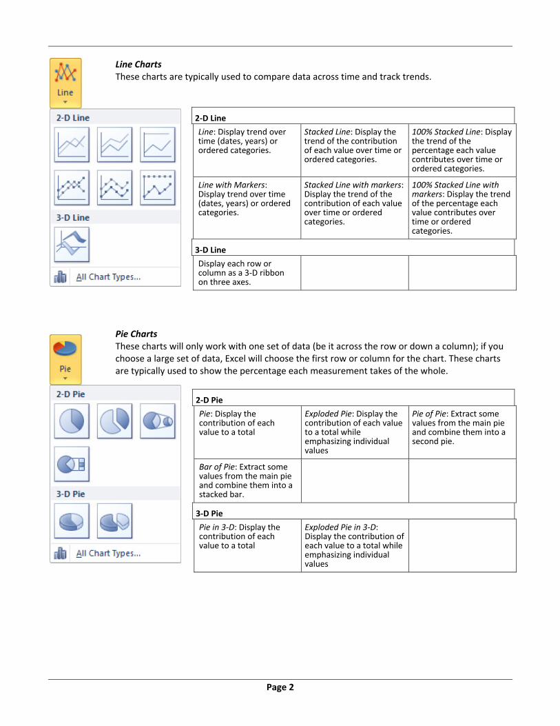
Line Charts These charts are typically used to compare data across time and track trends.
2‐D Line
Line: Display trend over time (dates, years) or ordered categories.
Stacked Line: Display the trend of the contribution of each value over time or ordered categories.
100% Stacked Line: Display the trend of the percentage each value contributes over time or ordered categories.
Line with Markers: Display trend over time (dates, years) or ordered categories.
Stacked Line with markers: Display the trend of the contribution of each value over time or ordered categories.
100% Stacked Line with markers: Display the trend of the percentage each value contributes over time or ordered categories.
3‐D Line
Display each row or column as a 3‐D ribbon on three axes.
Pie Charts These charts will only work with one set of data (be it across the row or down a column); if you choose a large set of data, Excel will choose the first row or column for the chart. These charts are typically used to show the percentage each measurement takes of the whole.
2‐D Pie
Pie: Display the contribution of each value to a total
Exploded Pie: Display the contribution of each value to a total while emphasizing individual values
Pie of Pie: Extract some values from the main pie and combine them into a second pie.
Bar of Pie: Extract some values from the main pie and combine them into a stacked bar.
3‐D Pie
Pie in 3‐D: Display the contribution of each value to a total
Exploded Pie in 3‐D: Display the contribution of each value to a total while emphasizing individual values

Page 3
Bar Charts These charts are typically used to compare data multiple sets of data.
2‐D Bar
Clustered Bar: Compare values across categories using horizontal rectangles.
Stacked Bar: Compare the contributions of each value to a total across categories using horizontal rectangles.
100% Stacked Bar: Compare the percentage each value contributes to a total across categories using horizontal rectangles.
3‐D Bar
Clustered Bar in 3‐D: Compare values across categories and display clustered bars in 3‐D format.
Stacked Bar in 3‐D: Compare the contribution of each value to a total across categories and display stacked Bars in 3‐D format.
100% Stacked Bar in 3‐D: Compare the percentage that each value contributes to a total across categories and display 100% .
Cylinder
Clustered Horizontal Cylinder: Compare values across categories
Stacked Horizontal Cylinder: Compare the contributions of each value to a total across categories.
100% Stacked Horizontal Cylinder: Compare the percentage each value contributes to a total across categories.
Cone
Clustered Horizontal Cone: Compare values across categories
Stacked Horizontal Cone: Compare the contributions of each value to a total across categories.
100% Stacked Horizontal Cone: Compare the percentage each value contributes to a total across categories.
Pyramid
Clustered Horizontal Pyramid: Compare values across categories
Stacked Horizontal Pyramid: Compare the contributions of each value to a total across categories.
100% Stacked Horizontal Pyramid: Compare the percentage each value contributes to a total across categories.
Area Charts These charts are typically used to emphasize the differences between several sets of data over a period of time
2‐D Area
Area: Display the trend of values over time or categories.
Stacked Area: Display the trend of the contribution of each value over time or categories.
100% Stacked Area: Display the trend of the percentage each value contributes over time or categories.
3‐D Area
3‐D Area: Display the trend of values over time or categories using areas on three axes.
Stacked Area in 3‐D: Display the trend of the contribution of each value over time or categories by using stacked areas in a 3‐D format.
100% Stacked Area in 3‐D: Display the trend of the percentage each value contributes over time or categories by using 100% stacked areas in 3‐D format.
Page 4
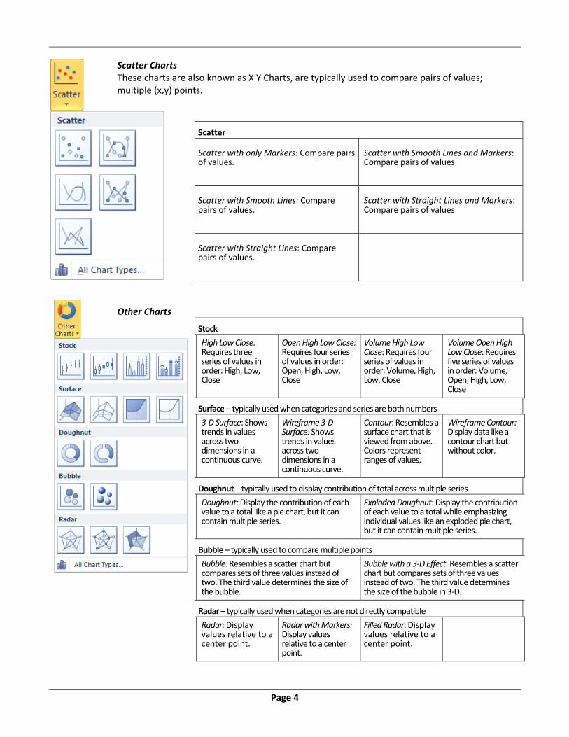
Scatter Charts These charts are also known as X Y Charts, are typically used to compare pairs of values; multiple (x,y) points.
Scatter Scatter with only Markers: Compare pairs of values.
Scatter with Smooth Lines and Markers: Compare pairs of values
Scatter with Smooth Lines: Compare pairs of values.
Scatter with Straight Lines and Markers: Compare pairs of values
Scatter with Straight Lines: Compare pairs of values.
Other Charts
Stock
High Low Close: Requires three series of values in order: High, Low, Close
Open High Low Close: Requires four series of values in order: Open, High, Low, Close
Volume High Low Close: Requires four series of values in order: Volume, High, Low, Close
Volume Open High Low Close: Requires five series of values in order: Volume, Open, High, Low, Close
Surface – typically used when categories and series are both numbers
3‐D Surface: Shows trends in values across two dimensions in a continuous curve.
Wireframe 3‐D Surface: Shows trends in values across two dimensions in a continuous curve.
Contour: Resembles a surface chart that is viewed from above. Colors represent ranges of values.
Wireframe Contour: Display data like a contour chart but without color.
Doughnut – typically used to display contribution of total across multiple series
Doughnut: Display the contribution of each value to a total like a pie chart, but it can contain multiple series.
Exploded Doughnut: Display the contribution of each value to a total while emphasizing individual values like an exploded pie chart, but it can contain multiple series.
Bubble – typically used to compare multiple points
Bubble: Resembles a scatter chart but compares sets of three values instead of two. The third value determines the size of the bubble.
Bubble with a 3‐D Effect: Resembles a scatter chart but compares sets of three values instead of two. The third value determines the size of the bubble in 3‐D.
Radar – typically used when categories are not directly compatible
Radar: Display values relative to a center point.
Radar with Markers: Display values relative to a center point.
Filled Radar: Display values relative to a center point.

Page 5
All Chart Types…
Each of the chart options has
an
button listed at the bottom.
This will open the chart dialog
window seen here.
You can also get to this
window by clicking the Create
Chart button ( ) at the
bottom of the Charts group on
the Insert tab.
From this window you can
choose from any of the
available charts and click OK
to accept or click Cancel to
close the window.
You can save a chart as a
template, and use it again to
create new charts. You'll find
your custom template choices
under the first option on the
left pane Templates.
The Manage Template…
button allows you to select,
modify and delete charts you
have saved as templates.
If you would like to create a
quick simple chart, you can
press F11 and a column chart
will be created based on your
selected data.
You can reset the kind of chart
that is created by choosing
one from this list and clicking
the Set as Default Chart
button.

Page 6
Chart Tools Once a chart is created, Excel will have a new “Chart Tools” Section in the tabs at the top of the window. There are three new tabs: Design, Layout, and Format. The buttons on the tabs may appear differently depending on the width of your monitor and screen resolution, but all the options should all be in the same general area.
Chart Design Tools Type Change Charge Type – Opens the window on the previous page, it allows you to change the chart to any other chart type. Save As Template – Allows you to save the current chart settings as a template. Data Switch Row/Column – By default charts are graphed by column, plotting the data of each column. Use this button to switch the data by column or by row. I think of this as switching the legend with the categories. Select Data – This button will open a Select Data Source window where you can customize the source of the chart data, even edit the labels. Use this window to reorder your legend.
Chart Layout You can change the overall layout of your chart using one of the built in Chart
Layouts. Click the More button ( ) in the bottom right of this section to view all of the chart layouts.

Page 7
Chart Styles
As with the Chart Layouts, there are many chart styles built into this version of Excel. Click the More button ( ) to view all the chart styles available. Choosing a new style will remove any custom colors you may have changed on the chart. Location By default when you create a chart it is placed on the same worksheet as your data set. You can move the chart to its own worksheet or to any existing worksheet with this Move Chart button.
Chart Layout Tools
Current Selection Chart Elements – The first option in this section is a drop down list of all the parts of
the chart. This is a sure way to select the exact part of the chart. Format Selection – This option will open the Format Selection window, with options specific to the chart element selected. Reset to Match Style ‐ This option will reformat the selected chart element to match the style of the chart.

Page 8
Insert Picture – Insert a picture from a file inside the chart area. Shapes – Insert an AutoShape into the Chart Area. This includes lines and block arrows that may help to emphasize portions of your chart. Text Box – Inserts a Text Box into your Chart Area. Text boxes can help you add your own comments or custom labels to your chart. Labels Chart Title – There are four choices for the Chart Title. None – No title; Centered Overlay Title – Place title at the top center, without resizing the chart; Above Chart – Resizes the chart and places the title at the top center of the chart area; More Title Options – opens the Format Title Window Axis Titles – Manage the titles for the Horizontal, Vertical and Depth Axes. From here you can decide if they should be displayed or not, and for the Vertical and Depth axes you can change the angle of the titles. You can also choose the more options to see the Format window for each title. Legend – From here you can turn off the legend or change its location on the chart area. You can always move the chart yourself, but if you use this option Excel will readjust the plot area to fit. Data Labels – This option allows you to turn the labels for each data point on and off. Data Table – This option allows you to show a data table under the chart. You can also choose to show the legend keys on the table. This usually allows you to turn off the legend.
Chart Title Data Labels Legend Axis Title Data Table

Page 9
Axes Axes – The options on this drop down will change depending on the type of chart you have created. For each axes you can decide whether or not to show it and if it should have labels. You can always choose the More Options on any part of the tab and see the Format windows for each axis.
Gridlines – Turn the Major and Minor Gridlines for each axes on or off.
Background Plot Area – The background of a two dimensional chart is the Plot Area. The default color will depend on the current chart style.
Chart Wall – The background of a three dimensional chart is the Chart Wall. This option lets you turn the color on and off.
Chart Floor – Three dimensional charts have floors. From here you can turn the color on and off.
3‐D Rotation – This button will open the Format Chart Area window, to the 3‐D Rotation tab.
Analysis Trend Line – Add a trend line to your chart. This includes linear, exponential, moving average.
Lines – This option works with line charts and will help you create drop lines, from the point to the axis or the highest to lowest point.
Up/Down bars – This option works with line charts and will help you create drop bars, from the point to the axis or from the highest to lowest point.
Error Bars – Adds error bars to your chart. You can set custom error bars for each data point under the more error bar options.
Normal Line Chart Line Chart with Trend Line
Line Chart with Drop Lines Line Chart with Error Bars
Page 10
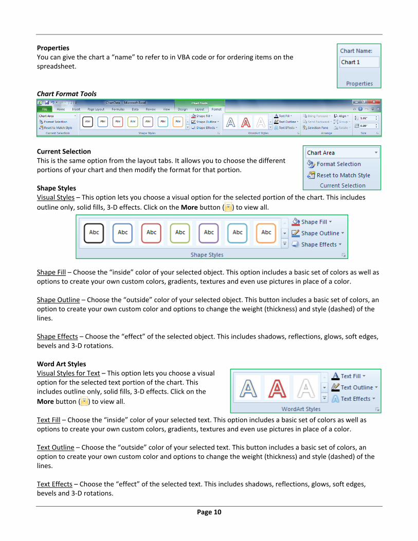
Properties You can give the chart a “name” to refer to in VBA code or for ordering items on the spreadsheet. Chart Format Tools
Current Selection This is the same option from the layout tabs. It allows you to choose the different portions of your chart and then modify the format for that portion. Shape Styles Visual Styles – This option lets you choose a visual option for the selected portion of the chart. This includes
outline only, solid fills, 3‐D effects. Click on the More button ( ) to view all.
Shape Fill – Choose the “inside” color of your selected object. This option includes a basic set of colors as well as options to create your own custom colors, gradients, textures and even use pictures in place of a color. Shape Outline – Choose the “outside” color of your selected object. This button includes a basic set of colors, an option to create your own custom color and options to change the weight (thickness) and style (dashed) of the lines. Shape Effects – Choose the “effect” of the selected object. This includes shadows, reflections, glows, soft edges, bevels and 3‐D rotations. Word Art Styles Visual Styles for Text – This option lets you choose a visual option for the selected text portion of the chart. This includes outline only, solid fills, 3‐D effects. Click on the
More button ( ) to view all. Text Fill – Choose the “inside” color of your selected text. This option includes a basic set of colors as well as options to create your own custom colors, gradients, textures and even use pictures in place of a color. Text Outline – Choose the “outside” color of your selected text. This button includes a basic set of colors, an option to create your own custom color and options to change the weight (thickness) and style (dashed) of the lines. Text Effects – Choose the “effect” of the selected text. This includes shadows, reflections, glows, soft edges, bevels and 3‐D rotations.

Page 11
Arrange Bring to Front – Bring the selected object in front of others. This option also allows you to bring forward one level. Send to Back – Send the selected object behind of all others. This option also allows you to send it behind one level. Selection Pane – Show the Selection Pane on the side of the window to help you manually rearrange the layers of objects on the window. Align – When you have multiple items selected you can align them relative to each other. Left, Center, Right, Top, Middle, Bottom. The alignment option also gives you the ability to evenly horizontally and vertically space your selected objects, such that the space between each object will be equal. Group – When you have multiple items selected you can group them. This allows you to move and modify multiple things at once. You may use this to group a drawing object with your chart. Rotate – Rotate or flip the currently selected drawing object. Size Height – Change the height, set how vertically tall the selected chart will be. Width – Change the width, set how horizontally wide the selected chart will be. The More button in the bottom left of this section will open a Size and Properties dialog window. Printing a Chart If a chart is selected Excel will print only the chart in landscape view. If you want the sheet, be sure to unselect the chart.

Page 12
Class Exercise
Explore workbook
- Open ChartData.xlsx
- View each worksheet
- Discuss 'consistent' set of data
Create Chart
- Turn to Sheet 'Sales by Quarter'
- Insert Tab, Chart Group, Column
o Choose first Column Chart
- View new Chart Tool tabs
- Click outside of chart to deselect
o Tabs disappear
- Click on chart, tabs reappear
Design Tab
- Change Chart Type to different options
o Reset it back to the original, first column chart
- Switch Row/Column
o Notice it's switching the legend with the category axis
o Leave the chart with quarter in the legend
- Select Data
o Rearrange legend 4th‐1st
o Cancel
- Explore different Chart Layouts
o Choose first layout
- Explore different Chart Styles
o Pick any you like
- Move chart to its own sheet
Layout Tab – Current Selection
- Select Legend from Current Selection dropdown
- Click Format Selection button
- Move window so you can see the chart and the properties
o Legend Options
Move legend to different positions
Try it with overlapping the chart
COLUMN TITLE COLUMN TITLE
ROW TITLE DATA DATA
ROW TITLE DATA DATA

Page 13
o Fill
Solid Fill Gradient Fill
Preset Colors Picture or Texture Fill
Textures
Insert a file o Use on of the Windows default images
o Border Color
Solid line
Difficult to see because it's so thin
o Border Style
Increase width
o Back to Border Color
Gradient
- Close properties
- Click Reset to Match Style
Layout Tab – Insert
- Insert Picture
o Use Picture tools to modify
o Change size 2" wide
o Change color
o Delete
- Insert Shapes
o Insert Block Arrow
o Uses yellow diamond to modify arrow
o Use green circle to rotate
o Delete
- Insert Text Box
o Type inside
o Move around
o Delete
Layout Tab – Labels
- Chart Title
- Axis Titles
- Legend
o More Legend Options

Page 14
- Data Labels
- Data Table
Layout Tab – Axes
- Primary Horizontal Axes
- Primary Vertical Axes
o Log Scale helps with comparing very large and very small numbers
- Gridlines
Delete Chart
- Right‐click on Chart 1 Sheet name
- Select Delete
- Confirm deletion
Create Chart
- Turn to Sheet 'Sales by Year
- Insert Tab, Chart Group, Column
o Choose first Column Chart
o Note the Chart Title appears because only one set of data
- Move to a new worksheet
- Remove Legend
- Change Font
o Right‐click on Category Axis (pants, shoes…)
o Choose 14 from the Mini‐Toolbar
o Undo
o Right‐click in Chart Area (blank space)
o Choose 14 from Mini‐Toolbar to change everything on the chart.
- Change Title to read "Yearly Sales
- Add Minor Horizontal Gridlines
o So you have Major and Minor lines
Format Tab
- Select Major Gridlines
- Change Shape Styles
o Use Preset options
o Use Shape Outline dropdown
o Use Shape Effects
- Select a column

Page 15
- Change Shape Styles
o Use Preset options
o Use Shape Fill dropdown
o Use Shape Outline dropdown
o Use Shape Effects
- Format Chart…
o Each column, independently
Click on a column, if necessary, click again to only get that one 'point'
o Plot Area
o Chart Area
- Format Chart Title
o Right‐click and change font size to 40
o See Shape Styles
o See WordArt Styles
Text Fill
Text Outline
Text Effects
Save as Template
- Design Tab
- Save as Template…
o 'Chart1' is fine
- Delete Chart Sheet
o Right‐click Sheet name
o Select Delete
Use Template
- Turn to Sheet 'Sales by Year
- Insert Tab, Chart Group, Column, First chart
- Design Tab ‐ > Change Chart Type
- Templates
o First option in pane on left
- Choose Chart1
- Delete Chart
Default Chart
- In Sheet 'Sales by year' Press F11
Page 16
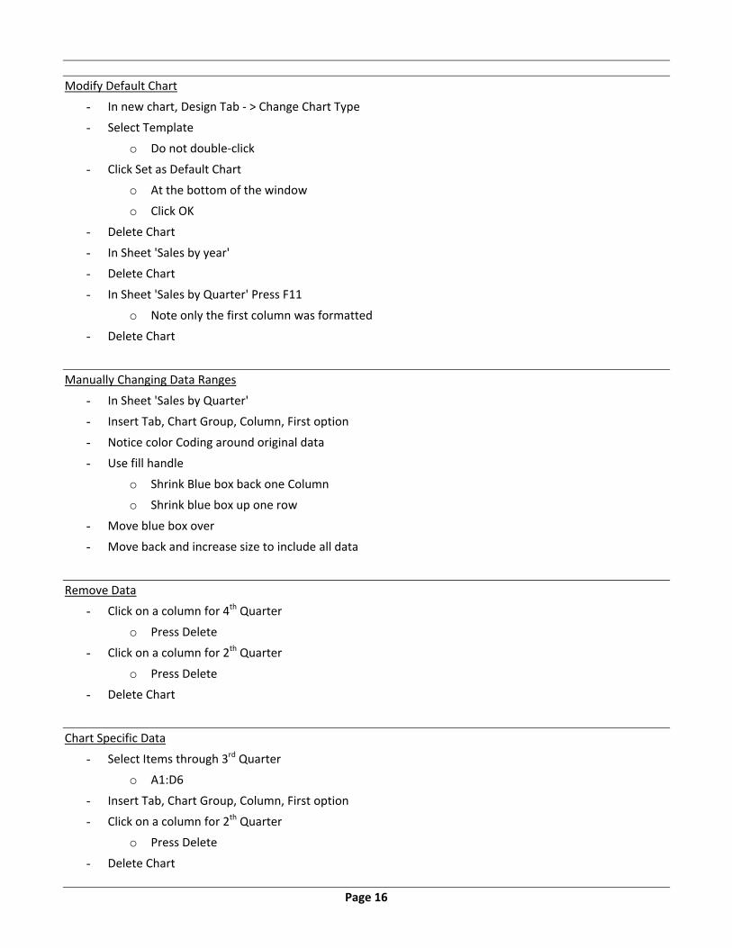
Modify Default Chart
- In new chart, Design Tab ‐ > Change Chart Type
- Select Template
o Do not double‐click
- Click Set as Default Chart
o At the bottom of the window
o Click OK
- Delete Chart
- In Sheet 'Sales by year'
- Delete Chart
- In Sheet 'Sales by Quarter' Press F11
o Note only the first column was formatted
- Delete Chart
Manually Changing Data Ranges
- In Sheet 'Sales by Quarter'
- Insert Tab, Chart Group, Column, First option
- Notice color Coding around original data
- Use fill handle
o Shrink Blue box back one Column
o Shrink blue box up one row
- Move blue box over
- Move back and increase size to include all data
Remove Data
- Click on a column for 4th Quarter
o Press Delete
- Click on a column for 2th Quarter
o Press Delete
- Delete Chart
Chart Specific Data
- Select Items through 3rd Quarter
o A1:D6
- Insert Tab, Chart Group, Column, First option
- Click on a column for 2th Quarter
o Press Delete
- Delete Chart
Page 17
- Select Items through 1st Quarter
o A1:B6
- Use Ctrl key to select 3rd Quarter
o D1:D6
- Insert Tab, Chart Group, Column, First option
- Delete Chart
- Click on a Single cell
- Insert Tab, Chart Group, Column, First option
- Switch Row/Columns
- Remove Hats & Socks
- Switch Row/Columns
- Delete Chart.
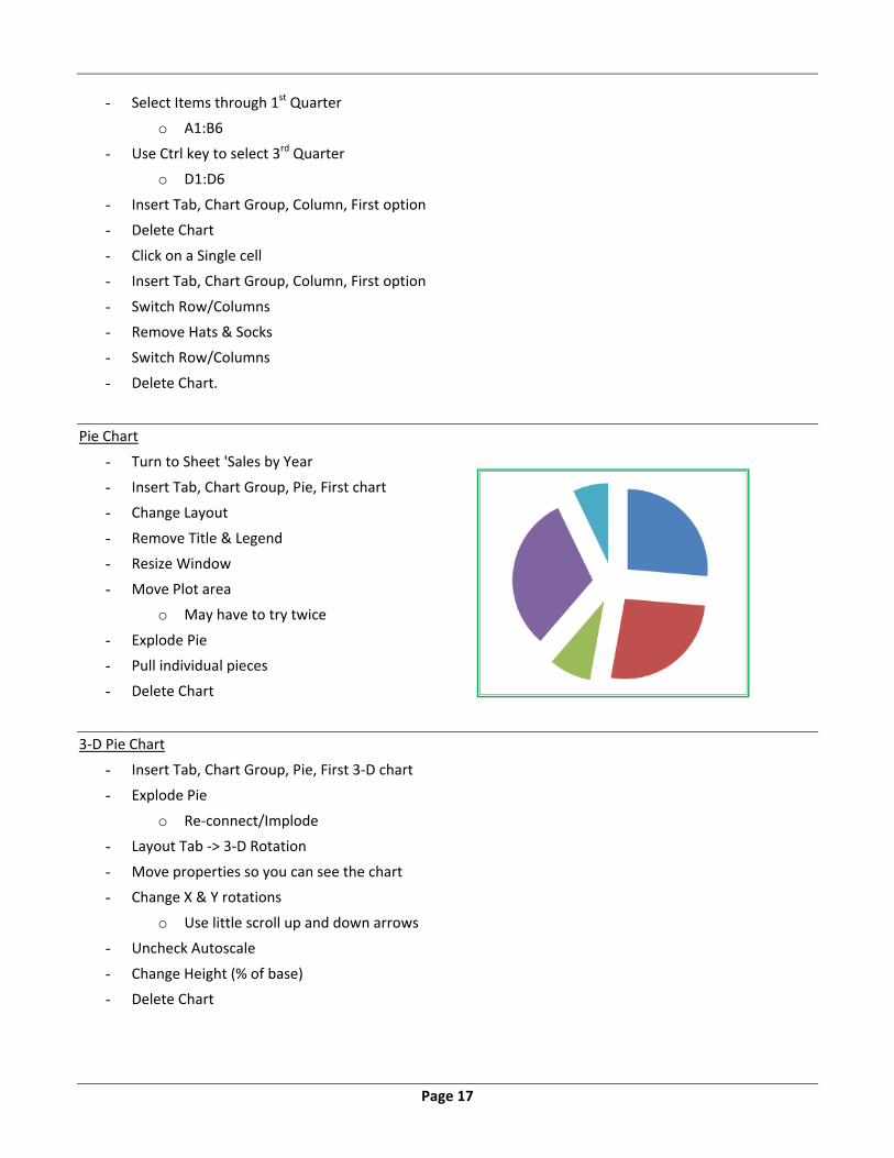
Pie Chart
- Turn to Sheet 'Sales by Year
- Insert Tab, Chart Group, Pie, First chart
- Change Layout
- Remove Title & Legend
- Resize Window
- Move Plot area
o May have to try twice
- Explode Pie
- Pull individual pieces
- Delete Chart
3‐D Pie Chart
- Insert Tab, Chart Group, Pie, First 3‐D chart
- Explode Pie
o Re‐connect/Implode
- Layout Tab ‐> 3‐D Rotation
- Move properties so you can see the chart
- Change X & Y rotations
o Use little scroll up and down arrows
- Uncheck Autoscale
- Change Height (% of base)
- Delete Chart

Page 18
3‐D Column Chart
- In Sheet 'Sales by Quarter'
- Insert Tab, Chart Group, Column, Last 3‐D option
- Delete Legend
- Design tab ‐ Switch Row/Columns
- Change Data titles to be 1st Qtr, 2nd Qtr, 3rd Qtr, 4 Qtr
- Design tab – Select Data
o Rearrange Legend so smaller values are in the front
- Delete Chart
Line Chart
- In Sheet 'Sales by Quarter'
- Insert Tab, Chart Group, Line, First option
- Design tab ‐ Switch Row/Columns
- Remove Smaller Values
- Move to own sheet
- Format Vertical Axis
o Minimum 400
o Maximum 600
o Major Unit 25
- Turn on Major and Minor Horizontal Gridlines
o Layout Tab
- Format lines to be thicker
Layout Tab ‐ Analysis
- Trend Line
- Drop Lines
- Up/Down Bars
- Error Bars
o More Error Bar Options
o Fixed Value 5
- Delete Chart
Practice (if Time permits)
- In Sheet 'Sales by Month'
- Create Line Chart
o Remove Total data
- Format as desired