media construction steps
TRANSCRIPT
Construction Steps
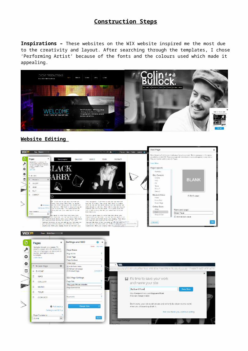
Inspirations – These websites on the WIX website inspired me the most due to the creativity and layout. After searching through the templates, I chose ‘Performing Artist’ because of the fonts and the colours used which made it appealing.
Website Editing

Enter Page
When I created the Enter Page, I chose a blank layout because it would contain the least content. Throughout, the process of doing the enter page, I did need to refer to the Help Center becuase I was unsure of a number of things such as how the enter button operates. But after looking at the tutorials, I got how to do it.
This was the template I used for my website. To begin with, I changed the names of the pages that were shown as well as added pages. Whilst doing this, I discovered the settings option which allowed me to either hide the page from the menu, give the page a title etc. After, I saved my worked and named my site ‘BigQuanOfficial’.
For the Home Page, I began changing the style of the box which was fairly easy to do.
On two of the pages, I set it so that it weren’t shown on the menu bar. These pages were the Lyrics and Enter Page.

I created a ‘Text Button’ and changed what it would say in the Button settings. I
also made the style of the button to a Text
Button. In the ‘Advanced Style’, I had the choice to change the colour of the text
and font. In the Button Settings, I made the button Link to the
Home page which was very easyto do. Below is a screen shot, of My
Final Button on my website.
Due to the colour of the background, I changed the colour of my text to white (shown above).
One of my first designs was to have a number of pictures of Big Quan however, I wasn’t sure if that idea would look good so I decided to make a ‘duplicate page’.
On the original enter page, I created another design which consisted of three pictures of him.
In the Image Gallery, I uploaded the picture I would use for the ‘Enter page’ which I edited on My Computer.
Below, is a screen shot of what the Enter page looks like.
Later on in the process of the website, I discovered that I needed to place the pictures on the enter page in the middle section rather than the header.

Home Page
For the home page, I created a button menu which I placed in the
header so that it could be shown on every page of the website. When I
discovered the header section, I was pleased because I realised that everything in that section would be
on every page and so I had the chance to change the positions of my pictures on the Enter Page. I
also changed the background colour to white to make it easier to
navigate through the website.

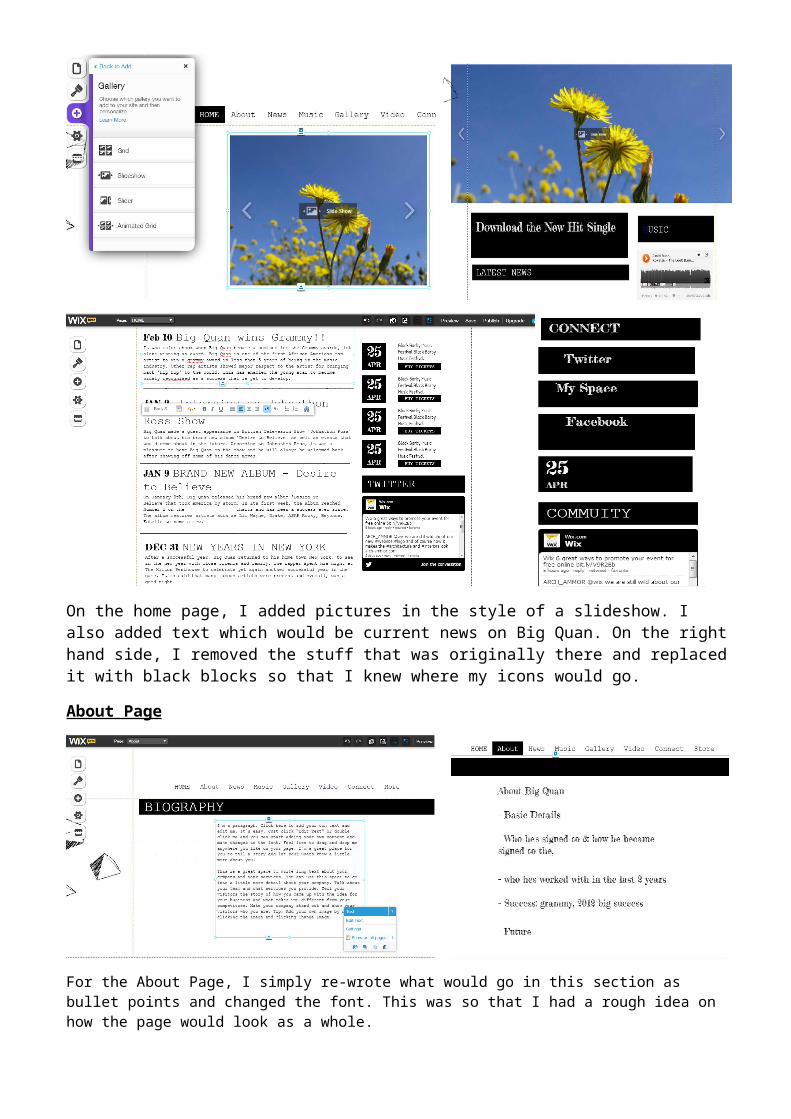
On the home page, I added pictures in the style of a slideshow. I also added text which would be current news on Big Quan. On the right hand side, I removed the stuff that was originally there and replaced it with black blocks so that I knew where my icons would go.
About Page
For the About Page, I simply re-wrote what would go in this section as bullet points and changed the font. This was so that I had a rough idea on how the page would look as a whole.
News Page
For the News Page, I added a box to the top of the page, which would be the position of the advertising section. I also added text in the style of the Home Page but added more in depth information for each post.
Music Page
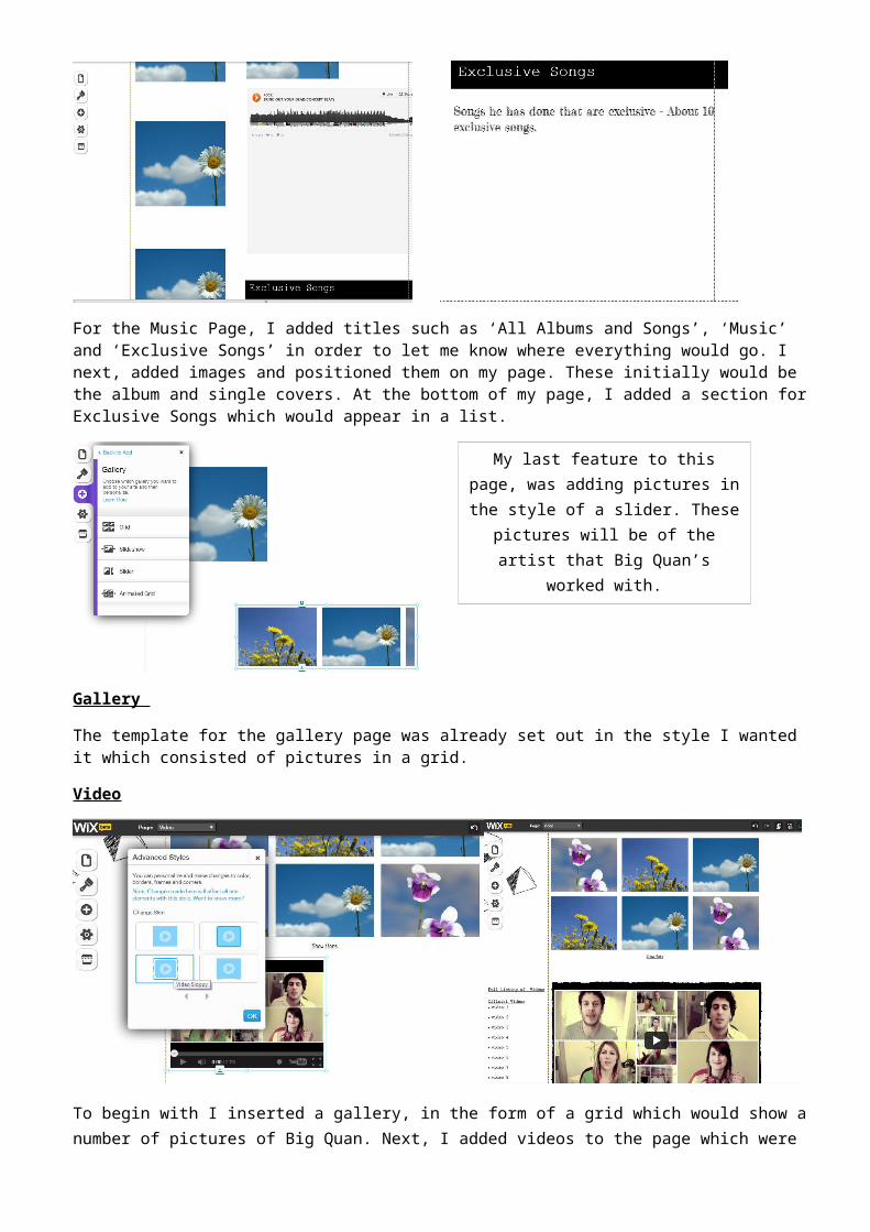
For the Music Page, I added titles such as ‘All Albums and Songs’, ‘Music’ and ‘Exclusive Songs’ in order to let me know where everything would go. I next, added images and positioned them on my page. These initially would be the album and single covers. At the bottom of my page, I added a section for Exclusive Songs which would appear in a list.

Gallery
The template for the gallery page was already set out in the style I wanted it which consisted of pictures in a grid.
Video
To begin with I inserted a gallery, in the form of a grid which would show a number of pictures of Big Quan. Next, I added videos to the page which were under the following headings: Official videos, backstage footage, behind the scenes and interviews. On the left hand side of the page, I added text to show a video listing of all the videos on the website.
My last feature to this page, was adding pictures in the style of a slider. These pictures will be of the artist that Big
Quan’s worked with.
Lyrics
Newsletter
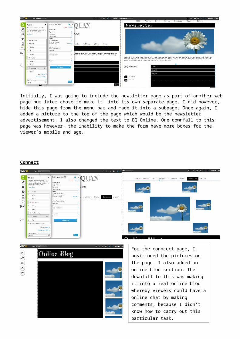
Initially, I was going to include the newsletter page as part of another web page but later chose to make it into its own separate page. I did however, hide this page from the menu bar and made it into a subpage. Once again, I added a picture to the top of the page which would be the newsletter advertisement. I also changed the text to BQ Online. One downfall to this page was however, the inability to make the form have more boxes for the viewer’s mobile and age.
For the lyrics page, I added a picture at the top which I planned to be either a picture of the artist or the advertising. I still kept the 3
column layout because it was much like what I planned my page to look like. In the first column, I added the text ‘All Albums & Songs’ and positioned where each album
and cover would go. In the second column, I simply added text so that I knew where the lyrics would go. Lastly, in the third column, I positioned where the header, picture and
track list would go.

Connect
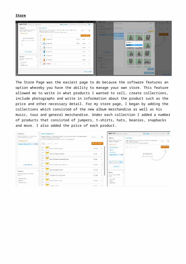
Store
The Store Page was the easiest page to do because the software features an option whereby you have the ability to manage your own store. This feature allowed me to write in what products I wanted to sell, create collections, include photographs and write in information about the product such as the price and other necessary detail. For my store page, I began by adding the collections which consisted of the new album merchandise as well as his music, tour and general merchandise. Under each collection I added a number of products that consisted of jumpers, t-shirts, hats, beanies, snapbacks and more. I also added the price of each product.
For the conncect page, I positioned the pictures on the page. I also added an online blog section. The downfall to this was making it into a real online blog whereby viewers could have a online chat by making comments, because I didn’t know how to carry out this particular task.
Once this was all complete, I linked the
‘cart button’ to the Store page. I also altered the
settings on the ‘Checkout button’ so that when the viewer clicked on it, the
payment page will appear as a pop out.
Despite managing my online store, I still needed to add the collections to the
page which was also fairly simple to do. Whilst doing this, I explore what types of
styles was available, to present the products. After adding each collection to the page, I changed the appearance of
the page by altering the ‘Product Gallery’ section. I altered my page to show two to
three rows in each collection with four columns.