math 3033 wanwisa smith 1 base on text book: a modern introduction to probability and statistics...
TRANSCRIPT

Math 3033
Wanwisa Smith1
Base on text book: A Modern Introduction toProbability and Statistics Understanding Why and HowBy: F.M. Dekking, C. Kraaikamp, H.P.Lopulaa, L.E.MeesterTemple University Fall 2009Instructor: Dr. Longin Jan LateckiSlides by: Wanwisa Smith

The set of observations is called a dataset.
By exploring the dataset we can gain insight into what probability model suits the phenomenon.
To graphically represent univariate datasets, consisting of repeated measurements of one particular quantity, we discuss the classical histogram, the more recently introduced kernel density estimates and the empirical distribution function.
To represent a bivariate dataset, which consists of repeated measurements of two quantities, we use the scatterplot.
2
Chapter 15 Exploratory data analysis: graphical summaries
Wanwisa Smith

15.1 Example: the Old Faithful data
3 Wanwisa Smith

A closer look at the ordered data that the two middle elements (the 136th and 137th elements in ascending order) are equal to 240, which is much closer to the maximum value 306 than to the minimum value 96.
4 Wanwisa Smith

15.2 Histograms: The term histogram appears to have
been used first by Karl Pearson.
5 Wanwisa Smith

How to construct the histogram?
6
Denote a generic (univariate) dataset of size n by
First we divide the range of the data into intervals. These intervals are called bins
and denoted by
The length of an interval Bi is denoted by ǀBiǀ and is called the bin width.
The bins do not necessarily have the same width. We want the area under the histogram on each bin Bi to reflect the number of elements in Bi. Since the total area 1 under the histogram then corresponds to the total number of elements n in the dataset, the area under the histogram on a bin Bi is equal to the proportion of elements in Bi:
The height of the histogram on bin Bi must be equal to
Wanwisa Smith

Choice of the bin width
7
Consider a histogram with bins of equal width. In that case the bins are of the
from
where r is some reference point smaller than the minimum of the dataset and b
denotes the bin width. Mathematical research, however, has provided some guide-
line for a data-based choice for b or m.
Wanwisa Smith

15.3 Kernel density estimates
8
The idea behind the construction of the plot is to “put a pile of sand” around each element of the dataset. At places where the elements accumulate, the sand will pile up. The kernel K reflects the shape of the piles of sand , whereas the bandwidth is a tuning parameter that determine how wide the piles of sand will be.
Wanwisa Smith

A kernel K is a function K:RR and a kernel K typically satisfies the following conditions.
9 Wanwisa Smith

Examples of Kernel Construction
10 Wanwisa Smith

Scaling the kernel K
11
Scale the kernel K into the function
Then put a scaled kernel around each element xi in the dataset
Wanwisa Smith

12
The bandwidth is too
small
The bandwidth is too big
Wanwisa Smith

Boundary Kernels
13 Wanwisa Smith

15.4 The empirical distribution function
14
Another way to graphically represent a dataset is to plot the data in a cumulative
manner. This can be done by using the empirical cumulative distribution function
of the data. It is denote by Fn and is defined that a point x as the proportion of
elements in the dataset that are less than or equal to x:
Wanwisa Smith

Empirical distribution function Continued
15 Wanwisa Smith

Empirical distribution function Continued
16 Wanwisa Smith

15.5 Scatterplot
17
In some situation we might wants to investigate the relationship
between two or more variable. In the case of two variables x
and y, the dataset consists of pairs of observations:
We call such a dataset a bivariate dataset in contrast to the univariate
dataset, which consists of observations of one particular quantity. We
often like to investigate whether we can describe the relation between the
two variables.
A first is to take a look at the data, i.e., to plot the points (Xi, Yi) for i = 1, 2, …,n. Such a plot is called a scatterplot.
Wanwisa Smith

Example of Scatterplot
18 Wanwisa Smith
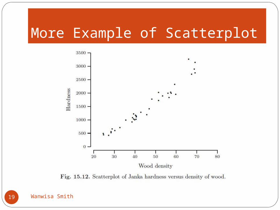
More Example of Scatterplot
19 Wanwisa Smith

Wanwisa Smith20
Thank you for reading this slide show.
I hope you enjoy it.