mapping the disciplinary diffusion of information understanding complex systems 2005 peter a. hook...
TRANSCRIPT
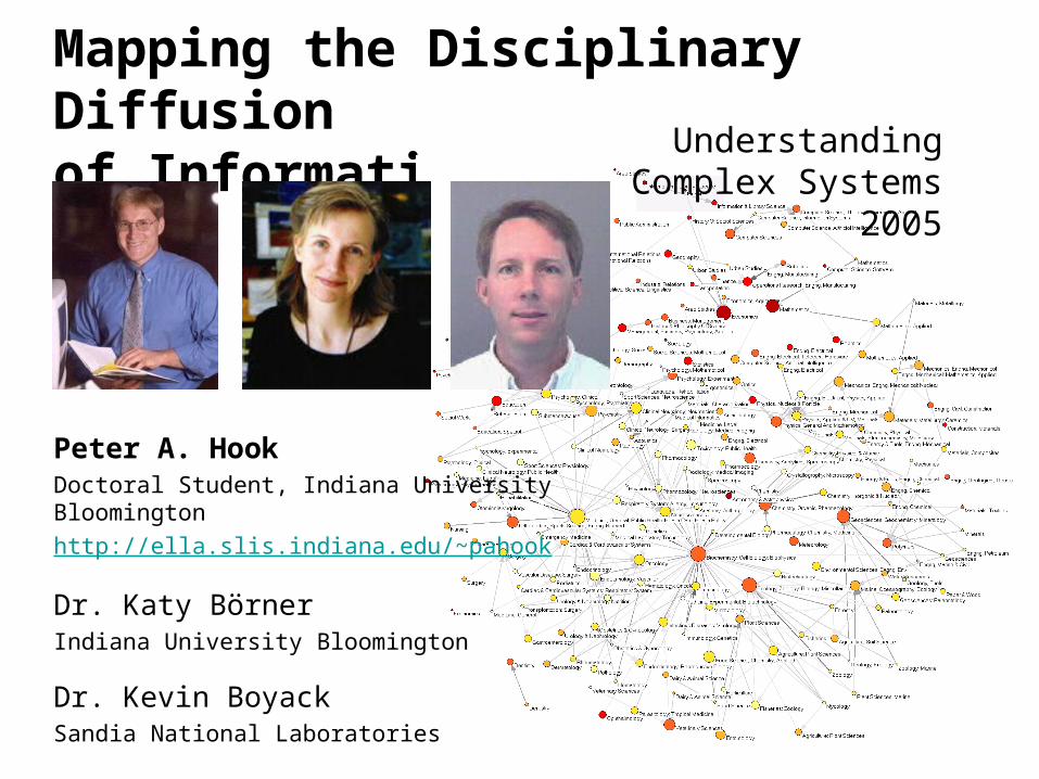
Mapping the Disciplinary Diffusionof Information Understanding Complex
Systems 2005
Peter A. HookDoctoral Student, Indiana University Bloomington
http://ella.slis.indiana.edu/~pahook
Dr. Katy BörnerIndiana University Bloomington
Dr. Kevin BoyackSandia National Laboratories
Conclusion:
Scholarly production and consumption itself is a complex system and justifies the attention of information scientists to contribute to macro and micro efficiencies in the use and understanding of information.

OVERVIEW
• (1) Diffusion Metrics (Geographic Substrate)
• (2) Creating a Map of all Science (abstract substrate)
• (3) Evolving Co-Authorship Networks in a Young Discipline
• (4) Educational Potential of Domain Mapping

Spatio-Temporal Information Productionand Consumption in the U.S.
• Dataset: all PNAS papers from 1982-2001 (dominated by research in biology)
• 47K papers, 19K unique authors, 3K institutions
• Each paper was assigned the zip code location of its first author
• Dataset was parsed to determine the 500 top cited (most qualitatively productive) institutions. Börner, Katy & Penumarthy, Shashikant. (in press) Spatio-Temporal Information
Production and Consumption of Major U.S. Research Institutions. Accepted at the 10th International Conference of the International Society for Scientometrics and Informetrics, Stockholm, Sweden, July 24-28.

Top 5 Institutions
• Harvard University (13,763 citations)
• MIT (5,261 citations)
• Johns Hopkins (4,848 citations)
• Stanford (4,546 citations)
• University of California San Francisco (4,471 citations)
• All totals exclude self citation
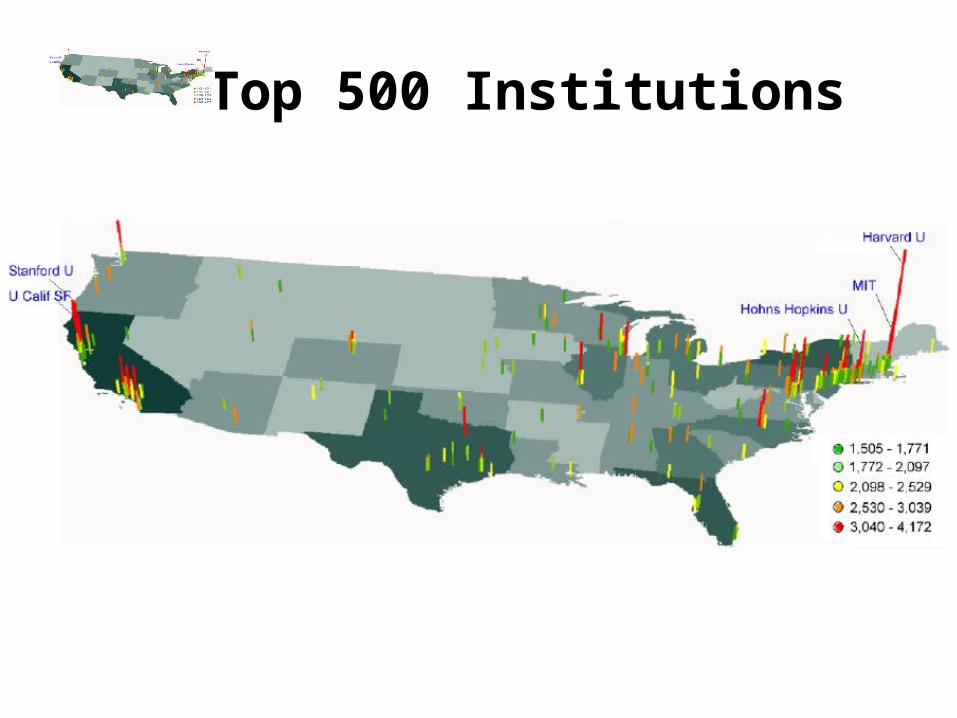
Top 500 Institutions

Relevant Metrics
• References = institution cites other institutions (Consumes Information)
• Citations = institution is cited by other institutions (Produces Information (of utility))
• Methodology can determine the net producers and consumers of information.


Change Over Time?• 5 year bins have remarkably
similar distribution plots. • In general, as distance
between institutions increases, those institutions cite each other less.
• Increased use of the Internet and Web do not have the expected outcome.
• In fact, geographic distance may matter more as time goes on.
• Information appears to diffuse locally through social networks.
Best Fitting Power Law Exponent:
1982 - 1986 1.94
1987 - 1991 2.11
1992 - 1996 2.01
1997 - 2001 2.01

Map of all Science & Social Science
• Each dot is one journal• Journals group by
discipline• Labeled by hand• Generated using the IC-
Jaccard similarity measure.
• The map is comprised of 7,121 journals from year 2000.
• Large font size labels identify major areas of science.
• Small labels denote the disciplinary topics of nearby large clusters of journals.
Comp Sci
PolySciLaw
LIS
Geogr
Hist
Econ
Sociol
Nursing
Educ
Comm
Psychol
Geront
Neurol
RadiolSport Sci
Oper Res
Math
Robot
AIStat
Psychol
Anthrop
Elect Eng
Physics
Mech Eng
ConstrMatSci
FuelsElectChemP Chem
Chemistry
AnalytChem
Astro
Env
Pharma
Neuro Sci
Chem Eng
Polymer
GeoSci
GeoSci
Paleo
Meteorol
EnvMarine
Social Sci
SoilPlant
Ecol
Agric
Earth Sciences
Psychol
OtoRh
HealthCare
BiomedRehab
Gen Med
GenetCardio
Ped
Food Sci
Zool
EntoVet Med
Parasit
Ophth
Dairy
Endocr
Ob/Gyn
Virol
Hemat
Oncol
Immun
BioChem
Nutr
Endocr
Urol
Dentist
Derm
Pathol
Gastro
Surg
Medicine
ApplMath
Aerosp
CondMatNuc
EmergMed Gen/Org
Boyack, K.W., Klavans, R., & Börner, K. (2005, in press). Mapping the backbone of science. Scientometrics.
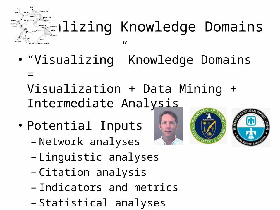
Visualizing Knowledge Domains
• “Visualizing” Knowledge Domains = Visualization + Data Mining + Intermediate Analysis
• Potential Inputs– Network analyses– Linguistic analyses– Citation analysis– Indicators and metrics– Statistical analyses

Well Designed “Visualizations”
• Must be preceded by good data mining and analysis• Provide an ability to comprehend large amounts of data• Communicate what is already known
– Reveal overall context and content of a domain– May confirm current hypotheses– Often reveal how the data was collected, along with
errors/artifacts• Reduce search time and reveal relationships that are hidden by
traditional analysis techniques– Support exploratory browsing, interaction with data, and query at
multiple levels of detail– Provide easy access to multi-dimensional data
• Facilitate hypotheses formulation and investigation

Domain Visualizations Are Used For …
QUESTIONS RELATED TO Fields and paradigms Communities and
networks Research performance or
competitive advantage Commonly used
algorithms
Authors Social structure, intellectual structure, some dynamics
Use network characteristics as indicators
Social network packages, MDS, factor analysis, Pathfinder networks
Documents Field structure, dynamics, paradigm development
Use field mapping with indicators
Co-citation, co-term, vector space, LSA, PCA, various clustering methods
Journals Science structure, dynamics, classification, diffusion between fields
Co-citation, intercitation
Words Cognitive structure, dynamics
Vector space, LSA, LDA (20) U
NIT
OF
AN
AL
YS
IS
Indicators and metrics
Comparisons of fields, institutions, countries, etc., input-output
Counts, correlations
Boyack, K.W. (2004). Mapping Knowledge Domains: Characterizing PNAS. Proceedings of the National Academy of Sciences of the US, 101(S1), 5192-5199.

Aside: Citation Mapping Comes of Age
Boyack, K.W. (2004). Mapping Knowledge Domains: Characterizing PNAS. Proceedings of the National Academy of Sciences of the US, 101(S1), 5192-5199.Boyack, K.W. (2004). Mapping Knowledge Domains: Characterizing PNAS.
Proceedings of the National Academy of Sciences of the US, 101(S1), 5192-5199.
• PNAS online interface now generates a citation map for some of its articles.

Process Flow for Visualizing KDs
Börner, K., Chen, C., & Boyack, K.W. (2003). Visualizing Knowledge Domains. In Annual Review of Information Science and Technology, 37 (B. Cronin, ed.), Information Today, Medford, NJ, pp. 179-255.

Process Used by Boyack
RecordsfromDigitalLibrary
Dimension Reduction
Correlation matrix
Similarities
betweenrecords
Browsable MAP
1
2 3
45
6
.6.6
.7
.1 .2
.6.8
.9
VxOrd
VxInsight
Common index valuessuch as Cosine
Nij / sqrt(NiNj)
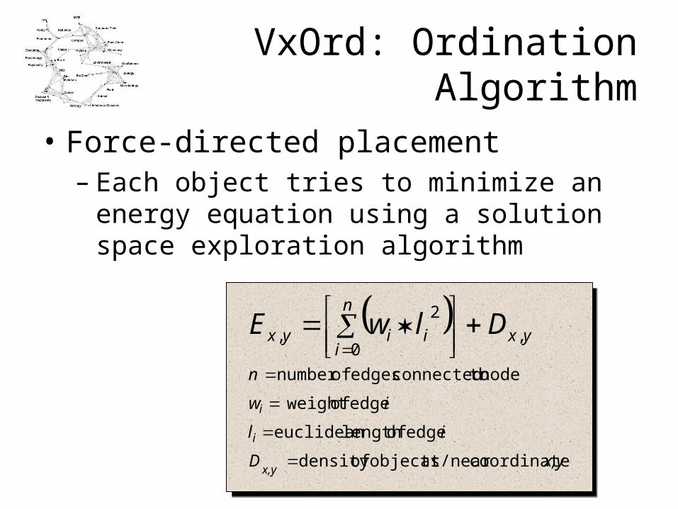
VxOrd: Ordination Algorithm
• Force-directed placement– Each object tries to minimize an energy
equation using a solution space exploration algorithm
coordinateat/near objects ofdensity
edge oflength euclidean
edge of weight
node toconnected edges ofnumber
,0
2
,
x,yD
il
iw
n
yx
n
iiiyx
x,y
i
i
DlwE
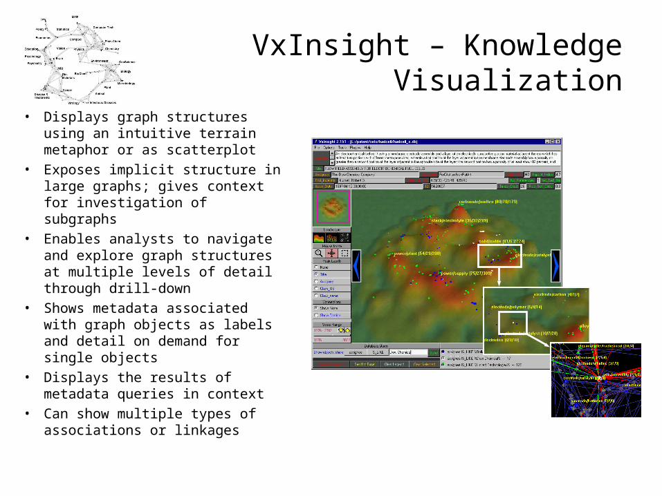
VxInsight – Knowledge Visualization
• Displays graph structures using an intuitive terrain metaphor or as scatterplot
• Exposes implicit structure in large graphs; gives context for investigation of subgraphs
• Enables analysts to navigate and explore graph structures at multiple levels of detail through drill-down
• Shows metadata associated with graph objects as labels and detail on demand for single objects
• Displays the results of metadata queries in context
• Can show multiple types of associations or linkages
Goals of Sandia Science Mapping Project
• Create maps of science with indicators of innovation, risk, and impact at the research community level
• Enable better R&D through:
– Identification and evaluation of current work in a global context
– Identification of highly-ranked communities in areas related to current work
– Identification and evaluation of proposed work in a global context
– Identification of research entry points (or potential collaborators) and emerging applications in our areas of focus
– Identification of opportunity and vulnerability using institutional comparisons
– Better understanding of the innovation process and better anticipation of future trends(?)

Strategy
• Develop and validate process, methods, and algorithms at small scale (~10k objects)– Macro-model– Using ISI citation data, create disciplinary maps of science using
journals (~7000 titles)– Validate using the known journal categorization structure
• Employ validated process, methods, and algorithms at larger scale (~1M objects)– Micro-model– Create paper-level (~1M annually) maps of science from ISI
citation data– Validate detailed maps at local structural levels where possible– Calculate indicators and metrics at the cluster or community
level

Macro-model Process
• Identify individual journals• Calculate similarity between journals
from inter-citation data and co-citation data
• Use VxOrd to determine coordinates for each journal
• Generate cluster assignments (k-means)
• Validate against ISI journal category assignments
RecordsfromDigitalLibrary
Ordination
Correlation matrix
Similarities
betweenrecords
Browsable MAP
1
2 3
45
6
.6
.6.7
.1 .2
.6.8
.9
1
2
3
1 2
Inter-citation1 cites 2
Co-citation1 and 2 are
co-cited
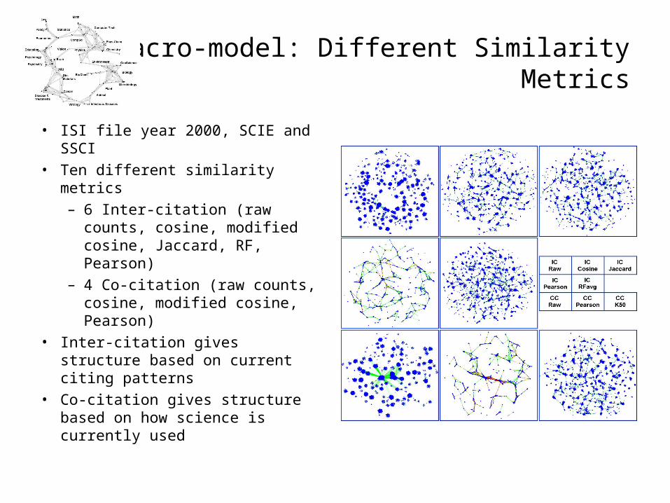
Macro-model: Different Similarity Metrics
• ISI file year 2000, SCIE and SSCI
• Ten different similarity metrics– 6 Inter-citation (raw counts,
cosine, modified cosine, Jaccard, RF, Pearson)
– 4 Co-citation (raw counts, cosine, modified cosine, Pearson)
• Inter-citation gives structure based on current citing patterns
• Co-citation gives structure based on how science is currently used
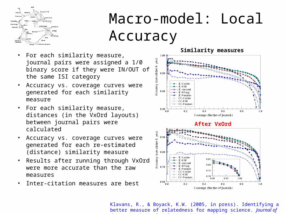
Macro-model: Local Accuracy
• For each similarity measure, journal pairs were assigned a 1/0 binary score if they were IN/OUT of the same ISI category
• Accuracy vs. coverage curves were generated for each similarity measure
• For each similarity measure, distances (in the VxOrd layouts) between journal pairs were calculated
• Accuracy vs. coverage curves were generated for each re-estimated (distance) similarity measure
• Results after running through VxOrd were more accurate than the raw measures
• Inter-citation measures are best
Coverage (fraction of journals)
0.0 0.2 0.4 0.6 0.8 1.0
Acc
ura
cy (
cum
ula
tive
% y
es)
0.40
0.60
0.80
1.00FIG5_DAT.PDW
IC-CosineIC-K50IC-JaccardIC-RFavgIC-PearsonCC-CosineCC-K50CC-Pearson
0.90 0.95 1.000.70
0.75
0.80
0.85
Coverage (fraction of journals)
0.0 0.2 0.4 0.6 0.8 1.0
Acc
ura
cy (
cum
ula
tive
% y
es)
0.60
0.70
0.80
0.90
FIG5_DAT.PDW
IC-CosineIC-K50IC-JaccardIC-RFavgIC-PearsonCC-CosineCC-K50CC-Pearson
Similarity measures
After VxOrd
Klavans, R., & Boyack, K.W. (2005, in press). Identifying a better measure of relatedness for mapping science. Journal of the American Society for Information Science and Technology.

Macro-model: Regional Accuracy
• For each similarity measure, the VxOrd layout was subjected to k-means clustering using different numbers of clusters
• Resulting cluster/category memberships were compared to actual category memberships using entropy/mutual information method
• Increasing Z-score indicates increasing distance from a random solution
• Most similarity measures are within several percent of each other
Number of k-means clusters
100 150 200 250Z
-sco
re280
300
320
340
360
380
400
IC RawIC CosineIC JaccardIC PearsonIC RFavgCC RawCC K50CC Pearson
Boyack, K.W., Klavans, R., & Börner, K., (2005, in press). Mapping the backbone of science. Scientometrics.

Computing Mutual Information
• Use method of Gibbons and Roth (Genome Research v. 12, pp. 1574-1581, 2002)
• K-means clustering (MATLAB) for each graph layout
– 8 different similarity measures
– 3 different k-means runs at 100, 125, 150, 175, 200, 225, 250 clusters
• Quality metric (mutual information) calculated as
– MI(X,Y) = H(X) + H(Y) – H(X,Y)
– where H = - Pi log2 Pi
– Pi are the probabilities of each [cluster, category] combination
– X (known ISI category assignments), Y (k-means cluster assignments)
• Z-score (indicates distance from randomness, Z=0=random)
– Z = (MIreal – MIrandom)/ Srandom
– MIrandom and Srandom vary with number of clusters, calculated from 5000 random solutions

Macro-model: “Best” Map
• Each dot is one journal• Journals group by
discipline• Labeled by hand• Generated using the IC-
Jaccard similarity measure.
• The map is comprised of 7,121 journals from year 2000.
• Large font size labels identify major areas of science.
• Small labels denote the disciplinary topics of nearby large clusters of journals.
Comp Sci
PolySciLaw
LIS
Geogr
Hist
Econ
Sociol
Nursing
Educ
Comm
Psychol
Geront
Neurol
RadiolSport Sci
Oper Res
Math
Robot
AIStat
Psychol
Anthrop
Elect Eng
Physics
Mech Eng
ConstrMatSci
FuelsElectChemP Chem
Chemistry
AnalytChem
Astro
Env
Pharma
Neuro Sci
Chem Eng
Polymer
GeoSci
GeoSci
Paleo
Meteorol
EnvMarine
Social Sci
SoilPlant
Ecol
Agric
Earth Sciences
Psychol
OtoRh
HealthCare
BiomedRehab
Gen Med
GenetCardio
Ped
Food Sci
Zool
EntoVet Med
Parasit
Ophth
Dairy
Endocr
Ob/Gyn
Virol
Hemat
Oncol
Immun
BioChem
Nutr
Endocr
Urol
Dentist
Derm
Pathol
Gastro
Surg
Medicine
ApplMath
Aerosp
CondMatNuc
EmergMed Gen/Org
Boyack, K.W., Klavans, R., & Börner, K. (2005, in press). Mapping the backbone of science. Scientometrics.
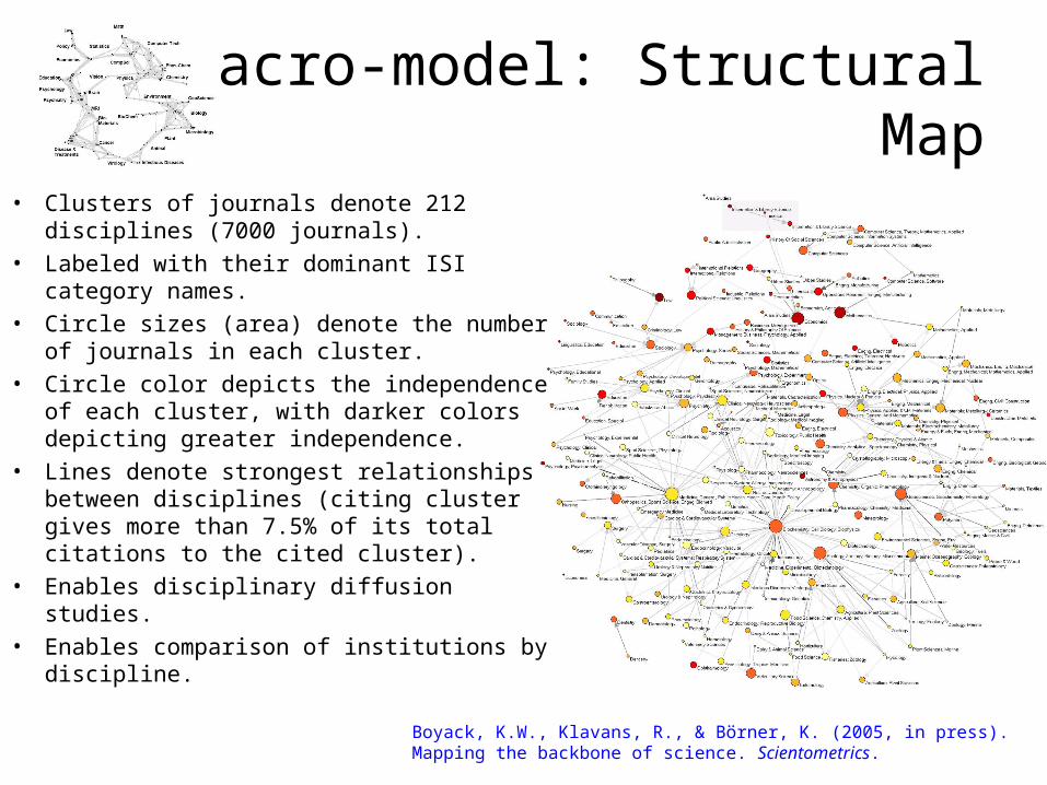
Macro-model: Structural Map
• Clusters of journals denote 212 disciplines (7000 journals).
• Labeled with their dominant ISI category names.
• Circle sizes (area) denote the number of journals in each cluster.
• Circle color depicts the independence of each cluster, with darker colors depicting greater independence.
• Lines denote strongest relationships between disciplines (citing cluster gives more than 7.5% of its total citations to the cited cluster).
• Enables disciplinary diffusion studies.• Enables comparison of institutions by
discipline.Boyack, K.W., Klavans, R., & Börner, K. (2005, in press). Mapping the backbone of science. Scientometrics.


Macro-model: Detail
• Clusters of journals denote disciplines
• Lines denote strongest relationships between journals
Boyack, K.W., Klavans, R., & Börner, K. (2005, in press). Mapping the backbone of science. Scientometrics.

What Came Before
Visualizing Science by Citation Mapping (Small, 1999)

What Comes Next?
(1) Further Refinements
(2) Different Visualizations
(3) Time series to capture the evolution of disciplines
(4) Larger Datasets – Incorporation of patent and grant funding data
(5) A new era in information cartography
(6) Widespread educational uses of knowledge domain maps.
Uses combined SCIE/SSCI data from 2002.See: http://vw.indiana.edu/aag05/slides/boyack.pdf
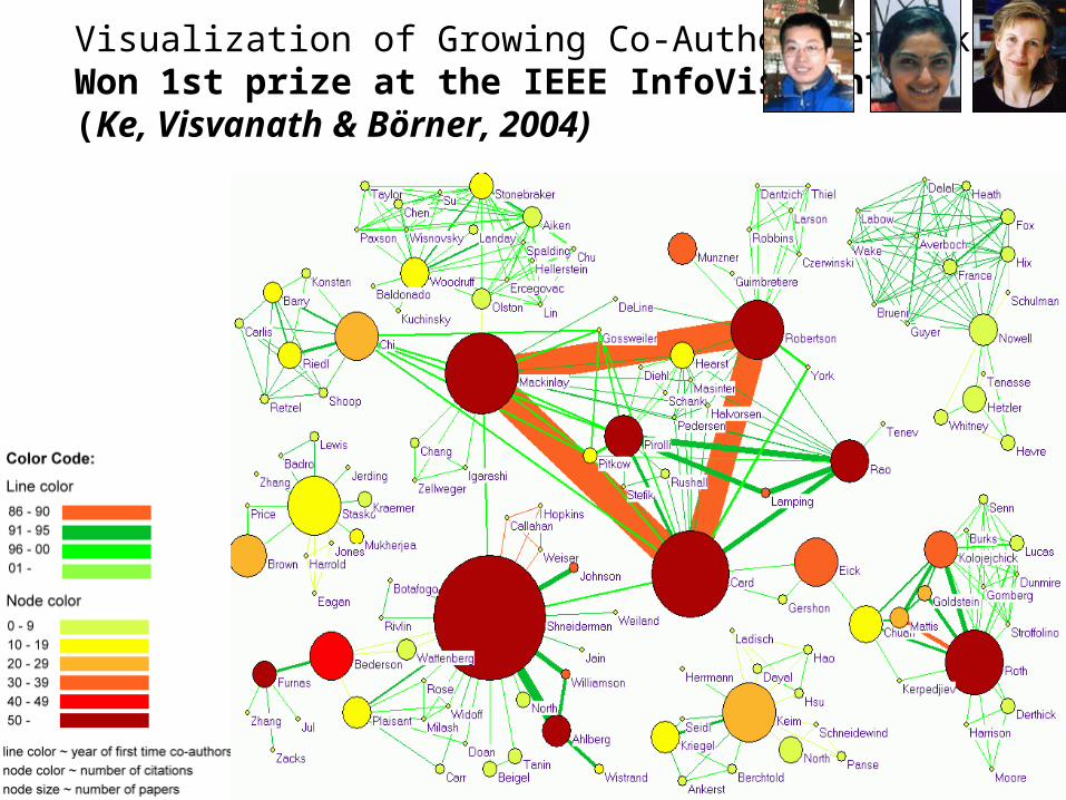
Visualization of Growing Co-Author Networks Won 1st prize at the IEEE InfoVis Contest (Ke, Visvanath & Börner, 2004)
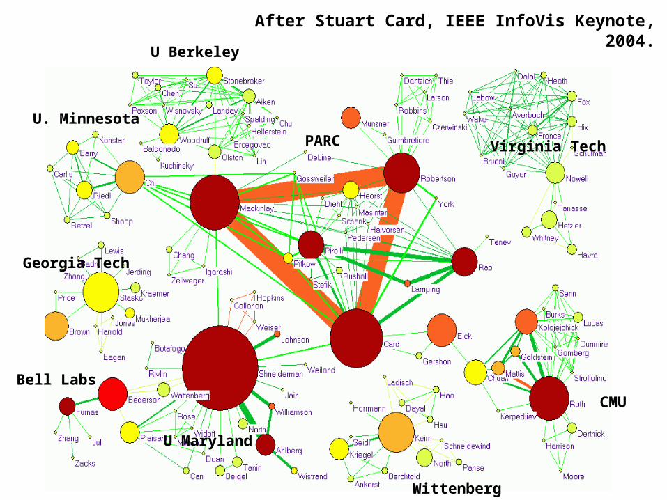
After Stuart Card, IEEE InfoVis Keynote, 2004.U Berkeley
CMU
PARC
U. Minnesota
Georgia Tech
Wittenberg
Bell Labs
Virginia Tech
U Maryland
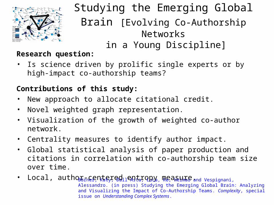
Studying the Emerging Global Brain [Evolving Co-Authorship Networks
in a Young Discipline]
Research question:• Is science driven by prolific single experts or by high-impact co-
authorship teams?
Contributions of this study:• New approach to allocate citational credit.• Novel weighted graph representation.• Visualization of the growth of weighted co-author network. • Centrality measures to identify author impact.• Global statistical analysis of paper production and citations in
correlation with co-authorship team size over time.• Local, author-centered entropy measure.
Börner, Katy, Dall’Asta, Luca, Ke, Weimao and Vespignani, Alessandro. (in press) Studying the Emerging Global Brain: Analyzing and Visualizing the Impact of Co-Authorship Teams. Complexity, special issue on Understanding Complex Systems.
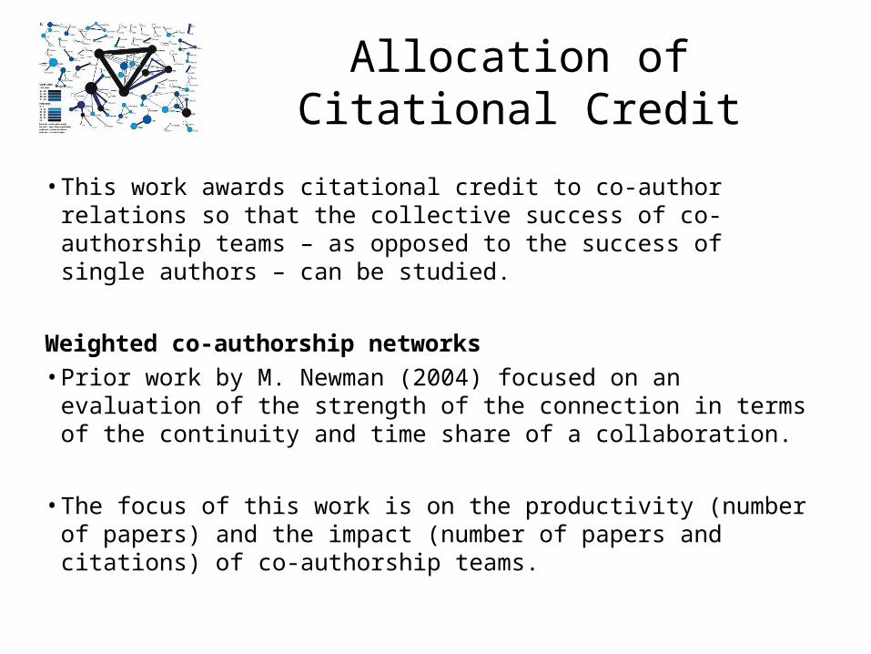
Allocation of Citational Credit
• This work awards citational credit to co-author relations so that the collective success of co-authorship teams – as opposed to the success of single authors – can be studied.
Weighted co-authorship networks• Prior work by M. Newman (2004) focused on an evaluation of the
strength of the connection in terms of the continuity and time share of a collaboration.
• The focus of this work is on the productivity (number of papers) and the impact (number of papers and citations) of co-authorship teams.

Representing author-paper networks as weighted graphs
Assumptions:• The existence of a paper p is denoted with a unitary weight of 1, representing
the production of the paper itself. (This way, papers that do not receive any citations do not completely disappear from the network.)
• The impact of a paper grows linearly with the number of citations cp the paper receives.
• Single author papers do not contribute to the co-authorship network weight or topology.
• The impact generated by a paper is equally shared among all co-authors.
• Author-paper networks are tightly coupled and cannot be studied in isolation.
• Solution: project important features of one network (e.g., the number of papers produced by a co-author team or the number of citations received by a paper) onto a second network (e.g., the network of co-authors that produced the set of papers).
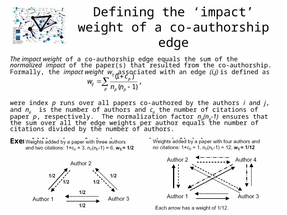
Defining the ‘impact’ weight of a co-authorship edge
The impact weight of a co-authorship edge equals the sum of the normalized impact of the paper(s) that resulted from the co-authorship. Formally, the impact weight wij associated with an edge (i,j) is defined as
were index p runs over all papers co-authored by the authors i and j, and np is the number of authors and cp the number of citations of paper p, respectively. The normalization factor np(np-1) ensures that the sum over all the edge weights per author equals the number of citations divided by the number of authors.
Exemplification of the impact weight definition:
p pp
pij nn
cw ,
)1(
)1(

Visualization of network evolution
To see structure and dynamics of co-authorship
relations
Visual Encoding
• Nodes represent authors
• Edges denote co-authorship relations
• Node area size reflects the number of single-author and co-authored papers published in the respective time period.
• Node color indicates the cumulative number of citations received by an author.
• Edge color reflects the year in which the co-authorship was started.
• Edge width corresponds to the impact weight.

74-84
74-04
74-94

Measures to identify author impact
• Degree k: equals the number of edges attached to the node.
e.g., number of unique co-authors an author has acquired.
• Citation Strength Sc of a node i is defined as
e.g., number of papers an author team produced and the citations these papers attracted.
• Productivity Strength Sp of a node i is defined as
e.g., number of papers an author team produced.
• Betweenness of a node i, is defined to be the fraction of shortest paths between pairs of nodes in the network that pass through i.
e.g., the extent to which a node (author) lies on the paths between other authors.
j
ijc wis )(
0|)()( pccp isis

Exemplification of impact measures using the InfoVis
Contest dataset:

Global statistical analysis of paper production & citation
Comparison of cumulative distributions Pc(x) of:– Degree k– Citation strength Sc– Productivity strength Sp
for two time periods: 74-94 and 74-04.
Solid line is a reference to the eye corresponding to a heavy-tail with power-law behavior P(x) = x-g with g= 2.0 (for Sc) and 1.4 (for Sp).
Discussion:•Distributions are progressively broadening in time, developing heavy tails. •We are moving from a situation with very few authors of large impact and a majority of peripheral authors to a scenario in which impact is spread over a wide range of values with large fluctuations for the distribution.
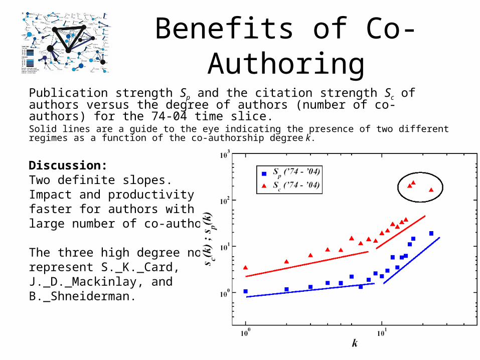
Benefits of Co-AuthoringPublication strength Sp and the citation strength Sc of authors versus the degree of authors (number of co-authors) for the 74-04 time slice. Solid lines are a guide to the eye indicating the presence of two different regimes as a function of the co-authorship degree k.
Discussion:Two definite slopes.Impact and productivity grow faster for authors with a large number of co-authorships. The three high degree nodes represent S._K._Card, J._D._Mackinlay, and B._Shneiderman.

Size and Distribution of Connected Components
Size of connected component is calculated in four different ways: GN is the relative size measured as the percentage of nodes within the largest
component. Eg is the relative size in terms of edges. Gsp is the size measured by the total strength in papers of authors in the largest
component. Gsc is the size measured by the relative strength in citations of the authors contained in
the largest component.
Exemplification using InfoVis Contest Dataset:
There is a steady increase of the giant component in terms of all four measures for the three time slices. Giant component has 15% of authors but 40% of citation impact.
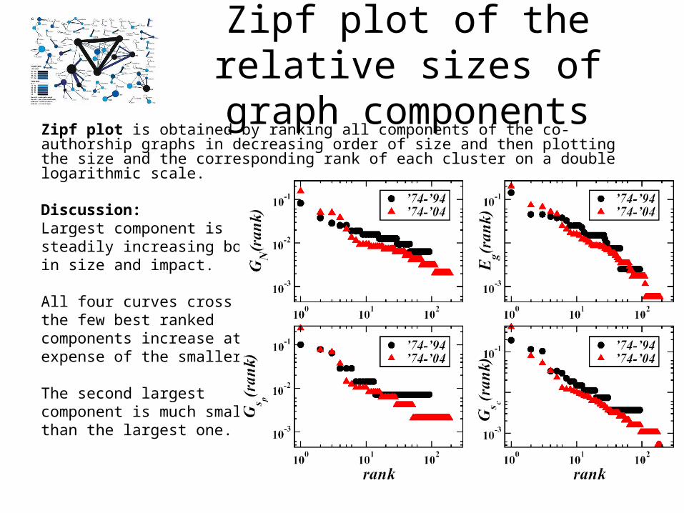
Zipf plot of the relative sizes of graph components
Zipf plot is obtained by ranking all components of the co-authorship graphs in decreasing order of size and then plotting the size and the corresponding rank of each cluster on a double logarithmic scale.
Discussion:Largest component is steadily increasing both in size and impact.
All four curves cross -> the few best ranked components increase at the expense of the smaller ones.
The second largest component is much smaller than the largest one.
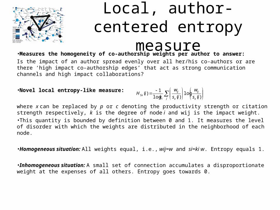
Local, author-centered entropy measure
•Measures the homogeneity of co-authorship weights per author to answer:
Is the impact of an author spread evenly over all her/his co-authors or are there ‘high impact co-authorship edges’ that act as strong communication channels and high impact collaborations?
•Novel local entropy-like measure:
where x can be replaced by p or c denoting the productivity strength or citation strength respectively, k is the degree of node i and wij is the impact weight. •This quantity is bounded by definition between 0 and 1. It measures the level of disorder with which the weights are distributed in the neighborhood of each node.
•Homogeneous situation: All weights equal, i.e., wij=w and si=ki w. Entropy equals 1.
•Inhomogeneous situation: A small set of connection accumulates a disproportionate weight at the expenses of all others. Entropy goes towards 0.
)(
log)(log
1)(
is
w
is
w
kiH
x
ij
j x
ij
iSx
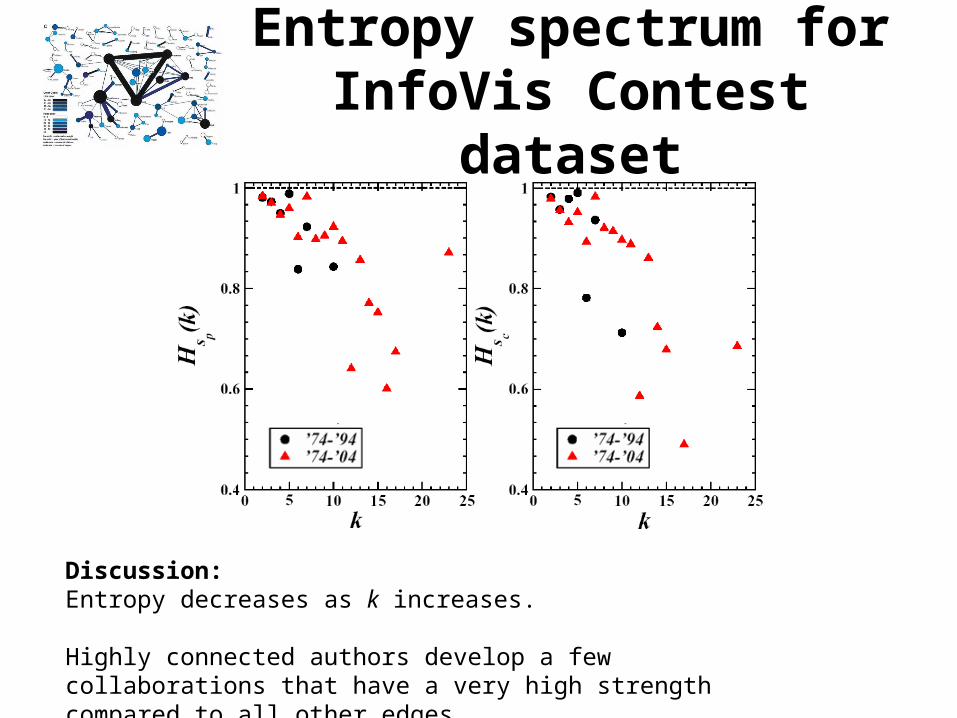
Entropy spectrum for InfoVis Contest dataset
Discussion:Entropy decreases as k increases.
Highly connected authors develop a few collaborations that have a very high strength compared to all other edges.

Benefits of the Big Picture
• “[L]earning best begins with a big picture, a schema, a holistic cognitive structure, which should be included in the lesson material[.]” (West et al., (1991). Instructional Design: Implications from Cognitive Science. Englewood Cliffs, New Jersey: Prentice Hall, p. 58).”
• Provides a structure or scaffolding that students may use to organize the details of a particular subject.
• Information is better assimilated with the student’s existing knowledge.
• Visualization enhances recall.
• Makes explicit the connections between conceptual subparts and how they are related to the whole.
• Helps to signal to the student which concepts are most important to learn.

Semantic Network Theory of Learning
• Human memory is organized into networks consisting of interlinked nodes.
• Nodes are concepts or individual words.
• The interlinking of nodes forms knowledge structures or schemas.
• Learning is the process of building new knowledge structures by acquiring new nodes.
• When learners form links between new and existing knowledge, the new knowledge is integrated and comprehended.
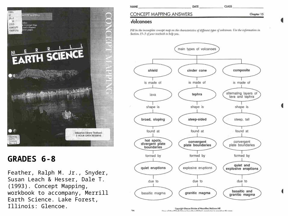
GRADES 6-8
Feather, Ralph M. Jr., Snyder, Susan Leach & Hesser, Dale T. (1993). Concept Mapping, workbook to accompany, Merrill Earth Science. Lake Forest, Illinois: Glencoe.

Concept Map Produced by Cmap Tools
Created by Joseph Novak and rendered with CMapTools. http://cmap.ihmc.us/

Concept Map Created With Rigor
Benefits of Computer-Based Collaborative Learning Environments
Kealy, William A. (2001). Knowledge Maps and Their Use in Computer-Based Collaborative Learning Environments. Journal of Educational Computing Research. 25(4) 325-349.

Modified from Boyack et al. by Ian Aliman, IU

Conclusion:Scholarly production and consumption itself is a complex system and justifies the attention of information scientists to contribute to macro and micro efficiencies in the use and understanding of information.

References• Boyack, Kevin W., Klavans, R. and Börner, Katy. (in press). Mapping the Backbone of Science.
Scientometrics. http://ella.slis.indiana.edu/~katy/paper/05-backbone.pdf • Börner, Katy, Dall’Asta, Luca, Ke, Weimao and Vespignani, Alessandro. (April 2005) Studying
the Emerging Global Brain: Analyzing and Visualizing the Impact of Co-Authorship Teams. Complexity, special issue on Understanding Complex Systems, 10(4): pp. 58 - 67. http://ella.slis.indiana.edu/~katy/paper/05-globalbrain.pdf
• Börner, Katy & Penumarthy, Shashikant. (in press) Spatio-Temporal Information Production and Consumption of Major U.S. Research Institutions. Accepted at the 10th International Conference of the International Society for Scientometrics and Informetrics, Stockholm, Sweden, July 24-28. http://ella.slis.indiana.edu/~katy/paper/05-issi-diffusion.pdf
• Hook, Peter A. and Börner, Katy. (in press) Educational Knowledge Domain Visualizations: Tools to Navigate, Understand, and Internalize the Structure of Scholarly Knowledge and Expertise. In Amanda Spink and Charles Cole (eds.) New Directions in Cognitive Information Retrieval. Springer-Verlag. http://ella.slis.indiana.edu/~pahook/product/05-educ-kdvis.pdf
• Klavans, R., & Boyack, K.W. (2005, in press). Identifying a better measure of relatedness for mapping science. Journal of the American Society for Information Science and Technology .
• Places & Spaces: Cartography of the Physical and the Abstract - A Science Exhibit http://vw.indiana.edu/places&spaces/