magazine analyse
TRANSCRIPT

Analyse cover, contents page & double page spread.
ByJulia Barfoot

Cover Page Have a running color theme through all issues of magazine. This gives a sense of identity and unity and easier to consumers to spot the genre.
Having a well known cover girl who is a role model for the target audience, shows she is current and fashionable. From her pose, it shows she is serious.
Having a set masthead in each issue gives the magazine an identity making it easier for the consumer to spot the magazine.
Example of coverlines.
Easy to identify a target audience by use of artists and cover lines.
Having the barcode (so you can buy the magazine), date (so you know you’re reading the most recent and up to date, as well as being able to archive each issue) and price (to see whether you can afford it and a more expensive magazine adds class) All of these things are essential for a good magazine.
Full of relevant artists making the magazine relevant, up to date and wanted.
Using plugs and puffs to make certain words and phrases stand.
Using words like ‘exclusive’ draws people to your magazine instead of others as they want to be the first to know.
Relevant artists, so the audience is interested in reading the gossip.
Main coverline- to tell you what is in the magazine and draws you in to read the magazine.
They have also made good use of the ‘gossip factor’ as they know that at this age this is what their target audience wants.
They have also included fashion as they know how much their target audience is obsessed with fashion and interested with what celebrities are wearing.
Contents Page
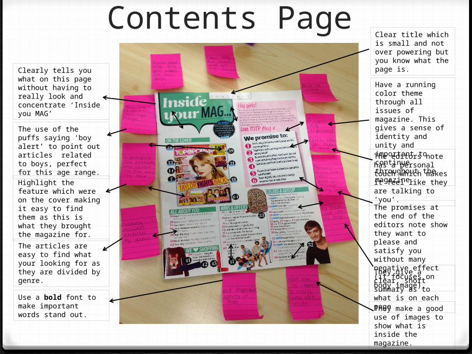
Have a running color theme through all issues of magazine. This gives a sense of identity and unity and important to continue throughout the magazine.
Clearly tells you what on this page without having to really look and concentrate ‘Inside you MAG’
The use of the puffs saying ‘boy alert’ to point out articles related to boys, perfect for this age range.
Highlight the feature which were on the cover making it easy to find them as this is what they brought the magazine for.
The articles are easy to find what your looking for as they are divided by genre.
Use a bold font to make important words stand out. They make a good use of
images to show what is inside the magazine.
They give a clear, short summary as to what is on each page
The promises at the end of the editors note show they want to please and satisfy you without many negative effect (it focuses on body image).
The editors note has a personal touch which makes it feel like they are talking to ‘you’.
Clear title which is small and not over powering but you know what the page is.

Double Page Spread
The running color theme which is continued throughout the magazine is similar in all the issues of magazine. This gives a sense of identity and unity and easier to consumers to spot the genre.
Having a little quote from each of the band members makes it more personal and shows you what is in the article.
The title is really clear with a clear font and also shows you what is in the article.
The article is written in a clear way with a good use of colours which match the continuous colour theme.
The features of the article are relatable for the target audience making it easier for the target audience to enjoy and understand the article.
The features of the article, little mix, are known for being fashionable something that their target audience are obsessed with (fashion)
Giveaway- raises the awareness of the article by attracting people to the page for the giveaway.
The picture of little mix are funny because they are pulling face but these faces are animated expressions of some of the feelings expressed in the article.
The clothes worn in the photograph link with the colour theme link the picture to the article in another way than one.
‘Exclusive’ make people want to read the magazine as they want to be the first to know the gossip.

Double Page Spread
They have a pun for the title which give an element of fun and joke not too serious.
They have continued the same colour theme as well as using colour the go with the picture to link it all together and give a feeling of unity.
By using one person but in many outfits give a them a chance to choose and steal an item that would suit many personalities as well as lots of situations.
They have clearly laid out the article so it easy read as well as adding pictures to allow you to choose the part that interest you.
The have included a small amount of description's so you know what the emphasis is on without taking it from a fashion feature to an article
By using high street prices the have made it very accessible for wider range of people.
By adding make-up to a fashion feature they have turned it more onto a ‘how to get the look’ and the age of their target audience is an age where the girls are finding themselves and would be extremely interested in tips and advice.
As well as make up they have also included accessories to really show you how to complete and outfit. As a feature it really contains a lot of advice.
By using Jennifer Lawrence as their main feature the are using relevant and up to date celebrities who are role models to their target audience. As well as a celebrity who is know for her fashion sense making people.