logo
TRANSCRIPT

LOGO
ARAVIND.T.SLEAD COLLEGE OF MANAGEMENT
PALGHAT

• The logo (ideogram), is the image embodying an organization. Logos are meant to represent companies’ brands or corporate identities

Preliminary Work Is a Must
• Preliminary sketches are an important first step in designing an effective logo.
• These can be as simple as paper and pen drawings or drafts made using a vector program, such as Illustrator.

Create Balance
• Keep your logo balanced by keeping the “weight” of the graphics, colors, and size equal on each side.
• a balanced design is the safest approach.
Size Matters
• A logo is not effective if it loses too much definition when scaled down
• for letterheads, • envelopes, and • small promotional items. • The logo also has to look good when used for
larger formats, such as posters, billboards, and electronic formats such as TV and the Web.

Clever Use of Color
• Use colors near to each other on the color wheel (e.g. for a “warm” palette, use red, orange, and yellow hues).
• Don’t use colors that are so bright that they are hard on the eyes.
• The logo must also look good in black and white, grayscale, and two colors.
• Breaking the rules sometimes is okay; just make sure you have a good reason to!
Design Style Should Suit the Company
• You can use various design styles when creating a logo, and to pick the right one, you should have some background information about the client and the brand.
Typography Matters… a Lot
• Choosing the right font type and size is much more difficult than many beginner designers realize.
• Avoid the most commonly used fonts, such as Comic Sans, or else your design may come off as amateurish.
• Make sure the font is legible when scaled down, especially with script fonts.
• One font is ideal, and avoid more than two.

The Goal IS Recognition

Dare to be Different
Try breaking the rules of design and taking risks.
K.I.S.S. (Keep it Simple, Stupid)
• The simpler the logo, the more recognizable it will be

Develop a Design “Assembly Line”
• Research• Brainstorm and generate ideas• Preliminary sketches• Develop vector designs• Send to client• Add or remove anything the client wants• Finalize the design and resubmit to client
Use Other Designs for Inspiration Only
DON’T COPY
• You might think the arrow does nothing here. But it says that amazon.com has everything from a to z and it also represents the smile
brought to the customer's face.

• Ever wondered what the three stripes on the Adidas Logo mean? They represent a
mountain, pointing out towards the challenges than are seen ahead and goals that can be
achieved.

• The apple in this logo is taken from the Bible story of Adam and Eve, where the apple represents the fruit of Tree of Knowledge, with a pun on “byte/bite”.
The star in the three corners on their logo represents the Mercedes-Benz dominance on
land, sea and air.
• Being an Online Food Delivery service, its logo shows a fork formed into an @ symbol! Such an easy logo to remember.

• The arrow was introduced to underscore speed and precision, which are part of the positioning of the company.
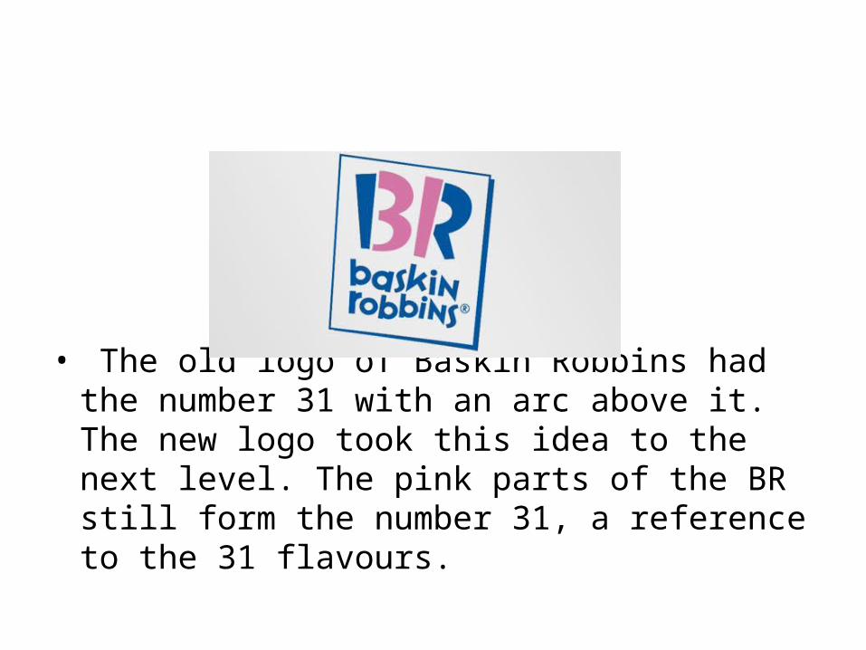
• The old logo of Baskin Robbins had the number 31 with an arc above it. The new logo took this idea to the next level. The pink parts of the BR still form the number 31, a reference to the 31 flavours.

• Carrefour is one of the biggest European retailers, and its also French for crossroads. The logo symbolizes this word via two opposite arrows. They also added the first letter of the name, because if you look closely youll see the letter C in the negative space between the two arrows.

• At first, this logo might not make much sense. But if you look closely, youll see the number 1 in the negative space between the F and the red stripes.

• Sony Vaio is a well known brand of laptops. But did you know that the name Vaio logo also had a hidden meaning? Well, the first two letters represent the basic analogue signal. The last two letters look like a 1 and 0, representing the digital signal.
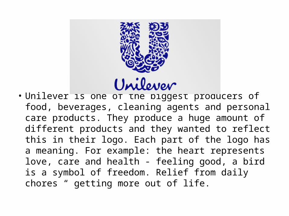
• Unilever is one of the biggest producers of food, beverages, cleaning agents and personal care products. They produce a huge amount of different products and they wanted to reflect this in their logo. Each part of the logo has a meaning. For example: the heart represents love, care and health - feeling good, a bird is a symbol of freedom. Relief from daily chores “ getting more out of life.
Make a Logo for LEAD