logo title thing
TRANSCRIPT


The magazine would need a barcode but I didn’t want it to just be placed at the bottom of the page because there wouldn’t be enough room and it wouldn’t look right. I found that I could use the masthead ‘beat’ to hide it in, because it has some solid black blocks and it wouldn’t look out of place as it is broken and streaky.
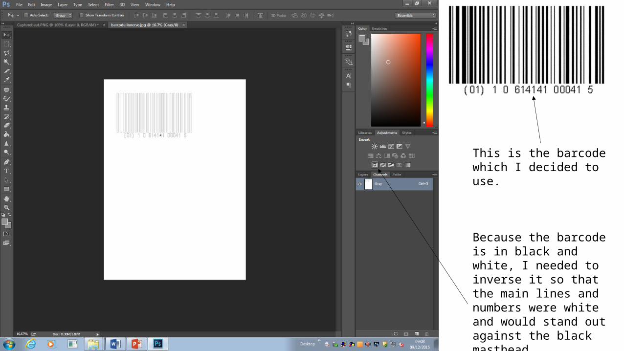
This is the barcode which I decided to use.
Because the barcode is in black and white, I needed to inverse it so that the main lines and numbers were white and would stand out against the black masthead.The inverse button was found here.

Because the barcode needed to be on a black background, I needed to make the background of the image transparent so that I could easily place it over the name of the magazine.
This is the tool which can make the background or parts of the image transparent.

This is the original image, there is already some lined effect around the ‘T’ so I chose to use this to be replaced with the barcode.
I had to remove the lines which were already in the place of where I wanted to get the barcode. I used the patch tool to move them away so that I could then add mine.

I placed the barcode where I wanted it on the image
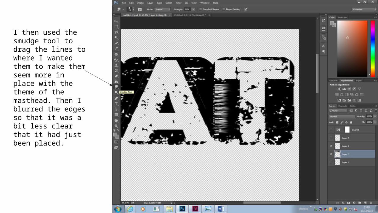
I then used the smudge tool to drag the lines to where I wanted them to make them seem more in place with the theme of the masthead. Then I blurred the edges so that it was a bit less clear that it had just been placed.

Because it still seemed a little out of place, I changed the block around the ‘E’ in the same way to make it fit more with what the general design would be.
Original ‘E’ block
