location, quality and choice of hospital · location, quality and choice of hospital: evidence from...
TRANSCRIPT

CHE Research Paper 123
Location, Quality and Choiceof Hospital: Evidence from England2002/3 - 2012/13
Giuseppe Moscelli, Luigi Siciliani,Nils Gutacker, Hugh Gravelle


Location, quality and choice of hospital: Evidence from England 2002/3 - 2012/13
1Giuseppe Moscelli 2Luigi Siciliani 1Nils Gutacker 1Hugh Gravelle
1Economics of Social and Health Care Research Unit, Centre for Health Economics, University of York, York, UK 2Department of Economics and Related Studies, University of York, York, UK January 2016

Background to series
CHE Discussion Papers (DPs) began publication in 1983 as a means of making current research material more widely available to health economists and other potential users. So as to speed up the dissemination process, papers were originally published by CHE and distributed by post to a worldwide readership.
The CHE Research Paper series takes over that function and provides access to current research output via web-based publication, although hard copy will continue to be available (but subject to charge).
Acknowledgements
This research was funded by the Department of Health in England under the Policy Research Unit in the Economics of Health and Social Care Systems (Ref 103/0001). The views expressed are those of the authors and not necessarily those of the funders. Hospital Episode Statistics are Copyright 2002-2013, re-used with the permission of The Health & Social Care Information Centre. All rights reserved.
Further copies
Copies of this paper are freely available to download from the CHE website www.york.ac.uk/che/publications/ Access to downloaded material is provided on the understanding that it is intended for personal use. Copies of downloaded papers may be distributed to third-parties subject to the proviso that the CHE publication source is properly acknowledged and that such distribution is not subject to any payment.
Printed copies are available on request at a charge of £5.00 per copy. Please contact the CHE Publications Office, email [email protected], telephone 01904 321405 for further details.
Centre for Health Economics Alcuin College University of York York, UK www.york.ac.uk/che © Giuseppe Moscelli, Luigi Siciliani, Nils Gutacker, Hugh Gravelle

Location, quality and choice of hospital: evidence from England 2002/3-2012/13 i
Abstract
We investigate (a) how patient choice of hospital for elective hip replacement is influenced by distance, quality and waiting times, (b) differences in choices between patients in urban and rural locations, (c) the relationship between hospitals’ elasticities of demand to quality and the number of local rivals, and how these changed after relaxation of constraints on hospital choice in England in 2006. Using a data set on over 500,000 elective hip replacement patients over the period 2002/3 to 2012/13 we find that patients became more likely to travel to a provider with higher quality or lower waiting times, the proportion of patients bypassing their nearest provider increased from 25% to almost 50%, and hospital elasticity of demand with respect to own quality increased. By 2012/13
average hospital demand elasticity with respect to readmission rates and waiting times were 0.2
and 0.04. Providers facing more rivals had demand that was more elastic with respect to quality and waiting times. Patients from rural areas have smaller disutility from distance. Keywords: hospital, choice, quality, waiting times, distance, rurality. JEL: I11, I18, L15, R22.

ii CHE Research Paper 123

Location, quality and choice of hospital: evidence from England 2002/3-2012/13 1
1. Introduction
Healthcare reforms extending the patient’s right to choose a provider for hospital care have been introduced in several OECD countries during the last two decades (Vrangbaek et al, 2012). Reducing constraints on choice for planned (non-emergency) healthcare is intended, inter alia, to incentivize hospitals to compete on quality (Besley and Ghatak, 2003), especially in those systems where prices for healthcare are regulated (Gaynor, 2006). It is hoped that with fewer constraints on patient choice of provider, hospitals with higher quality can attract more demand and raise revenues, whereas those with poor quality may lose revenues. However, the success of this incentive mechanism depends crucially on whether patients and demand respond to hospital quality. In the English National Health Service (NHS) before 2006 the choice of hospitals for elective hospital treatment was generally constrained to the set of local NHS hospitals which had contracts with the patient’s local health authority. In 2006 constraints on choice of provider were relaxed with patients having to be offered a choice of at least 4 providers and from 2008 they could choose from any qualified providers wherever located. Using data from 2002/3 to 2012/13 on choice of hospital for elective hip replacement we address three research questions related to understanding demand-side mechanisms in healthcare: (a) how do distance, quality and waiting times influence choice of hospital, (b) do these factors have different effects on the choices of patients in rural and urban areas, and (c) how does a hospital’s elasticity of demand with respect to its quality vary with the number of rivals. We make use of our long run of data on choices to investigate how the answers to these questions changed over time, especially after the relaxation of constraints on hospital choice in 2006. These questions have obvious policy relevance. If hospital demand is not responsive to quality then relaxation of constraints on choice is unlikely to stimulate hospital competition via quality. Wider choice sets may contain providers who yield higher utility to patients. But this benefit may be greater in urban areas where patients will have more local providers, whereas rural patients with longer distances to travel to providers may gain less and may change their demands less in response to quality. If demand is more responsive to quality for hospital with more rivals, quality may be higher in more competitive areas and lower in less competitive ones. We estimate models of hospital choice for elective hip replacement and focus on two dimensions of quality: procedure specific clinical quality and waiting times. The most common adverse outcome after hip replacement surgery is an emergency readmission within 28 days. In addition to emergency readmission rates, we also measure clinical quality by rates of revisions within a year of discharge, and mortality rates within 28 days of discharge. We find that patients value quality when choosing their preferred provider of care, especially after relaxation of constraints on choice. Specifically, we find that hospitals with higher readmission rates were less likely to be chosen in the years after 2006, while this was not the case in earlier years. Revision rates did not have a consistent effect on choice. Hospitals with long waiting times attracted fewer patients, but only after 2008, while hospitals with higher mortality rates were less likely to be chosen throughout the entire period. As with previous studies, we find distance to be a strong predictor of choice, with patients preferring hospitals close from home. Marginal utilities for quality are similar for urban and rural patients from 2006 onwards. Marginal disutility of distance did not change much over the period but was smaller for rural patients.

2 CHE Research Paper 123
After the introduction of choice policies, the average demand elasticity to readmission rates varied
between -0.07 and -0.25. The average demand elasticity to waiting times was about 0.04 after 2007. Patients are willing to travel 0.5 additional kilometres to avoid an increase of one standard deviation in emergency readmissions. Hospital demand is more elastic with respect to own quality the larger the number of rivals, and the effect of having more rivals became greater in later years. Section 2 provides background by way of a short review of the relevant literature and a description of the institutional framework. Section 3 describes the data. Section 4 sets out the methods and Section 5 has the results. Section 6 concludes.

Location, quality and choice of hospital: evidence from England 2002/3-2012/13 3
2. Background
2.1 Related literature
Our study contributes to the small but growing literature on hospital choice and how it relates to quality (see Brekke et al. (2014) for a review). Three recent studies are from England. Gaynor et al (2012) investigates the introduction of choice policies in England for patients in need of a coronary artery bypass graft (CABG) using data for 15 months before (January 2004 to March 2005) and 15 months after (January 2007 to March 2008). They find that patients are responsive to quality, and that the introduction of hospital choice led to a reduction in mortality and to increased patients’ welfare. The market for hip replacement is very different from that for CABG. The number of hip replacements has increased over time whereas CABG demand has fallen.1 The market for hip replacement is less concentrated: CABG surgery is highly specialised and provided by only 30 hospitals. Hip replacements are performed in most hospitals in England and the market has grown substantially over time from 187 providers in 2002/3 to 297 in 2012/13 as a result of the entry of private providers. The mortality risks of the two procedures also differ: 30-day mortality after non-emergency CABG is 1.17%, compared with non-emergency hip replacement mortality of 0.35%. Beckert et al (2012) use English data for elective hip replacement for 2009/10 and measure hospital quality by overall hospital mortality, MRSA infection rates, hip replacement waiting times and numbers of doctors and nurses. In keeping with the broader literature on hospital choice, they find that patients are responsive to quality. By contrast we use condition specific clinical quality measures (post-operative emergency readmissions, revision rates, and mortality rates). Moreover, we investigate how demand responsiveness has changed over a ten-year period before and after relaxation of constraints on choice. Gutacker et al (2015) analyse choice of provider for elective hip replacement surgery in the English NHS between 2009 and 2013 making use of newly available data on patient reported outcomes (PROMs) and find that using PROMs in addition to conventional quality measures such as revision and readmission rates improves predictions of hospital choice. Since PROMs data are only available from April 2009, we use the conventional measures to examine choices before and after relaxation of constraints on choice. The literature on rural and urban hospitals is mainly US focused and has mostly investigated differences in quality of urban/rural hospitals (Adams et al, 1991; Goody, 1993; Ferrier and Valdmanis, 1996; Baldwin et al, 2004). Differences in choice of healthcare provider and targeting of rural patients have been investigated by Tai et al (2004) and Roh et al (2008). These studies focus on the effect of patients’ characteristics (e.g. age, comorbidities, past medical utilisation) and organization characteristics (e.g. volume, type of hospitals, number of beds, ownership status) on demand for rural hospitals. Conversely, we focus on differences in choices (and preferences) between urban and rural patients.
2.2 Institutional background
The England NHS is funded by taxation and free to patients at point of use. Local purchasing bodies receive budgets from the Department of Health to contract healthcare provision for their resident populations from primary care and hospital providers.2 As part of the re-introduction of the internal market (Dixon et al, 2010), prospective payment for hospitals was rolled out incrementally from April 2003 onwards, so that increasingly money followed the patient (Farrar et al, 2009). Previously,
1 Hip replacements increased by 30% over our period compared with a reduction of 20% in CABG.
2 The English local purchasing authorities are Primary Care Trusts (PCTs) until April 2013, after which they have been
replaced by Clinical Commissioning Groups (CCGs).

4 CHE Research Paper 123
health authorities negotiated block contracts with their local providers under which the provider agreed to treat fixed number of patients in return for a fixed sum, with some adjustment to the payment if the number treated differed from the contracted number. Choice was not entirely constrained. In principle, GPs could refer patients to other providers who would then be remunerated per patient, but this was not encouraged by health authorities. In 2002/3 the average practice referred patients to over 7 different providers over all types of elective care (Dusheiko et al, 2008). Private independent sector providers (ISPs) were allowed to enter the NHS market for planned care from 2003 onwards; until then only public NHS hospitals could provide inpatient care.3 In 2006, patients were given the right to choose from at least 4 providers of non-emergency care; and from 2008 they could choose any qualified provider wherever located. An electronic booking system (Choose and Book) was introduced in 2005/6 to allow direct booking of referrals from general practices. By 2012/13, 50% of all referrals were made via the system (Dusheiko and Gravelle, 2015). Since 2007 the NHS Choices website has provided public information on the location, services and quality of providers.
3 By 2010/11, private providers treated 4% of NHS elective patients, concentrating on a small number of high volume
procedures such as hip replacements (Hawkes, 2012).

Location, quality and choice of hospital: evidence from England 2002/3-2012/13 5
3. Data
We use individual level data from Hospital Episode Statistics (HES) on all elective admissions for NHS-funded elective primary (i.e. non-revision) hip replacement surgery between April 2002 and March 2013 in English NHS and privately-operated hospitals for patients aged 18 and over.4 We exclude privately-funded patients treated in NHS hospitals (13,087, or 2.21% of the HES initial sample). We drop hospitals with less than 50 elective hip replacement patients in a given year to reduce noise in our quality measures. The average hospital volume in our estimation sample is 307 patients. Patients’ usual place of residence is reported at Lower Super Output Area (LSOA).5 Each LSOA contains approximately 1,500 inhabitants and is designed to be homogeneous with respect to tenure and accommodation type. We use ONS definitions of urban and rural LSOAs to attach an indicator of rurality to patients.6 We also attach a measure of income deprivation to each patient by their LSOA using the 2004 Indices of Multiple Deprivation. We compute straight-line distances using geographical coordinates of the centroid of patients’ LSOA of residence and the locations of all hospitals providing hip replacement surgery in a given year.7 The choice set for each patient is defined as the 30 providers closest to the centroid of the patient’s LSOA of residence. We exclude 5,589 NHS-funded patients (0.96%) who choose a provider outside this choice set. We measure hospital quality with three clinical indicators specific to elective hip replacement patients: 28-day emergency readmissions following discharge; one-year revisions rates following surgery; and mortality rates within 28 days of discharge. All rates are adjusted for case-mix differences using the approach prescribed by the Health & Social Care Information Centre (2013a). Emergency readmissions rates are associated with lower quality of care (Weissman et al, 1999) and are commonly used as a measure of quality, both internationally (B et al, 2007; Balla et al, 2008) and in England (Billings et al, 2012; Blunt et al, 2014). Waiting times are likely to influence patients’ choice of hospital (Varkevisser et al, 2007; Sivey, 2012; Gaynor et al, 2012; Ruwaard and Douven, 2014) since they postpone benefits and patients’ health status may deteriorate while waiting (Appleby et al., 2005, Oudhoff et al., 2007). We therefore also measure mean waiting time for hip replacement at a provider as the average time elapsed from the date the specialist adds a patient to the waiting list to the date of hospital admission for surgery. We distinguish between NHS and independent sector (ie private) providers (ISPs) and also group NHS providers into five categories used by the National Patient Safety Agency: NHS small and multi-service, medium, large non-teaching trust, NHS teaching trust, and NHS specialised orthopaedic provider. This allows for the possibility that choice of provider may be influenced by unobservable characteristics associated with provider type.8
4 We exclude patients undergoing a revision surgery because these patients are expected to be more likely to return to the hospital of initial hip replacement surgery, independently of observed hospital quality. We use the hip replacement procedure codes from Department of Health (2008). 5 As our sample span from 2002 to early 2013, we use LSOA defined according to 2001 census boundaries by the English Office for National Statistics (ONS). There were 32,482 LSOA in England according to this definition. 6 The rural category encompasses the grouping of areas classified as town and fringe, village, hamlet and isolated dwellings, while the urban category consist just of urban areas. See ONS (2004) for details. 7 Hospital location is based on the postcode of the headquarters of NHS trusts and the postcode of the hospital site for independent sector providers (ISPs). We use NHS hospital headquarters instead of the hospital site since: NHS produced quality information is defined and measured at trust level, NHS sites belonging to a same trust are typically clustered together and over 91% of elective hip replacement operations in NHS providers are performed in a single site. Private providers are often part of hospital chains which have more geographically scattered sites, so that LSOA to site distance is more appropriate for private providers. 8 Note that the size classification of NHS providers is not affected by the number of hip replacement patients as it is based on the total number of all patients (emergency and elective) and availability of services, and does not vary over time.

6 CHE Research Paper 123
4. Methods
4.1 Model specification
The empirical analysis is based on the conditional logit random utility model (McFadden, 1974). Utility of patient 1,...,i N receiving care at provider 1,...,j J at time 1,...,t T is
ijt ijt jt ijtU V (1)
where ijtV depends on observed hospital characteristics, such as quality, and travel distance, jt is
utility from unobserved hospital characteristics and ijt is the unobserved random error term. Each
patient i has a choice set itM J . If the error term ijt is distributed as an i.i.d. extreme value, the
probability of patient i choosing hospital j , given that they have decided to have a hip replacement in the NHS, is
1
' '
'
exp exp it
ijt ijt jt ij t j t
j M
P V V
(2)
The estimated coefficients in a conditional logit model are identified only up to a common scale
parameter that depends on the unobserved variance of the random error term ijt (Train, 2003). To
be able to compare marginal utilities of quality and distance across different years, we estimate a pooled model for all patients across all years interacting observable hospital characteristics and distance with year dummies. We assume that utility of patient i in year t who chooses hospital j of type g is
K K S K N M Sq q s qx d x s
ijt kt gkt kt jkt st ijt kmt jkt imt s ijt imt ijtk k s k i m sU q q d q x d x
= ( ) ( )q q d qx dx
gt t jt t t t jt it t t it t ijt q α q β d β q x β d x β (3)
where is the Kronecker product.
jktq is the kth quality measure (emergency readmissions, revisions, mortality, waiting times) in
provider j in year t. gktq = /gtN
jkt gtj gq N
is the mean of the kth quality characteristic in hospitals of
type g in year t.9 We include gktq in the specification to allow for the unobserved provider effects
jt .10
s
ijtd is the s’th power of the distance dijt from the centroid of the LSOA of residence of patient i to
provider j in year t. We found that a cubic distance specification had better fit than linear or quadratic specifications but adding further powers of distance did not yield further improvements.
9 There are six hospital types: private, large NHS, medium NHS, small/multiservice NHS, teaching NHS, specialist NHS, with
the reference category being large (non-teaching) NHS hospitals. 10
We also considered richer specifications with interactions of provider type with year dummies to allow the effect of hospital type to vary over time. However it was not possible to compute coefficients or standard errors for these interaction terms.

Location, quality and choice of hospital: evidence from England 2002/3-2012/13 7
mx = 1
imtt iN x is the average the m’th individual characteristic (the mean for age, measures
of severity and deprivation and the mode for gender) over all patients in all years and imtx = imtx
mx . We thus allow for patient characteristics to affect the marginal utility of provider quality and
distance. By interacting the deviations of patient characteristics from their averages we can
interpret the coefficients q
kt , d
st as the marginal utilities with respect to quality and powers of
distance of a reference patient with average characteristics in a given year. Information on hospital quality indicators is typically available to patients with a time lag of approximately one year, so patients are assumed to respond to past rather than current information on quality when choosing providers. For this reason, provider qualities qjkt and provider type
qualities gktq (emergency readmissions, revisions, mortality, and waiting times) are measured with a
one-year lag.11 To investigate differences in preferences between urban and rural patients and how these have evolved over time we also estimate a model assuming that
( ) ( ) ( ) ( )q q d qx dx qR dR
ijt gt t jt t t t jt it t t it t jt ijt t t ijt t ijtU R R q α q β d β q x β d x β q β d β (4)
where iR is an indicator function equal to 1 when the patient resides in an LSOA classified as rural.
Thus the marginal utilities of quality and distance for rural patients with reference personal
characteristics are q qR
kt kt and d dR
st st .
4.2 Willingness to travel and demand elasticity
Since the utility function (1) is unique only up to a linear transformation, estimated coefficients convey information only about the sign of marginal utility and of the effect of quality on demand. However, the ratio of estimated marginal utilities (i.e. the negative of the marginal rate of substitution) is unaffected by linear transformations and hence provides quantitative information about patient preferences which is comparable across different years and different types of patient. From (3) willingness to travel (WTT) of the representative patient in year t for a one standard
deviation increase in the k’th quality measure (k) is
2
1 2 3
/
/ 2 3ijt
qijt ijt jkt kt
kt k k k d d d
jkt ijt ijt t t d t dU
d U qWTT
q U d
(5)
where d is the average distance to the chosen provider for all patients over all years. The delta
method is used to compute the WTTs’ standard errors (Hole, 2007). ktWTT is the change in distance
to the chosen hospital that the average patient in year t requires to offset a one standard deviation increase in qjkt.
11
This approach is similar to Varkevisser et al (2012), Beukers et al (2014) and Gutacker et al (2015). Hospitals may learn by doing so that higher volume providers have higher quality (Luft et al, 1987; Gaynor et al, 2005). A study with English 1997-2002 hip replacement data found that 30-day in-hospital mortality was higher in low volume hospitals that treated less than 100 patients per year but found no volume effect above this threshold (Judge et al, 2006). A more recent study (Varagunam, 2015) using better data on quality reported no relationship between hospital volume and quality. Using lagged quality data further reduces the risk of simultaneity bias.

8 CHE Research Paper 123
Note that in the usual consumer setting, where utility depends on goods with positive marginal utility, the marginal rate of substitution between two goods is negative: it is the amount of one good the individual would be willing to give up in exchange for one unit of another good. If the quality measures had positive marginal utility and distance has negative marginal utility then WTT would be positive: it would be the extra distance the patient would be willing to travel to a hospital with higher quality. But if, as seems plausible, the quality measures qjkt (emergency readmission rates, revision rates, mortality rates, waiting times) and distance have negative marginal utility, then WTT would be negative. It would be the reduction in distance to a provider required to offset the increase in qjkt. We also compute provider elasticity of demand with respect to qjkt and the percentage demand change from a one standard deviation increase in own quality. Expected demand at provider j is
jtjt ijti C
Y P
where Cjt is the set of patients whose choice sets include provider j (j Mit).
Following Santos et al (2015), the elasticity of demand of provider j to its quality qjkt is
1jt
jt
jt
Y jt jkt jktq
jkt kt ijt ijti Cjkt jt ijti C
Y q qE P P
q Y P
(6)
We report the mean of (6) weighted by predicted provider demand jtY .
The percentage change in hospital demand for a k increase in qkt (semi-elasticity) is
1
% 100 100 1jt jtjkt k
jtk qkjt kt ijt ijt k ijti C i Cq
jkt jt
YY P P P
q Y
(7)
We investigate the relationship between semi-elasticities and market structure by plotting the
estimates of % k
jtY against the number of rival providers within a radius of 30 km.

Location, quality and choice of hospital: evidence from England 2002/3-2012/13 9
5. Results
5.1 Summary statistics
Table 1 has summary statistics on patient characteristics and their hospital choices. Patients are elderly (average age 68) and 60% are female. Around 1/8th have had an emergency admission in the year before their hip replacement and nearly a third suffer from comorbidities when admitted. Just over a quarter live in rural LSOAs. On average patients can choose from over 7 hospitals within 30km and over 15 within 50km. The average distance to their chosen hospital was 13km. Two thirds chose their nearest hospital but one third did not, travelling an additional 3.5km to their chosen hospital. Table 1. Descriptive statistics 2002/3 – 2012/13
Patient characteristics Mean SD Min Max
Age 67.95 11.36 18 103
Male 0.40 0.49 0 1
Emergency admissions in year prior to admission 0.13 0.56 0 211
Number of Elixhauser comorbitidies 0.32 0.8 0 13
IMD income 2004 (score) 0.13 0.1 0 0.96
Resident in urban LSOA 0.73 0.44 0 1
Availability of hospitals
Average number of hospitals within 10km 1.37 1.75 0 15
Average number of hospitals within 30km 7.35 7.23 0 33
Average number of hospitals within 50km 15.55 11.85 0 51
Choice of hospital
Distance to chosen hospital (km) 13.37 13.51 0 292.36
Proportion of patients bypassing closest hospital 0.34 0.47 0 1
Excess distance travelled over closest hospital 3.54 9.41 0 266.04
Proportion of patients treated in private hospitals 0.07 0.25 0 1 Notes. Number of observations is 546,474.
Figure 1 shows the marked changes in clinical quality and waiting times over the period. Note that, as we assume that patients observed quality and waiting time with a one year lag, we show the lagged values against the years for which they are relevant. For example, we plot 2001/2 readmissions against 2002/3 which is the year in which choices influenced by 2001/2 readmission rates were made. Lagged emergency readmission rates increased between 2002/3 and 2007/8 and then declined. Lagged revision rates fell from 2006/7 onwards and had halved by 2012/13. Lagged mortality after hip replacement declined over the period. There was a large decrease in waiting times over the period from nearly 9 months to under 3 months.

10 CHE Research Paper 123
Figure 1. Trends in one year lagged clinical quality and waiting times 2002/3 to 2012/13
Note. We plot one-year lagged values against years. For example the lagged readmission rate plotted against 2002/3 is the
readmission rate for 2001/2 as we assume that choices in year t are based on quality and waiting times in year t1. Figure 2 shows the increasing numbers of patients treated over the period. The total number increased by 65.5% with a larger increase (83.8%) for rural than for urban (59.5%). There was a substantial increase in the number of NHS hip replacement patients treated in private hospitals from zero in 2002/3 to over 20% in 2012/13.
Figure 2. Trends in patients treated by urbanicity and hospital ownership
Location, quality and choice of hospital: evidence from England 2002/3-2012/13 11
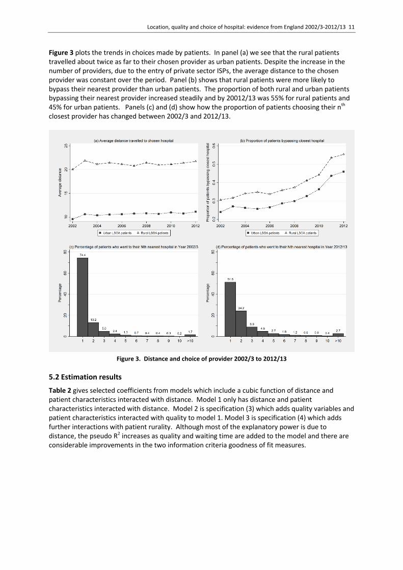
Figure 3 plots the trends in choices made by patients. In panel (a) we see that the rural patients travelled about twice as far to their chosen provider as urban patients. Despite the increase in the number of providers, due to the entry of private sector ISPs, the average distance to the chosen provider was constant over the period. Panel (b) shows that rural patients were more likely to bypass their nearest provider than urban patients. The proportion of both rural and urban patients bypassing their nearest provider increased steadily and by 20012/13 was 55% for rural patients and 45% for urban patients. Panels (c) and (d) show how the proportion of patients choosing their nth closest provider has changed between 2002/3 and 2012/13.
Figure 3. Distance and choice of provider 2002/3 to 2012/13
5.2 Estimation results
Table 2 gives selected coefficients from models which include a cubic function of distance and patient characteristics interacted with distance. Model 1 only has distance and patient characteristics interacted with distance. Model 2 is specification (3) which adds quality variables and patient characteristics interacted with quality to model 1. Model 3 is specification (4) which adds further interactions with patient rurality. Although most of the explanatory power is due to distance, the pseudo R2 increases as quality and waiting time are added to the model and there are considerable improvements in the two information criteria goodness of fit measures.

12 CHE Research Paper 123
Table 2. Estimates of marginal utilities
(1) distance (2) distance & quality
(3) distance, quality, rurality
urban patients rural interactions
Coef t Coef t Coef t Coef t
distance (baseline) -0.351 -92.048 -0.3675 -92.144 -0.3842
-94.01 0.088 14.19
2003 * distance 0.0697 15.718 0.0786 17.005 0.0755 15.522 -0.0229 -3.149
2004 * distance 0.0256 5.084 0.0279 5.298 0.0334 6.164 -0.02 -2.524
2005 * distance 0.0307 6.416 0.0365 7.33 0.0097 1.762 0.0487 6
2006 * distance 0.0232 4.712 0.0339 6.671 0.0419 8.109 -0.0204 -2.743
2007 * distance 0.0417 8.467 0.0467 9.091 0.0428 7.957 0.0115 1.387
2008 * distance 0.0641 13.617 0.0714 14.617 0.0668 12.819 -0.0012 -0.152
2009 * distance 0.0609 12.886 0.0694 14.148 0.0681 13.484 -0.0162 -2.185
2010 * distance 0.0688 14.708 0.0771 15.842 0.0697 13.594 0.0036 0.46
2011 * distance 0.0742 16.31 0.0841 17.79 0.0729 14.318 0.0045 0.592
2012 * distance 0.0706 15.453 0.0806 16.943 0.0775 15.432 -0.0103 -1.343
readmissions (baseline)
0.0502 10.487 0.0468 8.849 0.0127 1.498
2003 * readmissions -0.063 -8.968 -0.0831
-10.677
0.0655 5.267
2004 * readmissions -0.0425 -5.852 -0.0502
-6.226 0.0115 0.91
2005 * readmissions -0.0519 -8.103 -0.0453
-6.396 -0.0217 -1.879
2006 * readmissions -0.0363 -5.472 -0.0328
-4.45 -0.0173 -1.482
2007 * readmissions -0.0962 -15.237 -0.1137
-16.16 0.056 5.047
2008 * readmissions -0.0709 -11.731 -0.0705
-10.471
-0.0042 -0.388
2009 * readmissions -0.0761 -12.154 -0.0868
-12.473
0.0296 2.686
2010 * readmissions -0.125 -19.998 -0.1211
-17.443
-0.0196 -1.765
2011 * readmissions -0.1185 -19.507 -0.1316
-19.436
0.0403 3.78
2012 * readmissions -0.107 -17.742 -0.1089
-16.258
0.0046 0.438
waiting times (baseline)
0.0014 0.266 -0.0112
-1.943 0.0592 6.278
2003 * waiting times -0.0145 -2.027 -0.0153
-1.983 0.0019 0.148
2004 * waiting times -0.0086 -1.027 -0.0143
-1.586 0.0183 1.201
2005 * waiting times 0.0626 6.595 0.0564 5.424 0.0222 1.327
2006 * waiting times 0.1172 10.837 0.1152 9.683 0.0057 0.302
2007 * waiting times 0.0632 5.411 0.0572 4.348 0.0131 0.658
2008 * waiting times -0.046 -4.757 -0.0369
-3.364 -0.0462 -2.841
2009 * waiting times -0.0177 -1.341 -0.0234
-1.56 0.0079 0.359
2010 * waiting times 0.002 0.206 0.0284 2.63 -0.1058 -6.384
2011 * waiting times -0.0522 -4.013 -0.0319
-2.214 -0.0842 -3.692

Location, quality and choice of hospital: evidence from England 2002/3-2012/13 13
2012 * waiting times -0.0239 -2.122 -0.0105
-0.84 -0.0567 -2.857
revisions (baseline) -0.0817 -6.628 -0.0797
-6.021 -0.043 -1.877
2003 * revisions 0.1732 10.776 0.155 8.929 0.0825 2.735
2004 * revisions 0.0143 0.964 -0.0196
-1.226 0.186 6.627
2005 * revisions 0.0707 4.704 0.0514 3.142 0.1113 4.002
2006 * revisions 0.084 5.624 0.0581 3.604 0.1288 4.556
2007 * revisions 0.1288 7.825 0.117 6.523 0.0837 2.795
2008 * revisions 0.0233 1.485 -0.007 -0.411 0.1311 4.55
2009 * revisions 0.0544 3.156 -0.0041
-0.215 0.2373 7.556
2010 * revisions 0.027 1.55 0.0002 0.01 0.1498 4.66
2011 * revisions 0.1412 9.065 0.1389 8.166 0.0508 1.791
2012 * revisions 0.0982 6.178 0.0802 4.618 0.1004 3.478
mortality (baseline) -0.1335 -5.186 -0.1096
-3.912 -0.1079 -2.311
2003 * deaths 0.02 0.593 0.0517 1.414 -0.1524 -2.423
2004 * deaths -0.0176 -0.519 -0.0472
-1.277 0.1429 2.278
2005 * deaths -0.1901 -5.2 -0.2264
-5.661 0.1137 1.705
2006 * deaths -0.077 -2.155 -0.2445
-6.183 0.6332 9.896
2007 * deaths -0.1876 -5.13 -0.1808
-4.508 0.0013 0.02
2008 * deaths -0.2923 -7.272 -0.3122
-7.1 0.1195 1.6
2009 * deaths -0.0085 -0.223 -0.0525
-1.245 0.173 2.527
2010 * deaths 0.2848 7.745 0.2555 6.298 0.1203 1.8
2011 * deaths 0.0705 1.688 0.1117 2.438 -0.1506 -1.981
2012 * deaths -0.0098 -0.207 0.157 2.963 -0.491 -5.925
Pseudo R^2 0.6583 0.6746 0.6759
AIC 1270578 1210694 1205984
BIC 1273471 1218088 1214503 Notes. All models also contain distance squared, distance cubed, interactions of patient characteristics with distance, distance squared, distance cubed, all interacted with year. Models 2 and 3 also contain average quality of provider type and interactions of patient characteristics with quality, all interacted with year.
5.3 Marginal utility and willingness to travel
Unsurprisingly the marginal utility of distance is negative but less so as distance increases. Figure 4
plots marginal utility of distance against distance (2
1 2 32 3d d d
t t d t d ) for 2004/5 and 2008/9 for
all patients, urban patients and rural patients where d is the mean distance to the chosen provider for the relevant patient type over all years. Figure 5 has the estimated marginal utilities of distance in each year for all patients, urban patients and rural patients.

14 CHE Research Paper 123
Figure 4. Marginal utilities of distance in 2004/5 and 2008/9.
Note. Marginal utility of distance is 2
1 2 32 3d d d
t t d t d where d is the mean distance to chosen provider for each
patient type over all years and the coefficients on the powers of distance are for the representative patient with average personal characteristics. Coefficients for all patients are from model (2) and for rural and urban patients from model (3). Vertical lines show the average distance to the chosen provider for: all patients (solid); urban (short dashed); rural (long dashed).
The coefficients on distance and quality measures are for the representative patient with average characteristics.12 Figure 5 plots these coefficients of the marginal utilities of distance for different years and shows that rural patients have a smaller marginal disutility of distance than urban patients and that marginal disutility did not change greatly over the period.
12
We do not have space to show the interactions of quality and distance with patient characteristics, but we find that older and sicker patients have more negative marginal utility from distance, and distance has less negative marginal utility for more deprived patients. Moreover, gender had little effect on preferences for quality and, more surprisingly, nor does morbidity.

Location, quality and choice of hospital: evidence from England 2002/3-2012/13 15
Figure 5. Trends in marginal utility of distance
Note. Marginal utility of distance is 2
1 2 32 3d d d
t t d t d where d is the mean distance to chosen provider for each
patient type over all years and the coefficients on the powers of distance are for the representative patient with average personal characteristics. Coefficients for all patients are from model (2) and for rural and urban patients from model (3).
Figure 6 shows the estimated marginal rates of substitution (5) between distance and the quality measures (WTT). Given the temporal stability of the marginal utilities of distance, variations over time in WTT are mainly due to changes in the marginal utilities of quality and waiting times. The plotted WTT are the change (reduction) in distance required to compensate for a one standard deviation in increase in emergency readmission rates, revision rates, mortality rates, and waiting times. Since emergency readmissions either had a positive or zero marginal utility up to 2006 but had an increasingly negative marginal utility thereafter, the emergency readmissions rate WTT was initially around zero but increased from 2007/8 onwards. The mortality rate WTT grew up to 2008/9 and then decreased. Up to 2004/5 waiting times had a small negative marginal disutility. From 2005/6 to 2007/8 patients became more likely to choose hospitals with longer waiting times, and thereafter they were less likely to choose hospitals with longer waits. There was no consistent trend in the estimated marginal utilities and hence WTT for revision rates. Instead, they do not seem to consistently respond to one-year revision rates.

16 CHE Research Paper 123
Figure 6. Willingness to travel (WTT) for one standard deviation increase in quality and waiting time
The results suggest the effect of readmission rates, mortality, and waiting times changed after the relaxation of constraints on patient choice in 2006 and 2008. From 2008 patients were willing to travel 0.5 additional kilometres to avoid an increase of one standard deviation in emergency readmissions and 0.25 additional kilometres to avoid an increase of one standard deviation in waiting times.
5.4 WTT of urban and rural patients
The WTT for urban and rural patients are shown in Figure 7. Rural patients have a smaller marginal disutility from distance than urban patients. The marginal disutility for mortality is similar for urban and rural patients in most years up to 2011/12 except for 2006/7. Up to 2008/9 rural patients had a positive marginal utility for waiting time. Urban patients dislike 1-year revisions in most years while this is not the case for rural patients. Urban patients dislike emergency readmissions more than rural patients in most of the recent years.

Location, quality and choice of hospital: evidence from England 2002/3-2012/13 17
Figure 7. Willingness to travel for a standard deviation increase in quality for urban and rural patients
There are no systematic differences in the WTT for waiting times after 2008/9. There are also no systematic differences in WTT to avoid higher mortality except for the more recent years. In the last year (2012/13) rural patients are willing to travel 1 kilometre more than urban patients to avoid a one standard deviation increase in elective hip replacement mortality rates. Despite the higher disutility from travelling, urban patients are willing to travel further (up to 1 km in 2009) than rural ones to avoid increases in revisions after surgery. There are similar differences in all the years, except for 2002/3. The marginal utility for readmission rates was positive for rural patients in the pre-choice years before 2005. Similarly, the marginal utility for waiting times was positive for rural patients before 2007. It is unlikely that patients prefer high emergency readmissions or long waits. We interpret these counterintuitive results as evidence that hospital choice was constrained, i.e. patients were effectively allocated to hospitals, and that rural patients were the most penalized by such constraints to hospital choice.
5.5 Hospitals’ demand elasticity to quality
Table 3 reports the elasticity of demand with respect to own quality (6) for each year averaged across all hospitals. Although demand responds to quality after the introduction of choice policy, it was relatively inelastic. In years after 2008 the mean demand elasticity with respect to emergency
readmissions is 0.17 and with respect to waiting time it is 0.04. Demand also responds to mortality rates, though less so in later years, and across the whole period the demand elasticity is
0.03.

18 CHE Research Paper 123
Table 3. Average hospital demand elasticities with respect to own quality by year
Year Readmissions Mean waiting time Revisions Mortality
2002 0.124 0.005 -0.06 -0.027
2003 -0.037 -0.051 0.077 -0.026
2004 0.022 -0.023 -0.067 -0.033
2005 -0.005 0.179 -0.01 -0.06
2006 0.044 0.295 0.002 -0.043
2007 -0.156 0.148 0.035 -0.043
2008 -0.066 -0.086 -0.039 -0.057
2009 -0.082 -0.023 -0.016 -0.017
2010 -0.254 0.005 -0.029 0.02
2011 -0.23 -0.078 0.034 -0.005
2012 -0.201 -0.038 0.009 -0.009 Note. Elasticities are computed from model (2).
5.6 Semi-elasticities and number of rival hospitals
Figure 7 plots the percentage change in demand for each hospital resulting from 1 SD increases in readmission, mortality and revision rates, and waiting times (semi-elasticity (7)) against the number of competing hospitals within 30 km radius of each provider. It shows the extent to which hospitals facing more competitors have a more elastic demand. We compare two years, 2004/5 and 2008/09, before and after relaxation of constraints on choice. Figure 8(a) shows that in 2004/5 semi-elasticities with respect to emergency readmissions were positive (on average equal to 0.8%). The correlation between semi-elasticity of demand and number of rival hospitals was positive and significant (at 5%). In contrast, in 2008/9 the semi-elasticities with respect to emergency readmissions were negative (on average equal to -2.5%, varying between -0.35% and -4.8%) and negatively correlated with the number of rival hospitals. This suggests that after the introduction of choice, hospital demand responded to quality and the percentage demand change was larger for hospitals facing more potential competitors. The effect of additional rivals
seems modest. In 2008/9, a hospital with 5 rivals had a predicted semi-elasticity of 2%, whereas a
hospital with twice as many rivals (10 rivals) has a predicted semi-elasticity of 2.44%. Figure 8(b) shows in 2004/5 semi-elasticities with respect to waiting times are negative but small (on average -0.87%). In 2008/9, the semi-elasticities with respect to waiting times are greater absolutely (on average equal to -6%, and varying between -0.84% and -11.4%), and negatively correlated with the number of rivals hospitals. In 2008/9 one additional rival increases absolutely the semi-elasticity of demand by almost a fifth. The patterns of semi-elasticities with respect to mortality in Figure 8(d) are qualitatively similar to those for waiting times. In 2004/5 they are negative but small. In 2008/9, the semi-elasticities with respect to mortality vary between -1.18% and -16% and additional rivals lead to a bigger change in the semi-elasticity. The semi-elasticities with respect to revisions are negatively associated with the number of rivals (Figure 8(c)) but with a similar pattern in 2004/5 and 2008/9 (Full results are presented in Table A1 in the Appendix).

Location, quality and choice of hospital: evidence from England 2002/3-2012/13 19
Figure 8. Percentage demand change from a standard deviation increase in own quality and number of rivals

20 CHE Research Paper 123
6. Conclusions
We have investigated changes in the responsiveness of demand to quality following the introduction of the new internal market from 2002/3 onwards and in particular the relaxation of constraints on patient choice from 2006 onwards. Consistently with previous literature we find that distance is the main predictor of hospital choice. Before 2006 demand was sometimes higher for providers with worse quality or longer waiting times – a finding we interpret as suggesting that patient choices were indeed constrained. After 2006 these patterns disappear and we find that patients preferred, on average, providers with lower waiting times, emergency readmissions rates, and mortality rates. Although hospitals with higher quality, ceteris paribus, attract more patients, the estimated demand elasticities are generally 0.2 or less. With an average NHS tariff for hip replacement in 2012/13 of £5866 this implies that, for example, a reduction in the emergency readmission rate of one standard deviation would increase the number of hip replacement patients in an average provider by 24.4, yielding a revenue increase £143,000. However, additional patients impose additional costs and increasing quality by one standard deviation will also be costly. Hospital demand is more responsive to quality for providers facing more rivals. Although the result is intuitive, the increase in responsiveness seems quite small. For example in 2012/13, hospitals with ten additional rivals have demand semi-elasticity with respect to readmission rates by which are more negative by -1.2%. Compared with urban patients, rural patients do not seem to have very different preferences with respect to quality, except for revision rates (and readmission rates in recent years), which are generally found to be disliked more by urban than by rural patients. In contrast, rural patients are less averse to distances and travel further to their chosen provider. Although marginal disutility from travel is lower, the total disutility of travel is higher for rural patients. There seems to be scope for choice policies to be further refined and to stimulate patients to choose providers based on quality. Surveys of patients suggest that only around 2/3rd are aware of their right to a choice and that around 50% report being offered a choice (Dixon, 2010). There may be required policies which encourage further dissemination and use of information on quality. Other possibilities include subsidising travel expenses for patients bypassing local hospitals, as in Norway (Askildsen et al, 2013). The cost of interventions aimed at further stimulating competition need however to be traded-off with the opportunity cost of introducing alternative policies aimed at improving quality, such as monitoring and auditing, and pay-for-performance schemes.

Location, quality and choice of hospital: evidence from England 2002/3-2012/13 21
References
Adams, E. K., Houchens, R., Wright, G. E., & Robbins, J. (1991). Predicting hospital choice for rural Medicare beneficiaries: the role of severity of illness. Health Services Research, 26(5), 583. Appleby, J., et al. (2005). Sustaining reductions in waiting times: identifying successful strategies. Kings Fund, Working Paper, January. Askildsen, J., Iversen, T., Kaarboe, O., (2013). Norway, chapter 12. In: Siciliani, L., Borowitz, M., Moran, V., Waiting time policies in the health sector. What works? OECD Health Policy Studies. Baldwin, L. M., MacLehose, R. F., Hart, L. G., Beaver, S. K., Every, N., & Chan, L. (2004). Quality of care for acute myocardial infarction in rural and urban US hospitals. The Journal of Rural Health, 20(2), 99-108. Balla, U., Malnick, S., and Schattner, A. (2008). Early readmissions to the department of medicine as a screening tool for monitoring quality of care problems. Medicine, 87(5), 294-300. Beckert, W., Christensen, M. and Collyer, K. (2012). ‘Choice of NHS-funded hospital services in England’, Economic Journal, 122, 400-417. Besley, T. and M. Ghatak (2003). ‘Incentives, Choice, and Accountability in the Provision of Public Services’. Oxford Review of Economic Policy 19 (2), 235–249. Beukers, P. D., Kemp, R. G., and Varkevisser, M. (2014). Patient hospital choice for hip replacement: empirical evidence from the Netherlands. European Journal of Health Economics, 15(9), 927-936. Billings, J., Blunt, I., Steventon, A., Georghiou, T., Lewis, G., and Bardsley, M. (2012). Development of a predictive model to identify inpatients at risk of re-admission within 30 days of discharge (PARR-30). BMJ Open, 2(4). Blunt, I., Bardsley, M., Grove, A., and Clarke, A. (2014). Classifying emergency 30-day readmissions in England using routine hospital data 2004–2010: what is the scope for reduction?. Emergency Medicine Journal, emermed-2013. Brekke, K., Gravelle, H., Siciliani, L., Straume, O.R., (2014). Patient choice, mobility and competition among health care providers. In Montefiori, M., Levaggi, R. (eds.), Health Care Provision and Patient Mobility, Springer, 2014. Department of Health (2008). Guidance on the routine collection of Patient Reported Outcome Measures (PROMs). The Stationary Office, London. Dixon, S. (2010). Report on the National Patient Choice Survey. Department of Health. https://www.gov.uk/government/uploads/system/uploads/attachment_data/file/216073/dh_117096.pdf. Last accessed 12 June 2015. Dusheiko, M., Goddard, M., Gravelle, H., & Jacobs, R. (2008). Explaining trends in concentration of healthcare commissioning in the English NHS. Health Economics, 17(8), 907-926. Dusheiko, M., Gravelle, H. (2015). Choosing and booking – and attending? Impact of an electronic booking system on outpatient referrals and non-attendances. CHE RP 116

22 CHE Research Paper 123
Farrar, S., et al, (2009). Has payment by results affected the way that English hospitals provide care? Difference-in-differences analysis, British Medical Journal, 339 b3047. Ferrier, G. D., & Valdmanis, V. (1996). Rural hospital performance and its correlates. Journal of Productivity Analysis, 7(1), 63-80. Gaynor, M. (2006). What Do We Know About Competition and Quality in Health Care Markets? (No. w12301). National Bureau of Economic Research. Gaynor, M., H. Seider and W. Vogt (2005). ‘The Volume-Outcome Effect, Scale Economies, and Learning by Doing’. American Economic Review 95 (2), 243–247. Gaynor, M., C. Propper and S. Seiler (2012). Free to Choose? Reform and Demand Response in the English National Health Service. Working Paper 18574. National Bureau of Economic Research. Goody, B. (1993). Defining rural hospital markets. Health Services Research, 28(2), 183. Gutacker, N., Siciliani, L., Moscelli, G. and Gravelle, H. (2015). Do patients choose hospitals that improve their health? CHE Research Paper 111. Hawkes, N., (2012). Private hospitals look to NHS for elective operations as private medical insurance falls, British Medical Journal, 345. Health & Social Care Information Centre (2013a). Emergency readmissions to hospital within 28 days of discharge: primary hip replacement surgery. Compendium of Population Health Indicators. Accessed on 02/06/2015. URL: https://indicators.ic.nhs.uk/download/NCHOD/Specification/Spec_33D_533ISP4CPP1_12_V1.pdf. Hole, A. (2007). A comparison of approaches to estimating confidence intervals for willingness to pay measures, Health Economics, 16, 827-840. Judge, A., J. Chard, I. Learmonth, Dieppe, P. 2006. The effects of surgical volumes and training centre status on outcomes following total joint replacement: analysis of the Hospital Episode Statistics for England. Journal of Public Health 28 (2), 116-124. Luft, H.S., Hunt, S.S. and Maerki, S.C., 1987. The volume-outcome relationship: practice-makes-perfect or selective-referral patterns?. Health services research, 22(2), 157. McFadden, D. (1974). Conditional logit analysis of qualitative choice behaviour. In: Frontiers in Economics. Ed. by P. Zarembka. Vol. 4. New York: Academic Press, 105–142. ONS (2004). Rural and Urban Statistics Guidance Notes. Report. Office for National Statistics. Accessed on 28/05/2015. URL: http://www.ons.gov.uk/ons/guide-method/geography/products/area-classifications/rural-urban-definition-and-la/rural-and-urban-statistics-guidance-notes.pdf. Oudhoff, J., et al. (2007). Waiting for elective general surgery: impact on health related quality of life and psychosocial consequences. BMC Public Health, 7(1), 164. Roh, C. Y., Lee, K. H., and Fottler, M. D. (2008). Determinants of hospital choice of rural hospital patients: the impact of networks, service scopes, and market competition. Journal of Medical Systems, 32(4), 343-353.

Location, quality and choice of hospital: evidence from England 2002/3-2012/13 23
Ruwaard, S., and Douven, R. (2014). Quality and hospital choice for cataract treatments: the winner takes most (No. 272). CPB Netherlands Bureau for Economic Policy Analysis. Santos, R., Gravelle, H. and Propper, C., 2015. Does quality affect patients’ choice of Doctor? Evidence from England. The Economic Journal. Sivey, P. (2012). The effect of waiting time and distance on hospital choice for English cataract patients. Health Economics 21, 444–456. Tai, W.-T. C., Porell, F. W., & Adams, E. K. (2004). Hospital Choice of Rural Medicare Beneficiaries: Patient, Hospital Attributes, and the Patient–Physician Relationship. Health Services Research, 39 1903–1922. doi:10.1111/j.1475-6773.2004.00324.x Train, K. E. (2003). Discrete Choice Methods with Simulation. 1st ed. Cambridge: Cambridge University Press. Varagunam, M., A. Hutchings, Black, N. (2015). Relationship between patient-reported outcomes of elective surgery and hospital and consultant volume. Medical Care 53 (4), 310-316. Varkevisser, M. and van der Geest, S.A. (2007). Why do patients bypass the nearest hospital? An empirical analysis for orthopaedic care and neurosurgery in the Netherlands. The European Journal of Health Economics, 8(3), 287-295. Varkevisser, M., S. A. Geest and F. T. Schut (2012). Do patients choose hospitals with high quality ratings? Empirical evidence from the market for angioplasty in the Netherlands. Journal of Health Economics 31 (2), 371–378. Vrangbaek, K., R. Robertson, U. Winblad, H. Van de Bovenkamp and A. Dixon (2012). Choice policies in Northern European health systems. Health Economics, Policy and Law 7 (S1), 47–71. Weissman, J. S., Ayanian, J. Z., Chasan-Taber, S., Sherwood, M. J., Roth, C., and Epstein, A. M. (1999). Hospital readmissions and quality of care. Medical Care, 37(5), 490-501.

24 CHE Research Paper 123
Appendix A
Table A1. Linear regression of hospital semi-elasticities estimates (from Eq. 7) on number of rival hospitals within 30km.
Quality measure Year OLS Coefficient 95% C.I. Bounds
Readmissions 2002 0.2394 [0.2209, 0.2578]
Readmissions 2003 -0.0609 [-0.0657, -0.0560]
Readmissions 2004 0.0338 [0.0302, 0.0373]
Readmissions 2005 -0.0075 [-0.0083, -0.0067]
Readmissions 2006 0.0625 [0.0569, 0.0681]
Readmissions 2007 -0.1883 [-0.2057, -0.1709]
Readmissions 2008 -0.0869 [-0.0936, -0.0802]
Readmissions 2009 -0.0864 [-0.0962, -0.0765]
Readmissions 2010 -0.2087 [-0.2335, -0.1838]
Readmissions 2011 -0.1424 [-0.1658, -0.1190]
Readmissions 2012 -0.1228 [-0.1461, -0.0995]
Waiting Times 2002 0.0075 [0.0069, 0.0081]
Waiting Times 2003 -0.0687 [-0.0742, -0.0632]
Waiting Times 2004 -0.0349 [-0.0386, -0.0313]
Waiting Times 2005 0.3083 [0.2755, 0.3411]
Waiting Times 2006 0.5947 [0.5415, 0.6479]
Waiting Times 2007 0.2934 [0.2663, 0.3205]
Waiting Times 2008 -0.2072 [-0.2231, -0.1912]
Waiting Times 2009 -0.0601 [-0.0670, -0.0533]
Waiting Times 2010 0.0107 [0.0094, 0.0120]
Waiting Times 2011 -0.1174 [-0.1368, -0.0981]
Waiting Times 2012 -0.0540 [-0.0642, -0.0437]
Revisions 2002 -0.1705 [-0.1837, -0.1573]
Revisions 2003 0.1896 [0.1745, 0.2047]
Revisions 2004 -0.1295 [-0.1432, -0.1159]
Revisions 2005 -0.0207 [-0.0229, -0.0185]
Revisions 2006 0.0046 [0.0042, 0.0051]
Revisions 2007 0.0844 [0.0766, 0.0922]
Revisions 2008 -0.1069 [-0.1152, -0.0987]
Revisions 2009 -0.0397 [-0.0443, -0.0352]
Revisions 2010 -0.0667 [-0.0747, -0.0588]
Revisions 2011 0.0543 [0.0453, 0.0632]
Revisions 2012 0.0156 [0.0127, 0.0186]
Mortality 2002 -0.1041 [-0.1121, -0.0960]
Mortality 2003 -0.0878 [-0.0948, -0.0808]
Mortality 2004 -0.1085 [-0.1199, -0.0971]
Mortality 2005 -0.2293 [-0.2537, -0.2049]
Mortality 2006 -0.1553 [-0.1692, -0.1414]
Mortality 2007 -0.2146 [-0.2345, -0.1948]
Mortality 2008 -0.2914 [-0.3138, -0.2689]
Mortality 2009 -0.0773 [-0.0861, -0.0685]
Mortality 2010 0.0690 [0.0608, 0.0772]
Mortality 2011 -0.0214 [-0.0250, -0.0179]
Mortality 2012 -0.0506 [-0.0602, -0.0410]

Location, quality and choice of hospital: evidence from England 2002/3-2012/13 25
Figure A1. Marginal utilities of quality, waiting time and distance
Figure A2. Marginal utilities of quality, waiting time and distance for urban and rural patients