lesson 3 notes - storage.googleapis.com · exploratory data analysis lesson 3 notes explore one...
TRANSCRIPT

Exploratory Data Analysis
Lesson 3 Notes
Explore One Variable
Welcome!
Welcome to lesson three. In this lesson, we'll learn how to investigate a single variable within a data set. You'll learn about visualizations like the box plot and the histogram and you'll learn the R syntax to create them. But, before we do that, let's hear from Dean about how he approaches looking at data.
What to Do First
Exploratory data analysis is an opportunity to let the data surprise you. Think back to the goals of your investigation. What question are you trying to answer? That question might be relatively simple or one dimensional like the comparison of two groups on a single outcome variable that you care about. Even in such a case, exploratory data analysis is an opportunity to learn about surprises in the data. Features of the data that might lead to unexpected results. It can also be an opportunity to learn about other interesting things that are going on in your data. What should you do first? Well certainly you want to understand the variables that are most central to your analysis, often, this is going to take the form of producing summaries and visualizations of those individual variables.
Pseudo-Facebook User Data
Thanks Dean. Throughout this lesson and others, Dean will give us more advice and discuss the big picture when doing EDA. For now, let's start by loading up some data. You can find a data file in the instructor notes. This data file contains all the Facebook data that we're going to be looking at. To load up the data, let's first make sure that we're in the right directory. Here is my current directory and I can see that I'm in a folder that has the data sets. I can use the list.files command to figure out what that files are within this directory and here is the data set that I want.
Copyright © 2014 Udacity, Inc. All Rights Reserved.
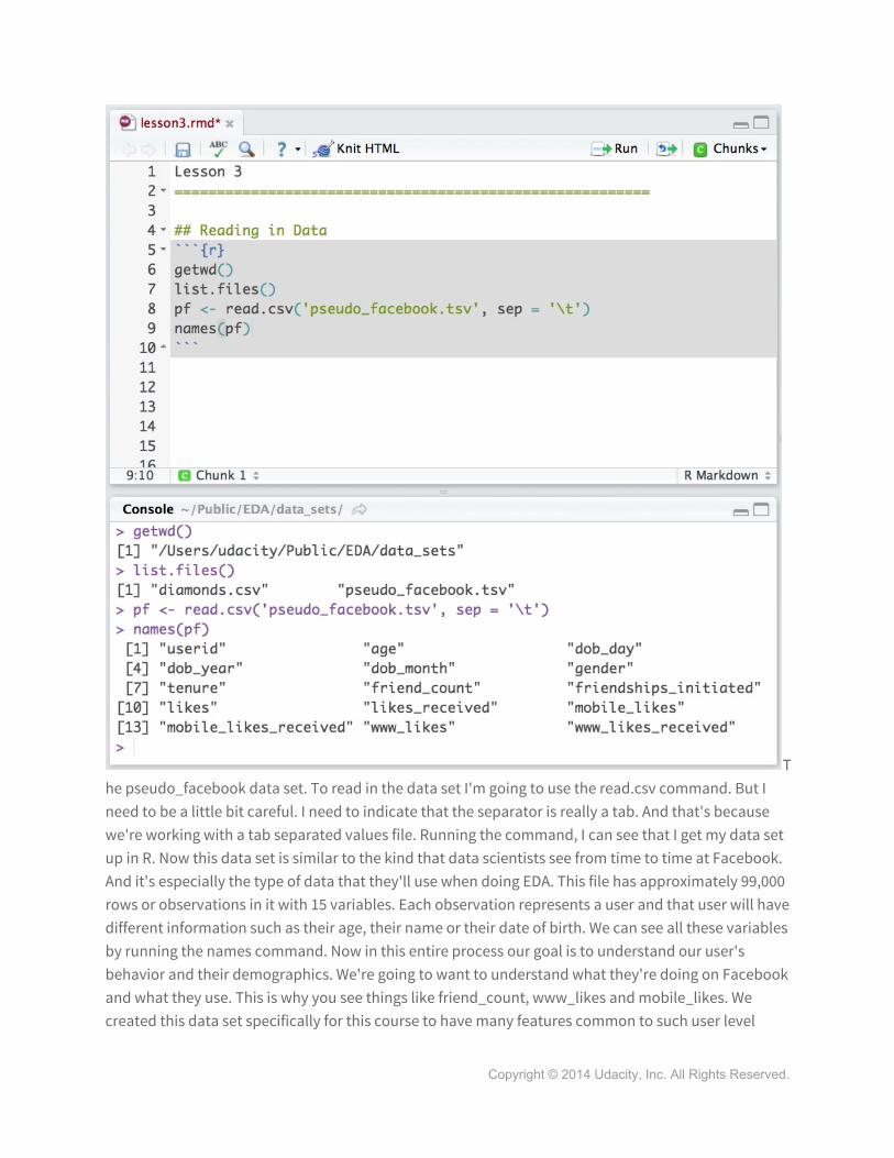
The pseudo_facebook data set. To read in the data set I'm going to use the read.csv command. But I need to be a little bit careful. I need to indicate that the separator is really a tab. And that's because we're working with a tab separated values file. Running the command, I can see that I get my data set up in R. Now this data set is similar to the kind that data scientists see from time to time at Facebook. And it's especially the type of data that they'll use when doing EDA. This file has approximately 99,000 rows or observations in it with 15 variables. Each observation represents a user and that user will have different information such as their age, their name or their date of birth. We can see all these variables by running the names command. Now in this entire process our goal is to understand our user's behavior and their demographics. We're going to want to understand what they're doing on Facebook and what they use. This is why you see things like friend_count, www_likes and mobile_likes. We created this data set specifically for this course to have many features common to such user level
Copyright © 2014 Udacity, Inc. All Rights Reserved.

behavioral and demographic data. But I need to say that this data isn't actual Facebook data. So not all statistics in this data set are going to be accurate representations of how people use Facebook on a day to day basis. So our lawyers want me to make the disclaimer that this isn't actual data from Facebook users. But we did use a complex model to generate it, and I think we can learn some very interesting things about it.
Programming Quiz: Histogram of Users Birthdays
Let's start by looking at birthdays using ggplot. Ggplot is a graphics package that allows us to make visualizations. We're using ggplot since it's easier than the base graphics that comes with R. It has some nice features, such as the format of plots and legends that are automatically generated. The first thing we need to do is to download and install the ggplot library. Now that we have got the ggplot loaded, let's use the qplot function to plot a histogram showing the number of users whose birthdays fall on any given day. I can run their name pf command to get an output of all my variables. Now, I'm trying to create the date of birth by day histogram for all my users. So, I'm going to use the date of birth day variable, here. For the qplot function, I'll pass it two parameters, x and data. X is going to take the variable of data birthday, and data's going to take the variable pf, which is where all my data comes from, from the pseudo Facebook dataset. Running this command, I see my histogram come out in a plot window below.
Now, you might notice that this plot is slightly different in color. If you're curious about setting color and themes in R, see the instructor notes. Getting back our code in console, you can see that we get this warning message, when we ran the code. This is fine for now but, you should think about what this warning message means. So, here's our histogram so far but, I want to add one more layer to this
Copyright © 2014 Udacity, Inc. All Rights Reserved.

plot. Let's fix the label on the x axis, so we can see every day of the month here. So to adjust the x axis, I'm going to add a + sign right after my code and then hit Return. This immediately takes me down the next line with a little bit of indentation right here. I'm going to add the layer scale x discreet and then give it the parameter breaks from 1 to 31. This is because I want all my days to be 1 to 31, the days of the month. And running this code, we can see we've done a little bit better. What are some things that you notice about this histogram?
Answer:
Here're some things that I noticed. On the first day of the month I see this huge bin of almost 8,000 people. This seems really unusual since I would expect most people to have the same number of birthday's across every day of the month. Now this would be true of course except for the 31st. Not all months have 31 days so the lower number of people in this bin makes a lot of sense.
Moiras Investigation
As you continue learning about EDA in the next lessons, you'll get to hear from Moira. Moira's done some exciting work at Facebook and she'll be sharing one of her projects with you. Let's hear from her.
So one of the things that I've been looking at lately is whether people's perception of their audience on Facebook matches up to the reality. Who's actually seeing the content that they're sharing. Because who you
think is in your audience really affects how you present yourself. So to investigate this problem, I worked with Michael Bernstein, Brian Carr, and Eytan Bakshy. And together we ran a survey where we pointed people to a post that they'd made in the last couple of weeks, and we said, how many people do you think saw this post? And then we took their responses to that question and we actually counted how many people had viewed that post for about a second at least and we found that there was a pretty big mismatch between people's perceived audience size and their actual audience size.
Programming Quiz: Estimating Your Audience Size
Moira just described the investigation where she estimated people's audience size. I want you to think about a time when you posted a specific message or shared a photo on Facebook. What was that message, and how many of your friends do you think actually saw that exact post? And finally, what percent of your friends do you think saw the post? The results of Moria's investigation will be revealed a little bit later in the course. But just so you know, there's no right or wrong answers for these. Keep your guesses in mind, and then you can compare them to the results that Moira found in her study. Write about your message or your post here and then enter two numbers here and here. And there's
Copyright © 2014 Udacity, Inc. All Rights Reserved.

no need to include a percent sign.
Perceived Audience Size
What we found, was that people dramatically underestimated the size of their audience. Typically, they guessed that their audience was about a quarter of the size that it actually was. When I first approached this problem, I, plotted a bunch of histograms. I wanted to know how many people do people think are in their audience. So, the first thing I did was, you know, I opened up R, and in ggplot, I plotted a histogram of people's guesses.
Programming Quiz: Faceting
Cool. It looks like Moira got started the same way as us when we investigated birthdays. Lets make more sense of our data, especially for this bin of people born on the first. We can break this histogram into twelve histograms, one for each month of the year. The code would look like this. First, I'm going to add a layer and that layer is going to be called facet wrap. Facet wrap takes a formula where we have a tilde, and then we're going to use the variable that we're going to split our data over. In this case, DOB month. We have the number of columns set equal to three. And then we can run this code and see the output. So notice, we took our one histogram and split it into 12 histograms. Since we set ncol as the number of columns equals to three, we can see the three columns in our one plot. Now, this one stands for January. This two would be for February, and so on. And if I wanted to, I could have used ncol equals four. It would have just given me a slightly different plot with four columns. Before we keep coding anymore, I want to focus on this facet wrap. And specifically, this formula right here. in general, facet wrap takes in a formula inside of its parentheses. The formula contains a tilde sign followed by the name of the variable that you want to facet over. This allows you to create the same type of plot for each level of your categorical variable. In our case, we wanted to make histograms of dob day, one for each month of the year. A similar layer to facet wrap is facet grid. Facet grid also takes a formula, but it's in a little bit
Copyright © 2014 Udacity, Inc. All Rights Reserved.

d ifferent form.
It's formula contains variables that we want to split over in the vertical direction, followed by a tilde sign, and then the name of the variables we want to split in the horizontal direction. In general, where you place the variables can change how the graph is laid out, and the orientation of them. Now, facet grid is generally more useful to use when you're passing over two or more variables. If it's just one I would use facet wrap. You can learn more about facet wrap, facet grid, and how to format plots by following the link in the instructor notes.
Copyright © 2014 Udacity, Inc. All Rights Reserved.
Answer:
Now, you may have noticed some peaks in May or perhaps in October, but I think what's really interesting is this huge spike on January first. There's almost 4,000 users in this bin. Now, this could be because of the default settings that Facebook uses or perhaps users are choosing the first choice in the drop down menus. Another idea is that some users may want to protect their privacy and so they just go with January first by default. Whatever the case may be, I think it's important that we make our considerations in the context of our data. We want to look out for these types of anomalies.
Be Skeptical Outliers and Anomalies
People often talk about the importance of detecting and dealing with outliers in your data. But there are many types of outliers and anomalies and how your analysis proceeds should depend on what type you're dealing with. Outliers can have many causes. For example, an outlier might be accurate data about an extreme case. For example, someone represented in your data set might really be tweeting 1,000 times a day. On the other
hand, sometimes outliers, or anomalies represent bad data, or the limitations of your data. For example, what otherwise would be a normal value of a variable might be replaced with an extreme value. Or, in other cases, extreme values might be replaced with a more normal value. For example, in a lot of census data or surveys, income information is top coded. So individuals with very large incomes have their incomes replaced with some other value. Let's get back to Moira's story about perceived audience size, and hear about a particular anomaly that popped up there.
Quiz: Moira’s Outlier
And the first thing you get is this really terrible plot with one big, tall bar. And that's because most people guessed a kind of small number, but at least one person guessed 10 million people saw my post which was not true. The first thing I needed to do was adjust the axes so that I could actually see the bulk of the data. So, I cut this one outlier out. And then, I looked basically at people who guessed a few thousand or, or below. Then, then you get a slightly better histogram by adjusting the axes. And, you can still see that the bulk of the data was in the smaller ranges, but it still was kind of hard to see how large people thought their audiences were.
Moira just explained how she encountered an outlier in her data. And I want you to think about what type of outlier do you think it was. So, try answering this question. Do you think Moira's outlier was an example of bad data about a non-extreme case, bad data about an extreme case, or was it good data about an extreme case? Choose the best answer here.
Copyright © 2014 Udacity, Inc. All Rights Reserved.

[ ] Bad data about a non-extreme case[x] Bad data about an extreme case[ ] good data about an extreme case
Answer:
In this case, the outlier was an example of bad data about an extreme case. The respondent in Moira's study said that they had over 1 million friends. Moira's outlier had a value of 10 million, which isn't possible using Facebook. So that would be an example of bad data in an extreme case since we're at the higher end of people who saw the post. In general, I think it's really important that we think about What type of case or categories that our outliers fall into. This may help us think about how we can adjust for the outliers, or replace them or exclude them for our data, if we want to make those decisions.
Programming Quiz: Friend Count
As Moira mentioned, we may need to adjust our axes to get a better look at the data. Let's see an example of this using our Facebook data set. I want you to create a histogram of friend counts. Try this in "R" and then paste your code in the box. Once you've got your plot, I want you to think about how this plot is similar to Moira's first plot.
Answer:
To create the histogram, we'll pass friend count to x inside of qplot, and we'll pass pf into data. When I run the code, I can get my histogram. Looking at the plot, we can see that the data is squished on the left side of the graph, just like Moira's plot, and this graph extends all the way to the 5000 mark. This is what we call long tail data. And this data can be common for some user-level data. Most users have friend counts under 500, so we get really tall bins on the left. But there are a few users in our dataset with really high values. The higher values are closer to 5,000, which is the maximum number of friends a user can have. Moira was interested in examining the bulk of her data. And, it's the same for us. While, we may want to investigate some observations in this tail, we really want to examine our users with friend counts well below 1,000. All of these people here. To do that, we'll need to learn something else, in order to adjust our code, and our plot.
Limiting the Axes
Copyright © 2014 Udacity, Inc. All Rights Reserved.
To avoid looking at all this long tail data, we can use the xlim parameter inside of qplot. This parameter takes a vector where we have the start position and the ending position of our axes. In our case, we want to examine friend counts less than 1000. Running the code, I can see that I have my plot with friend counts less than 1000. Now there is another way to create the same plot. Here I won't use the xlim parameter. Instead I'm going to add a layer. I use limits instead of xlim as the parameter inside of here since I know this adjustment is already for the x axis. That's why its called scale x continuous. There's also a counterpart for the y axis called scale y continuous. One of the neat concepts of ggplot is that you can build up your plot in layers. We're going to discuss layers later in this lesson, but for now I'm going to keep using the qplot syntax. So far we've learned how to create histograms, how to facet them, and how to adjust our axes. But up until now all of our histograms have had a default setting. We've been getting this error message for a while about the bin width defaulting to a range over 30. It turns out we can set the bin width ourselves to reveal interesting trends in the data. Let's hear what happened during Moira's investigation when she altered the bin width of her histogram.
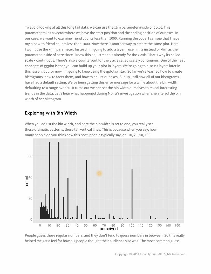
Exploring with Bin Width
When you adjust the bin width, and here the bin width is set to one, you really see these dramatic patterns, these tall vertical lines. This is because when you say, how many people do you think saw this post, people typically say, oh, 10, 20, 50, 100.
People guess these regular numbers, and they don't tend to guess numbers in between. So this really helped me get a feel for how big people thought their audience size was. The most common guess
Copyright © 2014 Udacity, Inc. All Rights Reserved.

was I think 20 with 50 and 100 close behind. In most cases though, this was only about a quarter the size of the actual audience.
Adjusting the Bin Width
Now that we've heard from Moira about the benefits of altering the bin width, let's try it for ourselves. Looking at the histogram we created earlier, we can see that it's skewed. We've just zoomed in on the left side of the graph from the histogram from before. Working from his new histogram, let's add some better labels and some binning. To adjust the bin width, I can pass the bin width parameter to qplot. And for this data, I'm going to choose a value of 25. That seems reasonable since we are going from 0 to 1000. The other thing that I want to do is break up this x axis every say 50 units. To do that, I'm going to pass the breaks parameter to our scale to x scale continuous layer. Breaks is going to take a sequence that has a starting point, an ending point, and a step or the interval space we want on our axis. So in this case, I'm going from zero to a 1000, and I want to step every 50 units. You can learn more about how to manipulate the scale and the breaks on the x or y axis by reading the link in the instructor notes.
When I run the code I can see that I get a completely different histogram. Taking a closer look, it's easy to see that many users have less than 25 friends. These users are probably new. Now let's ask a more interesting question. Which gender group on average has more friends: men or women? To answer this question we need to split this histogram into two parts for males and females. Let's see if you can do that.
Copyright © 2014 Udacity, Inc. All Rights Reserved.

Faceting Friend Count
So, to start answering our question of who has more friends, men or women, on average, let's take our histogram and split it up into two histograms for males and females. We do this by adding a facet wrap as another layer. This time, our facet wrap is going to take a formula where we have the tilde sign and then gender as our splitting variable, and when we run this code as you might find out, we get something quite unexpected. We don't just have two histograms, we have three. One for females, one for males, and one for NA?
Omitting NA Observations
So, we made these three histograms, and let's take a closer look at them. We have one for females, one for males, and one for NA. NA stands for Not Applicable. And the third histogram we just created contains users who are not labeled as male or female. This is how R handles missing values. Missing values take on a value of NA. Let's try creating our histogram for friend counts split by gender one more time. But this time we'll take a subset of our data and ignore the observations where the gender is NA. To do that, I'm going to subset our data. I can use the subset command and use a condition for the second parameter. The first parameter is just the data set. Here, I'm using the is.NA function with a bang (!). This removes any rows that have NA for the gender variable. So if I run this code this time I shouldn't see the NA and fixing a small typo I can see I have my two histograms for females and males. Now I do want to point out there's another way that we could have subset the data. If, instead, I use the na.omit function, I would remove any observations that have NA in them, not necessarily just for gender. You want to be careful when using the na.omit wrapper since we might end up ignoring some users that are labeled as male or female...but, they might have different variables that do have NA values. Say for like friend_count or something else.
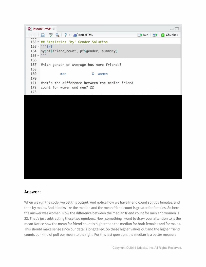
Programming Quiz: Statistics by Gender
Let's take a closer look at these two plots. Now, it might be hard to determine which gender has more friends on average. Remember, that's the question we're investigating. Who has more friends, males or females? So, instead of looking at these histograms, we can use the table command to see if there are more men versus women. When I run that command, I get this output. So, it looks like there's slightly more males than females in our sample. To look at the average friend count by gender, we'll need another new command. This command is the 'by' command. The 'by' command takes three inputs: a variable, a categorical variable, or a list of indices to subset over, and a function. In our case, we want to use the Summary as the function to get basic statistics on our friend count. So, friend count's the variable, gender is our categorical variable, or the variable that contains our segments of users. And, we want a summary of the friend count by gender. Now, I'm not going to run this code, but I want you to run it in R Studio and then answer these next questions.
Copyright © 2014 Udacity, Inc. All Rights Reserved.
Answer:
When we run the code, we get this output. And notice how we have friend count split by females, and then by males. And it looks like the median and the mean friend count is greater for females. So here the answer was women. Now the difference between the median friend count for men and women is 22. That's just subtracting these two numbers. Now, something I want to draw your attention to is the mean Notice how the mean for friend count is higher than the median for both females and for males. This should make sense since our data is long tailed. So these higher values out and the higher friend counts our kind of pull our mean to the right. For this last question, the median is a better measure
Copyright © 2014 Udacity, Inc. All Rights Reserved.

than mean because it's a more robust statistic. A few people with huge friend counts drag the mean upwards which isn't necessarily representative of most users. What's nice is that the median's resistant to change, since it marks the halfway point for all data points. So as long as we trust half of our values, we can report a reliable location of the center of our distribution.
Programming Quiz: Tenure
Let's continue looking at some other variables so we can better understand our users in our sample data set. This time I'm going to examine the distribution of tenure, or how many days someone has been using Facebook. I'm also going to start introducing color to jazz up our plots a little bit. To do that I'm going to use the color and the fill parameter. Now, I'm not going to explain this code in detail. Check out the instructor notes for an explanation of this code. There's also a link to ggplot's themes to learn about all the different adjustments besides color that you can make. Now, if this code has thrown you for a loop, I don't want you to focus on it too much, you can really just ignore it. I'll typically include it as the second line of parameters inside of qplot. Running this code, you can see we get a nice histogram. And again, here the histogram has defaulted to the automatic bin width. I'm going to make one last adjustment and set it for ourselves. By setting the bin width equal to 30, we can see we get a finer view of the distribution. Let's see if you have a handle on histograms and bin width. We're going to see if you can change the distribution in this next programming exercise. In it, you're going to be creating a histogram of tenured that's measured in years, rather than in days. You'll also want to think about an appropriate bin width for the data. 30 here makes sense, since I'm measuring days, and 30 days is about a month.
Copyright © 2014 Udacity, Inc. All Rights Reserved.

Answer:
For this programming exercise, you need to alter the variable tenure, so that way, it was measured in years instead of days. And this should make a lot of sense, since 365 days would be one year, and 730 days would be two years. Now for the bin width, let's set it equal to one so we get a count for yearly users. Running this code, we can see our histogram. And notice here that we have a different color. And I did that by changing the hex code. To get a finer view of our data, we could set the bandwidth equal to .25. It looks like the bulk of our users had had less than two and a half years on Facebook. To improve this plot in one more way, I can change the x axis, so that way it increments by one year. To do that, I can add the layer of scale x continuous, and set the breaks from one to seven. I'm also going to limit our data so that we only see users from zero to seven years. Writing this code, we can see we have a very nice histogram.
Labeling Plots
We haven't talked about this yet, but you do want plots to speak for themselves. If you look back at some of the plots we've created, you'll notice that the labels on the x axis and the y axis are automatically generated. By default, ggplot2 uses the variable names for the labels. That's why we
can see that tenure divided by 365 appears right here. We pass that to x, so that's going to appear in our graph. Now, this might not be the best label for the x axis, so let's change this. To do so, we can use the xlab and ylab parameters. Now, making sure I have a comma after each of these new parameters, I can run this code and see the labels on
their plot. Yeah, that's a lot better. Now, your x-axis might look slightly different from mine, and that's because I added scale-x continuous as a layer, and I made the breaks go from zero to seven. That's what this bit of code does here. Now, when you conduct EDA, your plots don't need to be perfect. I don't want you to stress about formatting, but do focus on making sensible choices for scales and limits on each axis. When you return to your plots and to your code later, labels can function as comments about what the code was intended to do. Likewise, if you were to share a plot with a colleague, labels can make your plots more understandable.
Copyright © 2014 Udacity, Inc. All Rights Reserved.
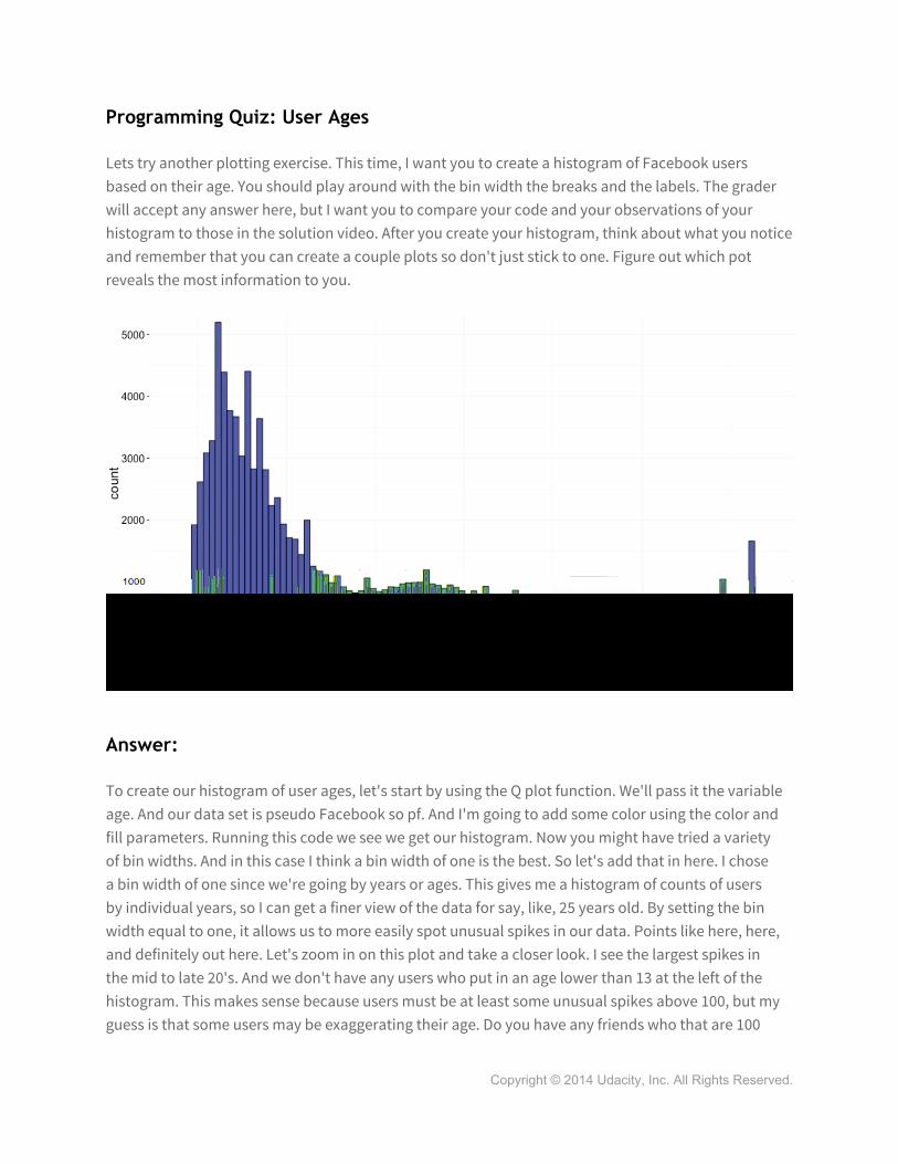
Programming Quiz: User Ages
Lets try another plotting exercise. This time, I want you to create a histogram of Facebook users based on their age. You should play around with the bin width the breaks and the labels. The grader will accept any answer here, but I want you to compare your code and your observations of your histogram to those in the solution video. After you create your histogram, think about what you notice and remember that you can create a couple plots so don't just stick to one. Figure out which pot reveals the most information to you.
Answer:
To create our histogram of user ages, let's start by using the Q plot function. We'll pass it the variable age. And our data set is pseudo Facebook so pf. And I'm going to add some color using the color and fill parameters. Running this code we see we get our histogram. Now you might have tried a variety of bin widths. And in this case I think a bin width of one is the best. So let's add that in here. I chose a bin width of one since we're going by years or ages. This gives me a histogram of counts of users by individual years, so I can get a finer view of the data for say, like, 25 years old. By setting the bin width equal to one, it allows us to more easily spot unusual spikes in our data. Points like here, here, and definitely out here. Let's zoom in on this plot and take a closer look. I see the largest spikes in the mid to late 20's. And we don't have any users who put in an age lower than 13 at the left of the histogram. This makes sense because users must be at least some unusual spikes above 100, but my guess is that some users may be exaggerating their age. Do you have any friends who that are 100
Copyright © 2014 Udacity, Inc. All Rights Reserved.

years or older on Facebook? I know I certainly don't. And one final comment that I want to make is that your x-axis might look slightly different than mine. Remember that we can use scale x discrete or scale x continuous to change this appearance. So I adding scale x discrete here, I can set the breaks so they run from 0 to 113, and then increment every five units, or every five years. Now you might be wondering why I chose 113 here, and I have a simple answer for you. I just used the maximum age in our user data set. Remember I can find that out by running a summary on that variable. So I can see the minimum age is 13, and the maximum age is 113.
The Spread of Memes
Now there are other changes that we can make besides bin width. I spoke to Lada who's a Facebook data scientist and she's been studying memes. Let's hear from her about how she made some adjustments to plots during her exploration.
Ladas Money Bag Meme
In terms of your work at Facebook, what are some recent projects that you've been working on?
So, one thing I'm really fascinated by is how information flows through networks. So, in my early work, this was just how web pages linked together. But, with online social networks being such a prevalent means of communicating these days there's a lot of transmission from individual to individual or from individual to their social network. And, there are these things called memes which are ideas that seemed to almost take advantage of this to replicate themselves. So, some
Facebook status updates, for example, will have a little piece of text that says copy and paste or repost or post this so that all your friends will see if you agree with this statement. One interesting thing about memes is that they tend to recur over time. So, sometimes you see a meme and it's like oh, yeah, I saw that one a year ago and now it's back and how does it come back? So, we looked at one particular meme. This is the Moneybags meme, which says that you know, this year, October has five Fridays, Saturdays, Sundays. This happens only once every 823 years and this is a lucky occurrence, blah, blah, blah and anyone who actually looks it up, sees that this kind of
Copyright © 2014 Udacity, Inc. All Rights Reserved.

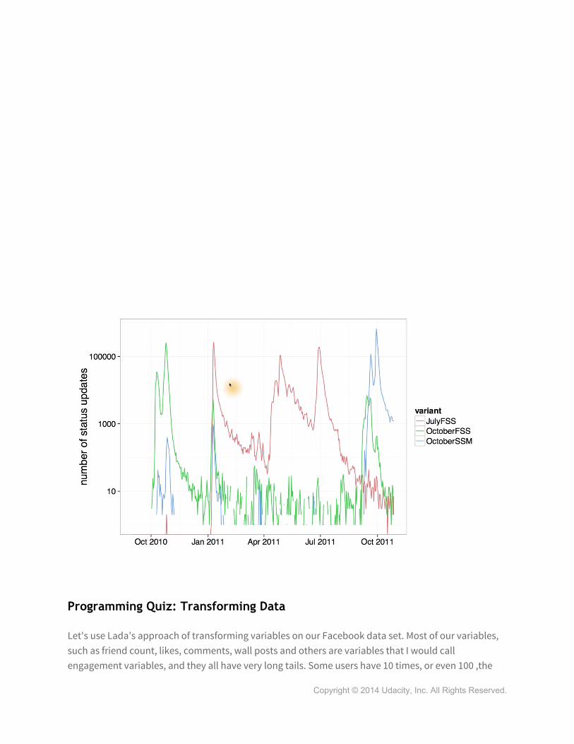
occurrence is much more frequent and in fact, you'll have different variants of the meme. For example, here in red, you have the one that says, July has five Fridays, Saturdays, Sundays. And this is true in 2011 and if you just look at this plot, which will, on a linear scale, show you the counts for this meme, it may appear as though it just disappears completely in between. So, you might think, well, maybe it's being introduced from some other source and not Facebook. But the weird thing is that the meme is adapted to Facebook. It says, copy and paste, which doesn't make so much sense for other media. So, is it possible that the meme is actually staying within Facebook but in very low numbers, and then flares up? And so if you, instead of using a linear scale, use a log scale here at the same time, you can see counts that are 100,000 and counts that are 10. And so here when you look, you can see that even though there's a rapid decay in interest, it actually looks like it's maybe parallel and you can see the meme persisting in low numbers. And then different variants, perhaps being prompted by a resurgence of this meme, then subsequently occurring. These were done in ggplot, just with a simple line geome and grouping by the particular meme variant and then rescaling the ax, the y-axis to log in one of the versions.
Copyright © 2014 Udacity, Inc. All Rights Reserved.
Programming Quiz: Transforming Data
Let's use Lada’s approach of transforming variables on our Facebook data set. Most of our variables, such as friend count, likes, comments, wall posts and others are variables that I would call engagement variables, and they all have very long tails. Some users have 10 times, or even 100 ,the
Copyright © 2014 Udacity, Inc. All Rights Reserved.

median value. Another way to say this is that some people have an order of magnitudes, more likes, clicks, or comments, than any other users. In statistics, we say that the data is over dispersed. Often it helps to transform these values so we can see standard deviations, or orders of magnitudes, so we are in effect, shortening the tail. Here was our histogram of friend count from before, and notice, we still have that long tail. We can transform this variable by taking the log, either using the natural log, log base 2, or log base 10. We could use other functions, such as the square root, and doing so helps us to see patterns more clearly, without being distracted by the tails. A lot of common statistical techniques, like linear regression, are based on the assumption that variables have normal distributions. So by taking the log of this variable, we can transform our data to turn it into maybe a normal distribution or something that more closely resembles a normal distribution, if we'd be using linear regression or some other modelling technique. Now, I know we're not doing modelling here, but let's just see what it looks like to transform the variable. First, I'm going to just do this in the summary command. So, here's our regular summary of friend count. Looks like the median friend count is 82, and the mean is 196. I can take the log base 10 of this friend count and get a different table. Now this seems a little bit unusual since I have negative infinity for the minimum and negative infinity for the mean. Hm.
So what must be going on? Well, some of our users have a friend count of zero. So, when we take the log of base 10 of zero, that would be undefined. For those familiar with Calculus, the limit would be negative infinity, which is why that appears here. To avoid this, we're going to add one to friend count, so that way we don't get an undefined answer, or negative infinity. There, that looks much better. And, just to show you another function, let's also use the square root on friend count. This would be another type of transformation. For me, log base 10 is an easier transformation to wrap my head around, since I'm just comparing friend counts on orders of magnitude of 10. Basically a tenfold scale like the pH scale. Now that you've seen transformations within summaries, let's see if you can
Copyright © 2014 Udacity, Inc. All Rights Reserved.

apply a similar transformation to the histogram. Check out the instructor notes to learn how to use scales and how to create multiple graphs on one page. Once you've read through those links, and you think you're ready, try this next programming exercise. In it, you're going to create three different histograms. The first one will be our original friend count histogram, and then the second one will have the friend count transformed using log 10. And then the last histogram will have the friend count transformed using square root. Now, I haven't given you all the information to do this exercise, but I want you to be resourceful. Part of being a good programmer is being able to read documentation and know how to find your answers to the questions you may have. Now, we've already done the legwork for you by providing the resource. So, let's see if you can figure it out.
Answer:
Your task was to create three histograms on one output plot. And to do that you needed to install the grid extra package and load it into our studio. Once you've got that, now it's just a matter of creating each of the three histograms. And saving them to three variables. I'll use p1, p2 and p3 for each of the plots that I'm going to create. Now the first histogram is the same as before. We just have friend_count, pass to x, and pf, pass to data. For the second histogram, we'll take the log10 of friend_count. And remember to add 1 to it first, so that we don't get any undefined results. And finally for our third histogram, we'll simply take the square root of friend count.
Now, if I run all these lines of code, I can see that I create three new variables that saves each of my plots. And now I just need to pass each of these plots to grid dot arrange. And set end col equal to 1, since I just want one column with all my histograms. And running my code, I can see that I get all three histograms. And here's a closer view of the three. Notice that our second plot is much better. Since we have a normalish kind of distribution. The square root transform is also better than no transformation at all, since we don't have as much of a long tail. We do still have a long tail, it's just that much lower friend count since we transformed the variable. The tail’s just not as bad as before. Now there was another way to create these same three histograms using a different type of syntax. Now the syntax is a little more complicated at first. But I want to give you a preview right now since you'll see it in upcoming lessons.
This time, we're going to use the ggplot syntax to create our histogram. Ggplot is very similar to the q plot function, since it still takes the same parameters, x and data. The key difference is that we need to include any x or y variables inside this aesthetic wrapper or AES. The other thing we need to do is we need to tell ggplot what type of plot we want to create. Or what kind of geom we want. The geom that we want is geom histogram. Running this bit of code I can see that I get my original histogram. Which is the first one we created on friend count. Running the entire line I can save this histogram into p1. Now I've got a plot that I can just alter using scales. So for the second plot, I'm going to take my first plot and just add a scale_x_log10 to it. This is going to transform the x-axis, or the x variable, using log base 10. Similarly, for the third graph, I'm going to add scale x square root. Now, I don't want
Copyright © 2014 Udacity, Inc. All Rights Reserved.

to use p2 here, since I've already got a scale log10 on it. I want to use my original graph, p1. And add scale x square root. Now saving all these plots and writing our grid dot arrange function, we get the same output as we had before. Now there is a slight difference here based on the x-axis labeling. And I want you to see if you can figure that out. If you're not sure of the differences, don't worry. I'll explain it in the next video.
Add a Scaling Layer
If you watched the solution video, you would have noticed that I used two different methods for transforming our variable. The first method used a wrapper right around the variable, and then the second used a scaling layer. Let's look at the differences between these two plots and see what the two adjustments really do. I'm going to save this first plot into log scale and I'm going to save the second plot into count scale. I'm going to use each of these variables and pass it to grid.arrange, so that way I can plot them side by side, and that's why the ncal is equal to two. Running this code, we can see that we get our two histograms. When looking at the two plots, we can see that the difference is really in the x axis labeling. Using scale_x_log10 will label the axis in actual friend_counts. Whereas using the log10 wrapper will label the x axis in log units. This is just something to keep in mind as you make more plots. In general, I think it's easier to think about actual counts, so that's why I prefer using the scale_x_log10 as a layer. Now, this does mean that you'll need to learn the ggplot syntax, but don't worry, you'll have plenty of practice in lesson four, and if you're feeling really adventurous, you can add a layer to any of the plots that you create. So, take our original histogram for friend count. Let's just add scale_x_log10 to it, and there you go. You have it, the new histogram transformed using log base 10.
Programming Quiz: Frequency Polygons
So far we've seen how to examine a variables distribution using histograms, and how to check our hunches with visualizations and numerical summaries. But there's another type of plot that lets us compare distributions, and it's called the frequency polygon. Frequency polygons are similar to histograms, but they draw a curve connecting the counts in a histogram. So this allows us to see the shape and the peaks of our distribution in more detail. You might remember from before that we were looking at friend count using this code. This code gives a histogram of our user's friend counts, and then we added a facet wrap and broke it out by gender.
Copyright © 2014 Udacity, Inc. All Rights Reserved.
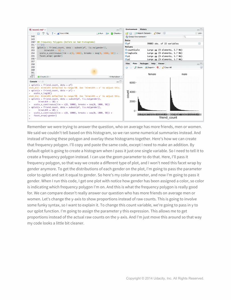
Remember we were trying to answer the question, who on average has more friends, men or women. We said we couldn't tell based on this histogram, so we ran some numerical summaries instead. And instead of having these polygon and overlay these histograms together. Here's how we can create that frequency polygon. I'll copy and paste the same code, except I need to make an addition. By default qplot is going to create a histogram when I pass it just one single variable. So I need to tell it to create a frequency polygon instead. I can use the geom parameter to do that. Here, I'll pass it frequency polygon, so that way we create a different type of plot, and I won't need this facet wrap by gender anymore. To get the distributions of each gender on the plot, I'm going to pass the parameter color to qplot and set it equal to gender. So here's my color parameter, and now I'm going to pass it gender. When I run this code, I get one plot with notice how gender has been assigned a color, so color is indicating which frequency polygon I'm on. And this is what the frequency polygon is really good for. We can compare doesn't really answer our question who has more friends on average men or women. Let's change the y-axis to show proportions instead of raw counts. This is going to involve some funky syntax, so I want to explain it. To change this count variable, we're going to pass in y to our qplot function. I'm going to assign the parameter y this expression. This allows me to get proportions instead of the actual raw counts on the y-axis. And I'm just move this around so that way my code looks a little bit cleaner.
Copyright © 2014 Udacity, Inc. All Rights Reserved.

And finally, let me change the labels to more accurately explain the plot. Alright, it looks like I have everything. Let's run this code and see the differences. Zooming in on the plot, we can see that we've changed the y-axis scale, and we have our labels appearing here and here. And while it may appear that males have higher friend counts on average than women, we can see that many males or a high percentage of them have low friend counts. It's probably in this tail region of the graph where females overtake males. I encourage you to play around with this yourself in our studio to see where women overtake men in this side of the x-axis. Try using limits or try using breaks to explore more. We've learned some new syntax here, so let's see if you can put it into practice. Your task is to determine which gender creates more likes on the world wide web. To answer that question, I want you to create a frequency polygon and explore it in many different ways. Remember that the first plot that you make doesn't need to be final. I want you to create a couple of plots and make adjustments to the limits and the breaks on the x axis until you're satisfied.
Answer:
Remember, our goal in analyzing this Facebook user data is to understand our users and their behavior. This question is just another dimension where we're trying to understand which segment of our population uses a certain feature on the website. In this case, we're wondering whether or not males or females end up using likes on the World Wide Web more often. So, first I'm just going to remind myself of what variables are in my data set. I'm wanting to compare likes between the genders, so I'm going to use www_likes. This code would give me a histogram which isn't what I want. And remember I also need to subset the data to remove any values for gender that are NA. Now this bit of code is starting to look more like what I want. But, I've only got one frequency polygon on
Copyright © 2014 Udacity, Inc. All Rights Reserved.

here, and I need two. So I'm going to use the color parameter, and pass a gender. That seems a little bit better. I'm also going to add scale x continuous, since I know that World Wide Web likes is on a continuous scale. Alright, now we're looking at a reasonable plot. Zooming in, it looks like males typically have more likes on the web. But I can't really make sense of the tail end of this graph. This is long tail data, so let's use a log transformation to see if we can get a better look at what's happening down here. I'm going to go back to my code and add a scale x log 10. Running this code we get a different plot with much more information. It looks like males have more likes on the web at first, but we can see that females overtake males at this point in the graph. So this still leaves me wondering who really has more likes, men or women?
Programming Quiz: Likes on the Web
Let's answer our question using a numerical summary instead. I want you to run some code in R to answer the following questions. First, what's the www_like count for males, and second, which gender has more www_likes? Is it the males or the females? These two questions will automatically be graded so you don't really need to go to the solution video unless you get stuck.
Answer:
The by command is going to allow us to answer this question. So first I'm going to create an r block of code and I'm going to use the by command. I'll pass a www_likes as the first parameter and then I'll pass gender as the second, since that's the variable I would have split our www_likes over. I want to total of likes for each gender, so I'm going to use the sum function here. Writing this code we can see our output. The likes for males is at 1430175. But it's the females that have way more likes. There are over three and a half million. It looks like females have more than two times the number of likes as men. And while this might seem trivial, information like this can help websites or other businesses decide which features are used most often by different subgroups. This might help a business or a website decide which feature they should continue to invest in, or which ones they should just leave behind.
Programming Quiz: Box Plots
Let's use another type of visualization that's helpful for seeing the distribution of a variable called a box plot. Now if you're unfamiliar with a box plot, you can find resources in the instructor notes, and there's also a link to Udacity’s statistic class so you can test your own knowledge. You may recall earlier that we split friend count by gender in a pair of histograms using facet wrap. The code looked like this. Instead of using these histograms we're going to generate box plots of friend count by gender, so we can quickly see the differences between the distributions. And in particular we're going to see the difference between the median of the two groups. And remember again the the q plot
Copyright © 2014 Udacity, Inc. All Rights Reserved.

function automatically generates histograms when we pass it a single variable. So we need to add a parameter to tell q plot that we want a different type of plot. To do that, we're going to use the gym called box plot.
Now, I'm going to use the same data set as before. So I'm going to keep this and q plot. Now, what's different about box plots is that the y axis is going to be our friend count. The x axis, on the other hand, is going to be our categorical variables for male and female, or gender. Notice that we use the continuous variables. Friend count as y. And the grouping, or the categorical variable as x. This will always be true for your box plots. I forgot a parenthesis here and then let me just reformat my code so it looks a little bit cleaner. There we go. Running this code, we can see that we get our two box plots. Let's zoom in to get a closer look. The boxes here and here cover the middle 50% of values, or what's called the inner quartile range. And I know these boxes are hard to see, since we have so many outliers on this plot. Each of these tiny little dots is an outlier in our data. We can also see that the y axis is capturing all the friend counts from zero all the way up to 5,000. So we're not omitting any user data in this plot. And finally, this horizontal line, which you may have noticed at first, is the median for the two box plots. And you might be wondering what makes an outlier an actual outlier. And well, we usually consider outliers to be just outside of, one and a half times the IQR from the media. Since there's so many outliers in these plots, let's adjust our code to focus on just these two boxes. We'll have you do this in the next programming exercise. See, if you can alter our code to make that adjustment.
Answer:
Copyright © 2014 Udacity, Inc. All Rights Reserved.

To change what our box plots look like, we just need to adjust the Y axis. We can use the ylim parameter inside of Q plot to do so. Here, I can set the upper and lower limits. The lower limit will be 0 and the upper limit will be 1000. Now, you may or may not have gotten a warning message here about removing data points. When we use the ylim parameter, we're actually removing data points from our calculations. So the original box plots that we have might look slightly different from this. Another way to create the same plot is to use the scale y continuous layer. So we can use this same bit of code here and then just close off our parenthesis. Adding the scale wide continuous layer, I can set the limits to be between 0 and 1000. Running this code, we can see that we get the same exact box plots. What I want to draw your attention to, is the female box plot. Notice how the top of the box is just below 250. So this value might be around 200 or 230. But this value might not be accurate for all of our data. When we use the ylim parameter or the scale_y_continuous layer, we actually remove data points from calculations. So a better way to do this is to use the cord Cartesian layer to set the y limits instead. So, we'll use the same bit of code and then instead of adding scale wide continuous layer, we'll add the cored Cartesian layer. And here I'll set the y limits from 0 to a 1000. Notice how the top of the box has moved slightly closer to next video. We'll also discuss what the top of the box means. What the bottom of the box means. And what this black line means.
Programming Quiz: Box Plots, Quartiles, and Friendships
It looks like females on average have slightly more friends than men. Since I can see that this median line is slightly higher. That's what this black line is. It represents the median or the middle 50% of friend counts for females and for males. Now this difference isn't very large. So let's zoom in to take a closer look. This box for females and this box for males Represents the middle sense that we zoom in even more to take a closer look. We should consider any values less than 250. Now, there's no exact choice here, I'm just choosing something that seems reasonable, since the bulk of my data is down here. After running this code, we can now see that the bulk of user friend count is similar for the middle 50% of men as it is for the middle 50% of women. Its just our females are slightly higher for friend count. Lets look at actual values though and compare the values to what we see in our box plot. We can look at those values by using the by command and running a summary of our friend count split by gender. So first, I want to include my friend count which is the variable I want a summary of. I want to split it over gender and I want a summary. Running this code, I get an output of my table, which shows me the minimum maximum values for both genders, as well as the core tiles. The first core tile for women is 37 and that looks about right in our graph. The third quartile or the 75% mark is at 244 and that's all the way up here. This means that 75% of female users have friend counts below 244. Or another way to say this is that 25% of female users have more than 244 friends. Similarly for the men, we can see how the first quartiles and the third quartiles match up to the box plot. Now, you might have remembered that we used coord_cartesian in the solution video from before. We did this so that way, the table output would match our box plots. If we would have just used the ylim parameter inside of qplot, we would have gotten different quantiles that wouldn't match our picture. This is just a subtle difference that you should be aware of when working in R. Now, it's your turn to
Copyright © 2014 Udacity, Inc. All Rights Reserved.

answer a different question. On average, who initiated more friendships in our sample? Was it men or was it women? Used some of the techniques that we just covered and then write a few sentences explaining how you came up with your answer. This second question won't be automatically graded, but it's important that you know how to communicate your analysis to other people.
Answer:
To answer this question we want to write code that looks very similar to the code from before. We want to create a box plot to compare the distribution of the number of friendships initiated for our male and female users. So lets just remind ourselves what variables we have in our data frame. So for friend requests, I think I'll use friendships_initiated that sounds right. To make my box plot I'll pass x the variable gender, since that's my categorical variable. And then I'll pass y, friendships_initiated. Now I need to subset my data frame just like from before. And then I'll need to tell cube plot that I want to box plot. So I'll set the geom. Looking at this plot, we see that most users make less than 500 friend requests. So let's set our y limb setting zero as our minimum and 500 as our max. So I'll add the cored_cartesian layer and set my limits. It's really close, but it looks like females have slightly more friend requests. Since the median black line is slightly higher for females than this median black line for males. Now, this might be too close to call. So, I say we should zoom in again. This time, we'll change the upper limit to 150. Yeah, it looks like females initiate slightly more friendships on average. Let's also check this with a numerical summary. I can use the by command and split friendships_initiated by gender and then, find their summary. So, I'll take my friendships_initiated, split it by gender and then run a summary. And here's our output. And we can see that the median for females is 49 whereas the median for males is 44. Now, you might be wondering, why should we even create this box spot to begin with if we can answer our question with a numerical summary. Well, it's helpful to understand the distribution of the data. So in the case of the box plot, we can see the middle 50% of values for each segment of our categorical variable. Our box plots also let us get a sense of alliers. So in one way, they're much more rich with information than just this table.
Programming Quiz: Getting Logical
So far, we've looked at a number of visualizations to examine the distribution of a single variable. And, we also looked at transforming a variable to get a better look at the data. Now, there are other ways that we can transform a variable, beside using something like the square root or a log. You often want to convert variables that have a lot of zero values to a new binary variable that has only true or false. This is helpful because we may want to know whether a user has used a certain feature at all, instead of the number of times that the user has actually used that feature. For example, it may not matter how many times a person checked in using a mobile device. But, whether the person has ever used mobile check-in. Here's what I mean. Here's a summary of the mobile likes in our dataset. The median is four, which means we have a lot of zeroes in our dataset. If I run this summary, I'm going to get a
Copyright © 2014 Udacity, Inc. All Rights Reserved.

different type of table.
Notice that in the table I get logical counts, because I use this comparison operator. I wanted to see whether or not someone had actually checked in. So, instead of tracking the count of mobile likes, let's create a new variable that tracks mobile check-ins. We'll call this variable, mobile_check_in. The first thing I'll do is assign it a bunch of NA values. Next, we can use the if/else function to assign a value of one if the user has checked in using mobile and a value of zero if the user has not checked in. So in this if/else statement, if this condition is true, we'll assign our user a value of 1. Otherwise, we'll give them a value of 0. And the last thing I'll do is convert it to a factor variable. Running this code, I get my new variable saved. And then taking a summary of the results, I can see that about 64,000 just shy of that, have checked in using mobile while 35,000 have not. So, using this data can you tell me what percent of users check-in using mobile. Try to use actual code here instead of using these wrong
Copyright © 2014 Udacity, Inc. All Rights Reserved.

numbers. Round your answer to the nearest percent and don't include the percent sign when you enter it here.
Answer:
To answer this question we need to know the number of users who did check in using mobile and the total number of users in our sample. Now I could have just used these two numbers and divided them, but I want to do this programmatically. To do that I can take the sum of my mobile check in variables when it's equal to one. And then divide that by the length of that vector. This is how many users are in our sample. Running that code I can see that I get about set, so it wouldn't make a whole lot of sense to continue the development of the mobile experience. At least based on this sample data set. So when you're answering questions, it's important not to just think about what kind of data you're looking at but maybe what types of transformations you can make to the variables themselves. Sometimes you want raw counts, and other times you just want a binary yes or no, did a user use this. It's important to think about what kind of data you need to answer a specific question. So not every sort of transformation you do has to be a functional transformation like square root or log.
Analyzing One Variable
Before we finish this lesson, I want you to take some time to reflect and think about the key ideas in this lesson. What are some strategies that you could use with other data sets? Once you've submitted your answer, you can see what we thought was important in the solution video.
Analyzing One Variable
Congratulations on finishing lesson three. Here we learned that it's important to take a close look at the individual variables in your data set. To understand the types of values they take on, what their distributions look like, and whether there are missing values or outliers. We did all this in part by using histograms, box plots, and frequency polygons, which are some of the most basic and important tools for visualizing and understanding individual variables. We also made adjustments to these plots. For example, we changed the limits on some of our axes. We adjusted the bin width on our histograms. And we transformed variables either logarithmically or turned them into binaries to uncover hidden patterns in the data. These are some of the main conclusions that we had, and, maybe you have more. We encourage you to share your ideas in the discussion forum, and we'll see you again in lesson four, where we explore the relationship between two variables.
Copyright © 2014 Udacity, Inc. All Rights Reserved.