kyle rush vis9 - cloudinaryres.cloudinary.com/general-assembly-profiles/image/upload/v...artist or...
TRANSCRIPT

Kyle Rush VIS9
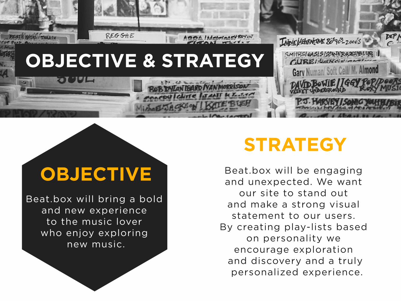
OBJECTIVEBeat.box will bring a bold
and new experience to the music lover
who enjoy exploring new music.
STRATEGYBeat.box will be engaging and unexpected. We want
our site to stand out and make a strong visual statement to our users.
By creating play-lists based on personality we
encourage exploration and discovery and a truly personalized experience.
OBJECTIVE & STRATEGY

Exploration
Unexpected
Discovery
Customize
Emerging
MONIKERS
Bold
Individual
Lifestyle
Relatable
Tailored
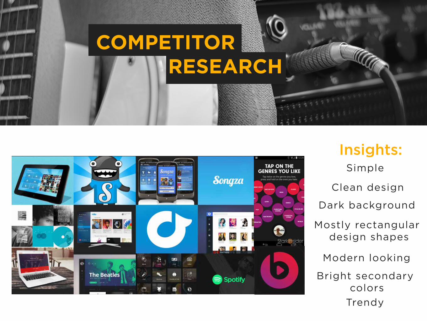
Insights:
Clean design
Bright secondary colors
Simple
Dark background
Mostly rectangular design shapes
Modern looking
Trendy
COMPETITOR RESEARCH

Insights: Hip
Young (millennial)
Edgy
Individuals
Energetic
College age
Low income
AUDIENCE RESEARCH
Diverse

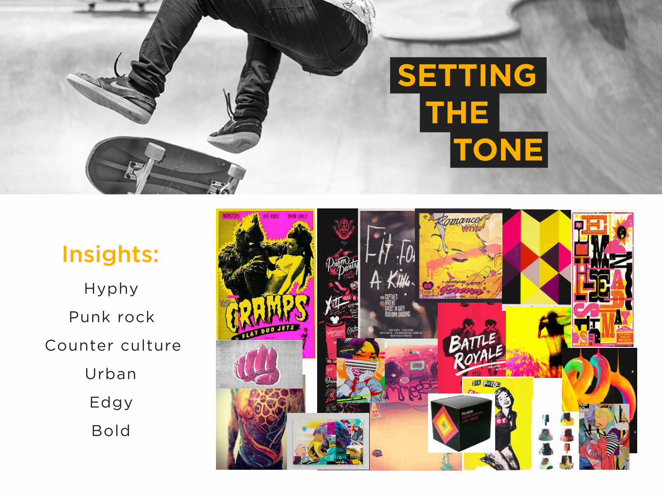
Punk rock
Hyphy
Bold
Urban
Counter culture
Edgy
Insights:
SETTING THE TONE
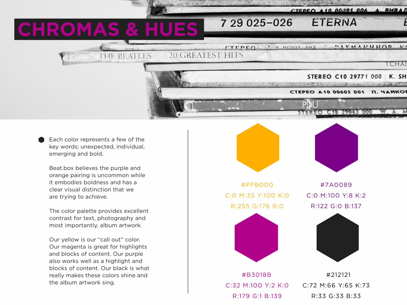
CHROMAS & HUES
#FFB000
R:255 G:176 B:0
C:0 M:35 Y:100 K:0
#B3018B
R:179 G:1 B:139
C:32 M:100 Y:2 K:0
#7A0089
R:122 G:0 B:137
C:0 M:100 Y:8 K:2
#212121
R:33 G:33 B:33
C:72 M:66 Y:65 K:73
Each color represents a few of the key words; unexpected, individual,emerging and bold.
Beat.box believes the purple andorange pairing is uncommon whileit embodies boldness and has a clear visual distinction that weare trying to achieve.
The color palette provides excellent contrast for text, photography andmost importantly, album artwork.
Our yellow is our “call out” color.Our magenta is great for highlightsand blocks of content. Our purplealso works well as a highlight and blocks of content. Our black is whatreally makes these colors shine and the album artwork sing.
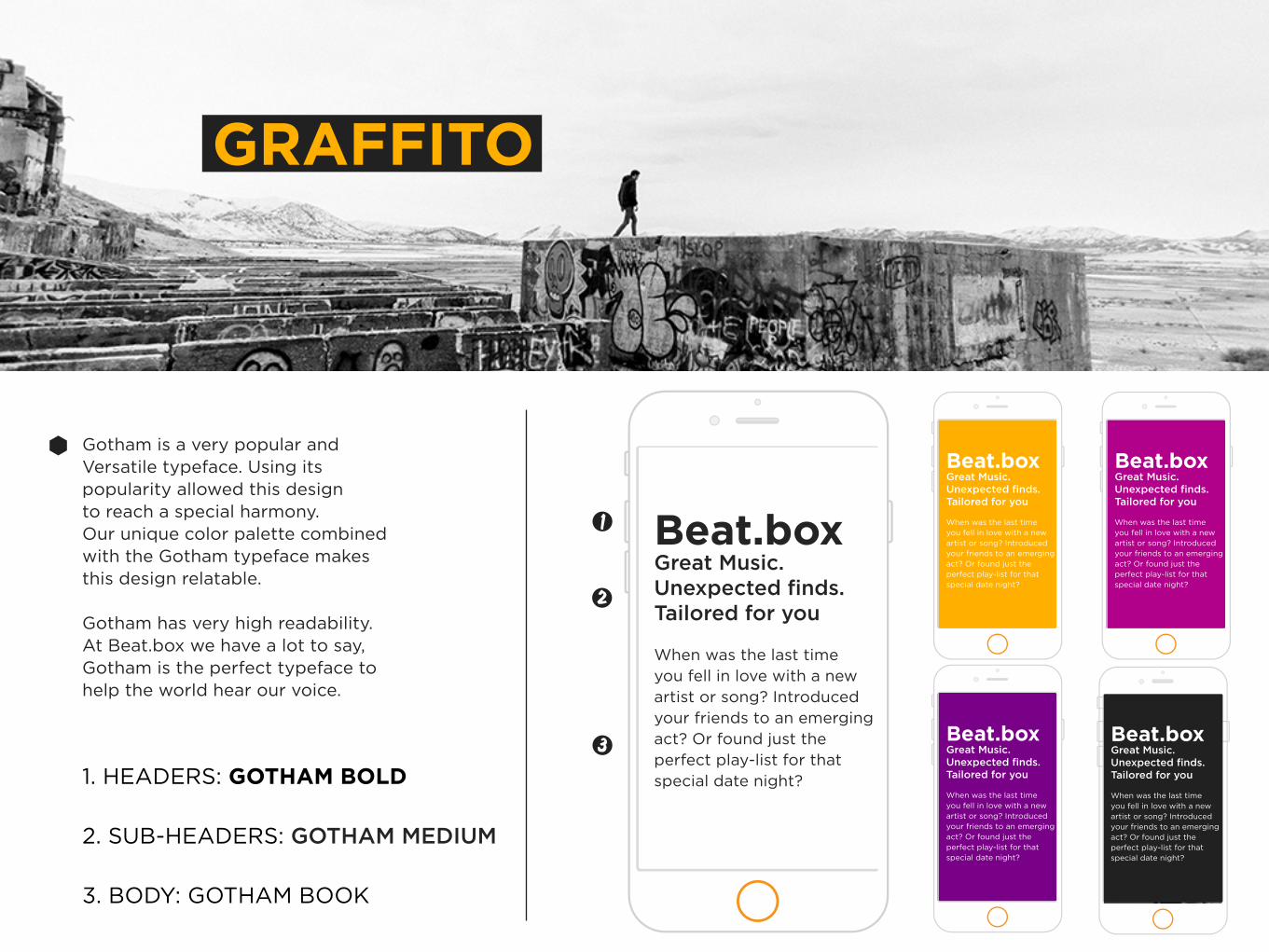
GRAFFITO
Beat.boxGreat Music. Unexpected finds. Tailored for you
When was the last timeyou fell in love with a new artist or song? Introduced your friends to an emerging act? Or found just the perfect play-list for that special date night?
Gotham is a very popular andVersatile typeface. Using its popularity allowed this design to reach a special harmony. Our unique color palette combined with the Gotham typeface makes this design relatable.
Gotham has very high readability. At Beat.box we have a lot to say, Gotham is the perfect typeface to help the world hear our voice.
Beat.boxGreat Music. Unexpected finds. Tailored for you
When was the last timeyou fell in love with a new artist or song? Introduced your friends to an emerging act? Or found just the perfect play-list for that special date night?
Beat.boxGreat Music. Unexpected finds. Tailored for you
When was the last timeyou fell in love with a new artist or song? Introduced your friends to an emerging act? Or found just the perfect play-list for that special date night?
Beat.boxGreat Music. Unexpected finds. Tailored for you
When was the last timeyou fell in love with a new artist or song? Introduced your friends to an emerging act? Or found just the perfect play-list for that special date night?
Beat.boxGreat Music. Unexpected finds. Tailored for you
When was the last timeyou fell in love with a new artist or song? Introduced your friends to an emerging act? Or found just the perfect play-list for that special date night?
1. HEADERS: GOTHAM BOLD
2. SUB-HEADERS: GOTHAM MEDIUM
3. BODY: GOTHAM BOOK

THE LOGO
Beat.boxBeat.box
Beat.box
Beat.box Beat.box
Beat.box
Beat.box
Beat.box
Our logo is bold and simple. The design speaks to nature of music, a little bit raw, yet refined.
The logo is versatile and can be used for digital assets e.g., thewebsite or mobile app. The logocan also be used in print e.g., flyers, mail outs and t-shirts.
To the right are examples of howthe logo should be used properly.Beat.box’s logo can be used on allbranded colors and can be used as all of the branded colors. White is preferred when being used on top of photography. White or black is preferred in combinationwith branded colors.

WIREFRAMES
1
2
3

THE SUPREME
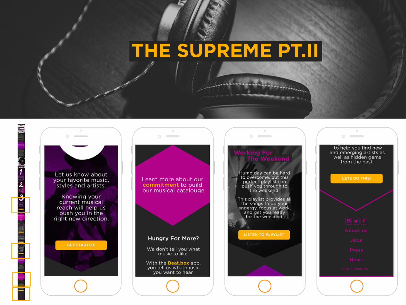
THE SUPREME PT.II

THANK YOU