james siena - sequence, direction, package, connection - dieu donne 2014
DESCRIPTION
Catalog for James Siena exhibition of artwork from residency at Dieu Donne, New York.TRANSCRIPT
dieu donné lab grant programpublication series no. 15
James SienaSequence, Direction, Package, Connection

Logic Package: Green, 2013–14pigmented linen pulp on cotton base sheet 16 5/8 x 12 7/8 inches (42.2 x 32.7 cm)
Logic Package: Primaries, 2013–14pigmented linen pulp on cotton base sheet 16 ½ x 12 ¾ inches (41.9 x 32.4 cm)
Logic Package: Purple, 2013–14pigmented linen pulp on cotton base sheet 16 ½ x 12 ¾ inches (41.9 x 32.4 cm)
Logic Package: Secondaries, 2013–14pigmented linen pulp on cotton base sheet 16 ½ x 13 inches (41.9 x 33 cm)
Logic Package: Orange, 2013–14pigmented linen pulp on cotton base sheet 16 ½ x 12 ¾ inches (41.9 x 32.4 cm)
Logic Package: Black, 2013–14pigmented linen pulp on cotton base sheet 16 5/8 x 12 7/8 inches (42.2 x 32.7 cm)

Paper Movesby Armin Kunz
James Siena has never made a secret of his affinity for printmaking. At one point he told printmaker friends visiting his studio that “all the paintings they were look-ing at were studies for prints”1—— and perhaps he was only half joking. It is not surprising, therefore, that he was also drawn to the process of artistic papermaking, even when his creations remain unique and uneditioned, as in most of the work he created during his 2012–14 residency at Dieu Donné. If all that the artist wanted to evoke was the primary visual information, it would hardly be worth the trouble. It is about time, therefore, that we heed the artist’s observa-tion that “the essential quality of the medium defines the outcome”2 and focus our attention on the material itself——paper, recently described by Susan Tallman as “the most overlooked component in visual art.”3
At least one obvious reason for using techniques like printmaking and papermaking to create an artwork lies in the option of multiplicity—— the artist creates a matrix that allows the resulting work to be printed or made more than once. But what about a monotype, for example, a print-related process in which a matrix is manipulated but (usually) pulled only once? Why go to the trouble of making this in a print studio, employing a plate and a press instead of drawing or painting directly on the paper? There must be something about the process itself that captures the atten-tion of the artist. Something that can be attained that would not be possible otherwise. What sets a print apart from, say, a drawing or a painting is that the medium itself adds a quality of its own. Gouache sits differently on paper than watercolor does. The effect of oil paint on canvas or board is different from that of acrylic paint or, for that matter, of sign-painter’s enamel on aluminum—— the latter adapted early on by James Siena as his “signature” technique.
Printmaking, however, adds yet another level of re-move—— the printing press that forces, not unlike a magic “black box,” the latent image from the matrix onto paper. The same is true for papermaking. Pressure is required to
make the pulp stay together or, in its artistic use, to fix the wet-on-wet arrangement of differently colored pulps. The overall appearance changes with the choice of the base sheet material—— a smoother cotton sheet or a sturdier abaca sheet, with the latter more likely to become wavy and “alive” when combined with linen pulp. And once linen pulp has been beaten intensely and all its fibers have been broken down, it takes pigment extremely well and can retain an astonishing intensity of color. Cotton pulp, on the other hand, works less well and, once dried, the tonal values are much more muted. With the use of stencils, the forming of images out of differently colored pulps becomes a repeat-able process—— enabling the creation of small editions. Unlike printmaking, however, the artist’s and papermaker’s control over the final result is hardly ever precise enough to allow exact replication.
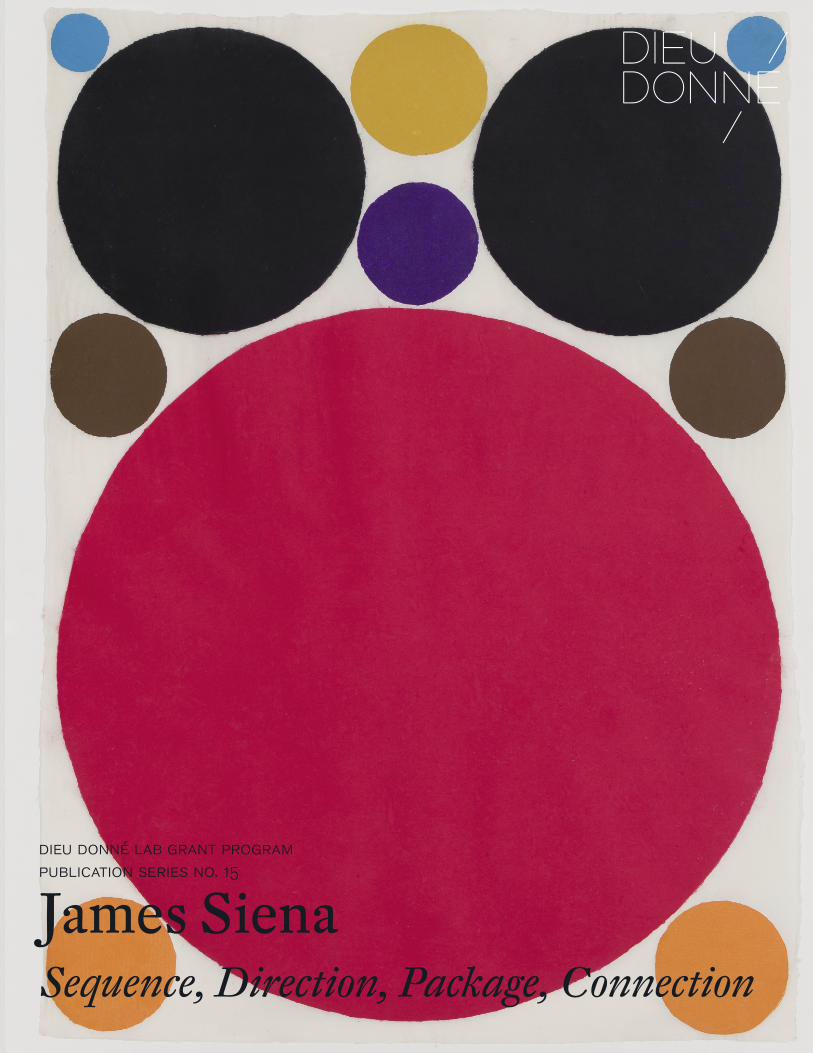
Siena first played with the arrangements of circles in a large lithograph titled Coalition, published by Tamarind Institute in Albuquerque, NM in 2011. Measuring 22 ½ x 18 inches, the print shows 35 circles of various sizes in 11 colors—— not unlike a compressed planetary constella-tion seemingly held together by a massive “red giant.” The somewhat strict geometric character of the composition is enlivened by the modulation of each of the circular color fields, an effect achieved by reticulation, the intentionally uneven drying process of the lithographic ink on the stone. The artist revisited this compositional model at the begin-ning of his Dieu Donné residency in 2012 in an editioned triptych called Twelve Circles, Twelve Squares. The ar-rangement and sizes of the circles (and the tiny collaged squares in their centers) remained the same in each of the three works while the colors changed between yellow, red, and black. Even the carefully crafted frames became part of this interplay. His most recent work, Circle Sequence I–VII, is yet another variation on this theme. Now, however, variety and interplay are created by an additive sequence of seven unique works: starting out with the largest circle, a huge red disk in vibrant red, the artist adds circles of decreasing
1

size until the sheet is densely filled with disks 11 in seven different colors. Siena uses the word “sequence” in the title deliberately. He actually expresses a certain reservation about working in the form of such series as diptychs, trip-tychs, and so on. The elements in a sequence are intended not so much to stand in relationship to each other but rather to make up the entirety of a work, not unlike the pages of a book. The sequence analyzes the work, breaks it down into its constituent elements—— Siena himself likes to use the term “unpacking” to describe this process, and both “se-quence” and “package” appear repeatedly in his titles.
Reproductions can hardly prepare one for the impact of the originals. The first shock is their size: each measures roughly 34 x 25 inches—— fairly monumental for sheets of paper, even more so for an artist whose paintings usu-ally measure no larger than 29 x 22 inches. The second surprise is the tactile texture of the works. This is neither hard-edged Precisionism nor Op Art. The sheets are, in a crinkly sort of way, alive: the surfaces are anything but flat, showing bubbles under the surface reminiscent of chine collé and created when the wet pulp of the large colored disks is joined onto the supporting abaca base sheets. And since these are not screenprints or lithographs, the stencil-created forms blur at the edges. In addition to what one might describe as the “organic liveliness” of the works, the densely colored linen pulp preserves a wonderful vibrancy that is innate to the technique itself. When one looks at these images, one immediately recognizes the attraction the process of their creation must have had for the artist: “I like the tension between precision and accident … It’s an inher-ent quality in papermaking that is utterly real.”4
As with printmaking, which often entails working with a master printmaker, papermaking is a collaborative effort. At Dieu Donné Siena worked with master paper-maker Paul Wong, whose deep experience with “all things paper[making]” lifts virtually every technical restriction for the creative ideas of the visiting artists. The technique nevertheless adds a layer of remove between the artist and the work. He is not painting or drawing, nor is he etching or engraving a printing plate. He comes up with compo-sitional ideas that are then translated into the different stages of the making of the sheets of paper. James Siena has famously stated: “I don’t make marks, I make moves.” It was probably meant as a somewhat ironic metaphor (since what else is painting and drawing than “making marks”?) to draw attention to the Gestalt of his creations, to aspects of his creative process that lie beyond what one might call the marked surface. If one takes the quote out of its original context, however, it becomes a prescient description of his recent papermaking: moving shapes and colors around and reassembling them in continuously new ways.
Critics often refer to the “rule-based” quality of Siena’s paintings and drawings. In 2001 Robert Hobbs invited the artist to write those “rules” down for all the paintings included in the exhibition at the Gorney Bravin + Lee and Daniel Weinberg galleries in New York and Los Angeles, respectively. They were published as “Notes by James Si-ena” in the back of the catalogue accompanying the shows. The inadvertent consequence was that people more often than not overlooked that Siena wrote them afterward——a fundamental difference to the approach of Sol LeWitt, for example. Hobbs, however, was very aware of this, and in his
2

3
seminal essay in the same catalogue he succinctly observes how “Siena has divided the activity of making art into gen-erative and executive realms. He has taken the two roles for making art … and appropriated them both. … While distinct in their goals, both roles are creative even though each emphasizes a separate course of action: the first is a mental construct, the second, which is highly intuitive, depends on the coordinated effort of the mind and hand working together.”5
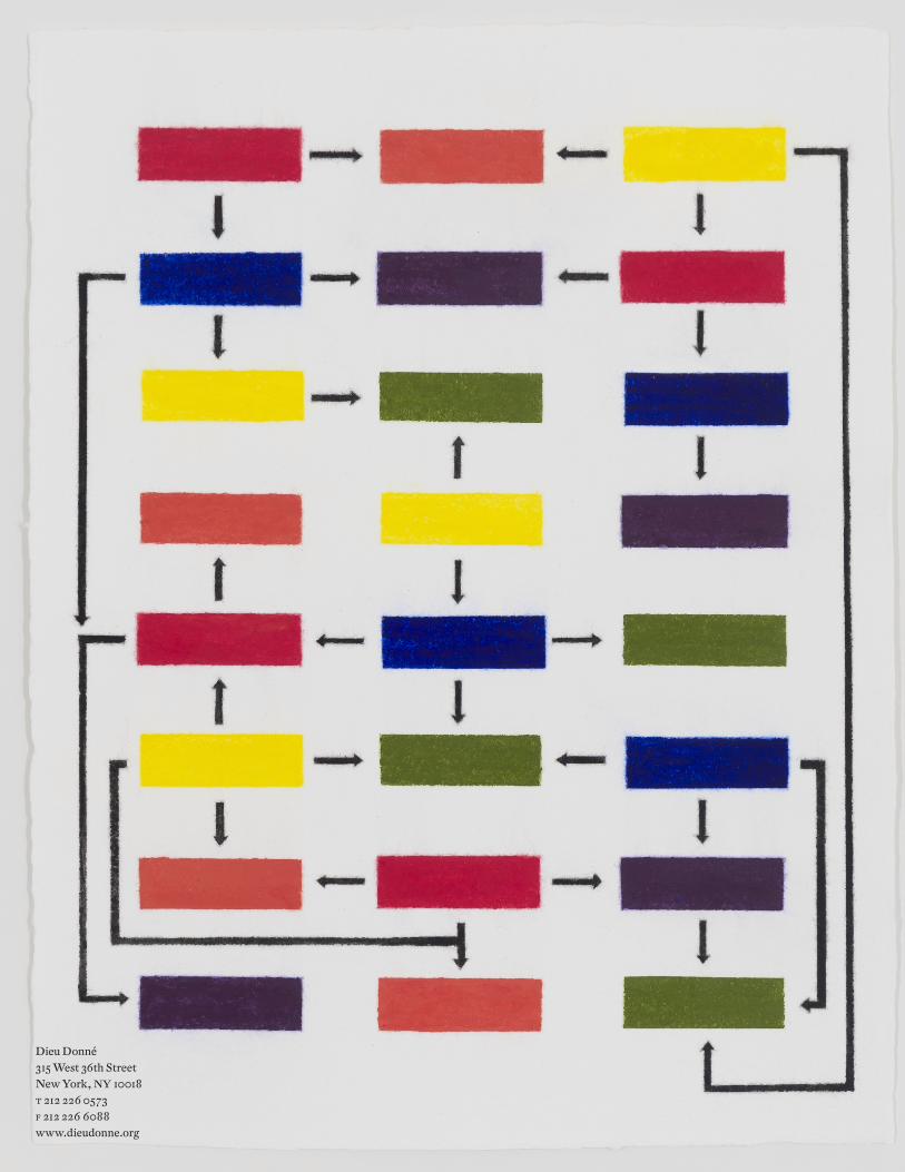
Another body of work that Siena recently made at Dieu Donné revisits the concept of “rules” in a newly explicit way. Here, too, the materiality adds substantially to the appearance of the finished works: the richly pigmented linen pulp creates radiant colors. Filling the pulp into the stenciled-out small rectangular fields creates subtle halos around their edges. At first sight, they look as if they are embossed, as if there was a platemark surrounding each rectangle. It is only on closer inspection that one realizes that the “fuzzy” edges—— to use a technical term—— are merely the oscillating borders between the richly colored linen pulp and the cotton base sheet. The apparent start-ing point is what looks like a color chart: Logic Package: Complete—— three columns, each consisting of eight small rectangular color fields, with the different primary and secondary colors arranged in seemingly random order. Next comes Logic Package Sequence: Complete which shows a flowchart of black arrows. Logic Sequence: Complete then merges the two previous images. Seen together, the flowchart analyzes and “explains” the way the color fields are arranged: the combination of blue and yellow leading to green, of red and blue leading to purple. Yet the order of
the chart as a whole was the subjective choice of the art-ist—— an “intuitive balance” that observes the sole rule that no two fields in the same color appear next to each other. Again, one gets the sense that Siena created the flowchart only after arranging the color planes; the rules were set up afterward. Now that the artist has established creative arbitrariness, he is free to play within the given parameters: the Logic Package Sequences are selected and “themed” by secondary colors Logic Package: Green (combining blue and yellow), Purple (combining red and blue), Orange (combining yellow and red), followed by Primaries (red, blue, and yellow), Secondaries (orange, green, and purple), only to conclude with—— Black.
It is this last work, subtitled Black, which provides the most intriguing twist and therefore, maybe, reveals the artistic license taken by Siena from the onset. Made up of yellow, red, and black, Logic Package: Black is the only work in which the individual color fields do not remain in the same place as in all the other works (and originally established by Logic Package: Complete). We are enter-ing a highly contested field here: the nature of the color black. For Isaac Newton, black does not exist as a color since it does not appear on the spectrum; it is merely the absence of light. Artists could hardly ever relate to Newton’s scientific rigor. They found their most outspoken champion in Goethe who argued for an understanding of color as a subjective phenomenon. His theory was not about techni-cal analysis but about perception, and black was therefore the visible form of darkness. Already Cennino Cennini had explained the use of black for the creation of shadows in his Libro dell’Arte, written in the first half of the fifteenth

century. Are we getting carried away here with art-historical trivia? Perhaps, but in an interview in The Brooklyn Rail Siena once described how at Cornell he studied with “a renegade art history professor named Peter Kahn (brother of the painter Wolf Kahn) [who] taught out of Cennino Cennini’s craftsman’s handbook”6—— so, again, there is more than meets the eye in this final Logic Package: Black. The artist has tricked us. In 2001 he wrote down the “rules” for his painting—— giving us the illusion that those brief statements alone might encom-pass the artistic process. In his Logic Packages he seems to have included the instruction visually within at least some of the works by adding flowcharts. Only that at the end, with a black rectangle in the center of the penultimate line of Logic Package: Black (the bottom line remains empty), we are left to wonder: how does this really work?
The two most recent works, Dis-connected Hooks in red and blue, are veritable capstones and seem to sum up the various explorations of Siena’s Dieu Donné residency: primary colors; the flowchart; the vibrant crinkliness of the abaca paper when combined with linen pulp. The little arrowheads aside, they are essentially mesmerizing versions of the “end-less line drawing” that has been at the core of James Siena’s art from the beginning.
Armin Kunz is an art historian and managing partner of C.G. Boerner,
a dealership for old master prints and drawings with galleries in
Düsseldorf and New York. His areas of special interest are Northern
European art of the early modern period and German Romanticism.
4
1 “In Conversation: James Siena with Chris Martin” in: The Brooklyn Rail, November 2005.
2 James Siena in conversation with the author, April 24, 2014.
3 Susan Tallman, “Richard Tuttle: The Theater of Attention” in: Richard Tuttle: Prints, exhibition catalogue, Bowdoin College Museum of Art (Brunswick,
ME), Zurich 2014, p. 20.
4 James Siena in conversation with Dieu Donné Executive Director Kathleen
Flynn, spring 2012.
5 Robert Hobbs, James Siena: 1991–2001, exhibition catalogue, New York/
Los Angeles 2001, p. 8.
6 The Brooklyn Rail, November 2005.
Previous page: Circle Sequence I–VII, 2013–14pigmented linen pulp on abaca base sheetseven unique panels34 x 25 inches each(86.4 x 63.5 cm)
This page above: Dis-connected Hooks (Blue), 2014pigmented linen pulp on abaca base sheet 17 ¼ x 13 ½ inches (43.8 x 34.2 cm) Edition of 15
Page 1 and this page below: James Siena working in the Dieu Donné wet studio
Support for Dieu DonnéThe artistic and educational programs at Dieu Donné are made possible with public funds from the National Endowment for the Arts, the New York State Council on the Arts with the support of Governor Andrew Cuomo and the New York State Legislature, the New York City Department of Cultural Affairs in partnership with the City Council; and Foundation support including: Lily Auchincloss Foundation, Milton & Sally Avery Arts Foundation, Inc, Bloomberg Philanthropies, Foundation for Contemporary Arts, The Greenwall Foundation, Horace W. Goldsmith Foundation, The Minnow Fund, The New York Community Trust, The O’Grady Foundation, The Andy Warhol Foundation for Visual Arts and The Partnership Fund for New York City along with major individual support.
ExhibitionJames SienaSequence, Direction, Package, ConnectionMay 10–June 31, 2014Reception: Friday, May 9, 6–8 PM
About the artistJames Siena is widely known for his abstract compositions, rendered by hand in painting, drawing, and printmaking. The artist’s unique process involves using geometric abstractions systematically according to procedures he defines. His work is included in many public and private collections such as The Metropolitan Museum of Art, New York; the Museum of Fine Arts, Boston; San Francisco Museum of Modern Art; the Museum of Modern Art, New York; and the Whitney Museum of American Art, New York, among others. James Siena has participated in more than one hundred solo and group exhibitions since 1981, and has been represented by Pace Gallery since 2004.
About Dieu Donné Dieu Donné is a non-profit contemporary artist workspace dedicated to the creation, promotion, and preservation of new art made using hand papermaking techniques. The organization’s primary services and programs are devoted to working with mid-career and emerging artists through collaborative residency opportunities. The Dieu Donné gal-lery is open to the public Tuesday–Friday, 10 am–6pm and Saturday 12–6pm or by appointment.
About Lab GrantThe Lab Grant Program, initiated in 2000, provides mid-career artists with a twelve-day residency to collaborate in hand papermaking at Dieu Donné. Through this program, Dieu Donné intends to produce exciting new work with art-ists who have a mature vision and long-standing commit-ment to artistic practice, thereby raising the profile of hand papermaking as an artmaking process and break-ing new ground in the field. Past and current participants in the program include Polly Apfelbaum, Robert Cottingham, E.V. Day, Melvin Edwards, Tony Fitzpatrick, Ann Hamilton, Jane Hammond, Arturo Herrera, Jim Hodges, Mel Kendrick, Jon Kessler, Glenn Ligon, Dorthea Rockburne, Kate Shep-herd, Kiki Smith, Jessica Stockholder, Do Ho Suh, Ursula von Rydingsvard, and B. Wurtz.
This is issue number 15 of the Dieu Donné Lab Grant Program publication series documenting the residency program for mid-career artists
Cover
Front: Circle Sequence VII
2013–14
pigmented linen pulp on abaca base sheet
33 ½ x 24 5/8 inches
(85.09 x 62.5 cm)
Back: Logic Sequence: Complete
2013–14
pigmented linen pulp on cotton base sheet
16 ½ x 12 5/8 inches
(41.9 x 32 cm)
Design
Project Projects (original template)
Bridget Donlon (this publication)
Photography
Etienne Froussard (artwork)
Bridget Donlon (studio)
Copyright
Publication © 2014 Dieu Donné
Essay © 2014 Armin Kunz
Printing
Automation Graphics, New York
Dieu Donné 315 West 36th StreetNew York, NY 10018t 212 226 0573f 212 226 6088www.dieudonne.org