introduction to statistics and probability -...
TRANSCRIPT

Introduction to Statistics and Probability
Michael P. Wiper,Universidad Carlos III de Madrid

Course objectives
This course provides a brief introduction to statistics and probability.
Firstly, we shall analyze the different methods of collecting, displaying andsummarizing data samples. Secondly, starting from first principles, we reviewthe main properties of probability and random variables and their properties.Thirdly, we shall briefly comment on some of the most important ideas ofclassical and Bayesian statistical inference.
This course should provide the basic knowledge necessary for the first termcourse in Statistics.
Statistics and Probability

Recommended reading
• CM Grinstead and JM Snell (1997). Introduction to Probability, AMS.Available from:
http://www.dartmouth.edu/~chance/teaching_aids/books_articles/probability_book/pdf.html
• Online Statistics: An Interactive Multimedia Course of Study is a goodonline course at:
http://onlinestatbook.com/
• L Wassermann (2003). All of Statistics, Springer. You should look at thematerial in chapters 1 to 4 of this book which will be used for the course inStatistics.
Statistics and Probability

Index
• Descriptive statistics:
– Sampling.– Different types of data.– Displaying a sample of data.– Sample moments.– Bivariate samples and regression.
• Probability and random variables:
– Mathematical probability and the Kolmogorov axioms.– Different interpretations of probability.– Conditional probability and Bayes theorem.– Random variables and their characteristics.– Generating functions.
Statistics and Probability
• Classical statistical inference
– Point estimation.– Interval estimation.– Hypothesis tests.
• Bayesian inference
Statistics and Probability
Statistics
Statistics is the science of data analysis. This is concerned with
• how to generate suitable samples of data
• how to summarize samples of data to illustrate their important features
• how to make inference about populations given sample data.
Statistics and Probability
Sampling
In statistical problems we usually wish to study the characteristics of somepopulation. However, it is usually impossible to measure the values of thevariables of interest for all members of the population. This implies the use ofa sample.
There are many possible ways of selecting a sample. Non random approachesinclude:
• Convenience sampling
• Volunteer sampling
• Quota sampling
Such approaches can suffer from induced biases.
Statistics and Probability

Random sampling
A better approach is random sampling. For a population of elements, saye1, . . . , eN , then a simple random sample of size n selects every possible n-tupleof elements with equal probability. Unrepresentative samples can be selectedby this approach, but is no a priori bias which means that this is likely.
When the population is large or heterogeneous, other random samplingapproaches may be preferred. For example:
• Systematic sampling
• Stratified sampling
• Cluster sampling
• Multi stage sampling
Sampling theory is studied in more detail in Quantitative Methods.
Statistics and Probability

Descriptive statistics
Given a data sample, it is important to develop methods to summarizethe important features of the data both visually and numerically. Differentapproaches should be used for different types of data.
• Categorical data:
– Nominal data,– Ordinal data.
• Numerical data:
– Discrete data,– Continuous data.
Statistics and Probability
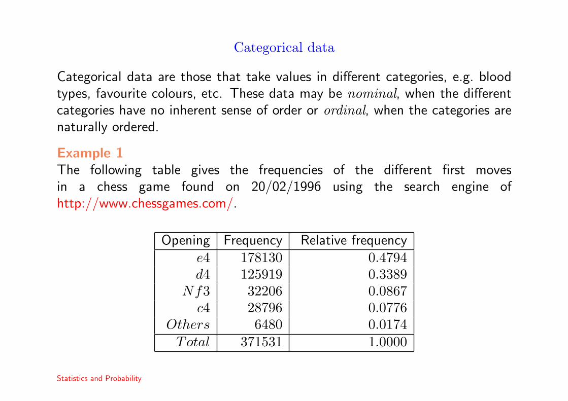
Categorical data
Categorical data are those that take values in different categories, e.g. bloodtypes, favourite colours, etc. These data may be nominal, when the differentcategories have no inherent sense of order or ordinal, when the categories arenaturally ordered.
Example 1The following table gives the frequencies of the different first movesin a chess game found on 20/02/1996 using the search engine ofhttp://www.chessgames.com/.
Opening Frequency Relative frequencye4 178130 0.4794d4 125919 0.3389
Nf3 32206 0.0867c4 28796 0.0776
Others 6480 0.0174Total 371531 1.0000
Statistics and Probability
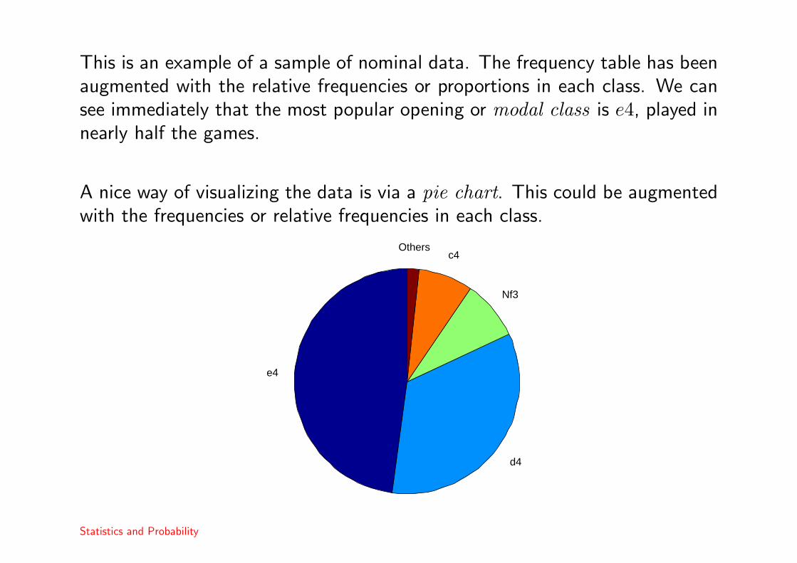
This is an example of a sample of nominal data. The frequency table has beenaugmented with the relative frequencies or proportions in each class. We cansee immediately that the most popular opening or modal class is e4, played innearly half the games.
A nice way of visualizing the data is via a pie chart. This could be augmentedwith the frequencies or relative frequencies in each class.
e4
d4
Nf3
c4Others
Statistics and Probability
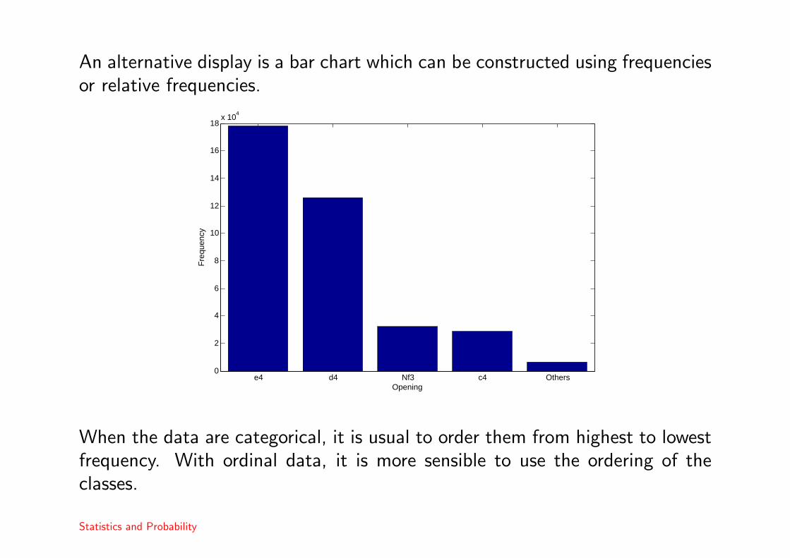
An alternative display is a bar chart which can be constructed using frequenciesor relative frequencies.
e4 d4 Nf3 c4 Others0
2
4
6
8
10
12
14
16
18x 10
4
Opening
Fre
quen
cy
When the data are categorical, it is usual to order them from highest to lowestfrequency. With ordinal data, it is more sensible to use the ordering of theclasses.
Statistics and Probability
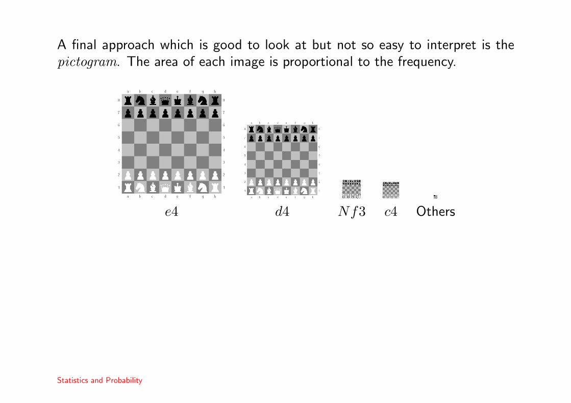
A final approach which is good to look at but not so easy to interpret is thepictogram. The area of each image is proportional to the frequency.
e4 d4 Nf3 c4 Others
Statistics and Probability

Measuring the relation between two categorical variables
Often we may record the values of two (or more) categorical variables. In suchcases we are interested in whether or not there is any relation between thevariables. To do this, we can construct a contingency table.
Example 2The following data given in Morrell (1999) come from a South African studyof single birth children. At birth in 1990 it was recorded whether or not themothers received medical aid and later, in 1995 the researchers attempted totrace the children. Those children found were included in the five year groupfor further study.
Children not traced Five-Year GroupHad Medical Aid 195 46No Medical Aid 979 370
1590
CH Morrell (1999). Simpson’s Paradox: An Example From a Longitudinal Study in South Africa. Journal of Statistics Education, 7.
Statistics and Probability

Analysis of a contingency table
In order to analyze the contingency table it is useful to first calculate themarginal totals.
Children not traced Five-Year GroupHad Medical Aid 195 46 241No Medical Aid 979 370 1349
1174 416 1590
and then to convert the original data into percentages.
Children not traced Five-Year GroupHad Medical Aid .123 .029 .152No Medical Aid .615 .133 .848
.738 .262 1
Statistics and Probability
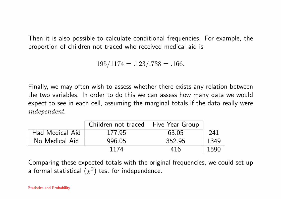
Then it is also possible to calculate conditional frequencies. For example, theproportion of children not traced who received medical aid is
195/1174 = .123/.738 = .166.
Finally, we may often wish to assess whether there exists any relation betweenthe two variables. In order to do this we can assess how many data we wouldexpect to see in each cell, assuming the marginal totals if the data really wereindependent.
Children not traced Five-Year GroupHad Medical Aid 177.95 63.05 241No Medical Aid 996.05 352.95 1349
1174 416 1590
Comparing these expected totals with the original frequencies, we could set upa formal statistical (χ2) test for independence.
Statistics and Probability

Simpson’s paradox
Sometimes we can observe apparently paradoxical results when a populationwhich contains heterogeneous groups is subdivided. The following example ofthe so called Simpson’s paradox comes from the same study.
http://www.amstat.org/publications/jse/secure/v7n3/datasets.morrell.cfm
Statistics and Probability

Numerical data
When data are naturally numerical, we can use both graphical and numericalapproaches to summarize their important characteristics. For discrete data, wecan frequency tables and bar charts in a similar way to the categorical case.
Example 3The table reports the number of previous convictions for 283 adult malesarrested for felonies in the USA taken from Holland et al (1981).
# Previous convictions Frequency Rel. freq. Cum. freq. Cum. rel. freq.
0 0 0.0000 0 0.00001 16 0.0565 16 0.05652 27 0.0954 43 0.15193 37 0.1307 80 0.28274 46 0.1625 126 0.44525 36 0.1272 162 0.57246 40 0.1413 202 0.71387 31 0.1095 233 0.82338 27 0.0954 260 0.91879 13 0.0459 273 0.9647
10 8 0.0283 281 0.992911 2 0.0071 283 1.0000
> 11 0 0.0000 283 1.0000
TR Holland, M Levi & GE Beckett (1981). Associations Between Violent And Nonviolent Criminality: A Canonical Contingency-Table
Analysis. Multivariate Behavioral Research, 16, 237–241.
Statistics and Probability
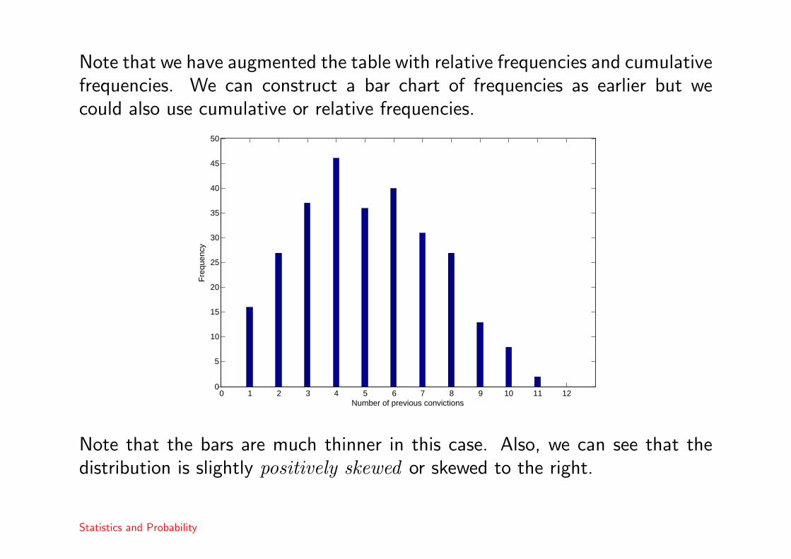
Note that we have augmented the table with relative frequencies and cumulativefrequencies. We can construct a bar chart of frequencies as earlier but wecould also use cumulative or relative frequencies.
0 1 2 3 4 5 6 7 8 9 10 11 120
5
10
15
20
25
30
35
40
45
50
Number of previous convictions
Fre
quen
cy
Note that the bars are much thinner in this case. Also, we can see that thedistribution is slightly positively skewed or skewed to the right.
Statistics and Probability
Continuous data and histograms
With continuous data, we should use histograms instead of bar charts. Themain difficulty is in choosing the number of classes. We can see the effects ofchoosing different bar widths in the following web page.
http://www.shodor.org/interactivate/activities/histogram/
An empirical rule is to choose around√
n classes where n is the number ofdata. Similar rules are used by the main statistical packages.
It is also possible to illustrate the differences between two groups of individualsusing histograms. Here, we should use the same classes for both groups.
Statistics and Probability
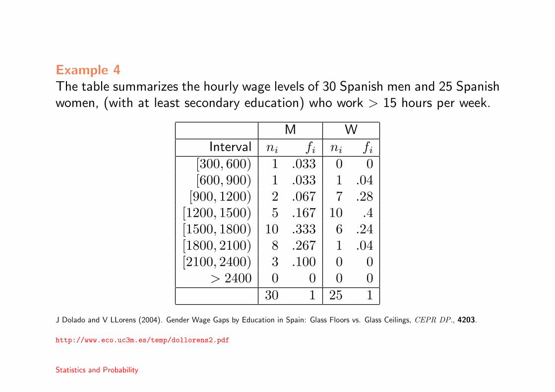
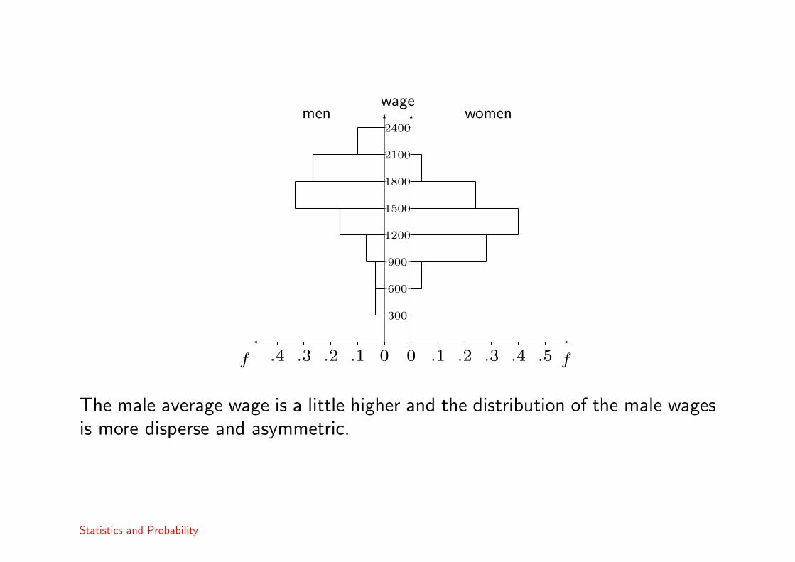
Example 4The table summarizes the hourly wage levels of 30 Spanish men and 25 Spanishwomen, (with at least secondary education) who work > 15 hours per week.
M WInterval ni fi ni fi
[300, 600) 1 .033 0 0[600, 900) 1 .033 1 .04
[900, 1200) 2 .067 7 .28[1200, 1500) 5 .167 10 .4[1500, 1800) 10 .333 6 .24[1800, 2100) 8 .267 1 .04[2100, 2400) 3 .100 0 0
> 2400 0 0 0 030 1 25 1
J Dolado and V LLorens (2004). Gender Wage Gaps by Education in Spain: Glass Floors vs. Glass Ceilings, CEPR DP., 4203.
http://www.eco.uc3m.es/temp/dollorens2.pdf
Statistics and Probability
6 6
� -
0 0.1 .1.2 .2.3 .3.4 .4 .5f f
300
600
900
1200
1500
1800
2100
2400
wagemen women
The male average wage is a little higher and the distribution of the male wagesis more disperse and asymmetric.
Statistics and Probability

Histograms with intervals of different widths
In this case, the histogram is constructed so that the area of each bar isproportional to the number of data.
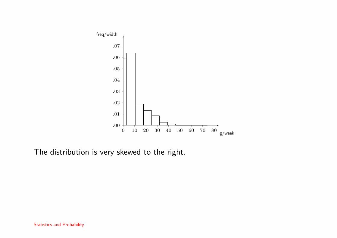
Example 5The following data are the results of a questionnaire to marijuana usersconcerning the weekly consumption of marijuana.
g / week Frequency[0, 3) 94
[3, 11) 269[11, 18) 70[18, 25) 48[25, 32) 31[32, 39) 10[39, 46) 5[46, 74) 2
> 74 0
Landrigan et al (1983). Paraquat and marijuana: epidemiologic risk assessment. Amer. J. Public Health, 73, 784-788
Statistics and Probability

We augment the table with relative frequencies and bar widths and heights.
g / week width ni fi height[0, 3) 3 94 .178 .0592
[3, 11) 8 269 .509 .0636[11, 18) 7 70 .132 .0189[18, 25) 7 48 .091 .0130[25, 32) 7 31 .059 .0084[32, 39) 7 10 .019 .0027[39, 46) 7 5 .009 .0014[46, 74) 28 2 .004 .0001
> 74 0 0 0 0Total 529 1
We use the formula
height = frequency/interval width
Statistics and Probability
-
6
0 10 20 30 40 50 60 70 80.00
.01
.02
.03
.04
.05
.06
.07
g/week
freq/width
The distribution is very skewed to the right.
Statistics and Probability

Other graphical methods
• the frequency polygon. A histogram is constructed and the bars are linesare used to join each bar at the centre. Usually the histogram is thenremoved. This simulates the probability density function.
• the cumulative frequency polygon. As above but using a cumulativefrequency histogram and joining at the end of each bar.
• the stem and leaf plot. This is like a histogram but retaining the originalnumbers.
Statistics and Probability

Sample moments
For a sample, x1, . . . , xn of numerical data, then the sample mean is definedas x = 1
n
∑ni=1 xi and the sample variance is s2 = 1
n−1
∑ni=1(xi − x)2. The
sample standard deviation is s =√
s2.
The sample mean may be interpreted as an estimator of the population mean.It is easiest to see this if we consider grouped data say x1, . . . , xk where xj is
observed nj times in total and∑k
i=1 ni = n. Then, the sample mean is
x =1n
k∑j=1
njxj =k∑
j=1
fjxj
where fj is the proportion of times that xj was observed.
When n → ∞, then (using the frequency definition of probability), we knowthat fj → P (X = xj) and so x → µX, the true population mean.
Sometimes the sample variance is defined with a denominator of n instead ofn− 1. However, in this case, it is a biased estimator of σ2.
Statistics and Probability
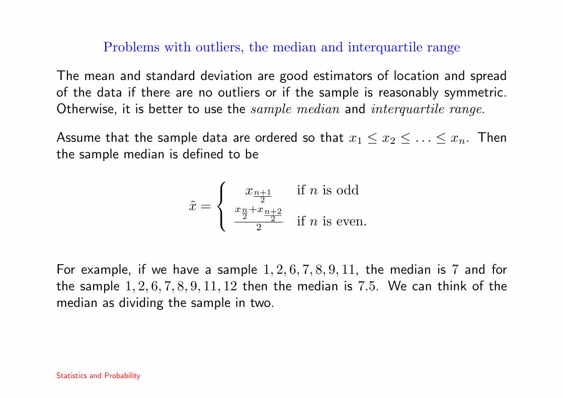
Problems with outliers, the median and interquartile range
The mean and standard deviation are good estimators of location and spreadof the data if there are no outliers or if the sample is reasonably symmetric.Otherwise, it is better to use the sample median and interquartile range.
Assume that the sample data are ordered so that x1 ≤ x2 ≤ . . . ≤ xn. Thenthe sample median is defined to be
x =
xn+12
if n is oddxn
2+xn+2
22 if n is even.
For example, if we have a sample 1, 2, 6, 7, 8, 9, 11, the median is 7 and forthe sample 1, 2, 6, 7, 8, 9, 11, 12 then the median is 7.5. We can think of themedian as dividing the sample in two.
Statistics and Probability

We can also define the quartiles in a similar way. The lower quartile isQ1 = xn+1
4and the upper quartile may be defined as Q3 = x3(n+1)
4where if the
fraction is not a whole number, the value should be derived by interpolation.Thus, for the sample 1, 2, 6, 7, 8, 9, 11, then Q1 = 2 and Q3 = 9. For thesample 1, 2, 6, 7, 8, 9, 11, 12, we have n+1
4 = 2.25 so that
Q1 = 2 + 0.25(6− 2) = 3
and 3(n+1)4 = 6.75 so
Q3 = 9 + 0.75(11− 9) = 10.5.
A nice visual summary of a data sample using the median, quartiles and rangeof the data is the so called box and whisker plot or boxplot.
http://en.wikipedia.org/wiki/Box_plot
Statistics and Probability
Bivariate data
Often, we may measure two or more variables at a time. In such cases we areinterested in the relationship between the two variables. Different techniquesare used to summarize discrete or categorical variables and continuous variables.
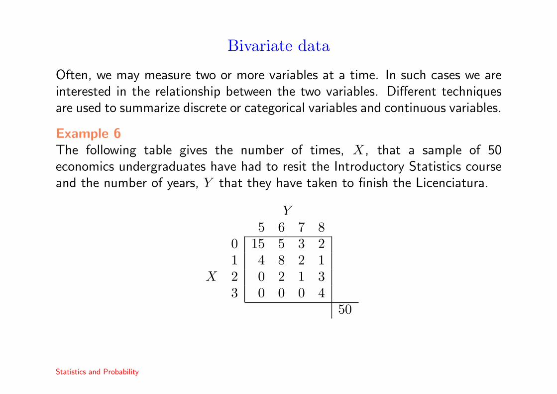
Example 6The following table gives the number of times, X, that a sample of 50economics undergraduates have had to resit the Introductory Statistics courseand the number of years, Y that they have taken to finish the Licenciatura.
Y5 6 7 8
0 15 5 3 21 4 8 2 1
X 2 0 2 1 33 0 0 0 4
50
Statistics and Probability
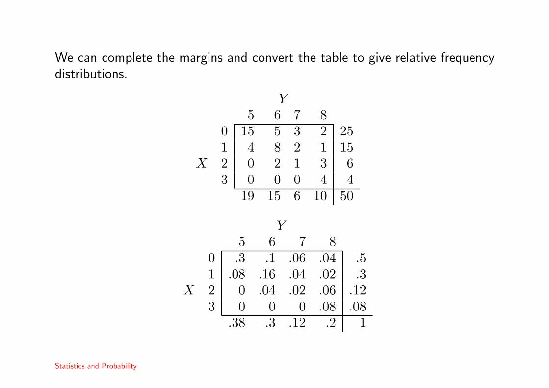
We can complete the margins and convert the table to give relative frequencydistributions.
Y5 6 7 8
0 15 5 3 2 251 4 8 2 1 15
X 2 0 2 1 3 63 0 0 0 4 4
19 15 6 10 50
Y5 6 7 8
0 .3 .1 .06 .04 .51 .08 .16 .04 .02 .3
X 2 0 .04 .02 .06 .123 0 0 0 .08 .08
.38 .3 .12 .2 1
Statistics and Probability

We can also calculate sample moments:
x = 0× 0.5 + 1× 0.3 + 2× 0.12 + 3× 0.08 = 0.78
and derive conditional frequencies.
What is the distribution of the number of years that a student takes to finishthe licenciatura supposing that they have to repeat the statistics course twice?
We wish to find the relative frequencies f(Y |X = 2). We can calculate theseby looking at the row for X = 2 y dividing the frequencies by the marginaltotal:
Y 5 6 7 8f(Y |X = 2) 0 .333 .166 .5
In general, f(y|x) = f(x,y)f(x) .
Statistics and Probability
Correlation and regression
Often we are interested in modeling the extent of a linear relationship betweentwo data samples.
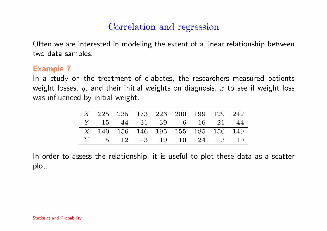
Example 7In a study on the treatment of diabetes, the researchers measured patientsweight losses, y, and their initial weights on diagnosis, x to see if weight losswas influenced by initial weight.
X 225 235 173 223 200 199 129 242
Y 15 44 31 39 6 16 21 44
X 140 156 146 195 155 185 150 149
Y 5 12 −3 19 10 24 −3 10
In order to assess the relationship, it is useful to plot these data as a scatterplot.
Statistics and Probability
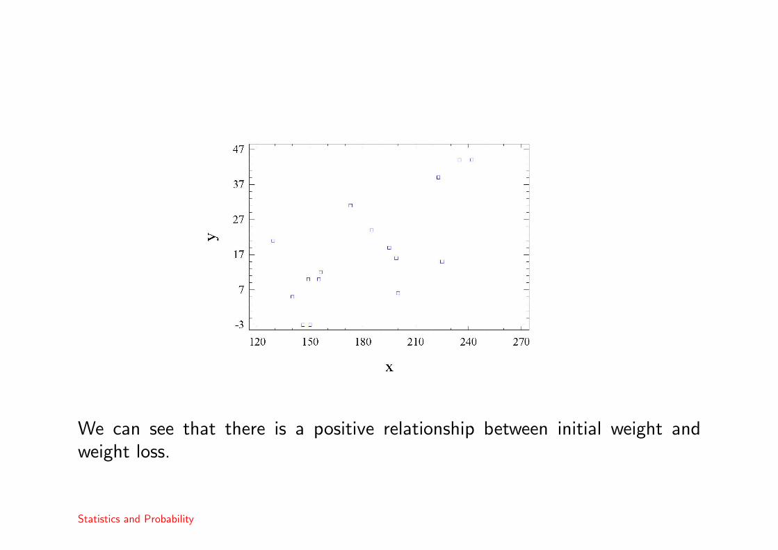
We can see that there is a positive relationship between initial weight andweight loss.
Statistics and Probability

The sample covariance
In such cases, we can measure the extent of the relationship using the samplecorrelation. Given a sample, (x1, y1), . . . , (xn, yn), then the sample covarianceis defined to be
sxy =1
n− 1
n∑i=1
(xi − x)(yi − y).
In our example, we have
x =116
(225 + 235 + . . . + 149)
= 181.375
y =116
(15 + 44 + . . . + 10)
= 18.125
sxy =116{(225− 181.375)(15− 18.125)+
(235− 181.375)(44− 18.125) + . . . +
(149− 181.375)(10− 18.125)} ≈ 361.64
Statistics and Probability

The sample correlation
The sample correlation is
rxy =sxy
sxsy
where sx and sy are the two standard deviations. This has properties similarto the population correlation.
• −1 ≤ rxy ≤ 1.
• rxy = 1 if y = a + bx and rxy = −1 if y = a− bx for some b > 0.
• If there is no relationship between the two variables, then the correlation is(approximately) zero.
In our example, we find that s2x ≈ 1261.98 and s2
y ≈ 211.23 so that sx ≈ 35.52and sy ≈ 14.53. which implies that rxy = 361.64
35.52×14.53 ≈ 0.70 indicating astrong, positive relationship between the two variables.
Statistics and Probability

Correlation only measures linear relationships!
High or low correlations can often be misleading.
In both cases, the variables have strong, non-linear relationships. Thus,whenever we are using correlation or building regression models, it is alwaysimportant to plot the data first.
Statistics and Probability

Spurious correlation
Correlation is often associated with causation. If X and Y are highly correlated,it is often assumed that X causes Y or Y causes X.

Spurious correlation
Correlation is often associated with causation. If X and Y are highly correlated,it is often assumed that X causes Y or Y causes X.
Statistics and Probability

Example 8Springfield had just spent millions of dollars creating a highly sophisticated”Bear Patrol” in response to the sighting of a single bear the week before.
Homer: Not a bear in sight. The ”Bear Patrol” is working like a a charmLisa: That’s specious reasoning, Dad.Homer:[uncomprehendingly] Thanks, honey.Lisa: By your logic, I could claim that this rock keeps tigers away.Homer: Hmm. How does it work? Lisa:It doesn’t work. (pause) It’s just a stupid rock!Homer: Uh-huh.Lisa: But I don’t see any tigers around, do you?Homer: (pause) Lisa, I want to buy your rock.
Much Apu about nothing. The Simpsons series 7.
Statistics and Probability

Example 91988 US census data showed that numbers of churches in a city was highlycorrelated with the number of violent crimes. Does this imply that havingmore churches means that there will be more crimes or that having more crimemeans that more churches are built?

Example 91988 US census data showed that numbers of churches in a city was highlycorrelated with the number of violent crimes. Does this imply that havingmore churches means that there will be more crimes or that having more crimemeans that more churches are built?
Both variables are highly correlated to population. The correlation betweenthem is spurious.
Statistics and Probability

Regression
An model representing an approximately linear relation between x and y is
y = α + βx + ε
where ε is a prediction error.
In this formulation, y is the dependent variable whose value is modeled asdepending on the value of x, the independent variable .
How should we fit such a model to the data sample?
Statistics and Probability

Least squares
Gauss
We wish to find the line which best fits the sample data (x1, y1), . . . , (xn, yn).In order to do this, we should choose the line, y = a + bx, which in some wayminimizes the prediction errors or residuals,
ei = yi − (a + bxi) for i = 1, . . . , n.
Statistics and Probability
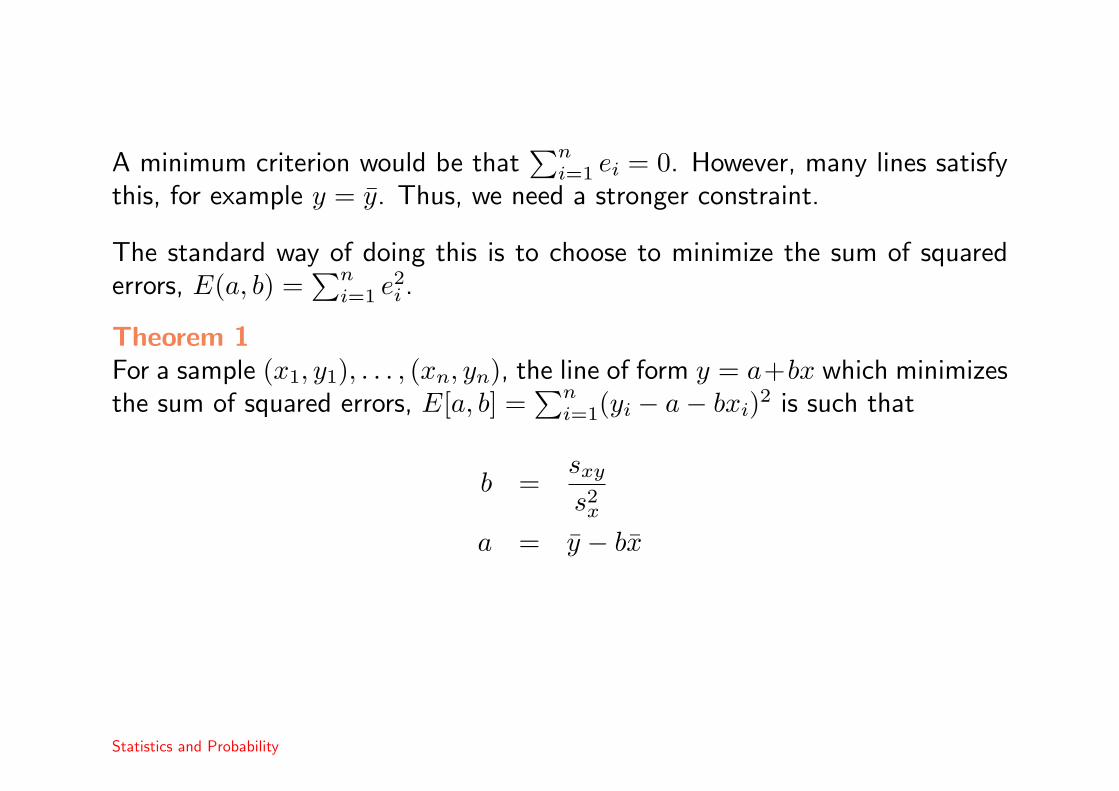
A minimum criterion would be that∑n
i=1 ei = 0. However, many lines satisfythis, for example y = y. Thus, we need a stronger constraint.
The standard way of doing this is to choose to minimize the sum of squarederrors, E(a, b) =
∑ni=1 e2
i .
Theorem 1For a sample (x1, y1), . . . , (xn, yn), the line of form y = a+bx which minimizesthe sum of squared errors, E[a, b] =
∑ni=1(yi − a− bxi)2 is such that
b =sxy
s2x
a = y − bx
Statistics and Probability
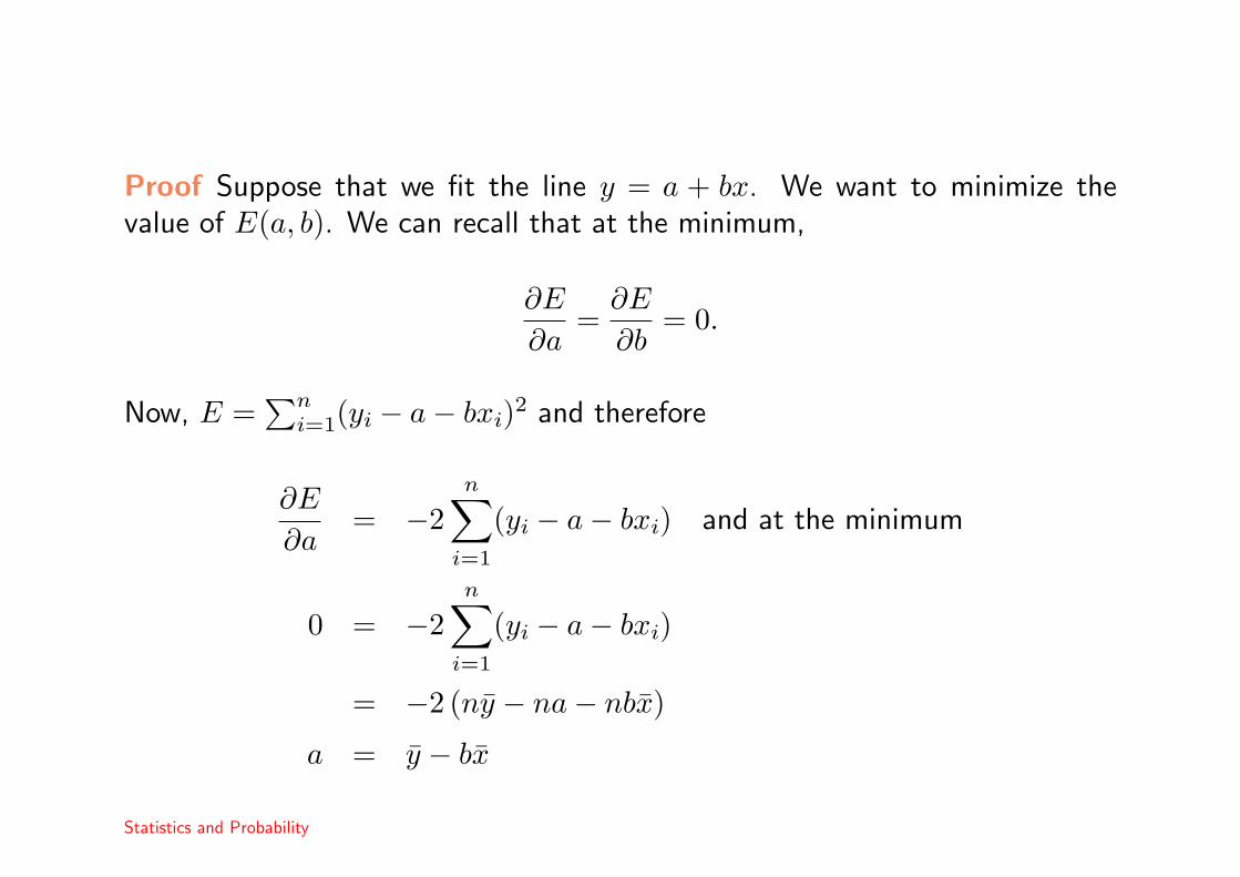
Proof Suppose that we fit the line y = a + bx. We want to minimize thevalue of E(a, b). We can recall that at the minimum,
∂E
∂a=
∂E
∂b= 0.
Now, E =∑n
i=1(yi − a− bxi)2 and therefore
∂E
∂a= −2
n∑i=1
(yi − a− bxi) and at the minimum
0 = −2n∑
i=1
(yi − a− bxi)
= −2 (ny − na− nbx)
a = y − bx
Statistics and Probability
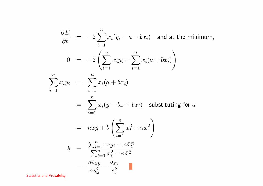
∂E
∂b= −2
n∑i=1
xi(yi − a− bxi) and at the minimum,
0 = −2
(n∑
i=1
xiyi −n∑
i=1
xi(a + bxi)
)n∑
i=1
xiyi =n∑
i=1
xi(a + bxi)
=n∑
i=1
xi(y − bx + bxi) substituting for a
= nxy + b
(n∑
i=1
x2i − nx2
)
b =∑n
i=1 xiyi − nxy∑ni=1 x2
i − nx2
=nsxy
ns2x
=sxy
s2x
Statistics and Probability

We will fit the regression line to the data of our example on the weights ofdiabetics. We have seen earlier that x = 181.375, y = 18.125 , sxy = 361.64,s2
x = 1261.98 and s2y = 211.23.
Thus, if we wish to predict the values of y (reduction in weight) in terms of x(original weight), the least squares regression line is
y = a + bx
where
b =361.641261.98
≈ 0.287
a = 18.125− 0.287× 181.375 ≈ −33.85
The following diagram shows the fitted regression line.
Statistics and Probability

Statistics and Probability

We can use this line to predict the weight loss of a diabetic given their initialweight. Thus, for a diabetic who weighed 220 pounds on diagnosis, we wouldpredict that their weight loss would be around
y = −33.85 + 0.287× 220 = 29.29 lbs.
Note that we should be careful when making predictions outside the range ofthe data. For example the linear predicted weight gain for a 100 lb patientwould be around 5 lbs but it is not clear that the linear relationship still holdsat such low values.
Statistics and Probability

Residual analysis
Los residuals or prediction errors are the differences ei = yi − (a + bxi). It isuseful to see whether the average prediction error is small or large. Thus, wecan define the residual variance
s2e =
1n− 1
n∑i=1
e2i
and the residual standard deviation, se =√
s2e.
In our example, we have e1 = 15−(−33.85+0.287×225), e2 = 44−(−33.85+0.287× 235) etc. and after some calculation, the residual sum of squares canbe shown to be s2
e ≈ 123. Calculating the results this way is very slow. Thereis a faster method.
Statistics and Probability
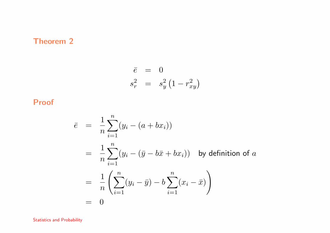
Theorem 2
e = 0
s2r = s2
y
(1− r2
xy
)Proof
e =1n
n∑i=1
(yi − (a + bxi))
=1n
n∑i=1
(yi − (y − bx + bxi)) by definition of a
=1n
(n∑
i=1
(yi − y)− bn∑
i=1
(xi − x)
)= 0
Statistics and Probability

s2e =
1n− 1
n∑i=1
(yi − (a + bxi))2
=1
n− 1(yi − (y − bx + bxi))
2 by definition of a
=1
n− 1((yi − y)− b(xi − x)))2
=1
n− 1
(n∑
i=1
(yi − y)2 − 2bn∑
i=1
(yi − y)(xi − x) + b2n∑
i=1
(xi − x)2)
= s2y − 2bsxy + b2s2
x = s2y − 2
sxy
s2x
sxy +(
sxy
s2x
)2
s2x by definition of b
= s2y −
s2xy
s2x
= s2y
(1−
s2xy
s2xs2
y
)
= s2y
(1−
(sxy
sxsy
)2)
= s2y
(1− r2
xy
)Statistics and Probability

Interpretation
This result shows thats2
r
s2y
= (1− r2xy).
Consider the problem of estimating y. If we only observe y, . . . , yn, then ourbest estimate is y and the variance of our data is s2
y.
Given the x data, then our best estimate is the regression line and the residualvariance is s2
r.
Thus, the percentage reduction in variance due to fitting the regression line is
R2 = (1− r2xy)× 100%
In our example, rxy ≈ 0.7 so R2 = (1− 0.49)× 100% = 51%.
Statistics and Probability

Graphing the residuals
As we have seen earlier, the correlation between two variables can be highwhen there is a strong non-linear relation.
Whenever we fit a linear regression model, it is important to use residual plotsin order to check the adequacy of the fit.
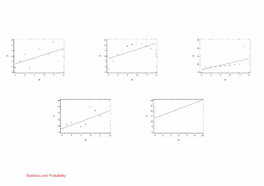
The regression line for the following five groups of data, from Basset et al(1986) is the same, that is
y = 18.43 + 0.28x
Bassett, E. et al (1986). Statistics: Problems and Solutions. London: Edward Arnold
Statistics and Probability
Statistics and Probability
• The first case is a standard regression.
• In the second case, we have a non-linear fit.
• In the third case, we can see the influence of an outlier.
• The fourth case is a regression but . . .
• In the final case, we see that one point is very influential.
Now we can observe the residuals.
Statistics and Probability
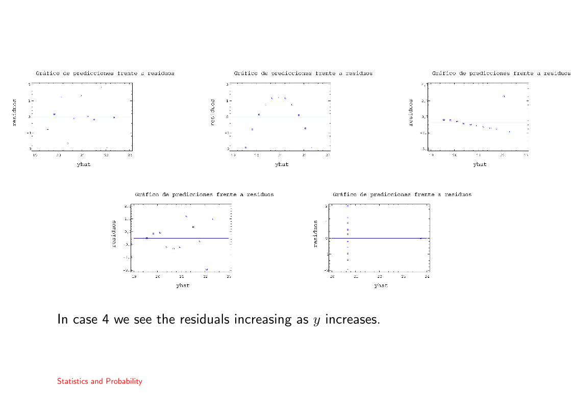
In case 4 we see the residuals increasing as y increases.
Statistics and Probability

Two regression lines
So far, we have used the least squares technique to fit the line y = a + bxwhere a = y − bx and b = sxy
s2x.
We could also rewrite the linear equation in terms of x and try to fit x = c+dy.Then, via least squares, we have that c = x− dy and d = sxy
s2y.
We might expect that these would be the same lines, but rewriting
y = a + bx ⇒ x = −a
b+
1by 6= c + dy
It is important to notice that the least squares technique minimizes theprediction errors in one direction only.
Statistics and Probability

The following example shows data on the extension of a cable, y relative toforce applied, x and the fit of both regression lines.
Statistics and Probability
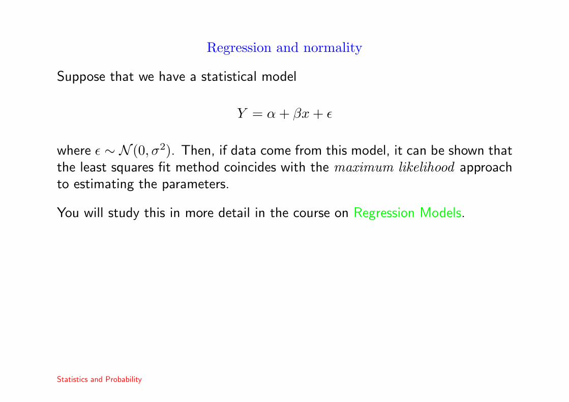
Regression and normality
Suppose that we have a statistical model
Y = α + βx + ε
where ε ∼ N (0, σ2). Then, if data come from this model, it can be shown thatthe least squares fit method coincides with the maximum likelihood approachto estimating the parameters.
You will study this in more detail in the course on Regression Models.
Statistics and Probability

Time Series
We often observe data over long time periods and are interested in the changesin these data over time.
Example 10The data are changes in the sizes of tree rings of the (pencil pine) tree inAustralia, between 1028 and 1975.
Statistics and Probability
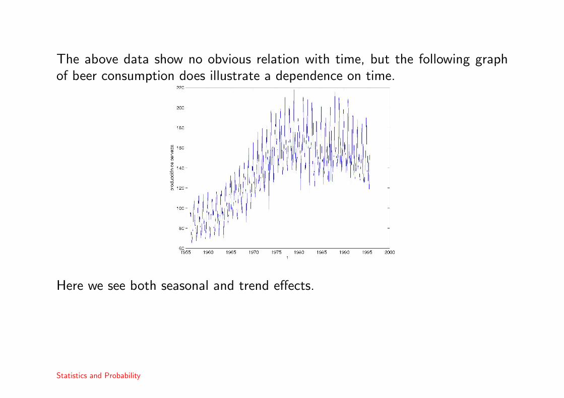
The above data show no obvious relation with time, but the following graphof beer consumption does illustrate a dependence on time.
Here we see both seasonal and trend effects.
Statistics and Probability

Classification of time series
A series is said to be stationary if the characteristics of the series (mean andvariance) are more or less constant over time.
Otherwise, the series is non-stationary.
Non stationary series can show a trend, so that the mean changes over time.
Also they can show seasonal effects which means to say that there are periodiceffects in time. For example, beer sales go up in the hot weather.
In many cases, a series Xt can be modeled as a simple sum form
Xt = Tt + St + It.
In such cases, each effect may be modeled separately.
Statistics and Probability

Modeling trend
Various techniques can be used. The simplest of which is simple regression.
Example 11Te data are CO2 levels in the volcano Muana Loa between 1974 and 1987.
Statistics and Probability
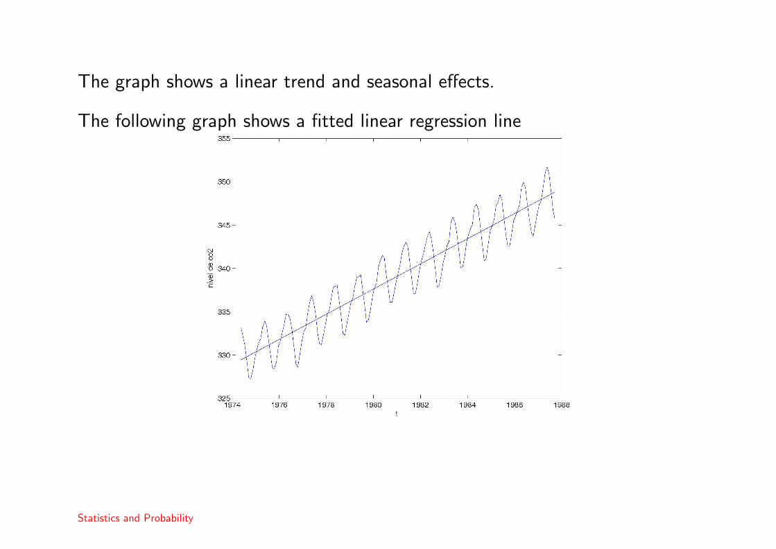
The graph shows a linear trend and seasonal effects.
The following graph shows a fitted linear regression line
Statistics and Probability

and we can see the residuals after fitting the regression.
We can now proceed to model the seasonal effects.
Statistics and Probability

Analysis of seasonality
A simple method of estimating monthly seasonal effects is to construct a tableas below.
Ano
1 2 · · · n Means S
January x11 x12 · · · x1n x1· S1
february x21 x22 · · · x2n x2· S2
month ... ... ... · · · ... ... ...
november x11 1 x11 2 · · · x11 n x11· S11
december x12 1 x12 2 · · · x12 n x12· S12
Means M1 M2 · · · Mn M
Here, M is the mean of all the data in the series.
The seasonal coefficients are Si = xi· −M for i = 1, . . . , 12 and the seasonaleffect, St satisfies.
St = St+12 = St+24 = . . .
Statistics and Probability
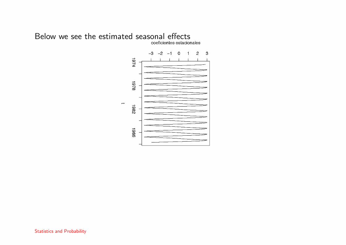
Below we see the estimated seasonal effects
Statistics and Probability
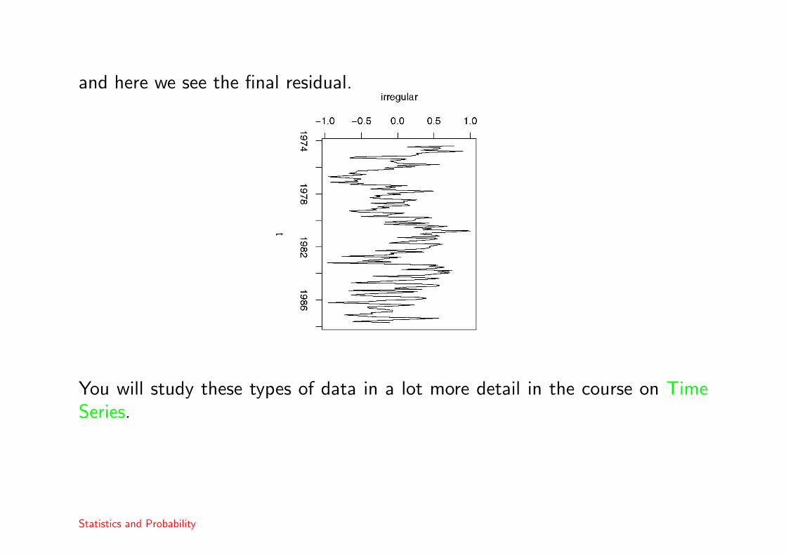
and here we see the final residual.
You will study these types of data in a lot more detail in the course on TimeSeries.
Statistics and Probability