intro to graphs vocab and categorical data. distributions what is a distribution? the distribution...
TRANSCRIPT

Intro to GraphsVocab and Categorical Data

Distributions
• What is a distribution?• The distribution of a variable tells us what values the
variable takes and how often it takes it.• Variables:
• Categorical: data that is collected based off specific characteristics• Examples: Eye color, level of education
• Quantitative: data that is collected based on its measurement or numbers• Examples: height, weight, age, score on a test

Collecting & Organizing Data
Tables• Title: should include the subject as well as the date it was taken• Labels: Should identify the variables and state the units (counts
– numbers, rates – percentage or proportions• Source: Where did the data come from? (usually denoted at the
bottom)

Our class
• How many of you have blue eyes, green eyes, hazel eyes, or brown eyes?
• How many of you are between 4’10 ¼ ” to 5’2 ”, 5’2” to 5’6”, 5’6” to 5’10”, and 5’10” to 6’2”?
• Create a table for each of these situations

Rounding Errors
• Start by finding the percentage of people in each group.
• When we do this, we must understand that the percentages may not always add up to 100%
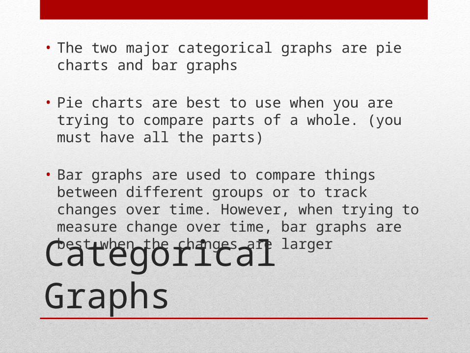
Categorical Graphs
• The two major categorical graphs are pie charts and bar graphs
• Pie charts are best to use when you are trying to compare parts of a whole. (you must have all the parts)
• Bar graphs are used to compare things between different groups or to track changes over time. However, when trying to measure change over time, bar graphs are best when the changes are larger

Creating the graphs
Number of persons (thousands)
Percent
Less than HS education 4,459
High School Graduate 11,562
Some College 10,693
Bachelor’s Degree 8,577
Advanced Degree 2,494
Total

Drawing bar charts
When drawing bar chart remember:
Give the bar chart a title.
Use equal intervals on the axes.
Draw bars of equal width.
Leave a gap between each bar.
Label both the axes.
Include a key for the chart if necessary.

Our bar graph
Not HS Grad HS Graudate Some College Bachelor's Degree
Advanced Degree
0
2
4
6
8
10
12
Percent of people with each level of education
PERCENT
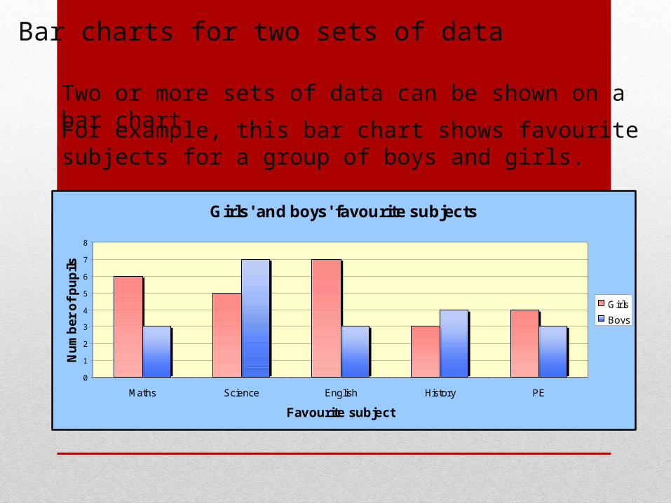
Bar charts for two sets of data
Two or more sets of data can be shown on a bar chart.
For example, this bar chart shows favourite subjects for a group of boys and girls.
Girls' and boys' favourite subjects
0
1
2
3
4
5
6
7
8
Maths Science English History PE
Favourite subject
Nu
mb
er o
f p
up
ils
Girls
Boys
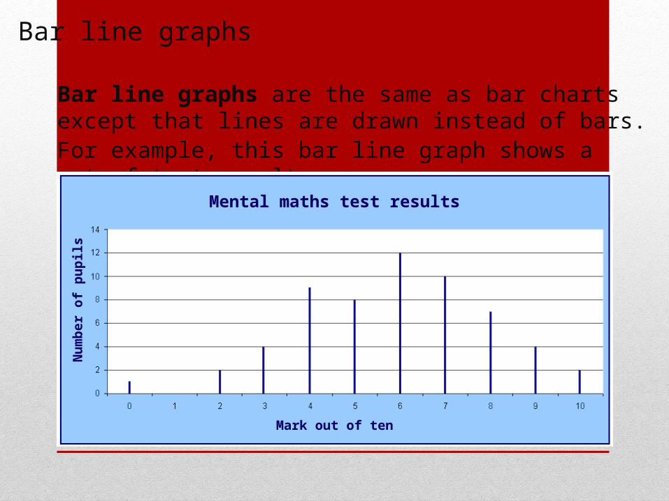
Bar line graphs
Bar line graphs are the same as bar charts except that lines are drawn instead of bars.For example, this bar line graph shows a set of test results.
Mental maths test results
Mark out of ten
Nu
mb
er o
f p
up
ils

Pie Chart
• What elements are important for a pie chart?• Legend or correctly labeled sections• Include the percentages in your graph• Calculations for the degrees of each section
• Take the 360o in a circle and multiple it by the % of each category to determine the angle measure for each section.
• Use a protractor to ensure the angle measure is accurate and correctly represents the data.
Our Pie Chart
Percentage of people with each level of education
Not HS GradHS GradSome CollegeBachelor's DegreeAdvanced Degree

Extra Practice
For example, 30 people were asked which newspapers they read regularly.
The results were :
Newspaper No of people Working Angle
The Guardian 8
Daily Mirror 7
The Times 3
The Sun 6
Daily Express 6

Create the Pie Chart