information systems - centrum wiskunde & informatica
TRANSCRIPT

C e n t r u m v o o r W i s k u n d e e n I n f o r m a t i c a
INformation Systems
Creating harmonious and legible colour schemes in the automated generation of multimedia presentations
Amit Manniesing
REPORT INS-E0304 NOVEMBER 14, 2003
INSInformation Systems

CWI is the National Research Institute for Mathematics and Computer Science. It is sponsored by the Netherlands Organization for Scientific Research (NWO).CWI is a founding member of ERCIM, the European Research Consortium for Informatics and Mathematics.
CWI's research has a theme-oriented structure and is grouped into four clusters. Listed below are the names of the clusters and in parentheses their acronyms.
Probability, Networks and Algorithms (PNA)
Software Engineering (SEN)
Modelling, Analysis and Simulation (MAS)
Information Systems (INS)
Copyright © 2003, Stichting Centrum voor Wiskunde en InformaticaP.O. Box 94079, 1090 GB Amsterdam (NL)Kruislaan 413, 1098 SJ Amsterdam (NL)Telephone +31 20 592 9333Telefax +31 20 592 4199
ISSN 1386-3681

Creating harmonious and legible colour schemes inthe automated generation of multimediapresentations
ABSTRACTDue to the growing amount of information on the web, the user specific requirements anddifferent characteristics of output devices, the opportunities for the automatic generation ofmultimedia presentations grow. The multimedia presentation generator, that resides in adynamic environment, such as a museum website, where the user requirements, presentationdevice characteristics, presentation content and the domain characteristics are not known inadvance, needs to be able to compose a presentation. With respect to stylistic design, graphicdesigners can create a template providing stylistic aspects, but as soon as any of the dynamicattributes of the system change this can result in the need for redesign. We argue that with thecorrect balance between form and function and by using relevant aspects of design theory, theautomatic presentation generator can keep harmony and legibility factors in balance. The aim ofthis work is to demonstrate this approach on the example of automatic colour design with theuse of colour theory from Itten and Tufte. By taking required legibility factors into account,harmonious and well balanced colour schemes, adapted to the requirements of the user, thecharacteristics of the presentation platform, the content's domain and discourse model can becreated. We apply our approach to the domain of presentation environments for musea for finearts.
1998 ACM Computing Classification System: H5.4, Architectures, Navigation, User issues; I7.2 Hypertext/hypermedia,Multi/mixed media.Keywords and Phrases: multimedia semantics; automatic colour design; colour harmonisation; style-driven multimediapresentation generationNote: This work forms the basis of report INS-R0303.

Creating harmonious and legible colour schemes in theautomated generation of multimedia presentations
Amit Sharwan Kumar ManniesingCWI
P.O. Box 94079, 1090 GB Amsterdam, The Netherlands
ABSTRACT
Due to the growing amount of information on the web, the user specific requirements and
different characteristics of output devices, the opportunities for the automatic generation
of multimedia presentations grow. The multimedia presentation generator, that resides
in a dynamic environment, such as a museum website, where the user requirements,
presentation device characteristics, presentation content and the domain characteristics
are not known in advance, needs to be able to compose a presentation. With respect to
stylistic design, graphic designers can create a template providing stylistic aspects, but
as soon as any of the dynamic attributes of the system change this can result in the need
for redesign. We argue that with the correct balance between form and function and by
using relevant aspects of design theory, the automatic presentation generator can keep
harmony and legibility factors in balance. The aim of this work is to demonstrate this
approach on the example of automatic colour design with the use of colour theory from
Itten and Tufte. By taking required legibility factors into account, harmonious and well
balanced colour schemes, adapted to the requirements of the user, the characteristics
of the presentation platform, the content’s domain and discourse model can be created.
We apply our approach to the domain of presentation environments for musea for fine
arts.
1998 ACM Computing Classification System: H.5.4, I.7.2
Keywords and Phrases: Multimedia semantics, automatic colour design, colour harmon-
isation, style-driven multimedia presentation generation
Note: This work was carried out under the ToKeN2000/CHIME project

2
Chapter 1
Introduction
1. IThis Master’s thesis was written within the scope of the Master’s program of the sectionInformation Systems Design of the Department of Information Systems Algorithms (ISA)of the Faculty of Information Technology and Systems (ITS) at the Technical University ofDelft.
The aim of this graduation work is to allow the student to work independently on aproject with typical engineering aspects, such as analysis, design, realisation and imple-mentation of algorithms, systems, methods and techniques. The research for this masterproject has taken place at the Multimedia and Human-Computer Interaction theme, (INS-2) of theCentrum voor Wiskunde en Informatica(CWI), the National Research Institutefor Mathematics and Computer Science. The work concentrates on colour design issues aspart of the automated generation process of multimedia presentations.
2. P SIn one “high information density sentence”, we formulate the problem of our research:
Convey, using the presentation-oriented design knowledge of an automatedinformative hypermedia presentation generator, the underlying information ina variety of circumstances, taking on the one hand the delivery context andon the other hand the inherent style attributes of constituent media items intoaccount.
By usingpresentation-oriented design knowledgewe intend to include the stylistic,aesthetic and semantic aspects of a presentation, keeping in mind the balance betweenform and function where emphasis on function or form is the leading thread for the designprocess of the presentation. The derivation of the design knowledge itself is also part of thisresearch. This design knowledge is used to guide theautomated informative hypermediapresentation generatorin creating a well-balanced hypermedia presentation. This hyper-media presentation takesdelivery context into account, with respect to the platform anduser characteristics, and on the other hand theinherent style attributes of the constituentmedia items, with respect to the domain, user and platform characteristics.
3. P The project is split up in five sequential phases, which to some extent can also be conductedin parallel

3
1. Based upon a literature study in the area of graphic design and interactive mediadesign, the candidate will need to select a number of relevant design topics and modelpotentially implicit design knowledge explicitly.
2. Based upon a literature study in the area of Semantic Web languages and tools, thecandidate will need to select appropriate tools for representing and manipulating theknowledge captured in phase 1.
3. The candidate will incorporate the knowledge and tools into the Cuypers multime-dia transformation research prototype in order to perform practical experiments ofautomatically applied design rules.
4. The functionality of the design rules used for the generation of presentations needsto be evaluated against the intended semantics, the given delivery contexts, and thestyle attributes of the media content.
5. The research results of the previous 4 phases will be documented in a Master’s thesis.The thesis should be of sufficiently high quality to be published as a CWI technicalreport.
4. S Graphical design issues in the automation of presentation generation are a broad topic. Itcomprises not only colour design issues, but also the design of spatial and temporal lay-out, typeface issues, such as font type, size and face, and perhaps the most important ofall, cognition and perception factors. With the use of colour theory from Itten [21] andTufte [50, 51] we will create, by taking the required cognition and perception factors intoaccount, harmonious and well-balanced colour schemes, adapted to the requirements ofthe user, the characteristics of the presentation platform, the content’s domain and the dis-course model. These colour schemes are to be used in an automatic presentation generatorprototype, which resides in a dynamic environment. Hence, the aim must be that the es-tablished structures and mechanisms facilitate content generation that generate human andmachine accessible content.
5. OThe remainder of this master’s thesis is as follows:
Chapter 2 describes the underlying theory with respect to documents when dealing withautomated hypermedia presentation generation, providing descriptions about hyper-media, web content evolution and the separation of style and content.
Chapter 3 explains the architecture of the prototype system Cuypers, an automated pre-sentation generator. An example scenario describes the role of the Design Modulewithin this architecture, the focus of our work, together with its current functionality.In this chapter it is also described how the balance between form and function is usedby the Design Module in its decision process.
Chapter 4 is the result of the derivation of colour theory in general (perception and cog-nition) and in particular the design knowledge, with respect to Itten’s equilibriumtheory and Tufte’s minimal effective difference theory. The results provide generalrules for using colours in combination with each other, dealing with aesthetics, andthe use of colours in combination with legibility problems when text is involved.
Chapter 5 provides an example scenario in which the different steps of the colour selec-tion process will be described. A proposed architecture guides the reader in under-standing the decisions made by the system.

4
Chapter 6 gives a description of the realisation of the Design Module, in which the ex-ample scenario will be used to make clear what happens at each step of the colourdesign process. The different components of the architecture will be described indetail as well as the integration of the Design Module within the Cuypers system.
Chapter 7 provides the reader with a summary and an evaluation of the project. Thechapter concludes with recommendations for future work.

5
Chapter 2
Automatic Generation of Hypermedia Presentations
The automatic generation of multimedia presentations has been a focus of multimedia re-search for over a decade. The aim is to establish generation mechanisms with adaptive [9]or adaptable qualities [42] that adjust the multimedia presentation to the specific contextof an individual user. Various attempts to explore and develop innovative presentationtechniques have been described with respect to fully automated multimedia authoring [2],constructive text theory [3, 22], the use of relational grammar [63], cross media adapta-tion [8], and the use of an evolving collection of media items [14]. This section conveysthe reader with a better understanding of automatically generating hypermedia presenta-tions by describing relevant aspects of hypermedia documents, stages of evolution of webcontent and the resulting separation of content and style.
1. H Hypermedia documents can be seen as a combination of hypertext and multimedia docu-ments. Table 2.1 from [54] provides a general classification.
Static media Time-based mediaLinear structure Text Multimedia
Non-Linear structure Hypertext Hypermedia
Table 2.1: Classification of electronic documents
Hypermedia presentations consist, thus, of the combination of multiple hypermedia el-ements, connected through temporal synchronization. The presentation itself is embod-ied in a document in which the temporal and spatial relations are encoded. This docu-ment can be for example, represented in the languages SMIL 1.0 [59], SMIL 2.0 [61] orHTML+TIME [43]. Another document type to embody a hypermedia presentation is theFlash format from Macromedia. This document type, however, is only human readablewith respect to content, in contrast to SMIL and HTML+TIME where the content is hu-manandmachine accessible. Due to the lack of machine accessibility we will not considerFlash in this work.
The automatic generation of hypermedia presentations allows authoring at levels of ab-straction higher than the final presentation [40], as well as the ability to reuse user, networkand platform adapted content. To achieve this goal, an essential requirement for the auto-

6
matic generation process is to separatecontentfrom style[57]. In the next sections we showhow this requirement developed over the years in the best known dynamic environment, thewww.
2. W With the introduction of the first graphical web browser, Mosaic, the applicability of hyper-media, i.e. documents combining text, links, images, sounds and video, became popular.In the first year after the introduction of Mosaic, the number of webservers grew exponen-tially from 100 to 7000 [49]. Over the years we saw three distinct steps in the developmentof Web content [55].
First generation Web content is known for its plain hypertext documents, which oftenwere handwritten. Hypertext was considered to be the glue of the WWW [53]. Therepresentation language of hypertext then was HTML.
When content or style needed to be changed, this type of generation of documents provedits inflexibility because of its handmade characteristics. Especially when the content waslocated in a database or was subject to frequent updates. This resulted in the developmentof the next generation of web content tools.
Second generation Web contentis the current state of the art of Web content. It is muchmore flexible than its predecessor because of a range of new technologies basedon the automatic generation of HTML content. An example of the use of secondgeneration Web content can be seen on almost every e-commerce website. The pre-sented data often resides in a underlying database, where it is extracted based on user-queries and then automatically arranged and displayed using XSL Transform (XSLT)(a language for transforming XML documents) and Cascading StyleSheets (CSS)1.The advantage of this technology is the separation of content and style that for ex-ample allows reuse of content on different output devices.
Musea, where visitors can be provided with a visit to virtual exhibitions, collections andgalleries in the form of a multimedia presentation, are good examples of environments forsecond generation Web content as well. Over the last decade musea have digitised theircollections, to provide access to the general public, see also [31]. These visually pleasing,often handmade virtual collections, galleries and presentations lack, however, adaptablequalities, which can provide a better fit to the user’s requirements. Attempts to createuser-adapted multimedia presentations resulted in the automatic generation of hypermediapresentations. These types of presentations supply opportunities for third generation webcontent.
Third generation Web content aims at the presentation environments, where the contentis not only human but also machine processable. The “Semantic Web”, as envi-sioned in [7], is a vital ingredient for the next generation Web content. Currentlythe Semantic Web2 is based on descriptive languages such as Resource DescriptionFramework (RDF), RDF Schema (RDFS) and Web Ontology Language (OWL) thatallow automatic reasoning on web content.
3. C, S SIn both previous sections we referred to the need to separate content from style, by usingXML-based languages to capture the content and let CSS deal with the style issues. Dealingwith presentations, however, requires a third essential ingredient, namely the presentationstructure, see also [57]. When the presentation structure is similar to the content structure
1A typical example are the websites of the affiliated companies from the Boekhandels Groep Nederland(BGN), for example the website of Broese∗) athttp://www.broese.net.
2http://www.w3c.org/2001/sw/

7
the two ingredients content and style suffice. Presentations, however, often use a differentstructure from the content structure, resulting in a transformation step, such as providedby XSLT, which is needed to transform the content structure into the correct presentationstructure. Figure 2.1 from [58] illustrates the dependencies between these three ingredients.
Figure 2.1: Dependencies between content, presentation structure and style
The different dependencies between presentation structure, style and content are:
1. Grouping in the presentation structure determines the selection of media items
2. The selected style determines the selection of media items
3. The grouping of the presentation structure depends on the semantic relations amongmedia items
4. The layout aesthetics determine the grouping
5. The selected different media items determine the overall style
6. Grouping determines presentation style
As we are interested in automated colour design the relationships between style andpresentation structure and between style and content are relevant. We thus have to keep inparticular the relationships 2, 4, 5 and 6 in mind.
4. CThe brief overview of this section showed that the various dependencies between presenta-tion structure, style and media content require a balanced application of formal and func-tional aspects within the automatic process of multimedia presentation generation. In thenext section we investigate an environment that take these various aspects into considera-tion, namely Cuypers.

8

9
Chapter 3
The Cuypers system
As outlined in chapter 2, the exploration and development of innovative presentation tech-niques has been an important topic of research. These techniques are based upon the as-sumption that the material to be used and the user requirements are already known in ad-vance, resulting in context restricted presentations. One of the few systems, if not the onlyone, which is situated in a dynamic environment, where neither the individual user require-ments nor the requested material can be predicted in advance, has been developed by Jaccovan Ossenbruggen and Joost Geurts [15, 55] within CWI’s theme INS-2. The approach ofa dynamic environment requires the need of knowledge, which provides a balance betweenmedia content, meaning, usability and aesthetics. As it is the Cuypers environment weintegrate our work in, it is useful to explain it in more detail in the following sections.
1. ICuypers is a research prototype system, developed to experiment with the generation ofWeb-based presentations as an interface to multimedia databases. In this section the archi-tecture used in Cuypers will be outlined. The chapter concludes with an example scenarioto demonstrate the Cuypers system in use. See [15, 17, 55] for a detailed description of thesystem.
2. C’ Before going through the system, its technical environment will be given some attention,see Figure 3.1. In general Cuypers distinguishes between the client and server side. Atthe client side a standard web client is sufficient to present the automatically generatedpresentation. On the server side resides the Cuypers system, the actual presentation gen-erator. This engine is, on request, fed by an Information Retrieval system, which retrievesits information from a multimedia DataBase Management System (DBMS) withknowl-edgeembedded in an annotation DBMS. At the time of writing this report, the demo ofthe Cuypers system works with an annotated media database from the Rijksmuseum ofAmsterdam. Furthermore anoff the shelfHTTP server (Apache) is used.
We now describe the 5 modules1, shown in Figure 3.1.
User Module guides, with the use of rules, choices of values of system attributes, suchas colour, text size, disabilities etc., to determine the most suitable user profile. Ex-
1These modules are hardcoded at the time of writing.

10
Figure 3.1: Cuypers’ technical environment with its 5 modules
tensive research on the field of user modelling, see [25, 44], provides applicableknowledge for the subject of this thesis, such as vision disabilities of the user.
Platform Module provides information about the technical environment, such as network,screen and sound characteristics. Note that this implementation at the time of writingis hardcoded in the web interface.
Discourse Module is responsible for establishing relevant information for the communi-cation structure of the presentation. One of the possibilities is giving a weight toinformation units, such as text or images, depending on the importance of their rolefor the communication goal. The discourse module is also responsible for the micro-and macro navigation within the presentation. At the time of writing research focuson ontology-driven discourse [16].
Domain Ontology supplies the system with specific domain knowledge. In our case thedomain ontology includes knowledge about specific styles of art, such as the maincolours of the “De Stijl” art movement, namely red, yellow and blue.
Design Module contains rules, methods and facts that make it possible to automaticallydesign the stylistic aspects of a presentation, with respect to layout, typography andcolour design. The Design Module is the module the remainder of this thesis focusseson.
The data provided by the User module and the Platform module can be encoded usingComposite Capabilities/Preference Profiles (CC/PP) [60]. This is a RDF-based frameworkwhich provides platform specific data, such as hardware and software profiles, as well asuser specific preferences within the output device’s set of options.
The different modules produce data to guide the Cuypers Presentation Engine (CPE) inmaking the presentation. For ease of reusability we first introduce a scenario that describesthe various steps Cuypers takes for generating a multimedia presentation. Based on thisscenario we then introduce in section 4.1 examples of data that can be expected from thedifferent modules.

11
3. E This section describes the different steps taken by the CPE, where a particular user askedthe system to describe thePaintingsfrom the art movement “De Stijl”2. The informationretrieval back-end queried its annotated multimedia DBMS and retrieved four images ofpaintings that are annotated as being of style “De Stijl”, with the accompanying titles andyear of creation. It also comes up with a textual description of the “De Stijl” movement.Looking in an abstract way at the various generation steps performed by the CPE, we canidentify five steps, as outlined in Figure 3.2 from [55]. Each of these steps is described nowin greater detail.
Mul
timed
ia IR
sys
tem
Sem
antic
stru
ctur
e
devi
ces
cons
train
tsQu
alita
tive
Cons
train
tsQu
antit
ativ
e
Com
mun
icat
ive
Pres
enta
tion
Fina
l for
m
HTTP
Web
clie
nt
Cuypers generation engine
Figure 3.2: Levels of abstraction in the Cuypers generation engine
3.1 Example scenario through the levels of abstractionThe example scenario will be described in a top-down approach, starting with the semanticstructure level to the final form presentation, of which an example presentation is portrayedin Figure 3.33.
Figure 3.3: Potential SMIL 2.0 presentation in RealOne
Semantic Structure level Based on the user query, requesting the description of the paint-ings from the art movement “De Stijl”, a presentation is constructed. The multimedia
2A somewhat similar example is given in [15, 17, 55], where thechiaroscurotechnique byRembrandt vanRijn is used.
3The image of the painting was extracted from [10].

12
DBMS provides the CPE with images and text regarding the “De Stijl” movement. Fig-ure 3.44 shows the tree structure using Rhetorical Structure Theory (RST) [29]. The sup-plied text is anelaborationof the concept “De Stijl” and the images supply theexamplesof Paintings from “De Stijl”. The system decided to try and preserve the order in whichthe paintings were created and decided on a sequence relation. The dates of creation aresupplied by the annotation DBMS. The RST nucleus/satellite relations are encoded usingan XML schema, as shown in Figure 3.5.
Figure 3.4: Input representation as RST tree
Note that the old Cuypers implementation did not provide automatic generation of therhetorical structure, it was hardwired in the system’s multimedia information retrieval sys-tem. The new version also generates this structure, as described in [16].
<!DOCTYPE presentation PUBLIC "-//CWI/DTD Rhetorics 1.0//EN" "rhetoric.dtd"><presentation xmlns="http://www.cwi.nl/˜media/ns/cuypers/rhetoric"><media id="title" ... refs to content/metadata database .../><media id="img1" ... />... ...<media id="img4" ... /><media id="de_stijl_paintings" ... /><nsRelation><nucleus><mediaref idref="title"/>
</nucleus><satellite type="example"><mnRelation type="sequence"><nucleus><mediaref idref="img1"/>
</nucleus>... ...
<nucleus><mediaref idref="img4"/>
</nucleus></mnRelation>
</satellite><satellite type="elaboration"><mediaref idref="de stijl paintings"/>
</satellite></nsRelation>
</presentation>
Figure 3.5: XML encoding of the presentation’s rhetorical structure
4Images taken from [39, 10, 19].

13
From the semantic structure level to the final form presentation we can distinguish fourlevels of abstraction, namely communicative device level, qualitative constraints level,quantitative constraints level and the final form presentation level, which will be describedbelow, (for an extensive description of these steps see [55]).
Communicative devices This step provides the spatio-temporal layout of the final formpresentation based on the RST structure, combined with knowledge about the underlyingdomain, the user preferences and the device capabilities. Elements are grouped accordingto the “communicative device” they belong to, see also [41].
Qualitative constraints The communicative devices set in the previous level do not pro-vide the system with mutual relationships among the different media. This is done in thequalitative constraint level, which converts the communicational hierarchy into a graphstructure. Constraints are set tox andy coordinates and to the duration attribute. Whenthe screen size is, for example, too small to allocate space for all the images a durationattribute which provide the relation between elements can be set tobefore, indicating thatthe elements are shown one after the other.
Quantitative constraints The last level before the final presentation converts the quali-tative constraints to numeric, or quantitative, constraints. Here the qualitative constraintsare reformulated to numerical constraints. Together with the actual sizes of the images andacceptable padding distances, the system tries to solve the constraints.
Final-form generation The processed information in the previous steps is used to gen-erate a SMIL 1.0, SMIL 2.0 or a HTML+TIME presentation. In Figure 3.3 the potentialSMIL 2.0 presentation can be seen in a player interface, namely RealOne. Figure 3.6 onthe next page displays the SMIL code for this presentation. Note that this code has beenadapted for readability.
This example scenario provided the decisions and steps taken during the creation ofa presentation conveying information about paintings from the “De Stijl” art movement.Issues like information retrieval, presentation structure and layout are covered by the dif-ferent levels. Graphic design with respect to colours, however, is not considered during thecreation of this presentation. The current colours are in fact hardcoded in the presentationgenerator. It is the task of the Design Module, see Figure 3.1, to deal with explicit graphicdesign issues. The next sections provide the context in which the Design Module operates.
4. T DMThe Design Module is responsible for the design of the stylistic aspects of the presenta-tion with respect to layout, typography and colour design. Within the abstract descriptivelevel of the Cuypers architecture all the abstract levels play a role, with respect to graphicdesign. One could say that stylistic issues are orthogonal placed in the abstract levels ofCuypers. In section 3 we showed that the selected different media items determine theoverall style. We also saw that the presentation style was determined by the presentationstructure, which is provided by the communicative device level. Both the qualitative andquantitative constraint levels are in combination with the communicative device level re-sponsible for the structure of the presentation, an important element of the Design Module.Note that the spatial and temporal design decisions have already been part of research byJoost Geurts [15] and therefore will not be part of the subject in this thesis. We will concen-trate on the use of colours, which is mostly dealt with, within the last level, the final-formgeneration. One has to keep in mind that the challenge in stylistic design is to create anequilibrium between form and function, where aesthetics and functionality both play animportant role. To achieve this equilibrium the Design Module requires information fromthe other modules. The next section, therefore, describes the relation between the othermodules and the Design Module.

14
<?xml version="1.0" encoding="iso-8859-1" standalone="yes"?><smil xmlns="http://www.w3.org/2001/SMIL20/Language"
xmlns:cuypers="http://www.cwi.nl/˜media/ns/cuypers#"<head><meta content="CWI Cuypers Presentation Generator v0.8" name="generator"/><meta content="www.Token2000.nl" name="project"/><layout><root-layout width="694" height="551" backgroundColor="#fdf5e6"/><region id="title1" ...><region id="title-region" ...></region><region id="hbox1-region" ...><region id="slideshow1-region" ...><region id="figure1" ...> ... </region>....
</region><region id="Text-region" ...></region>
</region></region>
</layout><transition id="Image1-trans-in" type="fade"/><transition id="Image1-trans-out" type="clockWipe" .../>.....
</head><body><par id="root1"><audio src="http://../bach.allegro1.aiff" dur="40"/><par id="title1"><text id="title" dur="40"/><par id="hbox1"><seq id="slideshow1"><par id="figure1"> ... 1st painting + label ... </par>....
</seq><text id="Text" region="Text-region" begin="0" src="http://.." dur="40"/>
</par></par>
</par></body>
</smil>
Figure 3.6: SMIL 2.0 representation of the presentation shown in Figure 3.3
4.1 Relation between the Cuypers’ modulesThe Design Module is the only module that is supplied with input fromall other modules.Some of this information was already elaborated in section 2, such as user, platform and do-main characteristics together with discourse information. Keeping the “De Stijl” examplescenario in mind we go a second time through the different modules:
User Module This module provides the Design Module with user specific knowledge. Inour example this information might be colour-blindness of the user.
Platform Module The platform module provides platform characteristics. In our examplewe are using a colour screen with a resolution of 800x600 and have the ability to usesound.
Discourse Module The discourse module provides us with importance weights of the con-stituent media items, for example the text element is more important than the title andis thus ranked higher.
Domain ontology The domain ontology provides the domain specific characteristics. Inour example this can include the use of the typeface family “De Stijl” and the use ofthe typical “De Stijl” colours, namely red, blue and yellow.
The information provided by the different modules constrains the Design Module andnarrows its search space.

15
4.2 Form Function BalanceAn automatic presentation generator has to be able to balance the functional aspects of apresentation. These need to address the information needs of the user and the presentation’saesthetic form [34, 32]. In the previous section we saw, with respect to the Design Mod-ule, the importance weights provided by the Discourse Model. These importance weightsprovide relevant data, which will support the Design Module deciding between form andfunction. Other modules, for example, the user module, which can provide the DesignModule with the user’s expectation and communicational goal, also aid to the decisionmaking in the colour design process. The heuristics used by the Design Module will useall the incoming data to solve the resulting constraints of the form and function balance.
5. CThis section provided the underlying framework for the automatic presentation generationand explained the uniqueness of the Cuypers system due to the dynamic environment inwhich it operates. Its modular framework offers a way to support automatic presentationgeneration, based on relevant aspects, such as content, meaning, usability and aesthetics.The Design Module, which is the focus of our work, now needs to be instantiated withknowledge about stylistic graphic design. This stylistic design knowledge and its theoreti-cal basis are the topics of the next chapter.

16

17
Chapter 4
Colours and Legibility Factors in Graphic Design
1. IWhile in Cuypers the temporal and spatial constraints are already implemented, othergraphic design factors also need to be automated as well. One important factor is the useof colours and their combination. Everybody has some intuition about these aspects, buttrying to make this implicit knowledge explicit can be difficult. In the following sections,we try to establish a foundation on which explicit rules can be created.
2. CMaking design decisions when dealing with colours is a complex process. There are, forinstance, millions of colours to choose from. Moreover, every choice of colour is alsobased on a feeling of harmony or cultural coding. Such design decisions, partially basedon aesthetics, can be made easier byunderstandingcolours. This section starts, therefore,with some physics about colours and a description of how the physics shape the colourperception of humans. We use the established physical and perceptial facts as the basis forthe description of computational colour models. We then describe the cognitive aspects ofcolour. The section on colours concludes with a base for design decisions rooted in implicitaesthetic rules, namely colour harmony schemes.
2.1 PhysicsIn 1665 Newton set the base for the first colour wheel [26], with the now well knownexperimentum crucis. In those days it was already known that light could be split intothe colours of the rainbow by using a prism. However, people thought that the incominglight was modified someway. Newton separated one of the colours and let this colour gothrough a second prism, but this light did not split up, see Figure 4.1. He concluded thatthe incoming light was split up in elementary colours by the prism. By recombining thecolours through a reversed prism he could recreate the incoming light. His conclusion wasthat white light is the result of adding all visible colours. Thus he stated that colour waspart of the light and not part of the prism and he concluded that white light was a mixtureof refrangible rays.
Newton was a great music lover. Thus he organized the light harmoniously on a Dorianmusic scale and divided it into seven segments, similar to an octave that displays sevensound intervals. Figure 4.2 from [5] displays Newton’s colour circle with its seven intervals,where the sizes are proportional to their respective colour’s intensity in the spectrum. The

18
Figure 4.1: Newton’s experimentum crucis
colours Newton distinguished were rubeus (red), aureus (orange), flavus (yellow), virdis(green), caeruleus (blue), indiculus (indigo) and violaoeus (violet). The borders betweenthe colour segments were given a letter according to the individual sound tones associatedwith the Dorian music scale.
Figure 4.2: Newton’s colour circle
In 1861 Maxwell showed that light was a form of electromagnetic energy which travelsin waves [48]. Table 4.1 shows the colours from Newtons colour circle with their cor-responding wavelengths [30]. The wavelength of electromagnetic waves is measured invery small units called Ångstrøm, these are one tenth of a nanometer (1 nm= 10−9m).Both Ångstrøm and nanometers can be used as measurement units for the electromagneticspectrum.
colour latin name wavelengthviolet violeaus 390-430 nmindigo indicus 440-450 nmblue caeruleus 460-480 nmgreen viridis 490-530 nmyellow flavus 550-580 nmorange aeureus 590-640 nmred rubeus 650-750 nm
Table 4.1: Colours and their corresponding wavelengths
A wide range from 400 nm (violet) to 750 nm (red) is the range of visible colours, seeFigure 4.3 from [28].

19
Figure 4.3: The electromagnetic visible spectrum
In 1900 Planck suggested that Maxwell’s electromagnetic energy comes in discreteamounts and is thus quantized. Partially based on Planck’s ideas Einstein published in 1905a paper called“On a heuristic viewpoint concerning the production and transformation oflight.” It showed that Maxwell’s theory was unable to explain photoelectric emissions andproposed a new theory of electromagnetic radiation. Einstein stated that light is composedof photons, also called quanta, little “wave packets”, carrying a fixed amount of energy.Later on Arthur Compton confirmed the existence of photons.
Having established that light exists of photons travelling in wave packets, where eachwavelength stands for a certain colour, we are in the position to explain how the human eyeresponds to incoming light.
2.2 Colour visionIf we look at the eye, light enters through the lens and shines on the retina. On the retinathere are two types of photoreceptor cells, the cones and rods. These photoreceptor cellsabsorb the photons and generate neural signals that initiate vision. The rods and cones havethe same architecture in which photons are absorbed by a certain pigment. After absorbingthese photons a chemical and electrical process takes place and the amount of recentlyabsorbed photons is transmitted by the rod or cone to the brain.
The chemical and electrical process1 The pigment molecules are located near the outersegment of the photoreceptor cells. There are roughly 100 million of these molecules inone photoreceptor cell. These molecules are members of a class of receptor moleculeswhich sense signals coming from outside themselves. These kinds of molecules share thesame architecture, where a single chain of amino acids (the protein) is embedded in a lipidmembrane. In the centre of the molecule a chromophore is embedded. When a photonis absorbed by this chromophore, it rotates at one of its molecular bonds. This effect iscalledcis-transisomerisation, and is in fact the only direct effect the absorption of lighthas. When the chromophore rotates, it changes the three dimensional shape of the protein,which now has catalytic properties. In this state the protein activates another protein calledtransducin. This catalytic process produces hundreds of these transducin proteins.
Transducins activate a third type of protein called phosphodiesterase. This enzymebreaks down a messenger substance, cyclic GMP (cGMP) inside the outer segment of thephotoreceptor cells. The substance cGMP causes in the membrane of the outer segment atrapdoor to open in which sodium (Na+), magnesium (Mg2+) and calcium (Ca2+) ions canenter. This is balanced by an outgoing stream through a sodium, calcium and potassium(K+) exchanger at the outer segment [66]. The enzyme breaks down the cGMP, resulting inthe closing of the trapdoor. This means that no calcium, sodium and magnesium ions canenter through the membrane, but that the outgoing stream continues. This finally resultsin a decrease of calcium ions and thus in a decrease of voltage inside the cell (hyperpo-larization), causing the voltage of the cell to become more negative within the entire cellcompared to the “normal” nerve cells. When we see bright light the voltage can be -70 mVwhereas in darkness it typically is -30 mV. The synaptic ending of the photoreceptor cell isalso influenced by the voltage shift, causing the amino acid glutamate to be less transmittedto the bipolar cells. These cells pass this information to retinal ganglion cells located onthe inner surface of the retina, see Figure 4.4. From here, long fibres carry the message
1Taken from [6].

20
over the optic nerve to the brain, where processing takes place.
Figure 4.4: A diagrammatic cross section of the retina [28]
Sensitivity and distribution Sensitivity is inevitably related to intensity,the amount ofabsorbed photons on a certain surface in a fixed amount of time. Rods are extremelysensitive and are able to respond to a single photon. Cones are less sensitive and providevision by ordinary daylight. These photoreceptor cells are responsible for colour vision. Asdescribed in the chemical and electrical process, the photoreceptor cells send no wavelengthinformation, they are only transmitting the amount of photons absorbed by the cells. Butwhy is the wavelength then of such importance?
The wavelength of the incoming light determines the probability that the photoreceptorcells absorb the photons of this light. Most human eyes have three types of cones whereeach has a peak sensitivity, giving us the ability to separate three different parts of thespectrum: the red, green and blue part. In table 4.2 the approximated peak sensitivity ofthe three types of cones is described in nanometers, see also Figure 4.5. The L, M and Sstand for Long, Medium and Short, referring to the wavelength of their peak sensitivity.
name wavelength colourL-cones 599 nm redM-cones 555 nm greenS-cones 446 nm blue
Table 4.2: The three type of cones and their peak sensitivity.
For the L-cones it can be seen that their peak sensitivity is 599 nm, this means thatlight with a wavelength of 599 nm is most likely to be absorbed by this type of cone. Theperception of what colour we are experiencing is thus determined by the combination ofstimulated cones and the intensity they are stimulated with.
2Values fromhttp://cvrl.ioo.ucl.ac.uk/database/data/cmfs/ciexyz31_1.txt.

21
Figure 4.5: Spectral sensitivity of the CIE 1931 colour matching functions2
Figure 4.5 shows a plot of the responsitivity of the CIE colour matching functions3 andcan be read as thecone sensitivity functions[45]. These are actually linear transformationsfrom the RGB matching functions to eliminate negative values [35].
The above theory, that states that colour vision is the result from the action of three conereceptor mechanisms with different spectral sensitivities, is called thetristimulus theory.
The retina contains around 120 million rods and 6 to 7 million cones. The latter aremostly concentrated in the central yellow spot. In the centre of this yellow spot lies thefovea centralis, a rod-free area with densely packed cones. Rods are dense elsewhere onthe retina. The fovea centralis is the area where the highest visual acuity can be achieved.The 6 to 7 million cones can be divided into red cones (64%), green cones (32%) and bluecones (4%), see [36]. Green and red cones are concentrated in the fovea centralis, whereasblue cones are mostly to be found outside the fovea. Blue cones are more light sensitivethan the red or green ones, however this does not compensate being outnumbered. Thisis reason to believe that there is some sort of a blue amplifier in the visual process of thebrain.
The tristimulus theory is not only helpful in understanding colour vision, it is also helpfulunderstanding colour blindness. There is a large percentage of people who suffer a form ofcolour-blindness. Because of the impact this may have on our design decisions we need toconsider this.
Colour vision abnormalities Most people are trichromatics, this means they see coloursusing three kinds of colour sensors, namely, the red, green and blue cones as describedin the tristimulus theory. There is, however, a considerably large percentage of peoplewho are so called colour blind. This doesn’t mean they can’t see any colour. It meansthey suffer a certain abnormality in the eye’s visual pigment. We can divide these colourblind people into 4 groups, namely monochromats, dichromats, anomalous trichromats andtetrachromats.
Monochromats This type of colour blindness is very rare and people with this type ofcolour blindness are truly colour blind and only see lightness differences. Thereare two types of monochromats, rod monochromats and cone monochromats. Rodmonochromats have no functioning cones on their retina and cone monochromatshave only one type of cones on their retina, which often is the blue one.
Dichromats The dichromats only have two types of cones instead of the normal number ofthree. This kind of colourblindness can be divided into three types, the protanopes,
3The method of determining these functions is explained athttp://www.adobe.com/support/techguides/color/colormodels/cie.html.
22
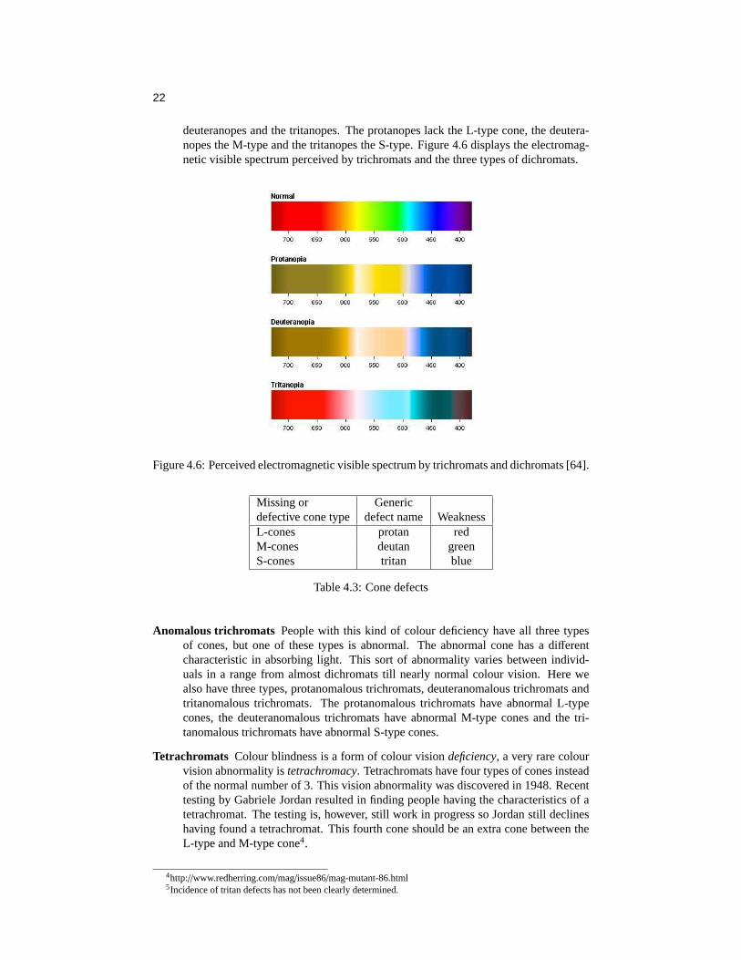
deuteranopes and the tritanopes. The protanopes lack the L-type cone, the deutera-nopes the M-type and the tritanopes the S-type. Figure 4.6 displays the electromag-netic visible spectrum perceived by trichromats and the three types of dichromats.
Figure 4.6: Perceived electromagnetic visible spectrum by trichromats and dichromats [64].
Missing or Genericdefective cone type defect name WeaknessL-cones protan redM-cones deutan greenS-cones tritan blue
Table 4.3: Cone defects
Anomalous trichromats People with this kind of colour deficiency have all three typesof cones, but one of these types is abnormal. The abnormal cone has a differentcharacteristic in absorbing light. This sort of abnormality varies between individ-uals in a range from almost dichromats till nearly normal colour vision. Here wealso have three types, protanomalous trichromats, deuteranomalous trichromats andtritanomalous trichromats. The protanomalous trichromats have abnormal L-typecones, the deuteranomalous trichromats have abnormal M-type cones and the tri-tanomalous trichromats have abnormal S-type cones.
Tetrachromats Colour blindness is a form of colour visiondeficiency, a very rare colourvision abnormality istetrachromacy. Tetrachromats have four types of cones insteadof the normal number of 3. This vision abnormality was discovered in 1948. Recenttesting by Gabriele Jordan resulted in finding people having the characteristics of atetrachromat. The testing is, however, still work in progress so Jordan still declineshaving found a tetrachromat. This fourth cone should be an extra cone between theL-type and M-type cone4.
4http://www.redherring.com/mag/issue86/mag-mutant-86.html5Incidence of tritan defects has not been clearly determined.
23
Type of Visual defect Percentage of Percentage ofvisual defect men affected women affected
Trichromats None 92.002% 99.573%Anomalous Protanomalous 1.08% 0.03%Trichromats Deuteranomalous 4.63% 0.36%
Tritanomalous5 0.0% 0.00%Dichromats Protanopes 1.01% 0.02%
Deuteranopes 1.27% 0.01%Tritanopes 0.005% 0.005%
Monochromats 0.003% 0.002%
Table 4.4: Relative abundance of visual chromatic defects
Table 4.4 portrays the three types of colour vision deficiencies. It also shows that colourvision defects affect more men than women. If we look at the genes it becomes obvious.On the X chromosome the genes for the red and green photopigments are adjacent to eachother. The genes for the blue photopigments are on a different chromosome. Women have2 X chromosomes, so they have 2 sets of green and red photopigment genes. Men haveonly one X chromosome, created by mixing the X chromosomes from the mother andfather. Because the genes of the red and green photopigments are next to each other theysometimes mix. This is normal. Sometimes, however, the mixing goes wrong and the resultcan be a “defective” X chromosome. This “defective” X chromosome can result in the lackof the green or the red photopigment gene, two slightly different red photopigment genesor two slightly different green photopigment genes. If the egg contains this “defective” Xchromosome and is a male embryo, then this male will be colour blind6.
Having described the mechanism in colour vision, we are now able to model colours in away that a machine can work with colours. Thus, the next section addresses variouscolourmodelsdeveloped over time.
2.3 Colour modelsColour models are used to classify and describe colours in terms of hue, saturation, light-ness, value or brightness in a machine accessible representation. In this section the mostcommon models are described, namely the RGB, CMYK, CIE, YIQ and HSL colour mod-els.
RGB The RGB colour model is a so called additive colour system. This system is basedon the emittance of light. We start with black and by adding more colours we eventuallyget white. The RGB model is the most basic, and probably best known, colour system. Themost important property of the RGB model is that it closely relates to the way we perceivecolour with the red, green and blue cones on our retina. Most Cathode Ray Tube (CRT)displays (e.g. televisions and computer monitors) work with the RGB model and this modelis also used for web graphics.
Familiar aspects of this system are primary and secondary colours.
Primary colours Primary colours are the fundamental colours of a colour system. In theRGB model this colours are red, green and blue. These colours cannot be createdby mixing other colours. All other colours created in the colour model consist of amixture of these primaries.
Secondary coloursSecondary colours are created by equally mixing two primaries. This
6One could imagine the tetrachromats getting their abnormal colour vision, by having two X chromosomes,with one “defective” X chromosome and one normal. This means only women can be tetrachromats and the“fourth” cone could be one with a slightly different green or slightly different red photopigment gene.

24
means that there are three secondaries. In this case these colours are yellow, cyanand magenta.
In Figure 4.7 the primary and secondary colours are marked with the first letter of theirnames. In the same Figure we can also see the starting colour black. With the combina-tion of Newton’s experimentum crucis and the definition of the primary colours above, weshould be able to explain why the equal mixture of the three primaries result in white.
A 3D representation of the RGB colour model is called the colour space, see Figure 4.8.On the axis of this colour space the primary colours are projected and in the origin we cansee the colour black. When coding colours with the RGB model there are different methods,the most commonly used represents the colour by 3 values, each on a scale from 0 to 255representing the amount of Red, Green and Blue. Another method is often used on webpages and is somewhat similar. Here the values are, however, hexadecimal, concatenatedand preceded by a # symbol. Black can be presented as 0 0 0, or as #000000, whereaswhite is 255 255 255 or #FFFFFF. The representation of colour, say yellow is 255 255 0or #FFFF00.
Figure 4.7: The RGB primary and sec-ondary colours
B
G
cyan
yellow
R
white
black
magentagr
ey
Figure 4.8: The RGB colour space
CMY(K) For printing, painting and drawing we use a totally different colour system, be-cause here we don’t see emitted, but reflected light. The object which reflects the incominglight absorbs all wavelengths except the one we see. In contrast to the RGB system, thissystem is called a subtractive colour system and consists of the primary colours yellow,cyan and magenta. By mixing these we get the secondary colours green, red and blue. Incontrast to the RGB model the CMY model starts with white and by adding more coloursit eventually results in black. However, the resulting black appears not to be deep blackbut more a dark brownish colour, because of this and due to the difficulty of creating greytints, the colour black is added to the system. The name CMYK is the result of these fourcolours: Cyan, Magenta, Yellow and blacK. Most people were taught the primaries to bered, yellow and blue, even in painting class. In most cases the actual used colours thenwere magenta, yellow and cyan.
The CMY colour space presented in Figure 4.10 has much resemblance with the RGBcolour space. In fact, when using a scale from 0 to 1 for the axis, the transformation can bedone with the following equation: C
MY
= 1
11
− R
GB
CIE colour In 1931 the Commission International de L’Eclairage (CIE) developed a de-vice independent colour system that was based on the tristimulus theory and thus on human

25
Figure 4.9: The CMY(K)primary andsecondary colours
Y
C
blue
M
white
black
red
green
grey
Figure 4.10: The CMY(K) colour space
perception. The differential response of the three cones is measured in three variables X, Yand Z, resulting in a 3D colour space. By projecting the Z coordinates to the X Y plane weget the CIE model, see Figure 4.11 from [38].
Figure 4.11: The CIE colour model with the gamut of an average RGB monitor
At the perimeter edge the pure spectral colours and wavelengths are presented. Noticethe purple colours at the bottom. These colours do not have a wavelength and are createdby a mixture of violet and red. By combining the different wavelengths of the spectralcolours the inner part of the figure is created. White light is seen when all three cones arestimulated.
We can use the CIE model for presenting the range of colours on acolour producer,such as a monitor, a television set or a printer is able to display. We call this range thegamut. In Figure 4.11 we can see the example gamut of a typical CRT monitor representedby the triangle, which is a lot smaller than all the possible colours we can see. Because allmonitors are different we have to take into account that their gamut also differs and thusthat the colours we want to display are to be displayed differently.
YIQ The YIQ model is a model used for recoding RGB values for the use of televi-sions, in fact for NTSC standard televisions. This model is used in the US for commercialbroadcasting because it is a more efficient way of transmission and it is downward com-

26
patible with black/white television sets. It is downward compatible because of its lumi-nance (Y) component. This component captures our perception of the relative brightnessof colours. The I and Q components describe the colour information and stand for Inphaseand Quadrature. The black/white television sets thus only have to use the Y component.The conversion from RGB to YIQ is given by: Y
IQ
= 0.299 0.587 0.114
0.596 −0.275 −0.3210.212 −0.532 0.311
× R
GB
We will use this colour model particularly for its Y component to compare the luminance
of different colours.
HSL The Hue Saturation Lightness colour system is a system that is more intuitive toartists and graphic designers. There is a variant of this system called the HSV system,where the V stands for Value.
If we look at the visible colour spectrum in Figure 4.3 on page 19, we can see that we aremissing a colour: Magenta. This happens to be the mixture of wavelengths red and violet,the very ends of the colour spectrum, as seen in the CIE model. By using this knowledgewe could easily create a colour circle by connecting red and violet together with magentaand filling in the inner part of the circle. Because white light is the addition of all spectralcolours, the centre point is white.
A colour on the wheel can be represented by a degree between 0◦ and 360◦, this we callthe hue. Hue is a way of describing a colour in a relative way compared to its wavelength,like when we are describing colours such as yellow, red, blue etc.
Lightness
Saturation
Hue
White
Black
Red
YellowGreen
Cyan
Blue Magenta
Grey
Figure 4.12: The HSL colour space
Cyan
Blue Magenta
Red
YellowGreen
Hue
Saturation
Grey
Black
Value
White
Figure 4.13: The HSV colour space
When we display the colour wheel in a 3D perspective as a dodecahedron, see Fig-ure 4.12, where the circle is displayed as a hexagon on the X and Y axes, the Z axis canbe used to display the Luminance, or the darkness/lightness of the colour. From the centralaxis to the border of the colour wheel there is a difference in dominance of the hue of thecolour. In the centre, we have a totally desaturated colour, and at the borders we have fullysaturated colours. Therefore the distance from the centre to the border is a measurementsystem for the saturation. This 3D projection is the HSL colour space.
Hue A value representing a certain wavelength of a colour.
Saturation The amount of hue in a colour, if the saturation is 100% we have a pure colourand at 0% there is no colour at all, and it is a grey tint.

27
Lightness A measure of brightness of a colour, where 0% is pure black and 100% is purewhite, both regardless of the hue or saturation. At 50% there is maximum coloursaturation.
In the HSV system at a value of 100% represents a maximum colour saturation and at avalue of 0% there is pure black, regardless of the hue and saturation. To get white in theHSV system the saturation has to be 0% and the value has to be 100%, see also Figure 4.13.A conversion from HSL to RGB and vice versa is given in Appendix 2 and 3. Note that thetransformation is not linear like the CMY↔ RGB conversion.
One important factor of the different colour models is the ease of use. Conversion fromone colour space to another is easy, so that using a model to represent the output’s hardwareis thus not necessary. The HSL colour space is a very intuitive colour space. We can lightena colour by adding white, or darken it by adding black, and fully saturated colours are foundon the equilateral plane. In the next sections when talking about colour models or spaces,we refer to the HSL space, except when there is explicit mention of another model.
Having introduced various colour models it is time to explain what they can be used for.We are now in the position to enter the field of colour cognition.
2.4 Colour cognitionAs described in section 2.2 on colour vision, it was shown that human perception onlyprovides the basis for the final processing of the information in the brain. This cognitiveprocessing is a subjective task. Studies showed that certainfeelingsabout colours are com-mon, even through different cultures [65]. Symbolic values of colours, however, differ toa great extent between different cultures [20]. In this section, we aim to classify coloursaccording to physical and psychological definitions.
Colour temperature We can make a separation between warm and cool colours. Warmcolours are often associated with fire and the sun. These colours produce feelings that arewarm, cosy and inviting. Cool colours, however, are often associated with ice and waterand the feelings produced here range from calm and peace to sadness. When using warmand cool colours together, one is able to notice cool colours tend to recede from the viewerand warm colours tend to move forward. Using the colourwheel, see Figure 4.14, wecan simply define warm colours as an clockwise interval between red-violet and yellow.The clockwise interval yellow-green to violet tends to be called cool. This definition ispartially based on experiments on user experiences and described in greater detail in [21].The intervals are however, not exactly defined because of the subjective property of colourtemperature.
Figure 4.14: Warm and cool colours
Luminance of colours Colours can of course be separated into light and dark colours. Atthe very ends of light and dark colours, we have pure white and pure black. If we only stayin the white-black area, thus without using a colour, or with the use of a totally desaturatedcolour, we obtain all different grey tones or shades. When we use colours however, it isharder to separate the dark colours from the light colours. Everybody has some intuition
28
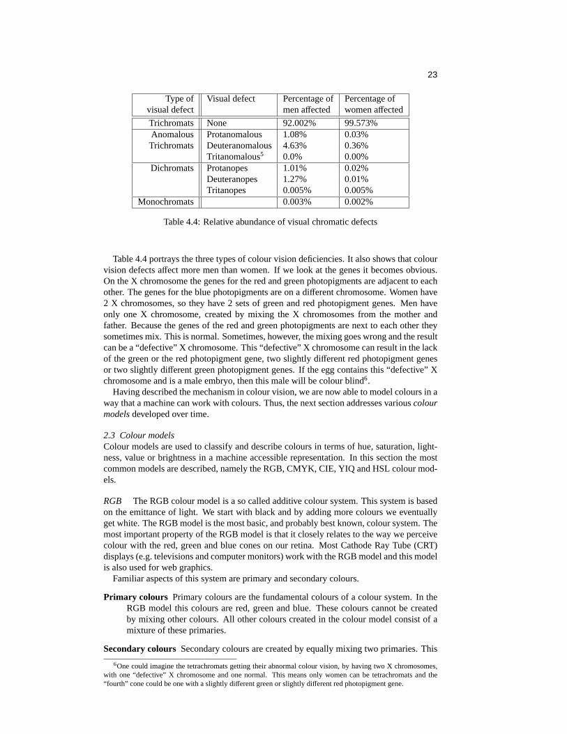
for colours, e.g. blue is dark and yellow is light, but how can this intuition be quantified?In [21] the luminance of a colour is described with the use of a figure like Figure 4.15.
Figure 4.15: The Luminance of different hues
In this figure we see in the first row 17 equidistant steps from black to white. The otherrows are the representation of 12 hues of the colour wheel with the same luminance as thegreys. So every column has the same luminance7. These 12 hues differ 30◦ starting with0◦ corresponding to the colour red. The trick is to spot the correct representation of thefully saturated colour belonging to its hue. In Figure 4.15 the square to the colour’s nearestfullest saturation is represented by a thick border. We can see that fully saturated blue isin the third column whereas fully saturated yellow is in the 15th column. We can concludefrom this, that yellow is brighter than blue. We can extrapolate this for the other colours.
This method is not very useful to define the luminance of a colour in an automatedpresentation generation. In section 2.3 we outlined the YIQ model for the NTSC colourtelevision standard. In this model the Y component described the relative brightness of acolour. We will use this component quantify the luminance of a colour. In fact, this Ycomponent was used to create Figure 4.15.
In Figure 4.16 the Y component of the YIQ model is plotted, with the use of Matlab,against the hue and lightness value of an HSL-coded colour. When there is no saturationall colours look the same (grey) and there will be no difference between hues. With asaturation of 100% the difference between different hues will be maximal and that is thereason that this graph is plotted at a saturation level of 100%. In this figure, we can seethat, when we use the maximum lightness we have the maximum brightness and vice versa.At a lightness level of 127, we have the pure spectral colours. Figure 4.17 is a slice ofFigure 4.16 on the lightness value of 127. At hue value 60◦ there is yellow and we can seethat yellow is the brightest colour, at 240◦ we can see that blue is the darkest colour. Notethat the colours used in the plot are merely for betterreadability.
2.5 Colour HarmonyThe term harmony is not only used in music, it has many areas which it applies to. In thisthesis the definition from [52] is used:
A pleasing combination of elements in a whole.
Colour harmony is therefore a pleasant combination of colours. But what can be calledpleasing? It is obvious we are entering the subjective area of aesthetics. In this section we
7on screen

29
Figure 4.16: The Relative brightness of colours at a saturation level of 100%
Figure 4.17: The Relative brilliance of the pure spectral colours
try to describe a way of defining harmonious colour schemes.If a colour representation is not in harmony it can be boring or, even worse, tiring to look
at. To keep the viewer’s attention the colours have to be in harmony. However, to obtainattention a non-harmonious colour selection can also be applied. The harmony of coloursis mostly subjective.
Two theories can help us in finding harmonized colour combinations. Both are, however,somewhat contradictory. The first one is described by Tufte in [51] and is called the min-imal effective difference. The second one is described by Itten in [21] and is based on theequilibrium state of the eye.
Minimal effective difference The design strategy of the minimal effective difference isdescribed as [51]:
Make all visual distinctions as subtle as possible,but still clear and effective
When dealing with colours this means finding colours which are almost similar, with thecolourwheel in mind, this means finding colours which are adjacent on the colour wheel.We can distinguish three different harmony schemes based on the minimal effective differ-ence.

30
Achromatic An achromatic colour harmony scheme is a scheme which lacks all colour.We only have black, white and everything in between. In Figure 4.18, we can see how thiscan be projected on the colour wheel. The value of the hue in the 3d HSL colour spacedoes not matter because our saturation used is 0. So the lightness and hue can obtain eachpossible value, as long as the saturation is 0.
Figure 4.18: Achromatic Figure 4.19: Monochromatic
Monochromatic The monochromatic colour harmony scheme is used when we use a sin-gle hue. Adding more white or black to the colour creates different colours. Reverting to the3D HSL colour space, a monochromatic scheme implies setting the hue to one single valueand allowing the saturation and lightness fluctuate between 0 and 100%. In Figure 4.21 wecan see several different colours with a hue of 120.
Analogue An analogue scheme is created by using analogue colours. This means usingcolours which are next to each other on the colour wheel. When using an analogue scheme,one has to take into account that warm and cool colours should not be mixed with eachother. The use of too many hues is also not advisable because of the danger of creatinga too variegated presentation. In Figure 4.21 there is a warm analogue scheme created byonly using red, orange and yellow.
Figure 4.20: Analogue
Figure 4.21: Examples of achromatic, monochromatic and analogue colour schemes.
Harmony through the equilibrium state of the eye.The three schemes described aboveare based on Tufte’s minimal effective difference theory. The following harmony schemesare of a different type.
Most people probably know the illusions where we have to focus or stare for about 30 to60 seconds at an image and then, when we look at a blank paper we can see the afterimage.If one tries to focus on the afterimage one can see it is the negative of the image one hasbeen staring at. Even with coloured images this works and we see the complementarycolours as a result. So if one focuses on a red spot, see Figure 4.22, and then looks at a

31
white paper one will see cyan, the complementary colour, for a short period of time8. Thiseffect is due to the eye which seeks to restore its equilibrium. The effect of the afterimagethat is created by the eye is called successive contrast.
If we look at Figure 4.23 we can see that the appearance of a colour is affected by whatsurrounds it. The image in Figure 4.23 only uses single colours red, yellow and blue. Thiseffect we call simultaneous contrast.
+
Figure 4.22: Successive contrastFigure 4.23: Simultaneous contrast
Both kinds of contrast indicate that the eye tends to create an equilibrium by using com-plementary colours. According to [21], Count Rumsford published in 1797 an article in theNicholson’s journal about creating colour harmony. He stated that colours are harmoniousif they are white when they are mixed. It is obvious that he was talking about an additivecolour model.
When we focus on a black spot on a white background we get a white spot as an after-image, the same for a white spot on a black background, this produces a black spot as anafterimage. This means the eye still seeks its equilibrium. The result of the research ofphysiologist Ewald Hering was that grey matches the equilibrium of the eye [21].
Colour harmony can thus be achieved by creating an equilibrium state for the eye, sothe addition of the colours needs to be greyish. There are however several ways to create aharmonic colour representation. In the next paragraphs several differentColour HarmonySchemeswill be described.
Complementary This scheme is based on the use of two different hues which are oppositeto each other on the colour wheel and thus producie a high contrast, for example yellowversus blue, see Figure 4.24. When looking at the 3D HSL model we can pick a point inthe model and create its complementary harmonious colour just by mirroring this point inthe centre point of the 3D model. So the hue value of the colours differ by 180◦ (mod 360◦)and the lightness is mirrored on the XY plane. In this colour scheme it is advisable to usecool colours as foreground and warm colours as background. When using colours with alow saturation level, the colours will be very near the centre point of our HSL-space, thesecolours will look very similar and the combination of these colours is not advisable. Amore flexible complementary scheme is the split complementary scheme, see Figure 4.25.Instead of using a single hue we use a hue range for both colours where the centre pointsof these ranges are complementary. Here one should avoid the use of highly unsaturatedcolours as well.
Figure 4.24: Complementary Figure 4.25: Split-Complementary
8The best way is to place this figure on a well lit stable area and to focus for 30 seconds on the little mark inthe centre of the red circle. When looking at a blank paper, one should be able to see the cyan afterimage, this canbe intensified by blinking the eyes.

32
Triad A triadic colour harmony scheme consists of 3 different hues, see Figure 4.26. Ifwe take the colour wheel and place an equilateral triangle we have a harmonious triad. Anexample is the combination of the three primary colours, red, green and blue. Other triadicschemes are created by turning the equilateral triangle on the colour wheel. Each of thethree hues selected to create the harmony scheme can be used as the centre of a range ofhues.
To give this scheme some extra flexibility we can also use an isosceles triangle insteadof an equilateral triangle. We then have to take into account that the angle of the top ofthis isosceles triangle must be in the range from 0◦ till 90◦, because of the equilibriumconstraint. With this triadic colour scheme we need not use only the colour circle only, butcan use the whole dodecahedron to create a triadic colour harmony scheme. We only haveto keep in mind that the point of intersection of the bisectors of the sides from the isoscelesor equilateral triangle lies at the centre of the dodecahedron.
When using black, we ought to use two complementary colours very near to white, butnot completely white, the same applies when using white, one should use two complemen-tary colours very near to black.
Figure 4.26: Triadic Figure 4.27: Tetradic
Tetrad The tetrad colour harmony scheme is based on the use of 4 hues, where we havetwo pairs of complementary hues, see Figure 4.27. If we connect these 4 hues it is permis-sible to have a square, rectangle or a trapezoid for still being a colour harmony scheme.Here we also do not have to stick with the single hues but we can create a symmetricalrange of hues around the chosen hue. The 4 hues can also be rotated in the dodecahedronkeeping in mind the symmetry of the hues relative to the centre point of the dodecahedron.
Pentad A pentad harmony scheme can be created by using an equatorial triadic harmonyscheme and by adding white and black. The created colours are still in balance because weadded black and white.
Figure 4.28: Hexadic
Hexad The same as being said for the pentad harmony scheme can be applied to thehexad colour harmony scheme, see Figure 4.28, if we take an equatorial tetrad harmonyscheme and add white and black we retain a harmonious colour scheme. Another wayof creating a hexad scheme is by drawing a hexagon in the colour wheel, by turning thishexagon in a dodecahedron we can get a wide variety of harmonious hexad colours.

33
Harmonic colour schemes in practiceColour schemes are useful for the interpretationand generation of images or documents. A well known example of the use of a colourharmony scheme is the work by Piet Mondriaan. In Figure 4.29 from [10] (page 127) wecan see a pentad harmonic colour scheme. Many paintings can be captured in one of theabove described harmony schemes. Van Gogh’s painting in 4.309 can be described as usinga tetrad scheme where he is using, cyan, red, blue and yellow. The same painting can alsobe described in a split complementary scheme, where yellow and blue are the twomaincolours.
Figure 4.29: Composition with Yellow,Blue and Red, Piet Mondriaan, 1939-42
Figure 4.30: Harvest in Provence ofWheat Field with Sheaves, Vincent vanGogh, 1888
If we want to use harmonic colour schemes for making design decisions, we first haveto know which scheme we are planning to be used. A guideline for choosing the schemeis the number of colours we want to use. Before doing this we first have to define someterms:
fixed colour A colour without any flexibility we will call a fixed colour, e.g. a corporateidentity colour hsl[250,255,128].
colour A colour is defined as a single hue, the different tones, tints and shades are allclasses of this colour.
colour range A colour range is a range of different colours, this means a range of hueswith their possible ranges of saturation and lightness.
relative colour Relative colours are a subset of the class of colour ranges. This subset canbe given a single name which applies to its whole colour range, e.g. blue, orange,lilac.
If we, for instance, want to use 2 colours we can choose an analogue or a complemen-tary scheme, for three colours we can use the triad scheme, but the analogue as well. Thismight sound arbitrary but every design decision process can usually be based on alreadyestablished colours, such as a preferred colour, coming from the user model or the domainmodel (for example a corporate identity colour). When using such inputs the colour har-mony scheme is almost provided. If the user, for instance, wants red and the corporateidentity colour is a fixed blue and we need 4 colours, we can only use a tetrad harmonyscheme, with blue, yellow, red and cyan. If we, however, needed three colours, then a tri-adic colour harmony scheme would have been a solution, but a very wide analogue schemewould have been a possible solution as well.
9from: http://www.art.com/asp/sp.asp?PD=10056399&RFID=864458.

34
We now have set a basis for graphic design using colours. Before we can continue withcreating explicit design rules, we have to take an important factor into account, namelytypography.
3. TIn the previous sections we started with the basic colour theory and ended with harmoniccolour schemes. Unfortunately, we can’t apply all these schemes when we use text in apresentation. In this section we try to describe why certain rules don’t apply.
The most important constraint of text on a certain medium is its legibility. If we placetext somewhere, we want the viewer to be able to read it. One of the things we should notforget is the difference between text on paper and text on a screen. Text on paper issolid,whereas text on a display is based on the emittance of light waves. The theory stated below,however, applies on both mediums for displaying text.
3.1 LegibilityWhen dealing with text, one often thinks in terms such as font types, font sizes and fontstyles. Because of the different assumptions one makes when talking about legibility, wefirst clarify some terms:
• typefaceA typeface is a design for a set of fonts, and often comes as a family of typefaces,e.g. bold, italic and other variations.
• typeface familyA family of typefaces is thus a set of typeface variations.
• fontWhen giving a typeface a certain size we have obtained a font. A font therefore is aset of text characters in a specific style and size.
Summarizing the above definitions in an example, it can be stated that: Courier is a typefacefamily, Courier italic is a typeface and Courier italic 12pt is a font.
Returning to legibility we can state that overall legibility depends on five basic fac-tors [23]:
1. The typeface familyTypeface families are often specifically created for on-screen or on-paper use. On-paper typeface families are mostly serif10, whereas on-screen typeface families aremostly sans-serif11.
2. The typefaceWhen using italic typefaces for longer texts on screen or on paper, it can be veryhard to read, when using bold typefaces, however, the legibility can improve. Thisdepends mostly on the typeface family and size of the used typeface.
3. FontsThe size of the typeface is a crucial factor for legibility. Because of the very lowresolution of screens (around 72 dpi) compared to printers (up to 2400 dpi) verysmall typefaces can be very coarse on-screen while perfectly readable on paper.
4. Font compositionElements of font composition are for example spacing (between characters and be-tween lines) and the length of a line. Spacing shouldn’t be too small or too large andthe number of words per line, on A4 sized paper, should be 10-12 [37]. Factors, suchas output medium type or font size influence this number of words per line.
10A serif is the little extra stroke found at the end of main vertical and horizontal strokes of some typefacefamilies.
11sans: without (French)

35
5. Font colourThe colour of a font is perhaps one of the most important factors of legibility. Weought not to forget that we are not only talking about the colour of the font itselfbut about the background colour of the font as well. When we are talking aboutbackground and foreground combinations, one have to keep colour harmony in mind.
All these factors are somehow dependent on each other. The typeface Geneva normal is,for instance, on-screen perfectly legible from 9 pts whereas the typeface Frutiger normalis legible from 12 pts. Another example is when the size of a font decreases. Keeping thetext legible we have to increase the saturation of the colour of the font [11]. There is thusa wide variety of possible combinations to create a legible text. Time, however, sets limitson the scope of this research. This is the reason that the emphasis will be on the font colourfor creating legible texts, see section 3.2. We, therefore, have to fix the other basic factorsfor creating legible texts.
As mentioned, sans-serif typeface families are often used on-screen, because the serifstend to disappear on the computer screen. Serifs, however, aid the reader by giving morevisual information about the shape of the letter and thus for legibility. Georgia, a seriftypeface family, was specially designed for the screen. The typeface family looks good onpaper and on screen, this is the reason that in our further research this typeface family isused. Figure 4.31 shows different fonts of the typeface Georgia regular.
Figure 4.31: The Georgia regular typeface in different fonts
3.2 Font ColourMost people have a good intuition about what (not) to use for text and background colours.Here we try to capture this intuition and try to explain why we can or cannot use certaincombinations. In the next section some general text colour rules will be derived from thisknowledge, based partially on [11].
When we use colours for text and background it is easy to make bad legible combina-tions, here are some in the additive colour system:
• Yellow text on a white background.
• Blue text on a black background.
• Red text on a cyan background.
• Blue text on a red background
These are just a few of the infinite possibilities of creating a bad legible text! If we recallthe colour harmony schemes, we can see that these combinations all fit in a certain scheme.Yellow on white and blue on black both fit in a monochromatic harmonic colour scheme,

36
whereas red on cyan fits in the complementary harmonic scheme. To fit blue text on a redbackground we can use a triad scheme if we are allowed to use a third colour: green. Butwhy do the above examples creat illegible combinations?
• Yellow text on a white background.Both yellow and white are bright colours, if we recall the YIQ model we can calculatethe Y component for both colours. If we assume we use fully saturated yellow we’vegot a relative Y component of 0.886, where the relative Y component of white is1.000. The problem here is that the distance|Y1-Y0| is too small.
• Blue text on a black backgroundThe same here as with yellow on white, except we have two dark colours, black has aY component of 0.000 and the relative Y component of fully saturated blue is 0.114.Here we can also conclude that|Y1-Y0| is too small.
• Red text on a cyan background.It was already mentioned that this combination could fit in the complementary colourharmony scheme. Using this scheme, however, for text and background colour is notadvisable. The result of using complementary colours is a flickering effect12, whichmakes the text harder and more tiring to read. On paper this should also be avoided(e.g. green on red). This effect can be weakened in various ways. One is for instanceby darkening the colour by adding black, another way is by desaturating the colours.
• Blue text on a red backgroundBlue is obviously a cool colour, whereas red is warm. As already described in sec-tion 2.4, cool colours tend to recede from the viewer and warm colours tend to movetoward the viewer. This makes warm colours more suitable for text than cool colours,see also [11].
When using bright colours with dark colours we have to consider the effect calledtypeglow. This is the effect which only appears in the additive colour system where the edgesof fonts appear thinner than they really are. This is because white or very bright areas aremuch brighter on screen than on paper. An example is the use of a white background andthe use of black fonts, we have to avoid the type glow effect.
A study from 1990, however, which included visual search and reading, where accuracyand timeliness of response were measured, showed an increase of performance, in the rangeof 2.0% to a high of 31.6%, was obtained when using negative contrast (dark colours ona light background) instead of positive contrast (light colours on a dark background) [4].Earlier studies also showed negative contrast gave better performance than positive con-trast [46].
With the above knowledge we can create some general rules for creating legible text.
3.3 General typography colour rulesIn this section we try to define some general colour rules.
• When using text we have to avoid colours with a low relative difference in luminance.Too much difference can also have a negative effect on legibility:x1 ≤ |Y1-Y0| ≤ x2.The actual values ofx1 andx2 have to be determined by experimentation.
• When picking a background colour, one has to avoid bright colours (afterglow).
• The use of a complementary harmony scheme, with saturated colours should also beavoided.
• We prefer negative contrast (dark foreground, light background) rather than positivecontrast [46, 4].
12Because the eye is trying to focus on 2 different wavelengths

37
• Finally, when using a warm/cool colour contrast, use warm colours for the fore-ground and cool colours for the background.
4. CColour graphic design is a very broad topic, especially when considering the physical,biological and cognitive aspects. When reading elsewhere on the same subject one shouldkeep the above theory in mind, because when doing this research many errors were foundon the web and in books. Even on page 18 in [21], considered as abible on colour theory,a fundamental error was found. It was stated that the complementary colours of green andyellow in the prismatic spectrum were red and violet respectively. This does apply to asubtractive colour model, but not to the prismatic spectrum which is an additive colourmodel (recall the RGB and CMYK models).
When dealing with colours in graphic design it is inevitable to treat the use of text ina presentation on screen differently. Colour harmony schemes can’t guarantee that text islegible, and, whenever we use a colour harmony scheme, we have to distinguish betweenthe additive and subtractive colour schemes.
The theory described in this chapter provides enough knowledge about graphic designto create a system which can perform colour design decisions automatically, given someconstraints as input. We got colour harmony schemes to select a harmonious colour com-bination from and we got some global constraints for colours when using text in a presen-tation. In the next section we describe the architecture of the Design Module that takes theestablished rules of this section into account.

38

39
Chapter 5
The automated selection of colours
1. IThe previous chapters provided us with background information required for the automaticgeneration of colour design. Chapter 2 gave us information about the underlying theorywith respect to hypermedia documents. In chapter 3 the automatic presentation generatorCuypers, its overall architecture and the 5 associated presentation generation modules weredescribed. Chapter 4 explained graphic design theory and legibility factors, focussing oncolour design aspects. The following chapters will combine these established theories toprovide an architecture for the Design Module. Furthermore they describe the actual real-isation and implementation. This chapter proposes an approach towards automatic colourdesign by using an example scenario to clarify the architecture of the Design Module.
Research on automated colour design, in particular on colour group selection for com-puter interfaces [27] has already been carried out. This research, however, used a givendiagram on which various colour schemes were tested, in contrast to the dynamic environ-ment of our prototype.
2. E Before realising the Design Module we need to know what the Design Module actuallydoes. This and the following section will provide the base on which the realisation of ourapproach on automatich colour design can be built1.
The process of designing visualisations of information, be it for cultural or technicalpurposes, is complex and resource demanding, where the end result might establish var-ious presentational forms, such as textbook illustrations, advertising images, or a fine artmultimedia presentation.
Consider the introduction screen for a presentation on the art movement “De Stijl”, asportrayed in Figure 5.1. This page emerged from the wish of a visitor of the web environ-ment of a museum to learn more about the “De Stijl” movement after she was intrigued bya Mondrian image she found while browsing the collection.
As well as decisions about the overall logic of the presentation, for example that furtherinvestigation of the subject or related topics should be possible, a considerable numberof decisions need to be made with respect to layout, typography and colour design of thisparticular page to ensure its functionality. The prerequisite of legibility of text, for example,might result in a provision of black text on a white background. Such a decision then
1This section and the next section are adopted from [33].

40
Figure 5.1: Introduction page for a presentation on the art movement “De Stijl”.
requires that the different functionality of textual links can be easily distinguished, forexample by assigning a particular colour scheme to them. On an aesthetic level the pageestablishes a “De Stijl” feel by advocating pure abstraction and simplicity: form is reducedto the rectangle, typography for headers uses the “De Stijl” font set, and colour uses theprimary colours red, blue and yellow, along with black and white.
Having introduced the main components within the Cuypers engine in chapter 3, weare now in a position to explain our approach that addresses the initial requirements forthe balance between functional and stylistic aspects in dynamic multimedia presentations,focusing on the automatic design of the colour scheme for a presentation. We base thediscussion in the context of the generation of a presentation about the art movement “DeStijl”.
The user was browsing the collection and came across a Mondrian image resulting in arequest for more information about the “De Stijl” movement. This request is interpreted,based on the user model, as the wish for a presentation that allows browsing through anevolving presentation. By evolving we refer to the concept of progression of detail thatfacilitates navigation based on a given weighted set of descriptors representing a storycontext on a micro level (next step in content exploration) as well as on a macro level (largercontextual units clustering content, such as classes of artefacts within an art movement), asdescribed in [14].
In the following section the colour design process will be described in detail.
3. A Our discussion starts at the point where the presentation engine has established the constraint-set on which the colour design process is based, as shown in the top line of Figure 5.2.
3.1 Constraints driving the colour design processIn this section we give details about the constraint-set provided by the presentation engine.The required steps up to this point, such as the design of the discourse structure, the semi-automated generation of metadata and the content retrieval process [34, 32], as well as theautomatic design of the spatial layout for retrieved material [15] are described elsewhere.
A typical request rule looks like this:With this rule, the generation engine requests from the design engine a solution for a

41
design module( Design task,
Communication preference,
Constraint list,
Result list).
Figure 5.2: Detailed view on the colour component of the Design Module
particular task based on the provided constraints. For the current example, the design-taskis “colour setting”.
The request further determines a communication preference for the presentation that wasalready established in earlier design stages. The identified preference guides the graphicdesign process by suggesting which general design orientation the process should follow.In our environment we utilize the following three:function, form , neutral.
A preference forfunction determines that constraints based on importance weights aredriving the design process. For the colour design process this might result in the dominantapplication of rules that compare colours based on contrast, as this effects the constructionof legible text. On the other hand, favouringform will mainly employ rules that effectthe appearance of colours, such as for achieving pleasing appearances based on colourharmony schemes as described in section 2.5.Neutral means that either way is acceptable.In our example, where the presentation is aimed at an educational presentation, a functionalcolour design process is required.
The Constraint list contains the relevant restrictions for the current design task,namely “colour setting”, established during previous generation stages performed by othergeneration modules. Such constraints supply a means of controlling the number of coloursto be used and, even more important, the automatic allocation of colours to the variouselements provided by the spatial layout of a page, as presented in Figure 5.3.
The structure of theConstraint list introduces particular constraints related to theuser, the domain and the layout, where each part represents in detail:
User (provided by the user module)Physical abilities that describe possible audio-visual deficiencies, such as colourblindness. Colour blindness makes it impossible to use red and green as structuraldistinguishes on the same page, as the user cannot distinguish between both colours. Inour system colour blindness is characterised asgreen red.
Domain (provided by the domain ontology and user module)

42
Figure 5.3: Graphical representation of the spatial layout structure before the colour designprocess.
constraint list(
[green red,[red,blue,yellow],
[[area:[content area1:1.0],elements:[textmalink1:1.0,header1:1.0]],
[area:[link area2:0.9],elements:[labelmalink1:0.8,labelmalink2:0.8,
labelmalink3:0.8,labelmalink4:0.8,image1:0.6,image2:0.6,image3:0.6,
image4:0.6]],
[area:[link area1:0.4],elements:[malink1:0.3,milink1:0.8,
milink2:0.8,funclink1:0.8]]]]).
Figure 5.4: Example of an instantiated Constraintlist
Domain colour is a list of colours that are related to the domain the content is about or toparticular colours required by the content environment the user is using, for examplecorporate identity colours. In our example the system might pick the primary colours usedin the domain ontology for describing the “De Stijl” colour scheme [red, blue, yellow].
Layout (provided by the Layout unit of the Design Module)Presentationelements, which is a structured list of all areas available and the variousinformation units combined in them. The list reflects on the one hand the spatial layoutthrough ordering the various presentation areas according to their size (the largest area,which is with respect to colour the most dominant, comes first). On the other hand it alsoprovides information about the importance of each information item according to its rolewithin the discourse structure, qualified by an associated importance weight. Informationitems in this context can be: text, text containing links (textmalink), header, label, label aslink (labelmalink), links for navigating on a micro level, such as moving from a definitionto an example (milink), links for navigating on a macro-level, such as jumping from thearchitecture section to the painting section (malink), functional links, such as search, print,or save (funclink), images, etc. An instantiated Constraintlist is shown in Figure 5.4.
The educational basis of the communication goal of our example presentation is repre-sented in the high importance value of the textmalink element within contentarea1. More-over, as the navigation style of the presentation is set to be “evolving”, the importancefor macro- and micro-navigation is reflected in the high importance value of the variousnavigation links.

43
The Result list determines the output of the Colour Design Unit, namely the de-scription of areas and included elements with the corresponding colour allocations. Thepresentation engine then processes the outcome to generate the final presentation of thatpage.
Based on the given description of the input parameters of the Colour Design Unit we cannow demonstrate how the module solves the established constraints and creates the colourscheme for the presentation.
3.2 The generation of the overall colour designThe Design Module, as described in Figure 5.2 on page 41, covers various design aspects,such as typography, layout or colour-design. In addition to those rather specialised unitswithin the Design Module, the Design Evaluation unit provides high-level rules, which areused to guide the design process or to evaluate intermediate results as a form of sanitycheck. Such rules might state, for example, with respect to the colour design process that:
A. If Communication preference= function => work on area elements
= form => work on area
= neutral => work on mix
B. If there are multiple background areas, begin assigning the one with the largest sizefirst and continue in descending order.
C. The number of colours used≤ 6.
Rule A determines whether the emphasis of the colour design is oriented towards thefunctionality of the information elements (foreground and structure) or rather on a lookand feel, emotionally oriented presentation (emphasis on background and contrast).
Rule B considers the overall importance the amount of space within colour design.Larger areas are dominant with respect to perception and thus more influential for the de-sign process than smaller areas. Note, there are other rules related to space that consider theshape of an area and the depth of colour in colour combinations (foreground backgroundrelationship) (see [21], pages 120-124, 144 149).
Rule C provides the maximum number of colours to be used in a presentation. Testsdescribed in the literature showed that too many and different colours on a screen attractthe user’s attention to the colours themselves and distract from the content [11, 12]. Weexperimented with a range from 4 up to 8 colours and found that the system could workmost effictively with 6. More user testing is required, though, to finalise this rule.
These rules are required to organise the different steps within the colour design process,as described in Figure 5.2 on page 41, which can be separated into:
• identification of available colours;
• detection of the colour scheme to be used;
• instantiation of the process order for the colour assignment;
• colour assignment.
These steps are described in more detail in the following sections.
Identification of available colours The first step of the Colour Design Unit is to identifythe potential number of colours to be used. For that the SubjectAnalyzer (see Figure 5.2)evaluates theconstraint list on areas and the information units contained in them. Forthe example provided in Figure 5.4 the SubjectAnalyzer comes up with 8 colours, namelythree colours for the areas, three colours for the different sorts of links (mi- , ma- andfunclinks), one colour for the text part of the textmalink field and one colour for the header.

44
High-level rule C states, however, that the overall number of colours should not exceeda total of 6. Thus the SubjectAnalyzer re-evaluates the constraint-set by trying to groupunits. Merging the three types of links into one presentational group provides the requiredresult and thus the number of colours to be used is established as 6.
Additionally, the SubjectAnalyzer identifies already selected colours, provided by theDomain colour element of the Constraintlist [red, blue and yellow]. Note, in our im-plementation the colours have already been transformed to actual HSL values using the“Txt2Col” transformation module (see top of Figure 5.2 on page 41), which transforms tex-tual colour representations into the numeric expression in HSL format of the correspondingfundamental colour. For example, red is transformed intohsl[0,255,128].
At this stage it is known that no more than 6 colours need to be associated and that threeof them have been determined.
Detection of the colour schemeThe next step is to identify the colour scheme used toassign colours. In our system four different schemes are implemented, namely achromatic,monochromatic, analogue and complementary (including split complementary), where eachscheme represents a particular rule set for colour use.
Applying our implemented schemes to the example scenario, the SubjectAnalyzer nowtries to establish the scheme used to pick and allocate colours for the presentation.
The selection process applies the approach of growing complexity to support the timeconstraints of the overall presentation generation. Thus, the algorithm tries to apply theachromatic scheme first, as it provides the smallest rule set. However, it fails because thisscheme does not support colour. The monochromatic scheme is rejected because it allowsonly a single hue, whereas the domain colours already provide three different hues. Theanalogue scheme cannot be selected for several reasons, such as
• the covered distance between the two outermost domain colours (red and blue) is toolarge (the angle between red and blue over yellow is larger than 120◦ in the HSLspace),
• cool and warm colours would be mixed (blue with red or yellow),
• the distance between red and blue over yellow potentially allows the use of greenas additional colour, which is not possible, as the user has extreme deficiencies indistinguishing between red and green.
Finally, among the available complementary schemes a split complementary scheme ischosen (red and yellow grouped on one side, blue on the other within the three dimensionalcolour space), as it facilitates the use of the established colours.
Instantiation of the process order for the colour assignmentThe next step in the colourdesign process is to establish the order in which the different areas and their elements shouldbe coloured. The order is of importance, as assignments for the most relevant area shouldbe based on the largest colour set (see rule A in Section 3.2). Established assignmentswill then act as further constraints in the ongoing colour picking process. The Grouper, aspresented in Figure 5.2, performs this task.
There is one essential assumption on which the performance of the Grouper is based,namely that areas usually provide the background within a presentation, whereas the asso-ciated elements supply everything that is layered on top of it (foreground). The Grouper cannow either pay special attention to the size of the areas (form), to the importance weightsfor the associated information units (function), or a mix of both (neutral).
Emphasising does, however, not mean neglecting other relevant elements. For example,as the physical size of an area specifies its importance for the feel of a presentation (thelarger an area the more dominant its colour), it has to be considered even though the mainorientation of the presentation is functional. Thus, in our experimental system we work

45
with three different ways of calculating the importance of an area, each taking both the sizeof the area and the contained information elements into account.
IAT represents the overall importance of the area,IA stands for the importance weight ofthe area with respect to content, P represents the size of the area provided by the reverseposition value in theconstraint list, and IE stands for the weight of an individualpresentational unit.
We are aware that the current formulae do not fully represent the complex relationshipbetween the foreground elements themselves, or all aspects of the relationship betweenforeground and background, especially when it comes to various layers of foreground ele-ments. However, trials with changing numbers of areas (max 5), associated elements (max20) and various levels of importance (in the range between 0.1 and 1.0) showed that theformulae establish a sensible hierarchy of areas, where areas are organized in decreasingorder of importance value. Note, it does not necessarily mean that the order is differentfrom the one already provided by theconstraint list, which is only based on the sizeof areas.
As thecommunication preference of the ongoing example is set tofunction, theGrouper uses the formulaIAT f unction, resulting in the following order of areas: Contentarea1,Link area1, Linkarea2.
Once the order of areas is established the Colour Design Unit starts with the assignmentof colours to the most important area, in this case Contentarea1.
Colour assignment The relevant unit for this task is the ColourPicker as shown in Fig-ure 5.2.
Colour assignment colourarea1The ColourPicker first separates background from foreground elements.As functionality is more important, the ColourPicker tries to identify the colour for the
foreground elements incontent area1, i.e. thetextmalink1 and theheader1 element.As both elements are of type text, the TextModule of the ColourPicker attempts to establishthe element colours using those colours that are already available: namely red, blue andyellow.
It is important to notice that the TextModule establishes simultaneously the backgroundcolour of this area too, as both colours depend on each other. The emphasis in the colourdesign process lies, nevertheless, on the foreground.
The TextModule uses the domain specific colours in their HSL notation and tries allpossible colour combinations with respect to all foreground and background groupings,where each combination is assigned with a legibility value (LV) based on
• the relative brightness factor (Ycolour1 − Ycolour2)
• the contrast between both colours based on their classification as light and darkcolours (light colours should be used as background and dark colours for the fore-ground on the screen [4])

46
• the contrast between both colours based on their classification as cold and warmcolours (cool colours should be used as background and warm colours for the fore-ground)
• the complementary contrast between both colours.
The calculated LV lies between 0.0 and 1.0 and the higher the value, the better the com-bination.
Note, the above approach does not use colour ranges as input. The reason for not allow-ing that is that usually the provided colours have a particular value that must not be altered,such as the domain colours for a particular style or art movement or corporate identitycolours. If the colour Design Module chose freely, ranges would be useful but we do notexplore this direction.
For our example the combination of a yellow background and a red foreground providesthe highest LV (0.633). However, the LV does not reach the threshold of 0.8 that is requiredby the DesignEvaluation unit to accept a colour combination in the function mode.
As the result the TextModule falls back to the default colour for text, namely black,which now also sets the foreground colour for that area. The next colour to be assigned isthe background colour. Within the split complementary scheme, the complementary colourfor black in the HSL space is white.
Once both colours are picked the DesignEvaluation unit performs a final test on lightnessand contrast required for achieving “legibility”. In fact, the extreme contrast between blackand white should be avoided, as it can create extra shimmering effects that can strain theeye. Thus, the contrast-smoothing rule is applied, which adds 10% of each colour to theother, resulting in two grey values that still give the impression of being essentially blackand white. However, both originally chosen colours will be added to the colour selection(i.e. red, blue, yellow, white and black= 5).
As the text body also contains links the TextModule next assigns the colour for the link.The aim is to distinguish link and text from each other. The goal is to find among thedepicted colours the one that provides the largest contrast to both the foreground and thebackground. In our example the best distance within the HSL colour space to black andwhite is provided by red. Thus, red will be assigned to the link. Note, the link colourcomes with two values. One represents a non-visited link and the other a link that wasalready visited. The TextModule applies one of the split-item strategies for assigning twocolours to a link. This rule diminishes the saturation of the established colour by 50%,which provides a sufficient difference to present the two states of a link.
Finally the Colour Design Unit has to assign a colour value to the “header”. The reason-ing is similar to the one described for the process of colouring links. The result is that theheader is assigned to blue because it provides a larger distance to white (background) thanyellow.
At the end of the colour design process for the content area we have the following situa-tion (text in brackets is added for better readability of this document):
Resultlist:Background: contentarea1: hsl[0,0,230] (white-grey)Foreground: contentarea1:
textmalink1: hsl[0,0,25] (black-grey)link: hsl[0,255,128] (red)
hsl[0,128,128] (0.5 red)header: hsl[240,255,128] (blue)
Colour assignment linkarea2The next area to be coloured is Linkarea2, as described in Figure 5.3 on page 42. As the

47
process will use already established colour allocations, the ColourPicker takes the colourfor link as given. The ImageModule considers images as being of colour “various”. Thisis a default within our current implementation, as the solution of matching the backgroundwith visual material such as images or a video area, is not fully implemented yet. Detailsabout the approaches taken are described in section 5.
Thus, the final decision to be made is concerned with the allocation of the backgroundcolour of this area. As the colour needs to be distinguished from the neighbouring area(white) but has to allow the legibility of the links (red) the TextModule decides on yellow,mainly because
• the combination of blue as background and red as foreground result in a too smallLV (0.178) to be acceptable and
• the contrast difference between yellow and white is big enough to allow a differenti-ation between areas (Ywhite− Yyellow > 25).
At the end of this part of the colour design process the system has made the followingallocations:
Resultlist:Background: contentarea1: hsl[0,0,230] (white-grey)
link area2: hsl[60,255,128] (yellow)Foreground: contentarea1:
textmalink1: hsl[0,0,25] (black-grey)link: hsl[0,255,128] (red)
hsl[0,128,128] (0.5 red)header: hsl[240,255,128] (blue)
link area2:link: hsl[0,255,128] (red)
hsl[0,128,128] (0.5 red)
Colour assignment linkarea1The final area to be designed is Linkarea1, as described in Figure 5.3 on page 42.
Equivalent to the steps described in section 3.2 the system considers the colours for linksset to red.
With the three unassigned colours, namely red, blue, and black, the TextModule is not inthe position to resolve the general contrast constraints for background colouring applicablein the split complementary colour scheme. Hence, the Colour Design Unit backtracksand tries to apply another colour scheme to solve this problem. The choice is the analoguescheme, as it mainly addresses the combination of colours that are next to each other withinthe HSL colour space.
The first approach to assign blue to the background fails because the general rule appliesthat two dark colours (here blue and red) should not make up back- and foreground. Thesame applies to black.
The next option for the system is to find an area where
• the information unit link is used and
• a background colour is allocated that is within the neighbouring range of one of thecolours within the analogue scheme.
As a result the system retrieves the allocations for thelink area2. However, the com-bination yellow (background) and red (foreground) cannot be used as no contrast betweenthe two areas can be achieved (in fact the contrast is 0).
48
As the importance of linkarea1 is≤ 0.5 (see Figure 5.4) and both red and yellow arein the domain set, the ColourPicker retracts to a shortcut rule that allows the reverse ap-plication of colours under these circumstances, resulting in an allocation for red to thebackground and yellow to the foreground. As the importance of this area is≤ 0.5, theColourPicker rules out further functional evaluation. This is important, as the ColourDe-sign unit does not try to fill the still open 6th colour-slot.
The end result of the colour design provides the allocations as can be seen on the nextpage.
Resultlist:Background: contentarea1: hsl[0,0,230] (white-grey)
link area2: hsl[60,255,128] (yellow)link area1: hsl[0,255,128] (red)
Foreground: contentarea1:textmalink1: hsl[0,0,25] (black-grey)link: hsl[0,255,128] (red)
hsl[0,128,128] (0.5 red)header: hsl[240,255,128] (blue)link area2:link: hsl[0,255,128] (red)
hsl[0,128,128] (0.5 red)link area1:link: hsl[60,255,128] (yellow)
hsl[60,128,128] (0.5 yellow)
The result list is returned as an answer to the request that was described earlier at the end ofsection 3.1. The transformation steps that generate the final presentation, e.g. generating aSMIL presentation, are described elsewhere [55]. Note, the established colour allocationswill be used during the ongoing presentation as input for further alterations, as required.
4. CThe approach discussed in this chapter can be used as a starting point of realising theDesign Module. The architecture is sufficient to let the system make the right choices andsuggestions.
Any system goes through the phases of a life cycle one or more times during its life-time [47]. The life cycle of a system consists of different stages, namely planning, design,realisation, implementation, exploitation and evaluation. This chapter covered the aspectsjust before realisation, which will be described in the next chapter. The example scenariowhere the user requested information about the “De Stijl” movement, can be used to eval-uate the system’s decision process and its performance, as being shown in the next chaptertoo.

49
Chapter 6
Realisation and Implementation
1. IIn the system life cycle [47] the next two steps after system design are realisation andimplementation. Realisation means building the system according to its functional design,which is implicitly depicted in the previous chapter. Realisation includes testing the systemto see if it meets its requirements. The next step is the implementation phase, which meanspreparing the system to take into operation, thus integrating the system into the environmentin which it will work, entering necessary data and adjusting parameters. The first part ofthis chapter describes the realisation and the second part describes the implementation ofthe system into a web interface and into the Cuypers system.
2. RThe starting point of realizing the Design Module was the example scenario and the pro-posed architecture, as described in chapter 5. The actual realisation is, however, a generali-sation of the scenario, as the system should be able to generally determine colour schemes.This section describes the actual components realised in the Design Module. We use, how-ever, the scenario to explain the functionality of the components.
The Design Module was implemented in Prolog and Eclipse. The latter is used forconstraint solving. The next section describes the entire process of assigning colours. Thedescription of the Design Module follows the architecture, as depicted in Figure 5.2 onpage 41.
2.1 Architecture and the componentsIn Figure 5.3 on page 42 we saw the different interface areas and elements the examplescenario was built with. When realizing the Design Module it was convenient to build itstandalone. Thus theinput parameters were predefined and located in a prolog file calledpages.pl.
The top level handler,designer.pl, initialises the program by callingloader.pl. This pro-log file takes care of loading all different components of the Design Module. Thende-signer.plretrieves the constraintlist as well as the orientation value for the form-functionbalance. In the current example the value is set to “function”, which indicates that theDesign Module aims for a functional presentation. In the next step the subjectanalyzeranalyses the retrieved information.
subjectanalyzer.pl

50
constraint list(
[green red,[red,blue,yellow],
[[area:[content area/1:1.0],elements:[textmalink/1:1.0,header/1:1.0]],
[area:[link area/2:0.9],elements:[labelmalink/1:0.8,labelmalink/2:0.8,
labelmalink/3:0.8,labelmalink/4:0.8,image/1:0.6,image/2:0.6,image/3:0.6,
image/4:0.6]],
[area:[link area/1:0.4],elements:[malink/1:0.3,milink/1:0.8,
milink/2:0.8,funclink/1:0.8]]]]).
Figure 6.1: Instantiated Constraintlist with “De Stijl” data
This component first uses the constraintlist to see whether the user has anyvision abnormalities, as described in section 2.2. It then translates the domainspecific colours into HSL values by using a utility moduletxt2col.pl. It thenanalyses the layout structure with respect to the avalaible number of areas andthe type of presentation elements used. The final task of the subjectanalyzer isto initialise the search of colour schemes which fit the given domain colours.
The search of colour schemes which fit the given domain colours is done by the modulefitscheme.pl.
fitscheme.plFitscheme compares the given input colours and identifies the scheme thecolours fit. In our case, there are three colours, namely red, yellow and blue.Contrary to the example scenario in the previous chapter, the program decidesfor either a tetrad scheme (with additionally cyan) or a hexad scheme (withadditionally green, cyan, and magenta). These two schemes are the only onesthat fit the three domain colours as can be seen in Figure 6.2.
(a) Tetradscheme
(b) Hexadscheme
Figure 6.2: The two schemes which fit the three domain colours
Results from the subjectanalyzer are thus the translated domain output colours and theschemes these colours fit:
DomainColours = [[0,255,128],[60,255,128],[240,255,128]],
Schemes = [tetrads,hexads].
The subjectanalyzerreturns the result list to the top level handlerdesigner.pl. Here, thenext task is to instantiate the process, which orders the identified areas to be coloured. Theorder in which the different components of the layout are labeled with colours is importantfor the final presentation. When areas and their elements are assigned with colours theyinfluence the assignment of the following areas and their elements. The ordering process isperformed byprocessconstraintlist.pl.
processconstraintlist.plThe size of the different areas and the weight of the different elements in theseareas determine their final order. The form function balance is also a factor

51
which influences the order of the layout data in the ConstraintList. The for-mulae are given in section 3.2, and are applied to the different areas of theexample ConstraintList. As the overall design is “functional” the moduleuses the “function” formula resulting in weights of 2.5, 0.875 and 1.6 for con-tent area/1, link area/1, and linkarea/2 respectively. The now ordered layout,which is the same as the original layout, is displayed below:
[[area:[content area/1:1.0],elements:[textmalink/1:1.0,header/1:1.0]],
[area:[link area/2:0.9],elements:[labelmalink/1:0.8,labelmalink/2:0.8,
labelmalink/3:0.8,labelmalink/4:0.8,image/1:0.6,image/2:0.6,
image/3:0.6,image/4:0.6]],
[area:[link area/1:0.4],elements:[malink/1:0.3,milink/1:0.8,
milink/2:0.8,funclink/1:0.8]]]]).
The preparation phase has been finished by now anddesigner.plcan begin instantiatingthe colour picking routine. For that, it startscolourpicker.pl.
colourpicker.plThis module, together with its submodules, is responsible for the actual as-signment of colours for the background of an area and for the assignment ofthe colours for the different elements in the area. What it actually does is takeeach area from the Layoutlist and check for elementtypes in each area. Theform function balance is responsible for the order in which elements will besearched for. In our case, where the balance is set tofunction, the picker startswith contentarea1 and searches for text elements, as text elements are impor-tant in conveying the communicational goal and thus by assigning them firstsupports the overall design which is “functional”. If the colourpicker founda text element it callsassigntext.pl, which is responsible for the text assign-ment. If the colourpicker did not find any text elements, it will continue withsearching for link elements, which will be assinged byassignlinks.pland fi-nally the image elements, which will be assigned byassignimages.pl. If theform function balance is set onform, however, the picker searches first for im-ages, links and then for text. If the form function balance is set toneutral, theorder will be text, images and then links. After assigning all colours for onearea the colourpicker continues with the next area, until all areas and elementsare assigned in the order determined by theprocessconstraintlist.
The three submodules of the colourpicker are thusassigntext, assignlinksandassign-images. The next three sections will briefly describe these three modules. One has to beaware, that when there is no background colour set for an area, the first call to assigntext,assignlinks or assignimages will set the background colour for that area. The backgroundcolour is thus influenced by the order in which the three submodules are called.
assigntext.plAssigntext looks at the different combinations of colours provided, that is thedomain and preferred colours, and chooses the best combination. This choiceis based upon the ranking of all the text background combinations, which weredetermined intextrank.pl. If the best foreground-background combination ex-ceeds a certain threshold, which is based upon the form function balance andthe weight of the element, the foreground and background colour are set. Thisthreshold is set in a prolog file calledconfig.pland this file contains severalsettings for “adjusting” the program. At the time of writing, these values areexperimentally determined. If this threshold is not exceeded,assigntext.plcallsto suggestor.pl, which will providesassigntext.plwith a suggested colour. Thismodule will continue suggesting colours which fit the schemes by means ofbacktracking, until the threshold is exceeded. If no colour is able to exceed

52
the threshold after trying all the possible schemes, thesuggestorsuggests thedefaults, which are black on white. If the weight of an area is, however, toohigh, which is also set inconfig.pl, then thesuggestoralso suggests black onwhite, as defaults.
assignlinks.plThis module provides the colourpicker with link colours. The first check iswhether a link colour is already provided in that area. If so, the module willreuse the colour. If a background colour is provided, the module determinesthe biggest difference between the colours used in that particular area and thecolours which are still left, that is, the colours left from the domain coloursand preferred colours. If this list is empty, the module will call thesuggestorwhich suggests a colour. If there is no background colour supplied the systemchecks whether in a previous area there is a link colour used and tries to reusethis colour with a background colour. If the weight of a particular area is belowa certain threshold, the system tries to apply theflipper method. This meansflipping the foreground and background colours of a previously defined areawhich included links.
assignimages.plAssignimages does not provide colours for the elements, but the colour for thebackground of an area. In the current implementation the colour of the imagesis hardcoded in the program. Future work involves extracting a generic colourfrom the images and based on this colour the module would attempt to providea background colour.
There are two modules involved with the assignment of the different elements, namelytextrankandsuggestor. These will be described below.
textrank.plRanking colour combinations on legibility is the task of this module. The inputis a list of colours and this module ranks each combination of foreground andbackground colours. Thus, if we haven input colours this module evaluatesn × (n − 1) combinations. At the time of writing the ranking takes all of thefollowing aspects into account:
• differences between warm and cool colours, as warmer colours seem tomove forward and cooler colours seem to recede, thus warm on coolcombinations are ranked higher than cool on warm combinations.
• differences between light and dark colours, onscreen background coloursneeds to be darker than foreground colours (see section 3.3), thus darkon light are ranked higher than light on dark.
• complementary combinations, as complementary combinations with purecolours, meaning fully saturated and a lightness of about 128, make ithard to focus on the background or foreground colour. The result is aflickering effect which we have to avoid. If the combination tends to bea complementary one, the ranking will be set lower.
• colour-blindness checks.
Altogether means that the combination of e.g. yellow as a background colourand black as a foreground colour ranks higher than yellow as a foregroundcolour and black as the background colour. The values determining the weightof a decision result are stored inconfig.pland thus can be adjusted.

53
suggestor.plThe suggestor, as the names already implies, suggests a colour. The input isa list of colours and a list of schemes. The suggestors checks if the schemefits the supplied colours and then suggests a colour which fits in the scheme.Currently the analogue, complementary, split complementary, triad and thetetrad schemes are implemented.
After processing all the steps with the given “De Stijl” input, we get the output as de-picted in Figure 6.3. The colours in the output page are the same as in Figure 5.1 onpage 40.
[[area : [content_area / 1 : 1.0 : [0, 0, 255]],
elements : [header / 1 : 1.0 : [0, 0, 0],
malink / 2 : 1.0 : [0, 255, 128], text / 1 : 1.0 : [0, 0, 0]]],
[area : [link_area / 2 : 0.9 : [60, 255, 128]],
elements : [image / 4 : 0.6 : [20, 255, 128],
image / 3 : 0.6 : [20, 255, 128], image / 2 : 0.6 : [20, 255, 128],
image / 1 : 0.6 : [20, 255, 128], labelmalink / 4 : 0.8 : [0, 255, 128],
labelmalink / 3 : 0.8 : [0, 255, 128], labelmalink / 2 : 0.8 : [0, 255, 128],
labelmalink / 1 : 0.8 : [0, 255, 128]]],
[area : [link_area / 1 : 0.4 : [0, 255, 128]],
elements : [funclink / 1 : 0.8 : [60, 255, 128],
milink / 2 : 0.8 : [60, 255, 128], milink / 1 : 0.8 : [60, 255, 128],
malink / 1 : 0.3 : [60, 255, 128]]]]
Figure 6.3: Output generated with “De Stijl” input
The suggested architecture, see Figure 5.2 on page 41, has been adjusted to the actualarchitecture and is portrayed in Figure 6.4. An extra input- and output line has been created.The input goes to the “pages” module and the XHTML+CSS output will be explained inmore detail in section 3.
TypographyUnit
hsltorgbcreatehtml
Colourblind,FormFunctionBalance,Outputtype).main(Domainlist,Preferred,HSLPref,Amount,
assigned coloursLayout list with
LayoutUnit
txt2col
subjectanalyzer
pages
fitscheme
processconstraintlist
assigntext
conf
ig
colourpicker
assign−images
assignlinks
suggestor
textrank
Design Module
ColourDesign
UnitDesign
EvaluationUnit
constraint_list(Colourblindness,Domainlist,Layout).
XHTML+CSS
dec2hexrgbtohsl
Figure 6.4: The actual architecture of the Design Module
In this figure we see a number of utility modules, namelypages, hsltorgb, createhtml

54
andtext2col, which usesrgbtohslanddec2hex. These modules are not needed by the actualcolour assignment of the various areas and their elements, but support the Design Moduleby doing pre- or post processing. A brief description of these utility modules will be givenbelow, as well as a description of theconfigelement which is used by thesuggestorandtextrank.
pages.plThis prolog file provides information that otherwise would be supplied by thediscourse-, platform-, user module or the domain ontology. As the follow-ing description of the architecture is based on the scenario example, see sec-tion 3 on page 40, the input file provides the user characteristics, the domaincharacteristics, the form function balance and the layout, together with theweight of the different areas and elements (see Figure 6.1 on page 50 for de-tails).
hsltorgb.plBased on the algorithm in appendix 2 this module converts HSL encodedcolours to RGB encoded colours. The HSL values for the hue are in the rangefrom 0 to 359 and for the saturation and lightness from 0 to 255. The outputRGB encoded values are in the range from 0 to 255. If the colours need to beused for the WWW, for example in a CSS, the values need to be converted tohexadecimal values. This is done by thedec2hexmodule.
createhtml.plThis module is used when the webinterface is used and produces HTML out-put including CSS, which defines the colours that are chosen by the DesignModule. More information about this web interface is supplied in section 3.1.
Thesubjectanalyzerusestxt2col.plfor translating colours described in natural languageand in RGB values into HSL values.
txt2col.plWhen given a colour name, such as blue, yellow or red, this component trans-lates these values to [240,255,128], [60,255,128] and [0,255,128] respectively.If a list of colours is provided, this module translates the entire list, and if HSLvalues are given, the module returns the value. The colours now known by thismodule are the 12 colours from the colour circle, where each colour represents30◦ of the entire circle. Colours which aren’t named are described by com-bining the two colours just before and after this colour (eg. [330,255,128] iscalled magentared). Black and white are also described with values [0,255,0]and [0,255,255] respectively. The names and HSL colour values can be easilyextended. Whenever there is an RGB encoded colour given, characterized bya string preceded by a “#” sign and with a length of 7 characters, this colouris first transformed to decimal values, bydec2hex.pl, and then converted fromRGB to HSL values byrgbtohsl.pl.
rgbtohsl.plThergbtohslmodule converts RGB encoded colours to HSL encoded colours.Input values for R, G and B are in the range from 0 to 255 and output valuesfor H are in the range from 0 to 359 and for S and L in the range from 0 to 255.The conversion is described in appendix 3.
dec2hex.plThis module is used byrgbtohsl and hsltorgb to convert decimal values tohexadecimal values and vice versa. Some of the parameters are describedbelow.

55
config.plThis is somewhat different from the files described previously. This prologmodule contains parameter values that are used in the decision process andcan thus be used toadjustthe system.
wc The parameter values for wc stand for warm/cool and are used in rankingforeground/background combinations. We distinguish between positive,neutral and negative parameters with values 1.2, 0.9 and 0.4 respectively.
ld These parameter values stands for light/dark and are also used in rankingforeground/background combinations. We distinguish between positiveand negative results with values of 1.2 and 0.6 respectively.
coollimit Here the upper and lower limits of warm and cool colours are set.Parameters are thus lower and upper with value of 120 and 330. Thesevalues are used in different modules of the system.
skim The only parameter currently in skim is “purity” with a value of 0.9.This value is used to determine the purity of a colour—the proximity tothe outer ring of HSL colour space. A colour with HSL values [0, 255,128] is considered as a pure colour and obtains a value of 1, which iscalculated bysaturation
255 ×(1− 128−lightness
255
). If this value is above the value
of “purity” we consider this colour to be arelativelypure spectral colour.This value is used for ranking foreground/background combinations withcomplementary colours, which has to be avoided when they are purespectral colours.
reusebgcolour This parameter can be set totrue or falseand tells the systemto (dis)allow reusing background colours for the different areas.
steps This parameter provides the stepsize for labelling the suggested colours.The value is set to 5 because colours [hue, 255, 128] and [hue+/- steps,255, 128] are perceived as similar.
Having described the different modules the Design Module is composed of and theframework in which it resides we are now able to test and evaluate the Design Modulewith different instantiated Constraintlists and scenarios.
2.2 Testing and evaluationThe “De Stijl” example scenario is a good example of how the system decides to pick andsuggest colours. By adjusting some input parameters we are able to see if the system stilldoes the right job. Figure 6.5 shows us 4 examples where input parameters of the “De Stijl”scenario have been altered:
1 This example is the original scenario, where red, blue and yellow are the domaincolours, colour blindness is set to redgreen and the form function balance is set tofunction.
2 In example 2 the form function balance is set toform. The most critical changecan be seen in contentarea/1, because the red on yellow combination now exceedsthe (lower) threshold, this combination is accepted.Assignlinksdecides that reusingthe link colour of contentarea/1 isn’t sufficient when assigning linkarea/2 with thebackground colours and calls thesuggestor, which proposes orange on blue. This isaccepted and the area on the left now has a blue background.
3 In example 3 we use the same settings as the original scenario, but omitted two ofthe domain colours, namely yellow and red. Because the weight of the area togetherwith the form function balance is set tofunction the system decides for black onwhite for contentarea1. The remaining colour is blue and the system decides to use

56
(a) Example 1 (b) Example 2
(c) Example 3 (d) Example 4
Figure 6.5: “De Stijl” page in 4 different output examples

57
this colour for the links. The linkarea2 is assigned blue as a background colour withblack as the link colour. When assigning colours to linkarea/1 the system decidedby using the flipper method.
4 In example 4 we set the form function balance toneutral, omitted the domaincoloursyellow and red and added cyan and cyanblue as preferred colours. The result is anice analogue cool scheme, in which legibility factors are utilized in an acceptableway.
To show that the system is not only capable of working with the “De Stijl” examplescenario, we used a second example scenario, partially based on a presentation generatedby the Cuypers system. Figure 6.6 shows a screenshot of a presentation generated for thestyle “Genre Painting” and the subject “Johannes Vermeer”1.
Figure 6.6: Screenshot of an automati-cally generated SMIL presentation
Figure 6.7: Graphical representation ofthe spatial layout
The page generated consists of three areas, as presented in Figure 6.7. The top area,containing the title, we call titlearea1. The area on the left, containing the painting from“Johannes Vermeer” we call slideshowarea1 because in the generated SMIL presentationthis area shows different images in a sequence. Finally we can distinguish mainarea1which contains the text about the subject “Genre Painting”.
The original colour design has been created by hand and consists of three colours. Colourone is the background colour of slideshowarea1 and has the HSL values [33,255,224].Colour two is the colour of the text from mainarea1 and is HSL-coded by [0,255,49].The last colour is the background colour for mainarea1 and titlearea1 and this is inHSL[39,217,242], these colours were originally coded in RGB values, see also Figure 6.8.
Colour 1
Colour 2
Colour 3
#ffe4c4
#600000
#fdf5e6 hsl(39,27,242)
hsl(0,255,49)
hsl(33,255,224))
Figure 6.8: The domain colours in RGB and HSL, supplied to the “Vermeer” scenario.
We supplied these three colours as domain colours to the system. Using these coloursthesubjectanalyzercomes up with an analogue scheme. Theprocessconstraintlistmoduledecides about the order in which the areas need colour assignment, based on the form-function balance set tofunction. The result is mainarea1, slideshowarea1 and finallytitle area1. For this particular example we will also describe four examples, which can beseen in Figure 6.9.
1The painting is called “The Kitchenmaid” by Johannes Vermeer (1658) and is taken from [1].

58
(a) Example 1 (b) Example 2
(c) Example 3 (d) Example 4
Figure 6.9: “Genre Painting and Johannes Vermeer” page in 4 different scenarios

59
1. Example 1 is the result we get by using only the 3 domain colours and the formfunction balance set tofunction. The lightest and darkest colour are approved by thesystem to be used as foreground and background colour combination.
2. In example 2 we added white as a preferred colour, resulting in anice harmoniousanalogue page. The system decides that colour 2 on white is a sufficient legiblecombination and use these for mainarea/1. Colour 2 is used for the background ofslideshowarea/1 and colour 3 is used for the background of titlearea/1.
3. In example 3 we let the Design Module use only a single domain colour, by omittingcolours 1 and 2. This is a test to show the system is able to generate colours insteadof only picking colours from a pool of provided colours. As we only provide onecolour, the system is able to use more schemes than the analogue scheme. As formfunction balance is set tofunction the system decides black is the best foregroundcolour on the provided domain colour for mainarea/1. Slideshowarea/1 obtains acomplementary scheme where the background colour is the complementary for theforeground colour, which is the same as the provided domain colour. As this do-main colour is very bright, the background and thus complementary colour is verydark, for the trained eye this colour is different from black (hsl[195, 217, 13]). Thecombination for titlearea/1 is similar to the one as for the slideshowarea, except thatthe background colour is in HSL coded as [200,217,13], which is a not noticeabledifference.
4. Example 4 shows the result if the form function balance is set tofuntion and anadditional colour is chosen, namely cyan. Only the titlearea is influenced by thisdecision as cyan is used here as the background colour. This is not an optimal resultand needs adjustment.
The above 8 examples from 2 scenarios show that the Design Module is able to pick andsuggest colours in a way that fits the decided upon harmonious scheme. Note: aestheticsare not to be evaluated in these examples. We only tested whether the system does what itis supposed to do regarding its requirements. The presented results describe that the systemtakes decisions it was allowed to do, and expected to do and thus fits the requirements.
3. ITo make use of the systems capabilities it is necessary to integrate the system in an envi-ronment in which its capabilities can be exploited. The creation of the Design Module wasdone standalone, because of the ease of testing and debugging during the realisation phase.After we had made progress, however, it was necessary to be able to see the actual coloursthe system used and suggested. A web-interface was the perfect solution to realise a quickintegration. The logical consequence after building the web-interface was the integrationinto the Cuypers system.
3.1 Web EnvironmentWhen using a web interface it is possible to directly see the results of the input parame-ters. We defined the two scenarios described above and made the parameters adjustable.Figure 6.10 displays the webinterface2.
Input parameters include the number of the colours that should be used, which was atdisabled at the time of writing, a colour-blindness checkbox and the choice between thethree options for the form-funtion balance. The next section of the interface is the selectionof preferred colours the user wants to use. The textbox provides a way of entering HSLcoded colours. The user is then able to select between the “De Stijl” or the “Genre Paintingand Vermeer” example scenario. The domain colours are optional, but by default checked.The final option is the choice between the output page, as in Figure 6.5 on page 56 and as
2This interface can be found athttp://media.cwi.nl/˜media/demo.

60
Figure 6.10: The web interface
in Figure 6.9 on page 58, and a log page. The log page is mainly used for investigating theDesign Module’s decisions.
When pressingsubmita “cgi-script” is used to generate a command which is used to call“eclipse” with reference to the top level module from the Design Moduledesignerand thecorrect parameters. Figure 6.11 shows the command that is used with the generation of theexample in Figure 6.5(a). In Figure 6.4 on page 53 we see a similar call entering the DesignModule.
/usr/local/bin/eclipse -e"[’../../color/designer.pl’],main([red,yellow,blue],[],[],2,green_red,function,destijl,page)."
Figure 6.11: The command generated by the “cgi-script”
The last parameter in this call instructs the toplevel handler to make a call to a utilitymodule, namedcreatehtml, which writes out XHTML with included CSS, which representsthe layout of the page and the style attributes. This output is fetched by the “cgi-script”which by in turn presents this XHTML and CSS in the web browser with “Content-type”set to “text/html”. Figure 6.4 on page 53 shows the XHTML+CSS output the DesignModule.
3.2 CuypersThe integration into the Cuypers System meant determining the right code placement of theDesign Module, in contrast to the web interface, where a frontend and a backend needed tobe built.
Chapter 2 described the separation between content, presentation structure and style.The Cuypers Presentation Engine (CPE) uses a specific multimedia formatting vocabularyto achieve this. Thus, before we describe the integration of the Design Module into theCuypers system, we first provide a brief overview of the CPE vocabulary.

61
Hypermedia Formatting Objects3 When using SMIL, or any other form of XML-basedmultimedia presentations, we need the same functionality as we are used to when us-ing XML-based text document transformations with XSLT. Requirements for multimediastyling and a formatting vocabulary are defined for:
• Visual layout
• Visual style
• Temporal structure
• Temporal style
• Support for top-down transformations
• Support for bottom-up transformations
• Abstraction from target output format
• Support for resource-constrained presentations
• Support for generating consistent presentations
For styling multimedia presentations, extra functionality and extended CSS is needed,such as timing and transition style properties. A small set of multimedia formatting objectshave been implemented in the CPE. These are focussed on constrained layouts and temporalbehaviour. Different formatting objects are described in an example scenario in [56]. Theseformatting objects are called Hypermedia Formatting Objects (hfos). An example of an hfois thehfo:image. This object models an image and contains contextual information aboutthe image. Information included might be height, width, URL etc., but can also containpreferred maximum and minimum duration and metadata information. Other hfo objectsare hfo:text, hfo:vbox, hfo:hbox, hfo:slideshow and hfo:root.
Integration of the Design Module in CuypersReturning to the Design Module and itsintegration within Cuypers, we can state that the assignment of the colours to the areas andtheir elements needs to be done after obtaining sufficient knowledge about the presentationto be generated. This means, for example, knowing the different areas and their elementsthat are to be used during the generation of the presentation. During the generation of mul-timedia presentations by the CPE, we can distinguish between two major transformationsteps, when dealing with ontology driven generation [16]. The first step, the transformationfrom the semantic graph to a structured progression, is out of scope of the current work, thesecond step is a transformation from the structured progression to a multimedia presenta-tion, which the Design Module supports. In this transformation step the various areas andelements are known and are passed to the module which creates the hfos. This transforma-tion step is where the Design Module is integrated in the CPE. We are using the data fromthe presentation structure to fill in the layout and domain aspects for the ConstraintList,which are fed into the Design Module. The colours returned from the Design Module arethen used to create the hfos4.
4. CThis chapter provided an insight into the realisation of the Design Module and its architec-ture. The establihsed research theory, provided by chapters 2, 3 and 4, helped in designingan example scenario. This example scenario was used during the realisation of the DesignModule, one of the modules attached to the Cuypers Presentation Engine (CPE). Integra-tion of the code for the Design Module was neccessary to allow proper evaluation of the
3based on [56].4The Design Module, integrated in the Cuypers Engine can be approached fromhttp://www.cwi.nl/
˜media/demo.

62
performance of the colour picking process. We decided first for a web interface, because ofthe ease of testing. After a sufficiently long testing period, the integration of the code intothe CPE was performed.
Colour decisions made by the system, with respect to the system requirements, are im-plemented according to the established theories. Aesthetics on the overall colour design,however, needs further evaluation. Certain colour decisions by the system provide a har-monious, yet unfortunately unattractive presentation.

63
Chapter 7
Conclusion
This thesis has presented a rule based approach to the automatic generation of correctcolour schemes, to convey the communicational goal of a presentation. We started thiswork with an extensive analysis on theory regarding web documents in the context of auto-mated hypermedia presentation generation. This included topics such as evolution of webdocuments and the inevitable separation of content from style. We continued our analy-sis with a detailed description of the automated presentation generator Cuypers. By usingan example scenario the presentation generation process within the Cuypers system wasexplained. This provided an overview of the environment our Design Module resides in.
The derivation of colour theory with respect to physics, perception and cognitics, set afundament, with the use of theories from Itten [21] and Tufte [50, 51], for defining colourharmony. Typography focussed on colours and legibility, was investigated and this pro-vided guidelines for graphic design. By combining colour harmony and legibility factorswe created general rules wich can be applied in graphic design and can be used in designdecisions within the automatic generation of hypermedia presentations.
By means of an example scenario we propose an approach to automate the colour de-sign, in which we take the created graphic design rules, the user requirements, the domaincharacteristics and the presentation characteristics into consideration. We allow the DesignModule to support a formal (aesthetics driven) or a functional (legibility driven) generationof multimedia presentations.
By realising the Design Module, we obtained insights in colour design and the applica-bility of the colour harmony theories. We demonstrate the flexibility and robustness of thesystem by adapting the user requirements or domain characteristics in the provided and anadditional test scenario.
Integration of the automatic colour design in the Cuypers system and in a web interfacegave the opportunity to see the results the system generates. Testing and evaluation showedthe system was capable of generating, depending on the constraint set, user adapted pageswith overall acceptable colour representations. We provide with this work a modular frame-work in which the Design Module resides. This framework can be seen as the starting pointof automated colour design to convey the communicational goal, taking the style attributesof the constituent media elements into account.

64
1. EDue to the dynamic environment in which Cuypers resides, in which neither the user re-quirements nor the requested material can be predicted in advance, we have developed thefirst dynamic automated colour design mechanism. The uniqueness of the Design Modulelies within its dynamic aspects, in contrast to [27], for example.
By doing extensive reseach on colours and legibility we converted implicit design knowl-edge into explicit, usable knowledge in the form of general graphic design rules. Theserelevant design aspects of colour theory have been integrated in the automated colour de-sign mechanism, the Design Module. By realising the Design Module we were able totest and evaluate these rules. Research on legibility factors for displays and general legi-bility constraints provided knowledge about background foreground combinations. UsingItten’s theory based on the equilibrium of the eye tends the Design Module to come upwith a more variegated presentation. Tufte’s minimal effective difference theory came upwith less variegated colour schemes because of the milder differences between colours.Aesthetics with respect to colour harmony have been, according to the different schemesfrom section 2.5, inserted in the Design Module. This means harmony is achieved withinthe scope of the definition of colour harmony schemes. These schemes provide the De-sign Module with a variety of possibilities in assigning colours to areas and their elements.Certain schemes may need, however reconsideration, after a possible evaluation-study. Forexample the hexad scheme, which provides the system with the possibility in choosing 6different colours, may cause a too variegated presentation.
With respect to form-function balance, the schemes provide sufficient flexibility to allowa moreaestheticalpresentation, or to allow a morefunctionalpresentation or a presenta-tion in between these two. Conveying the communicational goal with the help of this formfunction balance resulted in a research question of how to allow the system to decide au-tonomously when to overrule a functional decision with a formal solution or the other wayround because the result serves the current communicational goal best. Mechanisms havebeen designed and integrated within the Design Module. For example the possibility to letthe system alter a colour scheme, when the communicational goal cannot be achieved withthe current set of colours. Another example is theformal “flipper” method which can beused within a “functional” communicational goal, by introducing weights to different areasand elements.
The overall architecture of the Design Module is considered to be a flexible, modularframework which provides a fundament on which further development can be done. Thismodular quality of the architecture allows independently altering or even reprogrammingthe different components.
One has to keep in mind that we do not claim to produce optimal colour schemes for theautomated generation of presentations, we attempted, nevertheless, by balancing betweenform and function to optimise conveying the communicational goal.
2. F We are aware of the fact that some components needs further elaboration with respect todetail. For example the expression of the various states and functionalities of a link throughcolour [62, 24], the relation of colour and other visual information units and more variationson how to choose between colour schemes.
Further research is required on the relation between the background colour and the fore-ground colour of an image. Approaches may vary from taking anaveragecolour based on acolour histogram, or the average colour of the outer image boundary. Recalling the “GenrePainting and Johannes Vermeer” example scenario, where the images were placed on aslideshowarea, an interesting point of research would be letting the temporal attributes ofthe hfo:slideshow object influence the average colour, used for these images. Another topicwhich may need further research is the actual area a particular colour occupies, resultingin the colourpicker taking also the areasize into account when assigning colours to areas ortheir elements.

65
Furthermore, we need to investigate clashing colours, like the combination of pink andorange, and, altough part of the Design Module but not investigated yet, legibility factorswith respect to typography.
Interesting research questions still remain, such as how to adapt our environment to workwith an additional virtual colour space that contains those potential colours that might bepresented at a later stage, because particular functionality of an information unit might notbe required all the time. Another research question is how valid our hypothesis is that theautomated generation of dynamic presentations can be improved by providing a balancebetween form and function.

66

i
Appendix I
Conversion
1. HSL↔ YIQ YIQ
= 0.299 0.587 0.114
0.596 −0.275 −0.3210.212 −0.532 0.311
× R
GB
2. HSL→ RGB
Figure I.1: Visualization of conversion from RGB to HSL
The conversion from HSL to RGB and vice-versa can be visualized with Figure I.1. Withthe use of ABC, see [18], the conversion is described below, this conversion is originallyfrom [13].
HOW TO RETURN hsl.to.rgb(h, s, l):
SELECT:
l<=0.5: PUT l*(s+1) IN m2
ELSE: PUT l+s-l*s IN m2
PUT l*2-m2 IN m1
PUT hue.to.rgb(m1, m2, h+1/3) IN r
PUT hue.to.rgb(m1, m2, h ) IN g
PUT hue.to.rgb(m1, m2, h-1/3) IN b
RETURN (r, g, b)

ii
HOW TO RETURN hue.to.rgb(m1, m2, h):
IF h<0: PUT h+1 IN h
IF h>1: PUT h-1 IN h
IF h*6<1: RETURN m1+(m2-m1)*h*6
IF h*2<1: RETURN m2
IF h*3<2: RETURN m1+(m2-m1)*(2/3-h)*6
RETURN m1
3. RGB→ HSLHOW TO RETURN rgb.to.hsl(r, g, b):
PUT get.max3(r, g, b) IN max
PUT get.min3(r, g, b) IN min
PUT (max + min)/2 in l
IF max = min: PUT 0 IN s
PUT 0 IN h
SELECT:
l<0.5: PUT (max-min)/(max+min) IN s
ELSE: PUT (max-min)/(2.0-max-min) IN s
IF r=max: PUT (g-b)/(max-min) IN h
IF r=max: PUT 2.0 + (b-r)/(max-min) IN h
IF r=max: PUT 4.0 + (r-g)/(max-min) IN h
RETURN (h, s, l)
HOW TO RETURN get.max3(r, g, b):
PUT get.max2(r,g) IN t
PUT get.max2(t,b) IN max
RETURN max
HOW TO RETURN get.max2(x, y):
SELECT:
x <= y: RETURN y
ELSE: RETURN x
HOW TO RETURN get.min3(r, g, b):
PUT get.min2(r,g) IN t
PUT get.min2(t,b) IN min
RETURN min
HOW TO RETURN get.min2(x, y):
SELECT:
x <= y: RETURN x
ELSE: RETURN y
4. CMYK↔ RGB CMY
= 1
11
− R
GB
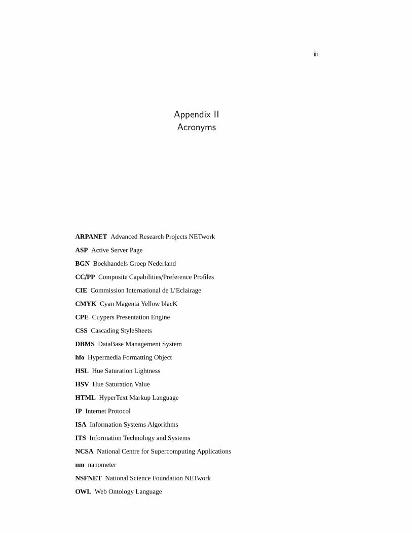
iii
Appendix II
Acronyms
ARPANET Advanced Research Projects NETwork
ASP Active Server Page
BGN Boekhandels Groep Nederland
CC/PP Composite Capabilities/Preference Profiles
CIE Commission International de L’Eclairage
CMYK Cyan Magenta Yellow blacK
CPE Cuypers Presentation Engine
CSS Cascading StyleSheets
DBMS DataBase Management System
hfo Hypermedia Formatting Object
HSL Hue Saturation Lightness
HSV Hue Saturation Value
HTML HyperText Markup Language
IP Internet Protocol
ISA Information Systems Algorithms
ITS Information Technology and Systems
NCSA National Centre for Supercomputing Applications
nm nanometer
NSFNET National Science Foundation NETwork
OWL Web Ontology Language

iv
RDF Resource Description Framework
RDFS RDF Schema
RGB Red Green Blue
RST Rhetorical Structure Theory
SMIL Synchronized Multimedia Integration Language
SQL Structured Query Language
TCP Transmision Control Protocol
TU-Delft Tecnical University Delft
URI Uniform Resource Identifier
URL Uniform Resource Locator
WWW World Wide Web
XHTML eXtensible Hypertext Markup Language
XML eXtensible Markup Language
XSL eXtensible Stylesheet Language
XSLT XSL Transform
XSP eXtensible Server Page

v

vi
References
1. R. Amsterdam. Rijksmuseum Amsterdam Website. http://www.rijksmuseum.nl.
2. E. Andre, J. Muller, and T. Rist.WIP/PPP: Knowledge-Based Methods for FullyAutomated Multimedia Authoring. London, UK, 1996.
3. J. Bateman, J. Kleinz, T. Kamps, and K. Reichenberger. Towards Constructive Text,Diagram, and Layout Generation for Information Presentation.ComputationalLinguistics, 27(3):409–449, September 2001.
4. D. Bauer and C. Cavonius.Ergonomic aspects of visual display terminals, chapterImproving the legibility of visual display units through contrast reversal, pages137–142. Taylor and Francis, 1980.
5. U. Baumann, N. Silverstrini, and E. P. Fischer. Colour Museum.http://www.colorsystem.com/index.htm.
6. D. Baylor.Colour: Art and Science, chapter Colour Mechanisms of the Eye, pages103–126. Cambridge University Press, 1999.
7. T. Berners-Lee.Weaving the Web. Orion Business, 1999.
8. S. Boll, W. Klas, and J. Wandel. A Cross-Media Adaptation Strategy for MultimediaPresentations. InACM Multimedia ’99 Proceedings, pages 37–46, Orlando, Florida,October 30 - November 5, 1999. ACM, Addison Wesley Longman.
9. P. Brusilovsky. Adaptive Hypermedia.Journal on User Modeling and User-AdaptedInteraction, 11:87–110, 2001.
10. H. Cooper and R. Spronk.Mondrian: The Transatlantic Paintings. Yale UniversityPress, 2001.
11. K. Czajka. Design of interactive and adaptive interfaces to exploit large media-basedknowledge spaces in the domain of museums for the fine arts. Diploma Media SystemDesign, University of Applied Sciences Darmstadt, June 14, 2002.
12. R. den Buurman. Use and abuse of color in designing for computer displays. InProceedings of Interacting with Computers Preparing for the Nineties, pages185–188. Stichting Informatica Congressen, Amsterdam, December 1994.
13. J. D. Foley.Fundamentals of Interactive Computer Graphics. Addison-Wesley PubCo, 1982.
14. M. M. G. Davenport. ConText: Towards the Evolving Documentary. InACMMultimedia ’95, Proceedings, pages 377–378, November 1995.

References vii
15. J. Geurts. Constraints for Multimedia Presentation Generation. Master’s thesis,University of Amsterdam, 2002.
16. J. Geurts, S. Bocconi, J. van Ossenbruggen, and L. Hardman. TowardsOntology-driven Discourse: From Semantic Graphs to Multimedia Presentations. InSecond International Semantic Web Conference (ISWC2003), Sanibel Island, Florida,USA, October 20-23, 2003. To be published.
17. J. Geurts, J. van Ossenbruggen, and L. Hardman. Application-Specific Constraints forMultimedia Presentation Geneneration. Technical Report INS-R0107, CWI, May 31,2001.
18. L. Geurts, L. Meertens, and S. Pemberton.The ABC Programmer’s Handbook.Prentice-Hall, 1991.
19. Guggenheim museum. Guggenheim Museum - The Collection.http://www.guggenheimcollection.org.
20. E. Heller.Wie Farben auf Gefuhl und Verstand wirken. Droemer Verlag, Munchen,2000.
21. J. Itten.The Art of Color. John Wiley and Sons, Inc., 2002.
22. T. Kamps.Diagram Design : A Constructive Theory. Springer Verlag, 1999.
23. M. Kohnke. A Sense of Type.http://www.weassociated.com/A Senseof Type/index.html.
24. H. W. Lie, B. Bos, and R. Caillau.Cascading Style Sheets: Designing for the Web(2nd Edition). Addison-Wesley Pub Co, 1999.
25. S. Little. Cuypers Meets Users: Implementing a User Model Architecture forMultimedia Presentation Generation. To be published as CWI-Techreport, 2002.
26. M. Longair.Colour: Art and Science, chapter Light and Colour, pages 65–102.Cambridge University Press, 1999.
27. P. Lyons, G. Moretti, and M. Wilson. Colour Group Selection for ComputerInterfaces. In B. Rogowitz and T. Pappas, editors,Human Vision and ElectronicImaging V., volume 3959, pages 302–313, San Jose, USA.
28. B. MacEvoy. Handprint: Color, 2002.http://www.handprint.com/HP/WCL/wcolor.html.
29. W. C. Mann, C. M. I. M. Matthiesen, and S. A. Thompson. Rhetorical StructureTheory and Text Analysis. Technical Report ISI/RR-89-242, Information SciencesInstitute, University of Southern California, November 1989.
30. J. Morton. Color Matters, 2002. http://www.colormatters.com/.
31. F. Nack. Pictures at an exhibition.IEEE Multimedia, pages 14–17, April - June 2002.
32. F. Nack and L. Hardman. Denotative and Connotative Semantics in Hypermedia:Proposal for a Semiotic-Aware Architecture.New Review of Hypermedia andMultimedia, 7:7–37, 2001.
33. F. Nack, A. Manniesing, and L. Hardman. Colour Picking, the Pecking Order ofForm and Function. Technical Report INS-R0303, CWI, June 2003.
34. F. Nack, M. Windhouwer, L. Hardman, E. Pauwels, and M. Huijberts. The Role ofHigh-level and Low-level Features in Style-based Retrieval and Generation ofMultimedia Presentations.New Review of Hypermedia and Multimedia, 7:39–65,2001.
35. Y. Ohno. CIE Fundamentals for Color Measurement.IS&T NIP16, October 2000.
36. G. S. Owen. Physiological Principles for the Effective Use of Color. Online, 1999.based on ”Physiological Principles for the Effective Use of Color”, G. Murch, IEEE,

viii References
pp. 49-54, Nov., 1984.
37. N. Poppelier and J. Braams. A style option to adapt the standard LaTeX documentstyles to A4 paper. May 1997.
38. M. Roberts. The CIE Colour System.http://www.cs.bham.ac.uk/∼mer/colour/cie.html.
39. Q. Roper. De Stijl and the Modern Movement.http://www.qdesign.co.nz/designhistdestijl.html.
40. L. Rutledge, B. Bailey, J. van Ossenbruggen, L. Hardman, and J. Geurts. GeneratingPresentation Constraints from Rhetorical Structure. InProceedings of the 11th ACMconference on Hypertext and Hypermedia, pages 19–28, San Antonio, Texas, USA,May 30 – June 3, 2000. ACM.
41. L. Rutledge, J. Davis, J. van Ossenbruggen, and L. Hardman. Inter-dimensionalHypermedia Communicative Devices for Rhetorical Structure. InProceedings of theInternational Conference on Multimedia Modeling 2000 (MMM00), pages 89–105,Nagano, Japan, November 13-15, 2000.
42. L. Rutledge, J. van Ossenbruggen, L. Hardman, and D. C. Bulterman. Mix’n’Match:Exchangeable Modules of Hypermedia Style. InProceedings of the 10th ACMconference on Hypertext and Hypermedia, pages 179–188, Darmstadt, Germany,February 21-25, 1999. ACM. Edited by Klaus Tochterman, Jorg Westbomke, Uffe K.Will and John J. Leggett.
43. P. Schmitz, J. Yu, and P. Santangeli. Timed Interactive Multimedia Extensions forHTML (HTML +TIME): Extending SMIL into the Web Browser. W3C Note areavailable at http://www.w3.org/TR/1998/NOTE-HTMLplusTIME-19980918,September 1998.
44. K. Schwarz. An investigation on the relationship between the user model and graphicrepresentations for the automated generation of multimedia presentations. DiplomaMedia System Design, University of Applied Sciences Darmstadt, 2003.
45. M. Q. Shaw. Evaluating the 1931 CIE Color Matching Functions. Master’s thesis,University of Hertfordshire, England, 1997.
46. H. L. Snyder, J. J. Decker, C. J. Lloyd, and C. Dye. Effect of the Image Polarity onVDT Task Performance. InProceedings of the Human Factors Society, 1990.
47. M. Spruit. Management van Informatiesystemen, 2002. TU-Delft dictaat bij het vakInformatiestrategie en Beheer van Informatiesystemen - In3020.
48. D. P. Stern and M. Perede. The Exploration of the Earth’s Magnetospehere, January2003. http://www-istp.gsfc.nasa.gov/Education/wmap.html.
49. A. S. Tanenbaum.Computernetwerken. Academic Service, Schoonhoven, 1998.Copublication from Prentice Hall International, Dutch translation by L. Geurts,Original Title: Computer Networks, Third Edition.
50. E. R. Tufte.Envisioning Information. Graphics Press, 1999.
51. E. R. Tufte.Visual Explanations. Graphics Press, 2000.
52. Dictionary.com. http://www.dictionary.com.
53. K. van der Meer.Documentaire Informatiesystemen. NBLC Uitgeverij, third revisededition, 1998.
54. J. van Ossenbruggen.Processing Structured Hypermedia — A Matter of Style. PhDthesis, Vrije Universiteit, Amsterdam, The Netherlands, April 10, 2001.
55. J. van Ossenbruggen, J. Geurts, F. Cornelissen, L. Rutledge, and L. Hardman.Towards Second and Third Generation Web-Based Multimedia. InThe TenthInternational World Wide Web Conference, pages 479–488, Hong Kong, May 1-5,

References ix
2001. IW3C2, ACM Press.
56. J. van Ossenbruggen, J. Geurts, L. Hardman, and L. Rutledge. Towards a FormattingVocabulary for Time-based Hypermedia. InThe Twelfth International World WideWeb Conference, pages 384–393, Budapest, Hungary, May 20-24, 2003. IW3C2,ACM Press.
57. J. van Ossenbruggen and L. Hardman. Smart Style on the Semantic Web. InSemanticWeb Workshop, WWW2002, May 2002.
58. J. van Ossenbruggen and L. Hardman. Multimedia on the Semantic Web. In H. vanOostendorp, A. Dillon, and L. Breure, editors,Creation, Use and Deployment ofDigital Information. Erlbaum, Publication planned late 2003.
59. W3C. Synchronized Multimedia Integration Language (SMIL) 1.0 Specification.W3C Recommendation, June 15, 1998. Edited by Philipp Hoschka.
60. W3C. Composite Capability/Preference Profiles (CC/PP): Structure andVocabularies. Work in progress. W3C Working Drafts are available athttp://www.w3.org/TR, 15 March 2001. Edited by Graham Klyne, Franklin Reynolds,Chris Woodrow and Hidetaka Ohto.
61. W3C. Synchronized Multimedia Integration Language (SMIL 2.0) Specification.W3C Recommendation, August 7, 2001. Edited by Aaron Cohen.
62. H. Weinreich, H. Obendorf, and W. Lamersdorf. The Look of the Link — Conceptsfor the User Interface of Extended Hyperlinks. InProceedings of the 12th ACMconference on Hypertext and Hypermedia (HT01), pages 19–28, University ofAarhus, Århus, Denmark, August 14-18, 2001.
63. L. Weitzman and K. Wittenburg. Automatic presentation of multimedia documentsusing relational grammars. InProceedings of the second ACM internationalconference on Multimedia ’94, pages 443–451, San Francisco, October 15 - 20, 1994.
64. T. G. Wolfmaier. Designing for the Color-Challenged: A Challenge.Internetworking,march 1999.http://www.internettg.org/newsletter/mar99/accessibilitycolor challenged.html.
65. S. Wu. The Psychology of Color, 2003.http://psychology.about.com/library/weekly/aa031501a.htm.
66. K.-W. Yau. Visual and olfactory transductions - a tale of two senses, July 2000.http://physiology.cup.cam.ac.uk/Proceedings/Abstracts/527P/Cambridge/Files/sympS10.html.